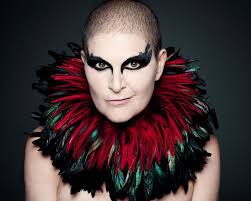
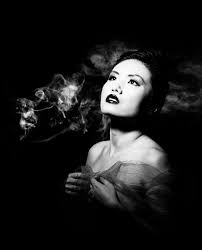
Why do we use studio lighting? We use studio lighting because it gives us more freedom to control the conditions that the subject is in. For example we can adjust the angle, brightness and color of the lights so that we can have the settings we desire to have the picture taken in. What is 3 point lighting? Three point lighting is split into three different points: Key lights, fill lights and back lights. Key lights: Usually the main and strongest light, with the most influence in the shoot, and is placed on one side of the camera so that the other has some shadow. Fill lights: The secondary light that is placed on the other side of the camera from the key light, to fill in some of the shadows using softer lighting. Back lights: This is placed behind the subject to provide some lighting from the back, with its purpose to provide definition and some highlights in the picture, which helps separate the subject from the backdrop.In this shoot I used the artificial lighting provided by the spotlights, to create a dramatic, almost black background, whilst using a red film to cast a reddish shadow onto the subjects face. I tried to position the subject's face using the rule of thirds, so that the eye was drawn to the face almost immediately, whilst blending in some of the subject's clothes into the darkness to create a smooth visually pleasing image. This was my response:
Final pictures:
I chose this image because I loved how the subject emerged from the darkness through the slow faint gradient of the red. This I found created a more dramatic effect to the overall image taken.
What I liked about this image was how not all of the subjects profile was shown, as there is a clear contrast between the light and dark side of the face. This created a more abstract effect where the body seemingly is materializing from the darkness.
I found that the clear definition between certain points of the subjects face, such as the neck and forehead allowed from a most striking and dramatic look from the individual.
What I really liked about this image was the use of the main light only being used. By doing so it created a circular spotlight illuminating only the top half of the subject's body, whilst making an imposing and strong contrasted image.
The use of the shadow in this image allows for a strong contrast created by the singular spotlight, to which the slight gradient around the edges makes the overall image more sinister.
Category Archives: Knowledge and Understanding
Filters
Photoshop Burn And Dodge Tools
What is the burn and dodge tool? The burn and dodge tool allow you to either darken or lighten an image of your choice. This can be used to create dramatic effect within an image, and so can use it to lighten dark areas or darken parts you want to stand out the most. This is used in portraiture due to how it can be used to make certain features stand out above the rest, such as making one side of the face darker. The image below shows the effects of dodge and burn to a grey surface:I wanted to apply this to an image of mine to see the effects that could be made. These were my steps: 1) Navigate to the selection bar on the left, and pick the burn tool.
2) Select a suitable size for the brush to match the face, and go over the parts of the face I want to darken once.
3) Go back to the bar on the left and select the dodge tool instead, from there I lightened the parts of the image I wanted to have a clear contrast from the darkness.
What Is Street Photography?
Street photography is a type of photography that features subjects in candid situations within public places. Street photographs are used to display how people behave in society.
A Candid Photograph is one in which the subject has not posed for the camera, they have been naturally caught in the image in whatever situation they are in.
Rankin
Who is Rankin? John Rankin (born 1966) is a British portrait photographer and fashion photographer. He made his name in publishing and founding the seminal monthly magazine Dazed & Confused with Jefferson Hack in 1922. The magazine went on to forge distinctive marks in the arts and publishing spheres, whilst developing a cult status forming and molding trends, bringing some of the brightest lights to fashion. And today is one of the leading online fashion and cultural brands.Rankin creates landmark editorial and advertising campaigns, with his work being some of the most celebrated by the biggest brands, charities etc. Rankin has published thirty books, and has his work exhibited around the world. In 2011, Rankin Film Productions was made to make music videos, commercials, and short films. Some of his work consists of:
I found that when Rankin captured the subjects features, he tended to base them around the head, making a certain aspect pop out (eyes, teeth and mouth). Through this it showed what defined them as an individual rather than what people saw them as.
Chiaroscuro
What is chiaroscuro drawing? chiaroscuro is the effect of light modelling in painting, drawing, or print making where three-dimensional volume is suggested by the value gradation of color and the analytical division of light and shadow shapes (Known as shading). Chiaroscuro has been used since the Renaissance and Baroque period where the artists wanted to engage their viewers. To do this one side of the subject tends to be darker than the other, usually bringing out an aspect of their features, and really drawing your eyes to it.How is it used in modern photography? Chiaroscuro is used within modern photography today to create dramatic portraits by making certain aspects of an image once again stand out as seen below:
Using this technique it allow as seen, it can also be used today to make aspects of objects as well as people stand out. When compared to the art, the chiaroscuro inside photography tends to be more dark and dramatic than the art, which tends to just make one side of the face slightly darker.
Street Photography Shoot
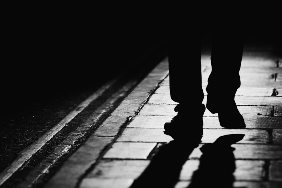
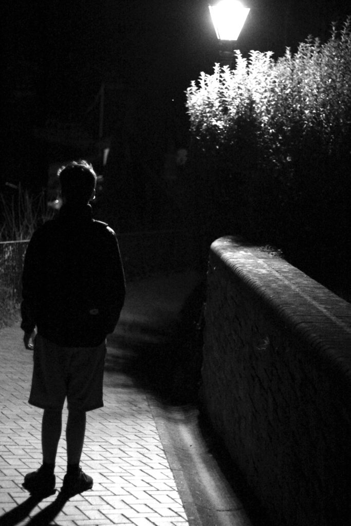
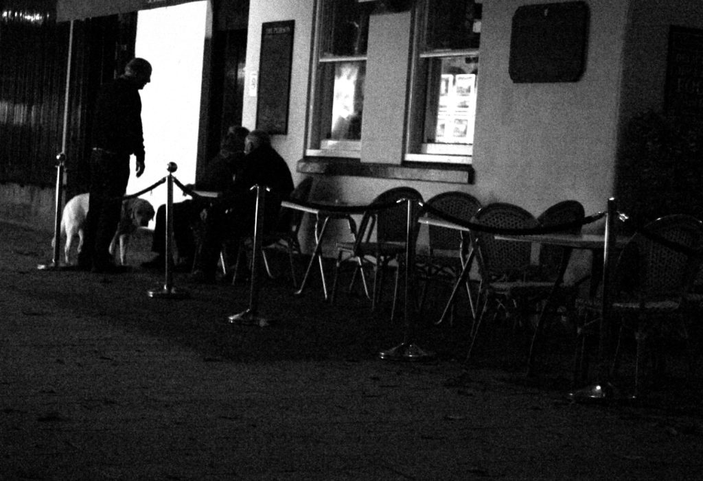
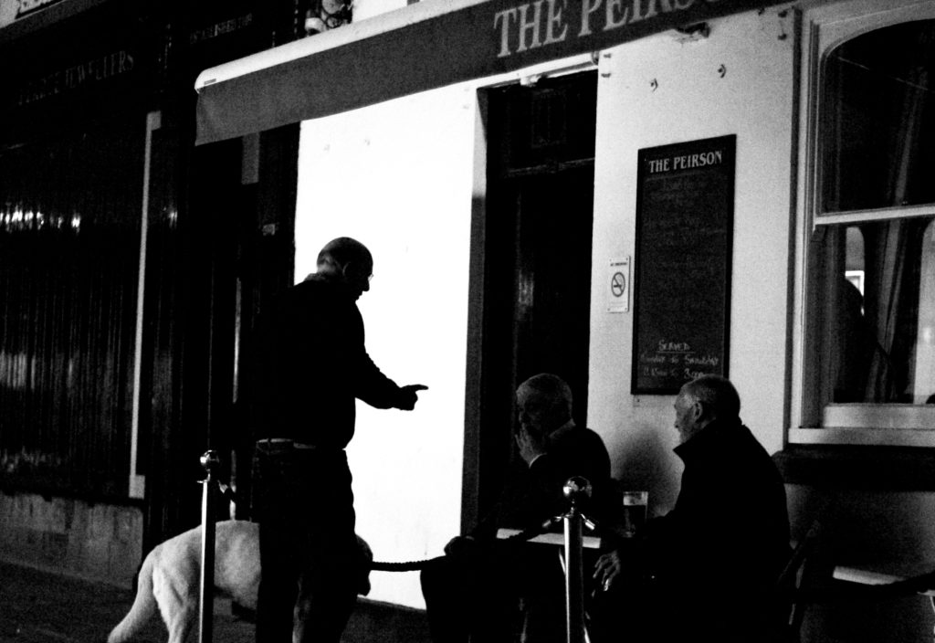
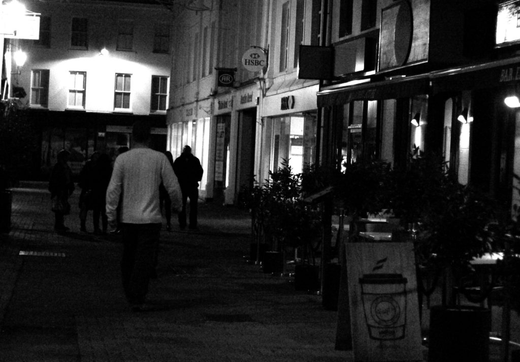
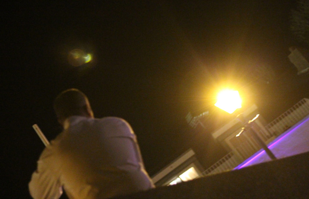
What is street photography? Street photography, also sometimes known as candid photography, is a type of photography conducted for either art of inquiry, that features many unedited encounters and random incidents within public places of interest. I found that many images of street photography included capturing the subjects off guard, and so thought that to try this would allow for maximum effect when taking the shoot. For my shoot I decided it would be either best to go into down for the nightlife, or stay around the street where I lived such as the bars etc. When planning the shoot I wanted it to be clear what I would be taking pictures of, and so made a mind-map to record my ideas, as seen below:This allowed me to focus on certain aspects of the shoot easier, as I now had a rough idea what I needed to capture. These were the results from my shoot:
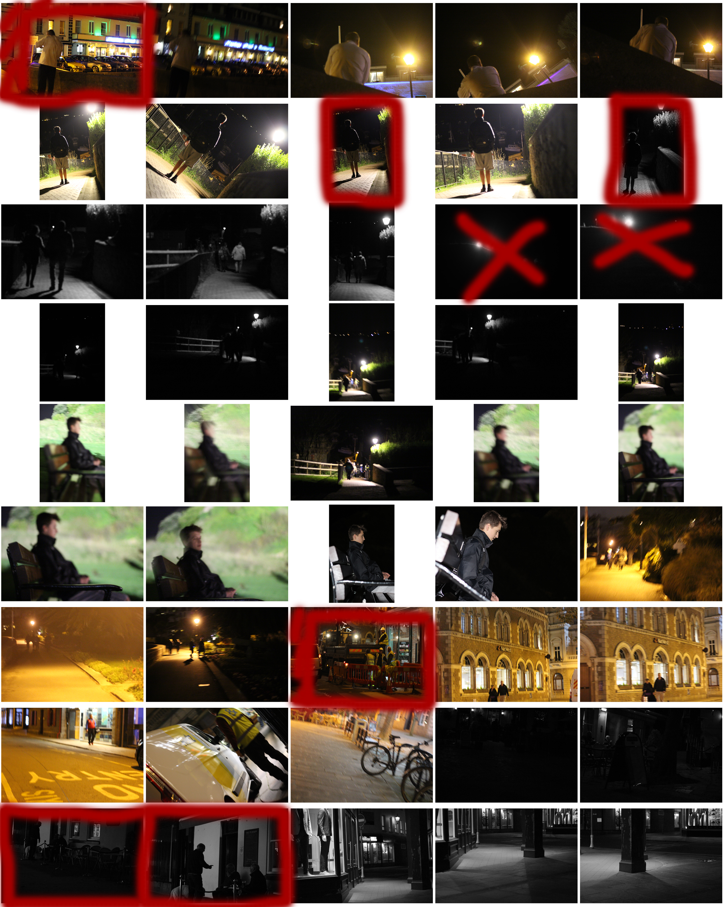
From the shoot I went on to highlight and crop the images I thought were the best out of all the photographs. This allowed me to limit the shoot down to just ten pictures so that I could choose my final image to display. These were my choices:
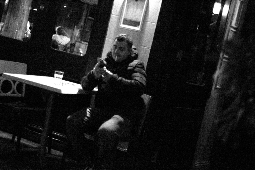
Once again from here I went to limit my selection to a top 5 to make it easier for me to find the final piece. This was my result:I chose this image because I loved the contrast between the darkness of the wall, and the subject. This is due to the rule of thirds which line up with the character inside, which instantly draws your eye to the face. I found that the pure blackness of the wall covering the picture added for a dramatic effect overall, making it almost seem hidden.
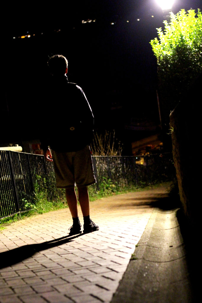
I chose this image once again because of the contrast between the subject and the surrounding area. I found that the silhouette created by the lamp really made the image pop, whilst at the same time balanced it so that the darkness itself was not too overpowering in the picture.
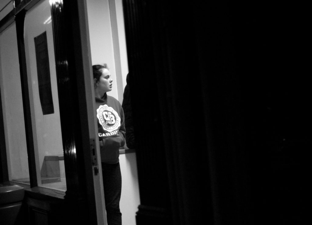
What I liked about this image was how the subjects face lit up against the darkness of the rest of the picture against the white strip of wall. I found that capturing someone off guard in their comfort zone allowed for a greater insight to the subjects life, and really captured them as an individual.
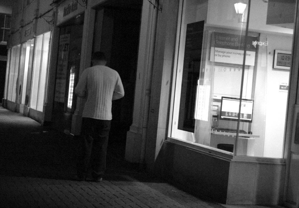
I found that this picture captured a clear contrast between the darkness of the three old figures and the white pub behind. I found that this silhouette that is almost created, makes the overall piece more dramatic than it is, with the blurred black building behind allowing for the whole picture to work.
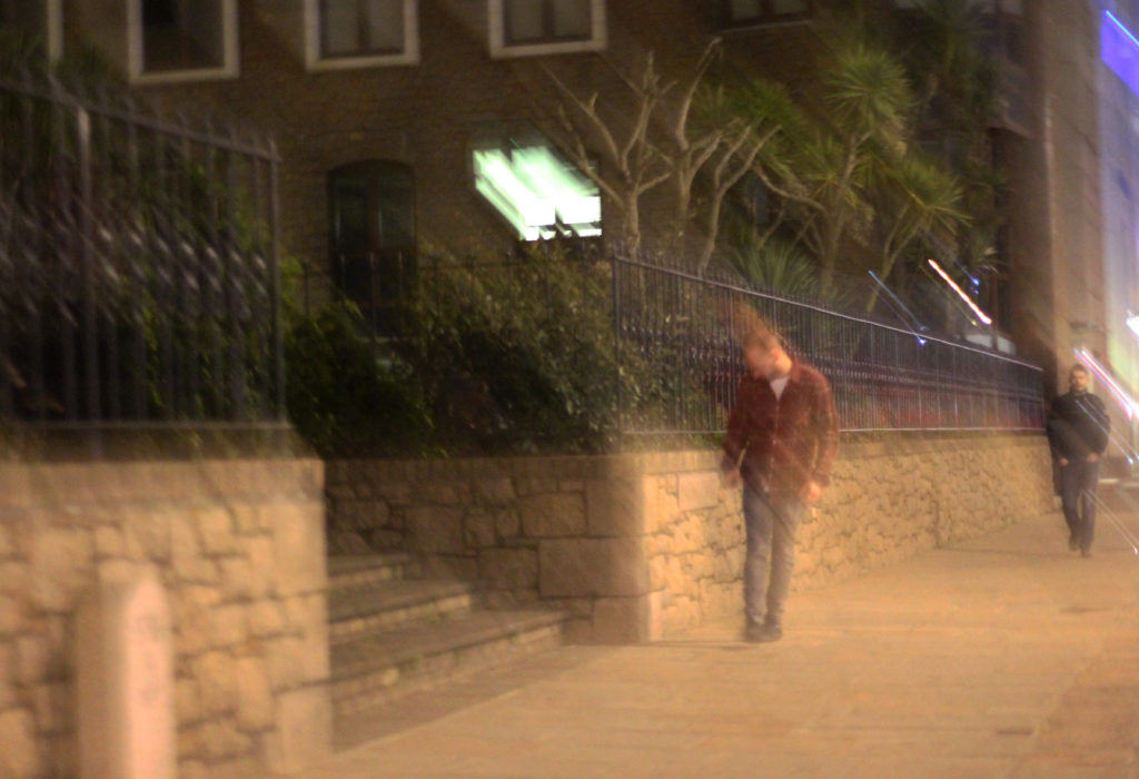
Finally I chose this image because it captured the nightlife of a man drunk stumbling home. What I liked about this was how the picture was blurred itself as well, allowing greater emphasis on the man in the jacket being drunk, and the perspective that he may be seeing. FINAL IMAGE
I chose this as my final image because I loved the use of the darkness provided by the wall, to create a backdrop which almost hides the subject behind, with only a glimpse of the subject within the heavily contrasted brightness of the indoors.
Street Photography
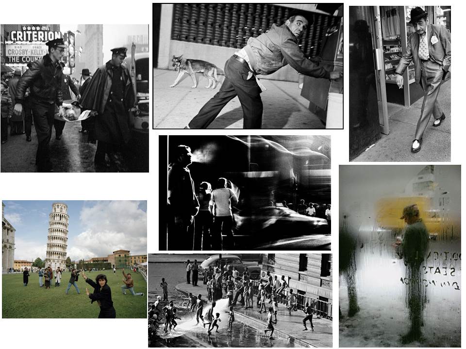
What is street photography? Street photography is about documenting everyday life and society. However street photography does not have to be taken in the streets. You can shoot at the airport, at the market, at the beach, at the park, in the bus or harbor, in the doctor’s office, in the grocery store, or in any other public places. Some examples of street photography are:From this mood board I chose the two images I thought were most effective.
These images highlight everyday life in certain parts of cities and countries. What I think makes them both so effective, is that in the top one taken in a construction site, has a clear pattern which leads to the central figure, where the eye is drawn. This use of using everyday sites to create pattern through contrast etc, allow for a more visually pleasing style of street photography. However the image beneath that image, focuses on a completely different aspect, as instead it chooses to focus on a poorer place in which sites like that are common. What makes it so effective is that there is a clear contrast between the blue wood, and the white dog, where the photographer uses the bike as a golden ratio to draw the eye to the head of the dog.
A LEVEL PHOTOGRAPHY TASTER | EXPERIENCE DAY | 9th / 10th NOVEMBER
COURSE OVERVIEW

ASSESSMENT OBJECTIVES
-
Develop ideas through sustained and focused investigations informed by contextual and other sources, demonstrating analytical and critical understanding.
-
Explore and select appropriate resources, media, materials, techniques and processes, reviewing and refining ideas as work develops.
-
Record ideas, observations and insights relevant to intentions, reflecting critically on work and progress.
-
Present a personal and meaningful response that realises intentions and, where appropriate, makes connections between visual and other elements.

TASTER LESSON: CONTEMPORARY PORTRAITS MINI-PROJECT
Learning Objectives:
To develop knowledge and understanding of environmental portraiture.
To explore and analyse the work of a photographer specialising in the genre.
To create a meaningful response and evaluate progress.
“All photographs are memento mori.
To take a photograph is to participate
in another person’s (or thing’s)
mortality, vulnerability, mutability.
Precisely by slicing out this moment
and freezing it, all photographs
testify to time’s relentless melt.”
Susan Sontag
RESEARCH What is Environmental Portraiture?
Portraiture is by far the most popular of all photographic subjects. Portraiture allows for far more freedom than other forms of photography, simply because the subject can be moved around and posed with ease. Much of the composition can therefore be controlled by instruction – rather than just by viewpoint.
An environmental portrait is a portrait executed in the subject’s usual environment, such as in their home or workplace, and typically illuminates the subject’s life and surroundings. The subject often knows he/she is being photographed but a lot more emphasis is placed on location.
E.g.

August Sander
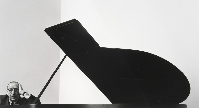
Arnold Newman

Dorothea Lange

Michelle Sank

Anthony Kurtz
What impact could photographing the subject in their usual environment have on the viewer?
ANALYSE Artist Reference
Who is Anthony Kurtz?

Anthony Kurtz is an award-winning, commercial, editorial and “art-documentary” photographer based in Berlin (formerly San Francisco). He specialises in environmental portraiture and strives to create beautiful and unexpected photographs of people and the spaces they occupy. Combining both natural light and studio strobes, Anthony sculpts light to create a mood, an atmosphere, a photograph that tells and story and, hopefully, sparks curiosity in the viewer.


ANALYSE Image Analysis
Apply a technical / visual / contextual / conceptual analysis to the below image – a photograph by Anthony Kurtz, taken from his series ‘No Man’s Job’, Senegal Africa, 2013.

The Guardian (2013) Big Picture: No Man's Job - female mechanics in Senegal by Anthony Kurtz https://www.theguardian.com/artanddesign/gallery/2013/apr/05/photography

https://anthonykurtz.com/
Things to consider with environmental portraits…
Technical = lighting / exposure / lens / shutter speed
Visual = composition / framing / viewpoint / angle / eye contact / engagement with the camera / facial expression
Contextual = background / story / character(s) / connection to the photographer / social or political context?
Conceptual = meaning / idea behind the work / social documentary? / class? / gender role? / lifestyle?

PLAN Your Photo Assignment
Organise your shoot and discuss your ideas.
- Model(s)
- Location
- Lighting
- Camera Settings
- Context
- Concept
RECORD Create a Meaningful Response
Take 10-20 photographs each that show your understanding of environmental portraiture in the style of Anthony Kurtz.
Use the school as your setting, and students / each other as your characters / models.
Think carefully about specific setting, facial expression, pose, lighting, and composition.
EXPLORE Experiment and Review
Explore the camera settings and demonstrate camera skills.
Review your images (in camera).
EVALUATE & PRESENT Select Final Images
In your group, select one final image to present to the class.
Evaluate your image using the analysis model (technical/visual/contextual/conceptual).
Reflect.
- What went well?
- Would you do anything different next time?
- How might you experiment further with your photographs – camera skills / photo editing skills (Photoshop)?
Henri Cartier-Bresson
Who is Henri Cartier-Bresson? Henri Cartier-Bresson was born in Chanteloup-en-Brie, Seine-et-Marne, France. He was the oldest of five children, with his father being a wealthy textile manufacturer. His mother's family were cotton merchants and landowners from Normandy, where Henri spent part of his childhood. His parents supported him financially so Henri could pursue photography more freely than his contemporaries. Henri took holiday snapshots with a Box Brownie; he later experimented with a 3×4 inch view camera. His father assumed that his son would take up the family business, but Henri also feared this prospect. Returning to France, Cartier-Bresson deepened his relationship with the Surrealists. He became inspired by a 1930 photograph by Hungarian photojournalist Martin Munkacsi showing three naked young African boys, caught in near-silhouette, running into the surf of Lake Tanganyika. Titled Three Boys at Lake Tanganyika, this captured the freedom and grace of their movement and their joy at being alive. That photograph inspired him to stop painting and to take up photography seriously. Some of the work he started to produce consisted of: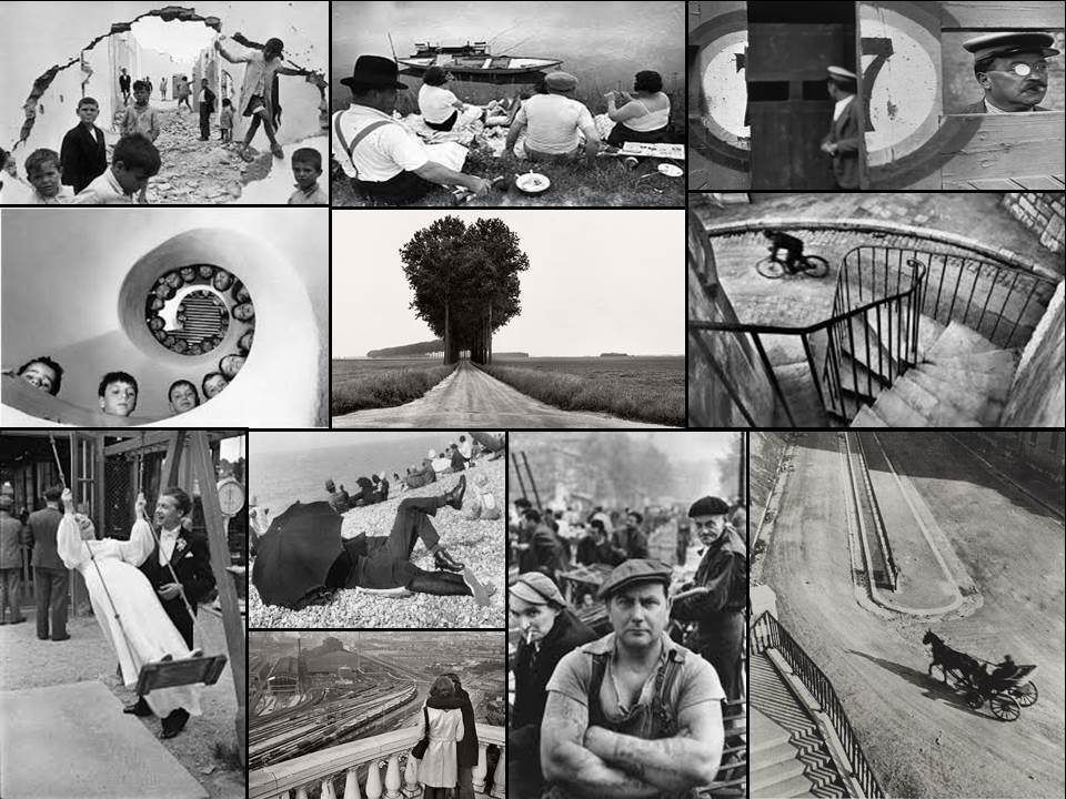
From this selection of a few of his images, I found that my eye was drawn to the picture of the wall crumbled in.
The contrast between the subjects within and the white crumbling wall, which in a way frames the image, allows the photograph to really define the faces of the individual children. From this it allows us to see the different expressions of each child, some seem to be captivated by this photographer taking the picture, whilst others are completely oblivious to it. Allowing the photographer to capture the playfulness but also the curiosity that is seen within each child. The fact that some of the children are playing on rubble, shows how that even in the worst scenarios, kids always make the best out of what they have, showing that innocence within.
Henri-Cartier Bresson
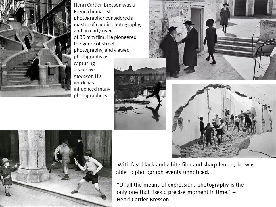
The Decisive Moment:
In 1952 Henri Cartier-Bresson, a founder of modern photojournalism, proposed one of the most fascinating and highly debated concepts in the history of photography: “the decisive moment.” This moment occurs when the visual and psychological elements of people in a real life scene spontaneously and briefly come together in perfect resonance to express the essence of that situation. Some people believe that the unique purpose of photography, as compared to other visual arts, is to capture this fleeting, quintessential, and holistic instant in the flow of life.
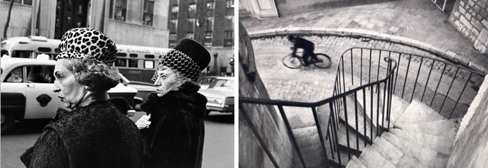
This website was established by Henri Cartier-Bresson, his wife Martine Franck, and their daughter Mélanie, the Henri Cartier-Bresson Foundation opened its doors in May 2003. It now preserves Henri Cartier-Bresson and Martine Franck’s archives:


