Who was Fay Godwin?
Fay Godwin was renowned for her black and white landscape photographs of the British countryside and coast. She also produced a series of portraits of literary figures, with many of them being collaborated in her 1979 book ‘Remains of Elmet’.
Fay Godwin had no training when it came to photography, but rather became interested in it from photographs of her families snaps. From there she went on to produced portraits of well-known writers, photographing nearly every significant literacy figure in the 1970s and 1980s within England.
Later in the years her love of walking led to the inspiration to pursue landscape photography. She often photographed isolated, remote areas of the British landscape and producing many pastoral scenes as well as contrasting urban landscapes. Godwin became president of the Ramblers Association from 1987 to 1990, where she became well-known for her work as an environmentalist.
In 1987 Godwin was awarded a major Arts Council Bursary to enable her to continue her landscape work in distant parts of Scotland. Her work soon started to appear in many public and private collections, including the Victoria and Albert Museum, The British Council, the Scottish National Portrait Gallery and many more. Originally her work began a world tour by the British Council, but later became a Fellow of the National Museum of Photography and in 1990 received an Honorary Fellowship from the Royal Photographic Society.
Some of her work can be seen below:
 As seen above Godwin focuses on very much of what is normal in the landscape, however she tends to use the weather to create more dramatic images to what would usually be seen, such as the clouds to create contrast on the land.

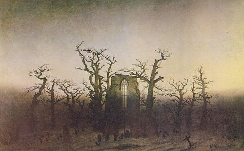

 More about Romanticism can be found
 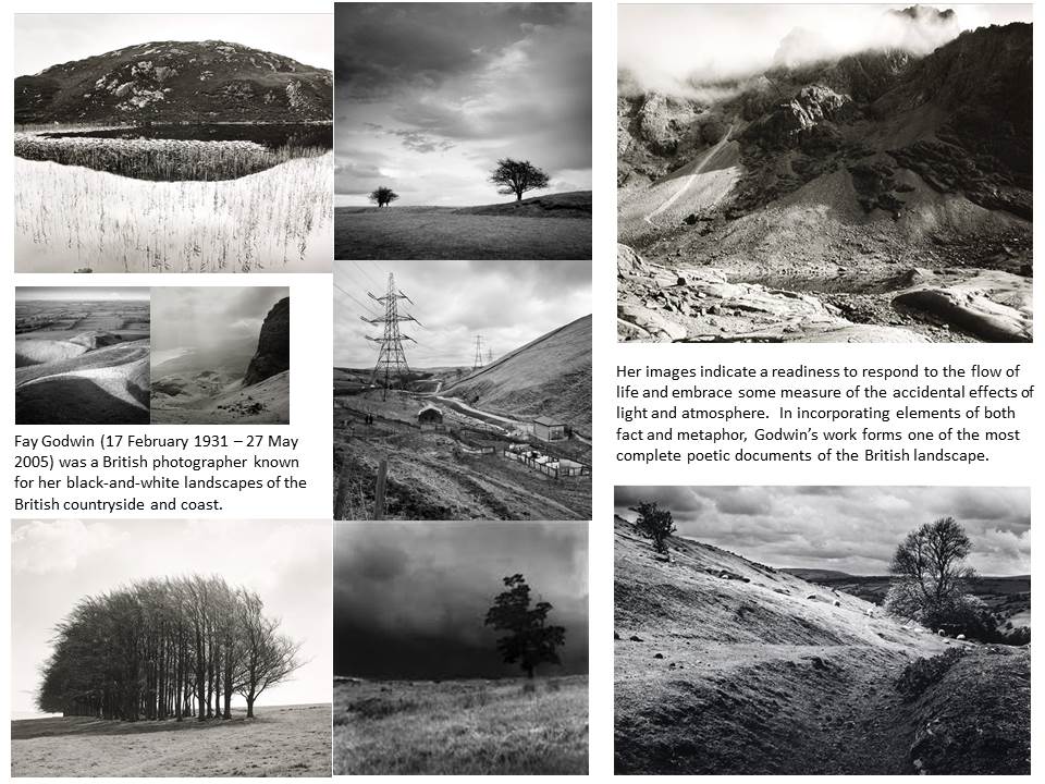 Godwin’s involvement with photography stemmed from the hobby of photographing her children which led in the early 1970s to commissioned portraits of poets and writers. Her interest in landscape was stimulated by her love of walking. She subsequently co-authored many essays, guide-books and poems on the theme of British landscape.
 When photographing landscapes she worked in black & white and her genuine concern for the environment made her a unique figure in British photography. Her images were noted for their clarity, careful composition and expert control over tonal values. She was known for great tenacity and determination when creating an image. When someone once remarked to her that she had been lucky to catch the ideal cloud formations in a particular picture she quickly replied, ‘I didn’t “catch” it. I sat down and waited three days for it.’
 I found that the use of nature was particularly effective when it came to the images, as the trees could be used for a variety of different things such as fades etc. Through this I found it great how trees could be used to define a certain aspect of the image itself, and so allowed for the silhouettes of the creatures they wished to be highlight.
I decided to make a response to these ideas by mainly focusing around the human body and nature combined. These were the results:

 To create these I used the opacity tool, this increased the transparency of the top image, allowing for the lower image to be seen more clearly, creating the desired effect. I then used the paint tool to rub out the excess parts of the image to match the shape of the subjects face, making it seem more realistic.
 I also wanted to switch between monochrome and the portrait settings when taking photos to allow for a greater contrast between the lights and darkness of an image. This would allow for a more sinister look when produced due to the emotionless expressions of the subject.
 Before the shoot I wanted to create a mind map of the ideas towards this, so that I would have an idea of what and how to take the photos of both subjects.
 From there I decided to carry out the shoot, these were my results:
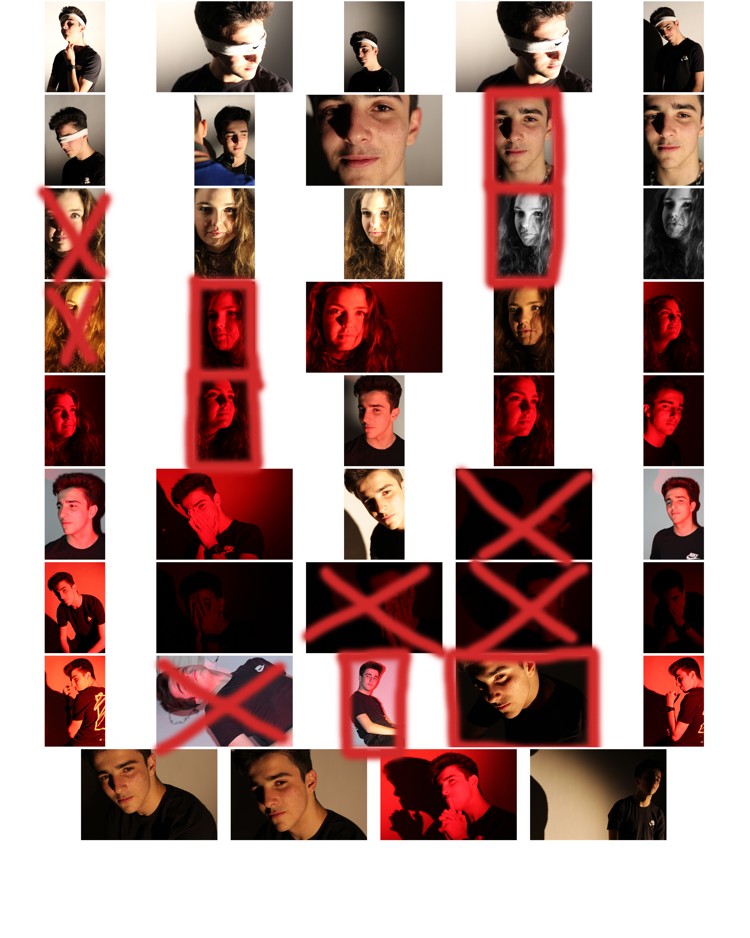
 From here I selected the top ten image from the entire shoot, this would make it easier for me to narrow it down to the final image that I deemed best from the shoot. These were the images I selected:
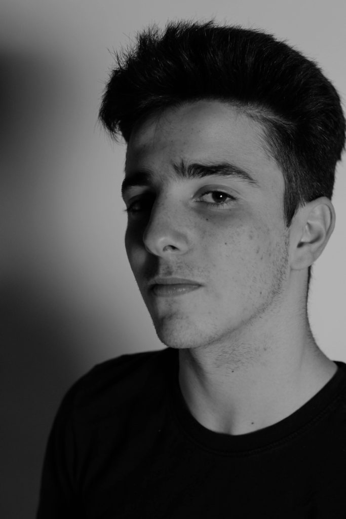

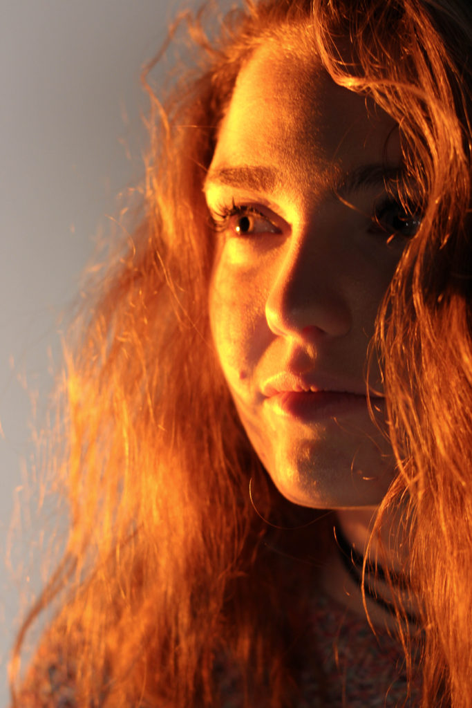


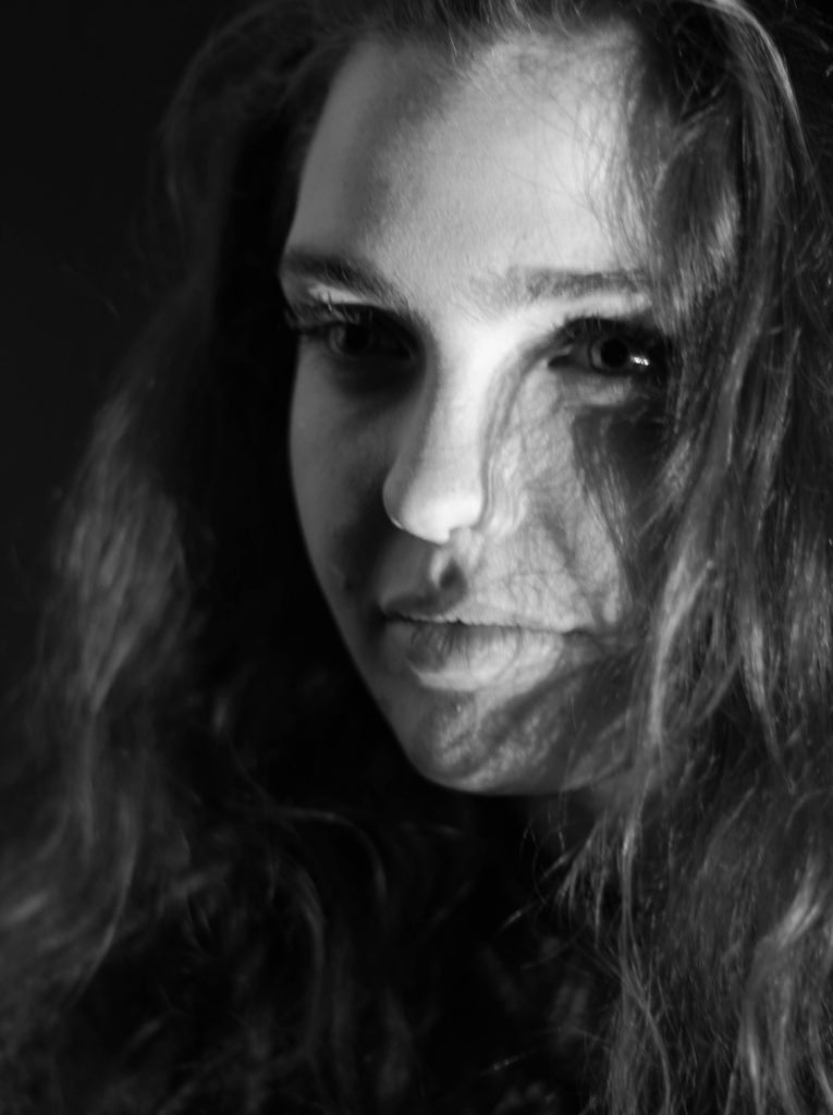


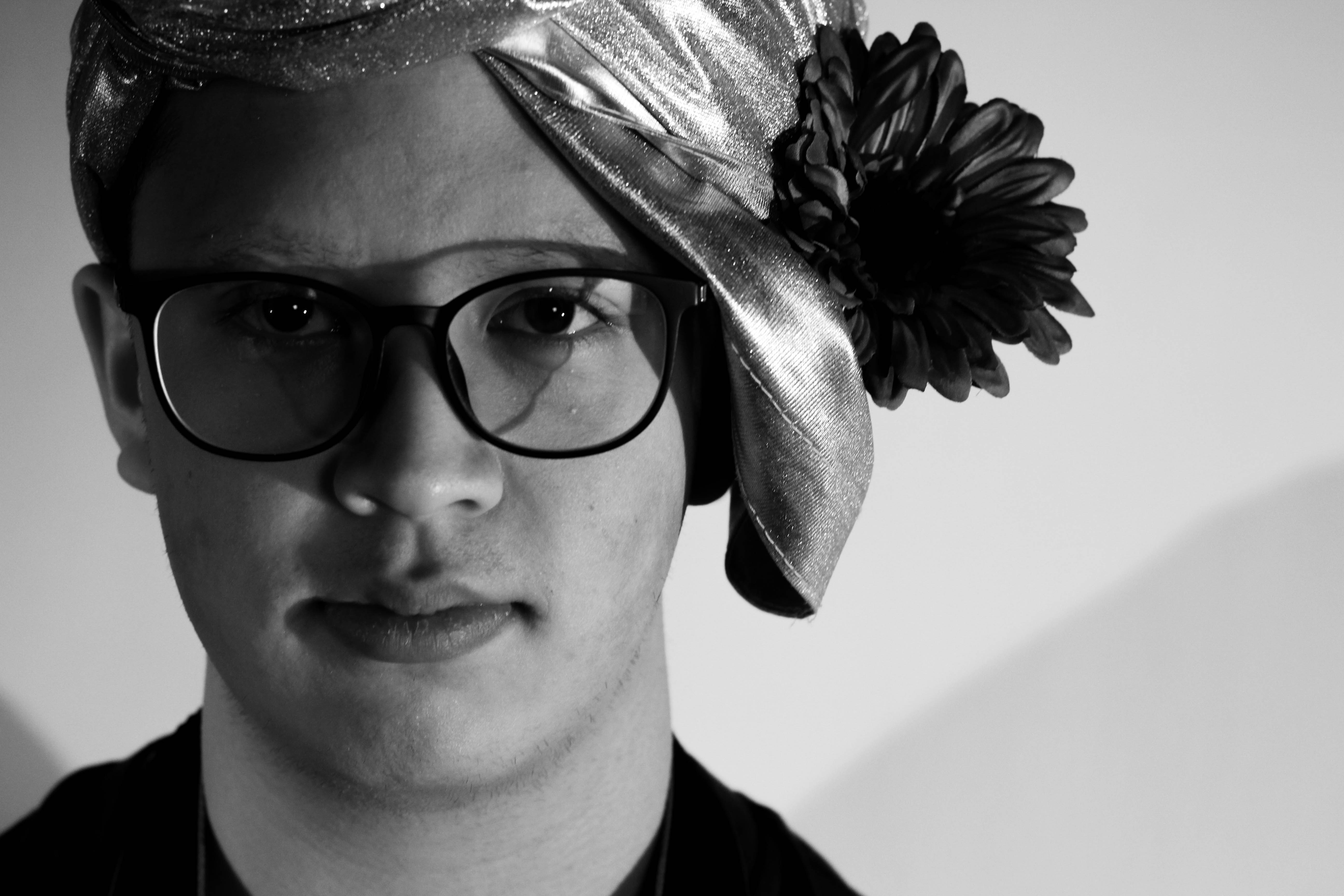 What I loved about this image was the obvious difference between the light and dark on either side of the face. This to me compared with the light backdrop allowed for a clear definition to the face, drawing out certain feature above others.
 In response to this I wanted to have a go at trying to create images based around this theme, using images taken by me which I could manipulate into these designs. These were my outcomes:

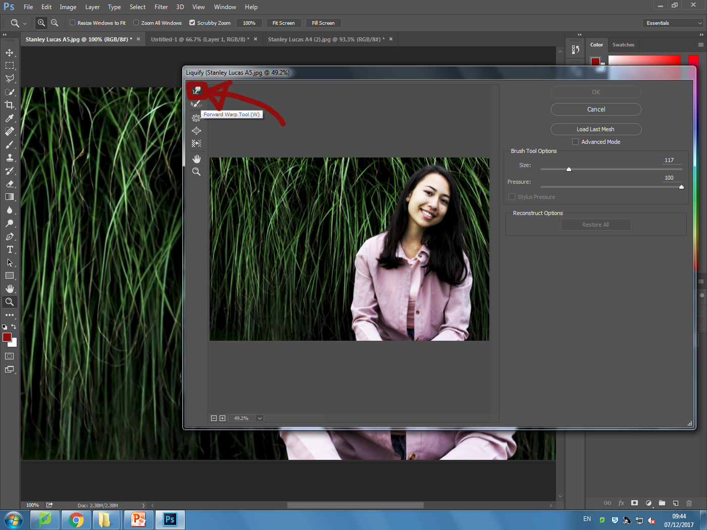
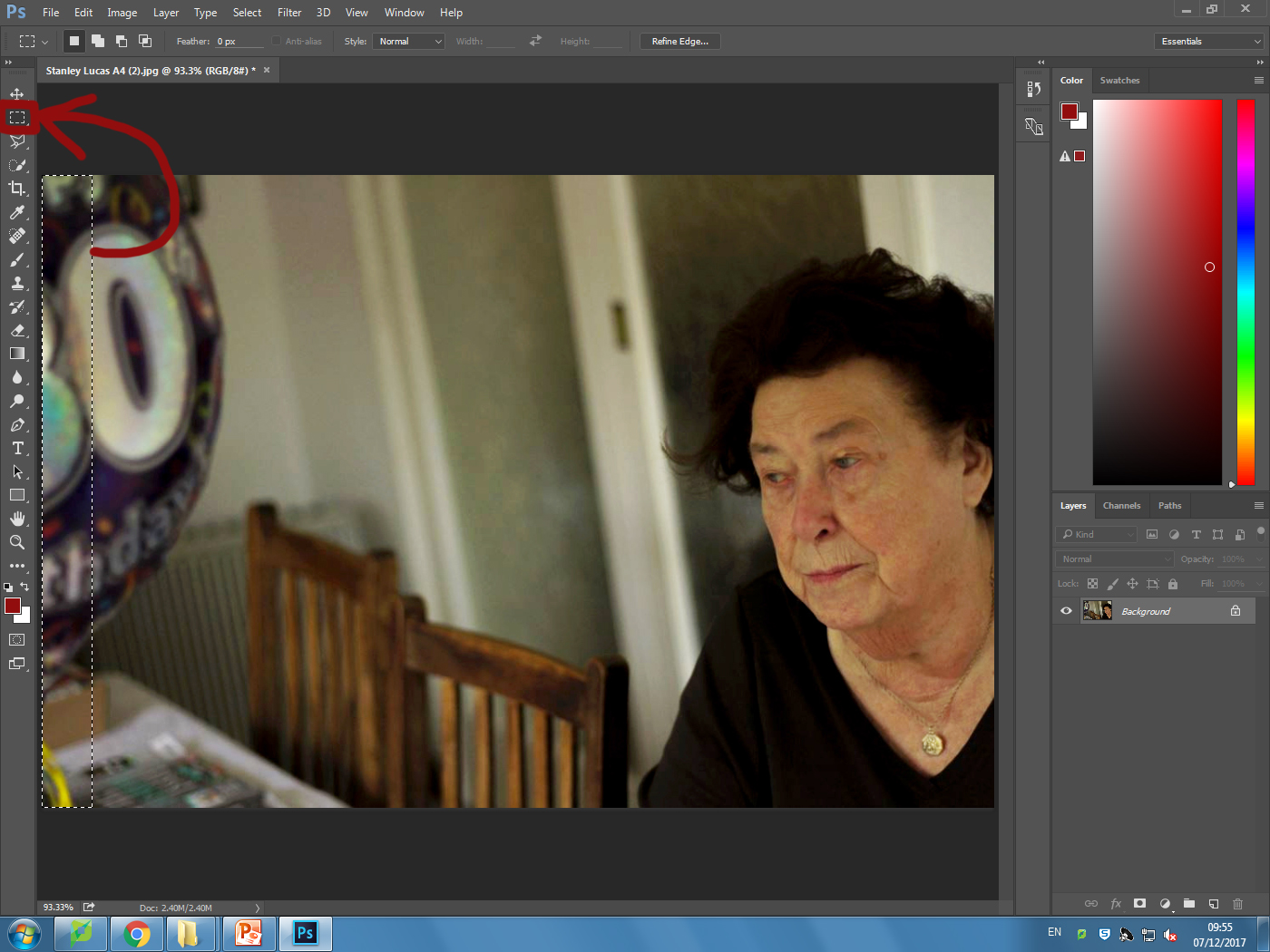
 I explored a variety of techniques such as liquify, layering and separation. This allowed me to have the effects desired as I was able to manipulate the facial features of the subject, which can be related to the theme of missing or lost identity within yourself.



 As seen in her work, she wanted to focus on how the photos were meant to recreate paintings in an innovative and creative way not seen before.
The 7 deadly sins were a popular topic when doing tableau photography due to each one having an important connection. These were Lust, Gluttony, Greed, Sloth, Wrath, Envy and Pride. I could then link this back to how these all formed their own unique identity and change the individual for the good or worse.
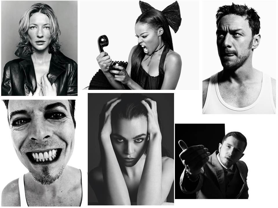
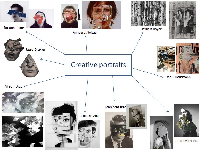 I first created a mind map of photographers that interested me and that I thought related to the concept of identity. The manipulation of paper and the way we perceive the photograph was also important when deciding which photographers I would take inspiration from when doing my photo shoots.
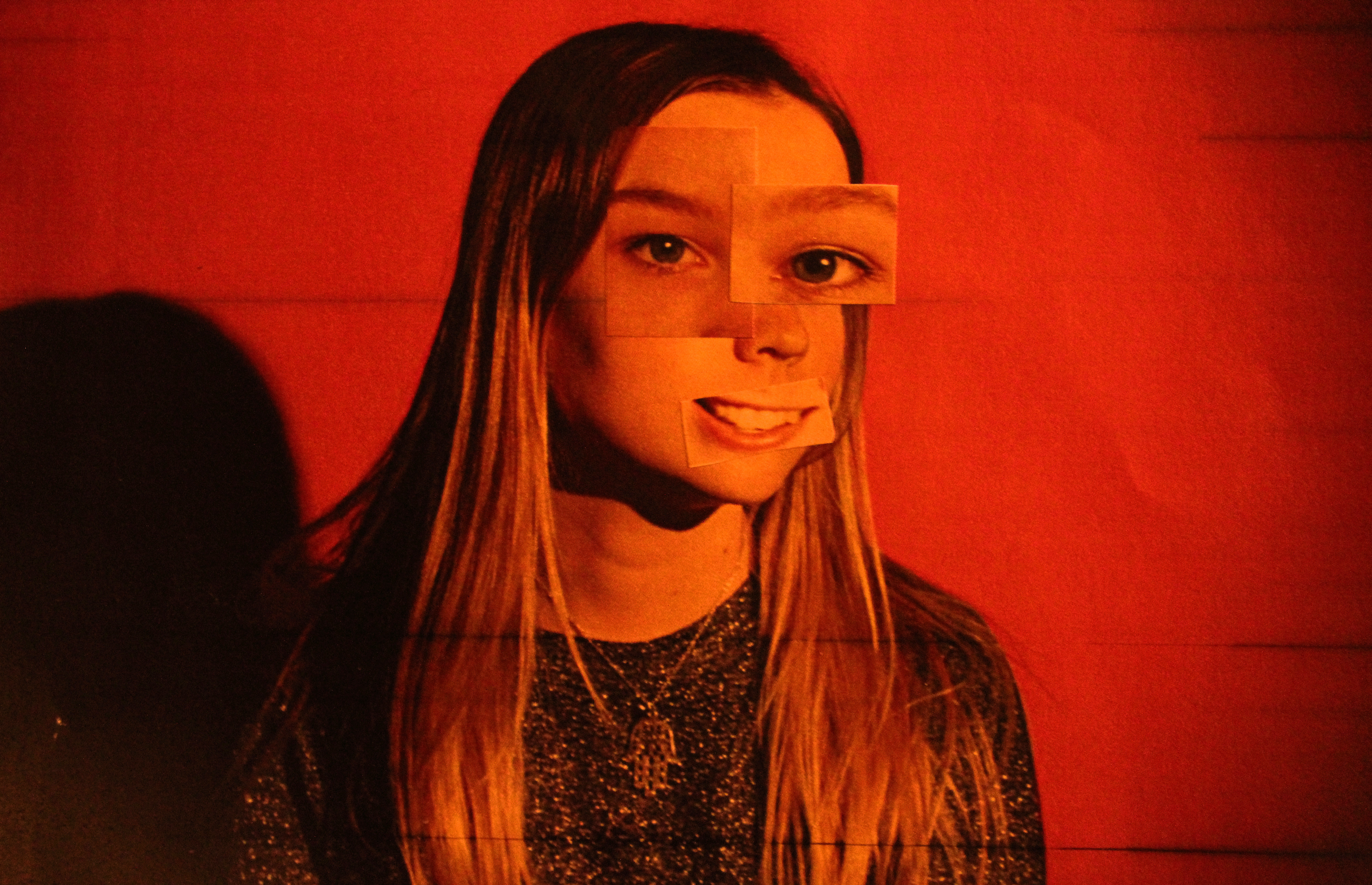
 I tried to interpret his style by creating images by layering different sections from different cropped photos.
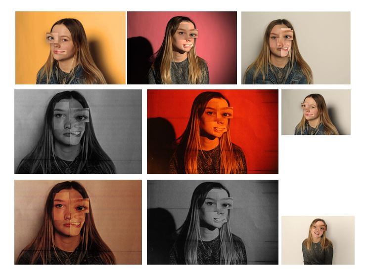 I edited some of the photographs on photo shop and some by cutting the paper and physically sticking on the different angles of the face to experiment which way worked best. I found that the better effect was when i physically stuck on paper on the printed out face as the images edited on photo shop looked too artificial, whereas the stuck on photos looked developed and well experimented.

 John Stezaker’s work may, in several respects, be part of the continuity of the collage activities that marked 20th-century art, but they stand out in particular by the way they broach the construction of meaning.
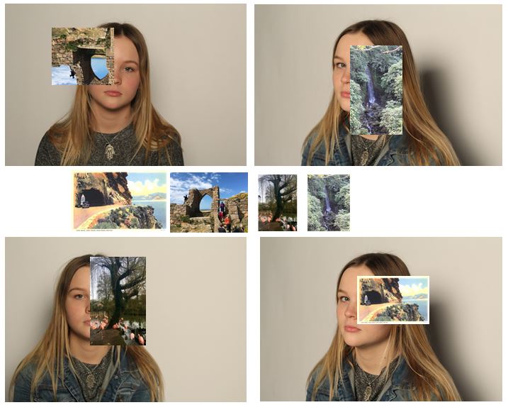 I tried to interpret John Stezakers work by editing photos onto images of my subject. I tried to select images that would make for an interesting photo and tried to connect lines in the attached photo to lines and sections on the original photos. For three of the images i edited my own photographs onto the image and the forth one i used a picture of an postcard I found online to interpret John Stezaker’s work the best i could as he used postcards in his photos, which i think is the most effective out of the four.


