Tanja Deman
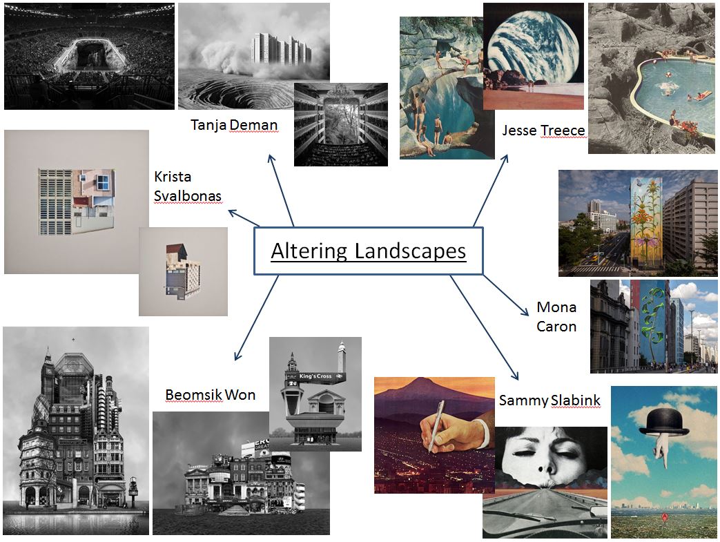
Tanja Deman’s art is inspired by her interest in the perception of space and her relationship to nature.
Tanja’s works, incorporating photography, collage, video and public art, are evocative meditations on urban space and landscape. Observing recently built legacy or natural sites her work investigates the sociology of space and reflects dynamics hidden under the surface of both the built and natural environment.
Her investigation of collective psychology and space focuses on recently built legacy, specifically in spaces for collectives and how they relate to nature. Her images are visual metaphors that step into puzzling sites and situations layered with history. She captures the awkward socio-political dynamics under the surface of both the built and natural environment.
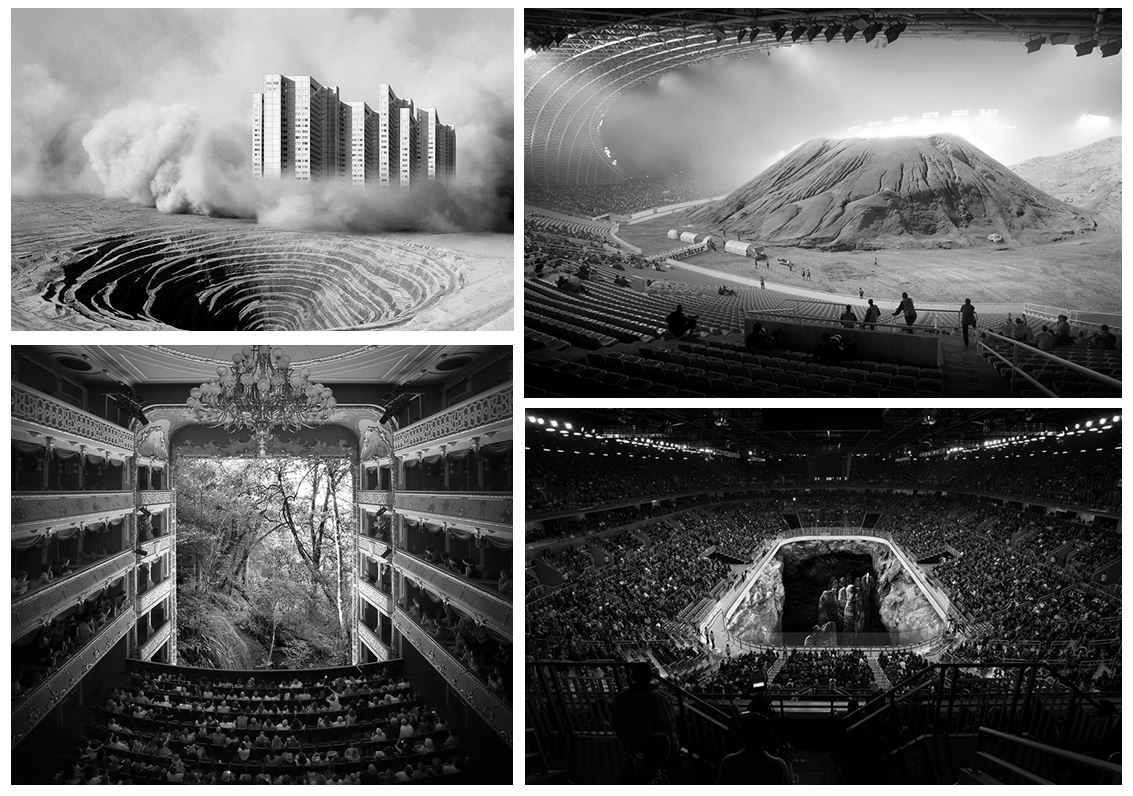
This image is part of her series called ‘Fernweh’ which explores the concept of a modernist city through its extreme relations to the landscape. The images are placed on a blurred line between a past which reminds us of a future and a future which looks like a past. Scenes are referring to the modernist ideas and aspiration of a man conquering the natural wild land and subordinating it to the rational order, and the consequences of those aspirations, which switched into the longing for an escape from urban environments.
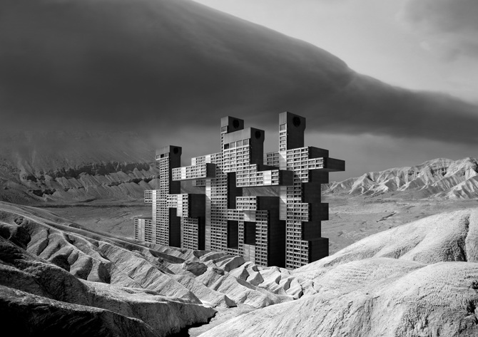
Another one of her series called ‘Sight Densification’ is a photo collage series, based on conflict atmospheres of rapid territorial densification of contemporary megalopolis. While creating these images she was interested in the aura of coexistent city infrastructure, skyscrapers, building sights, bridges, dams and other mega structures in urban environments, as well as their dramatic relation to the nature.
She also won the Archisle International Photographer in Residence Award in Jersey 2017. In 2015 she began ‘Salt Water’ a new series exploring the underwater landscapes of the Adriatic Sea and in her Jersey project she develops this body of work further for the exhibition Sunken Gardens.
“In Jersey I have made a photographic exploration of inter-tidal zones, capturing morphological formations of the seabed, reefs and cliffs that penetrate the sea depths; the transmission and refraction of light through the sea water; and above all the lush underwater gardens of seaweeds.”
Jesse Treece
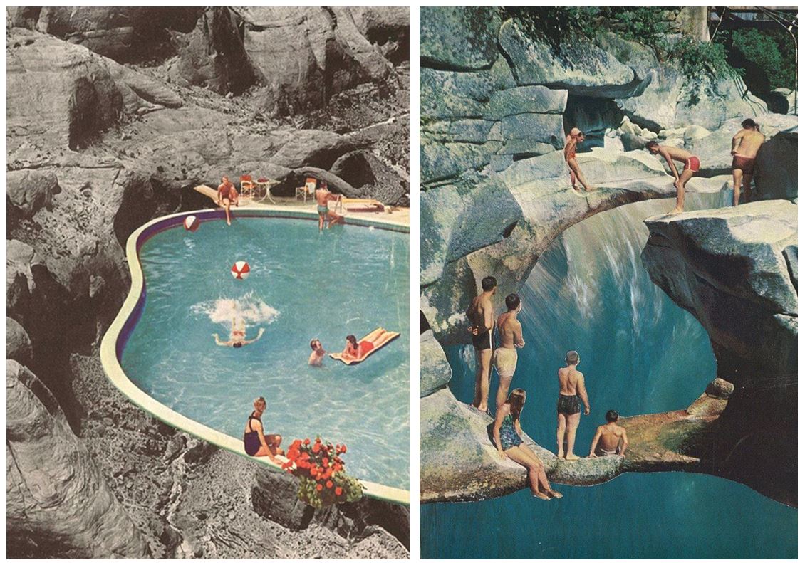
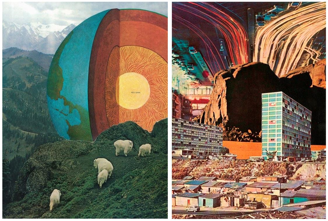
- His idea is to create artwork that excites and surprises no matter what the current trends or moods are.
- He’s mainly into old newspaper comic strips, dystopian sci-fi novels, crazy architectural drawings, designs from the 60’s and 70’s and works of artists like Salvador Dalí and Hayao Miyazaki.
- By this and his preference for the process and the look of handmade collages, he turns his inspiration into something unique and original.
- Being basically self-taught except for some not very serious art classes, Jesse Treece became a central figure in the underground collage art movement and was even recently included in AnOther Magazine’s list of the top ten collage artists in the world.
- He somehow manages to mix regular and absurd, beautiful and disturbing, science and nature, large and small and puts together these familiar imageries to create a whole new picture.
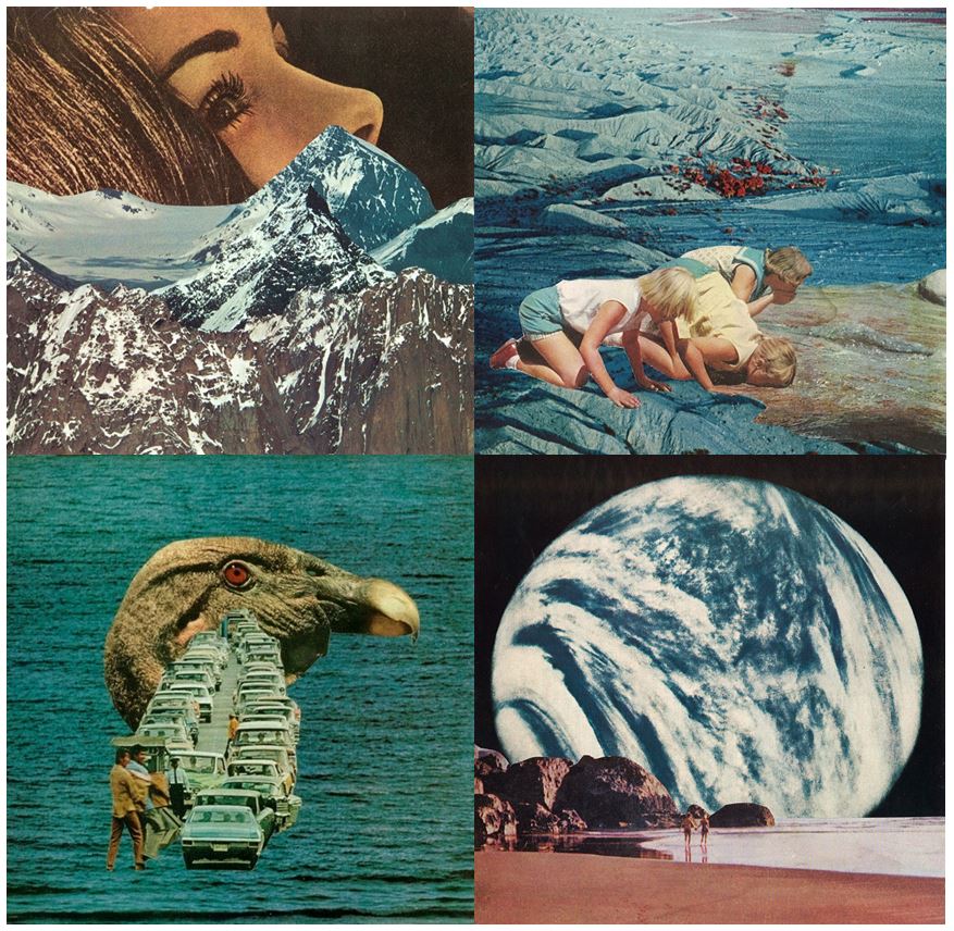 Every image tells a different story that you can get lost in for hours. Jesse Treece himself even calls his work slightly disturbing. His imageries somehow made me think of science fiction and horror movies from the 70s.
“I came across a box of old magazine clippings one night and found myself wanting to make a visual story out of them. That turned into my first collage and it was the most satisfied I ever felt with something I had created. I guess it kind of snowballed into an obsession from there”
Sammy Slabbinck
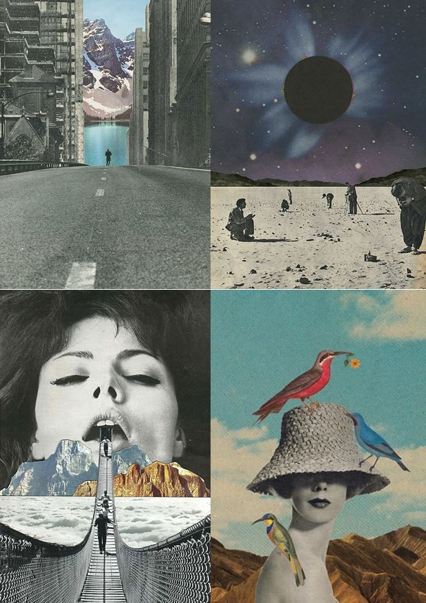
- Belgian artist Sammy Slabbinck’s work comprises surreal collages and illustrations that somewhat unexpectedly combine vintage with contemporary images.
- Slabbinck likes to play around with different styles and proportions with the aim of creating powerful yet simple visual works that are permeated by a subtle sense of humour.
- His carefully composed images create startling juxtapositions and present new meanings through a masterful combination of completely heterogenous elements and a clever use of scale and form.
- He is an avid collector of magazines and books from the 50’s, 60’s and 70’s and takes full advantage of the muted tones and rich textures that he finds in his source material, namely vintage advertisements, photography and print.
He uses photography from vintage magazines, advertisements and prints as he says “they have a certain look and feel, with very strong lines. You can see it in the architecture, the cars, the furniture. But the photography is also completely different: it has a quality which he finds very innocent. The colours are faded and warm, the images have a soul. It’s nothing like the photographs you can take now with a super digital camera and millions of pixels. I tried making collages with recent magazines but they just don’t have the same spirit.”
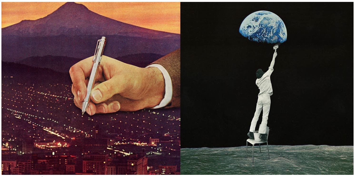
”Mid-century advertisements have a certain look that appeals even up to this day. There is a sense of innocence in them that’s very inviting to work with. Putting these images out of their normal frame and juxtaposing them with modern elements can give an exciting and surprising effect. The characters in these ads can function as actors in the collage, and I, as the director, can give them a second life by putting them in a new surreal landscape.”
He doesn’t consider him self to be a political artist but he does like to put extra layers in his work. Sometimes it can go as far as a political satire. He does like to play around with the absurd and put some humor in his work.
 I decided to attempt at making a panoramic image by stitching together individual images I had taken of a landscape within Photoshop. To do this I overlapped picture upon picture to create a forged landscape of the area taken as seen below:
 Once finished I proceeded to use this method to create a few more panoramas of the landscape in the area where I live, these were the results:
 This image of the bay consisted of twelve individual images that I had to crop and re-shape to allow for the smooth transition effect between each photo that creates the impression of a singular image.
  I took this image of the golf course across the road to me by cropping the overall piece due to how some of the images did not match the shape or size of the others taken. This removed any rough edges to the image allowing for the final result.
 This final image I found to be the most successful due to how the transition between each image looked the most natural with only slight lighting differences.
 From here I thought it would be appropriate to come up with a few ideas in order to help me along the shoot and guide me in what I should be doing. Here are my ideas:


 Once all the pictures of the given area had been taken I decided that I should whittle the selection down to the top ten overall images. This would allow me to come to an easier conclusion on what I thought was the best image taken in the shoot. These were my selected images I thought had the best outcome from the shoot:


 I selected this image because I loved the texture created by the shades of rust on a pole. I found that this allowed heavy but effective contrast between the overall piece as all the colors complemented each other making an almost molten scene.
 In this image I found that I particularly liked the contrast between the silhouette of the statue and the dim-lit sky, with the composition of the pole and string balancing out the image as a whole creating a visually pleasing overall piece.
 Once again I loved the use of the colors created by the rust to make an almost volcanic landscape with shades of red overlapping each other. I found the composition of the piece eye-capturing as the more rusted black areas looked like a mountain range captured from a bird’s eye view.
 In this image I tried to capture the way certain streets were looked after within my given area. What I liked about this one was how it incorporated everyday objects as almost ruining and breaking up the pattern made by the pavement through the composition of the paper and cigarettes.
 Finally I chose this picture because I loved the symmetry created by the textures of the floor surrounding the lights making an aesthetically pleasing image. This use of composition I found was most effective from how it drew the eye to the areas wanted through a clear contrast.


 Every image tells a different story that you can get lost in for hours. Jesse Treece himself even calls his work slightly disturbing. His imageries somehow made me think of science fiction and horror movies from the 70s.

 To add to my research of the area to be explored, I decided that it would be appropriate to take street view shots in order to have a bit of an insight before hand of the area.
 Part of the main area I am exploring is the car park, however now has been transformed into the International Finance Centers, with much of it still under construction. Other areas include Liberty Wharf, which was once known as a former abattoir that was restored and converted for the use of a shopping centre.
 As seen above Henner very much focuses on satellite imagery as his main source of art. One technique commonly seen in his work is shaped pixels, this can be done through selecting an area and finding the main color present in that space, to then convert it to just that singular color.
 They tend to focus on how the different textures of the floors can create the pattern to make aesthetically pleasing imagery. The images taken are of everyday generic objects that we take for granted and don’t see the patterns within them.
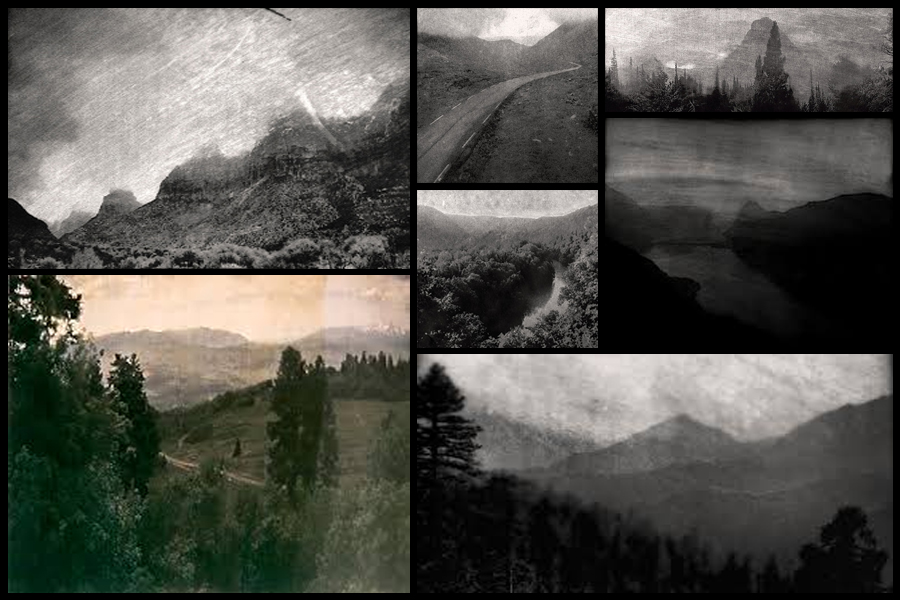
 One image that I particularly liked and decided to analyse was ‘Archival Pigment Print From a Surveillance Camera Feed’ which won the Lens Culture Emerging Talent Award 2016.
 Technical: Marcus DeSieno’s piece consists of hacking into surveillance feeds to capture interesting imagery, the image itself seems to be taken on a gloomy day, capturing the silhouette of the mountain range in the distance whilst incorporating the Ansel Adams system throughout capturing a range of shades. The picture seems to have been deteriorated creating an old feeling to it whilst maintaining much of the crisp qualities of the original photo. A depth of field can be seen partially used through the use of the graininess and how the road snakes off into the distance removing detail from the image, but at the same time keeping out focus on the road.


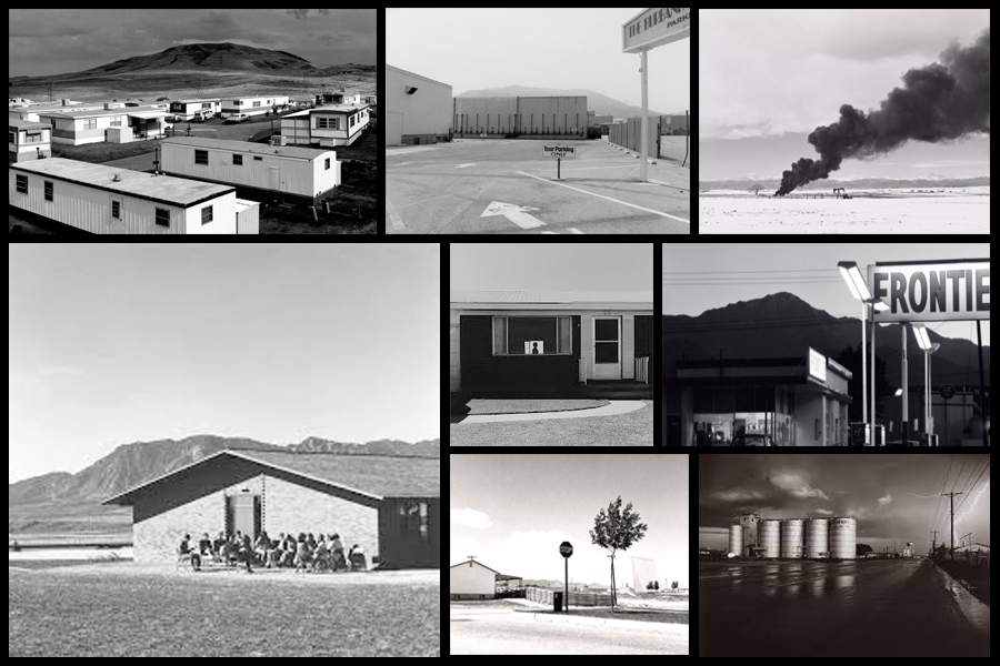
 Before taking the shoot I wanted to pull some ideas together on what to take, allowing for a guideline to my photos, this was my outcome:
 Once I had a general idea on what I could do for the shoot I finally moved onto the images themselves with these being the outcome:
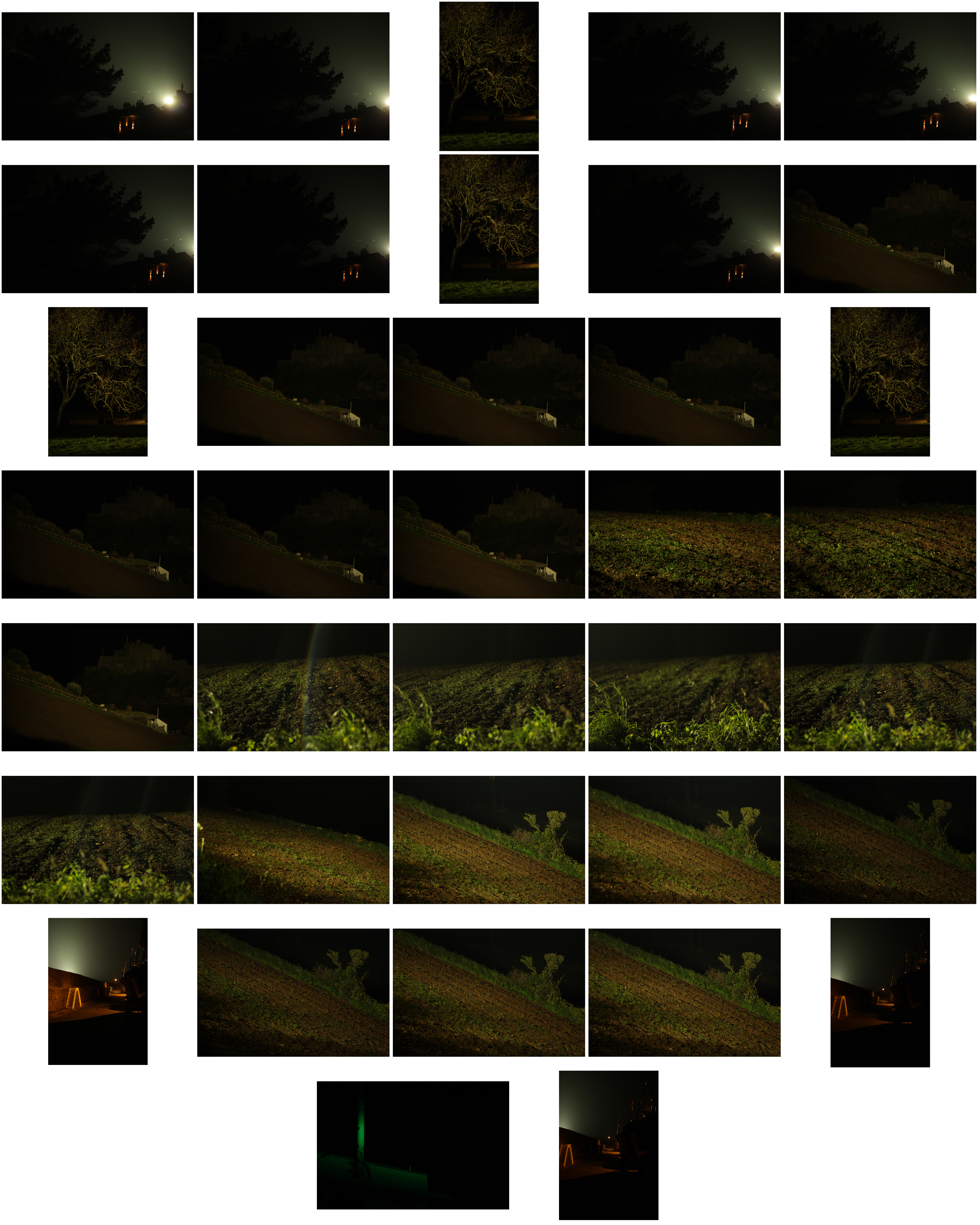


 I chose these images because I thought they popped out from the rest of the shoot, and had a greater understanding of what romanticism in photography was about. I found that their vivid colours and use of depth of field made them particularly effective. From here I wanted to whittle my selection down to just five images to really provide a clearer insight into my final image for the shoot. This is my selection:
 I chose this image due to how I loved the effect created from the back light that was meant to illuminate Gorey Castle at night, that instead silhouetted the housing and trees around it, creating an aesthetically pleasing result as an outcome. And with the slight use of red and oranges from the housing I though it really balanced it out.
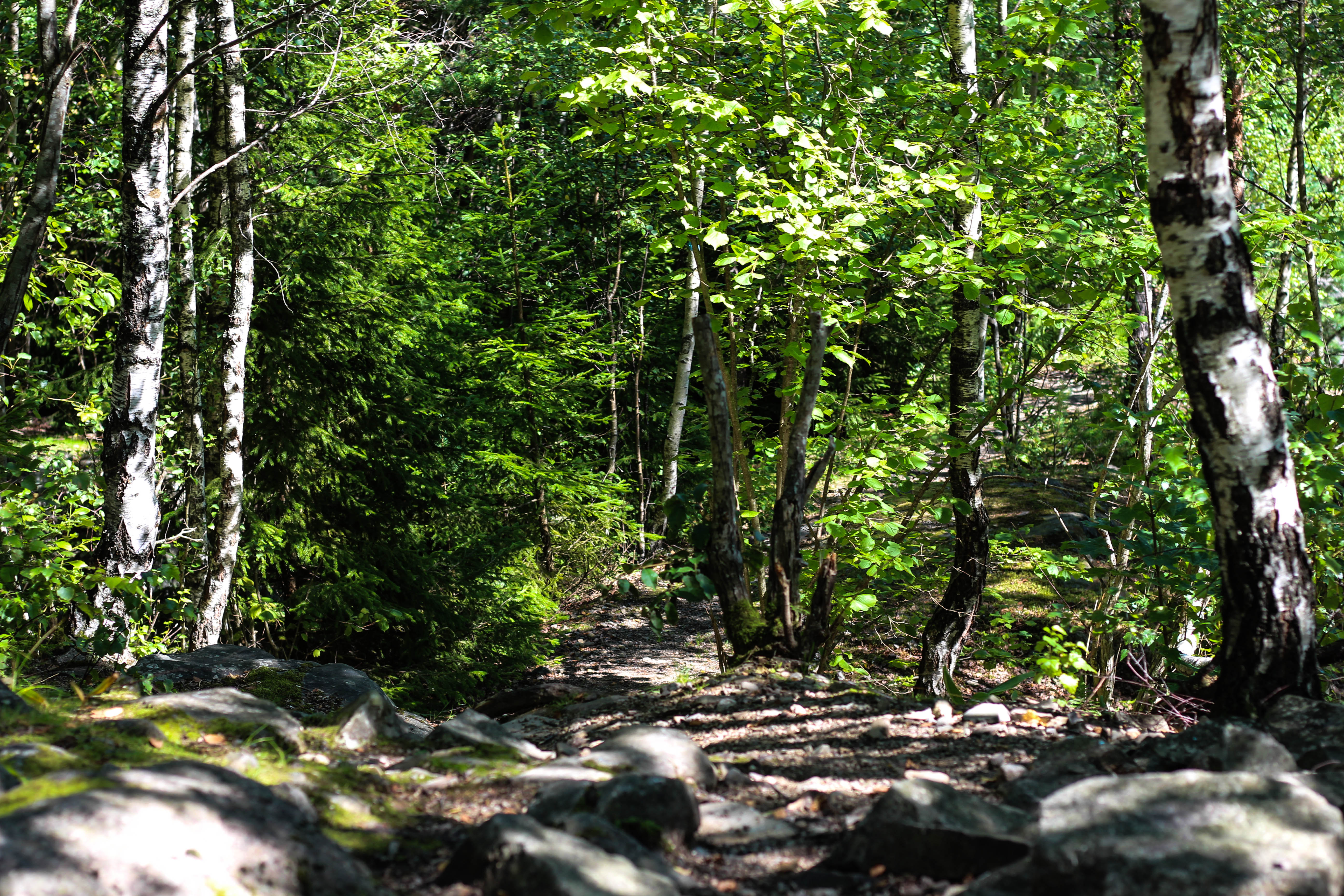 What I loved in this image was the use of the depth of field, this created a focus on a certain section of the woods which instantly drew the eye through the use of its vivid greens. Within the image I used Photoshop to enhance the greens within the image to make it more suited to the theme of Romanticism with the expected outcome as desired.
 I found that this images use of contrast between the light provided by the lamps created an aesthetically pleasing photo. This was because of how by making the oranges within the picture more vivid, it emphasised the shadows created by the surrounding boats, thus drawing the eye instantly to the soft glow of the lamp centred in the middle of the picture.
 The gradient created by the sky I thought particularly allowed for a romanticism theme. This was because of how the majority of the image was made up of the slow but constant changing of shades of blues into yellows, with only a small percentage made up by the landscape. I found that by darkening the ground it created a greater effect onto the sky due to an emphasis to the colours.
 What I loved about this image was the composition and the dark and grim colours. This is because of how the skeletons of the trees create a sinister but beautiful effect on the pathway through the middle of them, with unclear imagery of people in the far distance. I also liked the use of depth of field as well due to how the trees slowly faded and merged into one collective backdrop, whilst maintaining the desired look.
 I chose this as my final image because of how I loved the contrast created by the floodlights to Gorey Castle. I found that through this it completely emphasised the silhouettes of both the tree and the house in a sinister but fascinating way. I also liked how the floodlight captured by the camera is seen as a circular gradient in which slowly fades into darkness, with the three red lights being there to balance out the image as a whole and not let the black overpower the piece.