
HERE IS A LINK TO: PLANNING-TRACKING-PERSONAL INVESTIGATION-AUTUMN-TERM-2018
What is “Political Landscape”?
It is important that we all have an understanding and interpretation of the term “political landscape” before we venture into un-ravelling how a range of influential photographers have tackled elements of this theme…
- issues being discussed by some / most people
- current affairs that are influenced by the parties in power
- the current state of things, as well as how they are looking in the future.
- how decisions in past have shaped our lives…
Class Activity
- work in small teams of 2 /3 people
- respond to the following sub-headings and create a dynamic brainstorm on coloured sugar paper
- think carefully about how these points have affected your past, resent and future lives
- pass the paper around the class to add to the discussion points
- present your findings and debate the relevance / importance of each…
- health
- education
- infrastructure
- public services
- community
- human rights
- civil rights
Now look at…
Guernsey Photography Festival “Political Landscape”
- Click on the link above to view and choose a range of
- photographers to research and explore…
The theme for the 2018 Festival is Political Landscape. This has always been present throughout the history of photography. From the Crimean war battlefield photographs of Roger Fenton; Ansel Adams’ sublime American landscapes; the objective and conceptual typologies of Bernd and Hilla Becher’s industrial buildings; to the iconic pale blue dot, taken by Voyager 1. These historic landmarks and many more have helped develop the way photographers work with landscape.
You can clearly see in each of the contributing artist’s work how they have approached, embraced or integrated the theme…but we want you to now engage with the nature of the work itself and develop your knowledge and understanding.
The various approaches…
Documentary photography tends to take place over an extended time. Some photographers will set a specific time-frame to what they are documenting and how they are documenting the event(s), happenings, locations and characters attached to the story or narrative.
Social documentary photography or concerned photography is the recording of how the world looks like, with a social and/or environmental focus. It is a form of documentary photography, with the aim to draw the public’s attention to ongoing social issues.
Usually, there is a point to this process. We may, as photographers, document how land is being used / abused, how land is passed down through generations of families, how land is protected, why land often has a spiritual connection to communities and society as a whole, how and why land physically changes to fit with political agendas and so on…

But you may be more interested in exploring creative and conceptual approaches to taking / making your images. Tableaux photography relies on setting up, staging and capturing scenes, events or incidents usually involving people.
Archive driven / reliant work often stems from extensive research and even appropriation of pre-existing material including photographs, film, legal documents, transcripts, maps, plans, articles and more.
Example
Valeria Cherchi has combined archival material with tableaux arrangements to explore a controversial and secretive program of vigilante action in Sardinia towards the end of last century in “Some of you killed Luisa”.

Research and analysis Task
- Choose 2 x photographers from GPF 2018 to explore, discuss, describe and explain key examples from their current projects
- Compare and contrast their approaches and outcomes and ask yourself…
- what?
- how?
- why?
- when?
- where?
- Show critical awareness of the purpose and outcome of the work, and how it has developed over time.
- Illustrate clearly how the subject matter has been represented
- Critique the presentation of the work
- Ensure your blog posts are visually informative and include…
- hyperlinks to appropriate sites and articles
- embedded videos that support / illustrate you research
- definition(s) of “Political Landscape”
- a range of pre-exisiting, alternative approaches to the concept of political landscape
This should help YOU to formulate a plan for the practical element…
Practical Task
To successfully complete this task you must choose 2 of the options below to inspire your ideas…
- Documentary / narrative
- Creative / conceptual (includes tableaux approaches)
- Archive-driven
…and create a set of blog posts that clearly demonstrate your ability to respond to the theme of Political Landscape. You may want to extend your ideas from the Future of St Helier…or embark on a new and different approach.
You may want to choose from the following prompts…
- how land is being used / abused (locally or elsewhere)
- how land is passed down through generations of families,
- how land is protected,
- why land often has a spiritual connection to specific communities and society as a whole,
- how and why land physically changes to fit with political agendas
- the importance of borders / restrictions
- how we are defined by where we live, work, spend time
- human rights and the effects on our surroundings
- civil rights and the effects on our surroundings
- media outlets, agendas and information accessibility
You must clearly outline your intentions and reasoning for your approach to the theme…define and de-construct what political landscape could be
You must devise and complete at least 1 x photo-shoot (min. 250 images)and produce a range of outcomes that are the result of careful and intelligent camera techniques, selection, editing and presentation methods.
Remember to analyse and evaluate your process carefully, using specialist vocabulary…
Useful articles to help you explore some recent / current examples of local starting points re : political landscape
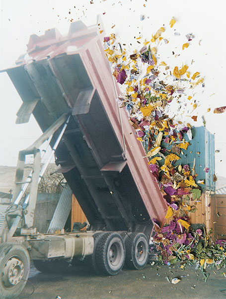
 This is my favourite image of my project. The content of the image is relevant to me quite literally because of the fact that me and my family produced this plastic waste in two weeks and continue to produce this amount because, it is almost impossible to avoid buying into plastic packaging. It is a conceptual photograph that carries a lot of meaning and relevance to the modern world because it brings forth an issue no one likes to see or do anything about. I think this is down to a common trait that everyone shares - laziness.
Using a camera only had a small significance in the process of making this image. If I left the image alone I would feel no satisfaction in its completion. I have learnt during this first year in photography that generating a final image with just a camera isn't enough. Even though a lot of technical work goes into producing a decent image.
It was difficult to achieve the right lighting because I could only light one side of the pile at a time unless I used the floodlights, yet I couldn't achieve my desired effect with them because of the high level of light intensity. I had to manipulate the lighting with colour and use different angles so I could accomplish an image with enough light to capture the detail but not too much to white wash my image or over expose it. It would of been more successful if I had two spotlights either side of the plastic.
For me, I want to reflect my artistic side in my images with colours and playing with the forms and shapes of the objects in a photograph by cutting out imagery from many of the photographic materials I produce from a photo shoot and piecing it together. Editing my images is the most important stage for me because it allows me to produce something that wouldn't possibly be seen in our daily lives.
In this photograph a lot of the imagery is repeated and seen in many areas of the plastic pile. I didn't want to hide this to make it seem like I produced more plastic than I did just so I could prove my point. I kept the repeated imagery visible because it has the implication that we repeat mistakes and the process of this ongoing problem is down to that fact. The dangers of producing so much plastic is known by everyone yet it is an ongoing cycle of production, because we live in a throw away society.
On the other hand, I also had to repeat the imagery because the majority of the plastic could not be seen in a singular flat image. This is one draw back that makes this image have a lesser impact on an audience. With the context of why I created this image some might ignore my points and reasons behind it because it doesn't impinge on that person. If this perhaps was an image of plastic collected over a year, it might of had a bigger impact. However, putting this image into perspective, this was one family out of billions. In two weeks how much plastic did everyone as a collective produce and where did it go?
This is my favourite image of my project. The content of the image is relevant to me quite literally because of the fact that me and my family produced this plastic waste in two weeks and continue to produce this amount because, it is almost impossible to avoid buying into plastic packaging. It is a conceptual photograph that carries a lot of meaning and relevance to the modern world because it brings forth an issue no one likes to see or do anything about. I think this is down to a common trait that everyone shares - laziness.

Using a camera only had a small significance in the process of making this image. If I left the image alone I would feel no satisfaction in its completion. I have learnt during this first year in photography that generating a final image with just a camera isn't enough. Even though a lot of technical work goes into producing a decent image.

It was difficult to achieve the right lighting because I could only light one side of the pile at a time unless I used the floodlights, yet I couldn't achieve my desired effect with them because of the high level of light intensity. I had to manipulate the lighting with colour and use different angles so I could accomplish an image with enough light to capture the detail but not too much to white wash my image or over expose it. It would of been more successful if I had two spotlights either side of the plastic.

For me, I want to reflect my artistic side in my images with colours and playing with the forms and shapes of the objects in a photograph by cutting out imagery from many of the photographic materials I produce from a photo shoot and piecing it together. Editing my images is the most important stage for me because it allows me to produce something that wouldn't possibly be seen in our daily lives.

In this photograph a lot of the imagery is repeated and seen in many areas of the plastic pile. I didn't want to hide this to make it seem like I produced more plastic than I did just so I could prove my point. I kept the repeated imagery visible because it has the implication that we repeat mistakes and the process of this ongoing problem is down to that fact. The dangers of producing so much plastic is known by everyone yet it is an ongoing cycle of production, because we live in a throw away society.

On the other hand, I also had to repeat the imagery because the majority of the plastic could not be seen in a singular flat image. This is one draw back that makes this image have a lesser impact on an audience. With the context of why I created this image some might ignore my points and reasons behind it because it doesn't impinge on that person. If this perhaps was an image of plastic collected over a year, it might of had a bigger impact. However, putting this image into perspective, this was one family out of billions. In two weeks how much plastic did everyone as a collective produce and where did it go?


 I decided however to plan the shoot before I went ahead and did it. This would allow me to have a general idea before hand of what I wanted, and needed to achieve to produce an effective overall image regarding the topic of New Topographics. These are my ideas:
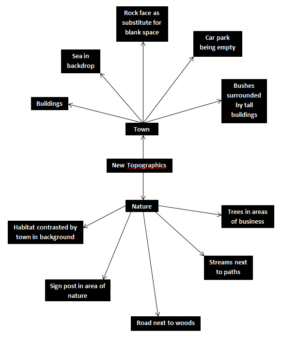 Once this was complete I decided it was time to move on to the shoot itself, and so decided to use the areas regarding the idea sheet of town, Grouville and St Brelades. These were my outcomes:
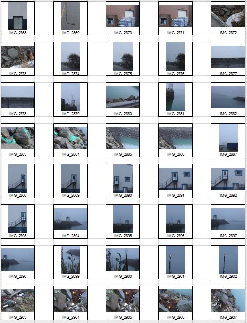

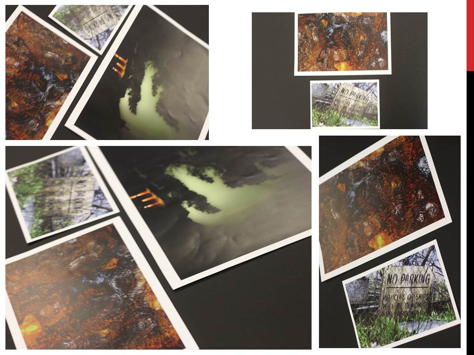
 Once the shoot was complete I narrowed the images down to only ten of my favourite pictures. By doing so it would make it easier for me to select the final image that I believe to be the most relevent and successful overall. These were my choices on the ten best images:


 I chose this image because of how I loved the clear contrast between nature and the taking over of it by man, seen by the run down sign surrounded by overgrown grass. I found this to be aesthetically pleasing created by the use of a depth of field, by doing so it blurs our the foreground and the background allowing only really the sign to be noticed properly which is where the eye is drawn. I found the slanted composition to be especially interesting by how it gives the impression of an overgrown and ruined world.
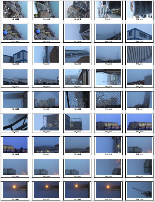
 I selected this image due to once again the use of the depth of field that blurs the backdrop, this along with the use of the composition allowed for maximum effect, giving the impression of a world that eventually succumbs to nature. I found that the way that the fence was composition allowed for a sense of distance to the photo, with the use of neutral space on the right being filled with industrial buildings bringing the viewer into perspective of the area it was taken in.
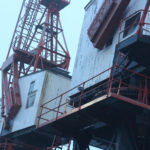
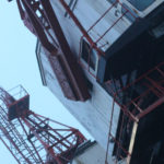
 What I loved about this image was the clear contrast and clear colors used to create an aesthetically pleasing outcome. This is done through contrasting colours blue and white which highlight features of the building, allow for such things as the door and bolts top pop out and draw the viewer’s attention. The composition I found also was aesthetically pleasing due to how the entire image is symmetrical which in consequence created a much cleaner and pleasing look.
 Within this image I found that there was obvious difference between nature and man-made structures. This is once again done through the use of a depth of field to which allows for the appearance of us peering through nature to find the man-made structures that surround everything, whilst showing how where ever nature is human activity is not far behind. I found that the gloomy colours within the image emphasised the destruction caused to the landscape by these structures and how nature and civilisation lives side by side.
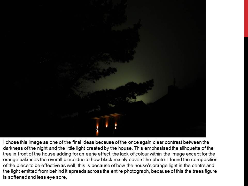
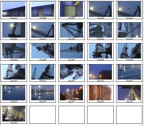
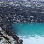
  Finally I chose this image as I loved the reflection of cranes created by the aftermath of rain fall. This was partially down to how I thought it highlighted a clear contrast between nature and society, with the looming structures left behind, whilst at the same time creating a deserted and desolate feel to the overall piece. I found that the composition of the piece complimented the photo as it filled most of the negative space made by bricks, with various beams fading out of the image.
 What made me choose this photo as my final image was because how to me it summed up the clear contrast between human activity and nature. This was done by the composition of the grass creating the impression of it growing around the sign as if taking back the land seized by man, to which there is a clear difference in surrounding of the backdrop consisting of machinery and metallic structures that create contrast in not only surroundings but color. The use of depth of field creates a clear definition around the sign allowing for the eye to be drawn to it immediately with both the foreground and background complimenting it due to the drastic difference in colors and blur. To me this was the image that related the most to the topic of ‘New topographic’, which not only created a feel of the contrast between man and nature, but also of the deserted spaces that surround us in our everyday lives.
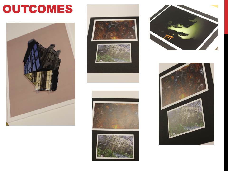
 I found that Svalbonas used a calm colored backdrop to her creations to balance the entire piece and really make the design pop out. In response to this I looked through previous photo-shoots picking out images of buildings that I had taken recently. Once found I proceeded onto Photoshop to cut out and stick the parts of these buildings together creating a structure similar to that of Svalbonas, to which I would continue to add a colored matt backdrop that in my opinion balanced the image out. This was my process:
 From here I cut out the buildings individually and proceeded to join them together experimenting with what fitted well.
 To do this I used the lasso tool to accurately outline the object wanted so that I could then paste onto the design and move it around until satisfied with its placement.
 Once the design had been finished I experimented with a series of colors that I thought were neutral and would not overpower the overall piece. To do this I used the shape tool to cover the backdrop with a large square where I could then change the colors of it.
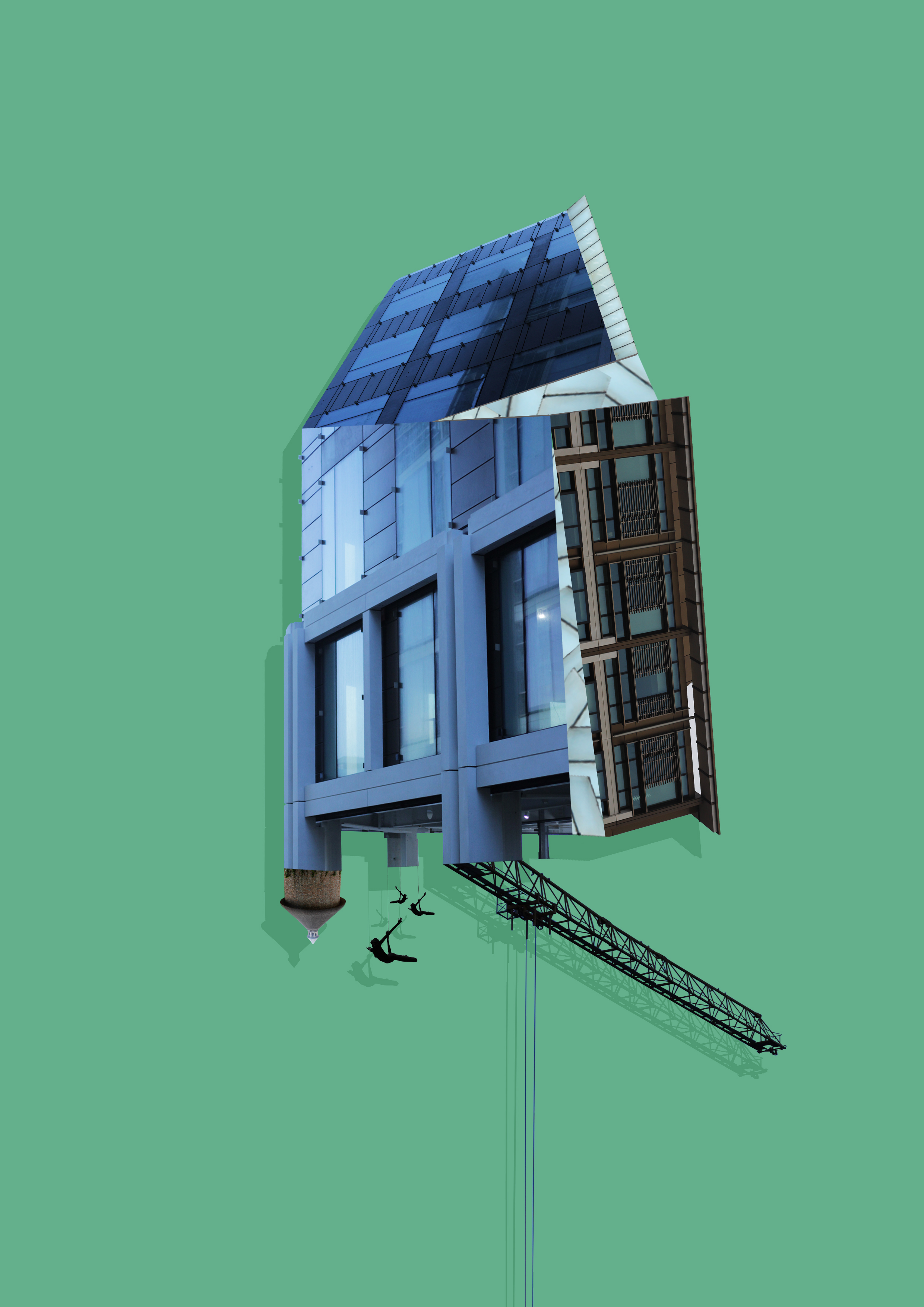
 To create these images I mainly incorporated photos that I had based around the International Finance Center for my psycho-geography shoot and a few images from various other shoots. Whilst doing so I found that by duplicating the image and coloring it black while at the same time reducing the opacity, created a shadow like effect to the piece, this allowed for a 3d like effect that I wanted to put across on the piece and at the same time giving it a more graphic feel. Once done I added a green and a pink backdrop to each piece as I found that these colors drew the gaze to the piece rather than be sore from all the negative space surrounding it.