Category Archives: Homework Assignment

Filters

Author:
Category:

Threshold Editing

Keld Helmer Petersen

Keld Helmer Petersen was a Danish modernist photographer. Keld was internationally acclaimed for his images of structures, patterns and details found in industrial areas, city scapes and nature.

These are examples of his work

Image result for Keld Helmer Petersen

Image result for Keld Helmer Petersen

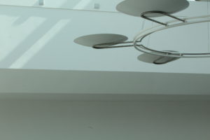
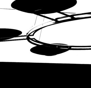
These are my attempt at editing photos in the style of Keld Helmer Petersen.
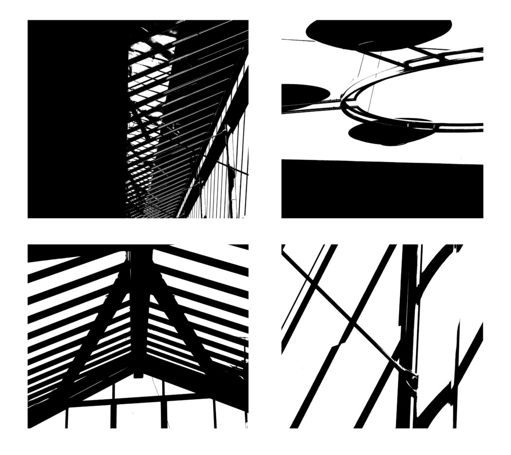
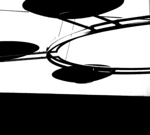
The first image was the original image without any edits or manipulations. The second image was my attempt to create a photo in the style of Keld’s.

How I created a photo in the style of Keld Helmer Petersen
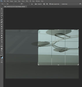
Firstly, I cropped the image to make it square and to make this chosen image follow the rule of thirds.
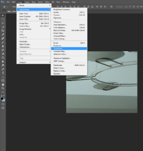
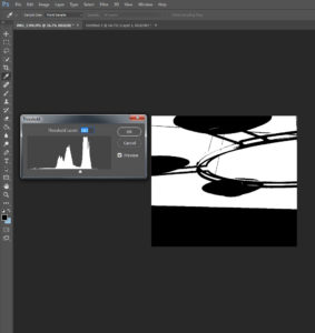
Once I was happy with how I cropped the image I clicked on the image tool at the top of the screen where there were multiple options for me to use where I could edit my image. I then went to the adjustment option where it gave me another drop down option which I then scrolled down and clicked on the threshold option. Once I had clicked the threshold option it changed the contrast of the picture massively as well as changing the image to black and white. I played around with the threshold option until i was really happy with it. This was my Final image.


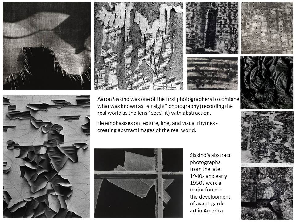
Frank Hallam-Day and Aaron Siskind

Aaron Siskind

Frank Hallam-Day

 Image Analysis:

I think this photo expresses Frank Hallam-Day’s theme of passage of time on works of man well. He highlights the bright colour yellow and also the brown to emphasise the weathering of the ship hull. He contrasts the work of man (ship hull) with nature (water) to express the affect nature has. The photo is split into the rule of thirds horizontally and one line vertically, creating a grid shape to show the sections within the photo of different patterns like weathering and rusting. The middle section has different levels of rust from where the sea has been, expressing that the ship hulls where once technological achievements but are now just sitting in the harbour. He contrasts the bottom of the photo with the top half, the bottom half having a lot of marks and patterns, and the top being one bold colour. The marks on the ship hull create interesting reflections on the sea and he has increased saturation to emphasise the rust in the reflection.

Abstract- Homework 3

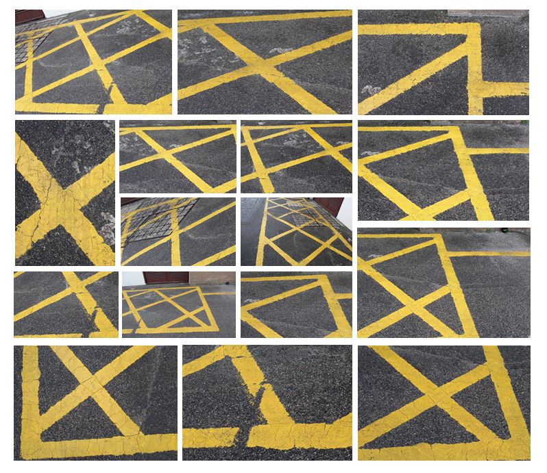
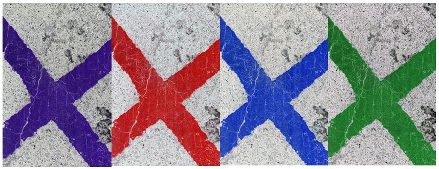
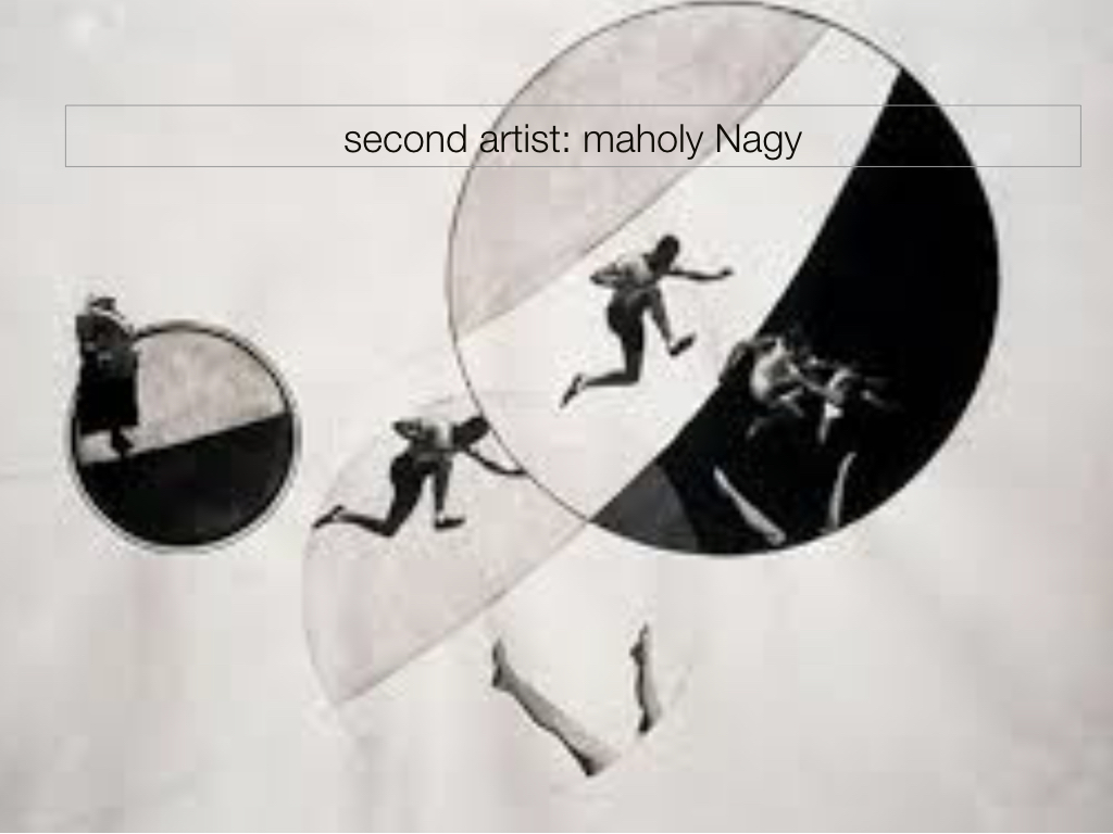
Abstract photography concentrates on shape, form, colour, pattern and texture. The viewer is often unable to see the whole object. The subject of the photo is often only a small part of the idea of the image. Viewers may only know the essence of the image subject or understand it by what is implied. However, it could be argued that all art, including photography, is essentially abstract. I first set out to look for straight bold lines and found that the bright yellow works well.

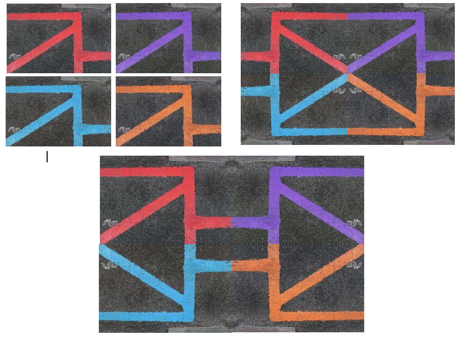
I edited these photos in photoshop by adjusting the hue and increasing the contrast to create different coloured lines to achieve more interesting, abstract photographs. I also experiemented with different layouts, creating patterns and geometrical shapes by flipping the photos vertically and horizontally.
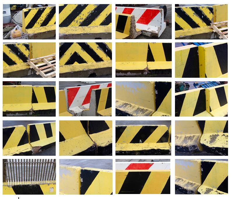
I tried to explore the contrast of colour between the yellow and black and the texture they presented. Using natural light and photographed different angles of the wall to create variety within the collection. To improve this photo shoot I would edit the photos to make them more abstract so the viewer would not be able to see that it was a wall and would emphasise the pattern and texture.

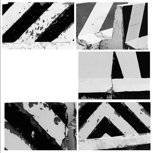
I edited these photos in photoshop to develop them further by turning them black and white and making the lines more bold. I like how the black and white emphasises the texture within the wall and the weathering that has occurred over time. I think it is now less clearer to the viewer that the photograph is of a wall and is now more abstract.

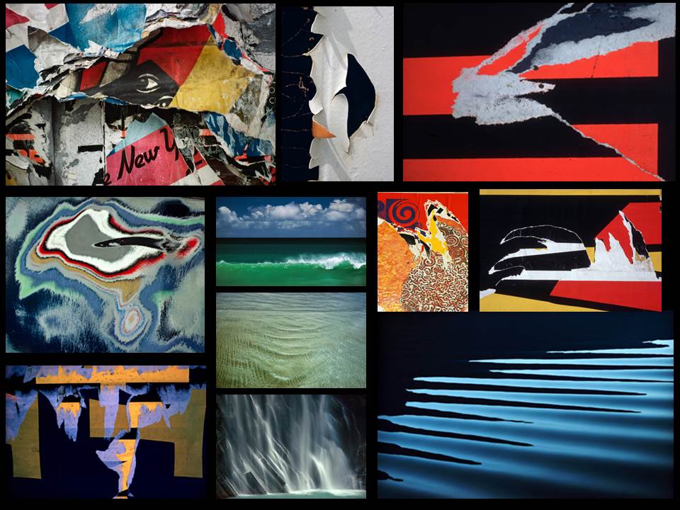
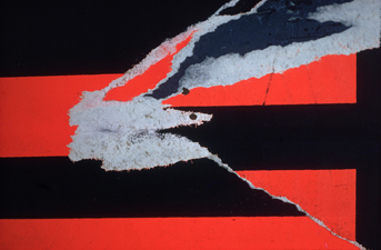
I think the photos I have taken are similar to this photo (Torn Poster II—Redbird) Ernst Haas photographed in 1960.  Both photos contain bold, straight lines and texture within that. The black lines frame the picture and are the points where the eyes are drawn to. Similarly, both contain horizontal, vertical and diagonal lines.

Ernst Haas HW

Ernst Haas

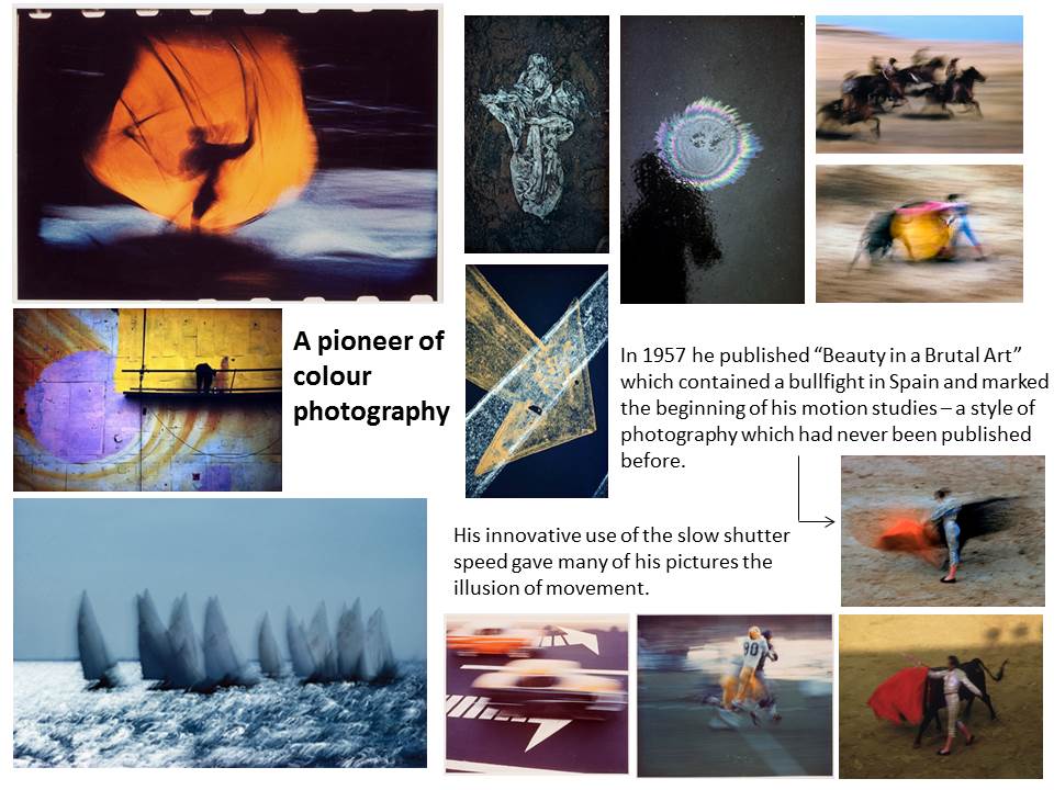
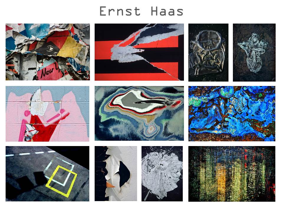
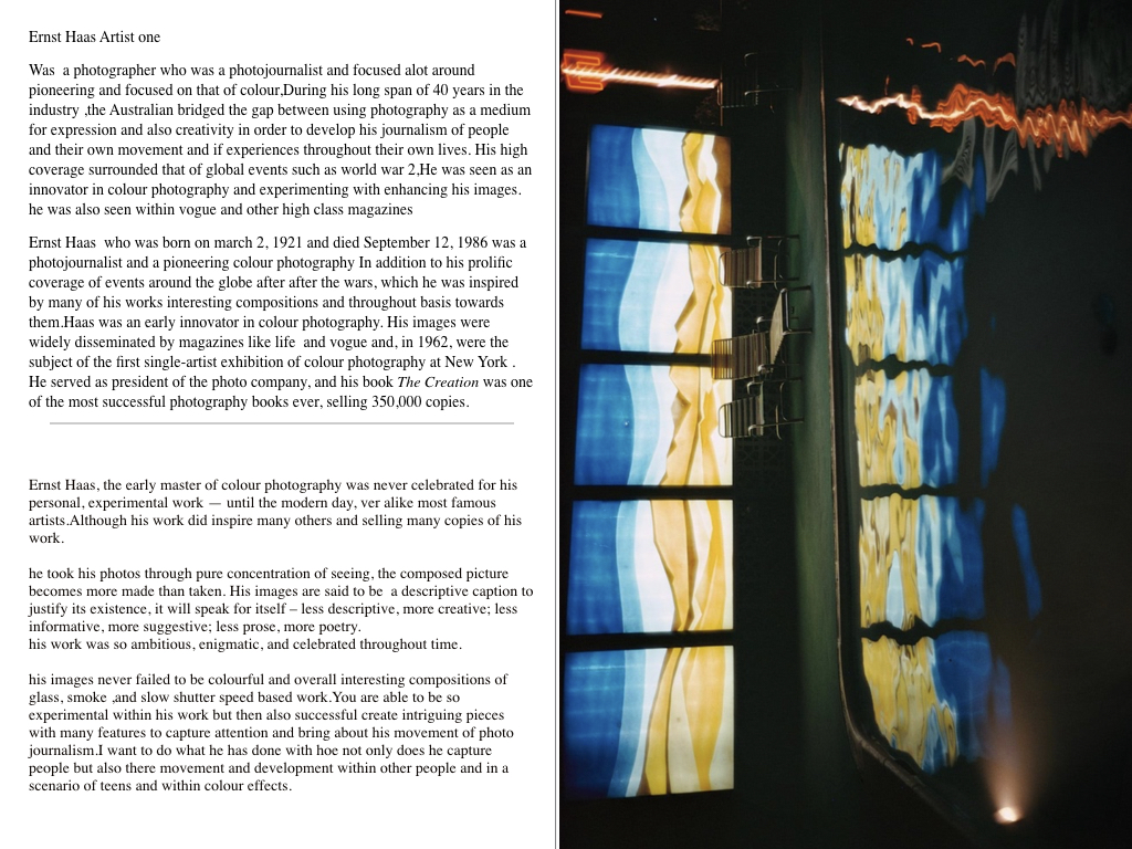
Ernst Haas was a photojournalist and a pioneering colour photographer. During his career, the artist bridged the gap between photojournalism and the use of photography as a medium for expression and creativity. In addition to his prolific coverage of events around the globe after World War II, Haas was an early innovator in colour photography. His images were widely disseminated by magazines like Life and Vogue and, in 1962, were the subject of the first single-artist exhibition of colour photography at New York’s Museum of Modern Art. He served as president of the cooperative Magnum Photos, and his book The Creation was one of the most successful photography books ever, selling 350,000 copies.

Image result for ernst haasImage result for ernst haas

Photo analysis

Image result for ernst haas

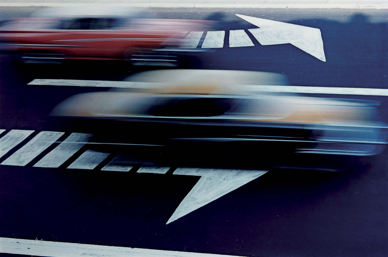
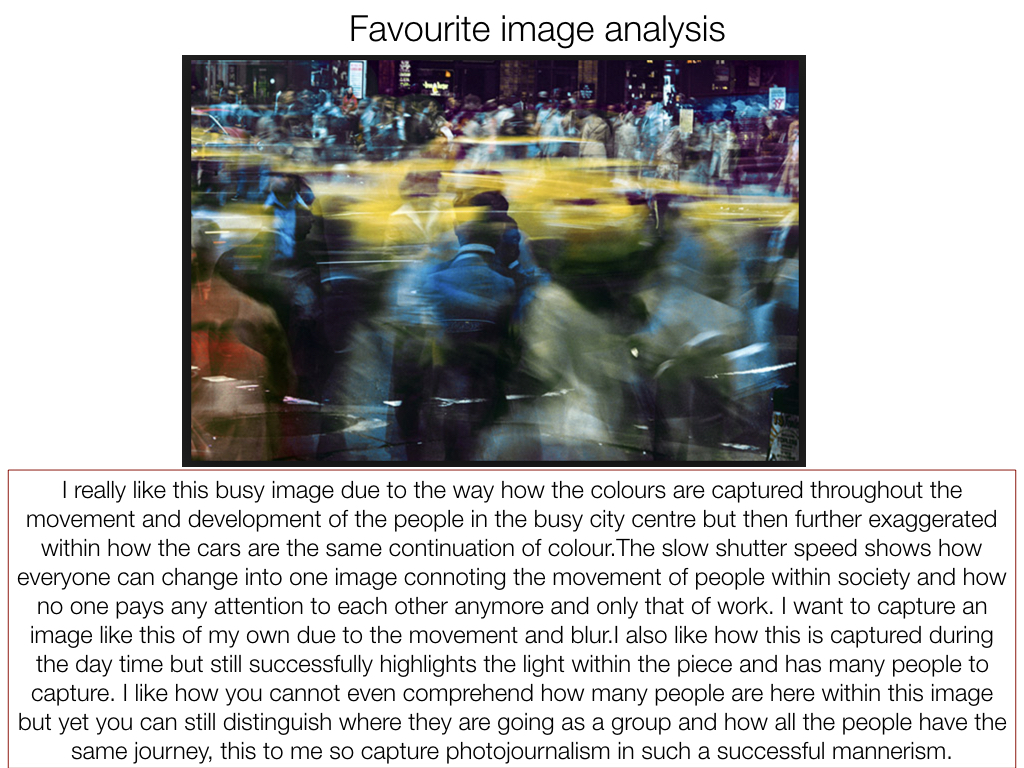
This is a coloured blurred picture with a car in the center which is in focus. This image is very visually pleasing as it almost conveys the every day life being quick and blurred as the people in the foreground and background are blurred which makes everything look rushed which easily links to everyday life. The brightness in this image makes it looks like it was taken in the evening as the lighting isn’t crisp and you can clearly see lights being reflected of the front of the car. The main focus of this photograph is the car which follows the rule of thirds as the car is in the middle guide lines.  There is also a sense of depth in this image as there are 3 layers to this image. Firstly,  there are the blurred people in the foreground, the car which is in focus is in the middle of the image which then follows by the blurred lights and people in the background.

Contact sheets

My interpretations

How I edited my images in the style of Ernst Haas

This was the original image

Firstly, I uploaded the original image into Photoshop where I then went onto duplicating the layer.

Once I had duplicated the image I went to the filter option on the top tool bar where a drop down list came down where I clicked on the blur drop down where I then clicked on the motion blur option which blurred the top image.

Once I had decided on how much blur I wanted on the image I then used the eraser tool where I rubbed out the area I wanted the image not to have blur on it (the phone box’s).

This was my final image.


Homework 3 ( Ernst Haas )

Ernst Haas

Ernst Haas was a photojournalist and a pioneering color photographer. During his 40-year career, the Austrian-born artist bridged the gap between photojournalism and the use of photography as a medium for expression and creativity. Ernst has a great vision in exploring photography in a more creative and unrealistic way than we actually see things in real life. Using various camera setting like shutter speed Ernst captures great visuals of urban environments, capturing the explosive and rushed vibes within these areas. He does this by producing many images containing motion blurs.

Haas was an early innovator in color photography. His images were widely spread by magazines like Life and Vogue and, in 1962, were the subject of the first single-artist exhibition of color photography at New York’s Modern museum of art. His book The Creation (1971) was one of the most successful photography books ever, selling 350,000 copies.

My Photo shoot Plan

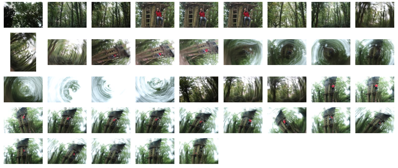
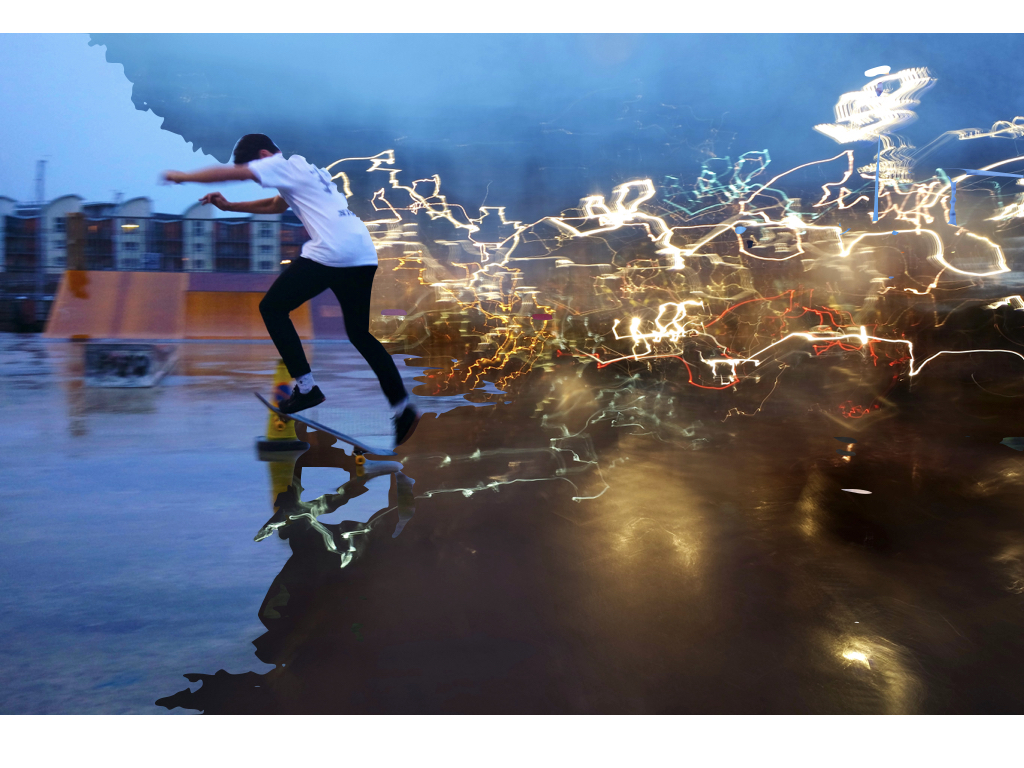
In my photo shoot I intend to use a slow shutter speed in order to capture abstract images which are serial, like Ernst’s are. It appears that he uses mainly natural lighting for his photographs therefore as will I and the location of my shoot will be in a woodland area, where I can capture the feeling within and among the trees. This is similar to Ernst’s photography where he captures the atmosphere in the city, amongst buildings however I am going to take a different approach by expressing the feelings found within a woodland area.

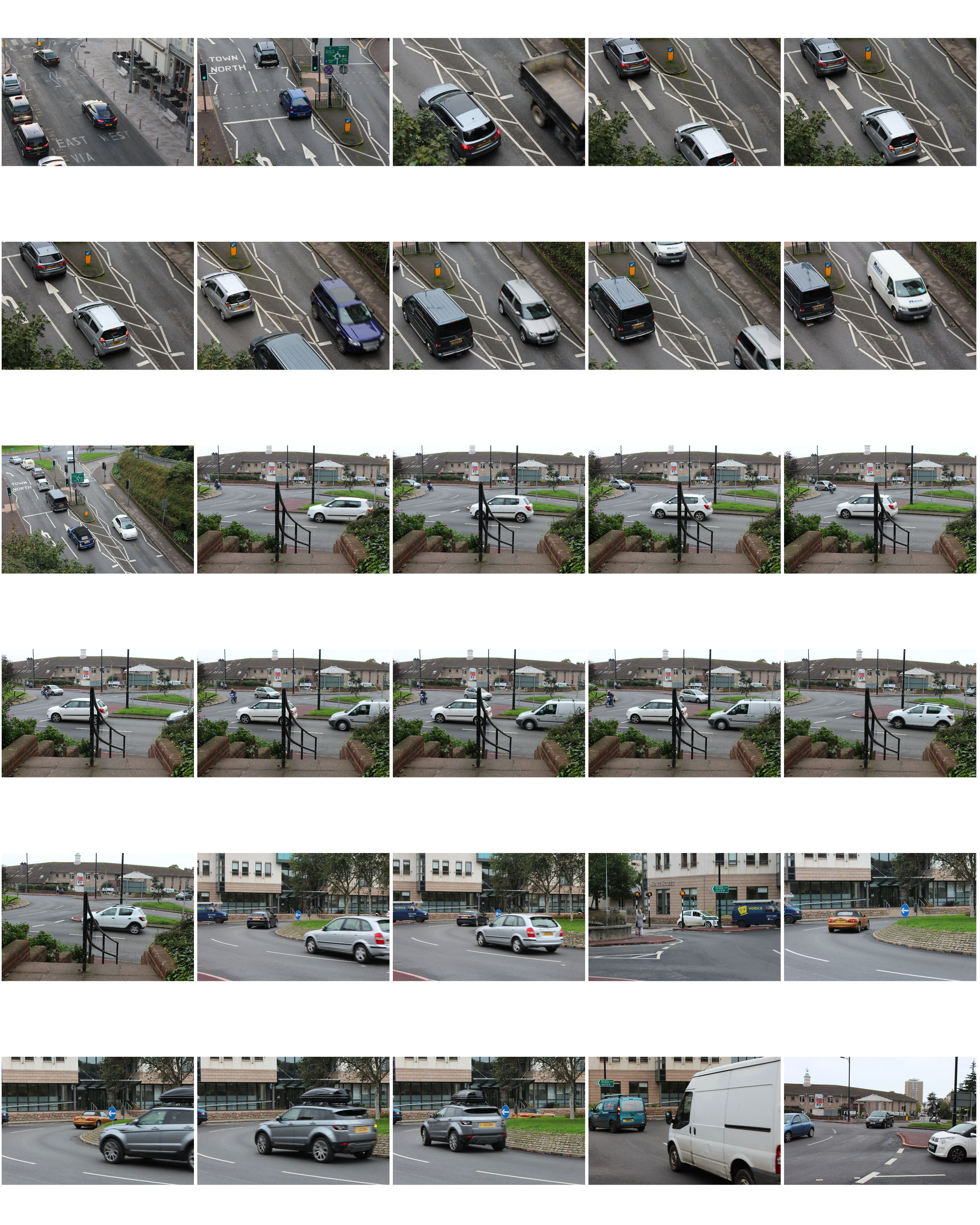
Contact Sheet of Photo shoot

Edits


Becher Inspired Photoshoot

What is a typology? 

Typology is the study of types, however in photography a typology is a series of images, in which the photographer has taken many of the same genre of object (buildings, pencils etc), using roughly the same composition for each one creating that scenes of repetition about them.

Bernd And Hilla Becher

Both these Photographers were German based, and were commissioned by the government to produces typologies of specific types of buildings, as seen below.

Image result for Bernd becher photography

These Photographers would go around the country taking the same composition of certain objects, which when one was taken would not look that impressive, but rather when hundreds were taken precisely from the same distance, and combined together, it creates an almost artistic creation

In response to this I decided I would walk around my home area and try to incorporate this style into my images, I chose the themes around car lights, windows with chimneys, and doors. These were some of my results:
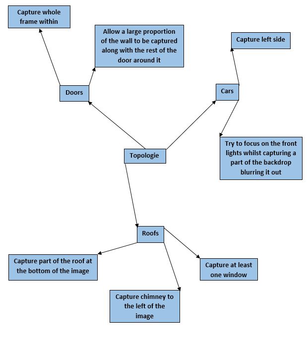


 I decided that the car topology sheets worked the best, due to the contrast between the lights and the bonnets of the car which came in different shapes.