Category Archives: Homework Assignment

Filters

Author:
Category:

Homework Assignment 5

Planning

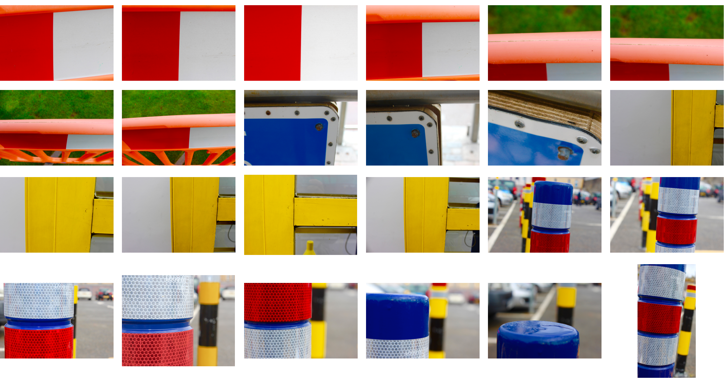
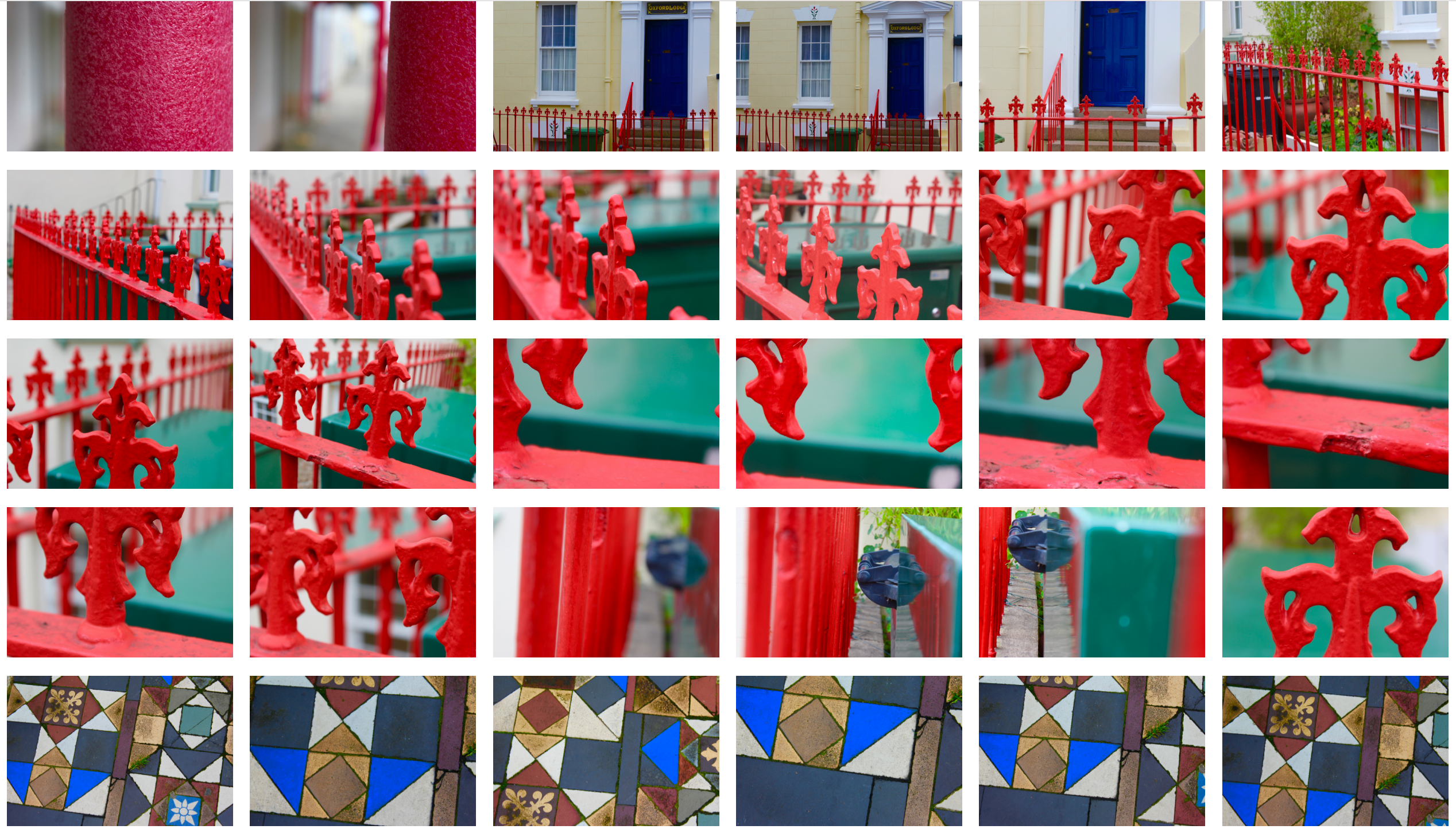
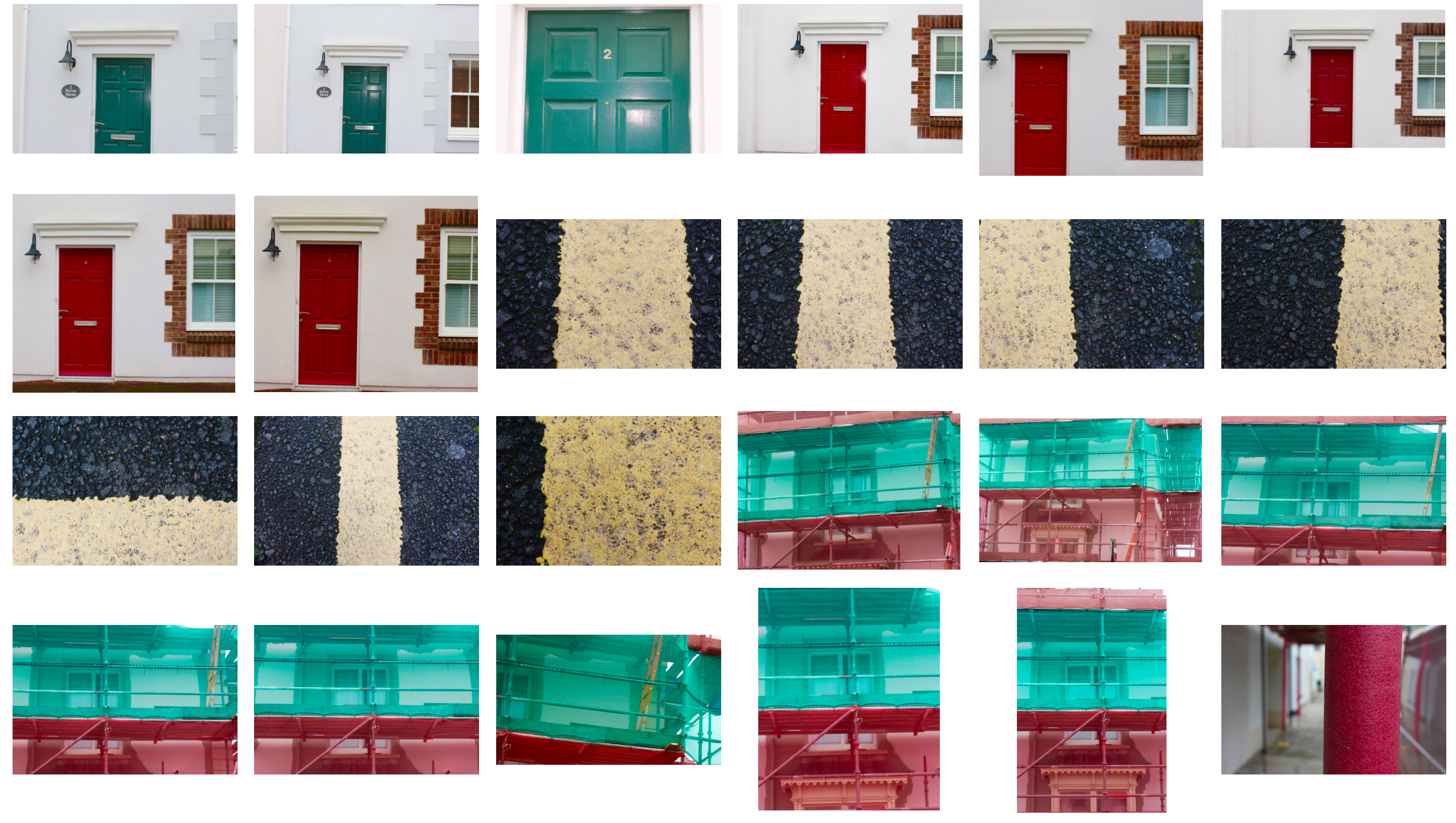
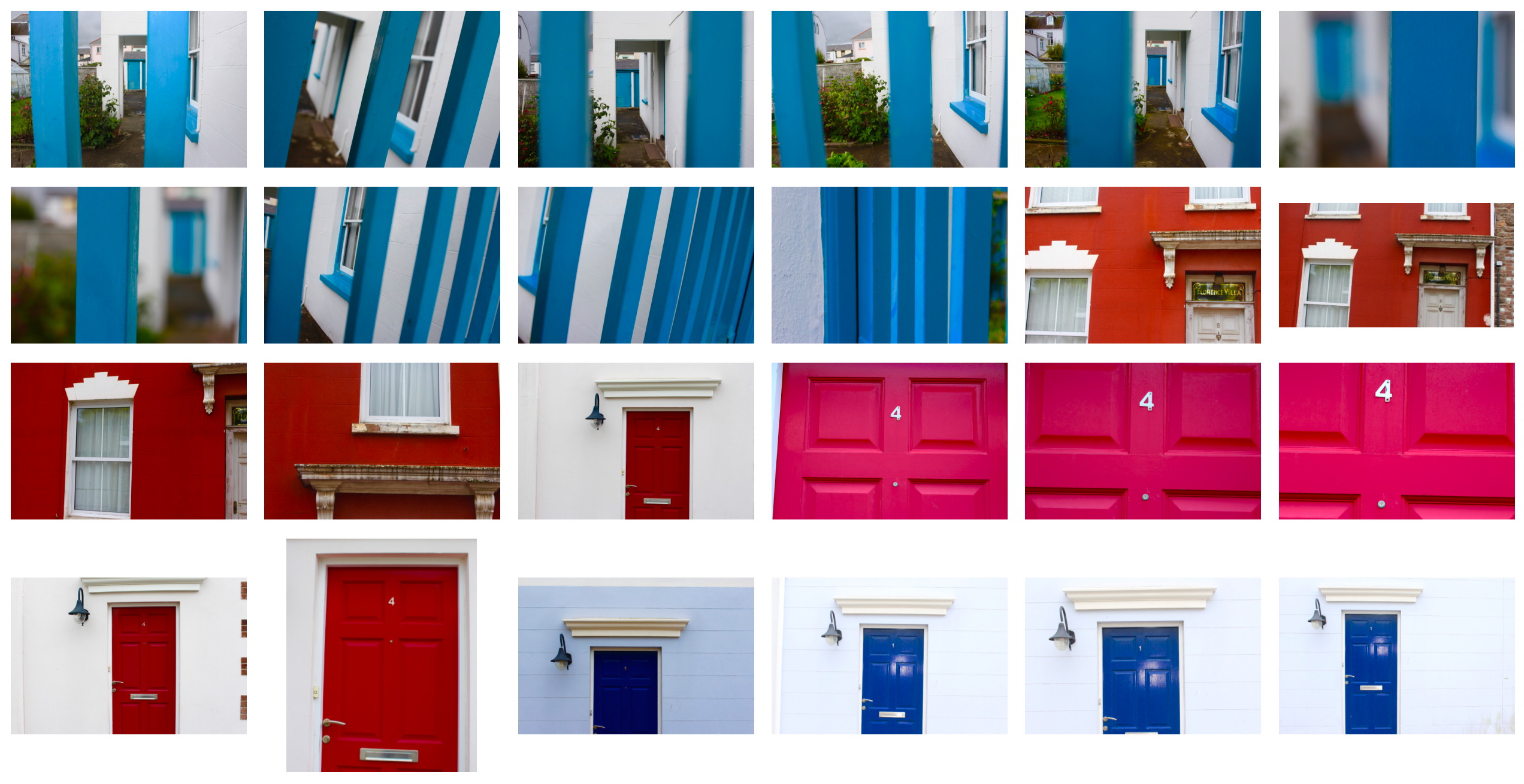
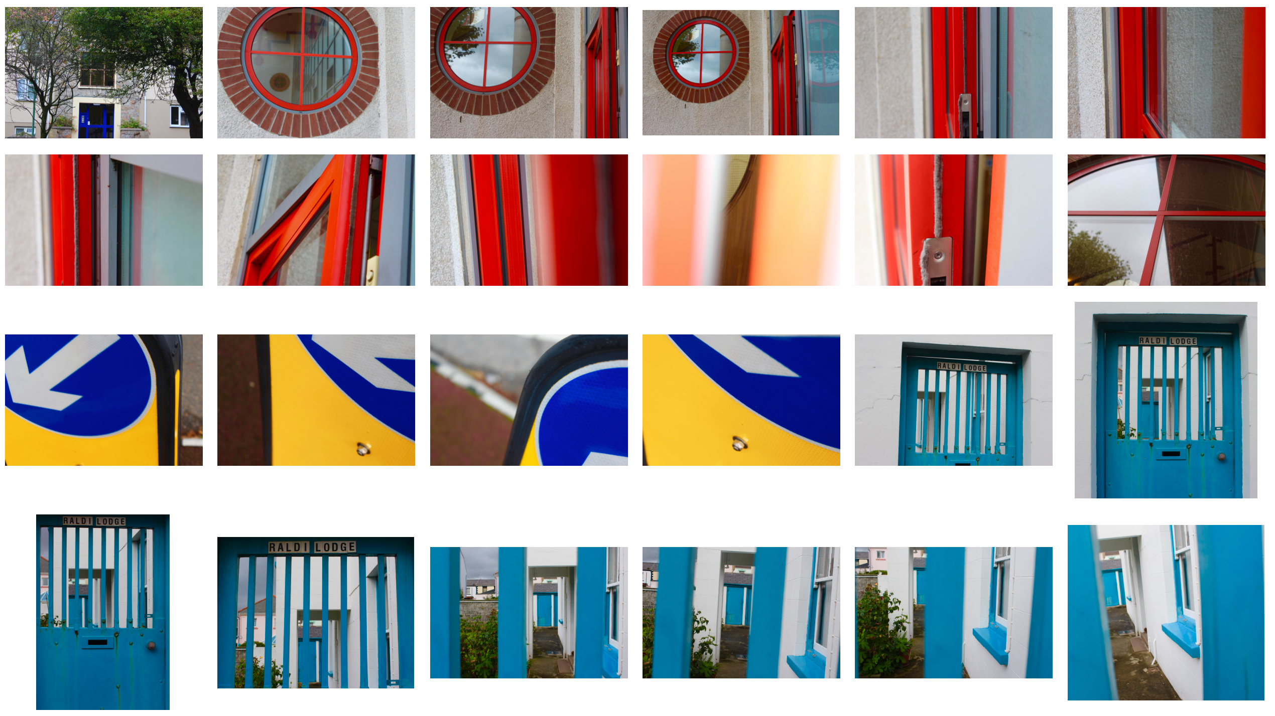
Task – Produce 100-200 images that explore a colour, contrasting colours or colour harmonies

Locations – roads, items in the streets, doors, fences, buildings

Lighting – natural lighting

Camera settings – ISO 400, fast shutter speed – 1/60, deep depth of field therefore high aperture.

Concept – capture images of contrasting colours and make them appear abstract.

Franco Fontana

Franco Fontana (born 1933) is an Italian photographer, who is best known for his abstract colour landscapes and use of vibrant colours. Fontana looks at many different subjects including urban landscape, fashion and portraits. Fontanas work is in about 60 museums all over the world and he has taken part in over 400 exhibitions. His work has also been used for album cover art.

Image result for franco fontana

Image result for franco fontana

Franco Fontana Favourite Photo:

In this photo natural lighting is used to create contrast, shapes and shadows. The bright yellow/orange contrasts with the black of the shadows. A deep depth of field was used along with a quick shutter speed and an ISO of 400-800 due to the sharpness of the image and lack of noise. The yellow in the image with the blue background gives a warm image.

You can clearly see texture all over the image from the bricked walls to the texture of the yellow material. The image is also quite 3D as it has lots of layers to it but it has a confusing layout; due to how abstract it is, it appears to be an illusion.

Fontana was well known for his abstractness and the colour intensity in his images and this was one of the many examples of his excellent works that show how he can combine colour and contrast to create an eye-catching image.

I think that in this photo and the other colourful abstract photographs that Fontana takes, he is trying to emphasise how colour and contrast is all around us but we do not stop in our day-to-day lives to appreciate it. He is trying to show people everyday scenes from new angles to get them to appreciate it.
Image result for franco fontana

Cara Berer

Cara Berer turns books into art by sculpting and dying them then presenting them in a way in which they have not been seen before. Through her work she tries to  document books and raise questions about the frailness of books and their future.

Image result for cara barer

Image result for cara barer

Cara Berer Favourite Photo:

In the below photo, a fixed light is set up to illuminate the subject and help it to contrast with the black background. There is a wide tonal range in the folds of the pages, this creates a more dramatic image. A deep field of depth appears to have been used as all of the image is in focus, this could also be because a quick shutter speed was used with a medium ISO.

The splashes of colour in the pages contrast with the plain paper and the background to help bring the image to live. The curls of the paper give layers to the image and almost a 3D effect. There is lots of symmetry in this photo which makes it a lot more appealing for the viewer.

Cara Berer takes books then dyes them and makes interesting shapes out of them to get people to think about books and the way that they are treated. She believes books should be appreciated more and the fact that to produce them it ruins the environment should be thought about.

This image and the rest of the images in the series are Berer’s way of saying that the books that you have at home are not as useless as you think; they are interesting objects that can be turned into something eye-catching and complex.

Image result for cara barer

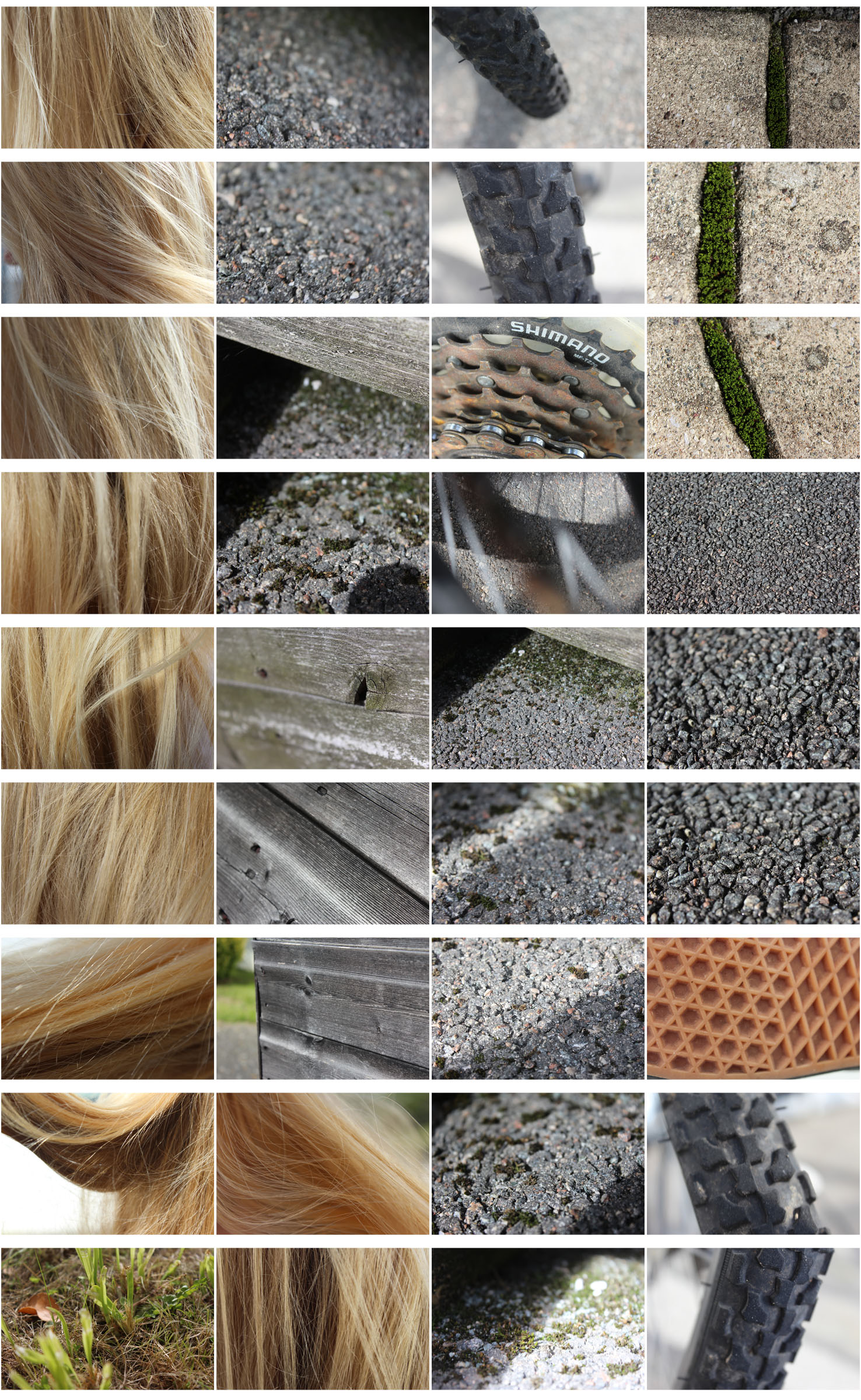
My Photos:

My Favourite Photo:

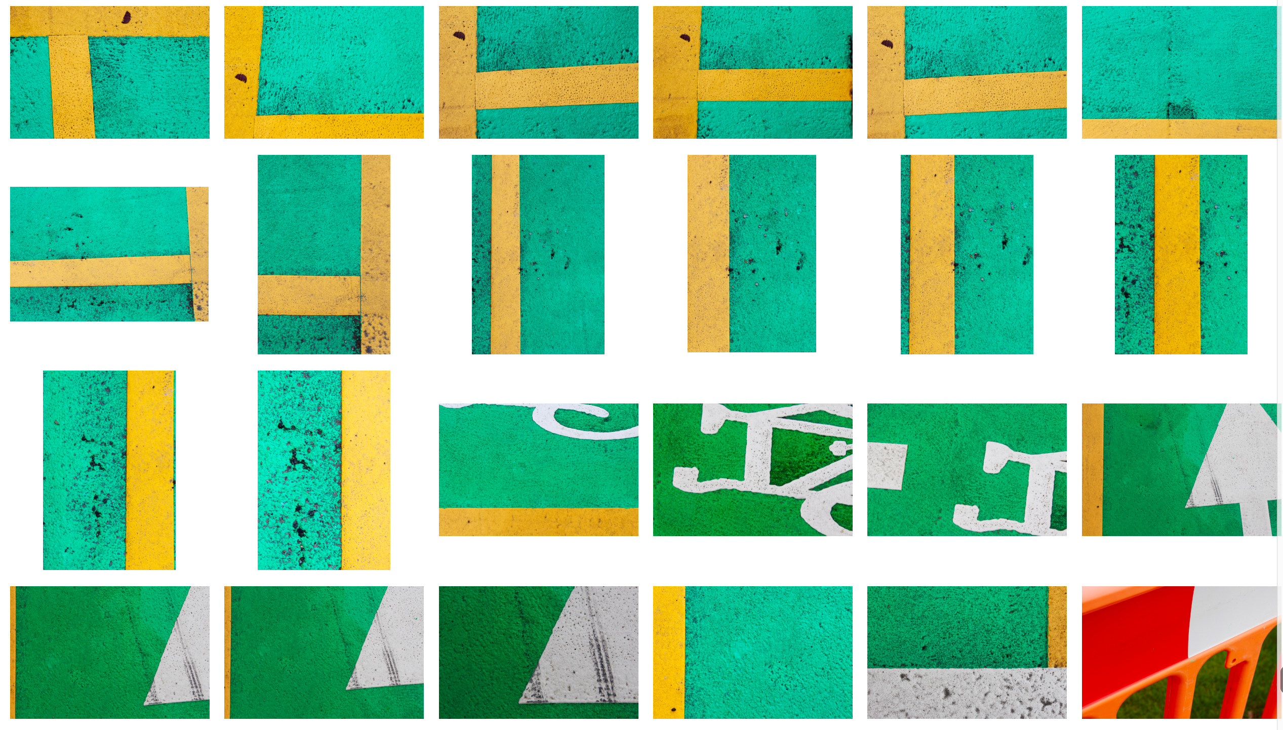
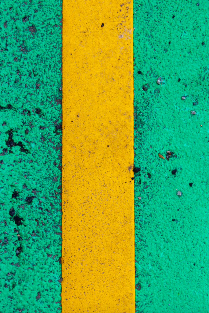
This photo is my favourite from the shoot. The natural daylight was used to capture this image. I used a deep depth of field to ensure that all of the image was in focus. I used a shutter speed of 1/100 to take this photo, I used a quick shutter speed to make sure that it was a clear image. A low ISO was used to take the image so that there was a minimal about of noise in the photo. You can see lots of texture in the surface of the subjects and even the dirt on top of it to give the photograph a more realistic feel. There is a large contrast between the two colours that you would not normally see together everyday, this makes the image more dramatic and interesting to me. One colour is warm and the other is cold, this makes the image even more contrasting.

The photo is full of vibrant colours to catch the viewers eye and make it a loud and interesting photograph. The photo is very close up and abstract so it adds mystery to it as the viewer will wonder what they are looking at. The two sides of the yellow line roughly line up with the two vertical lines on the rule of thirds grid to create an appealing photograph. I cropped this photograph to make it more abstract and mysterious.
Texture HW

What is Texture?

Texture photography is one way of drawing the viewer’s attention into the image. When used properly, the effect of the texture of the elements in the image can become as commanding as the use of pronounced colours and dramatic scenery.

Frank Hallam Day

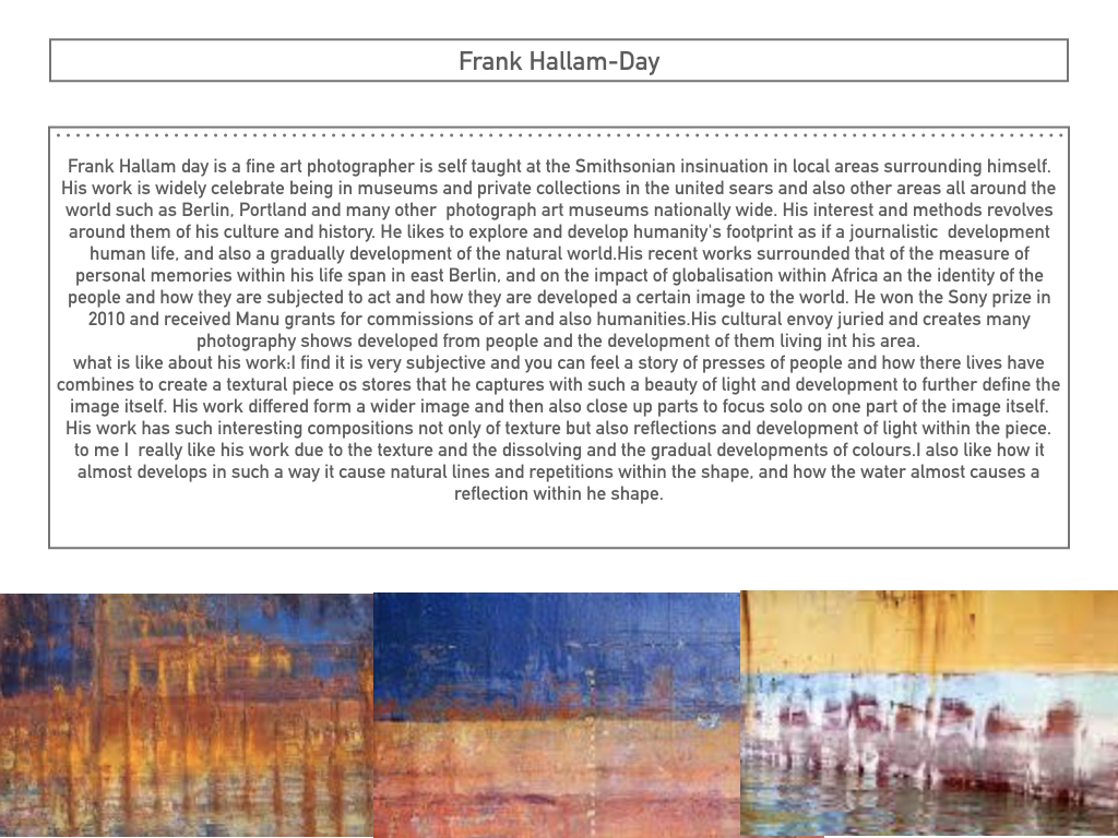
Frank is a fine art photographer in Washington.  He taught photography at the Smithsonian Institution in local programs.  His work is in numbers of museums and private collections in the States and abroad.  Frank is a flexible artist shooting in both black and white and color film who travels the world to remote destinations. He is able to capture the rich beauty of pattern, color and texture of everyday lives of diverse cultures.

These are examples of his work.

Image result for Frank Hallam Day

Photo Analysis

Image result for Frank Hallam Day

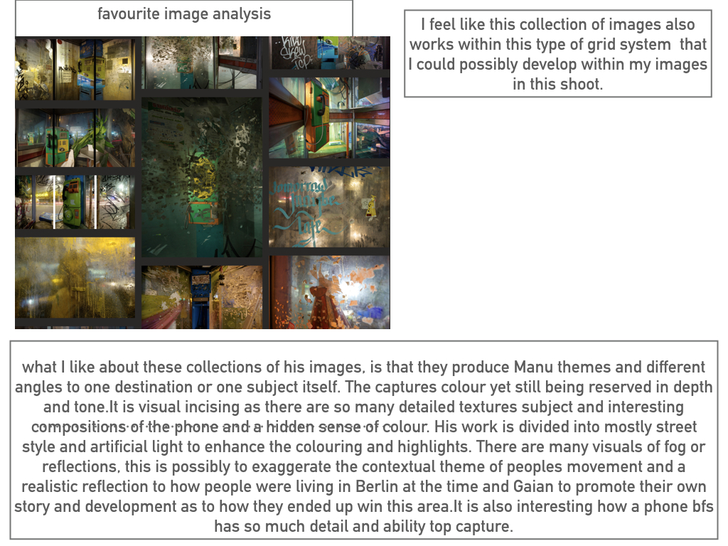
This photo is of the inside of phone box. Frank has been able to make a dull, boring thing a really interesting photography. I think this photograph would have been taken with a  slow shutter speed in order to capture the high light and the bold colours which are seen on the phone box and everything around it. Furthermore, I think the brightness and the sharp colours in this photo are taken using a high iso as they are captured really well and very strongly. The rule of thirds has been used in this photograph, with the phone box itself being placed just left from the center and it being the main focal point of this image. The use of the rule of thirds draws the human eye to this point and makes the viewer know that it is the main subject of the photo.  This photo is saturated greatly as it uses vibrant colours to intrigue the viewer. The use of different types of lighting makes the colours brighter. The use of reflection on the glass of the phone box creates a feeling of confusion, creating a real mood and story to the photograph.

Contact sheets

My Interpretations


Textures and Surfaces homework 4

Frank Hallam Day

Washington, D.C. based photographer Frank Hallam Day’s work explores the impact of humanity’s footprint on the natural world. Day, who was trained as a painter, says his photographs owe more to the history of painting than photography. Day prefers digital photography to film because it allows him to adjust the image, both on the spot and on the computer. He is a self taught fine art photographer and his interest and methods revolve around culture and history. I am very intrigued by his work as he creates real and moving stories which i believe can impact people upon viewing the images. Not only can he do this threw the use of people and how they are living their lives, which are different to ours in the first world countries, but threw the use of both wide and close up shots of the pure destruction that we are creating to the world. I believe there is a strong contrast within Day’s photos from the portrait pictures in Africa to the landscapes of urban areas in cities which have been destroyed. I believe that this contrast is purposely showing us that despite we have all these luxuries and strongly built buildings we take it for granted and therefore do not look after them, allowing graffiti and tear to occur. I also like the work of Day’s due to the highly saturated and vibrant colours used, bringing a dull telephone box to life for example. Also, the use of great composition and natural lines within his photographs allows him to take a boring boat and turn it into something which makes us appreciate and intake the whole photograph.

Image result for frank hallam day

Image analysis

Image result for frank hallam day

Clearly this photo shows the inside of a telephone box. What usually would have and should’ve been quite a boring image is actually, in my opinion, a very interesting and eye catching photograph. I believe this photograph would have been taken with a relatively slow shutter speed in order to capture the high light which is seen in the photo, possibly a shutter speed of approximately 1/10 of a second. an ISO of about 400/800 seems to of been used due to the brightness yet sharpness of the photo. The rule of thirds has most definitely been used within this photograph, with the telephone itself being placed on the top left focal point and on the left hand vertical line. The use of this draws the human eye to this point and makes the viewer aware that it is the main subject of the photo. Furthermore, this image uses leading lines to draw us into the subject. The metal panels are natural lines which makes us instantly view the phone. This photo is highly saturated using vibrant colours to intrigue the viewer. The use of strong and bright lighting is contrasted with the shadows on the left of the picture and the outside area on the right. This creates a sinister and scary feeling as it gives an impression of isolation as it is only inside the phone box that is overly bright. The use of reflection on the glass of the phone box creates a feeling of confusion, creating a real mood and story to the photograph. At the top of the phone box we can see how it has been destroyed by graffiti which relates to the photographers intentions of capturing human footprints.

Photoshoot

Edits

Homework Assignment 4

Planning

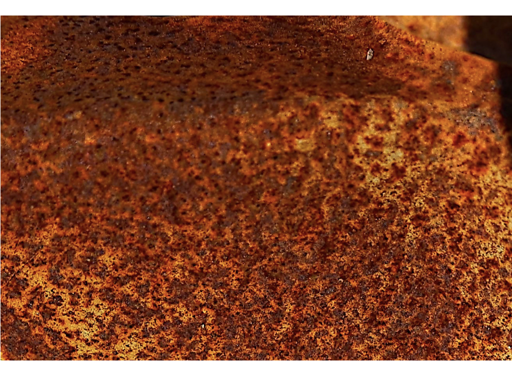
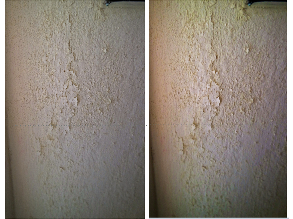
Task – Take 100-200 photos of different textures and surfaces eg rust, mould, rough , smooth , contrasting surfaces

Locations – Garage, garden, my house, school

Subjects – different types of flooring, hair, different textures on household objects, nature, clothes

Lighting – natural lighting to keep image natural

Camera settings – low depth of field so corners are blurred, quick shutter speed – 1/60 to 1/100, ISO 200.

Concept – to exploit different textures in household objects and show them in a way they are not usually seen.

Frank Hallam-Day

Image result for Frank hallam dayImage result for Frank hallam day

Frank Hallam-Day is a photographer based in Washington whose most notable work is his photographs of ship hulls. He described these images as “an afterthought to what I thought was a more interesting series; images of wrecked ships”. People were living on these shipwrecks when he was photographing them. He edited the colour balance of the sea to match the colour of the hull.

Hallam-day also teaches photography in several institutions in the US. He majored in social science at university and completed a masters in sociology.

Frank Hallam-Day Favourite Photo:

Image result for Frank hallam day

In this photograph, Hallam-Day uses natural lighting from the sun to capture a natural but abstract image. It is a very sharp and saturated photo that captures the texture and colours of the rusted hull. A fast shutter speed may have been used to capture this photograph – possibly 1/60 of a second as the photo is focussed. An ISO of 200/400 appears to have been used due to the brightness and clearness. It is a warm image with vibrant colours to catch the viewers eye.

Hallam-Day uses the rule of thirds in this photograph; the three layers of the image lie across the horizontal planes of the rule of thirds structure. The tone in the image is mostly light except for the contrasting dark rust. The eye is lead straight to the vibrant top two layers of the image. The pattern of layers makes for a better viewing. The cropping of the image makes it more abstract and therefore more interesting for the viewer. Due to the matching of the image to the rule of thirds, it appears to be almost 2D.

The original aim of this photoshoot was to picture shipping wrecks but an afterthought of this was to create abstract images photographing the typology of ship hulls. This work turned out to be one of his most famous pieces.

The way that the colours from the hull reflect on the water as if it was merging into the sea suggests that Hallam-Day is trying to show that the shipwrecks have been moulded into the sea.

Aaron Siskind

Image result for aaron siskind

Related image

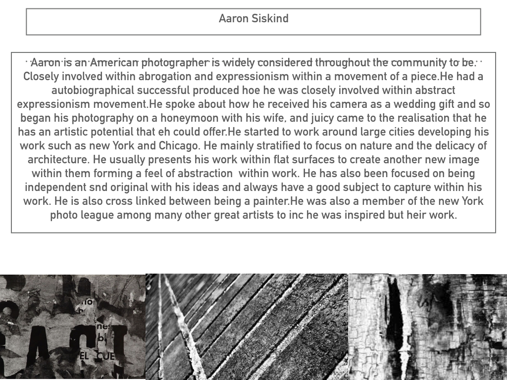
Siskind is a photographer that identified with the ideas and styles of the abstract expressionist artists in New York in the 1940’s. He tends to emphasise texture and lines to create abstract images of the real world. He turned away from the social/political world-post world-war 2 and looked at seeking meaning in inanimate forms around him.

Aaron Siskind Favourite Photo:

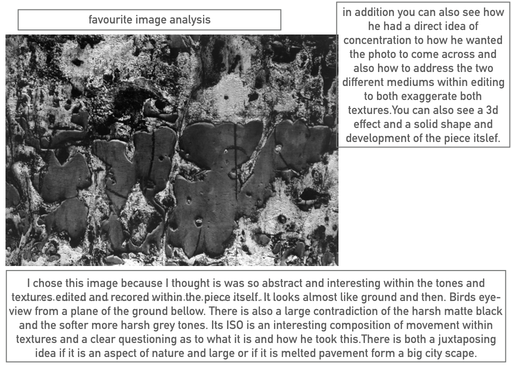
Image result for aaron siskind

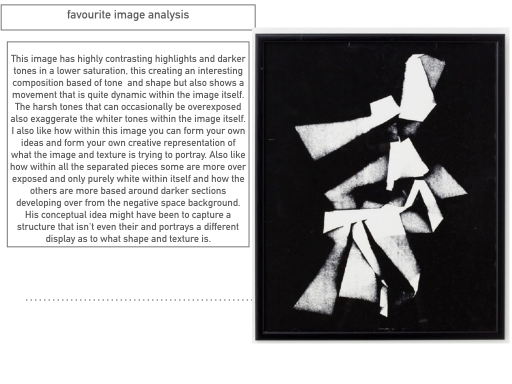
In this photograph, Siskind uses a dim lighting to create a dark and mysterious photograph. There is a wide tonal range – going from the darkness of the shadows to the brightness of the material. A short depth of field appears to have been used along with a quick shutter speed (possibly 1/60) and a low ISO because it is a dark, sharp image with a low amount of noise.

The grayscale colour and the cropping of the image creates an abstract image as you cannot tell what it is – especially without the colours. The texture of the image makes it appear to be of something that has been burnt or in a fire, which leaves the viewer to wonder what happened. There is some 3D elements in the photograph as you can see some pieces of material hanging off the wall and creating a shadow behind them. There is not a massive amount of contrast, balance or structure to this image which makes it even more abstract than it already is.

After researching further, I discovered that this image is called “Jerome, Arizona 21” and shows peeling paint from a decaying wall. Sisking would often take pictures of fragments of walls, architectural details and disintegrating signs and posters.

In this photograph, I believe that Siskind is trying to show that something considered ugly and discovered can be explored in detail and be considered intricate and intriguing.

Keld Helmer-Petersen

Image result for keld helmer petersenImage result for keld helmer petersen

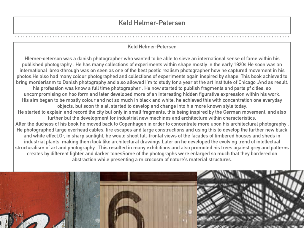
Helmer-Petersen was a Danish photographer who looks at shapes similarly to Albert Renger-Patzch. His work, especially his book “122 Colour Photographs” brought modernism to Danish photography and earned him a grant for a years study at the Art Institute of Chicago. He looks at the natural shapes and pattern in the world around us and creates something attention-grabbing out of it.

Keld Helmer-Petersen Favourite Photo:

Image result for keld helmer petersen

In this photograph there appears to be harsh lighting due to the editing but I believe that is it natural lighting. There is a large tonal range, ranging from the white of the posts to the black of the shade. This is a high contrast photograph as the spikes contrast with the background. It is a sharp, focused photo so it must have a fast shutter speed with a low ISO and a shallow depth of field.

It is quite a cold photograph due to the contrast along with the black and white. There is lots of repetition and patterns within this image; the spikes are repeated along with the shapes in the fence. The post sits along one of the vertical lines of the rule of thirds with the circle of the post being at the intersection of two lines. This means that Helmer-Petersen planned this to create an appealing image for the viewer.

I believe that in the image Helmer-Petersen is trying to exploit the beauty within things designed to keep people out. He looks at the patterns in the fences which are supposed to be menacing and he shows them off in a way in which they were not meant to be seen.

My Photographs:

My Favourite Photographs:

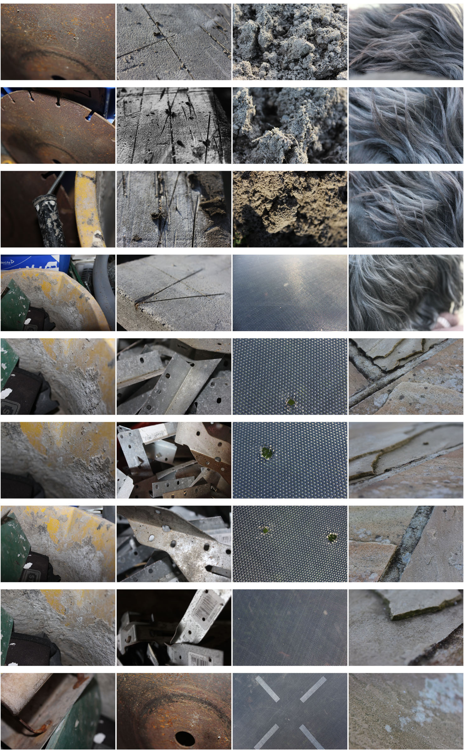
In this photo flash was used to introduce contrast into the photo to create a wider range of tones. The flash allowed the details of the material to be seen better. A macro setting was used to take this picture so that I could show the texture of the material. A low depth of field was used to create a blurred effect at the edge of the photo to emphasise the detail in the part that is in focus. A low shutter speed (1/60) was used to catch a sharp image. A low ISO was also used.
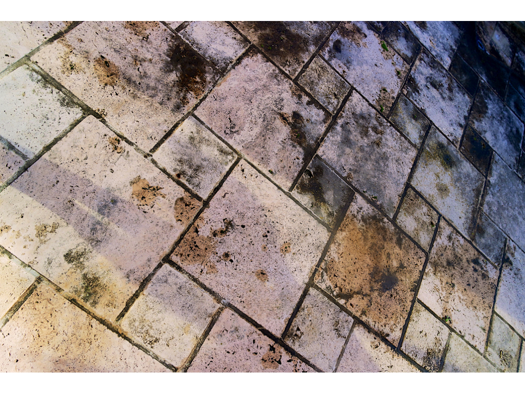
Both light and dark tones run throughout the photo, this allows the details of the material to be emphasised because of the contrast. A rough texture can be seen along each part of the photograph. The image has a slight 3D effect due to the low depth of field and the high contrast. The pattern of the material runs throughout the photo and creates an abstract image.

Because of how these techniques work so well together, this is one of my favourite photos from the shoot. One thing that especially stands out to me from the photograph is the texture and the 3D effect.

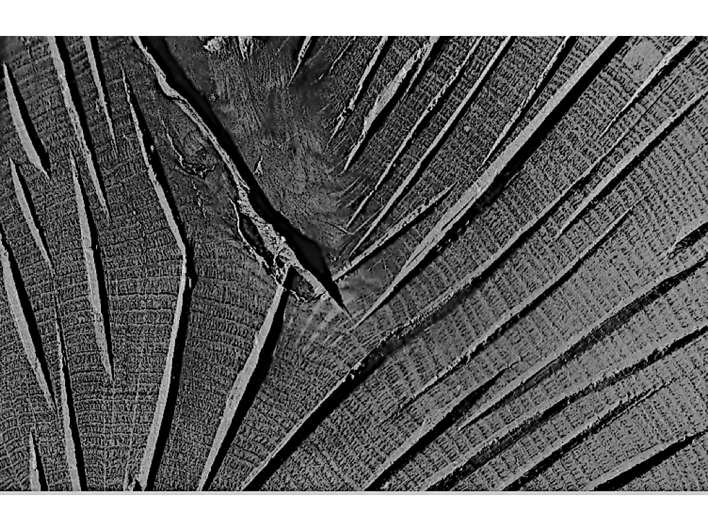
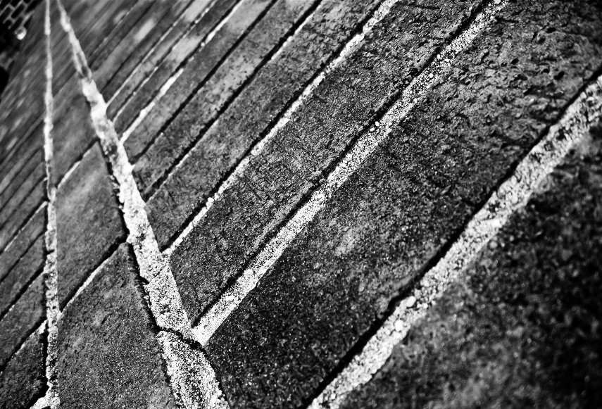
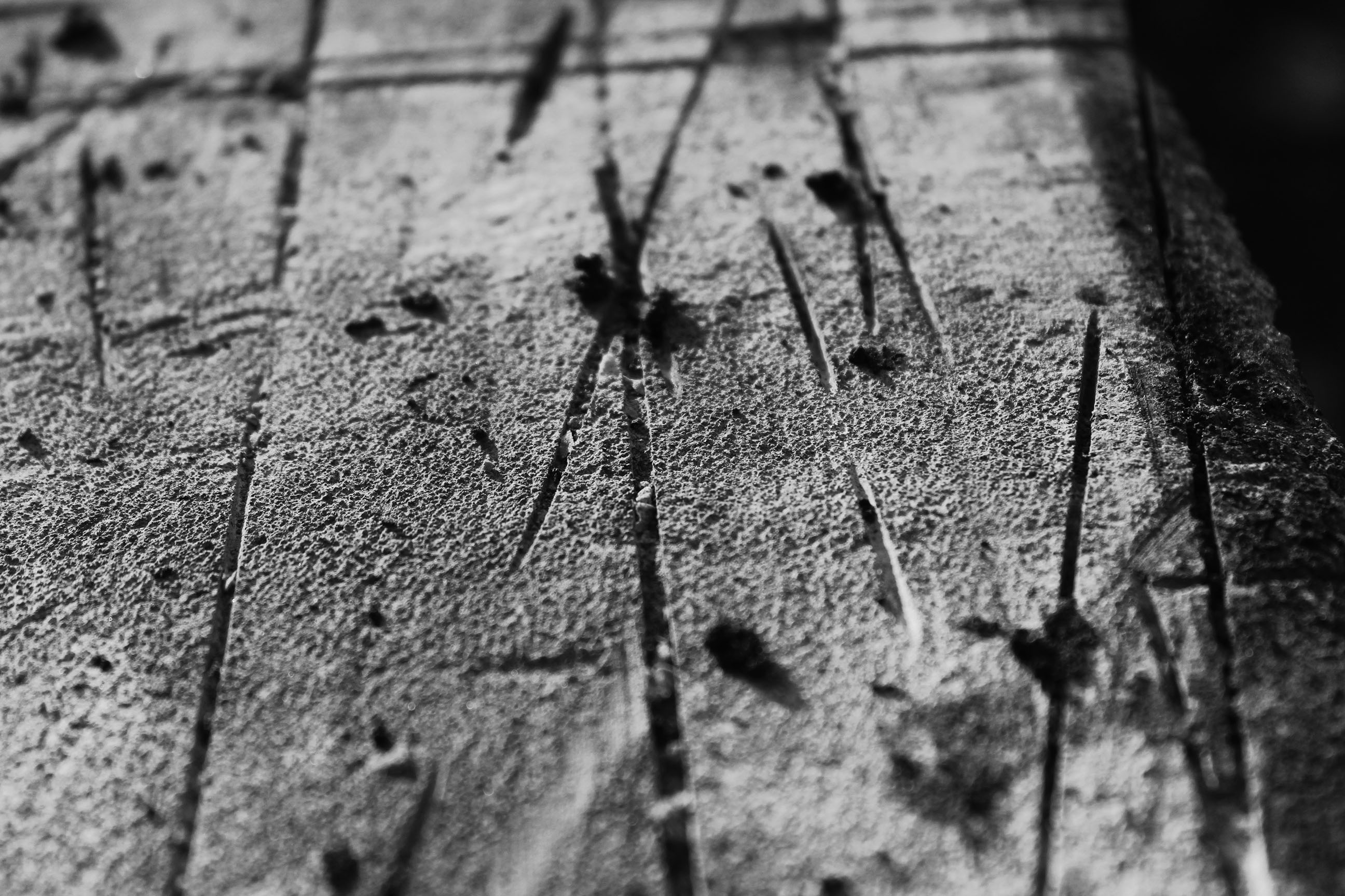
In the below photograph natural lighting was used to allow me to catch the natural shade of the subject. There is a wide range of tones between the surface and the cuts in it to create a dramatic and contrasting photo. A macro setting along with a low depth of field was used to create a blurred effect around the edge to allow the viewer to focus on the centre of the photo. A quick shutter speed was used to catch a sharp photograph. A low ISO was used to create a dark, dramatic image.

The black and white helps to increase the contrast in the image to make it stand out more. The cuts in the surface create a slight 3D effect in the photograph. The random cuts and lines contrast with my other favourite photo in which everything is a set pattern, this works well with the abstract theme..

For the above reasons, this is one of my favourite photographs from the shoot, especially because of its abstractness.
Ernst Haas and Moholy Nagy Homework

Ernst Haas 

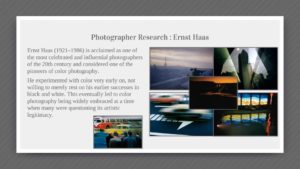
  • Ernst Haas was a photojournalist and a pioneering color photographer born on March 2, 1921 in Austria.
  • Haas was uninterested in learning photography as a child, though his father tried to share his interest. Upon his father’s death in 1940, Haas first entered the darkroom, learning to print old family negatives. His interest grew, and he soon began to take his own photographs.
  • Haas was inspired and fascinated by the natural world, and took photographs of the elements throughout his career. He used abstract elements such as shapes, textures and line and then edited his works using different colours by colour correction.
  • In addition his coverage of events around the globe after World War II made him an early innovator in color photography. His images were the subject of the first single-artist exhibition of color photography at New York’s Museum of Modern Art.
  • His book The Creation (1971) was one of the most successful photography books ever, selling 350,000 copies.
  • He died on September 12, 1986

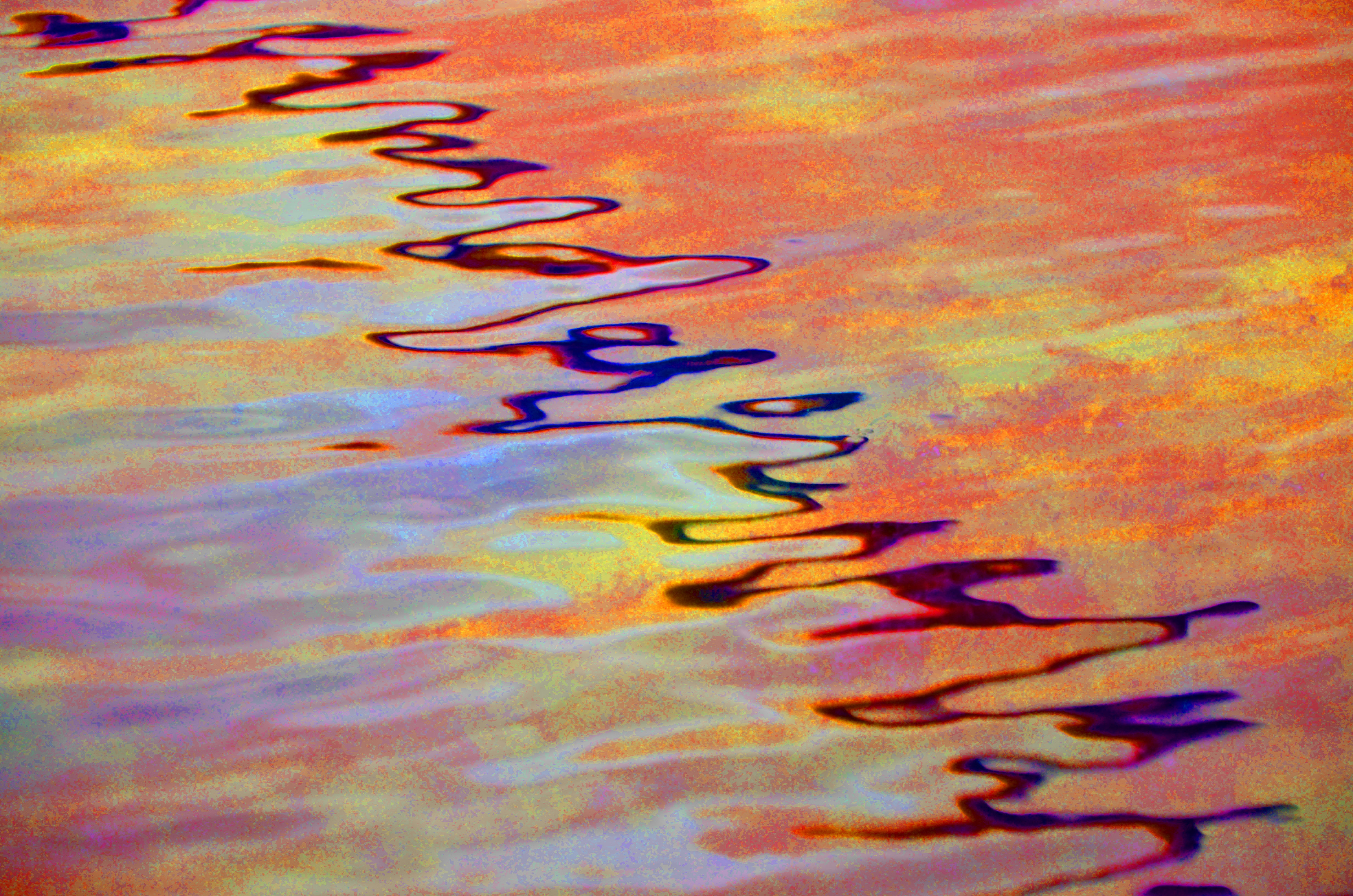
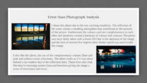
I was inspired by his use of light in reflections on the water to recreate the same style.

Moholy Nagy


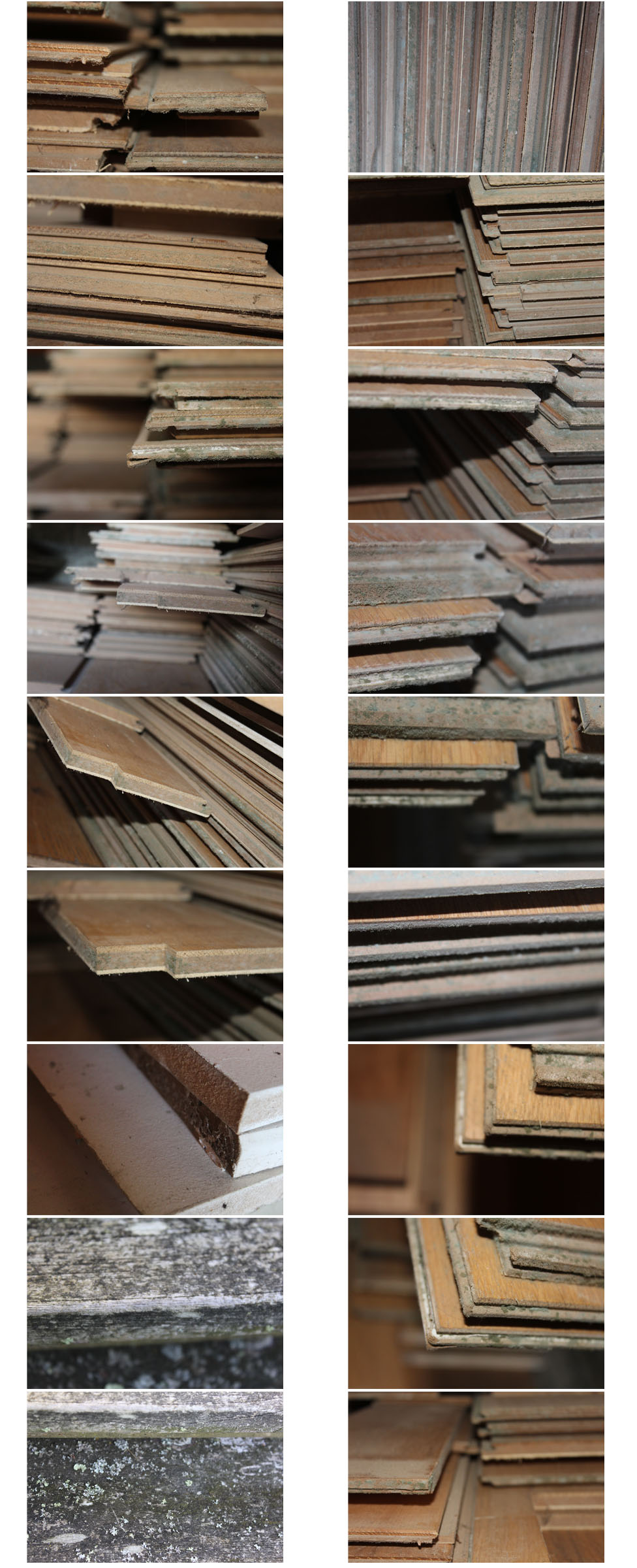
Typologies HW

What are typologies?

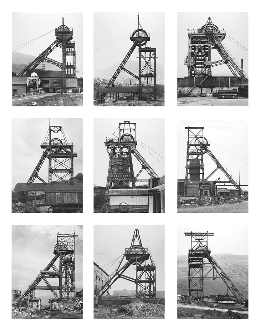
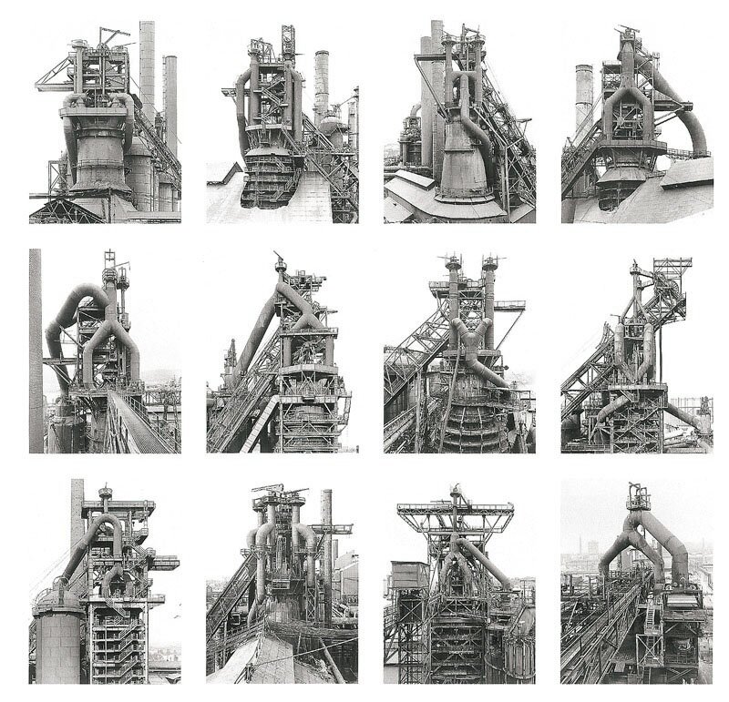
Typology is the study of types, and a photographic typology in a set of images or related forms, shot in a consistent, repetitive way.

Bernd and Hilla Becher

The couple where conceptual artists and photographer who worked together. They were best known for their extensive series of photographic images, or typologies, of industrial buildings and structures, often organised in grids.

Each series of images are capturing typologies, types of things. Each image is taken from the same perspective, angle and distance from the subject, this is an essential reason for why the series’ are so effective. All the images in each series have something in common which links them together, for example the images below the darkest part of the image is always in the middle of the building.

Image result for typologies

Image result for Bernd Becher

Image result for Bernd Becher

Contact sheets

My interpretation

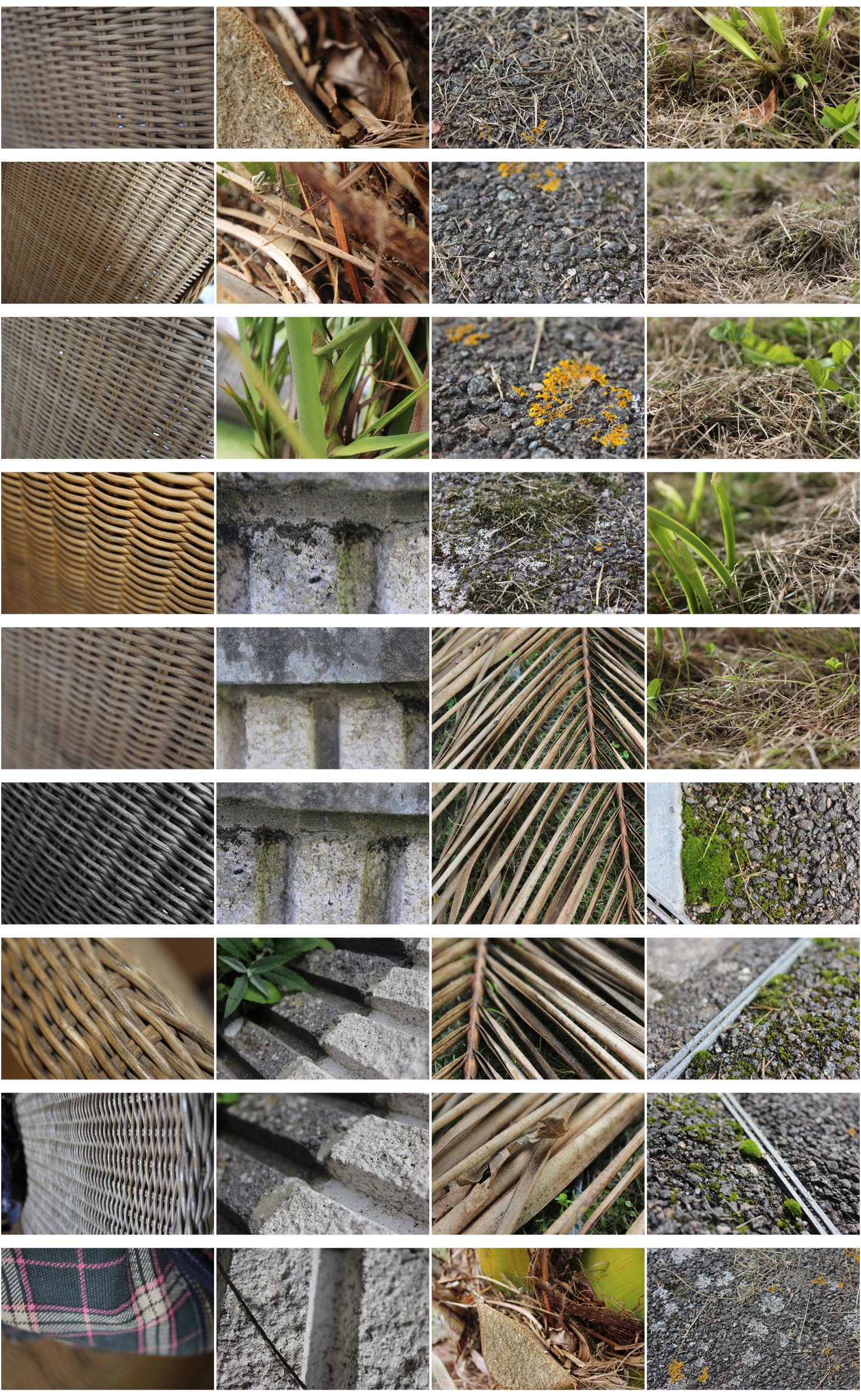
Texture- Homework 4

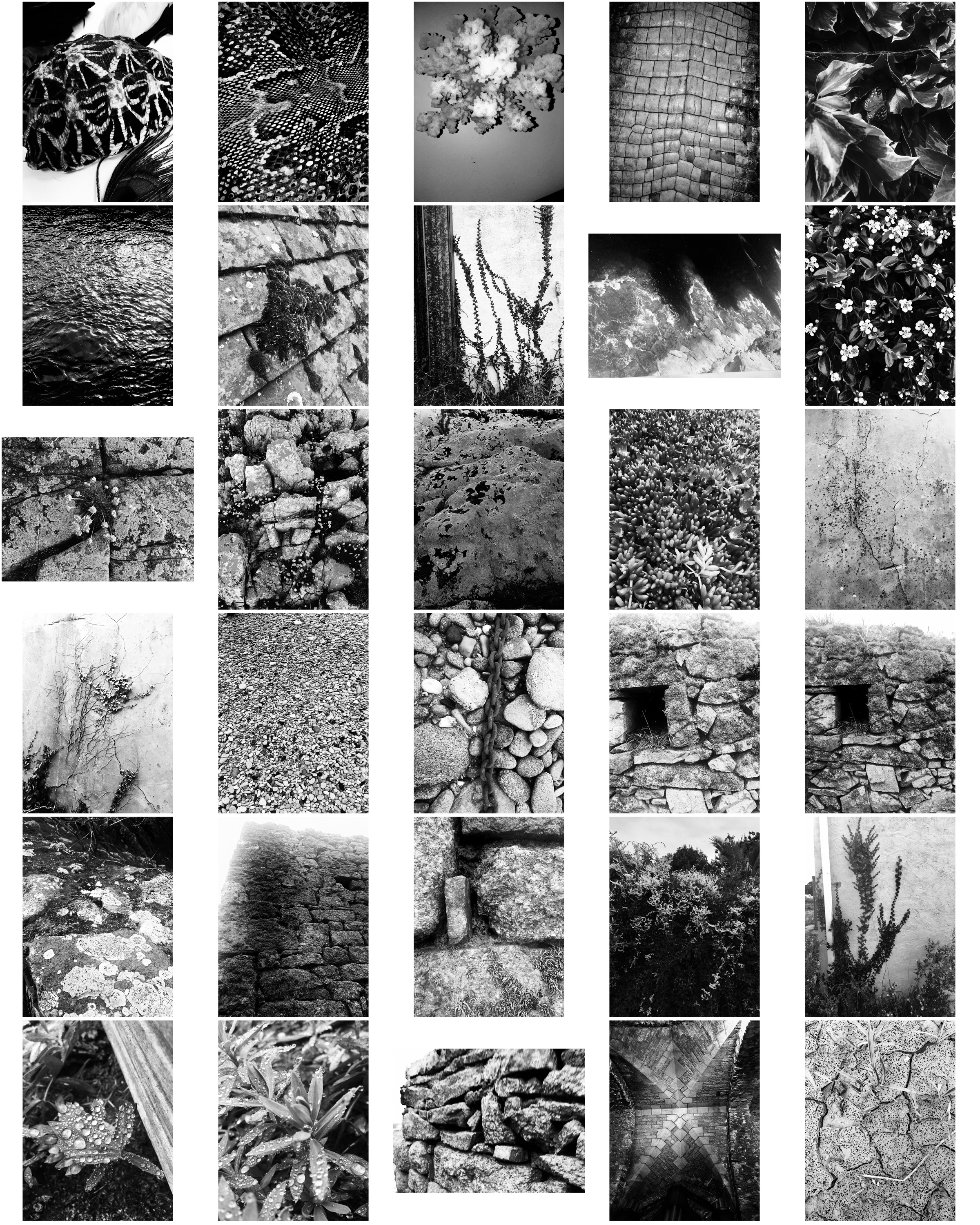
These photos take inspiration from Aaron Siskind focusing on texture, line and visual rhymes.

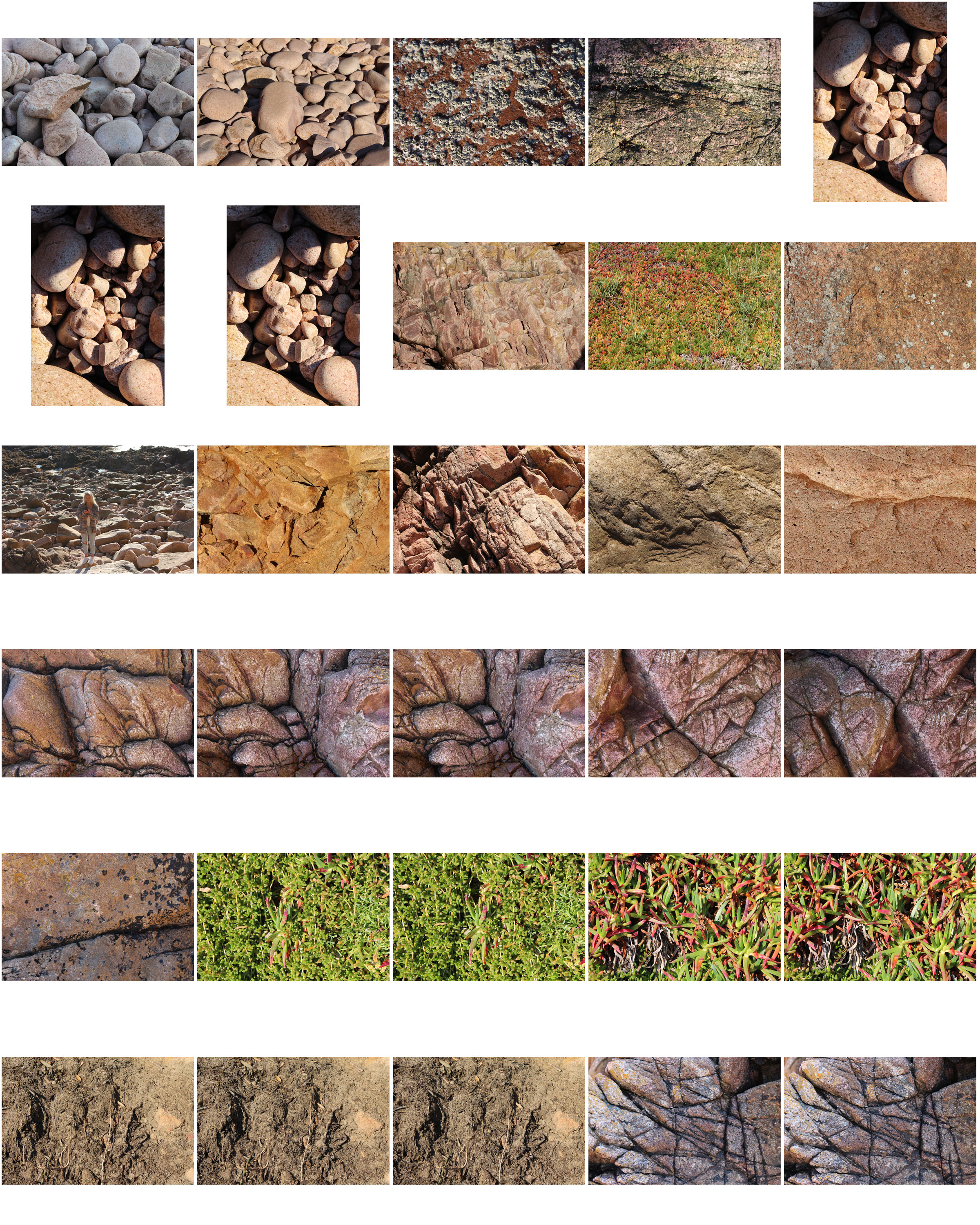
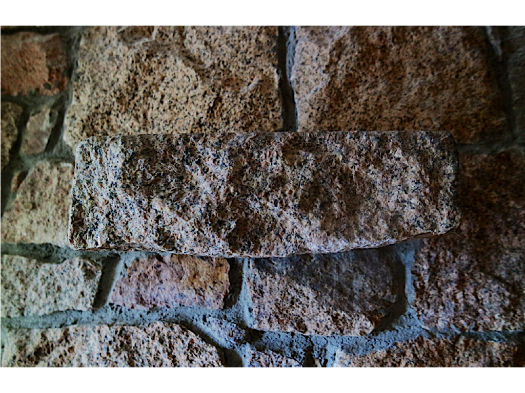
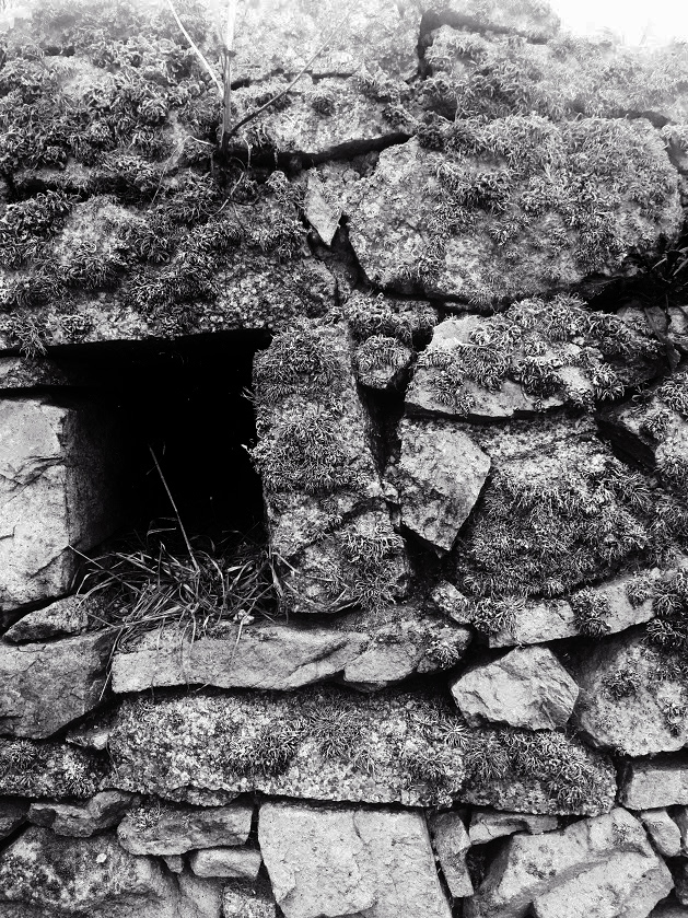
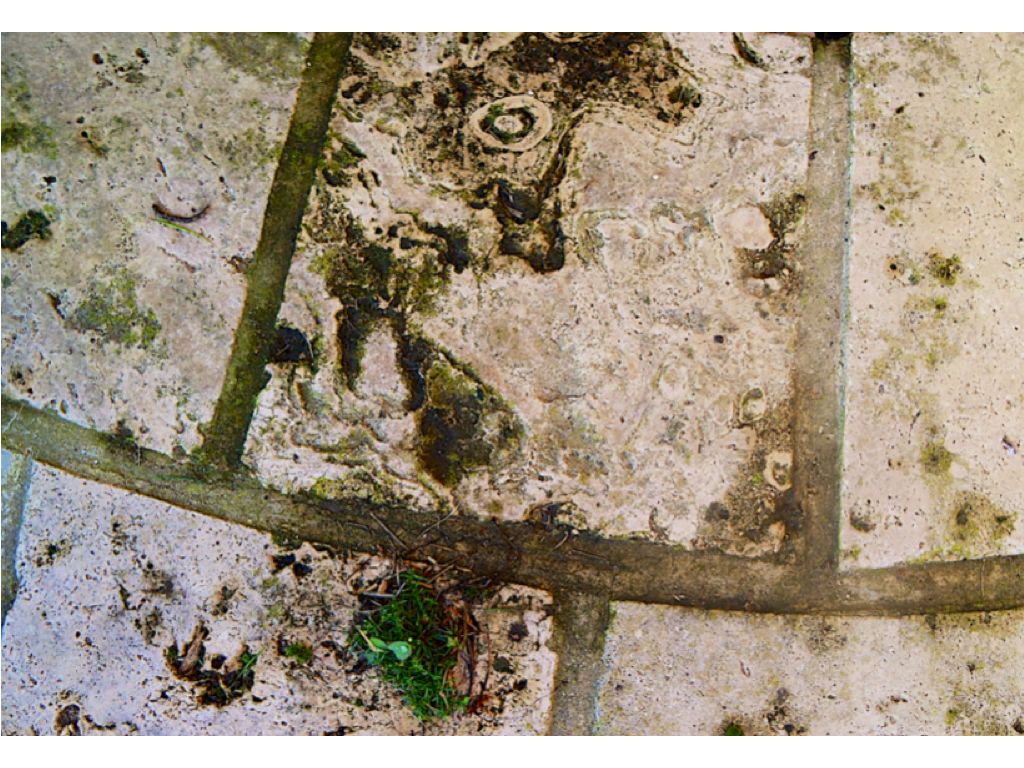
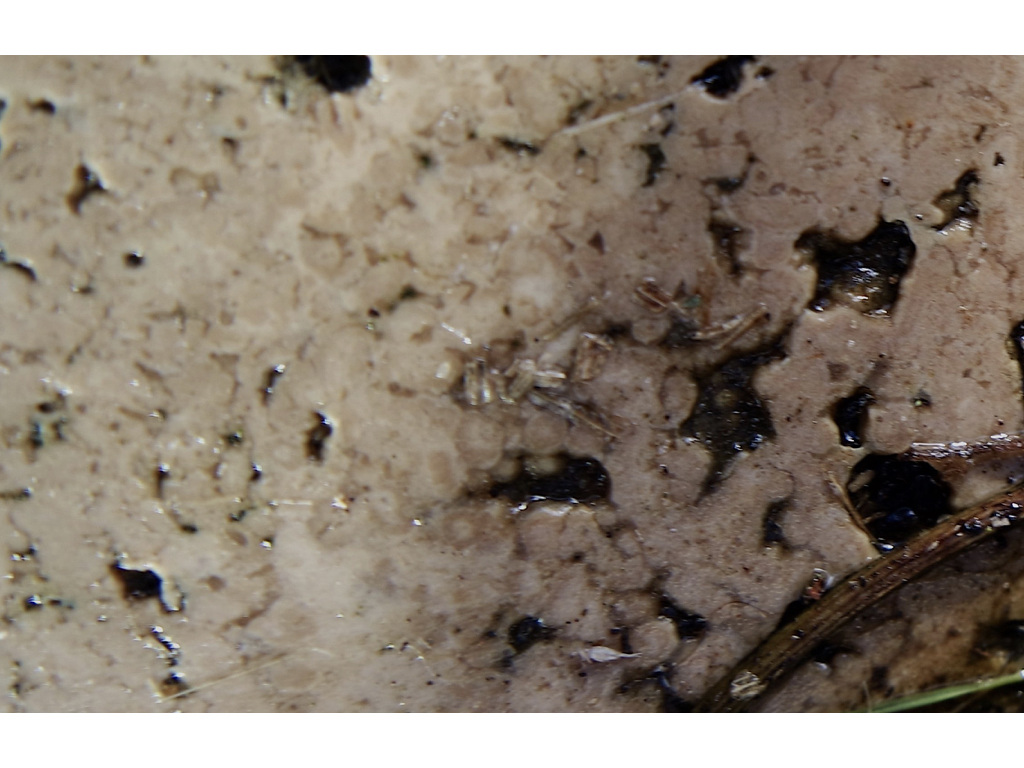
These two photos are my favourite from the shoot as they display texture of the surface, using the Ansel Adams zone system. The stones in these photographs both contain a lot of detail like the moss and weathering, making the photos more interesting. Both images contain contrasts between light and dark, the first image has contrasts from the higher level of rock and the shadows which they create below them, and the second image contains shadows through the gaps in the stones creating varied tones in the photo. Editing the photos in the contact sheet black and white makes them more similar to Aaron Siskind’s style.

These photos show similarities to Aaron Siskind’s ‘Martha’s Vineyard’ photograph:

Martha's Vineyard 131B


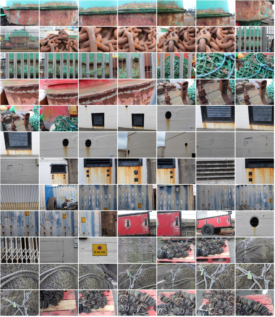
For this photoshoot I looked for objects that had been in the sea or near it so i could focus on the weathering and rusting, like Frank Hallam-Day did in his ship hull photos.

Final 5 Images from Shoot:

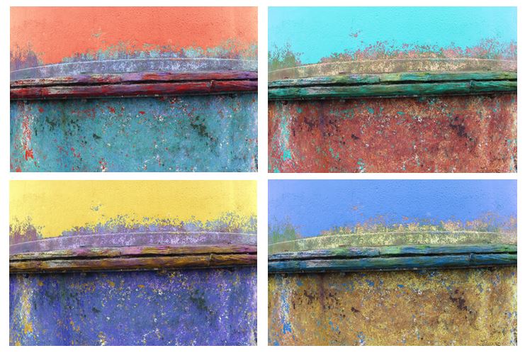
The photo which i think shows the most similarities to Frank Hallam-Days photography is image 5 as it focuses on the weathering and gradual deterioration of a man made object. It has horizontal lines, creating sections with the photo of different texture. To improve this   photo i would have photographed the entire ship hull so it showed more similarities to Frank Hallam-Days work.

I edited the original picture and altered the hue to create different colours of ship hulls and a more varied range of photos. I tried to capture the way Frank portrays the effect of time on works of man, emphasising the rusting and weathering.