Category Archives: Homework Assignment
Filters
Colour
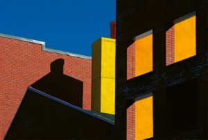
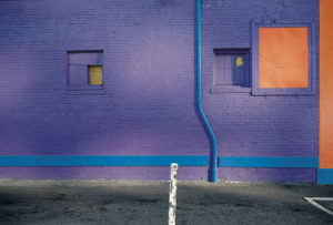
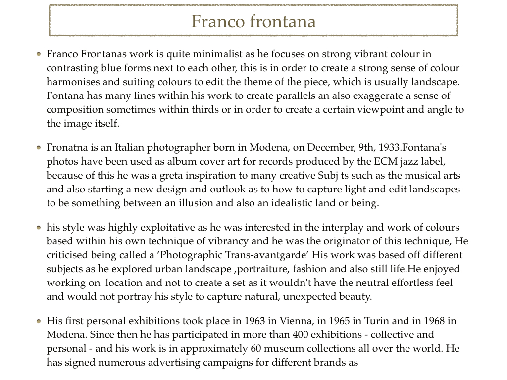
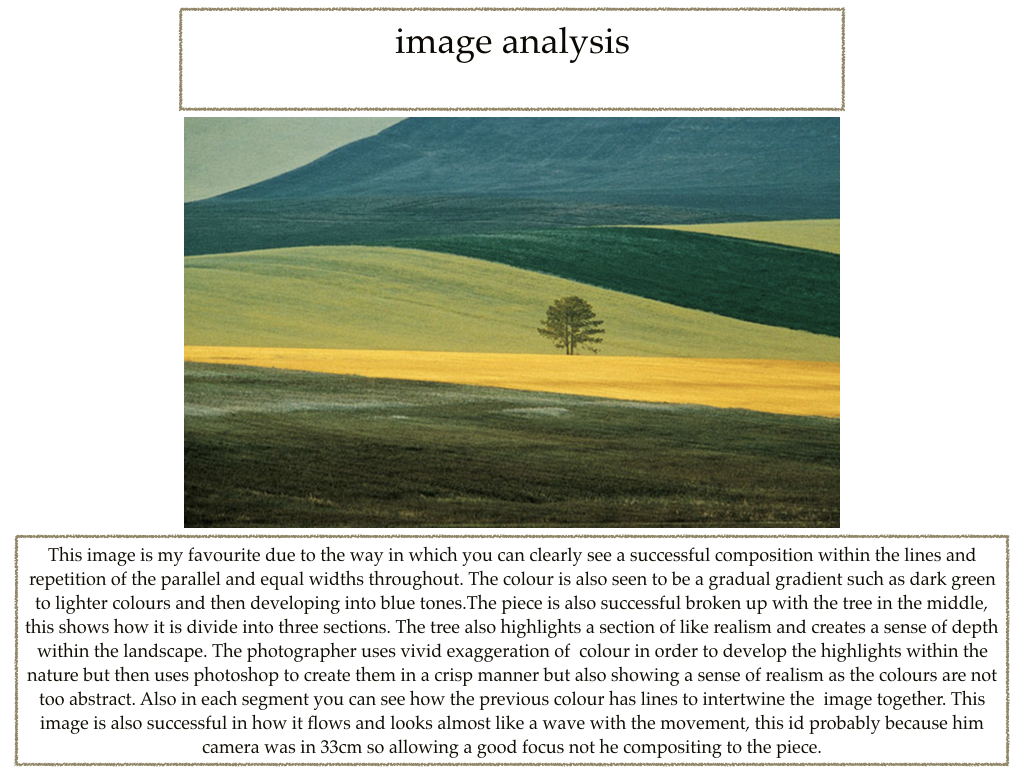
Franco Fontana
http://francofontanaphotographer.com/

Franco Fontana was born in 1933 in Modena. He took up photography in 1961, he is best known for his abstract colour landscapes. He held his earliest solo show was in 1968 in Modena, he has published over seventy books with Italian, French, German, Swiss, Spanish, American and Japanese publishers. His photographs have appeared worldwide in over 400 exhibitions, solo and collective.
My Edits
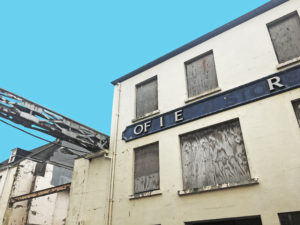
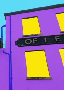
Colour Homework


Ernst Haas Inspired Photoshoot
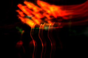
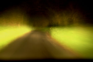
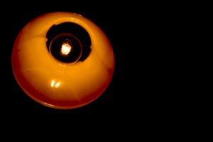
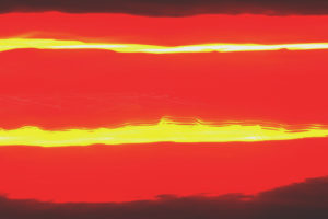
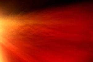
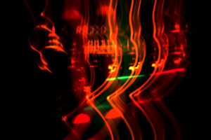
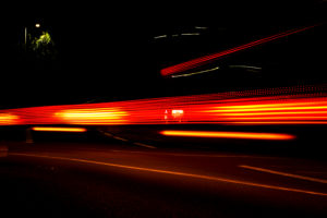
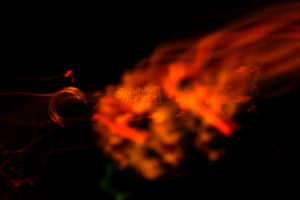
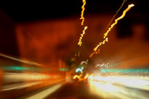
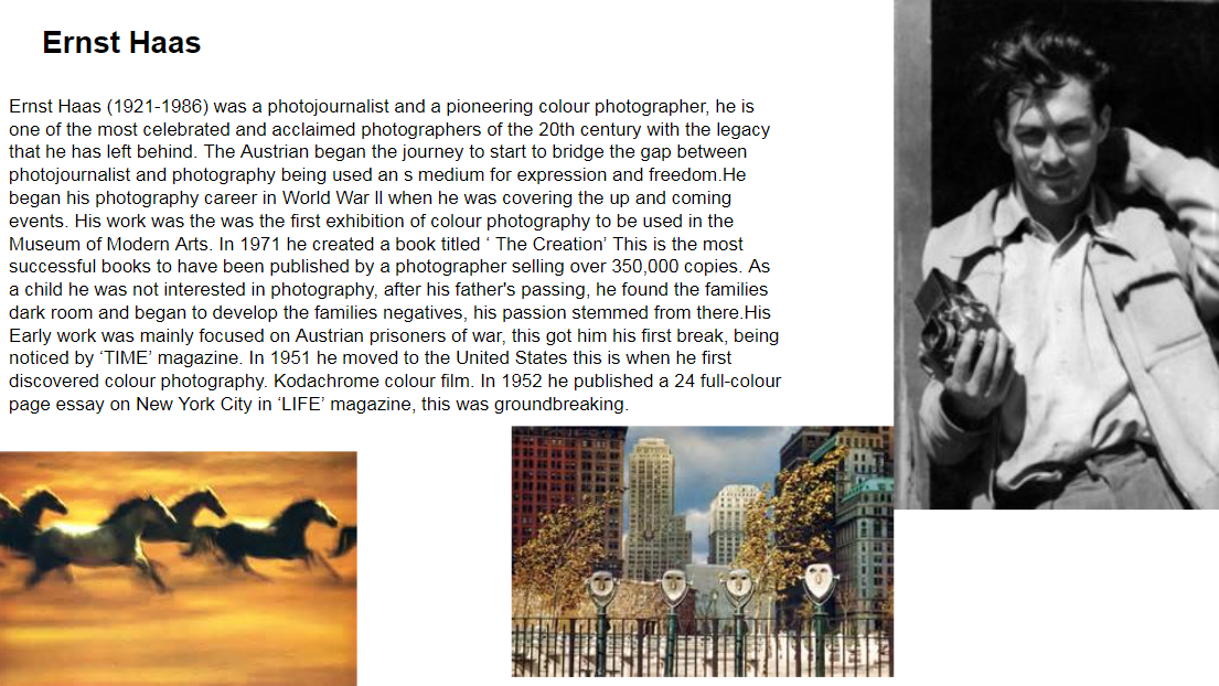
Within this shoot I focused on the aspect of movement, to create an abstract effect within my images, to do this I allowed a slow shutter speed of about 1.3 seconds to 13. This allowed me to make an abstract effect to everyday things, like cars and lights at the time of dusk. An artist I was inspired by was Ernst Haas. Ernst Haas was a photojournalist and a pioneering color photographer. During his 40-year career, the Austrian-born artist bridged the gap between photojournalism, and the use of photography as a medium for expression and creativity. I found many of the images he had taken in his years (Like the horse image below), as inspiration towards the somehow dramatic affect created by an almost simplistic technique.To really create the effect I desired, I drove round jersey to and from destinations, taking pictures of lights that interested me as a photographer, as I thought they would capture the eye of the viewer. Some of the techniques I would incorporate into the images were motion blur and low shutter speed zooming, I specifically made sure not to use a tripod, as I wanted to create a disrupted effect to most of the pictures taken. I decided to make a mind map of the objects and ideas behind them, that I could take in the shoot to help me along. From there I would be able to section off individual images from each segment, and choose the best image from each. This is what it looked like:
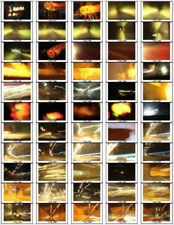
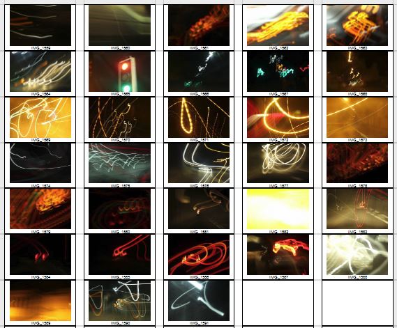
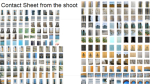
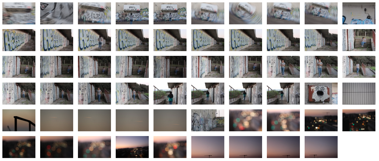
From here I went ahead with the photo shoot, and these were my results from this experiment below:
From these images taken, I chose the top ten images that I believed to be the best out of the contact sheet for various reasons, this is my selection:
From this selection of my top ten images, I decided to single them down even more to a top five, to really distinguish the good pictures from the rest. These are my top five:
Once again I decided to single out one image out of these five as my favorite. This is my final image:


I chose this image as I loved the triangular effect created by the outskirts of the blue lights at night when driving by, with a long shutter speed (1.8 seconds). I also thought that the contrast between the blue, really stood out from the rest of the image, making it very visually pleasing to the viewer, as seen by all the underlying shades of blue present within. What I really liked, was the fact that the image was an unbroken pattern, creating symmetry throughout the piece allowing for a greater effect.
Colour Homework 5

Colour- Homework 5
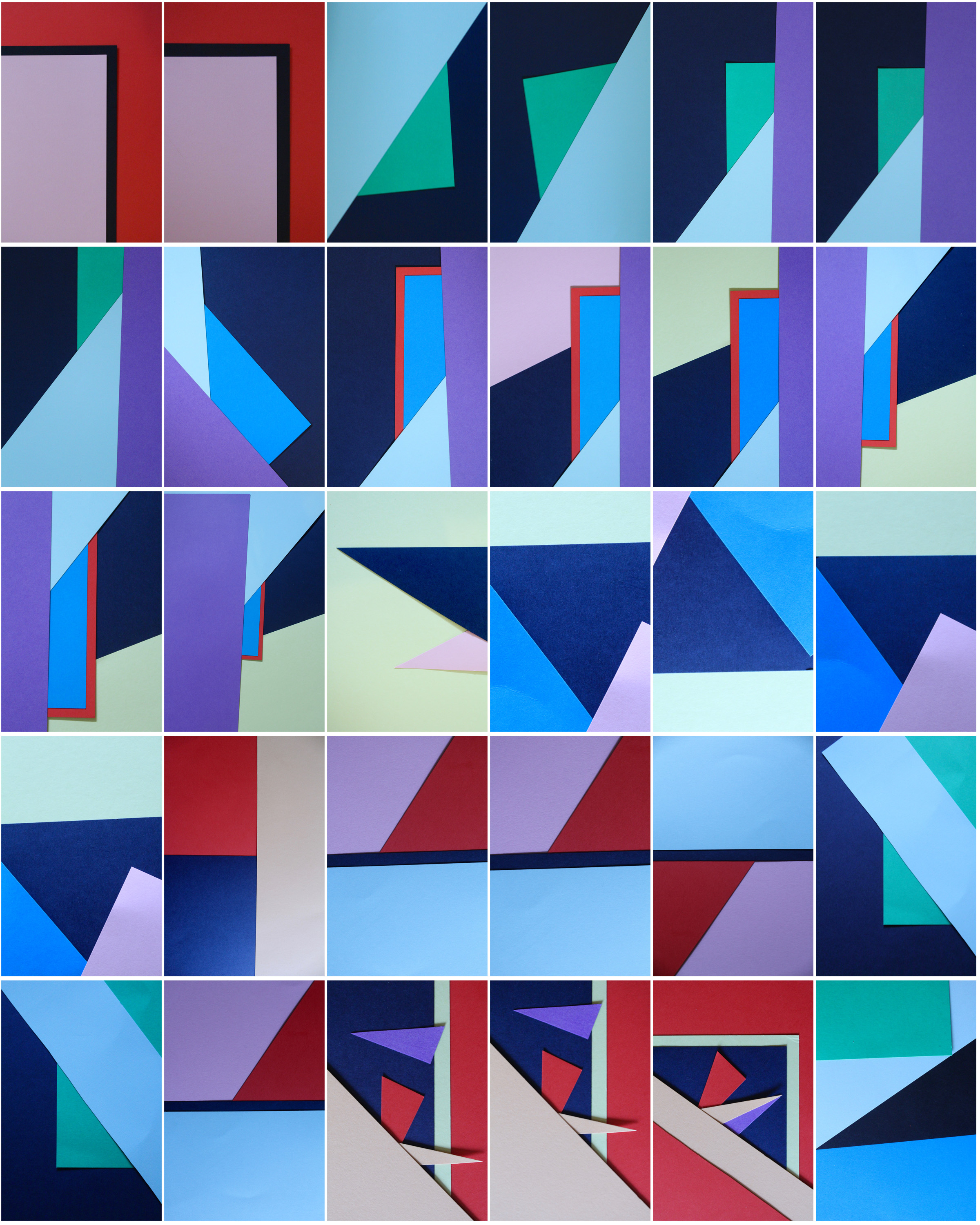
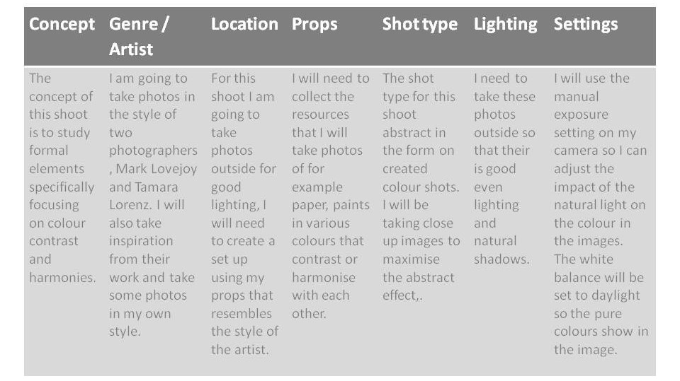
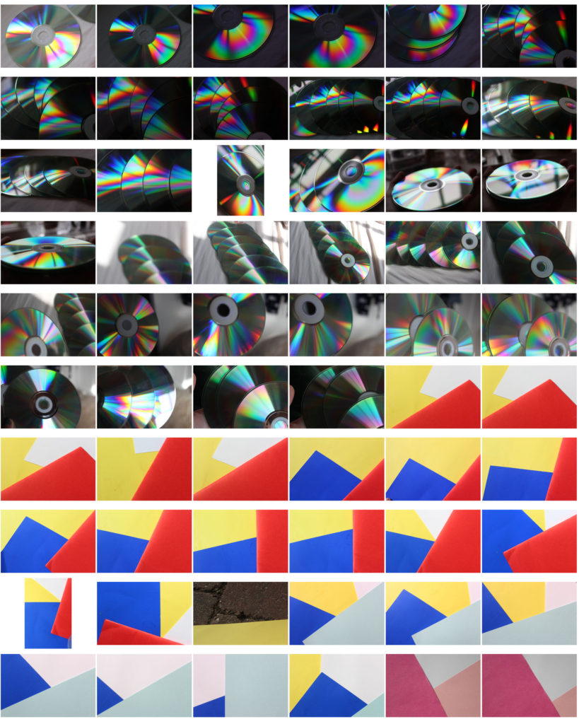
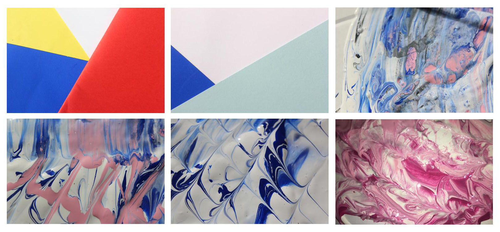
Taking inspiration from Tamara Lorenz, I tried to re-create her abstract photography using sheets of coloured paper and arranging them in different ways. I selected colours that complemented each other and cut pieces of paper to create traingles and other shapes to make the photos more interesting.
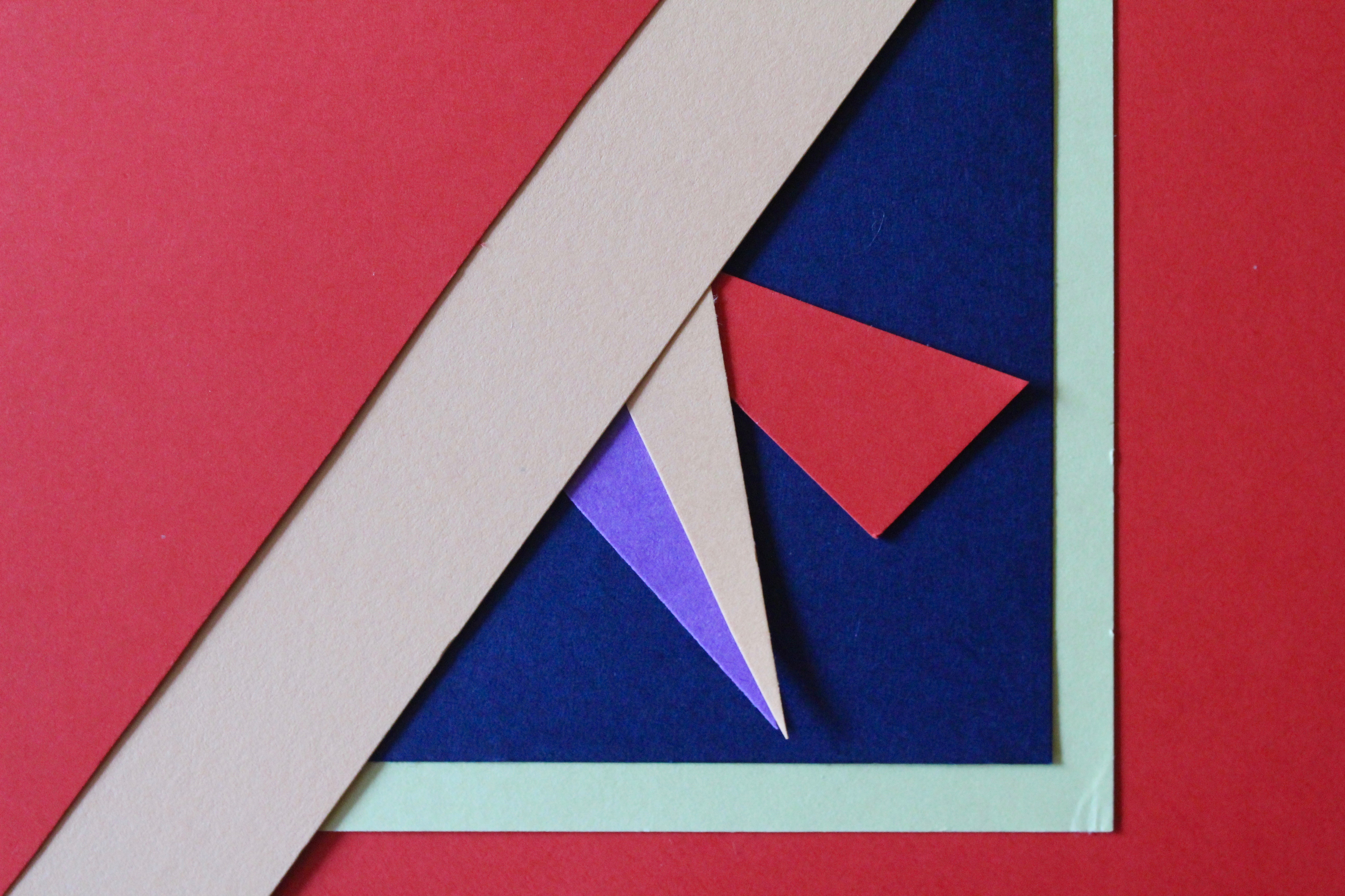
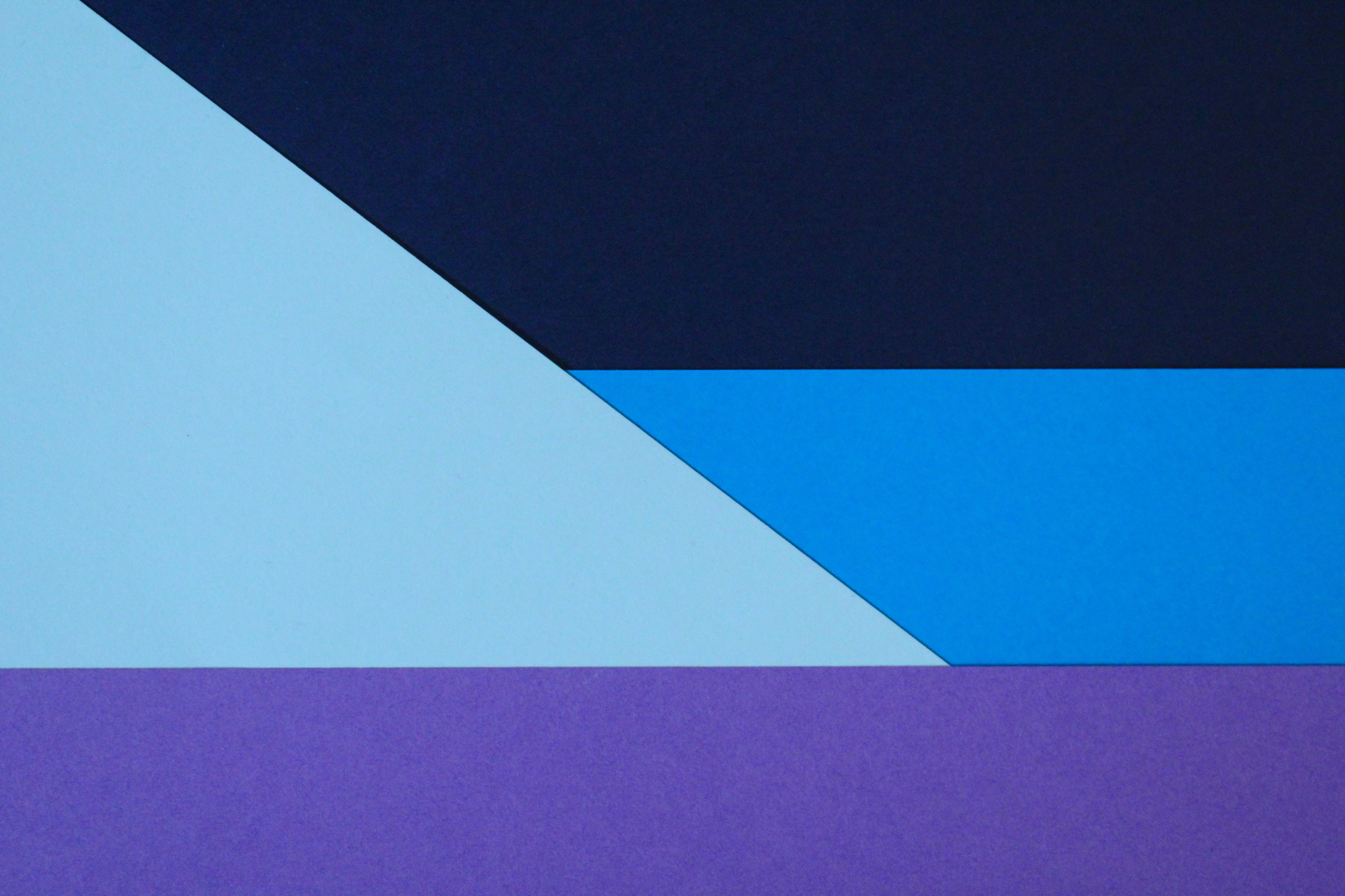
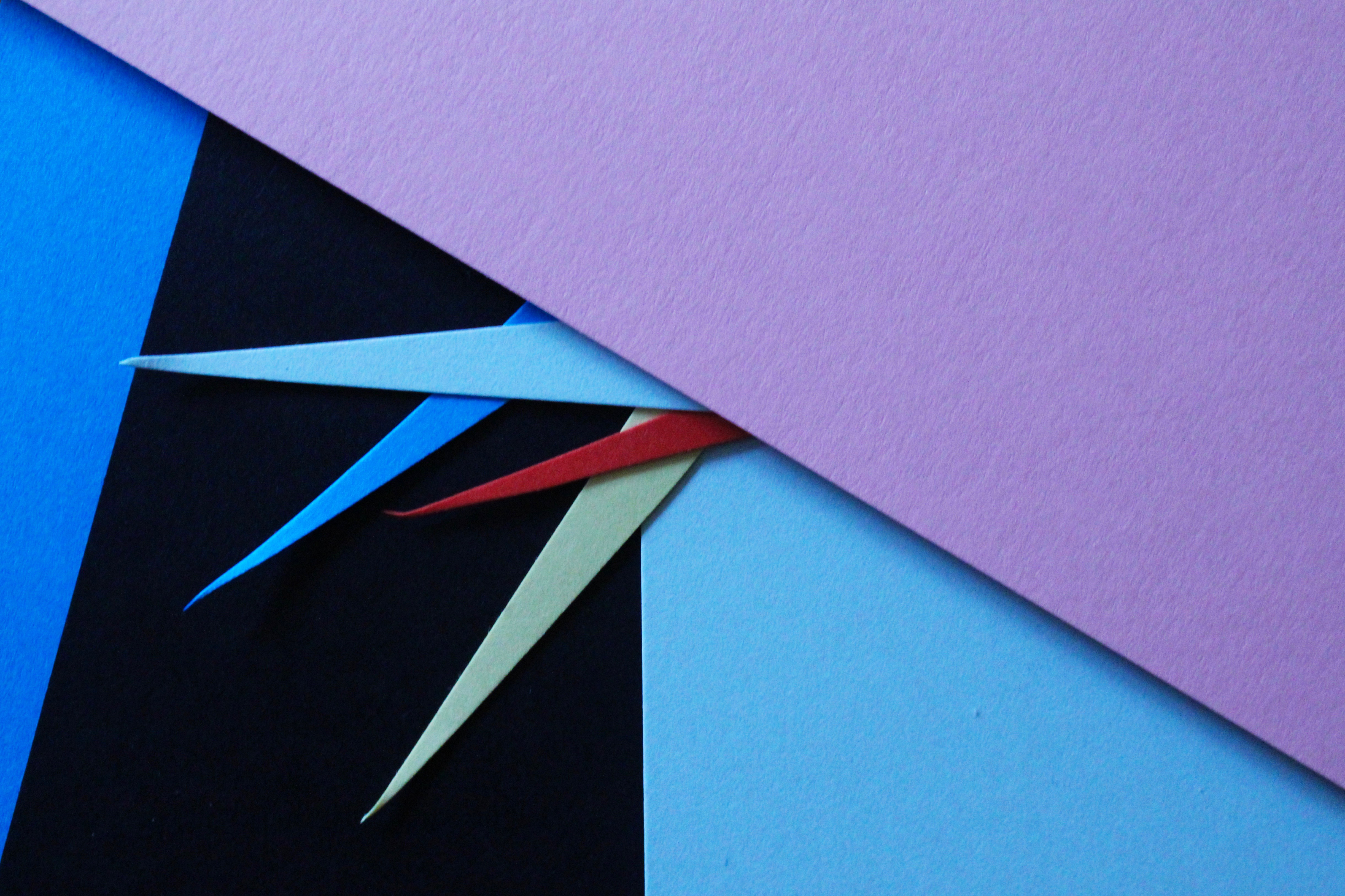
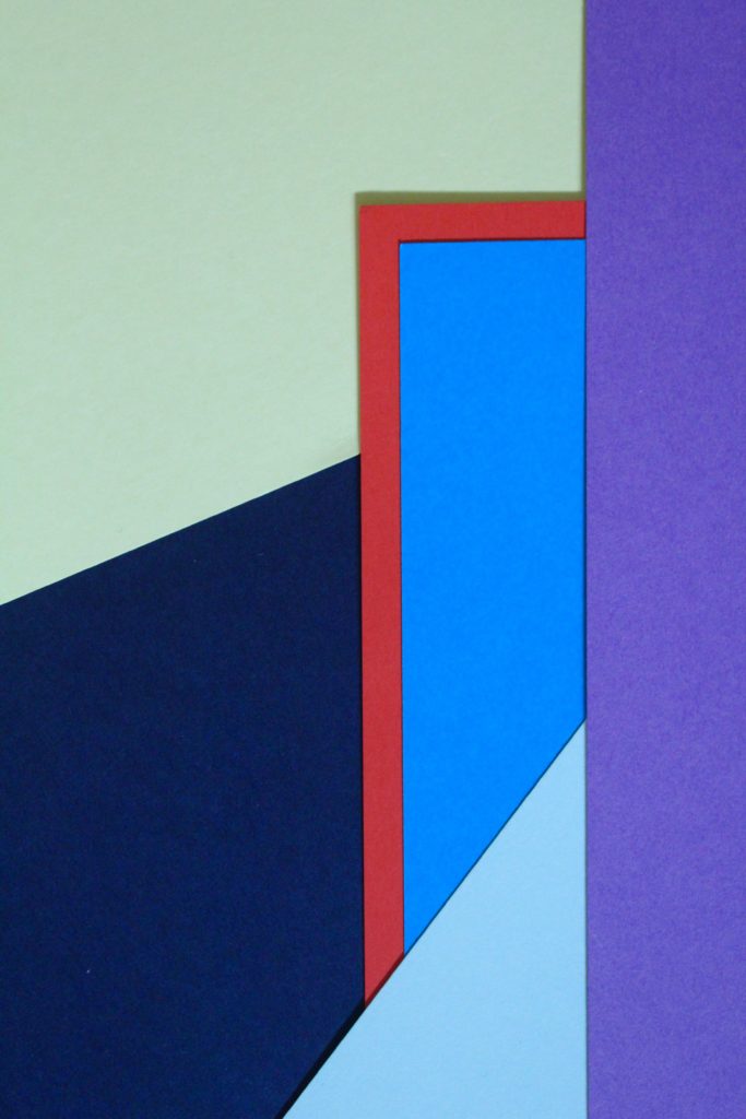
I especially like this photo and the colours I used to create the pattern. The red sheet of paper with the blue layered on top creates a bold outline and is the point where your eyes are drawn to. Like Tamara, the addition of strong planes of colour provide another source of contrast in addition to those of line, shape, tone and texture. The cold colours paired with the warm colour creates a contrast between the sheets. The paper layered behind is arranged to create distinct geometrical shapes, emphasising the straight lines. I experimented with different angles to place the paper and tried to find the most aesthetically pleasing arrangement. I experimented with flash and natural light and decided that natural was better. This work also shows similarities to Franco Fontana’s work using bold, vivid blocks of colour to link into abstract photography.
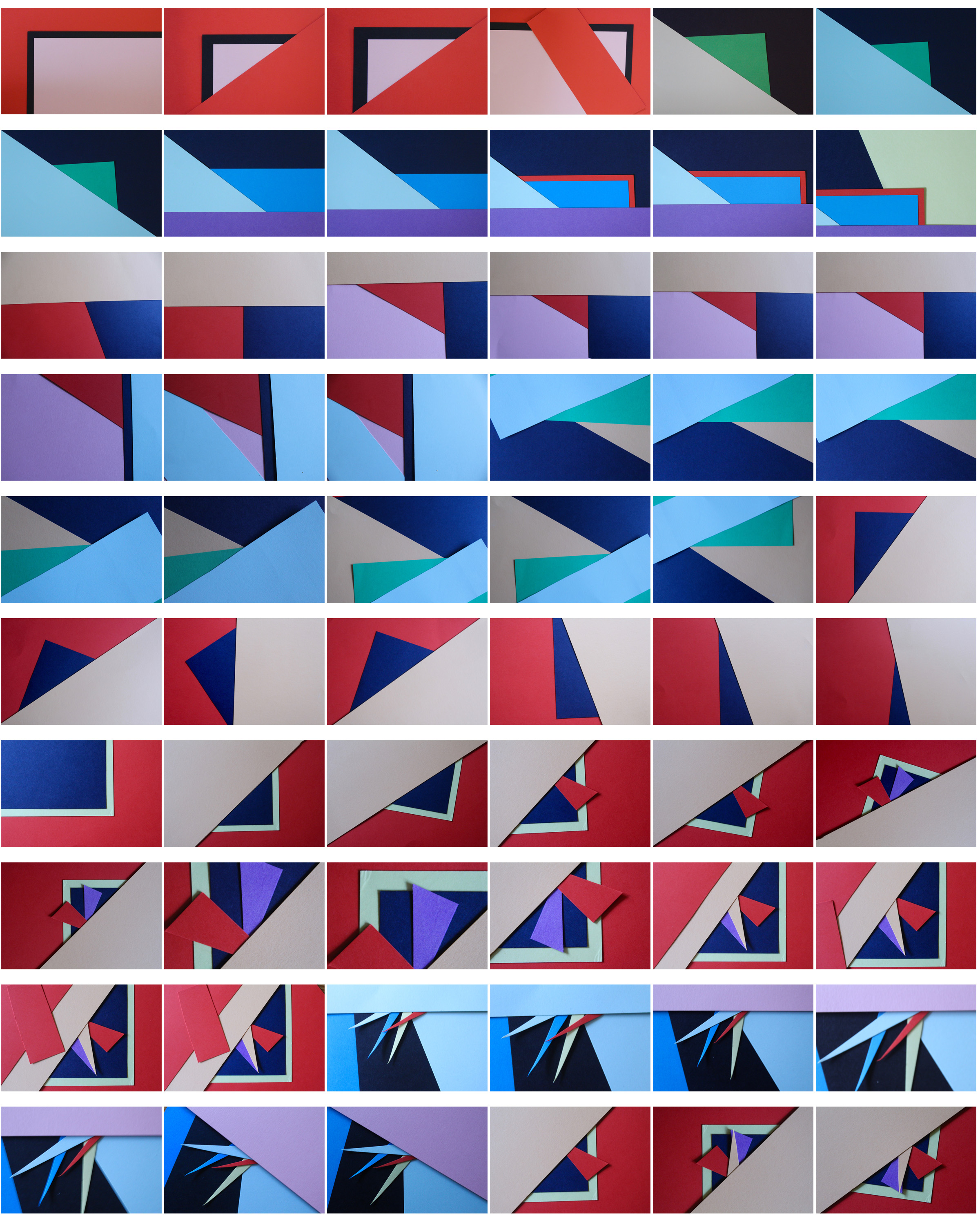
To further develop these photos I could arrange them in a different shapes, e.g. a circular shape, to frame the photos even more.
Homework Week 5
Mark Lovejoy
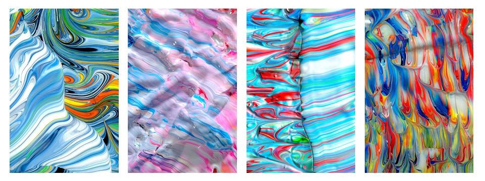
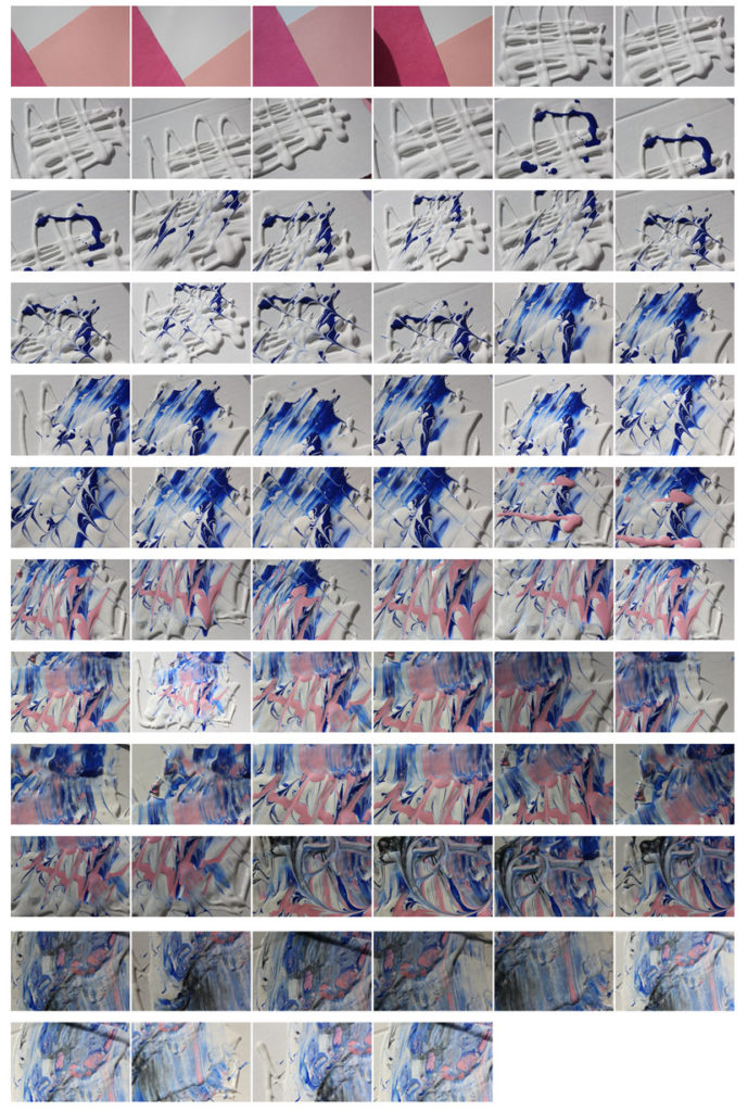
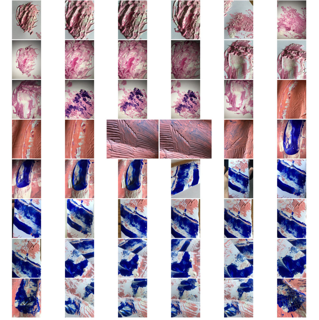
Mark Lovejoy is a painter and photographer from Texas. Alough from a glance his work looks like photographs of think mixed paint colours,m when we look closer we notice the detail in the images. Io make each image Mark mixes a variety of pigments with oils, resins and drying agents. he then takes multiple images when the paint is wet and dry so they can be manipulated and played with later. The light reflections and textures are retouched by editing which helps the images looks so detailed and created the illusion that they are standing of the page. When the paint has completely dried they no longer retail the same glossy look, this is why his work is thought of more as photography than painting because all that remains is the photograph.
Tamara Lorenz

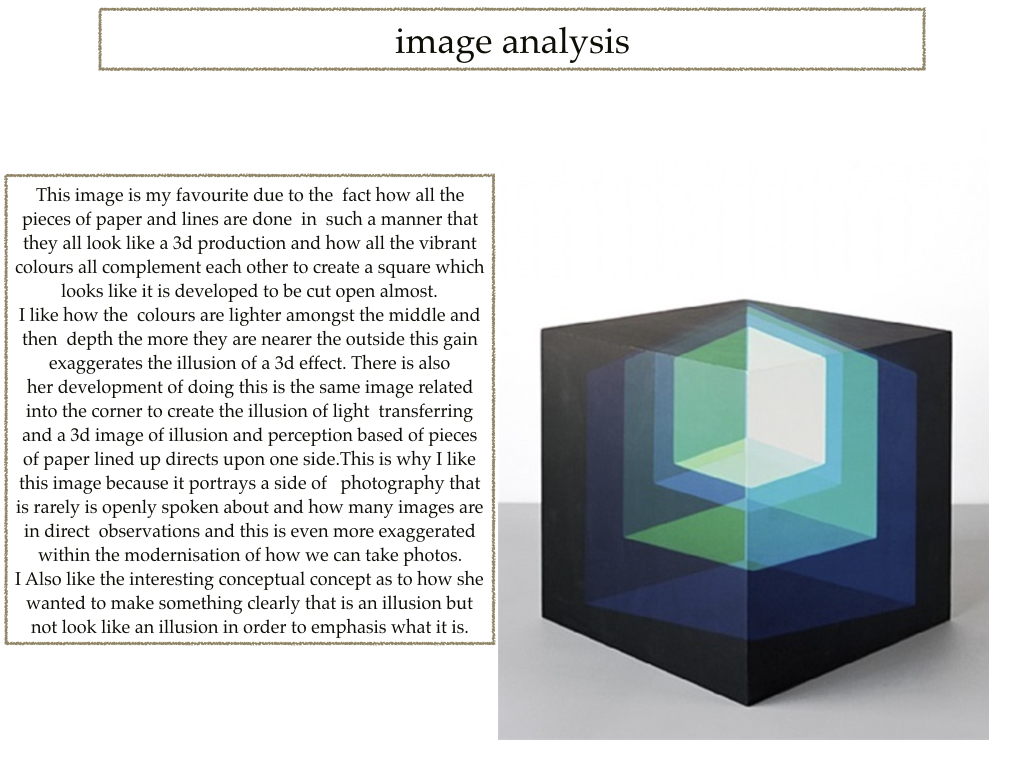
Tamara Lorenz is a German artist and photographer who creates various abstract constructions using different materials. a common theme running through her work is large areas of plane colour which contrast with the colours of the. the texture provided by the edges and shadows of the shapes makes the images look more 3D and ads depth. The photographs creates a type of illusion that becomes more complex the more you look at it.
Best Images
Homework week 4
Aaron Siskind
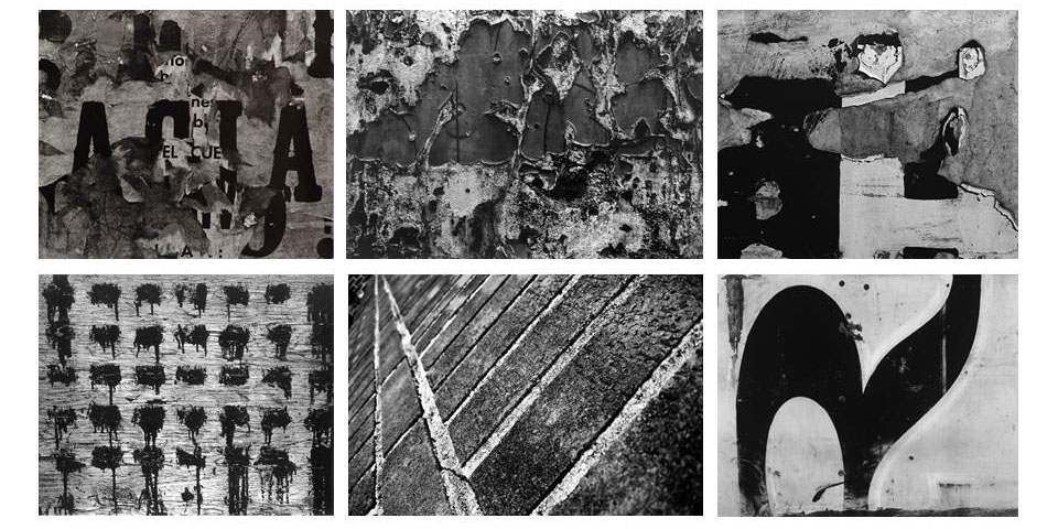
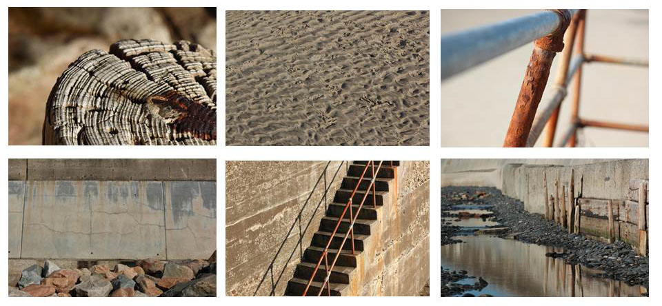
Aaron Siskind was an American photographer who’s work was popular in the 20th century. he became interested in photography in 1930 and joined a group of documentary photographers however after a time his work moved to a more abstract style. His photographs generally involve some sort of close up texture and his arrangement of objects within the frame was admired by other photographers in the abstract expressionist movement at the time. In the 1940’s and 50’s his work contributed to the avant-garde movement in America.
Frank Hallam Day
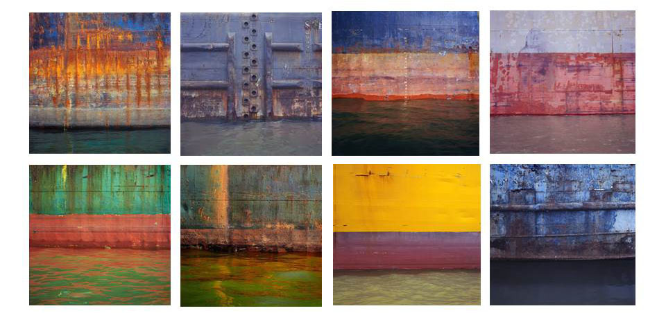
Frank Hallam Day is a photographer based in Washington who takes photos of ship hulls. His photos are have a common theme of vibrant colours interesting contrast in textures and perfect horizons. He started taking photos when he was 15, using a film camera and developing photos in a dark closet. He also has an interest in painting and we can see this style in his photos due to the bold colours and painted effect they give. The juxtaposition of the rough, rusted, paint pealed boats and the smooth water that reflects creates an interesting concept.
Tamara Lorenz and Franco Fontana
Franco Fontana

Tamara Lorenz

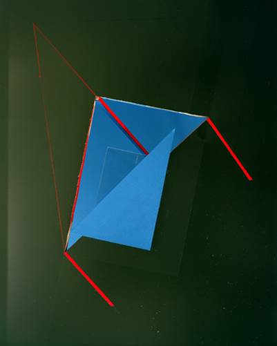
Tamara Lorenz uses geometrical shapes with solid colours to photograph. She cuts and folds the paper to achieve the shape that she wants. This photograph mainly consists of triangular shapes to give the impression of a 3D shape when in reality its only pieces of card. The folds within the photograph creates darker tones and shadows. The green background starts lighter in the top left corner and ends much darker in the bottem right, showing that the light is coming from the left. The thin lines of red create more geometrical shapes in the photo and outlines the other shapes. contrasting with the colours. At first glance, it is unclear whether the photograph itself is the artwork, or just a photograph of an exhibition, this directs attention to the tradition of photographic reproduction of artworks and its impact on the development of art and the art history since the nineteenth century.
Homework Assignment 5 – Color
Julian Schulze
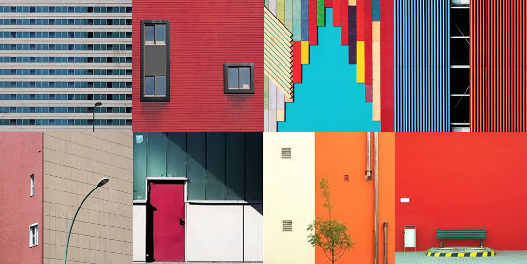
Julian Schulze is a Berlin based photographer which has an abstract and minimalist approach to photography. He is mainly focusing on the Abstract & Surreal genre of photography and it appears that he loves bold colors as well as color combinations and compositions. “I like the simple things in everyday life”. One of the most important things seen in Schulze approach is to identify freedom.
Analysis Of Photo
![]()
This image clearly shows a supposedly isolated man in what looks like an urban area between some interesting and abstract architecture. This image is aesthetically pleasing to view as it has a clear use of the rule of thirds. The image is split into three sections, the patio making up the bottom sector, the first part of the wall creating the second and the different part of the wall creating the third. Located within the bottom right box there is a fence which is used as a natural line to focus and lead us to the main subject of the man. Also the end of the fence is positioned of one of the focus points within the rule of thirds which helps to further guide the viewer deeper down the picture. This image has used natural lighting and appears that the lighting and colors have not been changed too much in the editing process leading to a extremely ‘real’ picture. I believe this image gives a sense of isolation and intimidation. This is due to the man being all alone and surrounded by buildings which appear to look down upon him creating an almost threatening approach. All this image contains is man made structures, no sights of the natural elements in our earth. I believe this shot is an indication of the rapid urbanization around the world and this is leading to humans destroying nature, plants and vegetation. It appears that the man is walking into the light and moving away from the darker place behind him. This is a clear relation to the contrast between good and bad as lightness relates and good and darkness relates to bad/evil. Perhaps this is suggesting the man has changed around his life and is moving on for the better or he is just heading into a much happier place compared to where he was before. It could also be seen that he has a ‘bright future’ as this is literally portrayed in this photo. However, on the floor we can see how the lighting has created different shaded shadows on the floor along where the man is walking. In the picture, he is walking on the darkest part of the shadow which could imply, he is not currently on the path for success but is heading in the right direction.
Photo shoot for Julian Schulze

Edits ( Minimalistic ) In the style of Julian Schulze
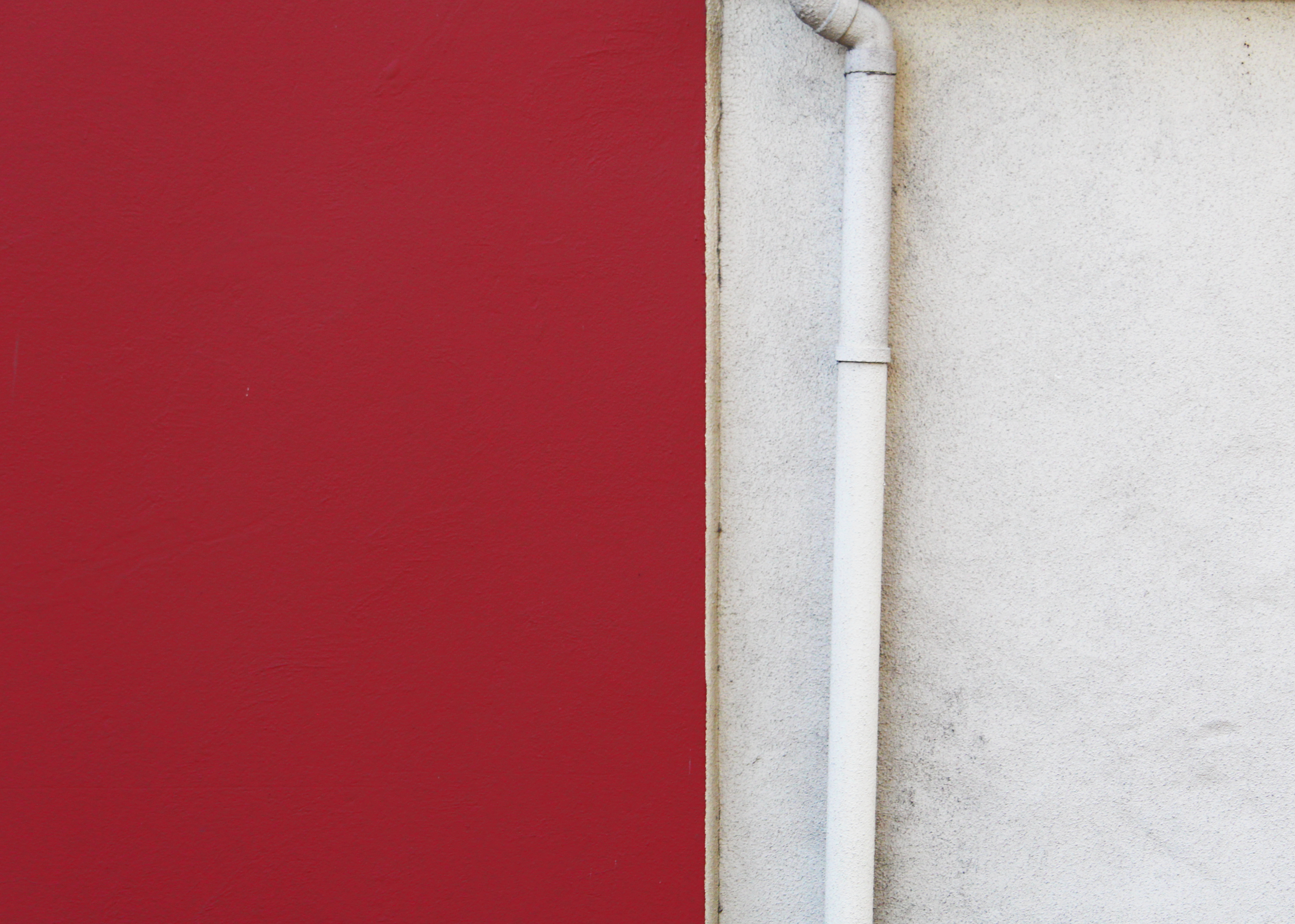


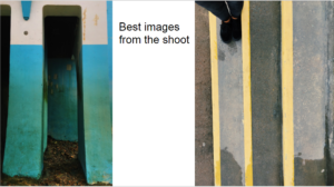
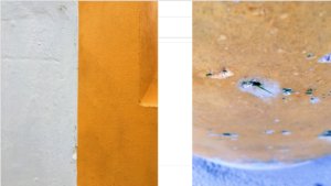
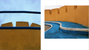
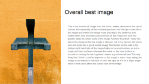
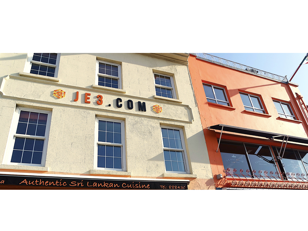
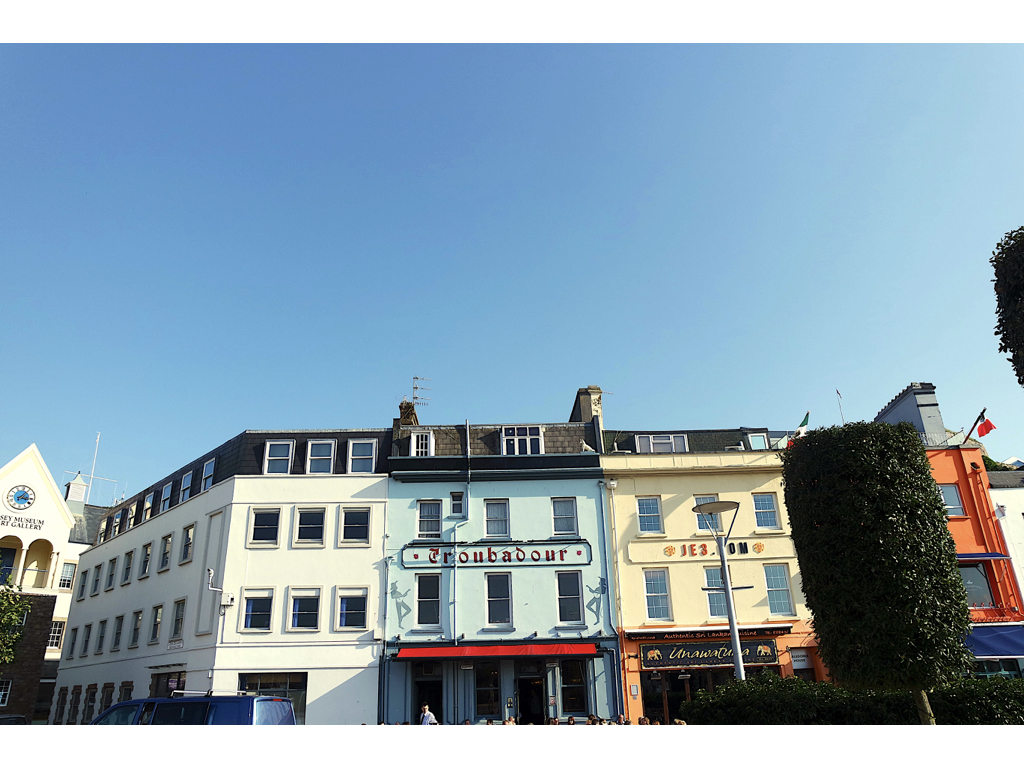
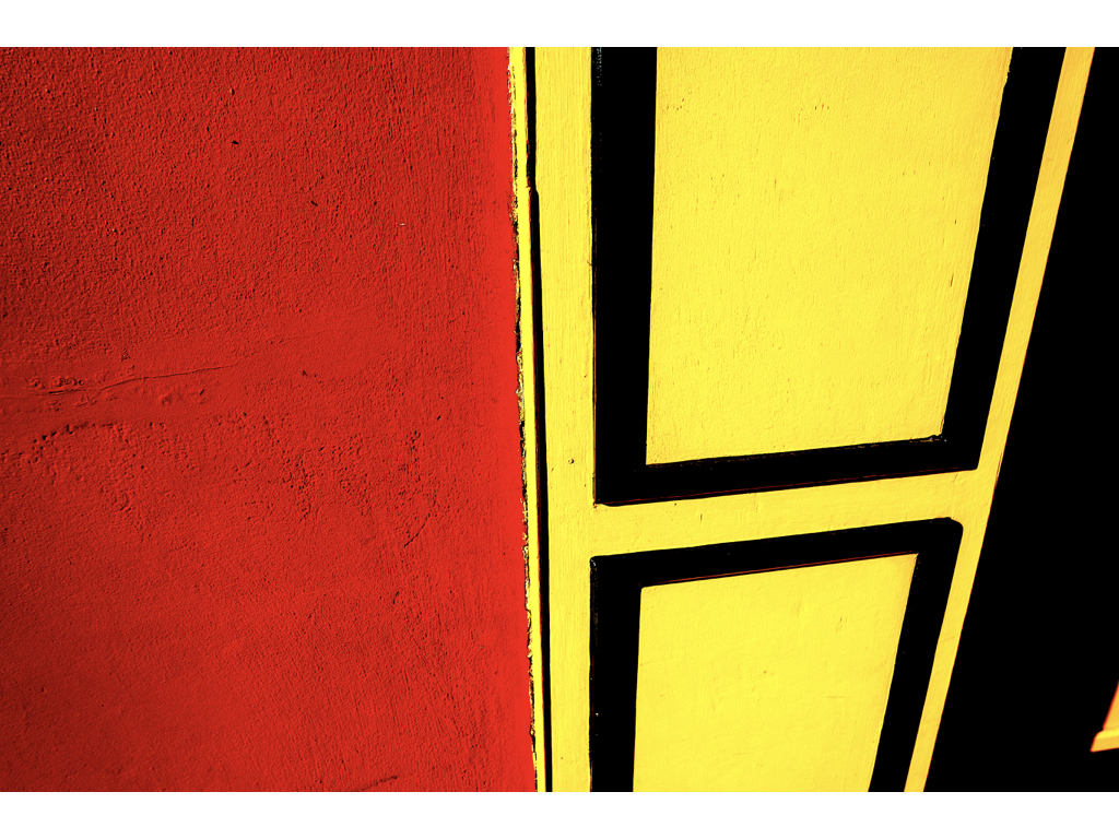
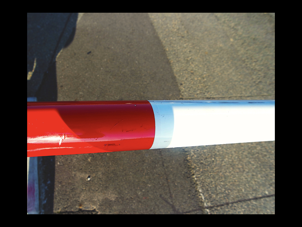
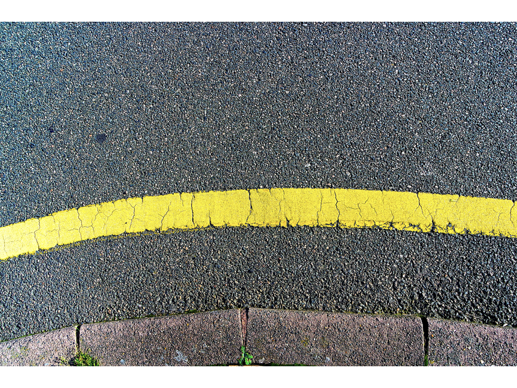
I believe these images strongly relate to Julian Schulz’s work in the sense that they capture a true response to minimalism with a strong demonstration of contrast. Also they have clearly got a sense of color which was the main focus of this shoot. I think what went well with these images is the composition I was able to achieve to allow a much more aesthetically pleasing image and the simply, yet interesting lines which separate color creating a natural, strong contrast. However I believe i could have improved the surrealism within the images to better portray the abstract theme and create an even more interesting photograph.

