Frank Hallam Day
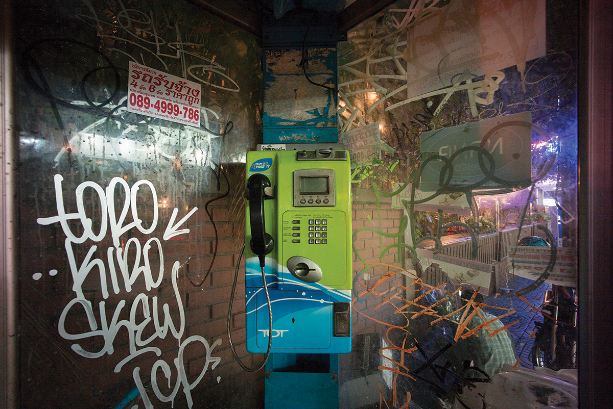
- Frank Hallam Day is a fine art photographer in Washington. He has taught photography at the Smithsonian Institution in other local programs.
- His work is in numerous museum and private collections in the United States and abroad, including the State Museum of Berlin, the Baltimore Museum of Art, the Portland Art Museum, the San Diego Museum of Photographic Arts and the Corcoran Gallery of Art.
- His artistic interests revolve around the themes of culture and history, and humanity’s footprint on the natural world. Recent projects include the erasure of personal and cultural memory in East Berlin, and on the impact of globalization on African identity.
- He was a winner of the prestigious Leica Oskar Barnack Prize in 2012 and the Bader Prize in 2006, and was a finalist both for the Sondheim Prize in 2007, the Sony Prize in 2010, the Voies Off Prize at Arles in 2010, and has received several grants from the District of Columbia Commission on the Arts and Humanities. He was Artist in Residence at Acadia National Park in 2007, and was U.S. Cultural Envoy to Ethiopia in 2008. He has juried and curated numerous photography shows and competitions in the Washington area. He also writes on photography for Photo Review.
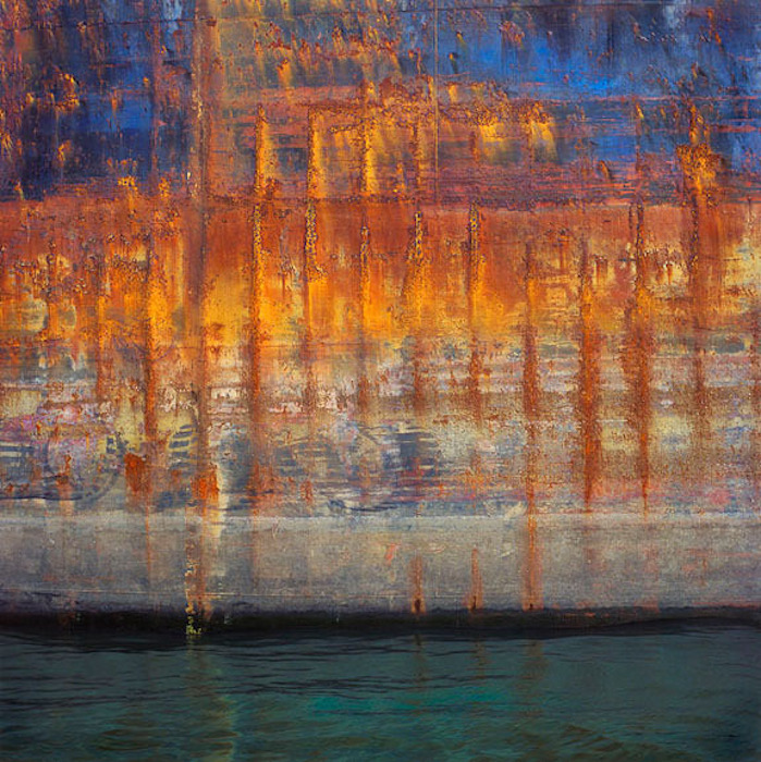
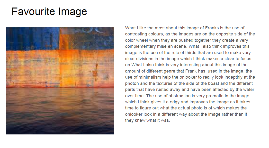
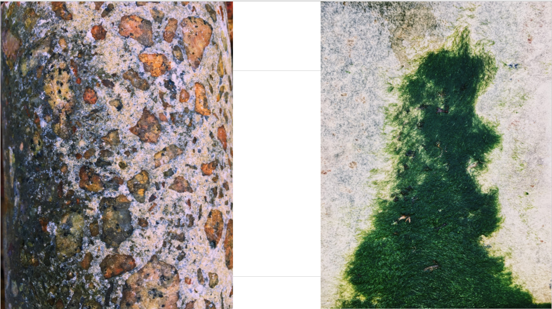
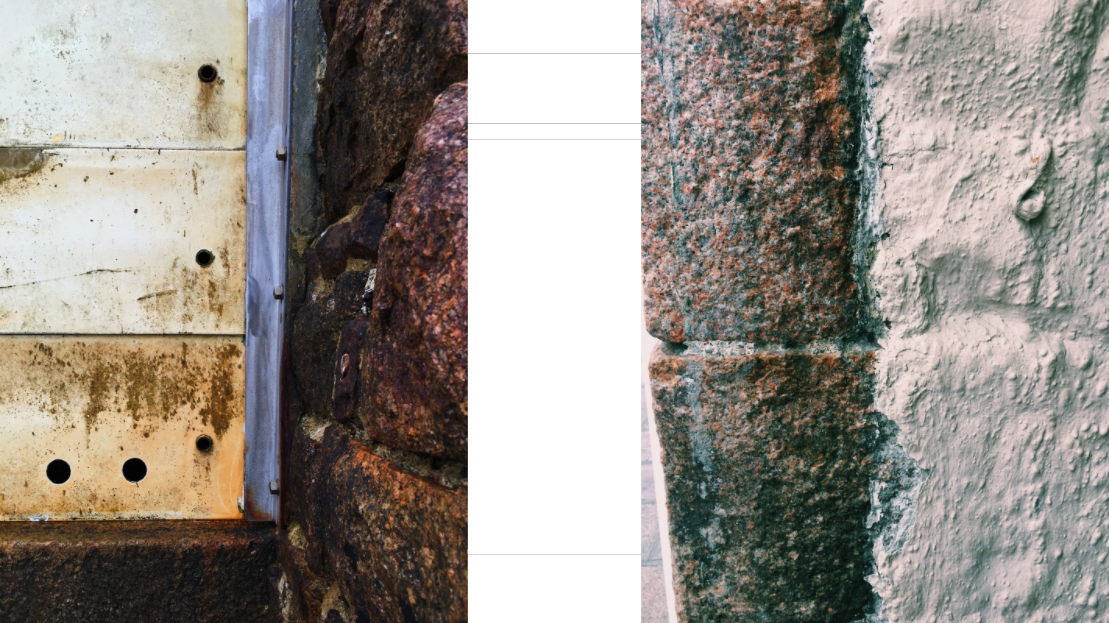
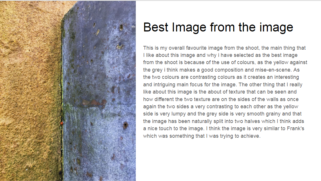
I was inspired by Frank’s use of vibrant colours on roughly textured backgrounds as it shows of the detail in their surface.
Aaron Siskind
- Aaron Siskind was an American photographer born December 4th, 1903
- He is considered to be a massive part of the abstract expressionist movement.
- He began his foray into photography when he received a camera for a wedding gift and began taking pictures on his honeymoon. He quickly realized the artistic potential this offered. He worked in both New York City and Chicago.
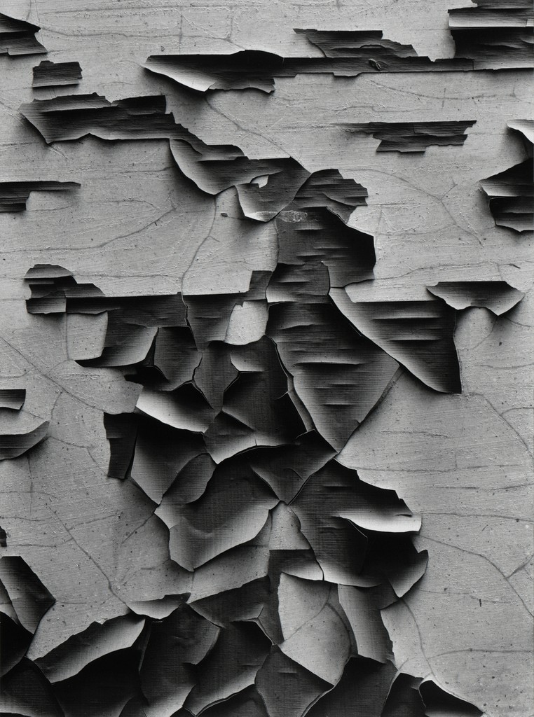
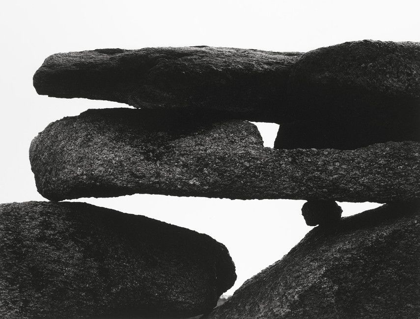
- Siskind’s work focuses on the details of nature and architecture. He presents them as flat surfaces to create a new image out of them, which, he claimed, stands independent of the original subject. His work has been described as crossing the line between photography and painting.
- He died on February 8th, 1991.
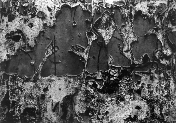
I felt inspired by Aaron’s work to use dark contrasted colours over different textures to present the different tones in their surfaces.
Image Analysis
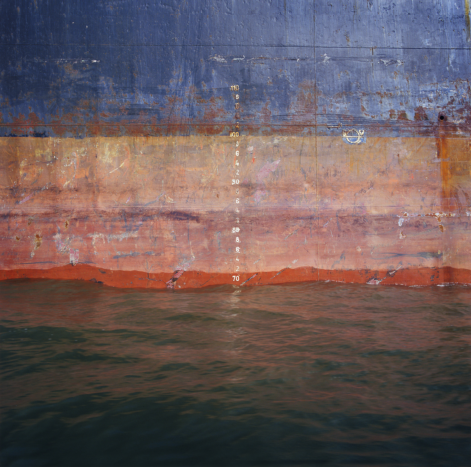
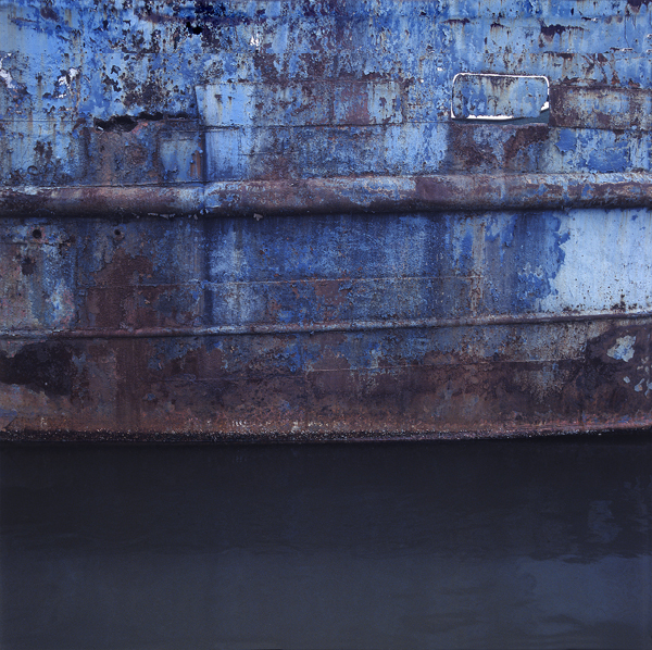
Frank Hallam Day uses a variety of natural textures such as the sea waves and the rust on an industrial ship. His image is composed into equal thirds with each section a different colour, allowing for the different textures to stand out from each other. Assuming he used a fast shutter speed, the sea waves provide a rich clarity in detail. The Ship Hulls series shows Frank’s interest in shipwrecks and travelling as he went across Lagos, Nigeria taking a photo everyday. Frank presents vibrant colours through this image, in reflections and the ship surface.
My Work
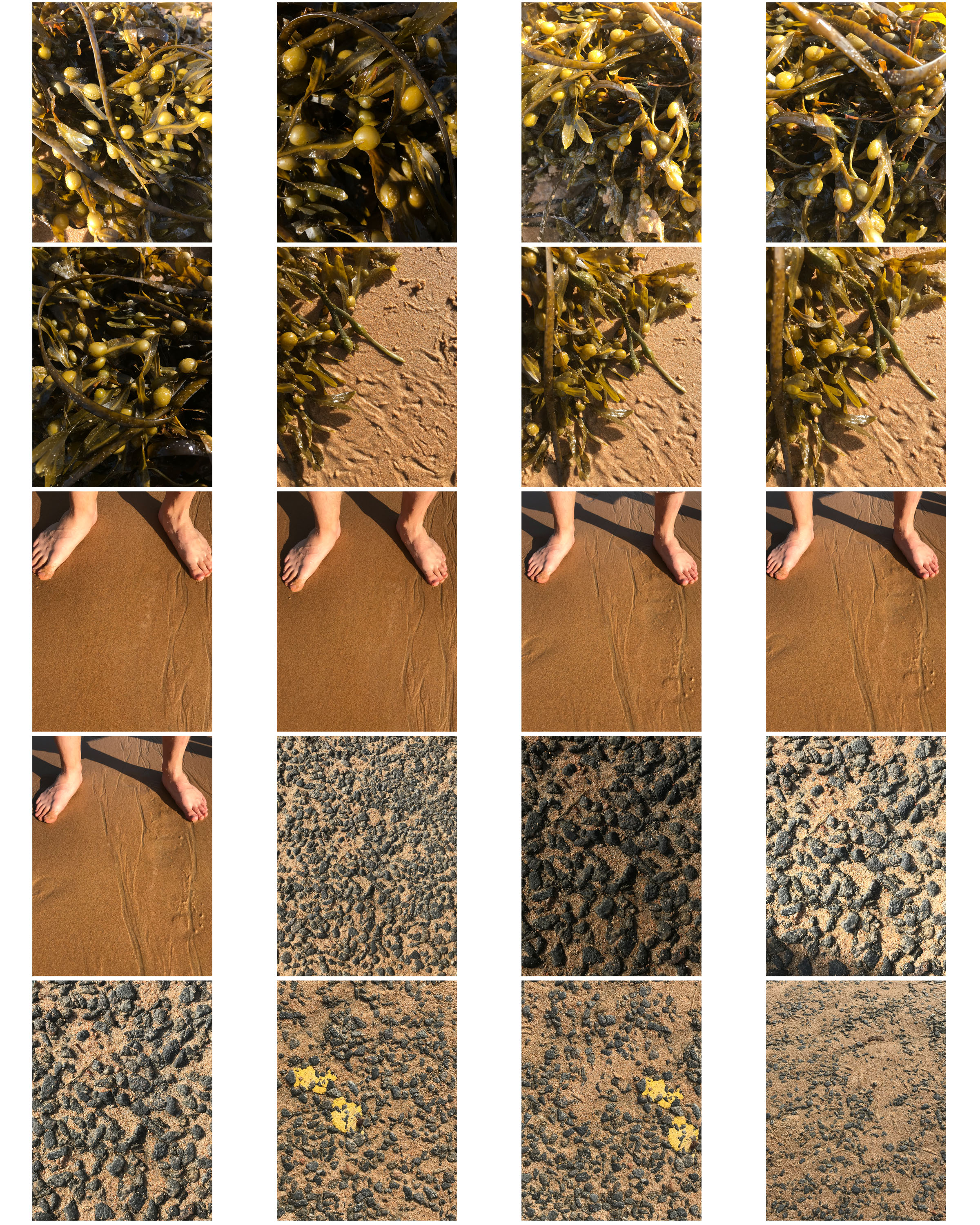
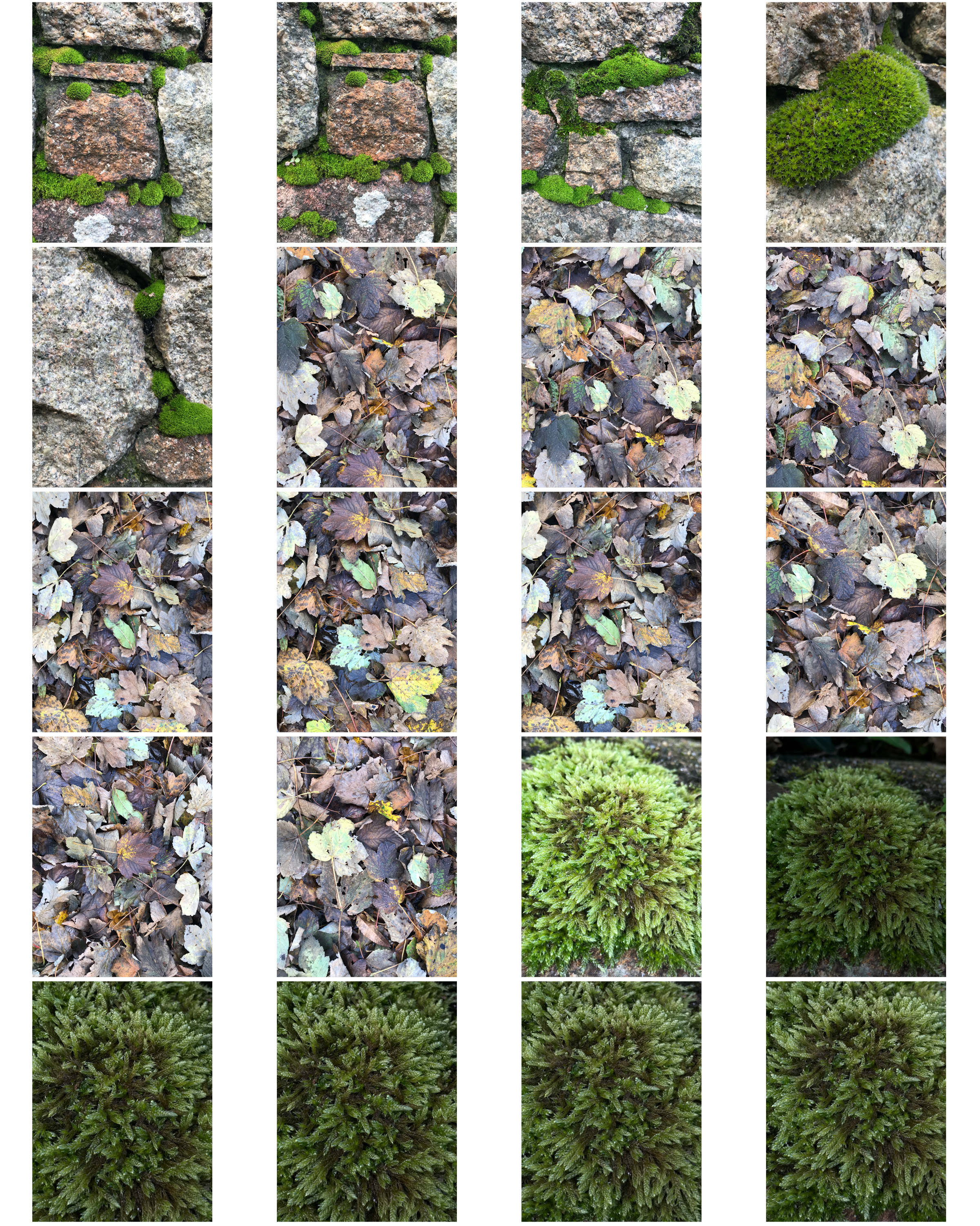
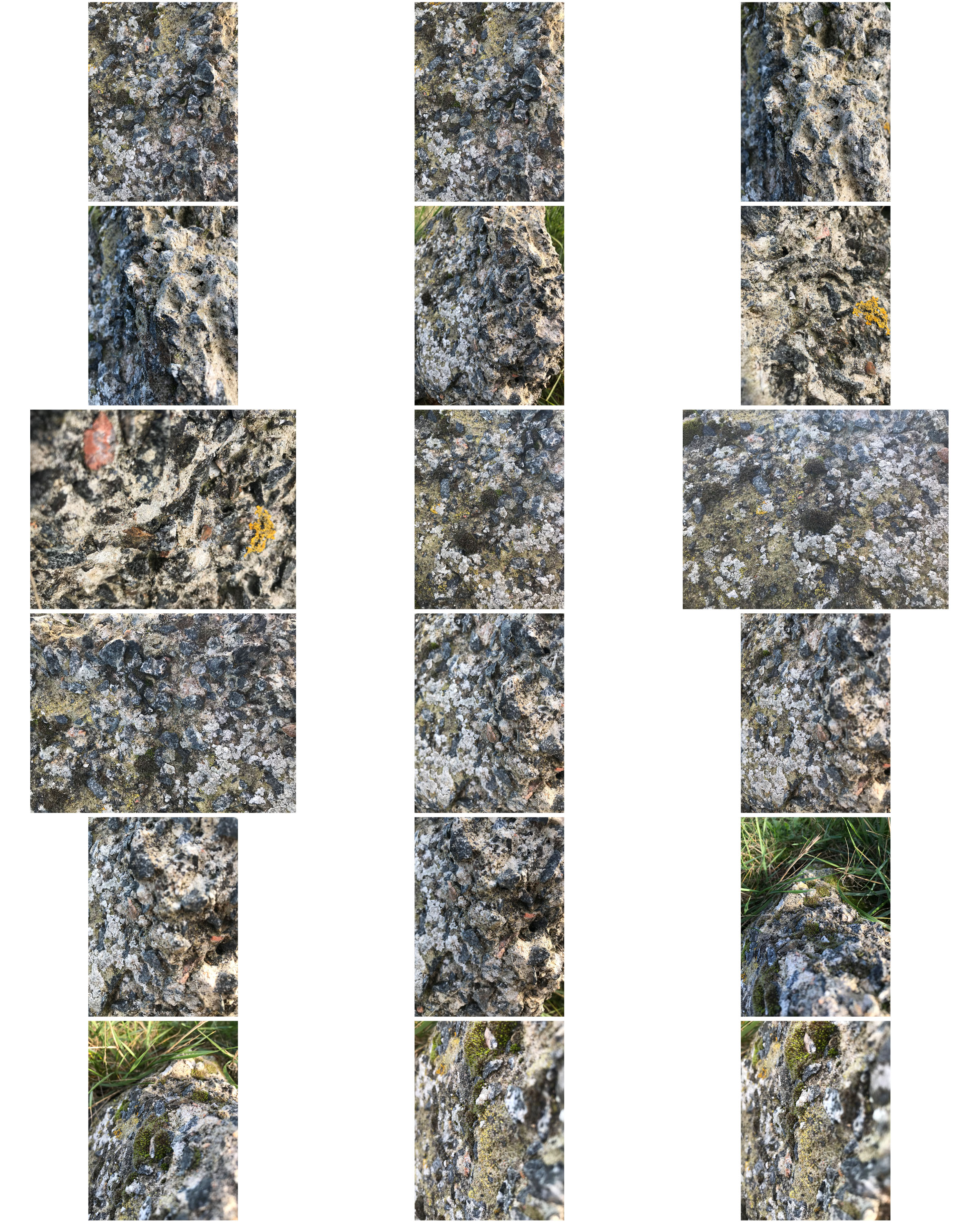
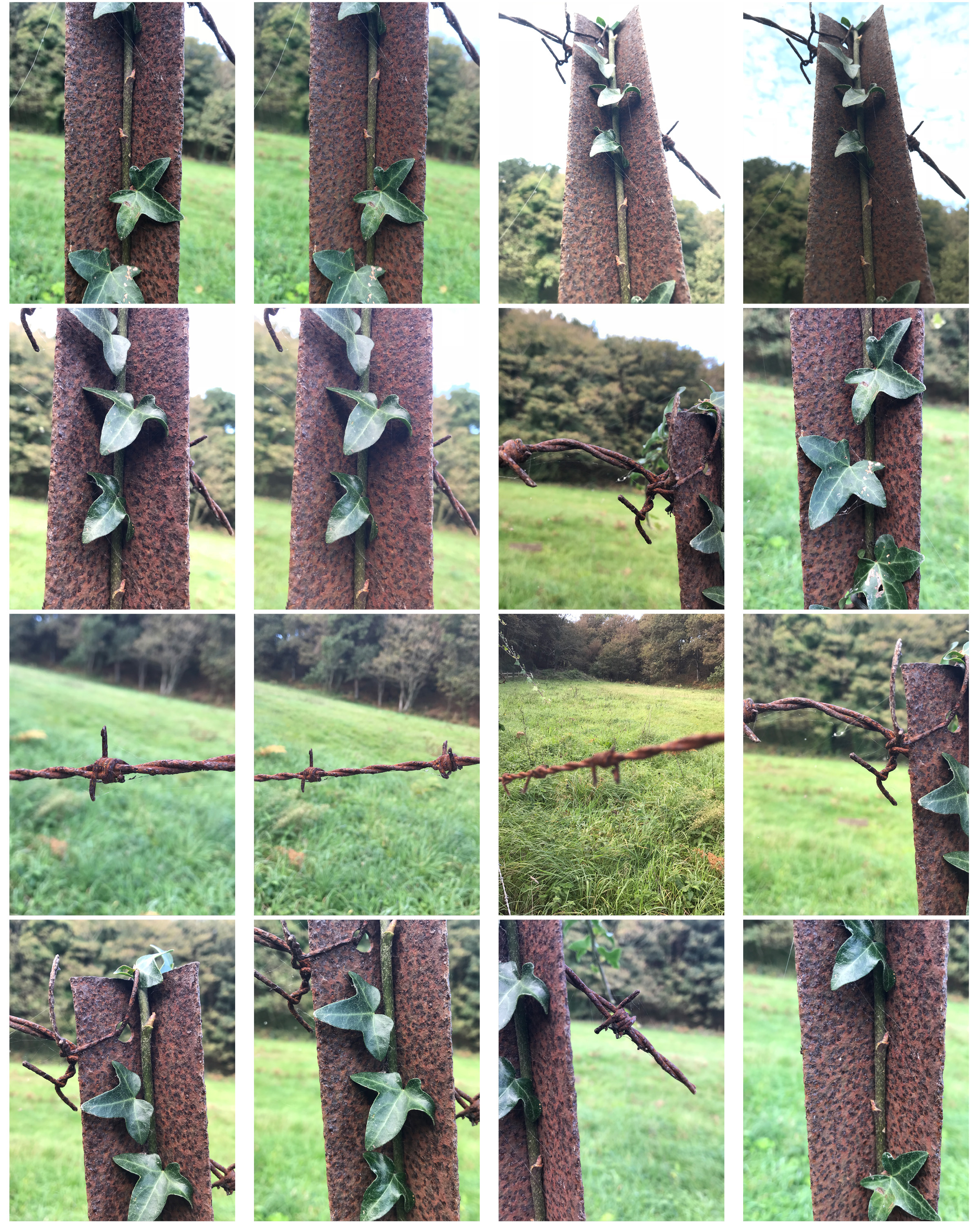
Edits
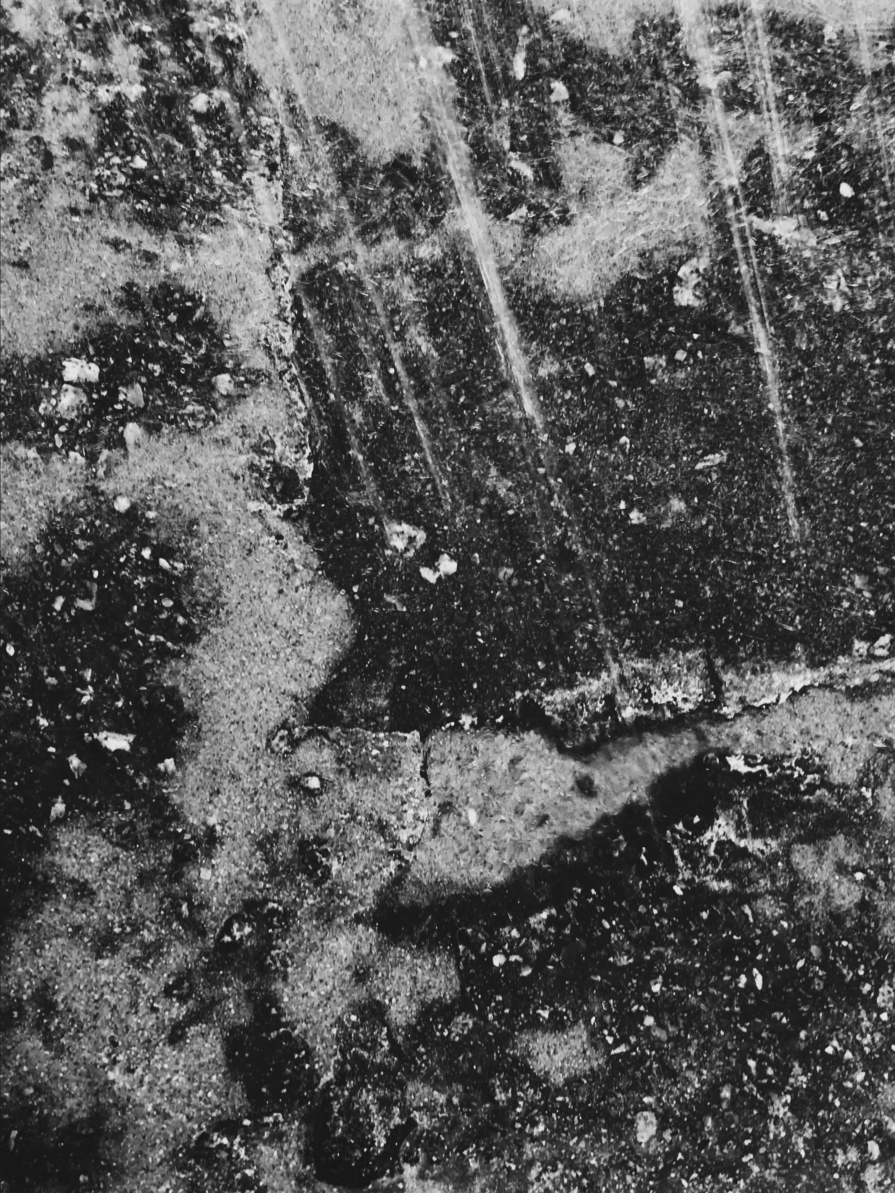
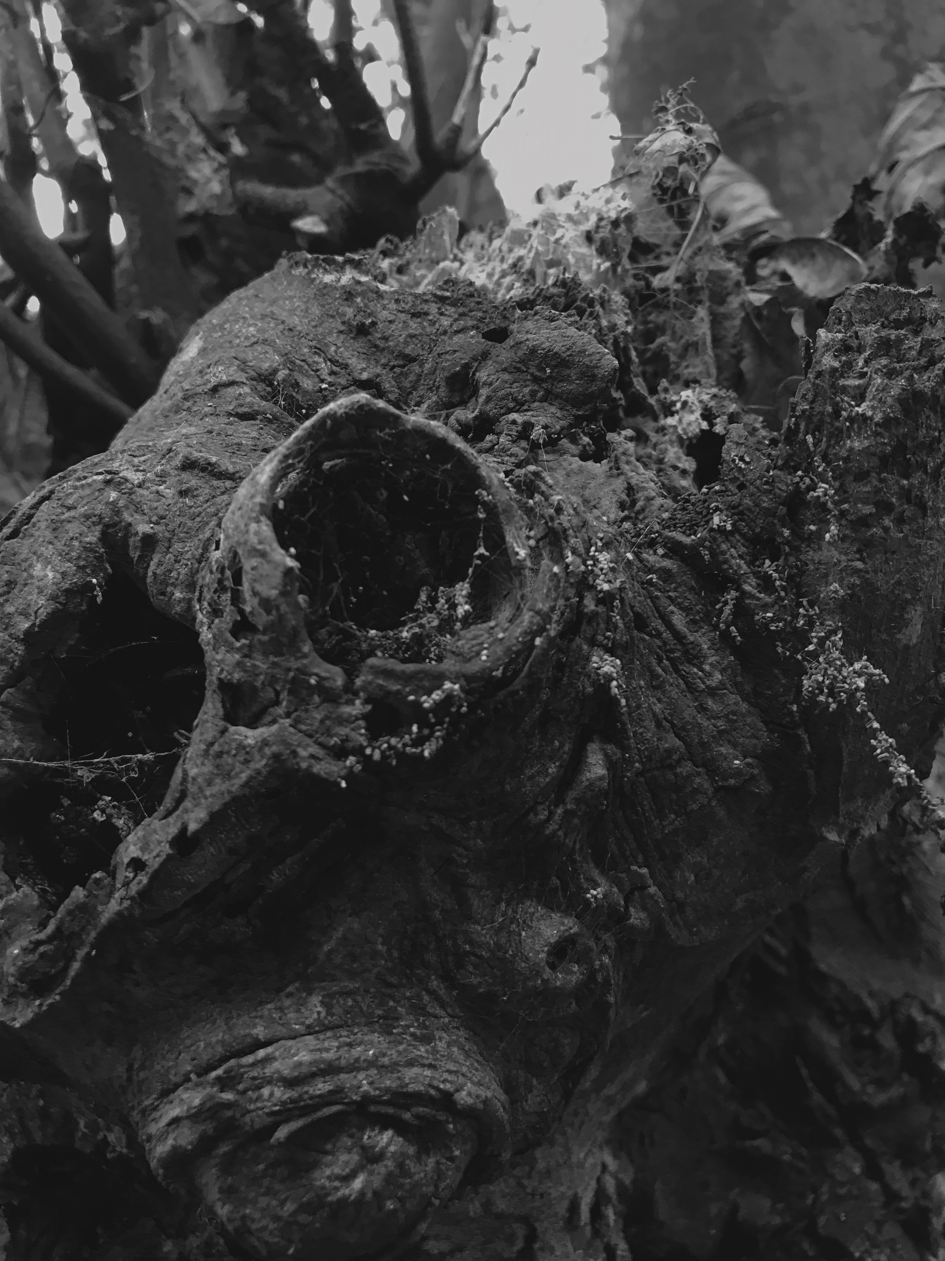
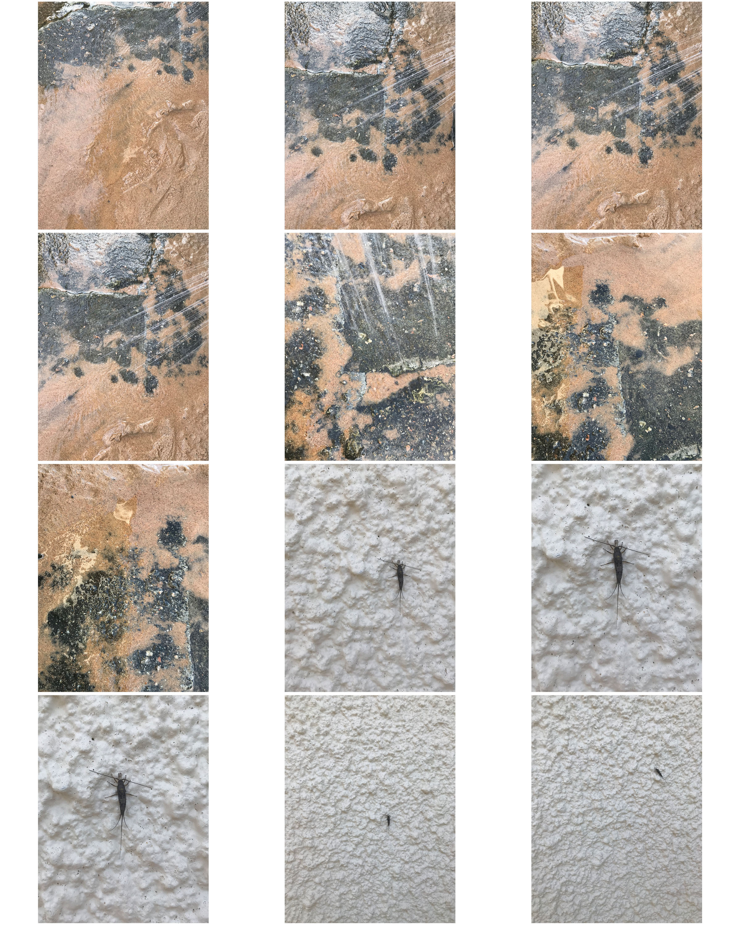
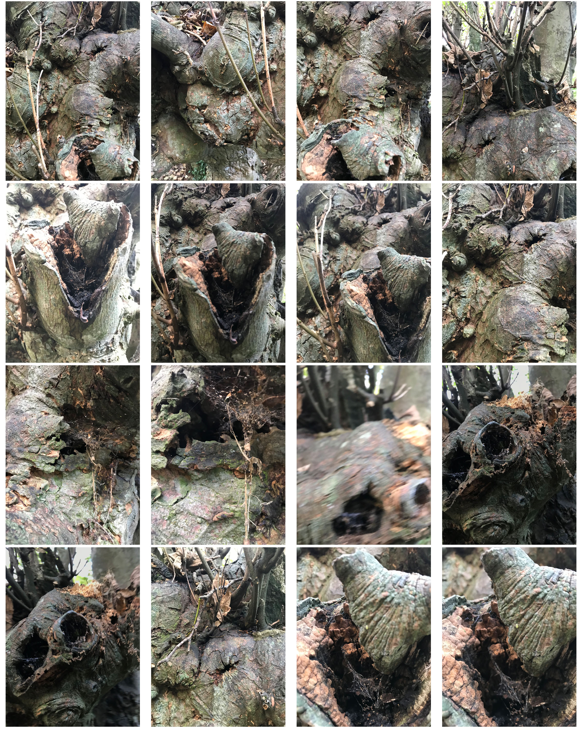
I edited the above images in black and white like Aaron Siskind’s work. I liked the balance of dark to light tones and felt it might be included in the Ansel Adams Zone System.
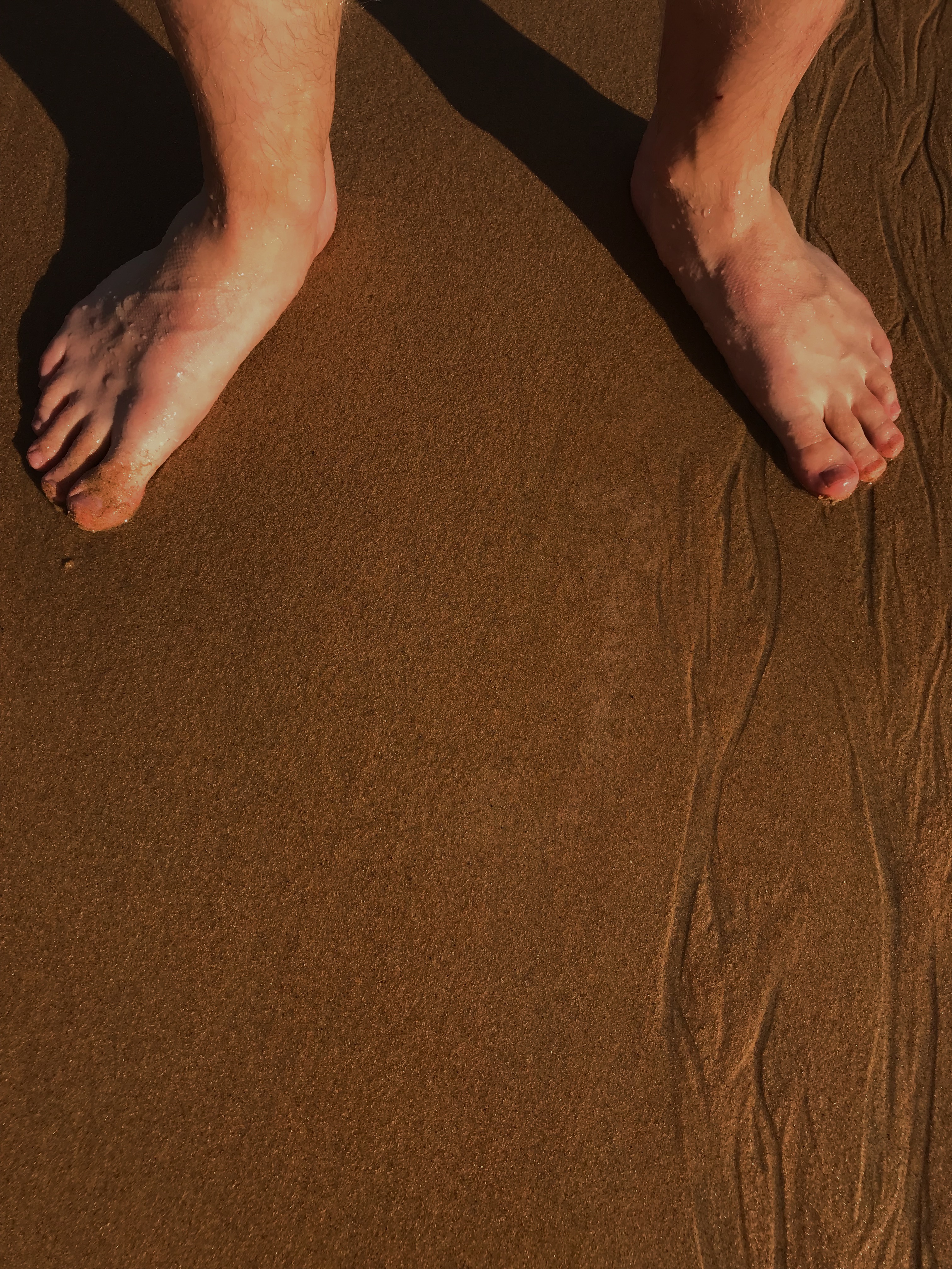
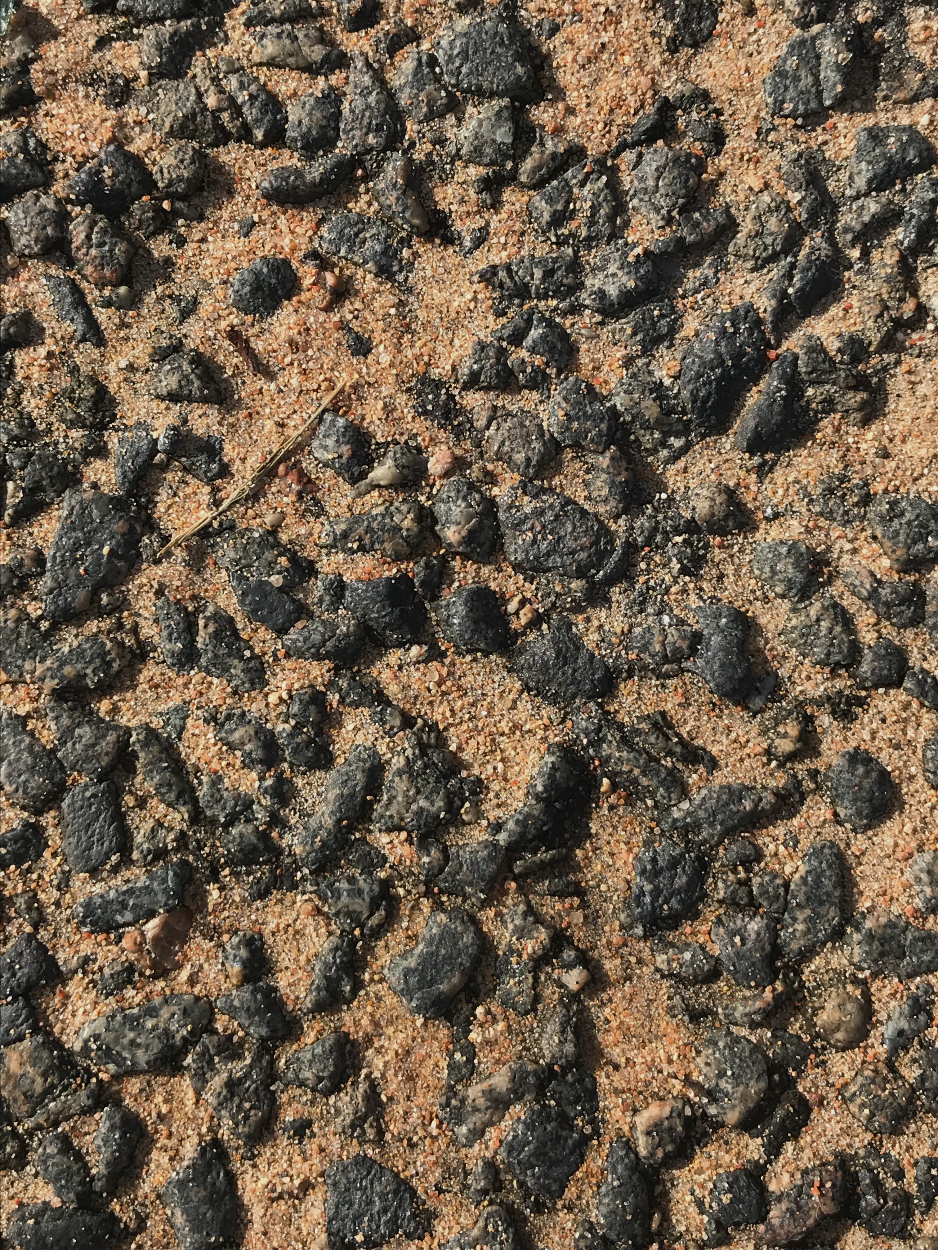
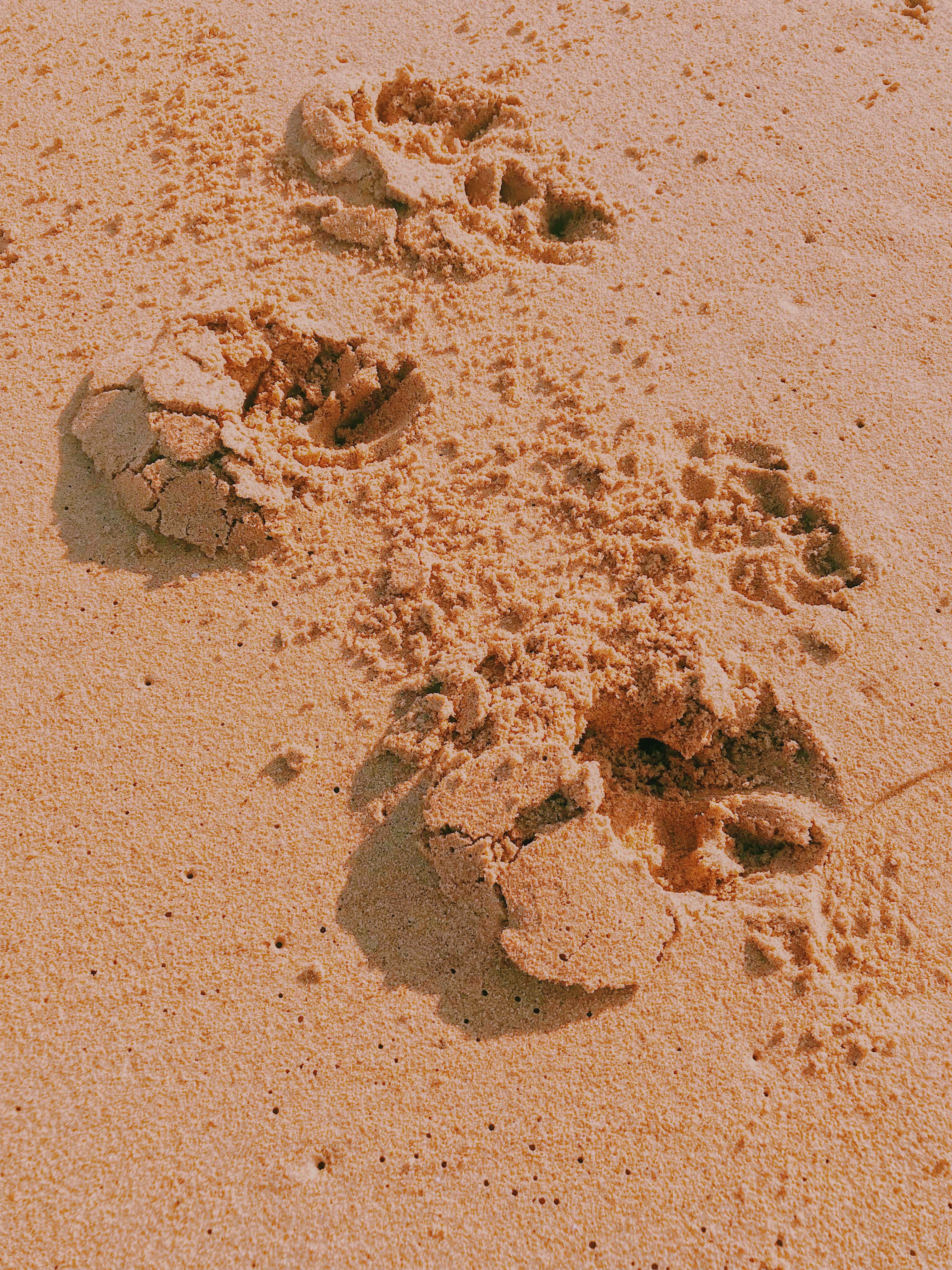
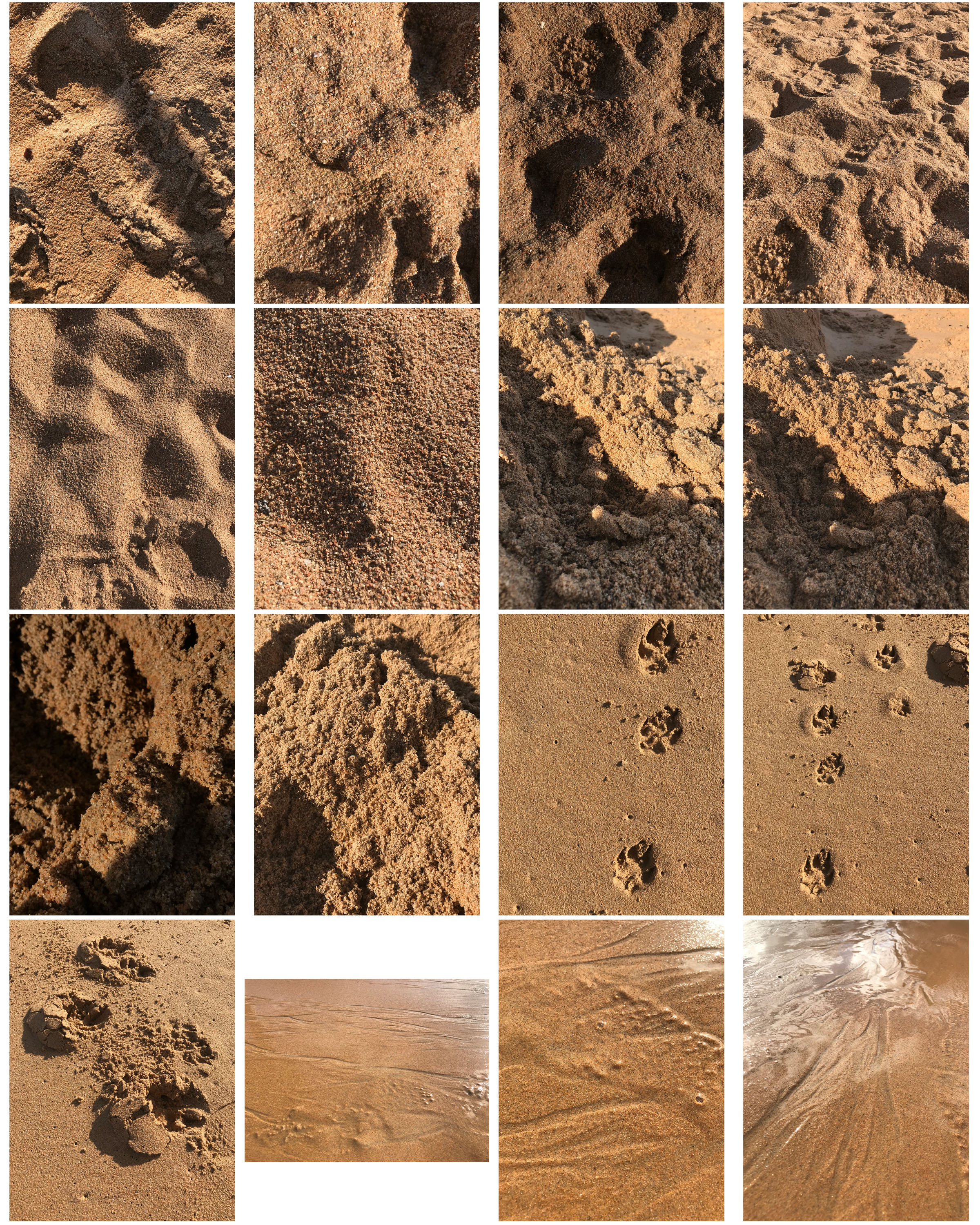
I liked the textures of the sand especially when it had been messed up by footprints or gravel. These images worked better in colour to show the different tones of the sand in comparison to other things such as the feet in one image or the gravel rocks in another.
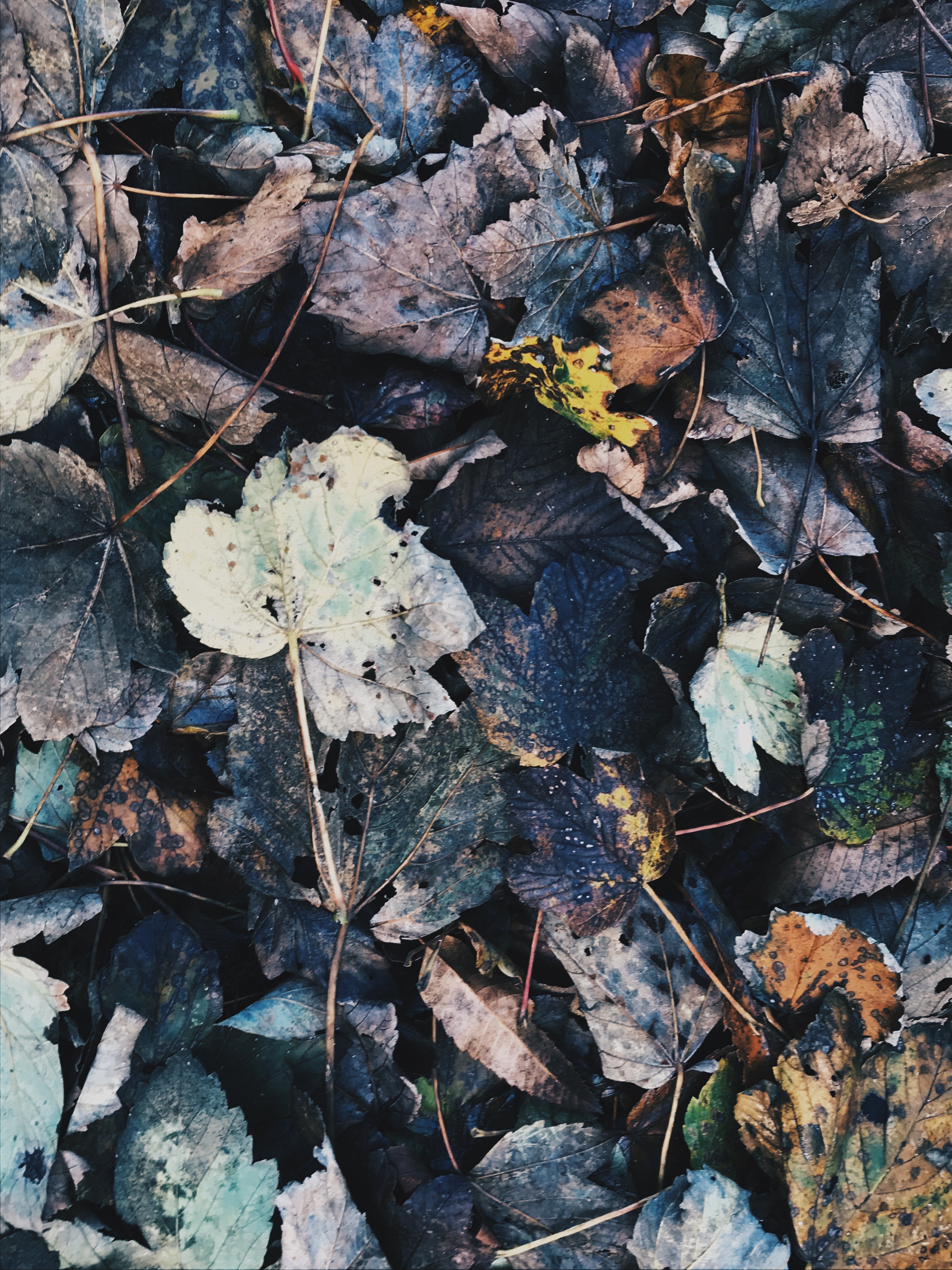
I experimented with different filters on the ‘VSCO’ app to bring out different tones in the subjects of an image. For example, in the above image, I liked the mixture of dark browns and blacks to brighter oranges and greens.
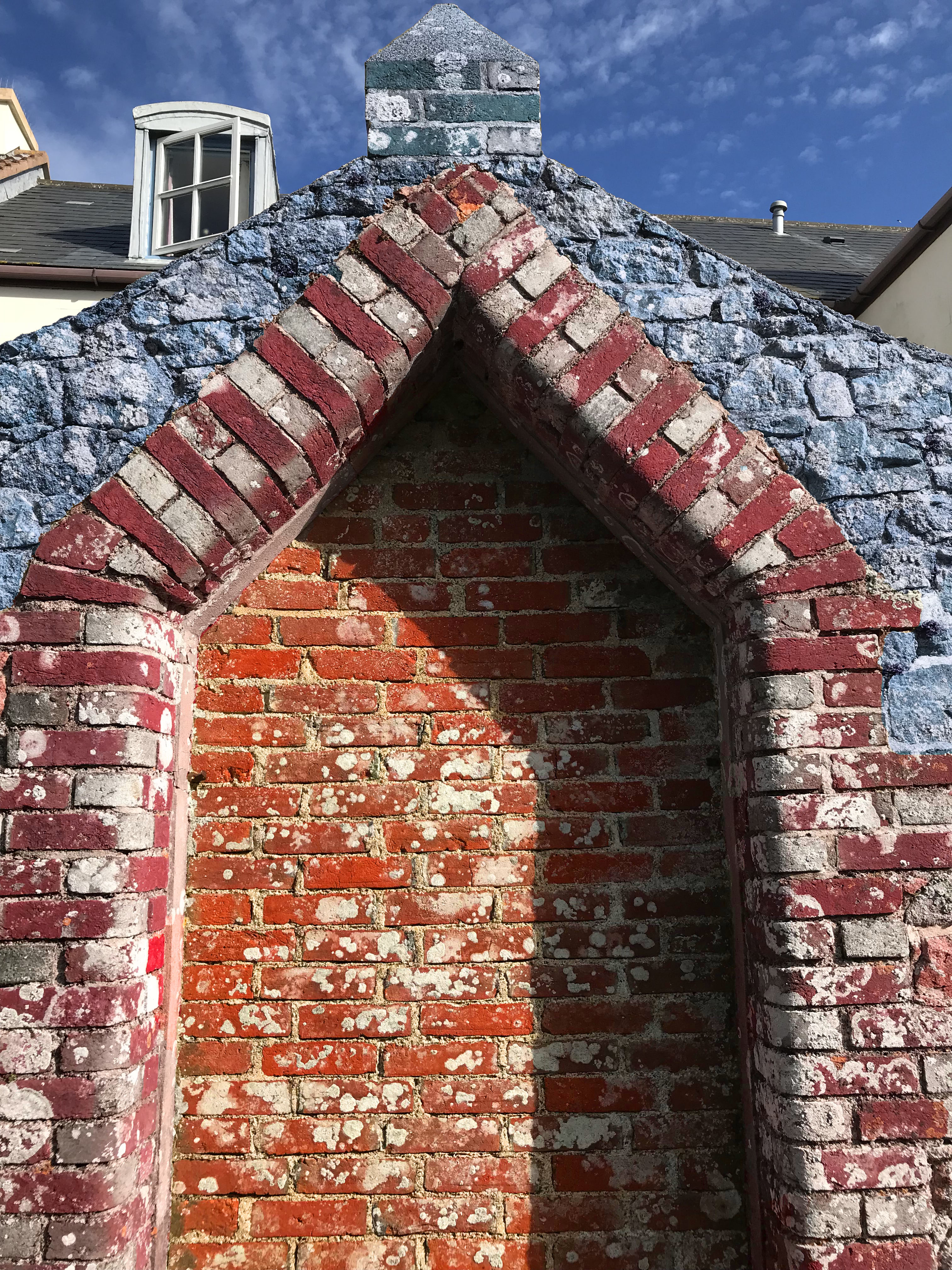
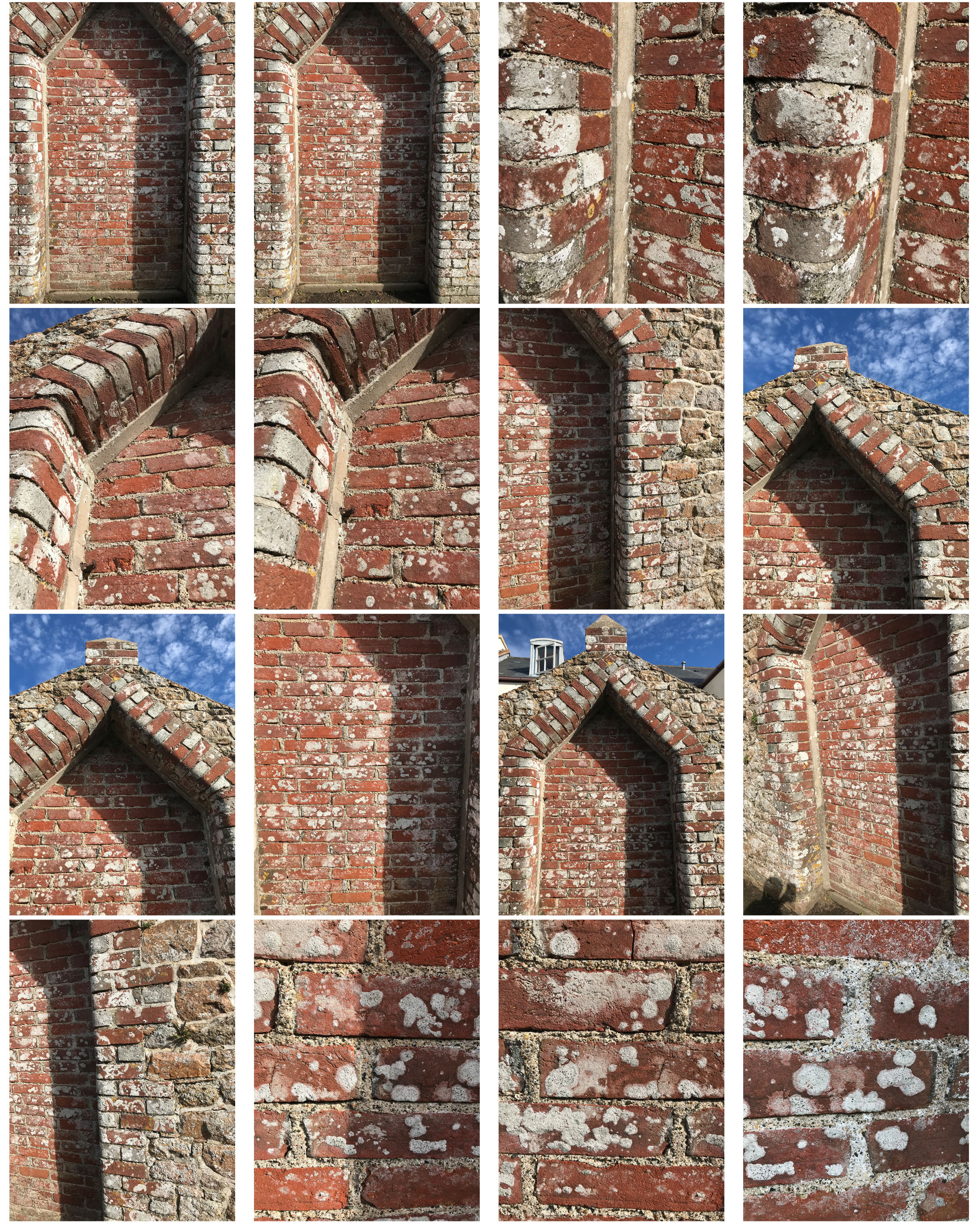
I quick selected each part of this wall and changed the hue colours to contrasting warm and cool tones that made it similar to Frank Hallam Day’s work.
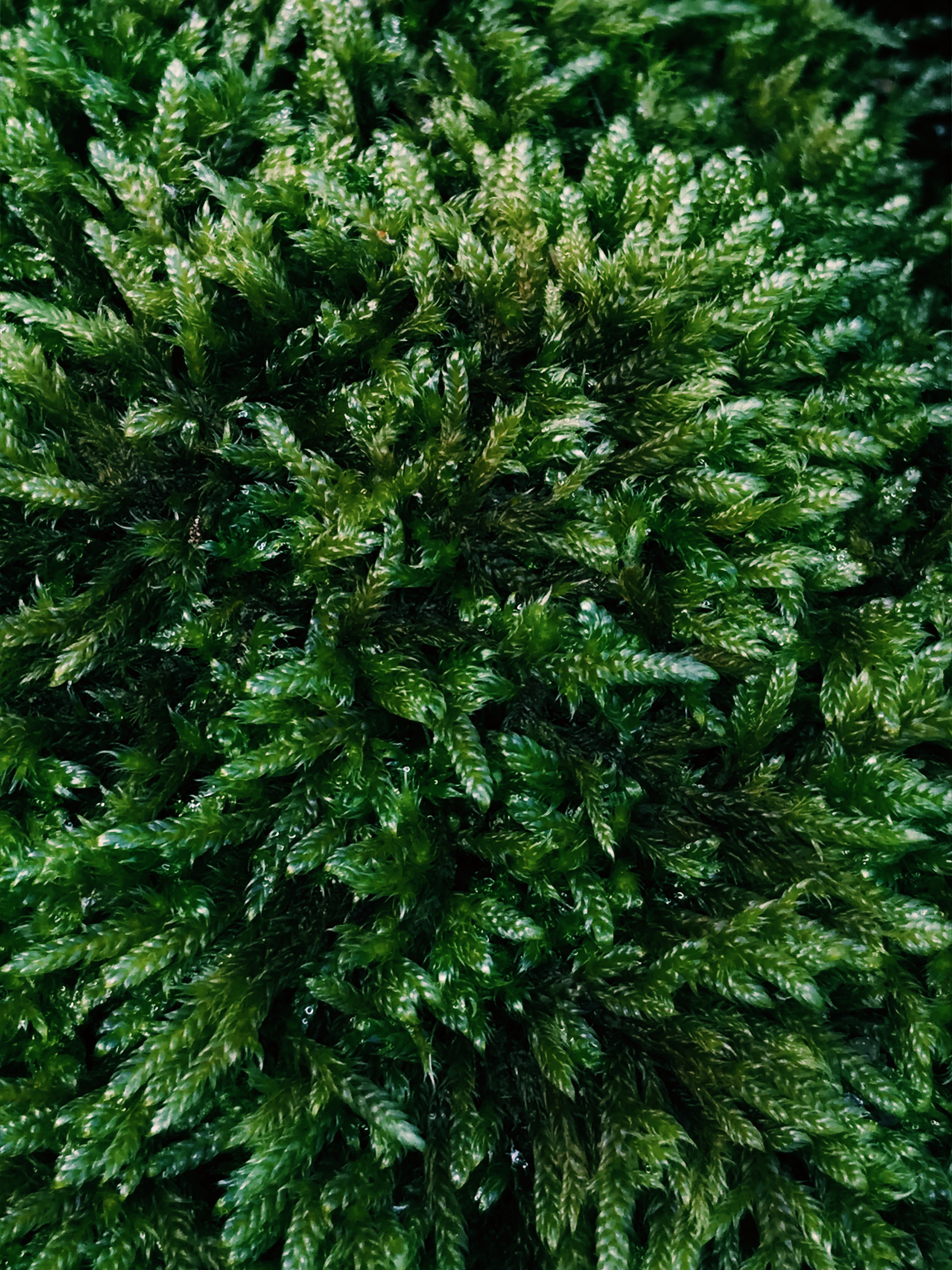
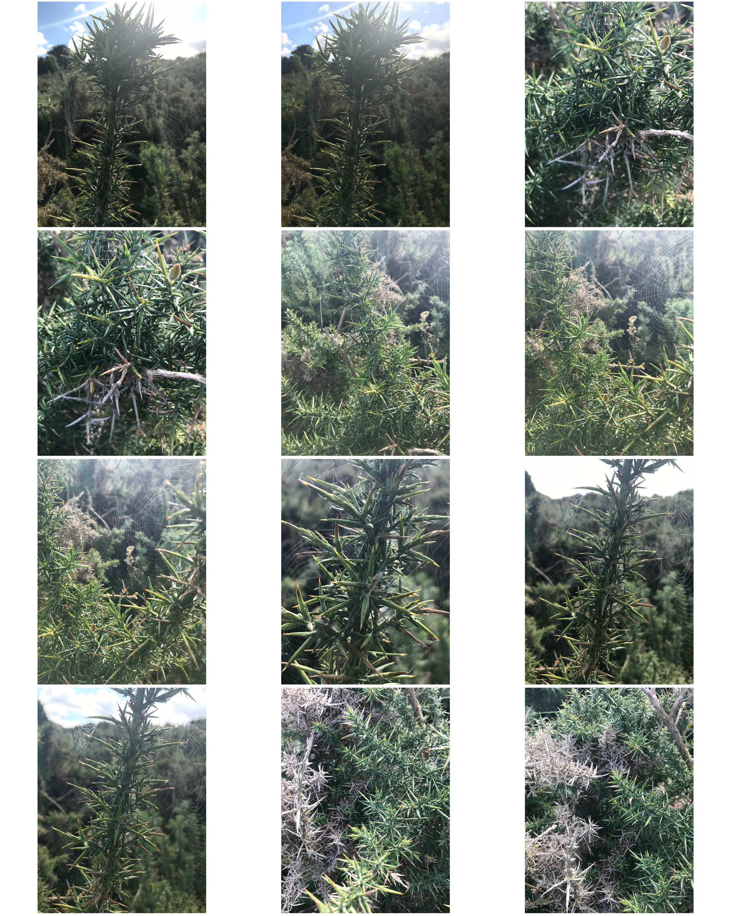
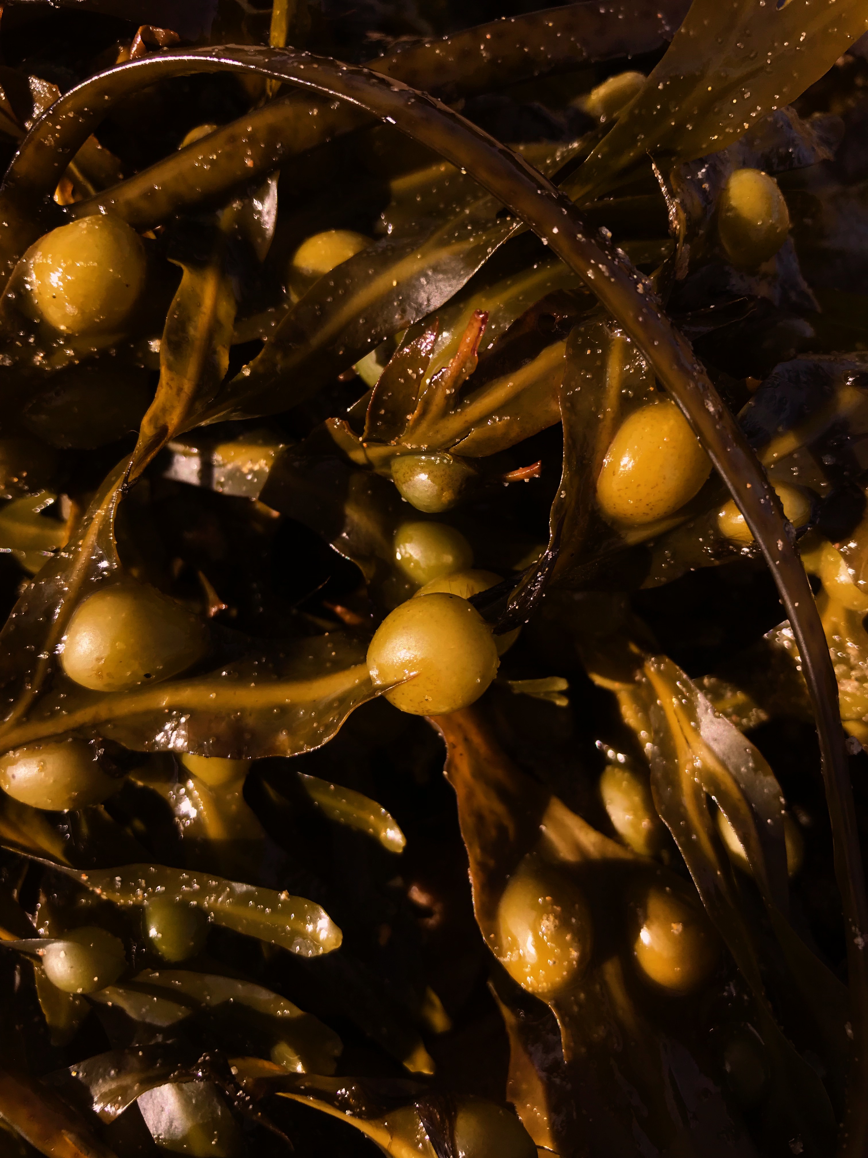
In this image, there is a subtle blur yet vibrant colours draw the viewers eyes in. The natural light from above as well as the darker shadows help give the moss more texture by adding shine. I took this photo as a close up which makes it feel like a mini jungle of moss.


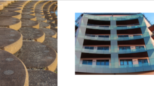
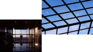
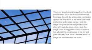

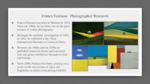

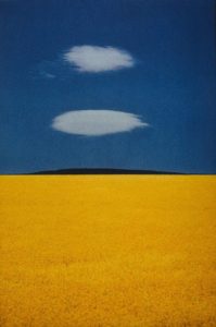
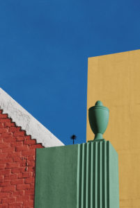
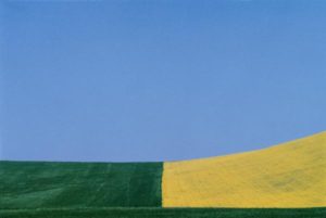 His work focuses on the enhanced colours that contrast and compliment each other. Visually, his photographs are aesthetically pleasing and minimal, yet the mise-en-scene in some photographs have a unnatural and toxic feel because of the intense colours.
 This image stood out to me because of the repetitive use of red is almost like the scene was composed to fit together for the photograph. However the image was probably edited after it was taken to create a perfect scene of red.
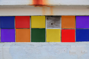
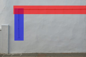
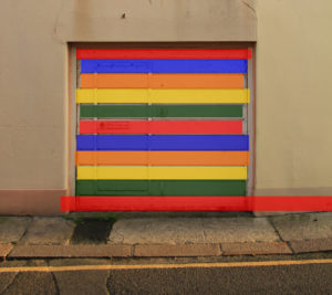

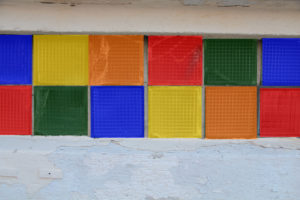
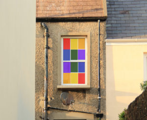
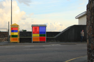
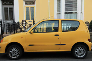 I used Photoshop to edit all these image to give eah of them unordinary colours that make the photographs stand out more. I kept the same colours in each photograph because I think the photos as a collection present a better response for Fontana. I used these photos because I wanted to bring ordinary photos onto another level.
 I wanted to incorporate this effect into many of my photos taken, and do decided to do this through corners of color paintings and instruments to mimic this style.
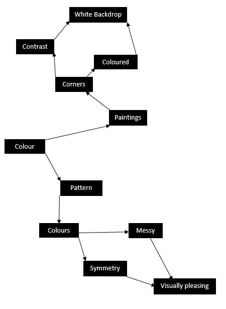 I used this mind map as my basis for the shoot, where I would occasionally use this to find what I needed to focus on most importantly. From this these were my results in the shoot:

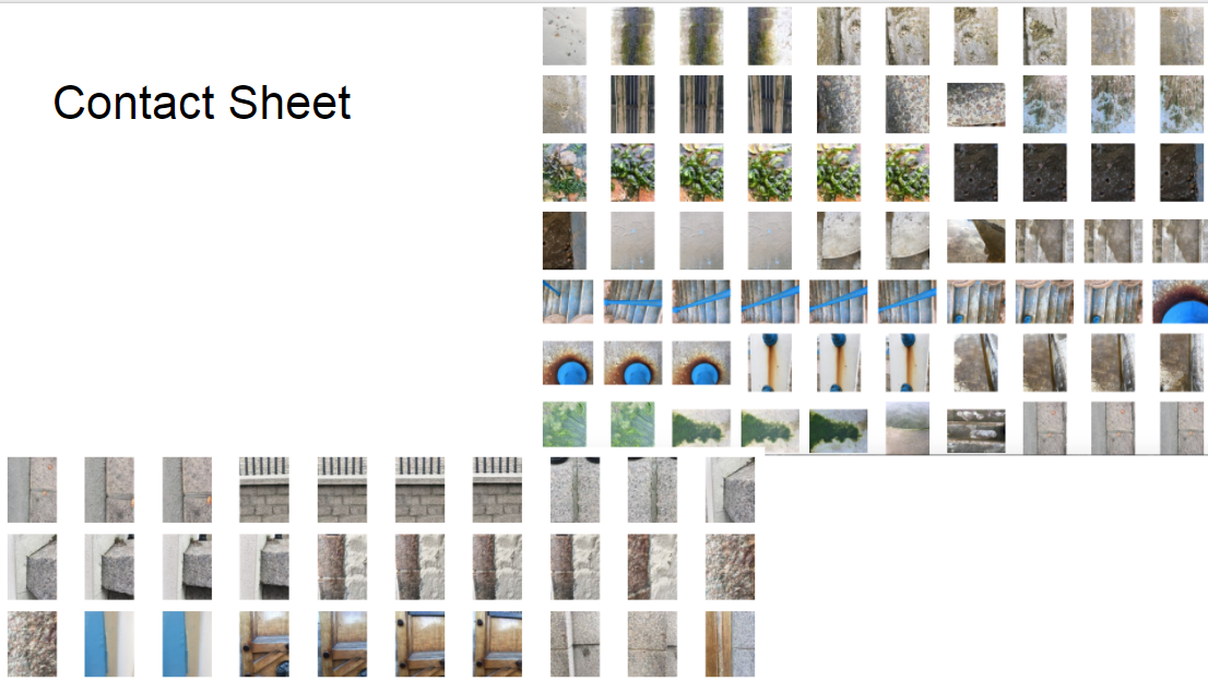
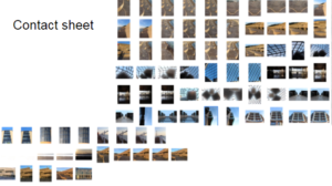
 From here I decided it would be best to cut the shoot down into ten images, through this it would make it easier for me to identify the photo I think is best in the shoot. These are my top ten images of the shoot:


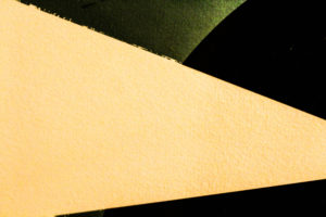


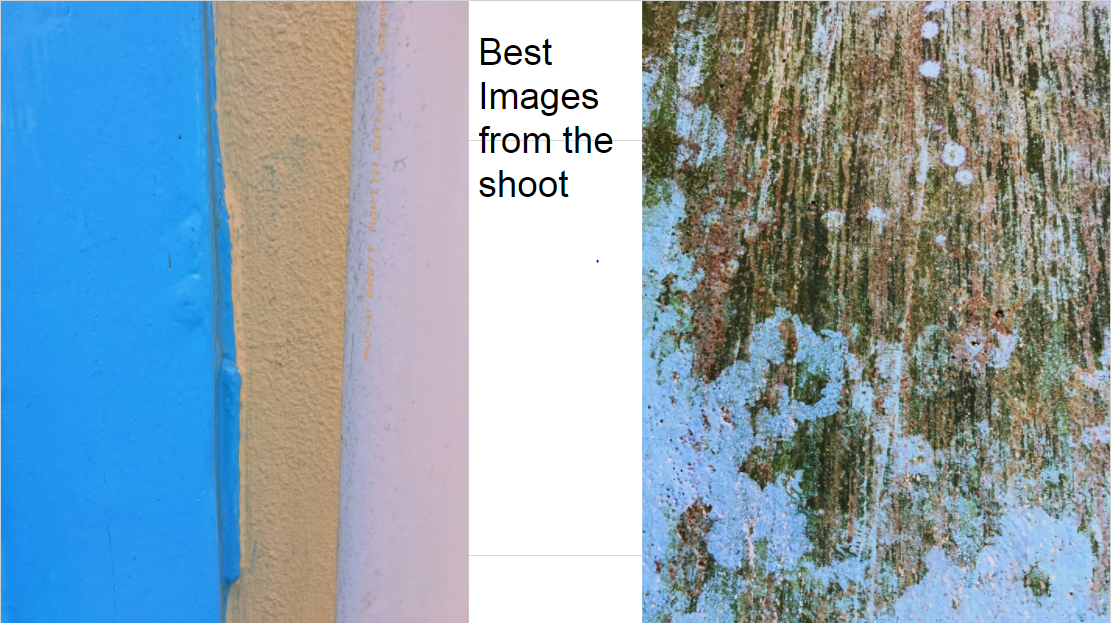
 I chose this image as my final photo, as I thought it best matched with the style of photography I wanted. Which incorporated an element of graphic design into the imagery, making it simple but visually pleasing to the eye.

 As much as I liked his work, I decided to mainly focus on reflections made by the water, and since I lived next to the beach I thought this would be an ideal idea to do.
 I used this as a basis for my shoot, so when taking the pictures would know what to specify on.


 From these images taken, I chose the top ten out of the shoot, to narrow down and edit which one overall I think should be my final picture.


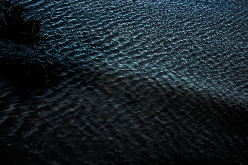

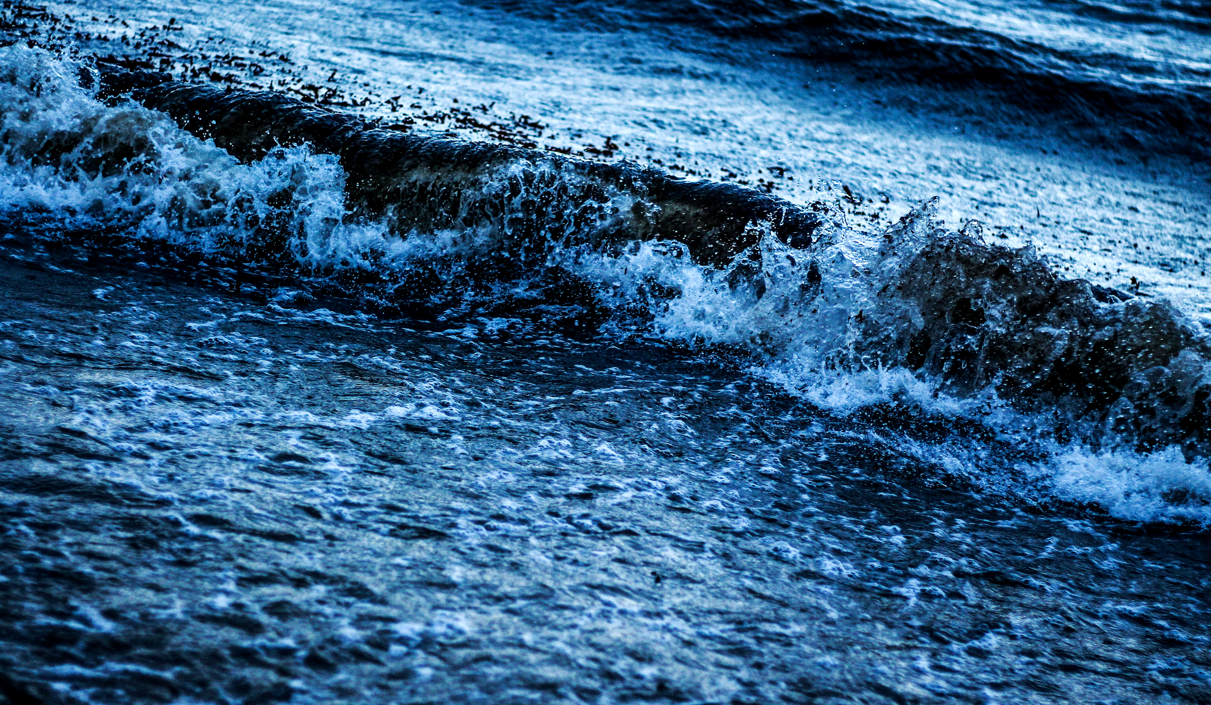 I chose this image because I loved the detail within the crashing wave on the shoreline, whilst the contrast between the darkness of the wave and the foam in my opinion make a dramatic effect. I also loved how the composition of the wave slanted across the frame, creating an almost abstract effect to it all.


