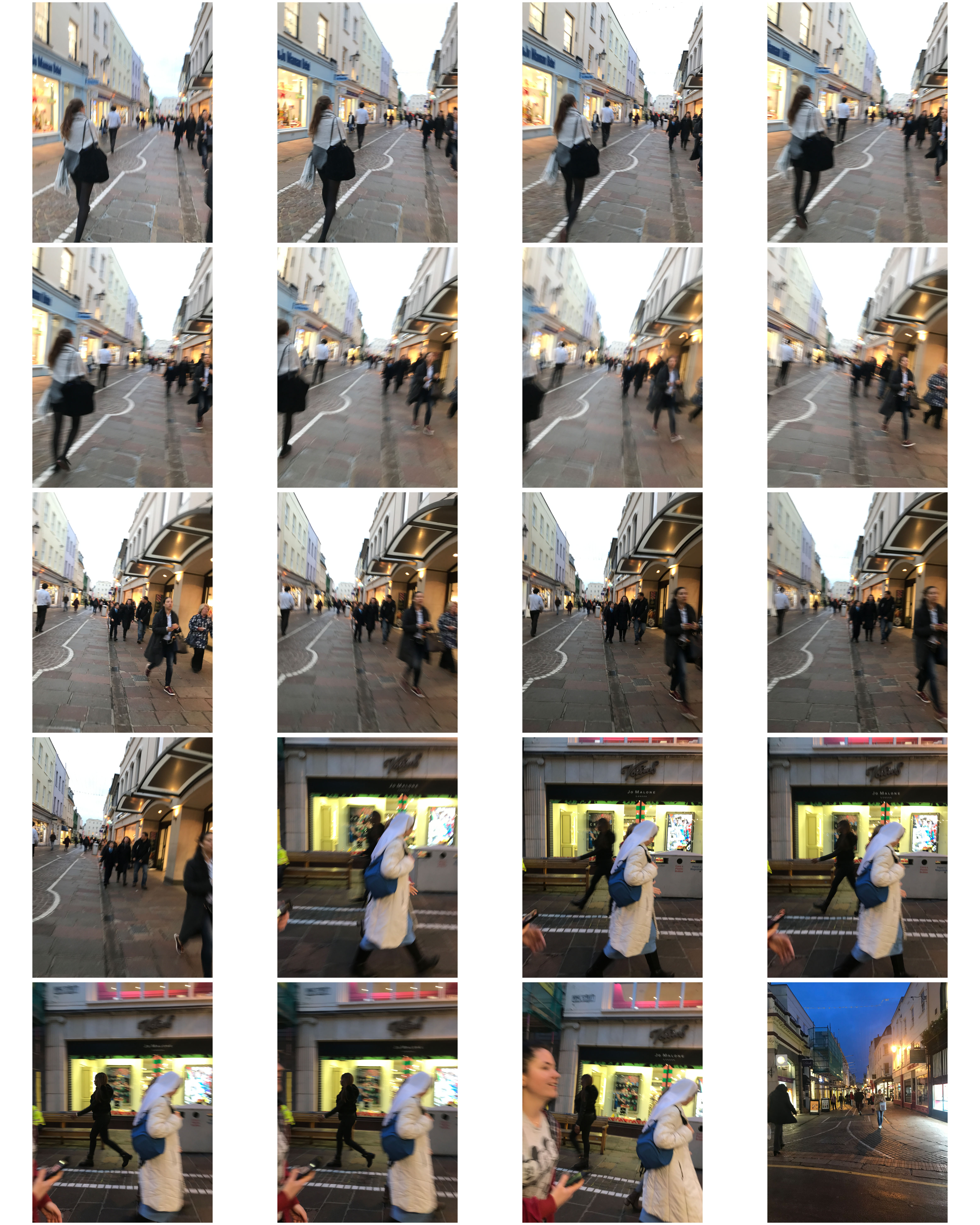
Category Archives: Homework Assignment

Filters

Author:
Category:

Henri Cartier-Bresson | Street Photography Homework 2

Henri Cartier-Bresson 

  • Henri Cartier-Bresson was born on August 22nd, 1908 and was a French humanist photographer considered a master of candid photography, and an early user of 35 mm film.
  • He pioneered the genre of street photography, and viewed photography as capturing a decisive moment. His work has influenced many photographers.
  • His father was a wealthy textile manufacturer, so Henri got the financial support he needed in order to pursue his photography ambition.
  • Henri was given his first camera by a man named Harry Crosby who convinced the commandment to release him into his custody from a House arrest for hunting without a licence. They both shared an interest for photography.
  • He died on August 3rd, 2004

Image Analysis

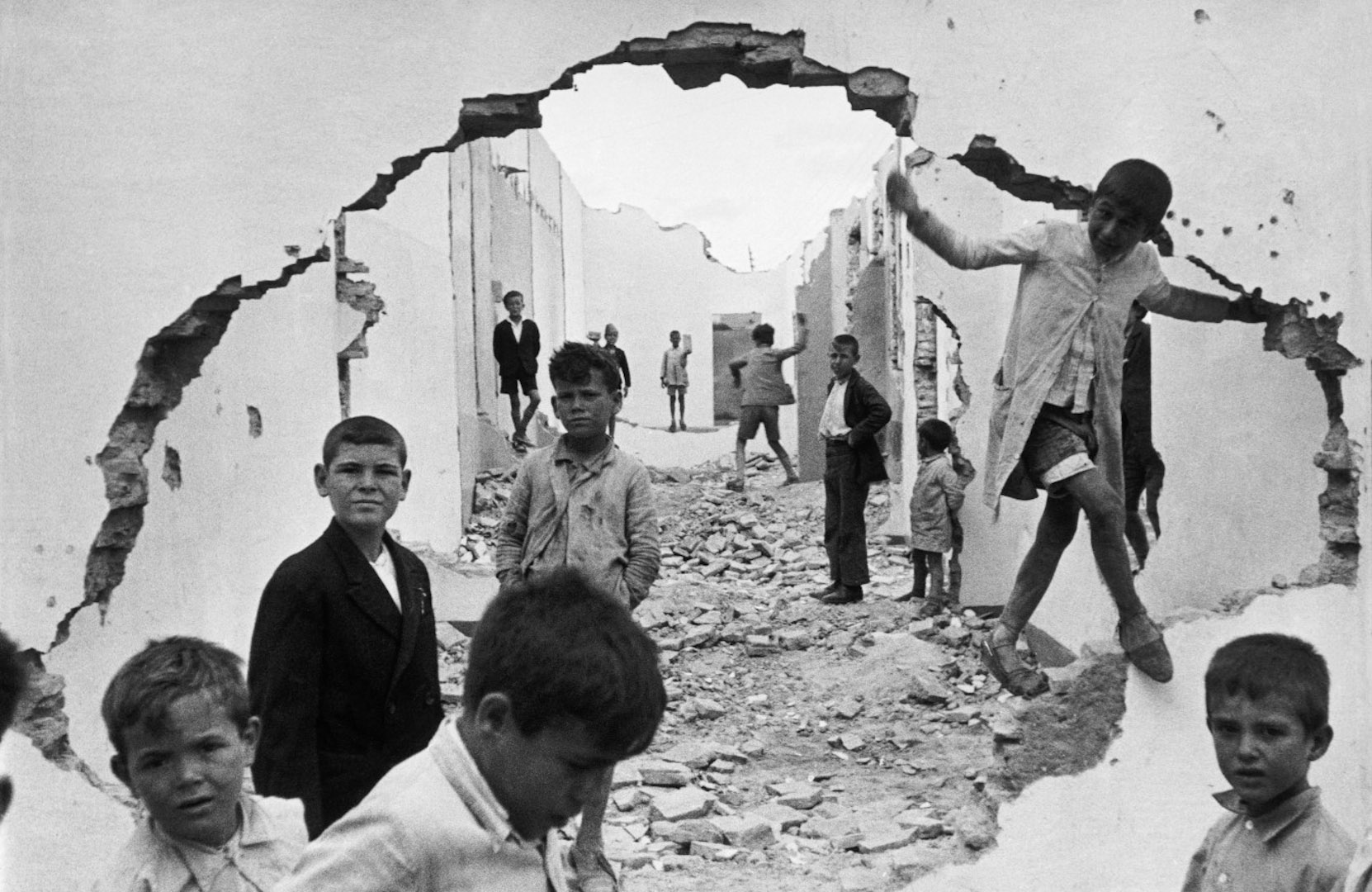
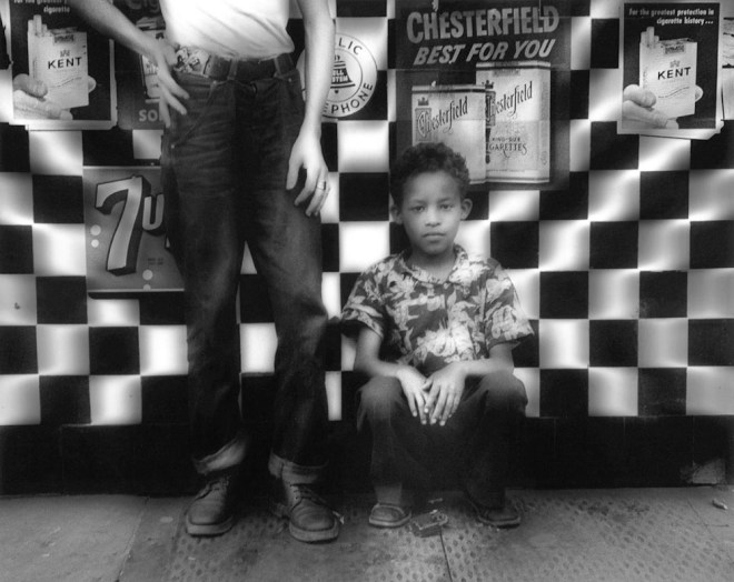
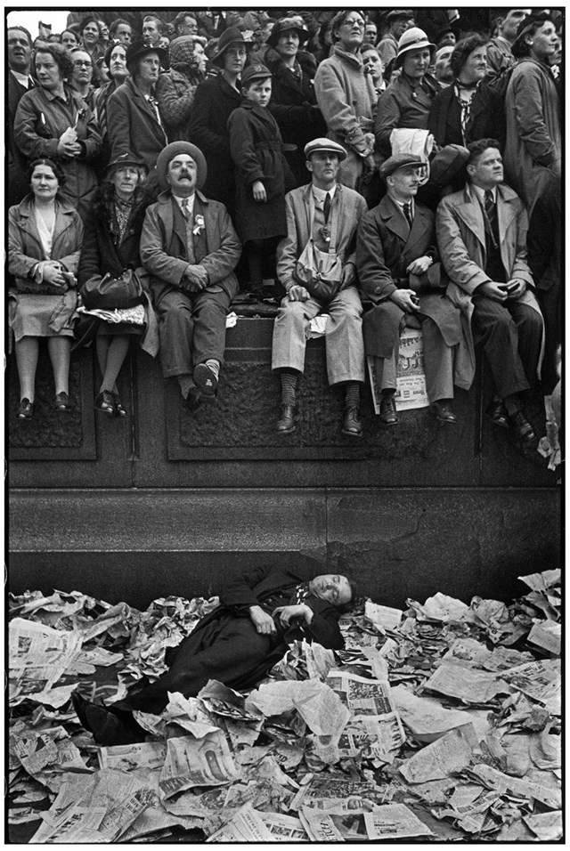
Technical: The image uses natural daylight to give a balanced tonal range that may consider it to be apart of the Ansel Adams Zone System.

The image appears to have used a wide lens and angle to allow for the majority of the image to be in focus, where it has a slight blur in the background. This also gives the whole image a feeling of stillness.

I believe it would have been taken with a fast shutter speed to capture the business of the street.

Visual: The image is presented in a Black and white 2D appearance. It is arranged to feature the repetition of the cattle.

Contextual: Cartier-Bresson was driven by a sociological impulse to India to convey the post-colonial development. He went at a turning point in his career as he had a “curiosity about what is going on in the world, a respect for what is going on and a desire to transcribe it visually.” The curiosity would drive a long career in photojournalism, for which his India trip was an apprenticeship.

My Images

Edits

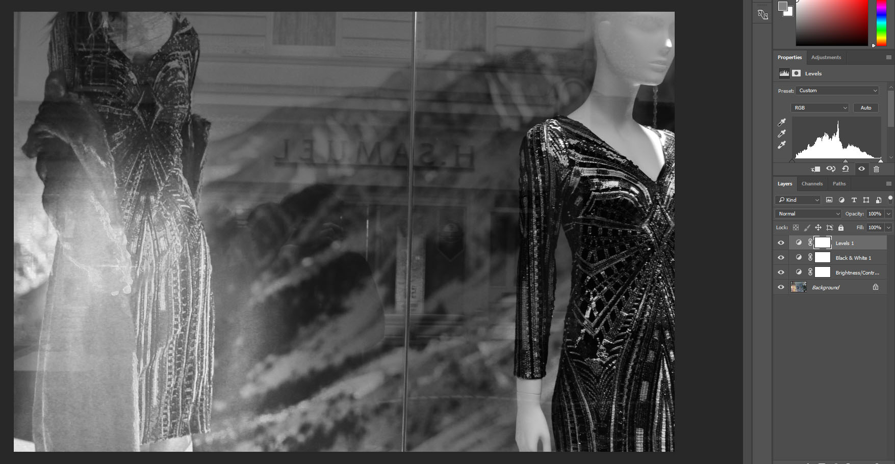
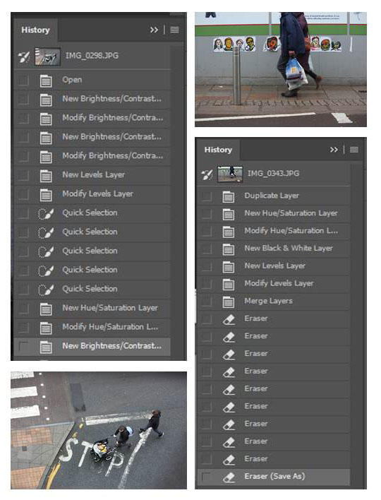
I reduced the brightness to -40, and increased the contrast to 53.

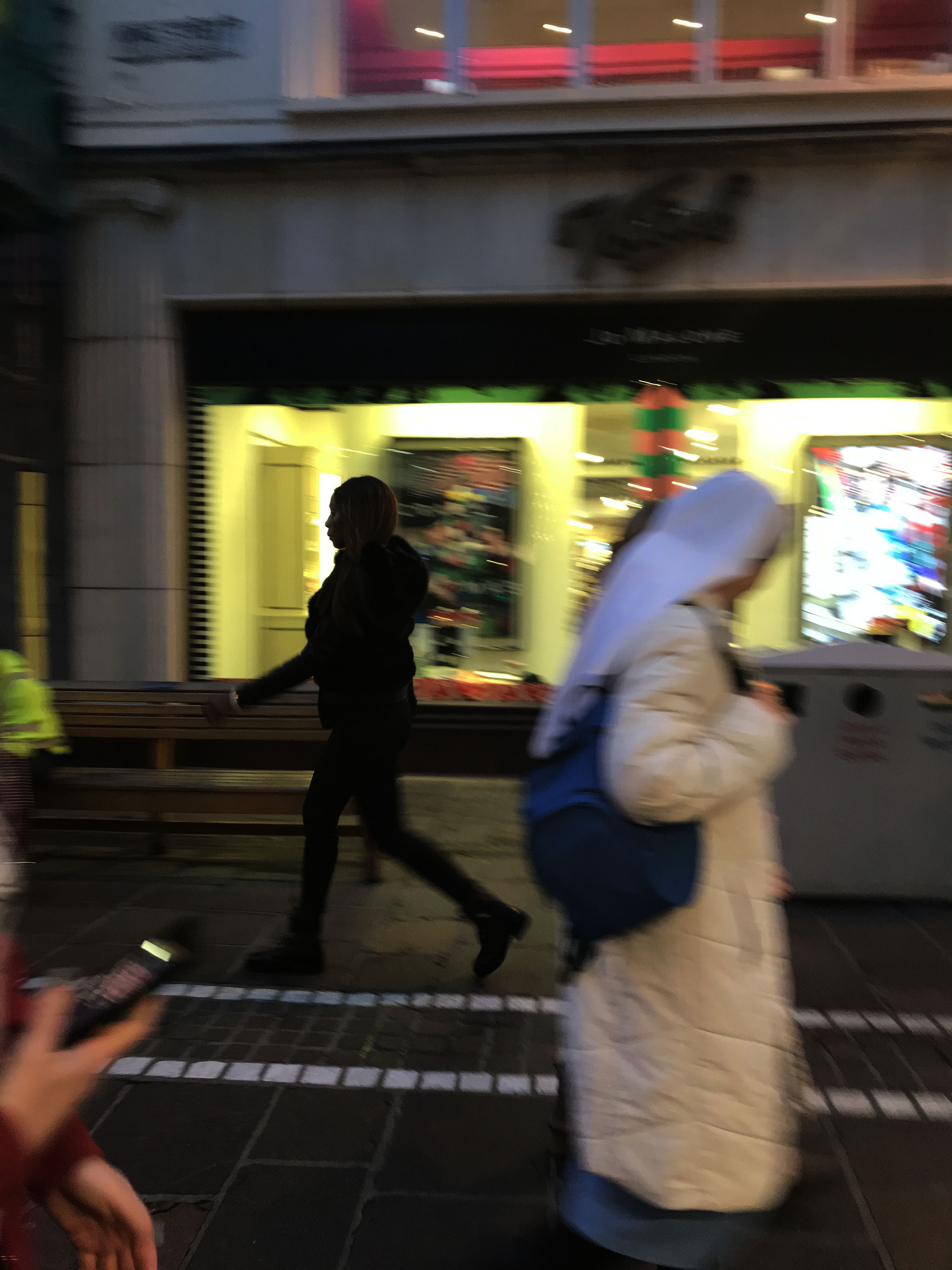
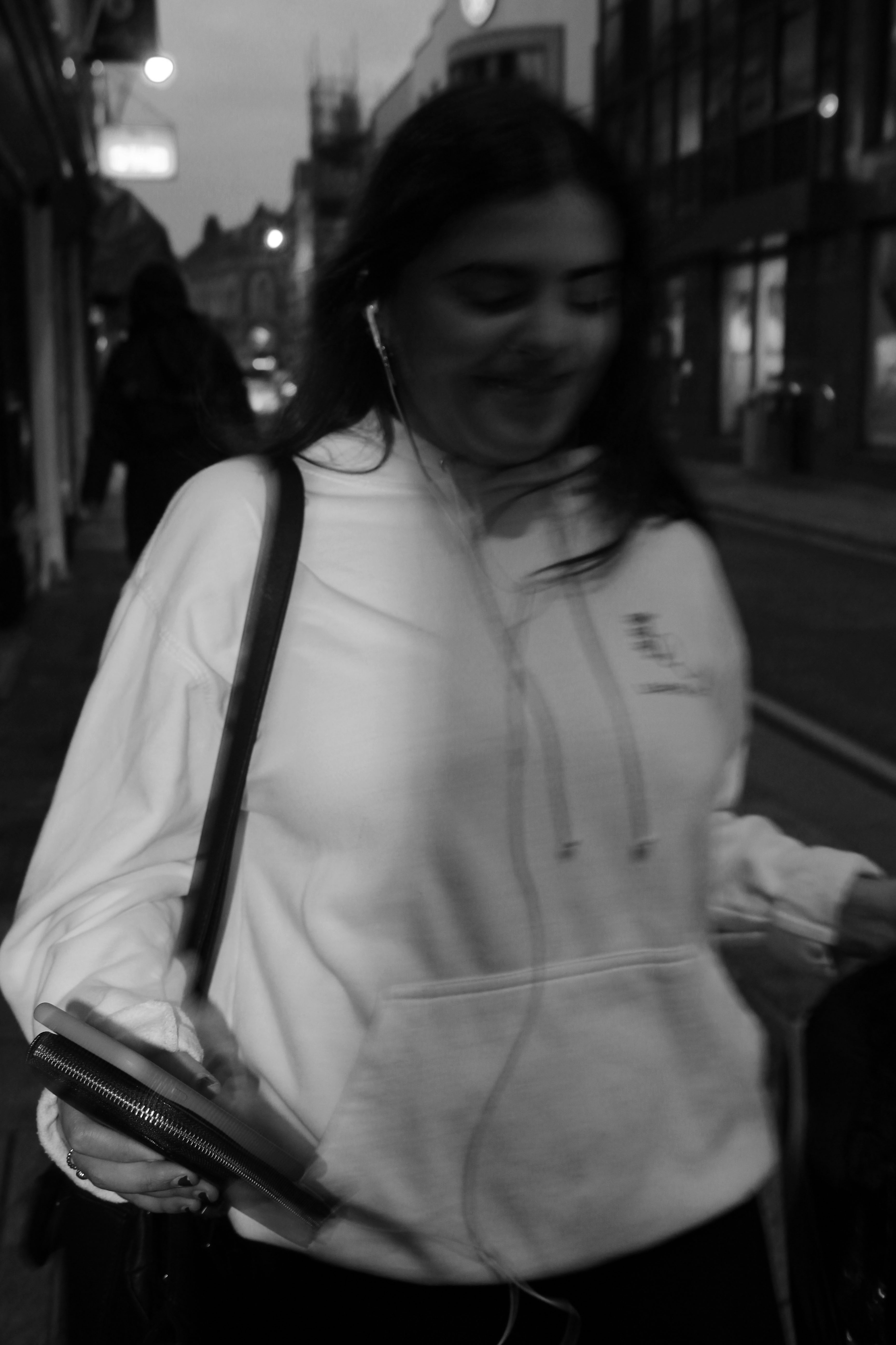
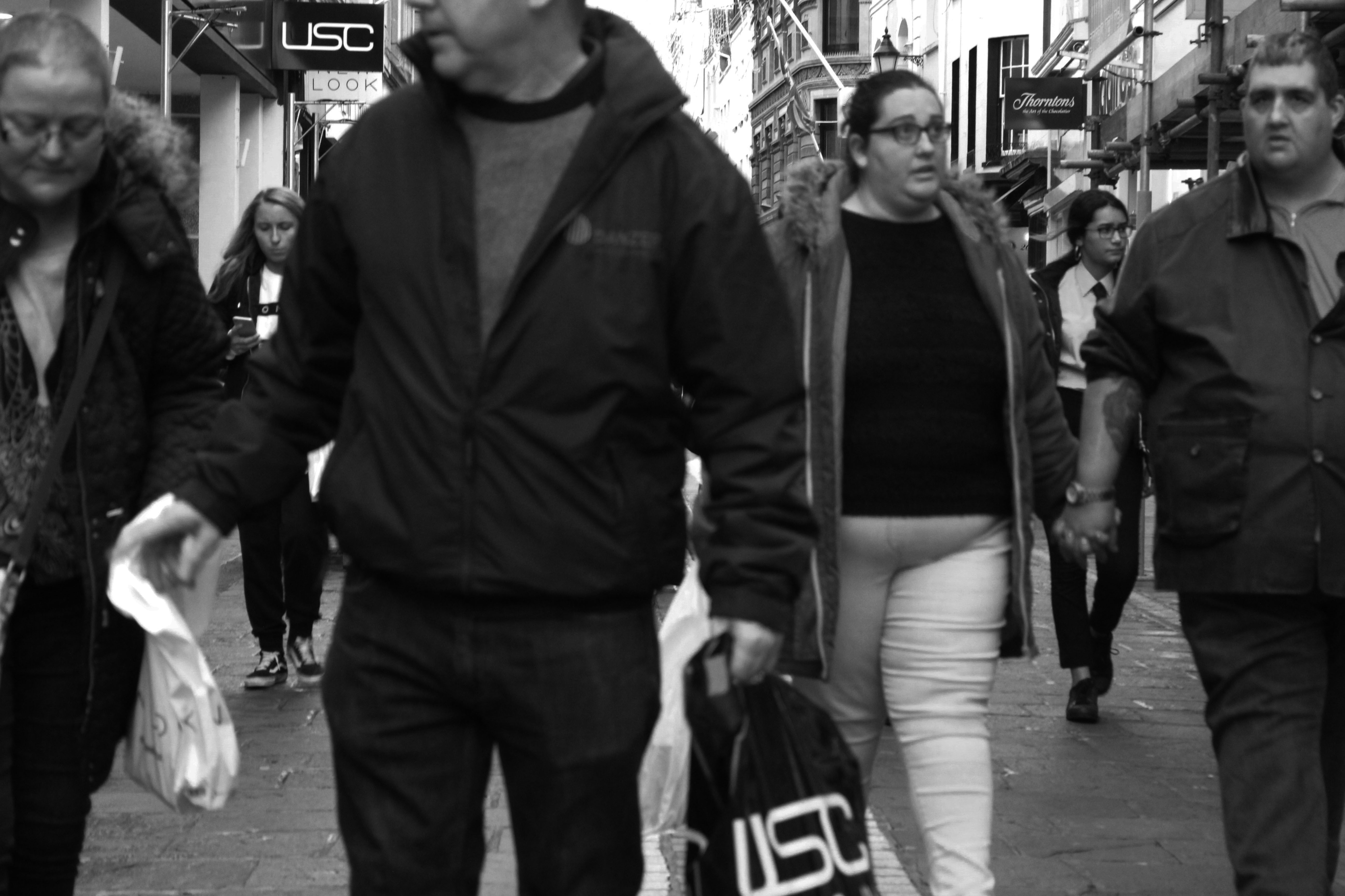
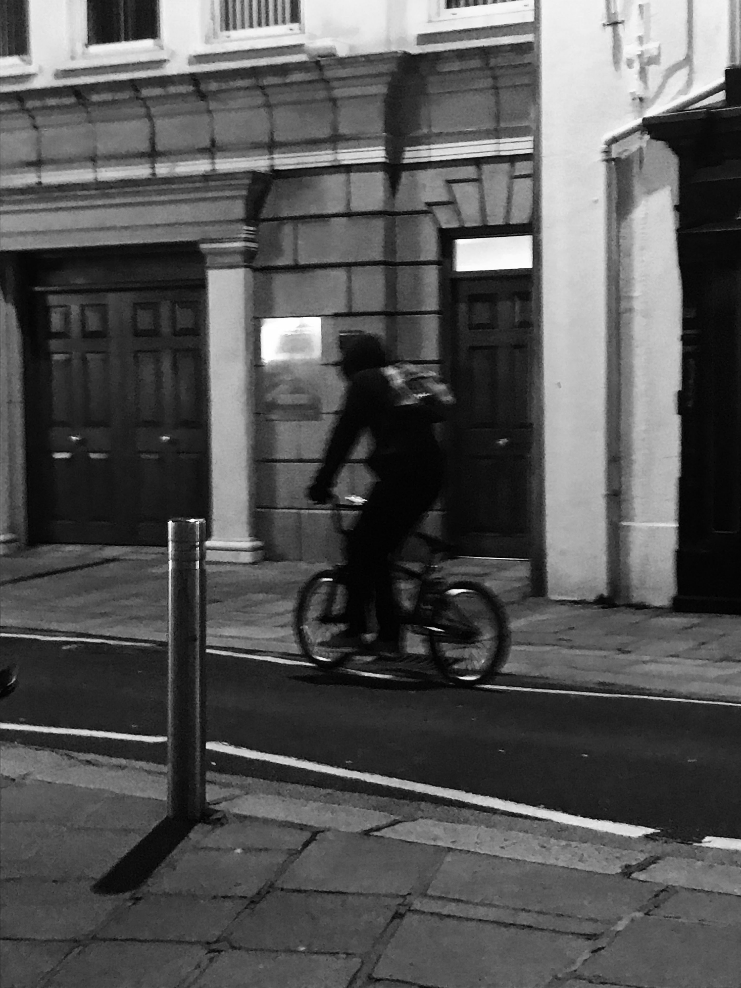
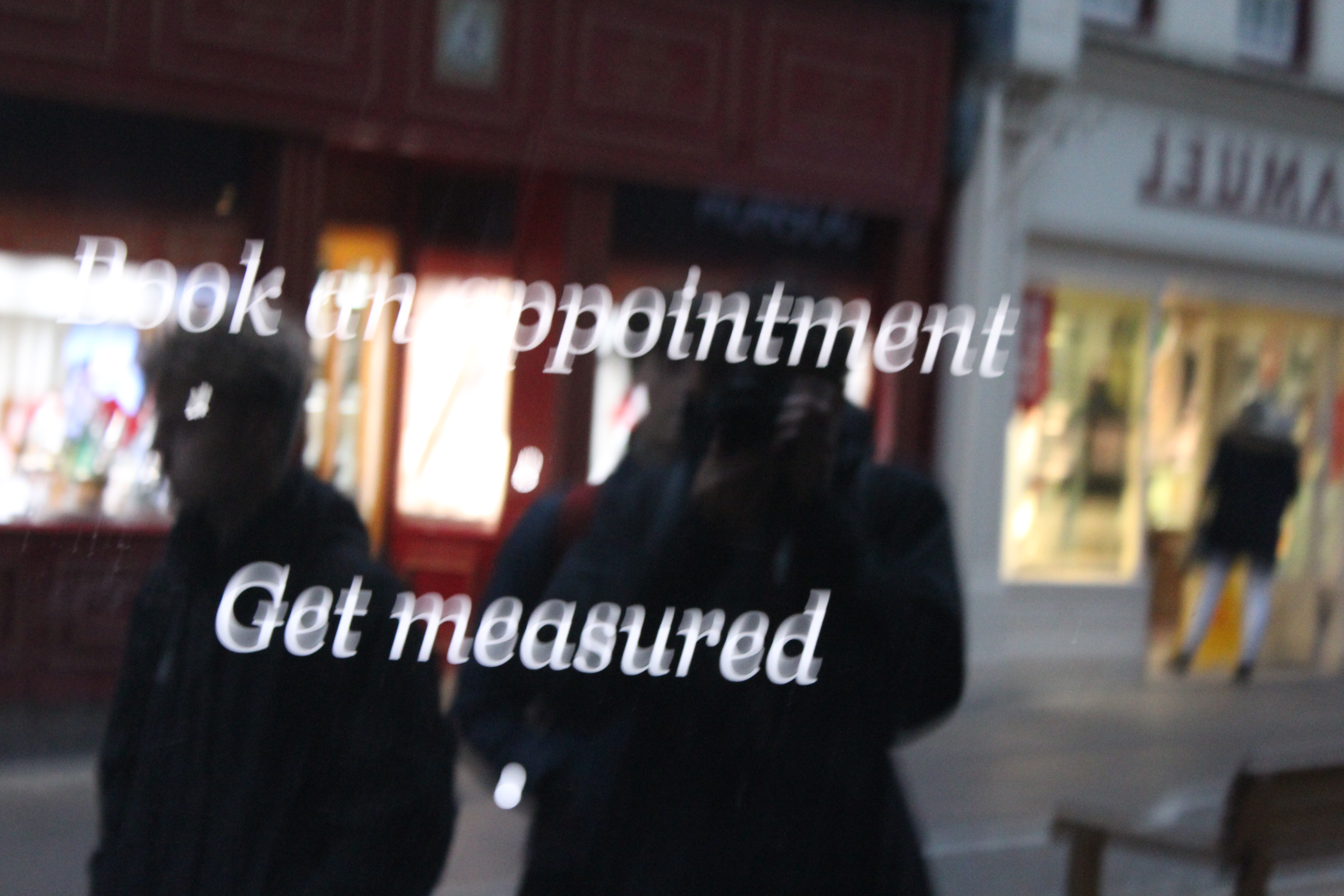
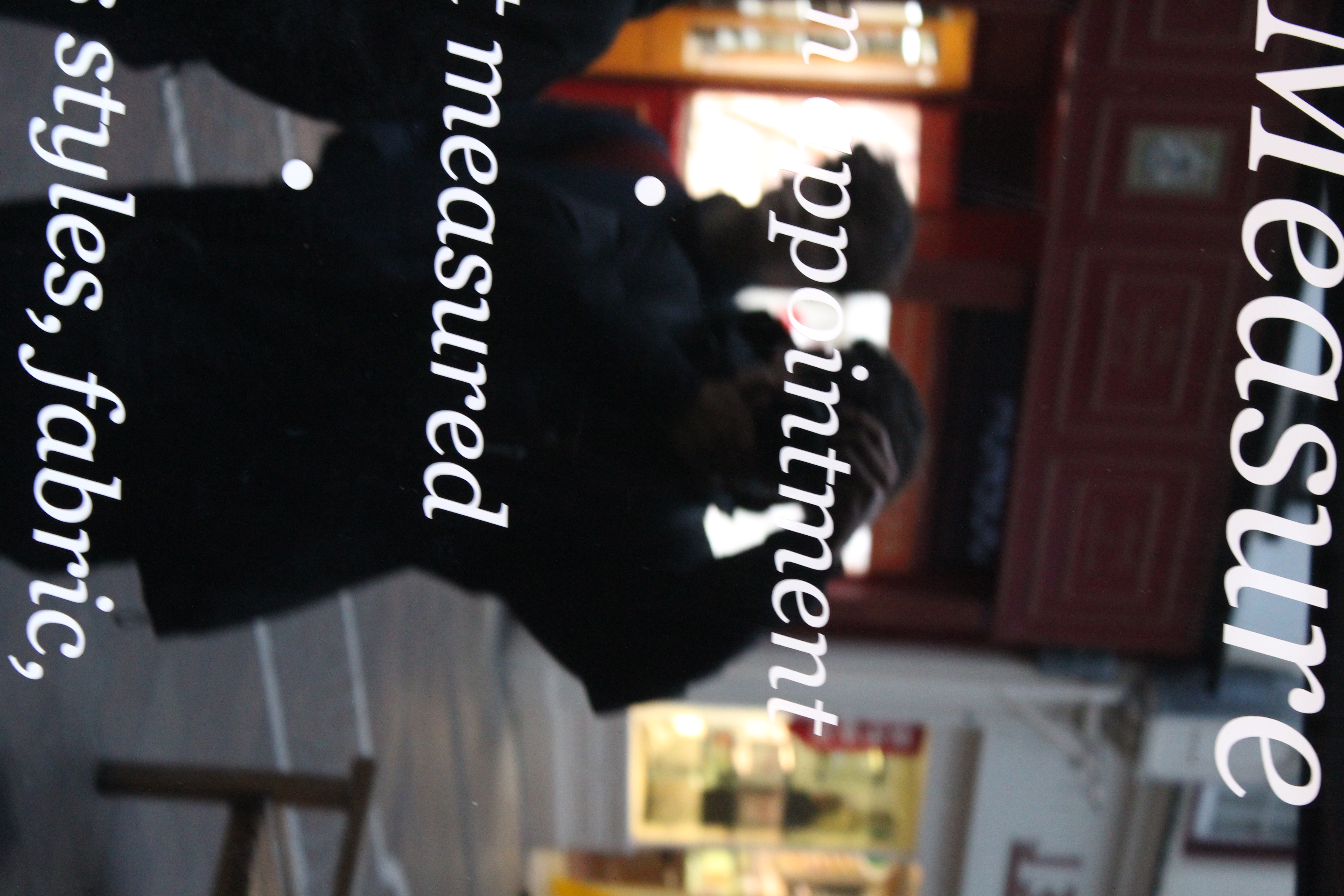
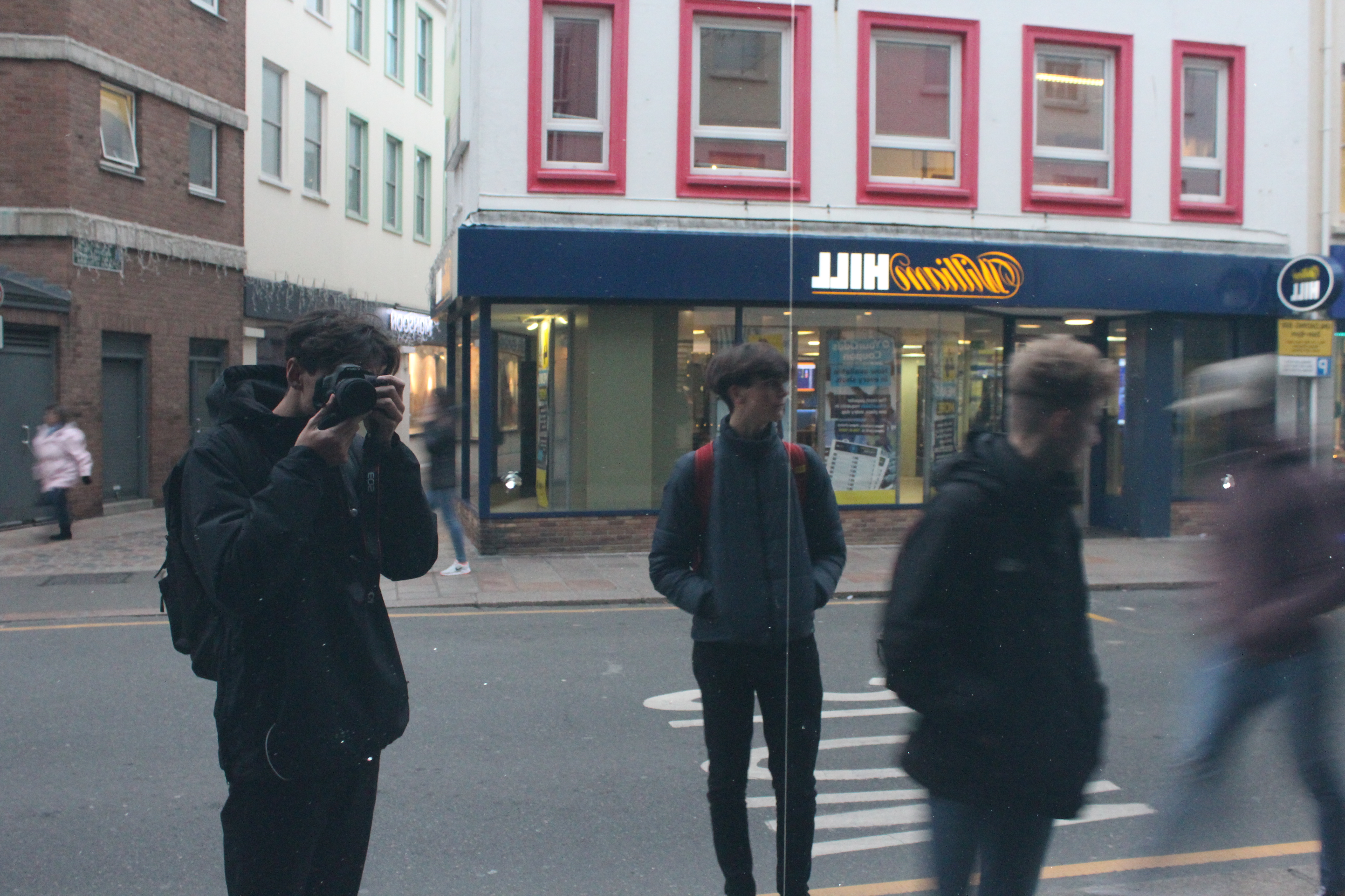
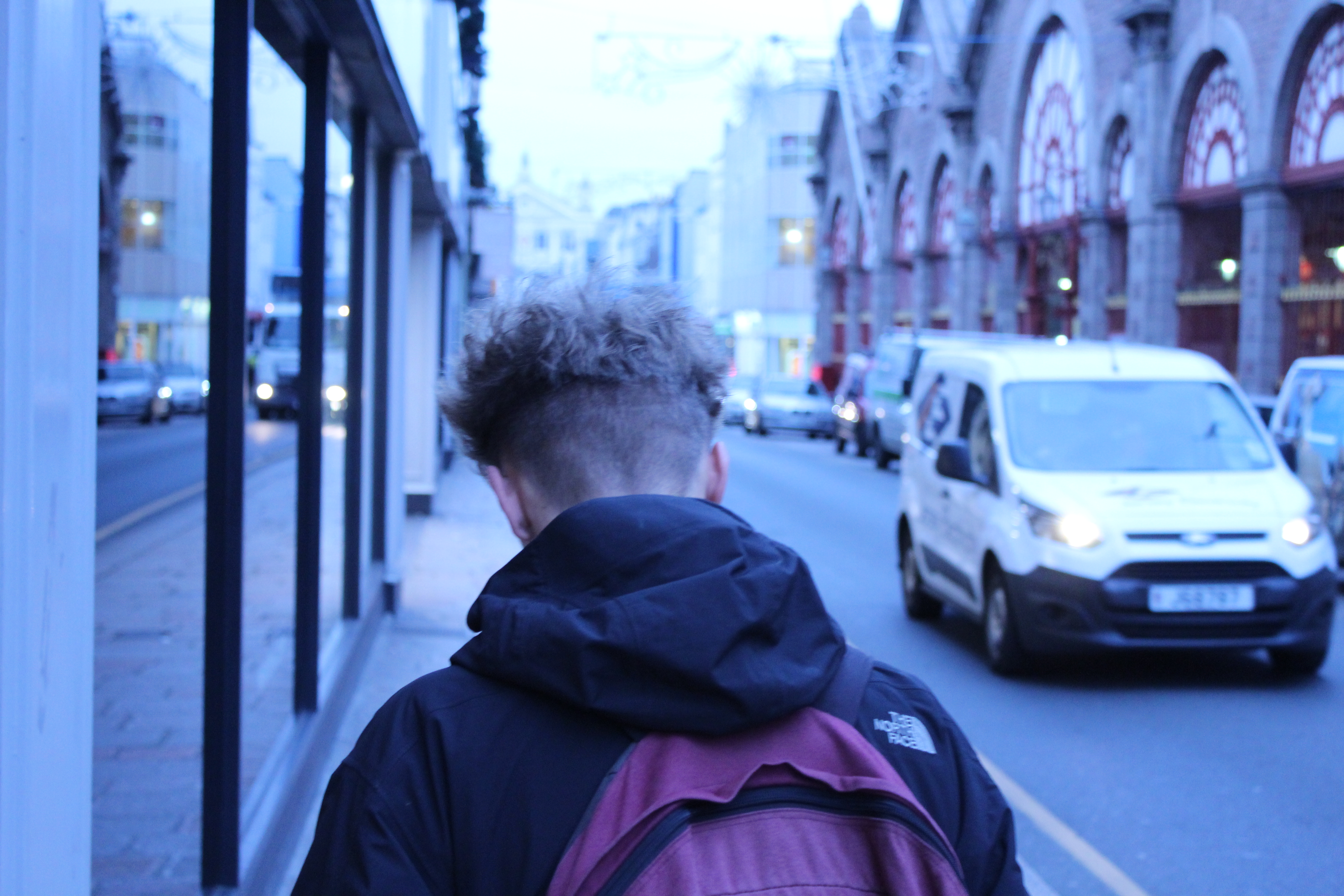
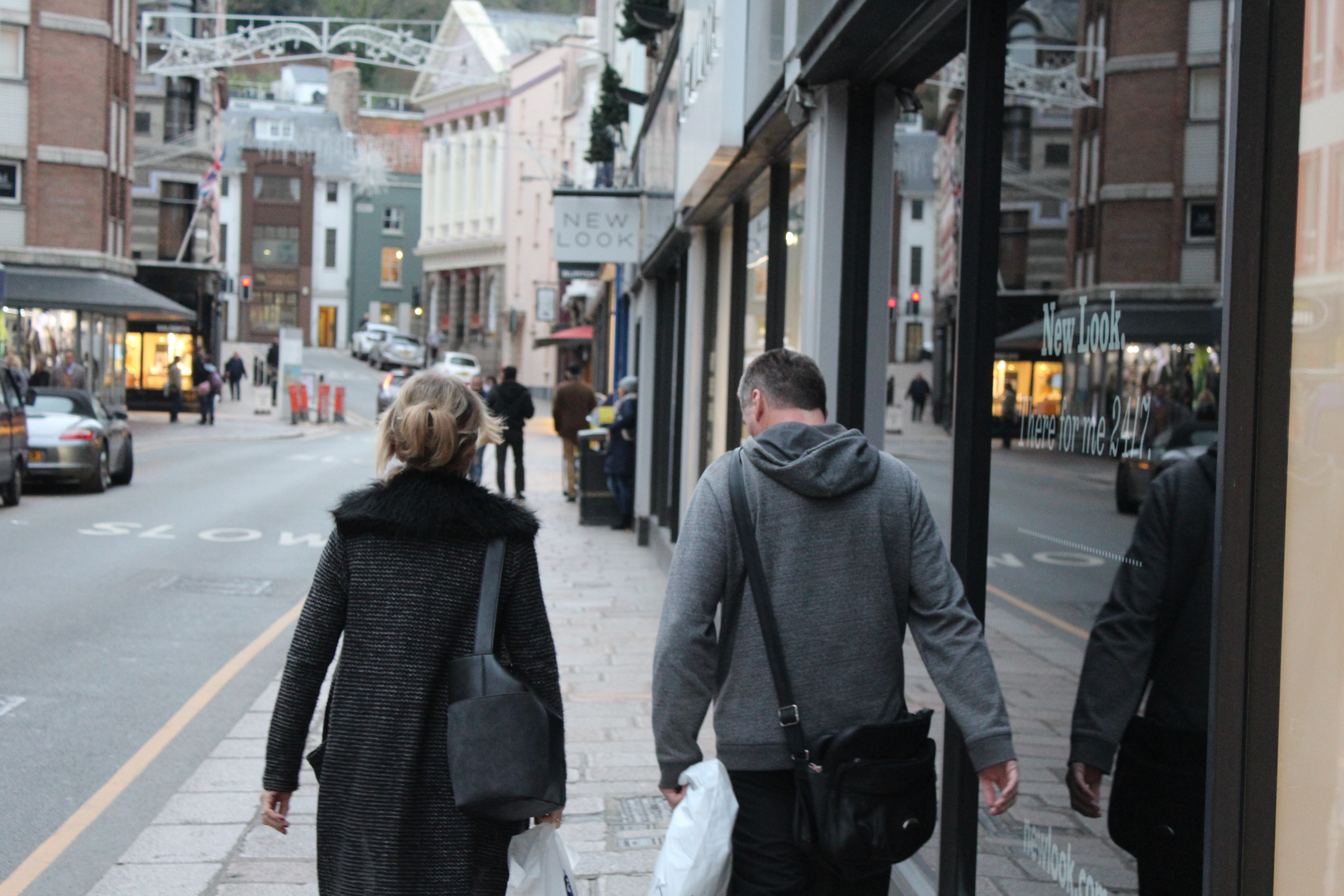
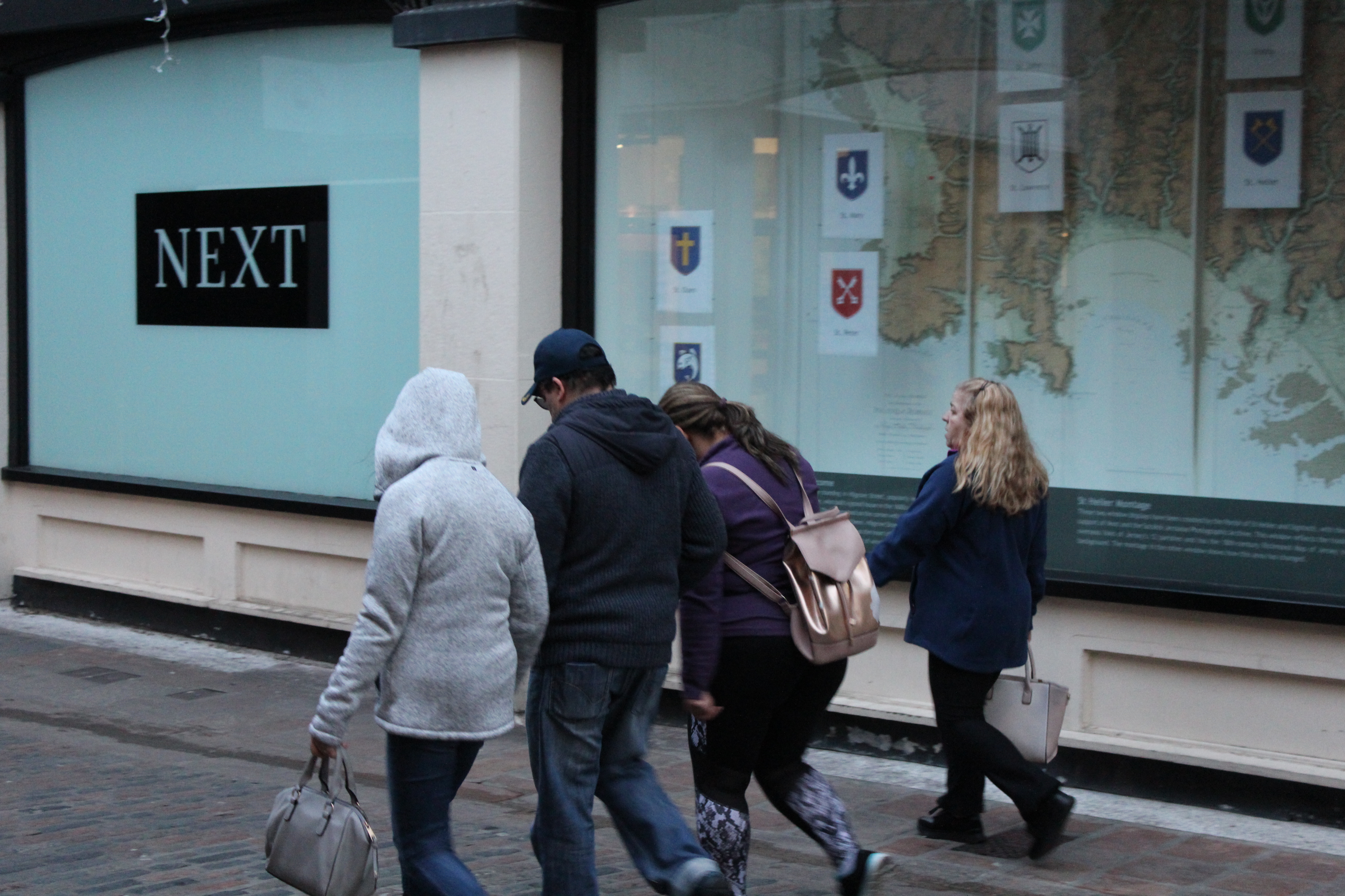
For the above 2 images, I took inspiration from Bruce Gilden’s technique of street photography and took photos of my subject by their suprise.

With the coloured image, I only increased the contrast to 56 on Photoshop. However, for the black and white image, I reduced the saturation before increasing the contrast to 20 and also decreasing the brightness to -12.

Processed with VSCO with c1 preset

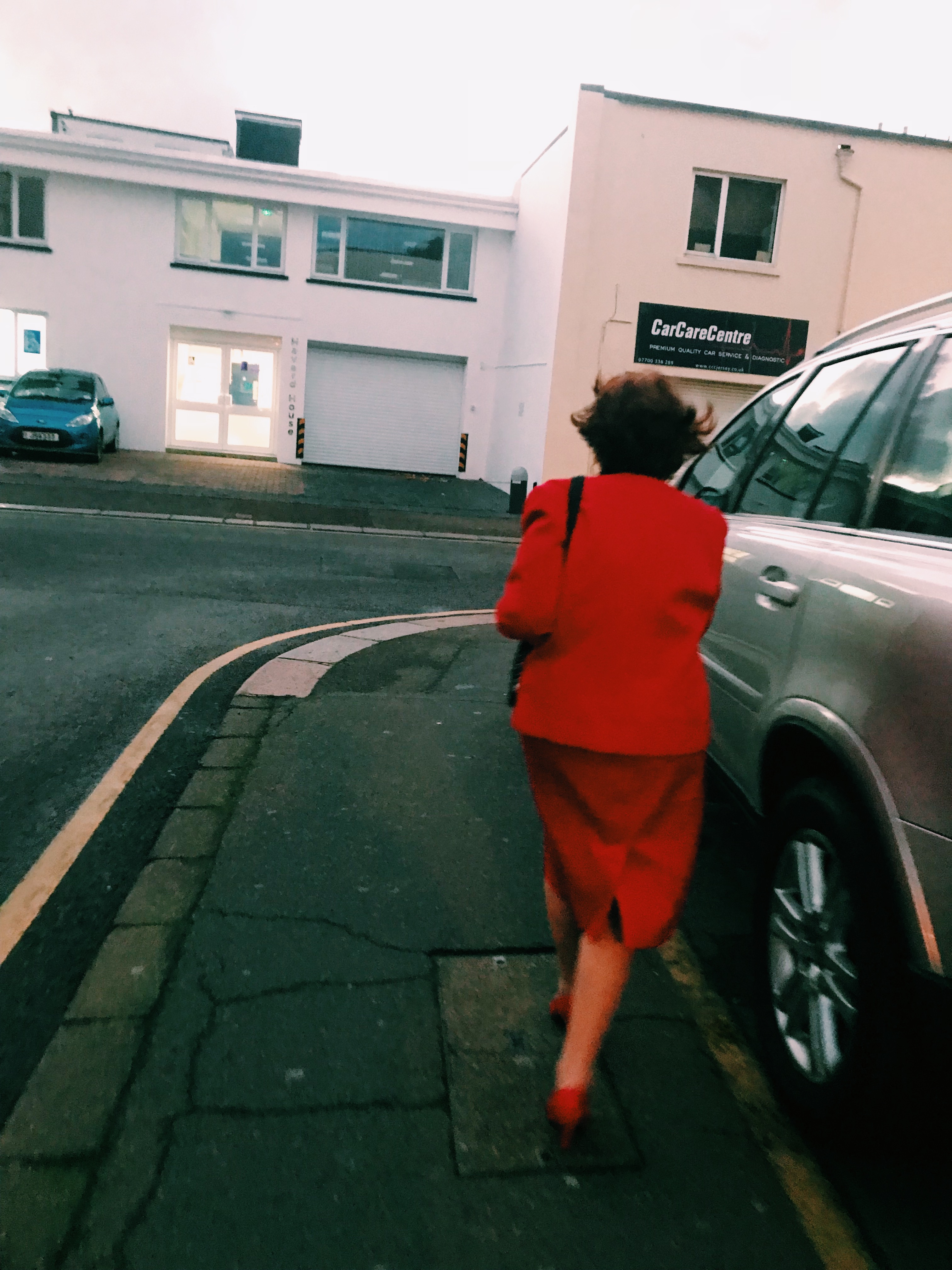
For this Image, I looked at the colour schemes of Martin Parr’s work and decided to incorporate this in my edit. This filter on the ‘VSCO’ app gave a similar feel.

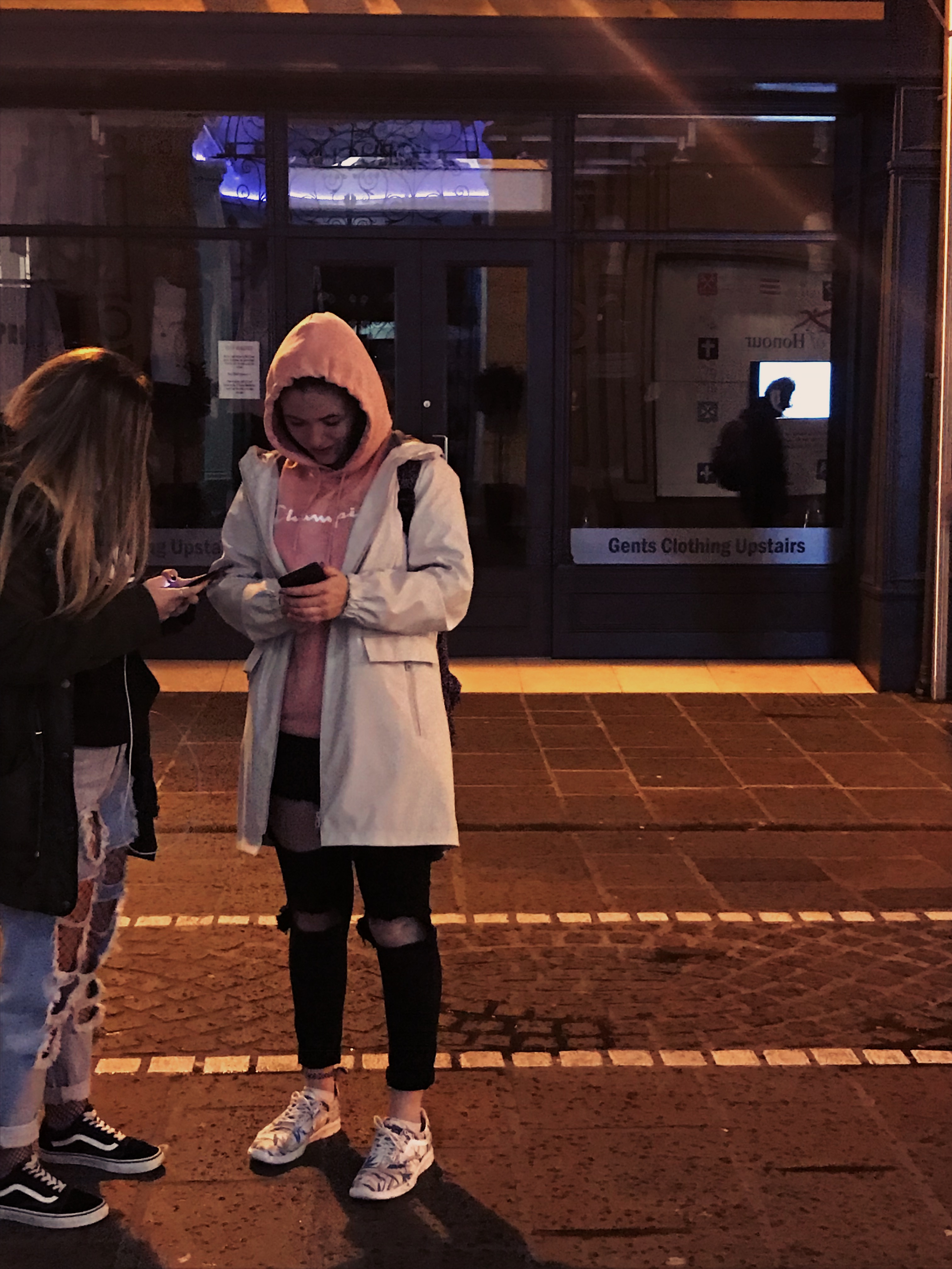
I also used the ‘VSCO’ app for the image below however this time I also reduced the exposure.

Processed with VSCO with nc preset

I liked the style of Henri Cartier-Bresson so decided to edit some of my images in black and white by reducing the saturation. I reduced the brightness and increased contrast to present different tonal ranges.

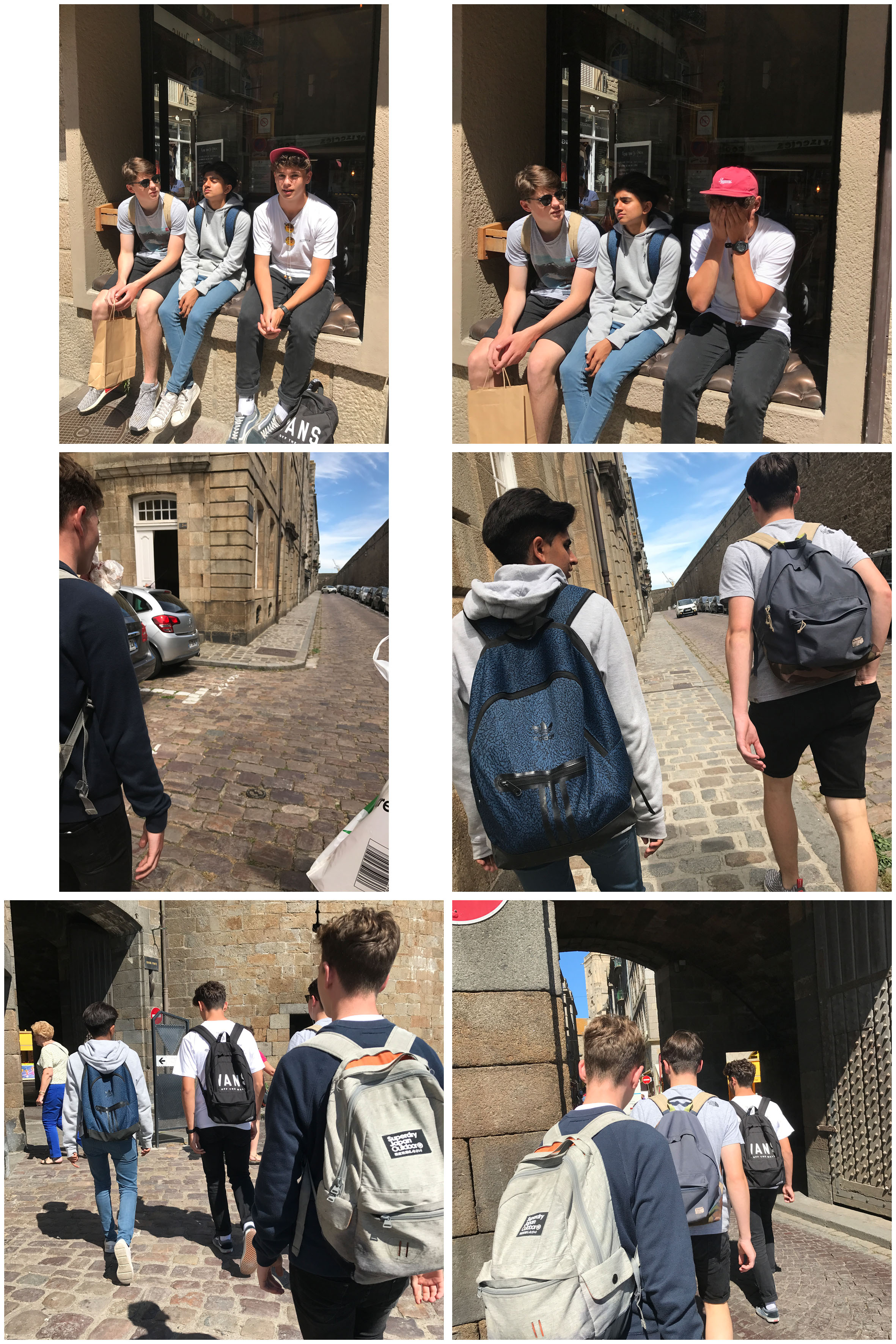
This is one of my favourite images as it was taken in St Malo, France. I feel as if this makes the image more interesting than an image just being taken in Jersey. I reduced the brightness to -70 and the contrast to -21 as I felt the original image was too bright and warm, and I wanted to show off the shadows.

Arnold Newman & Anthony Kurtz | Environmental Potraiture Homework 1

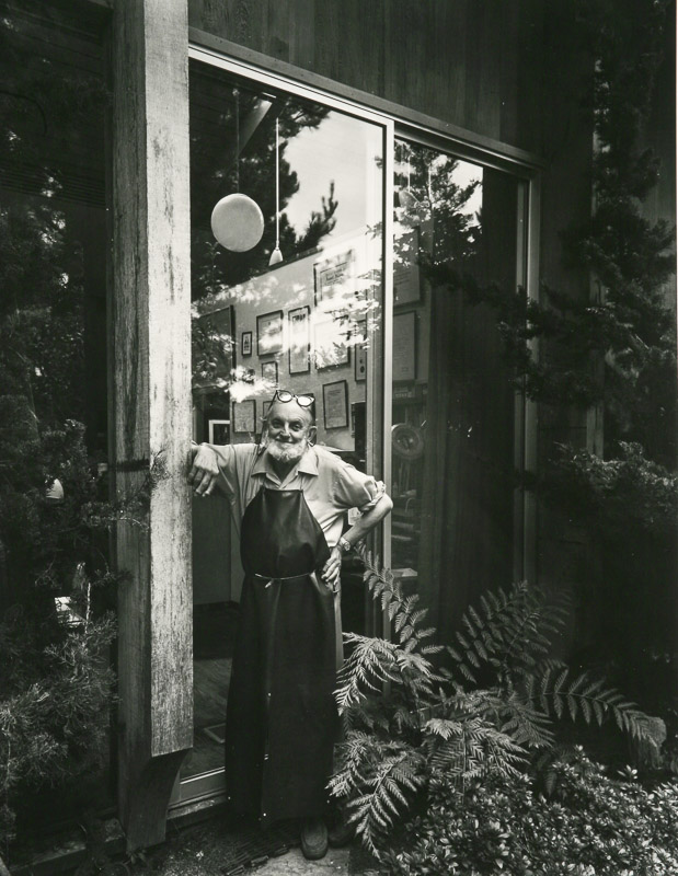
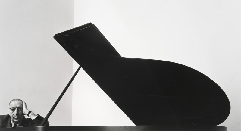
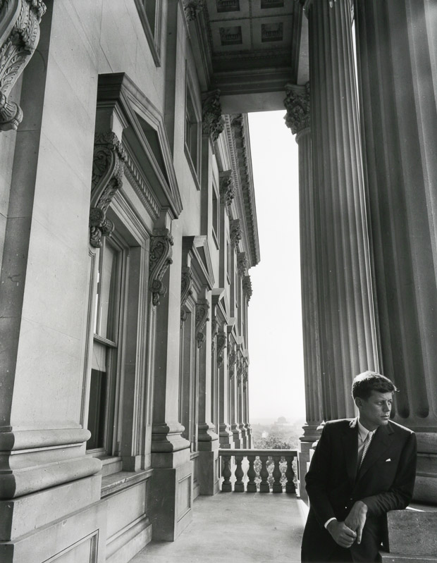
Arnold Newman

  • Arnold Newman was born March 3rd, 1918 in New York City.
  • He was raised and attended schools in Atlantic City, N.J. and Miami Beach, FL. He studied art under a scholarship at the University of Miami, Coral Gables, FL from 1936 to 1938.
  • Newman began his career in photography shortly after working at chain portrait studios in Philadelphia, Baltimore, and West Palm Beach. He immediately began working in abstract and documentary photography on his own.
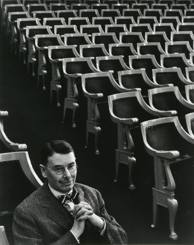
  • He then went on to work in Environmental Portraiture where he would normally capture his subjects in their most familiar surroundings with representative visual elements showing their professions and personalities.
  • Arnold Newman found his vision in the empathy he felt for artists and their work. He photographed many famous people such as John F. Kennedy, Pablo Picasso, Marilyn Monroe, Ronald Reagan, and Audrey Hepburn.
  • However he also  maintained that even if the subject is not known, or is already forgotten, the photograph itself must still excite and interest the viewer.
  • He died in New York City on June 6th, 2006.

“I didn’t just want to make a photograph with some things in the background,”

 “The surroundings had to add to the composition and the understanding of the person. No matter who the subject was, it had to be an interesting photograph. Just to simply do a portrait of a famous person doesn’t mean a thing.”

Image Analysis

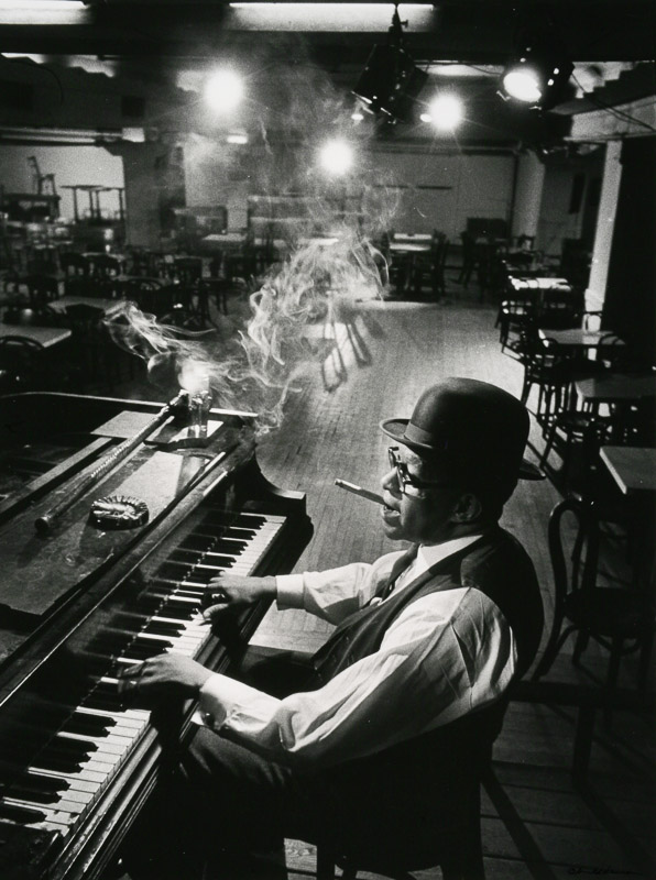
I believe he may have used a fast shutter speed as he was able to capture the smoke in the air of the image.

All light in this image is artificial which gives it a staged feel, this is suitable as the musician in the photo is on a stage where he would normally be in his career.

The image as a whole is in black and white with a high contrast that features all shades from light to dark. This could be considered to be included in the Ansel Adams Zone System.

The image is under exposed as it appears darker. This shows off the contrast of the image. Focus is down the centre of the photo where the subject is lit up.

The camera used may have had a wide depth of field and a small aperture which gave the  background a slight blur.

The man in the photo is Willie ‘The Lion’ Smith who was  an American jazz pianist at the time the image was taken (1960). He is considered to be one of the three greatest practitioners of the genre in its golden age, from about 1920 to 1943.

Anthony Kurtz

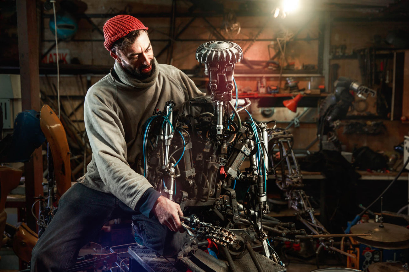
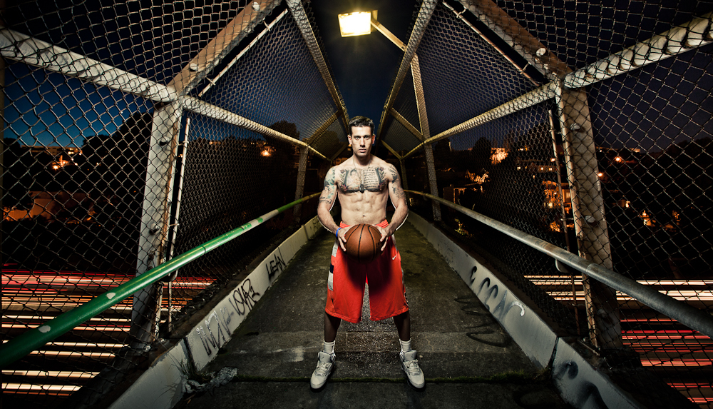
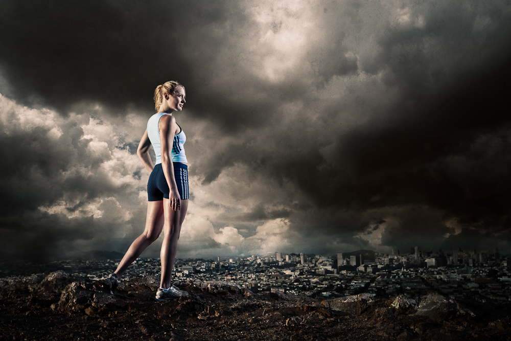
Anthony Kurtz is a Swiss-born photographer who currently lives in San Francisco. He specializes in environmental portraitures and landscape photography and strives to create beautiful and unexpected photographs of people and the spaces they occupy.

Combining both natural light and studio strobes, Anthony sculpts light to create a mood, an atmosphere, a photograph that tells a story and, hopefully, sparks curiousity in the viewer.

Kurtz has studied subjects from Science to Graphic Design, and New Media to eventually Photography. But no matter what the medium, he believes that his ability to meet extraordinary people is the best reward.

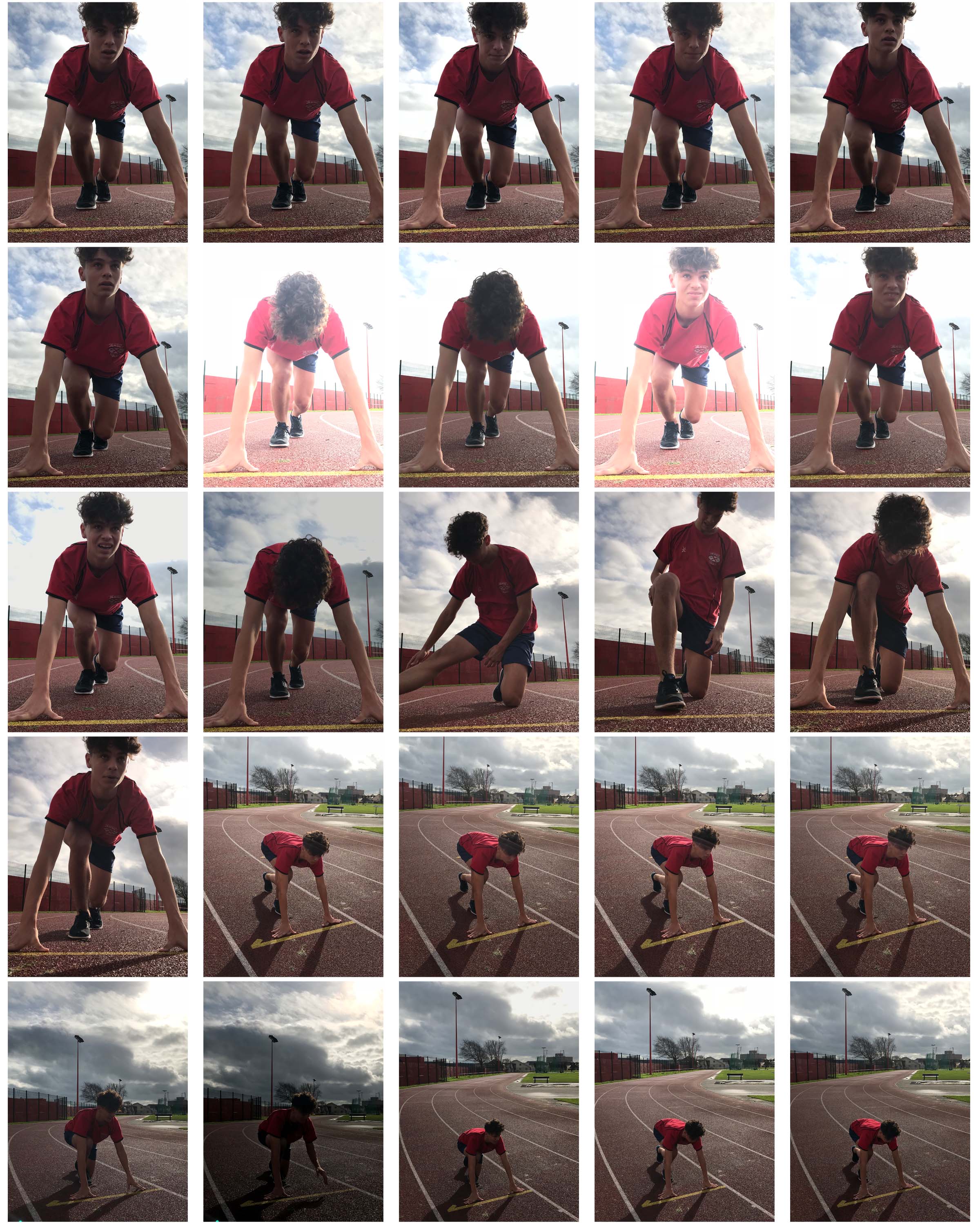
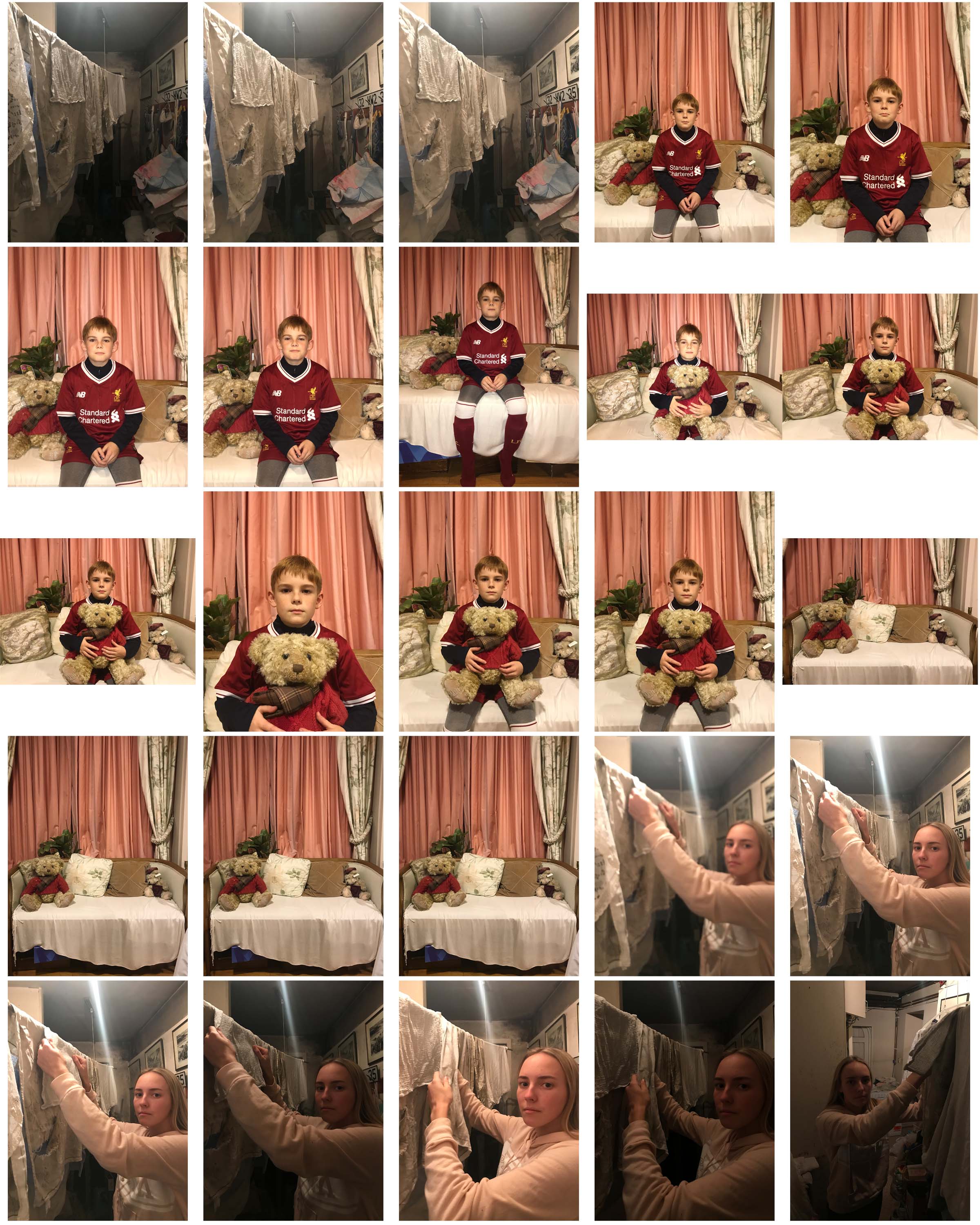
The above image inspired me to carry out a similar style photo of an athletic person with a dramatic sky.

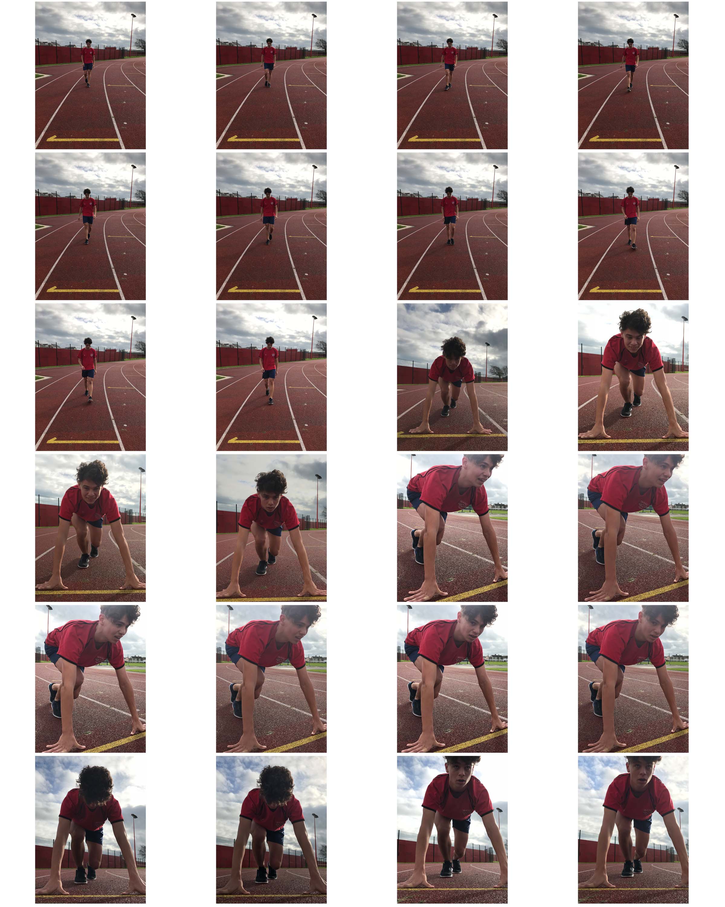
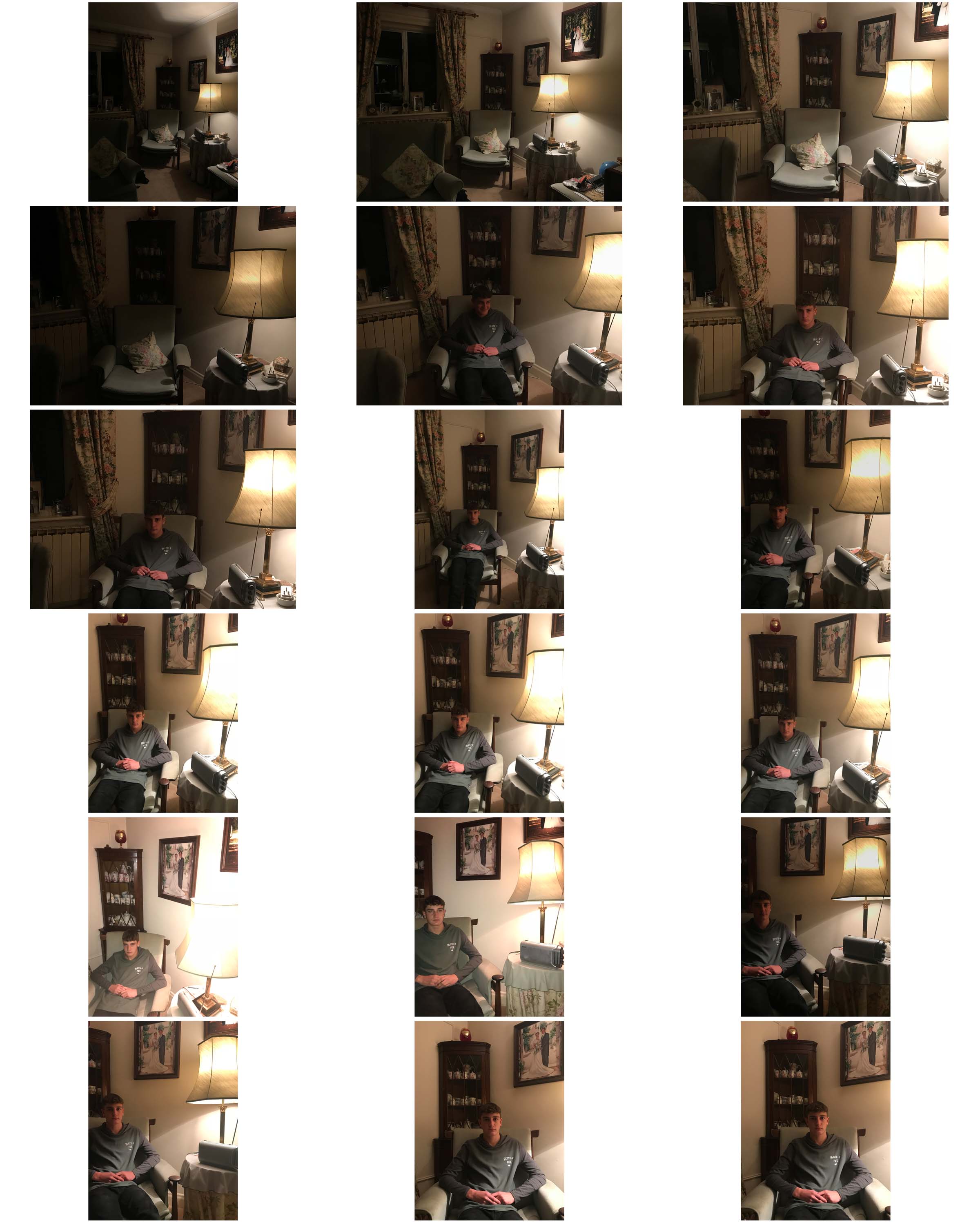
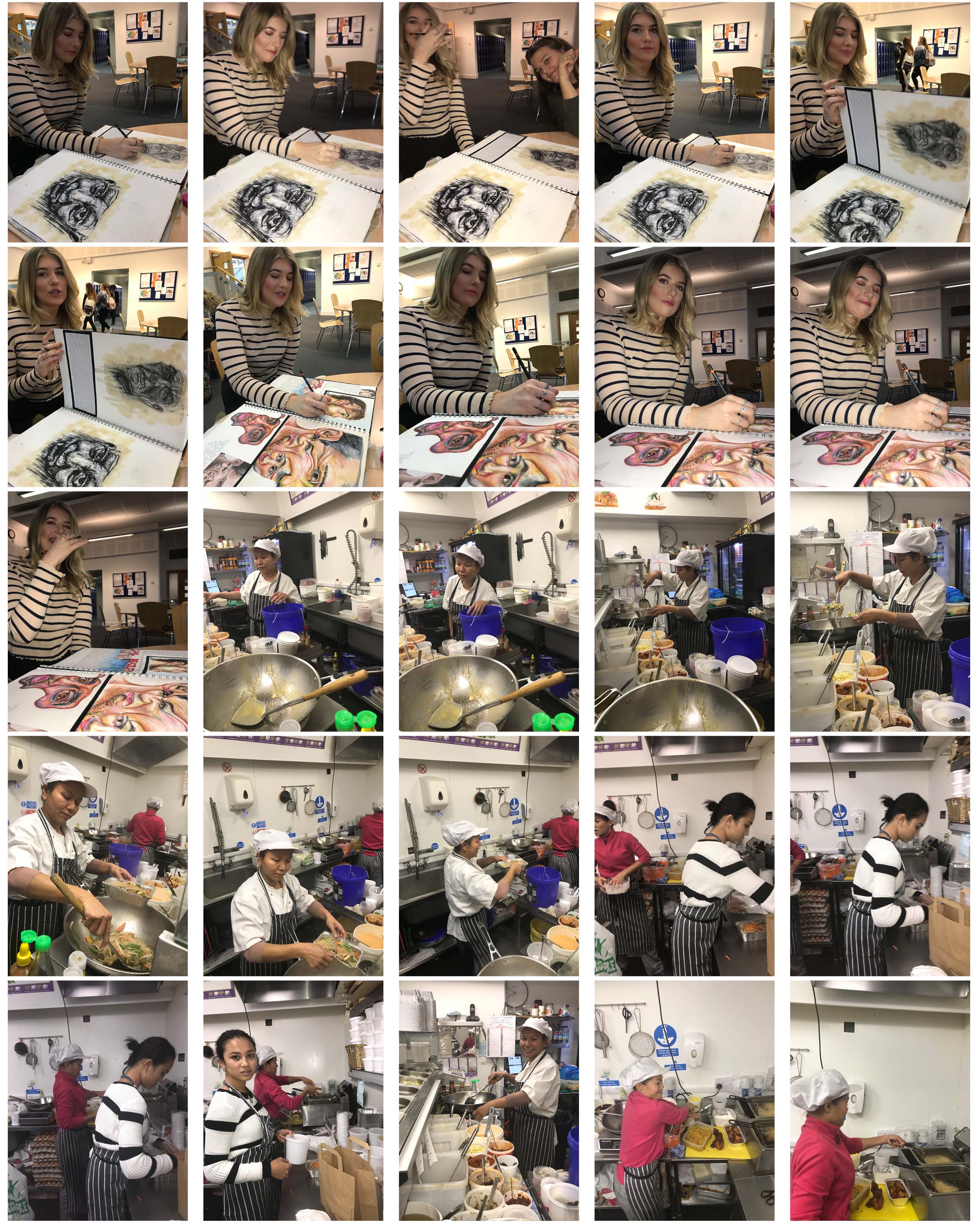
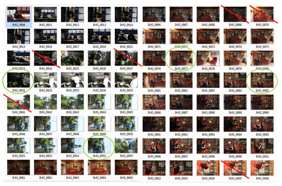
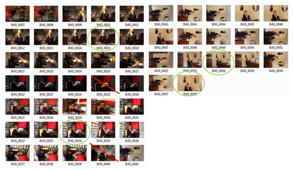
Contact Sheets

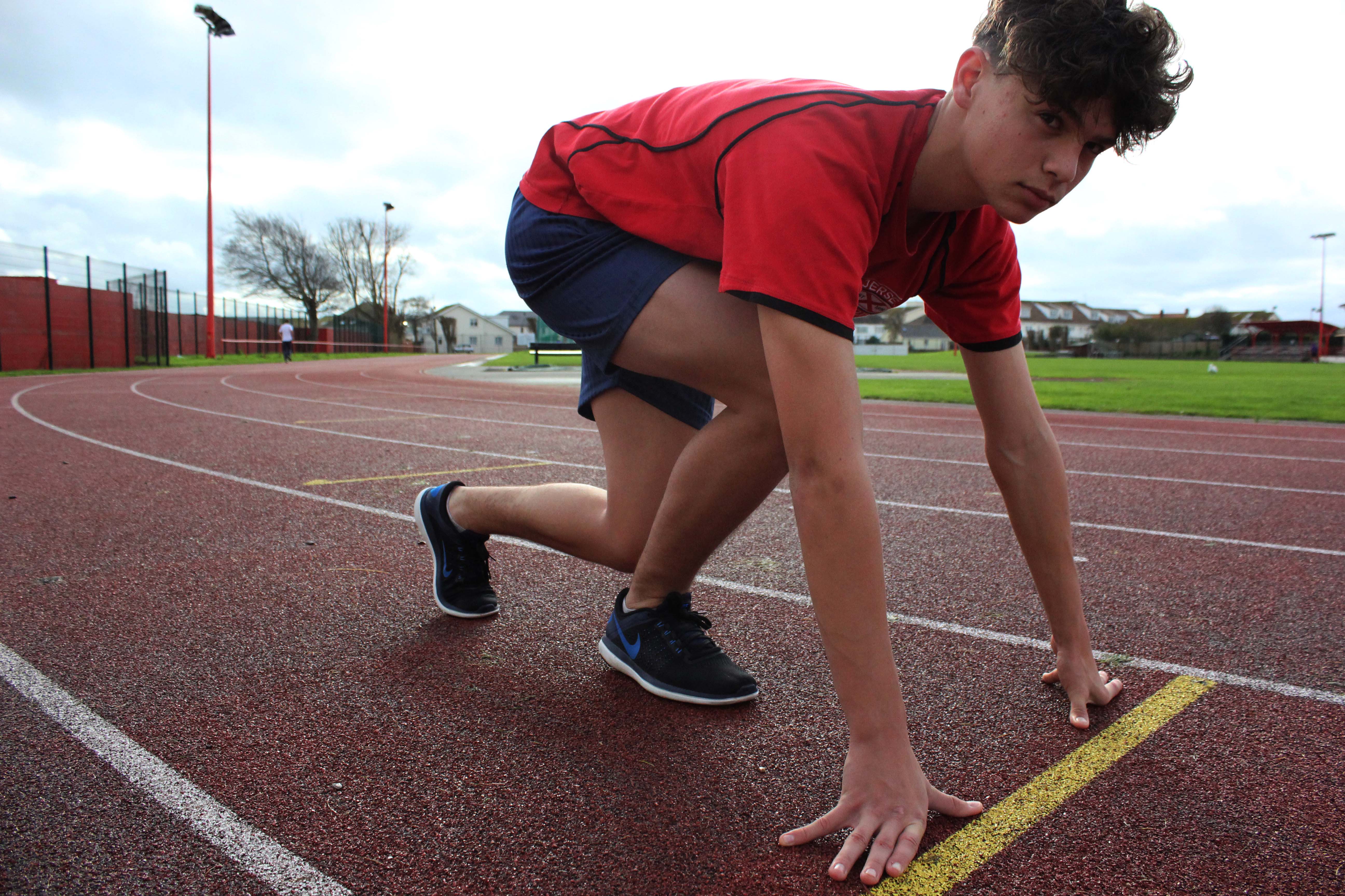
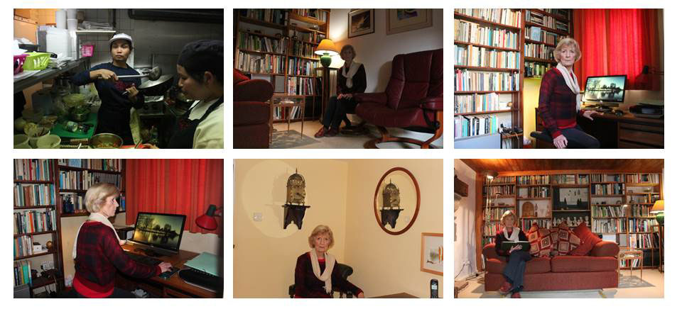
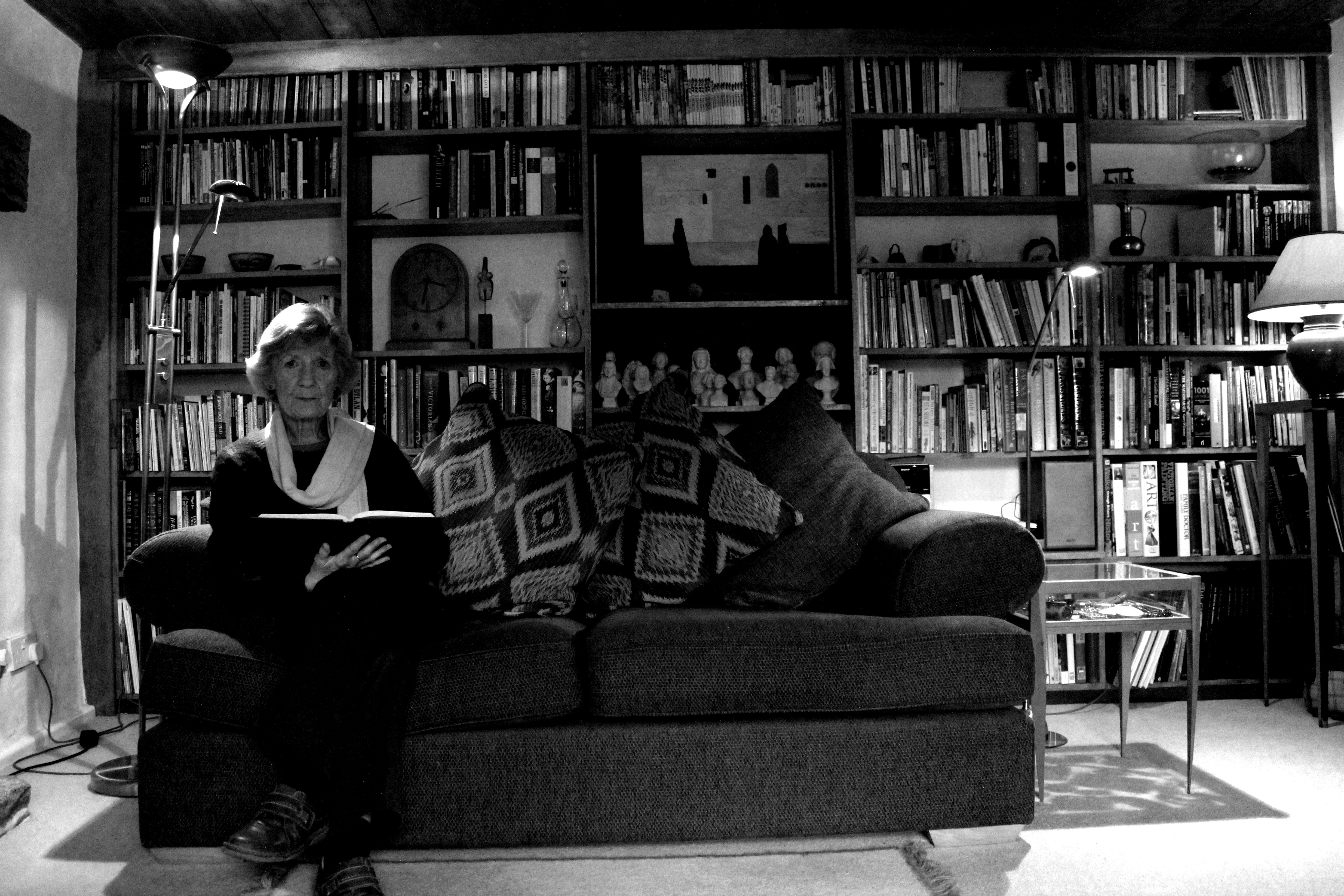
Final Images

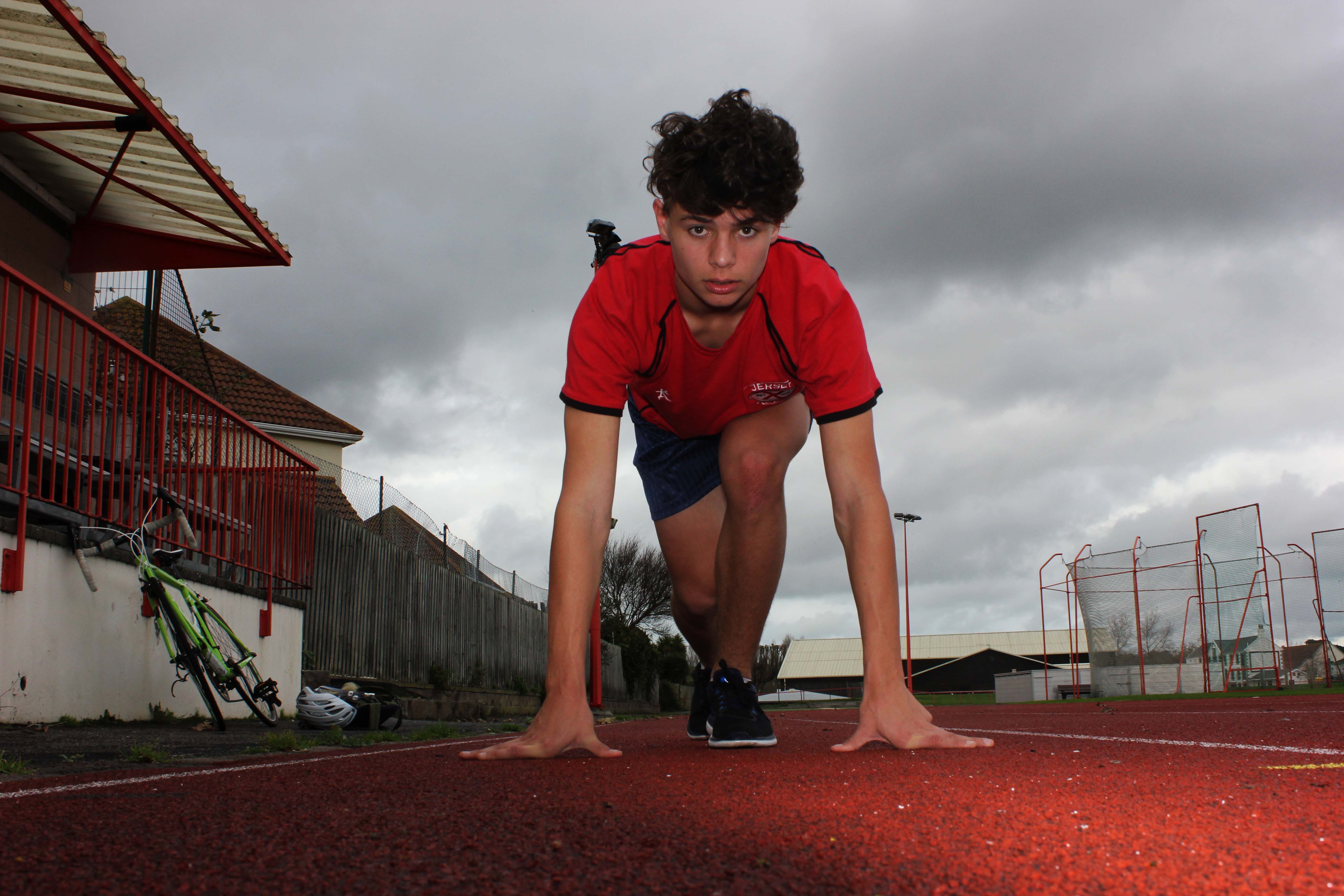
I edited the above images in a collection so that each photo added to the story of the subject in the photo, an athlete preparing to run. I brought down the brightness and increased the contrast to give the sky a dramatic effect behind the subject.

For this image, I edited it simply by increasing the contrast and reducing the brightness.

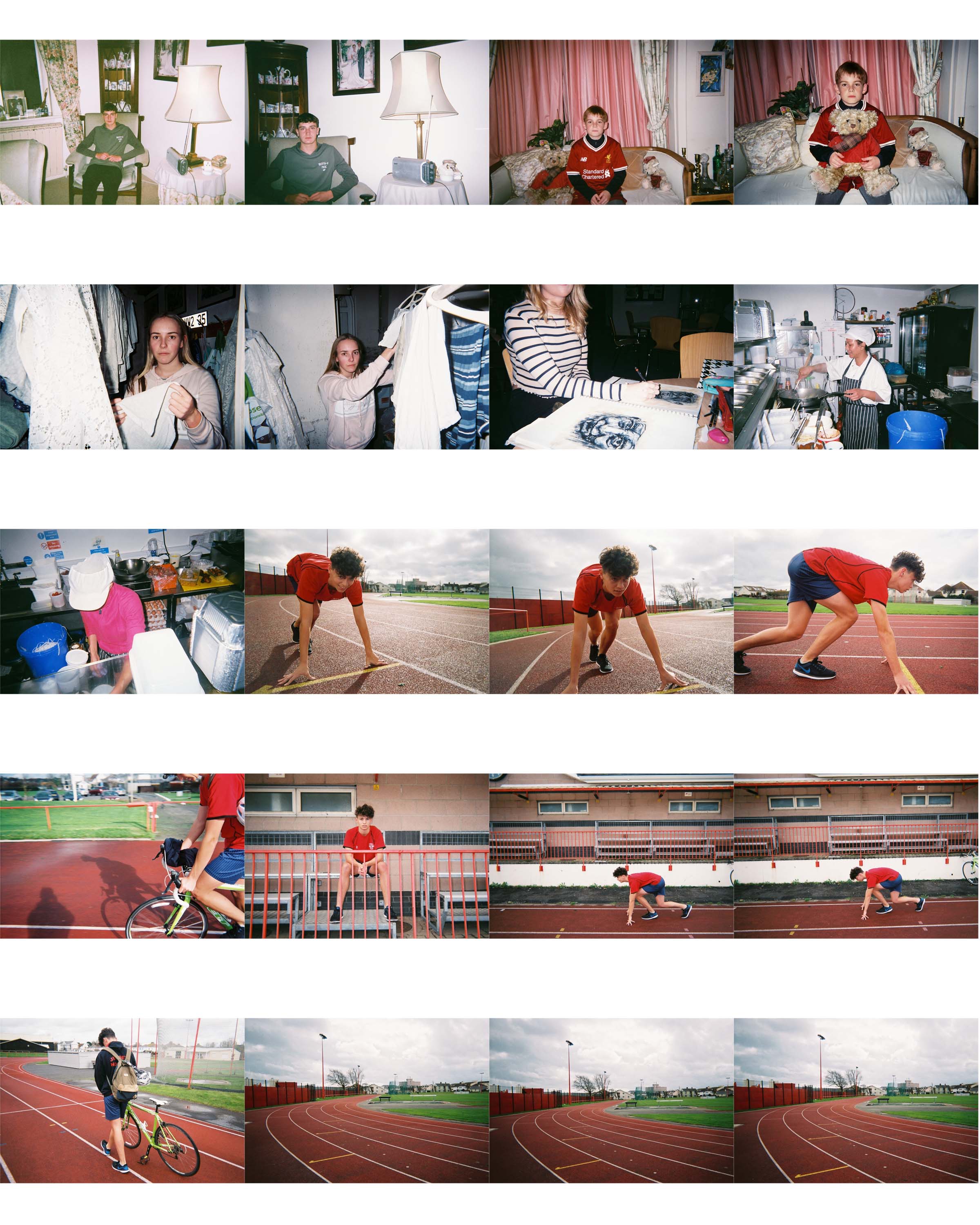
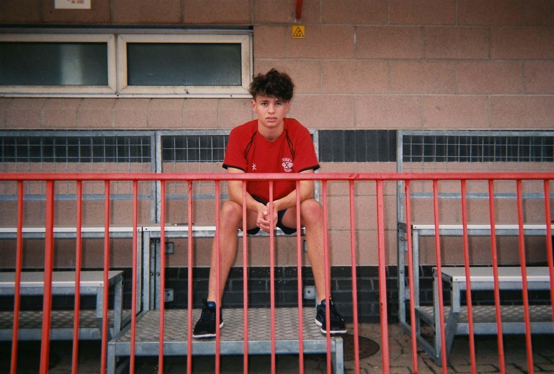
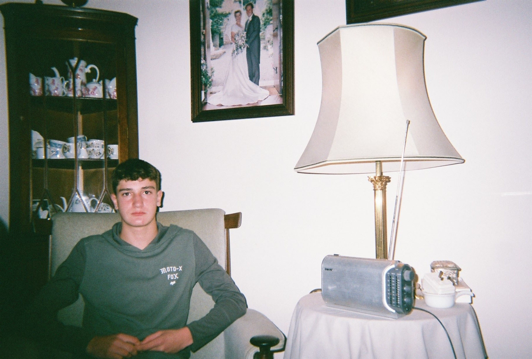
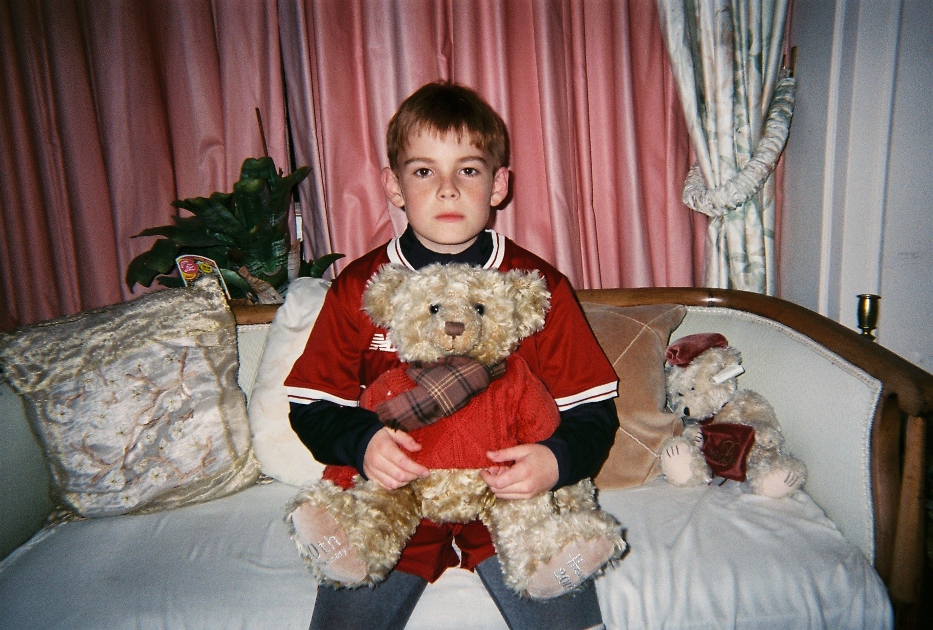
I took these images on a disposable camera as I liked the quality of them (an older family footage-style) and felt it would be suitable to take pictures of people in their environments anytime that I saw something interesting.

I did not edit these photos except to remove red eye from the camera flash, and reduce the contrast and exposure whilst increasing the brightness in the middle image.

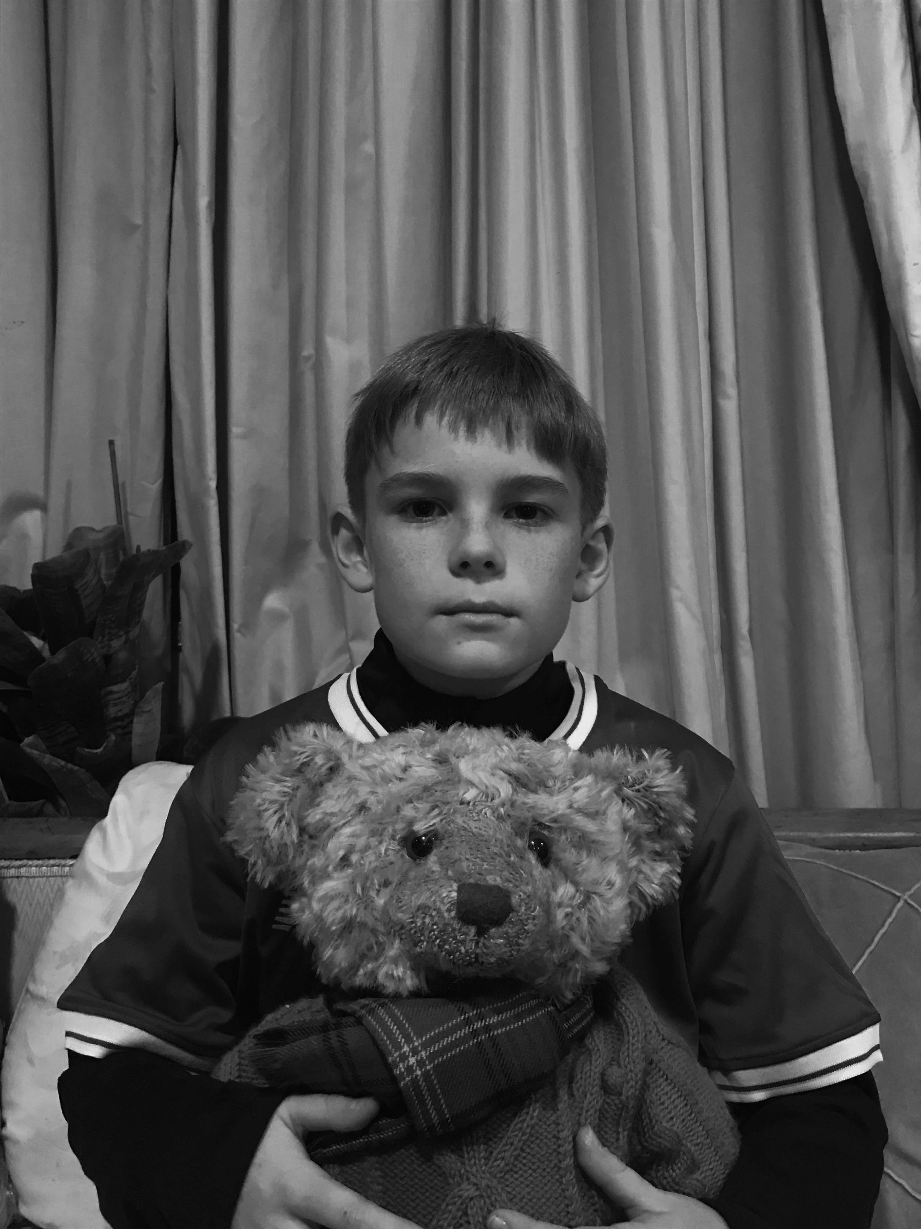
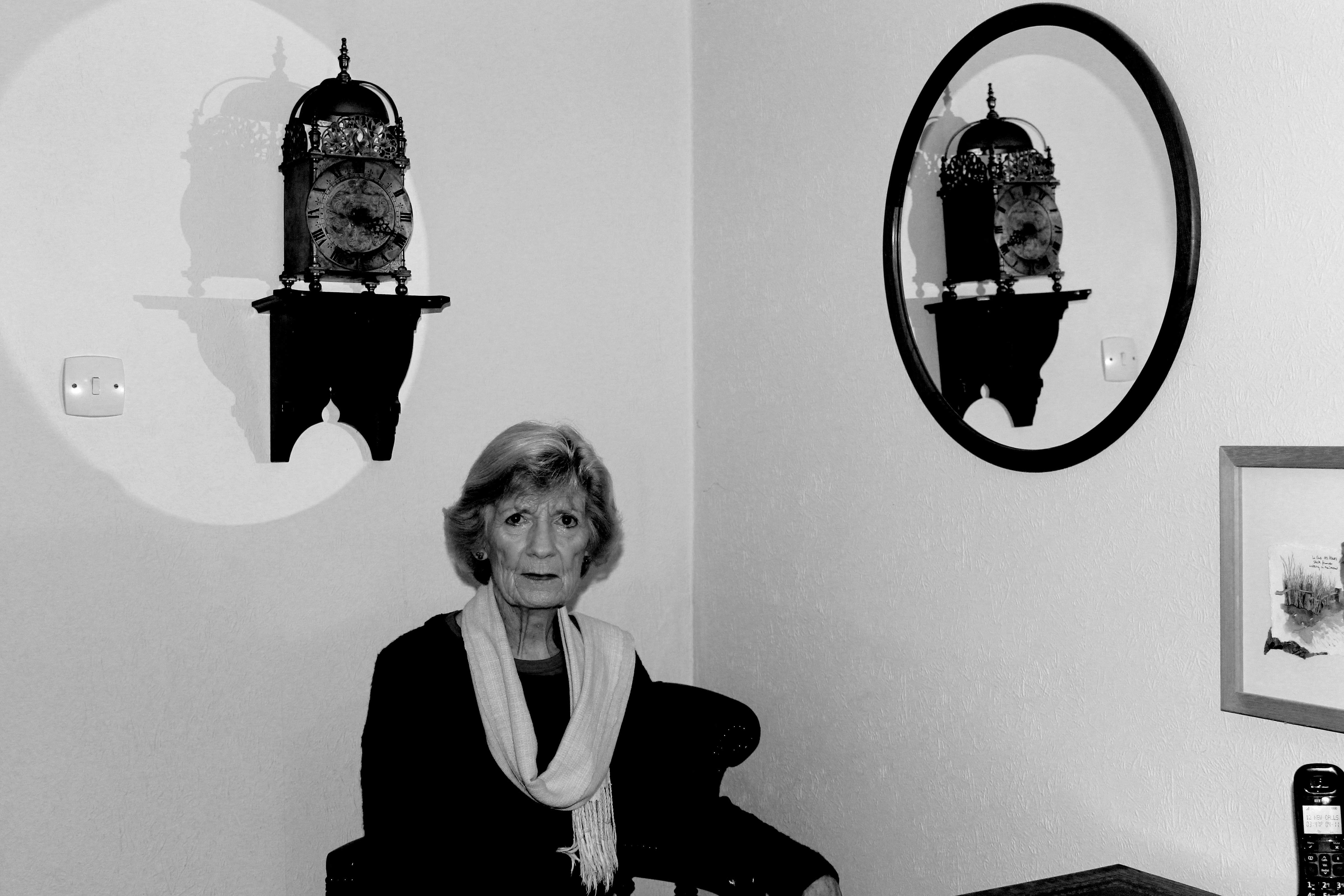
For these Images, I took inspiration from Arnold Newman’s famous black and white images. I reduced the saturation then increased the contrast and decreased the brightness to show off the different light and dark tones.

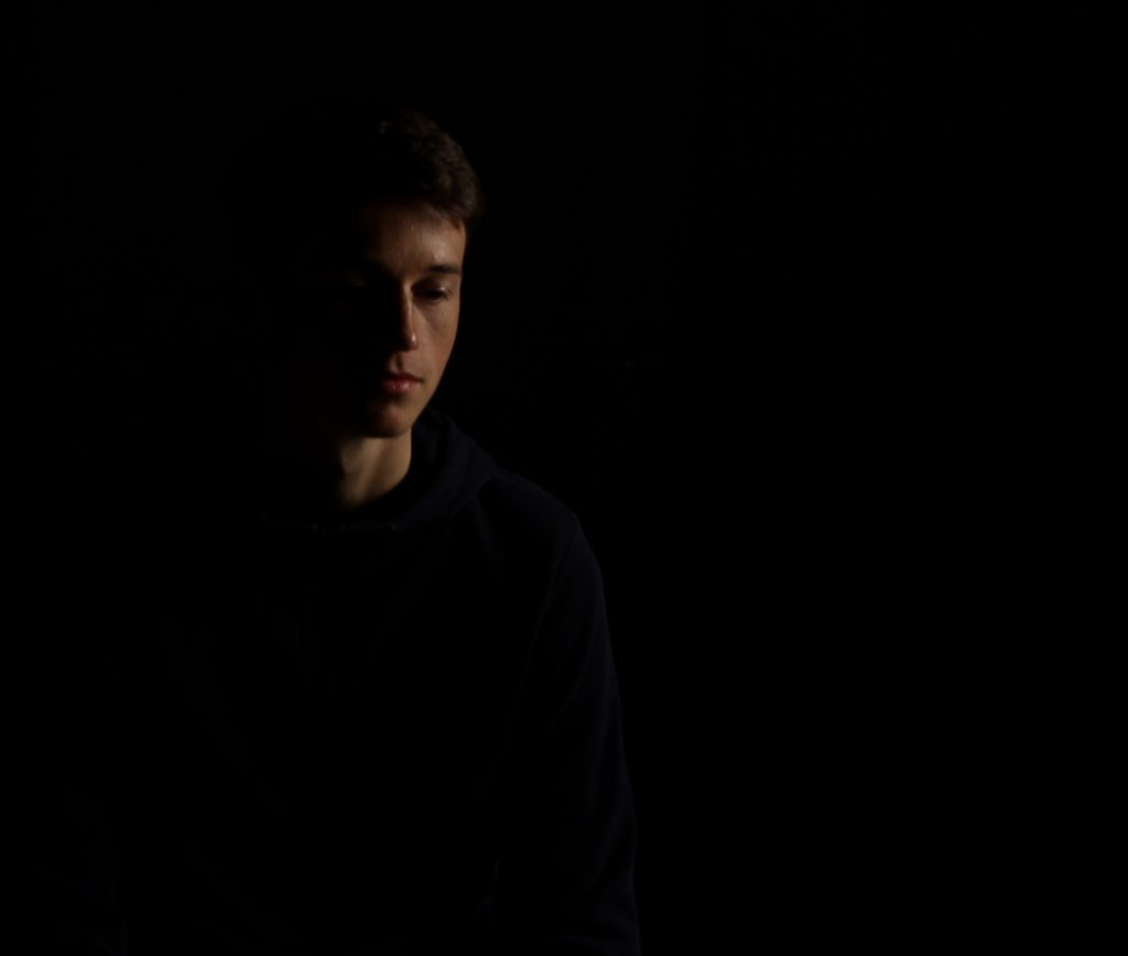
Chiaroscuro

What is chiaroscuro drawing?

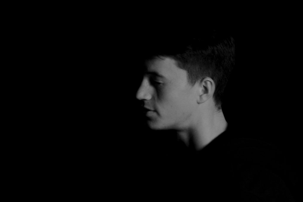
chiaroscuro is the effect of light modelling in painting, drawing, or print making where three-dimensional volume is suggested by the value gradation of color and the analytical division of light and shadow shapes (Known as shading).

Chiaroscuro has been used since the Renaissance and Baroque period where the artists wanted to engage their viewers. To do this one side of the subject tends to be darker than the other, usually bringing out an aspect of their features, and really drawing your eyes to it.
Related image
How is it used in modern photography?

Chiaroscuro is used within modern photography today to create dramatic portraits by making certain aspects of an image once again stand out as seen below:
Using this technique it allow as seen, it can also be used today to make aspects of objects as well as people stand out. When compared to the art, the chiaroscuro inside photography tends to be more dark and dramatic than the art, which tends to just make one side of the face slightly darker.

lee friedlander

Who is Lee Friedlander?

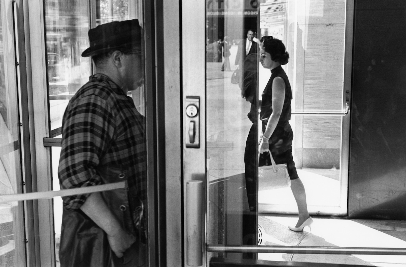
lee friedlanderis an American photographer and artist from the 1960s and 70s. Lee evolved an influential and often imitated visual language of urban social landscape, with many of his photographs including fragments of store-front reflections, structures framed by fences, posters and street signs.

Image result for Lee Friedlander

Image result for Lee Friedlander

Image result for Lee Friedlander

Image result for Lee Friedlander


Image analysis


Image result for lee friedlander

This is a black and white urban candid photograph. The black and white in this image creates strong contrasts, the black on the woman’s dress creates a strong contrast with the white zebra crossing on the road. The use of the strong contrast really allows the people to stand out and helps create a focal point for the image. This image also follows the rule of thirds as the large man on the right side of the image in on the two right intersecting focal lines. This photograph also has a sense of depth as it shows the people in the front but there is also a large group of people in the back that are also in focus.

My responses

Contact sheets

How I edited my images

Original Image
Final Image

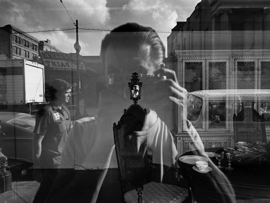
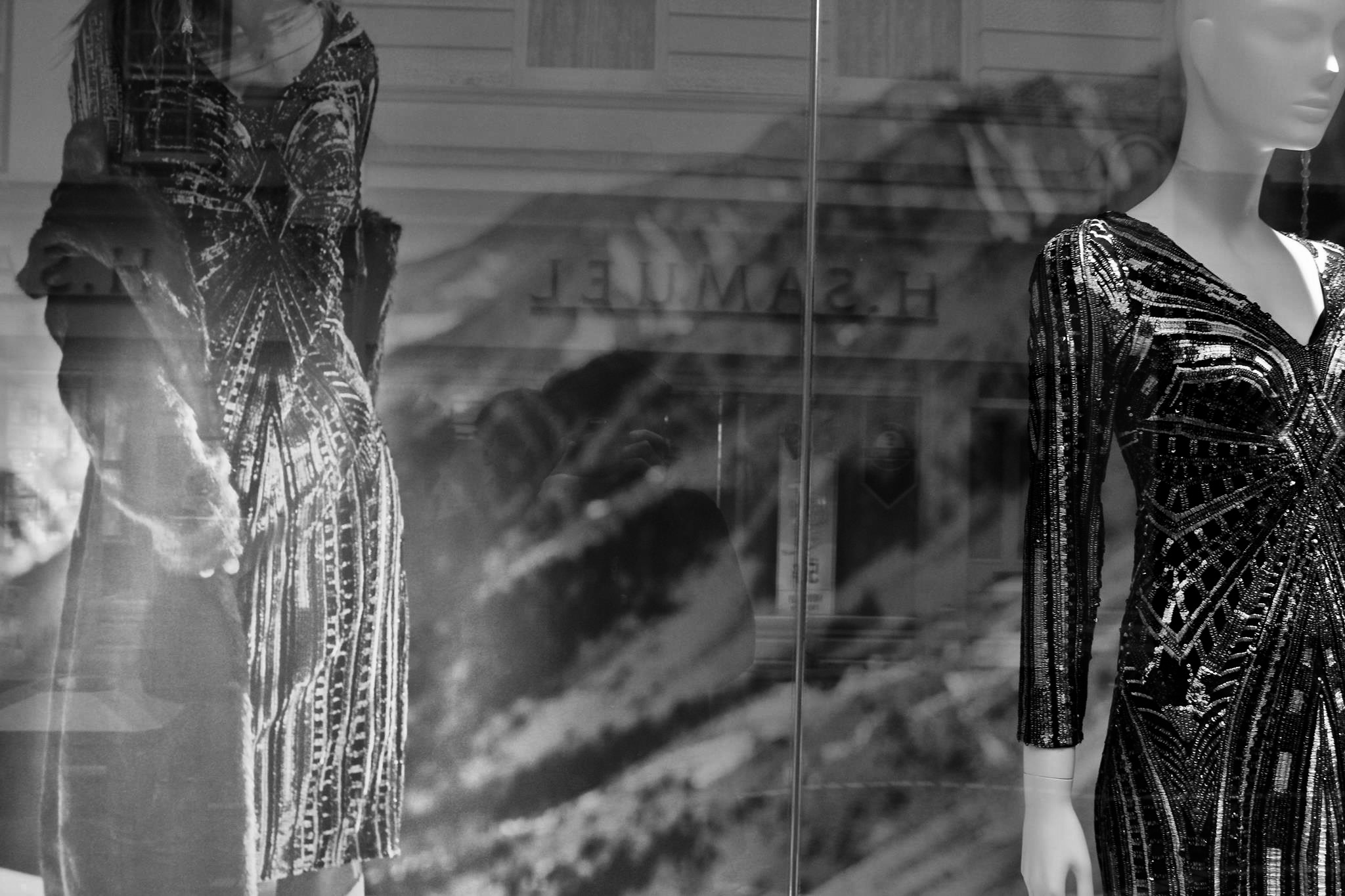
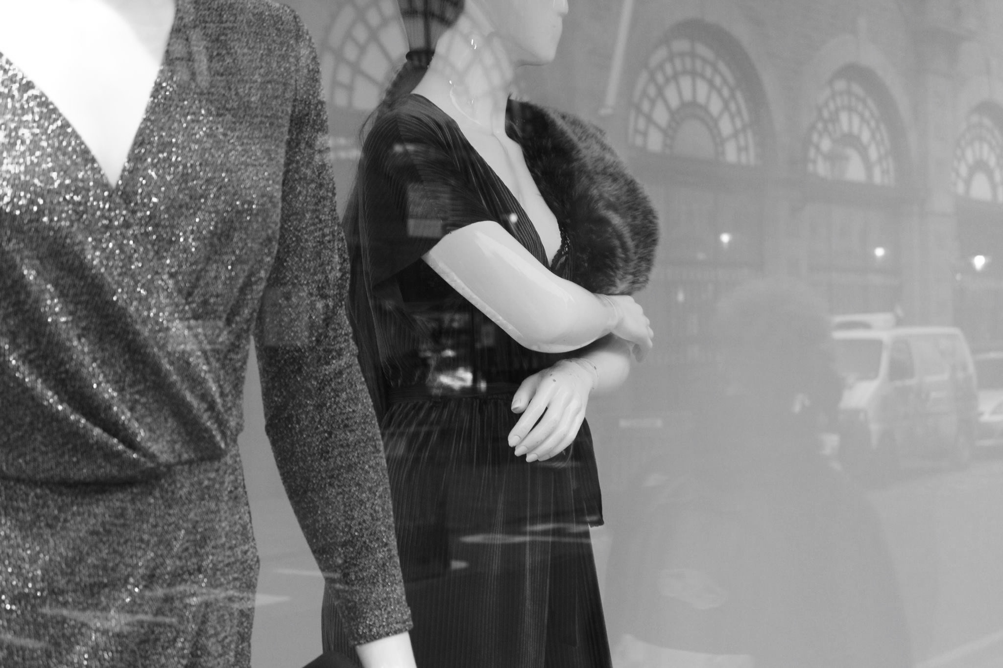
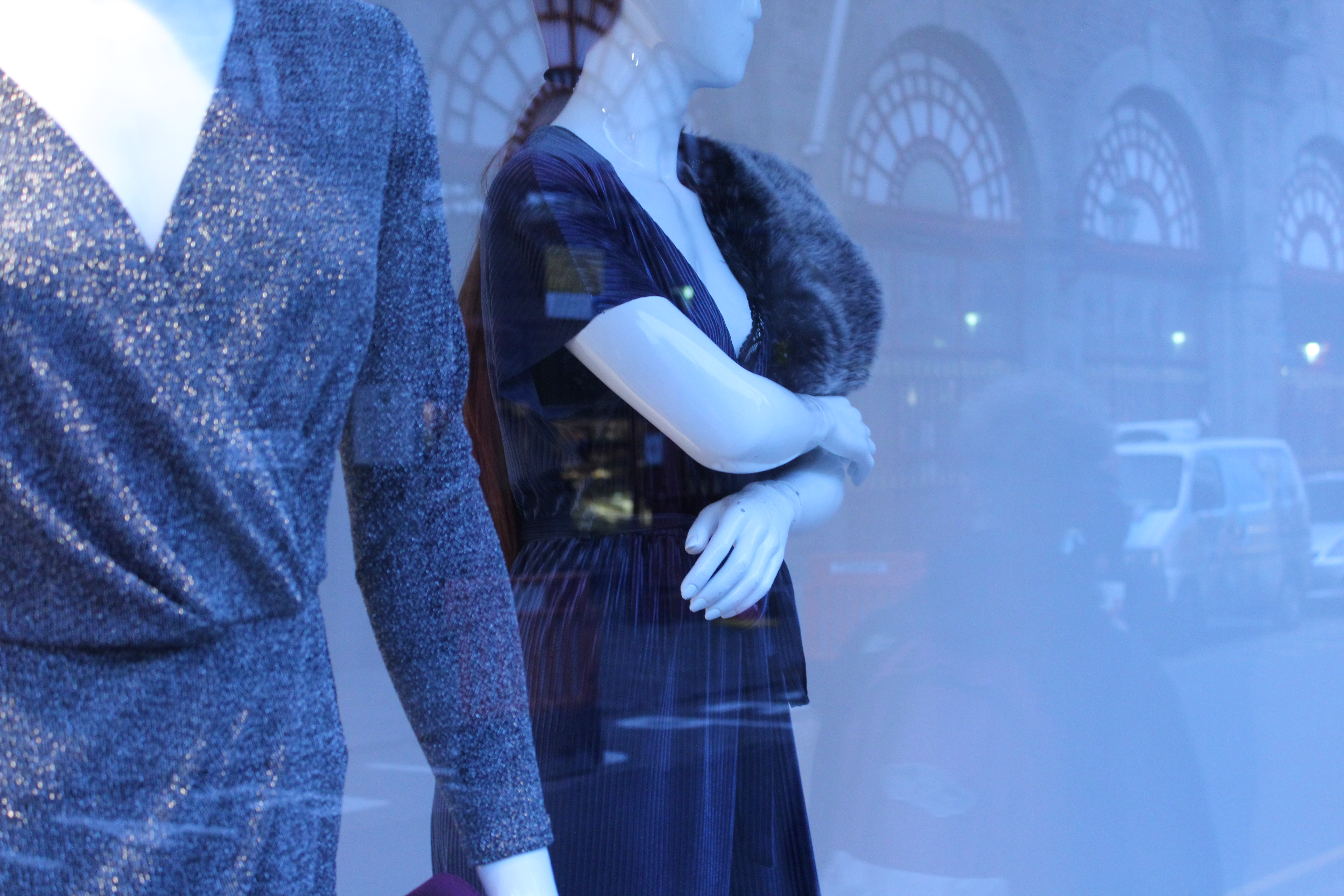
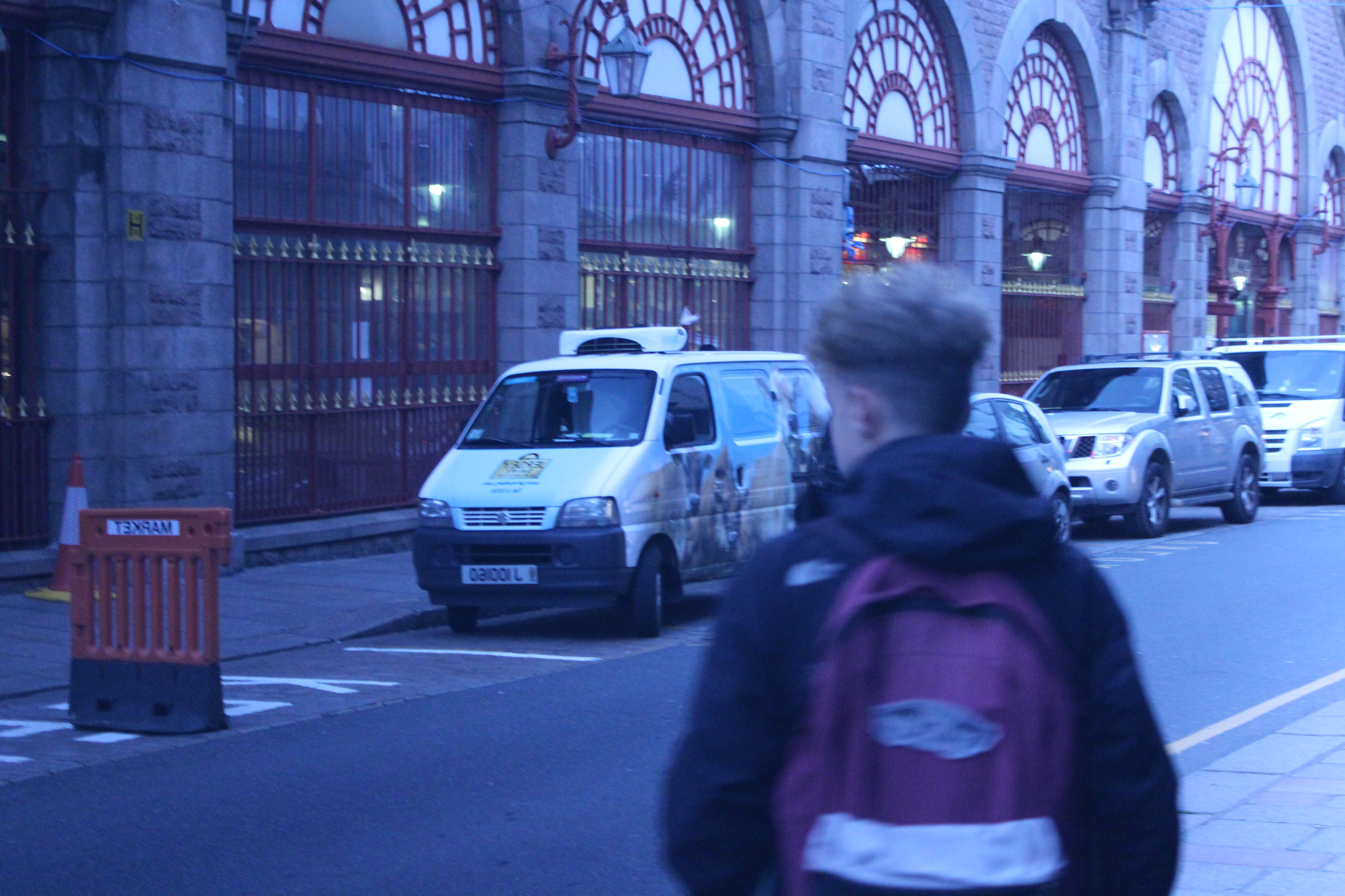
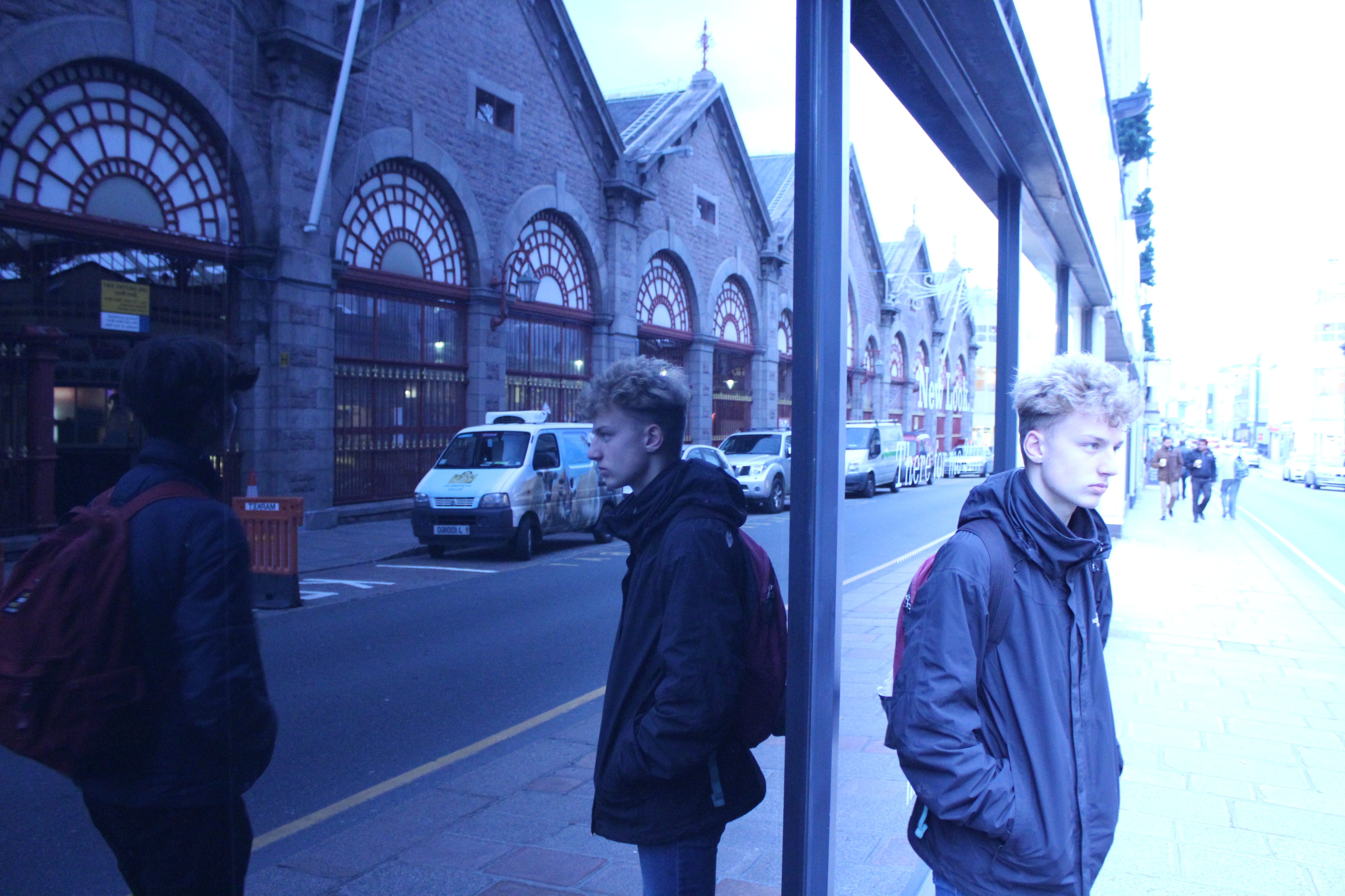
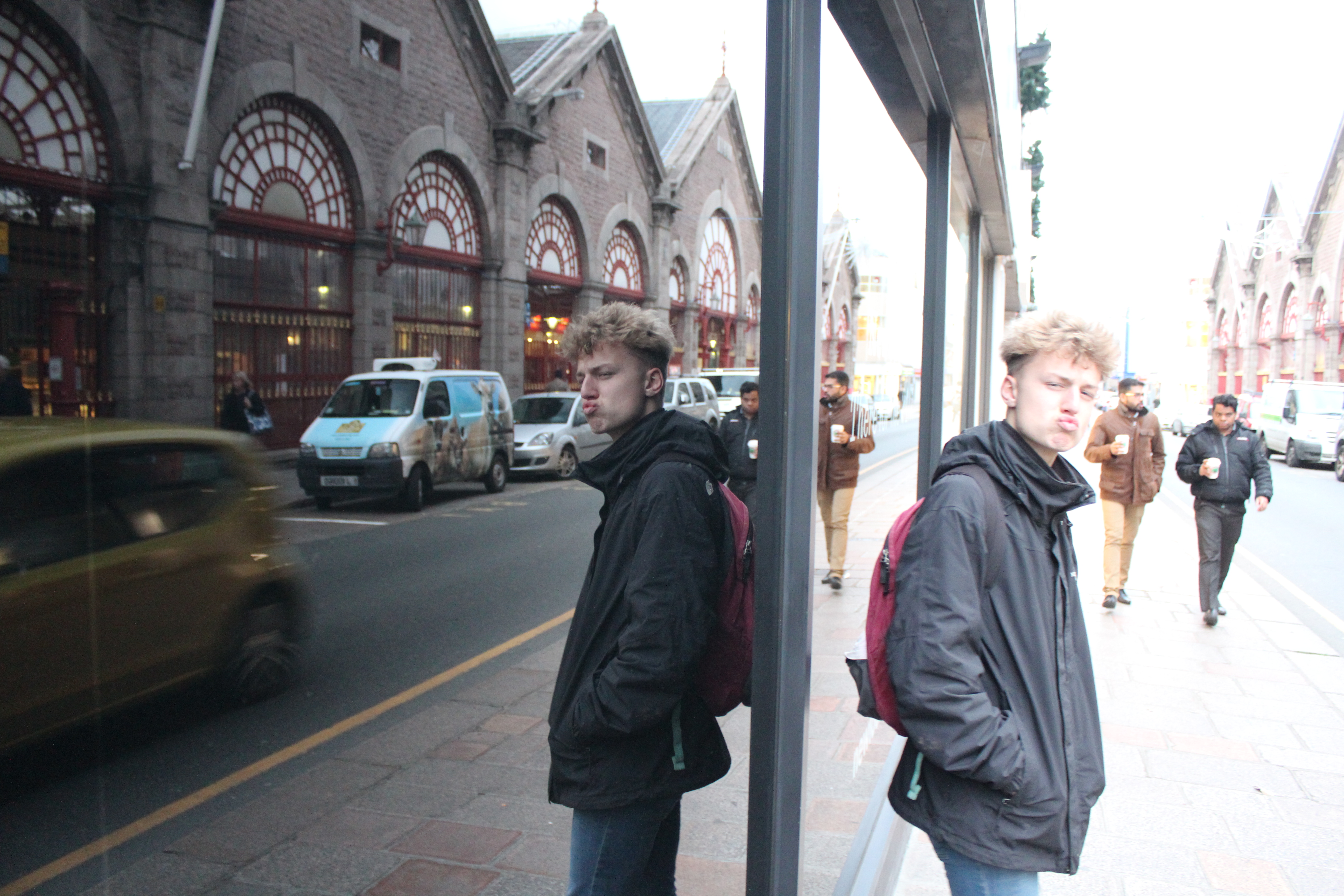
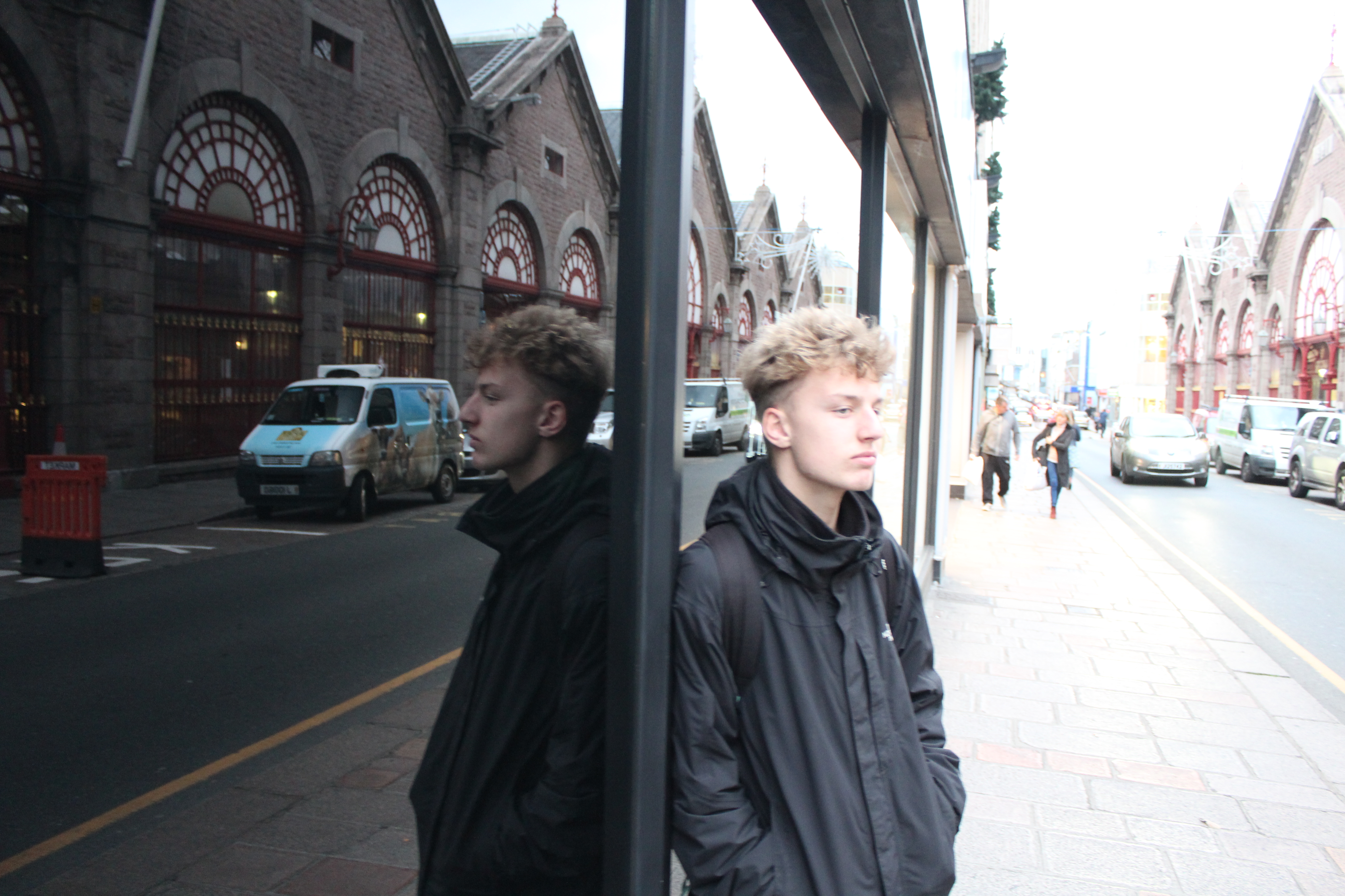
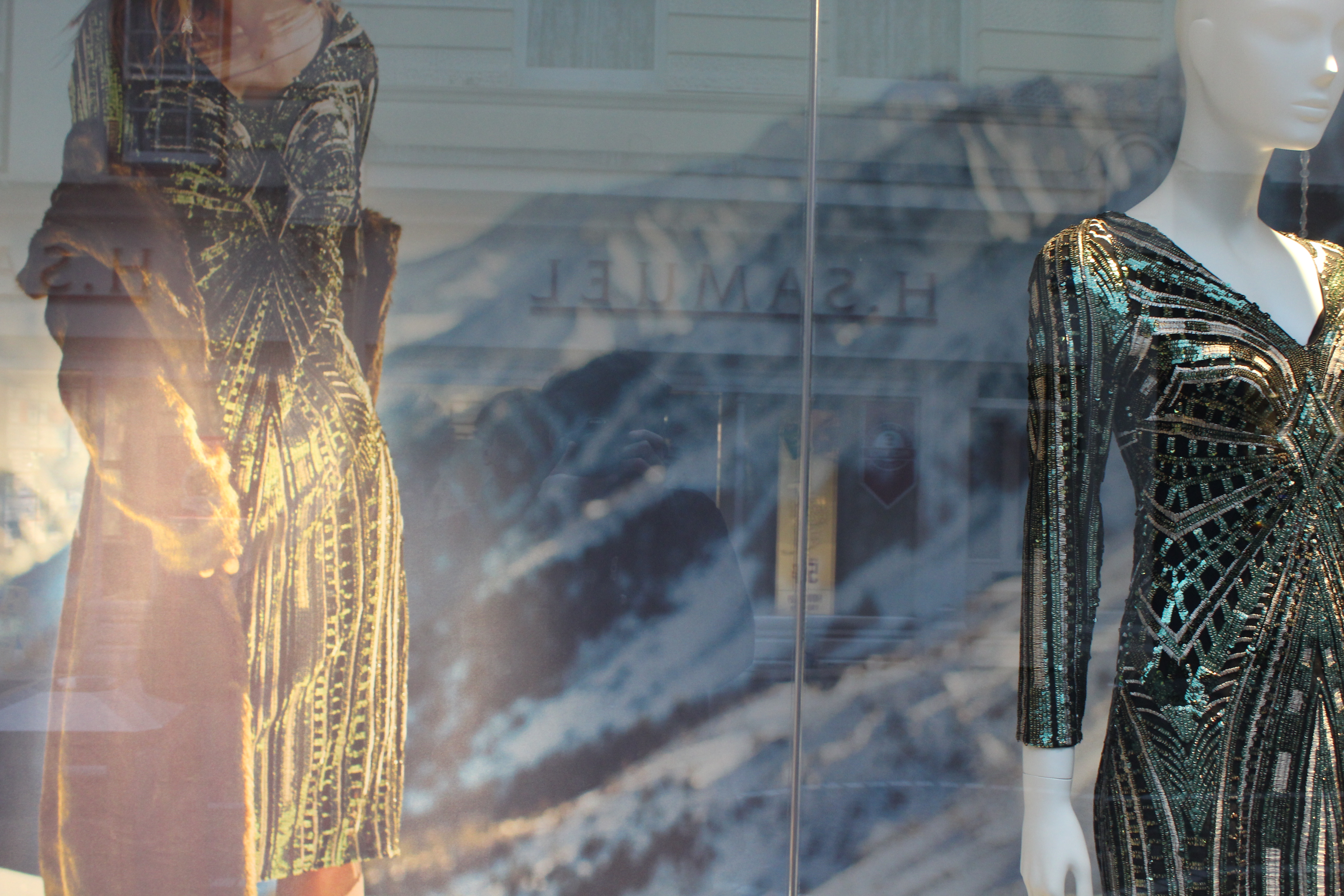
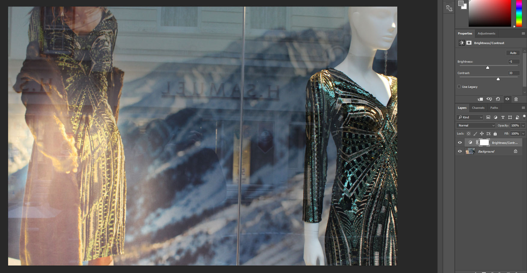
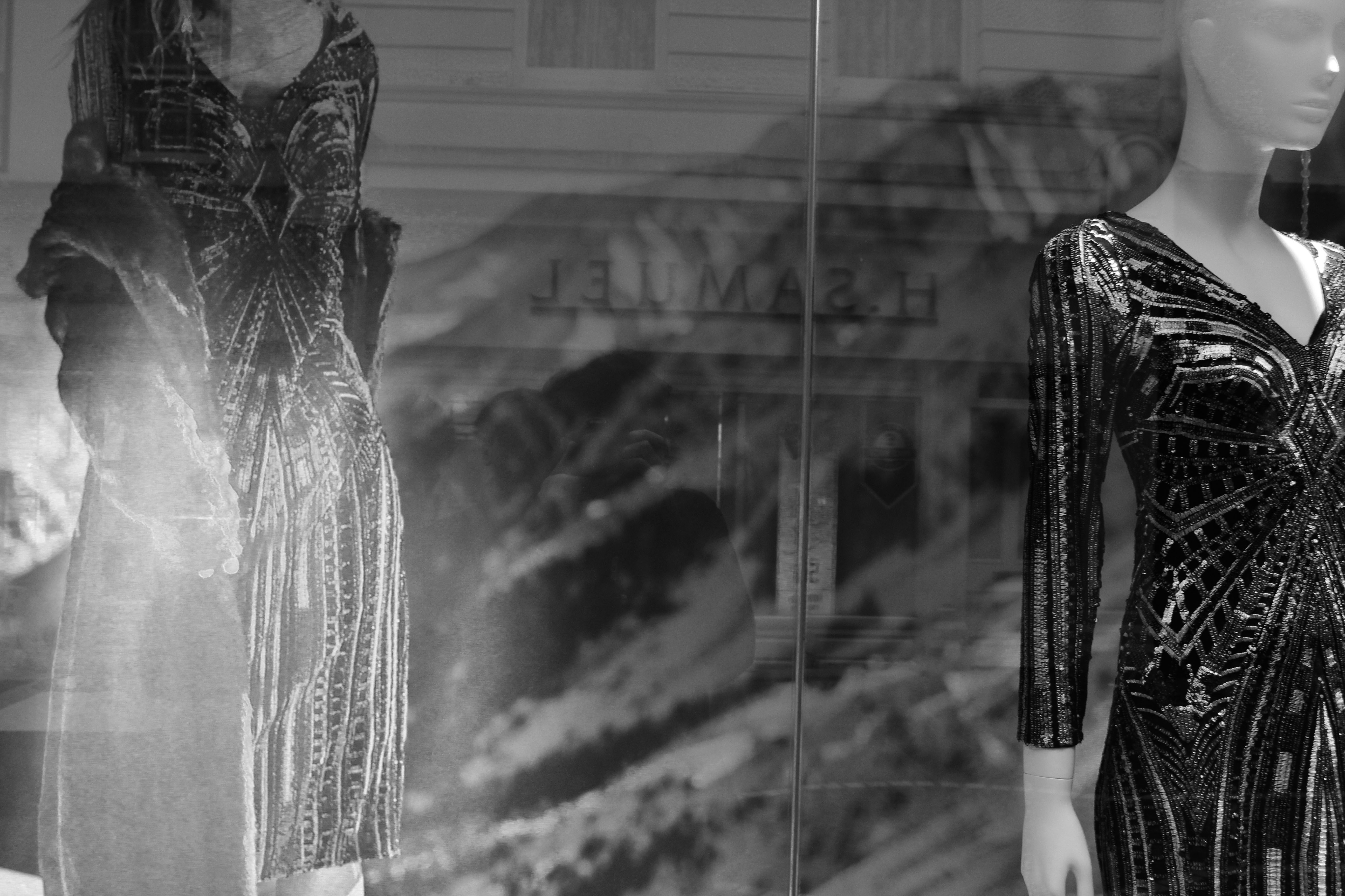
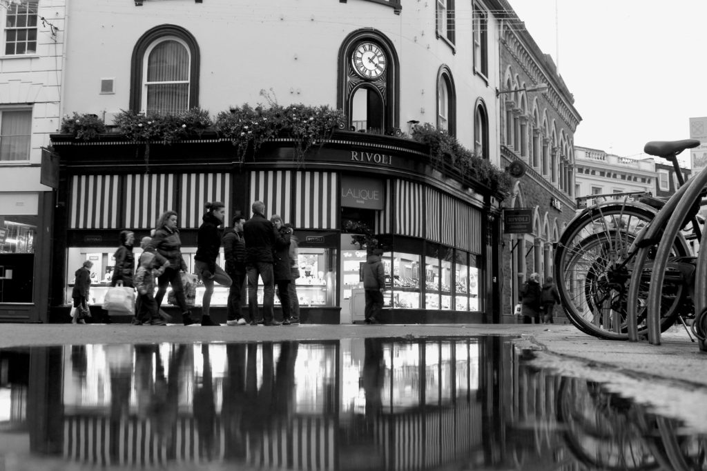
This was my favorite image out of my shoot and also my selected edits as it reflected Lee Friedlander work the most  and was the one I was most happy with.  This setting was perfect as the reflection from the building behind and myself where clear and it contrasted well with the mountains and the manicans in the shop window.

Street Photography – Homework

Planning

Task – Take 100-250 photos in an urbanised environment with people as the main focus.

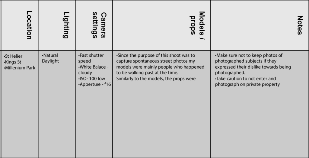
Models/Props – Friends and strangers

Camera Settings – I will use a quick shutter speed of about 1/100-1/500 depending on how fast the subjects are moving as I plan on photographing them whilst they naturally move around. I will use a low ISO as the area I will take photos in will be well lit with street lighting.

Lighting – Natural lighting will mostly be used however may be necessary to use a flash to highlight key aspects in my models face

Location – In town as this is an urbanised area

Context – Photographing strangers and friends without them aware of the photo being taken in order to capture a realistic view of how they would be behaving.

Concept – To capture street photographs in the style of Vivian Maier and Robert Frank.

Vivian Maier

Vivian Maier (1926-2009) was an American street photographer born in New York City. Her work was unknown and unpublished during her lifetime. In 2007,  collectors found some of her prints and negatives in boxes. Her images were first published on the internet in 2008. Her work has now been exhibited in North America, Europe, Asia and South America. A lot of details about Maier’s life remains unknown.

Image result for Vivian Maier

Image result for Vivian Maier

Image result for Vivian Maier

Robert Frank

Robert Frank (born November 9, 1924) is a Swiss-American photographer and documentary film maker. His most notable work, the 1958 book titled The Americans. His style of work is classed as photo journalism and documentary/street photography.

Image result for robert frank

Image result for robert frank

Photo Analysis

Image result for robert frank

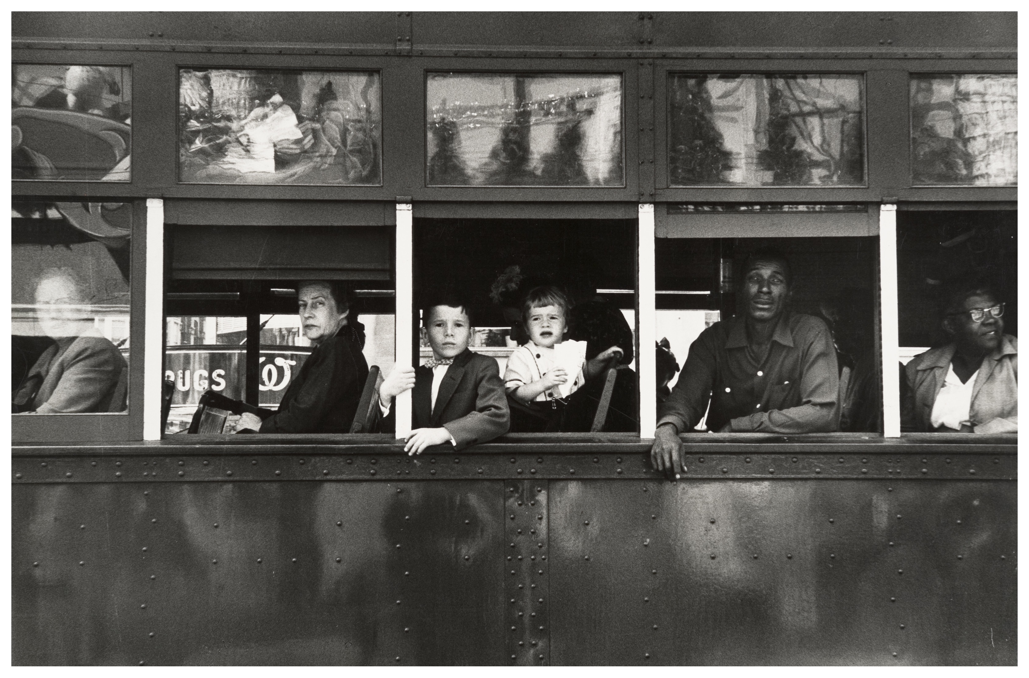
The first thing which caught my eye when observing this picture was the clear use of the rule of thirds. The bus itself create natural lines almost along the horizontal lines when following the rule of thirds. I believe this helps the viewer the see how the picture is made up of several portrait pictures. There is a large tonal range within this picture, with lighter tones towards the top and darker tones towards the bottom. The tonal range can also be seen within the skin tone of the people on the bus, from the left hand side a white man is presented and on the right hand side we are presented with a black person. We can clearly identify that Robert Frank would have used a fast shutter speed in order to take this photograph. This is because the picture is of a moving subject and would require a fast shutter speed to prevent a blur in the image. With a fast shutter speed he was able to capture a sharp photo.There is also multiple textures inside of this image, for example there is the texture of the trolley at the bottom of the image. The blots on the trolley also add another texture to the image.  Moreover, there is the texture of the windows at the top of the image, these look smooth.

This image is split into 3 main sections, the top middle and bottom. The middle part is the main focus which contains the main subjects of the people. Where as the top and bottom contain some interesting textures and reflections but this is not what stands out and catches the viewers eye immediately. There is a definite contrast within this image, with the black and whites exaggerated. There is a clear contrast between the white poles/bars separating the people and the rest of the bus, perhaps influencing us that they are a main factor of the image. This photo has been captured in natural light which is expressed in the reflections at the top of the image. I think that the use of the picture being in black and white emphasizes the different races.

This image taken by Robert Franks was captured in the 1950’s. This image was also taken in America, New Orleans. At this time period,  America experienced marked economic growth – with an increase in manufacturing and home construction among a post–World War II economic expansion. At this time period it was uncommon for photographers to tackle the issue of racism which is a key theme portrayed within this photo. The time period when this photo was taken was a time of racism and prejudice. Although the photo may have been an ‘accident’ as Robert Frank himself said, it may have been a powerful and strongly influential picture to help the problem with racism.

It looks as if the different races are separated from each other. The white man is at the front of the trolley while the rest are sat behind him. This can connote the fact that at this time people like that where protected by society and had more ‘privilege’. The different facial expressions of the different people can say quite a lot about the image. They all have the same serious look about them. This can represent the lives of these people. The layout of the characters in the image also represents the different classes, for example the man at the front could be a higher class than the one at the back however we do not know this it is just interpretation. The white bars can again also show the separation between the different classes.

My Photoshoot


Edited Images

Street Photography Shoot

What is street photography?

Street photography, also sometimes known as candid photography, is a type of photography conducted for either art of inquiry, that features many unedited encounters and random incidents within public places of interest.

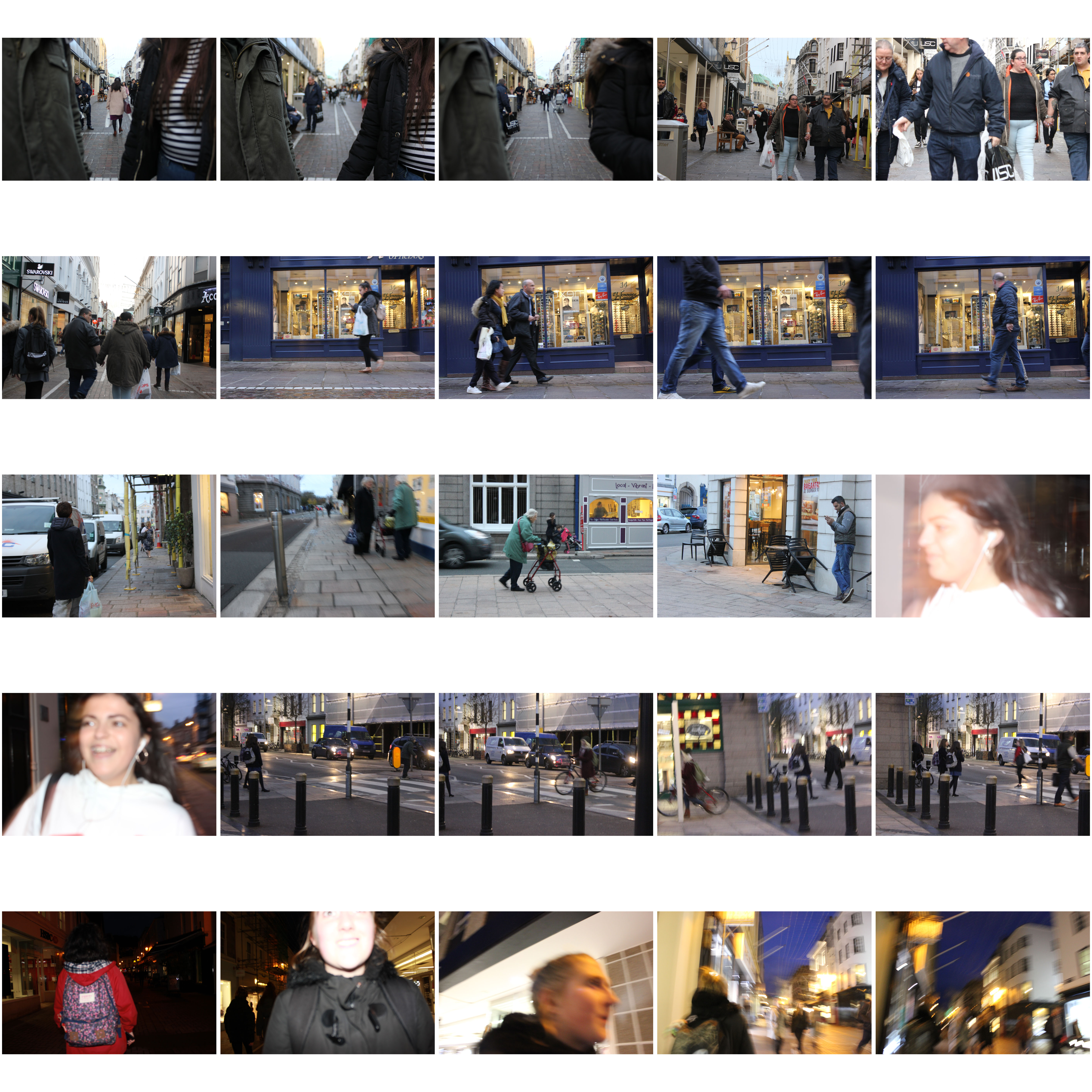
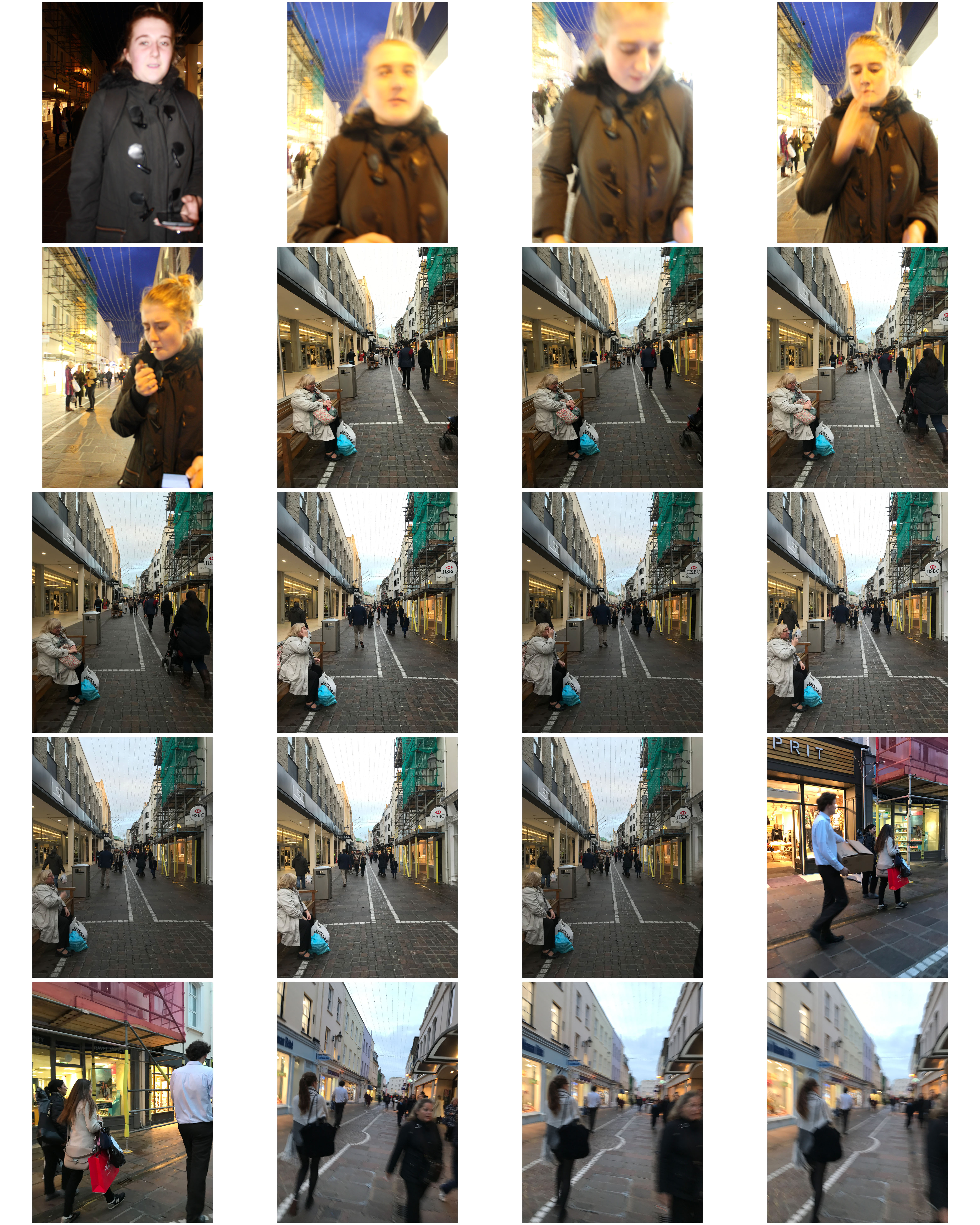
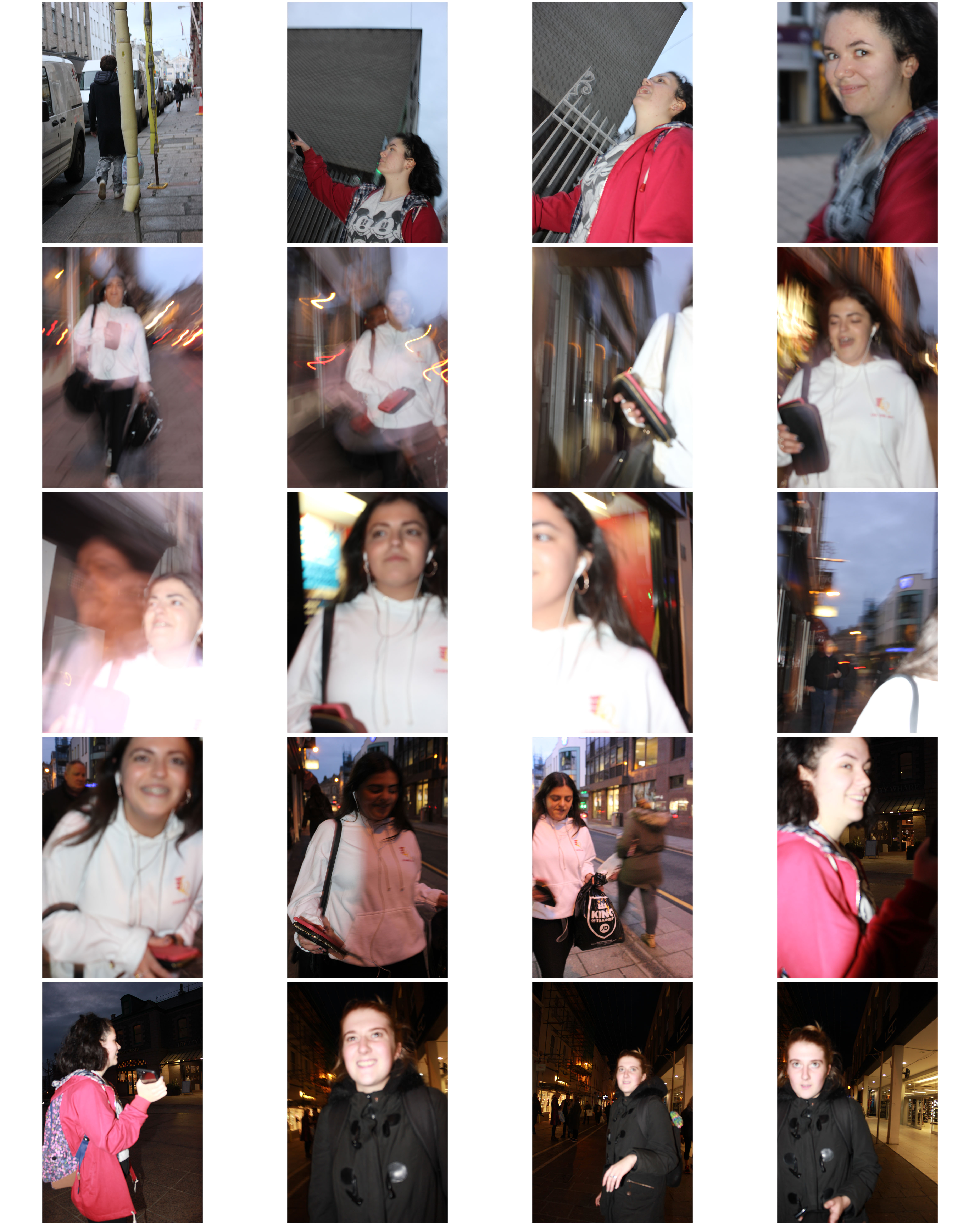
I found that many images of street photography included capturing the subjects off guard, and so thought that to try this would allow for maximum effect when taking the shoot. 

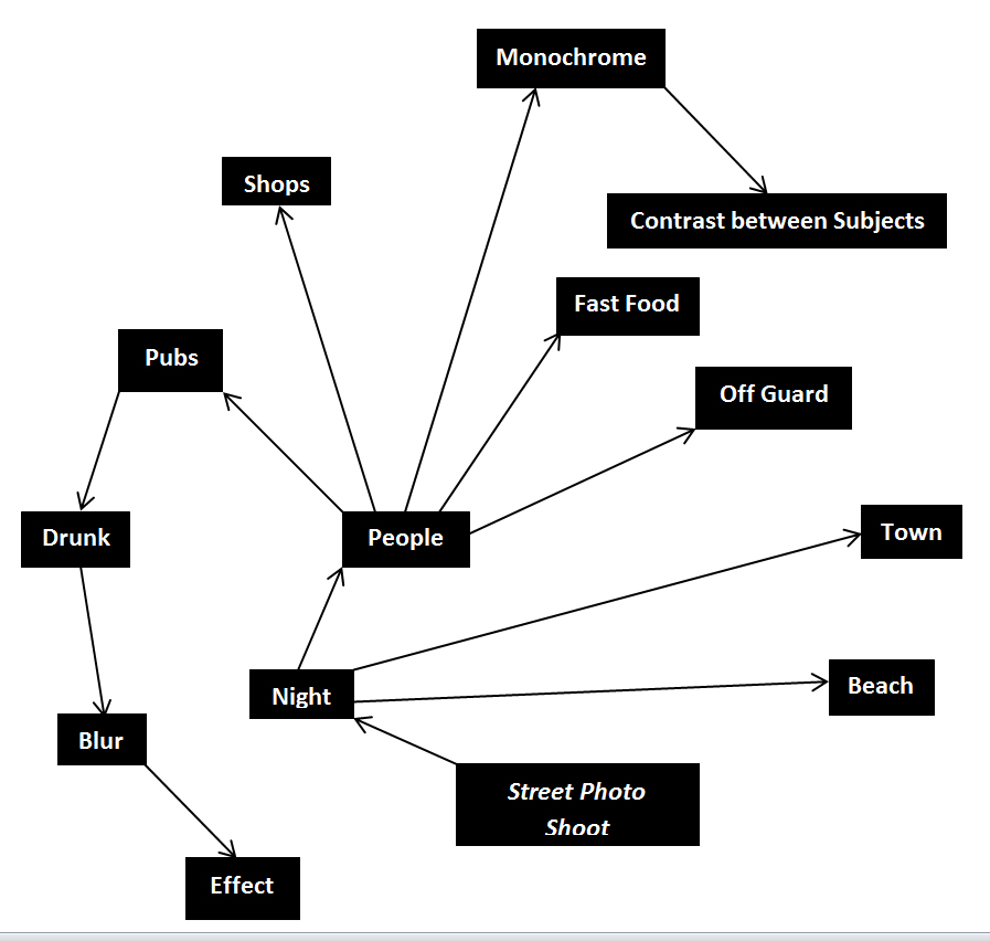
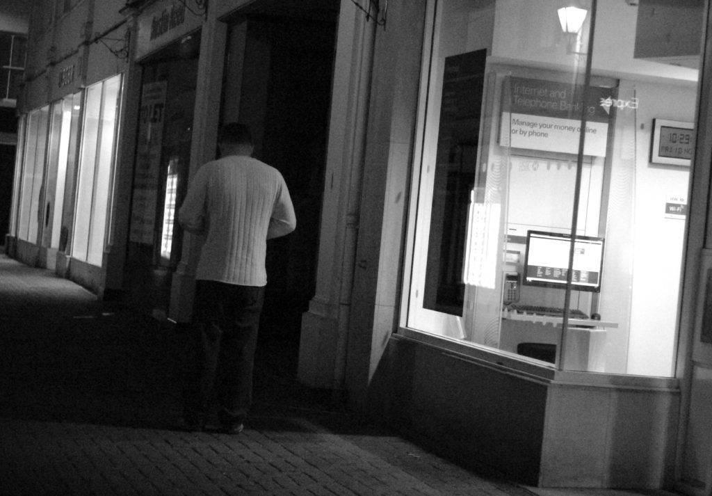
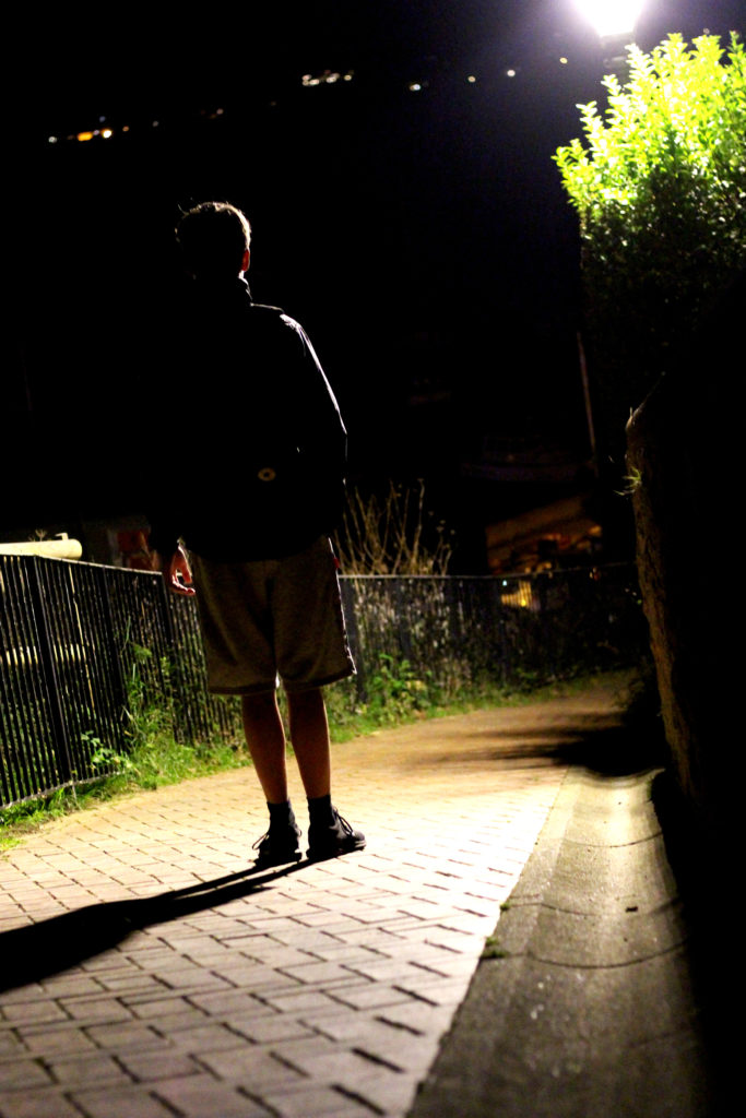
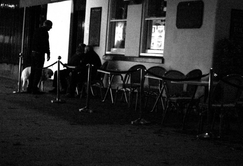
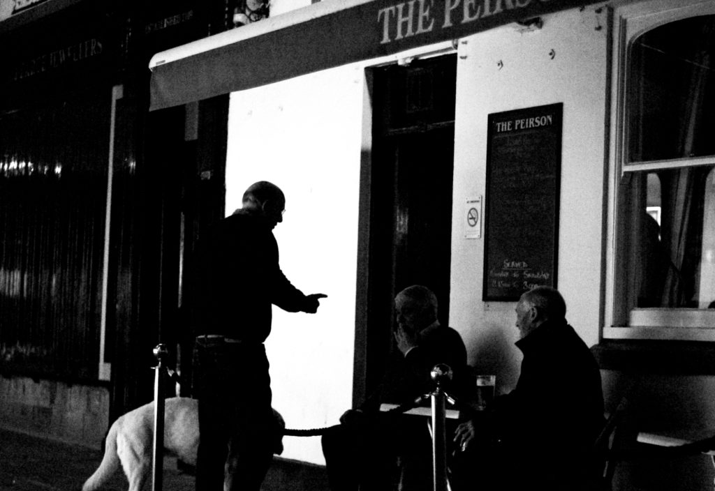
For my shoot I decided it would be either best to go into down for the nightlife, or stay around the street where I lived such as the bars etc. When planning the shoot I wanted it to be clear what I would be taking pictures of, and so made a mind-map to record my ideas, as seen below:
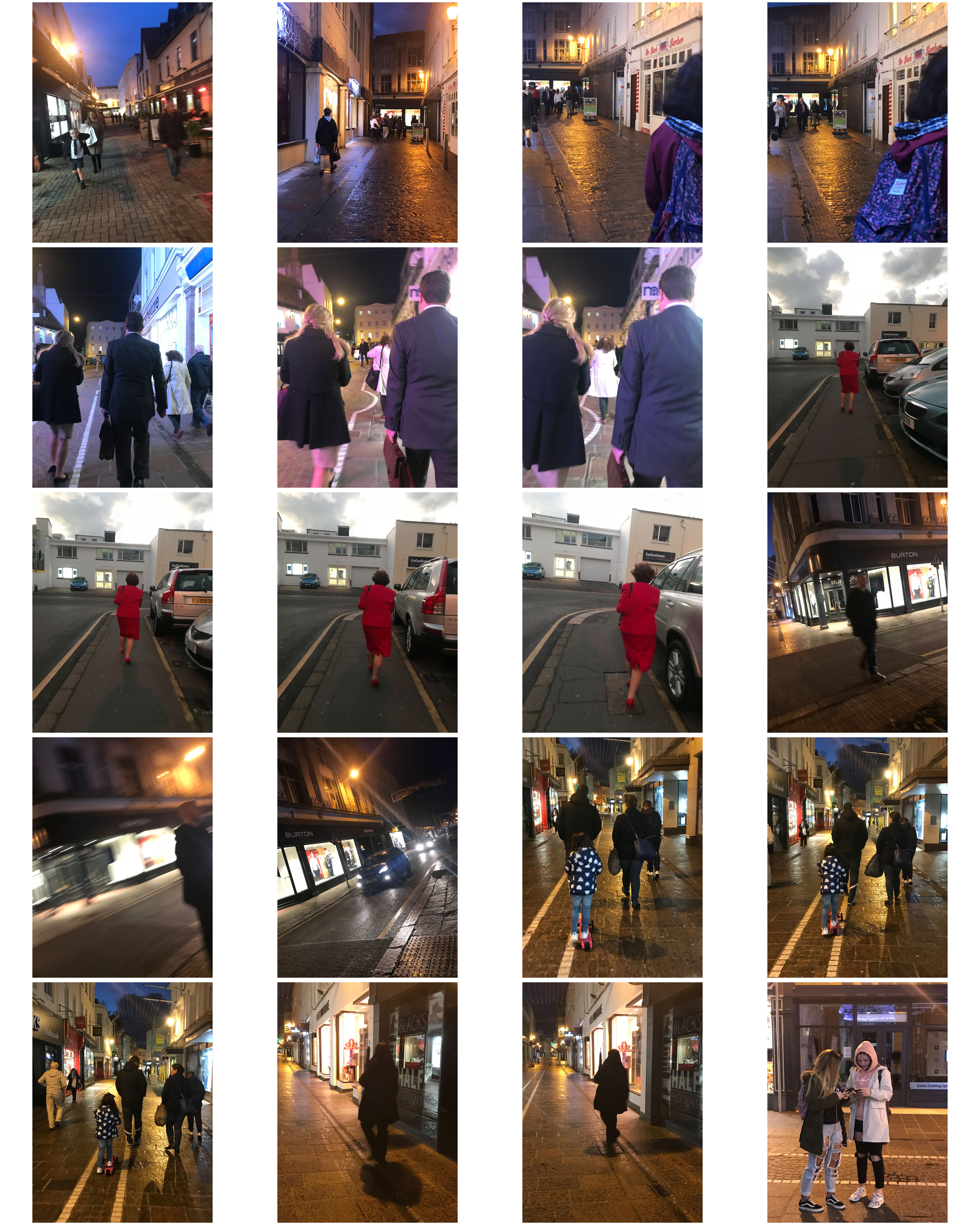
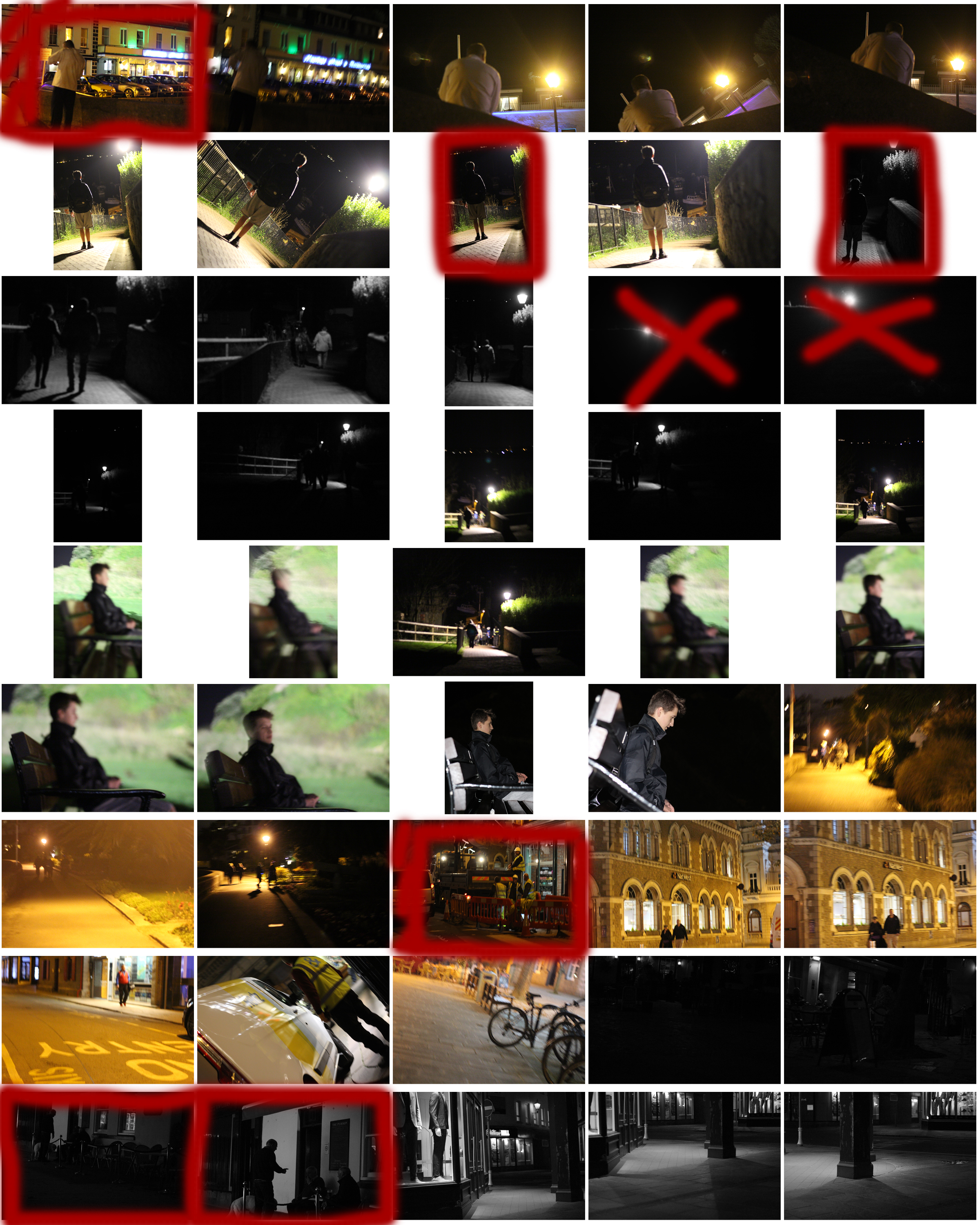
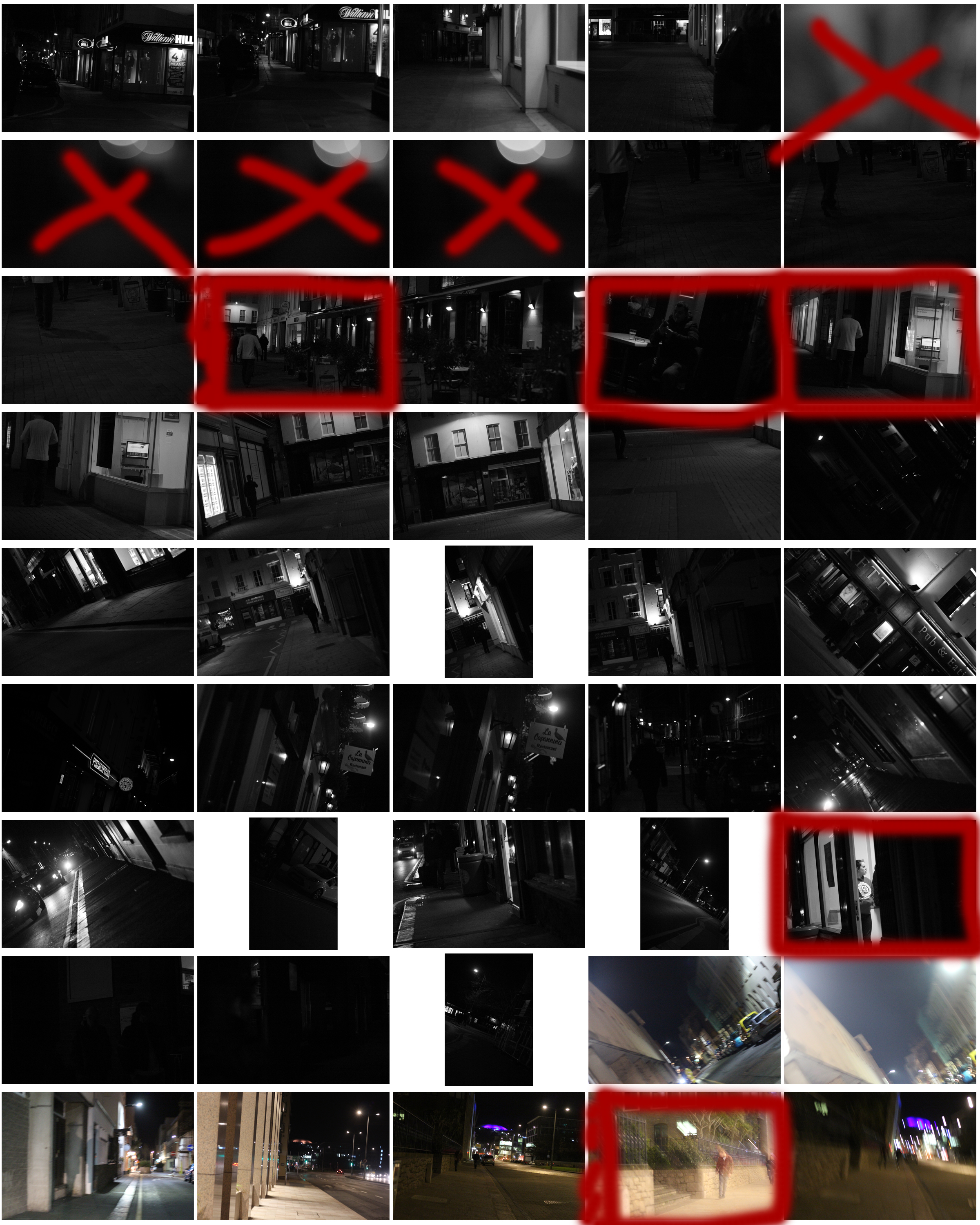
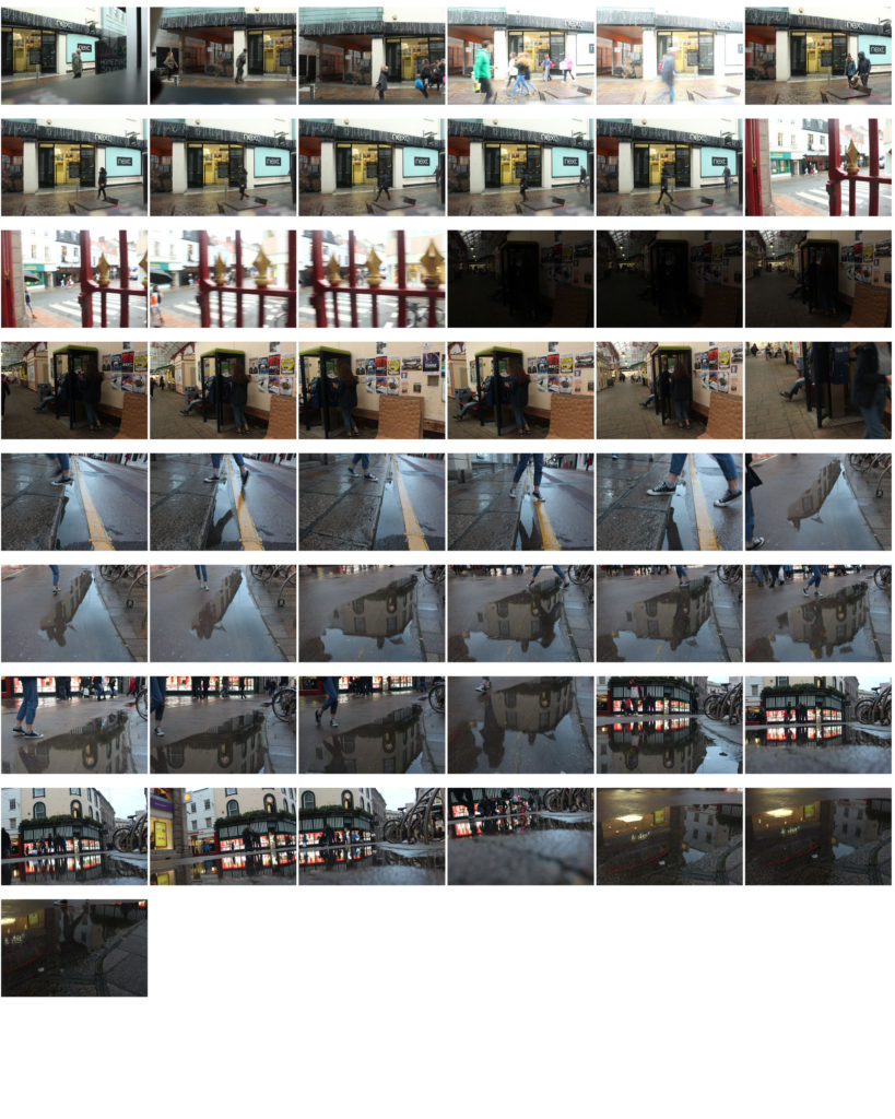
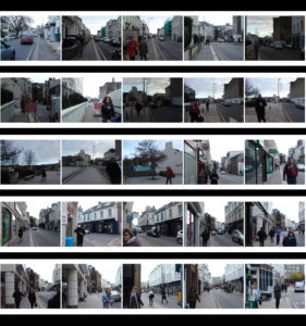
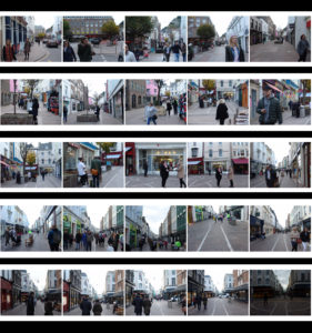
This allowed me to focus on certain aspects of the shoot easier, as I now had a rough idea what I needed to capture. These were the results from my shoot:
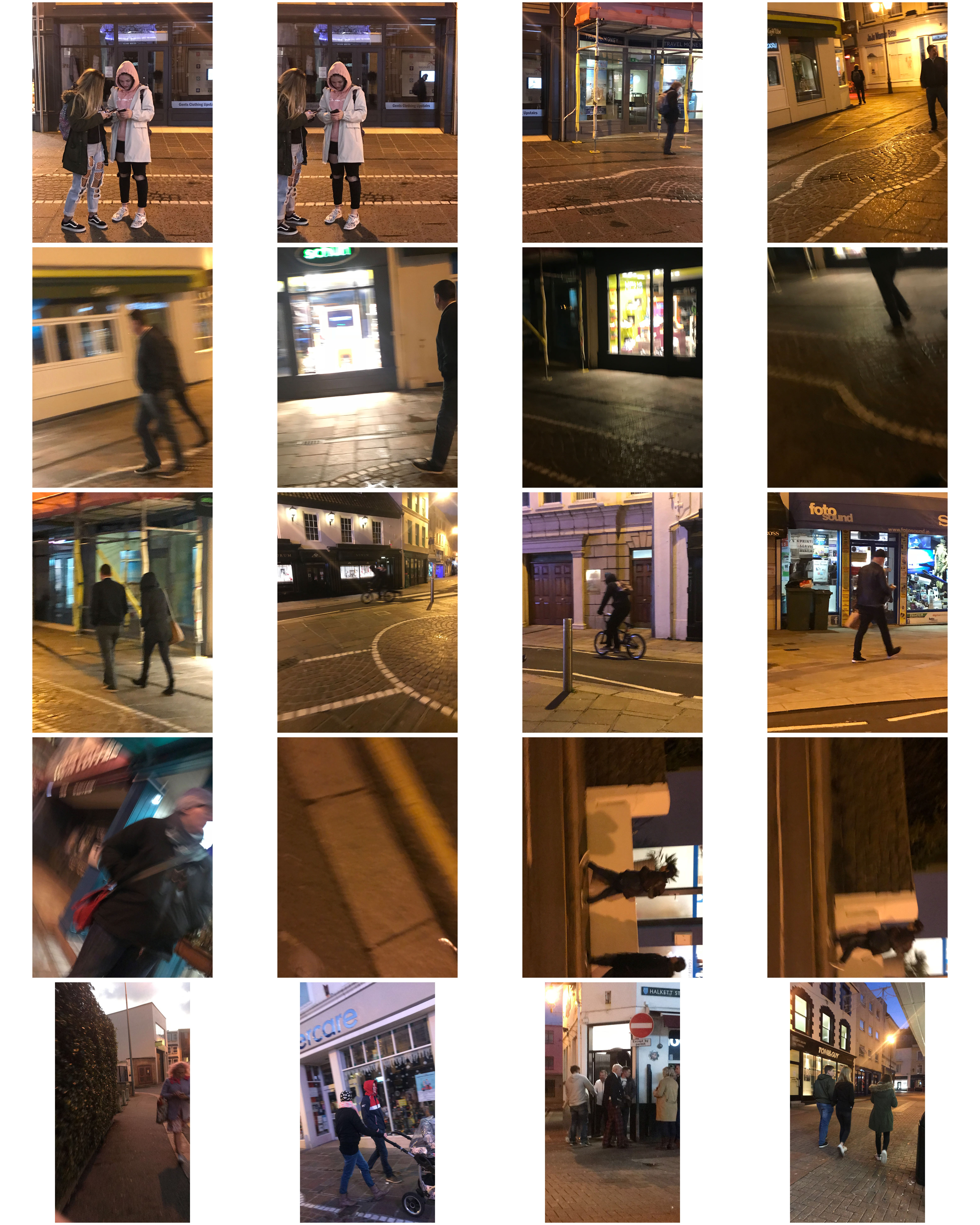
 From the shoot I went on to highlight and crop the images I thought were the best out of all the photographs. This allowed me to limit the shoot down to just ten pictures so that I could choose my final image to display. These were my choices:
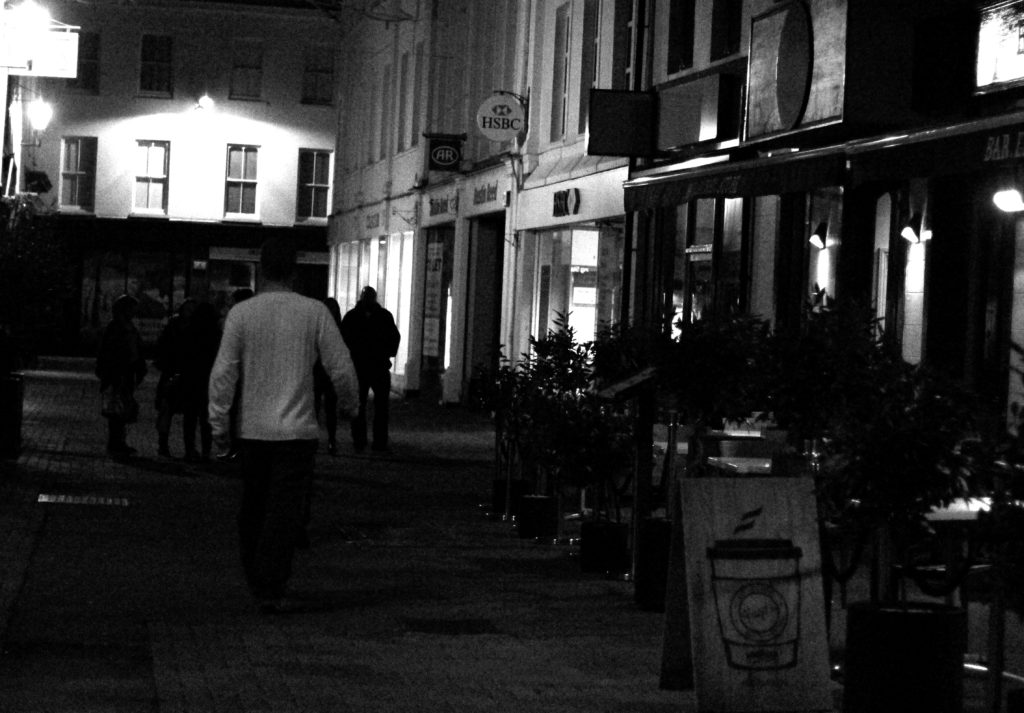
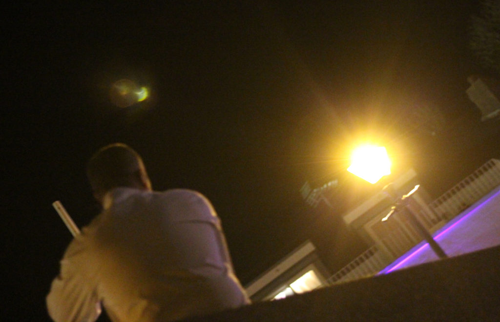
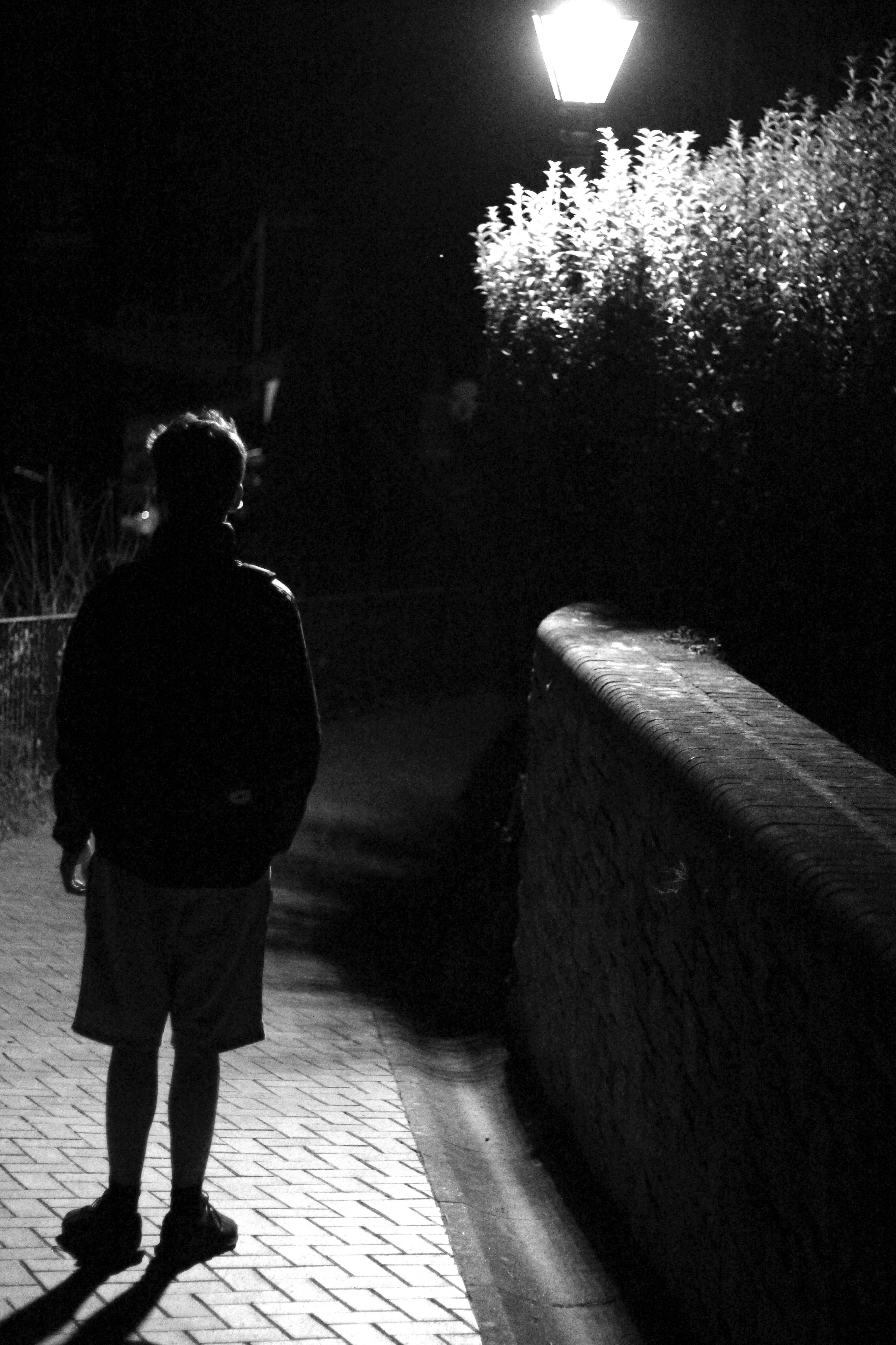
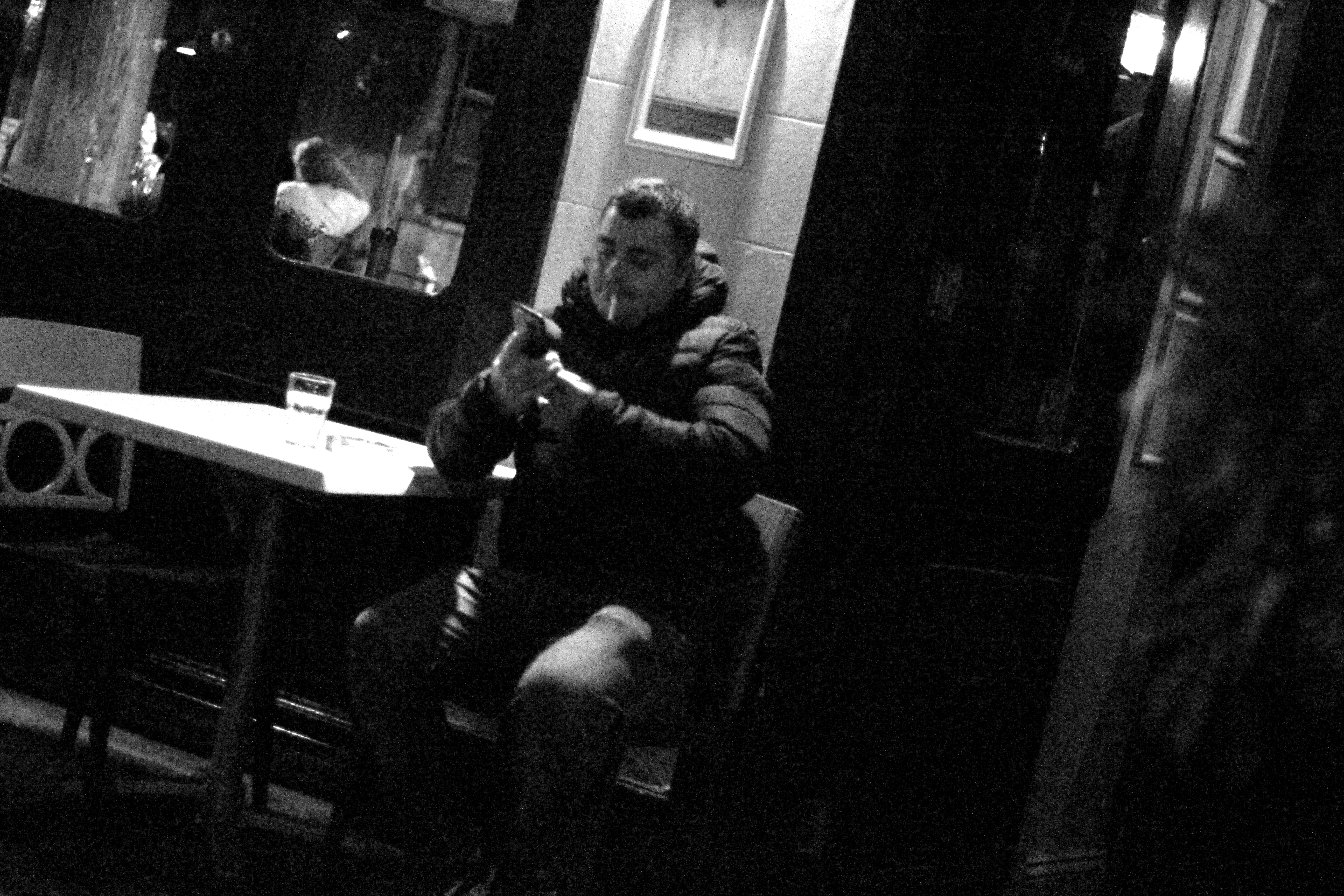
Once again from here I went to limit my selection to a top 5 to make it easier for me to find the final piece. This was my result:

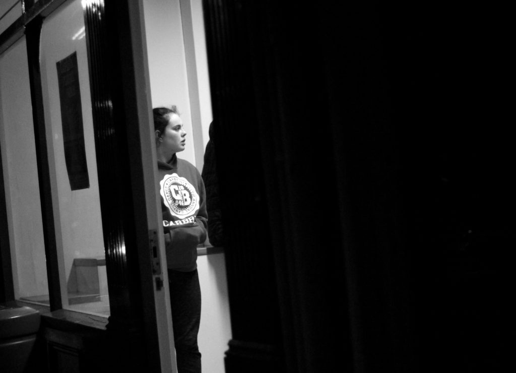
I chose this image because I loved the contrast between the darkness of the wall, and the subject. This is due to the rule of thirds which line up with the character inside, which instantly draws your eye to the face. I found that the pure blackness of the wall covering the picture added for a dramatic effect overall, making it almost seem hidden.

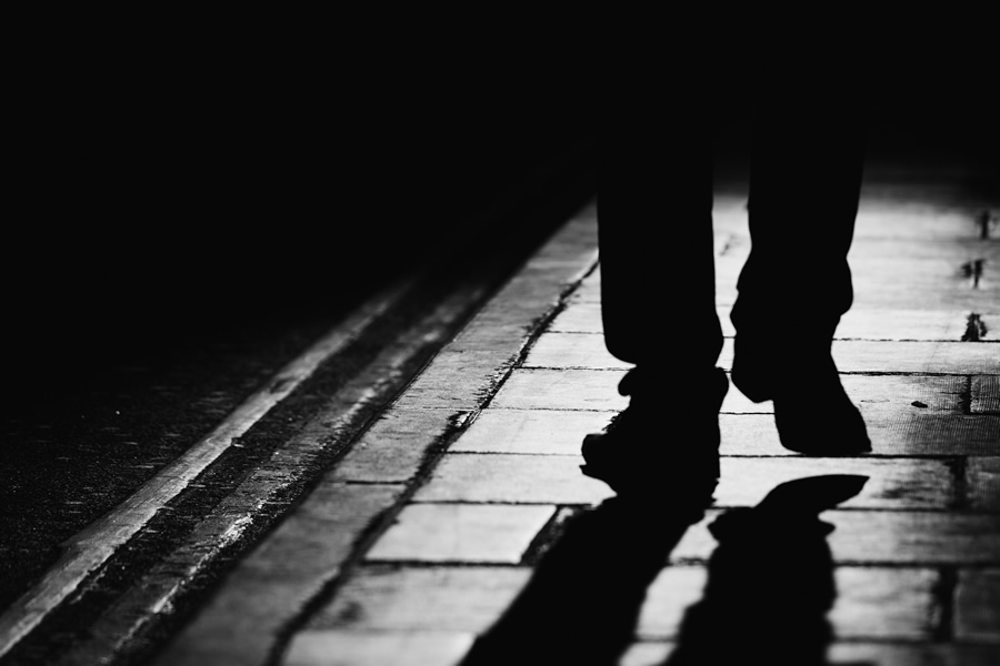
I chose this image once again because of the contrast between the subject and the surrounding area. I found that the silhouette created by the lamp really made the image pop, whilst at the same time balanced it so that the darkness itself was not too overpowering in the picture. 

What I liked about this image was how the subjects face lit up against the darkness of the rest of the picture against the white strip of wall. I found that capturing someone off guard in their comfort zone allowed for a greater insight to the subjects life, and really captured them as an individual.

I found that this picture captured a clear contrast between the darkness of the three old figures and the white pub behind. I found that this silhouette that is almost created, makes the overall piece more dramatic than it is, with the blurred black building behind allowing for the whole picture to work. 


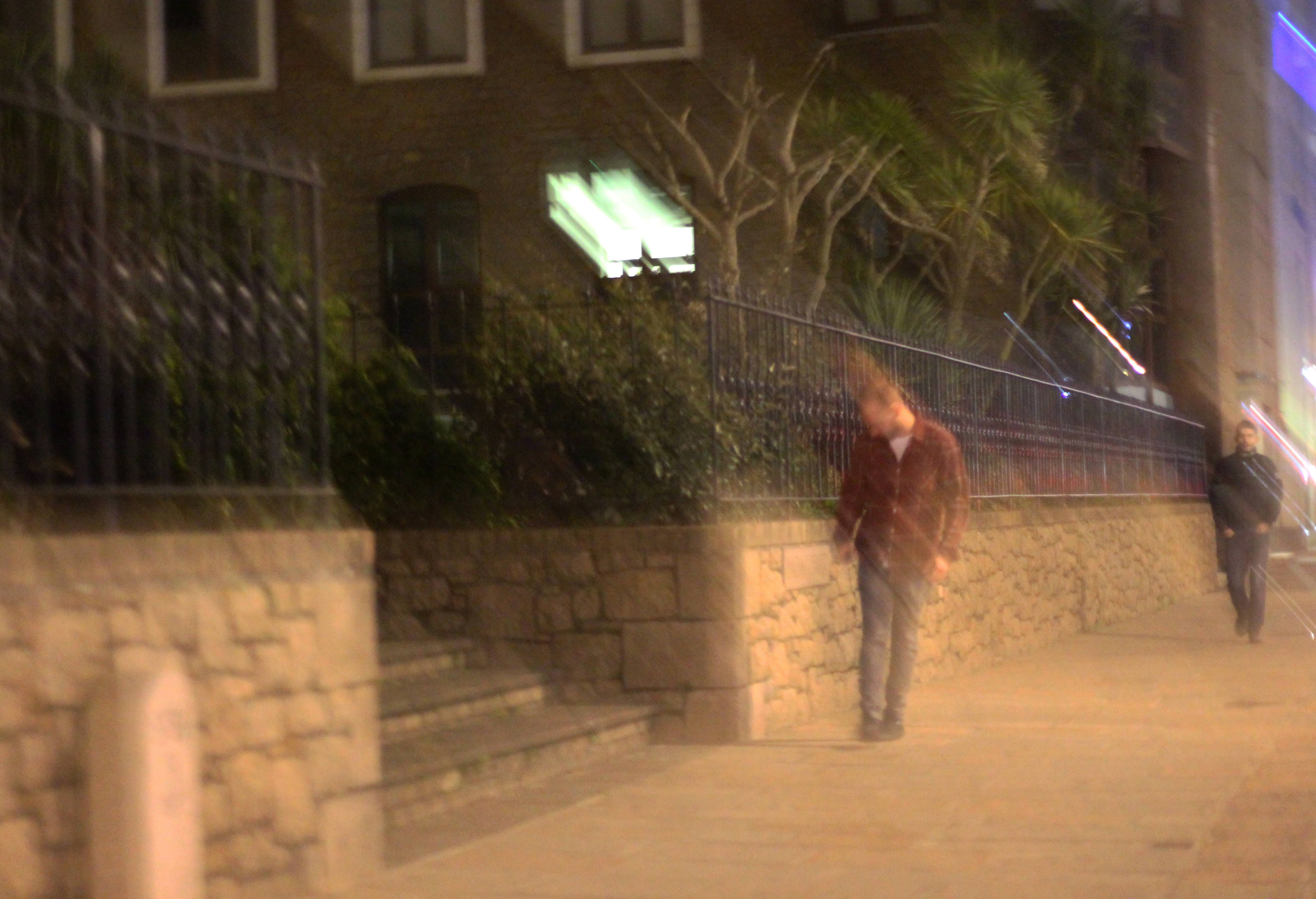
Finally I chose this image because it captured the nightlife of a man drunk stumbling home. What I liked about this was how the picture was blurred itself as well, allowing greater emphasis on the man in the jacket being drunk, and the perspective that he may be seeing.

FINAL IMAGE 
I chose this as my final image because I loved the use of the darkness provided by the wall, to create a backdrop which almost hides the subject behind, with only a glimpse of the subject within the heavily contrasted brightness of the indoors.

Street Photography Homework

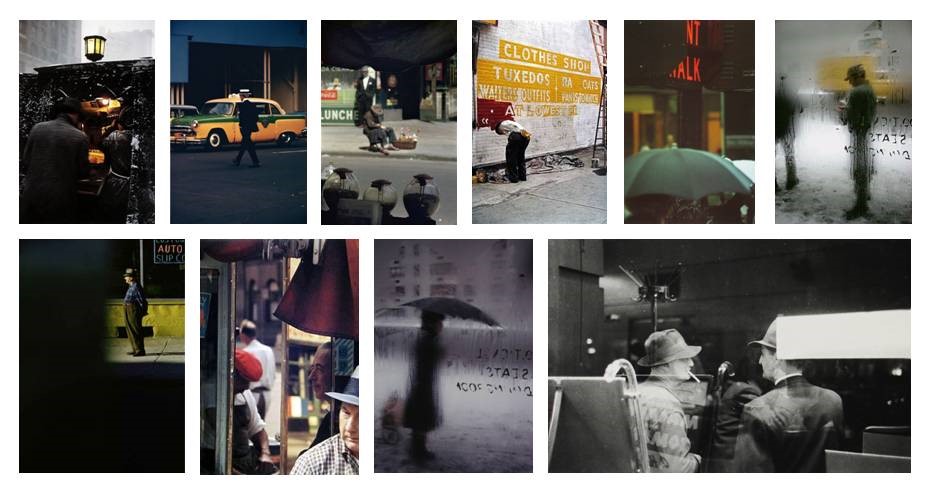
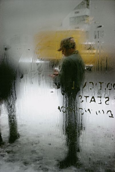
Saul Leiter

Saul Leiter is an American photographer born in 1923 who is know for his street photography in New York City. His mother gave him his first camera when he was 12 years old and by the age of 23 he had moved to New York to be an artist. His early work in the 1940’s focused on people going about their daily life in the city, he chose to photograph regular people in interesting ways. For example a lot of his photos include blurred areas or negative space which draws the our attention t the person. 

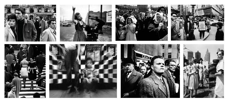
William Klein

William Klein was born in 1928 in america to French parents. He is a photographer and film makers who work often had an ironic approach. Although he is known for his fashion photography a lot of his work crossed over into the street photography category. He took all of his photos in black and white which helps focus on the peoples facial expressions rather than distracting colours. 

Studio Lighting – Homework Assignment

Planning

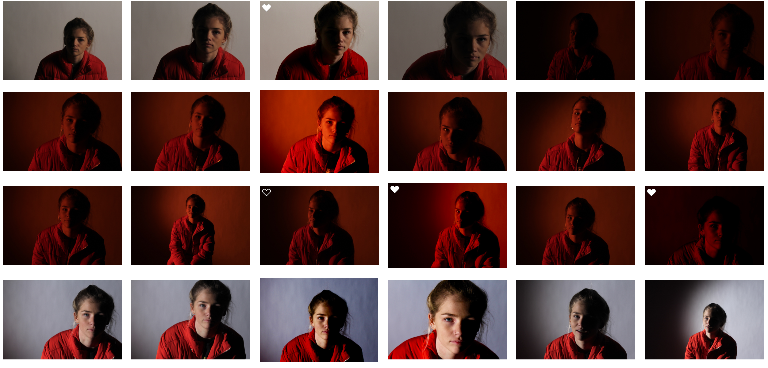
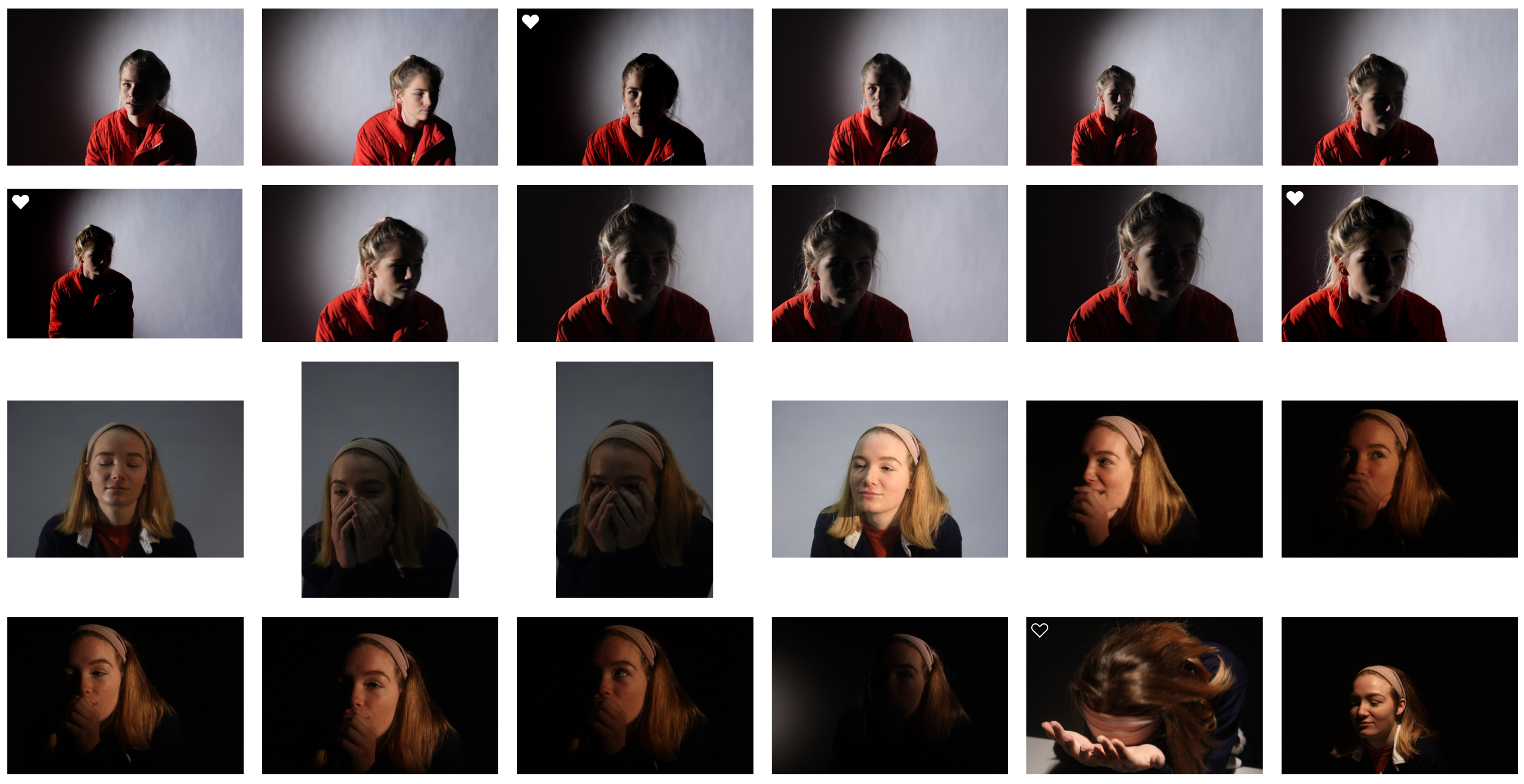
Task – Produce 100-200 images showing your understanding and control of studio lighting.

Models/props – For my model I will use somebody from my class.

Camera settings – I will use a fairly low shutter speed of 1/10 to 1/60 to allow more light to enter the lens from the dark environment when using a black background. I will use a higher shutter speed of 1/60 when using a white background. I will use a low ISO of 100 or 200 to keep the image high quality. I will use a shallow depth of field to create a soft blur in the background.

Lighting – I will be using red head lights, spotlights, natural light and flash to capture a wide range of images. I will be using red head light for soft light, white backdrop for some lighter images, a black backdrop for darker images,  a spotlight for harder light, a reflector to reflect light into the model’s face and gel filters to change the colour of the light

Location – School studio

Context – I will be using the school studio to capture a range of images in different styles and different lighting.

Concept – To capture studio photographs in the style of David Bailey and Irving Penn whilst incorporating chiaroscuro.

David Bailey

Image result for bailey photographerImage result for bailey photographer

David Bailey (born 1938) is an English fashion and portrait photographer. Bailey is considered one of the pioneers of contemporary photographer. He is credited with producing some of the most interesting images of recent times. He has captured images of some very iconic people such as The Rolling Stones and Kate Moss.

I like Bailey’s photographs because of the strong contrast in the images. As you can see in the images above, the subject is contrasted against the plain white background and this helps the viewer focus on the small details in the subject.

David Bailey Favourite Photo

Image result for bailey photographer

It appears that flash was used in this photograph as the faces of the subjects are over-exposed. This creates contrast in the image between the white faces and the black details, almost in the style of Andy Warhol’s pop art. It also increases the tonal range in the photograph. A deep depth of field appears to have been used also because all of the photograph is in focus. A quick shutter speed will have also been used because the image is focused and sharp. It appears that a medium/high ISO has been used as the image is quite light but there is some noise in it. The grey background creates a slightly cold undertone to the image.

There is no colour in this image as it has a black and white filter over it. This increases the emphasis on the contrast and boldness of the image. There is a wide tonal range in this image but the tones quickly range from dark black to bright white, there is not too many tones in between. There is a slight 3D effect on this image as one of the subjects are placed behind the other, this makes the photograph more interesting to look at. Both subjects have been placed along the horizontal lines of the rule of thirds, this makes the photograph more appealing to look at.

This image was taken in 1965. It shows Reggie Kray and Ronnie Kray, two London gangsters. It is a widely recognised image and is of historical interest in terms of representing Bailey’s style of artwork and also the Kray twins, who were iconic and infamous.

From doing this shoot with the Kray twins, I think that Bailey is trying to show that he does not only work with high-profile celebrities with good reputations – but he will also work with the gangsters that have bad reputations. This shows the diversity in Bailey’s photography and what he is capable of.

Irving Penn

Image result for irving pennImage result for irving penn

Irving Penn (1917-2009) was an American photographer best known for fashion photography and portraits.  Penn’s work included work at Vogue magazine and independent work for clients including clinique.  Penn was among one of the first photographers to pose subjects against a plain white or grey backdrop. Penn experimented with many printing techniques including prints made on aluminium sheets coated with platinum emulsion rendering the image with a warmth that untoned silver prints lacked. His black and white portraits stood out due to the high contrast he used in them.

I like Penn’s photographs because of the angles and poses of the subjects. This creates an interesting photograph that captures the eye of the viewer because most photographs aren’t taken from so close up and at these creative angles.

Irving Penn Favourite Photo

Related image

In this image, studio lighting was used coming from the right side of the image. This has created a wide tonal range in the image as it has created shadows and contrast. It appears that a deep depth of field has been used as the whole image is in focus, not just the subject. A quick shutter speed of possibly 1/60 – 1/200 will have been used as the image is sharp and in focus. It appears that a low/medium ISO has been used as it is a slightly dark image with low noise levels. The image has an underlying warm tone to it.

There is no colour in this image as a black and white filter has been applied to this, this has allowed more contrast and shadows to be introduced into the image to create a more eye-catching photograph. There is a wide tonal range in the photograph ranging from the white of his sleeve cuff to the black of his suit. There is a slight 3D effect to this image as the lens is so close to the subject so the hands and glasses are obviously closer in the image. The subjects face is at one of the points on the rule of thirds grid, creating a more visually appealing image. The eye is drawn to the subject’s facial expression straight away as it is unusual and eye-catching.

This photograph is of Truman Capote and was printed on a platinum palladium print in 1976. This would have been from a photoshoot that Penn did with Capote as Penn would often photograph celebrities in his studio as he was a very well known photographer.

In this photograph, Penn has gotten Truman to take an unusual pose and an unusual facial expression. This is a common recurrence in Penn’s photographs as Penn tries to catch the viewers eye with his abnormal style of portrait photography – it is what makes him stand out so he tends to play to this strength.


My Response
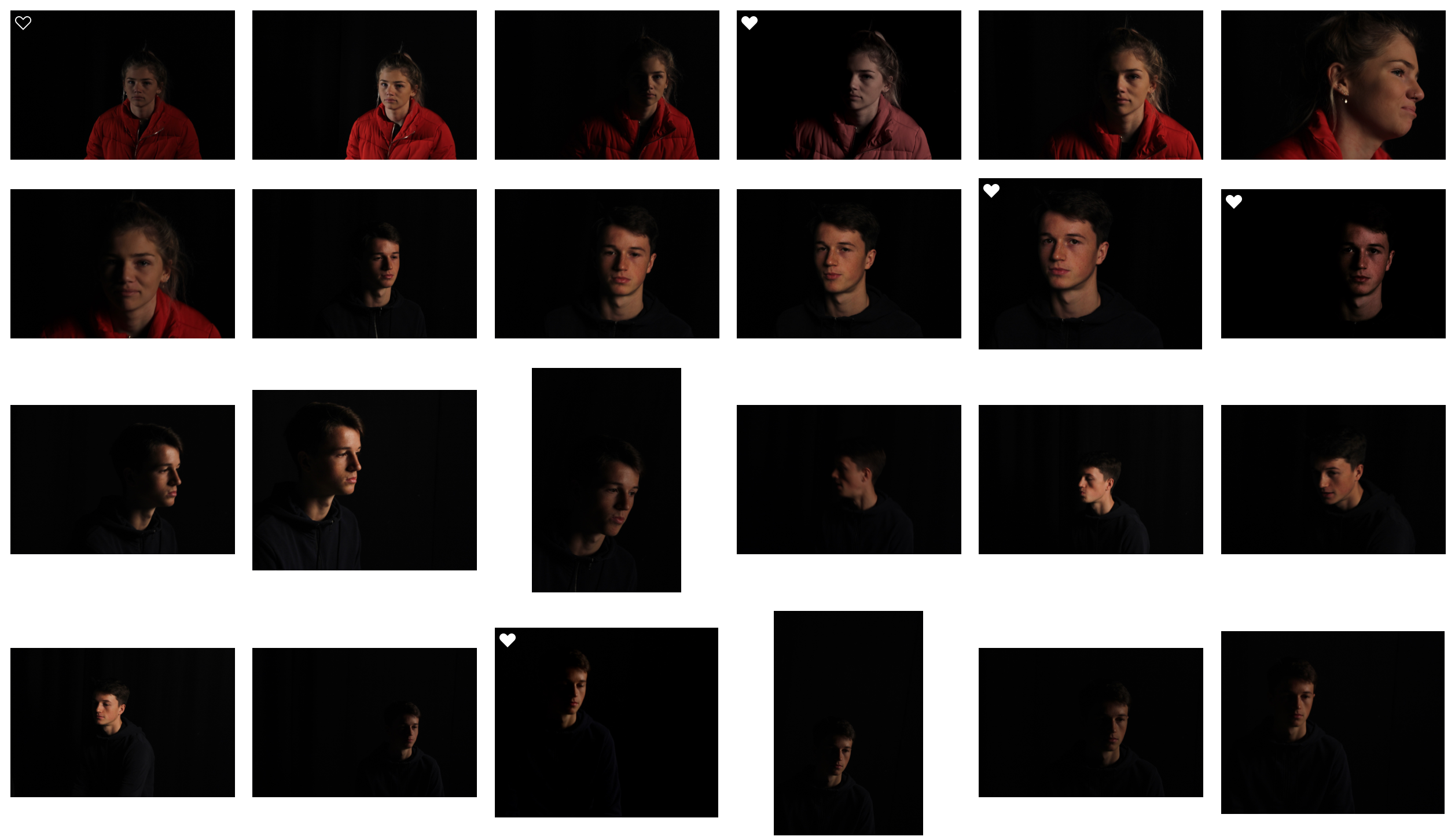
My Edits
My Favourite Photo

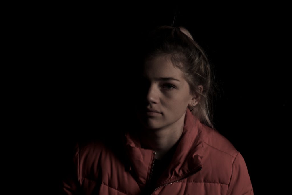
In this photograph, I used the soft light from red head light against a black background so that I could incorporate chiaroscuro into the photograph. I used a deep field of depth so that all of the image was in focus. I used a slow shutter speed (1/20) to allow more light to enter the lens from the dark environment. I also used a low ISO of 200 to keep the quality of the image as best as possible. I decreased the saturation in the image to create a slightly faded and colder effect.

The main colour in this photograph comes from the red coat which fades into the background, I reduced saturation in the image to help it fade into the black more. There are not many light tones in this image as it is mostly dark, this creates a mysterious setting in the photograph. It is quite a 2D photo as the only think that you can see is part of the model – there is nothing else in the image to compare her position to. I have placed the model along the right vertical line of the rule of thirds to create a more appealing image.

I set up this photograph in the studio, to get this photograph I had experimented with spotlights, red head lights, reflectors and gel filters. I took multiple photographs in this style but this one stands out to me because of the more gradual fade into darkness and the softness of the light.

I took this photo with the intention of experimenting with chiaroscuro and to me it was successful. I took inspiration for the dark tone from Irving Penn’s work. I chose a black background as I thought it would create a more dramatic image.

 

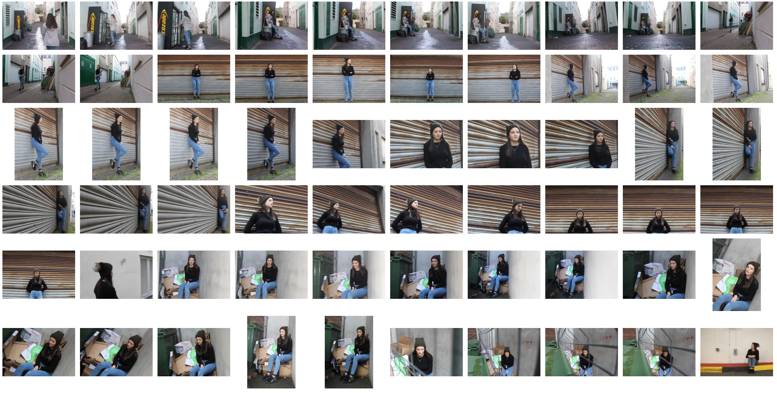
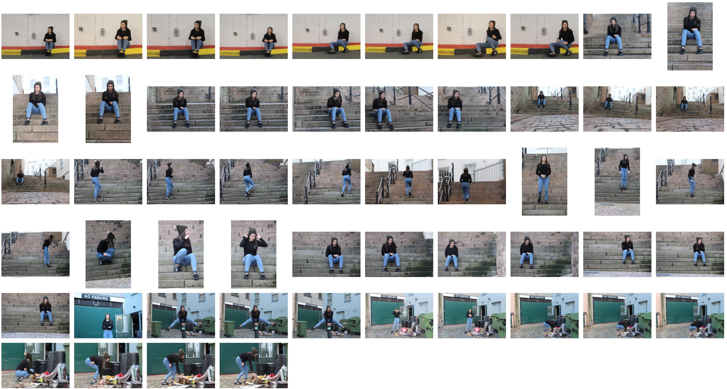
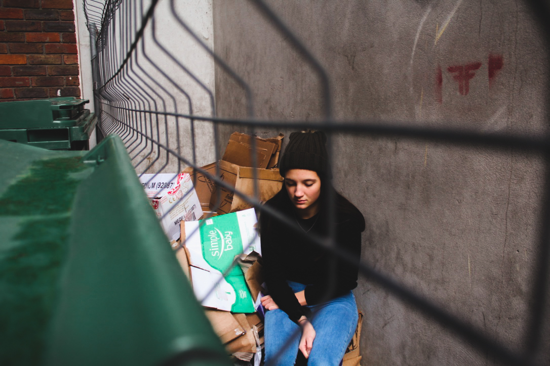
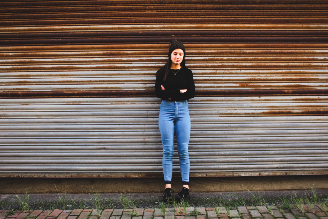
Environmental Portraiture Homework

 Anthony Kurtz

https://anthonykurtz.com/ABOUT/Biography/1

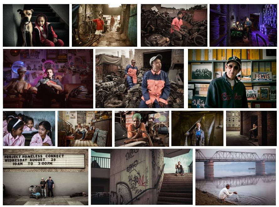
Anthony Kurtz was born in America and is now based in Berlin and San Francisco. He specializes in environmental portraiture and his work has been used as  commercial, editorial and art-documentary. His photos tend to be in the moment an unexpected however we can still see the strong ideas of formal portraits, the subjects in them tend to be in their natural location for example work place. He often works a lot with lights, mixing natural and studio to create mood and curiosity in the photographs.

Michelle Sank

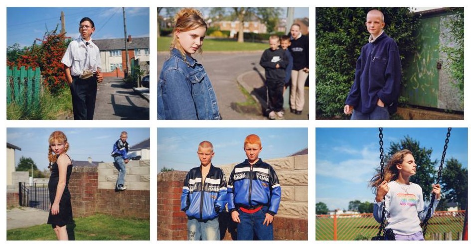
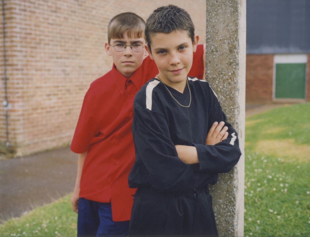
Teenagers Belfast:  http://www.michellesank.com/portfolios/teenagers-belfast
Young Carers: http://www.michellesank.com/portfolios/young-carers

Into the Arms of Babes: http://www.michellesank.com/portfolios/into-the-arms-of-babes