

Ansel Adams, an American photographer who took landscape photographs in order to capture the beauty of nature. He enjoyed taking pictures of National Parks and mountains. His photography includes a range of tones in which he believed brings his photos to life., creating a more memorizing picture. His use of tone and contrast brings out the detail in all areas of the picture whether it is over or under exposed.

Within Ansel Adams photographs he ensures he that he displays all and reflects all the shades within the zonal system. This is split into 10 different shades varying from sark grey to white.

Following from Adams work i used Photoshop to increase and improve the tone and contrast trying to ensure i displayed all shades from the zone system.
Tone is the lightness/brightness of a patch in a photograph, dark tones correspond to shadows, light tones correspond to bright or highlight areas.
Contrast is a tool that photographers use to direct viewers’ attention to their subject. There are two types: Tonal Contrast and Color Contrast. Contrast more or less refers to the difference in tones from the lightest tone to the darkest tone.


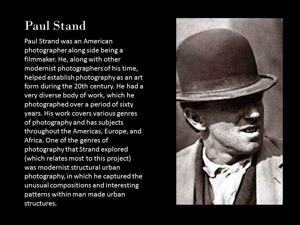
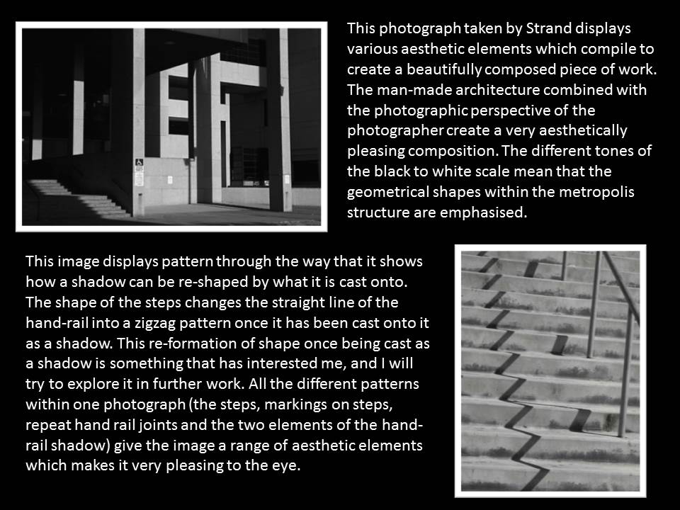
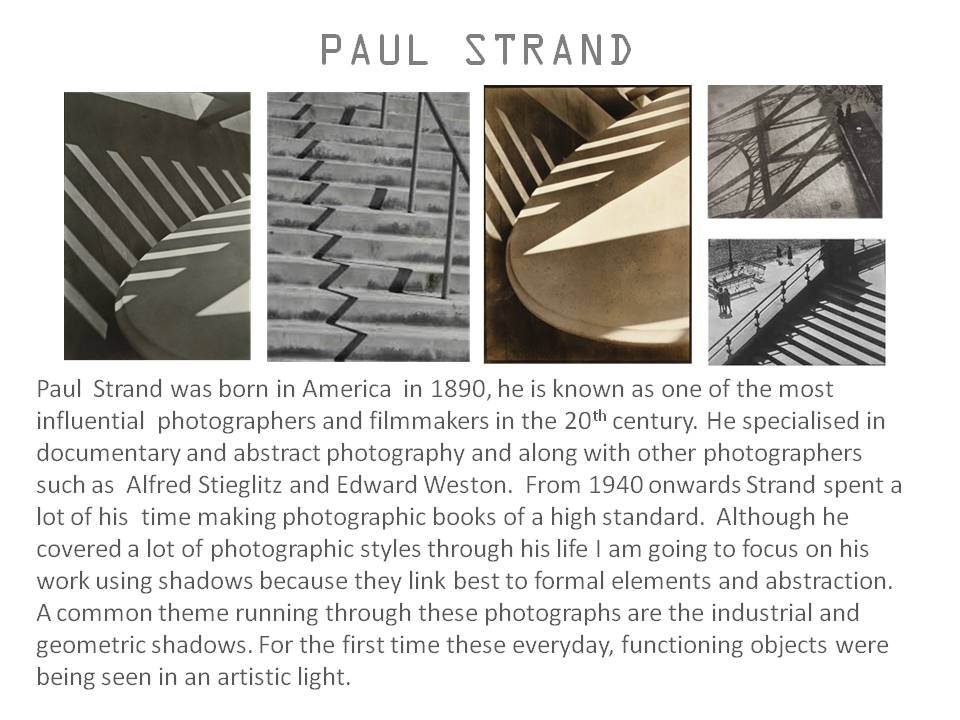
Paul Strand - was an American photographer and filmmaker who helped establish photography as an art in the 20th century. Although Strand's Photographs lack colour, they still contain a wide range of tones and shades and a great sense of depth, even in his simplest photos. I like these photographs because of the symmetry, pattern and shapes that are found in each of the images. These scenes are seen all the time in everyday life - each photo grants a satisfaction in the simple and basic shapes, set-ups and man-made structures. Each of these photos hold a sense of stillness in the frame and transmits a feeling of tranquility/content.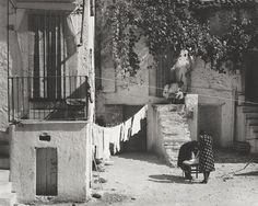
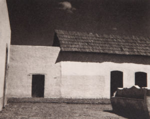
Brett Weston - Brett Weston was an American photographer. His work gives the same sense of stillness and focuses on natural/man-made shapes and forms - the second photograph's stillness is broken with the man passing the through the frame. Weston's photos are simple and complex - with complex shapes and layers. This first picture has a cluster of forms and rigid lines and demonstrates high contrasts between black and white. The last photograph has less in it - a simpler photo but also contains textures in the roof with its many ridges.
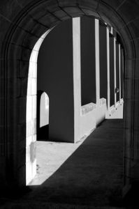
Plan - go out and take pictures of rigid shapes and forms in man made structures / simple pictures of everyday structures, look at buildings and pipes
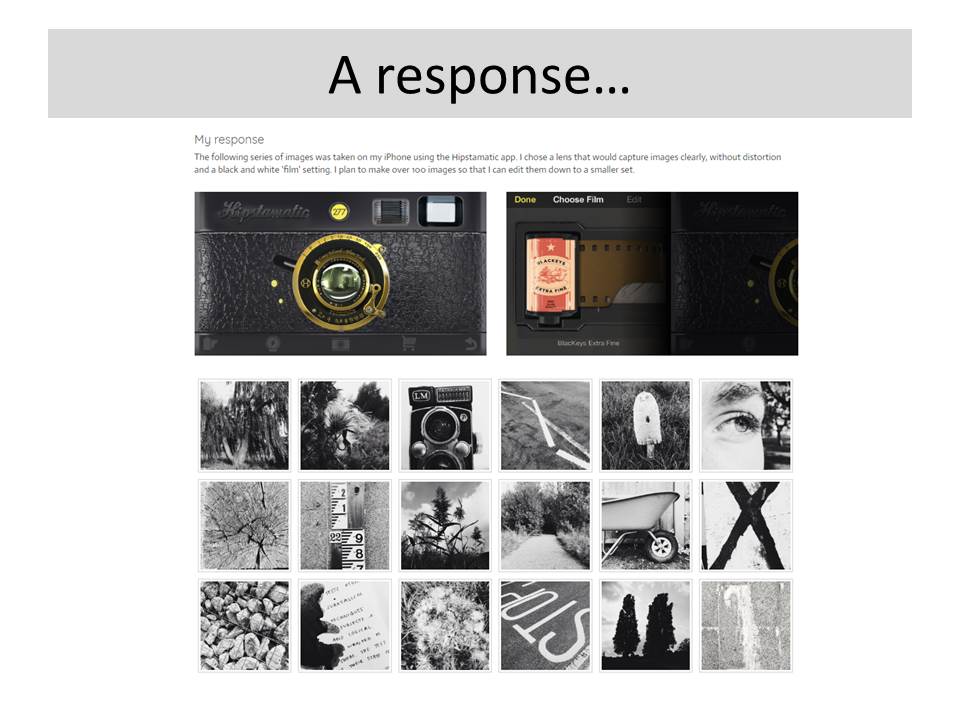
my photographs -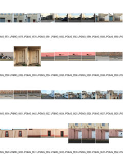
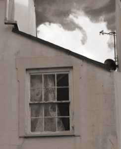
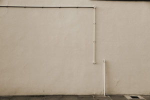
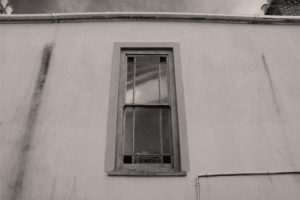
Best Photographs - I chose the simplest images because it helps to keep the focus on one point of the image. Each of these photographs are minimal which creates a sense of satisfaction. I chose to not have colour in the images so I could of focus on the tones in the image while still keeping the images basic and minimal.

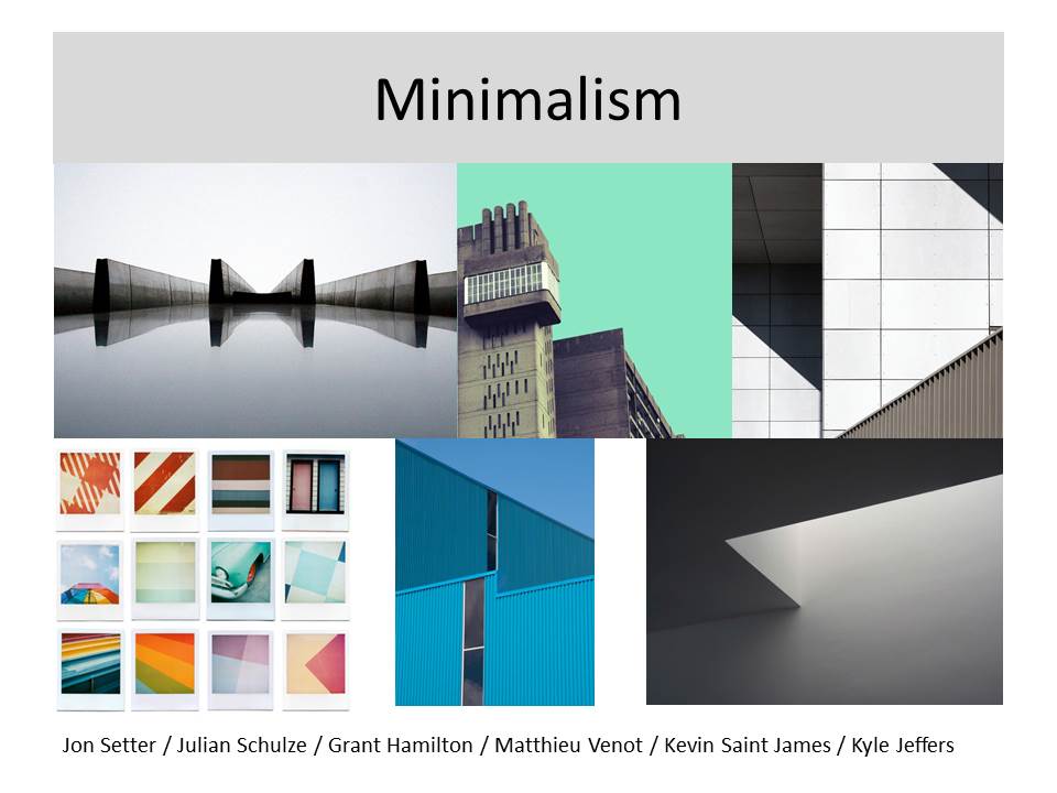 Remember…each task requires a new blog post! Keep your blog posts visual!
Mr Cole will be on residential with D of E students on Wednesday and Thursday…so you will be expected to complete current / outstanding blog posts and publish for tracking and assessment. Miss Hearn will be available on Thursday and Friday. Mr Cole will be available on Friday too.
We expect you to use this time wisely and upload all incomplete blog posts…remember, the homework tasks are NOT optional and form the spine of your coursework ie your photo-shoots!
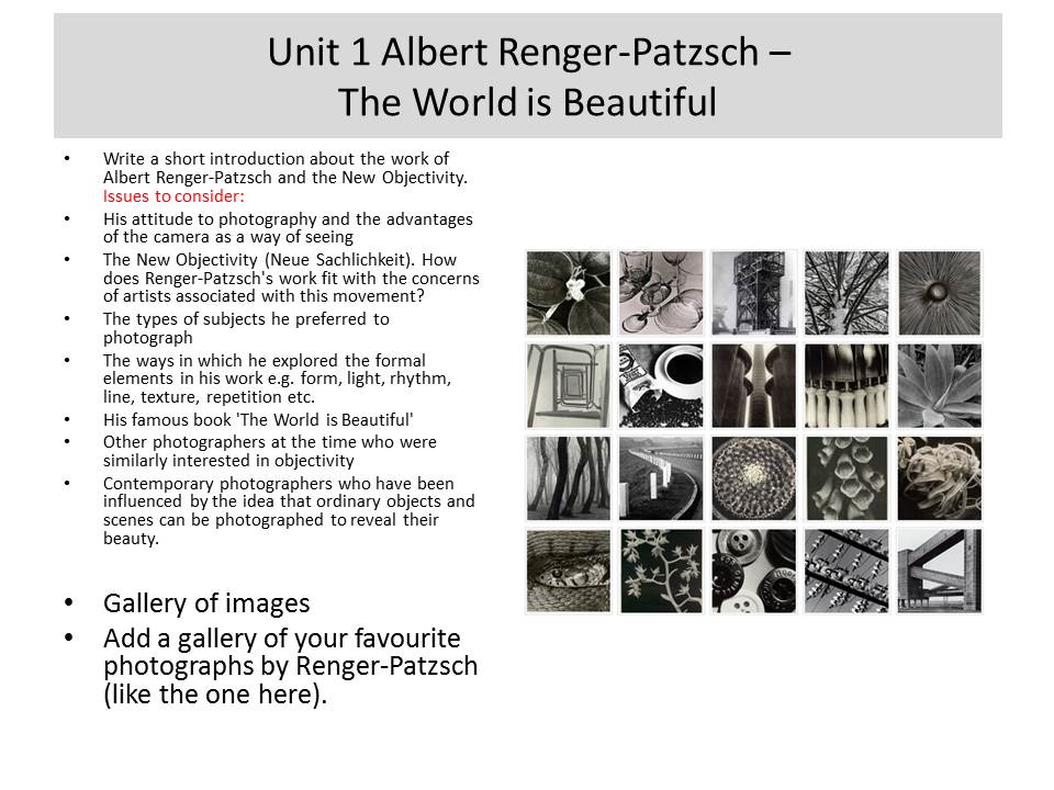
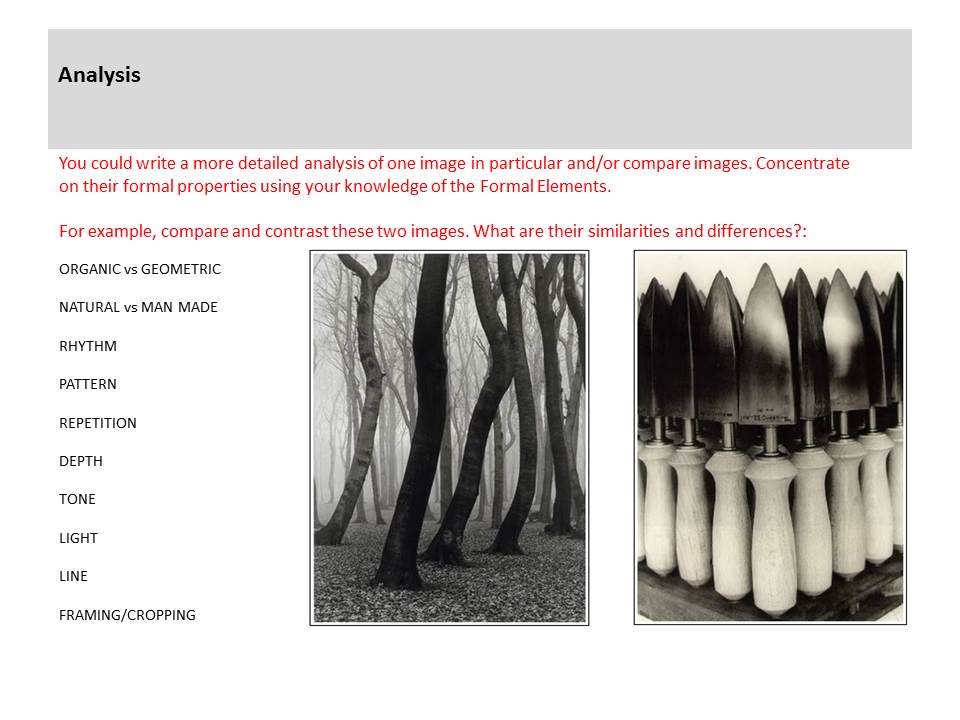
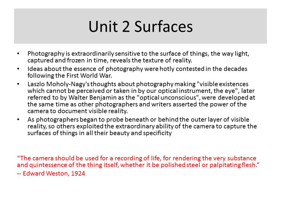
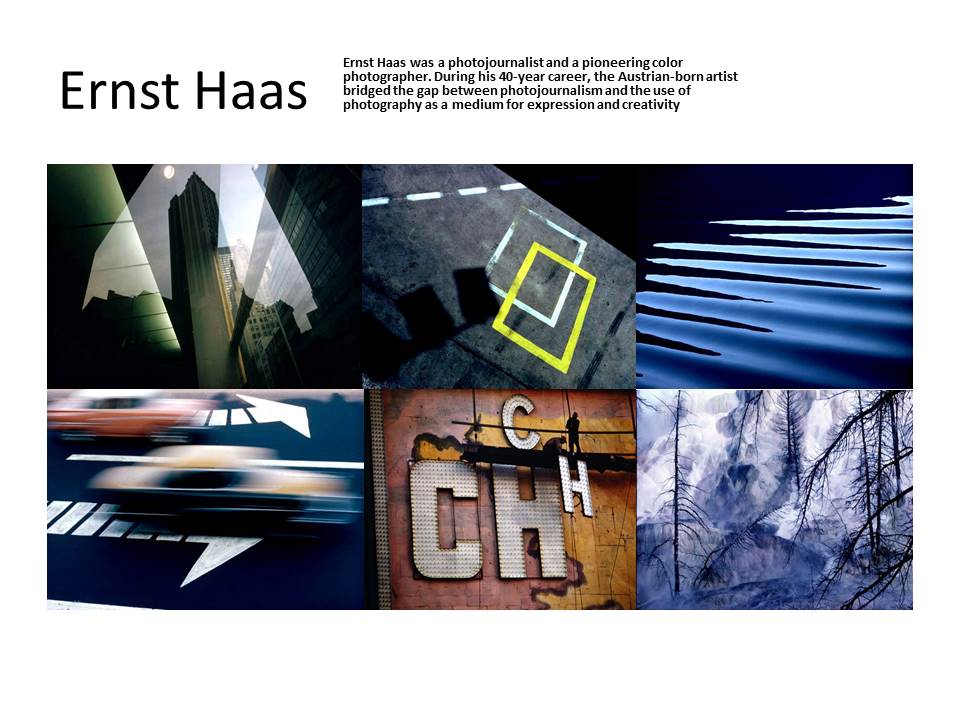
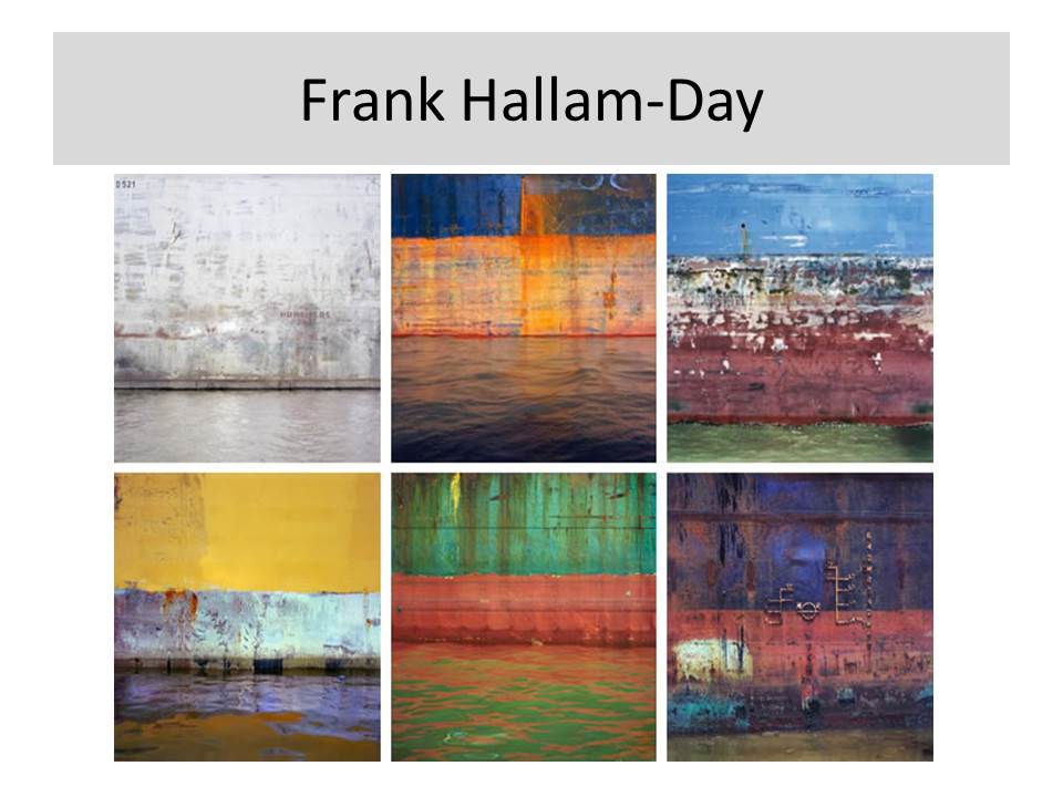
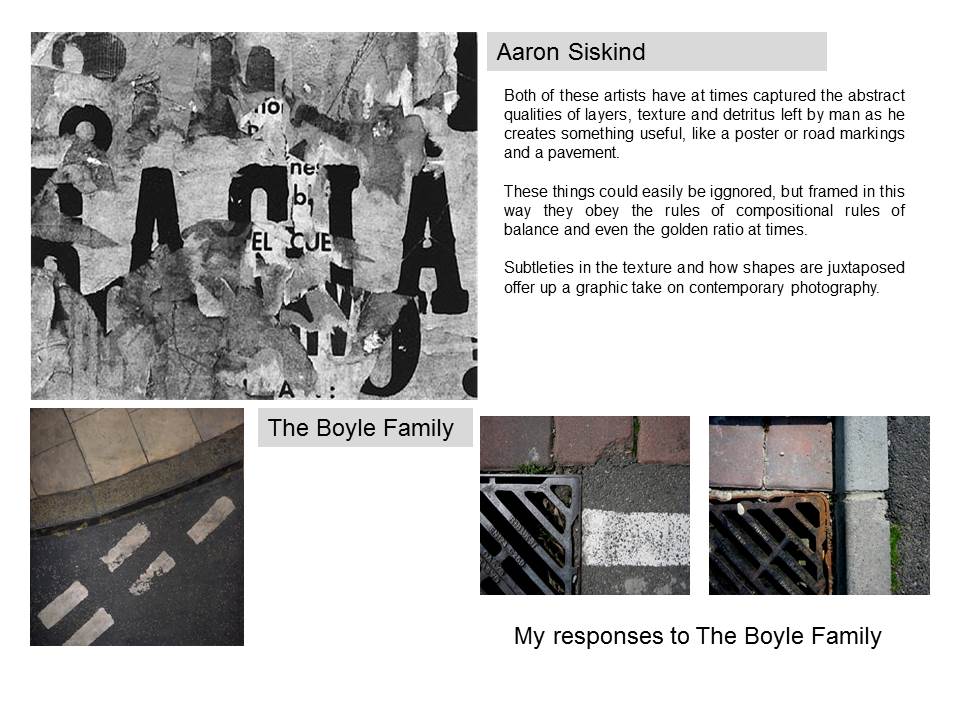



Jan Groover was born on April 24, 1943 and was an American photographer who spent the last part of her life in France, with her husband, a painter and critic named Bruce Groover. Groover was a still life photographer. Her work has been exhibited and included in the collections of most major museums worldwide, and continues to influence a new generation of artists. Groover moved to France in 1991.


This black and white Image is of silver cutlery in a pan. This image has a strong contrast as of the white background and the dark shadows behind the pan and the black inside the pan. This image also includes the rule of thirds as the right side of the picture where the cutlery is is the main focal point of the image as that is that area where the view looks at first and is the most interesting part of the picture. I really like this idea and also Groover’s style of photography as in this sense it is such a simple idea but once edited looks really effective and aesthetically pleasing.
This was my original image.





At it’s simplest white balance is adjusted to get the colors in your images as accurate as possible. If it is not adjusted to suit the environment, images will appear too warm or cool. This will result in highly blue or orange photographs.


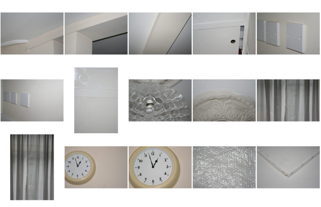
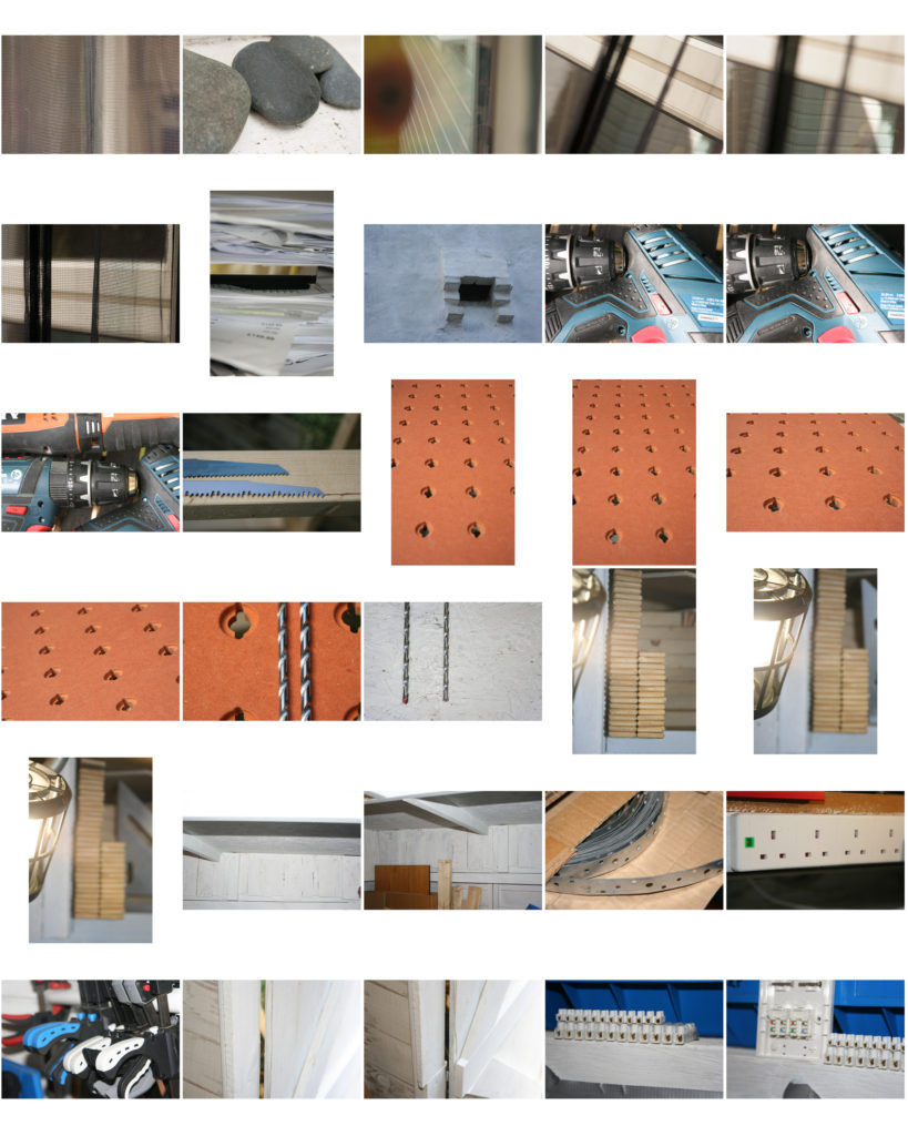
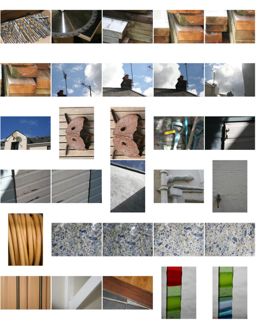
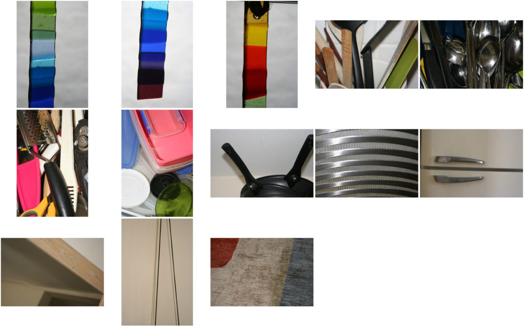
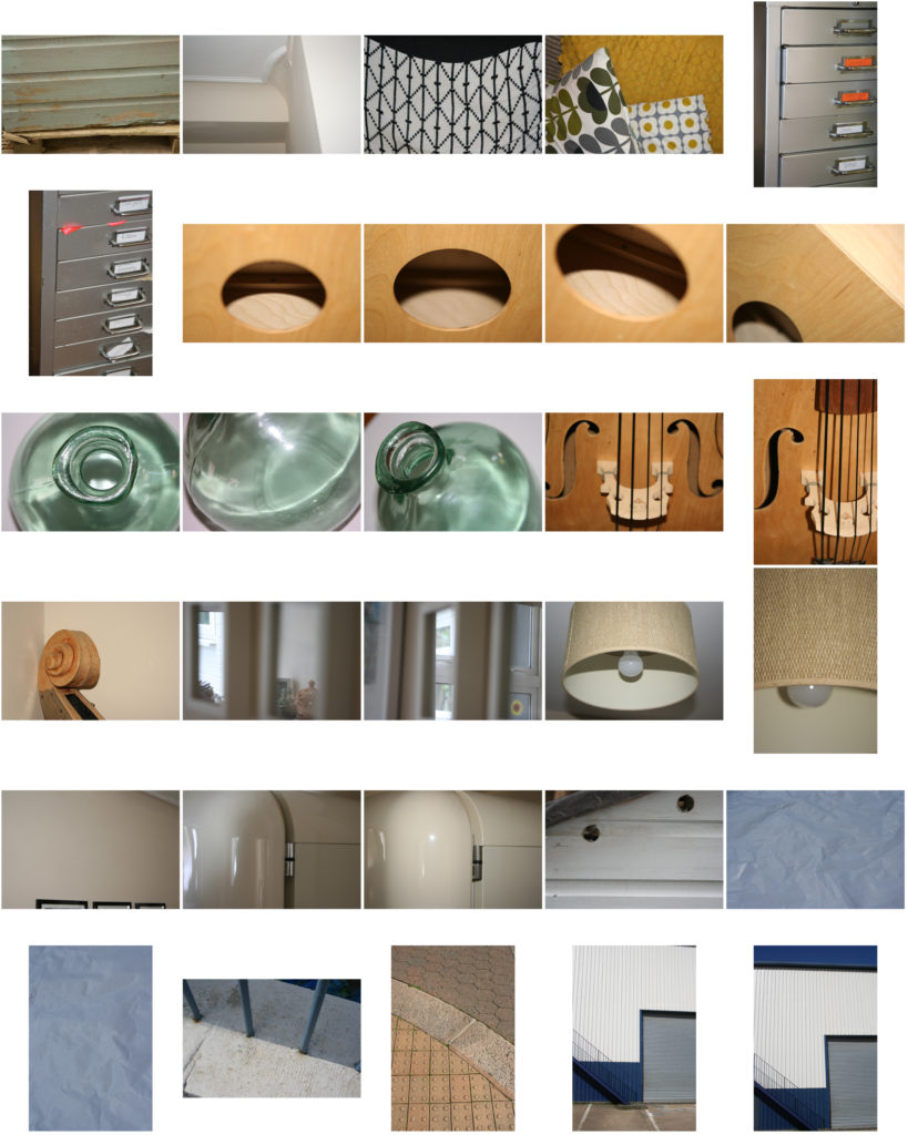
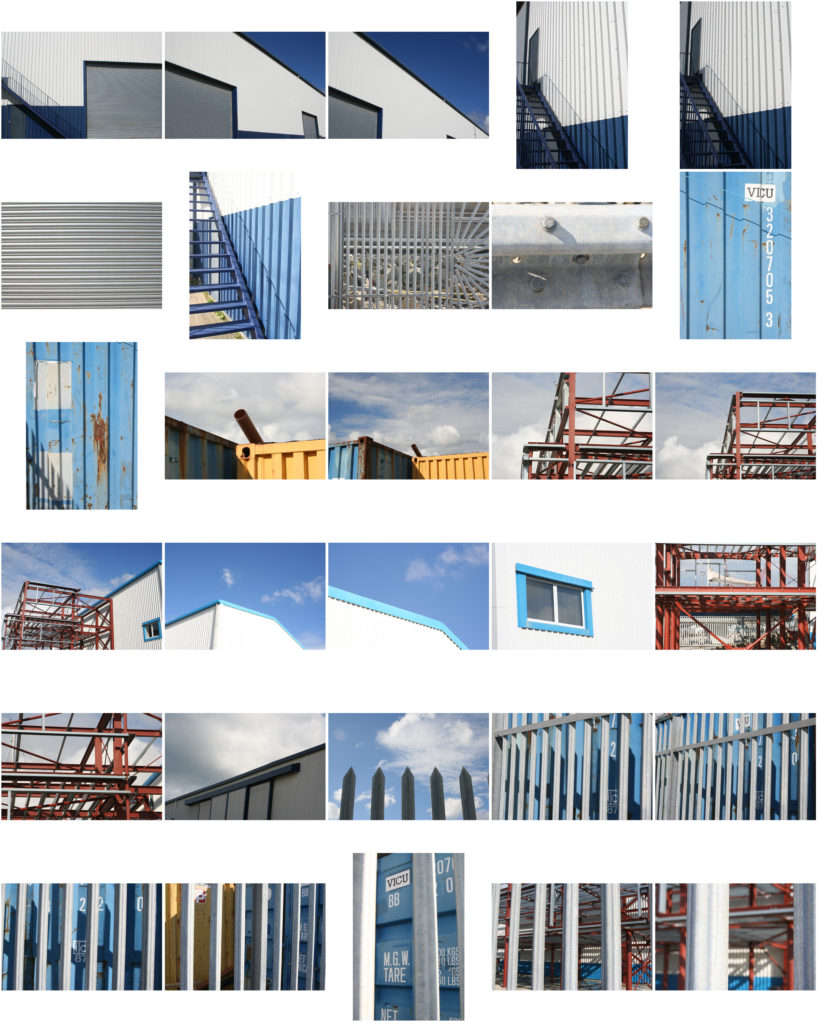
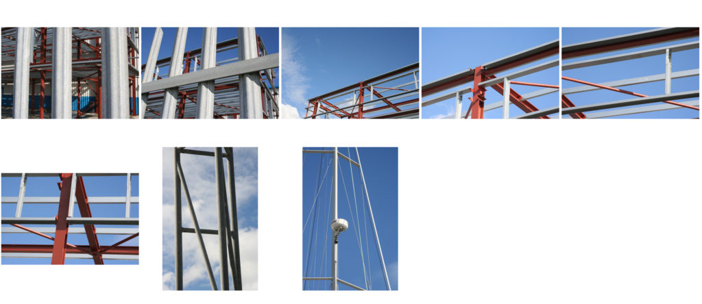
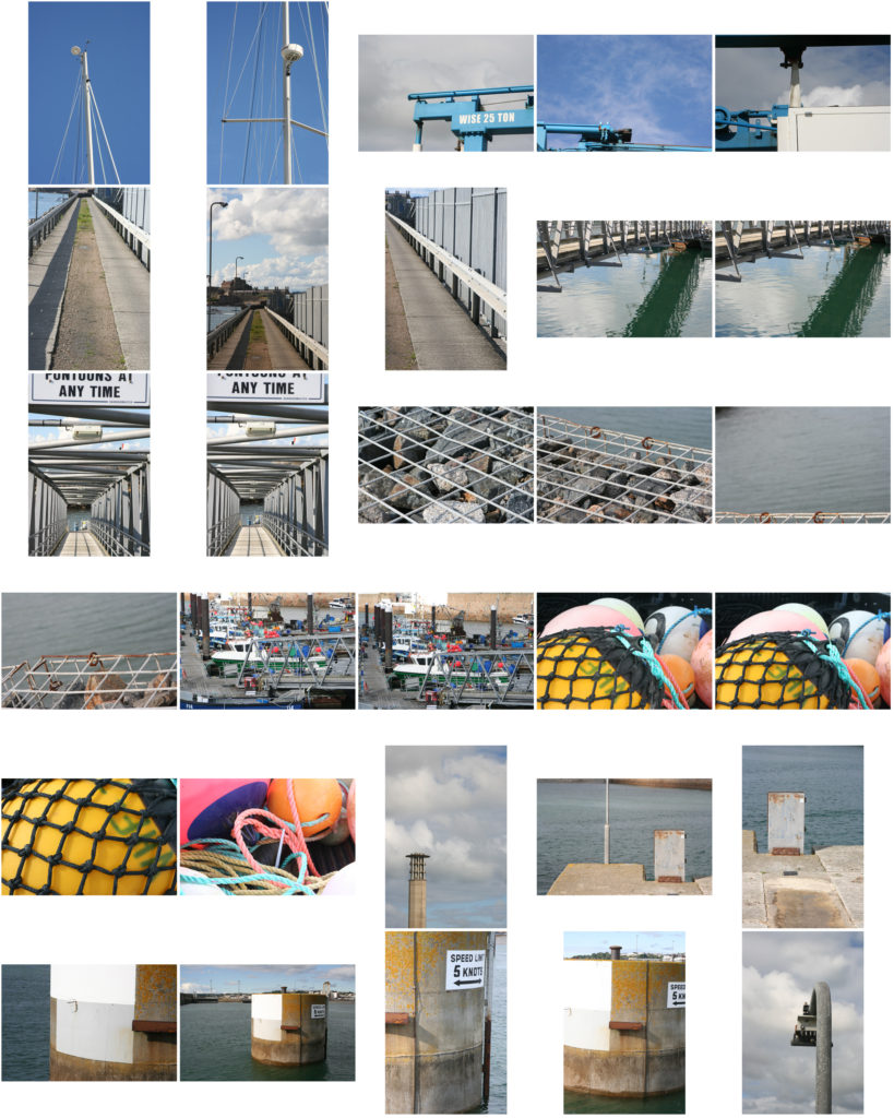
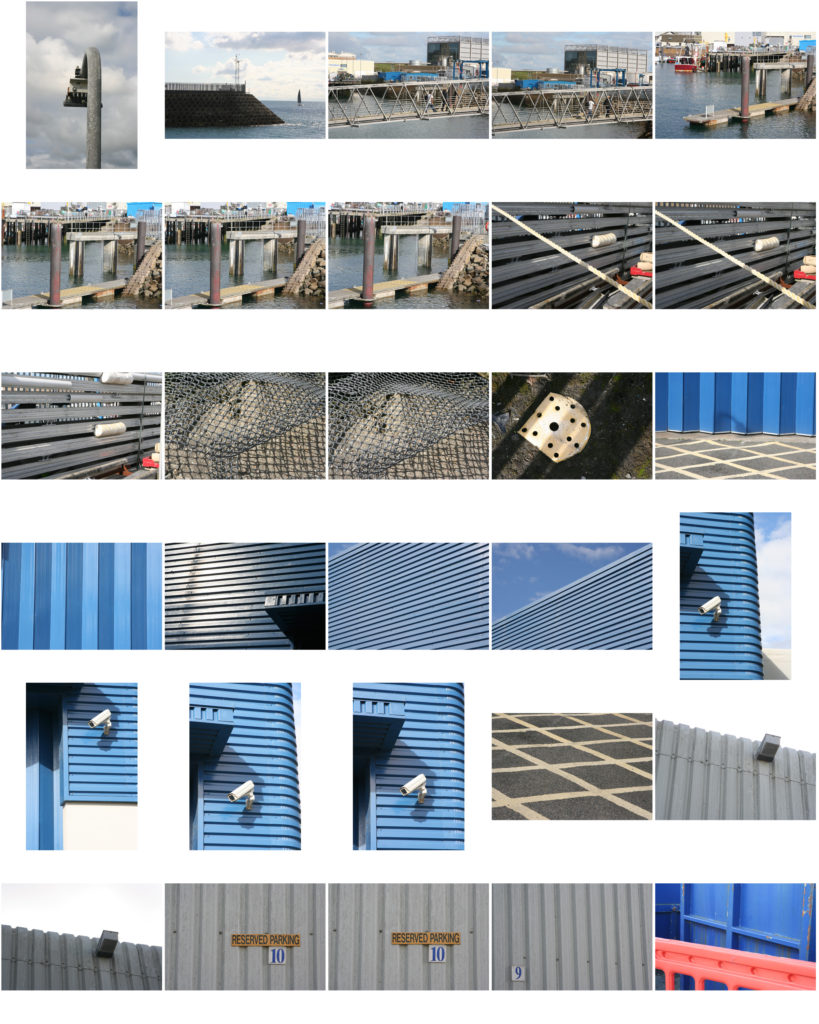
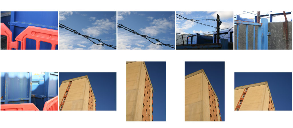
Here are the images in which I took around school came out.

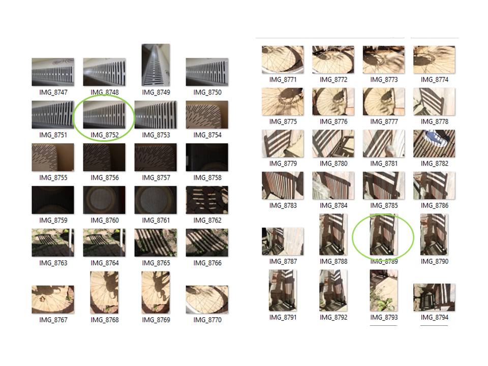
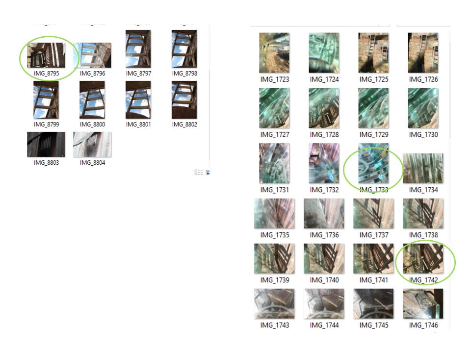
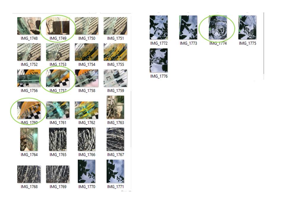
A contact sheet is a piece of photographic paper on to which several or all of the pictures in a shoot have been spread out.
We use contact sheets to easily pick out and select the best and worst images from a photo shoot and simply display all the photos in which one has taken.
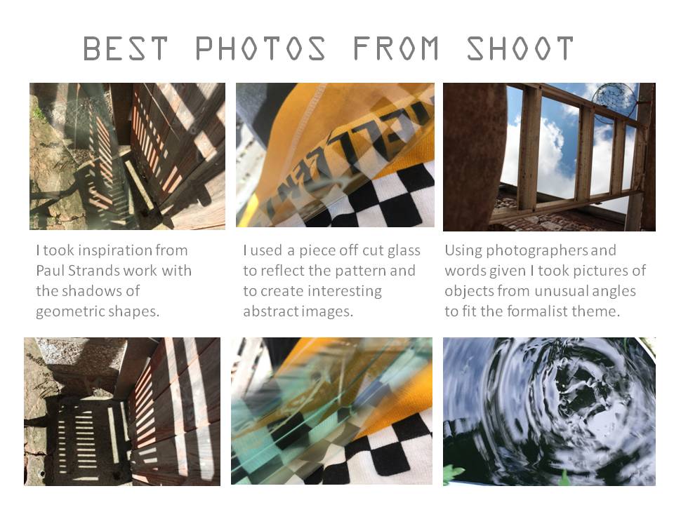
After having created a contact sheet we select our best images and then edit them accordingly.