Category Archives: Homework Assignment

Filters

Author:
Category:

Natural landscapes- 2

Location: Abandoned Places

To explore natural landscapes more i decided that i wanted to go to abandoned places that have been neglected to create more interesting subjects for my images. I decided that I would visit derelict greenhouses with overgrown plants showing the natural aspect with the broken greenhouse creating a more thought-provoking image. Although these photos aren’t completely natural, they show how the natural aspects have taken over and grow around the urban spaces.

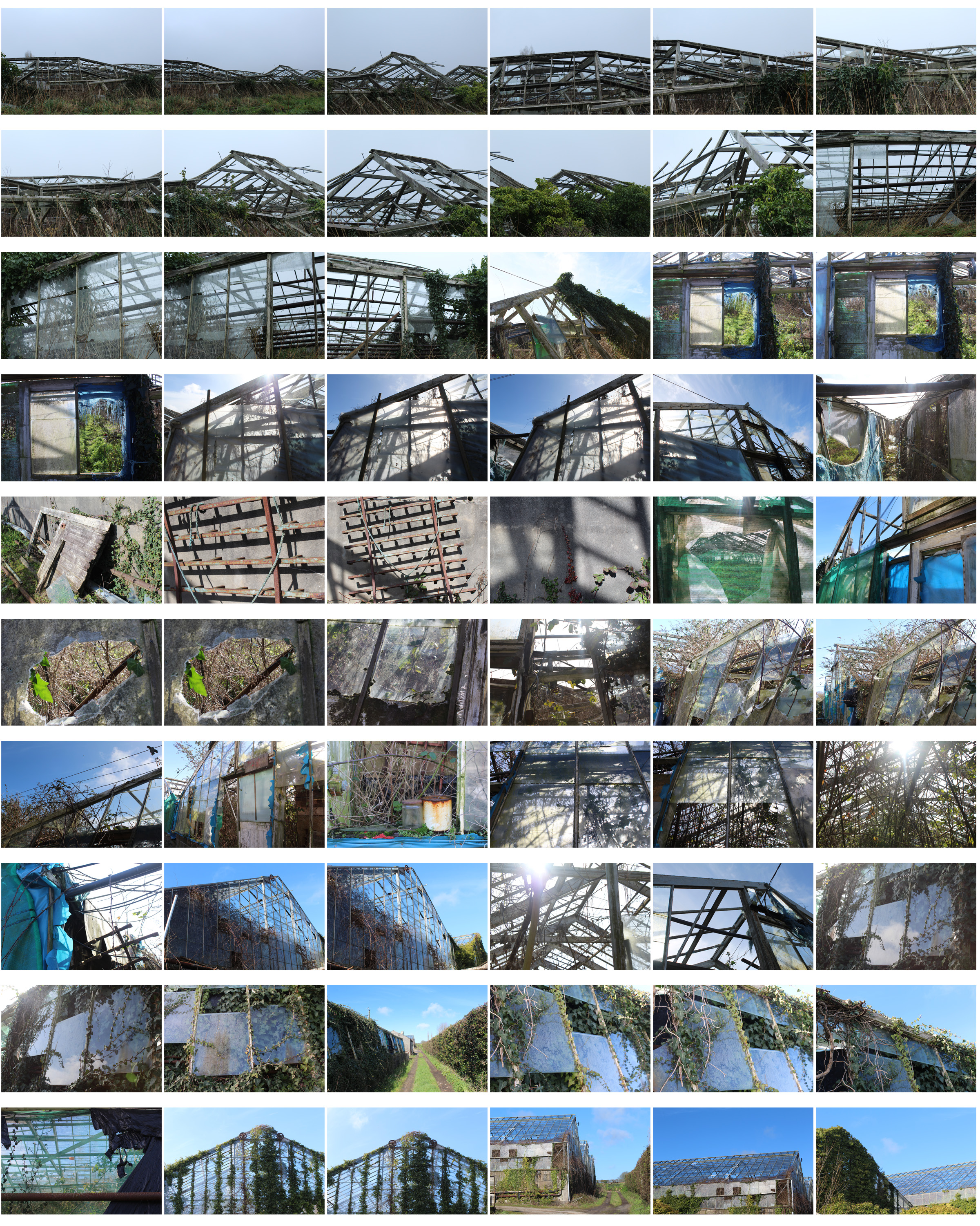
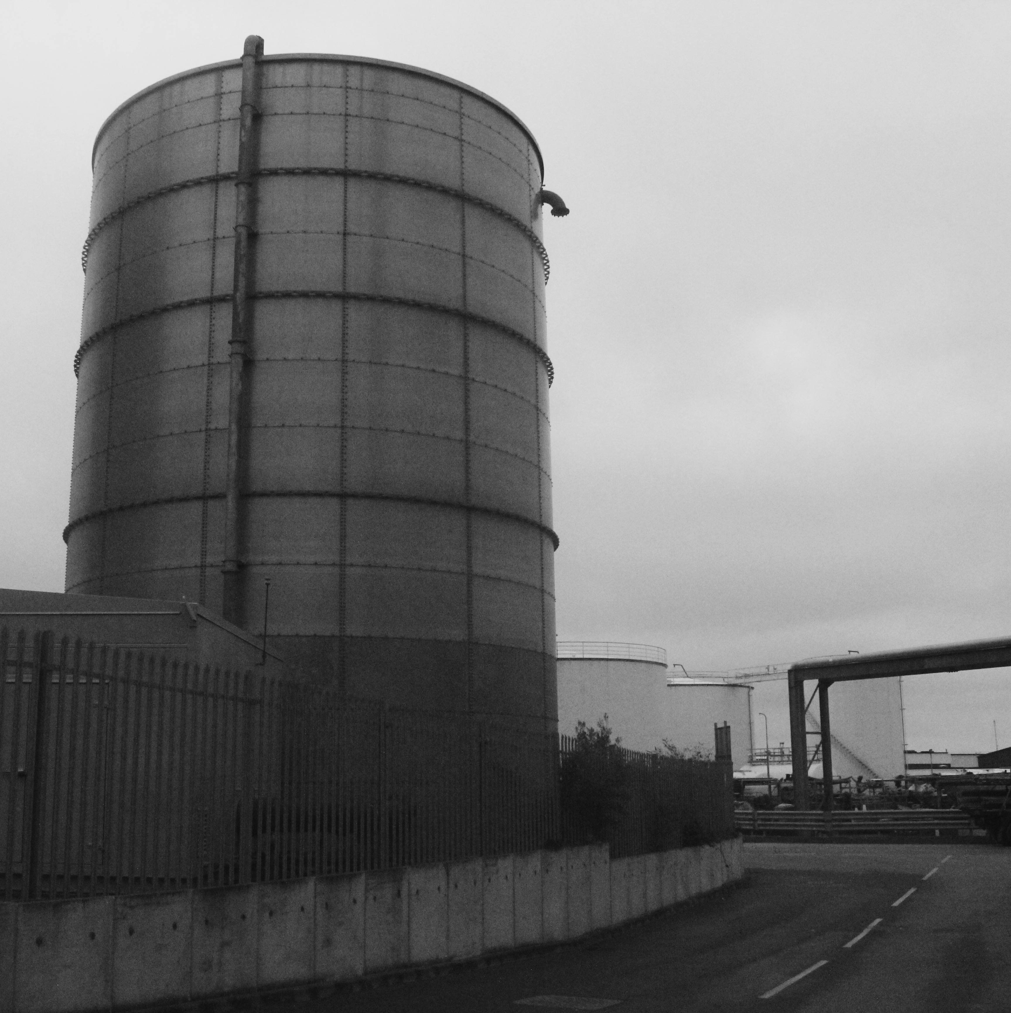
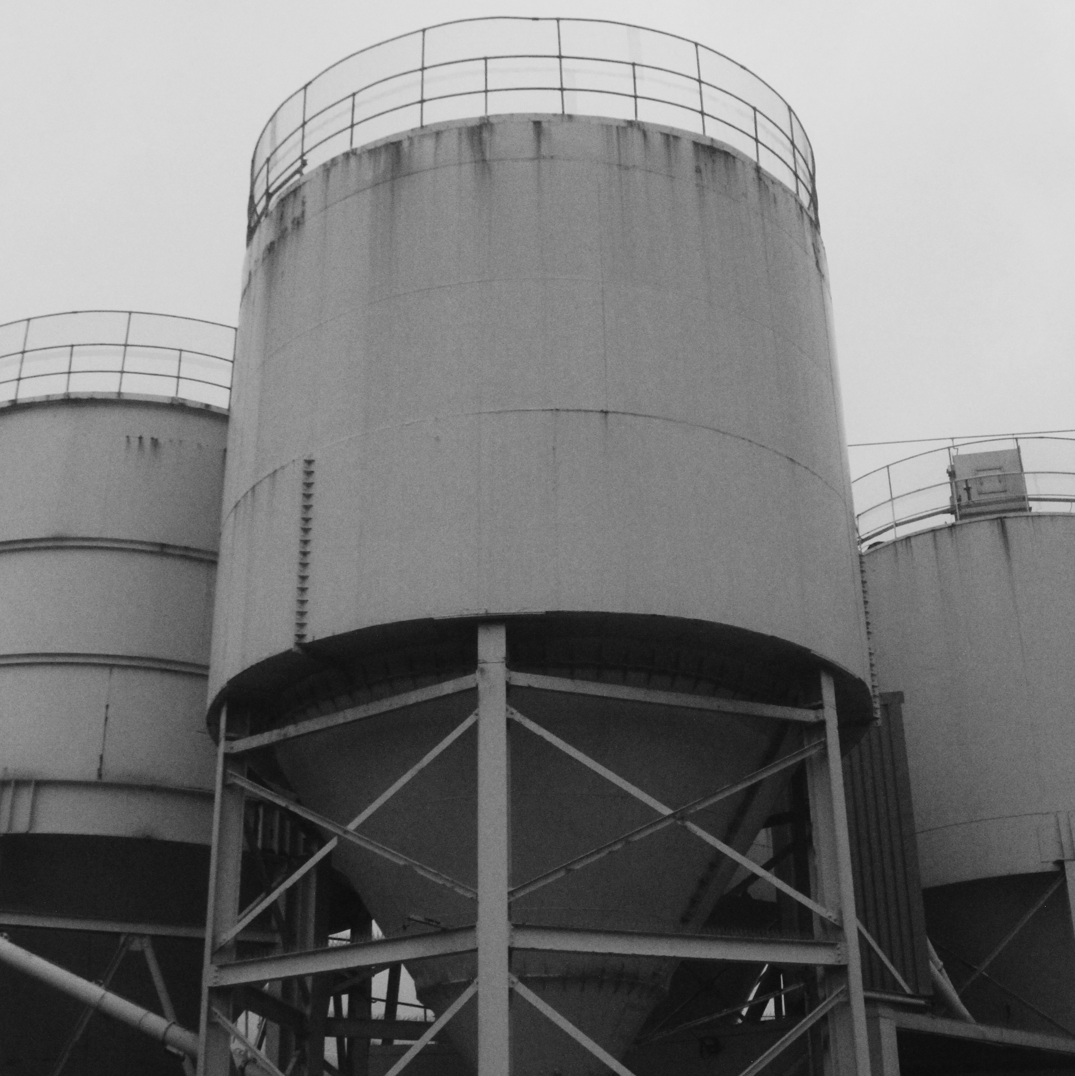
I went through my contact sheet and selected my favourite images and displayed them above unedited. I chose these photos as they are taken from different angles showing a different point of view in each image, some showing close up detail of areas that caught my attention and some that are from far away giving more of an overview of the scenery and structural shapes.

  • This is one of my final images for this homework as it clearly show the natural aspects i wanted to present and the derelict urban aspect through the broken glass.
  • I focused in on the left side of the image so the right side was gradually more out of focus to show the marks and patterns on the glass more clearly.
  • The glass has a reflection from the blue sky so I edited it slightly so that colour was emphasised to take make the image stand out more. The glass also has marks to show the derelict aspect of the greenhouses.
  • The colour of the plants growing around the glass are also emphasised showing darker and lighter greens. I chose this image as the panes of glass that are there create a pattern as some are missing.

  • I also like this image and decided for it too be printed and framed along with the image below as I think it portrays derelict greenhouses well.
  • The wooden frames with missing glass panes give evidence of destruction and reflects what happens to structural buildings over time.
  • I like the geometrical pattern that is created and the angle of the wooden door and frames also show how the greenhouses have been left alone for a long period of time to eventually be destroyed.
  • The condition of the plastic sheets show weathering and also show how the area has been neglected.

To experiment with my images I decided to edit different shapes with the image to make the photo more intriguing and to give the photo a different aspect, although I like the images by themselves.

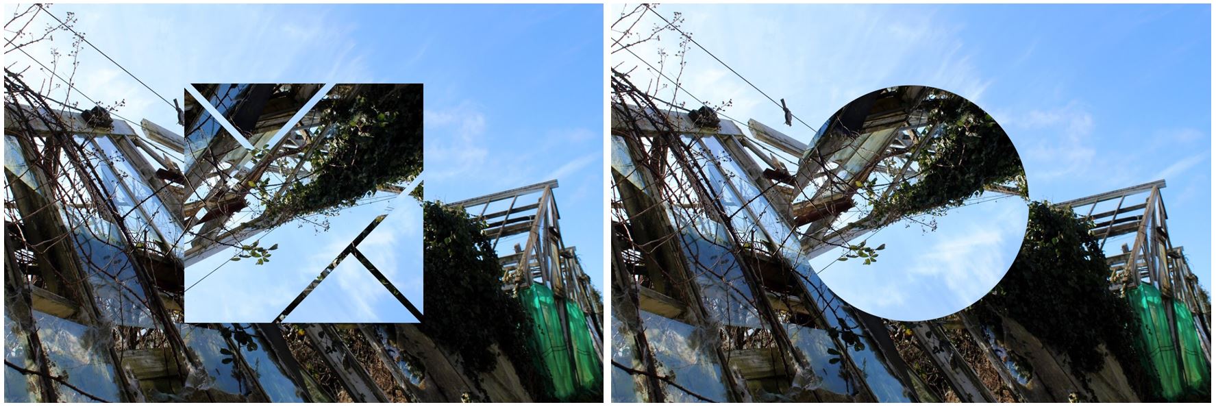
  • I like the geometrical shapes and lines created from the broken wooden frames, giving a different effect than if they were not derelict.
  • The shapes I have edited emphasise the geometrical lines and shapes within the image and adds a different aspect to the photo.
  • The most effective image i think is the square as its simple and not distracting too much from the original image and the detail within it as the other shapes remove whole areas from the background image, whereas the square is a thin line.
  • The shape also brings the light blue from the sky into the bottom half of the image creating contrast between the two as it contains parts of the image within the square.
  • The colours within the image as a whole are very neutral: the panes of broken glass on the left side of the photo also show the reflection from the sky making them appear blue in the image and  show the reflection of the clouds aswell.
  • This blue then contrasts with the green on the right side on the image on a different greenhouse,

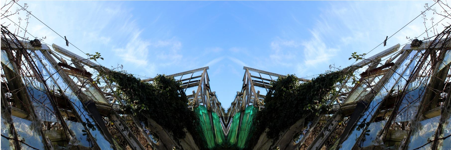
I also tried to create some panoramic images by taking the same image and flipping it horizontally and attaching to the original image. I did this as i thought it would be harder to attach different images and line them up exactly to create one landscape so i use the same images flipped so the it was easy to connect which I thought would be more aesthetically pleasing. These panoramic images create structural shapes that would not be found in real life making for an interesting image. I did not chose these images to be in my final outcomes as I think the patterns created are too repetitive being the same images repeated again.

Homework 5- Altered Landscapes

Out of Beomsik Won and Mona Caron i decided to take inspiration from Mona Caron. I decided to edit pictures of nature and plants onto buildings to present the concept of urban taking over nature. I planed to physically stick the images onto a printed out building to make a collage and to also digitally edit images onto buildings in photoshop, similar to how I edited my other altered landscape photos.

The images I planned to use to edit onto buildings were not my own photographs but secondary source of art as Mona Caron physically painted murals onto buildings I wanted to keep that aspect but using different artists work of natural landscapes and plants, still keeping my own images of the buildings.

I first went out and took pictures of buildings so i could edit them in different ways.

I then chose two of these images to be my final images to edit. The pictures I wanted to lay on the buildings are from the artist Claude Monet as his paintings are often of nature and plants so the urban and nature will both be included in my image. Also Mona Caron is an artists and physically paints murals onto the side of buildings so i wanted to carry that aspect on to my images.

I cut the paintings specifically in the shape of the windows so it looks like the paintings are inside of the buildings. I think this was effective as the paintings are angles to make the image look 3D. These were the final outcomes when I photographed the images stuck on top of each other:

  • I chose to do this as i think the images link into my other blog posts with the theme of urban vs. nature. Claude Monet’s painting of lily pads represents the nature with the structural building representing urban.
  •  I physically printed out the images and collaged and stuck them together to make the images seem less manipulated.
  • To re-take the photo I used artificial lighting to highlight the photo as best i could even though the print out of the building wasn’t the best quality (to improve these images i could get them printed professionally.)
  • I think the edits look effective as it looks as though they were edited digitally when they were physically stuck on.
  • The shadows created from the building (especially in the first photo) make edit look more real as the painting is cut in a certain shape to emphasise that shadow.
  • For my final image I put a black border around the images and combined the tow in the same photo to show the variety of images.

Mona Caron

Mona Caron is a San Francisco-based artist, engaging in muralism & street art, illustration, art-ivism, and photography. Her focus is on community-informed and site-specific public art . She has created murals in the US, throughout South America and in Europe, creates stop-motion mural animations, has freelanced as an illustrator, and engages in artivism with social and environmental movements.

The first image is a mural called ‘Outgrowing’ in Taiwan, Mona painted the plants growing, like weeds do, from an inhospitable ground, a disturbed environment. She utilizes a wall’s large size to emphasize this inversion of scale, a micro-to-macro assertion of the power of small things, the power of the grassroots, human or plant.

Public art

Mona has been focusing primarily on murals in public space since the beginning of the millennium. Her goal is to activate public space by simultaneously creating artwork and interactive street happenings, using the painting’s narratives to spark conversations and critical awareness of the space we share.

Several of these murals contain intricate miniature details, invisible from afar. These typically narrate the local history, chronicle the social life of the mural’s immediate surroundings, and visualize future possibility, and are created in a process that incorporates ideas emerging through spontaneous conversations with the artwork’s hosting communities while painting.

Mona’s first period in muralism was defined by very site-specific and community-immersive narrative murals, reflecting the past, present, and future images of their neighborhoods through a uniquely permeable participatory process, considered part of the artwork. Mona’s community process has been the subject, among other publications, of an Emmy-winning documentary film by Paige Bierma.

In recent years, Mona’s stop-motion animation and botanical mural series titled ”WEEDS”,  a metaphor about resilience, has been growing, just like its namesakes, both in numbers and geographic reach, as well as in the scale of her pieces.

  • Currently, Mona likes to combine the poetic with the narrative aspects of her work, as can be seen in her most recent Collaborative work.
  • Mona has also illustrated books, posters for music or political events, news editorials, and more, using various styles of watercolor, block print techniques and more.Mural by Mona Caron
  • This mural, called ‘Taking Root’, features the first wildflower that made it back to a barren piece of land in Union City, California, after its rehabilitation from industrial pollution, and during the construction of a new affordable housing complex.
  • The topsoil had been completely scraped off to remove pollution, killing all vegetation. As the building construction neared completion, the first wildflower she found became the main feature of the mural, a symbol of resilience.
  • https://www.monacaron.com/murals/taking-root-video-documentary- link to video
  • few more videos https://www.monacaron.com/murals/manifestation-station-painted-utility-box
  • https://www.monacaron.com/murals/brush-tenderloin-short-movie-paige-bierma

Dandelion 1 Masjid Darussalam, San Francisco by Mona Caron

http://youtube vid:  https://monacaron.com/weeds -a stop-motion mural animation

“They may be tiny but they break through concrete. They are everywhere and yet unseen. And the more they get stepped on, the stronger they grow back.”

This is a series of paintings of urban weeds, created as a tribute to the resilience of all those beings who no one made room for, were not part of the plan, and yet keep coming back, pushing through and rising up.

weed-1-new

“I look for weeds in the city streets near a wall I’m about to paint. When I find a particularly heroic one growing through the pavement, I paint it big, at a scale inversely proportional to the attention and regard it gets”

Abstraction and Formalism Landscape Homework

Planning

Task: Take 150-250 photographs that explore Abstraction and Formalism

Camera Settings: I will be used an ISO of 200 along with a shutter speed of 1/40 to allow the image to be as high quality as possible.

Lighting: I will be using natural daylight for my photographs.

Location: La Collette

Context: I will be taking photographs with the work of photographers such as Albert Renger-Patzch in mind.

My Response

My Top 5/Edits

My Favourite Photograph

In this photograph I used natural daylight in order to create a good amount of contrast between the structure and the sky. I used a deep depth of field in order to ensure that all of the photograph was in focus and sharp. I used a shutter speed of 1/40 to allow the image to be sharp, with an ISO of 200 it allowed the image to be slightly dark which increases the contrast and drama in the photograph.

There is no colour in the photograph as I used black and white. I took inspiration for this from Renger-Patzch who did his work in black and white. This creates more drama and shadows within the photograph. There is a wide tonal range in the photograph and the wires and metal structure is very dark whereas the podium they sit on is highlighted with white. There is a 3D effect in this photograph due to the shadows and edges with the photograph.

This photograph is of a crane-type structure used for moving large items, down at la collette. The industrial part of the island that I took photographs of is a great example of altered landscapes because there is almost no nature left there due to the amount of business that goes on there.


Altered Landscapes

For this post I wanted to explore the use of altered landscapes. To do this I would need to research specific photographers that use this technique to produce the artificial designs and attempt to copy the idea using my own imagery and Photoshop. A photographer I found particularly interesting is Krista Svalbonas, Svalbonas uses images she has taken of buildings to then create part of a structure by stitching together parts of the buildings wanted. Here are some examples of her work:
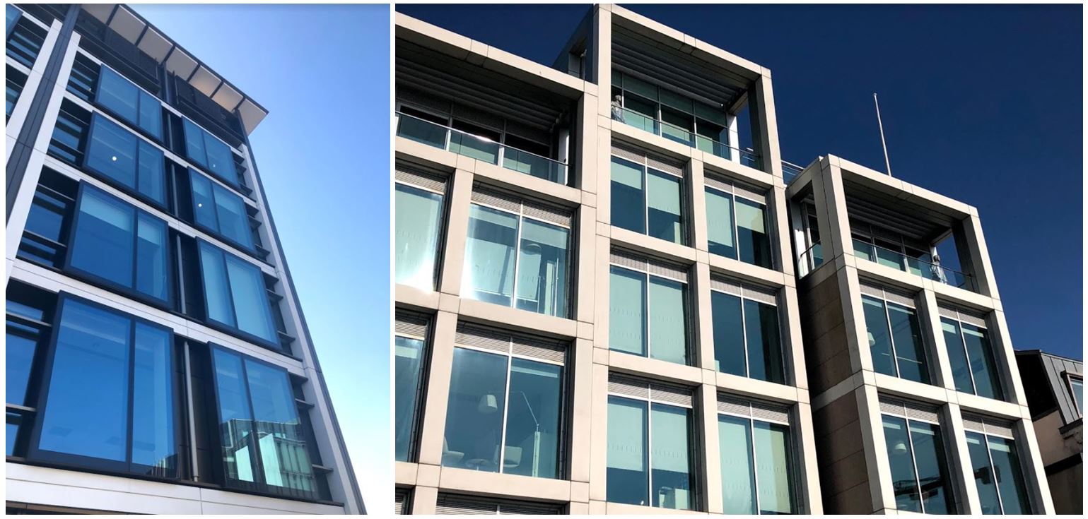
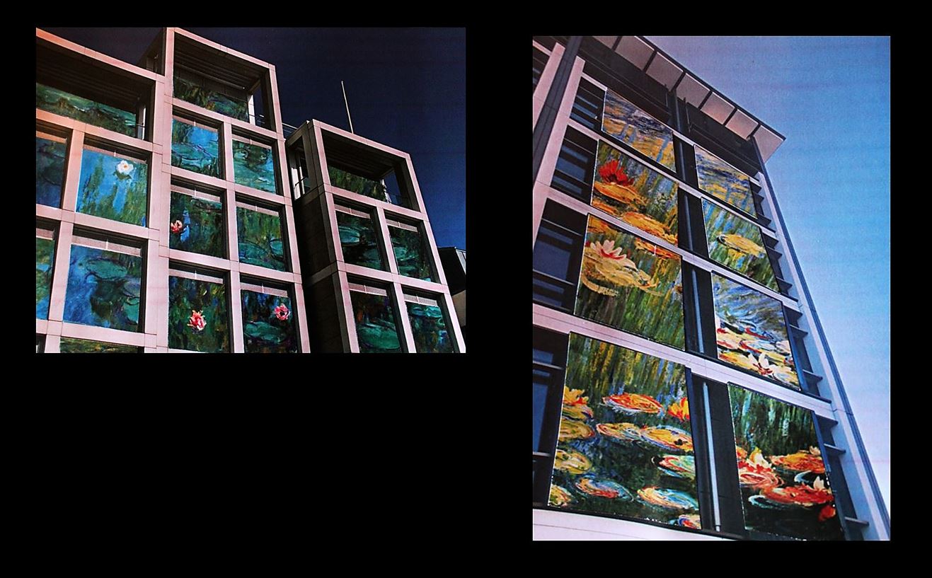
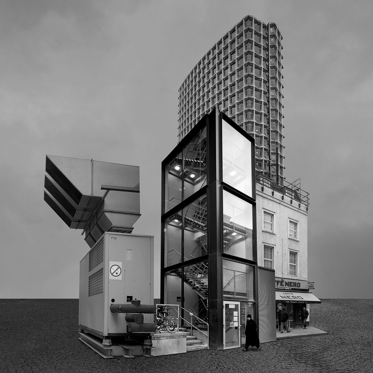
I found that Svalbonas used a calm colored backdrop to her creations to balance the entire piece and really make the design pop out. In response to this I looked through previous photo-shoots picking out images of buildings that I had taken recently. Once found I proceeded onto Photoshop to cut out and stick the parts of these buildings together creating a structure similar to that of Svalbonas, to which I would continue to add a colored matt backdrop that in my opinion balanced the image out. This was my process:

Firstly I created a mood board of the images I wanted to stick together that I thought worked well composition and color wise.From here I cut out the buildings individually and proceeded to join them together experimenting with what fitted well.To do this I used the lasso tool to accurately outline the object wanted so that I could then paste onto the design and move it around until satisfied with its placement.Once the design had been finished I experimented with a series of colors that I thought were neutral and would not overpower the overall piece. To do this I used the shape tool to cover the backdrop with a large square where I could then change the colors of it.

Once I had put together the images I thought best suited each other I added a backdrop using a singular shape put beneath the layers, this allowed for the effect wanted whilst neatly finishing the piece. These were my results:

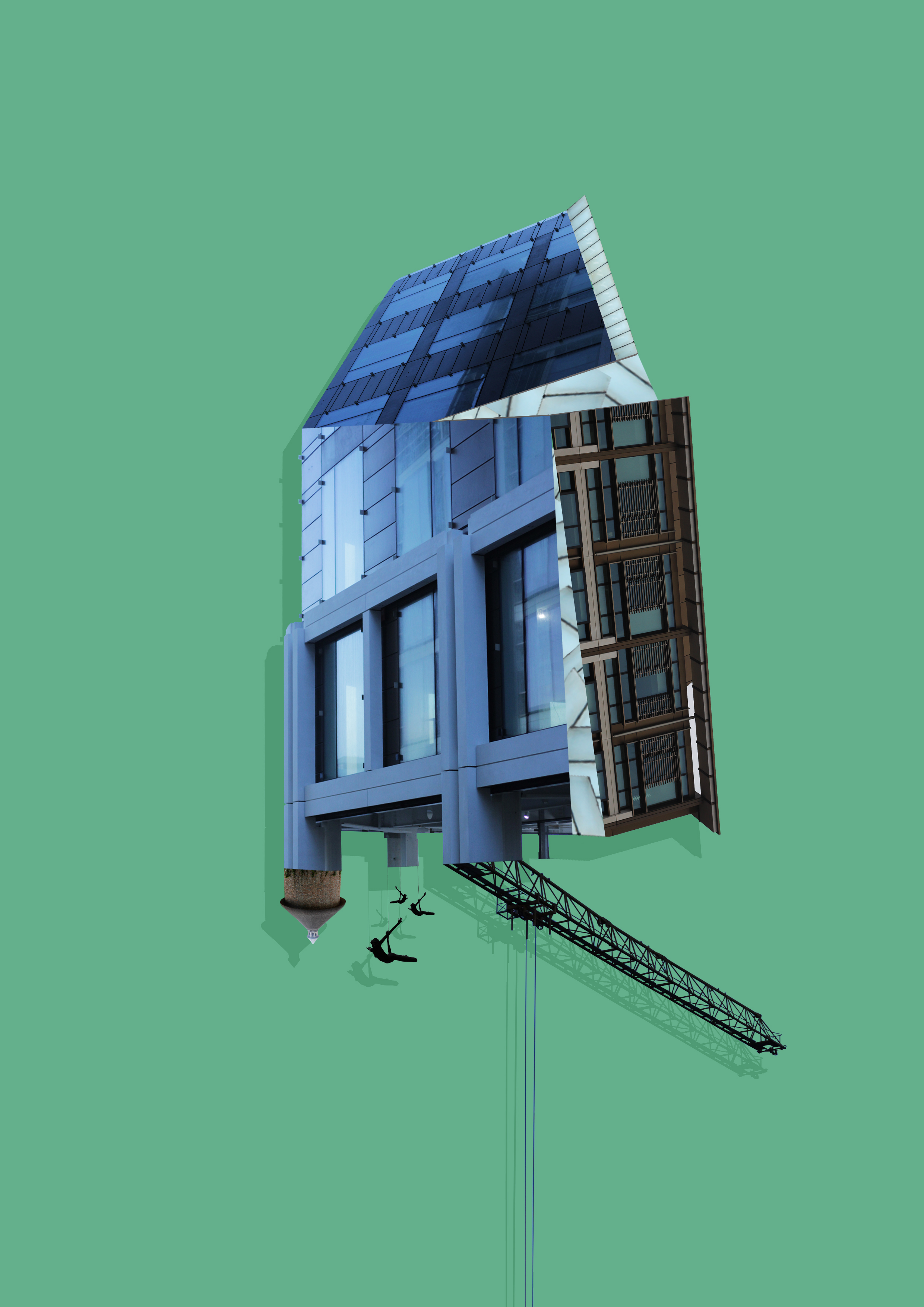
To create these images I mainly incorporated photos that I had based around the International Finance Center for my psycho-geography shoot and a few images from various other shoots. Whilst doing so I found that by duplicating the image and coloring it black while at the same time reducing the opacity, created a shadow like effect to the piece, this allowed for a 3d like effect that I wanted to put across on the piece and at the same time giving it a more graphic feel. Once done I added a green and a pink backdrop to each piece as I found that these colors drew the gaze to the piece rather than be sore from all the negative space surrounding it.


New Topographics | My Photos

My Edits

Processed with VSCO with b1 preset

I edited my photos to have the same banal aesthetic that the photographers of the New Topgraphics gave their work. I did this by making all my photos black and white and cropping them to squares.

Romanticism Photography Response

My Edits

When editing this image, I set the brightness to -68 and the contrast to 30. The contrast adds dramatic effect to the darker clouds behind the tree. The trees in the background have a slight blur but the foreground is more focused showing a narrow depth of field.

For this image, I quick selected the sky and set the contrast to 100 and the brightness to -82, giving the overall sky a romanticized style. I then added further contrast setting the whole image to a contrast of 46 to make the whole image more natural looking.

For the above image, I set the brightness to -102 and the contrast to 100 to create the more gloomy romantic style.

I quick selected the sky and increased contrast. I then decreased brightness to give the clouds dramatic effect.

For this image, I converted this image to black and white by reducing saturation and increased the contrast to 100. The image of a large cliff felt similar to Ansel Adams’ work of mountain scenes.

I adjusted the levels of dark to light and increased contrast to amplify the sun emerging from the clouds.

Beomsik Won

Beomsik WON takes photographs of urban buildings from different times and spaces, breaks them down into segments using digital techniques, and constructs collages to create familiar-looking, yet imaginary buildings. To make these “Archisculptures” as it is called, he carefully combines the segments taking into consideration the architectural size, space, and formative elements; he then places them against simple backgrounds, and lastly adds people or birds for the viewers to guess the size of the building. Although these strange buildings are products of the artist’s imagination, they show various styles of architectures throughout history.

  • In the Archisculpture series, WON collaged the images of politically or socially important buildings in order to present a new interpretation of a city that operates like an enormous organism.
  • He shows not only the history of the city but also the history of its people by revealing the surface of buildings that have been damaged due to natural weathering or historical incidents and then subsequently repaired.
  • The Archisculpture, essentially a collage of history and people, is how the artist collects, classifies, and preserves the collective memory.

His images are digitally manipulated photographs of non-existent, fantastical buildings that appear to be real.

“You have a photography and arts background. Where did your interest in architecture originate from? What inspired you to launch the Archisculpture photo project?

My interest in architecture stems from its gigantic size and pragmatic functions. Whenever I see buildings of grand scale or interesting design I usually take photos, so I’ve got thousands of them. However, I couldn’t use those photos because even though I took them I thought it’s not my work but the architects’. Thus I decided to use them as material for my artworks.”

At first, he only made images in black and white, but then he realised that the real world is not b&w but coloured. So since then he has been making two version at the same time. He believes the black and white version is more surrealistic than colour one.Beomsik Won, Archisculpture 003, 2010. Archival pigment print, 50x50cm.

Image Analysis:

  • Beomsik Won digitally manipulates and constructs buildings, compiling them together to create a completely new building. In this image he has combined an industrial machine, office buildings and  a cafe together.
  • The layout of the image is very aesthetically pleasing, with many straight lines within the windows and walls, as well as the straight horizon behind the buildings.
  • The buildings are placed to emphasise their different architectural sizes, levels and shapes, each level complementing each other.
  • He combines the different types of buildings and structures to show the contrast between them and compiles them together into one structure to make it appear real and to show various styles of architectures throughout history.
  • In the Archisculpture series, Won collaged the images of politically or socially important buildings in order to present a new interpretation of a city that operates like an enormous organism.
  • He emphasises the history of the buildings  by showing the surface of buildings that have been damaged due to natural weathering or historical incidents.
  • He took photos of the buildings from the same angles, or digitally manipulated them, so that they all fit together and face the same angle so they connected easily.
  • He uses a simple background of a cloudy sky and a cobbled pavement to emphasise the building he created  and the present it in a place where a normal building wouldn’t be, not surrounded by anything.
  • He takes the photos at different times of day so the lighting is different in each image. The glass window on the office building is reflecting white light , whereas the other buildings are not, emphasising how it is from the present-day as it is modern.

Paul Strand

Paul Strand (1890 – 1976) was an American photographer and filmmaker who helped establish photography as an art form in the 20th century. His work covers numerous genres and subjects throughout America, Europe and Africa. Strand was an early icon of the “straight photography school”. In contrast to Pictorialism, “straight photography” was a move to “pure photography” which was loosely defined as having stylistic traits that were not manipulated heavy to mimic other art forms such as painting.

Image result for paul strand photography

Image result for paul strand photography

My Favourite Photograph

Image result for paul strand photography

In this photograph it appears that Strand has used and manipulated natural light in order to capture this photographed. He has used the structure of man-made structures against the daylight to create contrast and shapes within the photograph. It appears that a deep depth of field was used as the whole of the photograph is sharp and in focus. A shutter speed of 1/20-1/80 will have been used for this photograph along with an ISO of 100/200/400 to allow enough light to enter the lens whilst keeping the photograph as high-quality as possible. There is a slightly warm and old-fashioned undertone to this photograph.

There is not colour in this photograph – only a warm black and white undertone. This gives an old-fashioned, industrial feeling to the photograph and makes it feel more dramatic. There is lots of contrast between the shadows and the ground which creates a wide range of tones, this adds more drama to the photograph. There is a dirty/dusty texture in this photograph which adds to the industrial feeling of it. It is a flat 2D image mostly due to the focus being the 2D shadows. The shadows create lots of patterns and shapes in the photograph making it more interesting to look at.

Typology Homework Assignment

Planning

Task: Take 100+ photos that explore the concept of typologies

Camera settings: I will be using an ISO of 100 with a shutter speed of 1/20 mainly in order to allow the image to be as high quality as possible but this may have to be adapted slightly for darker environments.

Lighting: I will be using daylight for the majority of my photographs but photographs taken inside the car park may be captured with flash or with the car park lights.

Location: Waterfront underground car park and Jacksons car centre.

Context: I will be taking photographs with the work of Typologists in mind.

My Photographs

My Edits

My Favourite Photograph

In this photograph I used the artificial lighting the waterfront underground car park. This lighting allowed the photograph to be contrasted with the correct amount of exposure. An aperture of f18 was used for this photograph to ensure that the whole of the photograph was in focus with a deep depth of field. I used a shutter speed of 1/20 along with an ISO of 200 to allow enough light to enter the lens whilst keeping the quality of the photograph as best as possible.

There is no colour in this photograph – only black and white. This creates a rustic/old-fashioned styled photograph. There is not a massively wide tonal range in the photograph but the contrasting tones are right next to eachother so it gives a more dramatic effect. It is quite a 2D photograph as it only has one close-up subject with no foreground or background.

This photograph is part of a collection of typology photographs that I took which include the fronts of cars up close in order to show the differences between similar structures on the Earth. I took inspiration for the style of photograph (rustic) from the Bechers’ but instead of photographing the same subjects as them I decided to choose my own typology whilst taking inspiration from their style.