What is an environmental portrait? An environmental portrait is a portrait of someone who has been taken in their place of work, which is the subject's usual environment. This can be their home or workplace, but usually within the image, it reflects and illuminates the person's personal life, seen through the surrounding objects within the picture itself. One photographer who does this is Sally Mann, as seen in her photos like the one below called 'Candy Cigarette'.Within environmental portraits the subject tends to have a relaxed and calm face, in order to create an effect inside the image itself, whilst allowing the image to be emphasized due to its dramatic characteristics. Sally Mann tended to focus on a individual face within her images, to really make out the backgrounds of the character within, allowing us to see the conditions many of the subjects were brought up in.
Category Archives: History and Theory
Filters
Tamara Lorenz Inspired Photoshoot
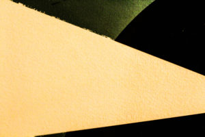
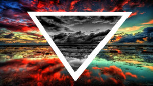
Within this photo shoot I will be focusing on the effect of layering in an image when taking photographs. I will also explore the use of colors to create a more dramatic effect to these pictures and really pull the photo together as a whole. One of the photographers that I have been inspired within this shoot are called Tamara Lorenz. German artist Tamara Lorenz creates various constructions which she then photographs to exploit their abstract properties. The addition of strong planes of color provide another source of contrast in addition to those of line, shape, tone and texture. Rather than photographs of things, each image seems to create its own reality. Consequently, the viewer is unable to recognize a conventional subject and is occupied with the business of looking. As seen below:I wanted to incorporate this effect into many of my photos taken, and do decided to do this through corners of color paintings and instruments to mimic this style.
I used this mind map as my basis for the shoot, where I would occasionally use this to find what I needed to focus on most importantly. From this these were my results in the shoot:

From here I decided it would be best to cut the shoot down into ten images, through this it would make it easier for me to identify the photo I think is best in the shoot. These are my top ten images of the shoot:
From these images taken from corners of paper, I wanted to cut it down once again, to my top five images to single out the best one. These were the photos I selected:
I chose these images because of their composition, color balance and patterns. I thought that these images stood out against the rest and so finally decided to edit these down to my top image of the shoot. This was the image I chose:I chose this image as my final photo, as I thought it best matched with the style of photography I wanted. Which incorporated an element of graphic design into the imagery, making it simple but visually pleasing to the eye.
Frank Hallam-Day Inspired Photoshoot
Within this photo shoot I will be focusing on surfaces, textures and pattern. To do this I will be focusing on walls, metallic objects etc, from this it will enable me focus on specific details like peeling, cracks, and bumps to allow for maximum effect.

One photographer that has inspired me to do this shoot is Frank Hallam-Day. Washington, DC-based photographer Frank Day is a versatile artist shooting in both black and white and color film. Traveling the world to remote destinations, Day is able to capture the rich beauty of pattern, color and texture of the open-air markets, isolated landscapes, busy harbors and everyday lives of diverse cultures. Day has also mastered the landscapes and cityscapes of the world, shooting the angular architecture of cities such as Berlin, New York, and Baltimore, as well as the beautiful softness of Washington, DC’s cherry blossoms.As much as I liked his work, I decided to mainly focus on reflections made by the water, and since I lived next to the beach I thought this would be an ideal idea to do.

I used this as a basis for my shoot, so when taking the pictures would know what to specify on.

From these images taken, I chose the top ten out of the shoot, to narrow down and edit which one overall I think should be my final picture.
From these top 10 photos taken when walking on the beach, I wanted to once again whittle it down to 5 images, so that I would once again have a clear insight on what to have as my final picture.
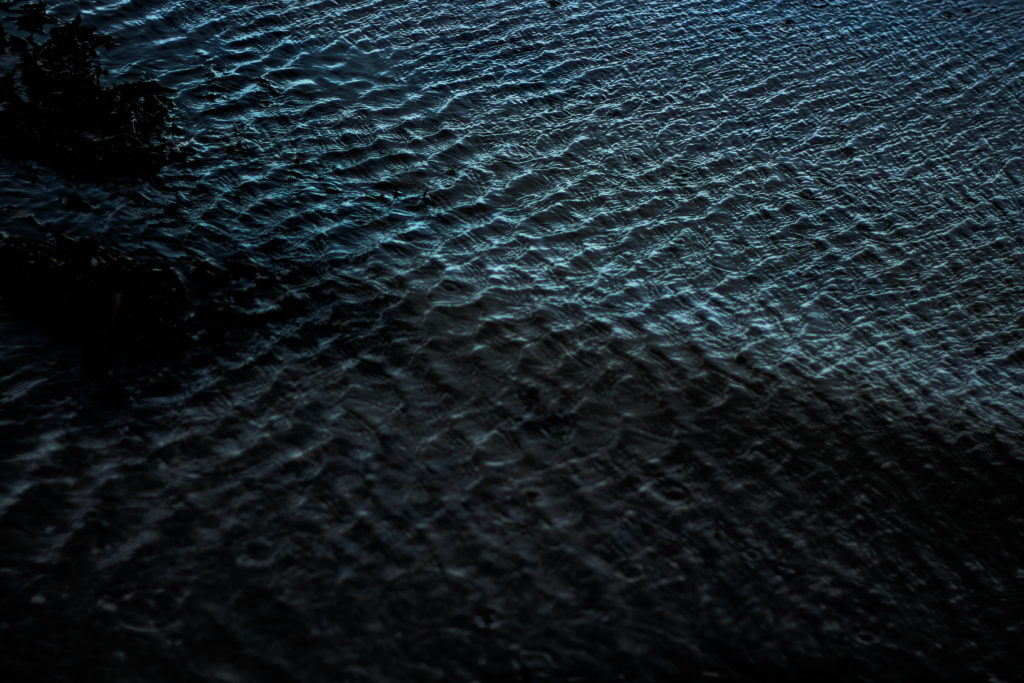
Finally from here I was able to decide on which image would be my final photo. This was my result:I chose this image because I loved the detail within the crashing wave on the shoreline, whilst the contrast between the darkness of the wave and the foam in my opinion make a dramatic effect. I also loved how the composition of the wave slanted across the frame, creating an almost abstract effect to it all.
Analysing Robert Frank
Trolley - New Orleans

Robert Frank is a Swiss-American  photographer and documentary filmmaker born in 1924, with his most noticeable work being the 1958 book called The Americans.
Trolley - New Orleans 1955

Named The Trolley, this became one of Robert Frank's most famous photos released from the book The Americans. The picture captures the fleeting moment that conveys the brutal social order of the postwar America. Frank was originally shooting a street parade when he saw a trolley passing, in which he quickly spun round and took a picture before the trolley disappeared from view.

Visual

The picture consists of a small amount of tonal range but a large contrast between black and white throughout. The picture is obviously taken at a slightly angled position, with a balanced symmetry across the entirety of it. This image has been cropped from the original taken with a huge contrast between the white poles and the people next to each one, instantly drawing your eye to them.

Technical

A natural light is used within the image as it was taken on a bright sunny day creating a warm tone to the overall piece, but has been slightly manipulated with evidence of the Ansel Adams zone system used throughout. The whole image seems to be in focus with no blur at all with a big depth of field, whilst telling us that Robert must have used a high shutter speed to capture the moving trolley so clearly without the traces of blur. From the reflection in the glass above the trolley windows, it is clear to say that it was taken head on allowing for the effect to occur.

Contextual

The picture perfectly captures the racial separation between the people at that time period within America in which classes were divided (In one window there is an old white woman, the next are two white children and the last are two black men), whilst also revealing and documenting the truth behind what the Americans saw as 'The American Dream' in which not everyone was equal with similar opportunities in life
Becher Inspired Photoshoot
What is a typology? Typology is the study of types, however in photography a typology is a series of images, in which the photographer has taken many of the same genre of object (buildings, pencils etc), using roughly the same composition for each one creating that scenes of repetition about them. Bernd And Hilla Becher Both these Photographers were German based, and were commissioned by the government to produces typologies of specific types of buildings, as seen below.These Photographers would go around the country taking the same composition of certain objects, which when one was taken would not look that impressive, but rather when hundreds were taken precisely from the same distance, and combined together, it creates an almost artistic creation In response to this I decided I would walk around my home area and try to incorporate this style into my images, I chose the themes around car lights, windows with chimneys, and doors. These were some of my results:
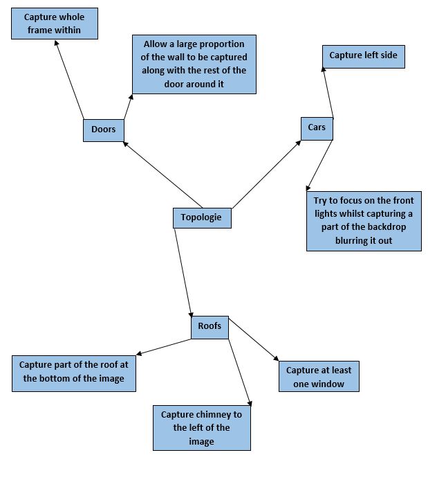

I decided that the car topology sheets worked the best, due to the contrast between the lights and the bonnets of the car which came in different shapes.
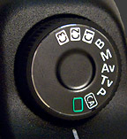
ISO,aperture photo shoot
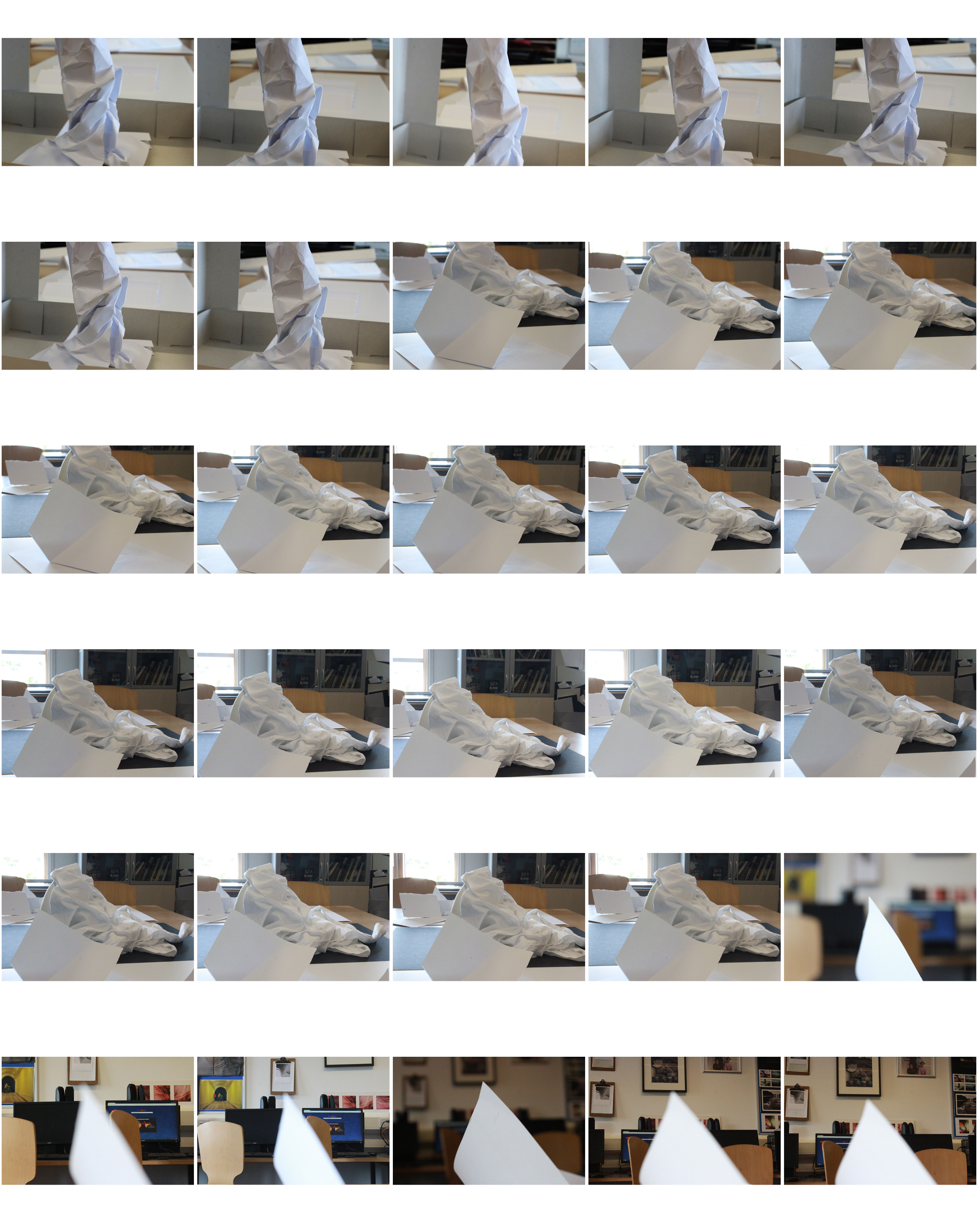
For this shoot I wanted to experiment the same shot and how it works ind developing detail, colour,and background when changing the ISO and Aperture settings.these photos devoted from 100 to 1600 doubling every time.
The ISO speed determines how sensitive the camera is to incoming light. Similar to shutter speed, it also correlates 1:1 with how much the exposure increases or decreases. However, unlike aperture and shutter speed, a lower ISO speed is almost always desirable. As a result, ISO speed is usually only increased from its minimum value if the desired aperture and shutter speed aren’t otherwise obtainable.This can cage depending to lighting or if it happens to be a very quick shutter speed to capture an action shot. With the first few images you can see the development of a lower to higher ISO level. It slowly looses the detail and becomes too exposed and is unable too capture the image; as seen before.The ghee exposure is available to ‘film grain” seen in traditional photography.
 Low ISO Speed
(low image noise)
 High ISO Speed
(high image noise)
Secondly I focused on Aperture. Aperture is when A camera’s setting controls the area over which light can pass through your camera lens,uch like exposure and alliance of light. It is specified in terms of an f-stop values. In photographer slang, when someone says they are “stopping down” or “opening up” their lens, they are referring to increasing and decreasing the f-stop value, respectively. this is the widening snd retraction of the lens to determine the amount of access to light they wish to capture. This is the second half of the photos and the development detail and focus within the images.
Independent Study (+ homework) Sept – Nov 2017
You are expected to take responsibility for your own learning, progress and success during A Level Photography…
- minimum 2 hours per week
- complete any incomplete class tasks
- contribute your own photo-assignments + research
- seek out opportunities to extend your learning / skill level
- if you are absent you must check the blog daily / check emails for instructions, guidance and advice and complete in accordance with deadlines for your teaching group (these may change depending on timetable).
Task 1 (Week 1, 2, 3)
| Blog posts / Sections to complete | Actions to take | Assessment | Complete by: |
| Homework Assignment 1: Take 150-250 photos that explore shape, pattern, line, repetition, symmetry, shadow, tone, curves, angles, edges | Make planning sheet
Photo Assignment |
AO3 | Lesson 1
Week 3 |
| Artists references: Research the work of at least two formalist photographers eg Rodchenko / Brett Weston / Paul Strand / Peter Keetman / Jan Groover | AO1 | ||
| Image Analysis: Choose 2 key images from each artist and analyse in details using the model of form-meaning-judgement-context. | AO1 |
Task 2 Due in Lesson 1 | Week 4
| Blog posts / Sections to complete | Actions to take | Assessment | Complete by: |
| Homework Assignment 2: Take 100 – 200 photos of types of things eg objects, buildings, people | Make planning sheet
Photo Assignment |
AO3 | Lesson 1
Week 4 |
| Artists references: Research the work of at least two TYPOLOGIES artists eg Bechers /Sander | AO1 | ||
| Image Analysis: Choose 2 key images from each artist and analyse in details using the model of form-meaning-judgement-context. | AO1 |
Task 3 Due in Lesson 1 Week 5
| Homework Assignment 1: Produce 100-200 images that show a response to abstract art and photography | Make planning sheet
Photo Assignment |
AO3 | Lesson 1
Week 5 |
| Experimentation : Photo safari grid, overlays, tracing paper | AO2 | ||
| Artist Reference : Ernst Haas and Maholy Nagy | AO1 | ||
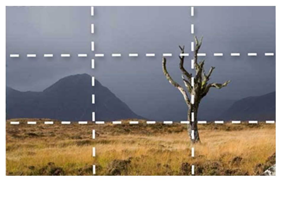
| Image Analysis : Rule of Thirds and depth of field | AO1 |
Task 4 Due in Lesson 1 Week 5
| Blog posts / sections to complete | Actions to take | Assessment | Complete by: |
| Homework Assignment : Take 100-200 photos of different textures and surfaces eg rust, mould, rough , smooth , contrasting surfaces | Make planning sheet
Photo Assignment |
AO3 | Lesson 1
Week 6 |
| Experimentation : juxtaposing textures and surfaces | AO2 | ||
| Artist Reference and Image Analysis :
Frank Hallam-Day / Aaron Siskind / Keld Helmer Petersen |
AO1 |
Task 5 Due in Lesson 1 Week 6
| Blog posts / Sections to complete | Actions to take | Assessment | Complete by: |
| Homework Assignment; Produce 100-200 images that explore a colour, contrasting colours or colour harmonies | Make planning sheet
Photo Assignment |
AO3 | Lesson 1
Week 7 |
| Experimentation; cut, tear and shape coloured card (flat and 3-d) to photograph | AO2 | ||
| Artist References : Franco Fontana / Tamara Lorenz | AO1 |
Practical Skills || Formal Analysis
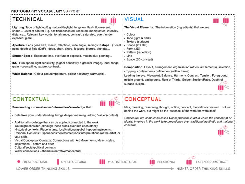
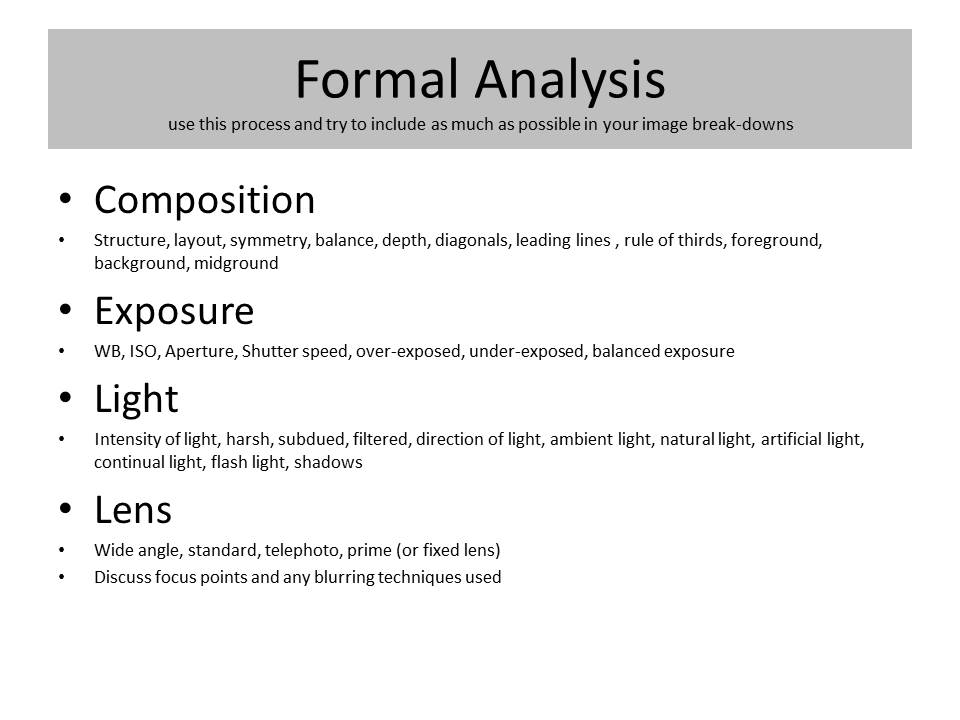
Use C.E.L.L. to help you describe and analyse images. Be prepared to discuss…
Composition : layout, structure, depth, rule of thirds, balance, symmetry, leading lines
Exposure ; over exposed, under exposed, balanced exposure
Light : Natural, artificial, harsh, soft, overhead, side etc
Lens : wide angle, telephoto, standard, macro, fish eye, focal length, focal point, depth of field, foreground, midground, background etc
Use this link to explore camera skills…
And create a set of blog posts that display your creative results and understanding of…
- camera handling skills as you learn them / explore them
- formal analysis of 1 x key image per photo shoot
- evaluative and reflective skills
- the role of contact sheets

