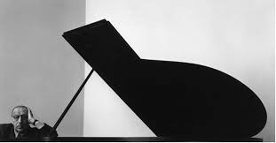
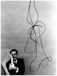
What is tableau photography?

Tableau is the French phrase for 'living picture'. Before photography was a thing it was a popular past time to which people would recreate scenes from famous paintings at parties. These people would dress up and use props to make it as accurate as possible. As photography emerged artists such as Julia Margaret Cameron created fantasy scenes like Sir Launcelot and Queen Guinevere, which prompted a huge interest in the art form. However this form of photography fell out of fashion with the introduction to realism.

Some of Julia Cameron's work can be seen below:
As seen in her work, she wanted to focus on how the photos were meant to recreate paintings in an innovative and creative way not seen before.
The 7 deadly sins were a popular topic when doing tableau photography due to each one having an important connection. These were Lust, Gluttony, Greed, Sloth, Wrath, Envy and Pride. I could then link this back to how these all formed their own unique identity and change the individual for the good or worse.
Category Archives: History and Theory
Filters
Studio Lighting
Why do we use studio lighting?
We use studio lighting when we want to control illumination, the subject as well as the camera and exposure settings.
Studio lighting (strobes, reflectors, diffusers etc.) offers us that control.

Shooting Mode:
Manual mode is often preferred once an initial exposure is established. If you’re shooting your camera in Manual Mode, and your flash in manual mode, you’ll also adjust flash intensities and then apertures. If your images are dark, you increase the intensity of your flash and/or use a smaller (higher) aperture. If your test images are overexposed, you decrease the intensity of your flash and/or use a larger (lower) aperture.

One Point Lighting
In many occasions, a single source of light creates a very natural, sometimes dramatic look that will draw people’s attention to the single lighted person or surface- a single source looks two dimensional or flat, and rarely hits people straight on, so it creates shadows.
Two point Lighting
When you want the subtleness of a single light source but want your people to stand out in 3D, two-point lighting can be a great way to add dimensionality without going overboard on your lighting.
Three point Lighting
The goal of three point lighting is to create the illusion of a three-dimensional subject in a two-dimensional image.
- The Key Light – This is the main light used on your subject. (The purpose of the key light is to put the light on the subject. You can place it anywhere you want, but a common placement is about 45 degrees to either side of the camera, and about 45 degrees up from the subject.)
- The Fill Light – The purpose of this light is to fill in the shadows created by the key light, preventing them from getting too dark. (The purpose of the fill light is simply to fill in the shadows caused by the key light. One thing to be cautious about — the fill light should not create a second shadow. If you see two shadows, that means the fill light is too powerful and needs to be reduced.)
- The Back Light – This is used to separate the subject from the background.
What is Chiarascuro ?
Chiarascuro is an oil painting technique, developed during the Renaissance, that uses strong tonal contrasts between light and dark to model three-dimensional forms, often to dramatic effect (it is a method of painting which imparts a sense of very directional light falling on the subject.) Artists known for developing the technique include Leonardo da Vinci, Caravaggio, and Rembrandt.
Some examples: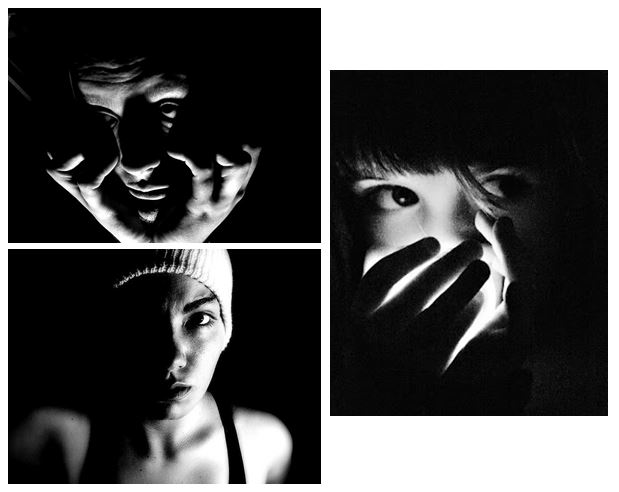
Photoshop Burn And Dodge Tools
What is the burn and dodge tool? The burn and dodge tool allow you to either darken or lighten an image of your choice. This can be used to create dramatic effect within an image, and so can use it to lighten dark areas or darken parts you want to stand out the most. This is used in portraiture due to how it can be used to make certain features stand out above the rest, such as making one side of the face darker. The image below shows the effects of dodge and burn to a grey surface:I wanted to apply this to an image of mine to see the effects that could be made. These were my steps: 1) Navigate to the selection bar on the left, and pick the burn tool.
2) Select a suitable size for the brush to match the face, and go over the parts of the face I want to darken once.
3) Go back to the bar on the left and select the dodge tool instead, from there I lightened the parts of the image I wanted to have a clear contrast from the darkness.
David Bailey And Rankin
David Bailey
David is considered on of the best pioneers of contemporary photography,he is credited with photoghing such compelling images whit the last 5 decades .he became famous when when making new generation models famous for many impresses roles in order to inspire critics.He is seen continually never failing to impress and captures Manu icon images within famous icons such as the Rolling Stone and Kate moss.although he has a simple style is does not lesson his large impact go tones that generate their own light and personality to the people themselves.
David Bailey was born in East London,to Herbert Bailey, a tailor’s cutter, and his wife, Sharon, a machinist. From the age of three he lived in East Ham. He enjoyed his dads more creative fashion of creating something with power and purpose that also helps define a person in a style in which they want. Although Bailey soon developed a more educational love for history in which led him into photoghy,despite suffering form dslyexia and school being a highly troubling time for himself, he seen attended a prestigious school in which they taught him the basics.His children all later in life have too be surrounding thmslevs in creative works this gene is seen to run whiten the family.
He was soon contracted to be a fashion photogher for vogue magazine, and undertook many freelance work.he later became a swing photogher in order to cpature many celebrities photos due to them having a large self persona in which he could easily show throughout his own work.An unusual and unique commercial release. It reflected the changing status of the photographer that one could sell a collection of prints in this way. Strong objection to the presence of the Krays by fellow photographer, Lord Snowden, was the major reason no American edition of the “Box” was released, and that a second British edition was not issued.for his work he hs know won many awards,bsed upon excellence,and his work is now even seen within the partite gallery.
My favourite image anylsis:
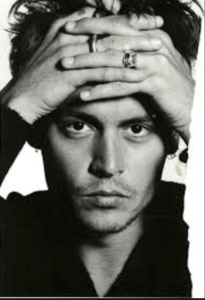
I then chose this image due to the dynamic range id dark and light contrasting tones that further the appearance of the structure upon his face, and also the dynamic and interposing composition of how the hands are placed and then how this forms an almost frame two the piece itself,allowing every tone and shape to work together effectively.
overall I would want to use his work of framing and angles in order to exaggerate lighting and reflect a personal theme to a piece.
Rankin
Rankin is a photogher and has been for around 20 years, he was training to be a lawyer but decided that he wanted to investigate more around the create side of photo journalism and soon moved to a more controlled studio photoshoots.he know has many class renowned books upon the illusion of photoghy and how you are able to also physically change an image with your own self creativity. he attendedLondon collage of painting with to him was his optimal of fine art and found that their fisilities unabated him to achieve great accounts of photoghy and inspire him fornhis future career.
He then met Jefferson Hack, with whom he formed a working relationship. In 1992, the two decided to start a magazine together called Dazed and Confused after they graduated, this magazine was inspired by many studio shoots further developed into such interesting designs full of extraordinary photography . he always donates many of his success from his work to charity such as the woman organisation,furthermore has work is known to have change fashion and how it is seen and also developed throughout his own work. he now has many biographies and sometimes you are able to see him teaching young teens like himself when he started his photography journey.
Within his work he also wants to be able to capture interposing people within a vibrant personality and not be condoned to only working on shoots in which he is paid. rankin has such diversity within each photo, he chooses scenarios and angles with suit the persona of the subject and does not have a specific style inn hich he sticks to
my favourite image analysis:
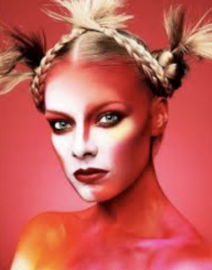
This image is a fashion based image in which he is trying to connote a-sense of unity of life throughout the vibrancy of the colours and ways inward which they are used to represented the darker tones but do not lessen the achievement of highlight within the image itself. the model herself is seen complimented by the colours and not overwhelmed in presents a personality of confidence which is suiting for a fashion magazine. furthermore her hair create a. juxtaposing raggedness that also highlights the darker red tones, this bring s an aspect of unity to the image. his conceptual thought foe this piece was a new intense side of beauty and how it can be shown in a large variety of ways in which I think he haw achieved.
From looking at his work I too would want to bring a sense of individuality and creativity,and not be compressed to a specific style of achievement. I think his work has such a large range of ideas and authenticity I could look at many different angles of colour and compoktionig that I would be inspired by his work.
Rankin
Who is Rankin? John Rankin (born 1966) is a British portrait photographer and fashion photographer. He made his name in publishing and founding the seminal monthly magazine Dazed & Confused with Jefferson Hack in 1922. The magazine went on to forge distinctive marks in the arts and publishing spheres, whilst developing a cult status forming and molding trends, bringing some of the brightest lights to fashion. And today is one of the leading online fashion and cultural brands.Rankin creates landmark editorial and advertising campaigns, with his work being some of the most celebrated by the biggest brands, charities etc. Rankin has published thirty books, and has his work exhibited around the world. In 2011, Rankin Film Productions was made to make music videos, commercials, and short films. Some of his work consists of:
I found that when Rankin captured the subjects features, he tended to base them around the head, making a certain aspect pop out (eyes, teeth and mouth). Through this it showed what defined them as an individual rather than what people saw them as.
Chiaroscuro
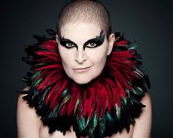
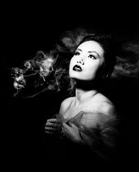
What is chiaroscuro drawing? chiaroscuro is the effect of light modelling in painting, drawing, or print making where three-dimensional volume is suggested by the value gradation of color and the analytical division of light and shadow shapes (Known as shading). Chiaroscuro has been used since the Renaissance and Baroque period where the artists wanted to engage their viewers. To do this one side of the subject tends to be darker than the other, usually bringing out an aspect of their features, and really drawing your eyes to it.How is it used in modern photography? Chiaroscuro is used within modern photography today to create dramatic portraits by making certain aspects of an image once again stand out as seen below:
Using this technique it allow as seen, it can also be used today to make aspects of objects as well as people stand out. When compared to the art, the chiaroscuro inside photography tends to be more dark and dramatic than the art, which tends to just make one side of the face slightly darker.
Street Photography Shoot
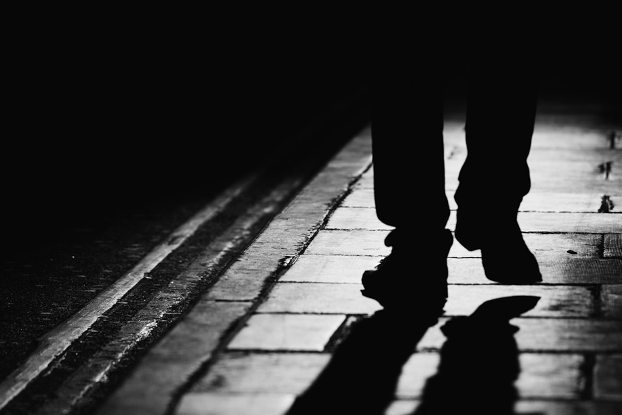
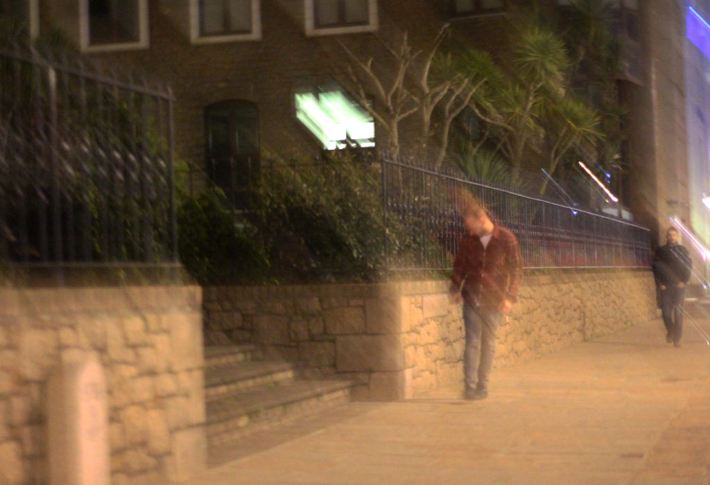
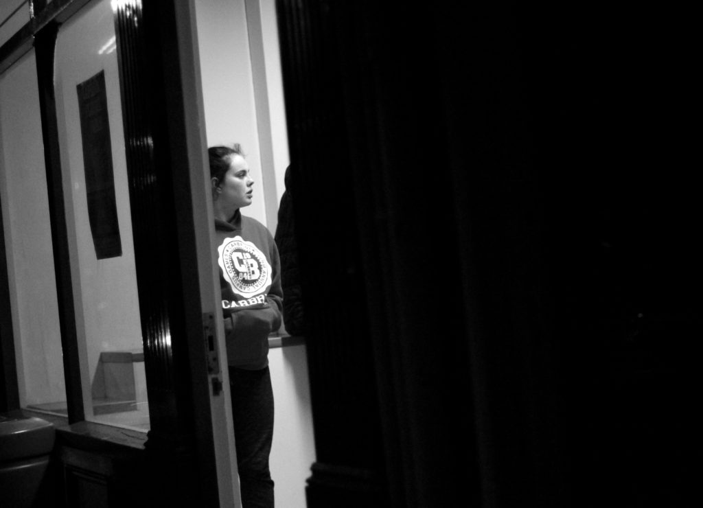
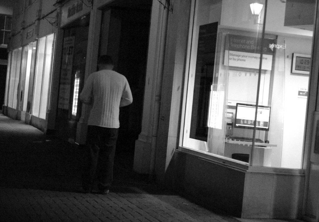
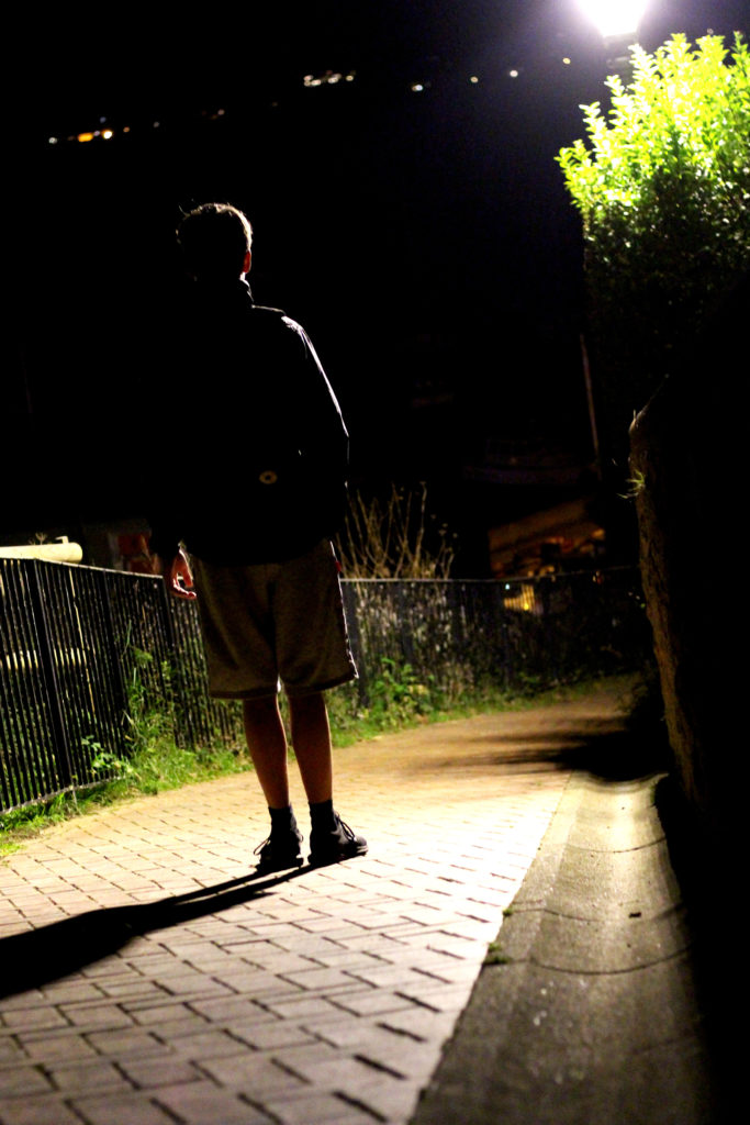
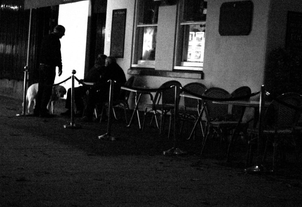
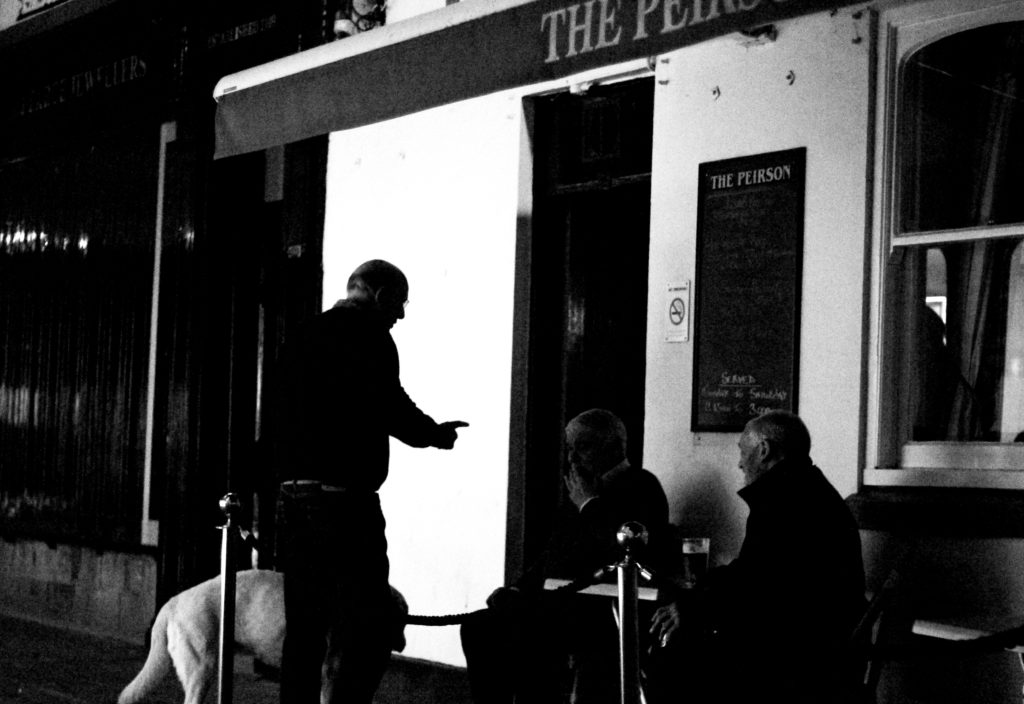
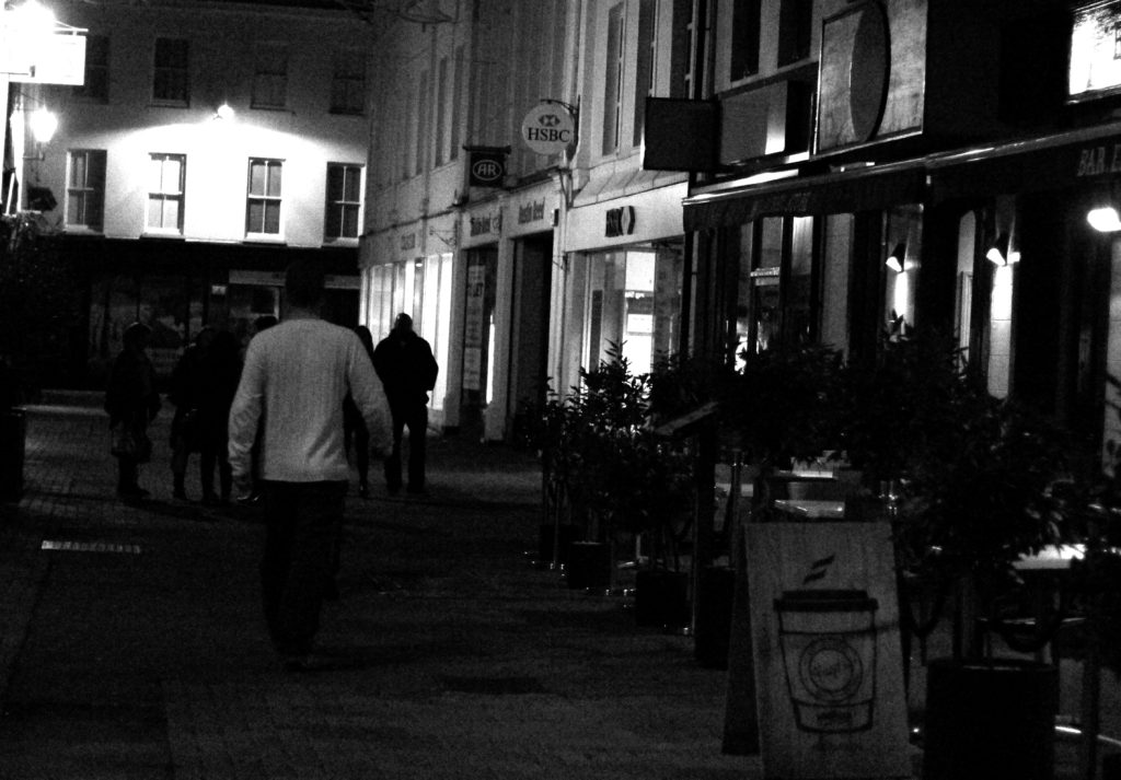
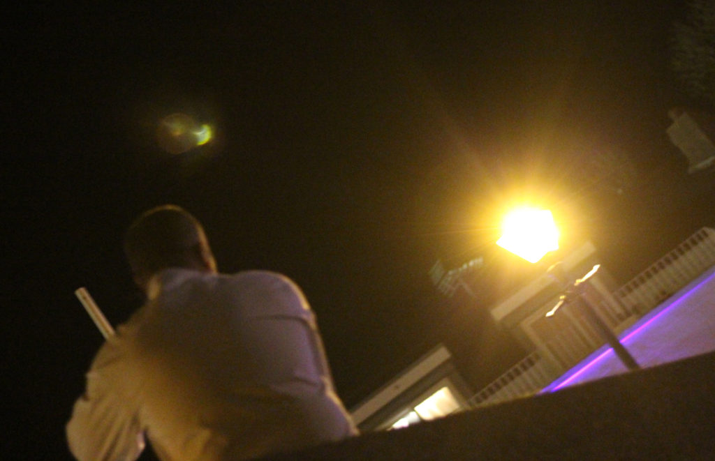
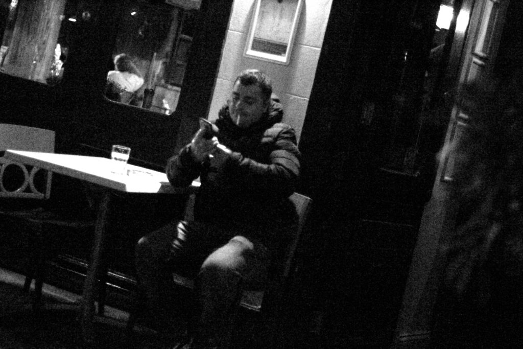
What is street photography? Street photography, also sometimes known as candid photography, is a type of photography conducted for either art of inquiry, that features many unedited encounters and random incidents within public places of interest. I found that many images of street photography included capturing the subjects off guard, and so thought that to try this would allow for maximum effect when taking the shoot. For my shoot I decided it would be either best to go into down for the nightlife, or stay around the street where I lived such as the bars etc. When planning the shoot I wanted it to be clear what I would be taking pictures of, and so made a mind-map to record my ideas, as seen below:This allowed me to focus on certain aspects of the shoot easier, as I now had a rough idea what I needed to capture. These were the results from my shoot:
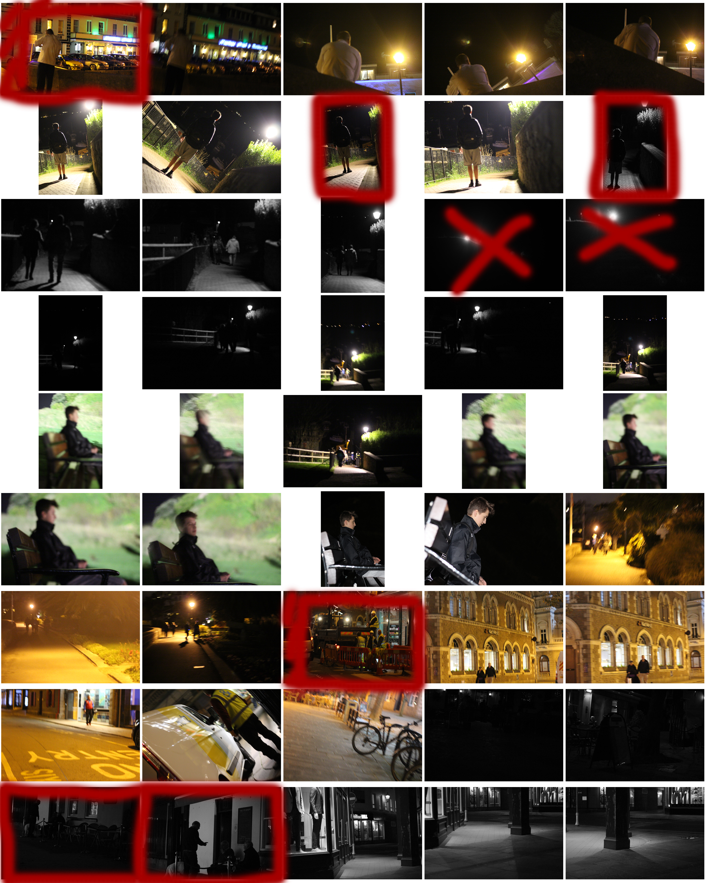
From the shoot I went on to highlight and crop the images I thought were the best out of all the photographs. This allowed me to limit the shoot down to just ten pictures so that I could choose my final image to display. These were my choices:
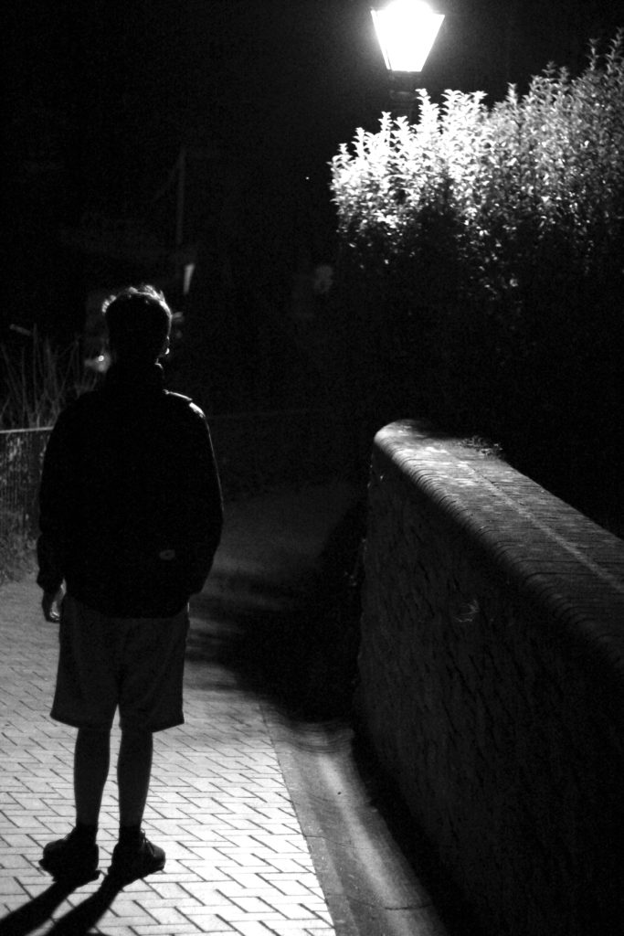
Once again from here I went to limit my selection to a top 5 to make it easier for me to find the final piece. This was my result:I chose this image because I loved the contrast between the darkness of the wall, and the subject. This is due to the rule of thirds which line up with the character inside, which instantly draws your eye to the face. I found that the pure blackness of the wall covering the picture added for a dramatic effect overall, making it almost seem hidden.
I chose this image once again because of the contrast between the subject and the surrounding area. I found that the silhouette created by the lamp really made the image pop, whilst at the same time balanced it so that the darkness itself was not too overpowering in the picture.
What I liked about this image was how the subjects face lit up against the darkness of the rest of the picture against the white strip of wall. I found that capturing someone off guard in their comfort zone allowed for a greater insight to the subjects life, and really captured them as an individual.
I found that this picture captured a clear contrast between the darkness of the three old figures and the white pub behind. I found that this silhouette that is almost created, makes the overall piece more dramatic than it is, with the blurred black building behind allowing for the whole picture to work.
Finally I chose this image because it captured the nightlife of a man drunk stumbling home. What I liked about this was how the picture was blurred itself as well, allowing greater emphasis on the man in the jacket being drunk, and the perspective that he may be seeing. FINAL IMAGE
I chose this as my final image because I loved the use of the darkness provided by the wall, to create a backdrop which almost hides the subject behind, with only a glimpse of the subject within the heavily contrasted brightness of the indoors.
Street Photography
What is street photography? Street photography is about documenting everyday life and society. However street photography does not have to be taken in the streets. You can shoot at the airport, at the market, at the beach, at the park, in the bus or harbor, in the doctor’s office, in the grocery store, or in any other public places. Some examples of street photography are:From this mood board I chose the two images I thought were most effective.
These images highlight everyday life in certain parts of cities and countries. What I think makes them both so effective, is that in the top one taken in a construction site, has a clear pattern which leads to the central figure, where the eye is drawn. This use of using everyday sites to create pattern through contrast etc, allow for a more visually pleasing style of street photography. However the image beneath that image, focuses on a completely different aspect, as instead it chooses to focus on a poorer place in which sites like that are common. What makes it so effective is that there is a clear contrast between the blue wood, and the white dog, where the photographer uses the bike as a golden ratio to draw the eye to the head of the dog.
Henri Cartier-Bresson
Who is Henri Cartier-Bresson? Henri Cartier-Bresson was born in Chanteloup-en-Brie, Seine-et-Marne, France. He was the oldest of five children, with his father being a wealthy textile manufacturer. His mother's family were cotton merchants and landowners from Normandy, where Henri spent part of his childhood. His parents supported him financially so Henri could pursue photography more freely than his contemporaries. Henri took holiday snapshots with a Box Brownie; he later experimented with a 3×4 inch view camera. His father assumed that his son would take up the family business, but Henri also feared this prospect. Returning to France, Cartier-Bresson deepened his relationship with the Surrealists. He became inspired by a 1930 photograph by Hungarian photojournalist Martin Munkacsi showing three naked young African boys, caught in near-silhouette, running into the surf of Lake Tanganyika. Titled Three Boys at Lake Tanganyika, this captured the freedom and grace of their movement and their joy at being alive. That photograph inspired him to stop painting and to take up photography seriously. Some of the work he started to produce consisted of: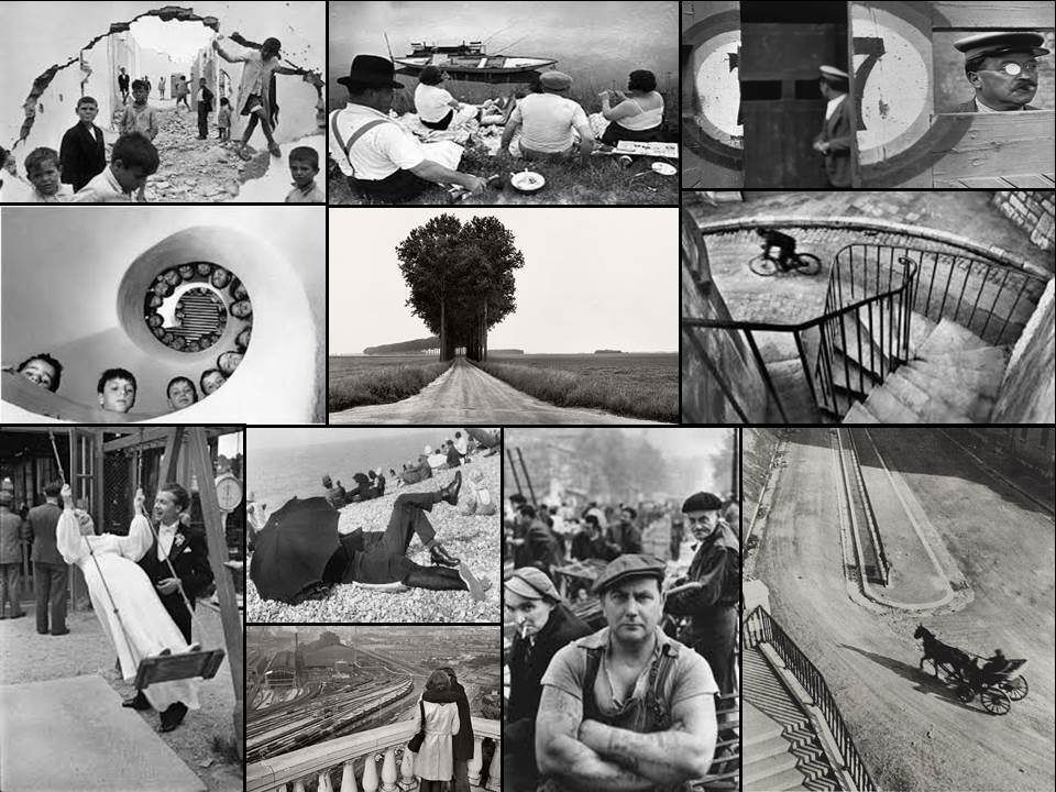
From this selection of a few of his images, I found that my eye was drawn to the picture of the wall crumbled in.
The contrast between the subjects within and the white crumbling wall, which in a way frames the image, allows the photograph to really define the faces of the individual children. From this it allows us to see the different expressions of each child, some seem to be captivated by this photographer taking the picture, whilst others are completely oblivious to it. Allowing the photographer to capture the playfulness but also the curiosity that is seen within each child. The fact that some of the children are playing on rubble, shows how that even in the worst scenarios, kids always make the best out of what they have, showing that innocence within.
Arnold Newman
Who is Arnold Newman? Arnold Newman was born March 3, 1918 in New York City. He studied art under a scholarship at the University of Miami, Coral Gables, from 1936 to 1938. However he died in New York City on June 6, 2006. Generally acknowledged as the pioneer of the environmental portrait, he is also known for his still life and abstract photography, and he is considered as one of the most influential photographers of the 20th Century.Newman began his career in photography in 1938 through working at chain portrait studios in Philadelphia, Baltimore, and West Palm Beach, and immediately began working in abstract and documentary photography on his own. In June of 1941, Beaumont Newhall of the Museum of Modern Art and Alfred Stieglitz “discovered” him, and he was given an exhibit with Ben Rose at the A.D. Gallery in September. There he began working on experimental portraiture, developing an approach that is widely influential in portrait photography today. In 1945 his Philadelphia Museum of Art one-man exhibit, “Artists Look Like This,” attracted nationwide attention. Well established, he moved to New York in 1946 and opened his studio and became a member of the American Society of Magazine Photographers, Newman’s new approach to portraiture began its influence through key publications in America and abroad. In 1949, he married Augusta Rubenstein, and they had two sons, Eric, born 1950, and David, 1952. His wife died in 2009.
I decided to analyse one of the images taken by Arnold, to see what made them so effective.From this image of Audrey Hepburn, what I believe makes it so effective, is the use of the rule of thirds within, which when taken into account, find that the models eyes line up with the top right corner, which is where you can find your eyes instantly drawn to. There is also that there is an even light throughout the whole picture, creating a balanced scene within throughout, which helps contribute to the visually pleasing aspect. Visually, what I find makes it so effective is the use of the subjects position and composition of the shot within. For example the person is evenly positioned in the center of the photo looking away, this visually makes it aesthetically pleasing to the eye, due to how the head which is the key part of the image is facing away, with a calm facial expression making it a very relaxed shoot. I also think the use of clothing from the neck to the bottom of her shoulders brings the image together, this is because of how the clear contrast between the blackness and the white brings out the features of the rest of the subject. The context of this image about Audrey Hepburn, was that Arnold Newman wanted to show that even if someone was famous to you or not, the image none the less could get you excited and interest the viewer. He wanted to capture the essence of Audrey's life and work, and so tried to do so with a controlled environment for the picture. He wanted to present what defined Audrey Hepburn as a whole, and so thought that through this composition would be able to reflect her life and work, in order to impact the viewer the most.


