In this shoot I will be focusing on photography surrounding Romanticism. To help me with my shoot I will use Fay Godwin as my influence from a photographer, I chose her because of how her photography uses much of the scenery seen in Jersey and so could use her techniques to provide guidance on what to take as seen below: Before taking the shoot I wanted to pull some ideas together on what to take, allowing for a guideline to my photos, this was my outcome:
 Once I had a general idea on what I could do for the shoot I finally moved onto the images themselves with these being the outcome:

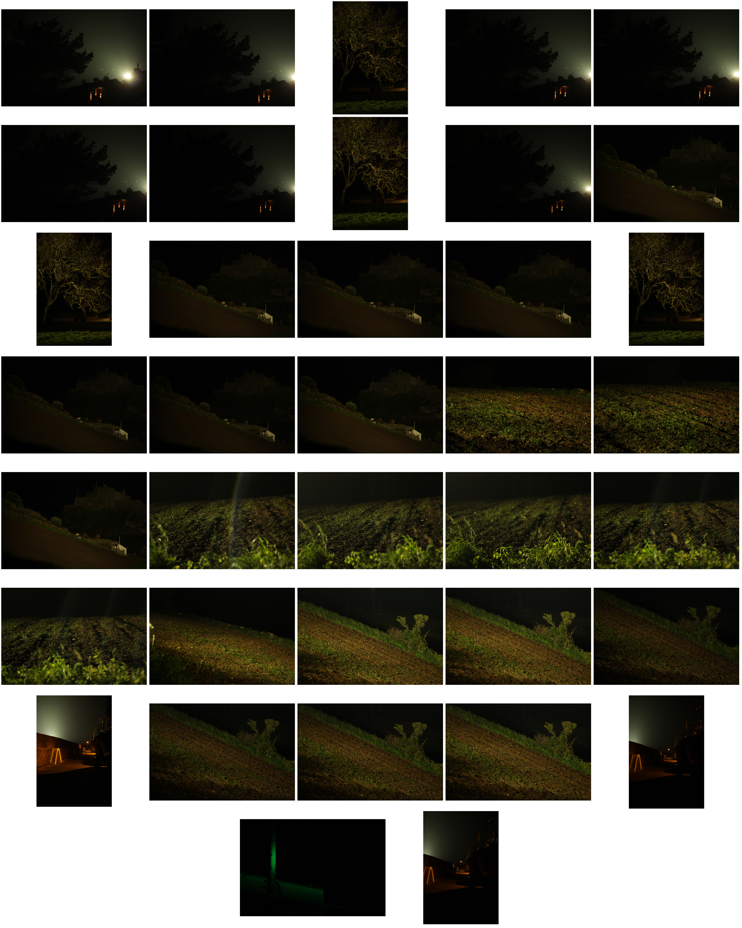
From the photographs I decided on, I made a selection of ten images that I thought presented my best imagery from the overall shoot on the topic of romanticism. These were my choices:


 I chose these images because I thought they popped out from the rest of the shoot, and had a greater understanding of what romanticism in photography was about. I found that their vivid colours and use of depth of field made them particularly effective. From here I wanted to whittle my selection down to just five images to really provide a clearer insight into my final image for the shoot. This is my selection:
 I chose this image due to how I loved the effect created from the back light that was meant to illuminate Gorey Castle at night, that instead silhouetted the housing and trees around it, creating an aesthetically pleasing result as an outcome. And with the slight use of red and oranges from the housing I though it really balanced it out.
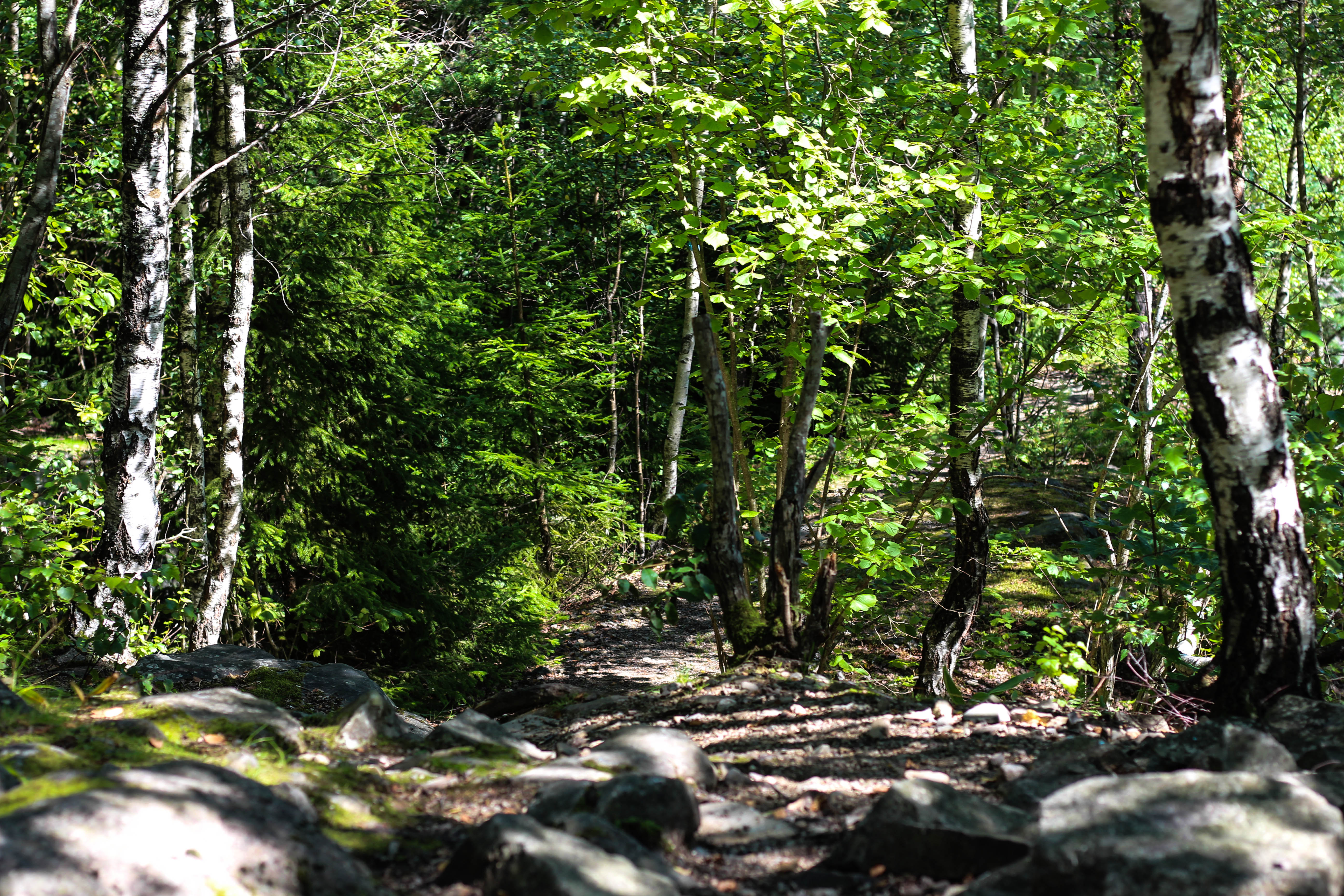 What I loved in this image was the use of the depth of field, this created a focus on a certain section of the woods which instantly drew the eye through the use of its vivid greens. Within the image I used Photoshop to enhance the greens within the image to make it more suited to the theme of Romanticism with the expected outcome as desired.
 I found that this images use of contrast between the light provided by the lamps created an aesthetically pleasing photo. This was because of how by making the oranges within the picture more vivid, it emphasised the shadows created by the surrounding boats, thus drawing the eye instantly to the soft glow of the lamp centred in the middle of the picture.
 The gradient created by the sky I thought particularly allowed for a romanticism theme. This was because of how the majority of the image was made up of the slow but constant changing of shades of blues into yellows, with only a small percentage made up by the landscape. I found that by darkening the ground it created a greater effect onto the sky due to an emphasis to the colours.
 What I loved about this image was the composition and the dark and grim colours. This is because of how the skeletons of the trees create a sinister but beautiful effect on the pathway through the middle of them, with unclear imagery of people in the far distance. I also liked the use of depth of field as well due to how the trees slowly faded and merged into one collective backdrop, whilst maintaining the desired look.
After analysing each of the five images, I decided to come to an overall decision on the final piece from the selection. This is my final choice for the best image out of the shoot:
 I chose this as my final image because of how I loved the contrast created by the floodlights to Gorey Castle. I found that through this it completely emphasised the silhouettes of both the tree and the house in a sinister but fascinating way. I also liked how the floodlight captured by the camera is seen as a circular gradient in which slowly fades into darkness, with the three red lights being there to balance out the image as a whole and not let the black overpower the piece.
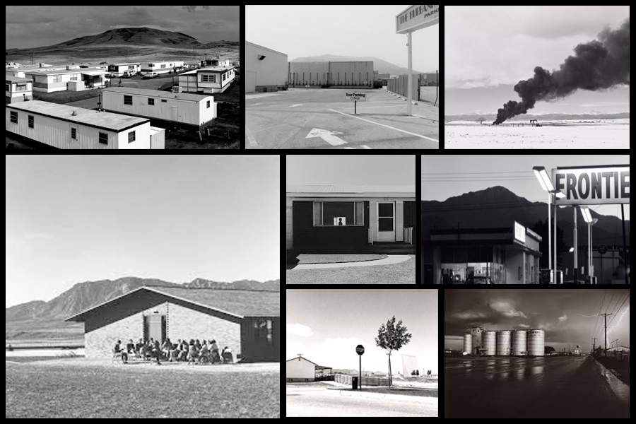

 Robert Adamas pointed his camera at eerily empty streets, pristine trailer parks and the steady creep of suburban development in all its regulated uniformity.
 “New Topographics: Photographs of a Man-Altered Landscape” was an exhibition that epitomized a key moment in American landscape photography. The exhibition was at the International Museum of Photography at the George Eastman House, New York, and remained open to the public from October 1975 until February 1976 featuring photographers showing the growing unease about how the natural landscape was being eroded by industrial development. In one way, they were photographing against the tradition of nature photography that the likes of Ansel Adams and Edward Weston had created.

 Before taking the shoot I wanted to pull some ideas together on what to take, allowing for a guideline to my photos, this was my outcome:
 Once I had a general idea on what I could do for the shoot I finally moved onto the images themselves with these being the outcome:


 I chose these images because I thought they popped out from the rest of the shoot, and had a greater understanding of what romanticism in photography was about. I found that their vivid colours and use of depth of field made them particularly effective. From here I wanted to whittle my selection down to just five images to really provide a clearer insight into my final image for the shoot. This is my selection:
 I chose this image due to how I loved the effect created from the back light that was meant to illuminate Gorey Castle at night, that instead silhouetted the housing and trees around it, creating an aesthetically pleasing result as an outcome. And with the slight use of red and oranges from the housing I though it really balanced it out.
 What I loved in this image was the use of the depth of field, this created a focus on a certain section of the woods which instantly drew the eye through the use of its vivid greens. Within the image I used Photoshop to enhance the greens within the image to make it more suited to the theme of Romanticism with the expected outcome as desired.
 I found that this images use of contrast between the light provided by the lamps created an aesthetically pleasing photo. This was because of how by making the oranges within the picture more vivid, it emphasised the shadows created by the surrounding boats, thus drawing the eye instantly to the soft glow of the lamp centred in the middle of the picture.
 The gradient created by the sky I thought particularly allowed for a romanticism theme. This was because of how the majority of the image was made up of the slow but constant changing of shades of blues into yellows, with only a small percentage made up by the landscape. I found that by darkening the ground it created a greater effect onto the sky due to an emphasis to the colours.
 What I loved about this image was the composition and the dark and grim colours. This is because of how the skeletons of the trees create a sinister but beautiful effect on the pathway through the middle of them, with unclear imagery of people in the far distance. I also liked the use of depth of field as well due to how the trees slowly faded and merged into one collective backdrop, whilst maintaining the desired look.
 I chose this as my final image because of how I loved the contrast created by the floodlights to Gorey Castle. I found that through this it completely emphasised the silhouettes of both the tree and the house in a sinister but fascinating way. I also liked how the floodlight captured by the camera is seen as a circular gradient in which slowly fades into darkness, with the three red lights being there to balance out the image as a whole and not let the black overpower the piece.
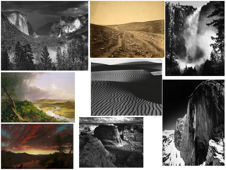
 As seen above Godwin focuses on very much of what is normal in the landscape, however she tends to use the weather to create more dramatic images to what would usually be seen, such as the clouds to create contrast on the land.
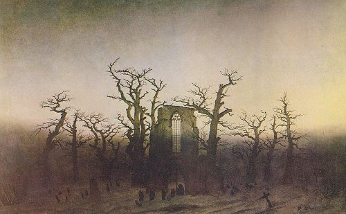

 More about Romanticism can be found
  Romanticism is a term in use by the early nineteenth century to describe the movement in art and literature distinguished by a new interest in human psychology, expression of personal feeling and interest in the natural world
 Romanticist practitioners found their voices across all genres, including literature, music, art, and architecture. Additionally, in an effort to stem the tide of increasing industrialization, many of the Romanticists emphasized the individual’s connection to nature and an idealized past.
 Painters began using current events and atrocities to shed light on injustices in dramatic compositions that rivaled the more staid Neoclassical history paintings accepted by national academies. Powerful compositions also erupted during this time, with artists often painting mythical, landscape, or historical scenes focused around a particular message.
 The invention of photography very nearly coincided with the Romantic movement. These included responses to nature, the environment, atmosphere, spirit of place, heightened moments of awareness and reflections on antiquity and ruin,
 I found that the use of nature was particularly effective when it came to the images, as the trees could be used for a variety of different things such as fades etc. Through this I found it great how trees could be used to define a certain aspect of the image itself, and so allowed for the silhouettes of the creatures they wished to be highlight.
I decided to make a response to these ideas by mainly focusing around the human body and nature combined. These were the results:

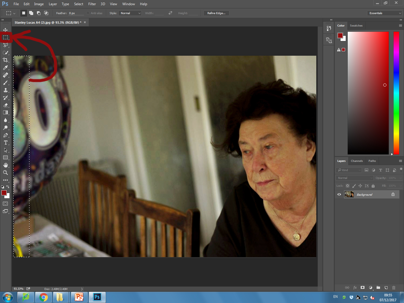
 To create these I used the opacity tool, this increased the transparency of the top image, allowing for the lower image to be seen more clearly, creating the desired effect. I then used the paint tool to rub out the excess parts of the image to match the shape of the subjects face, making it seem more realistic.
 I also wanted to switch between monochrome and the portrait settings when taking photos to allow for a greater contrast between the lights and darkness of an image. This would allow for a more sinister look when produced due to the emotionless expressions of the subject.
 Before the shoot I wanted to create a mind map of the ideas towards this, so that I would have an idea of what and how to take the photos of both subjects.
 From there I decided to carry out the shoot, these were my results:
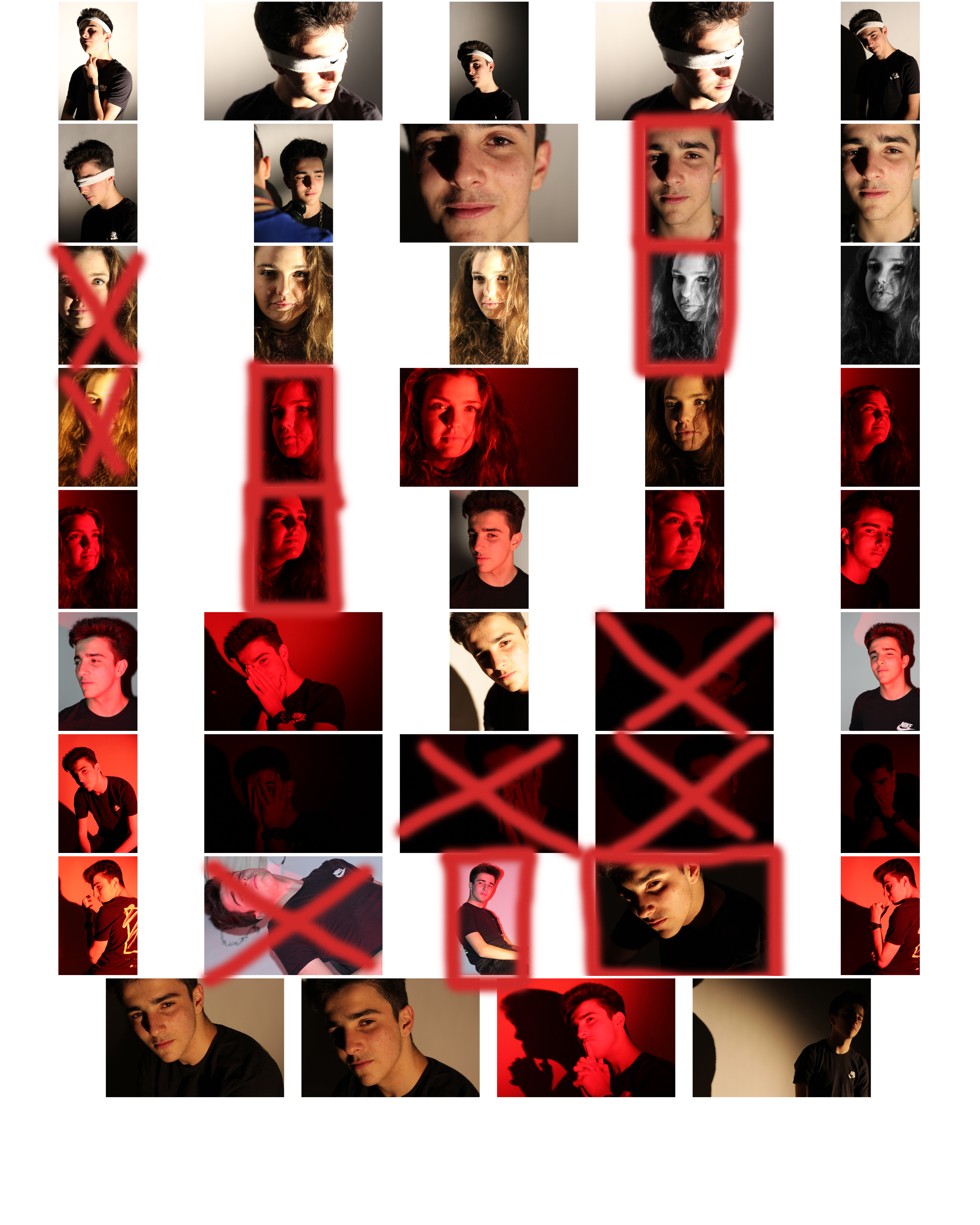
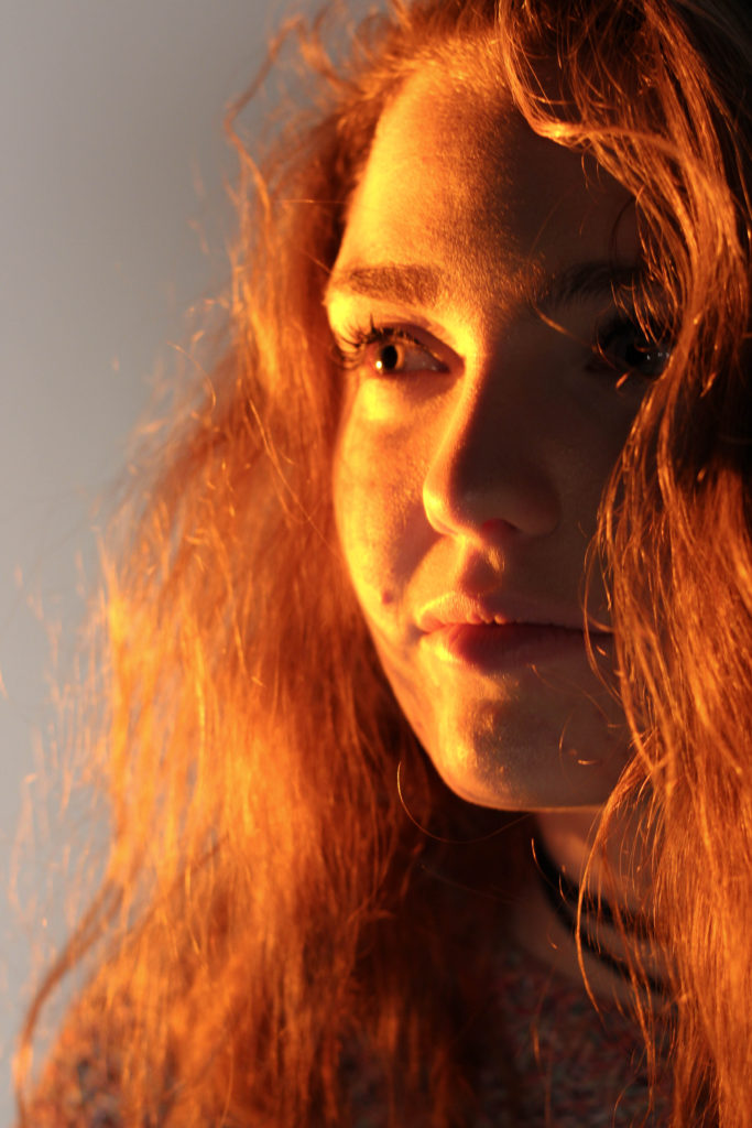
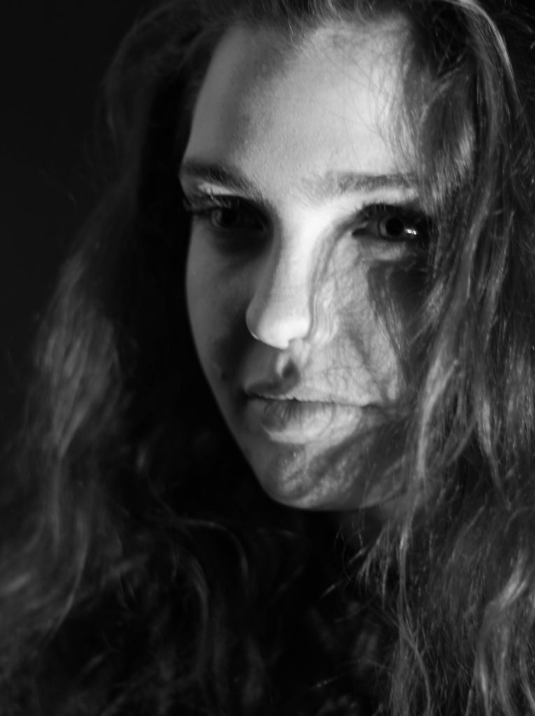
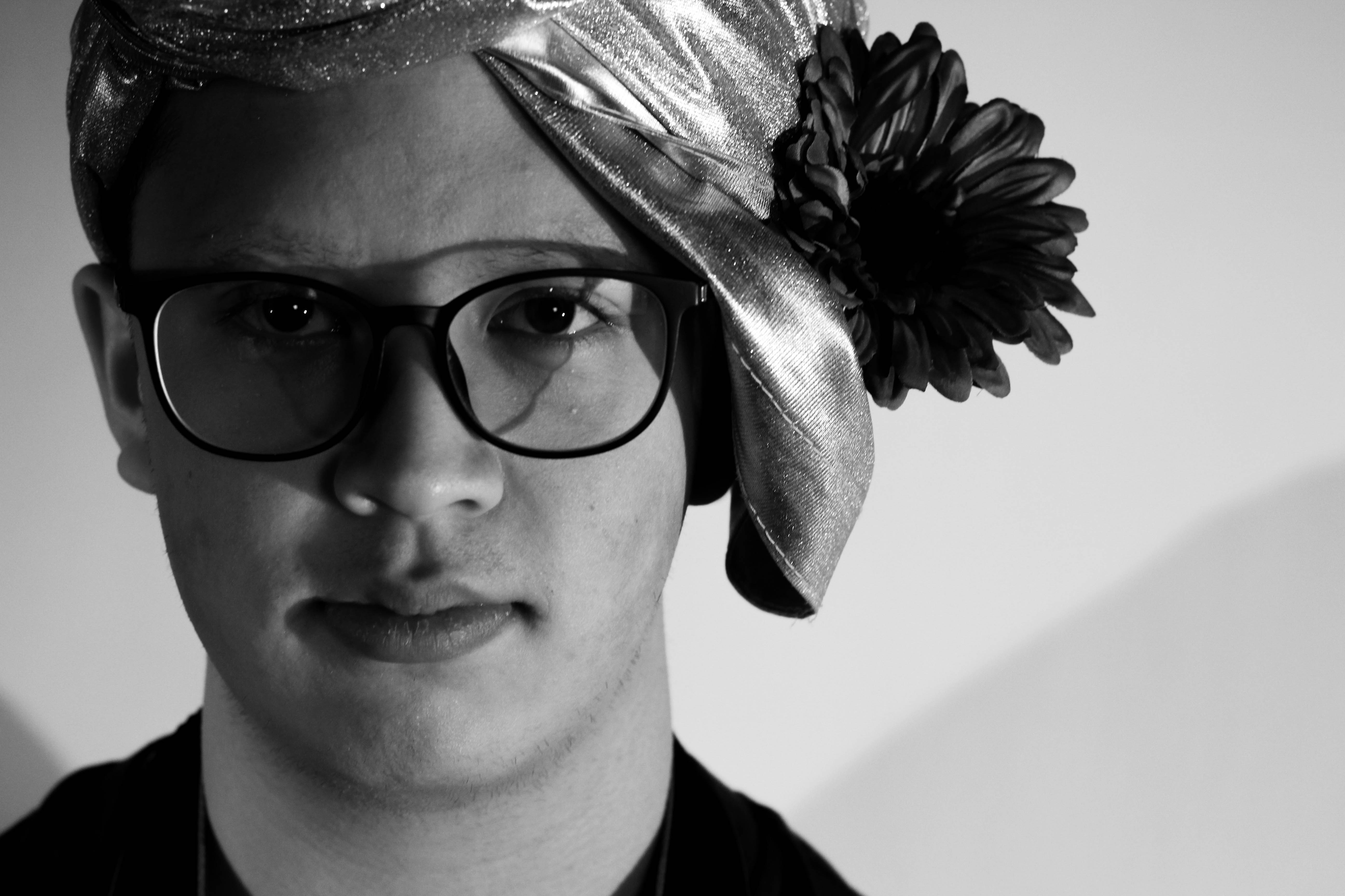
 From here I selected the top ten image from the entire shoot, this would make it easier for me to narrow it down to the final image that I deemed best from the shoot. These were the images I selected:
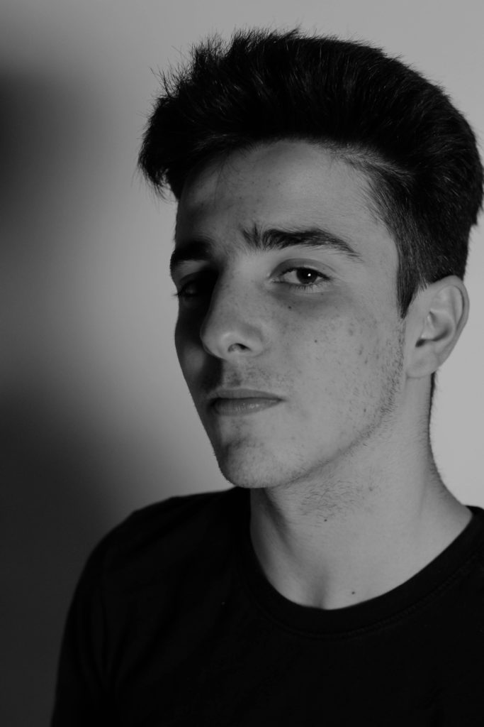





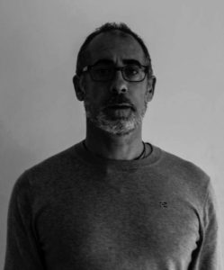
 What I loved about this image was the obvious difference between the light and dark on either side of the face. This to me compared with the light backdrop allowed for a clear definition to the face, drawing out certain feature above others.
 In response to this I wanted to have a go at trying to create images based around this theme, using images taken by me which I could manipulate into these designs. These were my outcomes:

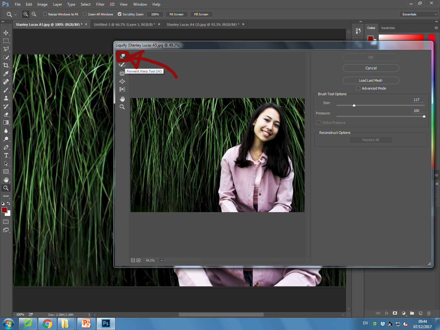
 I explored a variety of techniques such as liquify, layering and separation. This allowed me to have the effects desired as I was able to manipulate the facial features of the subject, which can be related to the theme of missing or lost identity within yourself.
