By the end of Week 4 you will all have visited and Trading Zones (Lewis Bush) and Entre Nous (Clare Rae x Claude Cahun).


Week 6-7 : 10 – 17 Oct > Inspirations Lewis Bush vs Clare Rae
AO1 DEVELOP IDEAS: RESEARCH > ANALYSIS
Mini essay: Write 1000 words with illustrations and references
Essay question: In what way can the work of Lewis Bush and Clare Rae both be considered political?
In order for you to write a critical essay you must adopt this methodology:
- Visit both exhibition and make notes on initial thoughts, what do you like/ dislike, consider how their work are exploring Political Landscapes in different ways.
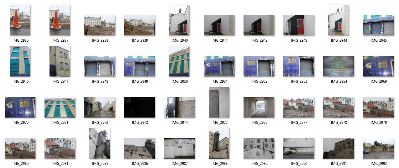
- Document installation with your phone and select specific images that interest you for further research and analysis.
- Use these images to illustrate your essay.
- Make sure you caption images, artist name, title, year, medium, size etc
- Look up influences for their own work, historical / political / artistic context
- Consider how their work is made within genres of documentary and tableaux approaches ie. observed vs staged.
- Find at least 3 different sources and read the the texts below for a broader context.
- Incorporate quotes and comments from artist themselves or others (art critics, art historians, curators, writers, journalists etc) using a variety of sources (at least 3) such as Youtube, online articles, reviews, texts, books
- Make sure you reference sources and embed links to the above sources in your blog post using Harvard System of Referencing
See this PDF for help with referencing: harvard sysytem of referencing
PHOTO-ASSIGNMENT 3: Make a response to either Lewis Bush or Clare Rae and evaluate.
EXTENSION: Make a response to both photographers and evaluate.
DEADLINE: Mon 5 Nov -this is a homework task that must be completed outside of lesson time. Upload essay with illustration on the blog
Helpful sources and guidelines
Here is a recent interview with Lewis Bush in online photography magazine ASX where talks about his creative process, method of working including general thoughts on the nature of photography
If you get blocked when you click on the hyperlink above, read article here as a pdf Lewis_Bush_article_ASX_v2
Links to his website and blog Dispothic – about visual culture with a particular emphasis on photography in all its many forms, from the mass vision of smartphones to the algorithmic vision of internet search engine.
Here are images of Lewis’ text from his exhibition Trading Zones in Jersey


Here is a recent photo-essay by Clare titled; A Photographic History in Jersey’s Rock Faces where she talks about her work produced in Jersey.
Link to her website and exhibition at the Centre for Contemporary Photography (CCP) in Melbourne, Australia and a link to her book Never Standing on Two Feet accompagnying her work
Consider how Claude Cahun’s work has influenced Clare Rae.
Consider how the following two statements may have had an impact on the work of Claude Cahun / Clare Rae
- In the public sphere, women must assume sufficient power to change the cultural imagery and the political landscape.
- Women, who had previously been barred from participating in elections, changed the political landscape by becoming voters.
Click on this blogpost: PHOTOGRAPHY, PERFORMANCE AND THE BODY for more in depth investigation of Clare Rae’s work in relation to Claude Cahun and artists exploring issues of gender representation in photography and feminist theory around self-portraiture and male vs female gaze,
DOCUMENTARY vs TABLEAUX
Two texts by David Bate from his book Art Photography (2015), Tate Publishing on documentary practice and tableaux photography. Read these to get an historical and contemporary overview of both genres
David_Bate_The_Art_of_the_Document
ESSAY PLAN > STRUCTURE
Make an essay plan that lists what you are going to write about in each paragraph. Here is a link to an essay structure.
- Essay question:
- Opening quote
- Introduction (125 words): What is your essay question? Which artists will you be analysing and why? What are you trying to prove/ disprove?
- Pg 1 (250 words): Analyse Lewis Bush in relation to your essay question. Provide any historical or theoretical context within art, photography and visual culture relevant to the artists work. Select a key image and use as an example to illustrate your point of view.
- Pg 2 (250 words): Analyse Clare Rae in relation to your essay question. Provide any historical or theoretical context within art, photography and visual culture relevant to the artists work. Select a key image and use as an example to illustrate your point of view.
- Conclusion (125 words): Draw parallels, explore differences/ similarities between both artists. Bring a conclusion to essay question.
- Bibliography: List all relevant sources used
QUOTE > REFERENCING > ACADEMIC SOURCES
- Research and identify 3 literary sources from a variety of media such as books, journal/magazines, internet, video (Youtube).
- Begin to read essay, texts and interviews with your chosen artists as well as commentary from critics, historians and others.
- It’s important that you show evidence of reading and draw upon different pints of view – not only your own.
- Take notes when you’re reading…key words, concepts, passages
- Write down page number, author, year, title, publisher, place of publication so you can list source in a bibliography
- Use quotes to support or disprove your argument
- Use quotes to show evidence of reading
- Use Harvard System of Referencing
- See Powerpoint: harvard system of referencing for further details on how to use it.
Critical image analysis
https://www.photopedagogy.com/photo-literacy.html
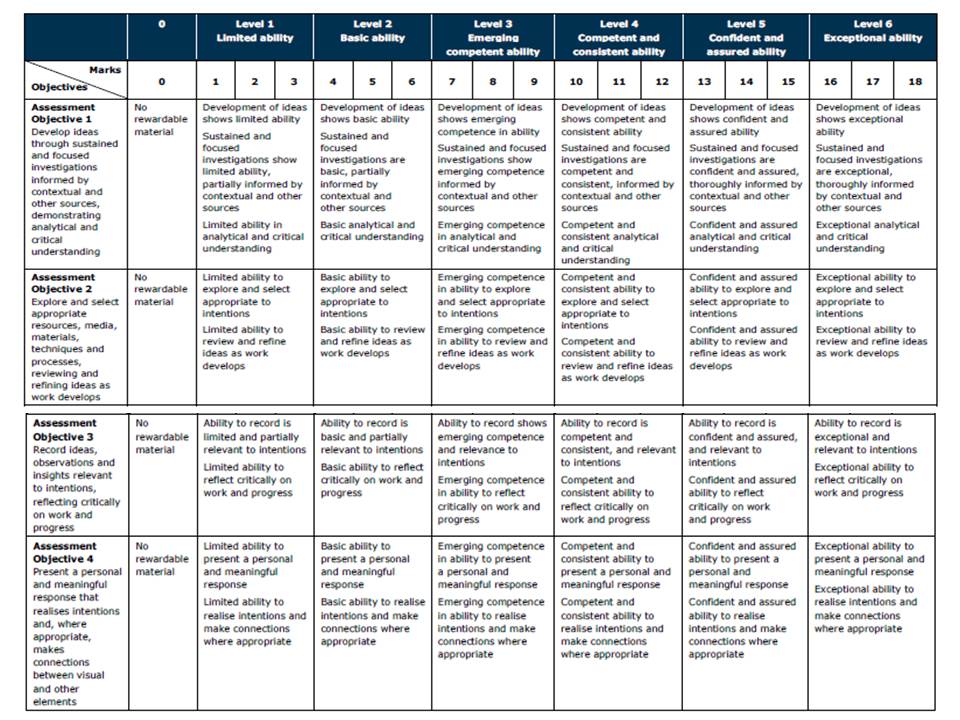
Refer to the marking criteria and pay careful attention to Assessment Objective 1…
- show critical awareness
- show contextual understanding


 I decided however to plan the shoot before I went ahead and did it. This would allow me to have a general idea before hand of what I wanted, and needed to achieve to produce an effective overall image regarding the topic of New Topographics. These are my ideas:
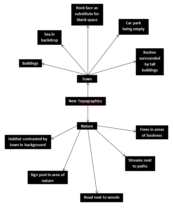 Once this was complete I decided it was time to move on to the shoot itself, and so decided to use the areas regarding the idea sheet of town, Grouville and St Brelades. These were my outcomes:
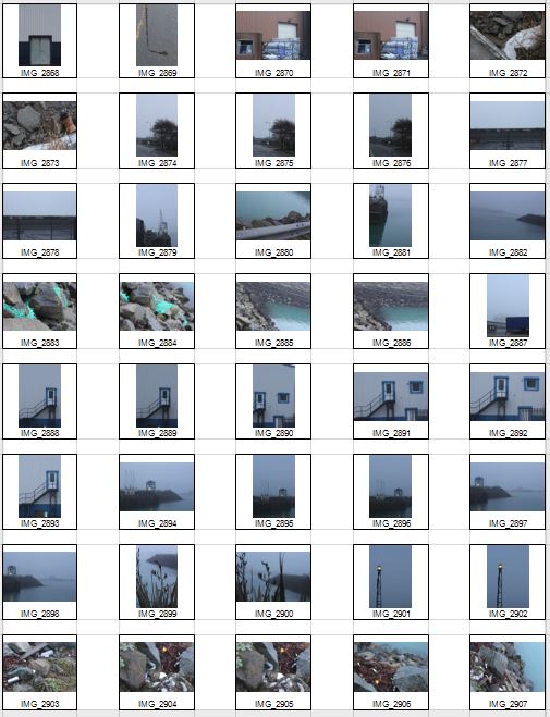

 Once the shoot was complete I narrowed the images down to only ten of my favourite pictures. By doing so it would make it easier for me to select the final image that I believe to be the most relevent and successful overall. These were my choices on the ten best images:


 I chose this image because of how I loved the clear contrast between nature and the taking over of it by man, seen by the run down sign surrounded by overgrown grass. I found this to be aesthetically pleasing created by the use of a depth of field, by doing so it blurs our the foreground and the background allowing only really the sign to be noticed properly which is where the eye is drawn. I found the slanted composition to be especially interesting by how it gives the impression of an overgrown and ruined world.
 I selected this image due to once again the use of the depth of field that blurs the backdrop, this along with the use of the composition allowed for maximum effect, giving the impression of a world that eventually succumbs to nature. I found that the way that the fence was composition allowed for a sense of distance to the photo, with the use of neutral space on the right being filled with industrial buildings bringing the viewer into perspective of the area it was taken in.
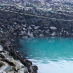
 What I loved about this image was the clear contrast and clear colors used to create an aesthetically pleasing outcome. This is done through contrasting colours blue and white which highlight features of the building, allow for such things as the door and bolts top pop out and draw the viewer’s attention. The composition I found also was aesthetically pleasing due to how the entire image is symmetrical which in consequence created a much cleaner and pleasing look.
 Within this image I found that there was obvious difference between nature and man-made structures. This is once again done through the use of a depth of field to which allows for the appearance of us peering through nature to find the man-made structures that surround everything, whilst showing how where ever nature is human activity is not far behind. I found that the gloomy colours within the image emphasised the destruction caused to the landscape by these structures and how nature and civilisation lives side by side.
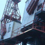
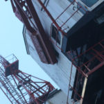
  Finally I chose this image as I loved the reflection of cranes created by the aftermath of rain fall. This was partially down to how I thought it highlighted a clear contrast between nature and society, with the looming structures left behind, whilst at the same time creating a deserted and desolate feel to the overall piece. I found that the composition of the piece complimented the photo as it filled most of the negative space made by bricks, with various beams fading out of the image.
 What made me choose this photo as my final image was because how to me it summed up the clear contrast between human activity and nature. This was done by the composition of the grass creating the impression of it growing around the sign as if taking back the land seized by man, to which there is a clear difference in surrounding of the backdrop consisting of machinery and metallic structures that create contrast in not only surroundings but color. The use of depth of field creates a clear definition around the sign allowing for the eye to be drawn to it immediately with both the foreground and background complimenting it due to the drastic difference in colors and blur. To me this was the image that related the most to the topic of ‘New topographic’, which not only created a feel of the contrast between man and nature, but also of the deserted spaces that surround us in our everyday lives.
 From here I thought it would be appropriate to come up with a few ideas in order to help me along the shoot and guide me in what I should be doing. Here are my ideas:
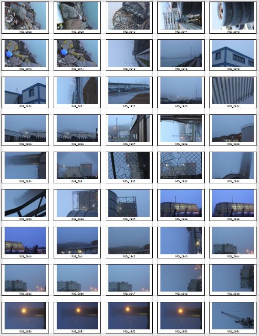


 Once all the pictures of the given area had been taken I decided that I should whittle the selection down to the top ten overall images. This would allow me to come to an easier conclusion on what I thought was the best image taken in the shoot. These were my selected images I thought had the best outcome from the shoot:


 I selected this image because I loved the texture created by the shades of rust on a pole. I found that this allowed heavy but effective contrast between the overall piece as all the colors complemented each other making an almost molten scene.
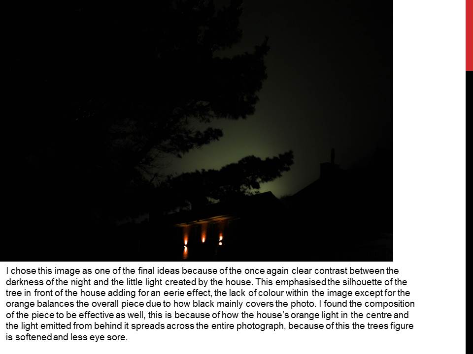
 In this image I found that I particularly liked the contrast between the silhouette of the statue and the dim-lit sky, with the composition of the pole and string balancing out the image as a whole creating a visually pleasing overall piece.
 Once again I loved the use of the colors created by the rust to make an almost volcanic landscape with shades of red overlapping each other. I found the composition of the piece eye-capturing as the more rusted black areas looked like a mountain range captured from a bird’s eye view.
 In this image I tried to capture the way certain streets were looked after within my given area. What I liked about this one was how it incorporated everyday objects as almost ruining and breaking up the pattern made by the pavement through the composition of the paper and cigarettes.
 Finally I chose this picture because I loved the symmetry created by the textures of the floor surrounding the lights making an aesthetically pleasing image. This use of composition I found was most effective from how it drew the eye to the areas wanted through a clear contrast.
 To add to my research of the area to be explored, I decided that it would be appropriate to take street view shots in order to have a bit of an insight before hand of the area.
 Part of the main area I am exploring is the car park, however now has been transformed into the International Finance Centers, with much of it still under construction. Other areas include Liberty Wharf, which was once known as a former abattoir that was restored and converted for the use of a shopping centre.
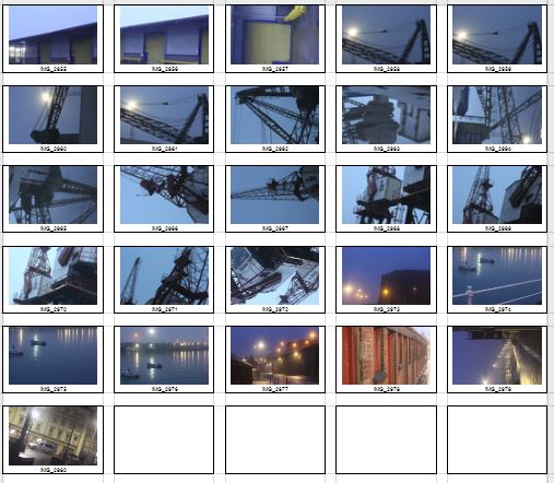
 As seen above Henner very much focuses on satellite imagery as his main source of art. One technique commonly seen in his work is shaped pixels, this can be done through selecting an area and finding the main color present in that space, to then convert it to just that singular color.
 They tend to focus on how the different textures of the floors can create the pattern to make aesthetically pleasing imagery. The images taken are of everyday generic objects that we take for granted and don’t see the patterns within them.
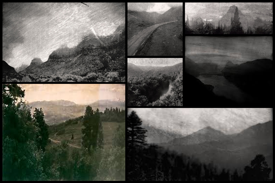
 One image that I particularly liked and decided to analyse was ‘Archival Pigment Print From a Surveillance Camera Feed’ which won the Lens Culture Emerging Talent Award 2016.
 Technical: Marcus DeSieno’s piece consists of hacking into surveillance feeds to capture interesting imagery, the image itself seems to be taken on a gloomy day, capturing the silhouette of the mountain range in the distance whilst incorporating the Ansel Adams system throughout capturing a range of shades. The picture seems to have been deteriorated creating an old feeling to it whilst maintaining much of the crisp qualities of the original photo. A depth of field can be seen partially used through the use of the graininess and how the road snakes off into the distance removing detail from the image, but at the same time keeping out focus on the road.