In this shoot I will be focusing on photography surrounding Romanticism. To help me with my shoot I will use Fay Godwin as my influence from a photographer, I chose her because of how her photography uses much of the scenery seen in Jersey and so could use her techniques to provide guidance on what to take as seen below: Before taking the shoot I wanted to pull some ideas together on what to take, allowing for a guideline to my photos, this was my outcome:
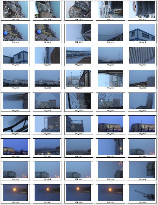
 Once I had a general idea on what I could do for the shoot I finally moved onto the images themselves with these being the outcome:

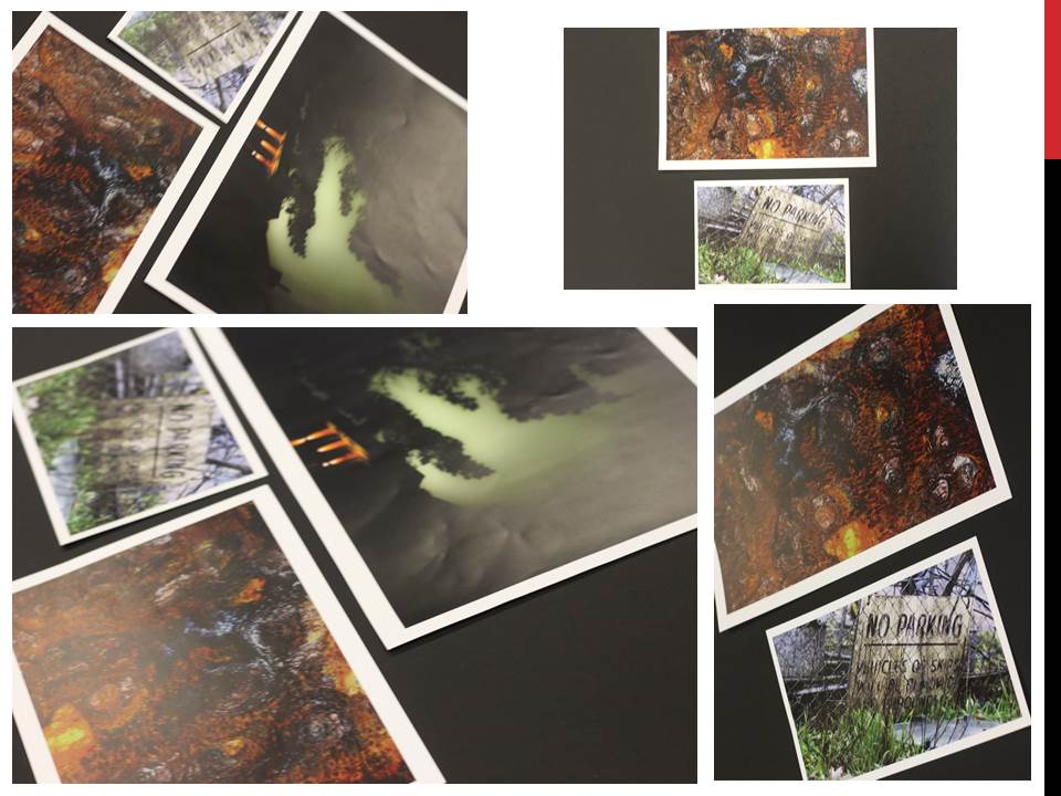
From the photographs I decided on, I made a selection of ten images that I thought presented my best imagery from the overall shoot on the topic of romanticism. These were my choices:


 I chose these images because I thought they popped out from the rest of the shoot, and had a greater understanding of what romanticism in photography was about. I found that their vivid colours and use of depth of field made them particularly effective. From here I wanted to whittle my selection down to just five images to really provide a clearer insight into my final image for the shoot. This is my selection:
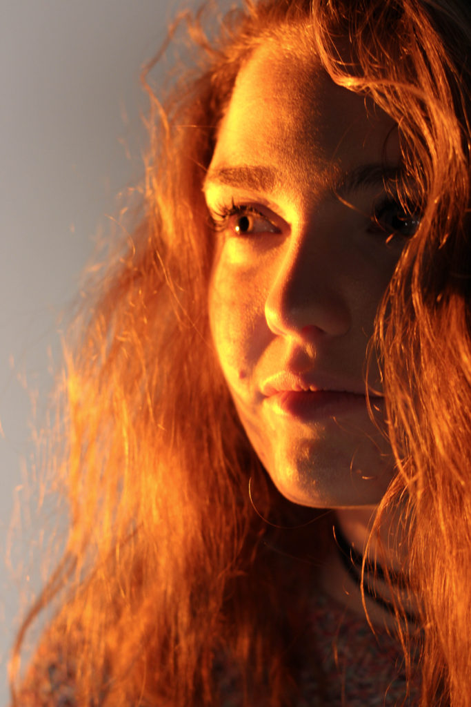
 I chose this image due to how I loved the effect created from the back light that was meant to illuminate Gorey Castle at night, that instead silhouetted the housing and trees around it, creating an aesthetically pleasing result as an outcome. And with the slight use of red and oranges from the housing I though it really balanced it out.
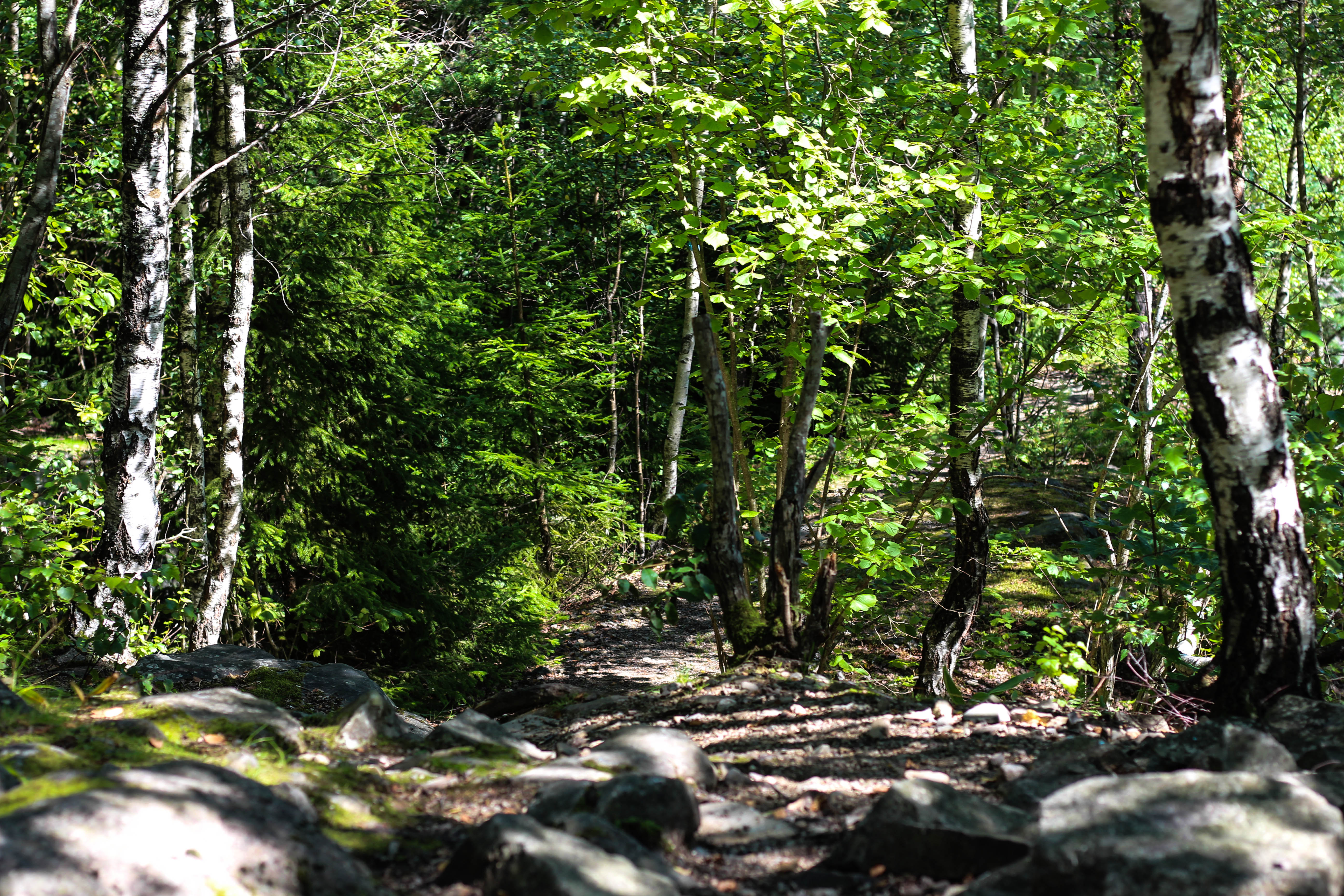 What I loved in this image was the use of the depth of field, this created a focus on a certain section of the woods which instantly drew the eye through the use of its vivid greens. Within the image I used Photoshop to enhance the greens within the image to make it more suited to the theme of Romanticism with the expected outcome as desired.
 I found that this images use of contrast between the light provided by the lamps created an aesthetically pleasing photo. This was because of how by making the oranges within the picture more vivid, it emphasised the shadows created by the surrounding boats, thus drawing the eye instantly to the soft glow of the lamp centred in the middle of the picture.
 The gradient created by the sky I thought particularly allowed for a romanticism theme. This was because of how the majority of the image was made up of the slow but constant changing of shades of blues into yellows, with only a small percentage made up by the landscape. I found that by darkening the ground it created a greater effect onto the sky due to an emphasis to the colours.
 What I loved about this image was the composition and the dark and grim colours. This is because of how the skeletons of the trees create a sinister but beautiful effect on the pathway through the middle of them, with unclear imagery of people in the far distance. I also liked the use of depth of field as well due to how the trees slowly faded and merged into one collective backdrop, whilst maintaining the desired look.
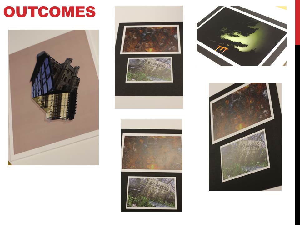
After analysing each of the five images, I decided to come to an overall decision on the final piece from the selection. This is my final choice for the best image out of the shoot:
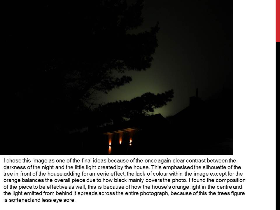
 I chose this as my final image because of how I loved the contrast created by the floodlights to Gorey Castle. I found that through this it completely emphasised the silhouettes of both the tree and the house in a sinister but fascinating way. I also liked how the floodlight captured by the camera is seen as a circular gradient in which slowly fades into darkness, with the three red lights being there to balance out the image as a whole and not let the black overpower the piece.


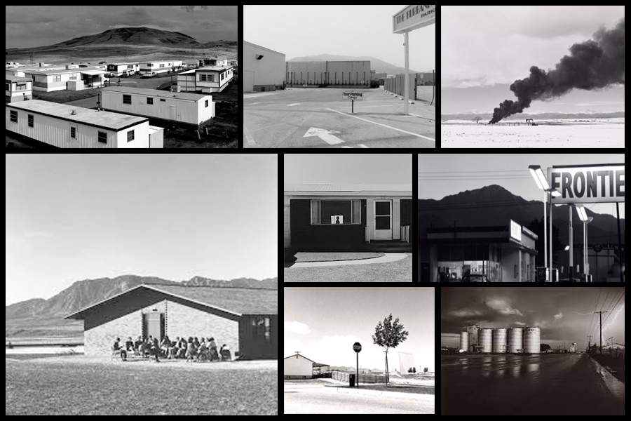
 I decided however to plan the shoot before I went ahead and did it. This would allow me to have a general idea before hand of what I wanted, and needed to achieve to produce an effective overall image regarding the topic of New Topographics. These are my ideas:
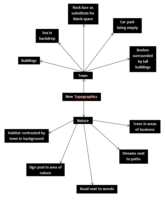 Once this was complete I decided it was time to move on to the shoot itself, and so decided to use the areas regarding the idea sheet of town, Grouville and St Brelades. These were my outcomes:
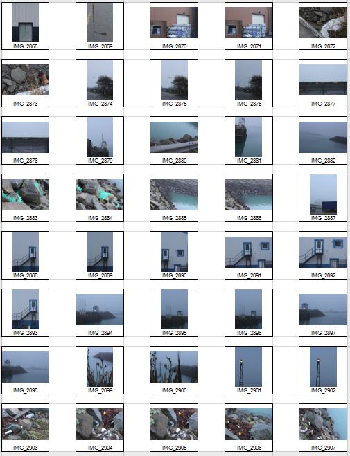

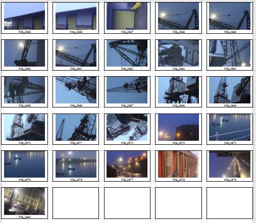 Once the shoot was complete I narrowed the images down to only ten of my favourite pictures. By doing so it would make it easier for me to select the final image that I believe to be the most relevent and successful overall. These were my choices on the ten best images:


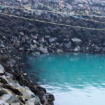


 I chose this image because of how I loved the clear contrast between nature and the taking over of it by man, seen by the run down sign surrounded by overgrown grass. I found this to be aesthetically pleasing created by the use of a depth of field, by doing so it blurs our the foreground and the background allowing only really the sign to be noticed properly which is where the eye is drawn. I found the slanted composition to be especially interesting by how it gives the impression of an overgrown and ruined world.
 I selected this image due to once again the use of the depth of field that blurs the backdrop, this along with the use of the composition allowed for maximum effect, giving the impression of a world that eventually succumbs to nature. I found that the way that the fence was composition allowed for a sense of distance to the photo, with the use of neutral space on the right being filled with industrial buildings bringing the viewer into perspective of the area it was taken in.
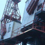
 What I loved about this image was the clear contrast and clear colors used to create an aesthetically pleasing outcome. This is done through contrasting colours blue and white which highlight features of the building, allow for such things as the door and bolts top pop out and draw the viewer’s attention. The composition I found also was aesthetically pleasing due to how the entire image is symmetrical which in consequence created a much cleaner and pleasing look.
 Within this image I found that there was obvious difference between nature and man-made structures. This is once again done through the use of a depth of field to which allows for the appearance of us peering through nature to find the man-made structures that surround everything, whilst showing how where ever nature is human activity is not far behind. I found that the gloomy colours within the image emphasised the destruction caused to the landscape by these structures and how nature and civilisation lives side by side.
  Finally I chose this image as I loved the reflection of cranes created by the aftermath of rain fall. This was partially down to how I thought it highlighted a clear contrast between nature and society, with the looming structures left behind, whilst at the same time creating a deserted and desolate feel to the overall piece. I found that the composition of the piece complimented the photo as it filled most of the negative space made by bricks, with various beams fading out of the image.
 What made me choose this photo as my final image was because how to me it summed up the clear contrast between human activity and nature. This was done by the composition of the grass creating the impression of it growing around the sign as if taking back the land seized by man, to which there is a clear difference in surrounding of the backdrop consisting of machinery and metallic structures that create contrast in not only surroundings but color. The use of depth of field creates a clear definition around the sign allowing for the eye to be drawn to it immediately with both the foreground and background complimenting it due to the drastic difference in colors and blur. To me this was the image that related the most to the topic of ‘New topographic’, which not only created a feel of the contrast between man and nature, but also of the deserted spaces that surround us in our everyday lives.
 To add to my research of the area to be explored, I decided that it would be appropriate to take street view shots in order to have a bit of an insight before hand of the area.
 Part of the main area I am exploring is the car park, however now has been transformed into the International Finance Centers, with much of it still under construction. Other areas include Liberty Wharf, which was once known as a former abattoir that was restored and converted for the use of a shopping centre.
 As seen above Henner very much focuses on satellite imagery as his main source of art. One technique commonly seen in his work is shaped pixels, this can be done through selecting an area and finding the main color present in that space, to then convert it to just that singular color.
 They tend to focus on how the different textures of the floors can create the pattern to make aesthetically pleasing imagery. The images taken are of everyday generic objects that we take for granted and don’t see the patterns within them.

 As seen above Godwin focuses on very much of what is normal in the landscape, however she tends to use the weather to create more dramatic images to what would usually be seen, such as the clouds to create contrast on the land.
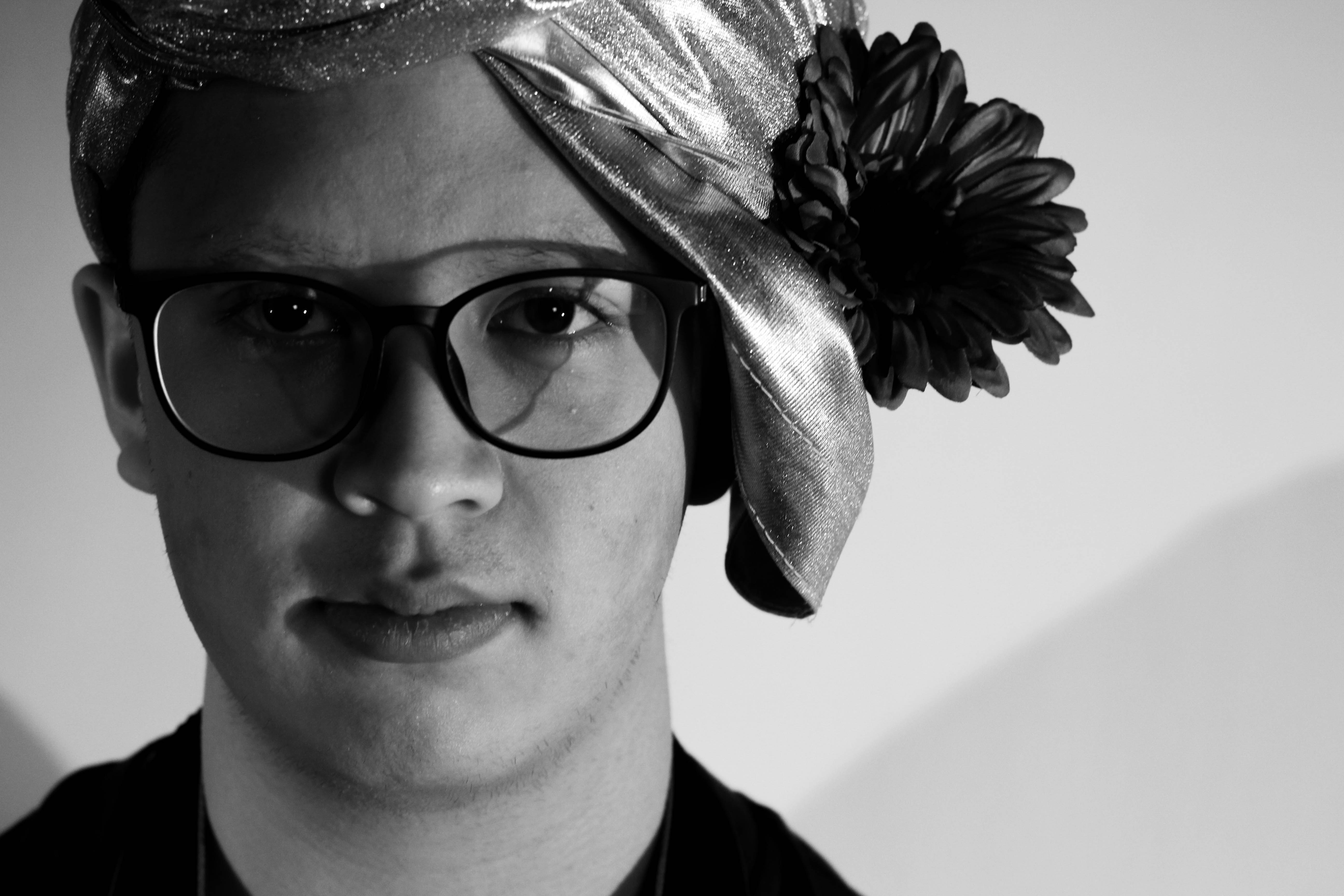
 I also wanted to switch between monochrome and the portrait settings when taking photos to allow for a greater contrast between the lights and darkness of an image. This would allow for a more sinister look when produced due to the emotionless expressions of the subject.
 Before the shoot I wanted to create a mind map of the ideas towards this, so that I would have an idea of what and how to take the photos of both subjects.
 From there I decided to carry out the shoot, these were my results:
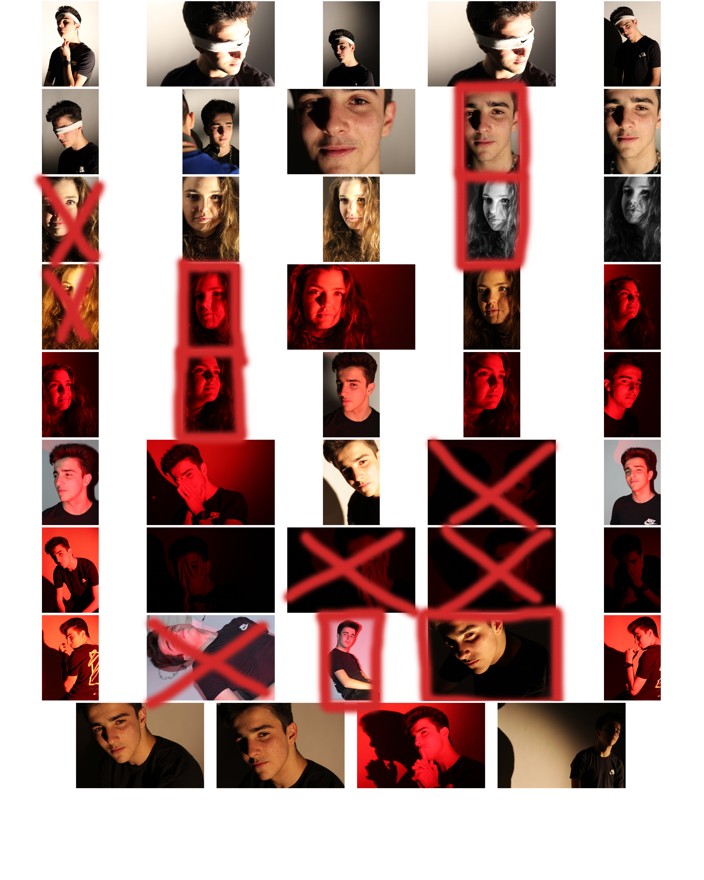
 From here I selected the top ten image from the entire shoot, this would make it easier for me to narrow it down to the final image that I deemed best from the shoot. These were the images I selected:
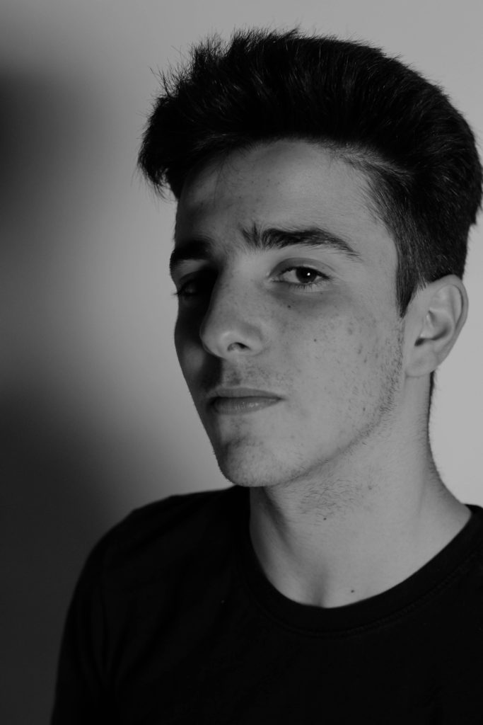


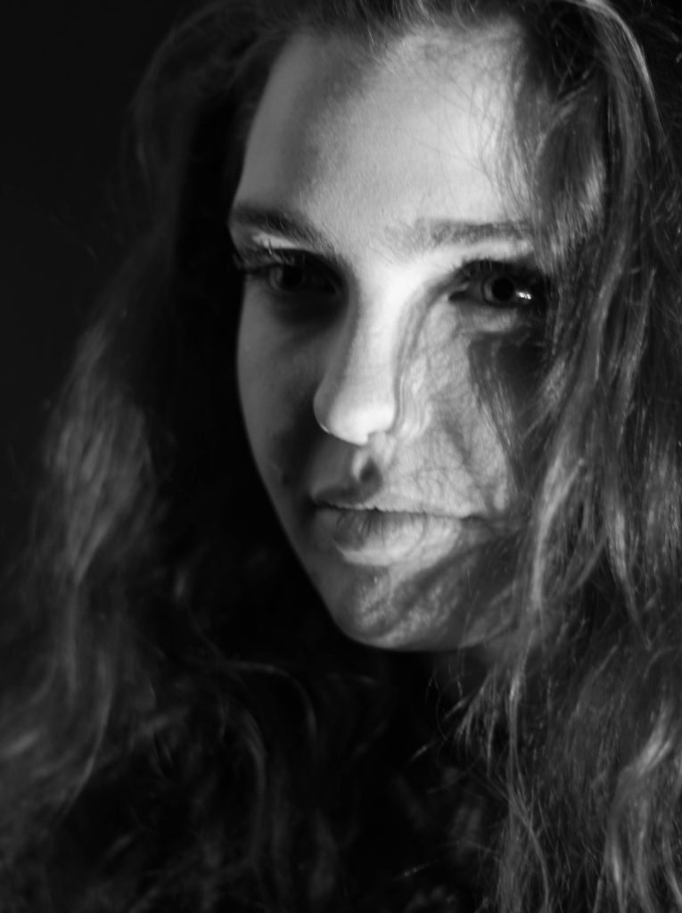


 What I loved about this image was the obvious difference between the light and dark on either side of the face. This to me compared with the light backdrop allowed for a clear definition to the face, drawing out certain feature above others.
 As seen in her work, she wanted to focus on how the photos were meant to recreate paintings in an innovative and creative way not seen before.
The 7 deadly sins were a popular topic when doing tableau photography due to each one having an important connection. These were Lust, Gluttony, Greed, Sloth, Wrath, Envy and Pride. I could then link this back to how these all formed their own unique identity and change the individual for the good or worse.
As seen in her work, she wanted to focus on how the photos were meant to recreate paintings in an innovative and creative way not seen before.
The 7 deadly sins were a popular topic when doing tableau photography due to each one having an important connection. These were Lust, Gluttony, Greed, Sloth, Wrath, Envy and Pride. I could then link this back to how these all formed their own unique identity and change the individual for the good or worse.
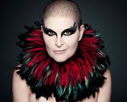
 Rankin creates landmark editorial and advertising campaigns, with his work being some of the most celebrated by the biggest brands, charities etc. Rankin has published thirty books, and has his work exhibited around the world. In 2011, Rankin Film Productions was made to make music videos, commercials, and short films. Some of his work consists of: