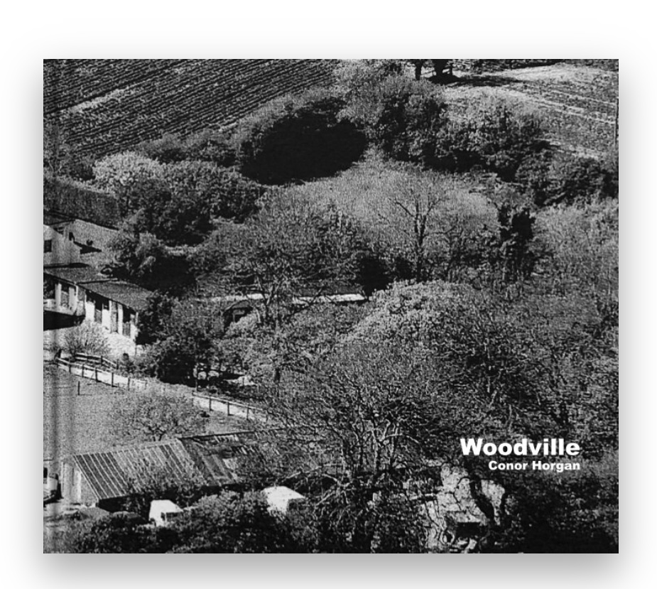
http://www.blurb.com/b/9300996-woodville


The images I chose to print were featured in my zine, based around the theme of ‘living’.
The top 3 images are paired together, connected by colour and location. The images show different perspectives of the same environment. The image on the left is the largest of the three as I wanted the viewer to notice the details in the image, the bird feeder, domesticated cat, mop and ladder all represent the theme of ‘living’.
I chose to present the black and white image on a single board as I believed that it was more powerful by itself. With the slightly hidden figure centre of the image, the viewer is drawn to connect with the person, relating over the daily task of ‘hanging the washing’.
I have chosen to use the technique of pasting and cropping photographs over a base photographs and placing them in different places in order to align with the base photographs in order to create an interesting and contrasting composition. This allows me to be creative with the selection and placement of the photographs in order to emphasise as much as possible the differences and similarities between the past and present uses of the land. I will also be incorporating technique 3 into this by using natural frames such as mirrors and windows around the house in order to provide a more personal and interesting touch by showing how the fashion and style of property design has changed through time.
In order to provide myself with more photographs/frames to work with I have conducted an additional mini photoshoot within my household in which I photographed more frames and decorations within the house. I can use these photographs to broaden the variety of edits in my final outcome and to further show the current fashion and style within households.


In the edits I have used photoshop to alter/crop the montage photographs or archival photographs to fit within the natural framings that I photographed around my household and then placed the montages within the frame. I have done this to create a sense of personalisation within the edits as well as delving deeper into the theme of political landscape by showing how the inner decoration of the land changes over time, as well as the buildings themselves. The mixture of new and old photographs along with the modern decorations allows for the changes and developments over time to be shown as clearly as possible.
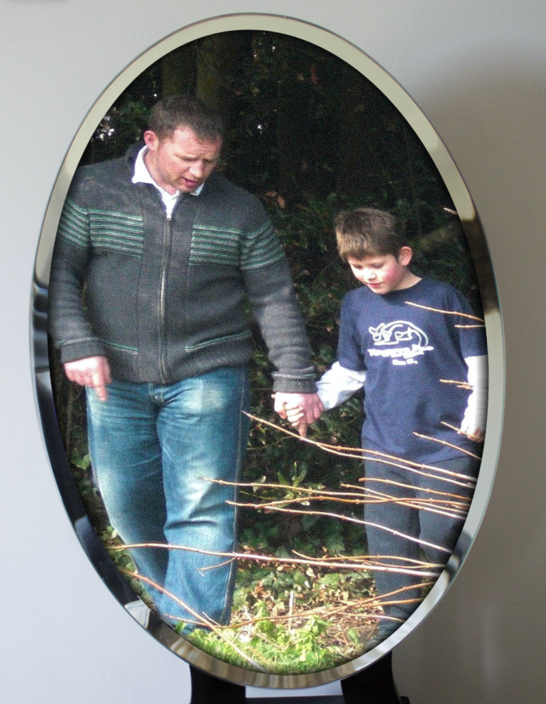
The majority of the photographs show the different sections of the houses and their developments through the use of montages but I have devoted one of the photograph edits to only the archival images within the frame in order for these photographs to be appreciated as they are without the contrast with the new photographs distracting the viewer from it. I have also included an edit which shows an archival photograph of me and my dad on the property in order to show that political landscape includes how the people involved in the change of land develop.


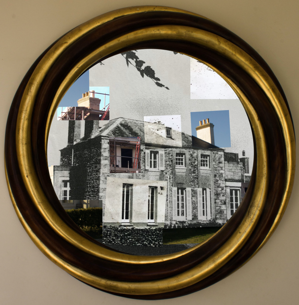
In this photograph natural lighting was used in all aspects from the photograph of the frame to the photograph of the house from 1873. This use of natural lighting has allowed for the natural shadows of the structure to be shown which helps to create contrast between the different shapes and angles in the structure of the house. There is a very wide tonal range in this photograph due to its montage nature – the bright white paint of the newly refurbished house contrasts against the black hole that is the window being renovated, this helps to create multiple viewpoints and areas of interest of which all contrast with eachother. A deep depth of field is used for all of the photographs involved in this montage as the whole of the photograph is in focus which allows for all the small details of the contrasts between the old and new to be seen. A shutter speed of 1/50 was used to capture the mirror frame along with an ISO of 200 as I wanted the frame to be of as high a quality as possible in order for it to compliment the photographs within it. For the photographs within the frame a slightly quicker shutter speed along with a lower ISO will have been used as the photograph was taken outside so the shutter did not need as much time to allow the light to enter the lens. The photographs are all correctly exposed but the exposures between the different photographs in the montage contrast with eachother to show the differences between them.
The colours in this photograph vary greatly due to the nature of the montage – the frame shows a dark gold and brown to contrast with the predominantly black and white montage. In the predominantly black and white montage there are splashes of colour through the inclusion of the photographs showing the current state of the house. These splashes of colour create a more interesting viewing and reminds the viewer how much technology has changed overtime to go from black and white to colour photography as well as the landscapes. There is a slight 3D effect to the montage as the closer corner of the house enters the background with the far corner being pushed towards the background – this 3D effect is further added to by the frame surrounding the montage, which creates a much more interesting and intriguing photograph. The frame is positioned directly around the centre of the photograph to allow the viewer clear viewing into what the frame is showing. This centralisation of the frame looks very orderly and neat which contrasts with the chaotic structure of the montage that it contains. The montage is placed within the frame in a way that shows as much of it as possible in order to convey my ideas within political landscape further. There are lots of viewpoints within the photograph as there is so much going on – which is possibly a bad thing – but I feel that there is a lot being said through this photograph so that fits the busyness of it.
This photograph is made from a collection of archival photographs and new photographs of my house. This collection of photographs represent the history of the house and the changes that it has gone through. I have incorporated both archival and new photographs to demonstrate how the genre of political landscape links to these photographs. The house has many similarities to cod houses through the shape and style – these cod houses were built in the 18th and 19th century from people who made their wealth through the North Atlantic cod trade which can be seen as one of the initial sources of wealth within Jersey. After research on the house I could not find any evidence that this is a cod house but the similarities and shapes are very close. This photograph has strong links to political landscapes and Guillame Bression and Carlos Ayesta’s work due to exploring what humans can do to a landscape and how drastically landscapes can change over a time period.
The idea behind this photograph is to show how even though fashion and trends come and go, they always come back around. This photograph shows sections of the house through photographs that are taken nearly 150 years apart – even though they are taken so many years apart the structure and shape of the building has remained. In the 1870 period only the people who could afford to would plaster their houses, but then later on it came into fashion for houses to have granite showing (as seen in the photograph) so the house was stripped of its plaster to reveal the granite structure. In the current state the house has been re-plastered in order to meet fashion trends and in order to show some inspiration from the original style of the property. This loop of fashion and trend shows how political landscapes often take inspiration from the past whilst putting a modern spin on them.


 I think that throughout the Future of St. Helier newspaper project I have thoroughly explored the different aspects of St. Helier and the people within it. I have photographed environmental portraits and portraits of unaware subjects to catch the different sides of the population of St. Helier as well as photographing completely different styles of buildings within the capital. If I was to explore the Future of St. Helier again I would focus on more set-up photo-shoots with interesting people within the parish in order to get an insight into what they think the future of St. Helier is and how they feel about the changes that it is going through.
At the beginning of the project I planned on photographing lots of people in their natural work environments in order to create a collection of photographs that show the different jobs and dress codes that come with them in St. Helier. My intentions changed when we visited the construction site at Ann Street car park as I saw the difference between the newly built buildings and the buildings being demolished and thought that this difference had to be recognised as it is the Future of St. Helier in the present.
I learnt throughout this photographs that there are many aspects to St. Helier which differ depending on which area of the parish you are in. Every subject that you photograph or speak to are completely their own person and have a different story. I learnt a lot about the future plans of St. Helier and how vital the finance industry is to Jersey and how quickly it is advancing.
Newspaper: Your best page will be selected for the Future of St Helier newspaper that will be printed and distributed island-wide on Tue 18 September.
Deadline: Final page must be ready for export end of lesson 10 Sept.


Photo-zine: For the next 4 weeks we would like you to continue to work in Indesign, experiment with layout and design in producing a 16 page photo zine.
Deadline: 16 page zine needs to be printed on both sides and bound on Tue 18 Sept.
Those travelling to GPF 2018 student will be taking your zine with you to be exhibited during Night of Photography Sat 23 Sept
All the zines will be assessed as part of your first coursework that is part of Personal Investigation unit.

Use PLANNING-TRACKING-PERSONAL INVESTIGATION-AUTUMN-TERM-2018 for a full overview of what you are required to do in the next 4 weeks.
You are required to self-monitor your progress and will be asked to upload Tracking-Sheet with an update on a weekly basis to your blog.
TASKS > produce a number of appropriate blog posts
PHOTO-ASSIGNMENT > SUMMER
You must return to your area of St Helier over summer and produce at least two more shoots.
Review and evaluate your shoot, identity weaknesses and strength Plan and re-visit for a new shoot that adds value to what you already have.
You have to ask yourself:
Am I satisfied that I have enough images/ material?
What are you going to do differently on next shoot?
How are you going to develop your ideas?
Your photo-zine is a final outcome that will be assessed as part of your Personal Investigation (coursework) giving you marks based on skills, knowledge and understanding of photography as a tool for communication in narrative, sequence and design
Deadline: Bring your new set of images to first day of school Tue 4 Sept.

RESEARCH > ANALYSIS
Café Royal Books is a small independent publisher of photography photobooks or zines, and sometimes drawing, solely run by Craig Atkinson and based in Southport, England. Café Royal Books produces small-run publications predominantly documenting social, historical and architectural change, often in Britain, using both new work and photographs from archives. It has been operating since 2005 and by mid 2014 had published about 200 books and zines and they are held in major public collections
https://www.caferoyalbooks.com/

Editions Bessard is a paris-based independant publishing house created by pierre bessard in 2011. Focusing on working with artists, writers and curators to realise intellectually challenging projects in book form.
https://www.editionsbessard.com/product-category/zine-collection/
Something to read:
ARTISTS REFERENCES: Follow these steps to success!
DEVELOP > EXPERIMENT
Create 3 examples of alternative layouts for your zine using Adobe InDesign and complete a visual blog post that clearly shows your decision making and design process using print-screens or save each page-spread as a JPEG.
EVALUATE > PRESENT
Write an overall final evaluation (250-500 words) that explain in some detail the following: