Category Archives: Final Outcome

Filters

Author:
Category:

Final Prints

Below I have shown the different layouts that I experimented with when attempting to find the most aesthetically pleasing way to present prints from my Political Landscape project. I first decided that I would be mounting the photographs on white mount board as the white of the board would contrast very well with the black and white photographs to create a clean and neat outcome. I then explored different ways of grouping the collection of photographs, such as the larger photographs together or grouping the archival photographs together and then the modern photographs together. Through this experimentation I came to the conclusion that the best way to present the photographs was in three columns in order to keep the presentation need and clear so that the photographs did not look crammed together or out of place. I believe that the way in which I have chosen to present the photographs makes use of the space available to place the photographs on the board whilst allowing enough space between the photographs for it to look good and for the viewer to be able to look at each photograph individually due to an organised structure.

Final Outcome

Final Prints

I chose to lay my images out in a grid, taking inspiration from Typologies that showcase variations of the same thing; in this case, rubbish. The layout is also inspired by methods of classification, commonly used in scientific processes. This is why I chose to use only images with a black background to serve as a standardised feature amongst all images.

  • All images are A5 to fit on one board.
  • I placed both images of balls in the centre row on either side as a way of balancing out the visual aesthetic.

analysis, sequencing and development of final book display

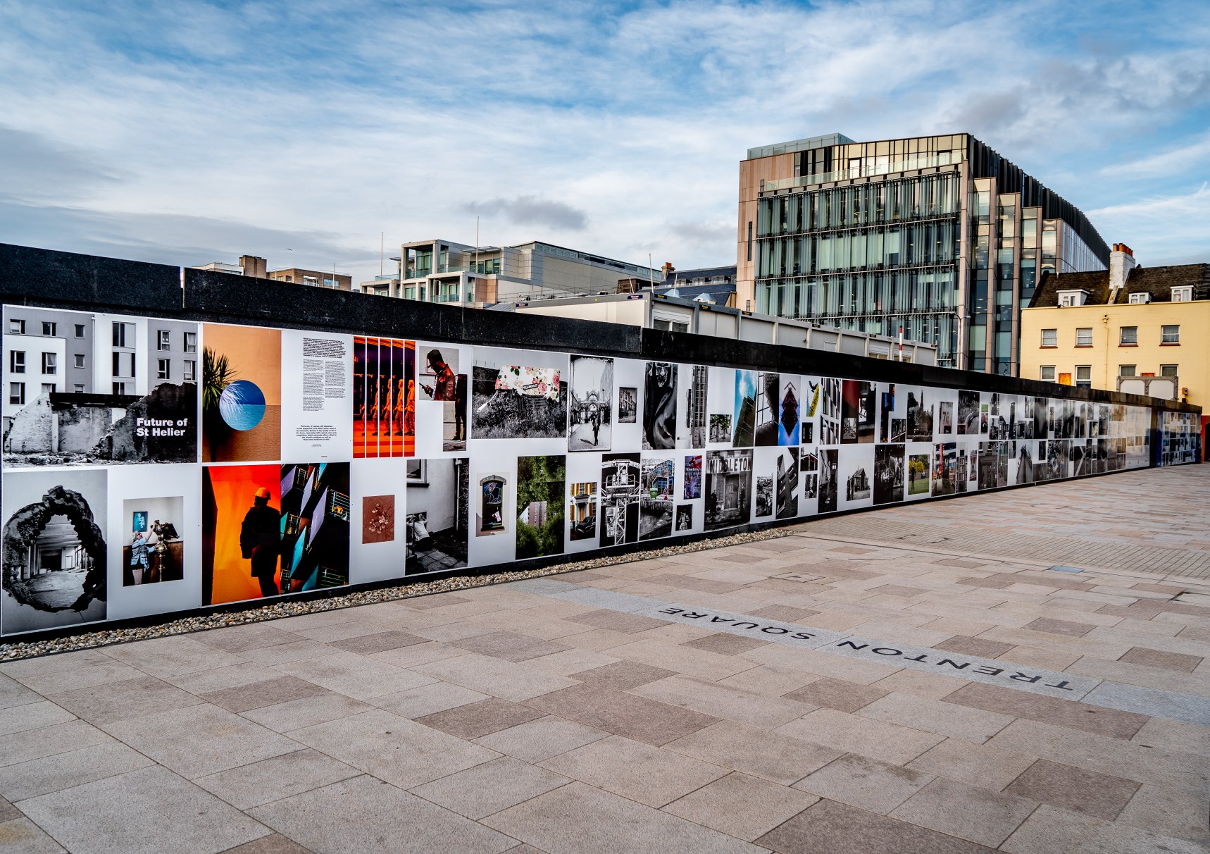
The sequencing and development of final photo-book, started off with thinking and discussing the final theme and narrative story which I want to show throughout my book. I believed I wanted it to still have strong connotations to the sublime, but also relations to emotions given off by the images. This then led me to ask myself, which of my shoots were the most successful, yet also work together through a sub- chronological story. To my mind, I believe my most powerful, emotional and successful shoots I have so far, are the sublime water ones. This leads me to choose the primary imagery from 4 shoots, and the other 10 shoots to be used to separate and create a more interesting narrative, yet without removing the theme that I want. I then wanted to choose a handful of 50 images from the primary shoots, and an additional 20 additional edits and images from the shoots less linked to the sublime, in order to create a variation and to keep interest throughout the photo book. These images where then categorise to what sizes would be most complimentary for their simply. So I ended up with a variation of images able to be on a double page spread e.t.c. I was very careful that when I started my composition for the book itself, not to allow two similar images, or similar layouts of images next to each-other and this repetition does not look correct and does not feel natural when going through the book. I wanted the structure to flow easily, yet still have a clear peak interest in each and every one of the images I used landscapes, and underwater images in order to operate many of The portrait’s throughout my work. Although all of the images have a clear conviction and interest of a certain point or another, It was still clearly apparent I needed an interesting set of images to divide up my photo-book. Because of This I decided to add images which have a mystical influence of rocks covered in different developments of rainbow patterns.

The development of my photo-book:

Other options, I decided on my final layout however as there was a good natural flow of colour synergy and the amount fo images within he dynamics of portraiture and landscapes.

My final photo book presentation:


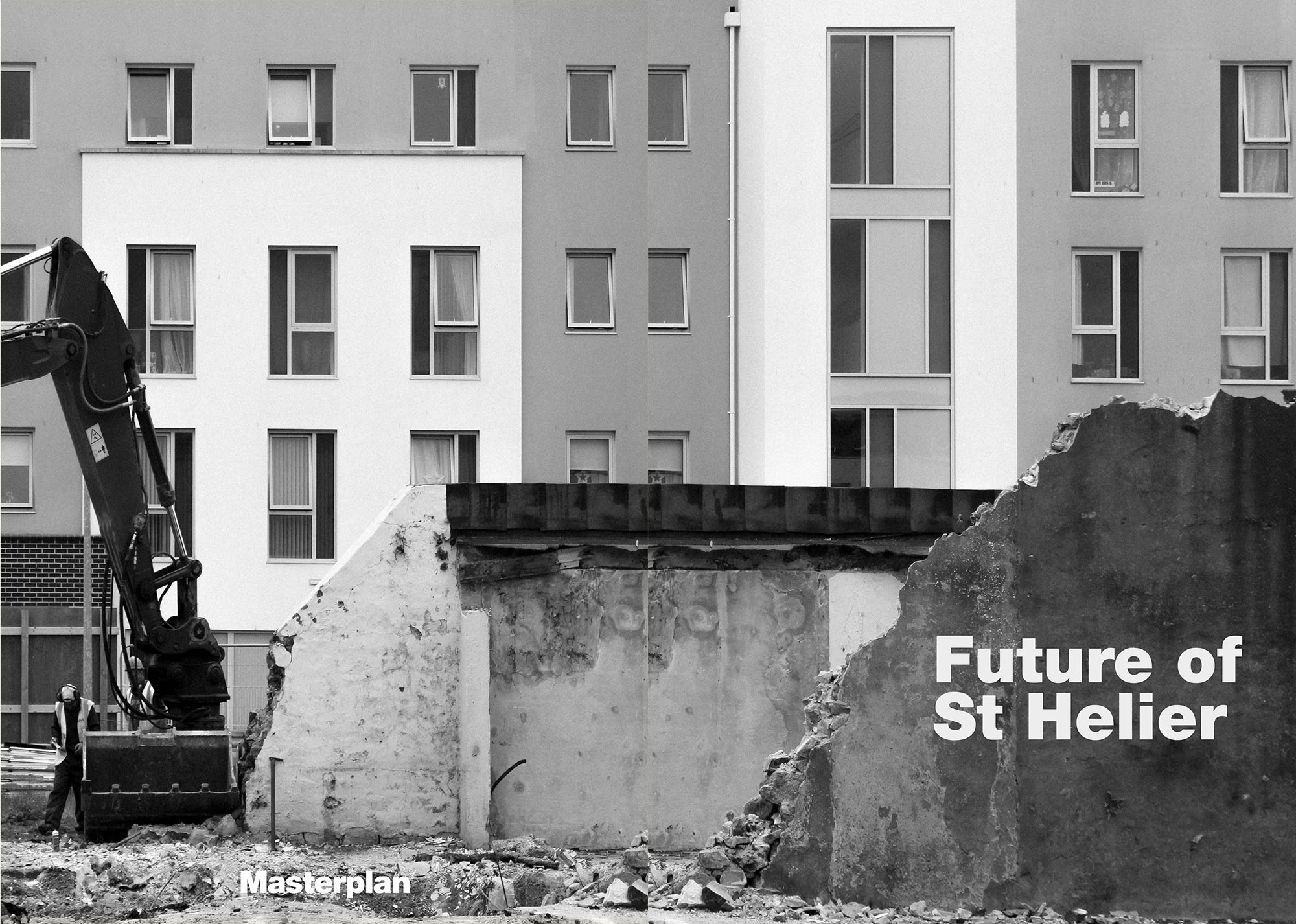
Front cover and back cover:

I chose this image in particular for many reasons, The first being the dark tones and deepness of the water creates a sense fo mystery and reinforces he fact of the book being about pleasure and pain. Secondly the use of water in itself is important as this is a key essence continuously repeated throughout my photo-book. So I believe it is a necessity to demonstrate clearly what will also be seen within my book. The front cover is also quite interesting in that side is quite abstract, it is divided into two half,  giving away any information about the rest of the image itself. This plain front allows a clear and informative title, which can easily be shown. However due to the amount of portraits within the book itself, To have a face visible as part of the front cover is important. However due to it only being visible on the back is interesting as it almost creates a narrative experience, and puts the aspect of human vs nature all into one narrative image. This is why I feel as though this image is definitely the most successful.

what my book title is and why:

I chose ‘The Evolution Of Essentialism’ Due to it being a pivotal part of my photography essay, additionally, essentialism has a clear link to water as it is a primary part of living, so also creates a clear indication of my subject from right at the beginning. The evolution part links in well throughout how water can be linked back to romanticism, Pictorialism and surrealism yet still be used to make an array of different sublime imagery seen through portraiture and landscape, as seen within the book.

The stories I used within my final photo-book are the following:

1:“Whereas the beautiful is limited, the sublime is limitless, so that the mind in the presence of the sublime,
attempting to imagine what it cannot, has pain in the failure but pleasure in contemplating the immensity of the attempt”

2:’A meditation rose on me that night
Upon the lonely mountain when the scene
Had passed away, and it appeared to me
The perfect image of a mighty mind,
Of one that feeds upon infinity,
That is exalted by an under-presence,
The sense of God, or whatso’er is dim
Or vast in its own being’

3:“Whatever is fitted in any sort to excite the ideas of pain, and danger, that is to say, whatever is in any sort terrible, or is conversant about terrible objects, or operates in a manner analogous to terror, is a source of the sublime; that is, it is productive of the strongest emotion which the mind is capable of feeling.”

4:’The sounding cataract Haunted me like a passion: the tall rock,The mountain, and
the deep and gloomy wood,
Their colours and their forms, were then to me An appetite;
a feeling and a love’


Final print presentation and layout deisgn

I chose the following images, As I have previously spoken about their quality that they hold and the amount of narrative which is found within the pieces. I wanted to create a final presentation that both showed element of landscape, portraiture, surrealism the sublime and lastly clear indication of water, as the end title of my political landscape model was named ‘ the evolution of essentialism’. I wanted to experiment within the orientation of my piece and more interesting and sublime ways which they could be positioned, as I think this would only further develop the narrative of my work altogether. I tried to choose images which have a similar colour theme yet not overall repetitive and bland to look at. The base tones are beige greens and blues, yet with vibrant purples lilacs and some pastel undertones to create a more interesting highlight. As seen as above with the last layout, I wanted to try to incorporate both presentations into one, however, this in turn looks far too crowded and actually removes the successful element to the pieces themselves.  I belive I cold do further experimentation with the ways I could possible present these, such as what type of frame and colour. Due to my images being quite vibrant, I do not feel as though black would be the best background, as it might remove some of the tones, and create a background which you cannot properly see the base texture. I believe this project overall has really allowed my images to have a much stronger narrative and really expand on the ways in which I am capable to take images and develop them further tonally and create a true theme to my progression of work.

I want my images of the girl cover in water and bright highlights to be front and centre, for the purpose as this is possibly the most dynamic and eye-catching image, and so would allow the viewer’s eye to be drawn in and then slowly go out looking towards the rest of the imagery. I believe I should separate the two images which are very dark tonally (the one by the reservoir and underwater) this is due to the equally weight of the dark tones to be spread out throughout the presentation as a whole.  Once again due to the strong narrative they hold, discussing the sublime. To do these on foam board would be beneficial, it would further create a three-dimensional dynamic against the white, and form a much more tied together final presentation. Due to this project being about the research of a narrative and not a chronological story, it does not matter the arrangement in an order or where my images are, as to why I am placing theme o this large piece of board and not using a window frame. Overall I believe this development will very much help me achieving a successful final presentation.

Future of St Helier Newspaper and Installation

Future of St Helier

Your final images/ design – choose from folders here
Then write your own evaluation / experience of  being part of  the newspaper and hoarding installation etc.

Copy and past all the below and publish as your own blog post

Hoarding Installation

The unveiling of the Future of St Helier Hoarding at the International Finance Centre on the Esplanade in St Helier took place on Thursday 13 Dec 2018.

First published as a 52 page newspaper supplement in September by the Jersey Evening Post the work produced by A-Level Photography students at Hautlieu School have been transformed into a 34m outdoor installation as part of Masterplan Community Arts and Education Project

We were challenged with responding to specific areas, streets and neighbourhoods divided up along the urban vingtaines of St Helier and to explore through research, archives and photography the built-environment, urban living, diverse communities, town planning, land use and re-generation projects.

We thank all sponsors and collaborators for making this a successful contribution to the island’s cultural records and historic archives Jersey Development Company, Camerons Ltd, MJP Architects, Archisle, Lewis Bush, Photo-Archive Societe-Jersiaise, Kevin Pilley, States of Jersey and Connétable of St Helier, Simon Crowcroft

Earlier today we unveiled the Masterplan Future of St Helier hoarding display at the International Finance Centre. Lots of local media interest from Jersey Evening Post, ITV Channel TV and BBC Jersey who broadcasted live on radio talking to photography students at Hautlieu School, Constable of St Helier, Simon Crowcroft and sponsors Jersey Development Company, Camerons Ltd, MJP Architects about the future of the island and its capital. An excellent example of how a community arts and education project can generate a debate that affects all those who either live, work or visit St Helier.

If you are interested in our views of young people tune into BBC Radio here (listen from 3:18:30 onwards or watch the six o’clock news tonight on ITV.

https://www.bbc.co.uk/sounds/play/p06rlpdw

If you missed the news last night at ITV Channel TV you can catch up here with Hautlieu students talking (15m.12s) about their images on display at the Masterplan Future of St Helier hoarding on the International Finance Centre.

See link here

The outdoor installation on the hoarding around the construction site is a great way to engage the public in art and debates concerning the future of the island’s capital but, what we need in Jersey is a new contemporary art space that will provide a new venue to showcase art produced in the island, but equally also bring international art to Jersey for the public enjoyment of its residents and visitors alike.

The recent Culture, Arts and Heritage Strategic Review, commissioned by the Government of Jersey makes 20 new recommendations that will revitalise the island’s cultural infrastructure and achieve a wide range of social and economic objectives from tourism, to health and well being to external relations, to planning and environmental developments – in the hope that in partnership with Government it will enrich and enhance Jersey’s quality of life.

Let’s hope those in power who can make real changes to St Helier’s build environment will include such a new art space in the revised Masterplan of the Waterfront. All we need is political will and re-prioritising public funding for the arts. States of Jersey

Future of St Helier Newspaper

The outcome of students work was first published on Tuesday 18 September 2018 as a 52 page newspaper supplement, Future of St Helier that was printed in 14,000 copies and inserted into a daily edition of the Jersey Evening Post and distributed island wide.

Here is a video browser of our Future of St Helier supplement printed and distributed in today’s edition of the Jersey Evening Post. Hautlieu photography students were challenged with responding to specific areas, streets and neighbourhoods divided up along the urban vingtaines of St Helier and to explore through research, archives and photography the built-environment, urban living, diverse communities, town planning, land use and re-generation projects. Each student designed a page spread which was then split in half producing a fragmented image reflecting on the nature of experience and diversity of St Helier.

https://www.facebook.com/martin.toft.758/videos/10155481208570899/