Category Archives: Externally Set Assignment AS

Filters

Author:
Category:

Un-inverted Editing

WHITE BACKGROUNDS

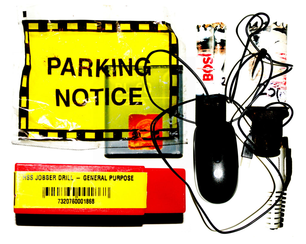
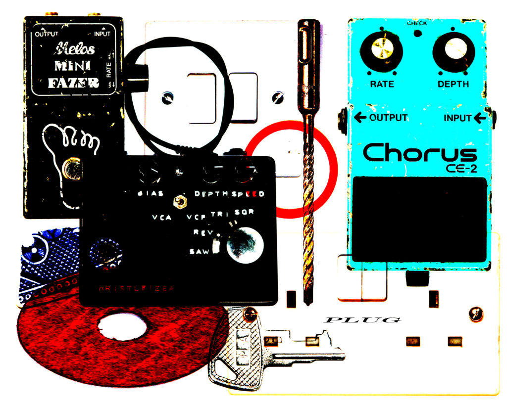
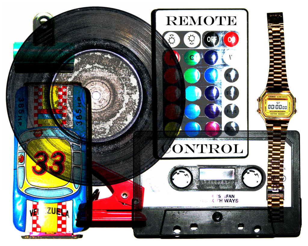
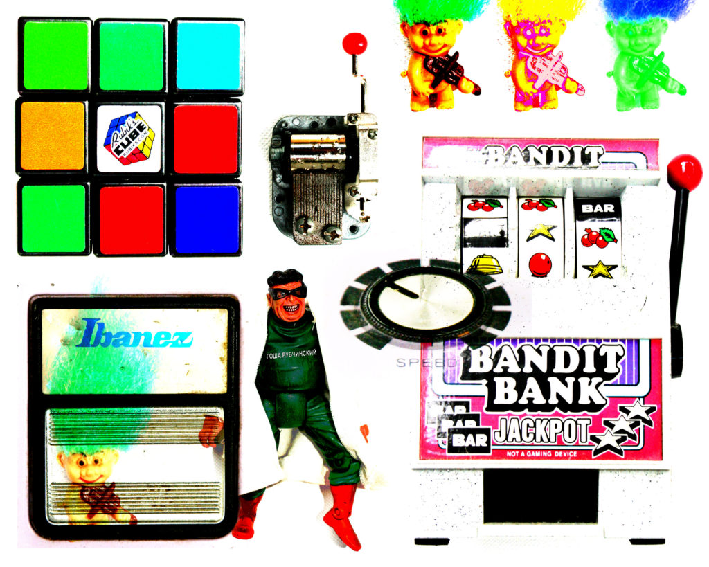
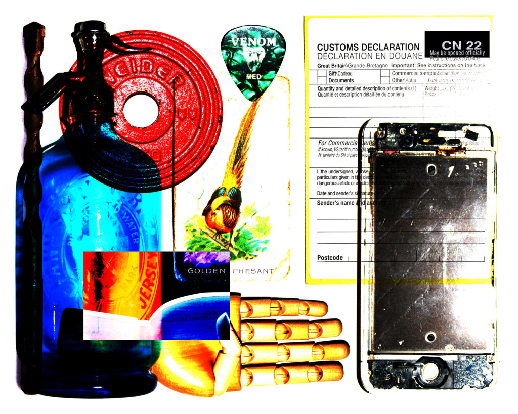
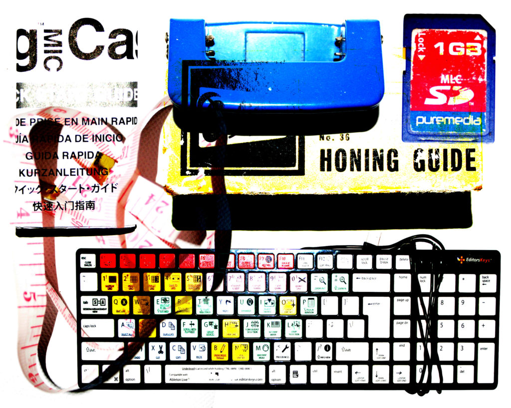
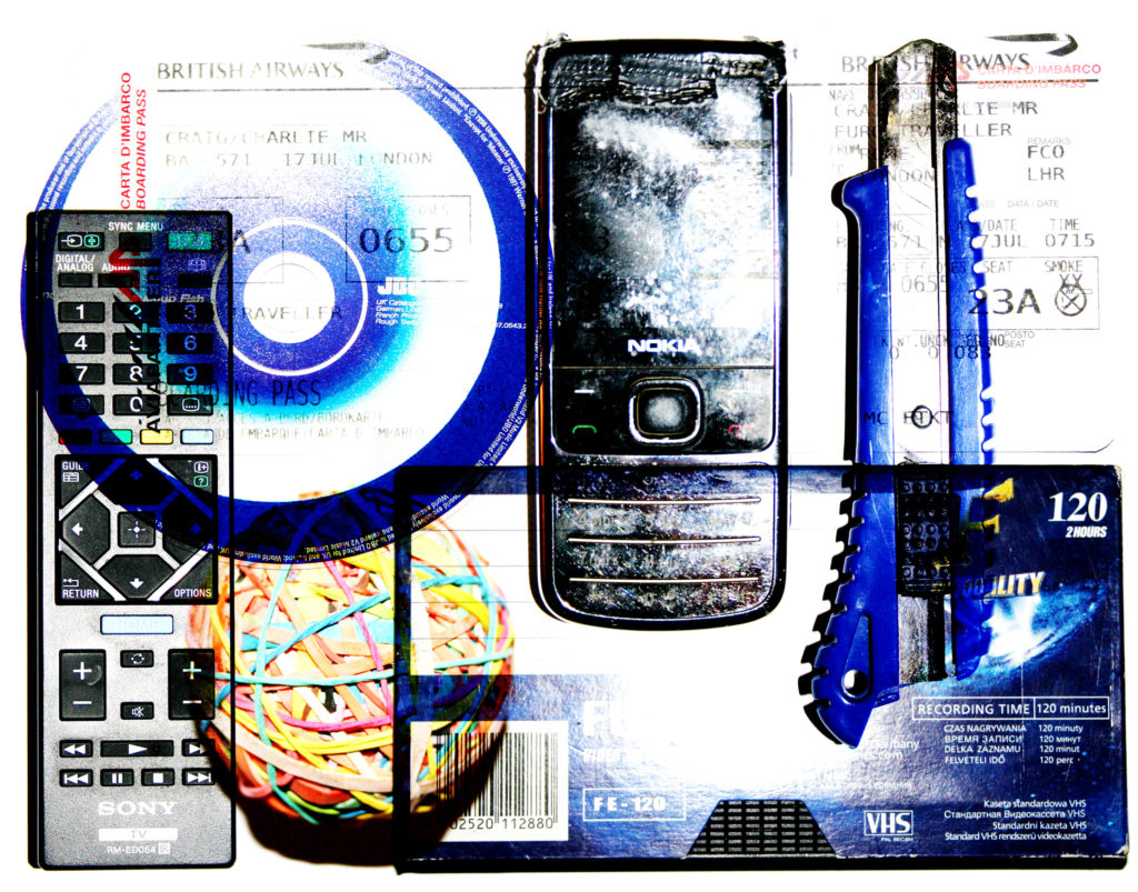
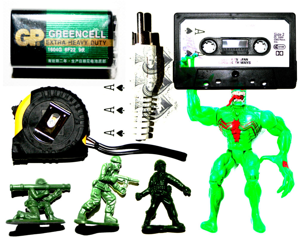
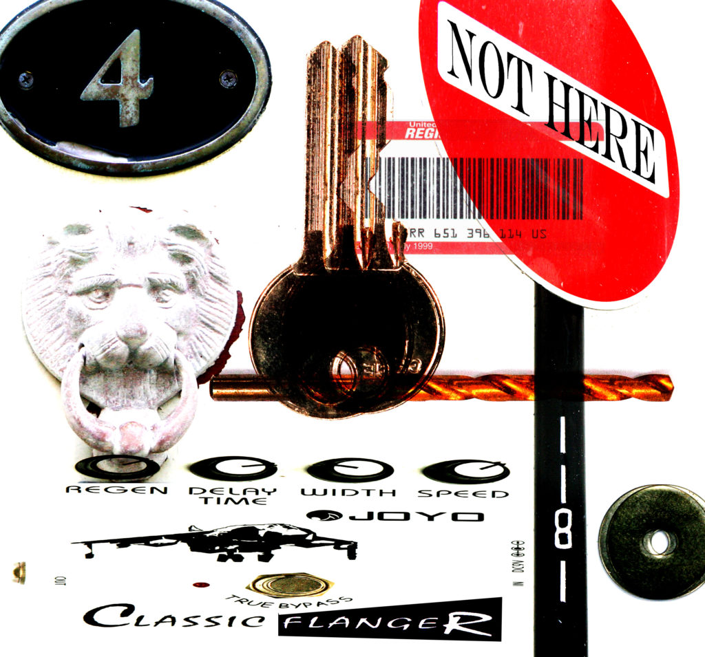
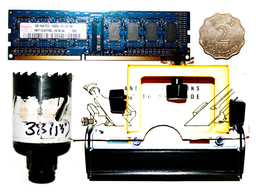
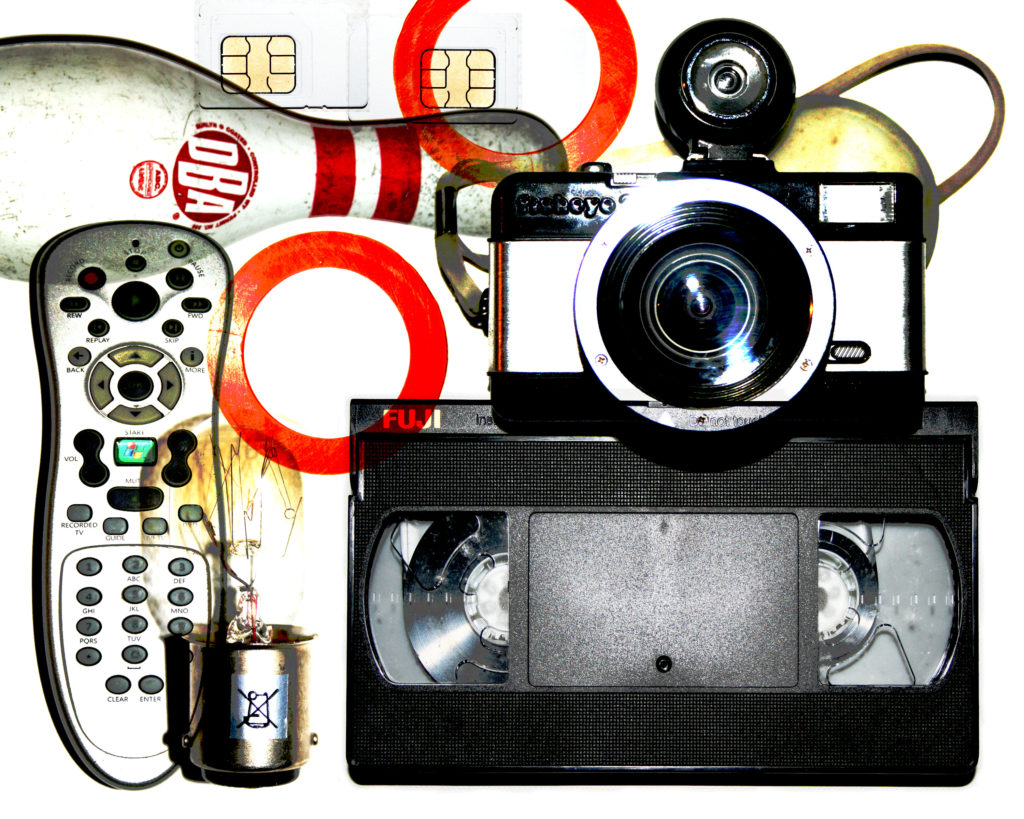
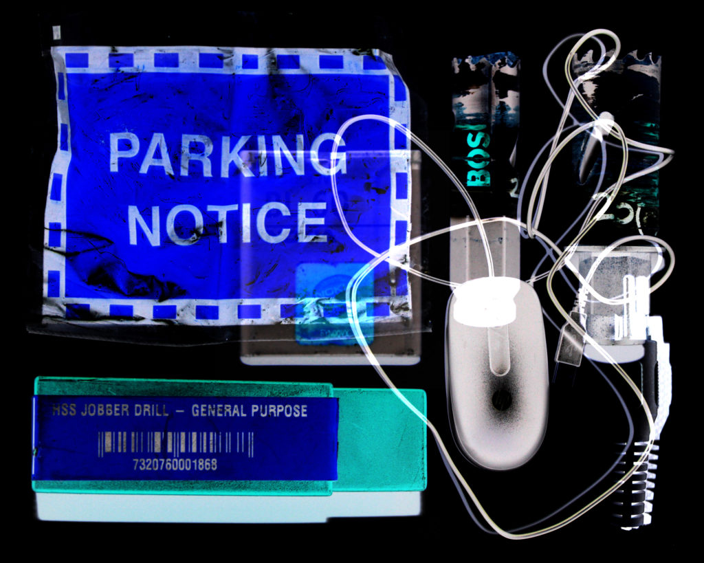
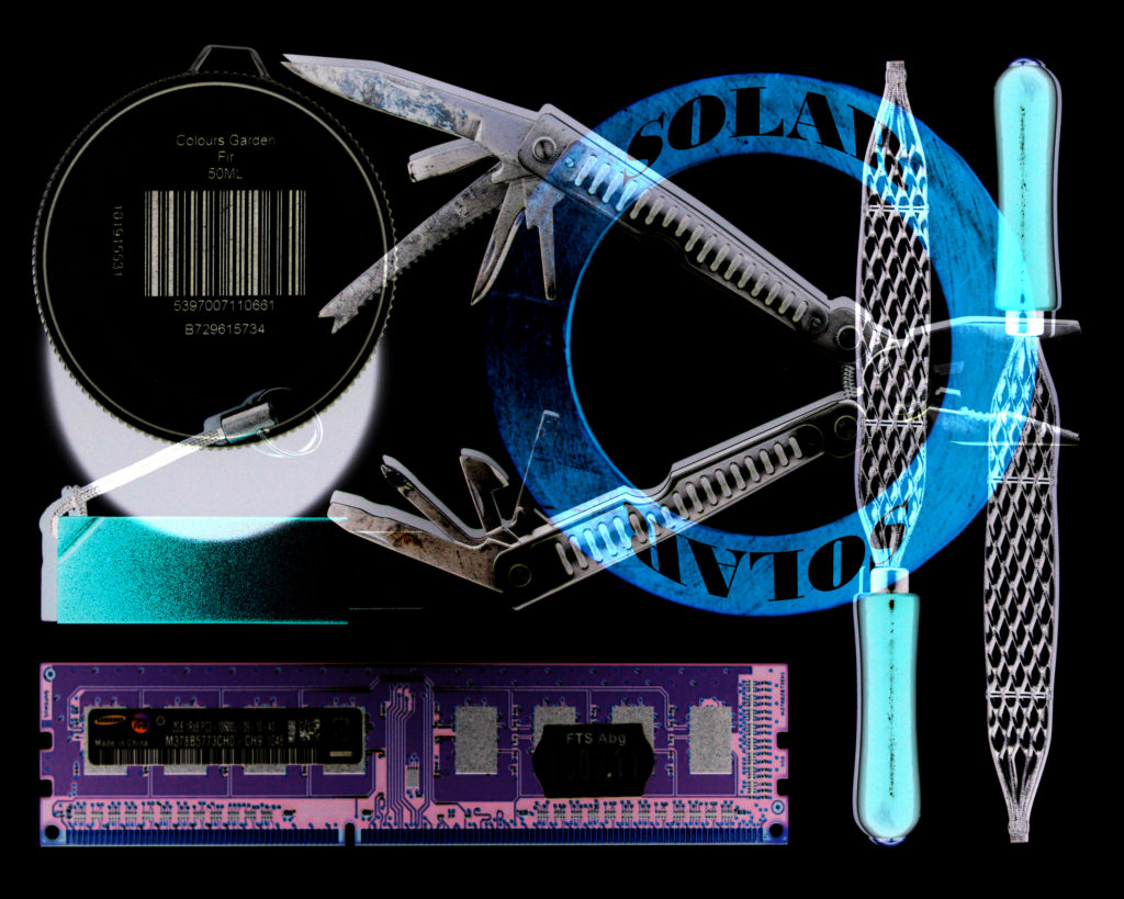
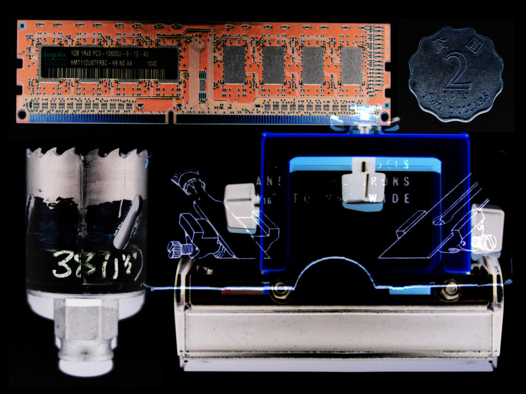
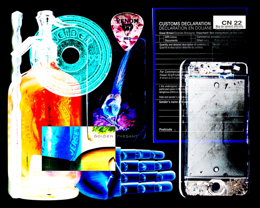
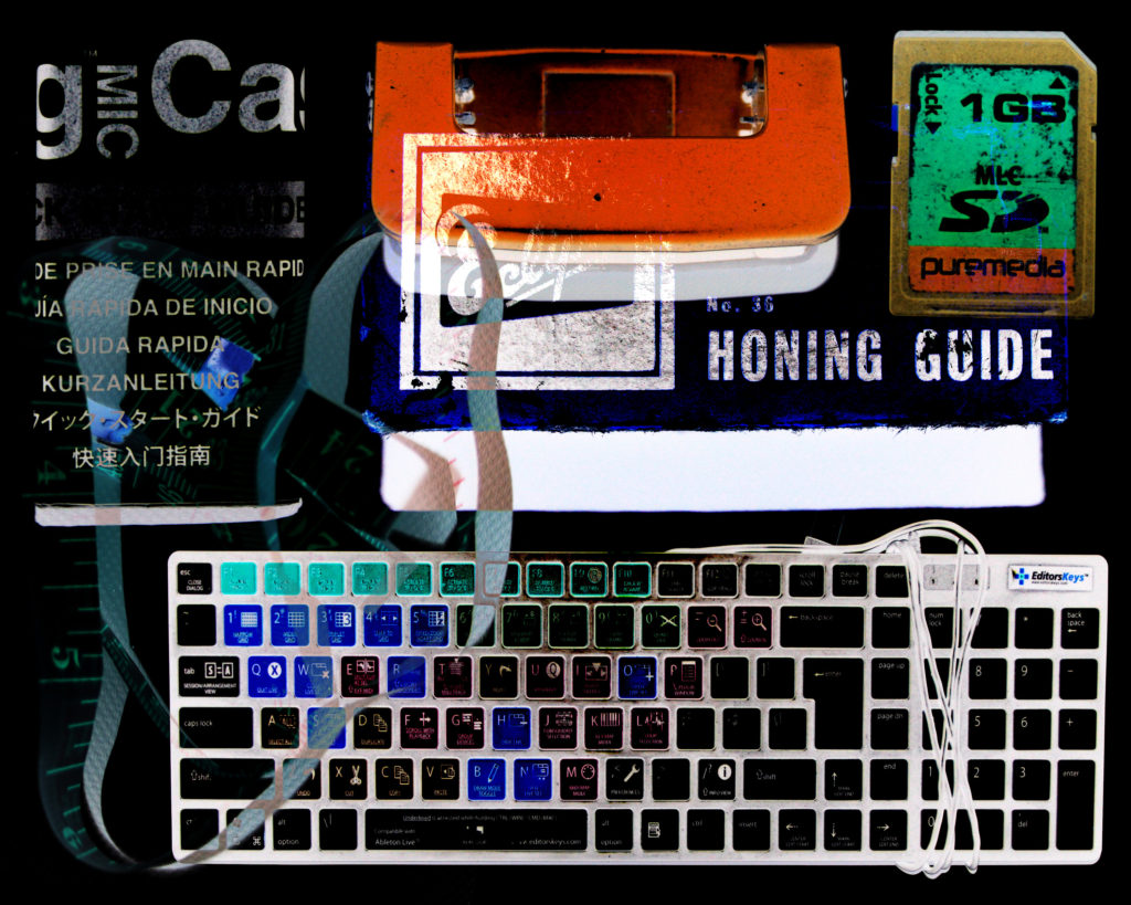
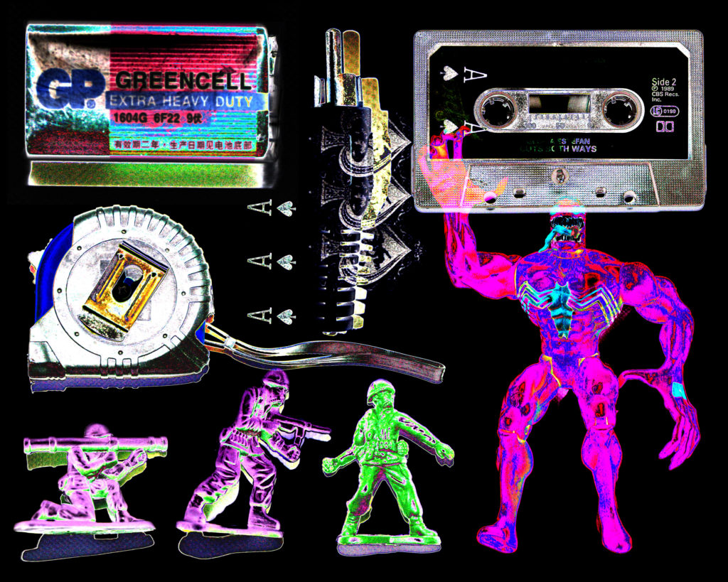
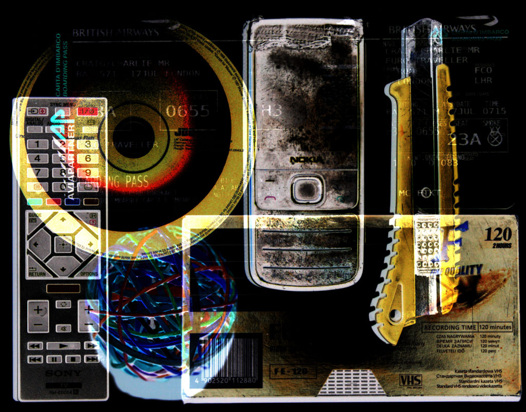
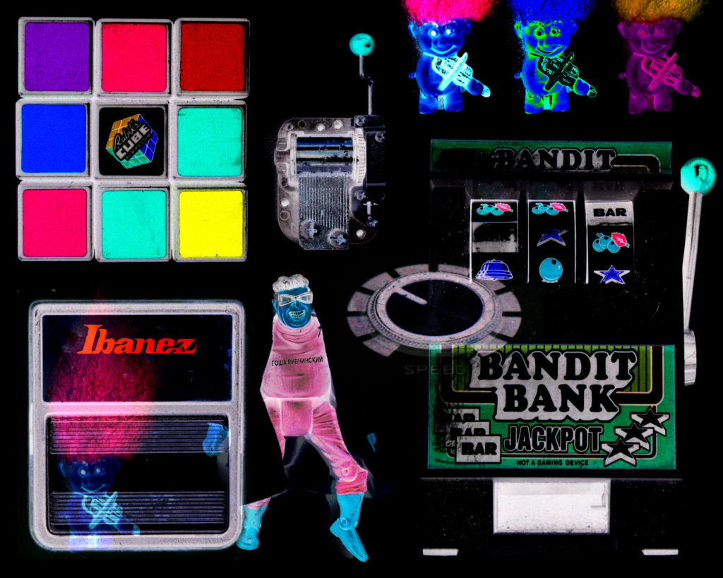
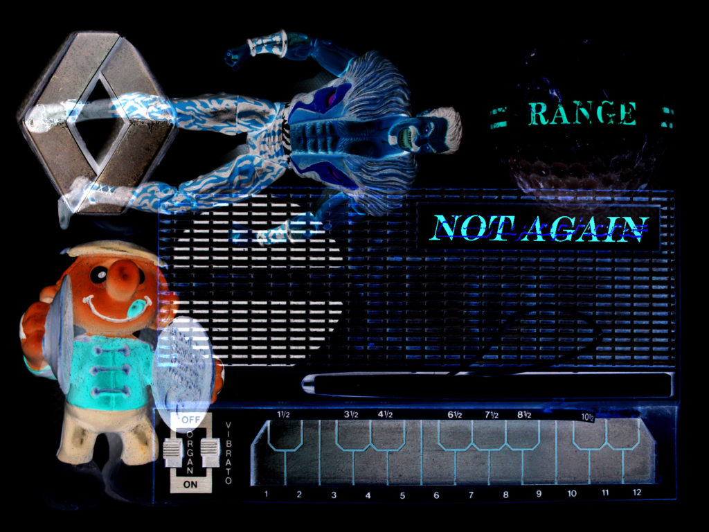
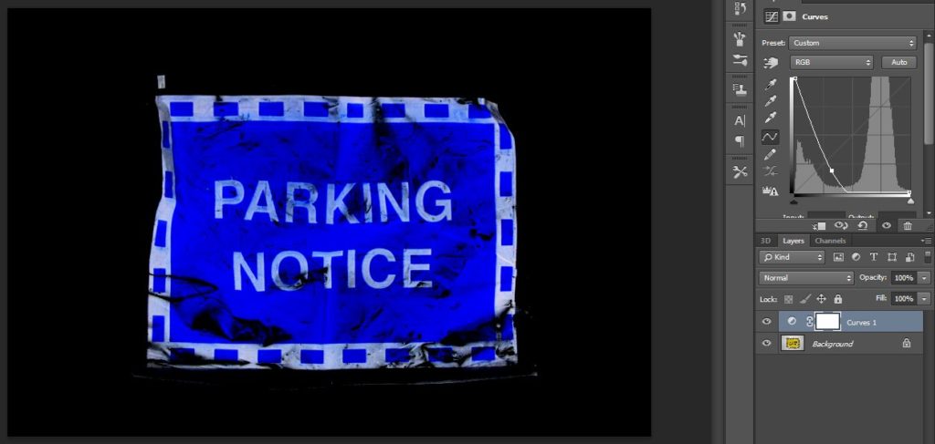
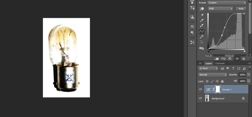
After looking at the work of Jim Golden, I decided to experiment by inverting and enhancing the colours of the images which I have already produced, in order to see how a white background with the real object colourways work in comparison with the inverted colours on black. The outcome of these images is something that I am very satisfied with, as I believe that they have an alternative but equal visual value as the original inverted images. I simply used the curves tool on Photoshop in order to un-invert the images and enhance the colours. I enhanced the colours and I like when they’re enhanced they stand out a lot from the white background, due to the strong contrast. This allows the viewer to have focus simply on the objects without having any surrounding distraction in the images.

Here are the outcomes of this experimentation…

inspiration 5:Ketty La Rocca

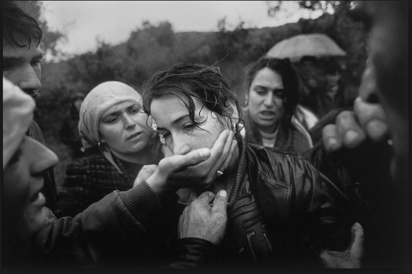
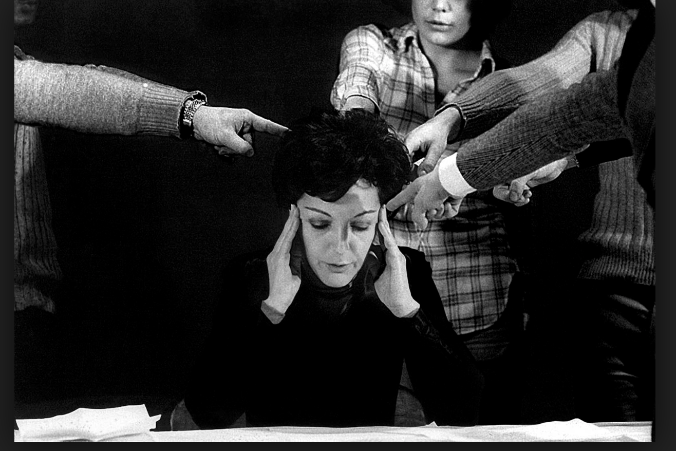
I was inspired by this image due to the composition of the piece centring the women and how she connotes a struggle of her voice being taken away with all the hands heading towards her mouth, It presents a strong relation of humans to violence,and the most important weapons we have is our voice. Although how we are expected to act a certain way due to the environment we grow up in or dependent on our gender.Furthermore the lack of eye contact presents her human emotion and how she is not addressing us directly as she is seen as powerless wihtin the image once again indicating human behaviour of fear due to others influences.

I would further develop this image in order to present more surrealist values possibly adding more hands and creating a more conceptual feel to being trapped and isolated.It again highlights the sense of human struggle and relationships people have to form due to the codes and conventions as where they were raised.

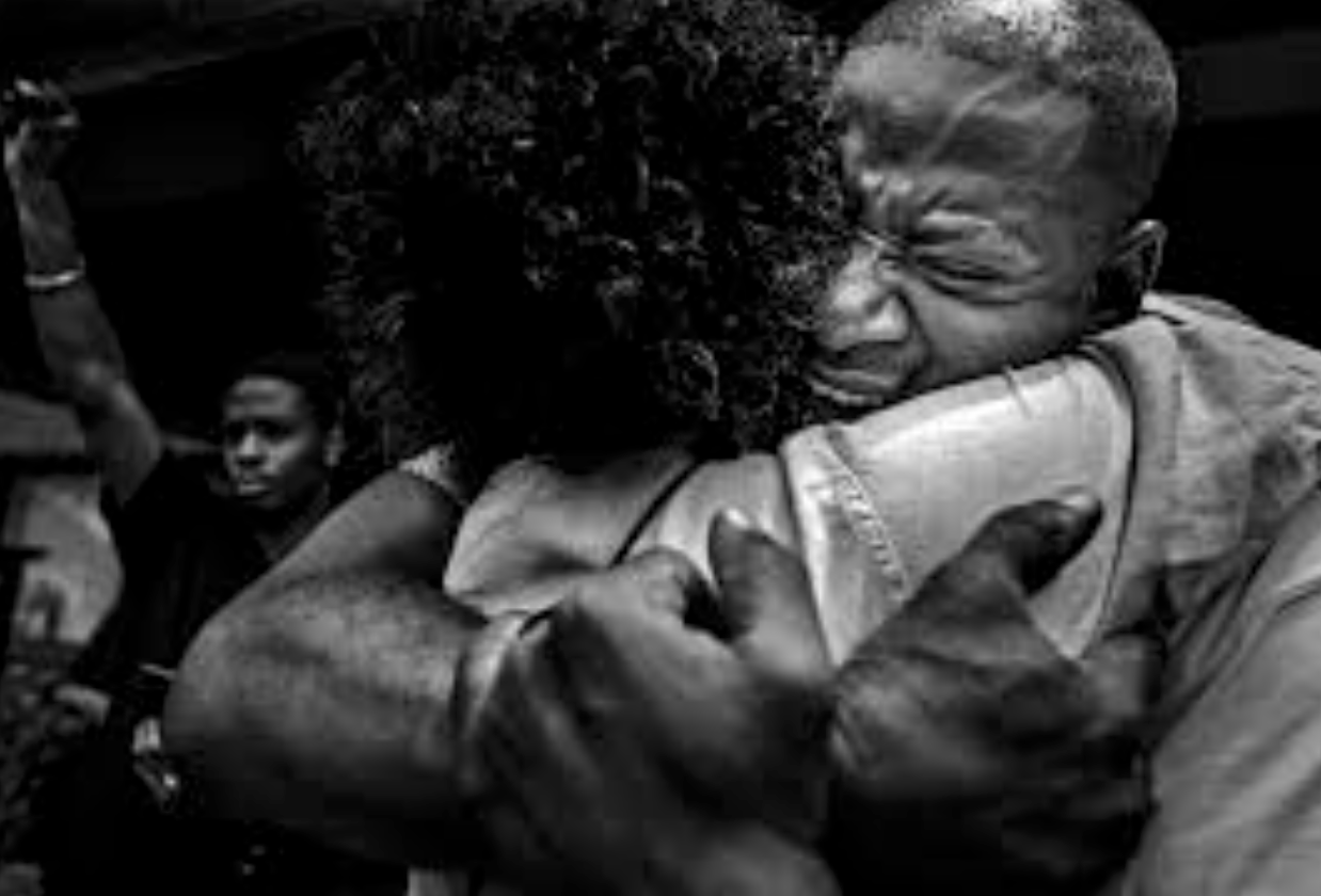
Secondly this image shows a strong sense of raw emotion and additional themes of photo journalism, it shows a presence of emotion as well as conceptual idea presenting peoples feelings and also what they want in the world.

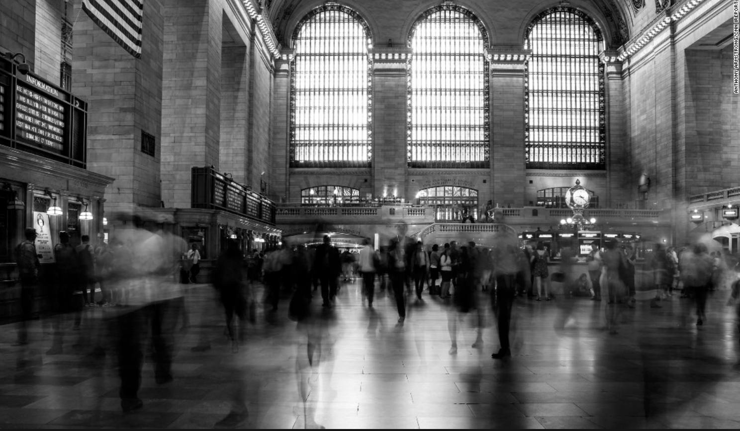
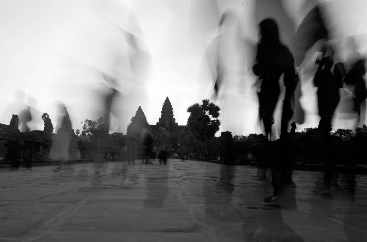
These last two images I  was inspired as it tracks human behaviour and activity as one existence and conceptually how we all ignore each other and do not view each other as equal.I think this demonstrates a movement as a wide view to capture society.I wasn’t influenced by a apseicifc artists but more the means at which all photojournalism and surrealism artists work to capture people in a certain light to present a conceptual meaning of truth.

for my shoot I too want to capture truth but will additional edit the images to presents a surrealism effect such as manipulating and adding more hands, or editing the scenario they are surrounded by. locations need to be areas in which travel is highly occurring and used to presents  a humans active life and actions .It also presents  conventions of a persons life and a routine in which we all stick to as a society because it is how we are expected to behaviour and act as a whole group.

Ketty la rocca

Ketty La Rocca was born 14 July 1938, in La Spezia, Kingdom of Italy – and died 7 February 1976, in Firenze,

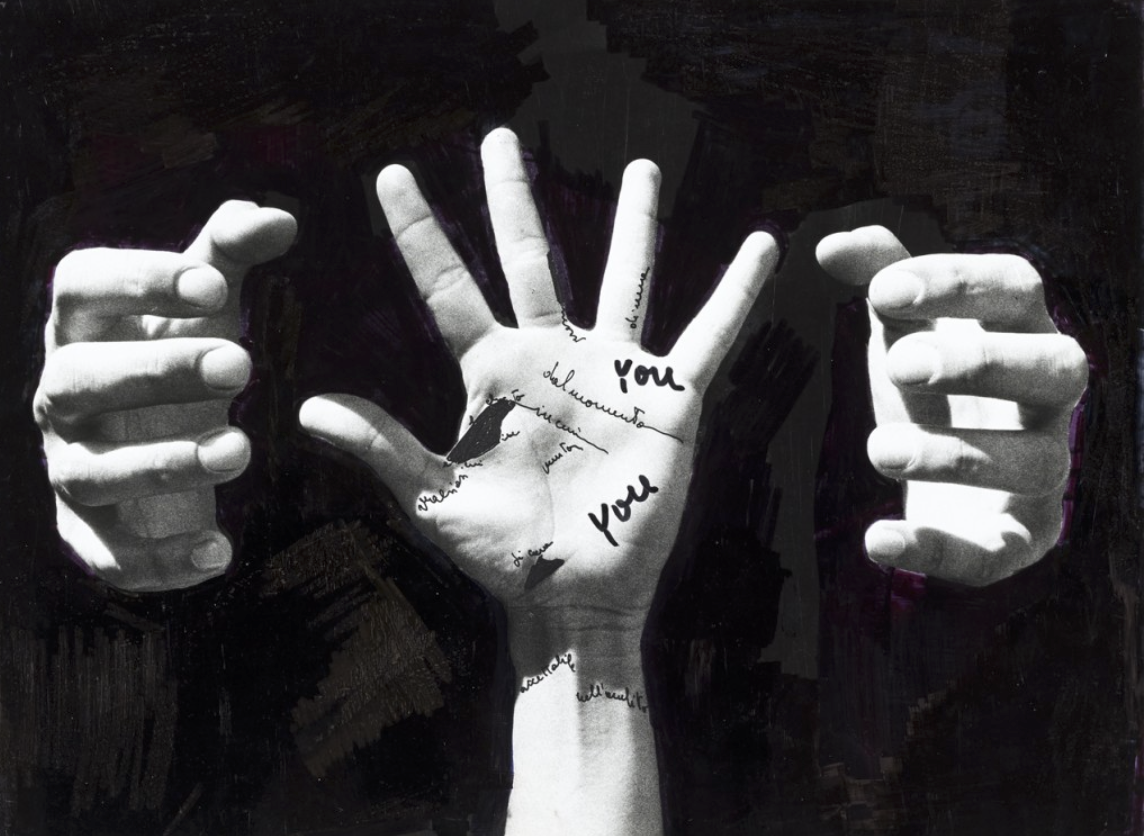
Her work focus on beauty conventions and breaking them, this artist specifically also demonstrates human behaviour and the relationship people hold within each other;The art of La Rocca acts as a form of  visual poetry, visual art, and performance. She explored language, images, and scenes of the everyday world. She emphasized the imagery of bodies.She examined their potential for expression. She combined hands and words. She desired to create a different language, a more visceral communion in which the physical body, gestures and the written word were intertwined. She was a leading exponent of body art and visual poetry movements.

Analysis of her work:

This image is almost symbolic for how we are tried and confined by a certain behaviour or have a constant fear to act or look a certain way. I think my previous idea and this artist would make a very interesting shoot altogether.

Jim Golden Photographer Research

JIM GOLDEN

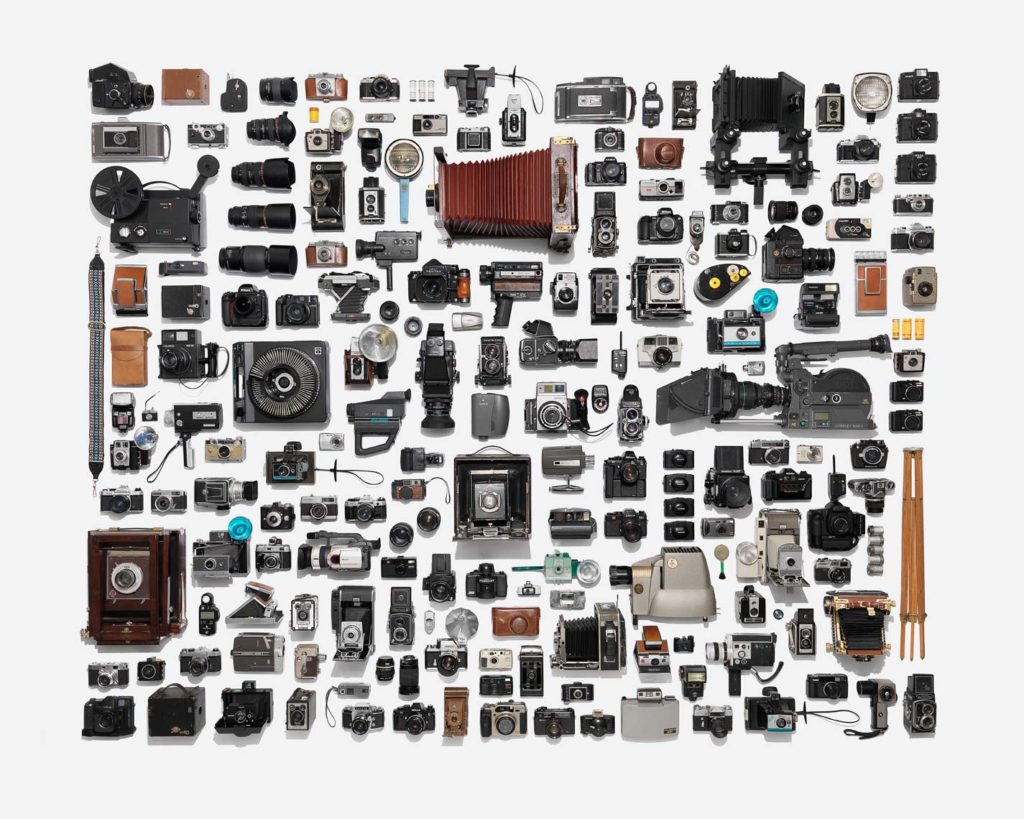
Jim Golden is a Portland based photographer who in this instance has produced various works which explore the idea of collection and objects. His work is very carefully layed out in order to balance composition and the effect of colour on lighting. The layout of these objects makes many things one collective, which is something I really like about his work.

Below are some examples of Golden’s work which I particularly am a fan of…

Jim Golden’s Work
Jim Golden’s Work

His work explores a large number of composure elements such as: Colour, Texture, Pattern, Contrast and Shape.

Jim Golden’s Work
Jim Golden’s Work

Here is a link to an article which looks at this particular collection of Golden’s work and the ideas behind it…

https://www.wired.com/2013/09/this-photographer-is-a-high-class-hoarder/

Photo shoot plan

Photo shoot Plan

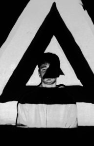
Genre /  Artist – Portrait/ John French

Concept –  Identity, Secrets, Codes

Location – School studio

Props – Tripod, Projector, Computer

Shot type – Portrait

Lighting – Studio

Settings –Portrait, No flash

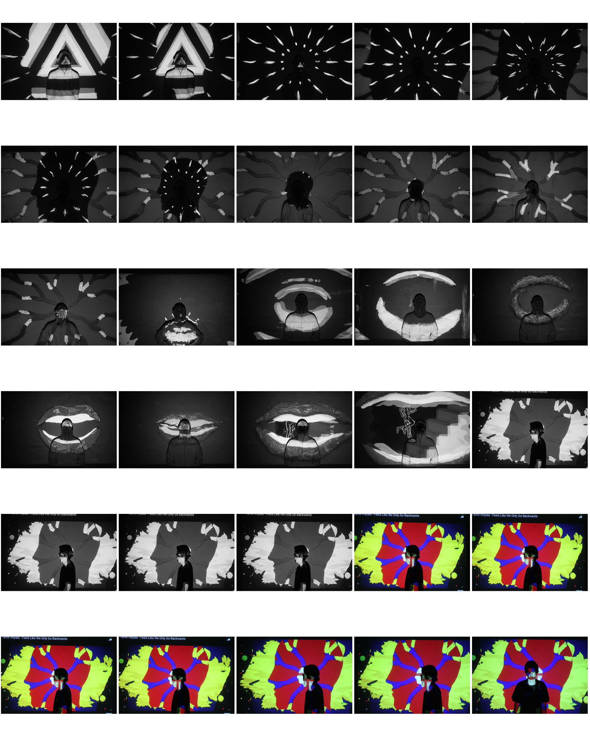
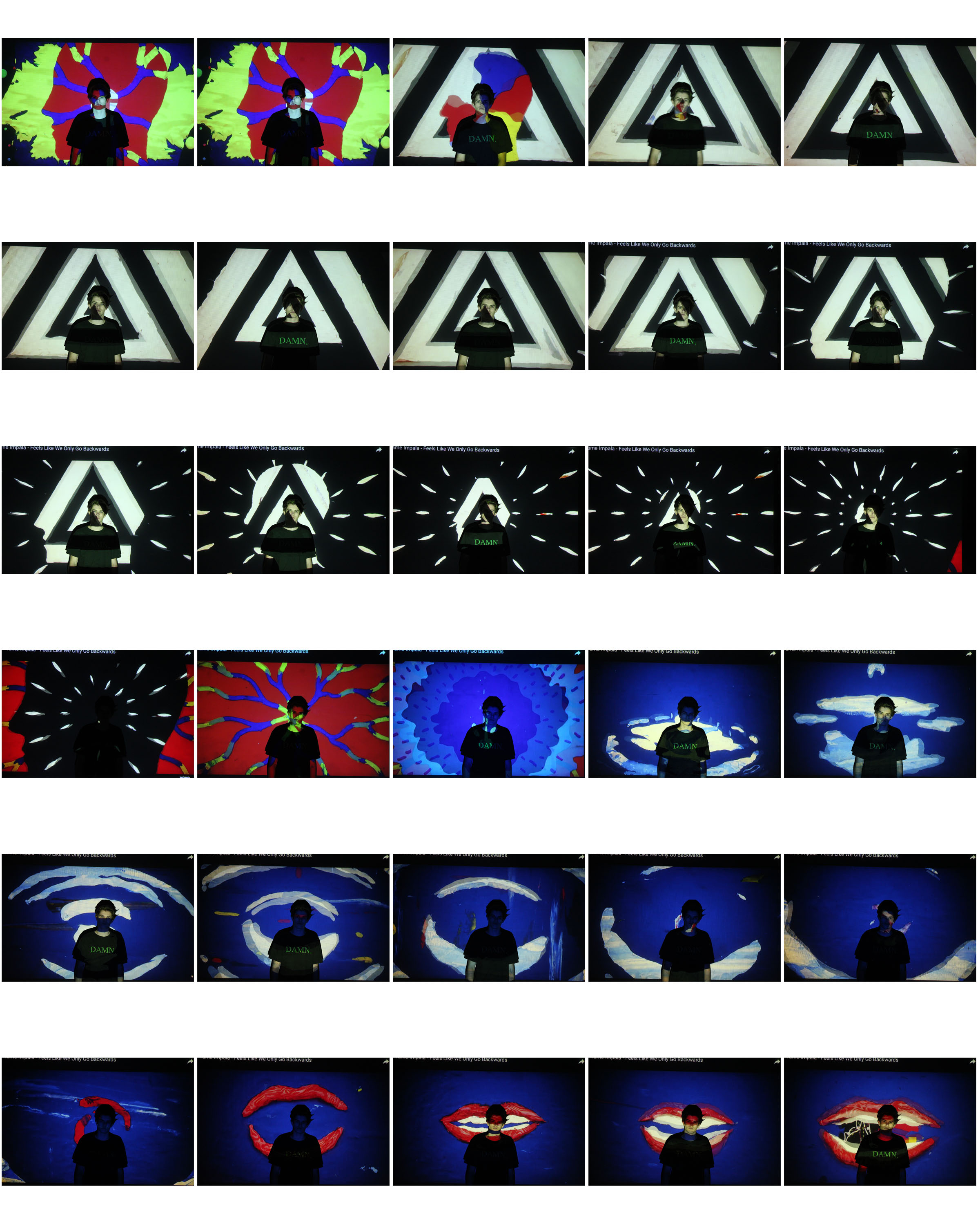
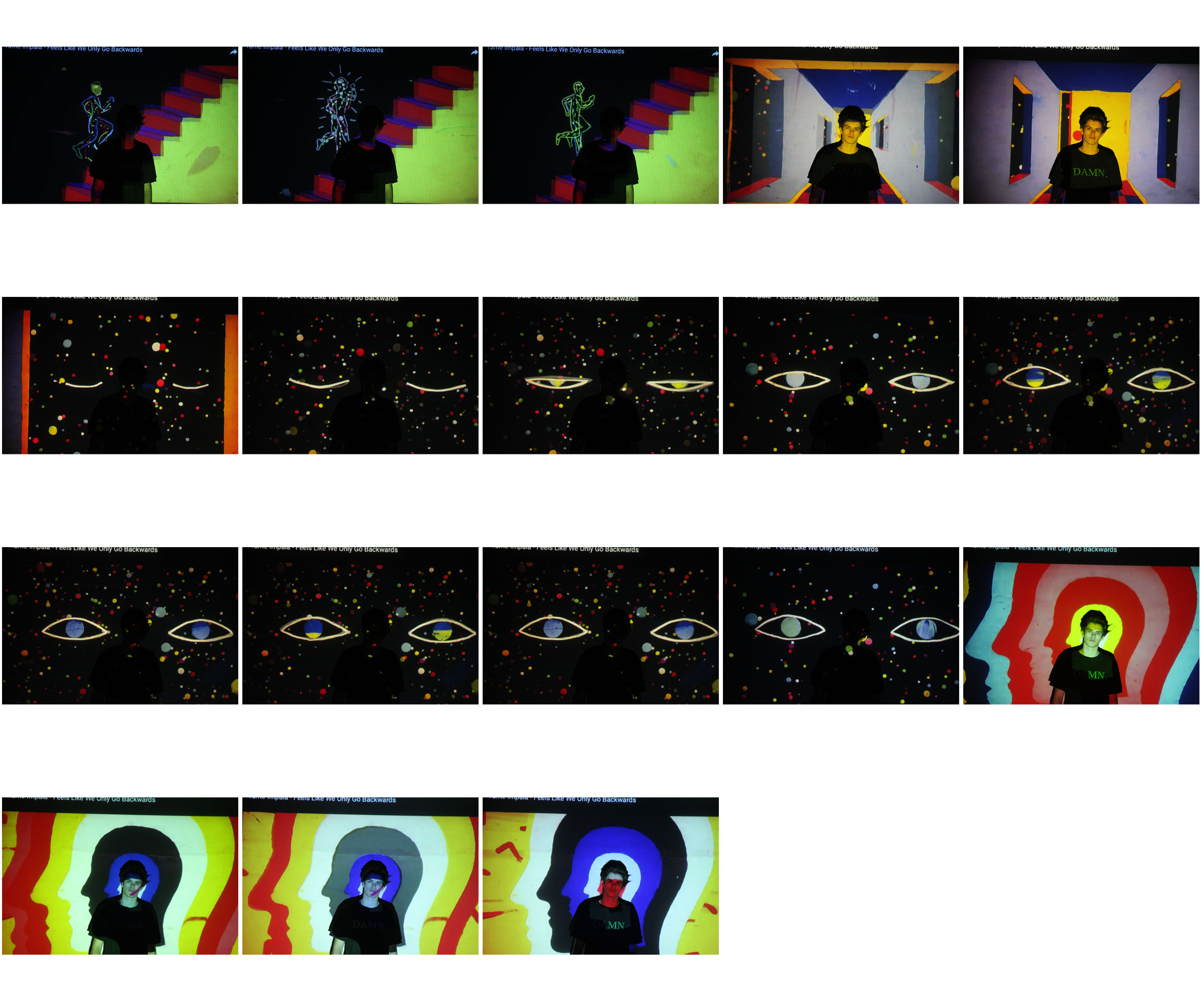
Contact sheets

My favorite interpretations


Further experimentation’s


John French

Who is John French?

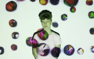
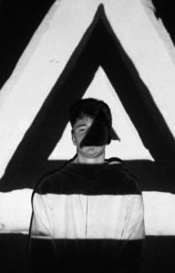
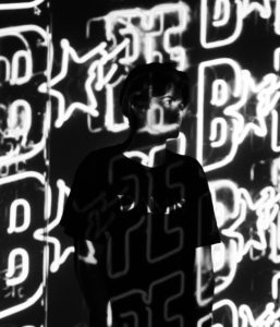
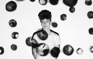
John French, was a English fashion and portraits photographer. French worked for many editorial magazines and newspapers, like the Daily Express. He developed a new form of fashion photography from bouncing light from reflector boards to create an aesthetically pleasing image that would reproduce well. French is known for his clear, stylish, uncluttered black and white photographs taken against clean backgrounds.  He preferred to work closely with his models, devoting much attention to their posing and his sets.

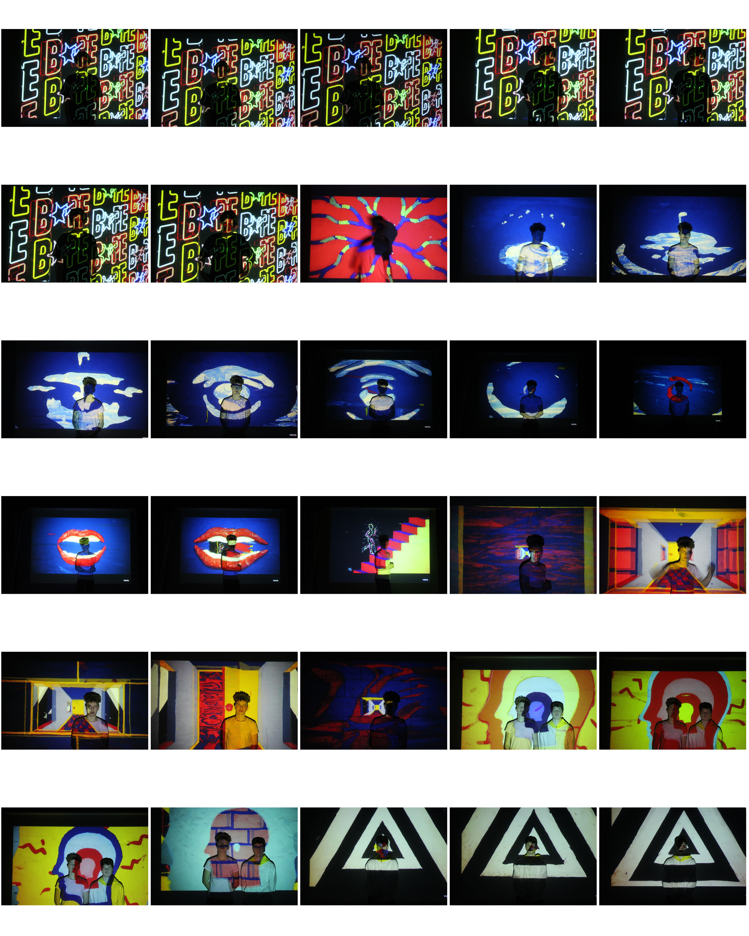
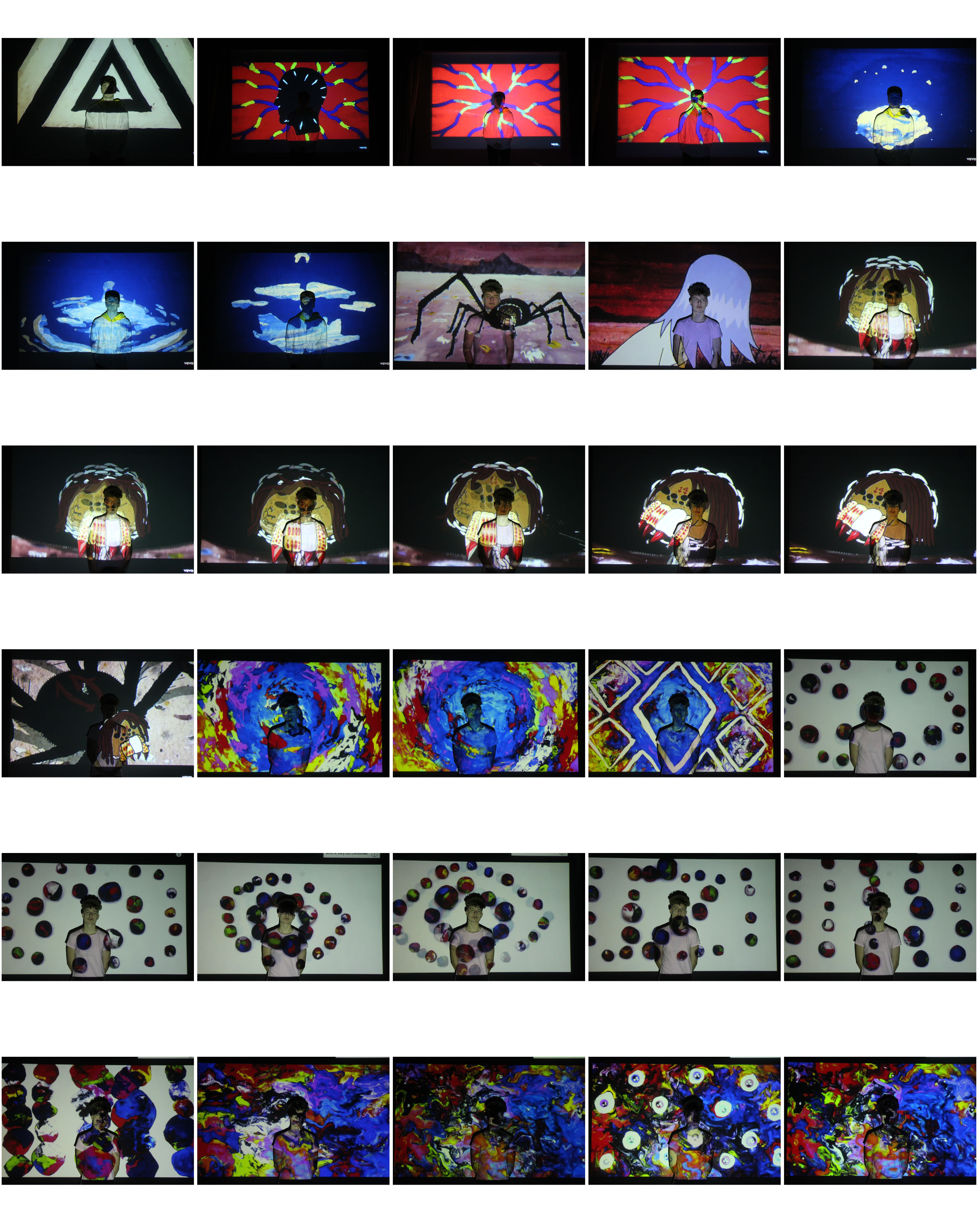
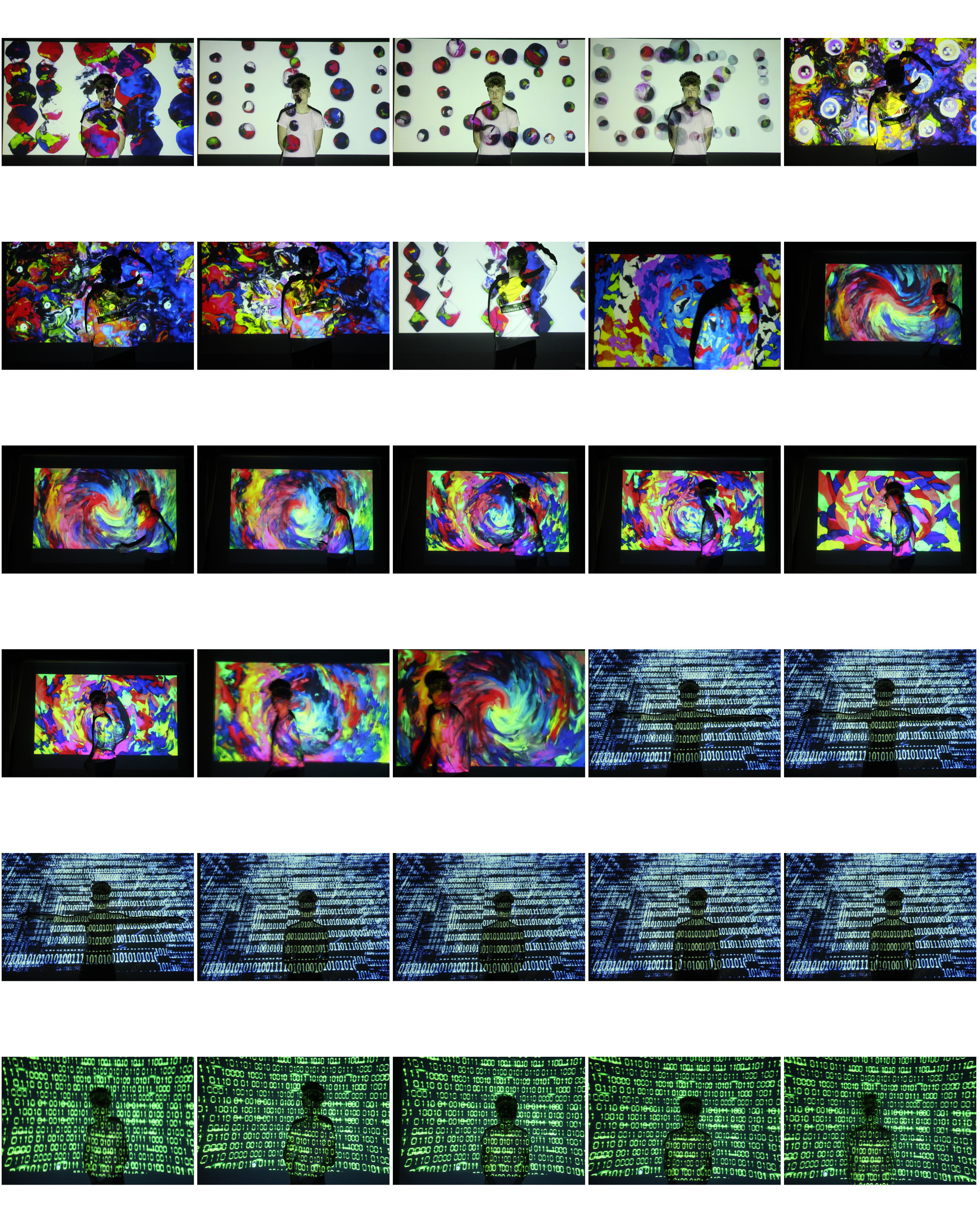
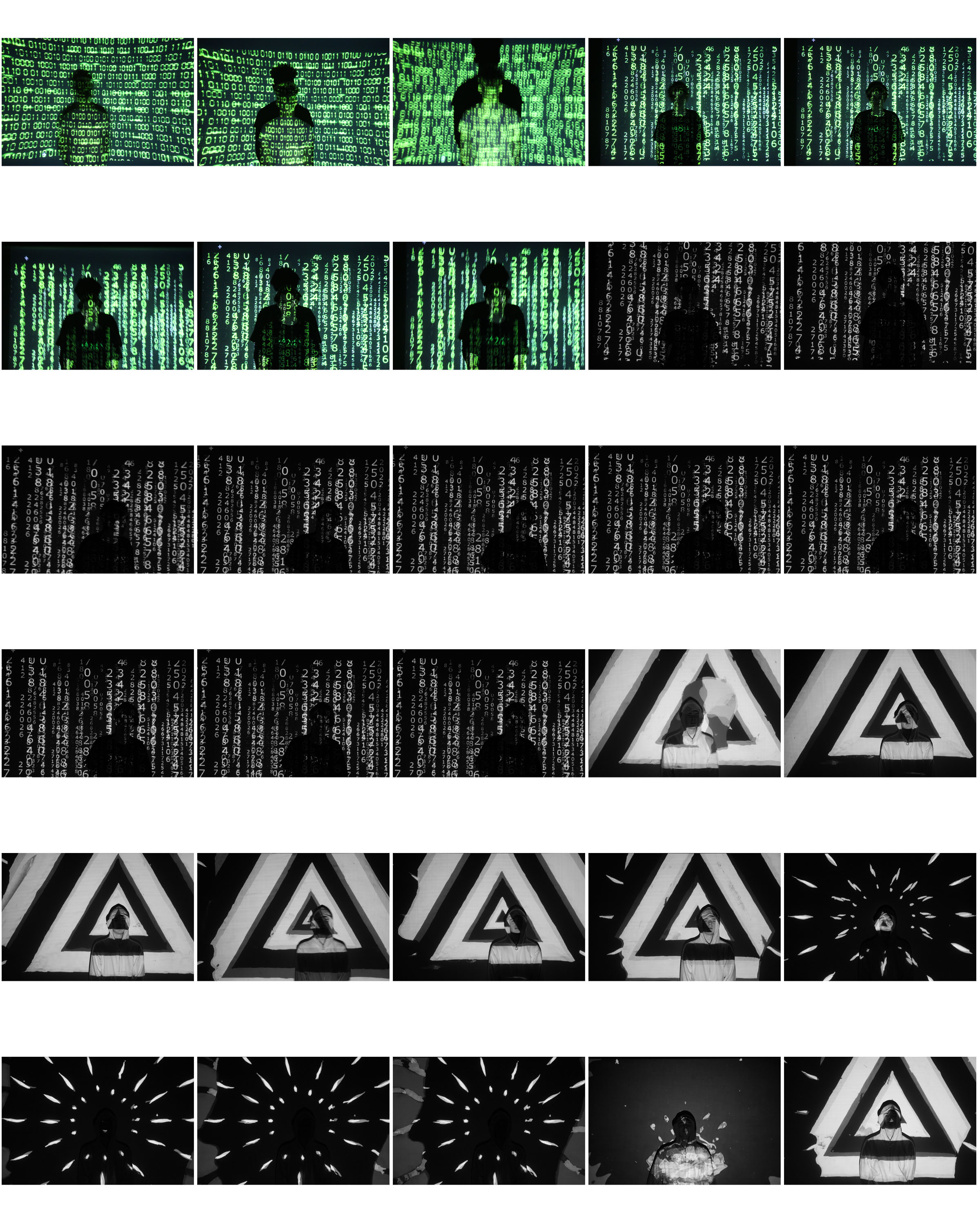
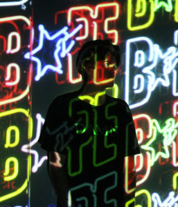
French was on of the first photographers who thought about how photo projection on a human body could create a new type of art. He started this form of work in the 1960s, where he photographed models with floral and 60s style patterns projected onto their bodies instead of clothes.

Image result for john french projector photographerImage result for john french projector photographer

Photo Analysis
Image result for john french projector photographer

Editing Process

EDITING PROCESS

This post will be a step by step run-through of how I am Photoshopping the images…

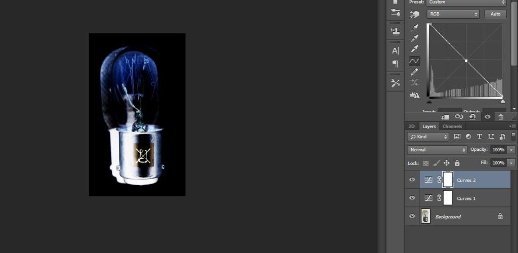
The first part of the editing process can be approached in two ways, so I will run through both

Part 1-

Approach 1

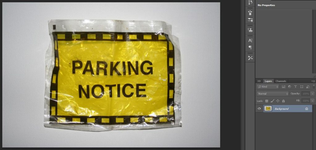
 1 – Open one object/photograph in Photoshop.

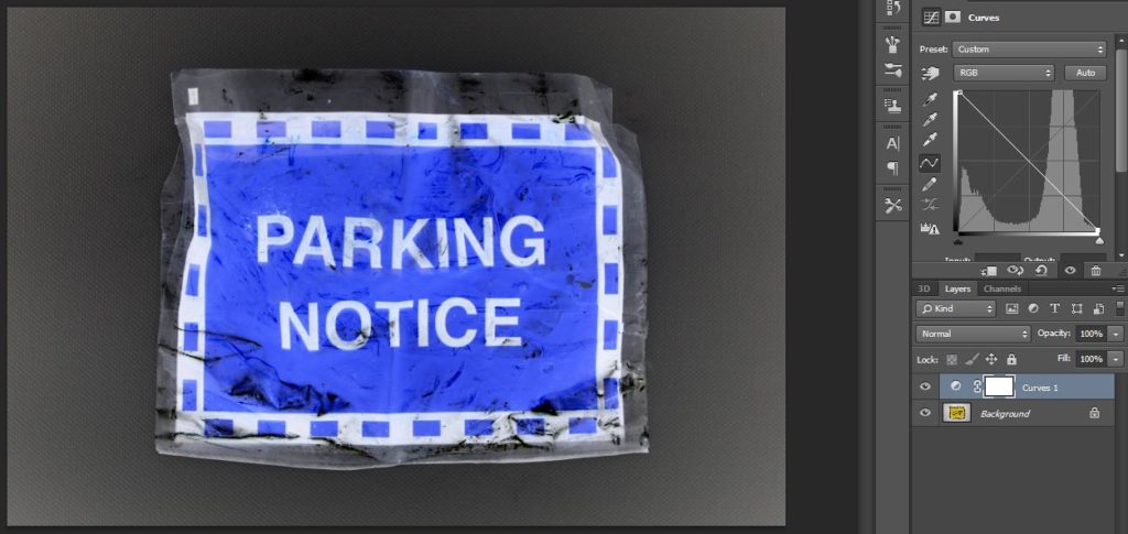
2 – Use the curves tool in order to invert the image.

3 – Use the curves tool in order to get rid of any surrounding tones that aren’t black (as the black tones are removed later in the process when merging/overlapping the objects.)

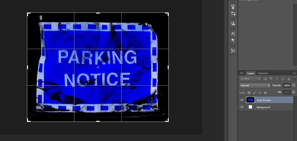
4 – Once it is only black surrounding the object, crop the image as close to the object without getting rid of any of the object.

Approach 2 

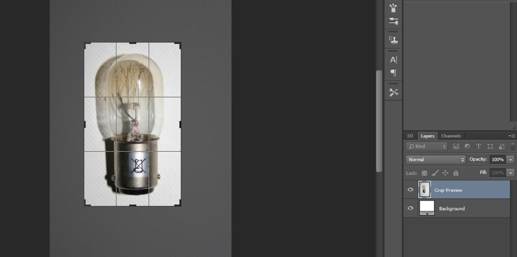
1 – Open object/photograph, and then crop close to the object.

2 – Use the curves tool in order to remove any tones surrounding the subject that aren’t white.

3 – Then open a second curves tool in order to invert the image (as long as all tones around the subject were white before doing this, then once inverted all surrounding tones will be black.)

Part 2-

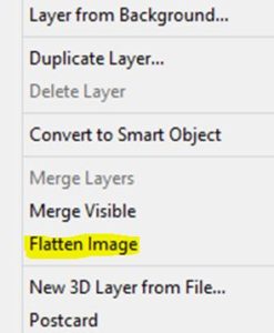
1 – By right clicking on the image layers flatten all images that you wish to compose.


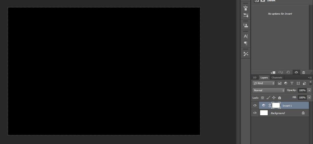
2 – Once the images are flattened, open up a new blank Photoshop file

3 – Then use the invert tool to turn the image background black.

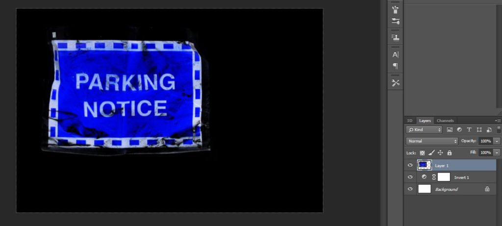
4 – Drag the flattened images into this piece.

5 – Position the images as you wish (As you can see, the black of the images overlap…)

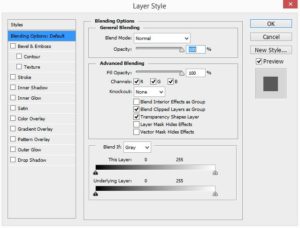
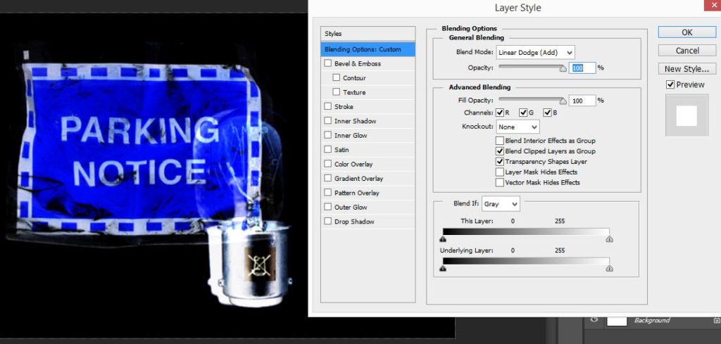
6 – In order to remove get rid of the black/ blend the images together, double click on the image layer to open up blending options, in which you can edit how images overlap due to the opacity of certain tones within each image.

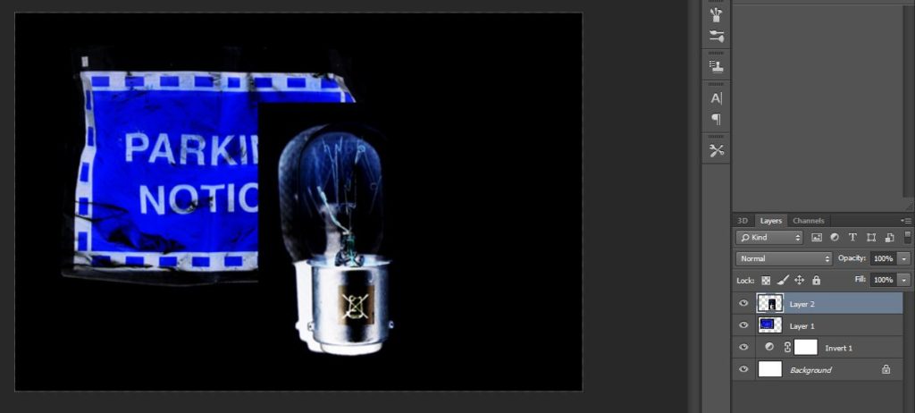
7 – In this case the black tones need to be removed from the images, therefore, using the blend mode drop down change ‘Normal’ to ‘Linear Dodge (Add)’ and leave the opacity at 100%. As you can see on the left of the image below, this removes any black tones of the image, but any necessary black in between is filled in by the black background.

Secrets, Codes and Conventions – Fourth Shoot

Planning

Task – Take 150-200 photos exploring the theme of exploration under the key word ‘secrets’

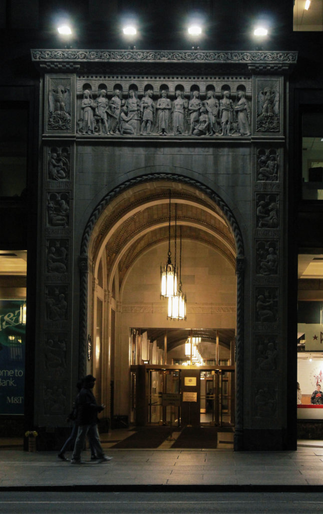
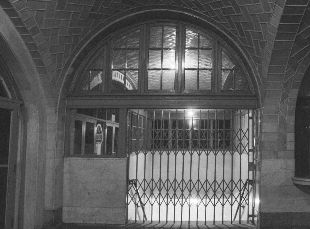
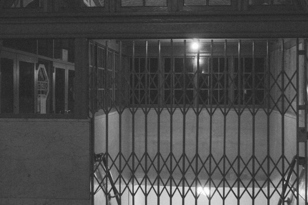
Props – I will be using the city of New York and its subway’s in my photographs

Camera Settings – I will be using completely different camera settings throughout the shoot as I will be exploring different areas.

Lighting – I will be using daylight and artificial light

Location – New York

Context – I am looking at the theme of exploration for my AS level externally set assignment.

Concept – I hope to take photographs of the secrets that are within New York City whilst taking inspiration from Gregory Berg and Robbie Shone.

My Edits

Favourite Photograph

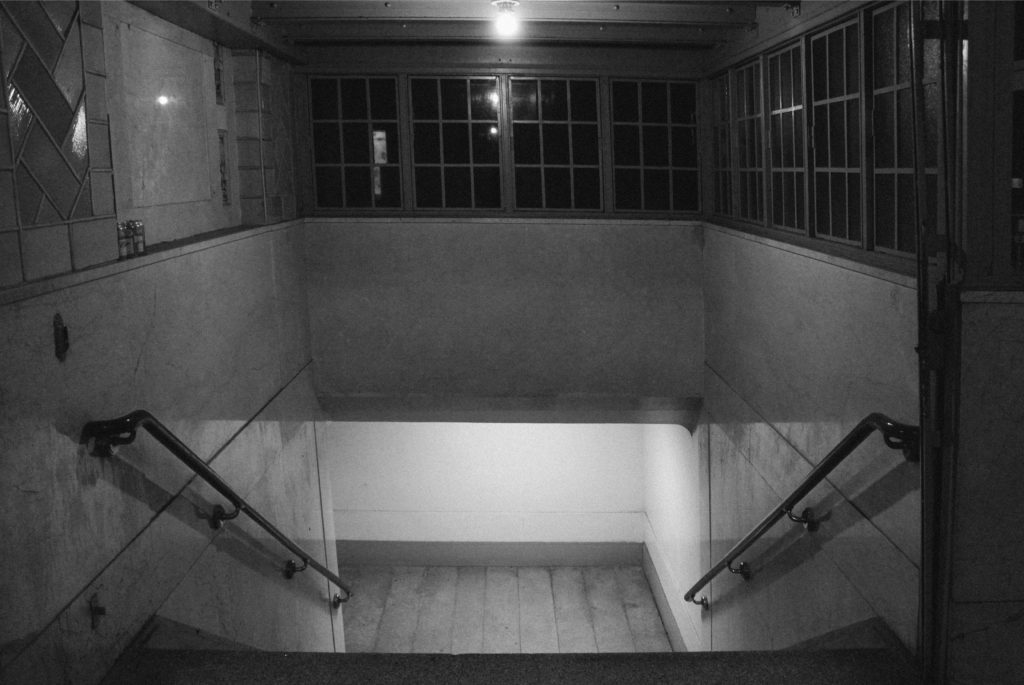
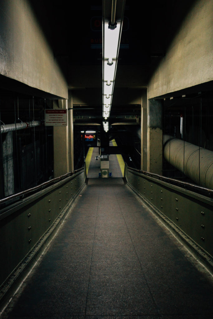
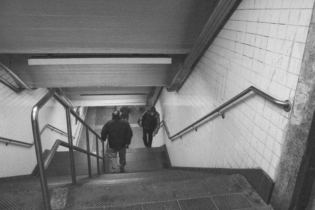
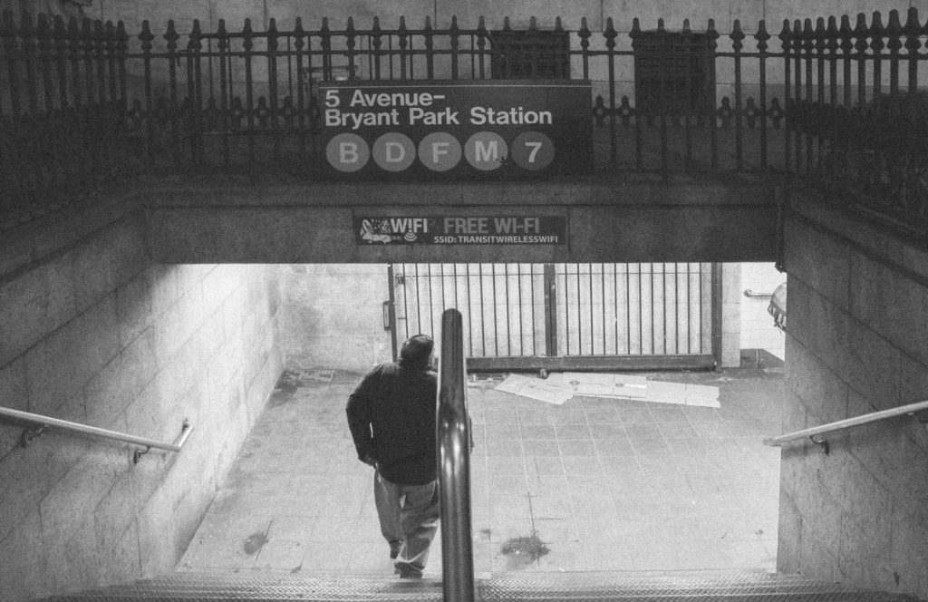
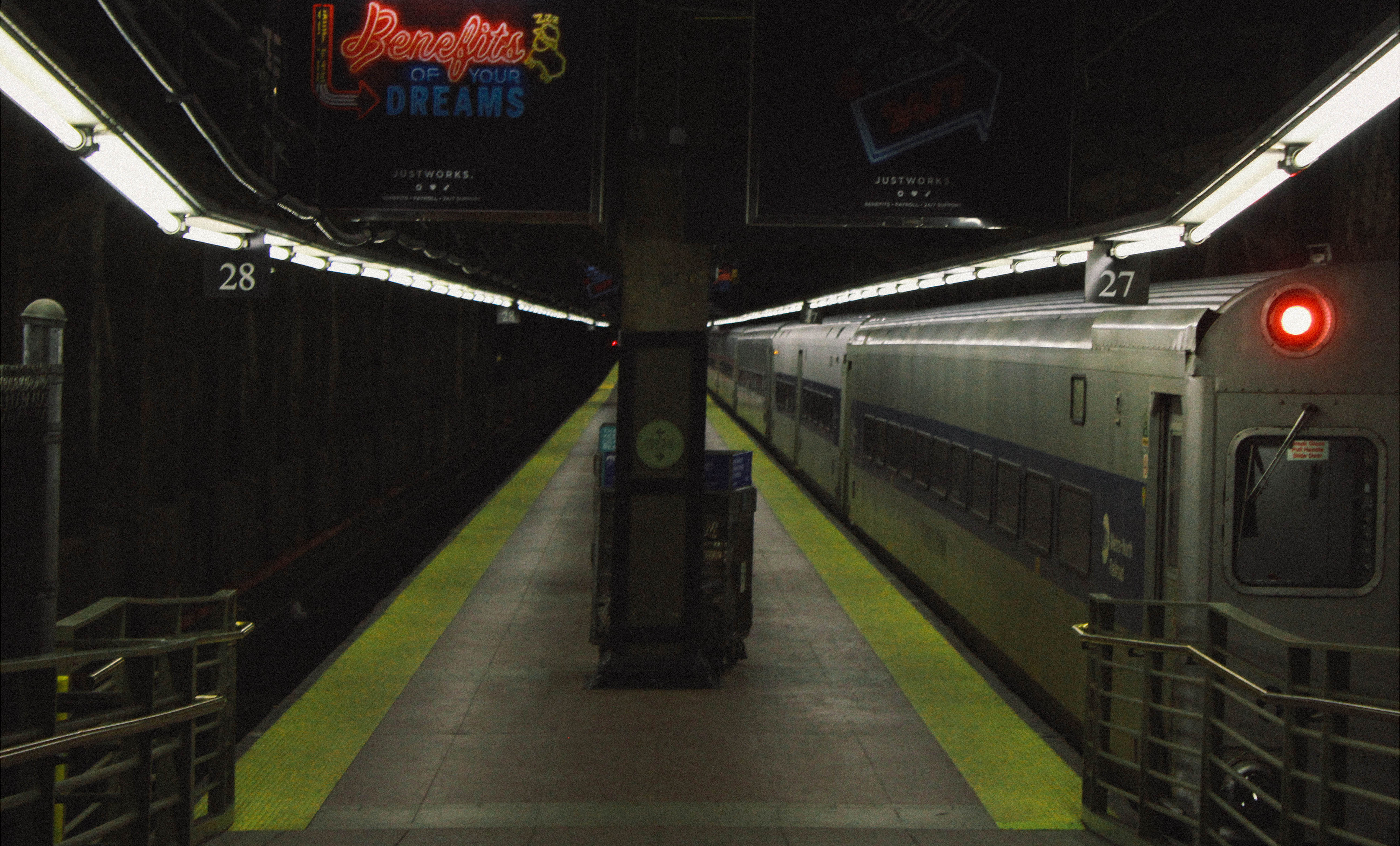
In this photograph I used the harsh lights of the subway to illuminate the photograph. These harsh lights created contrast with the rest of the dimly lit subway.  This photograph is slightly underexposed on purpose as it creates a mysterious feeling within it. I used a deep depth of field to capture this photograph in order to capture the depth and length that the subway travels. I used a shutter speed of 1/40 with an ISO of 200 in order to capture the photograph in the dimly lit environment whilst keeping the quality of the photograph as high as possible.

The colours within the photograph are quite faded and dim – this is to reflect how the subway is tucked away underground and is quite dark and can be quite intimidating with some of the characters that can be found within it.  There is quite a dark tonal range within this photograph other than the harsh lighting which adds to the mysterious vibe in the photograph. There is a 3D effect within this photograph due to the depth of the subway and the pathways within it. I placed the pillar central with the lights coming off to the side almost symmetrically in order to create a more appealing photograph. The pathways in the photograph help to lead the eye from the foreground to the background.

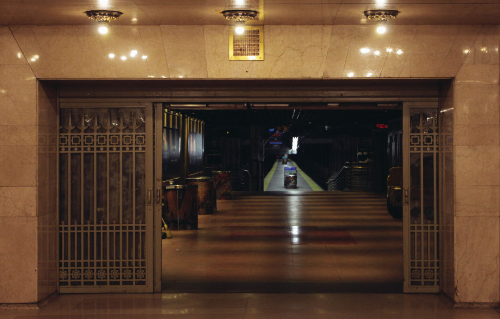
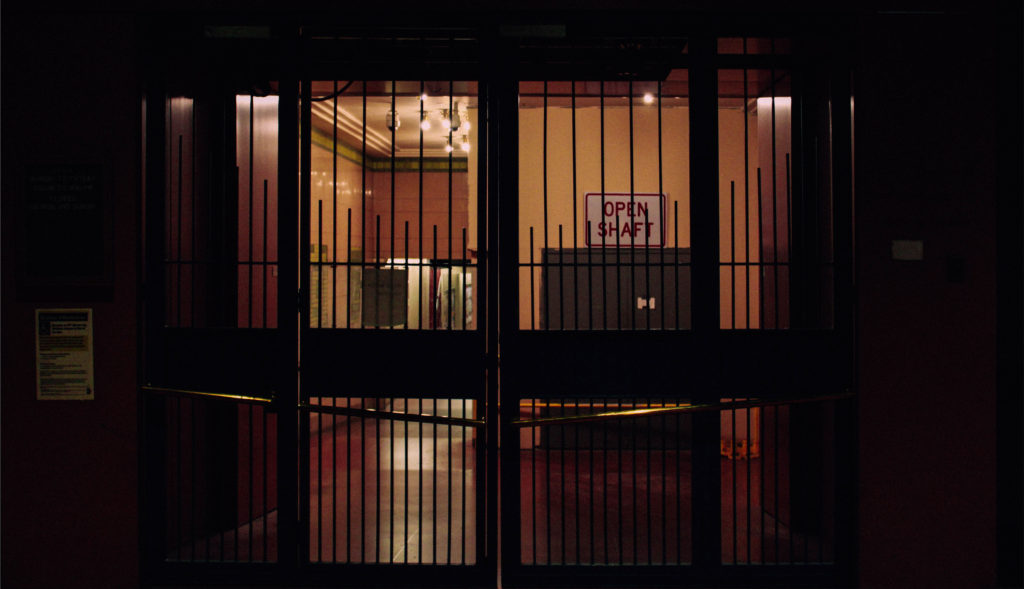
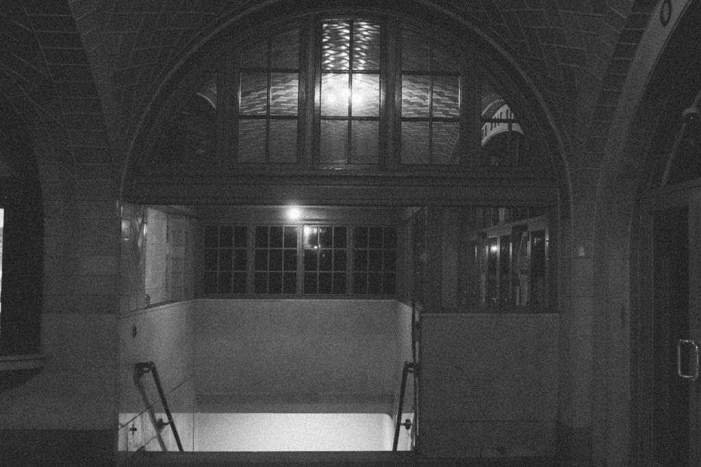
When composing this photograph I had the work of Gregory Berg  in my mind – I used the setting of the New York underground and captured it as if it was deserted. This showed the exploration within the underground and how it can vary from being packed with people to having no people around, whilst this is going on there is a whole other world walking around above this. This tucking away of the underground introduces lots of interesting characters in the subways which people native to large cities would not normally see, and this exploration shows secrets of the city and the underground.

Walker Evans

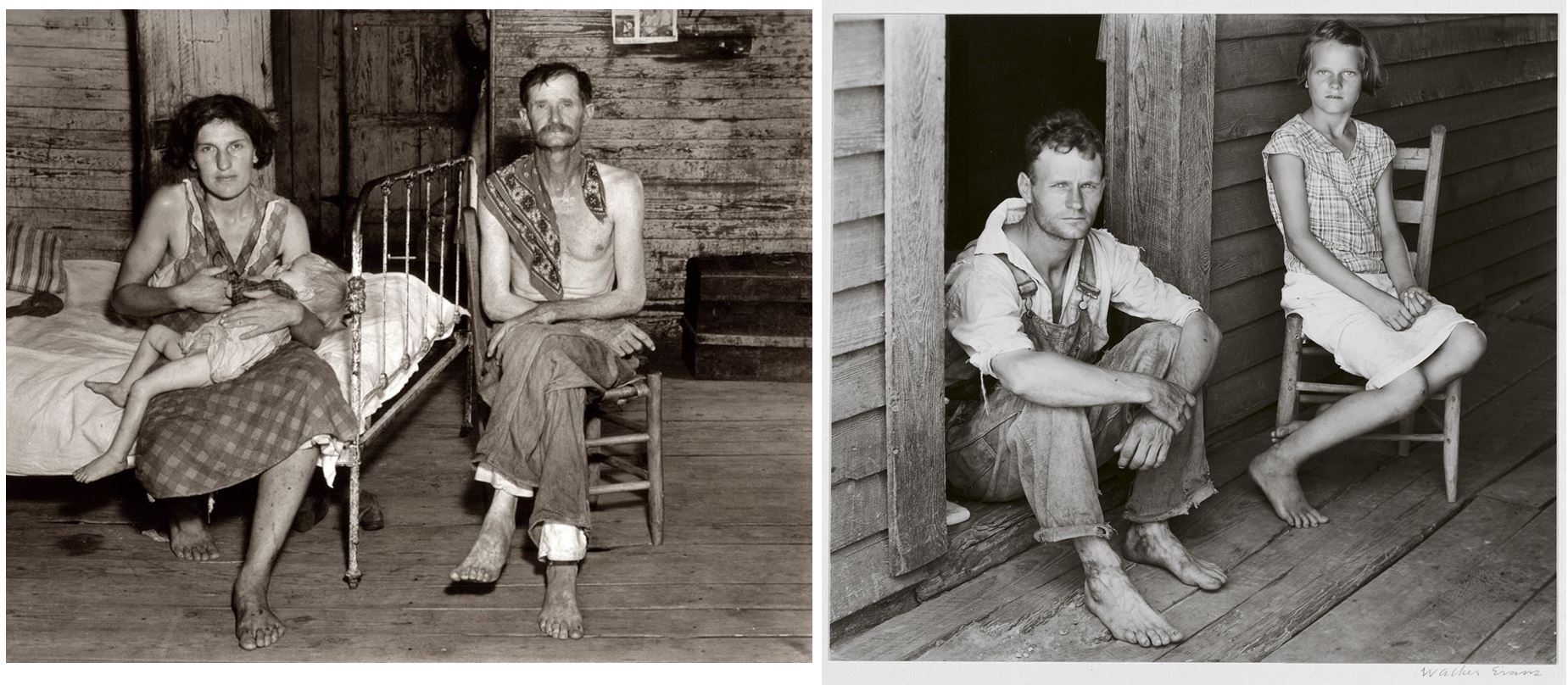
Walker Evans (born November 3, 1903) was an American photographer and photojournalist whose influence on the evolution of ambitious photography during the second half of the 20th century was perhaps greater than that of any other figure. Evans had the extraordinary ability to see the present as if it were already the past, and to translate that knowledge and historically inflected vision into an enduring art

His principal subject was the vernacular—the indigenous expressions of a people found in roadside stands, cheap cafés  advertisements, simple bedrooms, and small-town main streets.

Evans began photographing regularly in 1928, while living in New York City.  It was his goal to become a professional photographer, although it was difficult to find work.  His first big break came in 1930, when three of his photographs were selected to be published in a poetry book by Hart Crane, titled The Bridge.  This early work foreshadows his life-long interest in the imagery of urban architecture and industrial construction.
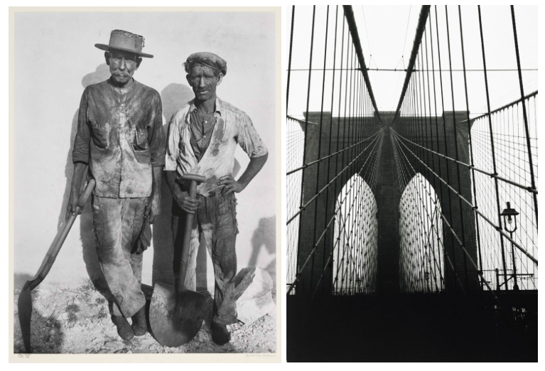
In 1933, Evans traveled to Cuba to take photographs for The Crime of Cuba, a book by American journalist Carleton Beals.  Beals’s goal was to expose the corruption of Cuban dictator Gerardo Machado.  For this project, Evans produced a number of portrait photographs using laborers, miners, and dockworkers.  He also documented the urban street life in Cuba, including images of vendors, pedestrians, and signage.  All of these themes would reappear in Evans’s later work for the FSA.

Mature Period

Photography flourished under the Great Depression, thanks to Roosevelt’s New Deal, which paid artists to work. The Farm Security Administration hired Evans alongside other photographers to document the government’s improvement efforts in rural communities. Unconcerned with the political ideology behind his assignment, Evans spent the better part of 1935 and 1936 eloquently capturing the aesthetic texture of ordinary life via rural churches, bedrooms, faded signs, and rumpled work clothes. He avoided using upscale equipment. Despite being familiar with and capable of affording the latest technology, Evans used an outdated camera with a very slow lens.
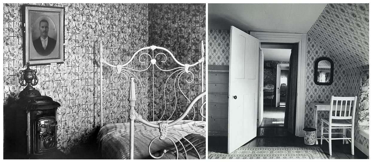
Evans’ interiors function like landscapes that open up towards other worlds, largely through the particular attention that he pays to the inanimate objects that are present, almost representing them as characters themselves

His book titled – Message from the interior – is both open and reserved, preparing the reader not only for its subject matter, but also for the atmosphere of intensity it contains. Here, through objects and places, the he speaks to us of absence, the difficulty of communication and the passage of time.
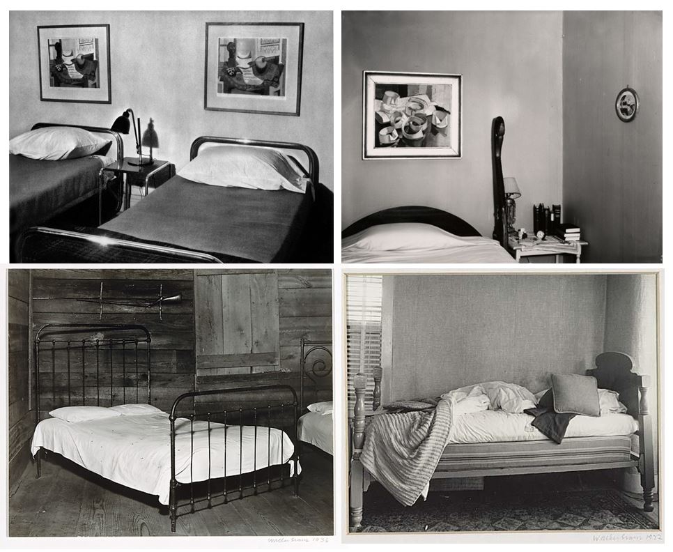
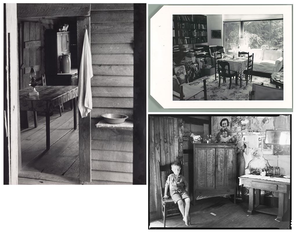
Walker Evans picks out details that unsettle our delicate balance with portraits set in living rooms, kitchens or bedrooms. On first impression, the meticulous layout of the images leave room for the disciplined and temporarily deserted places that they depict.

None the less there is resistance, in spite of all of these codes and the apparent passivity of these empty, predetermined spaces. Life is indeed present, in the smell of the wallpaper, the sound of the wooden floors, the slight movements of dust particles and the lengthening of shadows.

These spaces, now emptied of their occupants, rediscover their own life, perspectives stretch out or become flattened; shadows recompose themselves into sculptures, as the objects take over the roles of the missing occupants and complete the story.

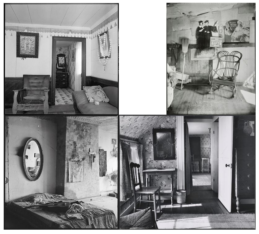
Most of Evans’s best work dealt not with people but with the things they made: he was concerned most of all with the character of American culture as it was expressed in its vernacular architecture and in its unofficial decorative arts, such as billboards and shop windows.

In Evans time, there were essentially two competing philosophies of photography: Documentary vs. Pictorialist. Documentary strove to represent the world as it was, flaws and all; Pictorialism produced a selective, transcendent view of the world, akin to traditional Western painting. Evans’s work, a blend of these two philosophies, brought greater nuance to the practice of photography. As he put it, “What I believe is really good in the so-called documentary approach to photography is the addition of lyricism… produced unconsciously and even unintentionally and accidentally by the cameraman.”

During the winter months between 1938 and 1941, Evans strapped a camera to his midsection, cloaked it with his overcoat, and snaked a cable release down his suit sleeve to photograph New York City subway passengers unawares.
For Evans, the subway portraits  were an attempt to capture the ultimate purity of a recording method without human interference.  He sought to reflect ordinary life in an organic and natural way.  The subway portraits were also, in many ways, a rebellion against studio portraiture and the commercialization of photography.  Evans criticized the inherently artificial nature of typical portrait photography, with its use of costumes, make-up, props, and posed stances.