Category Archives: Externally Set Assignment AS

Filters

Author:
Category:

Case Study William Eggleston

William Eggleston born 1939 is an American Photographer who is highly credited for the population of colour photography as a legitimate artistic medium to be displayed in art galleries
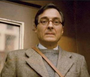
.From an early age, he was also drawn to visual media, and reportedly enjoyed buying postcards and cutting out pictures from magazines.ggleston’s early photographic efforts were inspired by the work of Swiss-born photographer Robert Frank, and by French photographer Henri Cartier-Bresson’s book, The Decisive Moment. Eggleston later recalled that the book was “the first serious book I found, from many awful books…I didn’t understand it a bit, and then it sank in, and I realized, my God, this is a great one.”[1] First photographing in black-and-white, Eggleston began experimenting with color in 1965 and 1966 after being introduced to the medium by William Christenberry. Color transparency film became his dominant medium in the later 1960s. Eggleston’s development as a photographer seems to have taken place in relative isolation from other artists.


Image AnalysisImage result for william eggleston

In this image Eggelstion has used the natural day light to highlight this image, could have been taken during the ;golden hour’ as the overall image was warm orange to which can normally only be found during these hours. The shadows that have been created due to the placement of the sun have help to create contrast within the image. A deep depth of field looks like it has been used as the whole of the image is in focus .A fast shutter speed would have been used so large amount of light wouldn’t be able to get into he camera and make the image too-overexposed. The colour palette is made up of bright and pastel colors such as pink,yellow,blue and grey theses colour created a bright and playful tone for the image. The image is entitled ‘Untilted’ from his project The Democratic Forest 1983

Lewis Bush

Who is Lewis Bush?

Lewis Bush  was born in 1988 and is a British photographer, writer, curator and educator. He aims to draw attention to many forms of power that operate in the world as he believes it is by nature always “abusive, arbitrary and untransparent”.

Bush  studied history at the University of Warwick and gained a master’s degree in documentary photography from London College of Communication.  He also lectures on photojournalism and documentary photography at LCC.

From 2011 to 2016 he wrote and edited a blog about photography, Disphotic. Its tagline was “Exploring photography and it’s [sic] intersections with journalism, art, and history.

In 2012, for The Memory of History, Bush travelled through ten European Union countries to examine the effects of the European debt crisis, in the context of Europe’s turbulent history of crises that are forgotten, only later to reappear. Bush’s intentions were to show the process happening again, where unresolved history is reappearing “with the economic pain of the present”, using photographs that show “connections between history and the present”.

Bush has  also worked on numerous of other projects for example ‘The Camera Obscured’ where he set up cameras outside sensitive sites around London where he was therefore challenged by security guards. He completed these projects to capture the boundaries that were preventing people from accomplishing things and also the struggles of everyday things.

A selection of Lewis Bush’s images

Image result for Lewis BushImage result for Lewis BushImage result for Lewis BushImage result for Lewis Bush


Evaluation and idea artist comparison

For my chosen final pieces I was mainly inspired by two artist being:

 Midori Harima

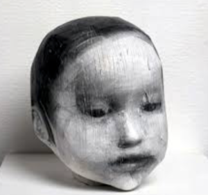
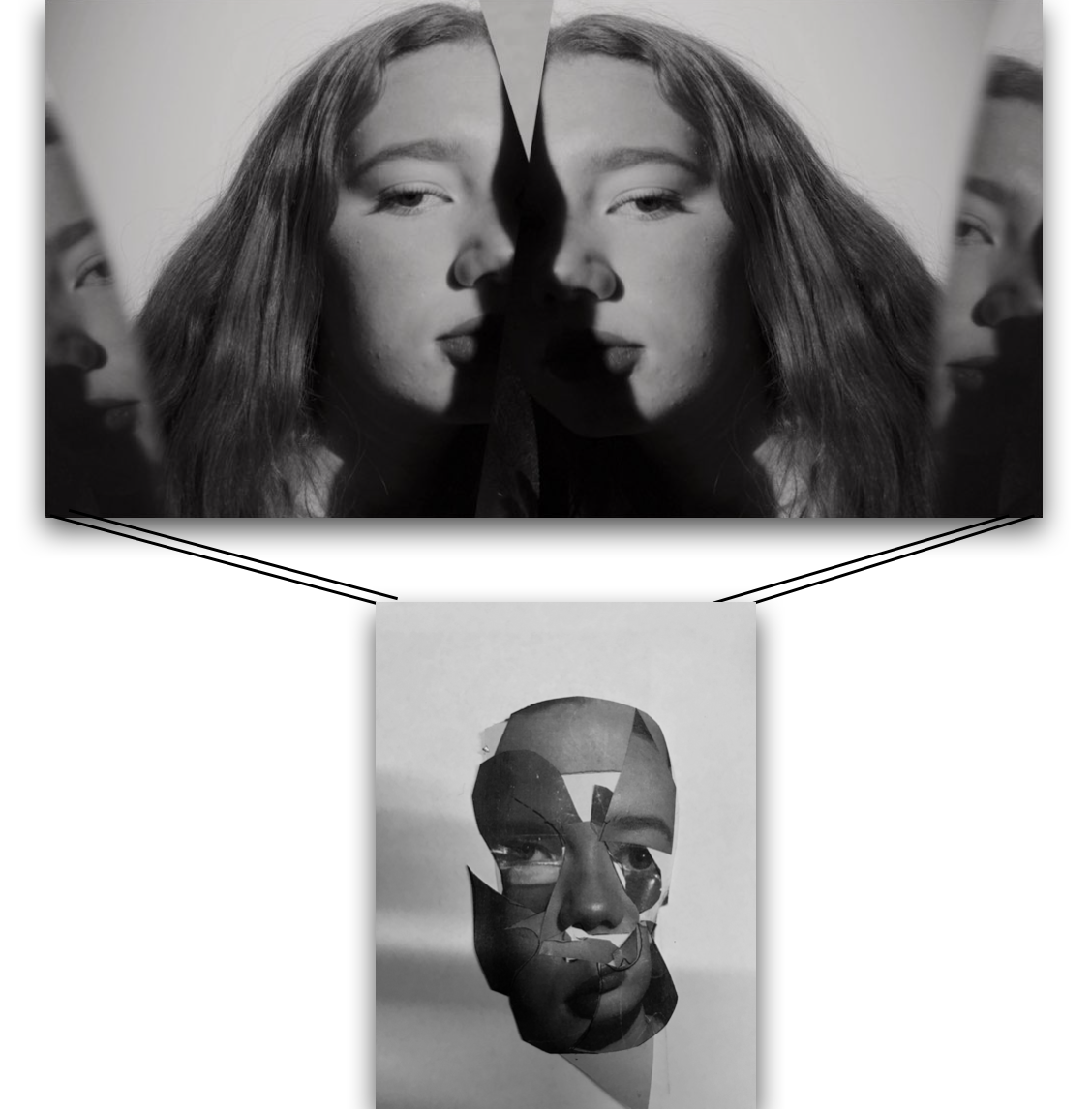
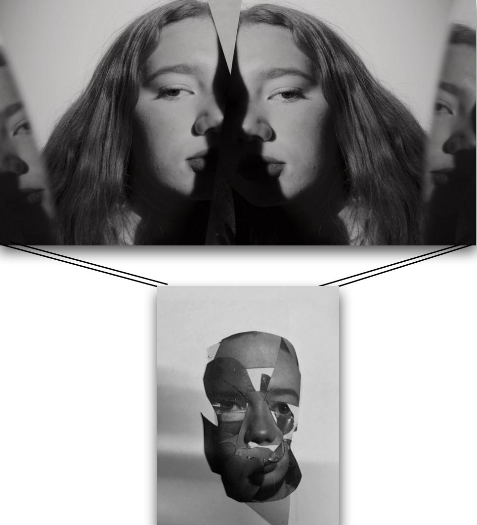
Comparison between artists work and mine:Harimas work is based around creating a 3d collage being a print off of her own image and wrapping this around a head structure to form a sculptor,I interpreted this as cutting up pieces from my portrait images and making this into a collage and then forming it in a curved manner to look 3d,I think it is quite evident to see the similarities between the pieces.And that my inspired piece works well with the techniques used.

conceptually it is an interesting piece as is symbolises different aspects of human emotion, the lighting to form a shadow is also effective as it further enhanced the three dimensional feel to the piece itself.


Connie imboden

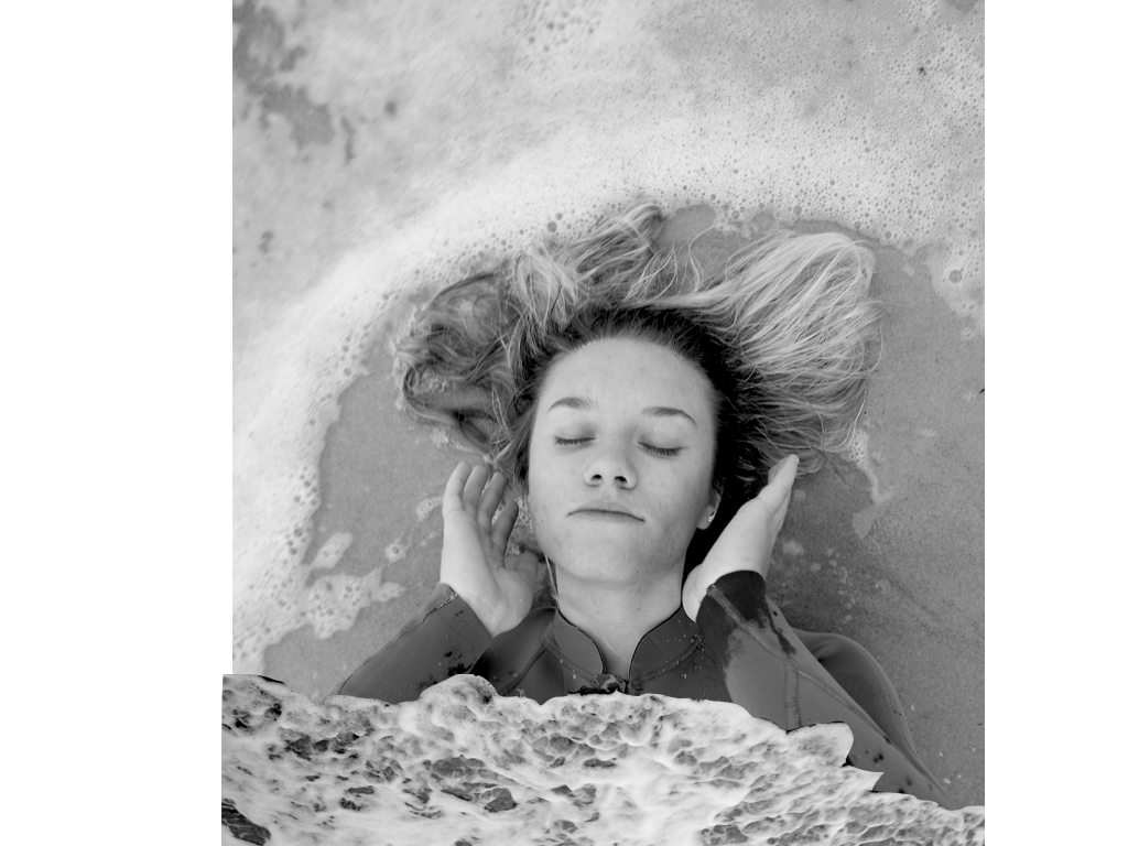
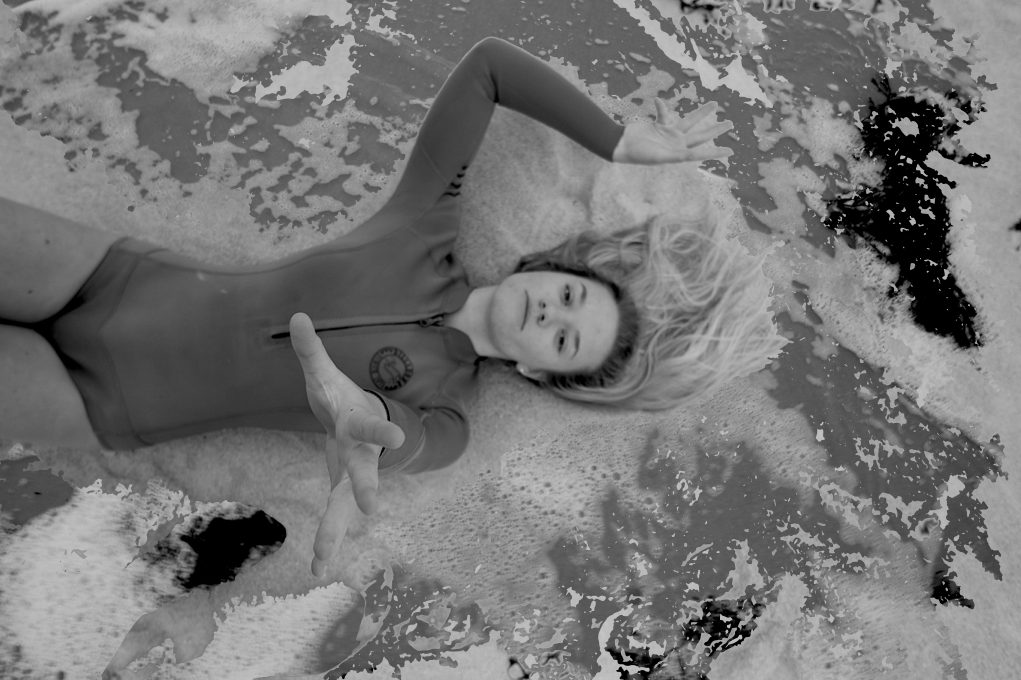
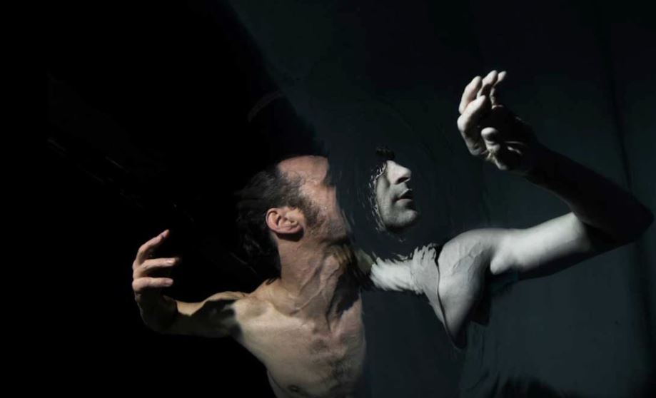
Second comparison:My main inspiration for this was themes of isolation from the behaviour of water, my image is a lot more abstract with a strong essence of movement, yet still has a similar composition and a similar facial expression to the artists work.Due to the unreliability of how the sea would be I think this is the most accurate presentation I could have to the artist. My other images all still carry the same concept of her work throughout.

Overall evaluation of project and final display:

Overall I think this project is very different to any work I have done before and very diverse within itself which using collage, themes of nature and behaviour; and finally  mirroring and editing techniques to remove features of a persons identity.I am happy with the final images I am left with and think they do reflect what I originally wanted to show through my work from the start. My work is clearly inspired by my artists but not a complete carbon copy,making  sure to add my own technique or additional themes of  human behaviour, isolation or loss of identity. when focusing on the words of:codes,conevtnions and secrets I feel as though I have touched on them all, being the ‘conventions’ of human behaviour and how we as humans are influenced through others behaviours,and also the unreliable behaviour of nature. Secondly ‘secrets’ is seen through the loss of identity and removal of features alongside the lack of presentation to people we think we know. lastly ‘codes’ is seen through the repetition of these characteristics  throughout many groups of people as if it is a code to be followed. There is a large range of editing between each shoot, the shoots are more concentrated on removal of identity I edited out significant features and used this to enhance the images.I also used photo techniques of mirroring and collage ,so overall using a large combination of many different ideas.The majority of my work is purely tonal shades of black and white, this is due to this being more appropriate to the pieces and themes behind them. At the beginning of the project I wanted to focus more on surrealism and I do think I have incorporated  some of these themes into my work, although I do think it has come out more of a direct portraiture observation,but with a complex presention and still does not fit wihtin the generic conventions of portraiture work.Overall I think this project is very unique and does apply to my themes and the outcomes I think all work well together.


Comparison of my work with Inspirations

Related image

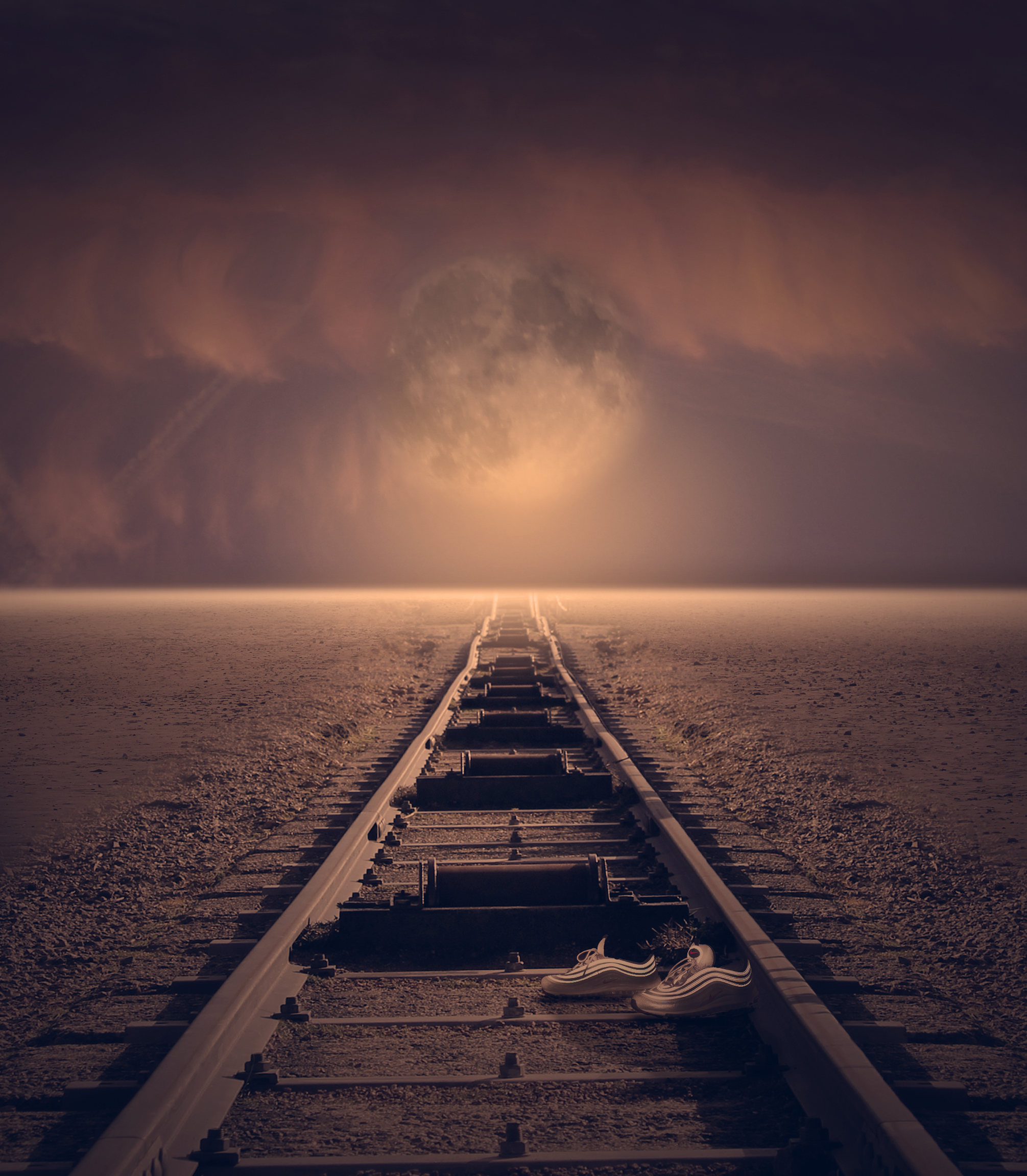
This final edit has been crafted through inspiration taken from all of the artists I have looked into. Most of all Thomas Barbey, who’s work is shown at the top. The main inspiration point i have taken from Barbey’s work is the conceptual ideas that he portrays through his cleverly manipulated photos. The generic ideas behind his photos are that humans are over ruling the world and recklessly destroying it with unnecessary man made features. He does this by exaggerating the effects we are having and combines two images to do so. In this case he has taken, what appears to be someones house corridor and put the golden gate bridge going through it. The cars on the road are clear indications of humans, and that it is us destroying earth. Similarly I have taken a very fantasy landscape image and merged train tracks into the scape to give a sense of destruction. Also I have added a pair of shoes into the photo to show the presence of humans.

The framing, composition and editing style was inspired mostly from Tommy Ingberg. Keeping a great deal of depth within the image, just like Tommy Ingbergs, allows for a sense of secrecy of what lies at the end of the tracks. It also helps to guide the viewer down the picture and be taken on the journey that would be taken by the people who made the tracks and obviously the train that drives down them. It also helps to direct the viewer up into the horizon and then the fantasised sky. The blown out horizon was influenced by Tommy Ingberg however the sky as a whole contrasts with what Ingeberg usually would do. Ingbergs photos usually have a rather aggressive sky with high contrast and menacing clouds, however I have gone for a more tranquil vibe to enhance the beauty of our earth and give this fantasy feeling, along with the enlarged moon. Furthermore, Tommy inberg also has this use of leading lines, consistently through his work as well as positioning his main subject in the middle of his frame, just like i have also done.

The sky, and colouring of this picture in general, was inspired by my first photographer i looked at which is Micheal Steric. There are direct links between the colouring/lighting in his images and my edit. He usually goes for saturated, vibrant feels to enhance the beauty of our world and give a positive view on earth. I believe this is the exact effect that the lighting and colour scheme have in my work and as a whole allow the consumer to be positively influenced that earth is a beautiful place. I have furthered my inspiration from Micheal steric and edited my image to become more fantasised by adding in a large moon and creating interesting reflections from it.

Ability seen within images

your technical ability to record using a camera / lens:
For each shoot I have used different settings on my camera, each with the different aim to either capture,motion,light or a specific focus on my images.To do so I used large lenses to be able to  capture detail and movement within all my pieces,additionally I put my camera setting on macro to be able to capture the detail of the image and not have any blur as this is not the effect that I wanted to capture.


your ability to select and edit images effectively:
when selecting my images I wanted to give a variety of techniques and presentations of human behavior,I have done this by choosing three separate shoots. I chose my primary shoot to be focused on the combination of human and nature behavior and how when formed together present the convention of loss of identity and isolation within the water itself.I chose this shoot as it it the most creative shoot with the combination of editing and real captured shots,I think overall all the images are very dynamic and able to work as individuals too.

your ability to respond to a key artist:
as previously shown my main aim for every shoot was the same theme of human behavior but my inspiration for each shoot was inspired by a different artists,although the main two artist for my final images was Midori Harima and conni imboden,both of their work is used presenting people in different mannerism and showing a more gruesome side to their personalities,I have shown their techniques using collage and additional editing techniques of removing eyes and finally submerging people within water. 
Final display ideas


Set 1;

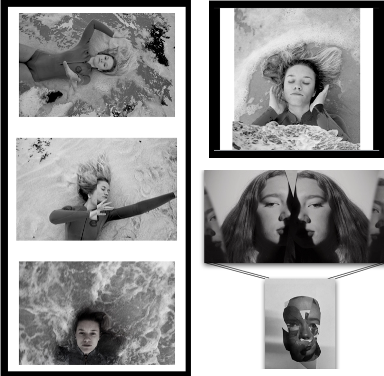
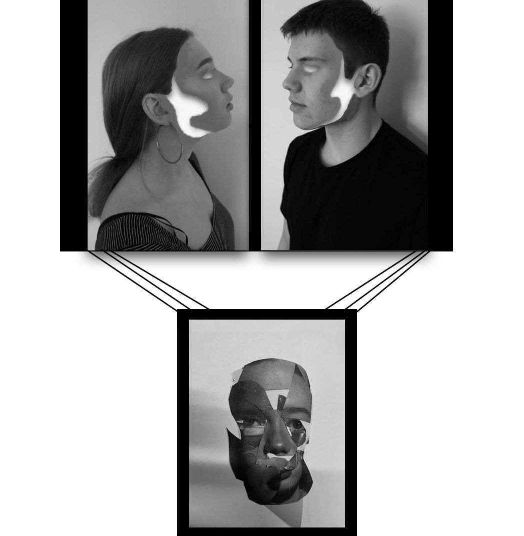
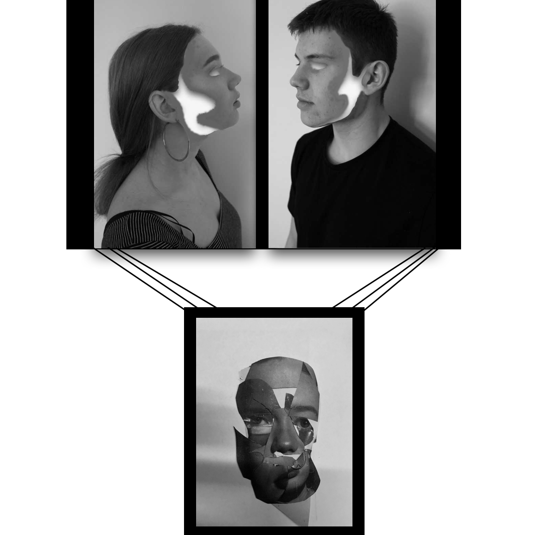
For this final outcome I want to frame all three of these images on window frames with black border, the top two I will lay across a long a3 size board with a small gap in the middle.I said earlier about these images all being highly impactful and able to have them all attached with black strings or metals bars to the image below.This could symbolise as emotion of human behaviour suspended.

However This is the new and updated version,I think the top piece is a lot more effective and works better with the concept of hanging the image bellow,addtinally because this is the same person edited in different manner it is an interesting  overall concept and I think works well.I think these two piece should be a4 size and then attached to each other with a black metal bar or black string. Both of these images will be on white board to make them have more depth and possibly a black boarder surrounding the images.

Set 2;

I will present this piece separately due to it not being landscape and also being more unique as it has the edited wave at the bottom and it being a portrait.The image will be a3 on white board surrounded by a black window frame.

The black boarder on its own removes the light tones and I don’t  think this works best.However the white and black double boarder  is more visually appealing and works better conceptually. I chose this layout as all the images are alined and in from and facing a similar direction, I don’t think it would look as good going horizontal as it would be an uneven too long of a line. I would like all these four images from this set to be a3 and have. a large strong impact altogether.

Overall this is what I want my outcome to look like, I think this overall layout is interesting and will be effective in displaying all the sets of images in the best way.

I think the inner boarder works well highlighting the images but the darker one surrounding is needed to finish off the form of the images,because of this I will put them on white board and then into a black window frame. I will do the same with all the images and then hang and present them like this:


Final images and possible additional editing

My first final outcome range

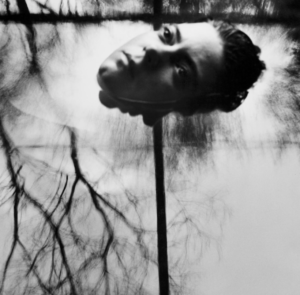
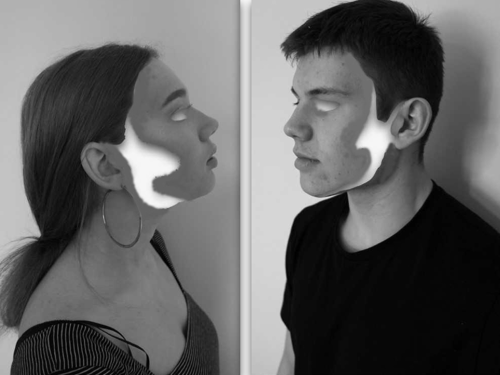
I chose this image as it contains a mirroring self removal of identity and questions the codes and conventions of people and how they act in groups when presented against another being. I think this is successful due to the tones and the removed fragments but after consideration I do not think is the most entertaining or edited to the level I would want for a finished piece.

I chose this to be a final image as it successful conveys my themes of presenting many aspects of human behaviour and emotion presenting one identity and being, due to this being a collage of a photoshoot I had done it is increasingly abstract ,tonally and yet also demonstrates a distortion wihtin people and a secret that we hold in out identity. Overall I think the composition of this image is interesting and still allows a three dimensional  aspect of realism. I think this image has such a strong impact and I would want the size around a3 and to be printed on its own on a large black canvas.

This was originally a development idea for a final piece but I have since released I do not think the top piece is the most successful, because off this I will continue on the idea of hanging the collaged face piece but accompanied with a different piece on top. 

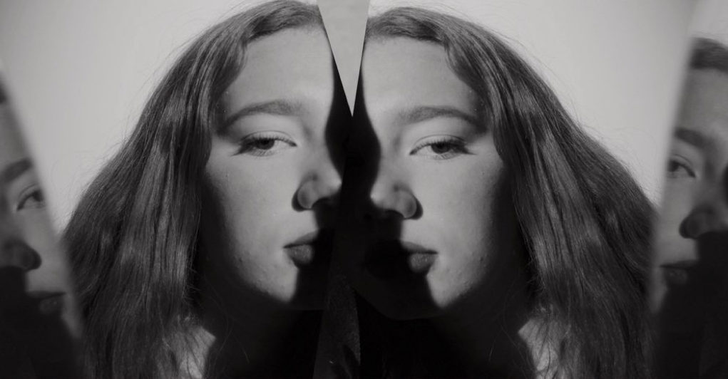
This image I have decided will definitely be accompanied with the collage piece, as it is interesting wihtin the mirror lines and the shades and again connotes a direct eye contact and a humanness mirrored of different emotions of different self, it proposes the idea what is real and if what we are seeing a a reflection of something untrue or if it is real.

I was considering this piece as a final but then have realised it,s not the most effective due to the editing not being the best and not finished to the standard I would want, although it would work well In a series it is not the standard of image I would want  to show.

Second final outcomes

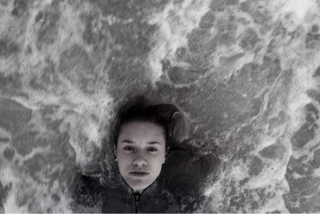
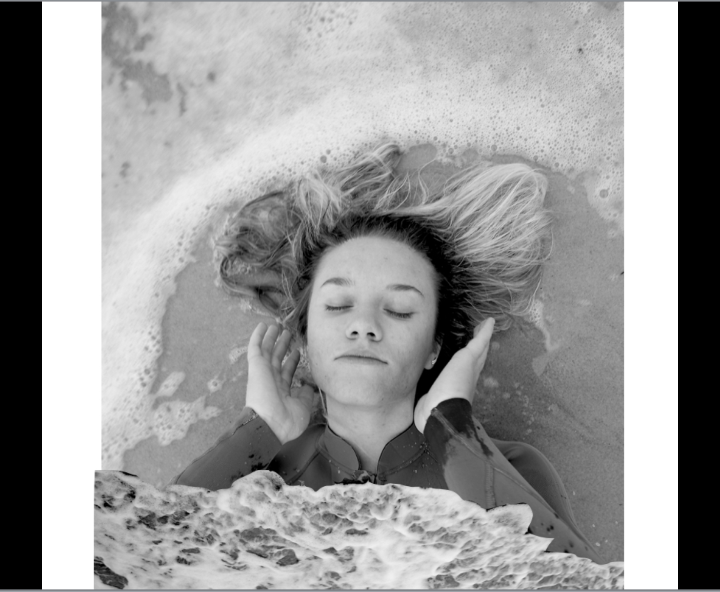
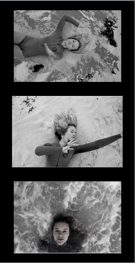
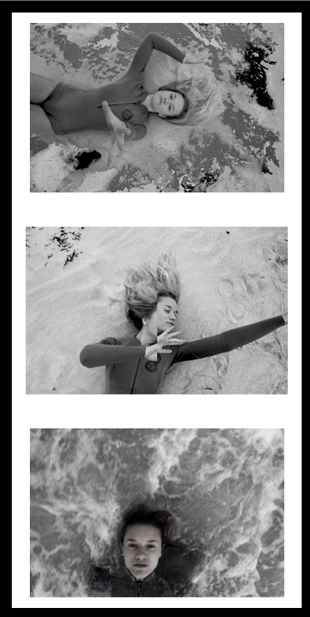
I then decided to focus on these following images as I think the moulding of the behaviour of nature and humans is more effective and the unpredictability of the water accompanied with additional editing has made a more accomplished set of images. I will have these four images as my main set, but separate this profile image and have it as its one successful separate image. I think this image is interesting with the amount of circular curves around the person, this allows a secret of hidden identity and being submerged and separated from society from being wihtin the water. Additionally the wave from below is interesting as it connotes tones of smoke and a gradually movement to the piece.
wihtin this image there is an emotion of isolation but it is highly accomplished and effective with the isolating pale tones of water contrasting to the darker face and direct eye contact to the camera.The composition works well as the face is at the bottom of the image as if it is being swept away.

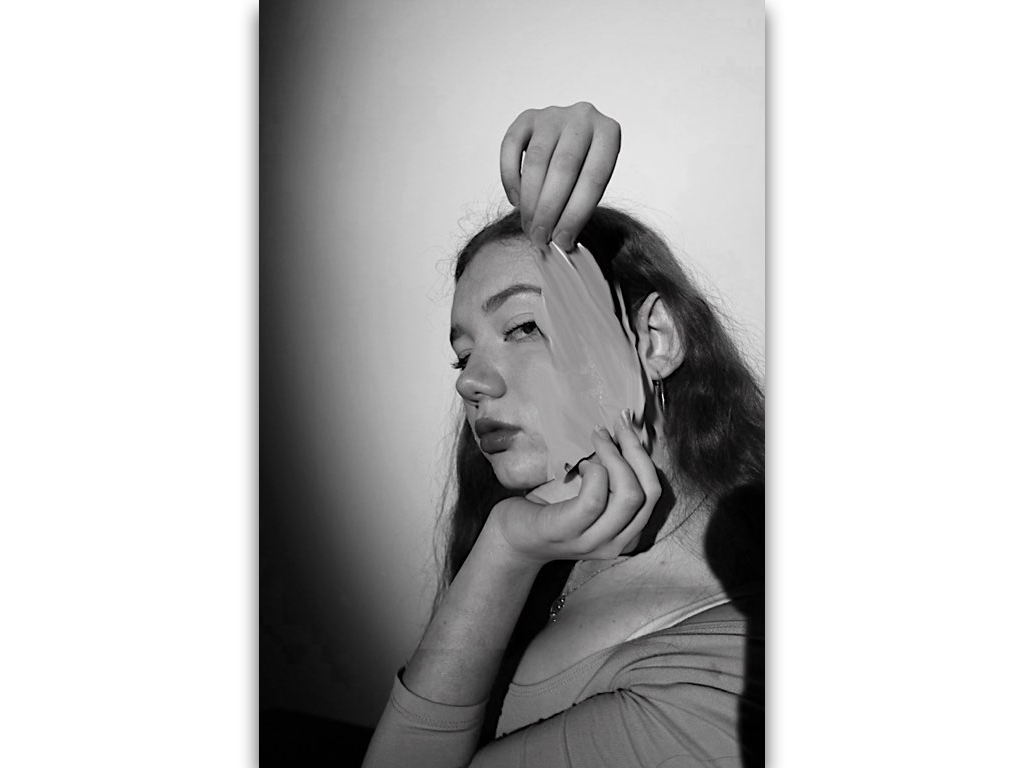
This images I wanted to show a removal of being and an aspect of  trying to escape the image, this simple editing enhances the image and still holds a simplicity.I chose this because it too still sticks to my themes and will work successful among the others. 

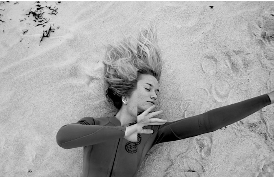
lastly I chose this images as there is a syncricity wihtin the previous and holds themes of escapism and surrleism within the hand almost coming through and out of the image, the textures on the floor also enhance a movement being surrounded by the water.Overall all these 6 photos(2 sets) of images will be successful and still convey human behaviour in two different environments and subject matters.

Light-box Presentation Idea

LIGHT-BOX IDEA

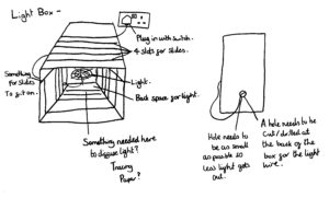
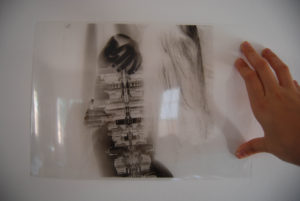
After looking into how X-ray scans work, I have come up with an idea to create a light-box as a method of presenting my final outcomes. In order to create this I will have to have my outcomes printed on acetate sheets, so that they can act as slides to go in a light-box. The inspiration from X-rays was that hard materials absorb x-rays in order to produce a layered image, but with the acetate slides the colour on the slides will absorb light in order to produce an image (X-rays and visible light both being part of the electromagnetic spectrum.) This is because the white from the images will be transparent once printed on acetate, meaning various pieces can be layered in order to create nearly endless combinations of images.

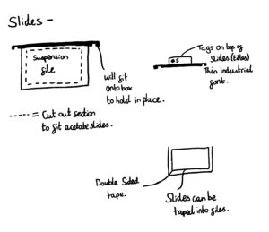
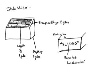
Here are some very quick 5 minute idea drawings for how I would like this light-box to look and function…

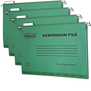
I plan to have my favorite outcomes of my white background images to be printed on acetate and then put inside suspension files because this will make sure the slides do not bend or misshape in the light-box.

Suspension flies
Acetate example

I plan to make the actual light-box either out of scrap wood or a wine crate, as I will need to make it to fit the dimensions of the suspension files.

Here are two simple Photoshop edits of how I expect the images will look when layered in the light-box…

Secrets, Codes and Conventions – Comparing My Work to the Artists

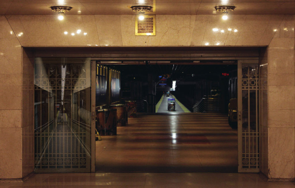
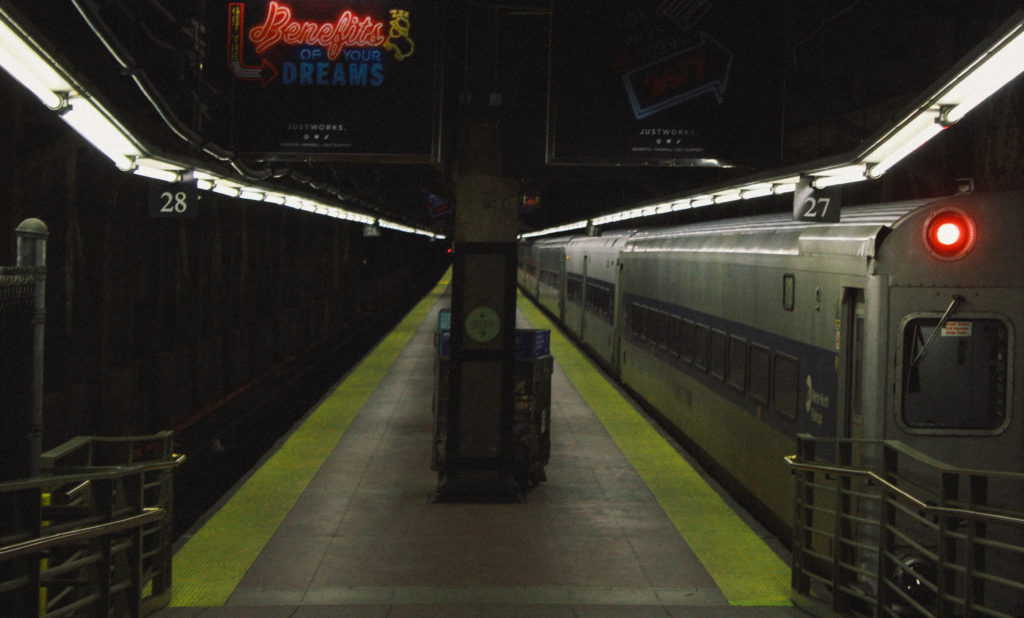
In my final photographs, I have taken some inspiration from each of the artists that I have looked at. The biggest influence on my work was Gregory Berg, I used his theme of long pathways within photographs and used the secrets of subways within my photographs just as he does. I also used the unusual lighting of the subway like Berg did in order to create an uneasy and unnatural vibe to the photographs. Whilst my photographs have similarities to Berg’s work, they also contrast with his work, Berg decided to look at the abandoned parts of the subway and tried to show the secrets within them. I took this and decided to photograph the ones fully in use in order to show how similar they are even though they are constantly cleaned and maintained. The modernness of and cleanliness of my photographs contrast with the dark and forgotten-about subjects of his photographs which shows how quickly things can change.

I also took some inspiration from Emmanuel Tecles’ work. Most of the inspiration taking from his work was shown in my earlier photographs of the secrets and exploration of nature but parts of his work are still reflected within my photographs, such as the subject positioned directly in the centre of the photograph in order to lead the eye to that subject and create some aesthetically pleasing symmetry. Whilst parts of my work do reflect with what Tecles does, it also contrasts with it. Tecles’ work looks at nature taking over urban development whereas my photographs look at only urban development and the structure within it. This also creates contrast within the lighting and shadows of the photograph.

The inspiration for the tunnel themed photographs came from Robbie Shone who looks at caves and exploration. I took inspiration from his exploration of places that would be considered alien to him. Both my photographs and Shone’s photographs have the theme of an end destination through a pathway, this helps to lead the eye of the viewer throughout the photograph. My photographs contrast with Shone’s photographs because mine consists of mad-made straightforward pathways whilst Shone’s photographs consists of natural waves and curves in the pathways which shows the difference between man-made structures and natural structures.

Overall, I have had mixed inspirations for my photographs and I have successfully incorporated these inspirations into my photographs through the use of composition and pathways. This has resulted in interestingly lit but dim photographs with contrast and colours in.
Image result for gregory berg photography

Image result for emmanuel tecles

Image result for robbie shone

Relics Of Technologies Photoshoot and Editing

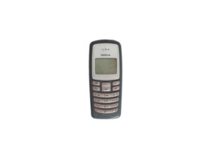
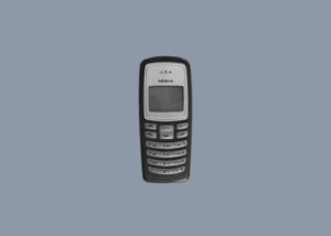
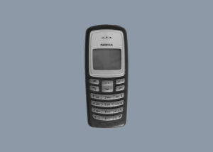
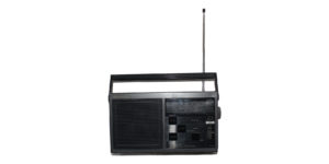
I want to develop my work from my last photoshoot and move on to documenting items linked to technologies from the past, this links to the title secrets codes and conventions because of the codes that are transmitted using technology and how this has changed over time. It also links to the idea of secrets in possessions like my previous shoots and will continue on the theme of my project.

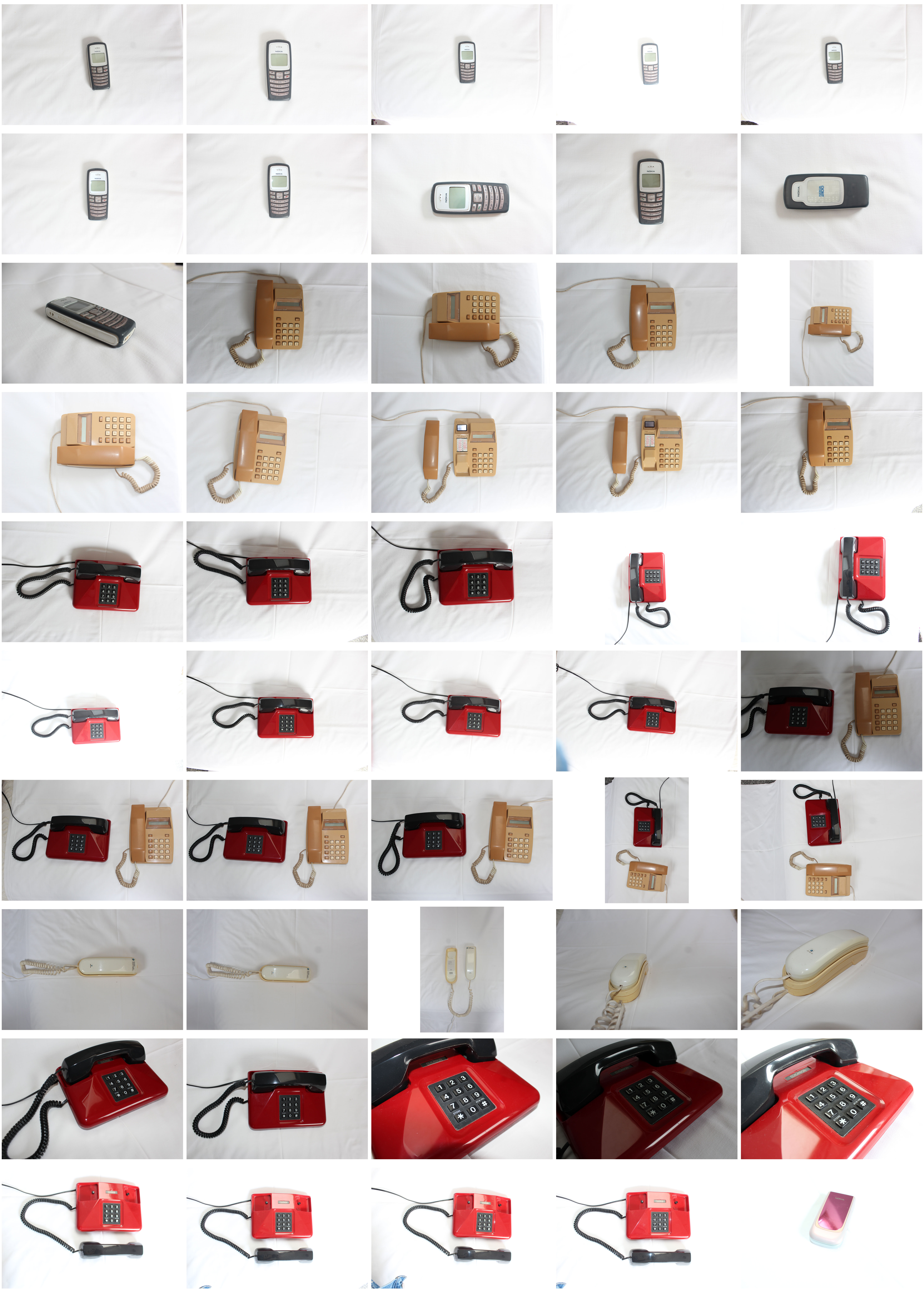
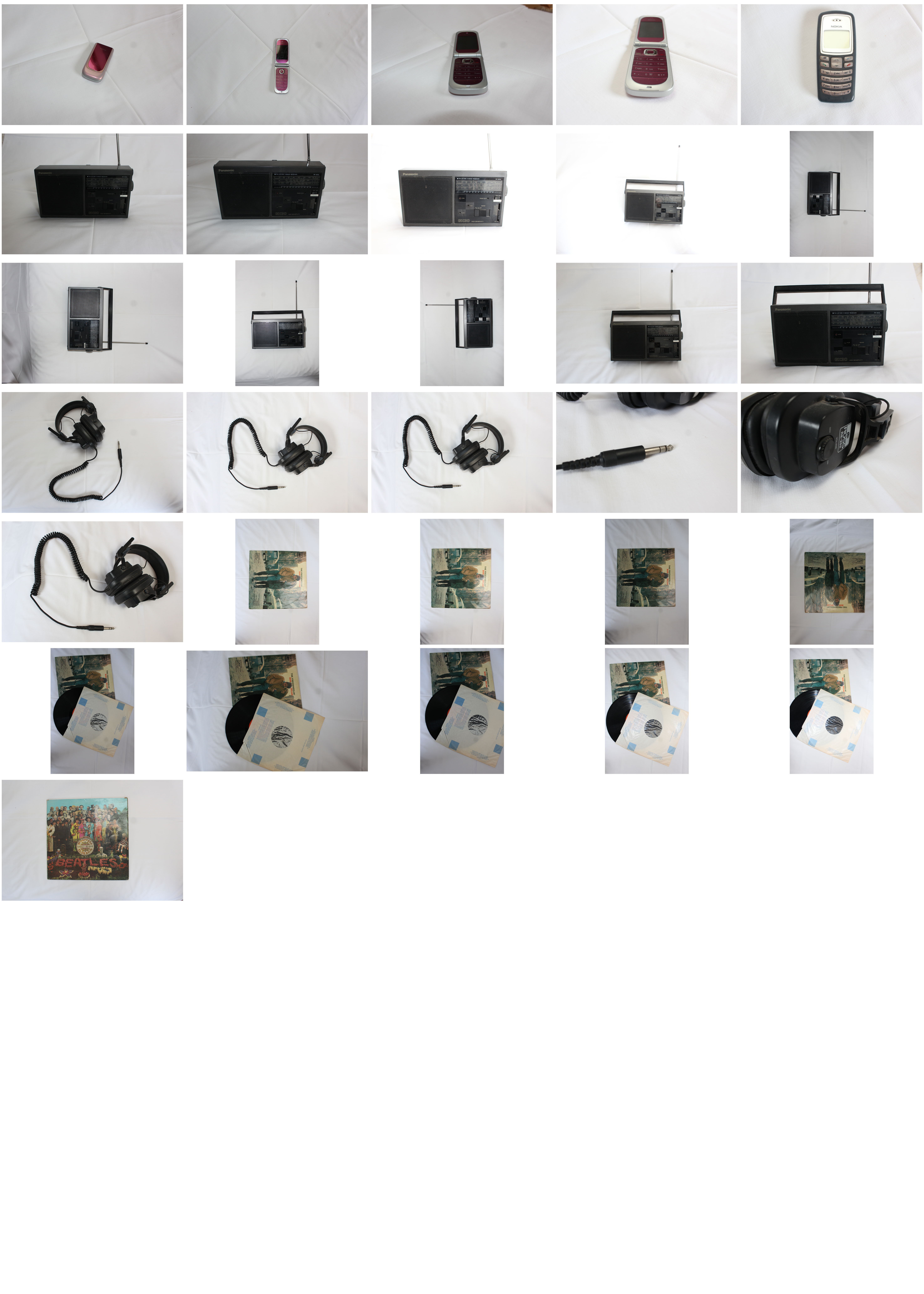
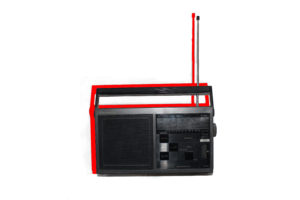
I am going to take photos inspired by Jim Golden and try to achieve a studio style of photo which carefully arranged items. I  will use a white or block colour background which will complement the colours of the items I am capturin

Concept: I am going to take photos inspired by Jim Golden and try to achieve a studio style of photo which carefully arranged items. I  will use a white or block colour background which will complement the colours of the items I am capturing

Location: I will take photos at my grandparents house using com of their old items, i will set up an infinity screen or white background that i can take minimal pictures of the items in front of.

Lighting: I will use natural lighting which will come in from a south facing window, this should reduce the amount of shadows however some will still need ti be edited out.

Camera settings: I will use the manual setting on my camera so i can change the exposure and shutter speed depending on the lighting and the item i am photographing.

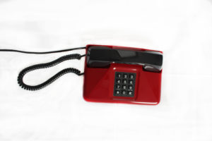
Props: I will need a plain white background and possibly a tri-pod to create a studio style setup. I will also need to gather items which either relate to the history of technologies or that have a hidden story or make the viewer intrigued about it. An example could be diary entries or unique items which could tell a story about their owner and their life.