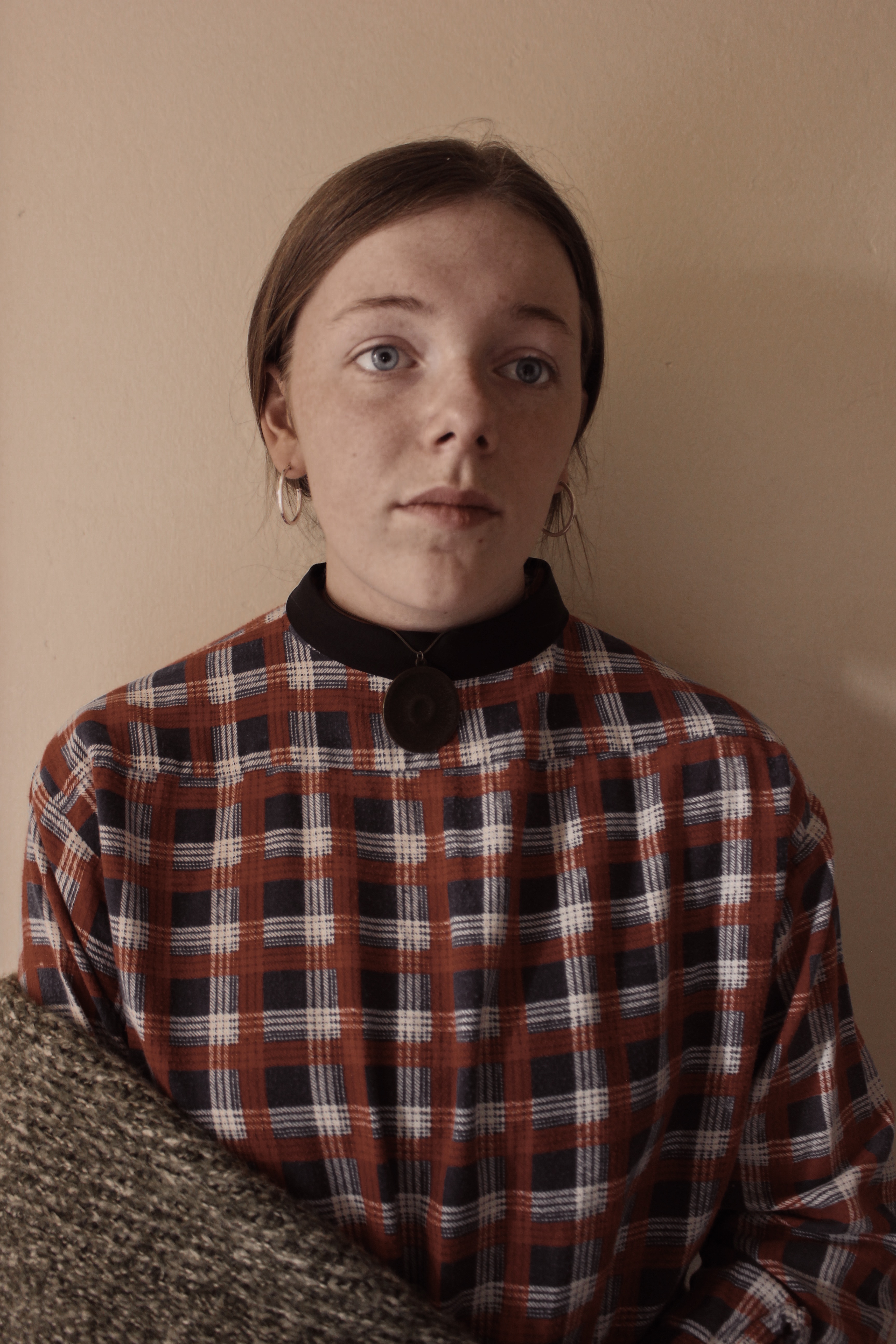
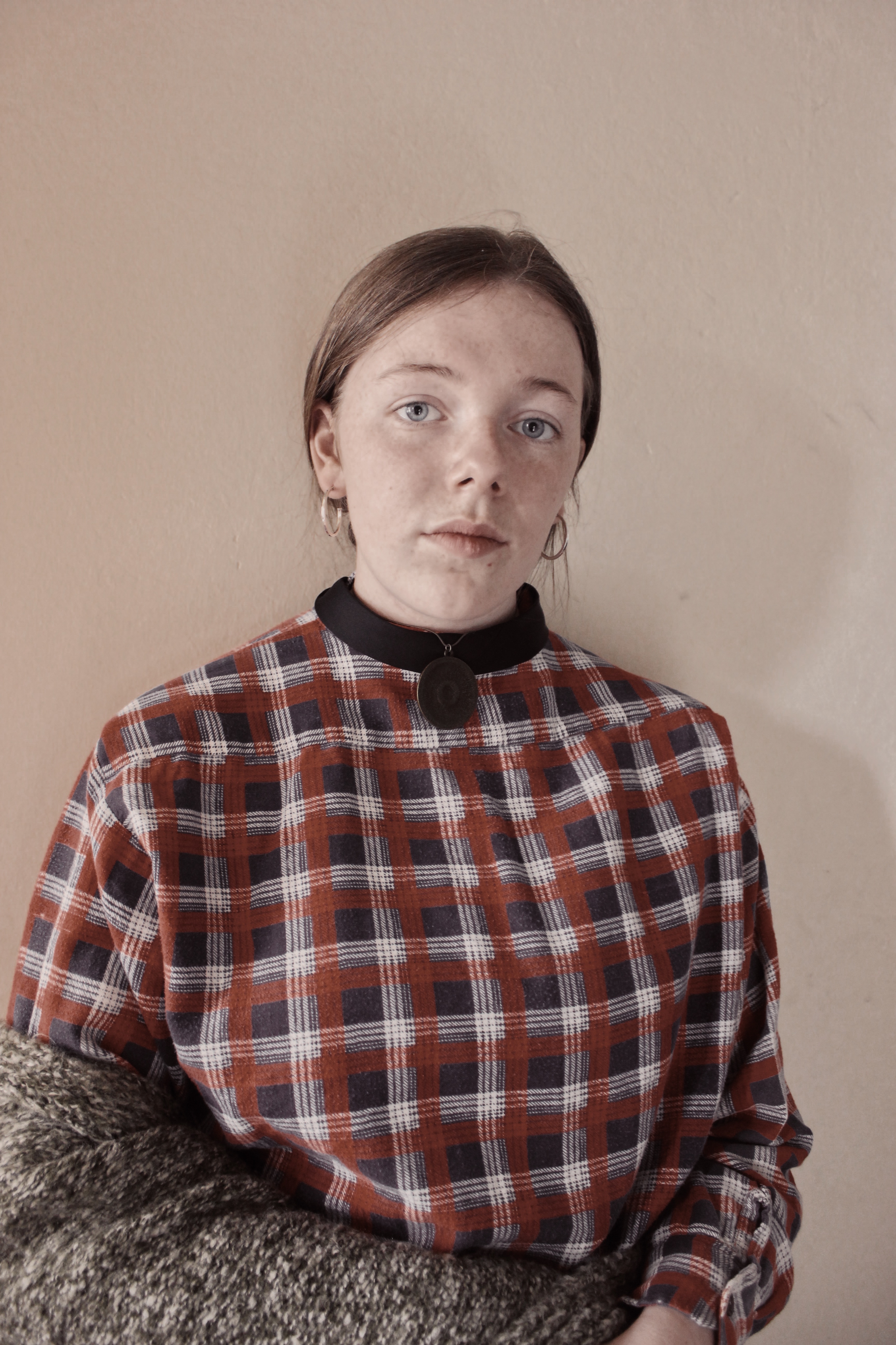
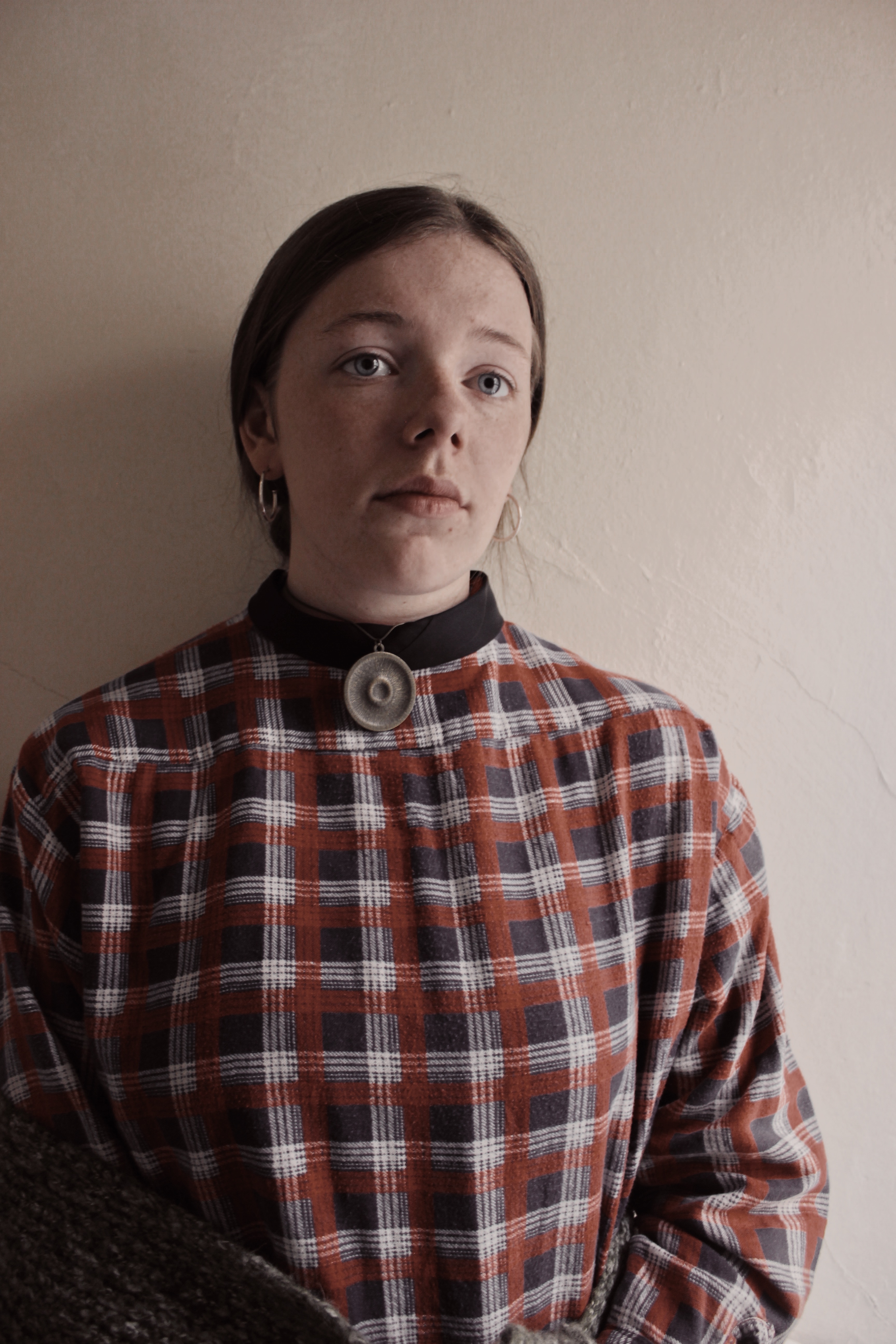
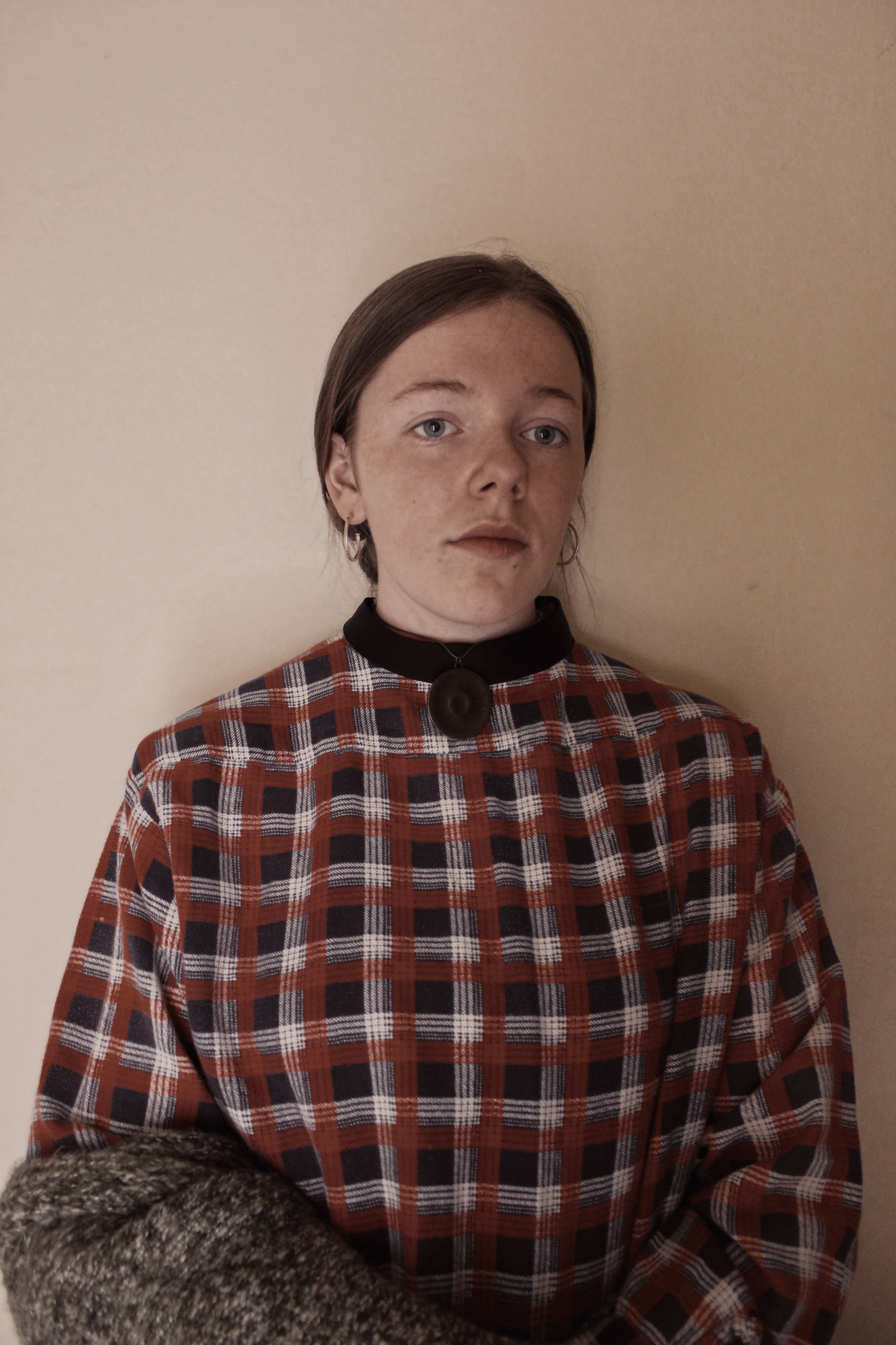
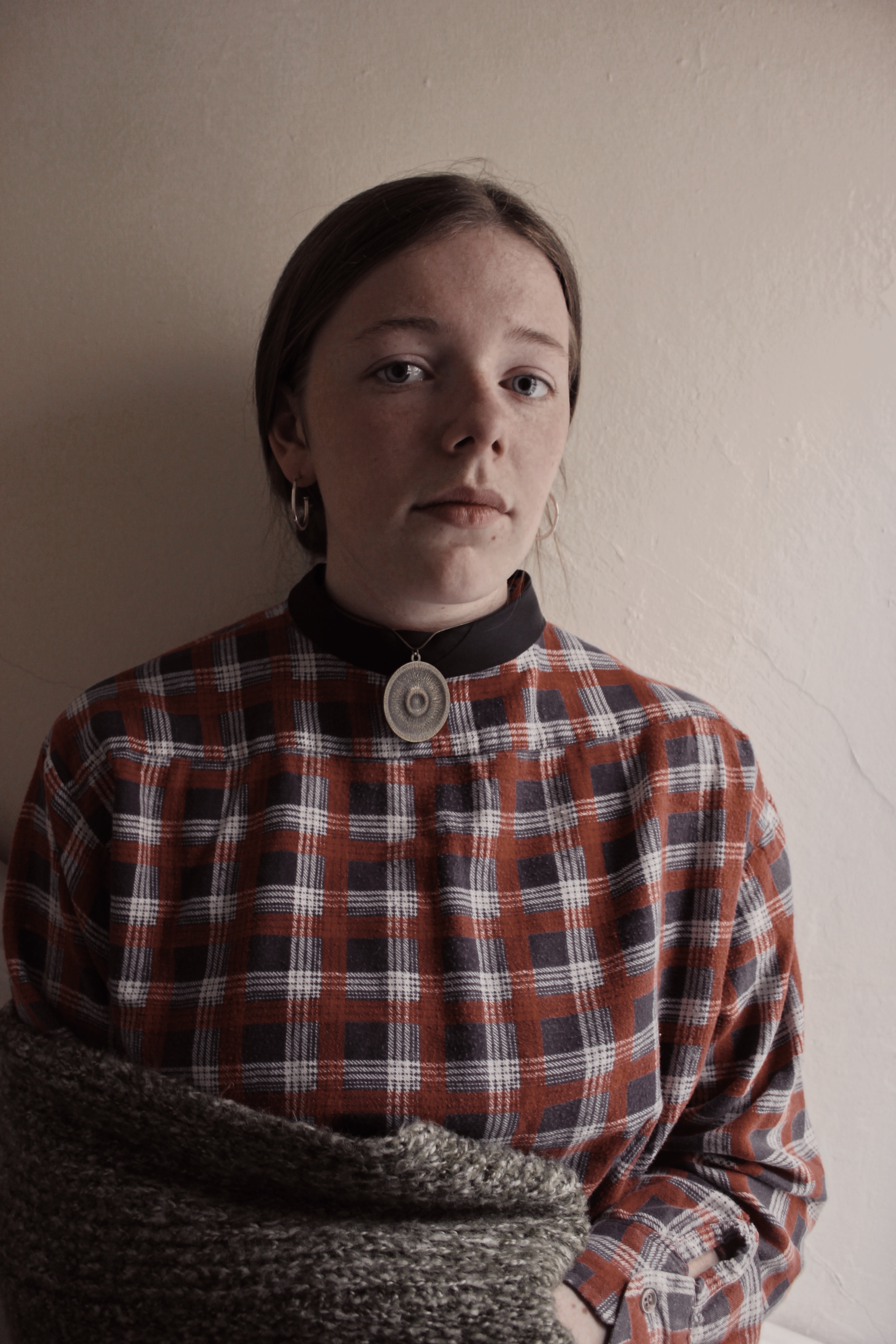
I applied the filter to all my images to give them the same temperature effect as Gwen John’s self portrait has. I chose these as I felt the shadows in the images don’t take the attention away from the subject in the centre.


I applied the filter to all my images to give them the same temperature effect as Gwen John’s self portrait has. I chose these as I felt the shadows in the images don’t take the attention away from the subject in the centre.
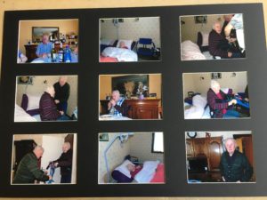
For my final presentation of my images I have decided to make a selection of nine of my strongest images and present them in a window mount, i have selected the nine images that I think best represent my intention of showing the candid moments and emotions, I decided to present them in a 3x3 black window mount because I think that photos show more when they are together rather than being presented as single images.
These are the nine images that I selected to present.
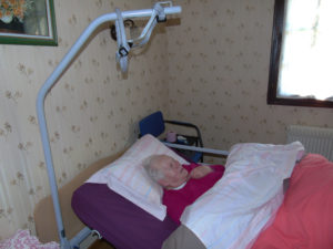
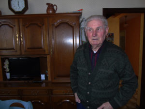
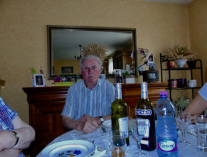
Before attaching the photos to the mount I tried out a few different arrangements to see which would look best. I tried to find a layout which made each photo stand out and so that there was a variation of compositions and colours in each row/column to make it more aesthetically pleasing to look at.
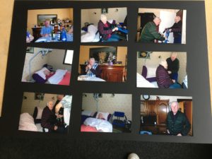
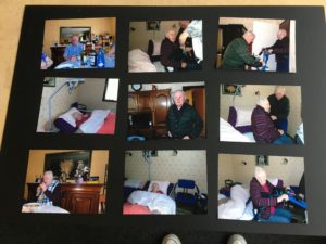
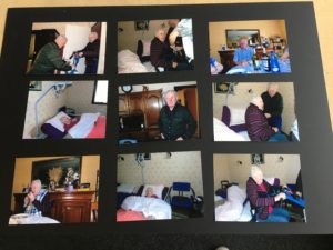
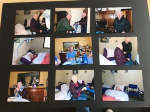
This is my final arrangement attached to the window mount. I feel that this was the best layout because there is a variety in each row and i tried to make sure that similar compositions would not be to close together even though all the photos are quite similar there is some variety so i tried to lay it out so that there was variation of lighting and composition.
Concept: The self portrait of Gwen John shows her isolation and struggle for recognition in a career dominated by men.
Location: I will position my model near a window with a clear background
Lighting: Natural Lighting from the side to create the similar soft effect and light shadow on one half of the face.
Camera Settings: Just clear focus on the subject
Props: I chose my model as I thought they looked similar to Gwen John. They will wear a shirt, tie and necklace backwards and ring earings. They will hold a grey cardigan over their arm.
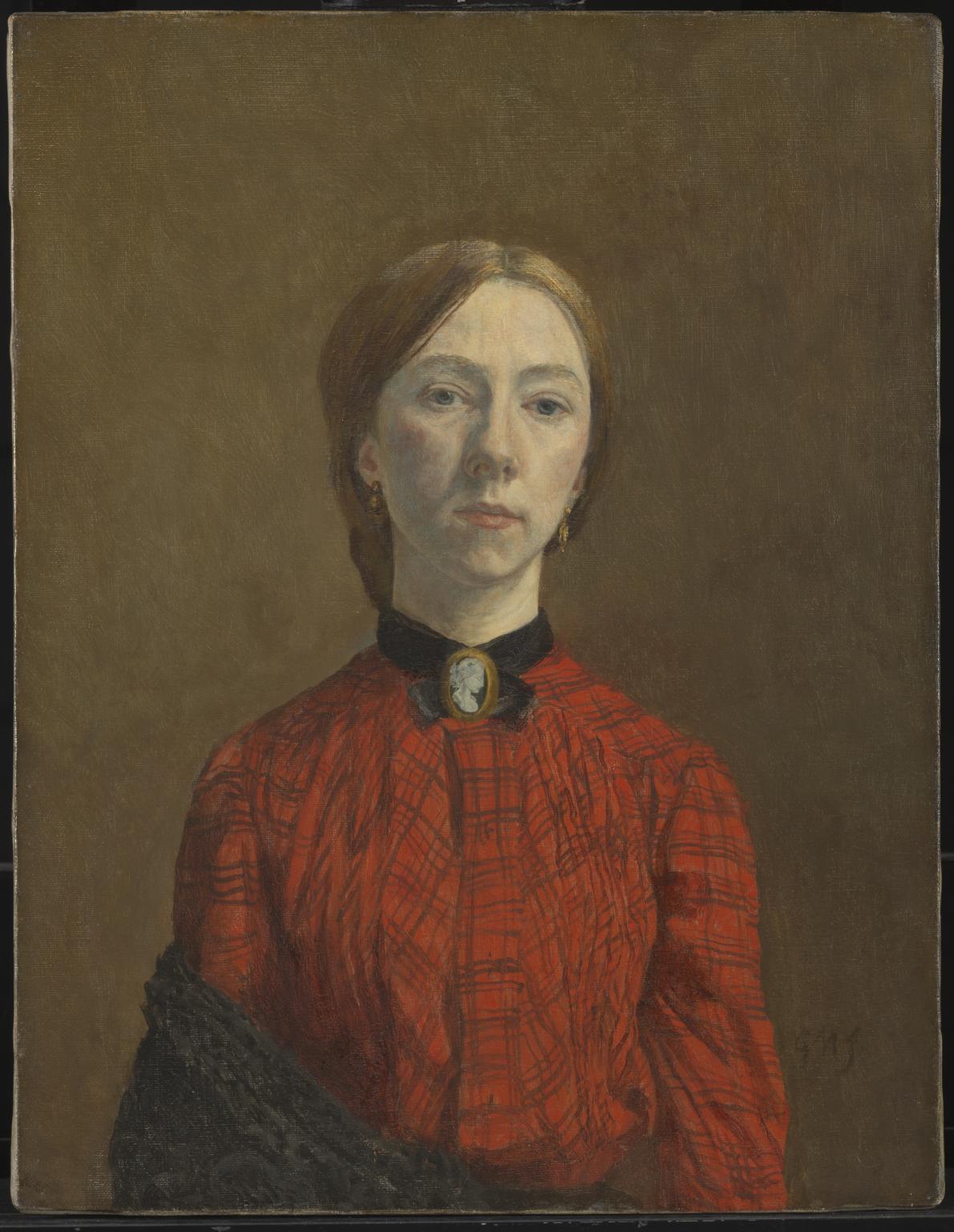
This image is the inspiration behind my images. It is titled ‘Self-Portrait’ By Gwen John.
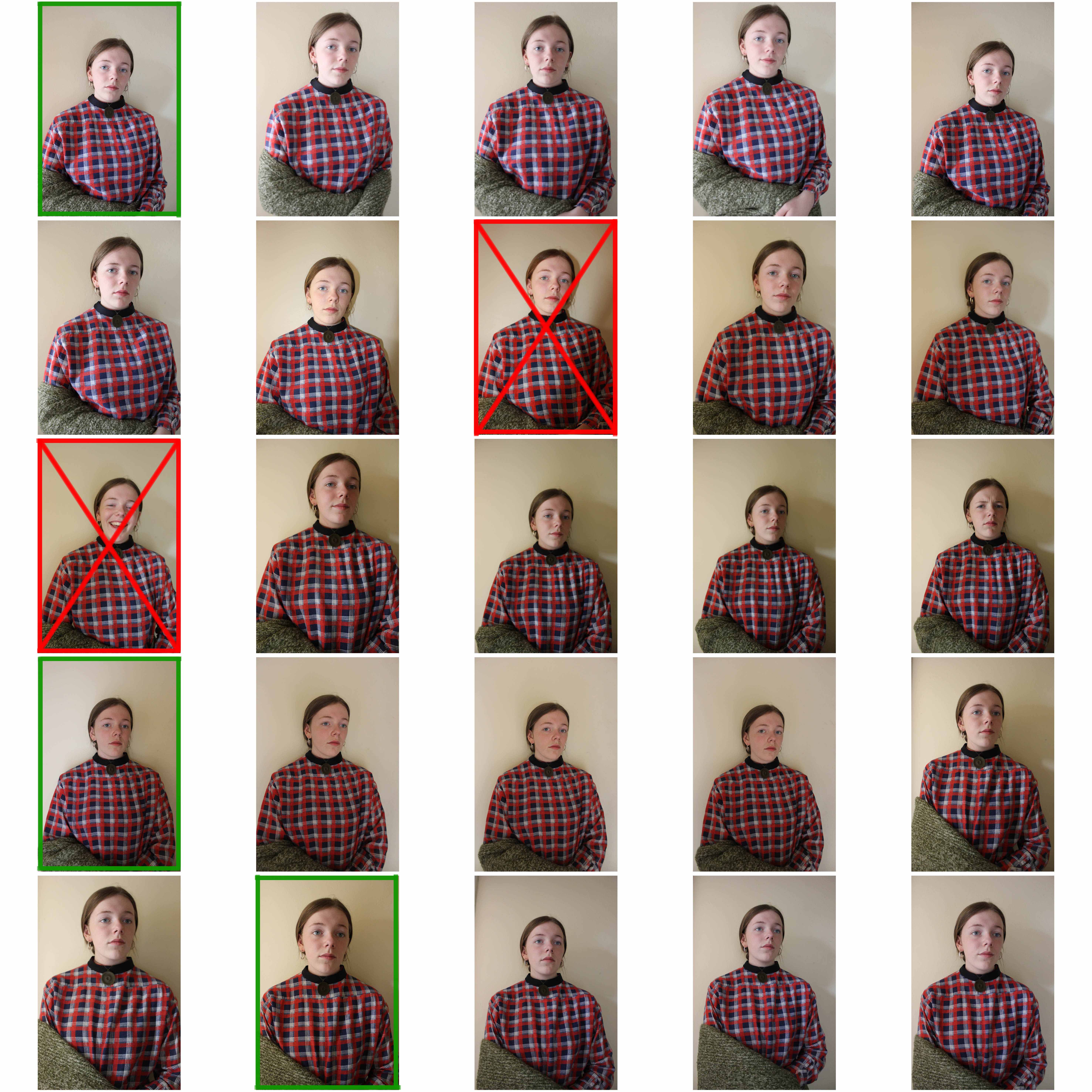
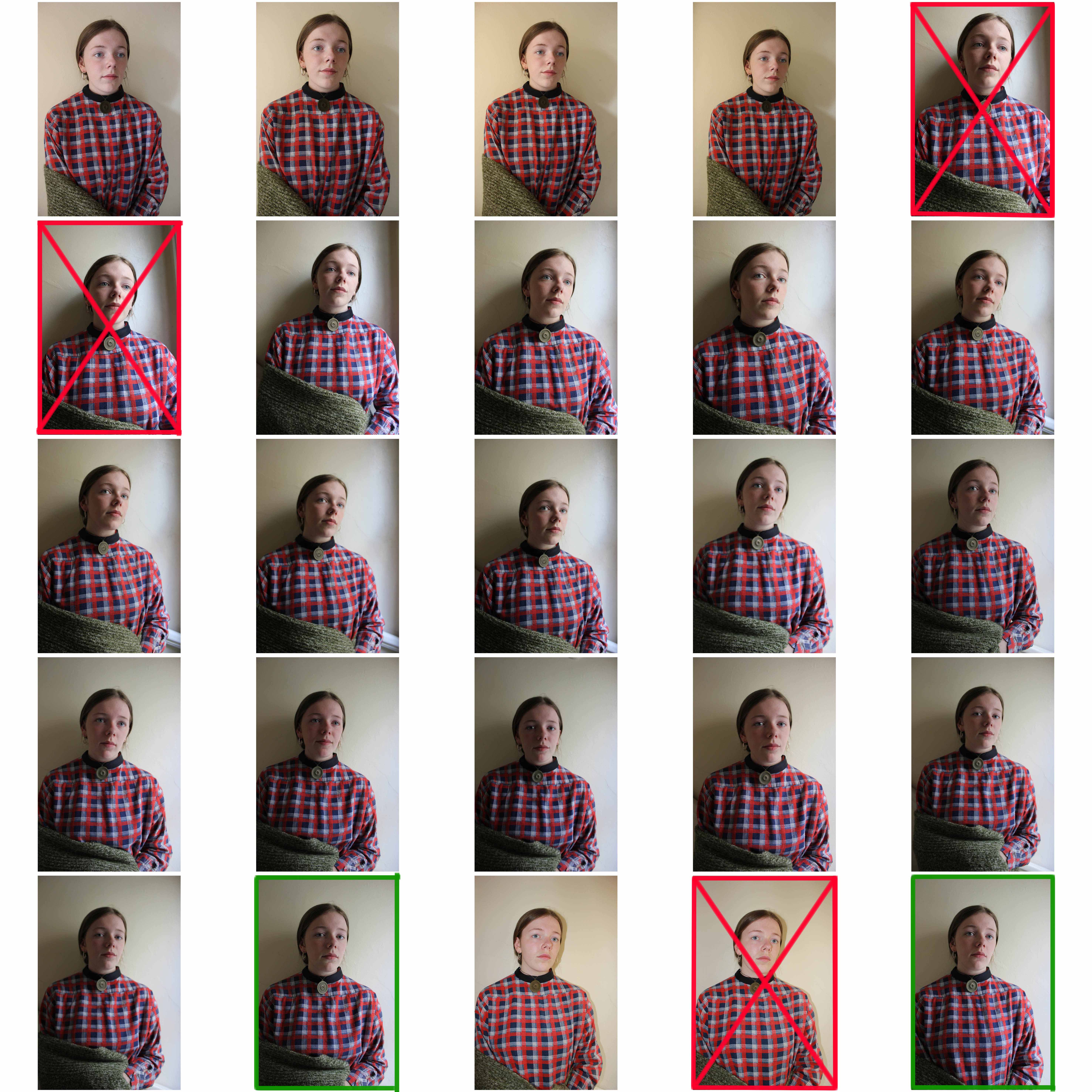
I decided not to use any of the images that had too many shadows in them.
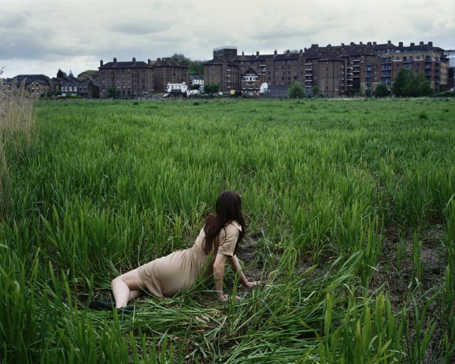
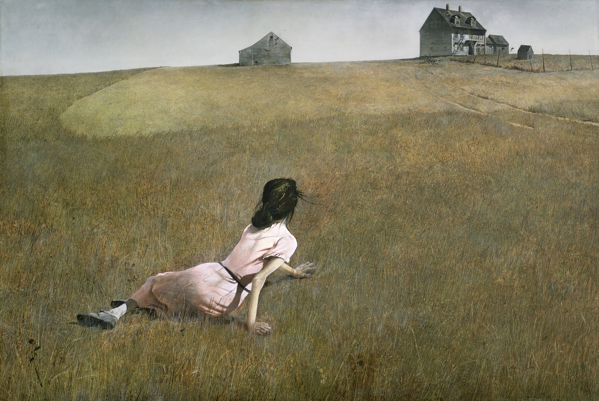
Tom Hunter is an artist using photography and film, living and working in East London. He is Professor of Photography at the London College of Communications, University of the Arts, London, Honorary Fellow of the Royal Photographic Society and has an Honorary Doctorate from the University of East London. Tom has earned several awards during his career, his latest in 2016, the Rose Award for Photography at the Royal Academy, London.
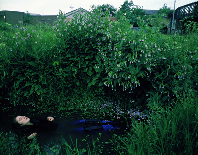
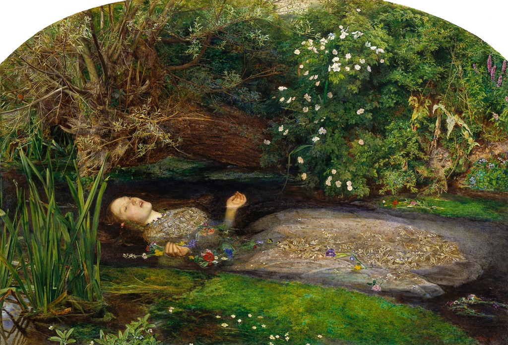
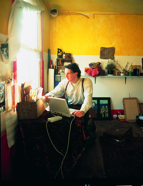
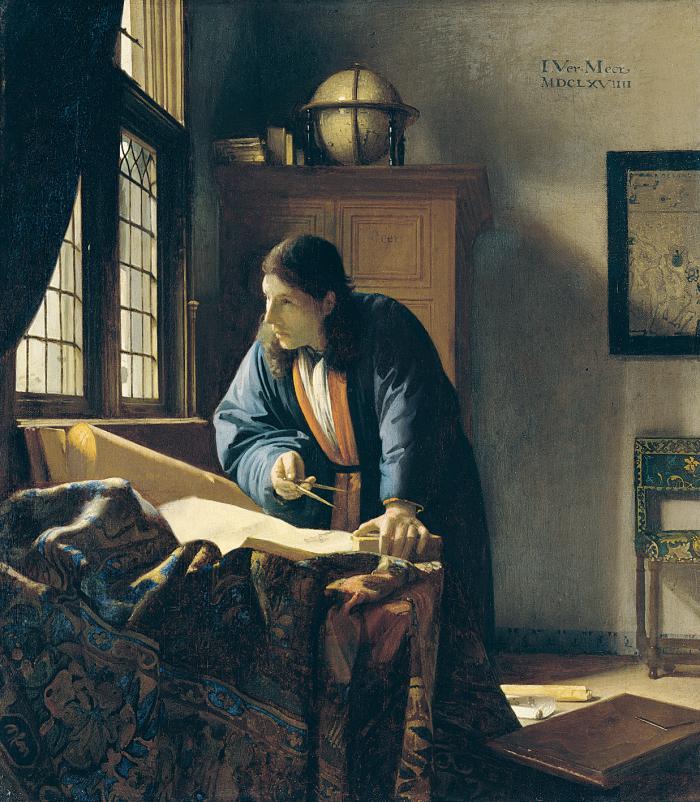
Many of Tom’s series show he is inspired by famous artists such as Johannes Vermeer and John Millais, He even takes inspiration from Biblical Tableaux paintings.
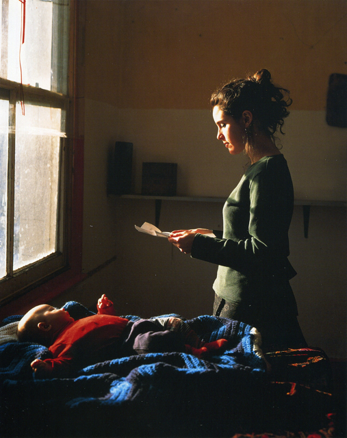

-In Johannes Vermeer Painting titled ‘Girl Reading a Letter at an Open Window’ the open window is on one level intended to represent “the woman’s longing to extend her domestic sphere” beyond the constraints of her home and society, while the fruit “is a symbol of extramarital relations.” The letter that she holds is a love letter either planning or continuing her illicit relationship. Tom Hunter re-imagines this image in current times showing a woman reading a possession order that tells her she has to leave her home.
-Hunter uses natural lighting to hit the side of the woman’s face allowing for emphasis of her emotional state.
-The ISO that Tom uses appears to be low as the image is mainly darker in tone. This is used as an advantage to give focus to where the light hits, the woman and the baby.
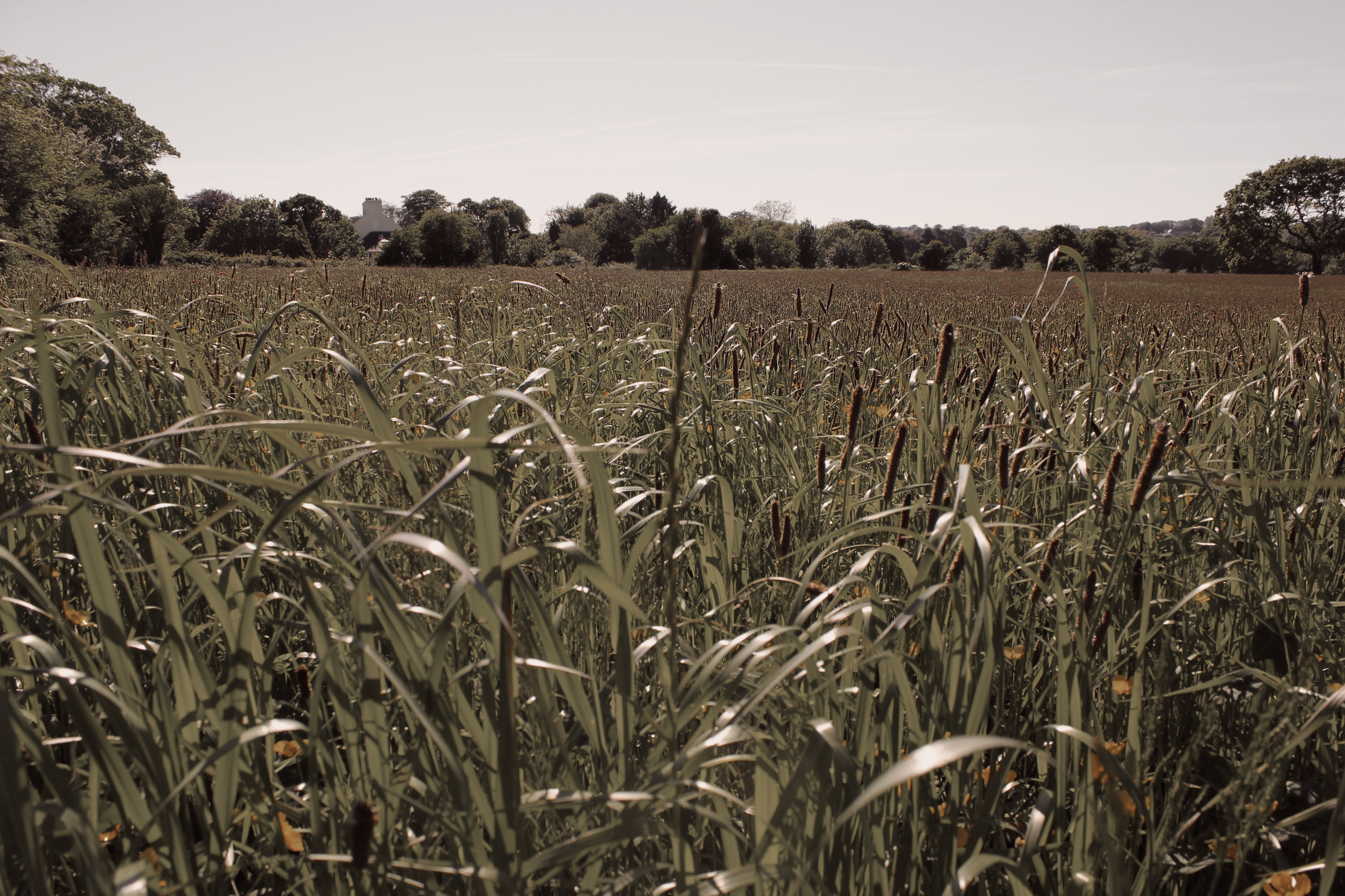
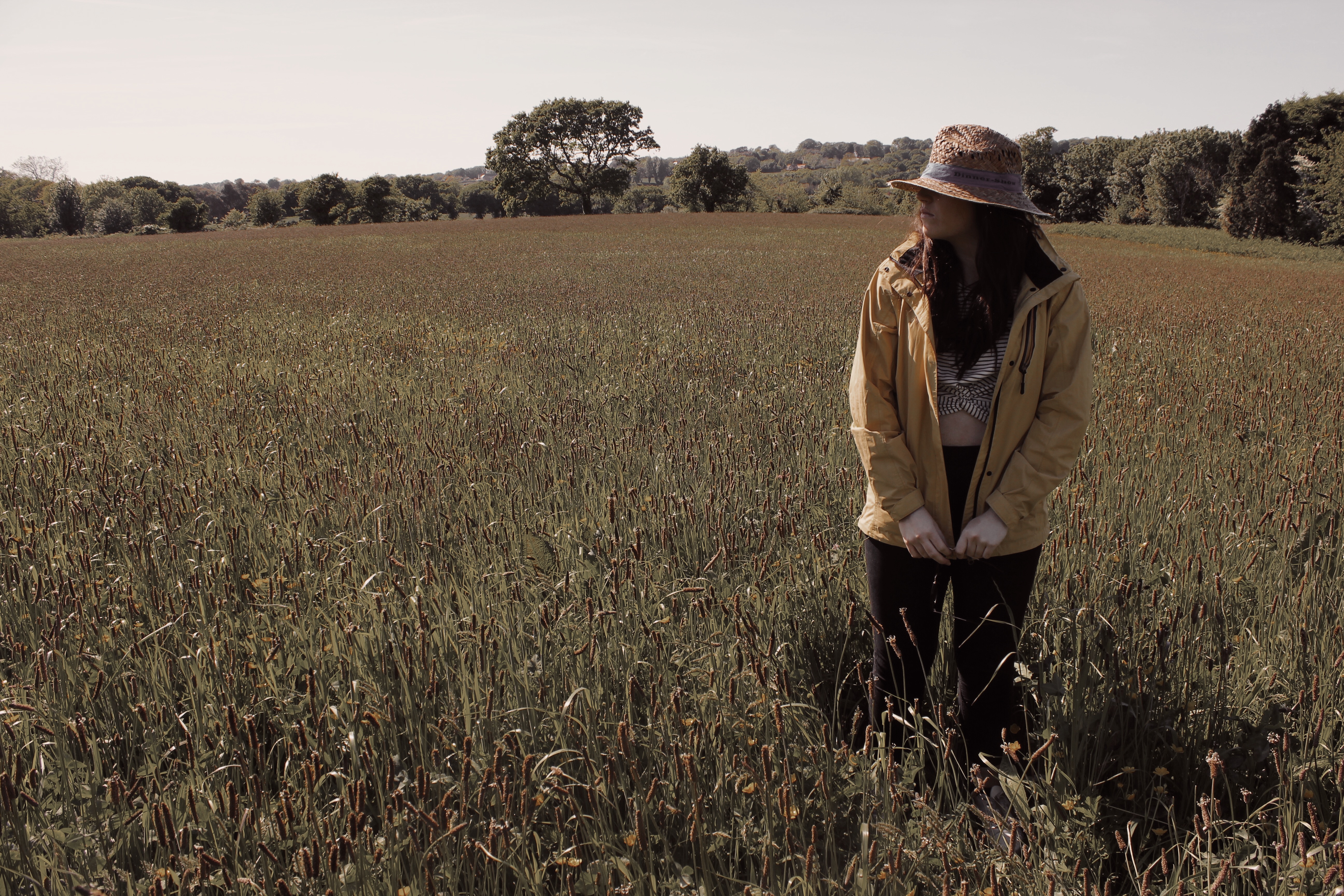
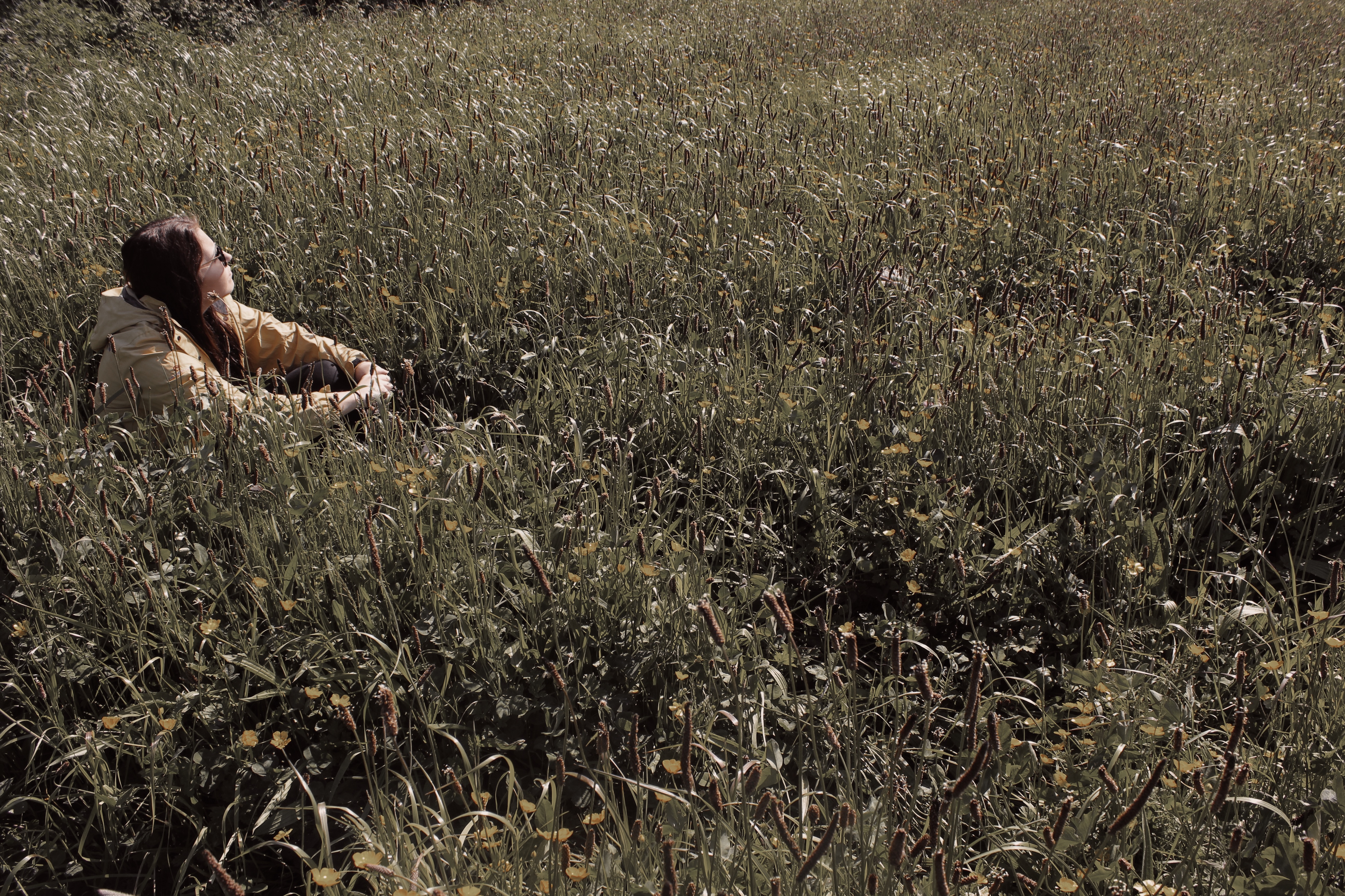
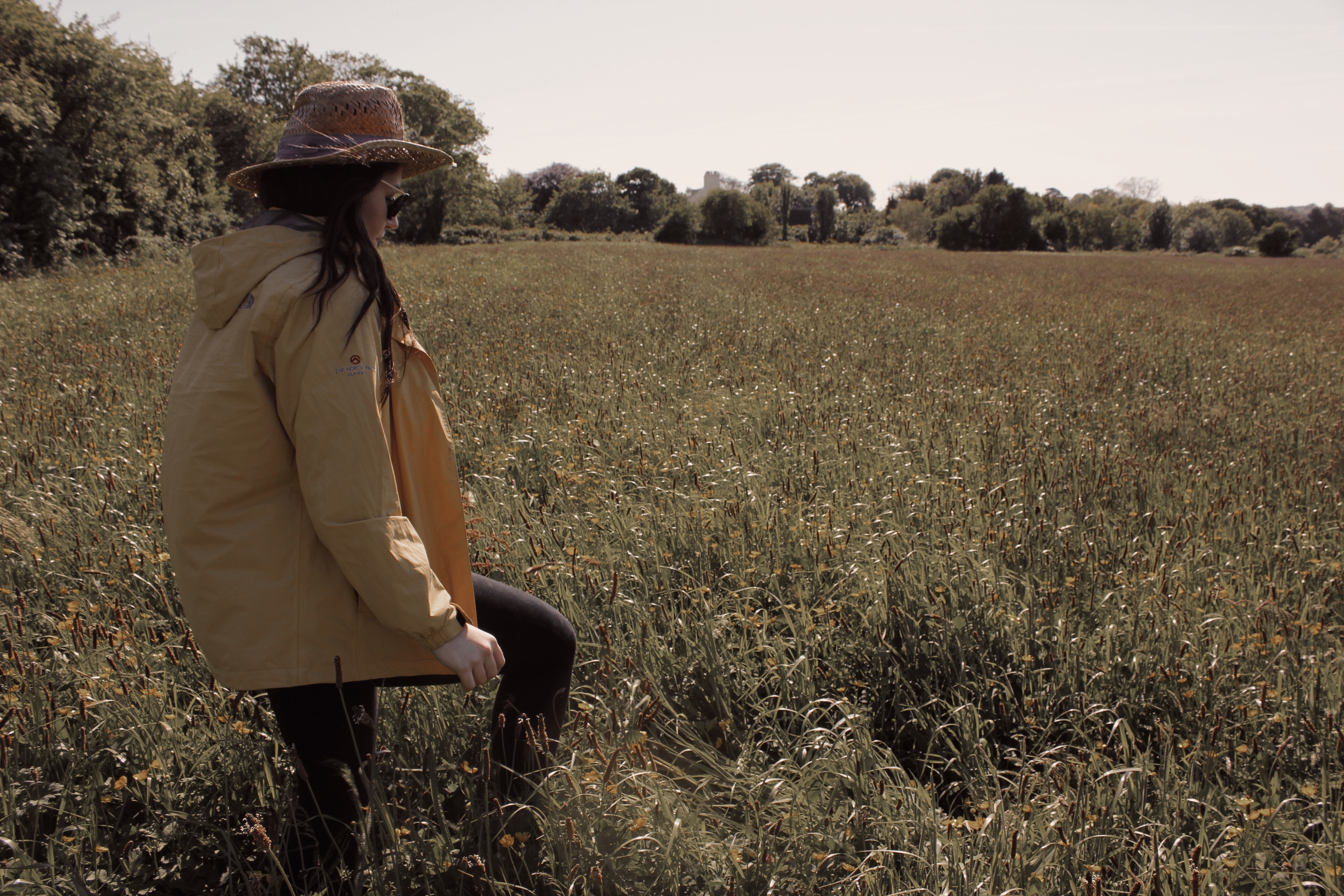
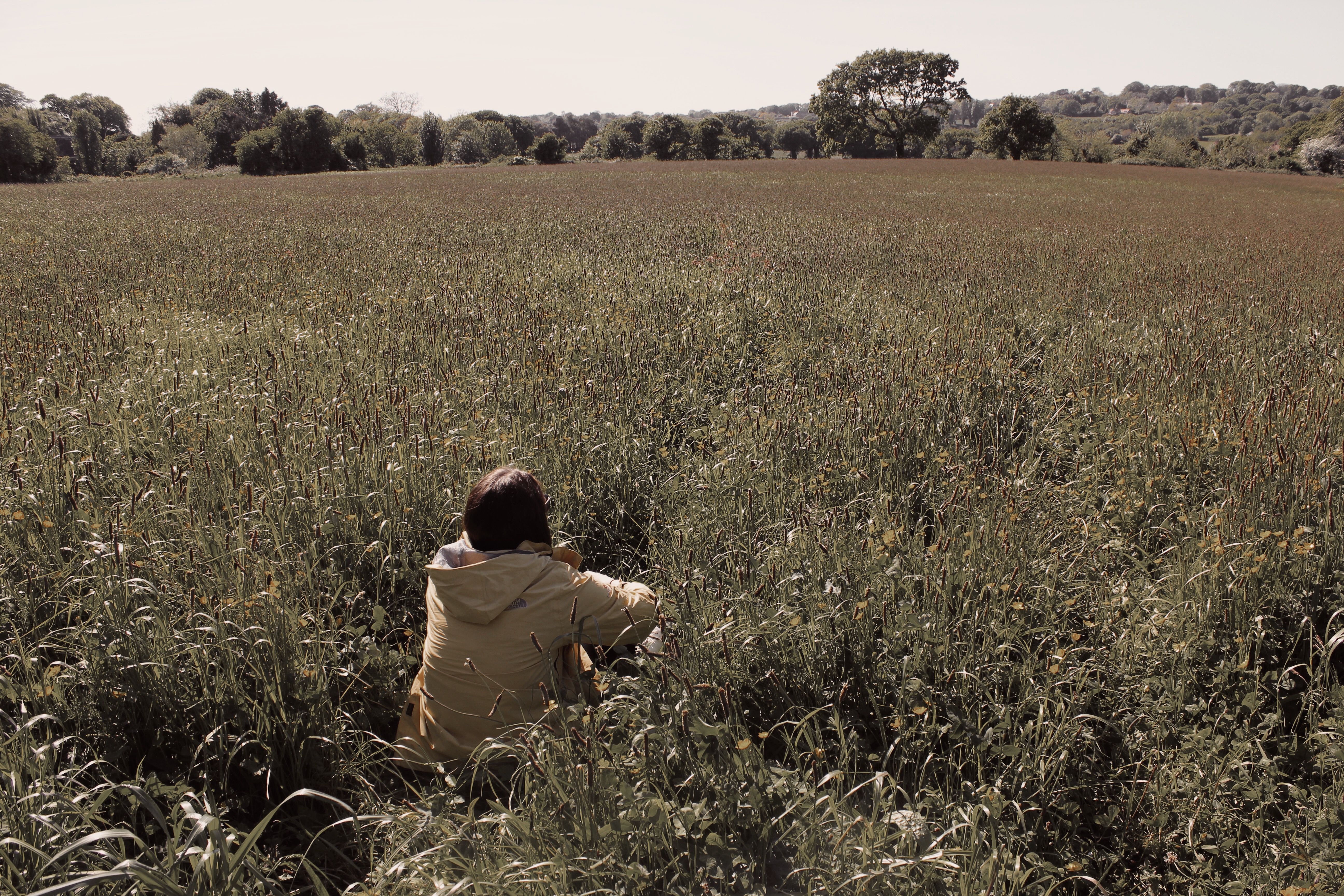
Like Tuschman, I was more inspired by Hopper’s Style to create my own work. Similarly, I used one subject in my photos to share the same meaning of isolation. In my photos, you can never see the eyes of the subject. This is supposed to deny the viewer from seeing the ‘windows to the soul’ and adds mystery to how the subject feels. I added the filter to reduce the warm temperature that was in the original images.
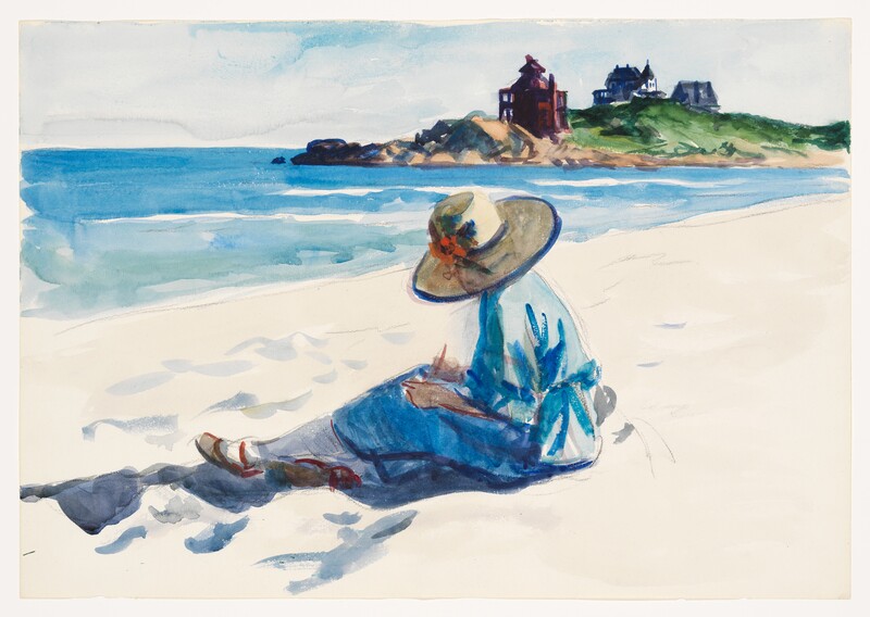
This image titled ‘Jo Sketching At Good Harbor Beach’ by Edward Hopper was probably my biggest inspiration for these images as I liked how the viewer was denied access to the eyes of the subject. It was also the reason I chose to feature a hat in my photos.
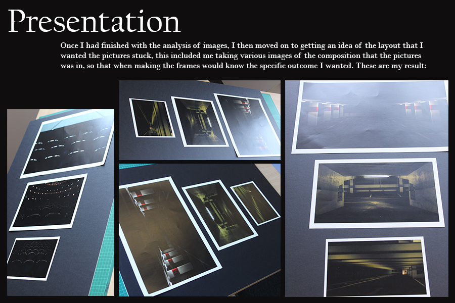
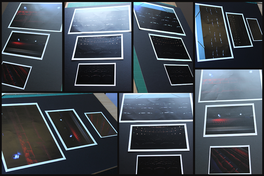
I had a number of different ways I wanted to present my work. I wanted to display my images either horizontally or vertically, like shown below. The reason for this is because I thought it would clearly and neatly display my images in a presentable way that would allow them to stand out. I finally decided on displaying my images vertically as I though that would be the neatest way for this specific set of images to be displayed. As the images where in black and white I then had the decision of displaying them on white or black card. The set of images that I had chosen had a lot of white patches which made me single out the white background as it didn’t really allow them to stand out. However, on black card the images really stood out in comparison. Furthermore, the black background and the images created a strong contrast which contributed to them standing out more. The layout of the images was chosen by the first image which I thought was the strongest image. The image with the people at the front, I thought, was the odd one out in this group of images which is why I placed it in the middle. This decision allowed me to separate the two man made images with some urban landscape. When displaying them I Created window mounts for the images as I thought this was the strongest way of displaying them and I thought it reflected my final images clearly.
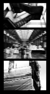
My response to Richard Billingham
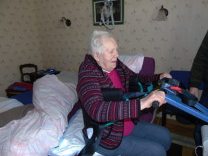
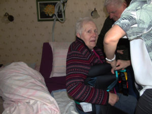
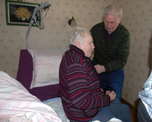
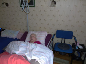
In response to Richard Billingham I decided to document my grandparents, the main focus being my grandmother who has Alzheimer's, I wanted to show the difficulties for someone who has Alzheimer's and also the effect it has on the people around them, in this case my grandfather who looks after her. My intention was to try and capture candid moments of their everyday life to show how Alzheimer's takes away memory of people and places, by capturing the constant surprised and dazed look of my grandmother who can see me taking her photo but does no necessarily know who i am or what i'm really doing, but also everyday functions such as eating, speaking and walking, as you can see in the photos she spends most of her day lying in bed because she simply doesn't know how to do anything else anymore.
These are a few of the images that I selected from my shoot as i think they best represent my intention.



When selecting photos and planning for my final presentation I have been looking at how Miyako Ishiuchi (my original artist reference) displayed her work. The photos in the Frida series were taken for a catalog which we can see bellow.
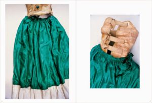
I like how minimal the layout is with no writing or patterns taking away from the impact of the image. The background surrounding the photo is white which brings out the rich colours in the silk. the background in the actual photograph is an off white colour and has shadowed areas, if the photo was displayed without a pure white boarder we might not notice these small details. These two images were selected to be placed together because they both display the different parts of the same item.
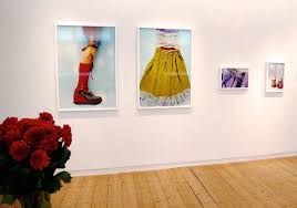
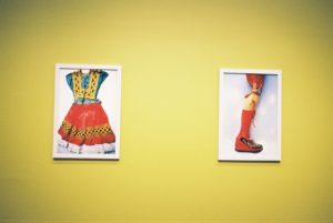
The photographs in the last two images have been displayed in white frames and hung on walls in different arrangements. Again they have been displayed in a very minimal way to keep a focus on the colour in the image. I love how the yellow background in the second display matches the colour in the image perfectly and brings the two frames together. I took inspiration from this for my own edits and used the eyedropper tool to sample the colours in the image onto the background.
Final Images:
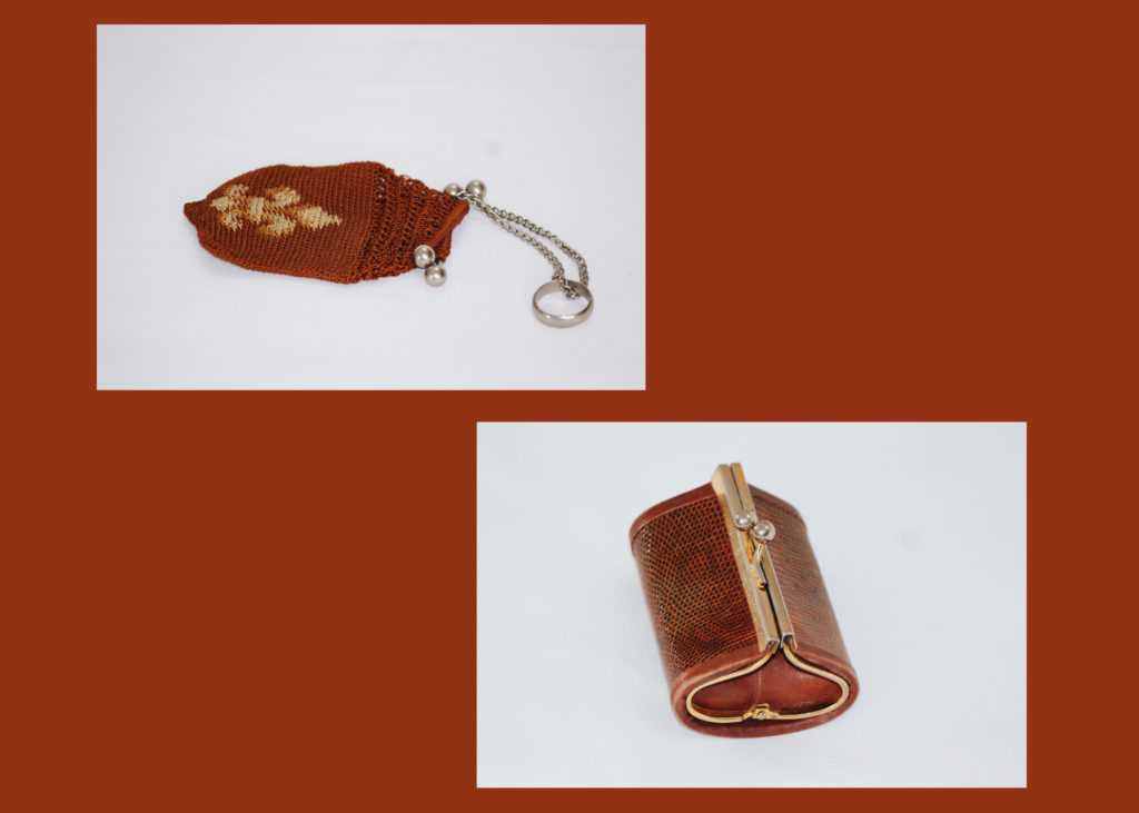
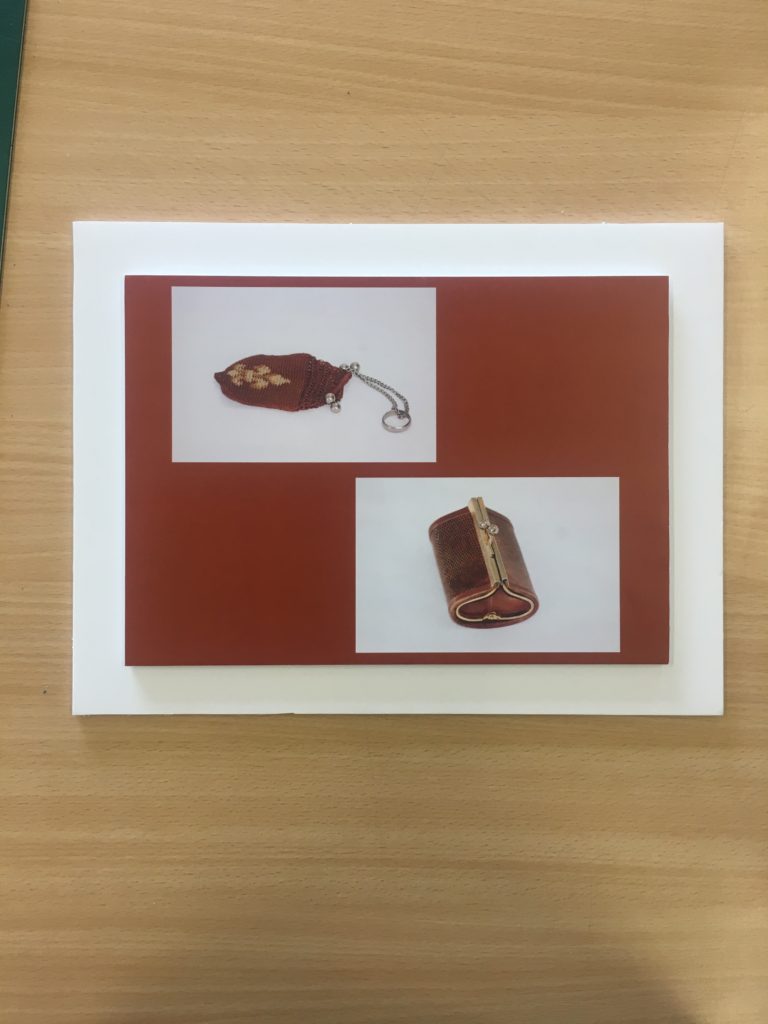
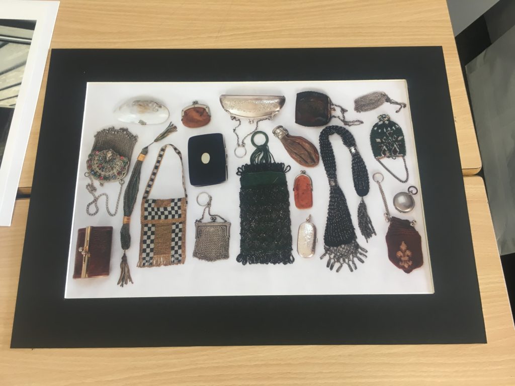
I took these two images of coin purses from the same shoot and chose to arrange them together as a set. Both the photos have a very similar colour schemes and I wanted to use this to link them together. I used the eye drop tool to select a red/ brown colour which matched both photos and made a new page, filling it with the selected colour. I then dragged the images onto the page and arranged them so that there was negative space in between filled with the colour.
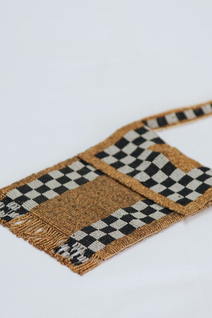
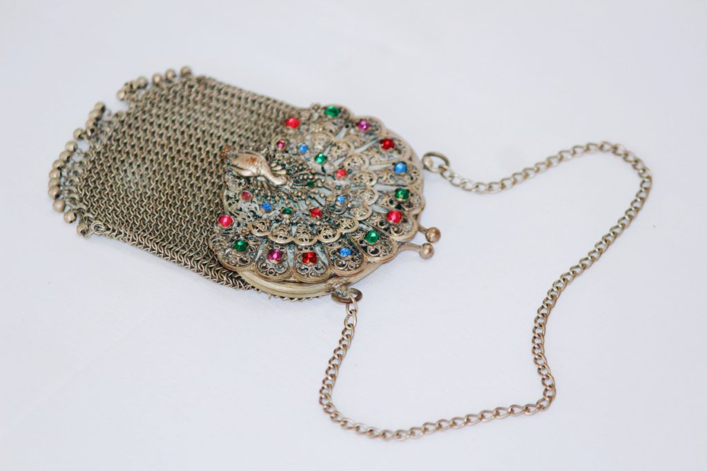
I will cut out and glue these two photographs on to white foam board because I want the colours to stand out on their own, I also think this will give them the clean minimal look i was going for.
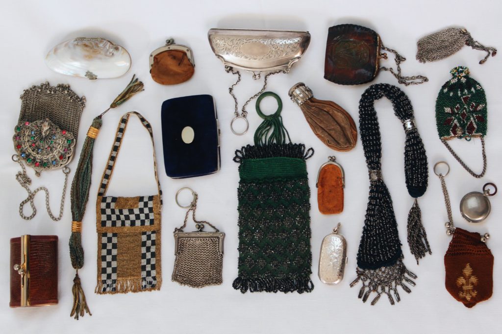
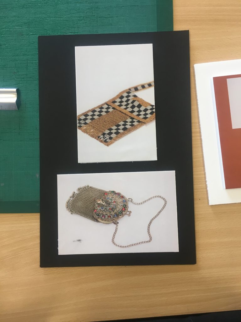
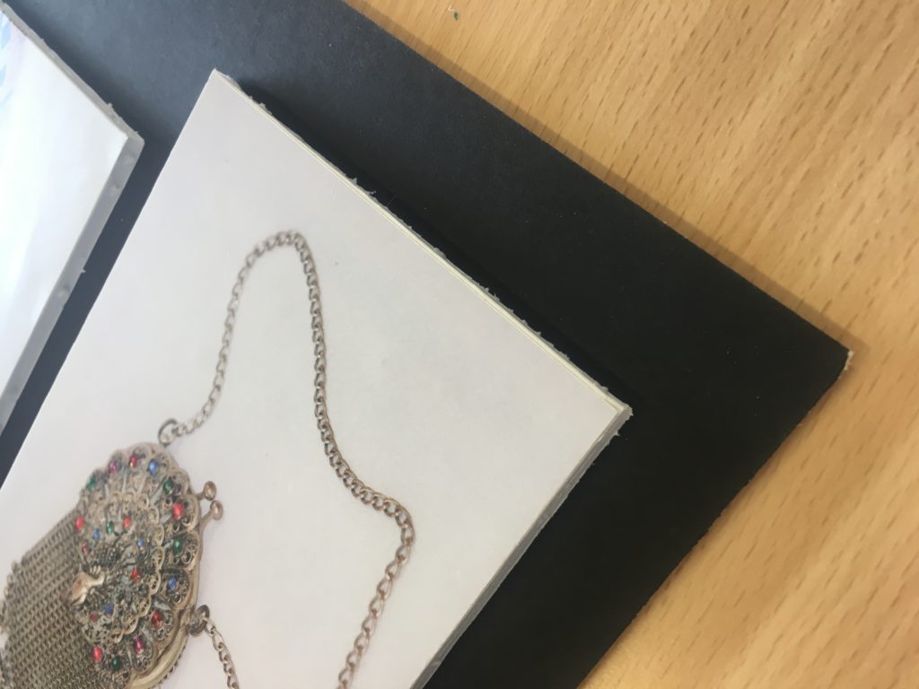
I chose these four photos of old coin purses for my final images because i think they show how how my ideas have developed through the project and display what i have learnt from studying my chosen photographers. The link to the theme of secrets, codes and conventions due to the museum style and unknown history in the items I have photographed. I wanted the photos to display what the antiques look like in real life and show their imperfections rather than re touching them to look perfect.
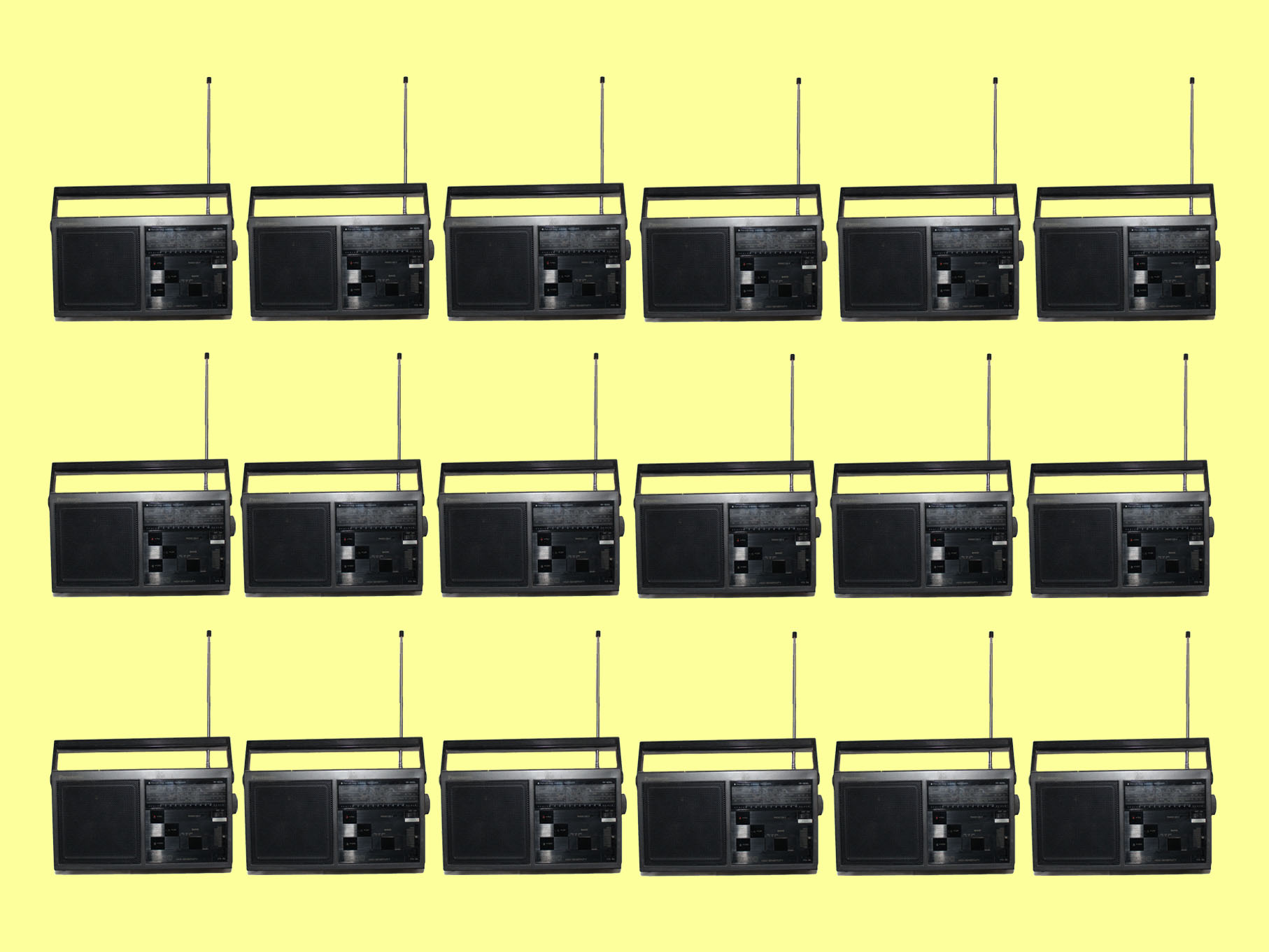
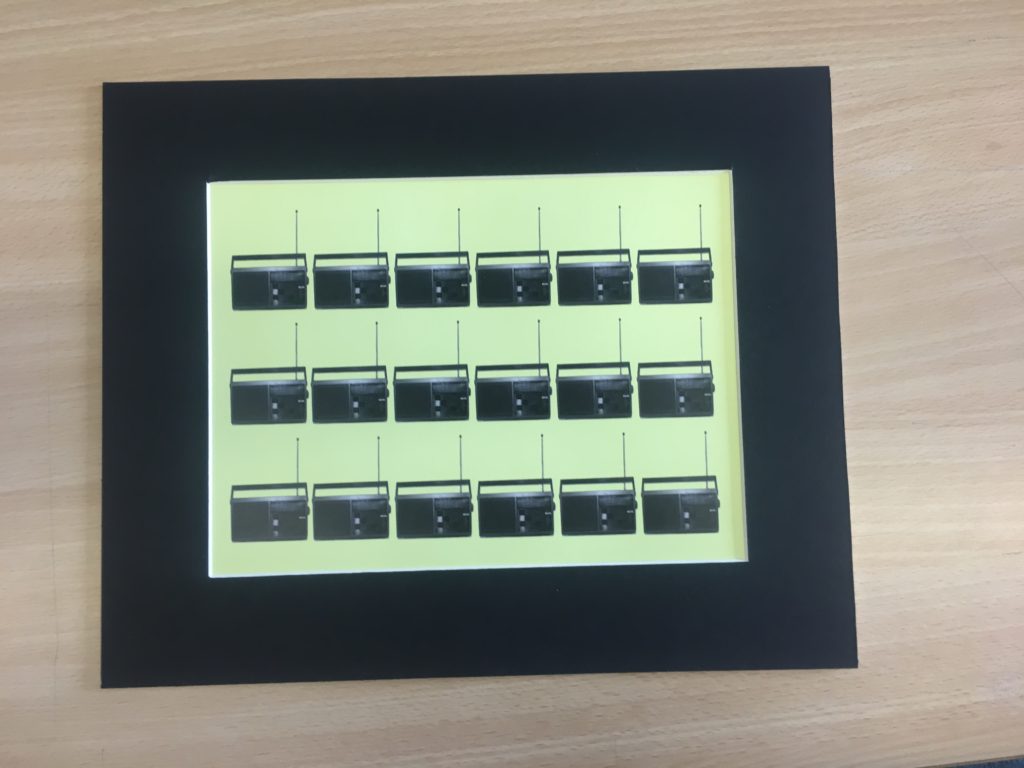
Another photo I have chosen to print is this one of a radio repeated multiple ties on a yellow background, again this shows an old item which has a story and a secret however also links to the theme of code in the way signals are transmitted to radios. I want to frame this image in a black window mount which will compliment the black parts of them image.
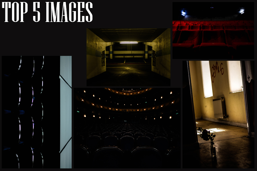
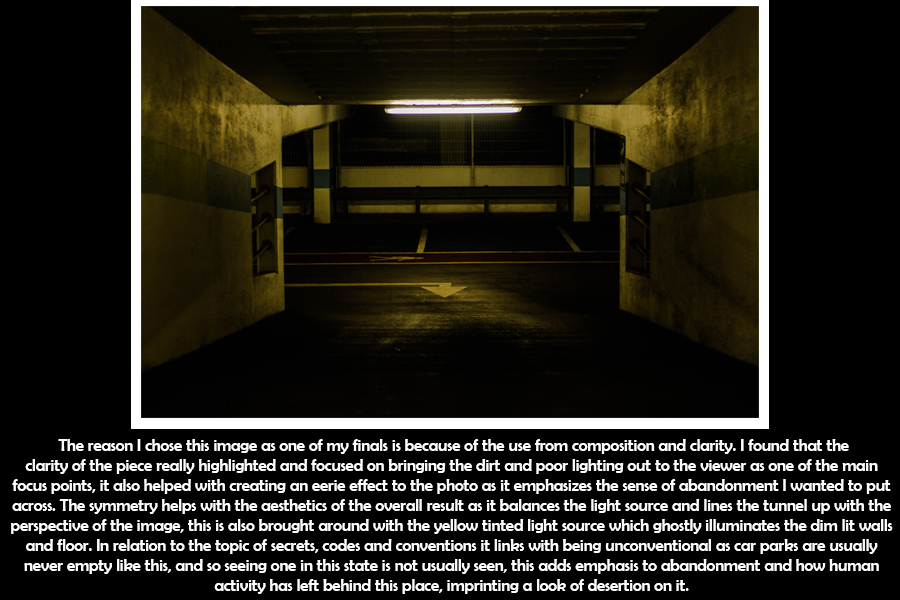
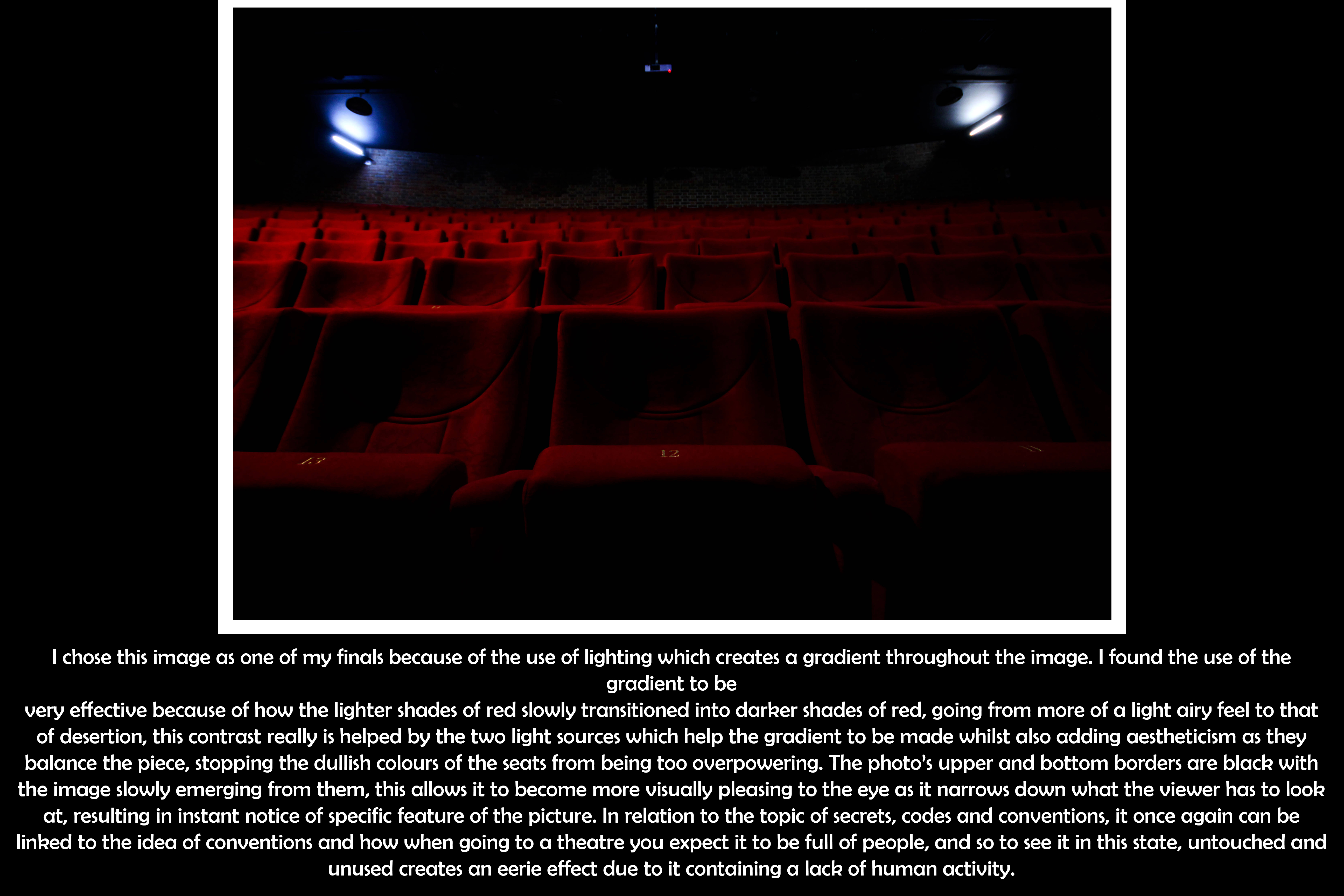
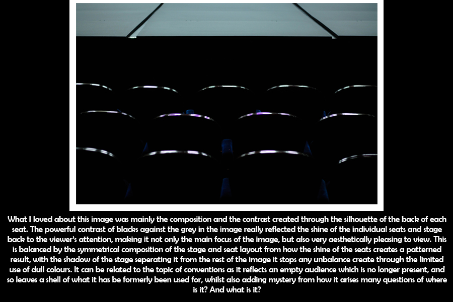
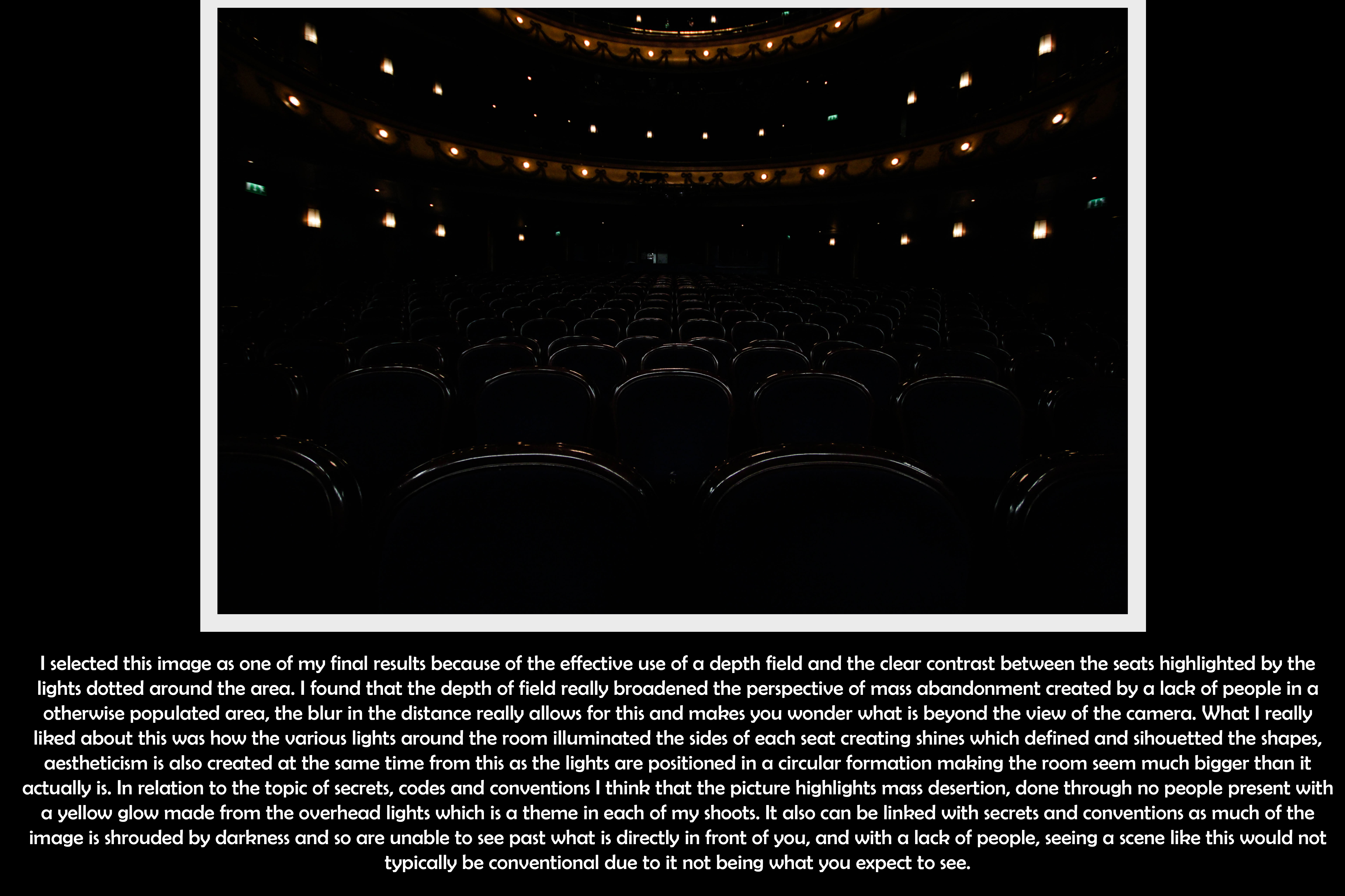
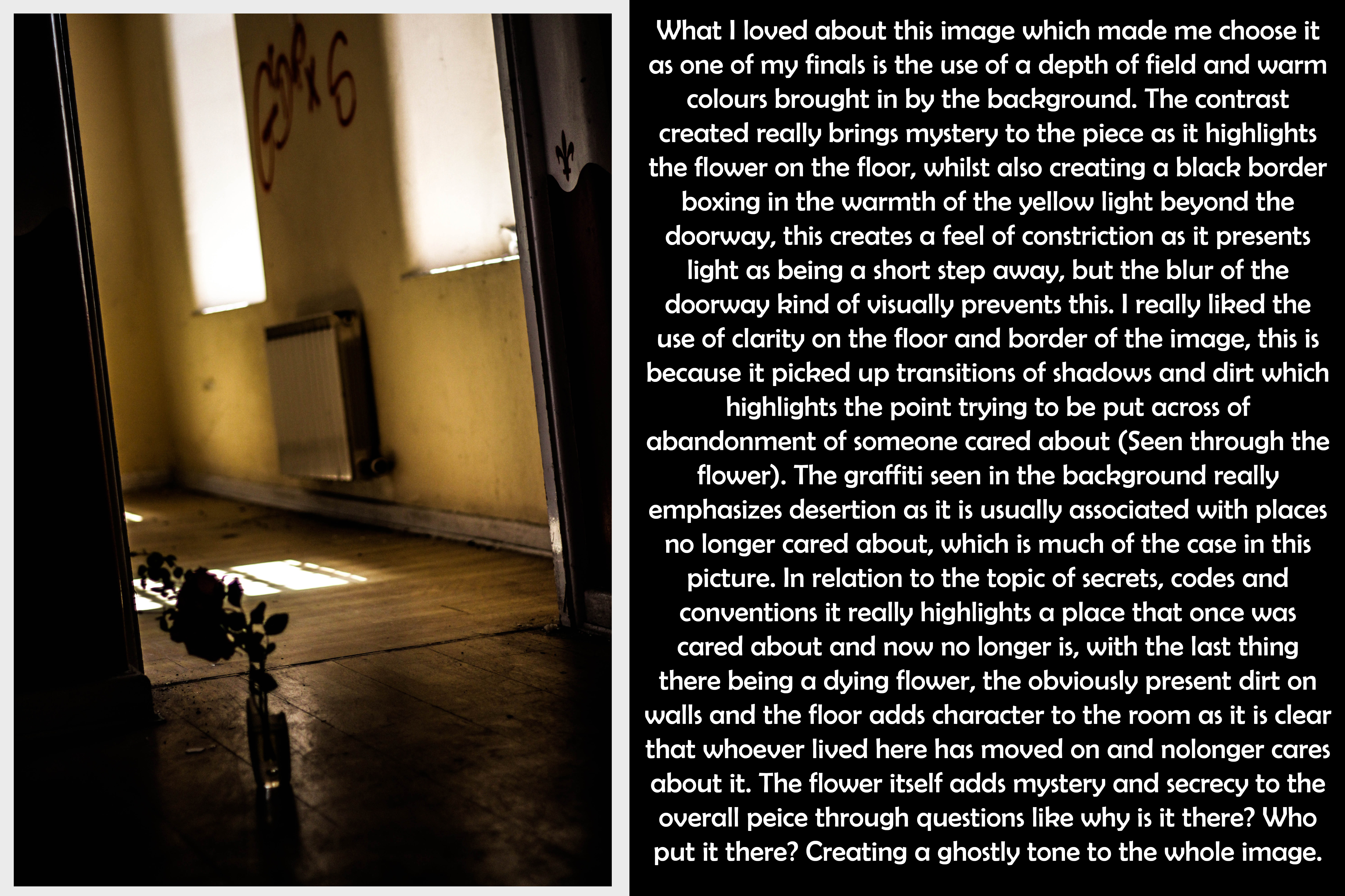
For my final images I gathered together the best photos I had taken from each shoot to compare with each other, by comparing analysis with each one it would really allow me to understand the reason for each ones success. At the same time as I analyse these images I have sent out nine of my favorite images to be printed so that I can present them in the way I want. Here are my choices for my top five pictures: 