Category Archives: Externally Set Assignment AS

Filters

Author:
Category:

Codes – Case Study and PhotoShoot

What are Codes ? 

Codes are a system of words, letters, figures, or symbols used to represent others, especially for the purposes of secrecy. Codes within photography are also known as symbolic codes, technical codes or written codes

http://jakehicksphotography.com/

Born in Cornwall, he first discovered his love for photography when his father first gave him a camera, but his real interest in the subject began when he found that photography was the only path left for him as he had to fail at most of his academic subjects. His work could be described as bold, bright and colourful, as lighting colour is the main focus of his images

Image result for jake hicks photography


PhotoShoot

Concept Genre /  Artist Location Props Shot type Lighting Settings
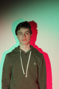
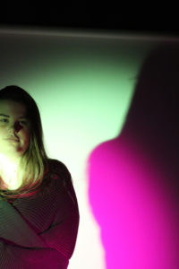
Codes Jake Hicks/Abstract/HDR Studio Tripod-Gel Sheets Portrait Artificial/Studio Lights Manual focus,f/2.8-f/4, 1/60 shutter speed ISO-100

Contact Sheet 

 Best Images from the shoot 

Overall this shoot was okay but I didn’t produce the outcome of images that I wanted. So I have decided that I am not going to carry on this idea, but I will use some of the backgrounds in some of the final outcomes

Secrets, Codes and Conventions – Shoot Three

Planning

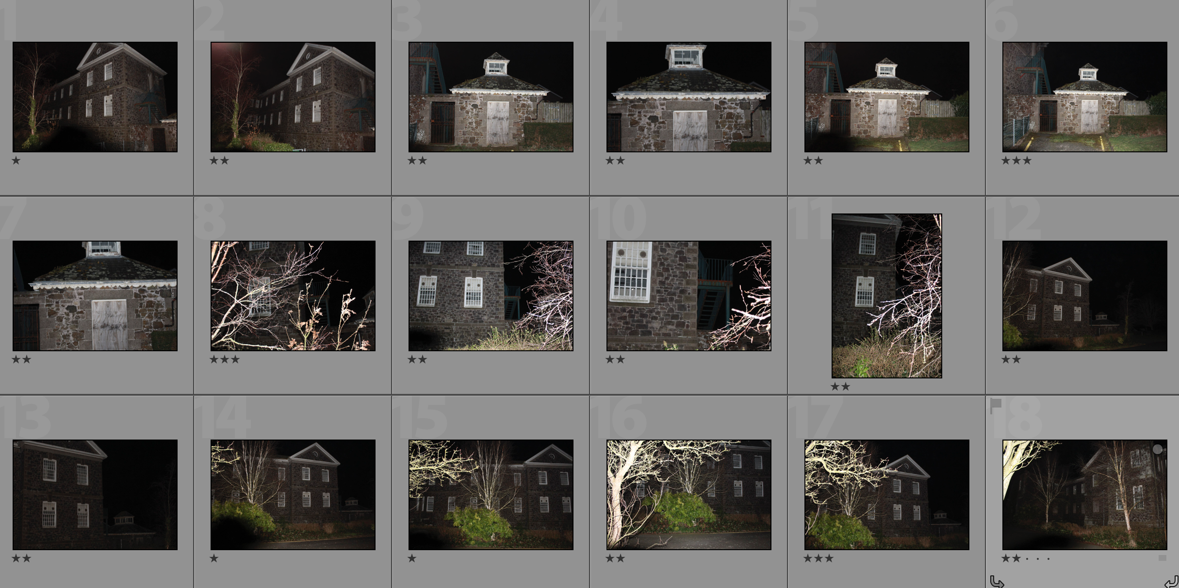
Task – Take 150-200 photos exploring the theme of exploration under the key word ‘secrets’

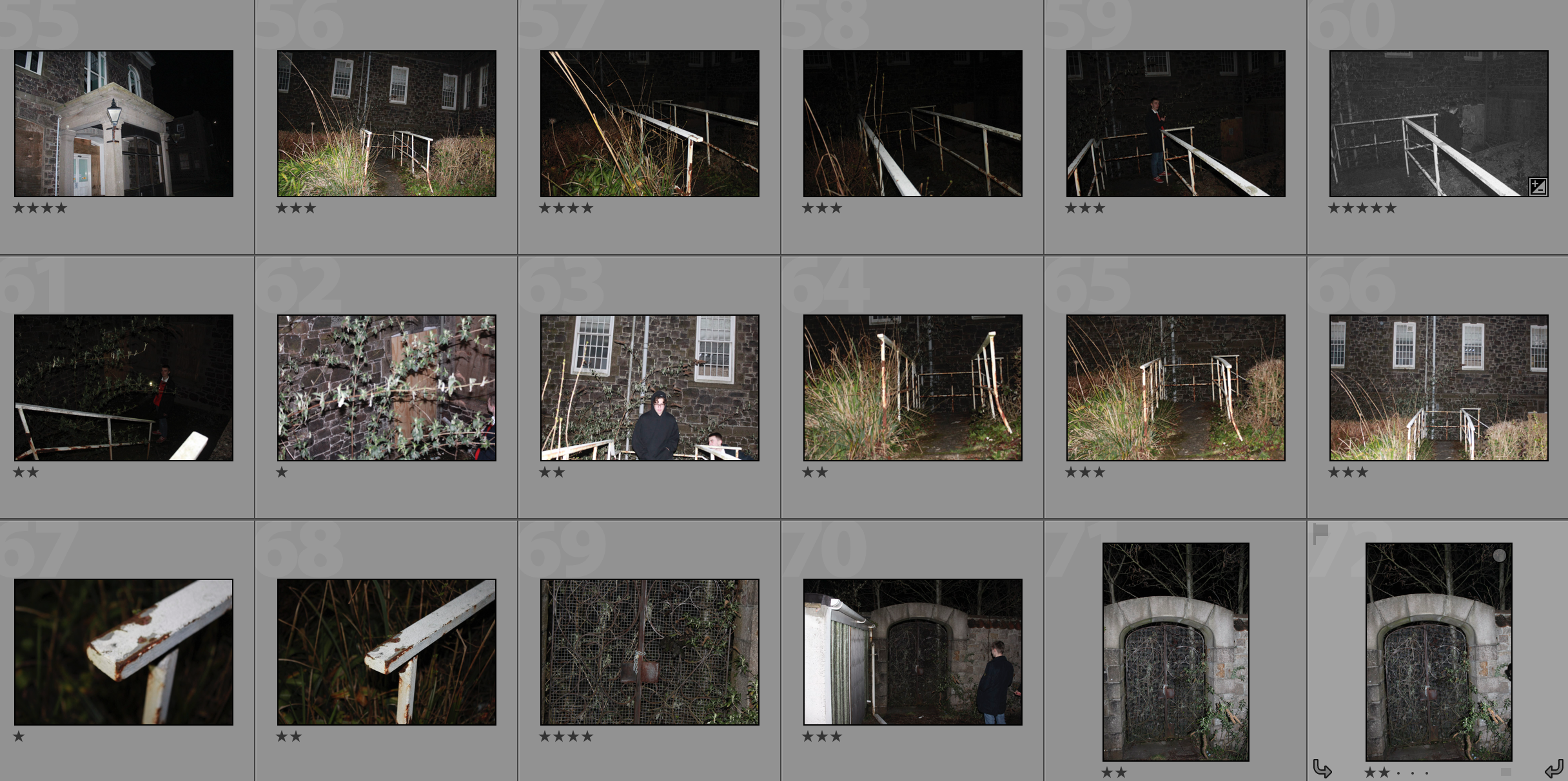
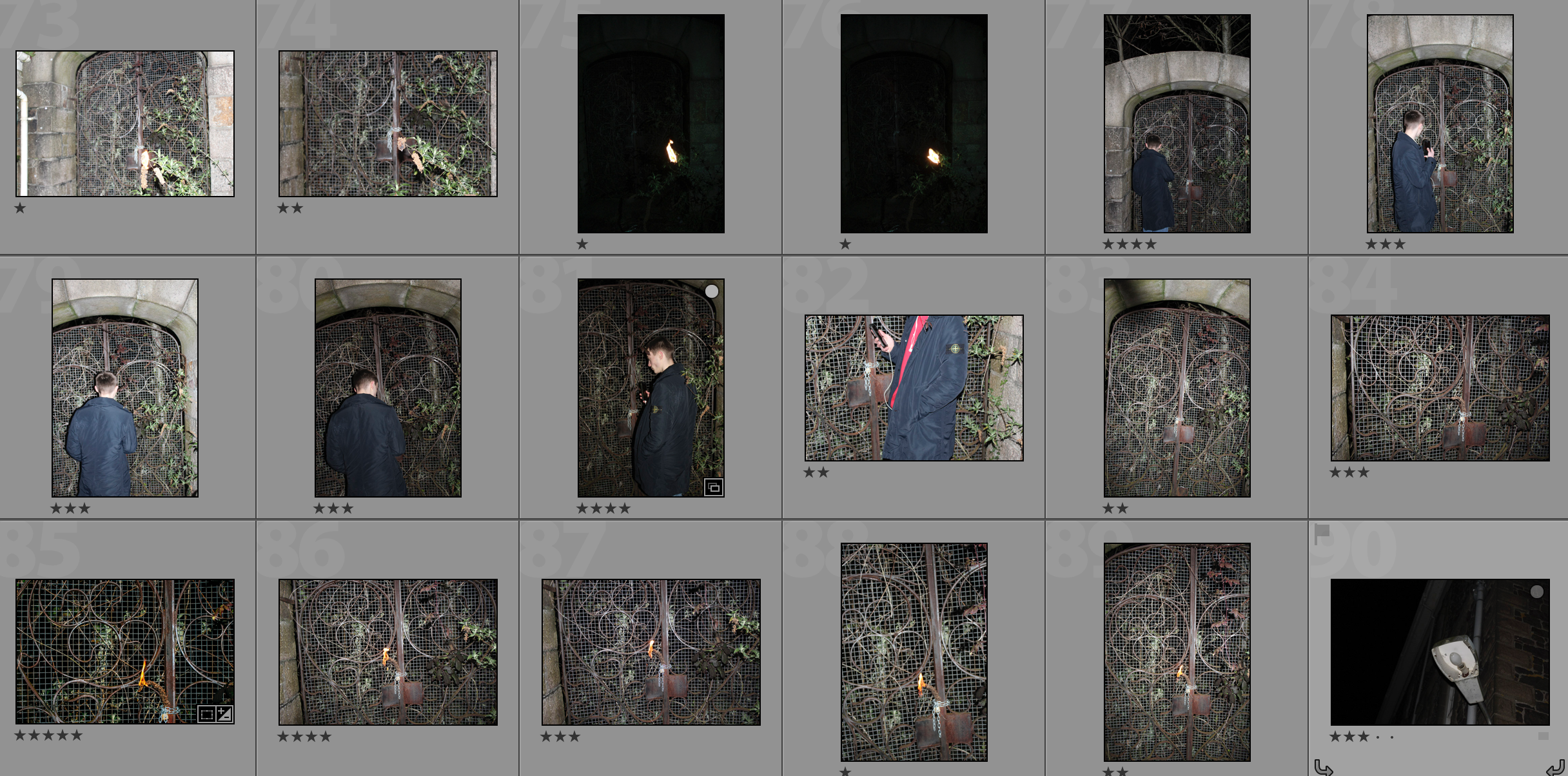
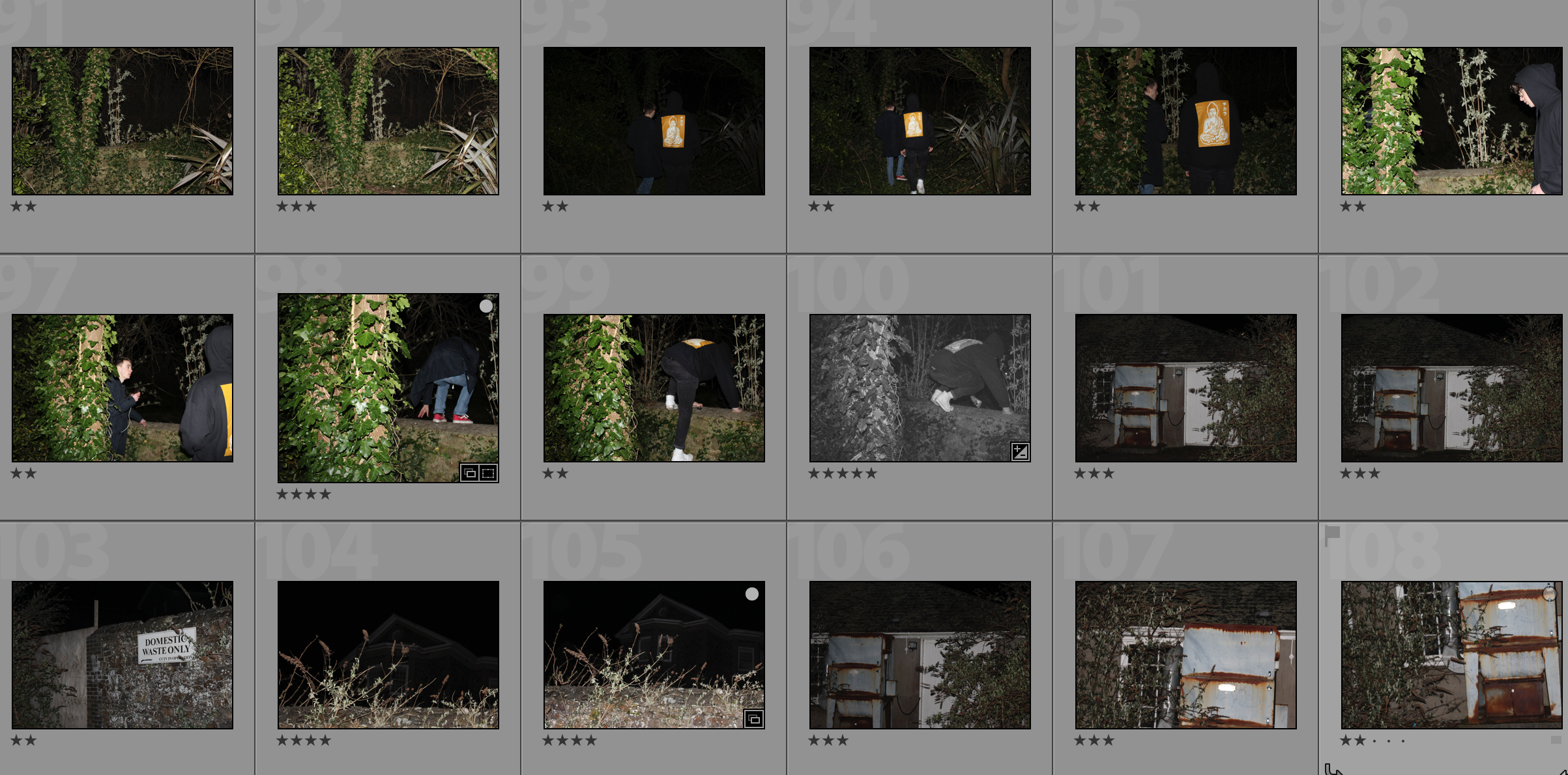
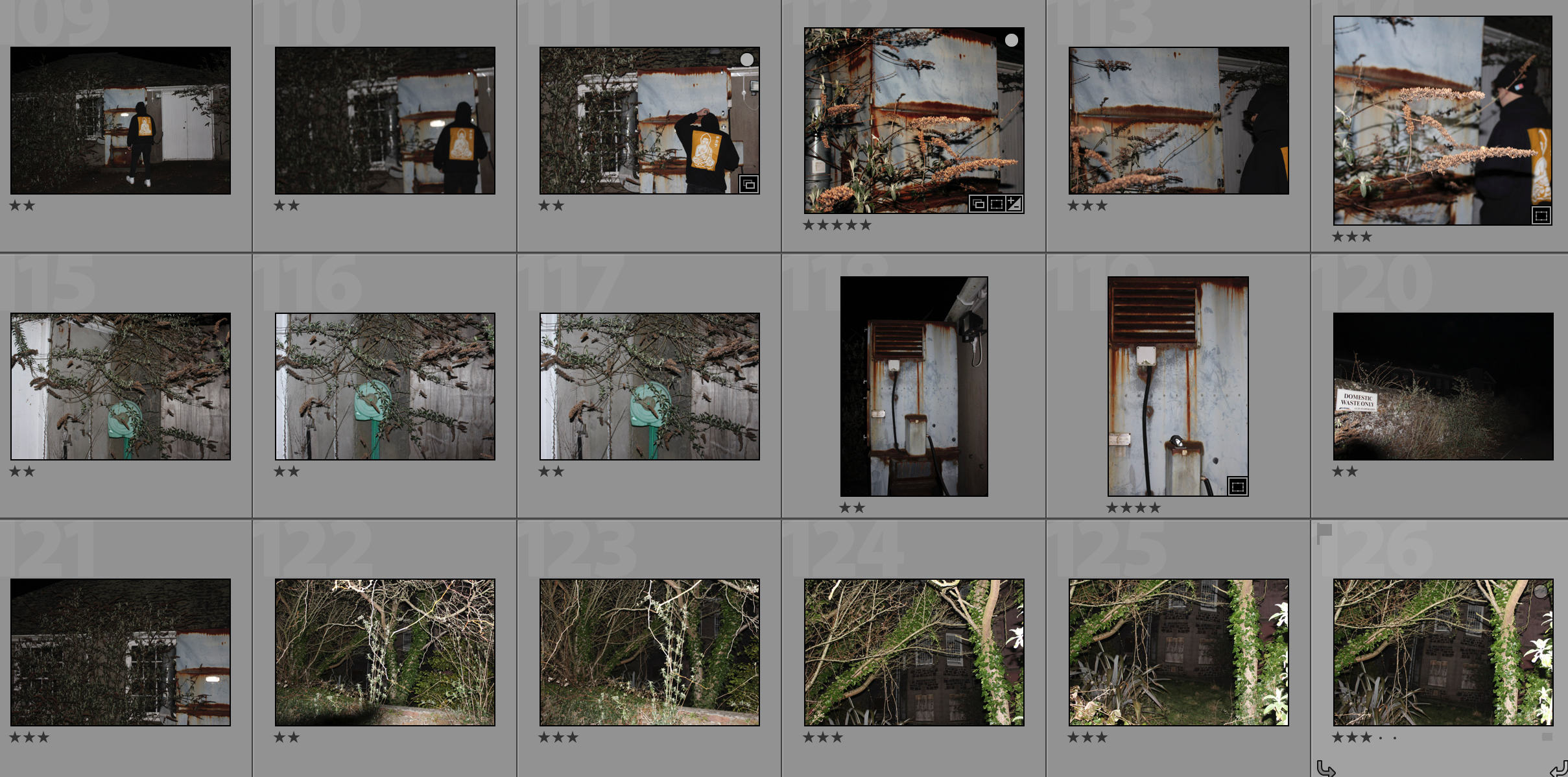
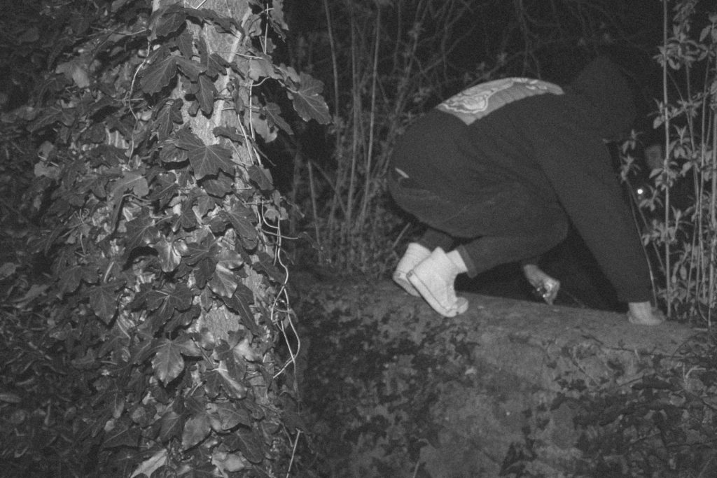
Props – I will be using the natural environment such as trees and overgrown areas along with people and a rundown building.

Camera Settings – Due to deciding to do the shoot in the dark will have to use flash in most of my photographs in order to illuminate the subjects enough. I will be using this with an ISO of 800 and a shutter speed of 1/40.

Lighting – I will be using strong torches or flash from the camera in order to capture these photographs.

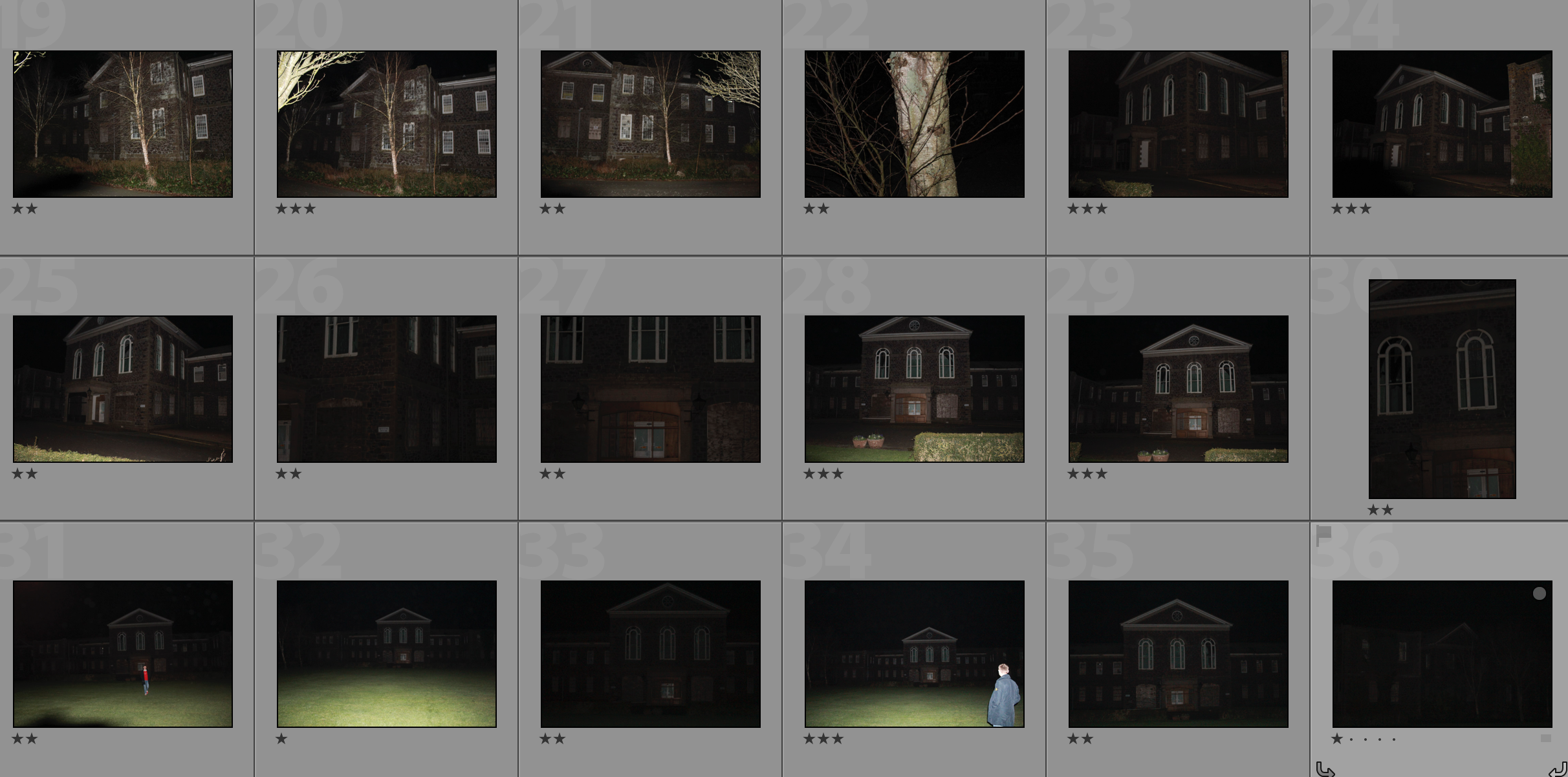
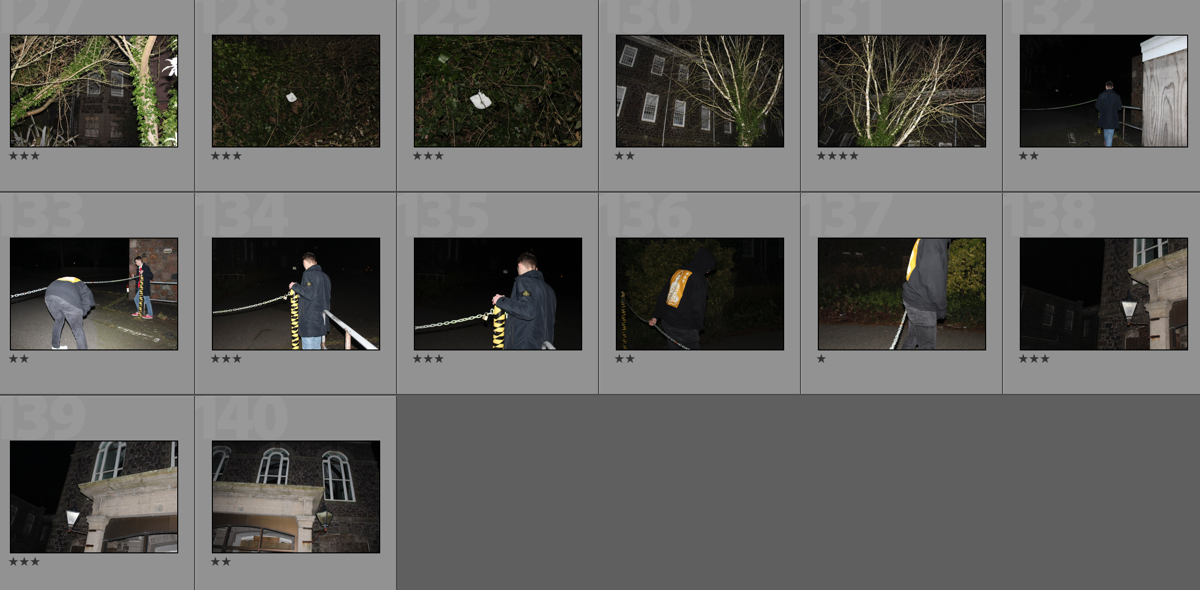
Location – St.  Saviours hospital

Context – I am looking at the theme of exploration for my AS level externally set assignment.

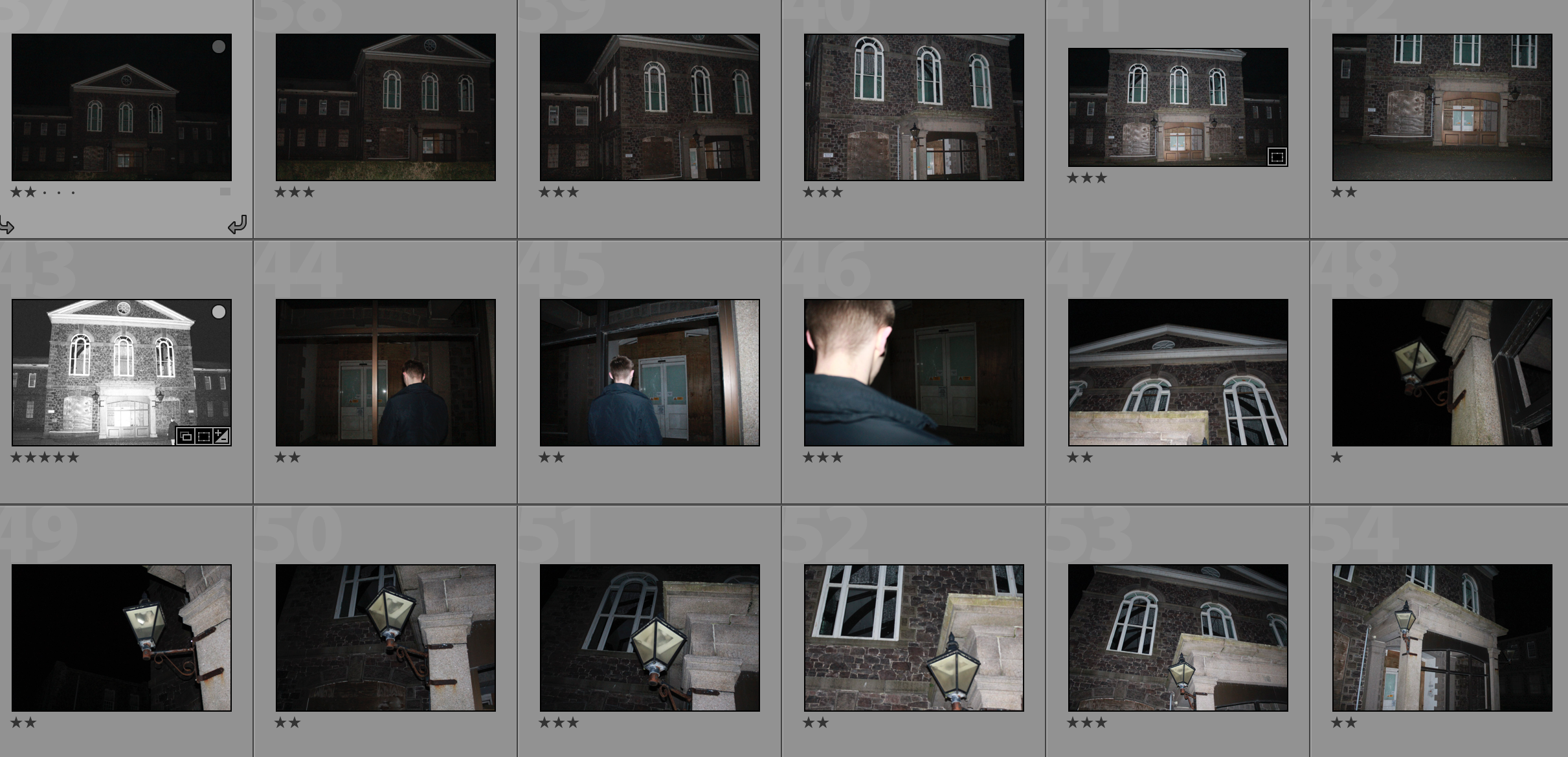
Concept – I hope to take photographs of the secrets that are the abandoned hospital and the overgrown areas around it whilst taking inspiration from Emmanuel Tecles

My Response

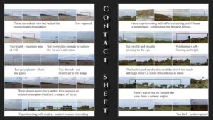
Contact Sheet

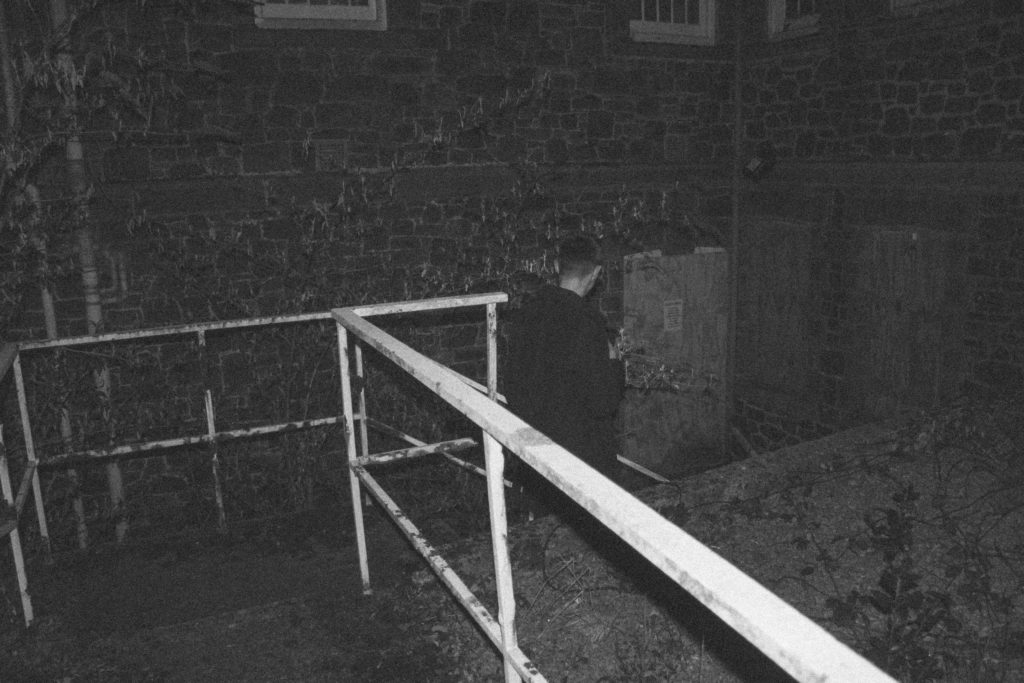
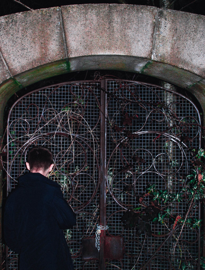
Edits

My Favourite Photograph

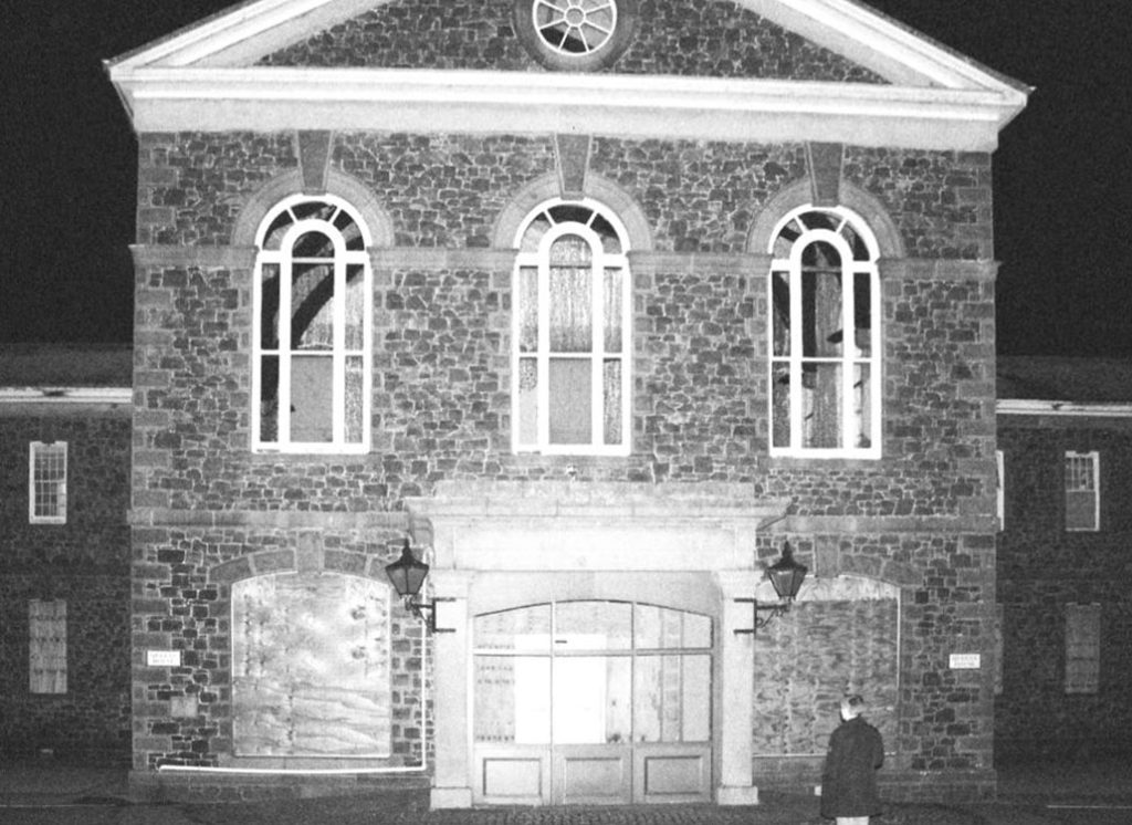
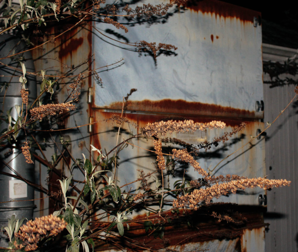
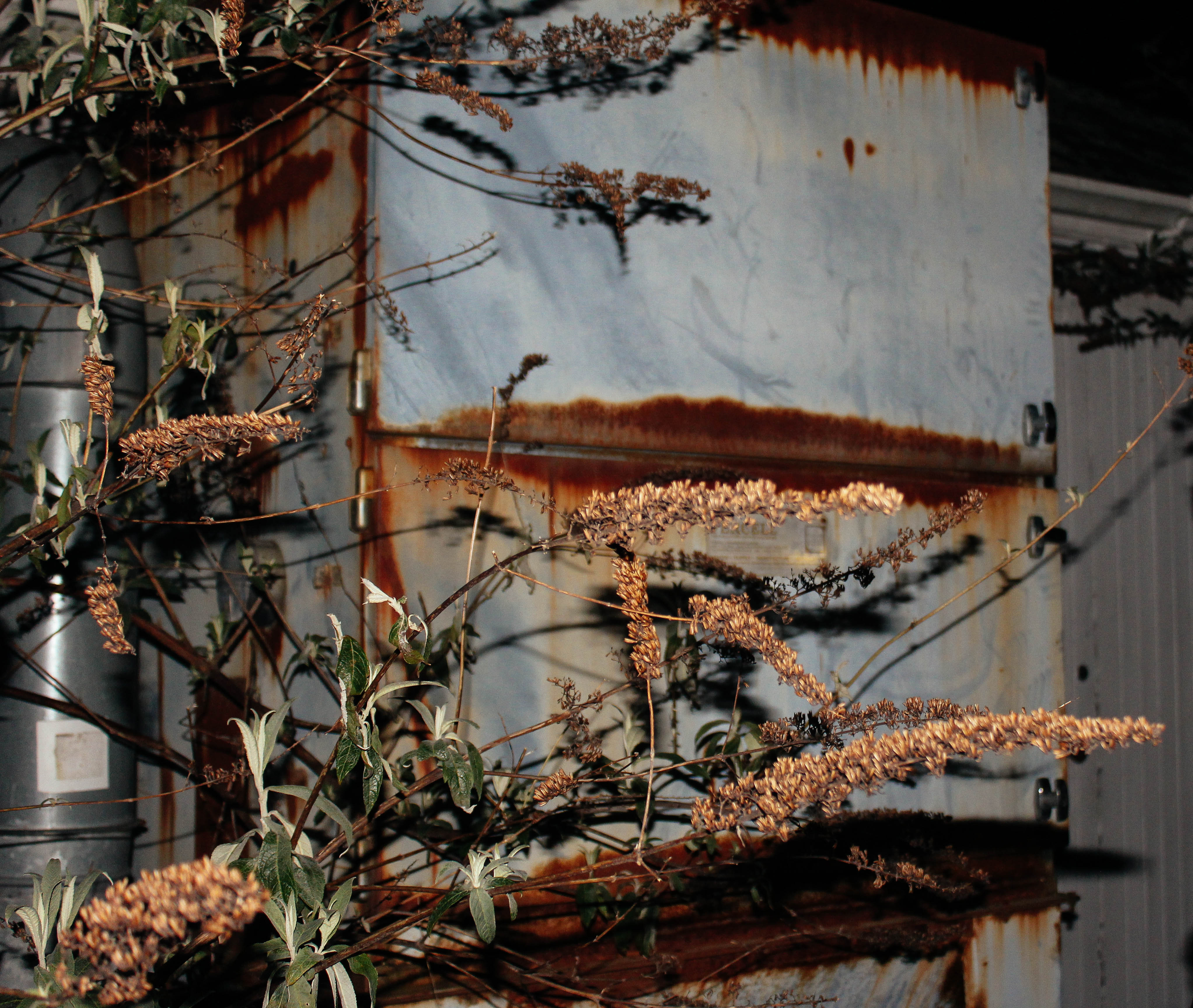
This photograph was taken with the flash on. This allowed me to create contrast between the shadows and the highlights within the photograph. I used a flash as the environment that I was taking photographs in was dark. Along with the flash I used an ISO of 400 to brighten up the photograph and a shutter speed of 1/40. For aperture I used a shallow depth of field, as this created a slight blurred effect in the background in order to separate the background and foreground.

In this photograph I used a natural colour scheme consisting of yellows and browns. This helped to convey a sense of natural decomposition. There is quite a 3D effect in this photograph due to the use of the flash and the low depth of field as the foreground and background have been separated. The tonal range in the photograph is fairly dark which creates a more mysterious photograph.

I took this photograph outside of the abandoned St. Saviours hospital – I chose this location due to the mystery and secrets about it. A lot of the area is overgrown and worn down so I decided to capture photographs of the disintegration of the area. This photograph in particular looks at a mysterious and dark atmosphere. It looks at the traces of the mystery of the area and the nostalgic history behind it. In this photograph I attempted to bring mystery and a sense of exploration into it in order to show that the building has many secrets about it that remain untouched in the abandoned area.


Surrealism Single Edit

Analysis

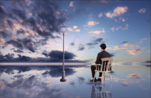
I believe this edit follows the suggested words for our exam title very effectively. It links to secrecy due to the isolation and sense of no where that is created. The clouds in both the sky and reflection help to draw the viewer down the picture into the background that is completed isolated, having connotations of mystery and secrecy. My edit has a connection with conventions because it demonstrates  how modern day photography is in the way photography nowadays is about photo manipulation and telling stories through this as a-pose to documentary styles of showing the truth. Also it can link to codes in the way that the objects in the photo, like the lamp posts, are symbolic and convey a secret meaning. In my opinion, the lamp posts  help to create the overall surrealism of this photo because usually lampposts are found in urbanised areas however in my edit I have juxtaposed this by putting them in a very open, empty place.

 Editing Process

Photos Involved in the edit

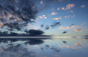
Photo 1

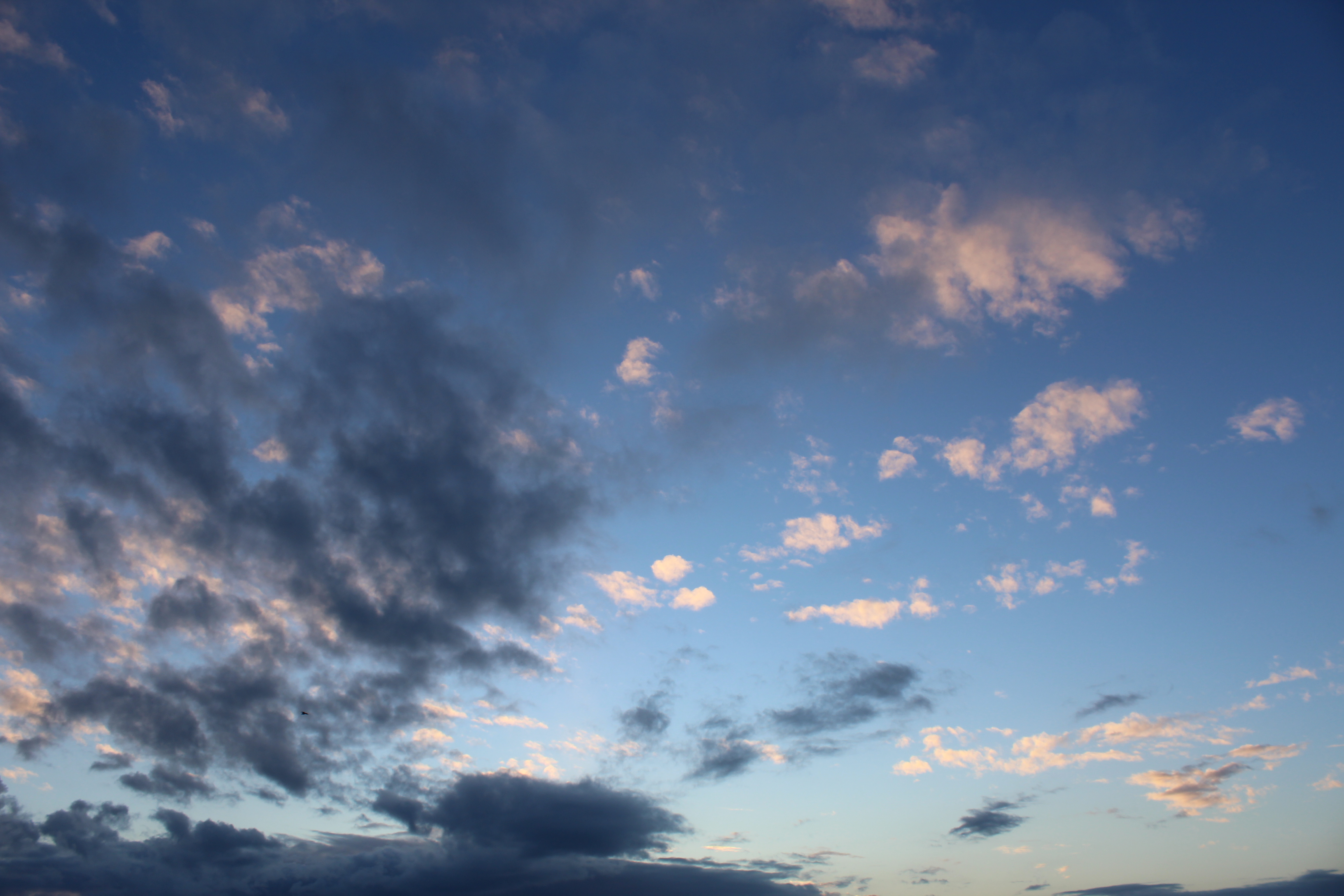
Within the edit I used this photo twice because I duplicated it to create the refection that my model appears to be sitting on. I used the gradient tool on the reflection to add a blue fade to make it seem as if it is actually a water reflection. Using the colour balance throughout the edit I ensured to create a more interesting image by adding in purples and pinks within the sky.

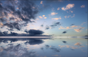
Photo 2

Again, within my final edit, I used this image twice. I made a duplicate of this image and then flipped it vertically and adjusted the opacity to 40% to create a reflection of the model in the floor.

Photo 3 (From The Internet)

Image result for lamp post transparent

This photo was used three times within the final edit, twice for the actual lampposts and one for the reflection of one. I think the lamp posts in this edit really help to give a depth of field and add to the isolation and loneliness of the photo. It helps to create the surrealist feeling because usually lampposts are in urbanised areas and in this image it is used to emphasise the isolation.

Step By Step

The Layers

collage edit of face inspired by second shoot

For this collage piece  it wad inspired by my second artsit,I took many profile shots at different angles and edited them all to be darker tonally, then I made a plan and decided upon the sizing and angles at which I wanted the images to be cut up,lastly I positioned the imagine in order to create a fragmented segmented appearance of a face.

original images:


I think this image is unique because I also cut the images in rounded lines in order to indicated an almost 3d effect,addtionally,this shows that is it also the shape of a human head and demonstrates the inspired artist pieces of the young boys 3d body.

collage:


Projector photography

What is projector photography?

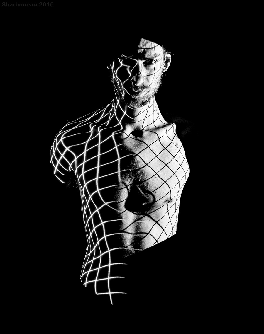
Projection is the use of equipment and lighting to cause an image of an object to be seen on a screen. Usually the image is larger than the original and the projected image is positioned to be easily viewed or used for another process.

Black and white projections were popular in the 60s. However, it developed to colour through the years. As projectors improved, their colours and brightness also become increasingly more defined and vibrant. Projector photography became increasingly more popular since the vast improvement of projectors.

Projection art and photography has become more popular over the years as photographers and artists have discovered this useful, adaptable resource to produce art and photography. John French was a famous photographer who used projection art photography in the 1960s.

Examples of projector photography

                                                             Image result for projector photographyImage result for projector photographyImage result for projector photographyImage result for projector photographyImage result for projector photography

klaus pichler

'No matter how rich or poor the country, the report found, one-third of food produced for human consumption goes to waste, due to factors such as consumer decisions and lack of distribution channels, while over nine hundred million people are starving.' - Klause Pichler interview
contextual - Pichler used his bathroom as a studio and for storing various foods kept in plastic containers as they began to flourish in mold and rot. He grew up in a rural province in Austria where raising and eating meat was an important part of their culture. Pichler later defied these customs and became a vegetarian. 
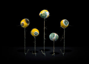
technical - This picture has been flipped to make it look like the string is holding the lemons up like flowers. The use of lighting is cleverly done, Pichler has lit the lemons from the front and bottom which gives a shadow on the floor of the picture [the ceiling], adding to the illusion that the lemons are standing up on 'stalks'. 
visual - As Klaus Pichler said, the initial sense of his work may seem beautiful and appetizing until the viewer realizes what they're looking at. He's set up this scene to remind the audience of something beautiful; flowers, with the string set up like stalks and the lemons displaying bright and vivid yellow and green colours. These colours relate to toxicity, beauty and nature creating conflicting views on the picture for the audience - is it beautiful or repulsive?
conceptual - The photograph is set up like flowers, giving connotations of beauty and life, directly contrasted with decay and effectively death. It gives the underlying message that everything comes to an end, highlighting that the luxuries we take for granted will slowly diminish with the natural reckless behaviours accompanied by humanity. Pichler has created these pictures to make us question the everyday actions that seem normal to us; throwing away rubbish, littering, driving cars, material consumption etc. - where does it come from and where does it go? We've been bred to do and not think.

landscape sea shoot development,third artist:Tony Hertz

Original inspiration

For my third artists I wanted to expand my ideas further from the behavior of people and  focus upon the behavior of nature and a pathetic flallsey effect and how nature has emotions and more power over humans.I want to portray a more free sense of nature and the environment not being held back by man made creations. I was originally inspired by the following images:I also want to focus on the conventional laws of how nature and how it is seen to behave and how we cannot actually predict its actions and its behaviour is a clear opposition to the lack of identity that people continuously show.


Third artists:Tony Hertz

He’s been recognized with top awards for his landscape photographs.His work has been published widely, including Outdoor Photographer Magazine, Photographer’s Forum, Silvershotz and Black and White Magazines. Tony has over 35 years of professional photography experience with 10 years of it as a daily newspaper photographer. While working as a photojournalist it helped refine his compositional instincts.Then he turned to focus mainly on landscape and nature subjects for personal and fine art photography work.  he become interested within photography in his early years of childhood when fining a box camera.At age 10 he was drawn to LIFE magazine and any book or tabloid that contained photos which in turn inspired him on his creative adventure. in 1971 he soon enrolled in a  photography class in San Bernardino Valley College.Afterwards he earns a liberal art degree and continued to teach photography.,while also learning the composition and techniques of the newspaper photographs. he soon became ;photojournalist;list of the year’ gaining skills of editing images and communicating within editors and photographers on story ideas and preventions. in the mid 1980’s he started to refine his compositional instincts and technically hone his photography skills. More importantly, it brought himself  into many situations and experiences with interesting people and events that shaped me professionally and personally.

I Chose this work due to the way the phototherapy divides his time equally shooting and then editing his work and additionally teaching traditional film photography and digital photography. within his work he has such diverse techniques and methods in order to capture the different atmospheres within landscapes and different methods in which to present nature and water,some of his work:


image anyslsis:

critical anyslsis:I Was inspired by this image as it presents a softer feel to nature and a long shutter speed in order to capture a movement of the water,This questions the conventions of the expectation of nature and the  presentation of how it works and can be presented.for my shoot I can develop the behaviour of nature demonstrating more stormy isolated weather as seen before and more romantisced nature to symbolises a behaviour we present and don’t show to people,furthermore the abstract sense and unpredictability that nature symbolises demonstrates the power nature has over people and how its strength can change the way people act and behave.


Johnny Joo Case Study

Who is he?

Johnny Joo born in Cleveland Ohio focuses on photographing places that have been forgotten through his camera. Joo is an urban explorer but aims to highlight the effect and beauty of places left behind that are not often seen without human intervention creating eerie effects whilst reminding viewers that all things must come to an end. His photos are meant to make the viewers aware of how humanity’s waste impacts society and nature when left behind through the destruction present throughout each image.

Joo photographs a range of abandoned areas from malls, stadiums, schools, hospitals etc with many images going world-wide. His work has been at the attention of many media outlets, much of his work is inspired by Salvador Dali from how the colours used pop out and wants to incorporate this into his own to create a realistic surrealism. Most of his work consists of the influence nature has over human structures and how eventually they will be re-claimed, but much of it has to do with a lack of human influence in an area and how this creates haunted and eerie images as a result due to it not being conventionally normal.

Here are some examples of his imagery:Once looking over his images I decided I should analyze it to see what made it effective as an image, to do this I would take into consideration the technical, visual and conceptual aspects of the photo. By doing this it would enable me to direct it to my own images and how I could relate this specific style into various shoots. The photo I chose to analyze is called Silent Hill:

Technical: The piece uses a high shutter speed to create a broad overview of everything in the theatre and capture the whole picture. Joo has used a higher exposure to capture parts of the shadows around the seats and ceiling to emphasize the sense of  eeriness around the idea of abandonment, by doing this it removes much of the sense from a light-hearted area. The use of including part of the floor before the seats creates the impression of long-term abandonment due to the rubble present throughout.

Visual: Visually the piece uses symmetry in its composition to not only create aestheticism through the use of patterned seating arrangements, but also to make the viewer understand the scale of the effect of abandonment in areas left behind or forgotten. The focus points consist around the entrance door lights which instantly draws the viewers attentions to the seats surrounding them.

Conceptual: The piece is meant to highlight the issues regarding forgotten places and how damage and neglect can ruin areas completely, however it is also meant to focus on the hidden beauty that arises from these areas in the process as the places photographed are rarely seen by the public eye. Joo also wants to make evident how nature always takes back what was built on it and the effects of it doing so.

midori harima shoot :shoot 2

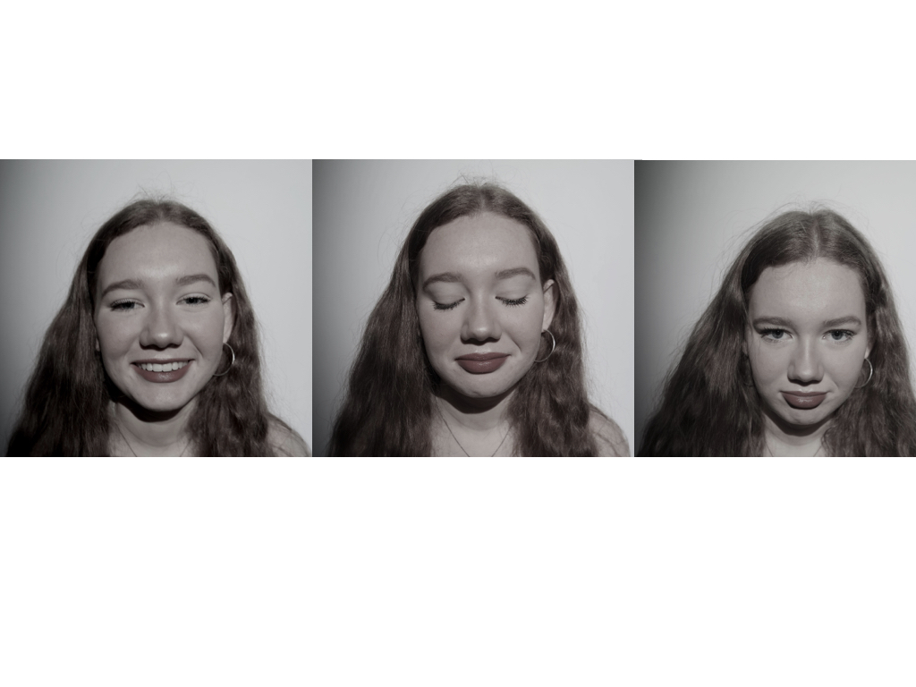
This shoot again was more abstract and focuses on more surreal aspects in the way their identity is pretested. I wanted to use aspects of mirrors and also collage to show a representation of  altered reality and identity to who someone is and who makes us who we are.This is also done in order to cover their identity with a different representation of themselves and how human behavior changes and is altered depending on the circumstances in which they are surrounded.I took this shoot in a room which the lighting was easy to control,due to the environment not being of high relevance but the main concentration upon collage and editing.

I have five main ideas for this shoot, collage,covering of identity,mirroring and using a doll to indicate a person beauty and false sense of covered identity and a lack of their real behaviour.

contact sheet:

edits:

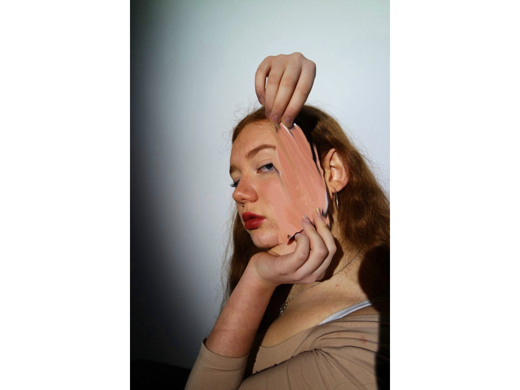
for the edits I used photoshop, with the addition or real life positioning with paper in order to indicate an effects of ripping off skin and covering of identity,addtionally I did many edits focusing upon mirroring and forming surrealism illusions within how a face is formed and how we have different sides and values to ourselves which can be viewed differently by different people. for my next experimentation within this shoot I will do a collage and from an abstract afce with the remaining images.
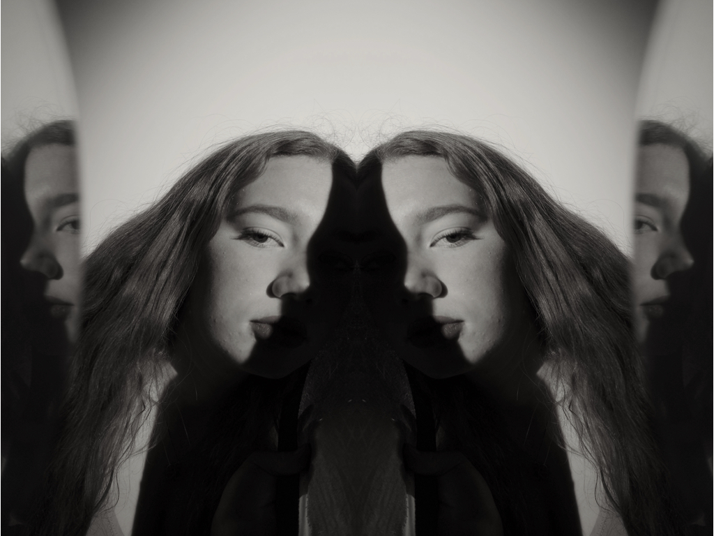
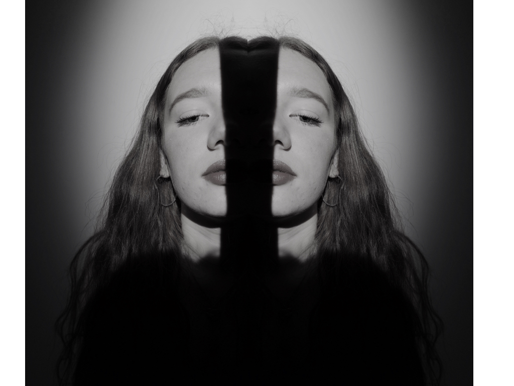
within these four images I repeated and flipped the images and edited the angles to create an altered reality to the positioning of her face.I originally did this by the lighting technique and blocking out light on half of her face originally.  
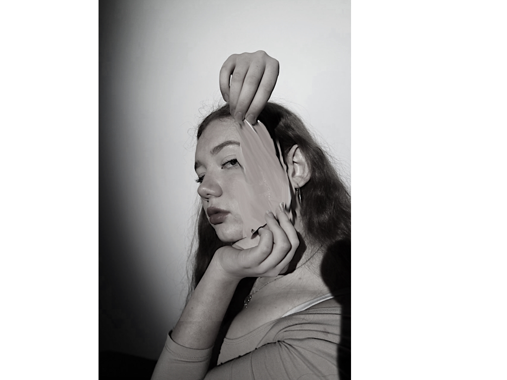
to edit this image I originally placed a piece f paper in order to introduce the angle and size of the effect that I would wants layered the image and used a lasso tool to segment the part of the skin I want to repeated and then shaped it to the size of the paper, removing access. lastly I used the smudge tool to allow a movement of the skin coming off and a pulling effect. 
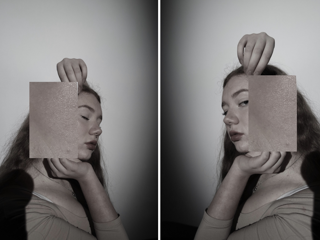
within this idea I wanted to develop more on human behaviour and emotion and what we show and cover as a secret to our identity,this tracks emotions to which people feel but will not consciously present to society.

best images and image analysis:

this is my favourite image as it uses many techniques of half lighting, and a mirror in order to recreate a face in a altered angle,I then repeated the image and positioned the faces to be facing each other to portray a whole face and then tonally edited the piece itself.Overall it symbolises a question of attitude and mystery to what a person thinks and presents through their behaviour to others,there is a sense of suspension of altered personalities to which are fake and not ourselves.