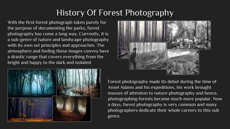
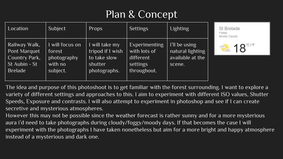
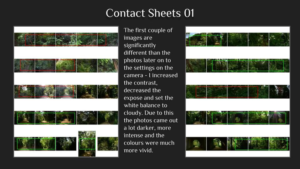
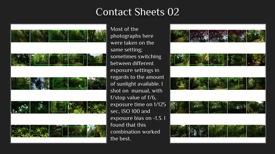
Category Archives: Externally Set Assignment AS

Filters

Author:
Category:

Secrets Photoshoot

Concept Genre /  Artist Location Props Shot type Lighting Settings
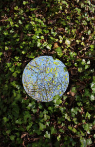
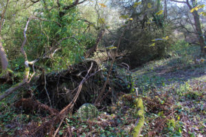
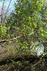
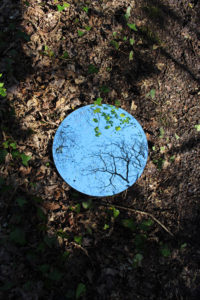
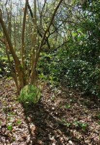
Secrets Sebastian Magnani/Reflections Woods Circular Mirror Landscape Natural Lighting Manual focus,f/2.8-f/4, 1/60 shutter speed ISO-100

To experiment with the different way secrets can be interpreted, I plan to explore the different reflections that can be made and the contrasting images can be made from this.

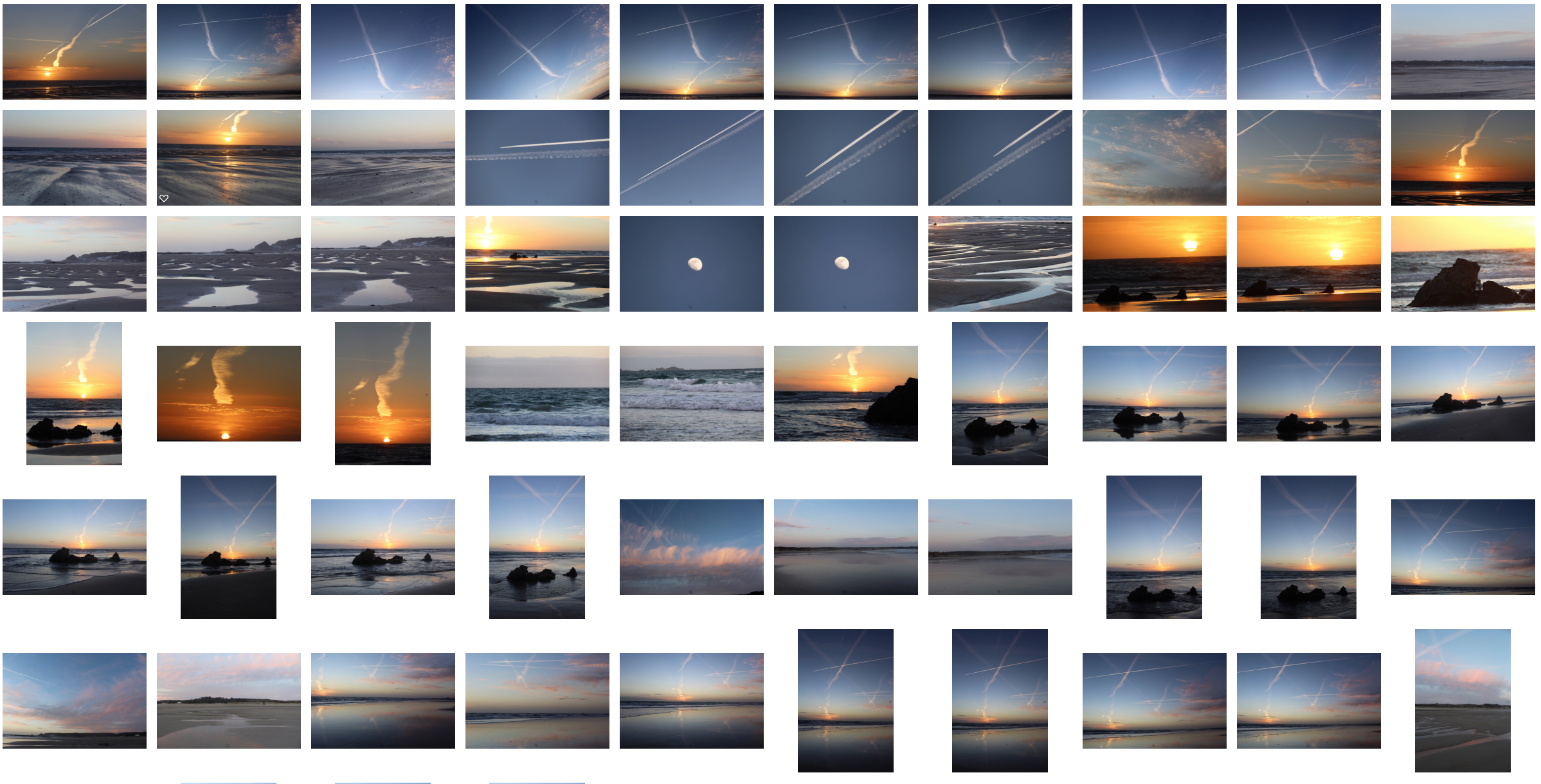
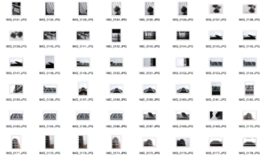
Contact Sheet 

Best Images from the shoot 


Thomas Barbey Inspired Photoshoot

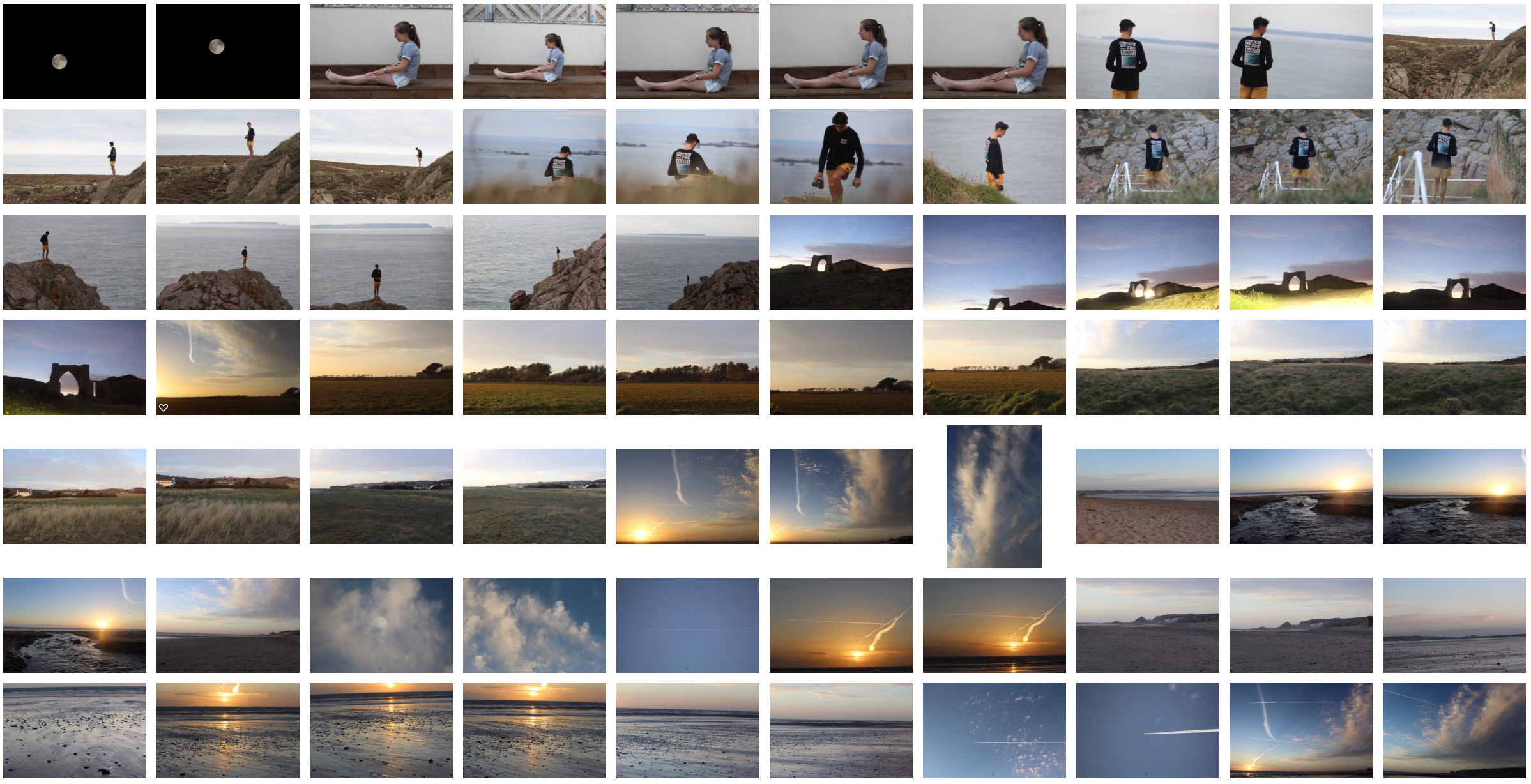
Photo shoot Plan

Genre / Artist – Surrealism

Concept – Capture images inspired by Tommy Inberg and Thomas Barbey to refelct a sense of secrecy and display a sense of the environmental issues going on which people are unaware of, as well as using codes to portray this.

Location – Studio for portrait images and rural areas for the backdrops.

Shot type – Landscape, varied angle dependent on subject matter

Lighting – Natural Lighting for landscape shots and spot lights and reflectors for the studio portrait images.

Settings – F/16, 1/30 shutter speed with ISO of 100 for landscape shots

                             f/5.6, 1/200 shutter speed, ISO 100 for portraits

My Ideas

To Explore Humans Destruction To The world and the environmental and social impacts it has on earth. I plan to look a certain situations such as urbanization, deforestation, global warming, rising sea levels and pollution. I will incorporate a sense of surrealism to help portray these secrets about our earth and emphasize them by doing so. This links to the exam title as my images will convey the secrets about our earth as well as defy the conventions of early day photography. This photo shoot and edits will have political context within it due to the awareness of environmental issues that Trump believes doesn’t exist.

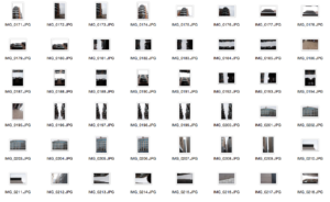
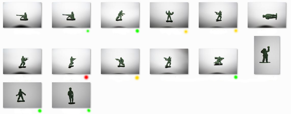
Contact Sheet
Edits
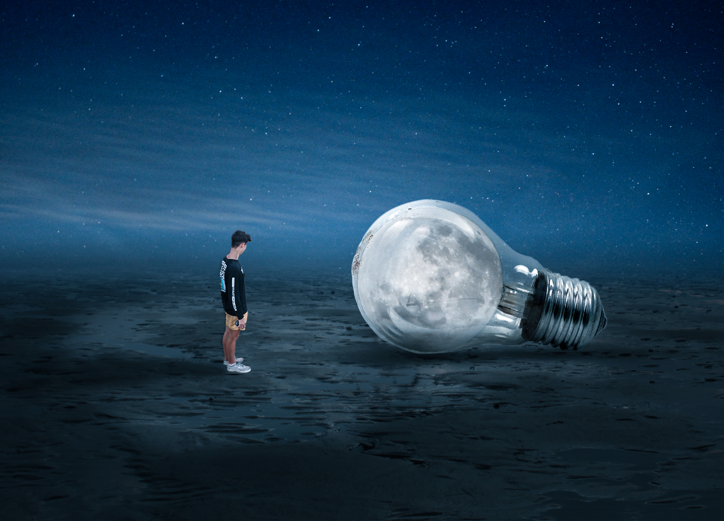
Analysis

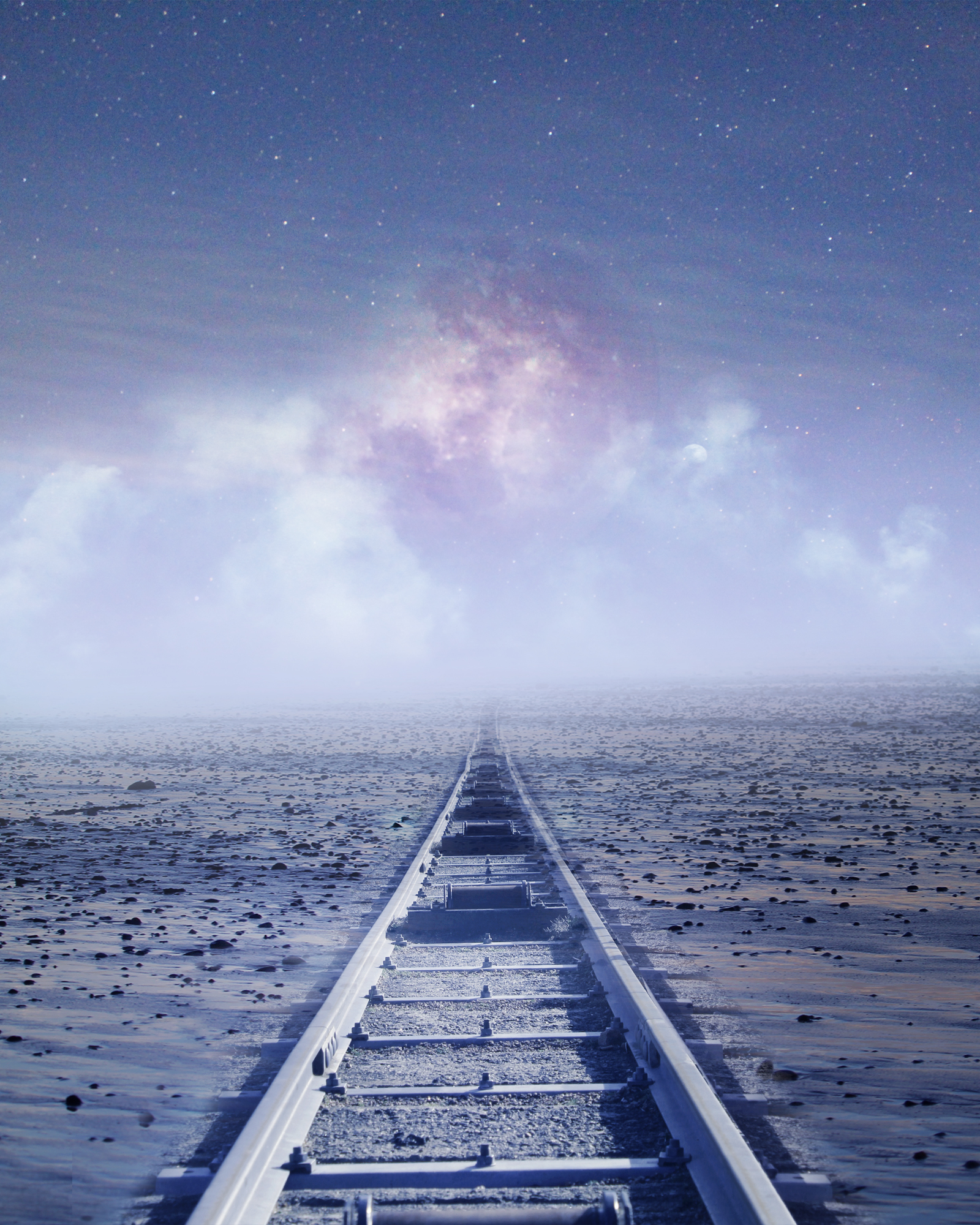
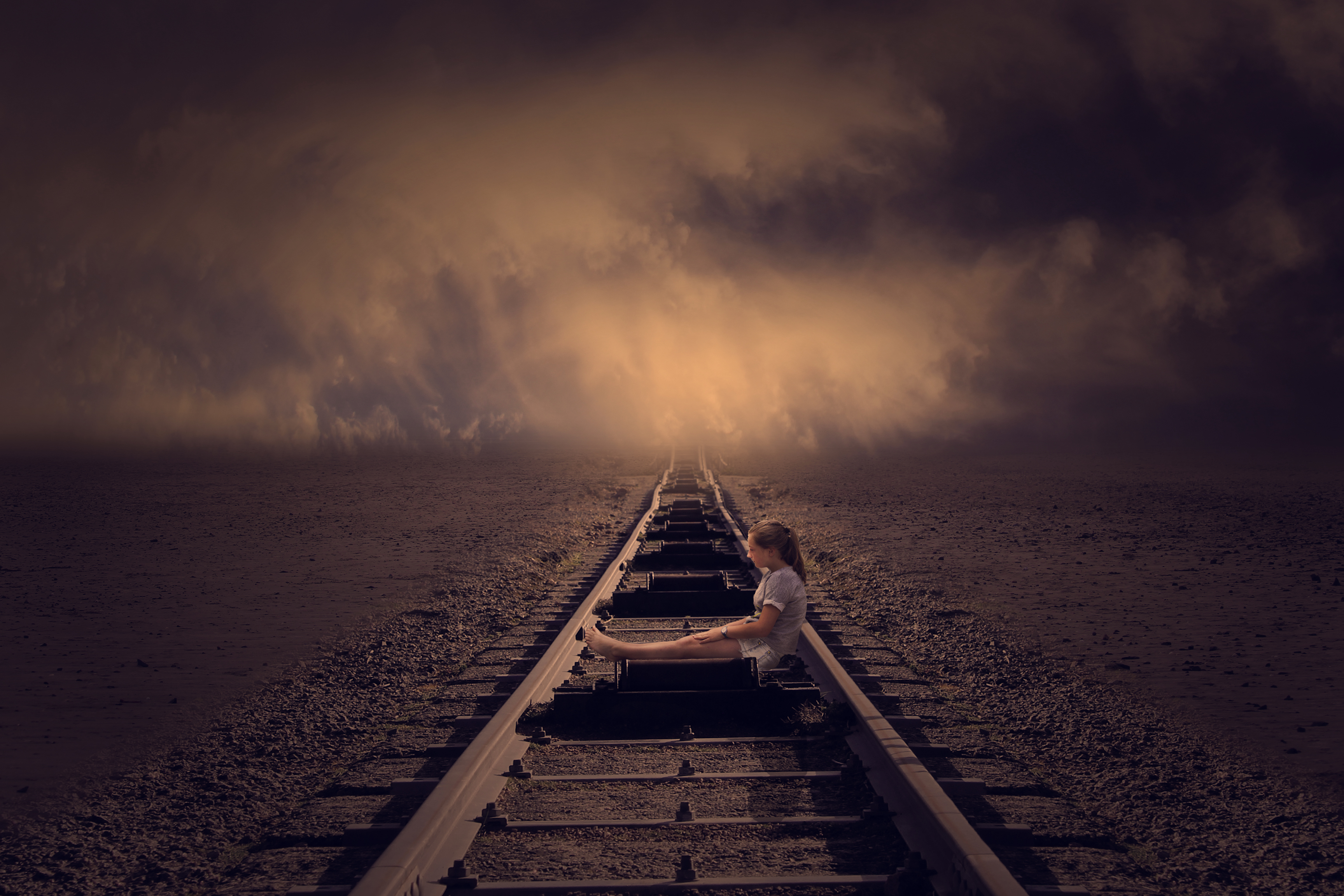
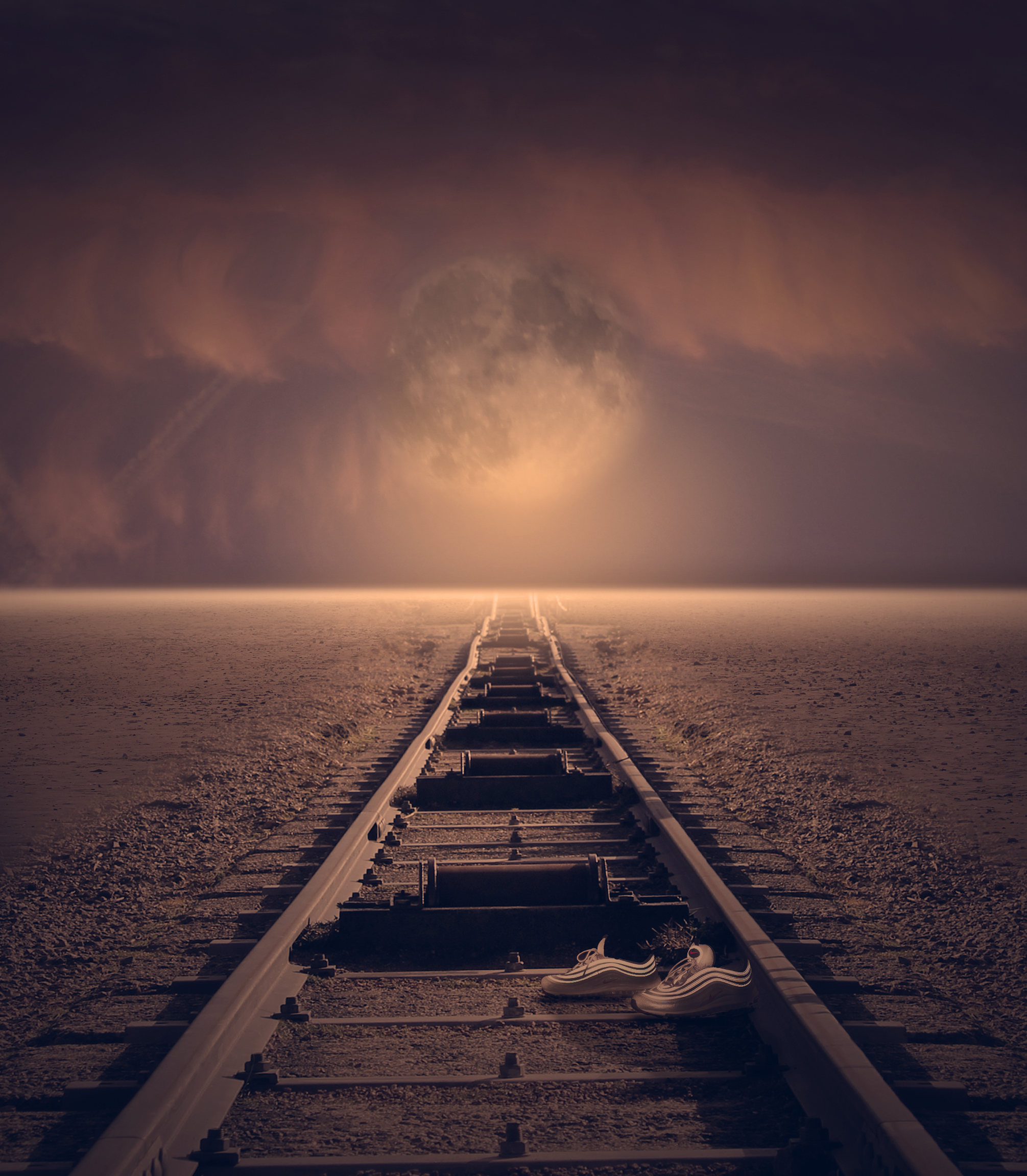
I believe these images respond to Thomas Barbey’s photos in the way the conceptual ideas are similar. Thus being the environmental issues that humans create and the man made features that are destroying our beautiful world. I have tried to over exaggerate our beautiful world by creating these fantasy landscape images, combining a few different pictures i have taken and then juxtaposing this with man made features that are wrecking this. I believe this over exaggeration helps to portray these messages. I have consistently used the moon through these edits because the ‘moon’ is symbolic of a fantasy world and it therefore contrast nicely with the train tracks and light bulb which are subjects that are destroying our world.
Initial Outcomes

INITIAL OUTCOMES

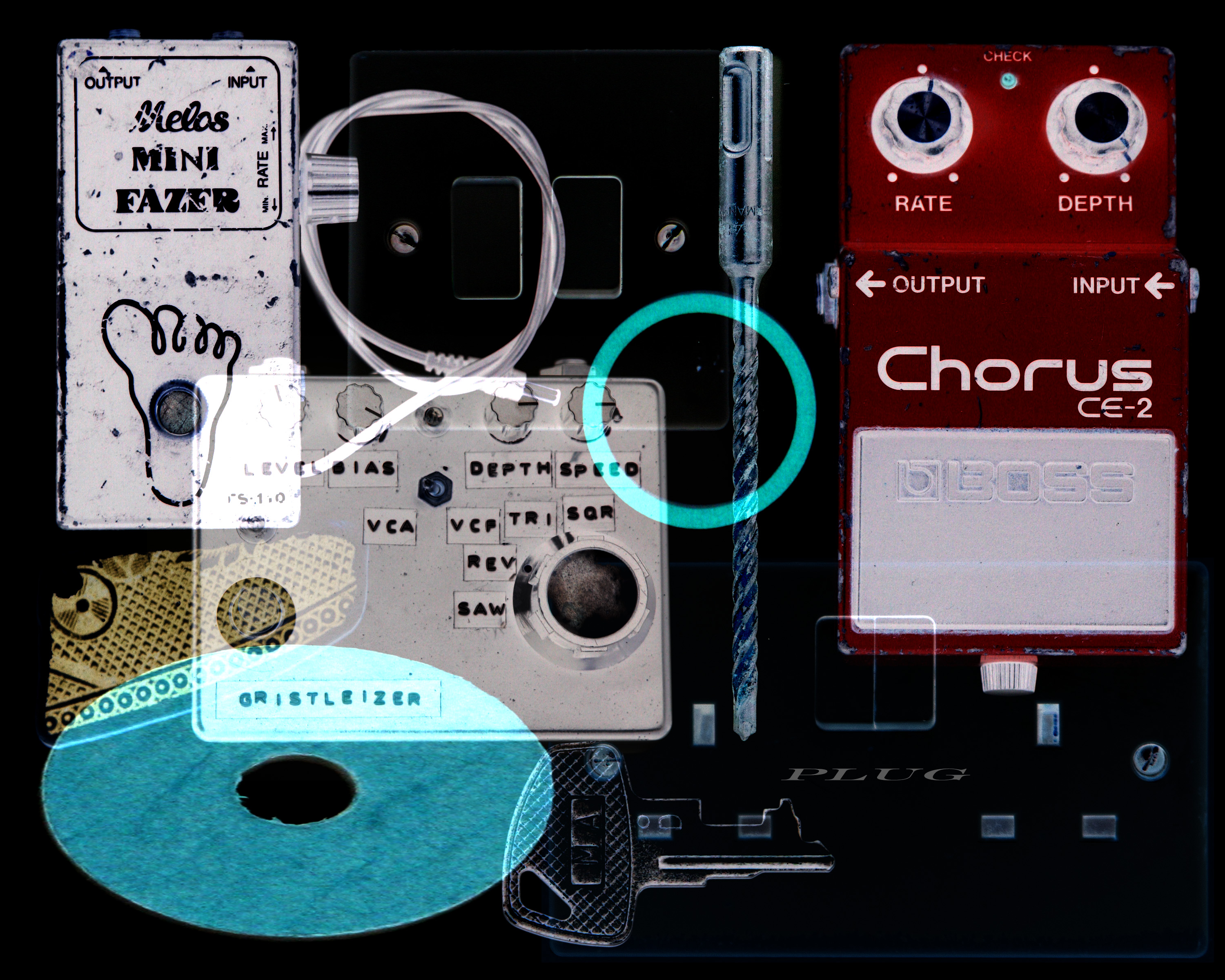
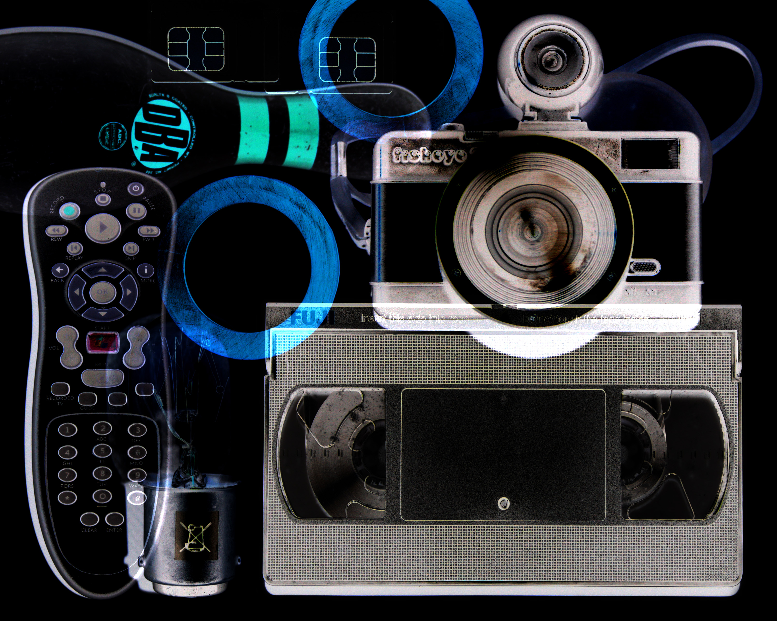
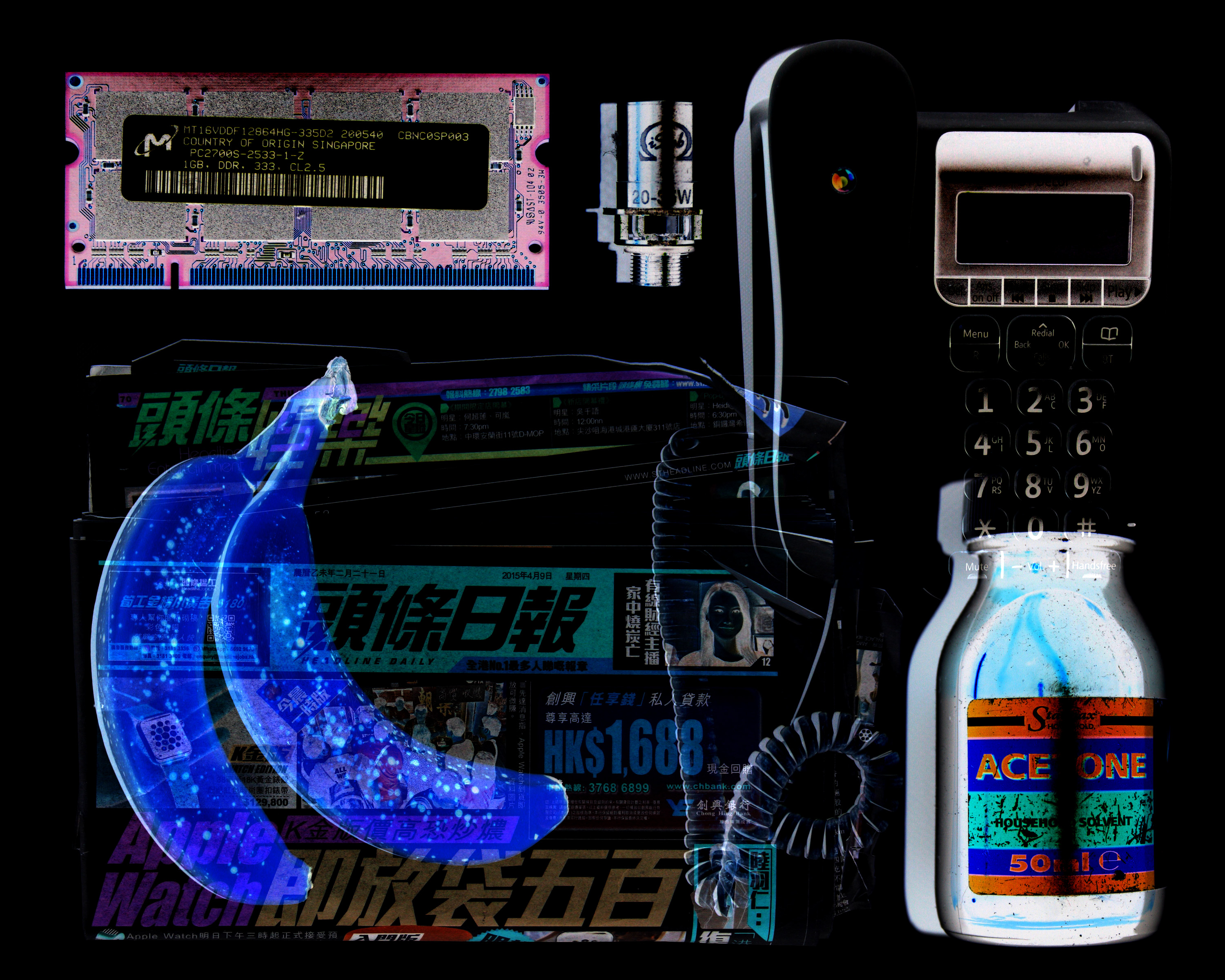
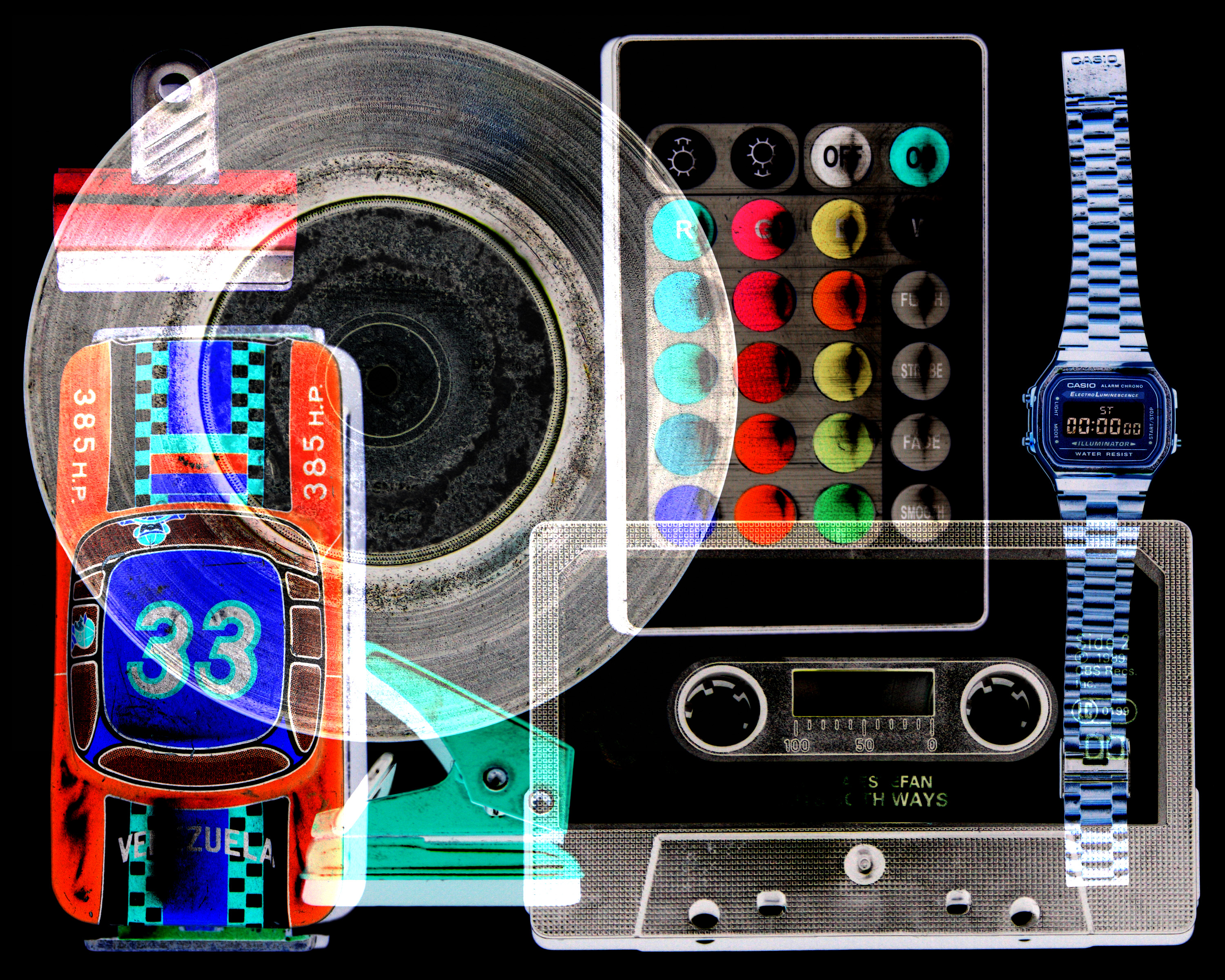
Here are some initial outcomes/edits which I have produced with my initial ideas and thoughts in mind. I believe that for a first effort these have come out rather successfully, therefore I plan to take this style of editing and composure forward in this project. I believe that they are a good initial response to the exploration of Maha Malluh’s work and the idea of the x-ray aesthetic.

This was my first outcome in which I used some photographs from earlier in my coursework, as I wanted to see how this style of editing/composure worked visually before using any of the photographs that I purposely took for this project. I was very satisfied with this outcome, therefore I decided to go forward with this idea…

…I believe that these images are well balanced with textures, tones and shapes…
…The way that the objects/subjects contrast with the dark background is also something that I believe is successful with these images…

…Overall as an initial response to my idea which was ‘to photograph individual objects and then use Photoshop to compile and overlay them in order to create images with a similar aesthetic to a mix of the X-rays and of Malluh’s work. However this will require me to find alternative objects which aren’t obvious in order to give the pieces individuality and visual interest within each piece itself. This will be a response to development in technology and the everyday objects that are found around us, and how this development is causing a loss of security and privacy (which will be symbolised by the security X-ray aesthetic as it something that breaks the line of privacy.)’ I believe that they reflect this statement.
I will soon follow up with a blog post on my editing process, so that the way I have edited these images is explained.
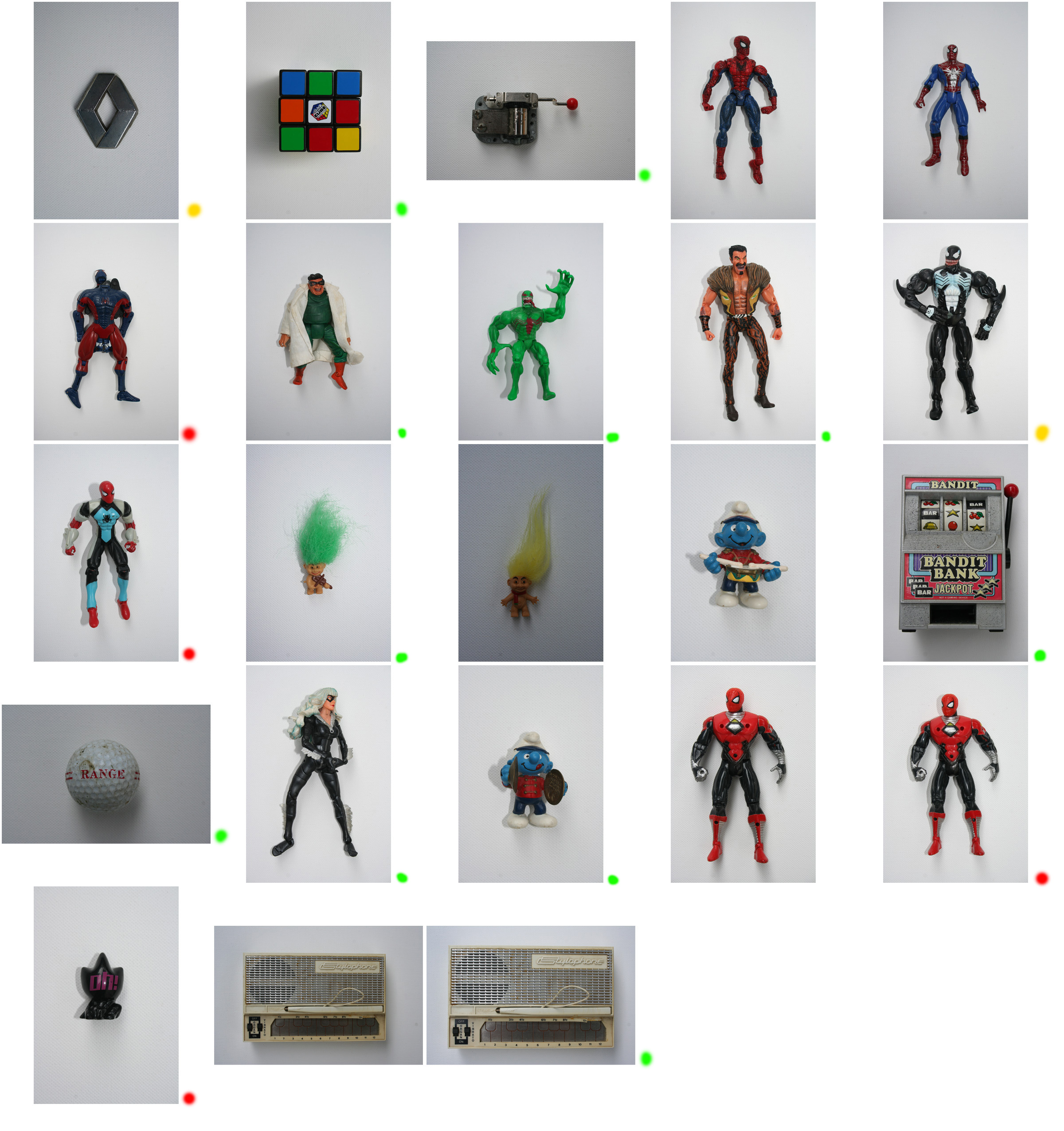
Jim Golden

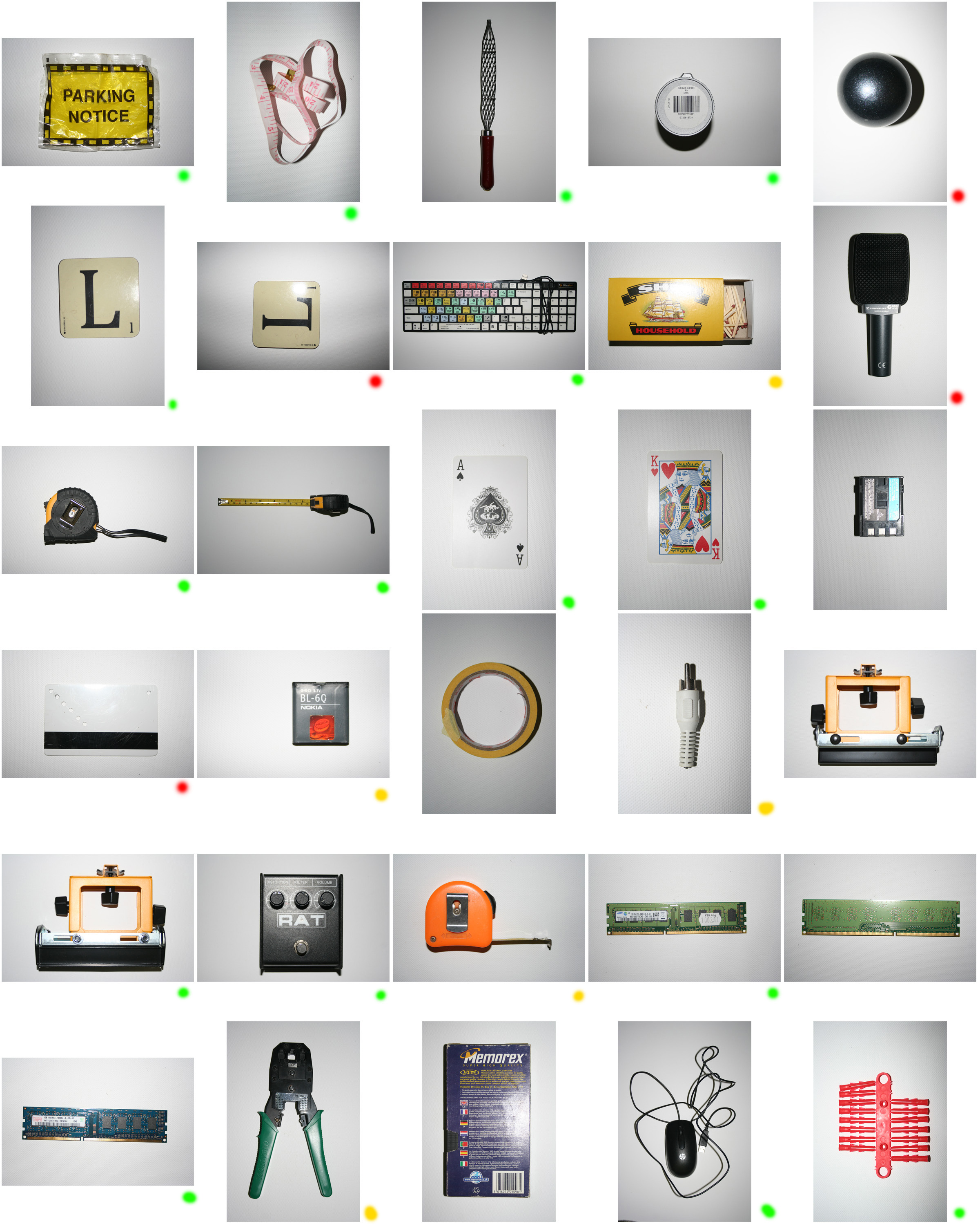
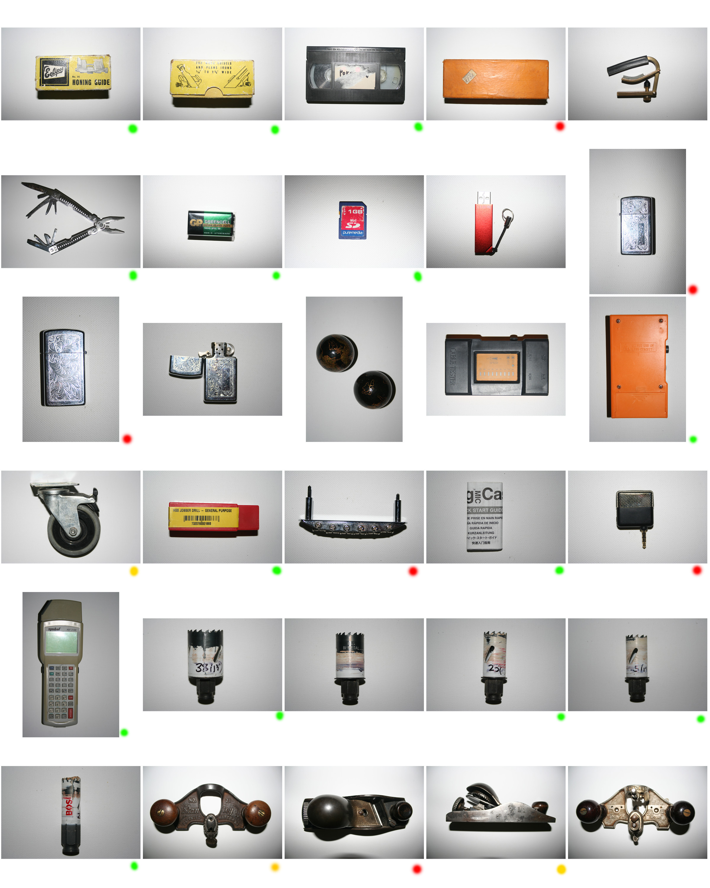
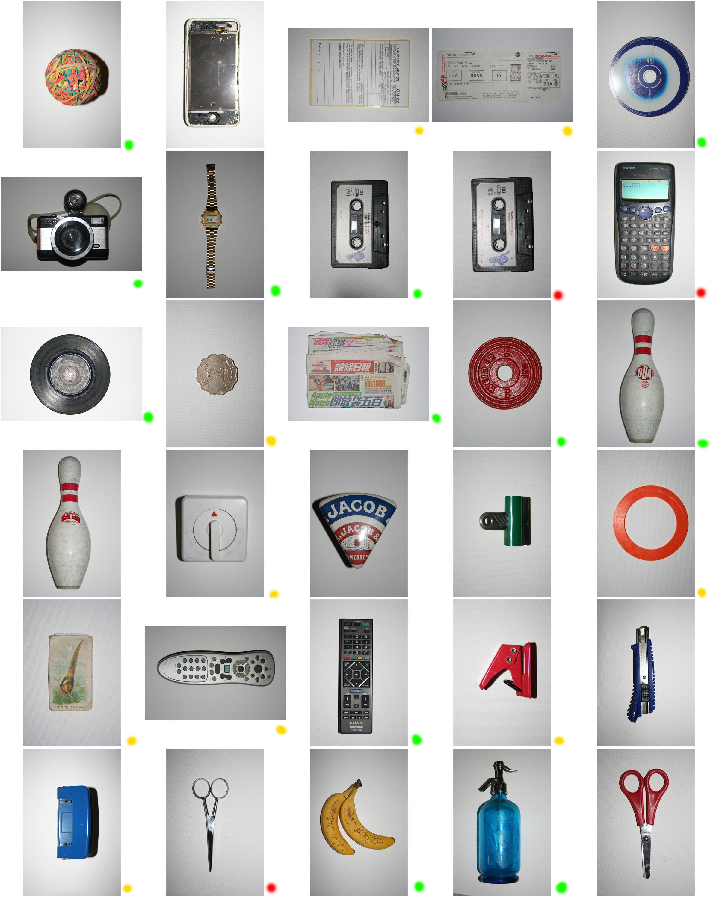
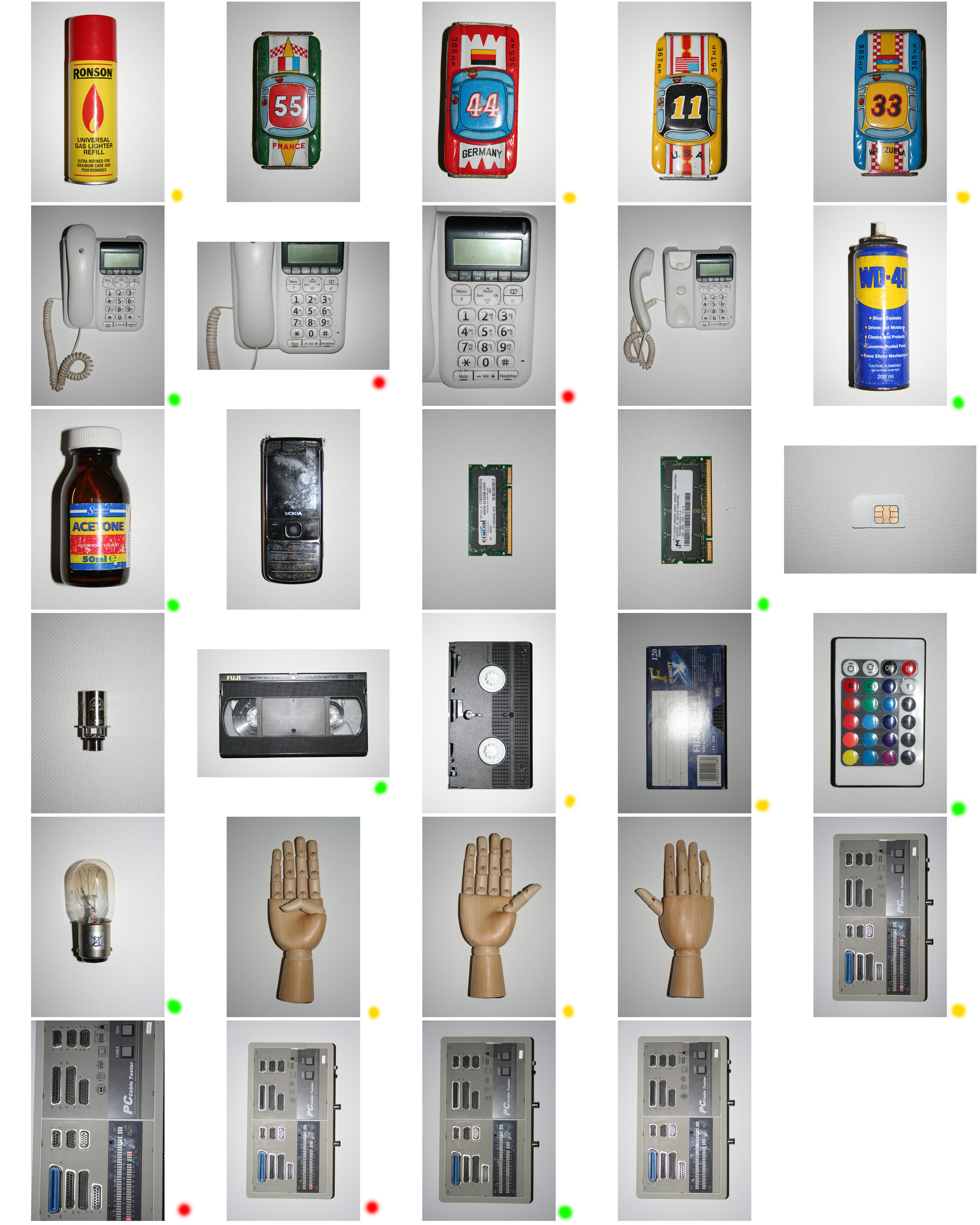
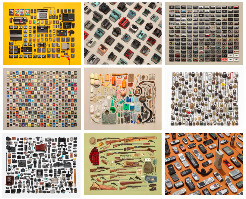
above I have collected a range of his collections work. “It all started with a scissor collection. Shooting them individually didn’t capture the magic” -Jim Golden.

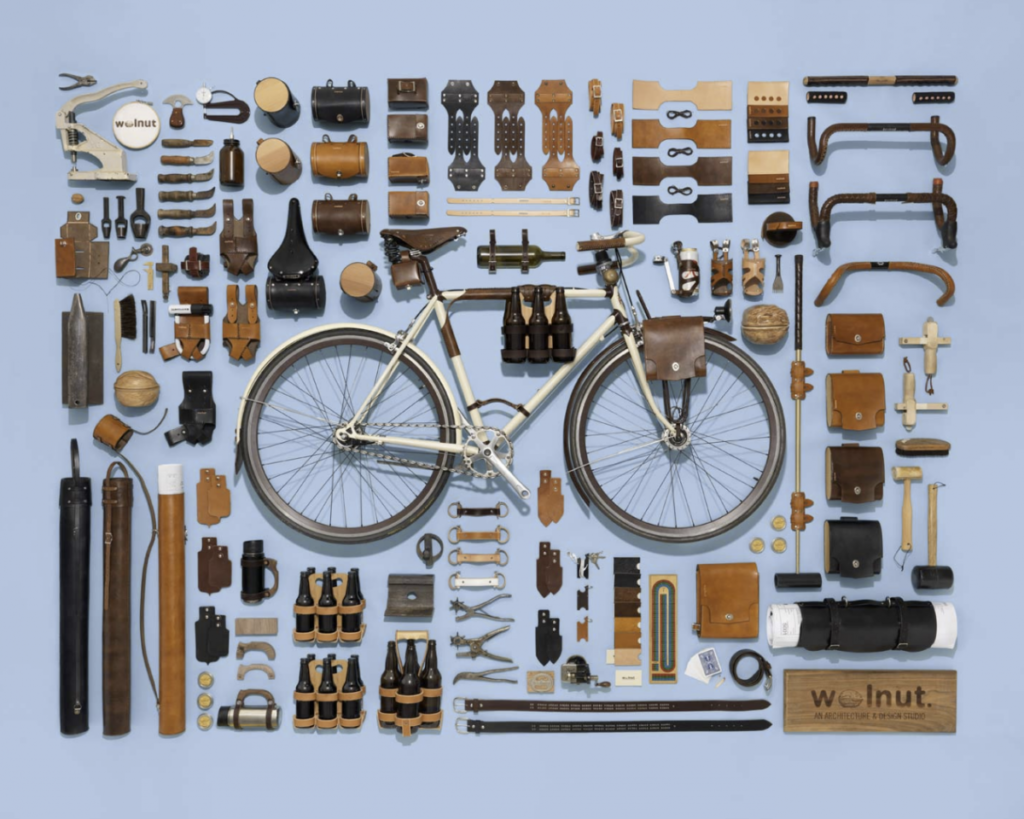
TECHNICAL: This photo was taken using controlled studio lights, these would have been fluorescent or led lights to give a bright and perfect block colour to the background of the images. There are no shadows in this image which tells us a soft box was used to defuse the light. A flash could have also been used to make sure there was and equal distribution of light and no shadows. For this reason the photo looks very clean and professional, all the items in the image took as they would in real life. A wide angle lens could have been used to get all of the items in the frame however from the photo of his set up there is a very tall tri-pod which would have been used with a standard lens. A high f-stop would have been used so that all of the objects spread across the image could all be in focus. The objects in the image would have been stationary meaning even if it shutter speed was slower to make the photo brighter they would still turn out sharp because the camera was on a tri-pod. The image is very clean and sharp meaning a low iso was used, this was possible because of the strong lighting in the studio.

CONTEXT: As well as taking promotional images for companies Jim Golden also takes pictures of people’s personal collections of items. these photos have a lot more personal value and can give us an in site to their owners life. This specific image looks like an advert or sponsored image due to the branding incorporated into it, however it has the same style as his other photos with a more personal touch. In the picture we can see different pieces of stylised cycling equipment, they all have a specific colour scheme because of the leather pieces.
VISUAL: The block background colour of this image is important to help the bicycle parts stand out, any colour could have been chosen but this blue helps the orange tones in the leather to pop. orange and blue are opposite colour on the colour wheel which means they compliment each other helping to bring the photo together. By using a limited range of colours Jim Golden’s photos look very minimal despite them having so many elements and focus points. The objects in the fame have been placed in a very organised rectangle shape, each item has been placed so that there is not large bits of empty space between them. The bike has been placed in the centre of the arrangement, which helps to create some symmetry in the image.

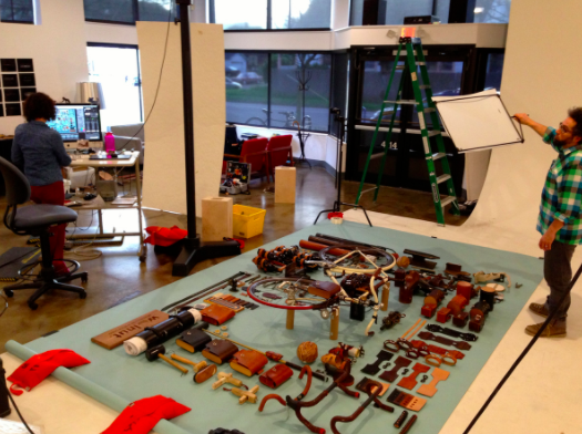
This is am image of how the photo above was taken, Golden has been known to start from scratch if the shot isn’t lining up. All his photos are taken in studios with bright perfectly controlled lighting to display the subject in a minimal and clean way.
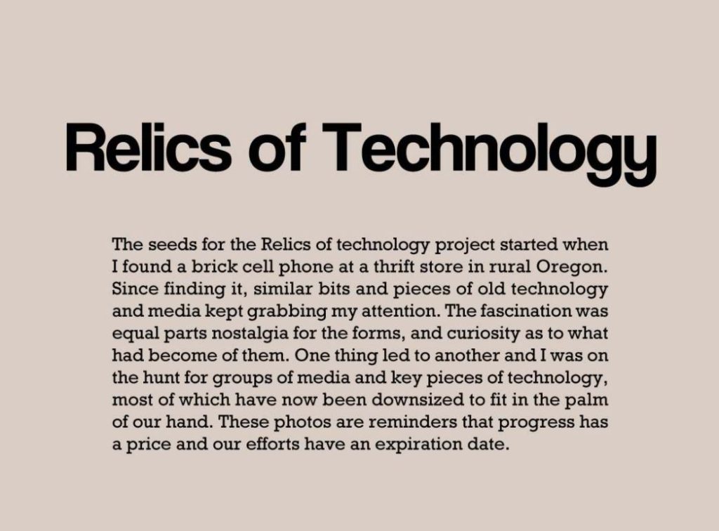
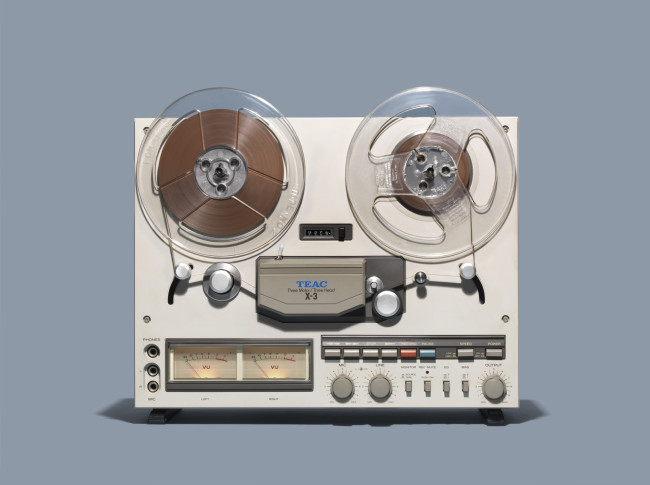
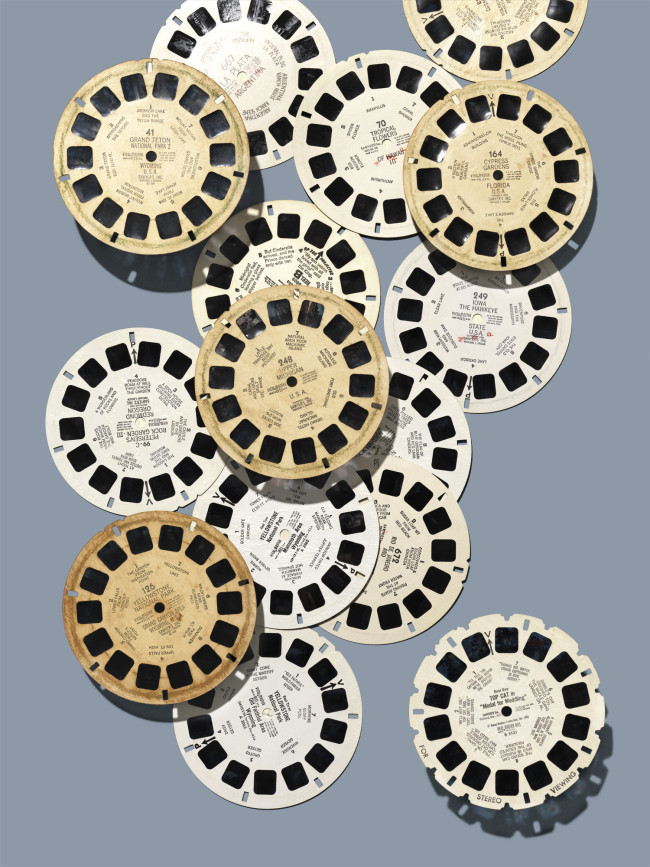
statement form Jim Golden about his relics of technology photo series.

Jim Golden photographer specialises in still life and photography of products, this is because of his experience in the advertising world after working as a retoucher for years. He was originally from New York but moved to Portland when he made the move to shooting. He received a BFA in photo degree and a minor in design but taught himself hoe to light from the ground by looking at the work of his favourite photographers. He focuses of capturing the true essence of a subject rather than impose a false sense of beauty on it. I am interested in his moving images which bring his usual clean still life photos to life in a simple sequence of shots put together to show motion:  https://jimgoldenstudio.com/Portfolio/Moving-Images/thumbs

I like his photos of collections, where he recorded  things that other people have hang onto and collect. This links to my theme of secrets codes and conventions because it helps to tell the secrets and storeys of the owner of the items, a persons possessions can tell us a lot about them and their life. it also links back to my first artist reference Ishiuchi Miyako. His series called ‘relics of technology’ also relates to my project because it links to the historic documentary style of Ishiuchi Miyako. instead of focusing on individual items in natural positions he creates more clinical and organised images.

Ishiuchi Miyako photoshoot


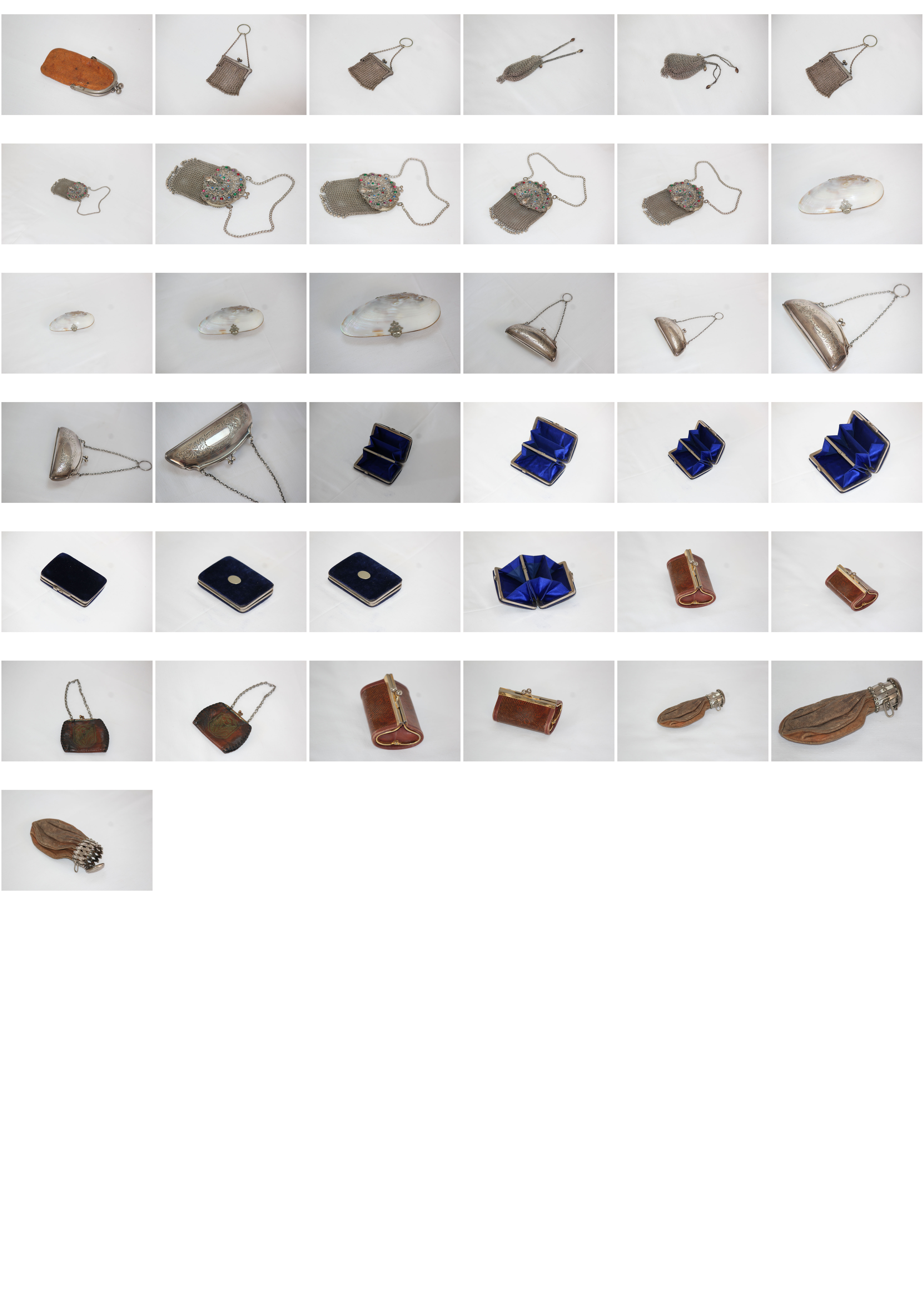
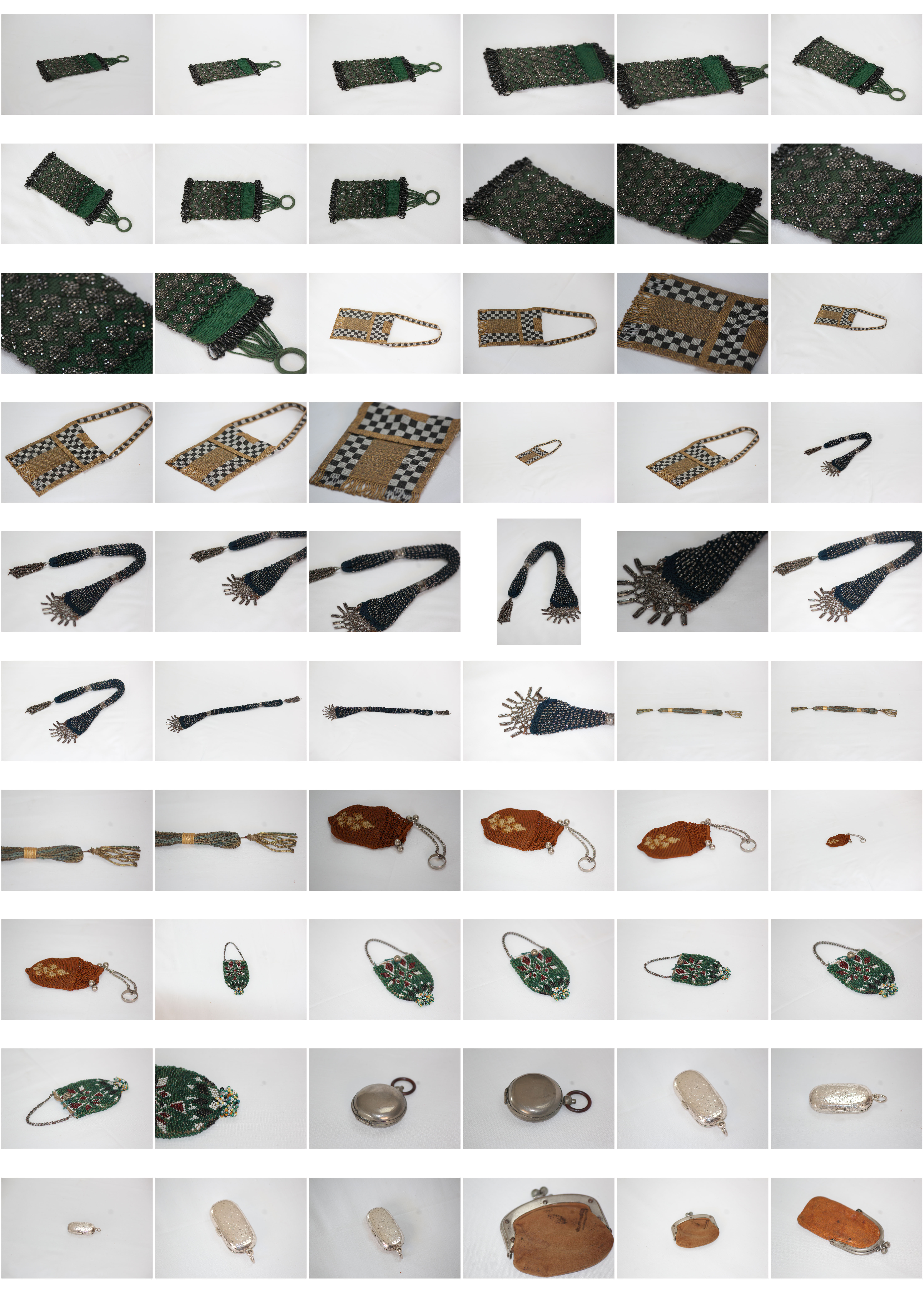
Concept: I am going to take photos inspiration from the style of photos taken by Ishiuchi Miyako of Frida’s possessions. Instead I am going to photograph my grans purse collection, I think this will give the same effect as they are old and have a sense of mystery and secrecy around them. i think the idea that these relics are not rare and in a way a forgotten treasure now will help to tie this photoshoot to the title of secrets codes and conventions.

Location: I will take photos In front of a white infinity screen which I will make by draping a sheet over the sofa to make a curve and give the photos a clean and professional look, it will also help the beauty of the individual items to stand out and look the same style asIshiuchi Miyako’s work. 

Lighting: I will use natural lighting which will come in through a south facing skylight, this means the room will be very bright but not in direct sunlight.

Camera settings: I will use the manual setting on my camera so i can change the exposure and shutter speed depending on the lighting and the item i am photographing.

Props: I will need a plain white background and possibly a tri-pod to create a studio style setup. I will also need to gather the coin purses I will be taking pictures of for this shoot.