Category Archives: Extension

Filters

Author:
Category:

Photo Stories and Stories in a Single Shot

Photo Stories

A visual story is often called a ‘photo essay’ or ‘photo story’. Photo stories allow photographers to narrate a story with a series of photographs. Images are ordered in a specific way with the aim of the viewer seeing them as a story rather than a series of images. Captions are often used with photo essays but it is the images themselves that should be telling the story – the caption is only there to provide some context.

Image result for picture story photography
A photo story found on the internet

Stories in a Single Shot

It doesn’t have to be a series of photographs that tells a story; stories can be told in one photograph. For example the one below. This photograph was captured in 1968 by Eddie Adams in Vietnam. Adams thought that he was watching the interrogation of a prisoner but to his surprise, as he looked through his viewfinder he saw a pistol being raised to the prisoner’s head. This photograph caught the emotion and action of everyone involved and showed the world what life is like in different places from just one photograph.

A comparison of work to William Klein and Diane Arbus

William kelin

William Klein was born in American but a French photographer and filmmaker was less well known for his ironic approach to both mediums, his extensive use of unusual photographic techniques in the context of photojournalism  and fashion photography ranked 25th on Professional Photographer‘s list of 100 most influential photographers.h has many awards and exhibitions surrounding his work, soon after being a painter he started off within his photography journey soon achieving  widespread fame as a fashion photographer  for vogue and for his photo essay  on various cities.

Because of this he was able to make many feature length films, and numerous of short and feature length documentaries advertising his work and allowing the public to see and be influenced by what he has achieved. Again he started off within photojournalism and street photography in new York much like many other famous photographers,His work was soon viewed to be considered revolutionary for its “ambivalent and ironic approach to the world of fashion”, its “uncompromising rejection of the then prevailing rules of photography”and for his extensive use of wide angles  and telephoto lenses, natural lighting and motion blur.

He was said by the New York times to had been considered one among the fathers of the streets and a mixture of compliments that classifies a man who is hardly classy,Or Perhaps this represents him in quite a figurative manner but it still successful shows how people within New York needed his influence and guidance in order to make  an important  for society and that he was able to capture both the humor and the reality within New York at the time.  the world of fashion would become the subject and inspiration for many of His works ad inspire inspirations of clothing evolution and a new meaning of beauty and womanly presentation. Lastly his street would would print a more violent and also exploit different religions and groups within America ta the time which was important to allow news programs to see his work.

what I like about his works that people were shown in such a ironic and unexpected light, people would be holding a gun with a face that implies that they are joking, or people in uncomfortable scenarios being laid-back and smiling while enraptured in a city more dull than themselves. he was able to capture the people within the city who would otherwise be ignored.

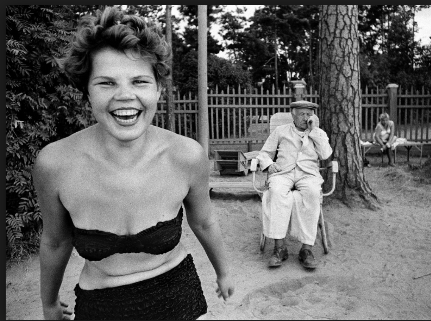
This is my favorite piece of his won work because it allows again a sense of youth and joy with is contradictory compared to that of the elderly people surrounding herself.It shows a women having a. sense of freedom and not wearing much clothing but she is not exploited for her sexuality but shown for reasons of her spirit and how this is what keeps cities alive. Again something more solemn is occurring in the background but the is ignored but to the irony of her celebration.

His work overall is very different to That of the previous artists as it portrays a more light hearted representation  on suffering and troubles within the world and surrounding New York city, his photographers are perhaps less natural but sill capture a well enraptured essence of the people and their lives.

Diane Arbus

Was an American photographer  well known for photographs of marginalized people such as dwarfs,giants,transgender people,nudists and finally circus from former. She again did this in order to represent the minority and portray a sense of  normality by ways in which they look and not general populace who would consider them as  ugly or surreal.Her work has been described as consisting of formal manipulation characterized by blatant sensationalism, this means that her work has most of the interests surrounding the subject of the charter and is taken in a formal manner, this allows a direct eye line and conceptual though go the person and their story and not allowing others to be influenced by herself.

sadly Arbus committed suicide and so presented a fictional version of her life story,within her last areas of photography .This was possibly due to her affair to a married a man who was never going to marry herself and only pushed her harder frequently throughout her work. She was married to another Jewish man such as herself Arbus was insulated from the effects of the great depression while growing up in the 1930s . Her father became a painter after retiring from Russek’s; her younger sister would become a sculptor and designer;so the majority of her family become intrigued in everything surrounding the creative arts and influence.

Diane started her own photography   business and  would come up with the concepts for their shoots and then take care of the models. She grew dissatisfied within this role, a role even her husband thought was “demeaning.”They contributed to  glamour,seventeen,vogue,Harper bazaar, and other magazines even though “they both hated the fashion world”. Despite over 200 pages of their fashion editorial in Glamour, and over 80 pages in Vogue, the Arbuses’ fashion photography has been described as of “middling quality’ due to her gradually  hate and enforcement of photography  she become even less inclined to choose to take a shoot and no longer wanted to develop her work and she grew older and more depressed.

what I like about her work: I like how formally and clearly she captures people. there is no doubt what they are feeling but only why,it allows question which you can answer yourself by looking further into the image itself,and also due to all the interesting people,it allows a more intriguing view of the society in which she was in. Her images also allow an interesting composition to enhance the interesting subject to which she is capturing.

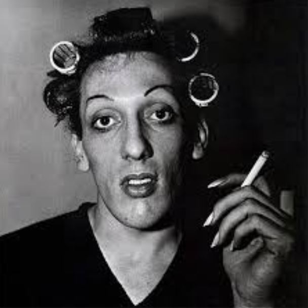
This is my favorite from this artist,this is due to interesting subject of a transgender man which again shows her representing the majority in order to allow a sense of normality to the society in which they are in.The makeup again furthers the image of femininity but that is contradicted within the darker tonal background suggesting more harsh underlining themes.You can also see how they are smoking,which bring a somewhat relevance to the time and possibly creates a sense of relation to the public and they all act the same but have different appearances.

Compared to the previous artist,She is a lot more formal within only concentrating on the face itself and not a lot of movement,this allows a  straight forward proposition of her these also allow a sense  of irony to show a more extravagant type of people within the society.


Sally Mann – Environmental Portraiture Extension Task

Image result for sally mann

Sally Mann (1951-present) is an American photographer who is well known for her black and white controversial photos of her children and for her landscape photography. Mann is a three-time recipient of the National Endowment for the Arts fellowship. Mann was also named “America’s Best Photographer” by Time magazine in 2001. Her photography was widely viewed due to the controversial nature of it but they showed every aspect of the children’s lives. The black and white contrasting image shown above helps to break the subject away from the background and create more contrast, which I will attempt in my homework.

Environmental Portraiture (Extension Task)

Within my portraiture photography I have in mind to try indulge into the realism side of photography and explore and portray images which enhance a sense of shock on how many people chose or more importantly have to live their lives.

Due to these intentions I have chosen to explore the work of photographers which I believe best represent their subject matter truthfully in order to be inspired to also convey these similar ideas in my work. I believe this communication of real life situations link very much to documentary photography in the way that they create a sense of awareness on how some people are living their lives.

Sally Mann

Image result for sally mann

Sally Mann is an American photographer, best known for her large-format, black and white photographs – at first of young children, then later of landscapes suggesting decay and death. Her environmental portraiture photos focus on the shocking and some what controversial behaviors of younger children which influence the idea that not all young children are innocent and sweet.

The photo above is a clear representation of the intentions that the photographer set out to convey. The innocent and harmless look upon the girls face suggests that she is the stereotypical sweet young girl. However this is clearly juxtaposed with the cigarette in which she holds which has many connotations, one being that she may no longer have the ability to conform to the standards that society inflicts upon young girls. Girls are expected to always look neat and tidy and display the correct behaviors at all times. It is a huge shock to many to see younger children performing in such behaviors as seen through this photograph which the photographer has clearly set up to challenge the dominant ideologies about young girls. The fact that the photo is in black and white helps to portray the idea that it is a disgraceful act to be smoking at that age. It would appear that this photo likely used a small aperture as the background is very much out of focus where as the foreground is is very detailed.


experimenting with layout:

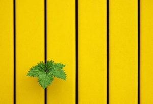
This was my image originally,I  chose this image because it has a lines of symmetry throughout the middle and due to the colour being vibrant. I also thought that all the lines of detail would compliment the composition of the piece when experimenting with the layout .

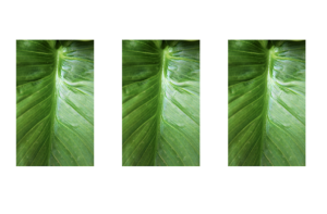
For my first edited I simply repeated these images in lines exactly the same as before,with the the lines throughout it is more obvious and appealing to see and it also portrays the highlights throughout very well.

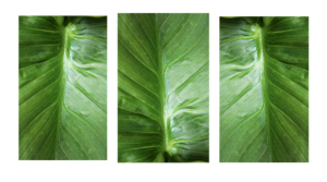
next I flipped these images to all be different,this creates a more abstract feel and a less fuller sense as to what the leaf really is and also shows the tones in different interesting experimental methods.

I then proceeded to put my images into a squared again continued these are different angles within th images and again have flipped images within the squares.

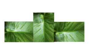
The next image is interesting because I wanted to shows a somewhat continuation of the lines through the second image which is also at a different angle so creates a center point and allows the image to become more dynamic and interesting.

For This image I was again inspired by my previous experiment of the layout of the piece itself is making it so every center point is facing out of the middle. I still have point  from the two opposite leaves.

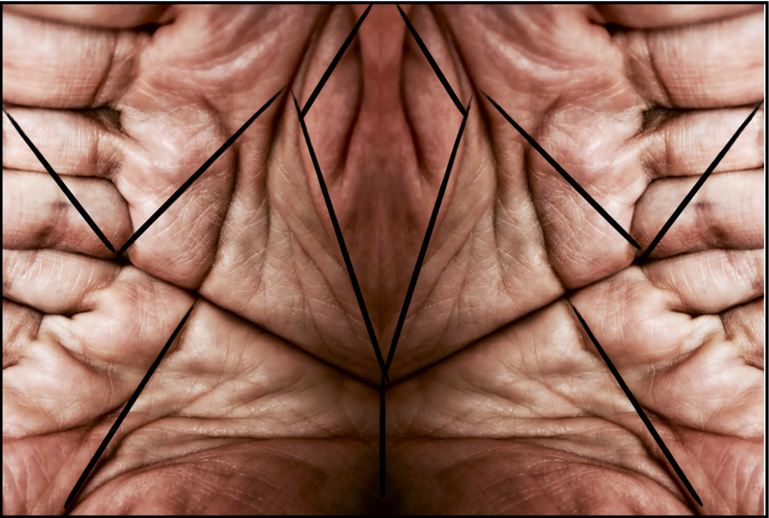
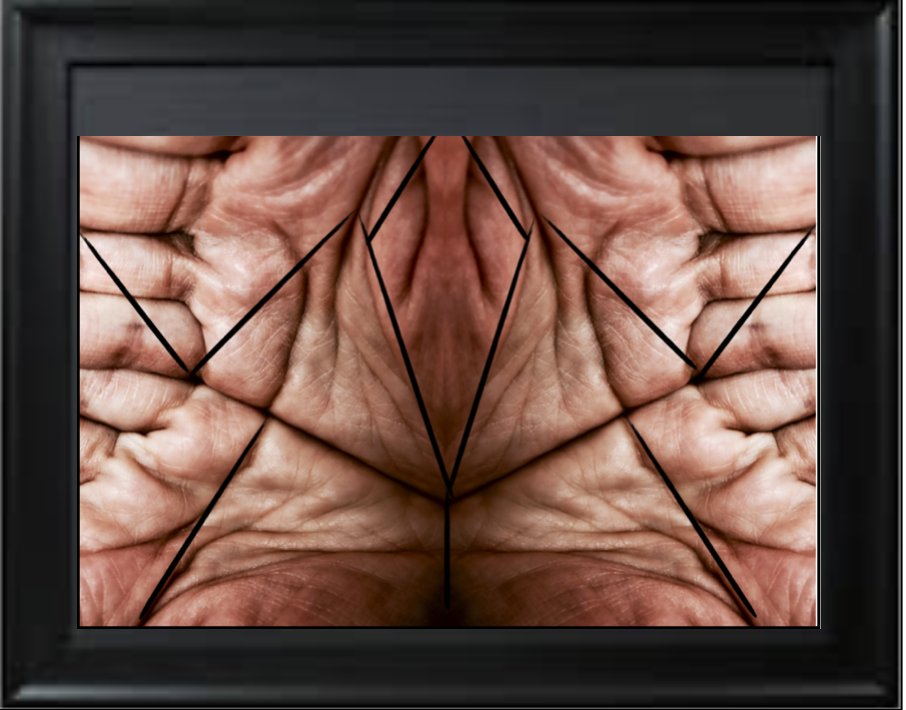
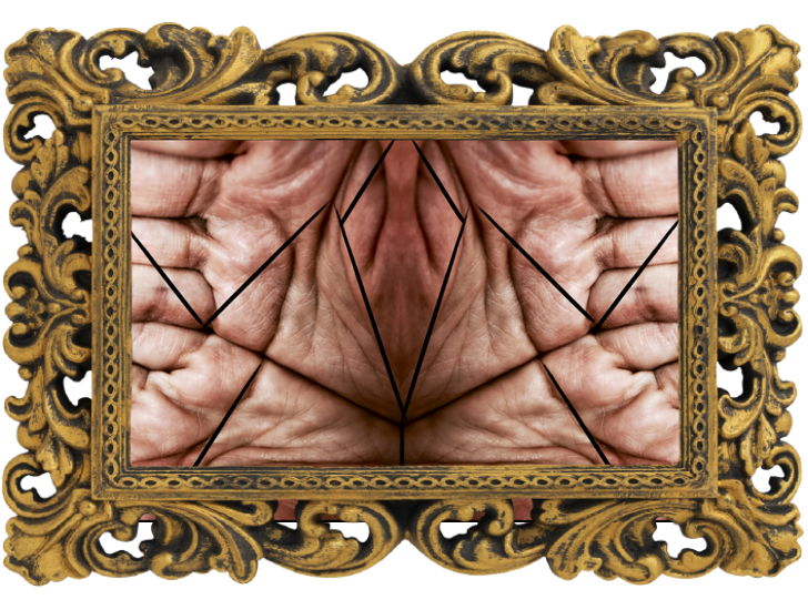
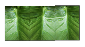
within this last image I want to form a mirror limes and. a sense os symmetry to the pieces also added a boarder so aswell as forming the piece it also breaks the form into specific piece of the text.This piece is also divided into darks and lights within the division.

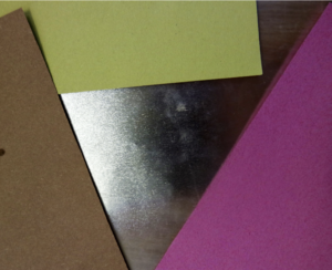
For these next images I wanted to focus more on the actual development of colour, this  was in order to again experiment with form and how I can develop the different angles of the paper too.

These images are both slightly different angles of the colour itself. but I want to further this image to more of circular and line patterns .

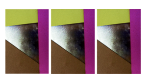
Here I wanted to show a repeated pattern of the lines within the image  but still showing the fragments of colour at the same time. I also exaggerated the colour in order to further exaggerate the vibrancy if the piece.

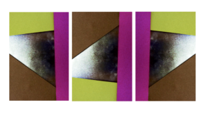
Within the two outside images are facing out in order to show a clear cohesion  within the piece and symmetry  too.But the middle image is the direct line as it is different to all the other images.

Here I also furthered the image  into a squares and again  flipped the image itself around too.

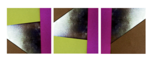
And lastly within this range you can see my lines of symmetry but a continuation of the line too.

Experimenting With Layout Composition

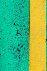
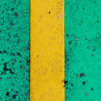
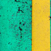
In this post I am looking at ways to present my final piece. Below are the three photographs that I am planning on presenting after deciding how I will present them. I am going to look at different ways of cropping and rotating them to find the most effective way of presenting them.
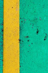
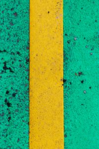
Square Cropping

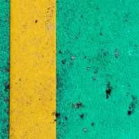
Here I have taken each photo and cropped them to a square to see how it may look.
Circular Cropping

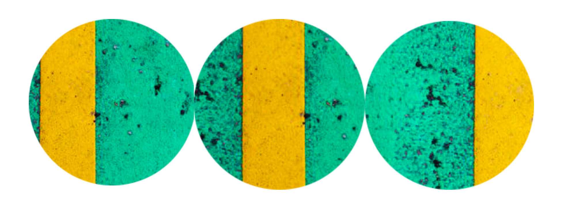
Here I have cropped the three images into circles to contrast the round edges of the circle with the sharp lines in the image.
Rotation

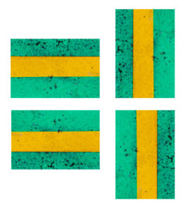
Here I have cropped the first image into a square and looked at the four possible ways of rotating it.
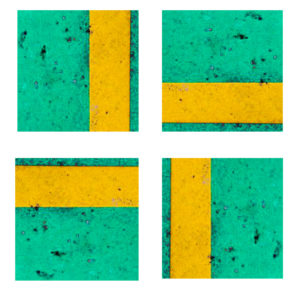
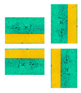
Below is the second image which i have cropped into a square and  explored rotating it to see the effects.
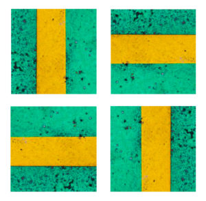
The set of images below show the third image cropped to a square and rotated, from these rotations I hope to gain an understanding of how I want to rotate it in my final piece.
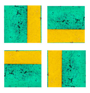
Here I have taken the first image and rotated it in four different ways to see which way works best.
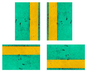
The below images are the second image which I have rotated in four different ways to find the most effective composition.
This is the third image rotated in different ways so I can decide which way will be most suitable for my final piece.
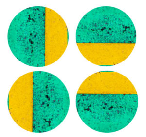
In these images I have cropped the image into a circle and rotated it in different ways to see the different effects.
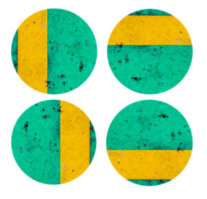
The below images show the second image rotated in different ways to help me decide which rotation I will use.
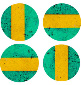
 

The below shows the third image cropped into a circle and rotated so that I can explore different styles of composition.
Composition

Composition 1

In this composition I took the three original images and lined them up horizontally so the lines were far apart to separate the images from each other.  I don’t like how separated the lines are, they appear too far apart.
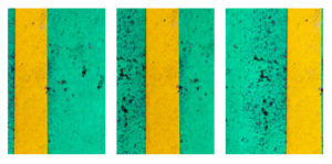
Composition 2

In this composition, I swapped image one and three to bring the lines closer together to create a sense of togetherness and to link the images. Due to this link and closeness between the images, I like this composition more.
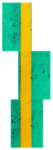
Composition 3

In this composition I pieced the images together to make a continuous line and bring the photos together to be one. In my opinion, this is one of my more creative compositions as it makes one image out of three images.
Composition 4

In this composition I rotated composition three to see the effects of the line going horizontally instead of vertically. I think that it looks better standing vertically as when standing vertically it looks less odd.
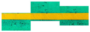
 

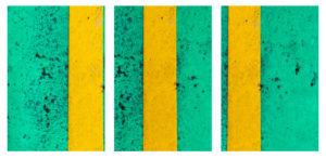
Composition 5

In this composition I rotated composition 2 to make the lines run horizontally to create a different effect. I like this composition because of the togetherness of the lines and the direction of them.
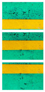
Composition 6

In this composition I rotated composition 1 to make the lines run horizontally to see what it would look like. As with composition 1, I do not like how far apart the lines are.
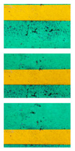
Composition 7

In this composition I have copied composition 1 but cropped the images to squares. I think it looks better in the original form than in square form
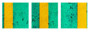
Composition 8

In this composition I have copied composition 2 but cropped the images to squares. In square form I cannot appreciate the togetherness of the lines as much as I believe the lines are cut too short.
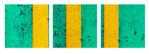
Composition 9

In this composition I have taken inspiration from  composition 3, I like the style of it but in my opinion it looks better with the original images as the line appears longer.
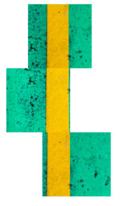
Composition 10

In this composition I have rotated composition 9 to make the line run horizontally. As I said about composition 4, I think the line looks better running vertically.
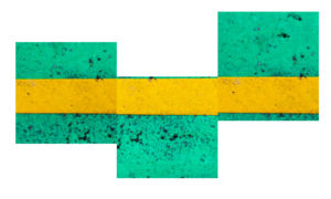
Composition 11

In this composition I have copied composition 5 but I have cropped it to a square. I still like the style but I think due to the square cropping, the lines do not appear longer enough.
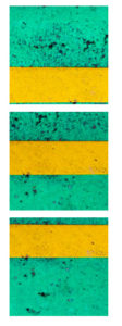
Composition 12

In this composition I have copied composition 6 but the images are cropped to squares. I do not think it works as the lines are too far apart and not long enough.
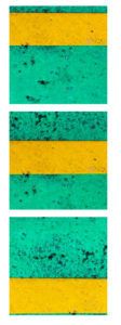
Composition 13

In this composition I have copied composition 1 but cropped the images into circles. I think this helps to reduce the problem with the lines appearing too far apart.

Composition 14

In this composition I have copied composition 2 but cropped the images into circles. I think this takes away from the image as the lines seem completely separated and due to the cropping in the first image, it is not obvious that it is a straight line.
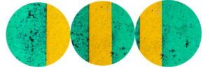
Composition 15

In this composition I have rotated composition 14 to make the lines run horizontally. I think this works better as the middle image is a clear focus point in this composition.
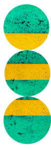
Composition 16

In this composition I have rotated composition 13 the make the lines run horizontally. I think that the images look too separated in this composition due to the cropping and positioning.
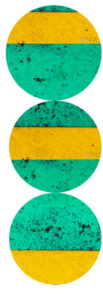
Composition 17

In this composition I have taken inspiration from composition 3 to bring all of the images together to create one image. I like the style of the composition but I think the outline of the shape is too abnormal.
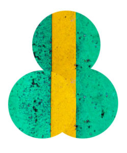
Composition 18

In this composition I have again taken inspiration from composition 3 but used circles instead of rectangles. In my opinion this type of composition works better with rectangles as it gives strong edges and shape whereas the circles don’t.
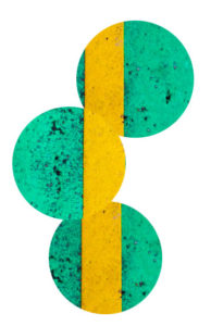
Exploring Minimalism

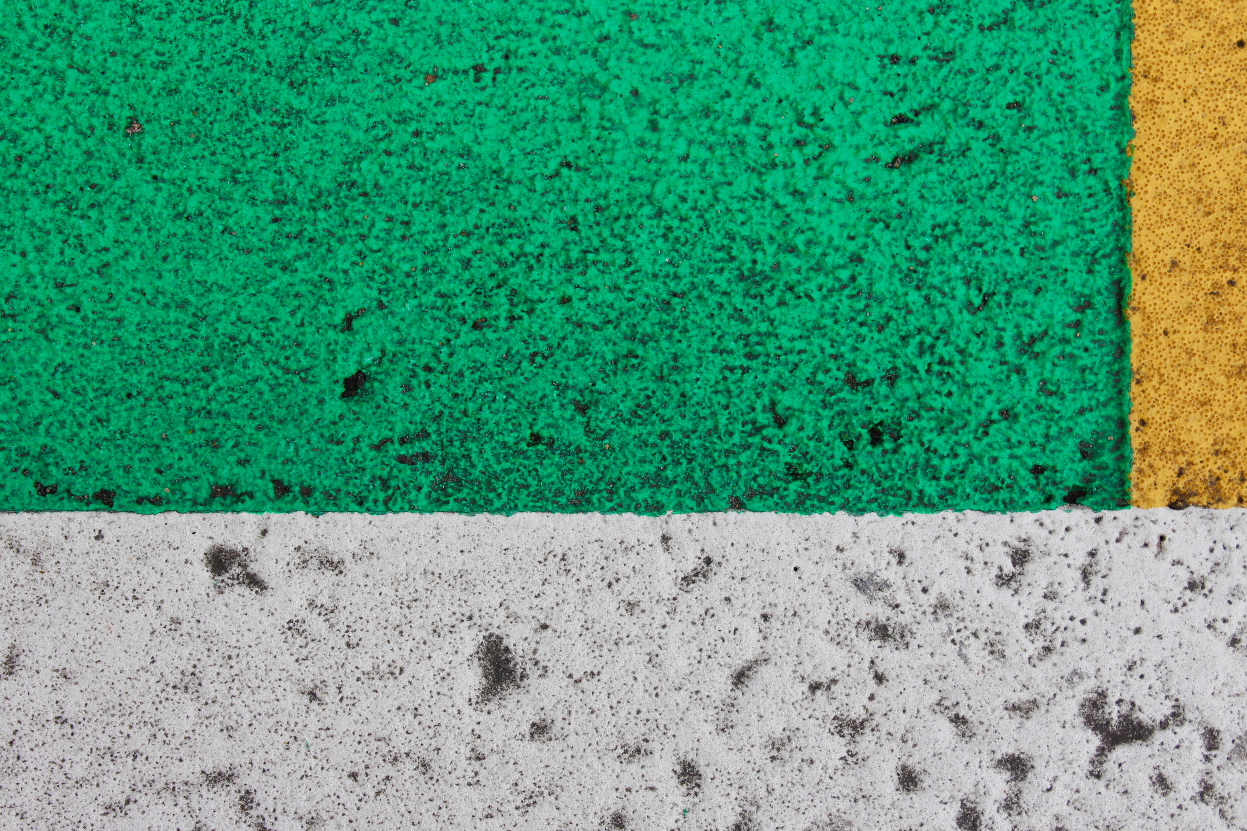
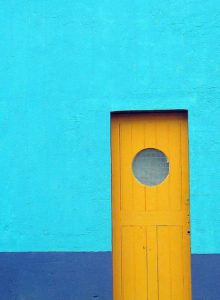
Minimalism is a style of photography/art that was introduced by many different 20th century artists. In minimalism,  the photo is kept simple with the minimum amount of colours, shapes and lines to create a simple but effective photo.

Below is an image that I took in a minimalist style; as you can see there is not much happening but it is bold and eye-catching. When taking this photo, I took inspiration from the strong colours and shapes that Franco Fontana uses.

Mark Rothko

Image result for mark rothko

Image result for mark rothko

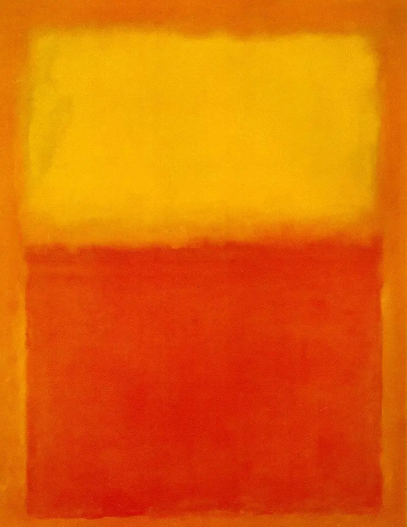
Mark Rothko was a Russian painter born in 1903. His family immigrated to the US in his childhood, here he became part of a circle of New York-based artists who were known as abstract expressionists. Rothko was most famous for his style of work shown above, they were large-scale rectangular paintings that used simplicity to evoke response.

Rothko is a brilliant example of a minimalist artist; his work shows simplicity and colour in the same way that mine does and I hope to reflect on his work in my final pieces.

Minimalism

what is minimalism?

 Minimalism is a modern idea within the 20th century,it is about specific components such as color,shape,line and texture.It is highly subjective as artwork itself. leaving interpretation and meaning up to the viewers perception of the work.Some photographers use this in order to tell a story of a act of photojournalism but in a easily presented manner to the audience. 

the best aspects are surrounding  the openness and embracing the freedom of interpretation.There is no real direction to minimalism but photographers can still focus on issues or a specific subject matter. Some other photographers would argue it is about simplicity and the audience creating their own feel or interpretation of the image itself. Some techniques are consistently used to employ and enhance the impact of the work.There should be  a consistent notion that is wanting to be captured.

It can be seen within this piece in order to direct attention to a specific point of view,possibly because this kids the most detail or it is aimed to promote a certain aim of development within the image itself. The images are developed through a certain line within the mage,a certain single aspect of the image,or a texture.

My experiment within minimalism:

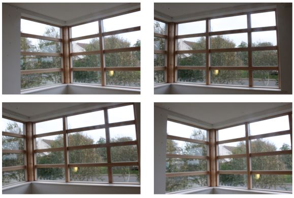
within these photos I simply wanted to capture the lines and highlights within the piece itself. I then decided to further edit these images to create more of a colour impact to the piece itself.

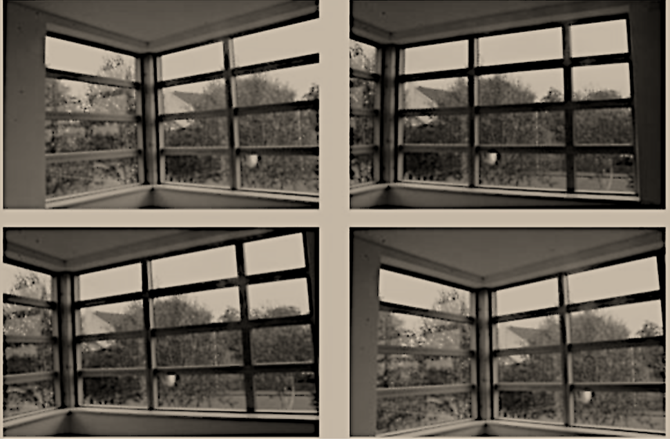
here you can see the final  edited image that I have lowered the saturation for and also developed the thickness and how dark the lines are to give a greater focus on the minimalist dimensions of the piece itself.