A philiosophical enquiry – by burke – oxford
Burke had the through that the beautiful us that which is well-formed and aesthetically pleasing. And differently how the sublime is something which has power to compel and then destroy us. He stated the difference was that of the transition from neoclassical to the romantic era. Burkes thinking was based off the understanding he had from the casual structures, this consisting of Aristotelians belief that ‘physics and metaphysics, causation can be divided into formal, material, efficient and final causes’ he believed the formal cause of beauty if the passion of love, the material cause concerns would be the materials of the object itself, smallness, smoothness, delicacy. These intern cause the calming of our nerves . The final cause is God and his providence. Beauty before burkes view was based on the three defining factors of fitness perfection and proportion. however the sublime also had a casuals structure before Burkes theory and this consisted of, the passion of fear(death), The material was the infinity, vastness and magnificence of the object. The efficient cause is the tension of our nerves, and gos role in the final cause is having created and battled satan.The themes within this book contain 4 main propositions throughout the novel itself, these consist of:
childishness: these are shown through the study of aesthetic requires to move beyond an implicit appreciation of the attractive elements of the world around them. burka himself acknowledges this fact through the establishment of childishness as a theme of his work. the childlike elements is substantial to the way he wrote without insulting great thinkers but his concern with he topic to be presented without inflicting or proving others to be wrong. The next is;
Classification: this is when Burke proceeds throughout his work using classifications. In particular, the theme of classification is permeated by the question of independence or dependence in the sensations about which he writes, as well as new connections and differences between objects and parts of life.
Humanism: burkes work focuses primarily of the beautiful and the sublime. although he soon redirects the attention to the paradigm of the self with the theme of humanism. he speaks about the placing of emotions within the personal realism. When studying terror burke evoked the sensation about which he writes, allowing the reader to maintain a childlike sense of observation and reminds ourselves that is the reason for the book itself if comprehension and appreciation. To my mind this has clear connotations of the way in which he has an emotional sensitivity when dealing with others and even talking about the harsh emotions considered with that of beauty and the sublime.
Aesthetics: enquiry is said to lead a reader to notice emotions. Burke is said to concern himself with the theme of aesthetics. The theory itself is a wide-ranging and many have attempted to define why we take pleasure of of certain scenarios of what we notice in the natural and sensory world. He develops on many of these themes with calmness and rarely becoming carried away. He talks about aesthetics throughout the novel, stating things such and . Burke argues in Reflections on the French Revolution, such rights are ‘by the laws of nature, refracted from their straight line’, enduring ‘such a variety of refractions and reflections, that it becomes absurd to talk of them as if they continued in the simplicity of their original direction’. What is natural about such rights is their deviance or aberrancy; their self-disseminatory power is part of their very essence. When Burke adds that ‘the nature of man is intricate; the objects of society are of the greatest possible complexity’, he speaks, in the original sense of the term, as an aesthetician. And this is equivalent, in this political context, to saying that he speaks also as a reactionary. Some quotes from reading the first beginning of the book that have really stuck with me are the following:people are not liable to be mistaken in their feelings, but they are very frequently wrong in the names they give them, and in their reasoning about them. pleasure does form the ceasing or diminution of some pain. pain and pleasure are each from a positive mature.
The sublime -contemporary arts – simon morleyth and this book is more of an in depth analysis to what the sublime is, means and how it was formed. For Longinus, the sublime is an adjective that describes great, elevated, or lofty thought or language, particularly in the context of rhetoric. As such, the sublime inspires awe and veneration, with greater persuasive powers.


 I decided to attempt at making a panoramic image by stitching together individual images I had taken of a landscape within Photoshop. To do this I overlapped picture upon picture to create a forged landscape of the area taken as seen below:
 Once finished I proceeded to use this method to create a few more panoramas of the landscape in the area where I live, these were the results:
 This image of the bay consisted of twelve individual images that I had to crop and re-shape to allow for the smooth transition effect between each photo that creates the impression of a singular image.
  I took this image of the golf course across the road to me by cropping the overall piece due to how some of the images did not match the shape or size of the others taken. This removed any rough edges to the image allowing for the final result.
 This final image I found to be the most successful due to how the transition between each image looked the most natural with only slight lighting differences.
 I found that the use of nature was particularly effective when it came to the images, as the trees could be used for a variety of different things such as fades etc. Through this I found it great how trees could be used to define a certain aspect of the image itself, and so allowed for the silhouettes of the creatures they wished to be highlight.
I decided to make a response to these ideas by mainly focusing around the human body and nature combined. These were the results:
I found that the use of nature was particularly effective when it came to the images, as the trees could be used for a variety of different things such as fades etc. Through this I found it great how trees could be used to define a certain aspect of the image itself, and so allowed for the silhouettes of the creatures they wished to be highlight.
I decided to make a response to these ideas by mainly focusing around the human body and nature combined. These were the results:

 To create these I used the opacity tool, this increased the transparency of the top image, allowing for the lower image to be seen more clearly, creating the desired effect. I then used the paint tool to rub out the excess parts of the image to match the shape of the subjects face, making it seem more realistic.
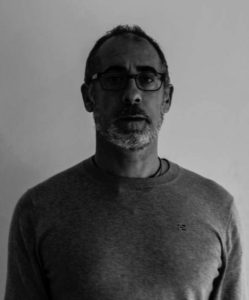
 I also wanted to switch between monochrome and the portrait settings when taking photos to allow for a greater contrast between the lights and darkness of an image. This would allow for a more sinister look when produced due to the emotionless expressions of the subject.
 Before the shoot I wanted to create a mind map of the ideas towards this, so that I would have an idea of what and how to take the photos of both subjects.
 From there I decided to carry out the shoot, these were my results:
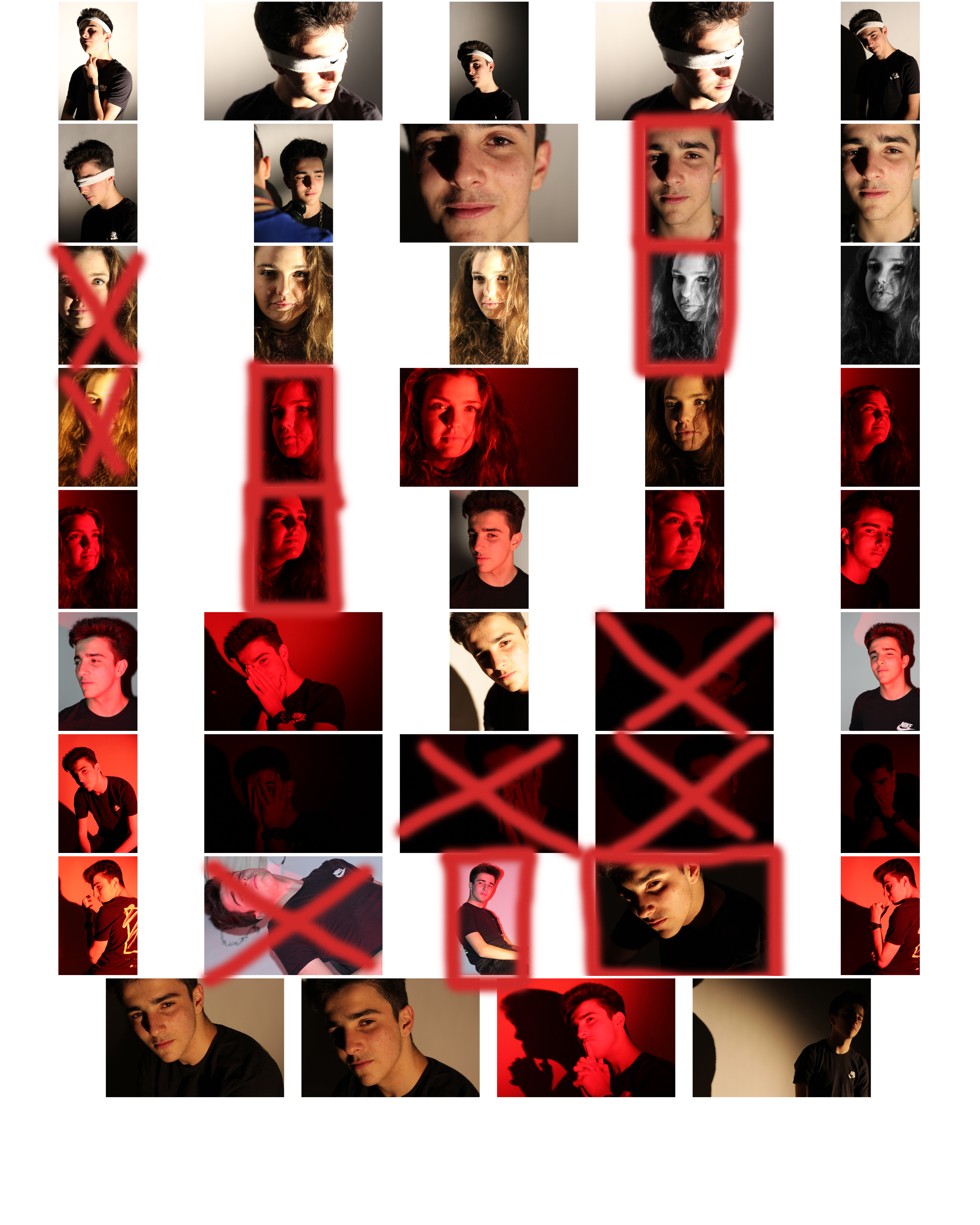
 From here I selected the top ten image from the entire shoot, this would make it easier for me to narrow it down to the final image that I deemed best from the shoot. These were the images I selected:
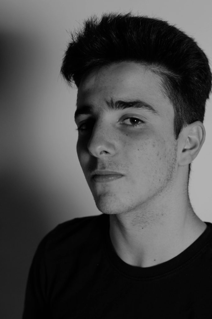

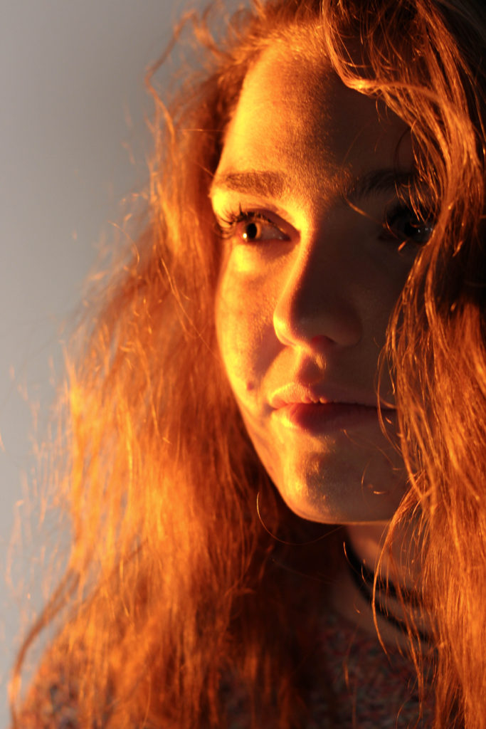


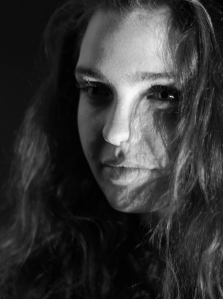


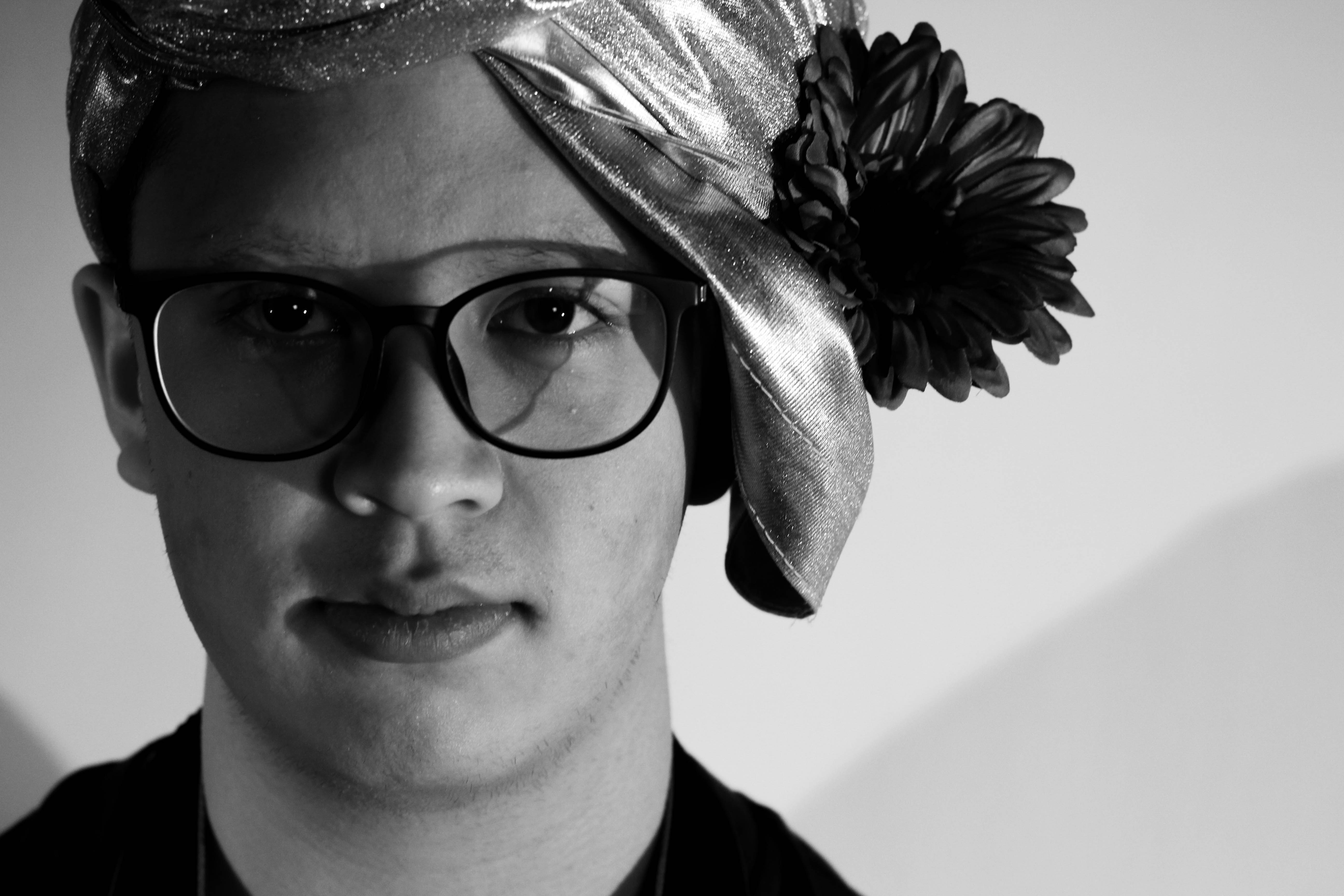 What I loved about this image was the obvious difference between the light and dark on either side of the face. This to me compared with the light backdrop allowed for a clear definition to the face, drawing out certain feature above others.
 In response to this I wanted to have a go at trying to create images based around this theme, using images taken by me which I could manipulate into these designs. These were my outcomes:

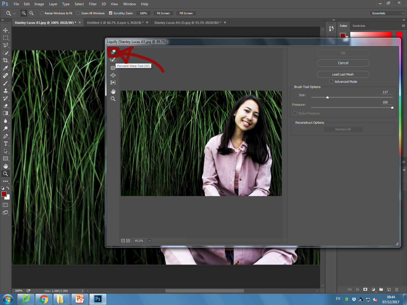
 I explored a variety of techniques such as liquify, layering and separation. This allowed me to have the effects desired as I was able to manipulate the facial features of the subject, which can be related to the theme of missing or lost identity within yourself.

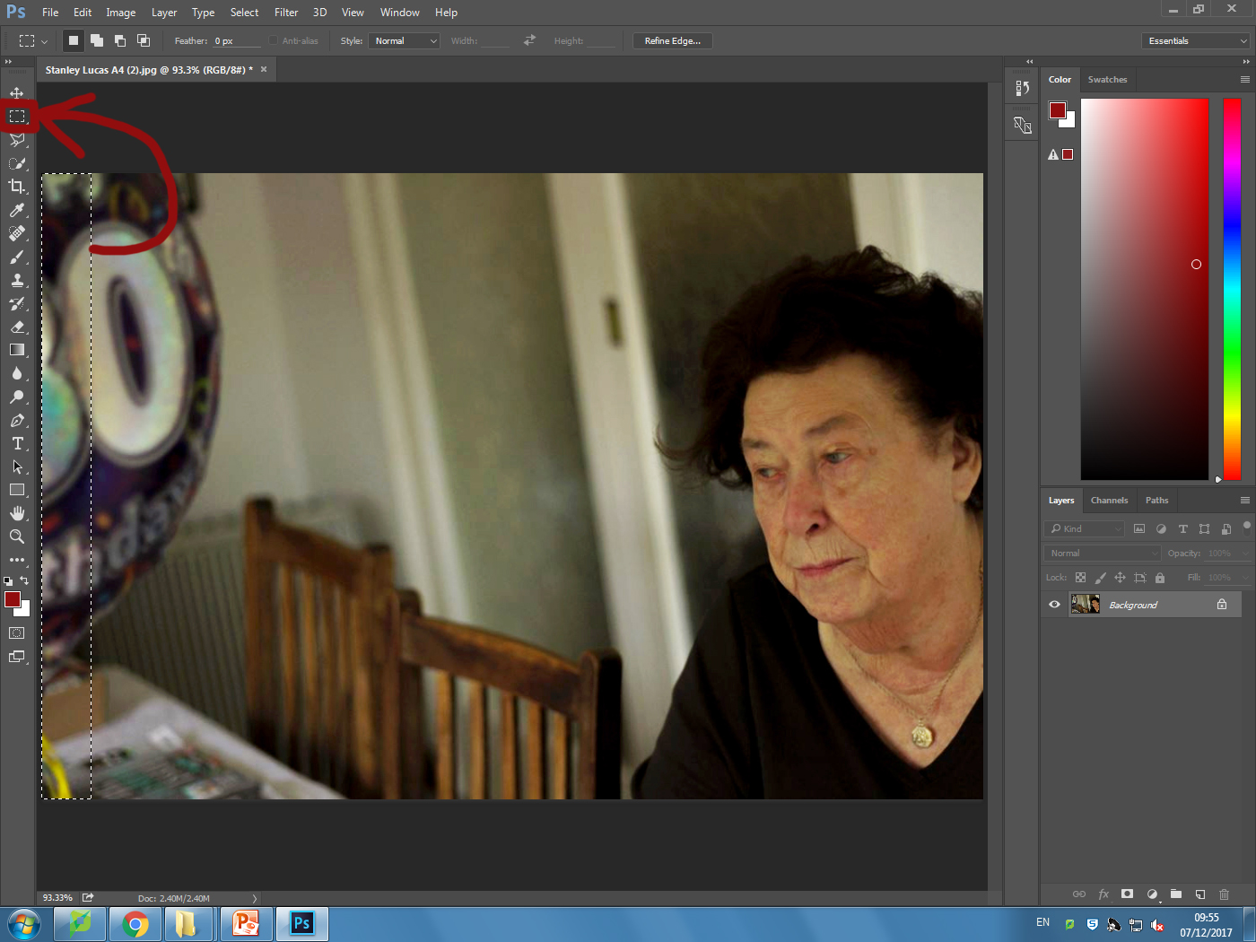


 I wanted to apply this to an image of mine to see the effects that could be made. These were my steps:
1) Navigate to the selection bar on the left, and pick the burn tool.
I wanted to apply this to an image of mine to see the effects that could be made. These were my steps:
1) Navigate to the selection bar on the left, and pick the burn tool. 2) Select a suitable size for the brush to match the face, and go over the parts of the face I want to darken once.
 3) Go back to the bar on the left and select the dodge tool instead, from there I lightened the parts of the image I wanted to have a clear contrast from the darkness.