Category Archives: Experimentation

Filters

Author:
Category:

Photobook Layout Experimentation

I repeated the same pattern of images throughout the book, to give an organised aesthetic. The circle images are placed alongside their close-up comparisons to show the detail in the items depicted. I chose to make many of my images full scale, as they all have dark backgrounds. Black is used in a minimalistic style to emphasize the items, as well as being associated with darkness and negativity to reflect the topic of pollution.

As Keith Arnatt and Mandy Barker formed my biggest inspirations amongst the project, all the images used within the book reflect their work, styles and methods.

To fit the theme, I also incorporated the use of black in the cover.

EXPERIMENTATION

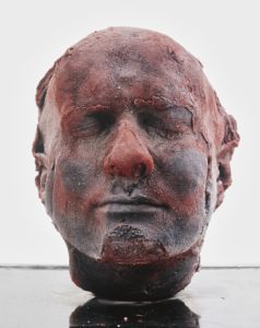
Marc Quinn ‘Self’ – 1991

These pictures are experiments of my own existing material from previous projects. Each piece of material that I have taken from my photographic archive were taken with different incentives yet i have merged them together and created images with different meanings within their context. I’ve done this to further explore my idea of how western culture identifies with meat, in the hope of developing an alternative response that incorporates emotion and a story within my images. This inspiration has stemmed from the artist Marc Quinn and his ongoing series of self-portrait sculptures ‘Self’, sculptured entirely from his own blood, capturing his aging throughout the years. Quinn’s sculptures are innocently morbid, encapsulating the idea that we are all just made of meat.  He’s used mediums from his own body without harming himself. Throughout history, there has always been the repeated idea that the body is sacred and should be left untouched after death. When exposed, the internal body has always been associated with death, perhaps connected with the fragility of life and the fragility of the body, yet the exposure of our insides is often forbidden through the eyes of religion. Western Religion has always taught people to respect the body before and especially after death. This also aligns with our laws and standards; it is commonly known that any mutilation of the body is forbidden. Although we carry out respect for our own bodies, the consummation of meat is often overlooked. The whole process of producing meat violates and mutilates an animals body before and after death. Surely all life in every shape and form should be protected, yet we break this rule by reassuring ourselves that animals are less than us and therefore, it is okay to enforce ill treatment upon them just to satisfy an acquired taste that everyone picks up from an early age. These photos that I have created is a reflection of ourselves and our diets. I have placed another animals internal layers above the external layers of these portraits, just for the sake of spite; we can’t mutilate one another but can mutilate beings ‘lesser’ than us – I have surfaced how this reflects on us – almost like the infamous Lady Macbeth from Shakespeare’s ‘Macbeth’, relating to the scene when she hallucinates blood on her hands. The meat connotes death within a picture of a life.

Editing and experimenting with plants photos.

This is just a small and quick experimentation I have developed in order to shows how all of the images can be combines to form a mysterious and a genuinely more interesting composition. Due to the differing layers and levels it allows us to question the extent as if what we are looking at is beautiful or if it is a solitude presentation of dead flowers. The camera is the causation and memory of the past, we belive through photos that something has the ability to be immortal yet in actuality it means the subject could be dead by now. Because of the connotations of fading away the beautiful subject makes the audience becomes concerned the the actuality of the well being of the beauty of its life itself. There is a need question of suspended reality and i belive if i even further edited these images and possible experimented within exploding flowers this would create a more obvious example of the sublime. But these images being hidden within themselves and the actuality of them dying presents both a pain and beauty which are the two examples which constitute the sublime.

BREAKING THE RULES – RULE OF MANIPULATION

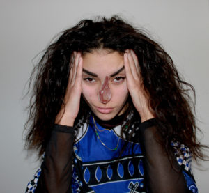
Image by Paola Paredes

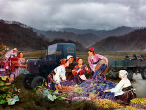
Alice Wielinga – North Korea: A Life Between Propaganda And Reality, 2013-2014

EIGHT 'RULES' OF PHOTOGRAPHY THAT ARE WORTH BREAKING
A photographers work is often manipulated by a set of rules that have been drilled into the mind when learning how to use a camera. These rules are often followed through in photojournalism when it comes to documenting scenes, places and events. The rule forbids a photographer to manipulate an image digitally as it is often believed that a good photographer can take the perfect photo in the moment. However, manipulation can be looked at in different ways. When looking at a photograph which has been produced to record a series of events or a culture for example, it is a usual standard for the audience taking in the image to trust that the photographer has not staged or changed the scene in any way. However there is always an underlying pressure for a photographer to create an image that looks perfect or in a sense aesthetically pleasing for an audience to like and accept it. If the underlying statement for a set images has a political message, producing an image to have an impact and to be thought provoking towards an audience is almost impossible without having some control over the image you produce other than the chance of coming across a scene at the right place and time. 
Manipulating an image can be done during the process of taking the picture and editing or even by changing the caption. This can give the opposite connotations of what the original image had and can move the audiences viewpoint or focus on a photograph. For example, a news story will usually be accompanied by an image. If the editor was to change the headline of the image it can either change the image to be positive or negative; changing how someone can perceive a photograph.

PAOLA PAREDES Paola Paredes created a body of work through redeveloping the visual representation of a set of images from Jean-Martin Charcot's 'evidence' of 'hysteric' women through digital technology, handmade collages and stitching, turning his imagery into animations. 'Transforming this once static archive into one now dynamic and contemporary'. 'These experimental pieces seek to increase awareness of a time when the field of medicine subjected women to abhorrent treatment'.

Experimenting With My Response To Political Landscape

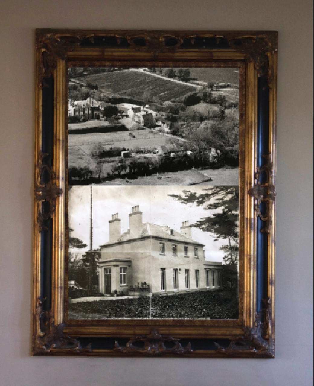
I have collected an variety of archival photographs on my house and its history and well as creating a response to these photographs by taking inspiration from these archival images. I will be experimenting with different ways to demonstrate the changes and development within the house as well as how political landscape links to the set of photographs.

Technique 1

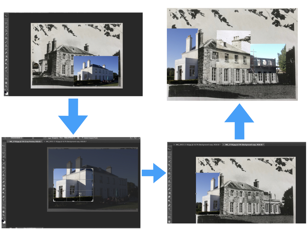
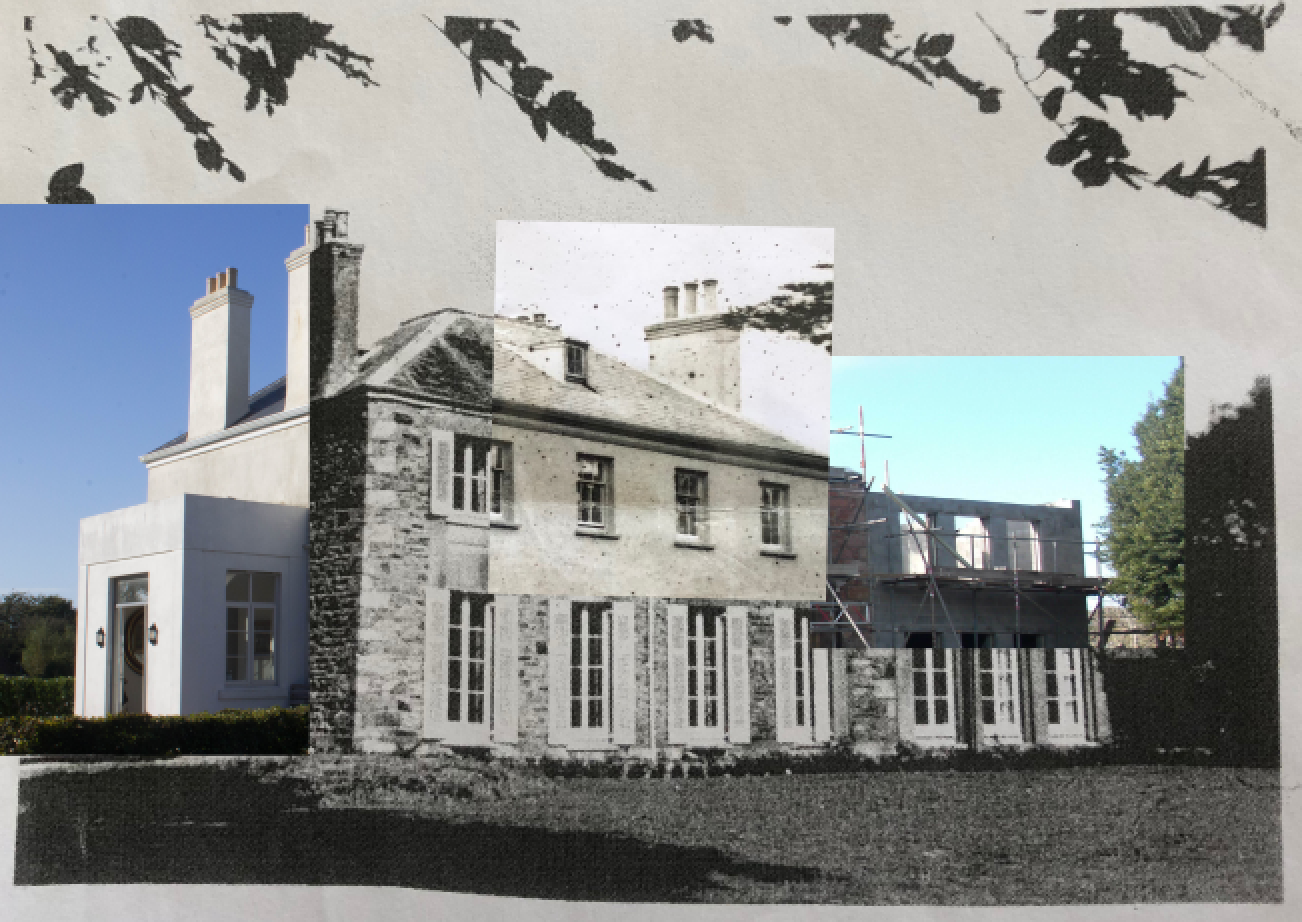
For this technique I will be placing the new photographs over the archival photographs and vice versa in order to create a contrast between the photographs as well as drawing similarities between them. I am going through with this by using photoshop. I start off by placing both photographs in the same photoshop tab.

I then choose an area of one of the photographs to crop in order to place over the other photograph. This area can be any detail of the property that shows similarity/contrasts between the now and then.

Once a section is cropped I will then focus on aligning this cropped part of the photograph with the other photograph in order to create a collage type photograph. I will do this with multiple photographs that match/line-up with the archival photograph to show as much contrast as possible. If I go through with this technique I will edit features such as the brightness of the photographs before hand to ensure that the photographs fit together well. I will also spend more time aligning the photographs to create the most accurate collage possible. I will also look at cropping and inserting smaller parts of photographs in order to provide more detail.

I think that this technique allows me to creatively place the different photographs in different combinations to create different photographs and interesting perspectives. One worry that I have with this technique is that the archive photographs may not fit in with the new photographs but I will overcome this problem by readjusting properties of the photographs when it comes to final editing.
Technique 2

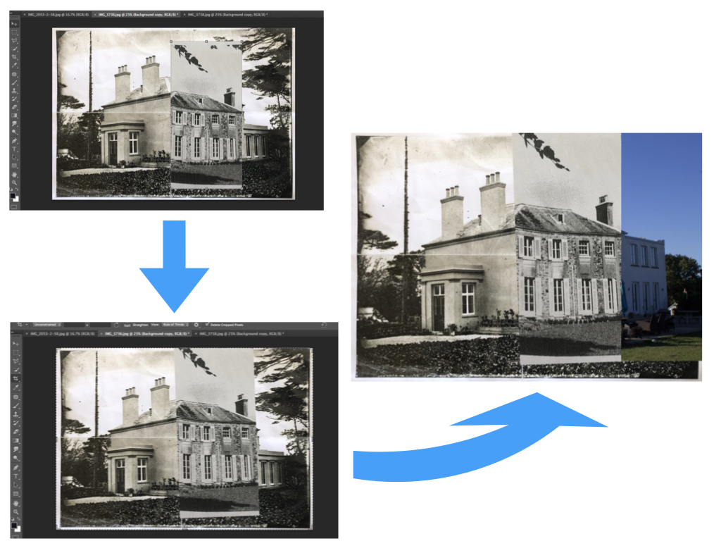
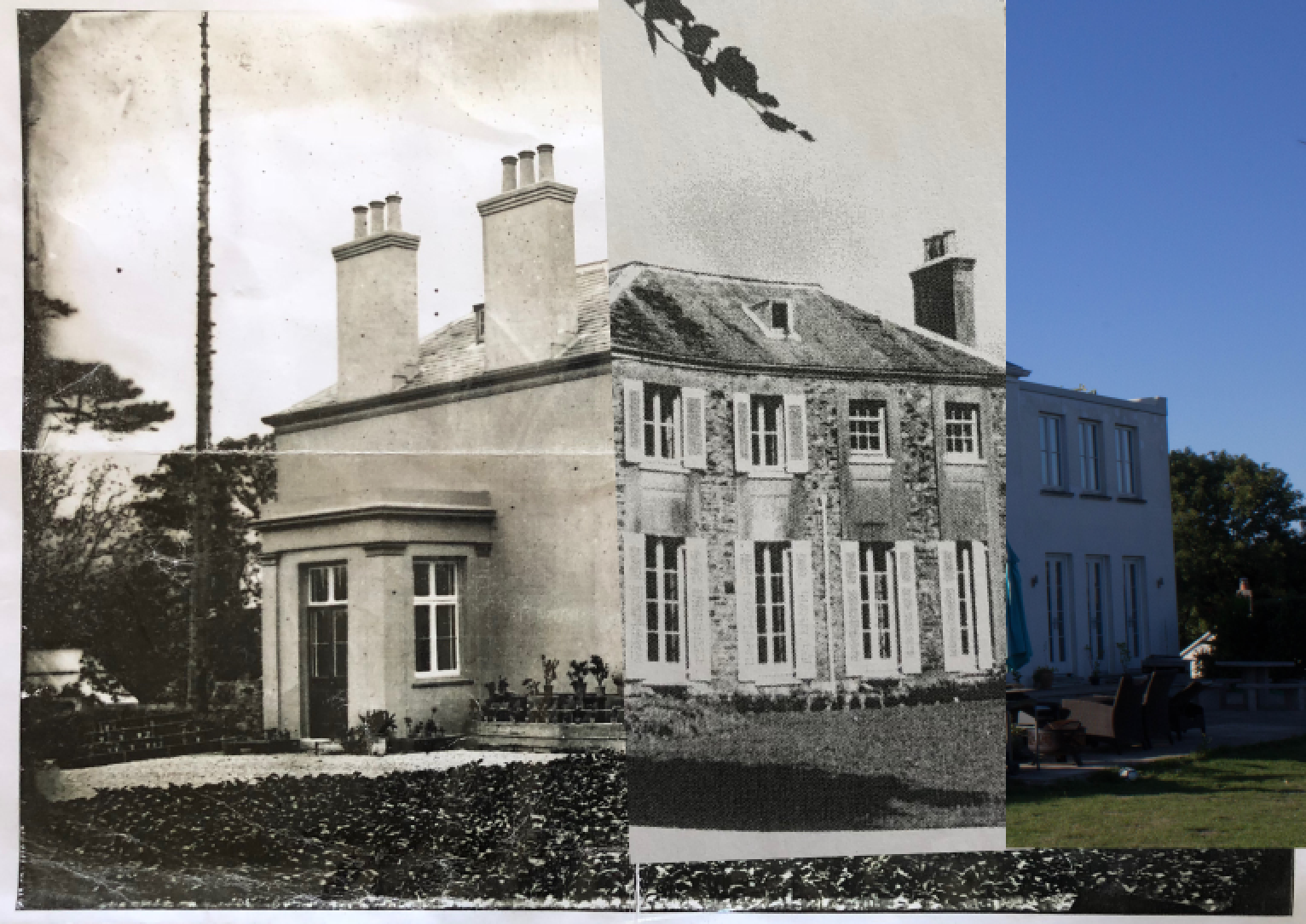
For this technique I will look at splitting the two photographs half and half or into thirds or quarters if there is more photographs to compare.

I will do this by first choosing a photograph to be the base photograph that the other photographs will be pasted over. I will then crop the other photographs to be roughly a half/third of the whole compostion. I will then paste the photographs onto the base photograph and look at altering them slightly to realign them in order to create a more accurate composition. As with technique 1, if I go through with this technique I will edit features such as the brightness of the photographs before hand to ensure that the photographs fit together well as well as spending more time aligning the photographs to create the most accurate collage possible.

I like this technique as it allows me to create clearly set out the contrasts and similarities over time but I feel as though this technique has a similar approach to technique 1 except that it slightly restricts what I can do with the compositions and where I can place the photographs.
Technique 3

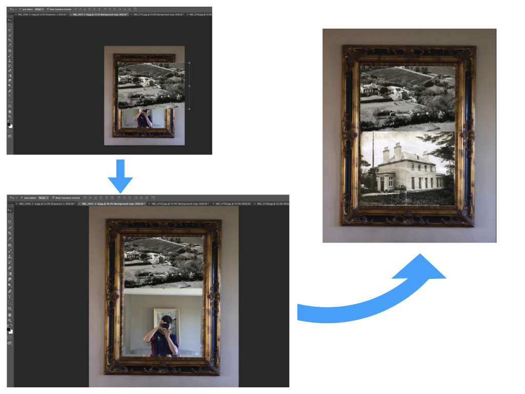
For this technique I will look at incorporating a more personal factor to the composition through the inclusion of how the property is being used meaning the way in which it is decorated. This gives a further insight into how the use and appearance of the property has changed throughout time. I will be taking natural frames, such as a mirror for example, and placing both archival and new photographs within the frame to give another element of how the land use has changed.

I will do this by first choosing the base photograph containing the natural framing. I will then paste the photographs chosen over the top of the base photograph and crop/alter the photographs so that they sit well in the natural frame. This will create further contrast between the old and new by showing a personal aspect of the decorations within the property.

I like this technique as it allows me to delve deeper into the use of the property and how the fashion and style of property design has changed over time. This technique can also be mixed with technique 1 as I can place the results from technique 1 into the natural frames to again add another sense of personalisation and to further show the similarities and differences that occur over time. This technique allows me to be as creative as I like with my compositions, as does technique 1, as I can place the photographs in any sequence that I choose but still create a feeling of organisation through the natural framing.
 

Layout of Newspaper

I created various different versions to experiment with the layout of my images. I tried to balance the number of black and white images to the number of coloured images that I used in order to keep a balanced aesthetic.

I did not like the first few versions as I believed I was trying to fit too many images on the page spreads. This was very distracting and prevented the viewer from being able to analyse the important details in the images.

Chosen Edit for the Newspaper spread:

I liked this version the most as the two people in the images are facing away from each other therefore representing the two different directions of the future, religion and construction. The difference in views is also represented by the difference in colour to black and white.

Another of my images was placed on a separate page alongside one of my peers as they both share soft tones of colour.

Experimentation with Colour, Cropping and Montage

Cropping


My main aim when cropping my images was to ensure the focus was on whatever the important subject was in the image so as to draw the viewers attention to it.

I took the same image and cropped it into to create 3 different versions that focused on different aspects of the original image. The top two images demonstrate the buildings abstract structure whereas the bottom image focuses on the detail of the window and what is inside.

I also explored changing the image into a negative to see what tones would be emphasized. In this edit, the cracks of the walls stood out.

Colour


For this image, I first increased saturation to bring out the luminosity caused by the blue blur of the bar just outside the right side of the image. The green and blues on the left and right side of the photo puts focus on the man wearing the neon jacket in the centre. I cropped this image into a square so as to present the lined architecture that spirals into the subject in the centre.

Changing the hue of the photos gave a more abstract feeling where in the first image I desaturated it and increased contrast a small amount to give a softer effect for the theme of hanging out laundry in everyday life. In contrast, the second image has an increased saturation to represent the psychedelic theme of alcohol and other substances that appear.

Montage


Using a selection of images in colour, I cut up sections of scaffolding from Convent Court, the tower block across the road from St Thomas’s Church and placed them over the church itself. The contrast in colour reflects the two important and different aspects of the future of St Helier, construction and religion.