


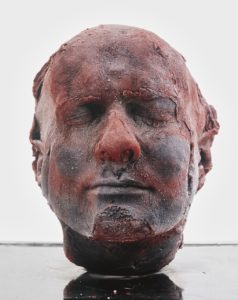
These pictures are experiments of my own existing material from previous projects. Each piece of material that I have taken from my photographic archive were taken with different incentives yet i have merged them together and created images with different meanings within their context. I’ve done this to further explore my idea of how western culture identifies with meat, in the hope of developing an alternative response that incorporates emotion and a story within my images. This inspiration has stemmed from the artist Marc Quinn and his ongoing series of self-portrait sculptures ‘Self’, sculptured entirely from his own blood, capturing his aging throughout the years. Quinn’s sculptures are innocently morbid, encapsulating the idea that we are all just made of meat. He’s used mediums from his own body without harming himself. Throughout history, there has always been the repeated idea that the body is sacred and should be left untouched after death. When exposed, the internal body has always been associated with death, perhaps connected with the fragility of life and the fragility of the body, yet the exposure of our insides is often forbidden through the eyes of religion. Western Religion has always taught people to respect the body before and especially after death. This also aligns with our laws and standards; it is commonly known that any mutilation of the body is forbidden. Although we carry out respect for our own bodies, the consummation of meat is often overlooked. The whole process of producing meat violates and mutilates an animals body before and after death. Surely all life in every shape and form should be protected, yet we break this rule by reassuring ourselves that animals are less than us and therefore, it is okay to enforce ill treatment upon them just to satisfy an acquired taste that everyone picks up from an early age. These photos that I have created is a reflection of ourselves and our diets. I have placed another animals internal layers above the external layers of these portraits, just for the sake of spite; we can’t mutilate one another but can mutilate beings ‘lesser’ than us – I have surfaced how this reflects on us – almost like the infamous Lady Macbeth from Shakespeare’s ‘Macbeth’, relating to the scene when she hallucinates blood on her hands. The meat connotes death within a picture of a life.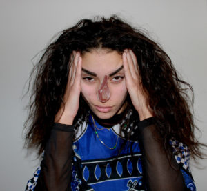


5-10 manifesto rules inspired by surrealism.
To convey a clear methodology of abstract, creative and surreal qualities of a dreamatic identity.
Free one’s mind from the past and from everyday reality to arrive at truths one has never known.
liberate one’s psyche from traditional education, feel an empowerment through the creative mind rather than analytical.
Do not stifle your imagination, break down tradition and become the create space around yourself.
Become an explorer of your own narrative, become who you are and who you aspire to be.
Do not hide your emotions but express them in passion. Do not be silenced by the government but uplift your own political power.
Be unique through your past, your truth, your dreams and express this is such a way to uplift other and not as a example of bitterness towards them.
Evoke a consciousness from those in power, use a voice of positivity for change to better the future.
Be expressive not only through yourself but the environment, view the world as something to composed and to create beauty for others.
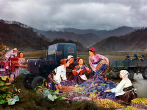
Alice Wielinga – North Korea: A Life Between Propaganda And Reality, 2013-2014
EIGHT 'RULES' OF PHOTOGRAPHY THAT ARE WORTH BREAKING
A photographers work is often manipulated by a set of rules that have been drilled into the mind when learning how to use a camera. These rules are often followed through in photojournalism when it comes to documenting scenes, places and events. The rule forbids a photographer to manipulate an image digitally as it is often believed that a good photographer can take the perfect photo in the moment. However, manipulation can be looked at in different ways. When looking at a photograph which has been produced to record a series of events or a culture for example, it is a usual standard for the audience taking in the image to trust that the photographer has not staged or changed the scene in any way. However there is always an underlying pressure for a photographer to create an image that looks perfect or in a sense aesthetically pleasing for an audience to like and accept it. If the underlying statement for a set images has a political message, producing an image to have an impact and to be thought provoking towards an audience is almost impossible without having some control over the image you produce other than the chance of coming across a scene at the right place and time.
Manipulating an image can be done during the process of taking the picture and editing or even by changing the caption. This can give the opposite connotations of what the original image had and can move the audiences viewpoint or focus on a photograph. For example, a news story will usually be accompanied by an image. If the editor was to change the headline of the image it can either change the image to be positive or negative; changing how someone can perceive a photograph.

PAOLA PAREDES Paola Paredes created a body of work through redeveloping the visual representation of a set of images from Jean-Martin Charcot's 'evidence' of 'hysteric' women through digital technology, handmade collages and stitching, turning his imagery into animations. 'Transforming this once static archive into one now dynamic and contemporary'. 'These experimental pieces seek to increase awareness of a time when the field of medicine subjected women to abhorrent treatment'.
The word ‘rule’ is defined as one of a set of explicit or understood regulations or principles governing conduct or procedure within a particular area of activity. This shows that the word rule is linked to control and standards – rules govern what we should and shouldn’t do. When looking at photography, the rules can often be what is acceptable to photograph and what is not, where a subject should be placed, and which camera settings should be used to capture the technically correct photograph. Below is the origin for the word ‘rule’. It originated from the latin word ‘regula’ for ‘straight stick’ and progressed through French in order to come around in the Middle English language.

The word ‘technicality’ is defined as ‘a point of law or a small detail of a set of rules, as contrasted with the intent or purpose of the rules.’ This shows that technicality links into rules as they are small details which should be set a certain way in order to stay in line with the rules governing. In terms of photography, this is the settings of the camera; the ISO, the shutter speed, the aperture and the exposure. The technicalities and rules of camera settings suggest that photographs should be exposed correctly, be in focus and be aesthetically pleasing but technicalities can be changed in order to challenge these rules.
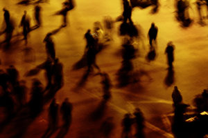
In Lewis Bush’s article ‘Rule Breakers‘, he explores eight rules within photography that are worth breaking. One of these rules is the rule of technicality. Bush says that “the camera technology of today means the real skill and the real statement sometimes lies in taking a wilfully ‘bad’ image”. By saying this, Bush is trying to convey the idea that it is alright to go outside the conventions of ordinary camera settings in order to create experimental photographs that would not normally be deemed aesthetically pleasing, but by using unique technicalities, photographers and artists such as Laura El-Tantawy and Henrik Malmstrom have used these technicalities to show creative expression. For example, El-Tantawy renders photographs of the Egyptian revolution with long exposures to express a personal vision of the event. El-Tantawy says “It was about responding spontaneously to the events around me” when speaking about the photographs as they showed what she felt and what she saw in the moment.

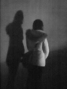
Whilst exploring the rule of technicality I will be looking at altering camera settings to create unconventional photographs that are both interesting and unique. I can take inspiration from both El-Tantawy and Henrik Malmstrom for this investigation as they both create unique and unconventional photographs. I think that Malmstrom has a very interesting approach in his book ‘A Minor Wrongdoing‘ in which he photographs subjects at night with a very high ISO to create grainy and underexposed photographs so I will continue to study Malmstrom. I will be able to explore street photography/documentary photography through this whilst also exploring the people within Jersey. Whilst doing this I can also look at creating out of proportion photographs or ones which do not consist of a conventional composition to further explore the idea of breaking the rule of technicality.

Whilst focusing on taking inspiration from Malmstrom, I may also look at changing technicalities which Malmstrom did not, such as shutter speed and aperture in order to make my photographs more unique and interesting. I hope through exploring this that I will be able to show my understanding of the rule of technicality and my understanding of the camera technicalities and conventions.
I have chosen to use the technique of pasting and cropping photographs over a base photographs and placing them in different places in order to align with the base photographs in order to create an interesting and contrasting composition. This allows me to be creative with the selection and placement of the photographs in order to emphasise as much as possible the differences and similarities between the past and present uses of the land. I will also be incorporating technique 3 into this by using natural frames such as mirrors and windows around the house in order to provide a more personal and interesting touch by showing how the fashion and style of property design has changed through time.
In order to provide myself with more photographs/frames to work with I have conducted an additional mini photoshoot within my household in which I photographed more frames and decorations within the house. I can use these photographs to broaden the variety of edits in my final outcome and to further show the current fashion and style within households.


In the edits I have used photoshop to alter/crop the montage photographs or archival photographs to fit within the natural framings that I photographed around my household and then placed the montages within the frame. I have done this to create a sense of personalisation within the edits as well as delving deeper into the theme of political landscape by showing how the inner decoration of the land changes over time, as well as the buildings themselves. The mixture of new and old photographs along with the modern decorations allows for the changes and developments over time to be shown as clearly as possible.
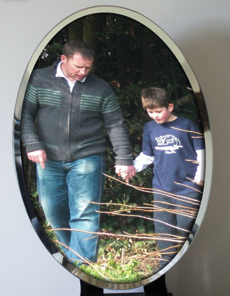
The majority of the photographs show the different sections of the houses and their developments through the use of montages but I have devoted one of the photograph edits to only the archival images within the frame in order for these photographs to be appreciated as they are without the contrast with the new photographs distracting the viewer from it. I have also included an edit which shows an archival photograph of me and my dad on the property in order to show that political landscape includes how the people involved in the change of land develop.

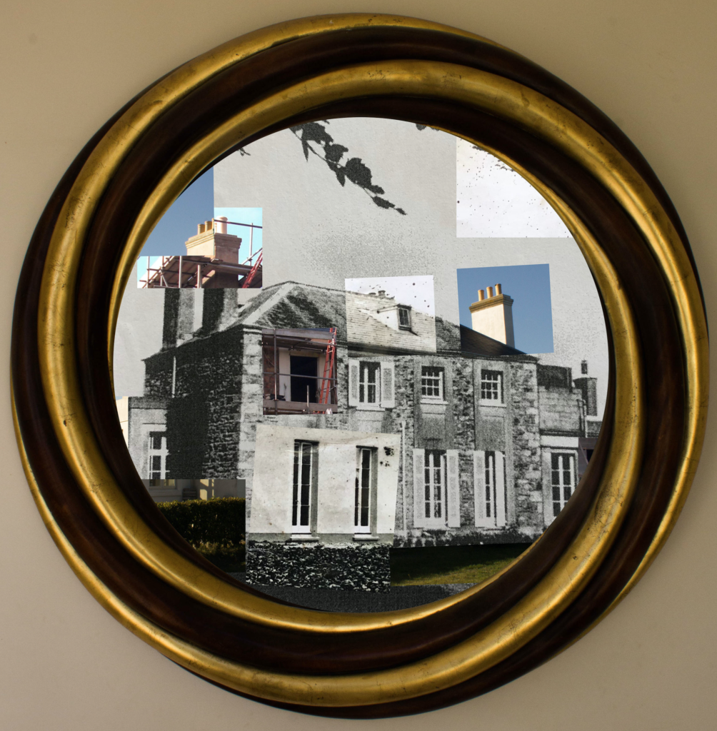



In this photograph natural lighting was used in all aspects from the photograph of the frame to the photograph of the house from 1873. This use of natural lighting has allowed for the natural shadows of the structure to be shown which helps to create contrast between the different shapes and angles in the structure of the house. There is a very wide tonal range in this photograph due to its montage nature – the bright white paint of the newly refurbished house contrasts against the black hole that is the window being renovated, this helps to create multiple viewpoints and areas of interest of which all contrast with eachother. A deep depth of field is used for all of the photographs involved in this montage as the whole of the photograph is in focus which allows for all the small details of the contrasts between the old and new to be seen. A shutter speed of 1/50 was used to capture the mirror frame along with an ISO of 200 as I wanted the frame to be of as high a quality as possible in order for it to compliment the photographs within it. For the photographs within the frame a slightly quicker shutter speed along with a lower ISO will have been used as the photograph was taken outside so the shutter did not need as much time to allow the light to enter the lens. The photographs are all correctly exposed but the exposures between the different photographs in the montage contrast with eachother to show the differences between them.
The colours in this photograph vary greatly due to the nature of the montage – the frame shows a dark gold and brown to contrast with the predominantly black and white montage. In the predominantly black and white montage there are splashes of colour through the inclusion of the photographs showing the current state of the house. These splashes of colour create a more interesting viewing and reminds the viewer how much technology has changed overtime to go from black and white to colour photography as well as the landscapes. There is a slight 3D effect to the montage as the closer corner of the house enters the background with the far corner being pushed towards the background – this 3D effect is further added to by the frame surrounding the montage, which creates a much more interesting and intriguing photograph. The frame is positioned directly around the centre of the photograph to allow the viewer clear viewing into what the frame is showing. This centralisation of the frame looks very orderly and neat which contrasts with the chaotic structure of the montage that it contains. The montage is placed within the frame in a way that shows as much of it as possible in order to convey my ideas within political landscape further. There are lots of viewpoints within the photograph as there is so much going on – which is possibly a bad thing – but I feel that there is a lot being said through this photograph so that fits the busyness of it.
This photograph is made from a collection of archival photographs and new photographs of my house. This collection of photographs represent the history of the house and the changes that it has gone through. I have incorporated both archival and new photographs to demonstrate how the genre of political landscape links to these photographs. The house has many similarities to cod houses through the shape and style – these cod houses were built in the 18th and 19th century from people who made their wealth through the North Atlantic cod trade which can be seen as one of the initial sources of wealth within Jersey. After research on the house I could not find any evidence that this is a cod house but the similarities and shapes are very close. This photograph has strong links to political landscapes and Guillame Bression and Carlos Ayesta’s work due to exploring what humans can do to a landscape and how drastically landscapes can change over a time period.
The idea behind this photograph is to show how even though fashion and trends come and go, they always come back around. This photograph shows sections of the house through photographs that are taken nearly 150 years apart – even though they are taken so many years apart the structure and shape of the building has remained. In the 1870 period only the people who could afford to would plaster their houses, but then later on it came into fashion for houses to have granite showing (as seen in the photograph) so the house was stripped of its plaster to reveal the granite structure. In the current state the house has been re-plastered in order to meet fashion trends and in order to show some inspiration from the original style of the property. This loop of fashion and trend shows how political landscapes often take inspiration from the past whilst putting a modern spin on them.