Category Archives: Coursework

Filters

Author:
Category:

Week 3 | Psycho-Geographies | Landscape Unit

Psycho-geography is a hybrid of photography and  geography that emphasizes playfulness and “drifting” around urban environments. It has links to the Situationist International.

Psychogeography was defined in 1955 by Guy Debord as “the study of the precise laws and specific effects of the geographical environment, consciously organized or not, on the emotions and behavior of individuals.”

Another definition is “a whole toy box full of playful, inventive strategies for exploring cities… just about anything that takes pedestrians off their predictable paths and jolts them into a new awareness of the urban landscape

The originator of what became known as unitary urbanism, psychogeography, and the dérive was Ivan Chtcheglov, in his highly influential 1953 essay “Formulaire pour un urbanisme nouveau” (“Formulary for a New Urbanism”).

It has roots in Dadaism and Surrealism.

The idea of urban wandering relates to the older concept of the flâneur, theorized by Charles Baudelaire…and is similar to STREET PHOTOGRAPHY

PETAPIXEL definition of PsychoGeography CLICK HERE
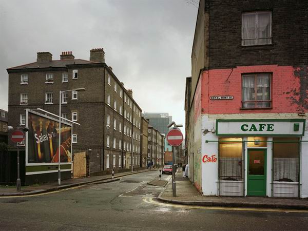
What will you see on your journey…and how will  you respond and adapt to it ???

Koyaanisqati : Drawing its title from the Hopi word meaning “life out of balance,” this renowned documentary reveals how humanity has grown apart from nature. Featuring extensive footage of natural landscapes and elemental forces, the film gives way to many scenes of modern civilization and technology.

Superflux : explore over-surveillance and the prospect of intrusion in our everyday lives…has the concept of psycho-geographies evolved into something dystopian-like and Orwellian (1984- “Big brother”)…governments, town planners and the authorities design how we live, where we live and essentially control popluations of towns and cities.
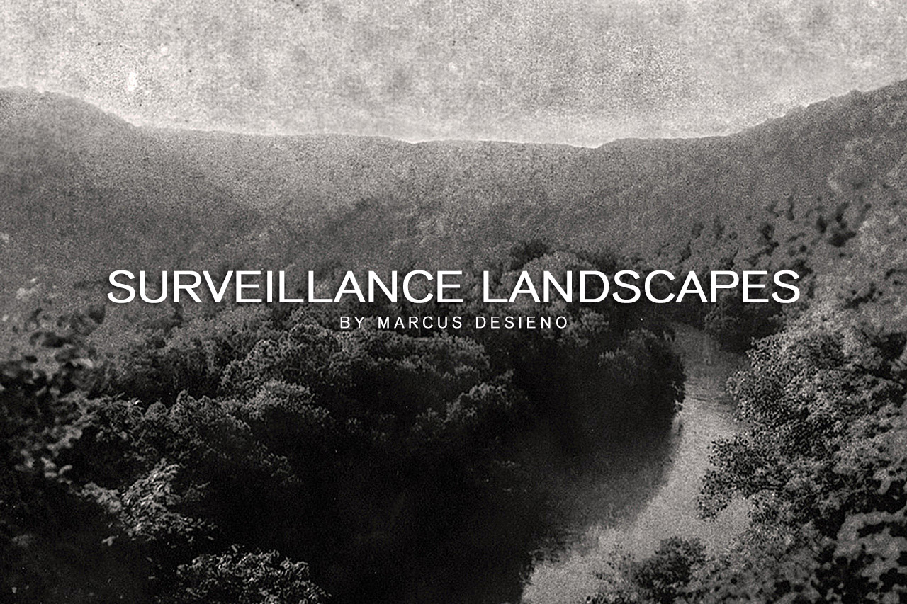
Marcus Desieno creates de-humanised landscape photography by hacking surveillance camera networks…but avoids privacy problems normally associated with urban and residential areas…

What you need to do…(3-5 blog posts)

  1. Research thenDefine, describe and explain what Psycho-Geography is…
  2. Choose an (urban) area of Jersey that you are interested in exploring
  3. Find the area on google maps and zoom in so that you can make a screen shot to add to your blog post.
  4. Add the “street view” too if you can
  5. Find as much information and images online as you can about the street / area you are exploring and include these in your blog post
  6. Add any archival information that you can too (see below)
  7. Then go to the area and explore on foot…photographing everything you can, and all that appears of interest to you at that time. Photograph up, down and across…creating a film or time-lapse is good too as is drone footage / imagery…
  8. Record the time, date and place of your journey in your blog post
  9. Add any thoughts, feelings or emotions you can about the place your are exploring…and as you develop a connection and familiarity with the place/ people / buildings etc.
  10. Refer to Mishka Henner and Edward Burtynsky (aerial photographs) and The Boyle Family in your blog post…and discuss how they interact with an area and create art / photography inspired directly by the location and its uses / functions.
  11. Analyse and evaluate your process…show your selection, editing and presentation of final images.

What Are Archives?

In the course of daily life, individuals and organizations create and keep information about their personal and business activities. Archivists identify and preserve these documents of lasting value.

These records — and the places they are kept — are called “archives.” Archival records take many forms, including correspondence, diaries, financial and legal documents, photographs, and moving image and sound recordings. All state governments as well as many local governments, schools, businesses, libraries, and historical societies, maintain archives.
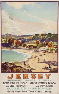
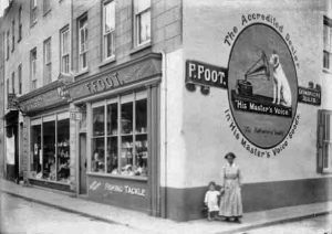


Your task

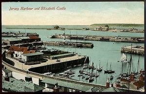
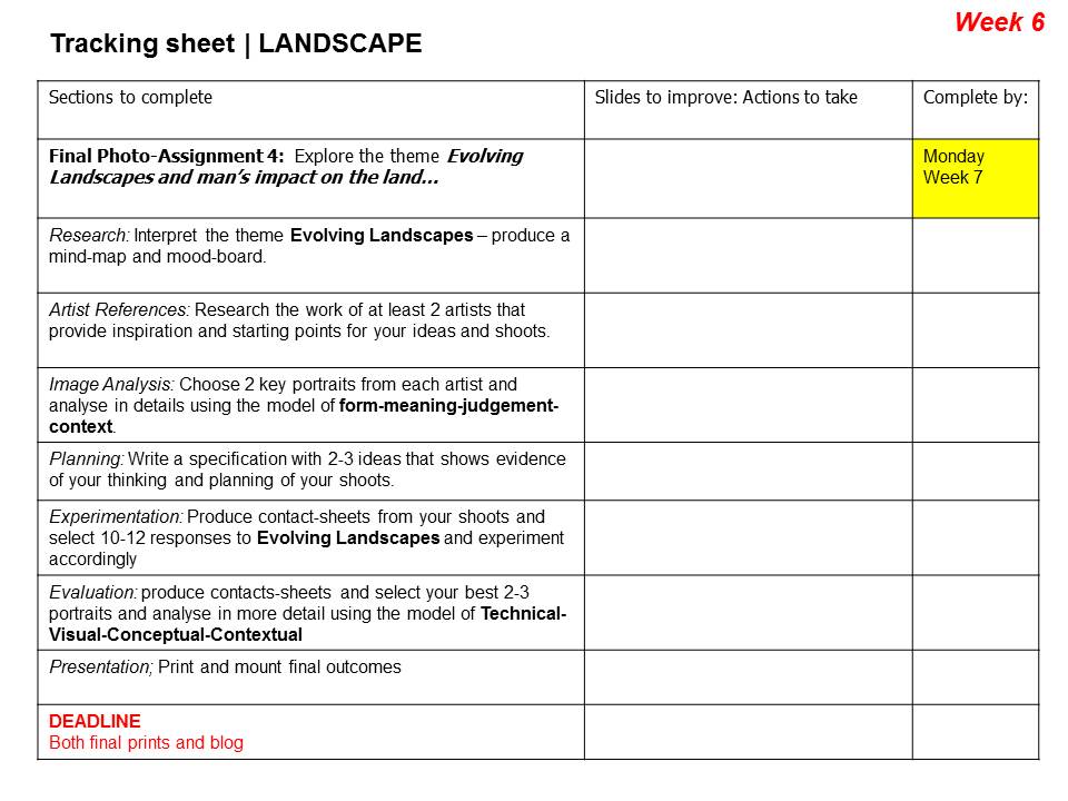
The images above are Archival Images from iconic areas of Jersey…and these areas have changed over time.

  • Find archival images that correspond to your own landscape photography and contrast and compare. Include any info you can find about the image itself / photographer / time period etc
  • OR…you may find that you are intrigued by a particular landscape image and want to respond to it and create a comparison / composite image. For this you must conduct a photo-shoot aiming to document the area from a similar viewpoint and edit your images accordingly
  • OR…you may want to explore the concept of JUXTAPOSING Old and new buildings / parts of Jersey…either by photographing them in situ, or creating a composite image using photoshop
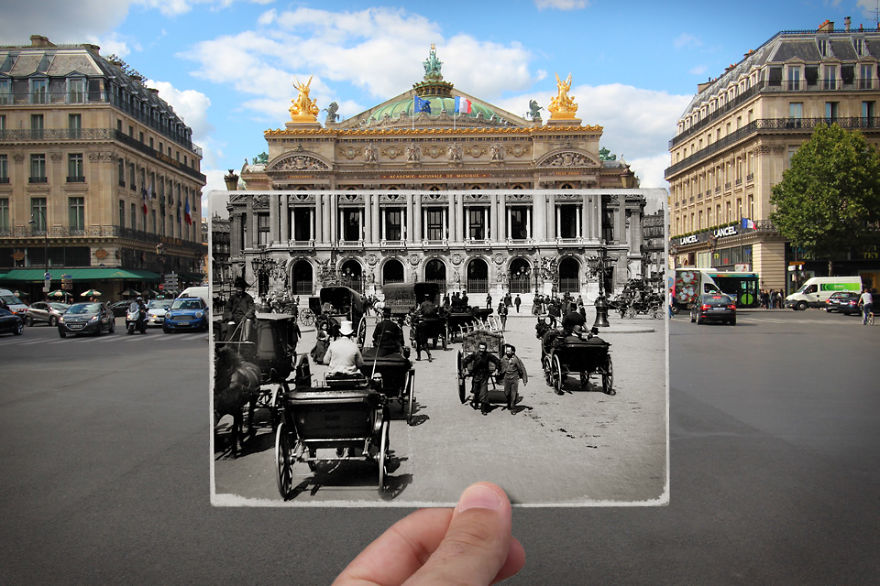
i-combined-old-and-new-photos-of-paris-to-bring-history-to-life-5__880

Public archives in Jersey

Jersey Archives:  Since 1993 Jersey Archive has collected over 300,000 archival records and it is the island’s national repository holding archival material from public institutions as well as private businesses and individuals. To visit click here

Jersey Archive can offer guidance, information and documents that relate to all aspects of the Island’s History. It also holds the collections of the Channel Islands Family History Society.

Societe Jersiaise: Photographic archive of 80,000 images dating from the mid-1840s to the present day. 35,000 historical images in the Photographic Archive are searchable online here.

Societe Jersiaise also have an extensive library with access to may publications and records relating to the island’s history, identity and geography. Click here

Archisle: The Jersey Contemporary Photography Programme, hosted by the Société Jersiaise aims to promote contemporary photography through an ongoing programme of exhibitions, education and commissions.

The Jersey Evening Post Archives CLICK HERE

The Archisle project connects photographic archives, contemporary practice and experiences of island cultures and geographies through the development of a space for creative discourse between Jersey and international practitioners.

Link: http://www.archisle.org.je/

Extension Task

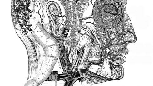
  • Research and explore how Lewis Bush  engages with and photographs the city and its development  / over-development.
  • Click  here to check out an interview as he explains how he uses aerial / satellite imagery to home in on secret data stations used in the Cold War and produce abstract imagery influenced by the radio waves of secret information being mysteriously broad-casted.



Case Study – Romanticism

Photographer Research – Hiroshi Sugimoto

Sugimoto Hiroshi, born on February 23, 1948, is a Japanese photographer and architect. He leads the Tokyo-based architectural firm New Material Research Laboratory.

He came to be known for his strictly black-and-white, highly stylized photography series. These series show views of the sea, extremely long exposed theatres, photos of scientific display cabinets, wax figures or Buddhist sculptures. Hiroshi Sugimoto sometimes works for several years on these work series. In recent years he has occupied himself increasingly with architecture, furniture design, objects and fashion.

“It was my goal to visualize the ancient layer of human memory with the means of photography”

“It is about returning to the past and remembering where we come from and how we came into existence.”

source

Photo Analysis

Technical

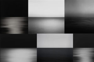
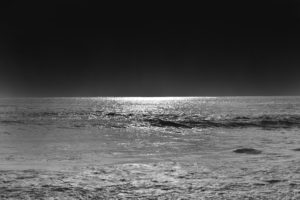
Although this photo may look plain and simple at first glance; there are many technical elements embedded in the image. Firstly, the smooth ripples in the water mean long exposure was used, Hiroshi Sugimoto most likely paired that with a slower shutter speed and bigger exposure to achieve this smooth and serene effect. Since the sky is rather dark, it’s natural to assume that the photo was taken at night – due to this, Sugimoto didn’t have to worry about overexposing the image as it would have been too dark to begin with. If the photo was taken in the dark, there would be no natural light for Sugimoto to work with meaning he had to rely on his camera and settings. Referring to Ansel Adam’s tonal range; the image seems to be missing the darkest black and brightest white but captures most of the tones in between.

Visual

Visually, I find this photo very pleasing and soothing. The lack of colour doesn’t feel like a disadvantage in this image; in fact, the lack of colour contributes to the simplicity and straightforward nature of Hiroshi Sugimoto’s photographs. By looking at the other photos in this set, it is safe to assume that Sugimoto used a black and white effect on this photo like all others. The photo has two parts to it: the sky and the sea, divided only by the line of the horizon that creates a soft contrast between the dark grey sky and lighter waves. Sugimoto purposely arranged the position of the sea like this in countless photographs to play and experiment with the concept of minimalism.

Contextual

The photograph was taken in 1997, during a time where most people had access to coloured photographs- Sugimoto purposely chose to not include colour in this image. Hiroshi Sugimoto studied art in Los Angeles in 1971, at the time of Minimalism and Conceptual Art – this is clearly evident in his work.

Conceptual

To me, the concept behind the image is to challenge the audience’s perspective and views on what makes a successful photograph. The image, at first glance, lacks the most conventional aspects of a successful photograph.  The image is incredibly plain due to the lack of subjects but still able to capture the attention of the viewer and provoke an emotional response. The whole set has a similar calm and harmonious atmosphere it radiates, allowing the viewer to feel safe and at peace – which may not be a feeling we expierence much in our chaotic everyday life.

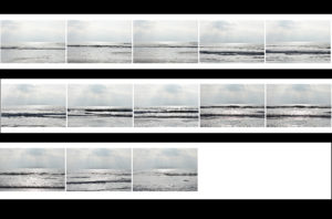
Contact Sheets

Final Edited Image In The Style Of Hiroshi Sugimoto


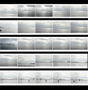
For this image, I first used the lasso tool to separate the sky and the ocean into two different layers and then I simply used the ‘burn’ tool to darken both the sky and the ocean until I was satisfied with the results.  It was an easy process but it allowed me to quickly obtain the results I wanted.

New Topographics Homework Assignment

Planning

Task: Take 100-150 urban landscape/night photos

Props: I will be using a tripod in order to capture some long exposure shots at night.

Camera settings: For my long exposure shots I will be using a shutter speed of 30 seconds to make them more effective, along with a 100 ISO. For other landscape photographs I will be using an ISO of 200 with a shutter speed of 1/20 to allow enough light to enter the lens.

Lighting: I will be using lights from passing cars, buildings and lamp posts to capture my photographs

Location: Town

Context: I will be capturing photographs with the style of the New Topographics in mind.
Concept: To capture photos whilst taking influence from the style of Robert Adams and Stephen Shore.

My Photographs

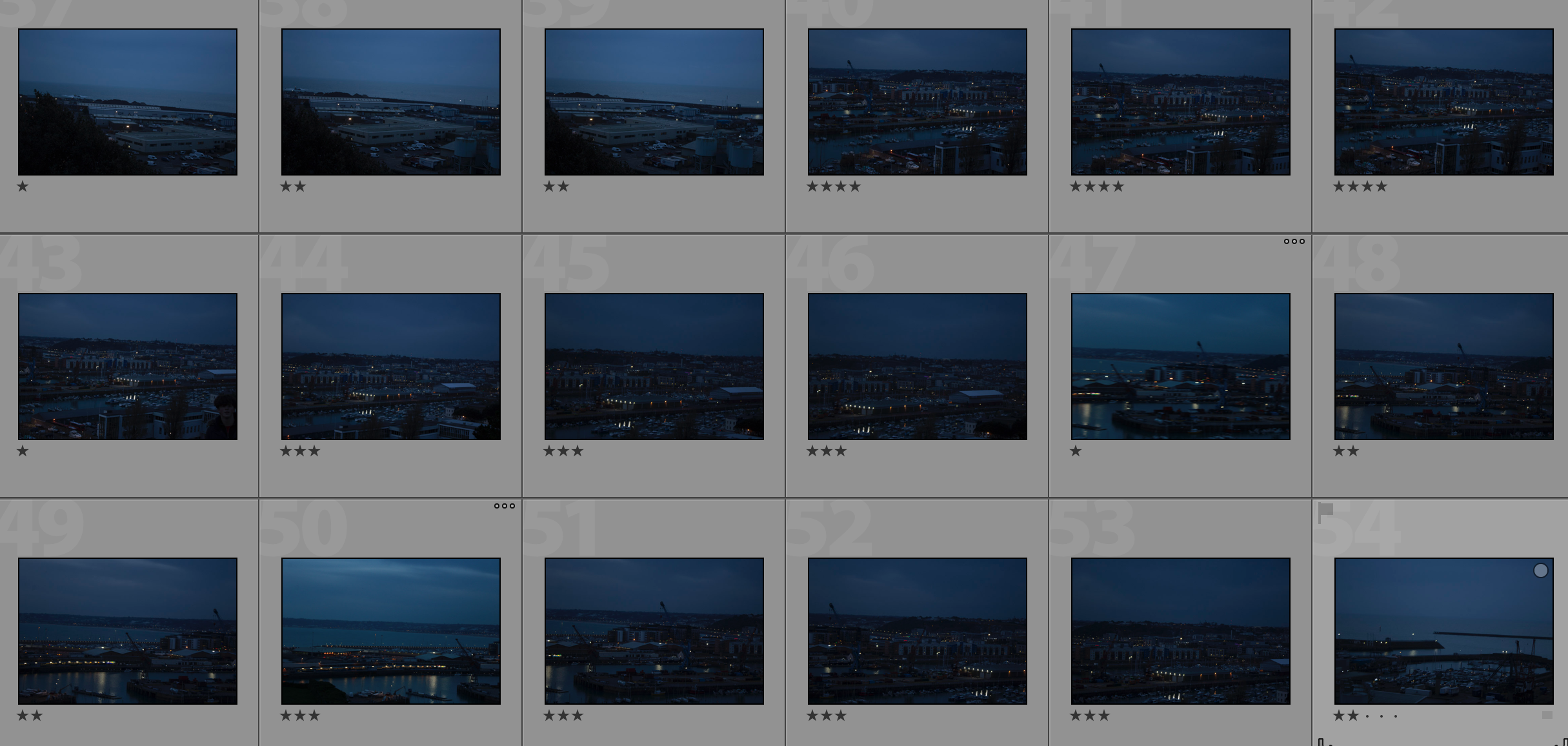
Contact Sheet

My Edits

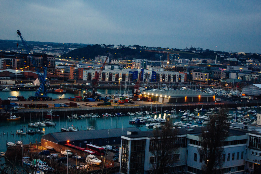
My Favourite Photo

In this photograph I used natural lighting. I took advantage of the lights in the down as dusk approached in order to cast contrasting orange colours against the blue-tinted town. I used a deep depth of field of  20 to capture this photograph to ensure that the whole of the image was clear and in focus. I used a shutter speed of 1/20 in order to allow enough light to enter the lens from the dark environment, paired with the low ISO of 100 that I used, it allowed me to create a high quality image with a wide tonal range.

There are lots of intense colours in this photograph such as the orange lights and the blue sea and sky which cast a blue tint on the photograph. It is generally quite a dark image with the lightest tone being the bright lights. It has a slight 3D effect due to the harbour in the middle separating the foreground and background.

This photograph has been taken with the work of the New Topographic movement in mind. It shows the industrial side of the environment and all the man-made structures along with nature being pushed to the background or covered up by man-made structures.

The photograph shows how the nature shown in the photograph has been taken over completely by man-made structures and has lost the attention it once had. This is symbolic for the New Topographic movement taking over from the Romanticism movement. It shows how quickly things can change for better or for worse.


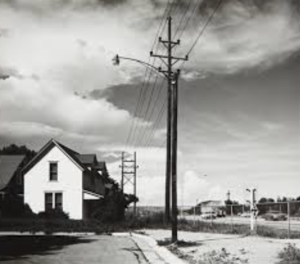
Robert Adams

Robert Adams

Adams was an American photographer who had a significant focus upon changing landscape of the American west,his work first started to become relevant within the 1970’s due to the success of his book ‘the new west’.The artist brown on May 8th,1937 was part of a family having himself a brother and sister,when he was younger he was infected with polio and had harm to the left side of his area and hand but soon recovered, but later in life suffered form other medical problems due to the previous illness. he had a very nature enforced childhood going on many walks accompanying his father, he also worked in a mountain national park in Colorado,and went mountain climbing and then so start visiting art museum with his sister.Not knowing what he wanted  to do he continued to take English and get his ph. D in English In 1965,he soon married to Kirsten who too and similar interests whiten art and nature. he taught English in Colorado college ad then soon as able to buy his first camera.

He mainly focus more upon taking many images of landscapes of nature and architecture. he learned many of his  photography knowledge form a professional photographer local to him named ‘Myron Wood’.Soon his love for photography spread and he became a full time photographer.His subject matter was ‘vastness,its sparse beauty and its ecological fragility’ manner of his work was produced throughout varying shades if grey and what has been lost remains, and a brilliant subtext to everything.

favorite image analysis

I chose this image due to the intriguing way in which Adams was able to capture the  strength and dominance within the clouds and the deep contrasting tones from within the background trees.you are clearly able to see the way in which people or  juxtaposing to the man made metal equipment. There is a sense of irony with the nature in the background and the way in which the people are more occupied within the pool and not the natural lakes and such.There is also almost a theme of segregation within the communities and the continuation of fences and boarder in which they are surrounded.The close up gate allows a redistricted in which we are viewing the people. All the over exposed lighter tones also have connotations to a more harsh lined  industrial area and shows elements of possibly not being safe.It shows a strong contrast within the beauty of nature and the urban life in which these people are living and choosing to do so.I think it is interesting in how the photographer chose to take the image when no one is in the pool,it shows a sense of reason to the image and the joy they should be having being in the pool but the rugged nature of pool is perhaps a preventative,perhaps this is to demonstrate the gradual separation between people and nature.

Mind map

Many of his works shows a strong industrial structure  presents in the foreground and a gradual deterioration into the nature based areas of his work. There is also a large surrounding space to present that their is an effect go nothingness without human evolution to buildings  and Inhabitance.

Ideas that will use in my work:

My main attraction to his work is how he has many layers of attention to the image itself and how it consistently evolves to create many interesting aspects throughout the original image,secondly I would want to expand on the use of persona and what people are doingerive attention to the image itself,and what the meaning of the contrast to nature would in fact be

LANDSCAPE PHOTOGRAPHY | WEEK 2 | THE NEW TOPOGRAPHICS


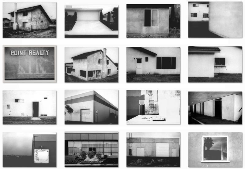
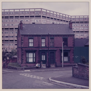
New Topographics was a term coined by William Jenkins in 1975 to describe a group of American photographers (such as Robert Adams and Lewis Baltz) whose pictures had a similar banal aesthetic, in that they were formal, mostly black and white prints of the urban landscape…
LEWIS BALTZ
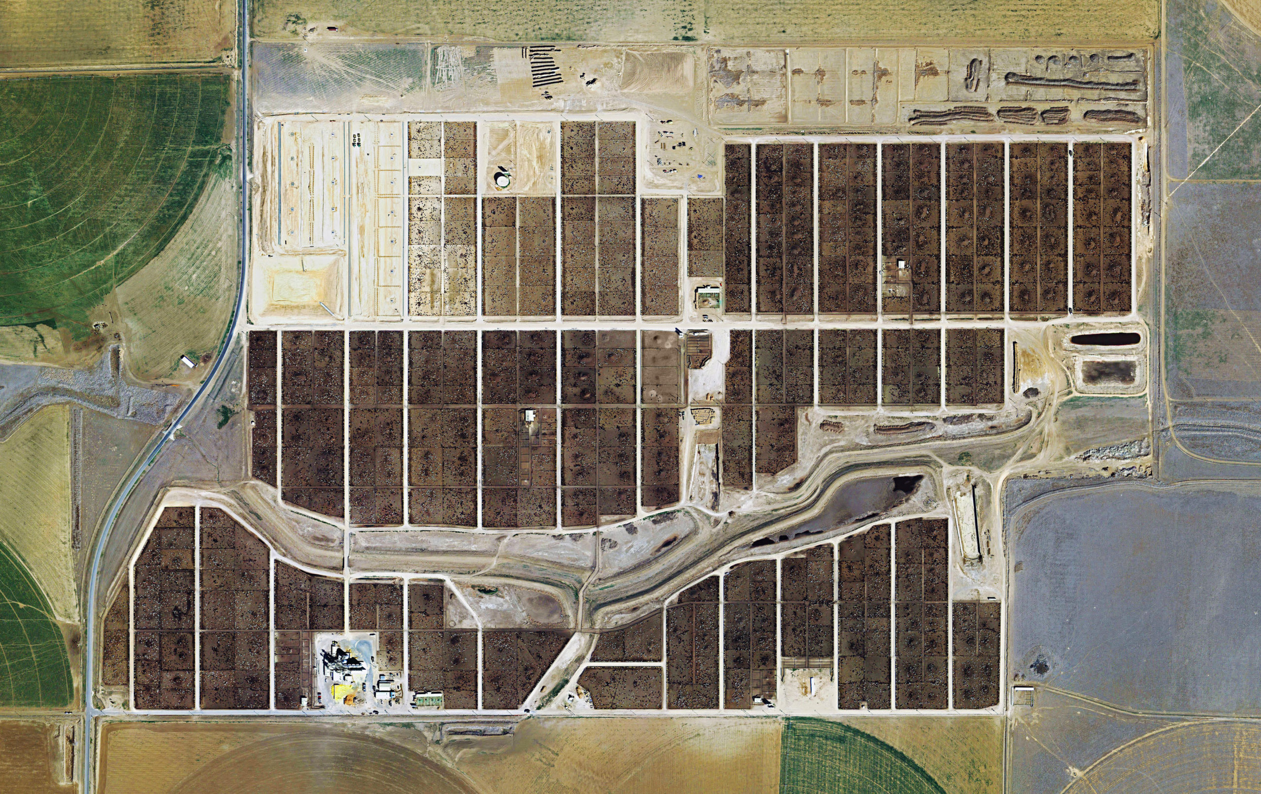
Many of the photographers associated with The New Topographics including Robert Adams, Lewis Baltz, Nicholas Nixon and Bernd and Hiller Becher, were inspired by the man-made…selecting subject matter that was matter-of-fact. Parking lots, suburban housing and warehouses were all depicted with a beautiful stark austerity, almost in the way early photographers documented the natural landscape. An exhibition at the International Museum of Photography in Rochester, New York featuring these photographers also revealed the growing unease about how the natural landscape was being eroded by industrial development.
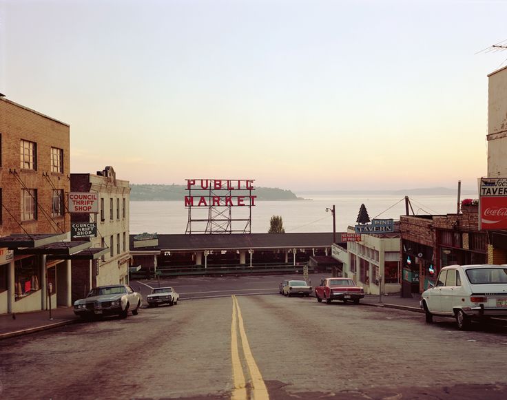
STEPHEN SHORE

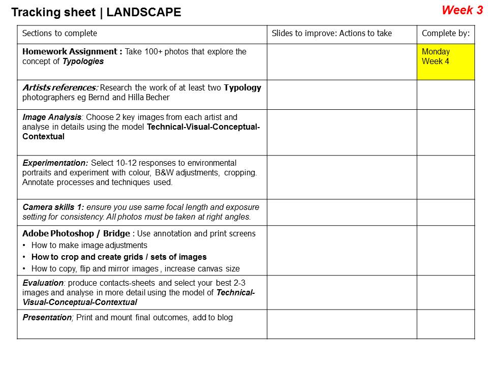
The new topographics were to have a decisive influence on later photographers including those artists who became known as the Düsseldorf School of Photography.

WATCH THIS …New Topographics

Photographing Urban Landscapes

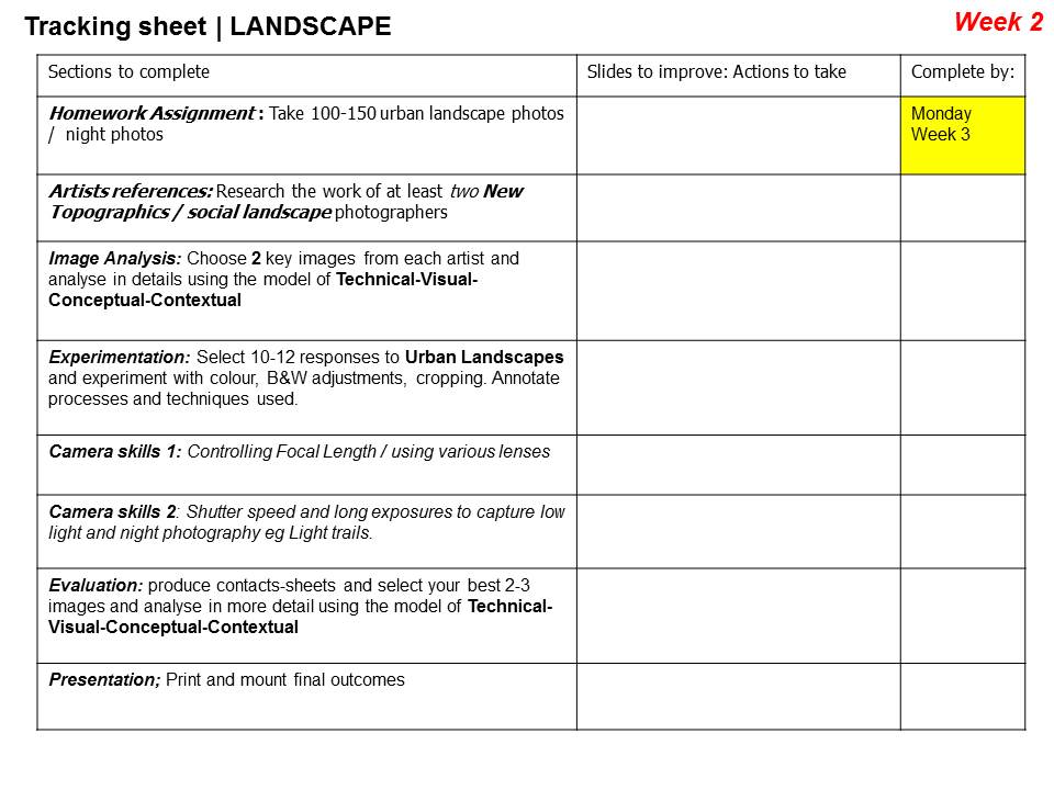
  1. Research and explore The New Topographics and how photographers have responded to man’s impact on the land, and how they found a sense of beauty in the banal ugliness of functional land use… 
  2. Create a blog post that defines and explains The New Topographics and the key features and artists of the movement.
  3. ANSWER : what was the new topographics a reaction to?
  4. Choose from…ROBERT ADAMS, STEPHEN SHORE, JOE DEAL, FRANK GOLKHE, NICHOLAS NIXON, LEWIS BALTZ, THE BECHERS, HENRY WESSEL JR, JOHN SCHOTT ETC to write up a case study that will inspire your own photography.
  5. Analyse some key imagery carefully and show your understanding of the  TECHNICAL / VISUAL / CONCEPTUAL AND CONTEXTUAL ATTRIBUTES OF THE IMAGES YOU HAVE CHOSEN TO DISCUSS
  6. Here are some other suggestions that may stimulate your imagination  / Starting points for YOUR OWN photo-assignments THIS WEEK…

    • Scrapyards, building sites, cranes, restoration yards, derelict ruins
    • Stadiums, floodlight arenas, staircases
    • Motorways, railways, runways, dockyards
    • Circuit boards, pipework, telephone poles, towers, pylons, skyscrapers
    • Shop displays, escalators, bars, libraries, theatres and cinemas
    • Gardens, parks, playgrounds, swimming pools, man-made beaches

    Possible titles to inspire you and choose from…

    Dereliction / Isolation / Lonely Places / Open Spaces / Close ups / Freedom / Juxtaposition / Old and new / Erosion / Altered Landscapes / Utopia / Dystopia / Wastelands / Barren / Skyscapes / Urban Decay / Former Glories / Habitats / Social Hierarchies / Entrances and Exits / Storage / Car Parks / Looking out and Looking in / Territory / Domain / The Realm / Concealed and Revealed

EXTENSION TASK

Look at how the New Topographics approach has inspired landscape photography and we document our surroundings / the way we are using and transforming the land.

You should look at photographers such as…

Research a selection of these photographers and respond with…

  • similar imagery from your own photo-shoots / image library
  • analytical comparisons and contrasts
  • a presentation of final images

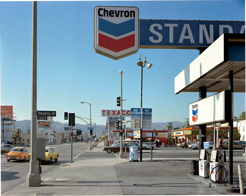
Stephen Shore, Beverly Boulevard and La Brea Avenue, Los Angeles, California, June 21, 1975, 1975, chromogenic color print

Analysis starters

  • Foreground vs background | Dominant features
  • Composition | low horizon line | Square format
  • Perspective and detail / cluttering
  • Wide depth of field | Large Format Camera
  • Colour | impact and relevance
  • Nationalism vs mobility vs isolation
  • Social commentary | The American Dream ?

Romanticism

Romanticism

Romanticism is an artistic movement originating in Europe in the late 1700’s and involves lots of interest in nature and rebellion against social rules and conventions. Romanticism is quite conceptual and aesthetically pleasing to the viewer as is further explained in this video. The main idea behind romanticism is that reason cannot explain everything. The romantics searched deeper and more subconscious than other movements.

Examples of RomanticismImage result for romanticism photography

Image result for romanticism photographyImage result for romanticism photographyImage result for romanticism photographyImage result for romanticism photography

Landscape Unit | Schedule | Jan / Feb 2018

AS PHOTOGRAPHY MOCK EXAM

THEME : LANDSCAPE 

DATES…

MONDAY 26TH FEBRUARY 12 A PERIODS 1-5 IN PHOTOGRAPHY ROOM

TUESDAY 27TH FEBRUARY 12 B PERIODS 1-5 IN PHOTOGRAPHY ROOM

WEDNESDAY 28 FEBRUARY 12 C PERIODS 1-5 IN PHOTOGRAPHY ROOM

THURSDAY 1 MARCH 12 D PERIODS 1-5 IN PHOTOGRAPHY ROOM

PRINT DEADLINES

FEBRUARY 20TH for ALL GROUPS

(You can add abstract, formalist, portrait and landscape final images to this print run too)

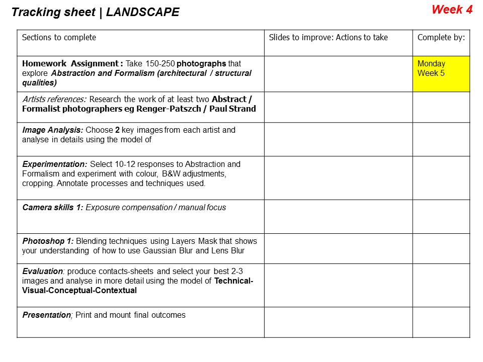
You may have other opportunities to explore architecture, and make links to what you studied in ABSTRACT AND FORMALIST photography…


Formal & Contextual Analysis

Pioneers Of Landscape Photography

Carleton Watkins

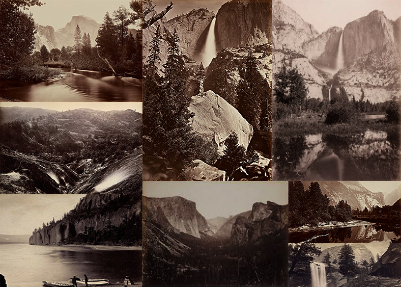
He was perhaps America’s greatest 19th century landscape photographer yet today he’s largely unknown. His breathtaking landscapes of the Yosemite Valley were instrumental in preserving the valley for future generations and paving the way for both the National Parks system and the environmental movement.

Among the people who had Watkins’ prints was a U.S. Senator from California, John Conness. He showed them to his fellow lawmakers as part of his effort to save Yosemite from the development and tourism that was already encroaching on the valley. When President Abraham Lincoln saw them, it helped convince him to sign a bill in 1864 declaring Yosemite Valley “inviolable.”

It was the beginning of America’s environmental movement and the National Parks system. And if not for Watkins, there might not have been a pristine Yosemite Valley for photographers like Ansel Adams to photograph.

Source

Ansel Adams

Though 50 years of work preceded him, Ansel Adams is the spiritual father of American landscape photography. Not only is he perhaps the most recognizable name in all of photography, but his work transcended art and science to make him an icon of popular culture as well.

“It’s rare to find a landscape photographer,” says Carr Clifton, “or any photographer who hasn’t been touched by Ansel Adams’ black-and-white work of the exquisite landscapes of the American West.”

Like Carton Watkins (above) before him, Adams made many famous photographs of Yosemite National Park. What set him apart was his work’s timeless quality. Technologically innovative and advanced enough to surpass much of the printing done today, Adams’ photography was simple enough to maintain a direct connection to the earliest pioneers of the medium.

Source


Project Final Outcomes

FINAL OUTCOMES

My favourite chosen outcomes from the project are also those that I have used for my final print compositions, here is a link to the post that went over my final prints…

https://hautlieucreative.co.uk/photo19al/2017/12/18/print-compositions-framing/

Outcome 1

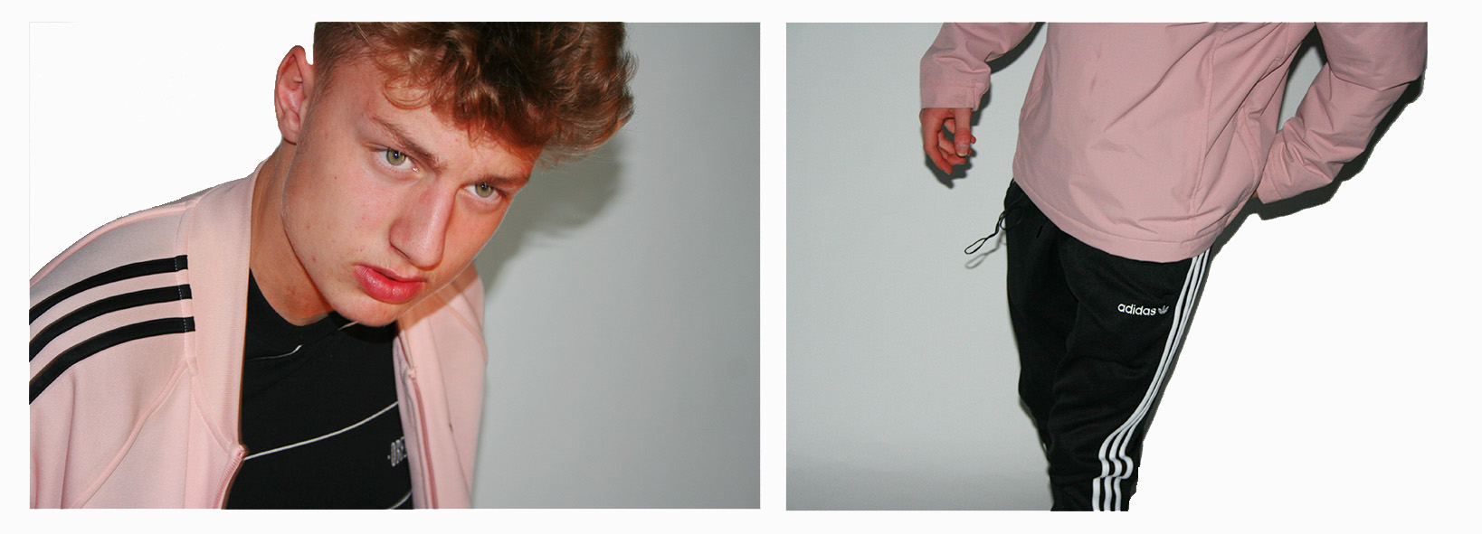
The first of my final pieces is a composition of 2 studio portraits that I believe simply work together rather well and effectively, to create 1 piece.

Outcome 1

The images needed slightly enhancing in order to balance the light, contrast, saturation and shadows of the 2 photographs, and cropping in order to make sure that the background of the images look clean and fully white so that the subjects stand out nicely.
This composition of 2 images is one that I believe shows my raw camera skills. I believe that the 2 images compliment each other perfectly due to the colours, composition and patterns within the images.

Image result for ADIDAS LOGO


The thing other than the balanced colours/shades pink, black and white that stands out to me between the two images is the balance between pattern through the 3 Adidas stripes in both images. These 3 stripes are something that you will see just about everywhere in which people are wearing casual attire. The stripes are the trademark the adidas sport and casual wear brand, causing Adidas to be known as the “The three stripe company” after being called this by its founder Adolf Dassler. In my 2 photographs the dark on light stripes create a good contrast with the light on dark stripes.

Outcome 2

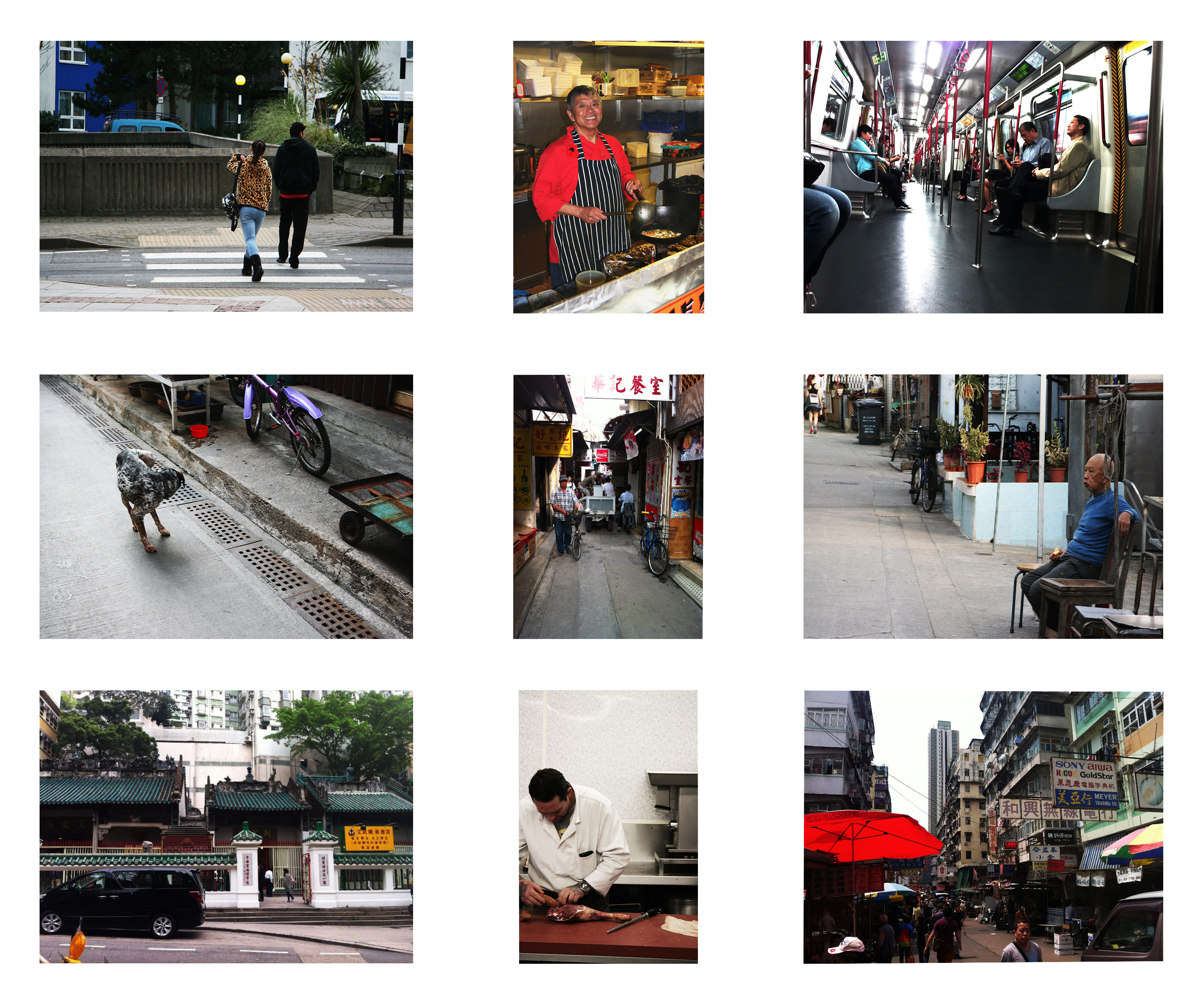
The second of my final pieces is a composition of 9 images (Street photography and Environmental portraiture) in a story board style which explore how the surroundings of a subject visually effects the subject, and how the subject effects its surroundings.

Outcome 2

I have composed the images in this fashion as each image that is opposite to another length-wise or height-wise is related to and balanced with each other.

Here are the 9 original photographs that I have used in this piece…

The environmental portraits were inspired by August Sander who had a mission of photographing every worker in the whole of Germany, here are some examples of his work…


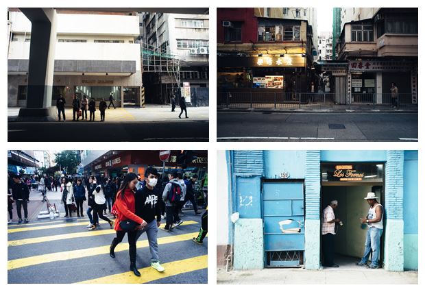
The street photographs were inspired by Genaro Bardy who photographs the streets of metropolitan cities and small towns. Here are some examples of his work…

Genaro Bardy

Outcome 3

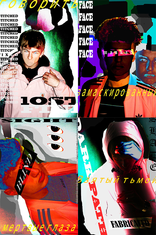
The third of my final pieces is a composition of 4 creative portraits exploring a theme of socially perceived identity.

Outcome 3

I believe that these creative portraits present my creative skills through the use of Photoshop and Typography. The theme of socially perceived is about how people portray themselves within society and how other people portray them, not specifically to the subjects of the images but in general as a society how people seem to see themselves as individuals. The words used in these images explore different social boundaries that some people may come face to face with in society.

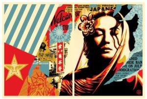
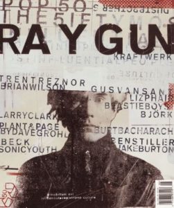
This style of work which I have used in this piece of work is inspired by various photographers and graphic artists including: David Carson, Lester Beall, Neville Brody, Paula Scher, and Shepard Fairey (the creator of the OBEY brand.) Here is some of their work…

Shepard Fairey
Shepard Fairey
Paula Scher
David Carson
Lester Beall
Neville Brody

The work also was influenced by Russian graphic propaganda. This was a way of representing the topic of  social identity as a battle within my work.

Print Compositions / Framing

PRINT COMPOSITIONS

These are how I wanted to present my final printed images. I have chosen to present them in a simple way because the images are very detailed and contain a lot of aspects, which I didn’t want to over do by presenting them in quite a complicated way.

Mounting Board

This composition of 9 photographs (in a story board format) took a lot of time choosing what images work best together and where to locate them in the piece. I eventually chose these 9 in this order as I believe that they are well balanced and without going into too much detail the images found opposite of each other in the piece tell a story of how the subject is effected by it’s surroundings or how the subject’s surroundings are effected by it.

Mounting Board

The second print composition that I have created explores a more creative portraiture aspect of the project through the use of typography and Photoshop. Although slightly worried about how the quality of the printed outcome would be the prints came out in good quality despite the intentional grain within the images. Again without going into much detail I believe that these 4 images balance each other well and are effective in implying the message of socially perceived identity.

Foam board

Finally this composition of 2 images is one that I believe shows my raw camera skills. I believe that the 2 images compliment each other perfectly due to the colours, composition and patterns within the images. And despite the 2 separate subjects I was able to choose the two with really well balanced fits (colours, stripes, angles) on meaning that when put together as one piece they would look even better.