Category Archives: Coursework

Filters

Author:
Category:

Presentation Of Final Pieces

Final Images

Presentation Method

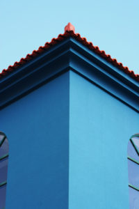
For the following images I chose a simple framing method; this is mainly because I feel like the images are rather complex and I think a complicated display would only harm the photographs as the viewer would be too distracted.

I bought 3 simple glass frames with a black outline; I found out that the images were too small for the frames alone so I decided to make borders in order to fill the empty space. I experimented with different sizes and colours before I then cut out 2 white borders (for the A4 prints) and 1 black border (for the A3 print).

Evaluation & Critique

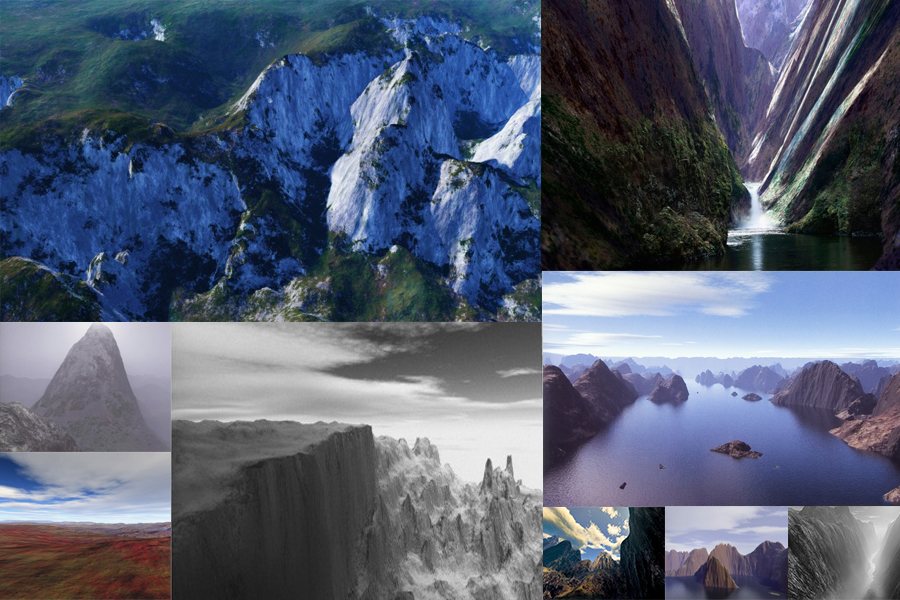
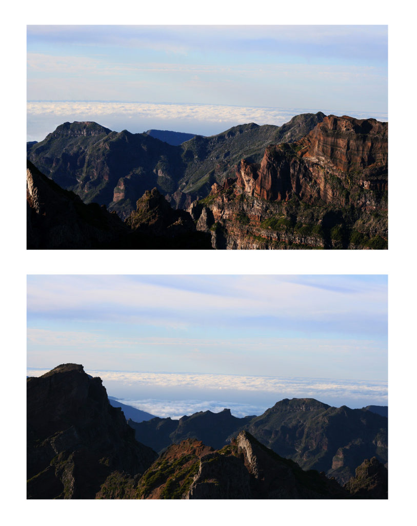
Overall I am rather happy with the final outcome and how everything tied together; during this project I explored a variety of different landscapes (both man made and naturally occurring) but settled with a self made landscape.

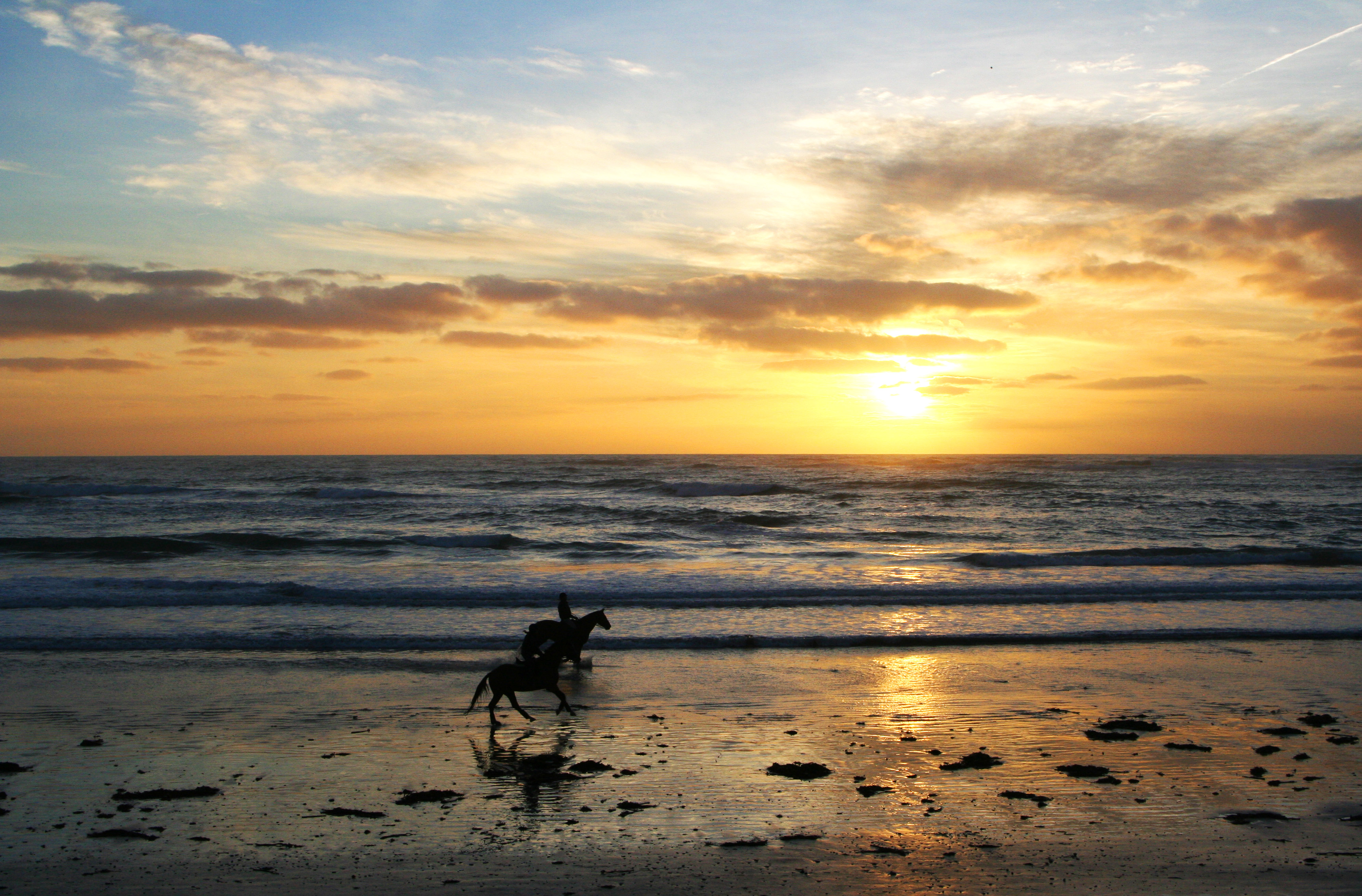
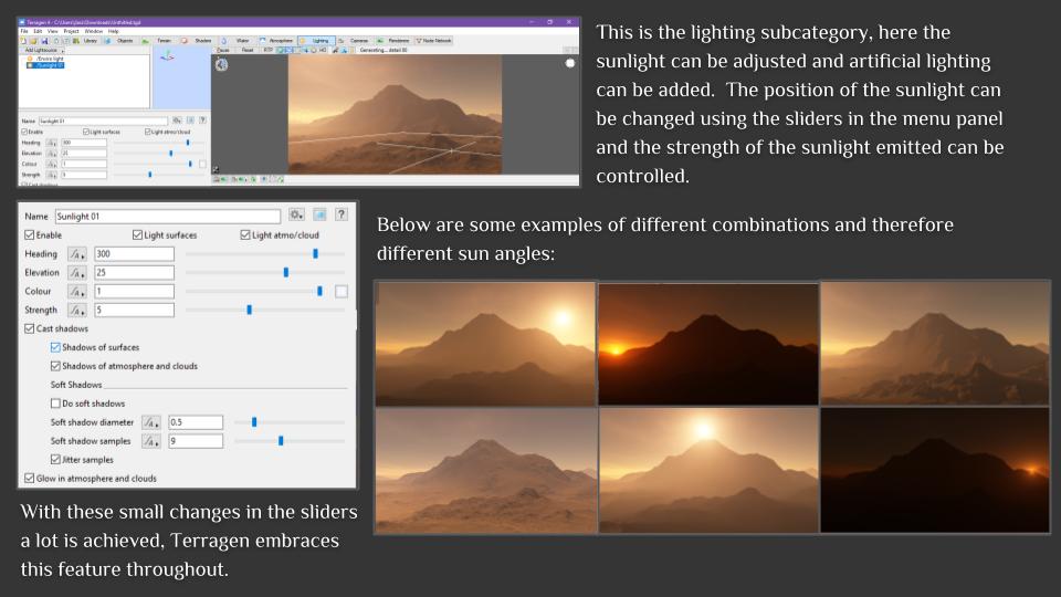
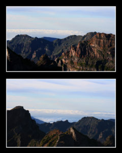
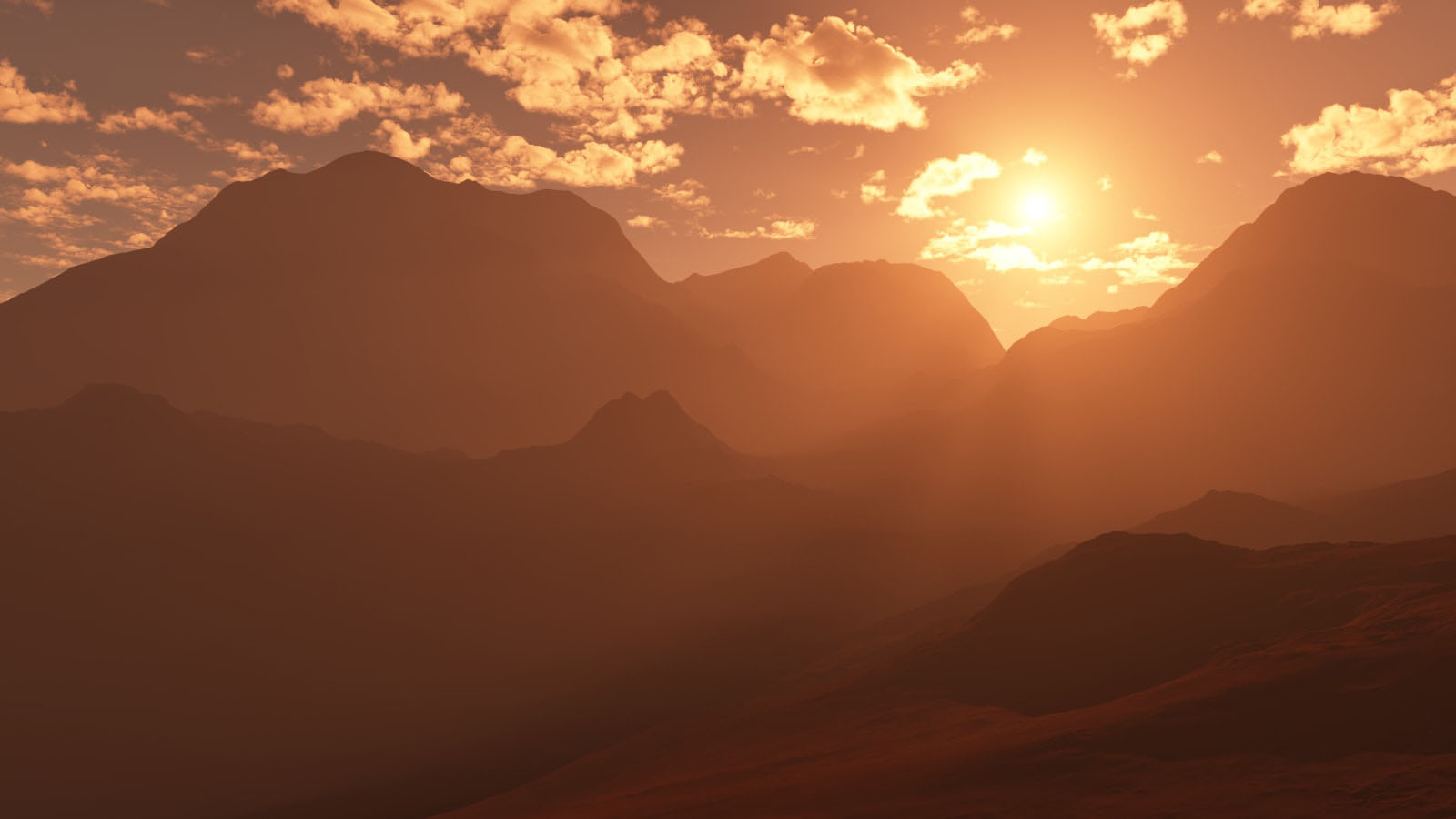
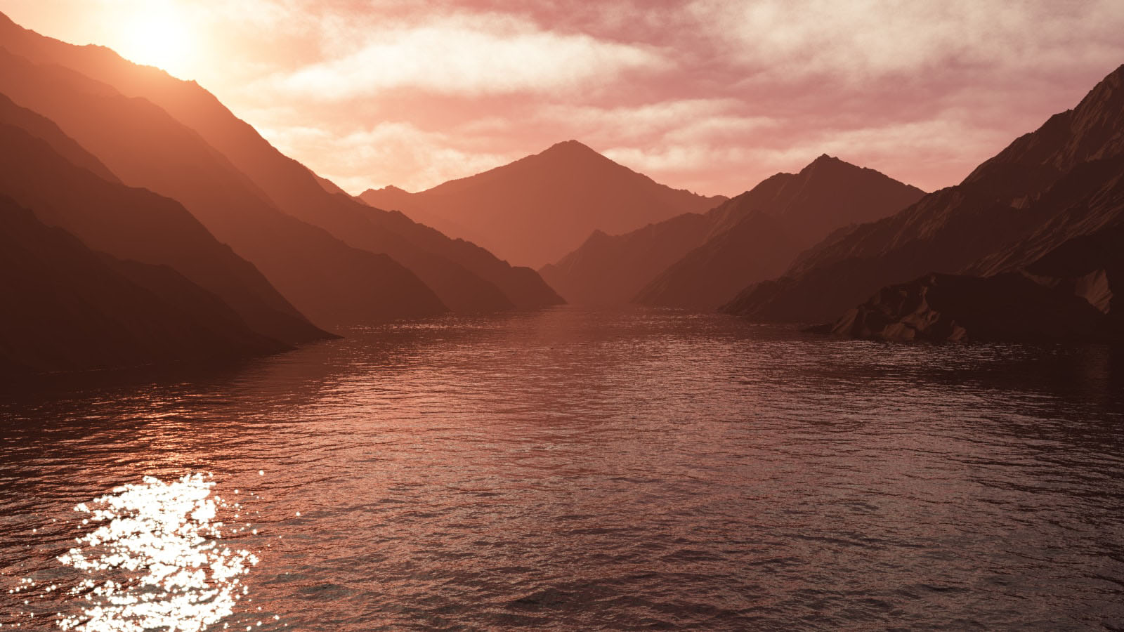
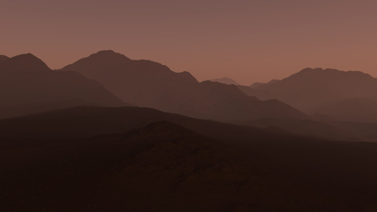
I liked the control I had over the geo-mapped landscapes; I could alter every last detail which wouldn’t be possible in a real life situation. Due to this i’m rather pleased with the photographs. The first image has a warm, morning atmosphere, the main focus of the image is the sun in the middle left. The second image has more pink undertones which give it a more surreal feel. The last photographs contains more purples which results in a colder, evening perception.

The lighting would have been natural if the photographs were of  real landscapes, otherwise it’s technically artificial as it came from a fake source designed to act like the sun. Since most of the images are in focus, it is safe to assume a small aperture was used (f/20+) and the shutter speed was a little longer than usual to help capture the detail. Visually, the images are appealing to the eye – there’s a distribution of tone and texture throughout each photograph. In addition to this, the first image follows the Rule Of Thirds (a point of focus is found within 1/3 of the photograph) which contributes to its success. The photos are all shown to be taken from the viewpoint of someone standing below the mountain scenery – which further contributes to the appeal of the pictures.

Critically speaking, the photographs feel detached from reality; they seem too perfect to exist. Maybe this idea of creating a landscape that’s perfect ruins the concept of capturing nature (which, most of the time, is not perfect). Although I enjoyed making these surreal landscapes, it also allowed me to understand Landscapes more deeply and even aided me in obtaining a new view.


Evaluation , Critique and Analysis and Final Response

Image Analysis

This light in this image is the natural lighting coming from the sun, I took this image during golden hour which has given the sky lots of different colours. I took this image using a shutter speed 1/250 as I wanted the crashing waves to be sharp and in focus. An ISO of 200 and an aperture of  f/22, these settings made the image have lot of light.There isn’t a large amount of texture in this image as I have edited out rocks that would have given texture as I wanted the image to have a crisp look to it. The colours in this image are very brought and vibrant due to the way that I have edited them to look like this, I wanted the piece to have a very bright and light feel to it, to add emphasis on colours in the sky being created by the sunset. There isn’t a large tonal range in this image as the image is bright.I took his image down at St Brelades Bay at low tide during ‘Golden Hour’ .This is my favourite image from the shoot, what I like the most about this image id the colour palette and the reflected section of the image lines up with the rest of the image.My concept behind this image and the shoot as a whole was to take a different perspective when looking at landscape images and to make them more interesting and appealing.

Final Presentation Of Images 

My final piece is a combination of 4 images from the Alternate Landscapes project. I stuck the images onto a white foam board and then stuck them onto a large white piece of card,  By having the images backed onto white foam and then white card it helps to bring out the colour in the images and highlights the brightness in them. One way that I feel that I could have improved the overall presentation of this image, as if I had thought ahead about how I wanted the images to look as I would have printed out one more image from my selection at A4 size, I would have placed it at the top to balance out the position of the images.I think that these four images are the most effective as they all have a clear linking theme between them.

Overall I feel that this project went very well and is the best project that I have done so far. I really liked exploring different techniques in relation to geometric and the way the two come together.  Using Tyhe Reading as my inspiration for this project I feel that I have created images that have the same theme but are also successful in their own way. What I want to improve for next time would take a wider range of images at different locations and different times during the day as this effects the lighting and the overall look of the images.Overall I feel that these images work well together to show the themes of Geometric Landscapes although some of the images could have been further edited the simplicity of some of them still creates the same overall effect.

Landscape Final Outcomes

FINAL OUTCOMES

This post covers my final outcomes from the whole landscape project. Some of these were photographs that i had printed and some are purposed for the blog.

The first of my final outcomes is this composition of 2 photographs of mountainous landscape in Madeira. I chose to put these two photographs together as one of my final pieces simply because i believe the photos show my raw camera skills and show the true beauty of the landscape as opposed to my previous projects in which my final outcomes were fairly edited and although the raw camera skills of those pieces were good the editing could be seen to ‘take over’ the raw skill. I believe that the exposure of all the photos that I have chosen for my final outcomes are well suited to the condition in which the photos were taken. These 2 photographs have taken inspiration from and are a response to the romanticism landscape photographer Ansel Adams.

Outcome 1

Outcome 1

For my second final outcome I have chosen this 3 piece composition of black and white photographs of rocks and water. I believe that these photos represent the harmony of land and ocean as the water covered rocks show how the ocean adds to the aesthetics of the land. the monochrome of the images helps to focus on the detailed textures and shadows of the images by enhancing the light and dark within each.

Outcome 2

Outcome 2

For my third final outcome I have chosen this 3 piece composition of photographs of  minimal, colourful and bold architecture which show a really interesting combination of shape, pattern, shadow and colour.  Also the combination of the 3 primary colours is something that I believe is rather aesthetically pleasing. These 3 images are a inspired by the abstract photographer Yener Torun.

Outcome 3

Outcome 3

For my fourth final outcome I have chosen this 4 piece composition of photographs of houses positioned in and on top of natural landscapes to show how industrialization/property building effects the natural landscape (but not always in a bad way), which is the idea I was aiming to present from the start of the project. Also I believe that the 4 photographs are all very well matched as the colours and exposures are very balanced.

Outcome 4 

Outcome 4

For my last final outcome I have chosen this photograph of a shoreline with the sunset and two horses. Similar to my first outcome I feel like this piece presents the pure beauty of the landscape and displays my raw camera skills so therefore deserves to be one of my final outcomes. I feel that the dusk exposure of the image is very effective as it enhances all the different textures within the image such as the smooth clouds and the rough, jagged sea. The silhouette-like dark figures of the horses are the main focus of the image as the sunlight draws the viewers eye right towards them.

Outcome 5

Outcome 5

Overall I feel that my 5 outcomes achieve what I wanted to present by the end of the landscape project as they show the harmony between Urban and Natural landscapes. Whilst taking inspiration from the photographers that I have looked at over the project. Also with this project I have been able to produce aesthetically pleasing outcomes whilst purely showing my raw camera skills without any over-creativity which I have been more inclined to explore in my previous projects.

Experimenting With Map-Rendering Software

What Is It?

Terragen is the software that many artists turn to when they want to render beautifully realistic landscapes, skies or other natural environments. It’s used to create blockbuster movies such as Star Wars: The Force Awakens, TV shows, games, VR environments, museum exhibits, documentaries, and much more.

Generally speaking, it’s a landscape generator designed to render micropolygon displacements. It’s driven by a layer-based system, which allows you to drive fractal functions with various shaders. So, for instance, you can have a fractal node generating the landscape, with a displacement shader adding specific details. Then the colour can be derived from another node, and masked by a shader driven by slope or altitude – which in turn can be driven by another node – and so on.

Currently, the prices for Terragen 4 stand at  $349 for Terragen Creative and $699 for Terragen Professional. However, Planetside (the company behind Terragen) offers an educational license that allows you to acquire Terragen Creative for free given that you can prove that you’re a student.

Source: Official Terragen Site

My experimentation with Terragen 4

The Terragen Education Licence doesn’t come with any sort of tutorial or guide on how to use the software, therefore, I was left to figure out the basics by myself.  Below is a basic overview and my understanding of each of the functions.

Print Choices and compositions

For my final Prints I have chosen the following images.

A3
A3
A5
A5
A4
A4

I have chosen these images to print out as I believe that all together they have a good balance of natural and urban landscape. This covers my idea from the start of the project of showing how industrialised development is taking over natural areas. And they also show influence and response to the photographers that i have researched during the landscape project (Ansel Adams, Michael Boniwell, The New Topographics and Yener Torun).

Here is how I plan to mount and compose my prints…

With the A3 print of 4 photographs of houses situated in/on natural landscapes, I plan to trim down the 4 images and place each on a slight frame of black mounting board. Then place all 4 pieces onto 1 piece of foam-board. This will hopefully give the images a slight elevation from the board putting them closer to the viewer. With the raw minimally edited approach to this landscape project, giving the image presentations a sense of depth will mean that there is an extra element added to the piece rather that just mounting the images straight onto mounting board.

With this composition I am using my two A5 prints and one of my A4 prints. The idea of this composition is to present colour and shape within landscape which i think is effectively executed with the use of primary colours. I will put each image on its own piece of foam board with a 1cm boarder (grey in picture) and then mount all three in the order above onto one long thin piece of foam board. The idea of this is to give the piece a considerable amount of depth so that hopefully a shadow is cast on the white foam board as shadow is an element explored within the photographs.

For this A4 photograph print I wanted to keep it simple as it subtly reflects various elements such as shape, line, shadow and pattern. Therefore I will give the image a thin black boarder and place this onto a larger piece of foam board to give the piece a sense of scale and draw your eye into the image without over complicating its presentation.

For this final print composition I plan to mount these images of mountains in black mounting board. I wanted to do this as the images are quite detailed in areas and there is a large sense of depth within the photographs, so i didn’t want the presentation of the image to have significant depth its self. I also feel that the black surrounding the photographs will help to bring out the light in the image and draw the viewer’s eye towards the photographs.


Contextual/Conceptual Study

Joan Fontcuberta – Artist Research

Joan Fontcuberta, who was born in 1955. He is also a teacher, editor, curator and writer. He received a communication’s degree from Autonomous University of Barcelona in 1977. In his early years of career, he worked in the field of advertising just like his family. Between 1979 and 1986, he taught at the University of Barcelona in the Fine Arts department.

An exhibition by Joan Fontcuberta, titled Through the Looking Glass in association with Digital Nights, involved internet resources (Reflectograms and Googlegrams). These pieces of works aim to reflect the significance of the rise in use of images, the potential of viral distribution and broadcast, as well as artists’ proliferation.

Source

Landscapes Without Memory

The series is deceptive; these aren’t photographs but computer-generated images created by software renderers that are designed to produce 3D images based on cartographic data. Fontcuberta decided to explore the possibilities of the technology by feeding it misinformation: instead of giving it a map to read, he fed it the visual data contained in famous paintings or pictures of different parts of his anatomy. The results are these “landscapes without memory.

Night Photography

Artist Research – Edgar Martins

Edgar Martins (born 1977, Évora, Portugal) grew up in Macau, moving to London in 1996, where he completed an MA in Photography and Fine Arts at the Royal College of Art.
Landscape, place, space, and architecture have established themselves as the predominant themes in Martins’ photographic imagery. Martins uses photography to develop a philosophical, quasi-scientific investigation, examining various minimalist concepts of the contemporary urban landscape. Moving between the factual and fictional, between the concrete and the metaphorical, the artist operates within a landscape of uncertainty, permanent flux, transition and opposition.

My Contact Sheets

Edited Pieces Selected From Above Photographs


Altered Landscapes

What Is It?

The Altered Landscape Photography Collection is the largest focus collection of the Nevada Museum of Art permanent collection. Since its establishment in the early 1990s, the collection has included images that address and engage issues related to land use and the changing landscape.

Much inspiration for this theme  was deprived from a group known as the New Topographic photographers; they made works that framed industrial structures, suburban developments, and other ordinary subjects with unprecedented matter-of-fact realism.

Now, the term ‘Altered Landscapes’ refers to a variety of different subjects and approaches, these range from surreal images where Photoshop and editing plays a large part to purposely visibly cut and pasted imagery. Due to this, altered landscapes is a very open theme to work with.

Yener Torun

Yener Torun is an absract minimalist photographer who was born in Turhal, Turkey in 1982. His portfolio mainly consists of colorful, bold and minimal photographs of architecture and other man made structures.

His photographs usually flatten space, they emphasise and exaggerate  line and color instead of image depth. He alters the urban landscape, by re-framing structures as geometric abstractions and creates an alternative reality by abstracting architectural structures from their usual place into a brand new sense of space.

Below are some examples of his work…

From his work I take the idea that you are able to use pattern, colour and geometric architecture in order to flatten dimensions and create an abstract, minimal landscape.

Here is my personal response to Yener Torun’s work…