Category Archives: Coursework

Filters

Author:
Category:

Formal Analysis

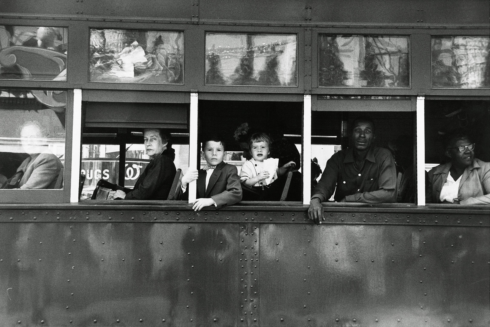
Trolley—New Orleans by Robert Frank

The genres for this photo are street photography, journalism, documentary photography and portrait.

Technical

The photo had a long exposure time and therefore this created a high contrast image. The lighting at the scene is predominately natural daylight. The shutter speed must have been fast in order to capture the moving trolley full of people- however, it’s possible that the trolley stopped for a period of time and therefore the shutter speed could have been longer. The image is black and white with a vast tonal range (Ansel Adams zone system) which supports both the darkest black [000000] and the whitest white [ffffff]. Finally, the image uses the rule of thirds and as a result of this, the eye is drawn into the centre most part of the image.

Visual

The image is naturally split into three sections due to the rule of thirds; the top, middle and the bottom third. The image is also naturally framed due to the background and white stripes. Although the image is tilted slightly it doesn’t lack the aspect of symmetry. The texture of the trolley is successfully portrayed in this image along with various patterns such as the bolts in the lower half of the image. Furthermore, the contrast between white and black in both the photo and the social situation is extremely vivid.

Contextual

This photograph explores the divide between black and white people in America at the time. It also shows the difference in classes and ages; the older woman looks as if she’s turning her nose up at the photographer whereas the kids look very interested, this could be due to the fact that they’ve never seen a photographer before and are fascinated by the equipment and concept of taking a photo. The photo was taken in 1955, the year of the African-American Civil Rights Movement (a movement that sought to challenge the views of society on people of colour and rebrand America as the land of equality).

Colour Overlays

Colour Overlays

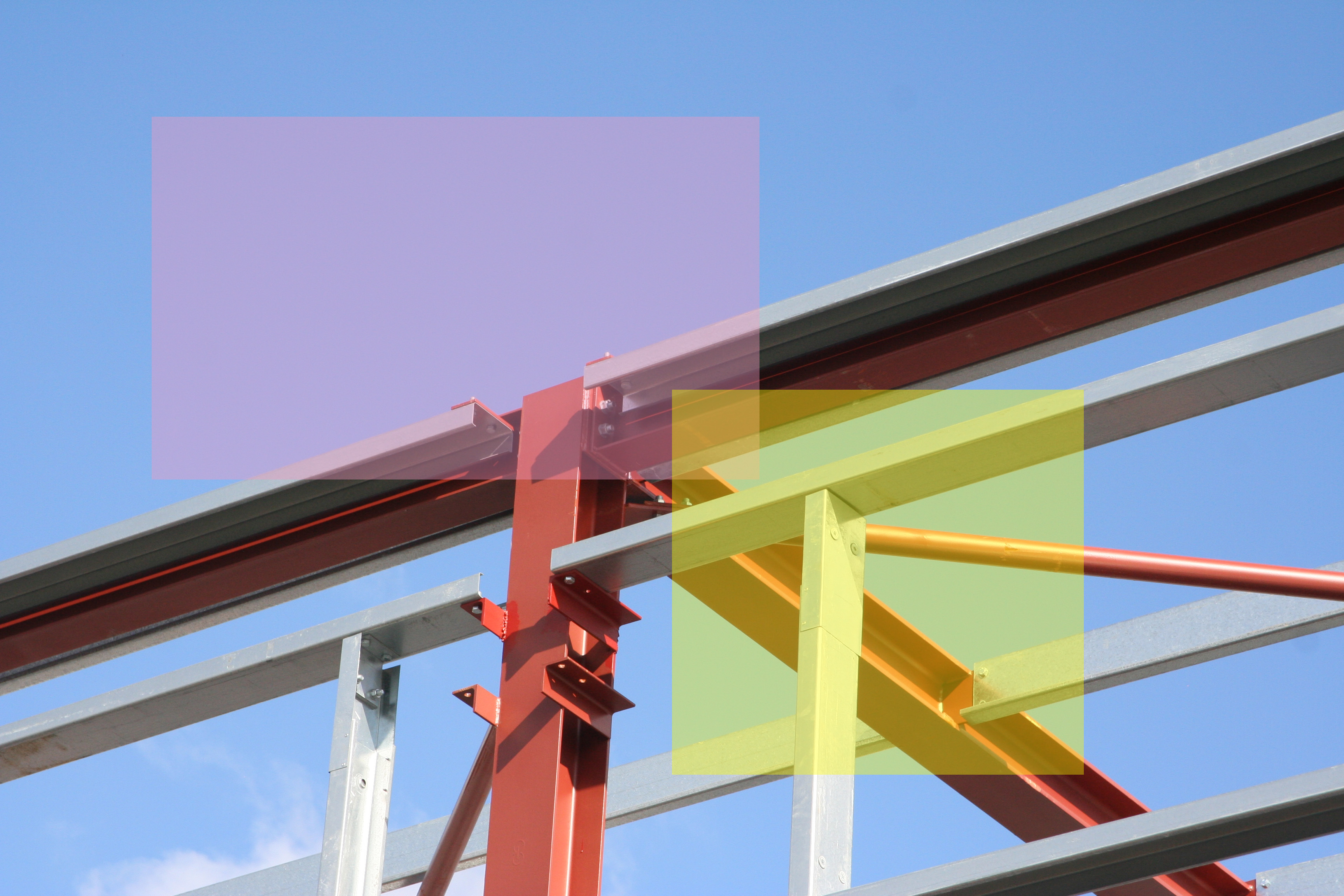
Colour overlays are a block of colour with an opacity lower that 100% that are placed over an image in order to bring the viewers eye to a specific section of the image.

Here are my colour overlay experimentations that were done on Photoshop using the shape tool and then adjusting the opacity of the coloured shapes.

Exposure Triangle

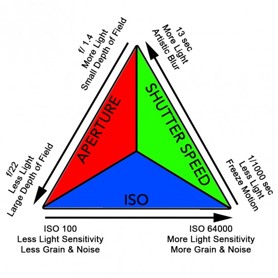
The exposure of an image is dependent on 3 variables/elements…

Shutter Speed

Aperture 

ISO

These 3 variables must be set depending on the environment in which the photograph is being taken.

Shutter Speed – A faster shutter-speed lets in less light but takes a still freeze motion image of the subject. And a higher shutter speed lets in more light and gives the image a blur if motion is present.

Aperture – A lower aperture lets in more light and creates a smaller depth of field within an image and a higher aperture lets less light in and gives the image a larger depth of field.

ISO – A low ISO has less light sensitivity and causes the image to have a less grainy aesthetic, and a higher ISO has more slight sensitivity and gives an image a more grainy aesthetic.

THE EXPOSURE TRIANGLE

How Depth Of Field and Aperture work


Depth of field is the distance between the nearest and the furthest objects within a focused image. And how focused separate elements of the image are.

An example of depth of field

In these images the depth of field is alternative as in the first image the main focus (the branch) is in crisp focus however the further objects in the image are unfocused/blurred. But in the second the depth of field is slightly more balanced as the background although not in full focus is more visible.

The depth of field of an image can be altered through the use of the camera’s aperture (approx f/1.4 to f/22)

Image result for aperture

As you can see in this diagram a lower aperture (eg. f/1.4) causes the background of the image to be unfocused with the close/main subject remaining in focus. However a higher aperture (eg. f/22)  the whole image is focused.


editing with threshold: keld helmer petersen

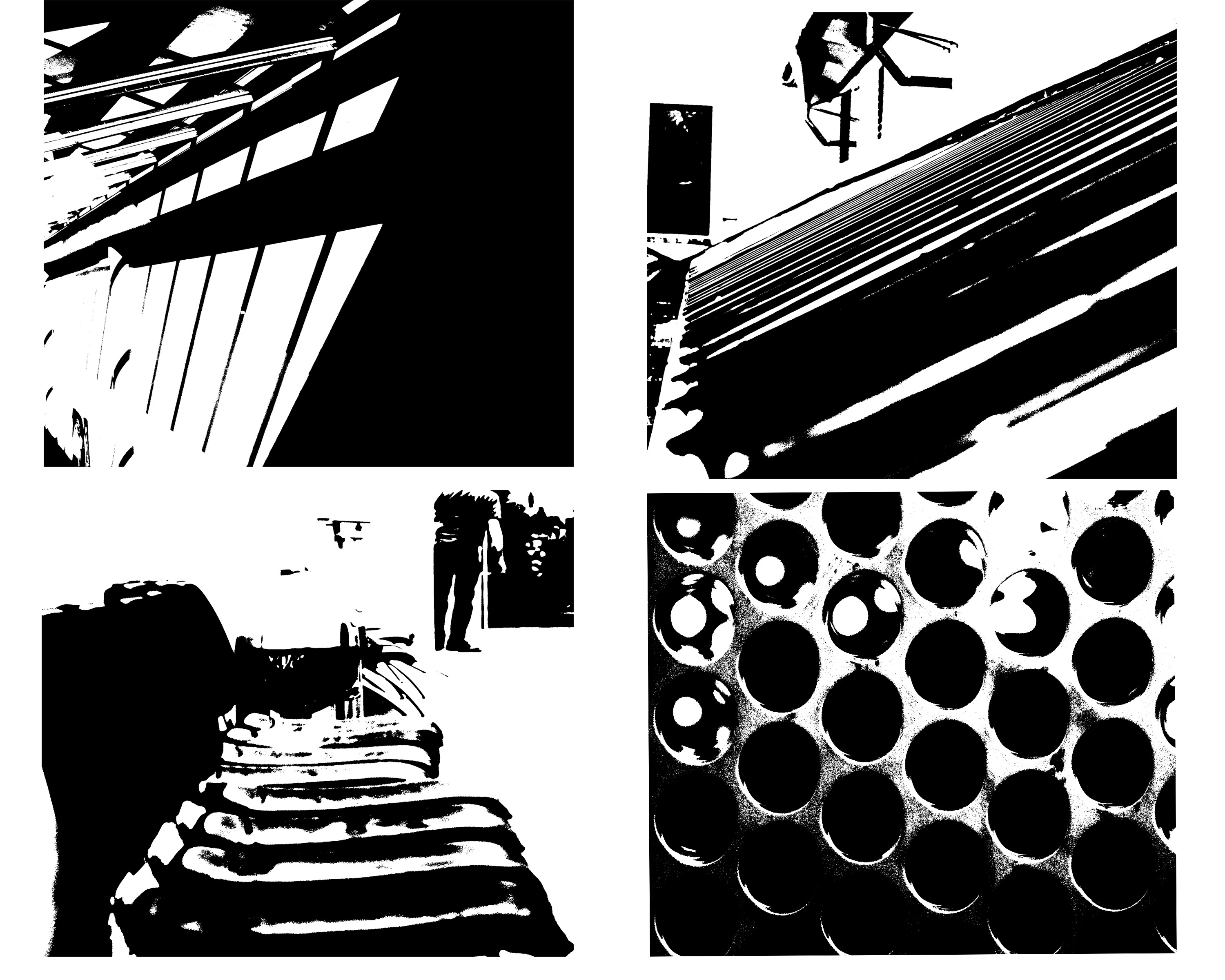
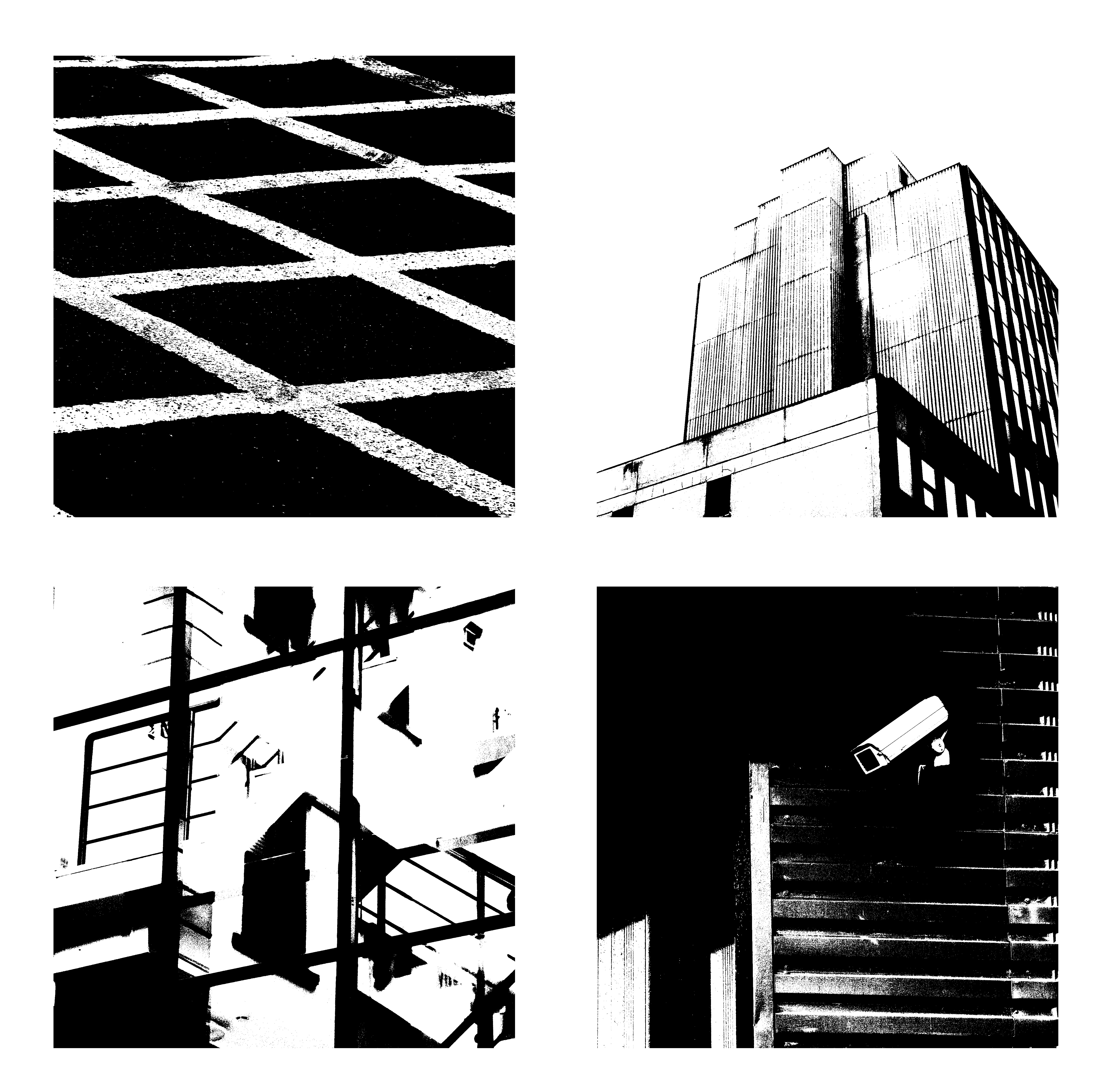
within this image it is edited to show black light within high saturated edits,then also turned into squares for an even overall finish.I was inspired by the artists Keld Helmer Petersen who  wanted to achieve an international collection of experimentation shapes inspired by ranger patsch. He also developed poetic realism  within his work and modernism within photography.

He eventually adapted and developed the intellectual structuralism to art and photography,he liked  to capture leafs and  trees against grey light and patterns created within nature.He started to become more abstract within the enlarging of his images focusing on the microcosm of nature.

I chose these images due to their defined lines and shape within the pieces. I thought the compositions of the pieces where also quite interesting as there are many dimensions and angles to the piece themselves.


this is a clear  example of his work and how he different from using more simplistic images to more complex lines but overall still achieved the same tonal range and detailed effect of the image.


Keld Helmer-Petersen

Keld Helmer-Petersen

Keld Helmer-Petersen

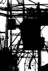
Helmer-Peterson produced large bodies of work in which he presented his images as the black and white extremities of the tones of his subject. This gave his work a bold and considerably minimalist style. Many of his subjects were based around a theme of industrialisation and architecture. The lack of any tones between black and white mean that the viewer is able to quickly interpret what the image is putting forwards without any unnecessary distraction.

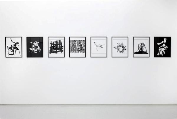
Helmer-Petersen Exhibition

My Response To Helmer-Petersen’s work

I produced this response simply in Photoshop using the threshold tool and adjusting it to a point where i believed it looked as aesthetically pleasing as possible. Then compiling the 4 edited images into 1 document in which the compliment one another.

Analysing Robert Frank’s Work

Robert Frank

Trolley, New Orleans, 1955, Robert Frank ”The Americans”

The analysis of photographs consist of 4 elements these are:

-Visual

-Technical

-Conceptual

– Contextual   

Analysis of Robert Frank’s ‘Trolley’

Visual: This photograph consists of various visual aspects. One of these aspects is the tone of the image due to the time it was taken. The monochrome tones allow the viewer to focus more on what the photograph is trying to capture rather than it’s details, and also shows a contrast between the races in the photograph. The photo consists of various natural frames, these natural frames surround the different goings-on within the photo allowing the viewer to look at each part separately without the distraction of another. The window frames of the train represent a separation between different classes and races, showing the hierarchy of power at the time, from the left to right. The rule of thirds is present in the image as it is split up into 3 sections from top to bottom, which gives the image extra focusses other than the main one in the centre. Although the image does mainly consist of foreground (the train) There is still an even depth of field as Robert Frank still keeps the background of the image clear.

Technical: The image has been taken using a natural light source, this could be a contrast between the nature and the unnatural social and racial issues of the time. There is a low aperture that is used to capture the background of the image sharply and to ensure that the entire image is focussed. The image would have probably been taken with a considerably fast shutter speed in order to capture the movement of the train sharply rather than the motion being evident. The image overall has a large tonal range, with the top of the image containing mainly light tones the centre containing a balance of tones and the bottom containing mainly dark tones, which could also represent the racial hierarchy of the era with white people believing they were above people of other race.

Conceptual: The white man is separated from the other passengers on the train as he is covered by the transparent window, this represents how he would’ve been protected by society at the time. The order of power at the time is shown from left to right which links in with the contextual side of things. The white bars between the separate frames/windows represent the power of white at the time, and how it was them who were separating themselves from black people during that era.

Contextual: This photograph was taken in the 1950’s. At this time the US was suffering from massive racial issues of segregation. This is due to the fact that equal rights hadn’t been introduced and racism was heavily influenced by the general public through political and governmental actions. This caused a segregated system on public transport, which is why in this image the African-American people are situated at the back of the train and the White-Americans are situated more forward. There was also issues with gender equality, as at the time of this photograph the US was a patriarchal society, that is why the males are situated in front of  the females within each gender. So overall the image shows the massive social changes in society since the 1950’s.


Rule of thirds

what is rule of thirds?

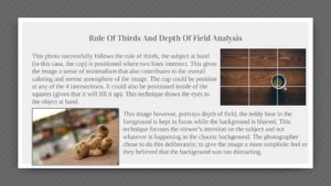
rule of thirds is applied by aligning a subject with the guide lines and their intersection points, placing the horizon on the top or bottom line, or allowing linear features in the image to flow from section to section.This is on order to create a successful and visually pleasing formatted composition. It can allow a direct view of a subject or the type of depth you would like to capture. It can also exaggerate editing within blurring and also subjects such as ISO.

Using the rule of thirds

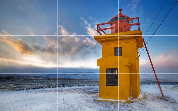
The rule of thirds is applied by aligning a subject with the guide lines and their intersection points, placing the horizon on the top or bottom line, or allowing linear features in the image to flow from section to section.It can be used by using a visual of tow lines formatted at each angle on the screen or possibly within dots for slight dissidence as to where to place the main subject of the image.

The rule of thirds was written by John Thomas Smith,this was written back in 1797 in order to find the perfect way in how to capture rural scenery,

You can clearly see the horizon and how it sits equally in the middle throughout the lines.,this divides the image into thirds of the lower two sections. The tower is the point of interest directly in the middle of the second line.The sky also develops with color over the horizon.

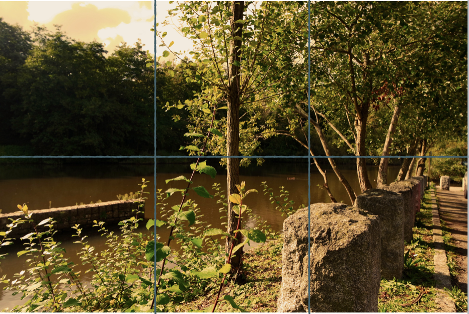
within this image you can see the rule of thirds of how the rock is alined within the first line with the rest entering back to become equal with the second horizontal line.There is also a tree centre and this achieves an even overall effect.