Category Archives: Case Study

Filters

Author:
Category:

Case Study-merve ozaslan

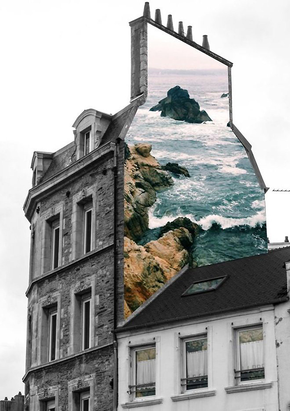
Merve Born in Istanbul, Turkey and graduated from Mimar Sinan Fine Arts University as an ceramic artist in 2010. She is a ceramics jewellery artist but is most popularly known for her series “natural act” which is a group of collages based on the questions of the relation between nature and the humanity. The main feature of this series is the unexpected use of selective colouring of black and white vintage photographs and new coloured photographs which creates a parallel meaning to the original storyline of the photograph. She spends a lot of time looking for  the perfect vintage photo to manipulate, when she finds one she instantly starts thinking of how it could be manipulated in her head.


Technical: This image is made up from two photographs, one of a cliff edge with rough water at the bottom stretching out to sea. the second photo is of the edge of an old building. Both of the images were taken using natural lighting which was probably not with direct sun light due to the lack of harsh shadows. both of the photographs have a large depth of field because they are both landscapes. we know they were both taken with a fast shutter speed due to how sharp the images are, the waves would also be blurred if it was a longer shutter speed.

Visual:  The main image of the building is in black and white and has a high contrast, the sky in the background is white washed which helps the texture of the building stand out. There is no other distraction in the background which helps the building stand out and take more of our focus. The photo of the sea has been edited with a filter which gives it a blue tint and enhances the shadows giving the image more texture. The image of the sea has been cut out and placed perfectly over the edge of the building to look as if the picture is on the wall in real life. the photo has also been taken from a low angle making us feel we are looking up at the wall. although we know that the image has been manipulated it creates a sense of fantasy by combining two polar opposites.

Conceptual: this image is made out of two completely separate photography, the black and white image is one the artist found and did not take herself. Like the rest of her work she combines old photos with knew ones, this old photo acts like a canvas for the new image. The coloured photo represents nature and contrasts with the urban black and white image to show a visual representation of how diverse landscapes and out surroundings can look.

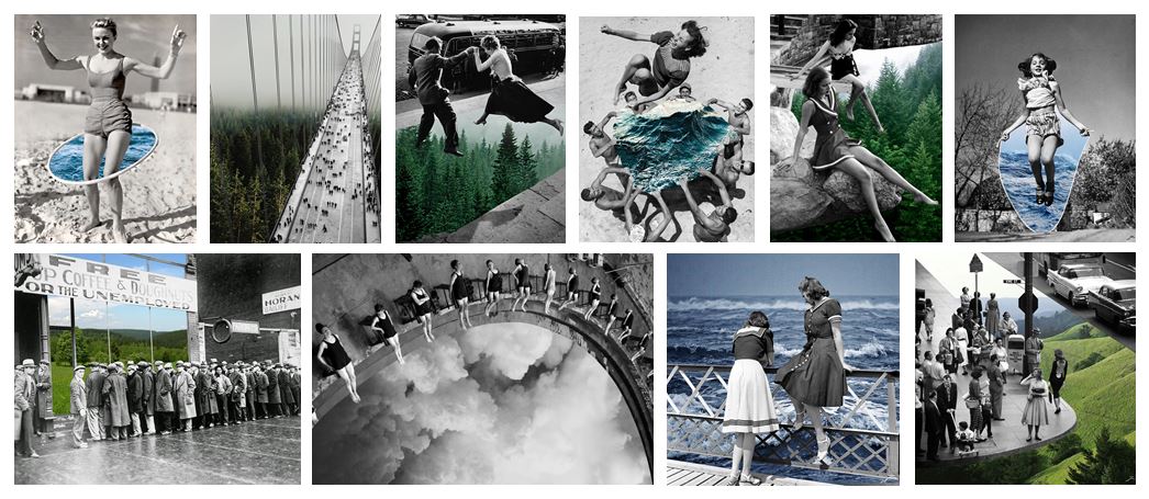
Hannah Hoch and the early pioneers of photo collage / montage

Hannah Hoch was a german artist who focused on the style dada and focused on collage in her work. She was born in 1889 and died in 1978 meaning she lived through two world wars, this is the reason for the dada and political influence in her work. Dada was an artistic movement formed in 1919 in Switzerland which rejected the monarchy and the military, they felt art should have no restrictions.  She was a pioneer of photomontage which focused on the issues of gender and the figure of women in in modern society which made her a pioneer of feminist art. She was also well known for her political collages where she reworked images and text fro the mass media as a critique of the failings of the weimar german government.  Her inspiration came from the collage work of Pablo Picasso and Kurt Schwitters, both of their work incorporate a dynamic layered style.

Preparation For Mock Exam

Mood Board

Image result for romanticism photographyImage result for romanticism photographyImage result for romanticism photographyImage result for romanticism photographyImage result for romanticism photographyImage result for romanticism photography

Brainstorming

For my final photographs I want to produce pictures of natural landscapes with a moody, dramatic feeling to them.

  • Sunset
  • Cloudy
  • Storm
  • Beach
    • Devils Hole
    • St Ouens
    • Greve De Lecq
    • Gorey
  • Rocks
  • Trees
  • Cliffs
  • Hills
  • High contrast
  • Dark image

Ansel Adams

Ansel Adams (1902 – 1984) was an American photographer and environmentalist. His photos of the American West are often seen on calendars, photos and books.  Adams founded the photography group ‘Group f/64’. He was part of the romanticism movement and produced lots of striking landscape photographs in black and white, often involving a pathway of some sort and interesting weather.

Image result for ansel adams

Image result for ansel adams

My Favourite Photograph

Image result for ansel adams

This photograph was taken using natural daylight with the clouds blocking the harsh sun from the camera, resulting in dramatic contrast between the mountains and the river being brought into the photograph. It appears that a wide angle lens was used to take this photograph as this is what was typically used by the romantics to capture landscape photographs. It looks like a deep depth of field was used as the whole of the photograph is sharp and in focus. A shutter speed of 1/60 – 1/150 was possibly used for this photograph due to no motion blurs being in the photograph. A low/medium ISO appears to have been used as the photograph is not grainy and is quite dark, which will have been intended. There is lots of texture in the photograph, from the grassy bank to the flowing river. It seems to be quite a cold and isolated photograph as there are no signs of civilization around.

There is no colour in this photograph, which allows the viewer to focus on the range of tones, textures and shapes in the photograph rather than the colour. There is a wide tonal range in the photograph ranging from the dark silhouettes of the mountains to the white reflection of the river. It is quite a 3D photograph due to the trees in the foreground and the river running throughout the photograph, leading the viewers eyes from the trees in the foreground all the way to the mountains in the background. There is no rule of thirds used in this photograph, to me this is because Adams is trying to show that it is natural and nothing is set up.

Adams was a big part of the romantic movement in the late 1700’s, typically the romantics would photograph striking black and white landscapes with the idea that there is a deeper meaning than what appears behind everything. Romanticism was a rejection of the Enlightenment movement which took emotion out of writing and art, Romanticism wanted to challenge this by depicting emotions such as horror and untamed nature.

I think that in this photograph, Adams was trying to emphasise the natural beauty of the environment and to show that no editing was needed on the image, it is as it appears. He is trying to challenge the Enlightenment movement by doing this.

My Photographs

Top 5/Edits
My Favourite Photograph

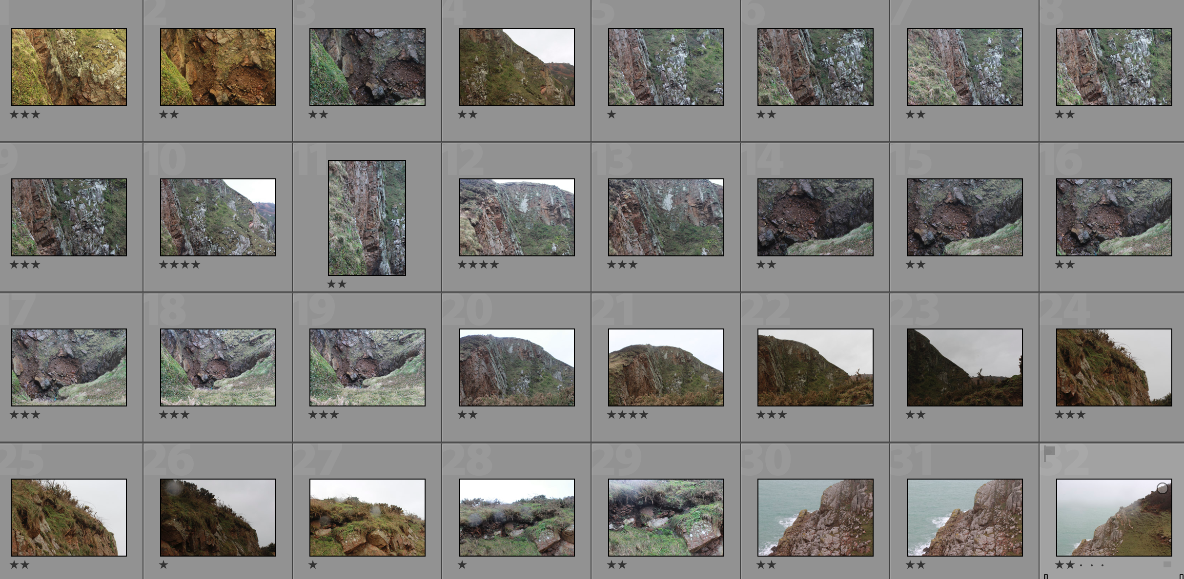
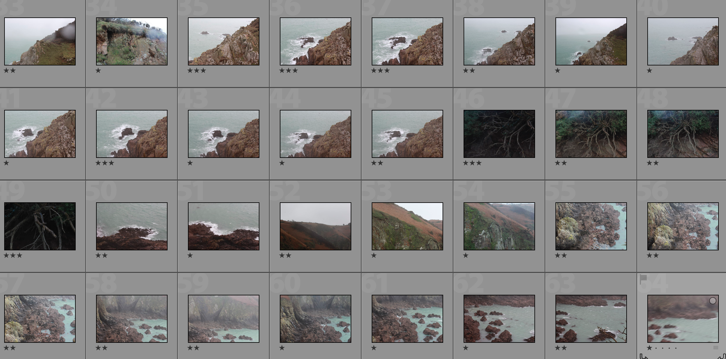
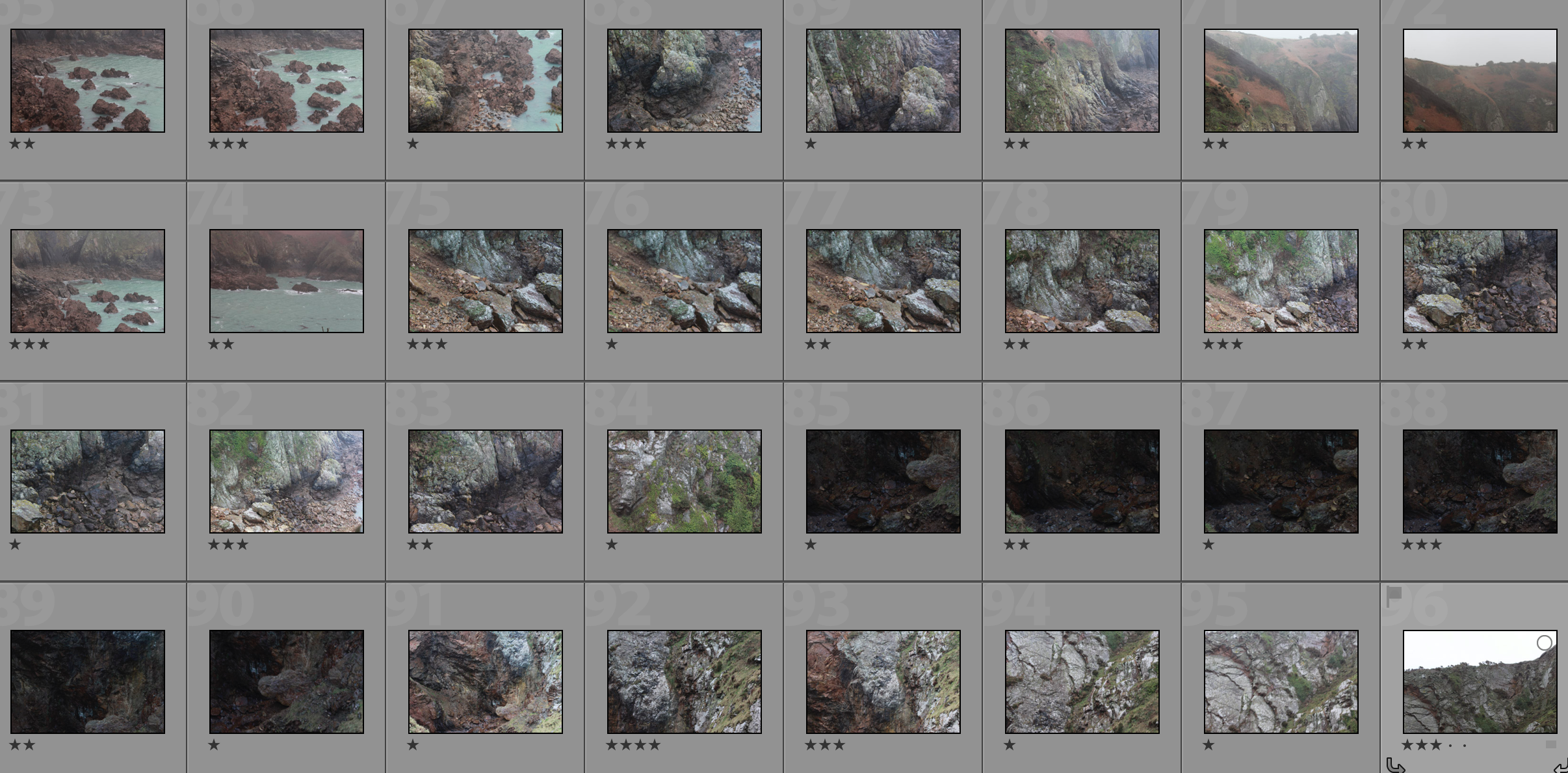
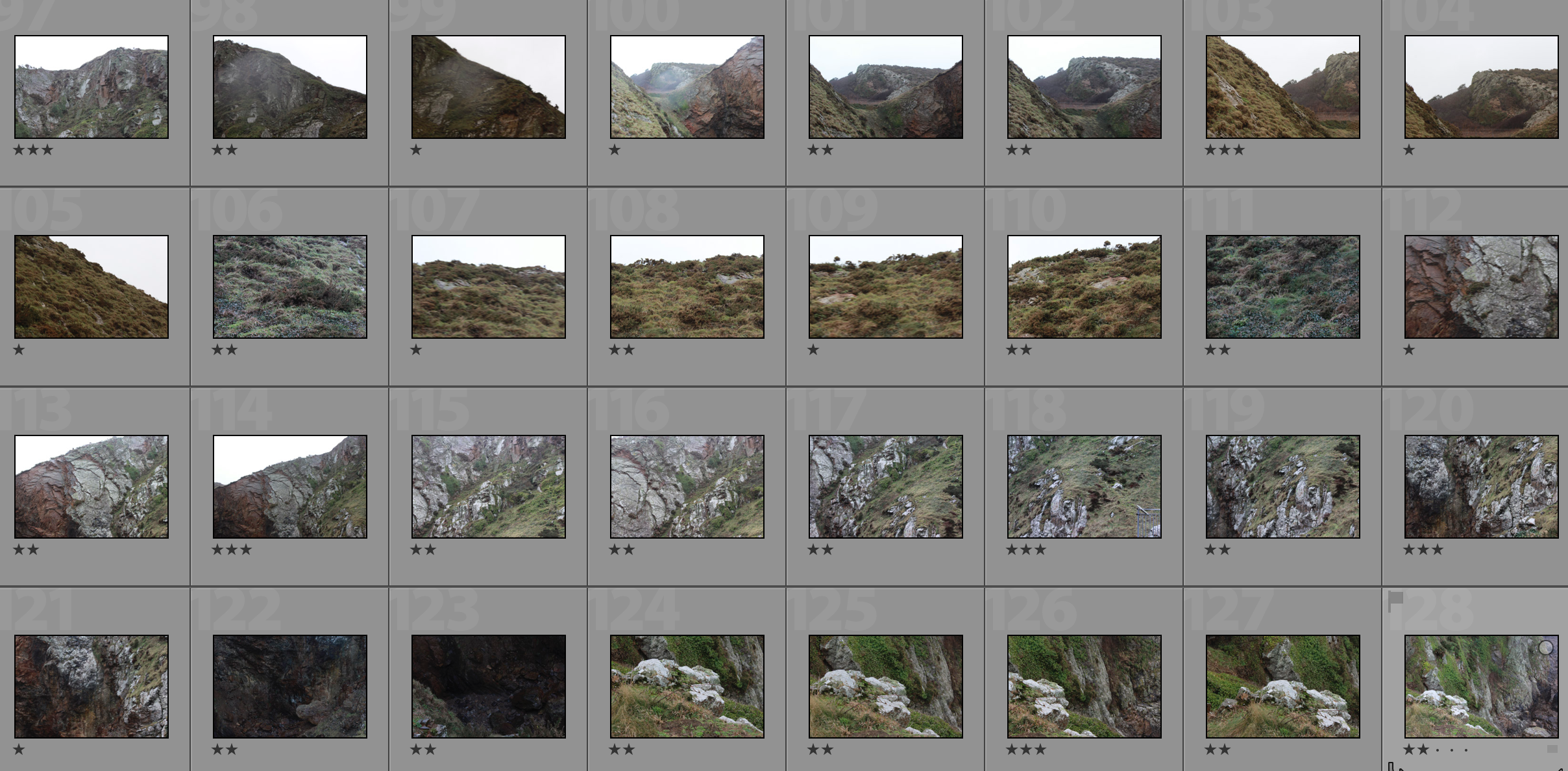
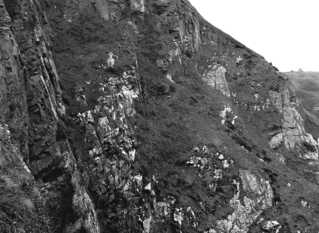
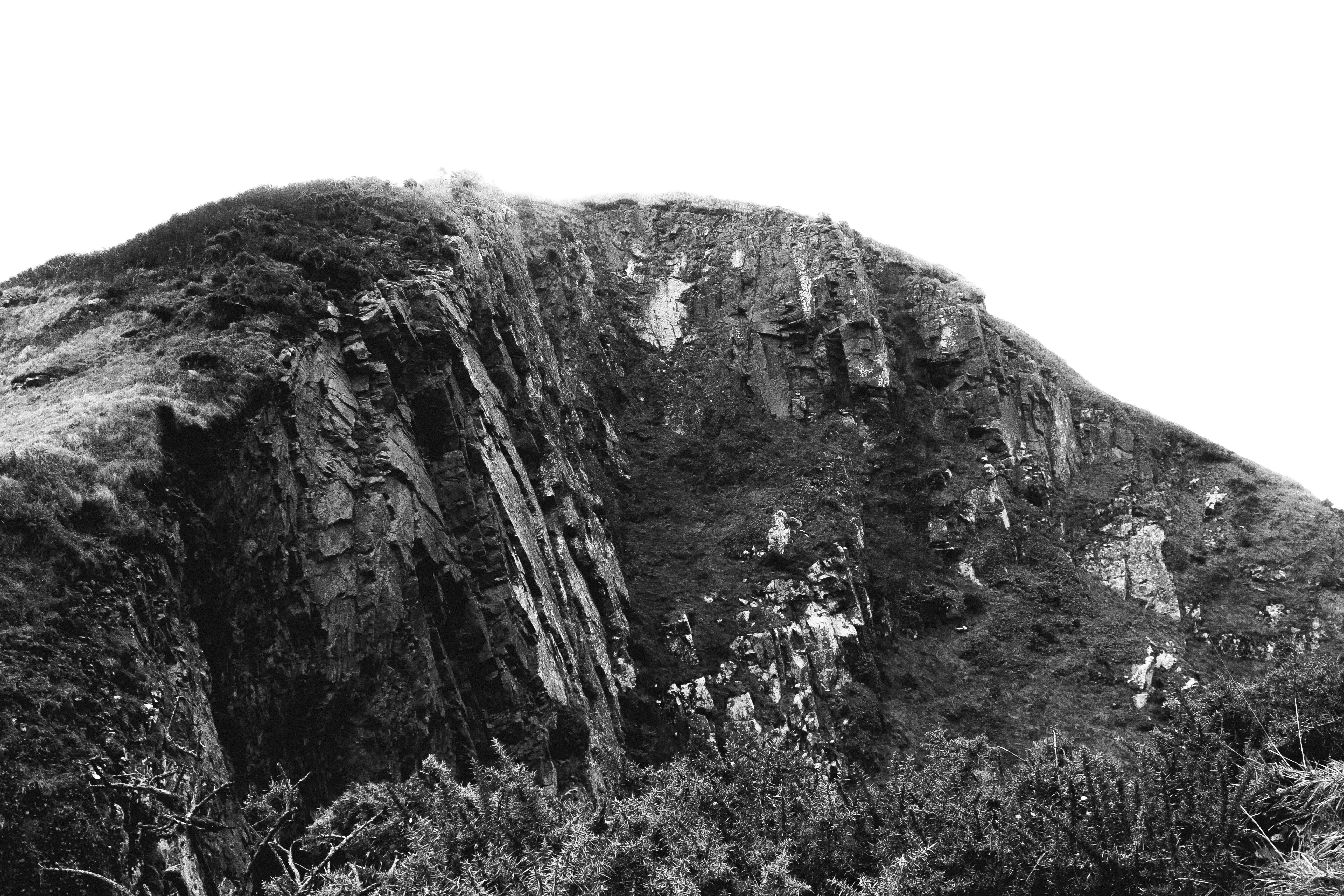
In this photograph I used natural lighting which allowed contrast between the correctly exposed cliff face and the over-exposed sky. This created a very wide tonal range in the photograph. An aperture of 18 was used which allowed the whole of the photograph to be in focus. I used a shutter speed of 1/40 with an ISO of 100 to create a photograph with the highest quality possible. There is a slightly cold undertone in the photograph due to the white balance.

There is no colour in this photograph as it is in the style of the romantics – the lack of colour helps to bring our more contrast and a wider tonal range in the photograph. The texture of the cliff face can be clearly seen which creates a more interesting photograph. There is a slight 3D effect in the photograph due t the shapes and depth within the cliff face.

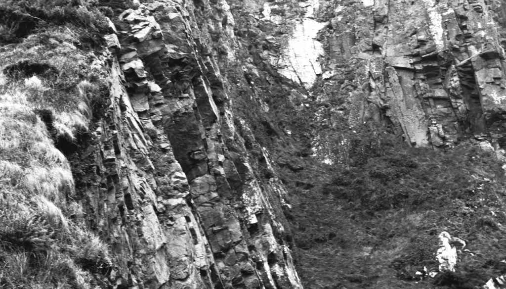
I took this photograph at Devils Hole. I chose this as the location as it has a rich history and has lots of interest cliff faces surrounding it. I tried to create and edit this photograph in the style of the Romantics in the sense that it is black and white, has dramatic contrast in it and shows only nature. This photograph is similar to the work of Ansel Adams in the sense that it shows the untouched nature in a black and white photograph with lots of shapes and edges within it. My photographs do not have as much contrast and definition in them as Adams’ does but there is clear inspiration from him in my photographs.

Frank Gohlke Case Study

Frank Gohlke (born 1942) was raised in Wichita Falls, Texas. He received an M.A. in English Literature from Yale University in 1966. While at Yale, Gohlke met photographer Walker Evans, and in 1967 and 1968 he studied with the landscape photographer Paul Caponigro.

Between 1971 and 1987, Gohlke made his home in Minneapolis, and has resided since in Southborough, Massachusetts. He has taught photography at Middlebury College; Colorado College; Yale University; and the Massachusetts College of Art.

Gohlke′s photographs have been exhibited at the Museum of Modern Art; the Art Institute of Chicago; the Cleveland Museum of Art; the Minneapolis Institute of Arts; the Amon Carter Museum; and the Museum of Fine Arts, Houston. In 1975, he was included in the influential exhibition New Topographics: Photographs of a Man-altered Landscape, organized by the International Museum of Photography at George Eastman House. His photographs are held in the permanent collections of the Museum of Modern Art; the Metropolitan Museum of Art; the International Museum of Photography at George Eastman House; the Canadian Center for Architecture; the Art Institute of Chicago; the Amon Carter Museum; and the Walker Art Center.

His monographs include Landscapes from the Middle of the World: Photographs 1972 – 1987 (1988); Measure of Emptiness: Grain Elevators in the American Landscape (1992); The Sudbury River: A Celebration (1993); and Mount St. Helens (2005). Image Analysis
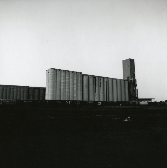
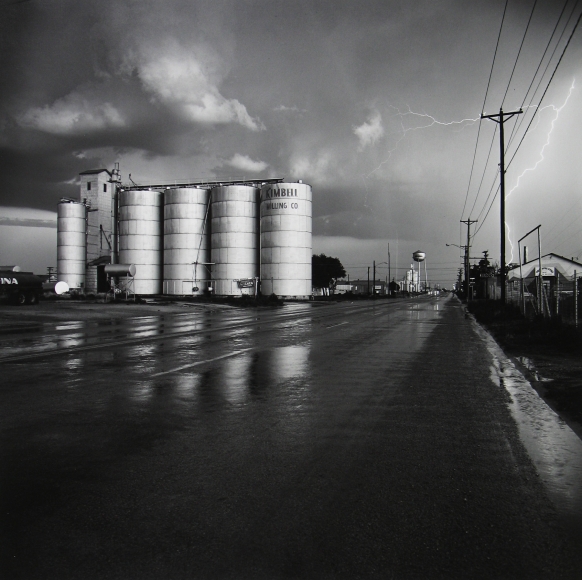
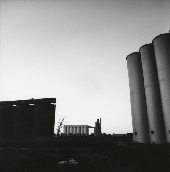
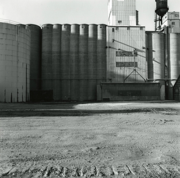
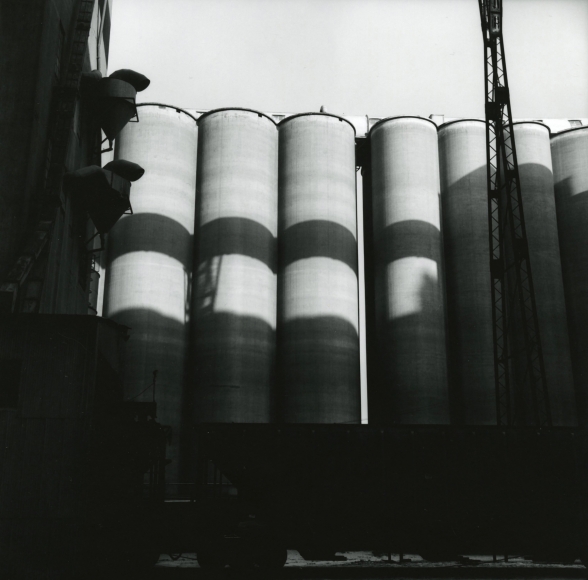
Frank captures the shadows that are cast on the grain elevators by natural light. He positions himself so as to capture them through the other structures behind him.
The image is in black and white with a balanced tone from black to white, the darkest areas being in the foreground as the machinery. This allows focus onto the towering grain elevators behind them.

The image is not over contrasted nor over exposed, capturing the reality of what he is standing in front of. Gohlke stands facing up at the repetitive towers that fit into each third of the image, this demonstrates their significance in what is a changing landscape from natural to urban. This is a common theme in all the photographers’ works from the “New Topographics” Exhibition.

Gohlke became fascinated by the design of the grain elevators, their connection to the surrounding landscape, and their function within the cities and towns they occupied. His photographic practice grew to include a research component whose relationship to the pictures themselves was one of reciprocal influence. A selection of the photographs was eventually published as Measure of Emptiness: Grain Elevators in the American Landscape (Johns Hopkins University Press, 1992), Gohlke’s first monograph.

Fay Godwin Case Study

Fay Godwin

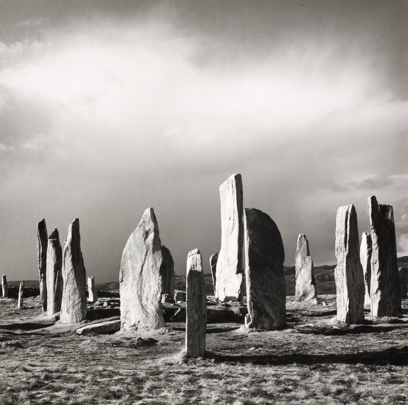
Fay Godwin, born in Berlin on February 17 1931, was a British photographer known for her black-and-white romantic landscapes of the British countryside and coast. She was compared to other famous photographers like the Great American photographer Ansel Adams.

Her photographs captured the differing moods and textures of moors, forests and country trails with a remarkable sensitivity and lack of sentimentality. Her pictures also drew attention to environmental campaigns (an abiding interest), and her critique Our Forbidden Land won the first Green Book of the Year award.

Her love of walking inspired her to pursue landscape photography, often photographing isolated and remote areas of the British landscape and producing many beautiful pastoral scenes as well as contrasting urban landscapes.

She died on May 27, 2005, aged 74.

Fay Godwin begun taking pictures only in the early 1960s, when she discovered that her husband was not much good at family snaps. “I discovered I loved doing it,” she said. “Eventually I taught myself to print, and it really went on from there.”

Image Analysis

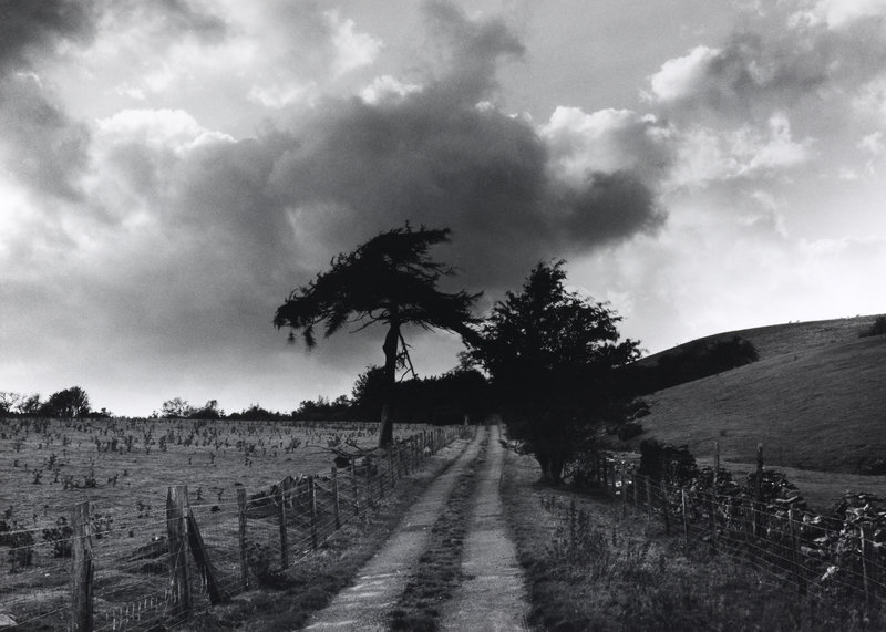
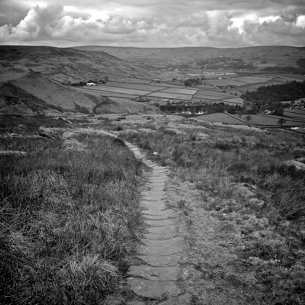
Godwin captures a cloudy day in a dramatic mood by using natural light behind the paler clouds. This gives a comparison to the darker clouds, showing a range of tones from black to white.

The image is composed with a pathway running down the centre that creates a sense of curiosity into the nature of the image.

The trees and clouds are contrasted to give the intense presence that nature has over us as humans.

Fay would have used a faster shutter speed hence the stillness of the clouds and the balance of light exposure.

The image was taken on the rural Roman road in Ceirieg, Drovers Roads, Wales where she created other works in the ‘The Drovers’ Roads of Wales and Other Photographs’ exhibition.

Like Godwin’s other photos, This image heavily shows influences from the Romanticism movement from which an ambient mood is created from the tones and contrast of the nature in the image, that can be presented to people who may not usually have the chance to see nature in that way.

Paul Strand

Paul Strand (1890 – 1976) was an American photographer and filmmaker who helped establish photography as an art form in the 20th century. His work covers numerous genres and subjects throughout America, Europe and Africa. Strand was an early icon of the “straight photography school”. In contrast to Pictorialism, “straight photography” was a move to “pure photography” which was loosely defined as having stylistic traits that were not manipulated heavy to mimic other art forms such as painting.

Image result for paul strand photography

Image result for paul strand photography

My Favourite Photograph

Image result for paul strand photography

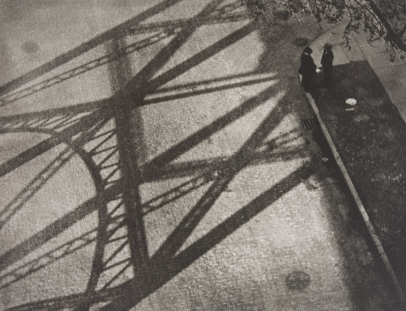
In this photograph it appears that Strand has used and manipulated natural light in order to capture this photographed. He has used the structure of man-made structures against the daylight to create contrast and shapes within the photograph. It appears that a deep depth of field was used as the whole of the photograph is sharp and in focus. A shutter speed of 1/20-1/80 will have been used for this photograph along with an ISO of 100/200/400 to allow enough light to enter the lens whilst keeping the photograph as high-quality as possible. There is a slightly warm and old-fashioned undertone to this photograph.

There is not colour in this photograph – only a warm black and white undertone. This gives an old-fashioned, industrial feeling to the photograph and makes it feel more dramatic. There is lots of contrast between the shadows and the ground which creates a wide range of tones, this adds more drama to the photograph. There is a dirty/dusty texture in this photograph which adds to the industrial feeling of it. It is a flat 2D image mostly due to the focus being the 2D shadows. The shadows create lots of patterns and shapes in the photograph making it more interesting to look at.

Week 4 | Altered Landscapes | Cut-N-Paste | Composite Images

This week we will be looking more closely at the concept of altered landscapes.

You may choose to employ a range of creative techniques (digital and traditional) to create your environments…

  • Photographing changed, changing or altered landscapes
  • Creating altered landscapes by combining a range of images in Adobe Photoshop
  • Using cut-n-paste techniques and printed matter (from photos, magazines, print-outs, newspapers etc)

You may already have a range of suitable images to start your designs…but will need to conduct a range of photo-shoots to ensure that you have enough high quality images to work from:

Here are some examples to help inspire your ideas…

Tanja Deman

Beomsik Won

Jesse Treece
Sammy Slabink

Krista Svalbonas


CLICK HERE to research Vassilis Konstantinou’s “unintentional sculptures”

CLICK HERE to research “new landscape” photography

CLICK HERE to find more examples of cut-n-paste ideas…

Essential Blog Posts This Week…

  • Research Altered realities,
  • Hannah Hoch and the early pioneers of photo collage  / montage
  • A Case Study on your chosen photographer (plus analysis of a key image)…show how this has inspired your ideas and process
  • Your images, process, editing, selection, final outcomes and evaluation

HANNAH HOCH INTRO CLICK HERE

EXTENSION TASK

Research the work of Joan Fontcuberta…

One of Spain’s most prominent artists, Joan Fontcuberta is best-known for his exploration of the intersection between art, science, and illusion. In Landscapes without Memory, an exhibition of forty large-scale works made between 2002 and 2005, Fontcuberta harnesses a piece of landscape-rendering computer software designed for the military, which creates photo-realistic three-dimensional models based on two-dimensional sources. For his Landscapes of Landscapes series, the focus of the Aperture exhibition, Fontcuberta feeds the software images of famous paintings and photographs by Turner, Cézanne, Rothko, and Carleton E. Watkins, among others, forcing the program to interpret the landscape masterworks as “real.” The contours and tones of the pictures are transformed into three-dimensional mountains, rivers, valleys, and clouds—baroque, fantastical landscapes void of human existence that tap into our desire for unattainable paradise. Thumbnails of the original images are shown next to Fontcuberta’s work.

Through his artistic process, Fontcuberta creates new landscapes that, despite their “postcard perfect” resonance, are purely fictional­ and can never be experienced in nature. The result is “landscapes without memory.”

  • Why do you think Fontcuberta creates “photography” in this way…?
  • How does Fontcuberta’s work compare to the work of James Casabere ??? (below)
  • “The photographs that put artist James Casebere on the map are chilling. Like an architect, he builds a highly detailed model. But instead of turning the model into a life-size construction, Casebere zeroes in on the nano-details of the space and then photographs it to create his “constructed photography.” In the past, he has built and then photographed empty spaces, from miniature prison cells to flooded rooms to suburban homes that recall the housing crisis. To call these sparse, meditative images haunting, with their careful placement of light and shadow, is an understatement.”

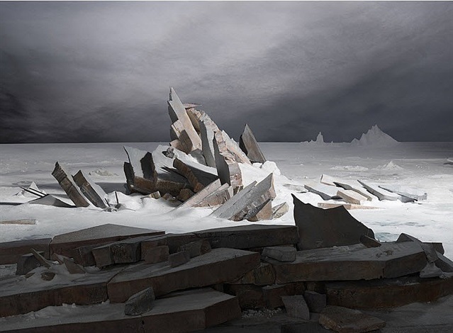
    James Casabere (after Friedrich)


lewis baltz

Lewis Baltz was a visual artist and photographer who was a significant figure in the new topographics movement. His work has appeared in museums, exhibitions and has been published in books.

Technical - The choice of black and white is repeated throughout this movement, it creates depth in the photograph as it has reduced the colours to shades which changes the direction of focus onto the tones in the photograph. The high resolution and natural daylight captures every detail in a bland scene and exaggerates the dullness and precise form of man made structures.

Visual - The photographs serves an aesthetic quality through the minimal shapes and lack of subjects which allows the viewer to concentrate on the straight and rigid lines that contrast with broken and curved wires. Black and white adds to the minimal theme with basic shades.
Conceptual - The photo reflects the movement away from natural landscapes with its banal and ugly qualities yet it finds satisfaction through its minimal style. It also highlights the reality of the progress of man, and the destruction of natural landscapes that have been replaced with flat concrete streets and rectangular buildings infested with wires, pipes, plastic and metal. It could be argued that the concept of the photograph is accepting this development of order and convenience.

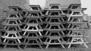
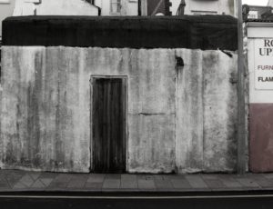
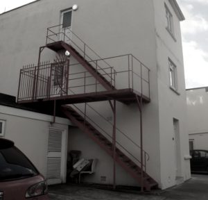
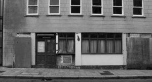
Photo shoot - When I went out for this photo shoot I stuck to old run down buildings with interesting characteristics, colours and objects within them with rigid lines and edges. 
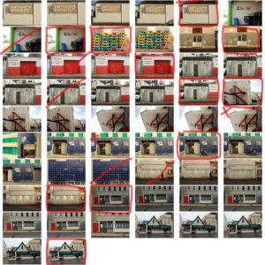

final images - 
     
I've chosen pictures that have a lot of simple basic shapes in them, some more than others. Each photo has ugly and banal features, especially in the buildings as they have been stripped and worn down to what this society perceive as ugly. This statement is reinforced in the last image where it has hazard and construction signs, signalling that it has no uses and only dangerous qualities to it. I reduced the colours in each picture, most to just black and white to reinforce the simplicity that the structure of each picture reflects.

edward weston

Contextual - https://www.ai-ap.com/publications/article/18753/archive-fever-edward-weston.html
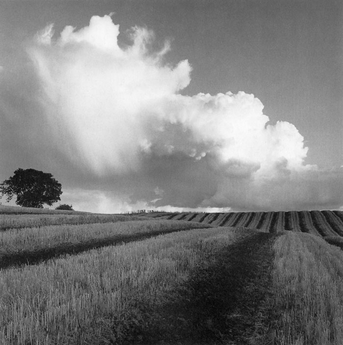
Weston was a 20th century American photographer. He captured images of landscapes, still life, nudes, genre scenes and whimsical parodies. Technical - In the foreground of the image the contrast is high between the dirt and the crops - black and white accentuates this - yet the tonal range is small until the focus is brought to the sky and further hills in the background where lighter and softer tones. The photograph has sharp details - fast shutter speed.
The deep depth of field gives the field a greater distance - the lines of the crops also exaggerate this as some of them fade into the distance.

Visual - Weston has captured what people would have seen as a seemingly mundane scene and has composed a photograph that incorporates pattern, contrast and depth. His approach to taking photographs as he says is 'To make the common place unusual'. The aesthetics of the austere landscape has been brought to a focus through Weston's photographs.

Conceptual - The purpose of Weston's photograph could be to reinforce the beauty in nature and to perhaps conserve the natural landscape through photographs. The subject of a tomato field is also an insight to the natural order man creates in society and life. 

Continue reading

Lewis Baltz

Lewis Baltz a visual artist and photographer who was born in 1945 in California. After studying at San Francisco Art Institute he worked as freelance photographer and taught photography to students.His work has been included in major exhibitions, including New Topographic at the George Eastman House in 1975 and Mirrors and Windows at the Museum of Modern Art in 1978. Since the mid 1980’s he has been based in Europe and traveling a lot taking photos everywhere he goes.

Lewis Baltz produces photographs in series focused on a particular theme or geographic area and usually publishes them in the form of a book. His work, like that of others associated with the New Topographic, challenges the nineteenth century tradition of western landscape photography represented by people like Ansel Adams  by presenting a less innocent view of the landscape.

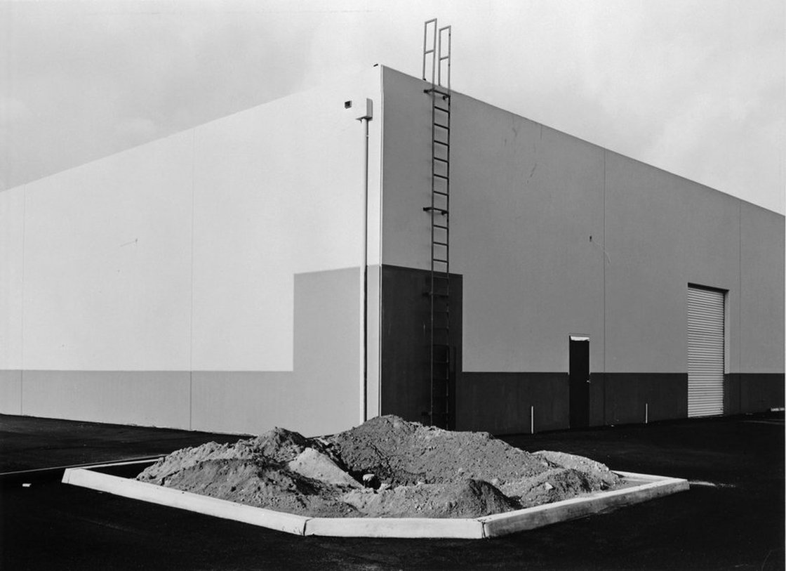
South Corner, Riccar America, 3184 Pullman, Costa Mesa”, 1974, silver print, printed ca. 1974, 5 15/16” x 8 15/16

Technical: from the photography I can tell that natural lighting was used and it was probably a cloudy day, i can tell this from the bright but soft light and the absence of sharp shadows. A wide angle or regular lens would have been used to take this photo and to help get this much of the building in the frame. The image has a large depth of field which makes everything at a distance from the lens sharply in focus. I think a short exposure would have been used to get such a sharp image and to capture the dark tones.

Visual: It is a black and white Photograph which has a high contrast with an equal amount of light and dark areas. The image is separated by different shades of grey in geometric shapes, these are split up using texture from the empty flower bed in the centre of the image. the bottom of the image has more dark shades whilst the top half contrasts with this with bright almost white shades. the corner of the building is centred to the middle of the image with lines going out towards the outer edges of the image

Contextual: towards the end of the 1960s the rapid development of the American postwar decades began to take a toll on the environment. In November 1971, the newly created Environmental Protection Agency announced a massive photo documentary project, called DOCUMERICA, which recorded the adverse effects of modern life on the environment. More than 100 photographers were hired not only to document specific issues, but to capture images showing how we interacted with the environment. By 1974, more than 80,000 photographs had been produced.

Conceptual: his work focused on searching for beauty in desolation and destruction, his images show the architecture of the human landscape, officers, factories, and car parks. the idea of his photos are  is to show the control, power and influence which human have on nature and nature consequently has on us. In this image we can see a large building with simple characteristics. the flower bed in the image was made by human in intention for life to live in amongst urban areas however as we can see this image there is no sign of life which could lead us to believe that humans power over nature is weak and that we can not control it.

Read more http://www.leegallery.com/lewis-baltz/photography/