Category Archives: Case Study

Filters

Author:
Category:

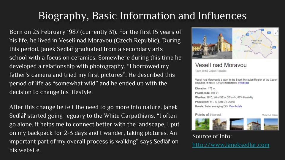
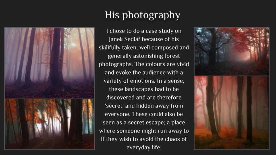
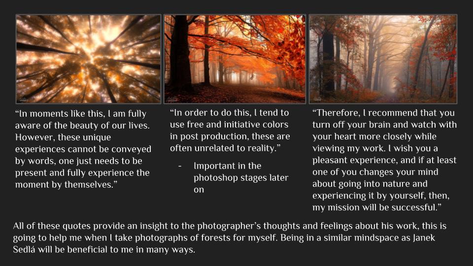
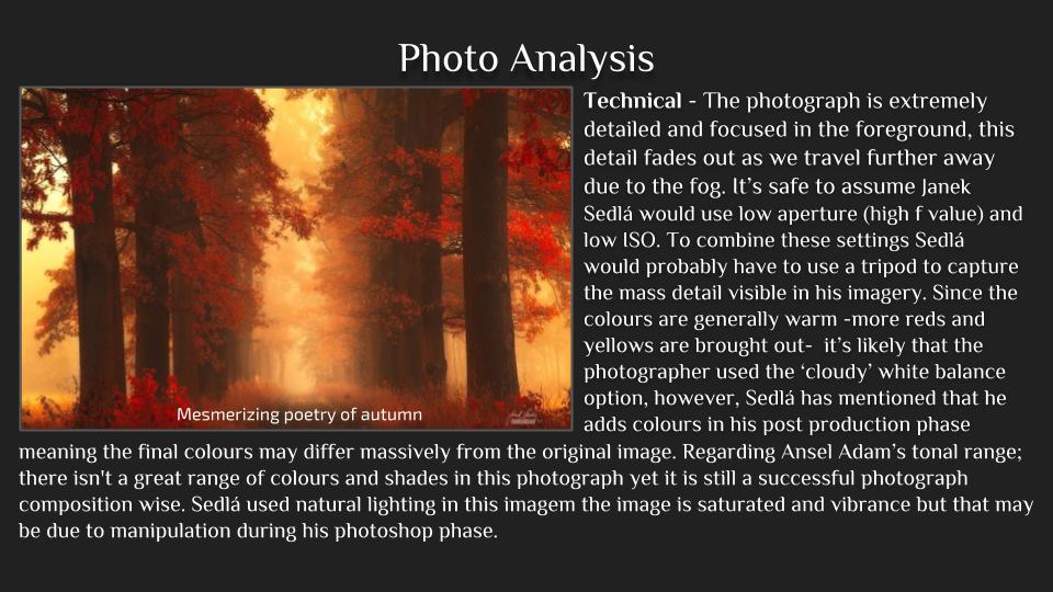
Classic and Contemporary Photographer Inspirations

Albert Smith


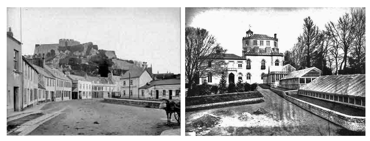
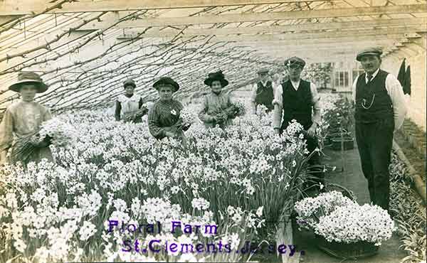
Albert Smith is the best known and probably the most prolific of Jersey’s early photographers, although a significant number of pictures attributed to him, and particularly those used for his postcards, were taken not by him, but by employees or by Ernest Baudoux, whose business he acquired when he arrived in Jersey from London.
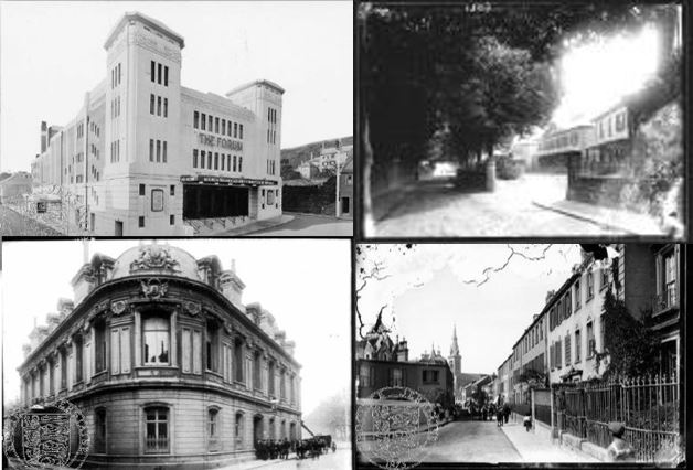
Not all of Albert’s photographs were taken by him personally, however they are all attributed to his business. Many are overtly commercial, but others constitute a fascinating documentary of life in Jersey in the late 19th and early 20th century. Although an early advertisement promoted portrait photography in clients’ homes, Smith, unlike many of his contemporaries in Jersey was not predominantly a portraitist. He preferred to work out of doors, photographing groups on carriage and charabanc outings.

Image Analysis
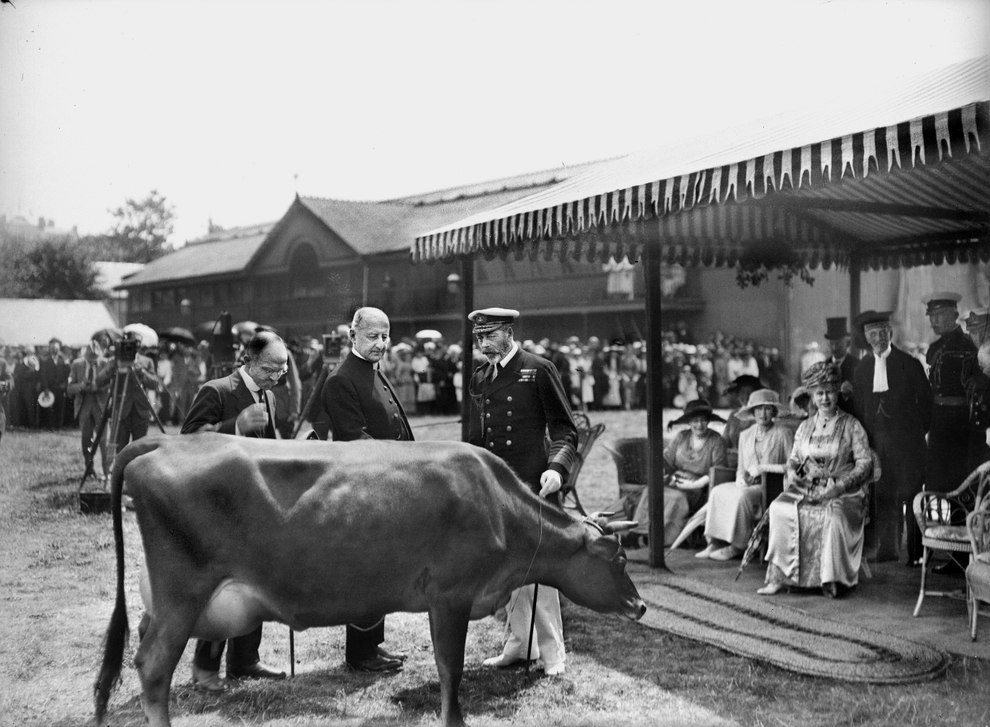
This image shows the Royal Visit of King George V and Queen Mary in 1921 where they were presented with the Jersey cow at a cattle show at Springfield. The Jersey Cattle Breed is famous for its high butterfat content of milk and lower maintenance costs attending its lower body weight, as well as its genial disposition. The image appears to be over exposed, allowing the dark tones to become more contrasted. The focus is maintained on the cow as it is in the forefront and is shown to be observed by the other subjects in the image. The image is in black and white as it wasn’t until 1935 when Kodak brought out Kodachrome, a 16mm color film, that colour photography became more common.

Tom Pope


Tom Pope is an award winning photographer born in Bristol, UK in 1986. Acting as the 2015 Archisle International Photographer in Residence for Jersey, he produced the work “I Am Not Tom Pope, You Are All Tom Pope”.

“The work I intend to carry out in Jersey will explore notions of play and how we conduct ourselves in public. Gathering inspiration from the Société Jersiaise Photo Archive and collaborating with the Jersey community, performances and situations will be initiated where the act of taking and making photographs becomes a social event.”
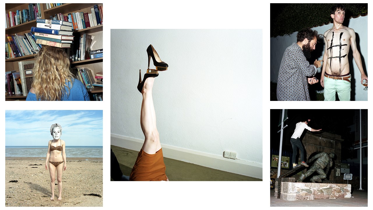
Image Analysis

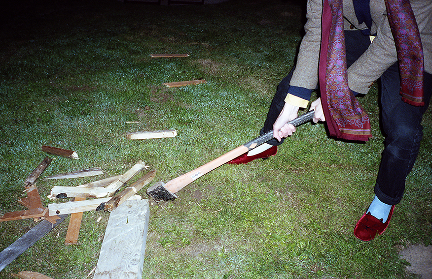
The image features a figure chopping wood with an axe. This is mysterious and intriguing to the viewer as the image is cropped to not reveal who the person in the image is. This similar technique is used in many of Tom Pope’s other works. A vignette appears across the top left side of the image due to the use of a flash which places the focus on the subject. The image feels almost dynamic due to the scarf hanging down before the swinging axe.

Pope’s use of flash brings out the contrast of colour in all of his images, allowing for the subject to become more important in the foreground.

When producing my work to represent the future of St Helier, I want to use the flash in the same way Pope used to bring out the same vibrance and contrast of colour.

Luke Fowler

Luke Fowler is an artist, filmmaker and musician based in Glasgow.  Luke Fowler’s work explores the limits and conventions of biographical and documentary film-making. This has resulted in comparisons with British Free Cinema of the 1950s, which represented a new attitude to film-making that embraced the reality of everyday, contemporary British society. Working with archival footage, photography and sound, Fowler’s filmic montages create portraits of intriguing, counter cultural figures, including Scottish psychiatrist R. D. Laing and English composer Cornelius Cardew.

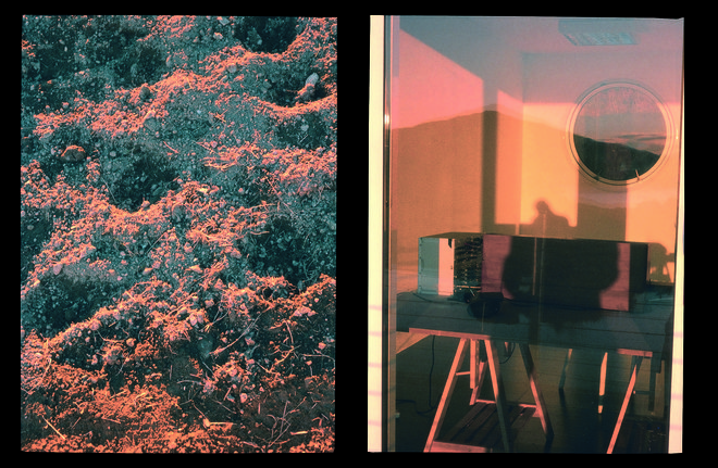
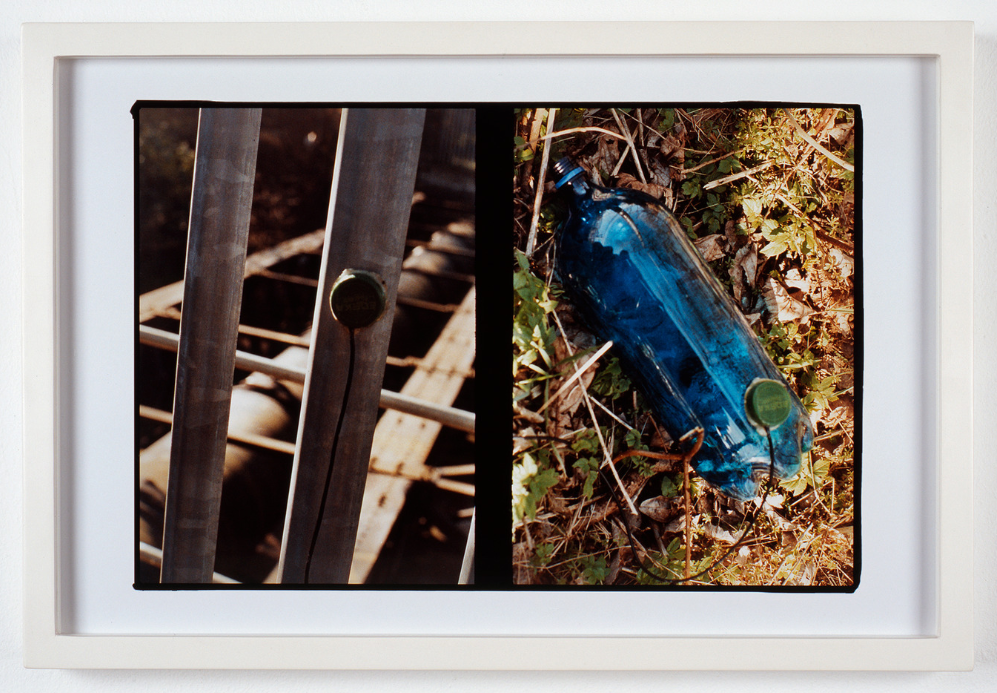
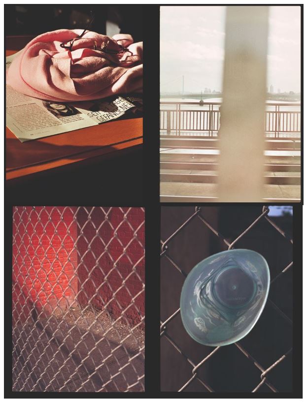
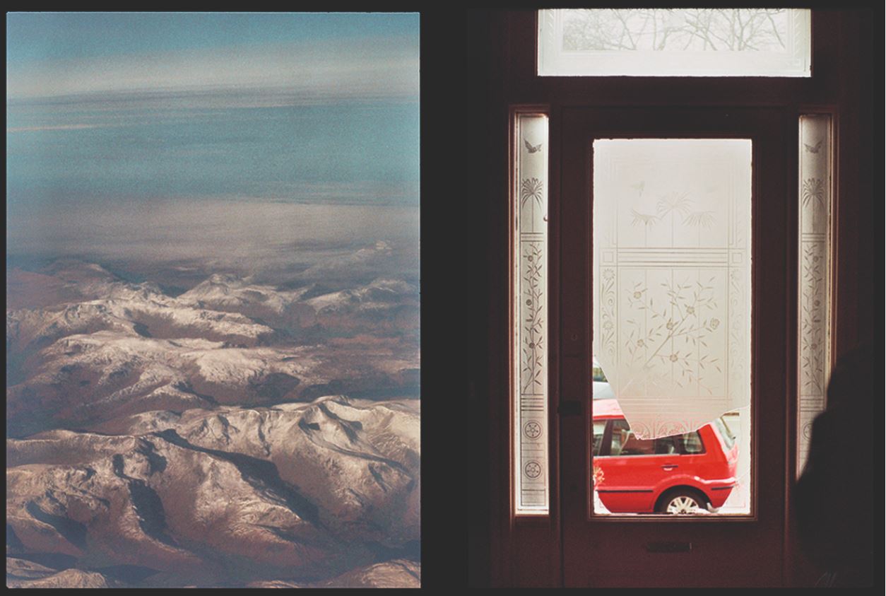
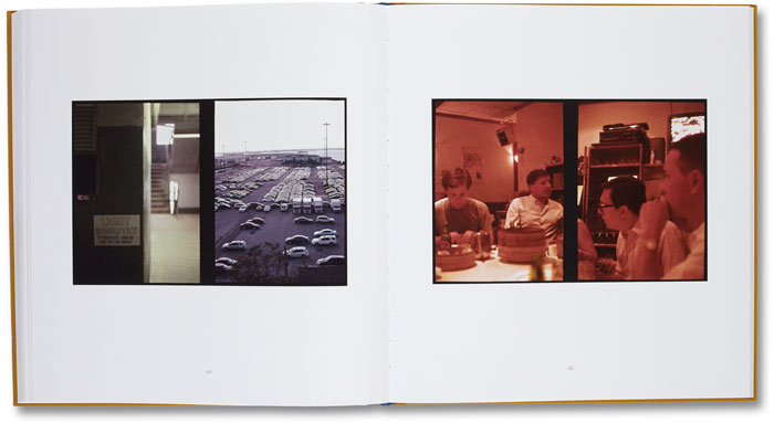
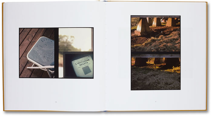
It is said that there is a fine line between film and photography. In 2006, filmmaker Luke Fowler(1978, Glasgow) borrowed an Olympus Pen F to document his artist residency in Bamburg, Germany. Fowler created the double images by using a half-camera frame, exposing two images in one 35mm frame.

  • After developing the first roll, he was struck by the role that chance had played in the resulting diptychs. This signalled the start of a new project, resulting in his book Two-Frame Films: 2006-2012.
  • The book addresses the fine line between photography and film, as the photographs, which are reminiscent of film-stills, question the limits of photography as a medium of representation.

  • In the introduction Fowler discusses how the idea of ‘in the blink of an eye’ has a different meaning for us as human beings than it does with the camera.
  • When we blink and close our eyes, we are blind to the world in that instant.
  • By printing two different images alongside one another, he aims to emphasise the momentary nature of a photograph.

The images that are paired together were taken moments apart in some cases, while they were taken at entirely different times in others.

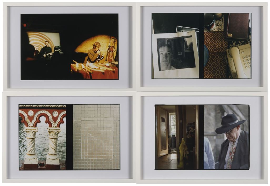
  • The way in which he combines the images in Two-Frame Films shows that Fowler is first and foremost a filmmaker, creating a narrative of, and an interaction between, multiple images.
  • These new narratives created by the diptychs, question photography’s reliability as a way of documenting ‘real’ life in a single, still frame.
  • He shows us how we can create a story, or tell our own story, through combining the chance fragments as exposed by photographs.

What drew me to Luke Fowler was his attention to detail in his photographs and the way he focuses on what others may not notice. In particular his juxtaposition two frame images caught my attention as the two images

Fowler experimented with different film stocks, subjects and framing, and the images are inextricably linked to his filmmaking as evidenced by the elements of montage, colour and reflectivity that permeate the series. In both still and moving image, Fowler considers how an event might be abstracted by the camera apparatus in a subjective ordering of reality that is emphasised by the dialectic between paired images. The photographs are a means of personally testing the ability of the camera to authentically bear witness to an event, and its fallibility as a medium of representation.

‘Two-Frame Films’:

https://www.themoderninstitute.com/artists/luke-fowler/works/photo-archive-group-1-2006-2009/36/

The link below links to a film, shot on 16mm in Glasgow, shows images of Luke Fowler’s home, studio and neighbourhood along with a commentary in which the Turner Prize nominee describes his working practice.

https://www.tate.org.uk/context-comment/video/turner-prize-2012-luke-fowler

Albert Smith- Photo Archive

Albert Smith is the best known and probably the most prolific of Jersey’s early photographers, although a significant number of pictures attributed to him, and particularly those used for his postcards, were taken not by him, but by employees or by Ernest Baudoux, whose business he acquired when he arrived in Jersey from London

Thousands of his images survive as glass plate negatives and subjects include studio portraits and portraits of cattle. Many of his views were sold as postcards. He and his staff not only worked on commissions, but also captured many scenes of island life and events of historical importance. Nearly 2000 of his images can be seen on line in the photographic archive of la Société Jersiaise, out of a total of nearly 3,300 held in the archive.

Among these are undoubtedly many not taken by Smith. Not only, as mentioned above, are there images acquired from Ernest Baudoux, and others taken by employees of Smith, but some are also dated after he closed his business in 1931. It is not clear whether he continued to take photographs after that date, which are included in the Société Jersiaise collection, and private collections, or whether they were taken by staff. There is little doubt that they have been correctly attributed either to Smith or a (former) employee, because there are photographs, bearing his signature logo, taken at the Battle of Flowers in the mid-1930s and at the opening of Jersey Airport in 1937.

The Albert Smith business’s photographs were taken to sell and, in addition to those in negative format in the Société Jersiaise collection, many thousands of prints remain in circulation, notably in two collections in South Africa and the United States, to which Jerripedia has been given access.

Link to photo archive:

https://www.theislandwiki.org/index.php/Albert_Smith

This link to a  gallery of photographs shows the extreme diversity of Albert Smith’s work. Although all of these photographs may not have been taken by him personally, they are all attributed to his business. Many are overtly commercial, but others constitute a fascinating documentary of life in Jersey in the late 19th and early 20th century. Although an early advertisement promoted portrait photography in clients’ homes, Smith, unlike many of his contemporaries in Jersey was not predominantly a portraitist. He preferred to work out of doors, photographing groups on carriage and charabanc outings. This gallery only contains a limited selection of the hundreds of Smith photographs to be found throughout the site.

Smith published a book in about 1910 of 102 Views of Jersey and the Channel Islands, which includes pictures of early Battles of Flowers, and a selection of pictures of Guernsey. Among other advertisements in the book is one for his own series of Hartmann’s coloured Jersey postcards.

krista svalbonas

In terms of my presentation I admire Krista Svalbonas' execution of demonstrating her story and issues in her pieces. Her images are very abstract yet are easy to deconstruct and interpret different meanings behind them. 
I want to reflect her work in the presentation of my work by keeping the focus on the subjects of my images and making the focal points stand out and clear for the audience.
Contextual - Krista Svalbonas 
Krista's assembled photographs carry a heavy weight of personal and political meaning about immigration and the political influences that took away the meaning of a home for her family and herself, and replaced the idea of 'home' to be contingent due to their historical displacement.
Technical - The images have been cut and reassembled in sets of three, 'creating hybrid structures that reinterpret and reinvent architecture, disrupting space, light, and direction'. Svalbona’s 'Migrants' series began with photographs the artist took in the three locations she called home over the past eight years – the New York metro area, rural Pennsylvania, and Chicago. The use of three images creates a 'stability that acts as a counterweight to the sense of dislocation'. 
Visual - The structures of her images almost replicate a triangle- the use of three sides lining up and becoming a whole image with a sense of continuity. 
Conceptual - The use of three makes the abstract imagery wholesome and complete with each part integral for Krista's desired effect. The fact she uses three separate pieces to create a continuous image shows the longing for continuity in terms of a home life.

Walker Evans

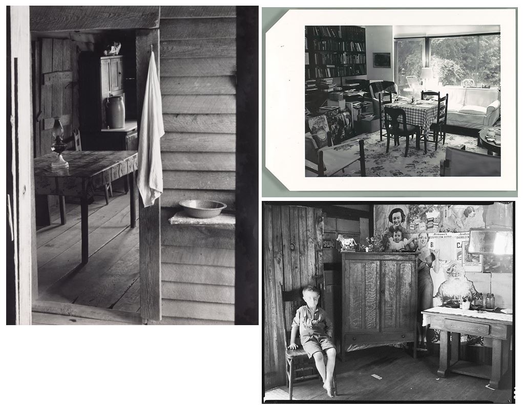
Walker Evans (born November 3, 1903) was an American photographer and photojournalist whose influence on the evolution of ambitious photography during the second half of the 20th century was perhaps greater than that of any other figure. Evans had the extraordinary ability to see the present as if it were already the past, and to translate that knowledge and historically inflected vision into an enduring art

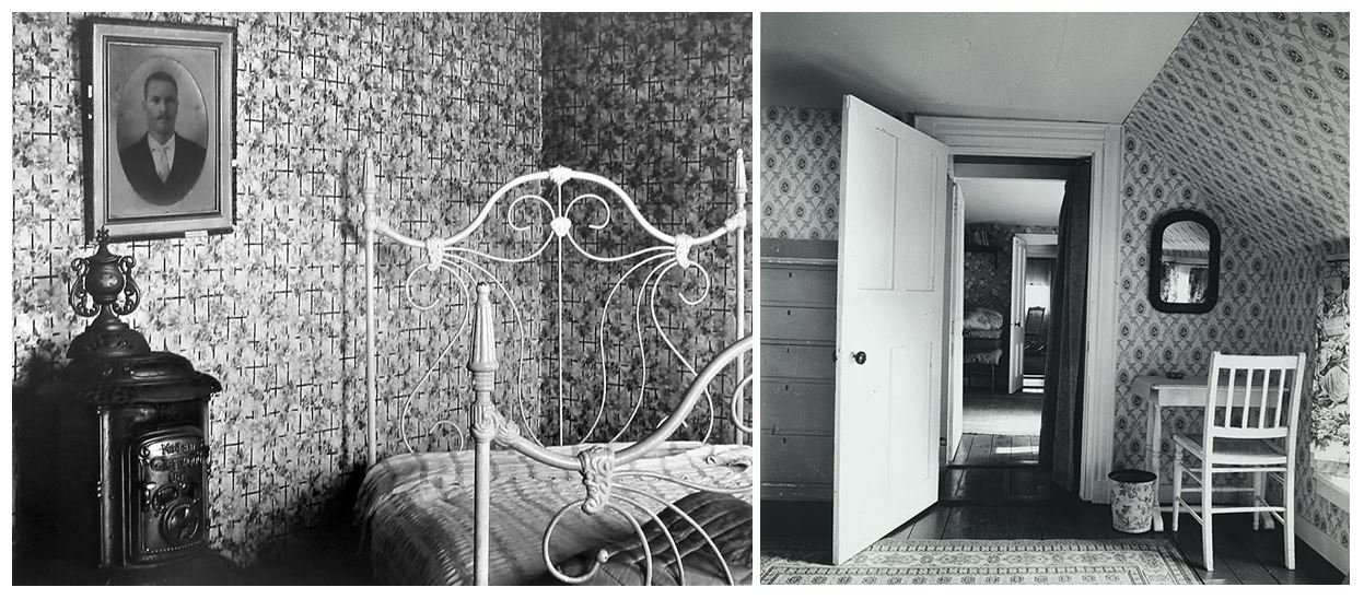
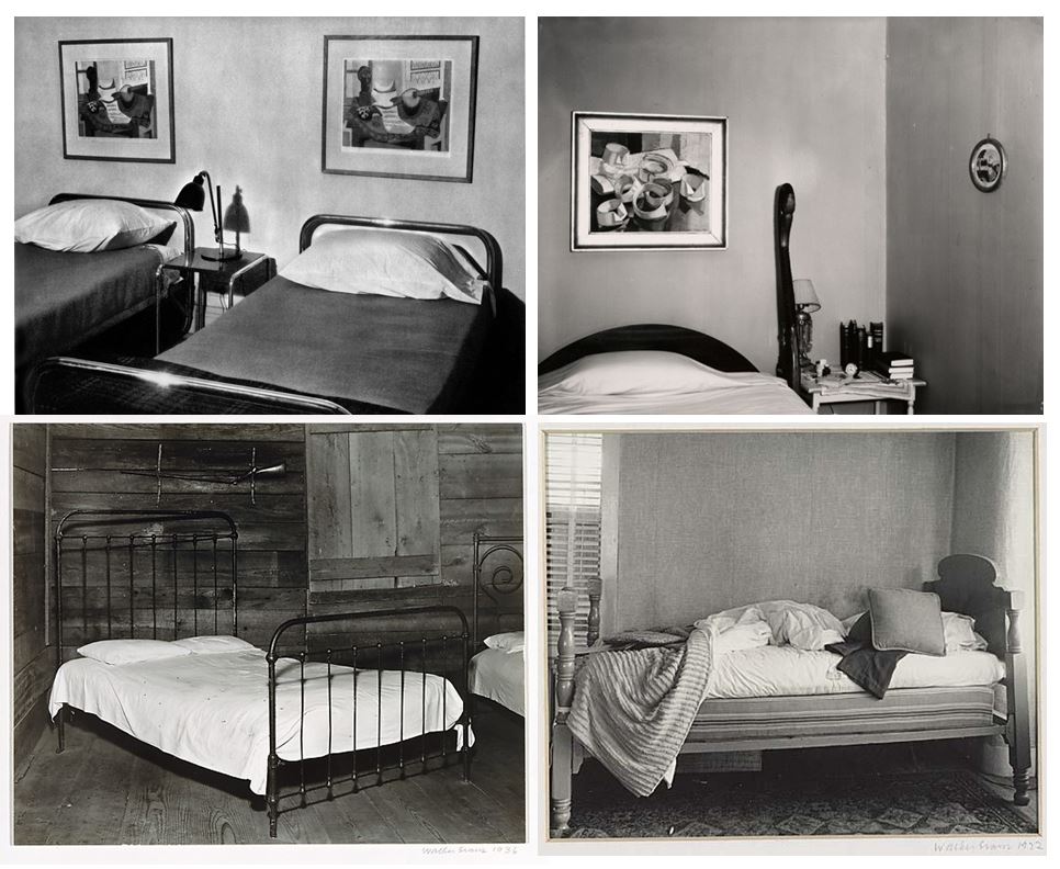
His principal subject was the vernacular—the indigenous expressions of a people found in roadside stands, cheap cafés  advertisements, simple bedrooms, and small-town main streets.

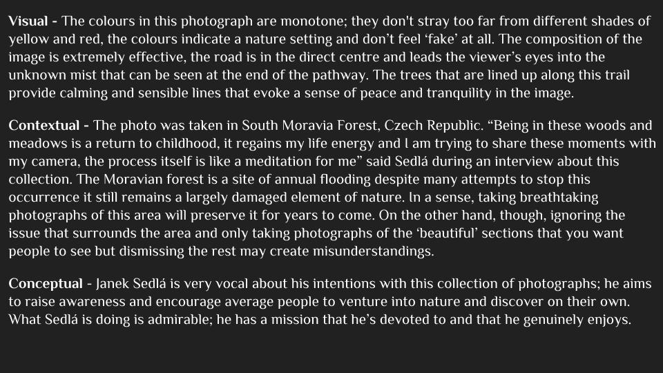
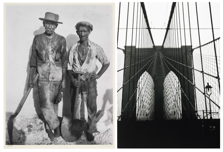
Evans began photographing regularly in 1928, while living in New York City.  It was his goal to become a professional photographer, although it was difficult to find work.  His first big break came in 1930, when three of his photographs were selected to be published in a poetry book by Hart Crane, titled The Bridge.  This early work foreshadows his life-long interest in the imagery of urban architecture and industrial construction.

In 1933, Evans traveled to Cuba to take photographs for The Crime of Cuba, a book by American journalist Carleton Beals.  Beals’s goal was to expose the corruption of Cuban dictator Gerardo Machado.  For this project, Evans produced a number of portrait photographs using laborers, miners, and dockworkers.  He also documented the urban street life in Cuba, including images of vendors, pedestrians, and signage.  All of these themes would reappear in Evans’s later work for the FSA.

Mature Period

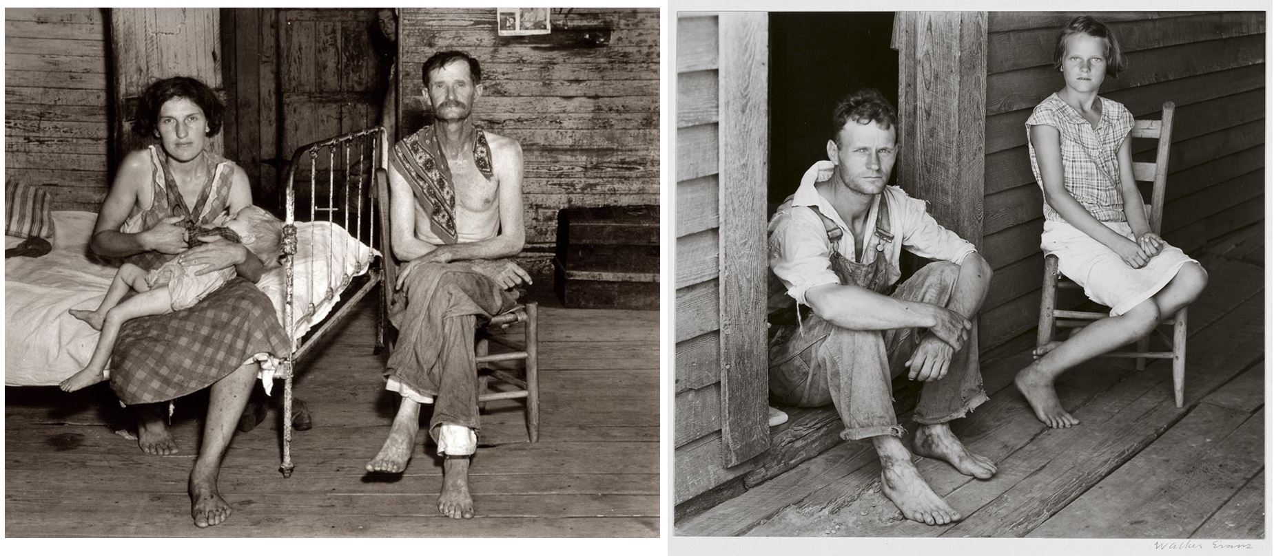
Photography flourished under the Great Depression, thanks to Roosevelt’s New Deal, which paid artists to work. The Farm Security Administration hired Evans alongside other photographers to document the government’s improvement efforts in rural communities. Unconcerned with the political ideology behind his assignment, Evans spent the better part of 1935 and 1936 eloquently capturing the aesthetic texture of ordinary life via rural churches, bedrooms, faded signs, and rumpled work clothes. He avoided using upscale equipment. Despite being familiar with and capable of affording the latest technology, Evans used an outdated camera with a very slow lens.

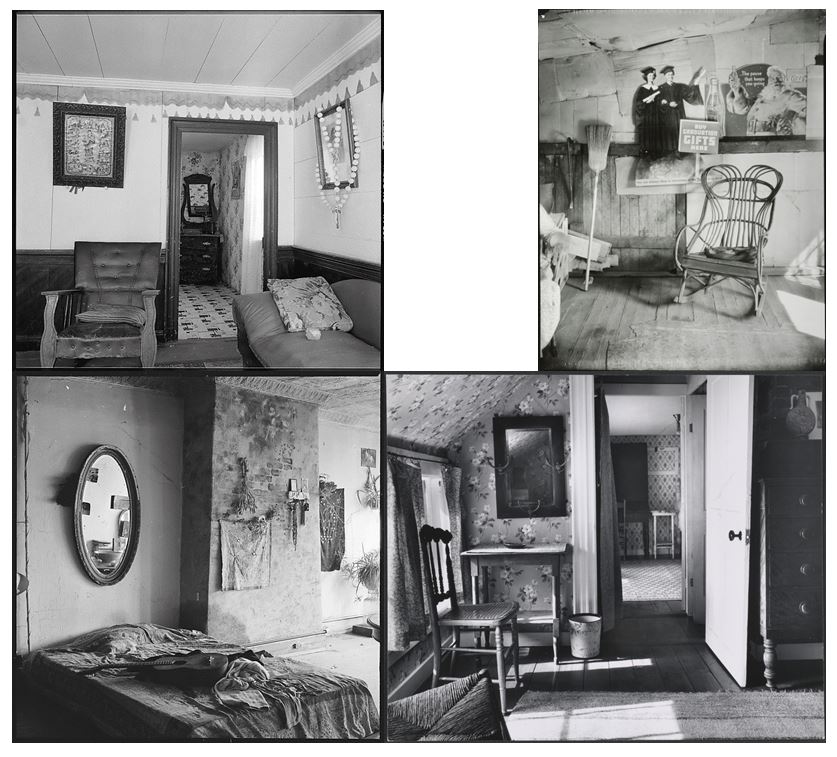
Evans’ interiors function like landscapes that open up towards other worlds, largely through the particular attention that he pays to the inanimate objects that are present, almost representing them as characters themselves

His book titled – Message from the interior – is both open and reserved, preparing the reader not only for its subject matter, but also for the atmosphere of intensity it contains. Here, through objects and places, the he speaks to us of absence, the difficulty of communication and the passage of time.

Walker Evans picks out details that unsettle our delicate balance with portraits set in living rooms, kitchens or bedrooms. On first impression, the meticulous layout of the images leave room for the disciplined and temporarily deserted places that they depict.

None the less there is resistance, in spite of all of these codes and the apparent passivity of these empty, predetermined spaces. Life is indeed present, in the smell of the wallpaper, the sound of the wooden floors, the slight movements of dust particles and the lengthening of shadows.

These spaces, now emptied of their occupants, rediscover their own life, perspectives stretch out or become flattened; shadows recompose themselves into sculptures, as the objects take over the roles of the missing occupants and complete the story.

Most of Evans’s best work dealt not with people but with the things they made: he was concerned most of all with the character of American culture as it was expressed in its vernacular architecture and in its unofficial decorative arts, such as billboards and shop windows.

In Evans time, there were essentially two competing philosophies of photography: Documentary vs. Pictorialist. Documentary strove to represent the world as it was, flaws and all; Pictorialism produced a selective, transcendent view of the world, akin to traditional Western painting. Evans’s work, a blend of these two philosophies, brought greater nuance to the practice of photography. As he put it, “What I believe is really good in the so-called documentary approach to photography is the addition of lyricism… produced unconsciously and even unintentionally and accidentally by the cameraman.”

During the winter months between 1938 and 1941, Evans strapped a camera to his midsection, cloaked it with his overcoat, and snaked a cable release down his suit sleeve to photograph New York City subway passengers unawares.

For Evans, the subway portraits  were an attempt to capture the ultimate purity of a recording method without human interference.  He sought to reflect ordinary life in an organic and natural way.  The subway portraits were also, in many ways, a rebellion against studio portraiture and the commercialization of photography.  Evans criticized the inherently artificial nature of typical portrait photography, with its use of costumes, make-up, props, and posed stances.


klaus pichler

'No matter how rich or poor the country, the report found, one-third of food produced for human consumption goes to waste, due to factors such as consumer decisions and lack of distribution channels, while over nine hundred million people are starving.' - Klause Pichler interview
contextual - Pichler used his bathroom as a studio and for storing various foods kept in plastic containers as they began to flourish in mold and rot. He grew up in a rural province in Austria where raising and eating meat was an important part of their culture. Pichler later defied these customs and became a vegetarian. 
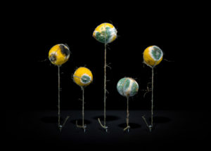
technical - This picture has been flipped to make it look like the string is holding the lemons up like flowers. The use of lighting is cleverly done, Pichler has lit the lemons from the front and bottom which gives a shadow on the floor of the picture [the ceiling], adding to the illusion that the lemons are standing up on 'stalks'. 
visual - As Klaus Pichler said, the initial sense of his work may seem beautiful and appetizing until the viewer realizes what they're looking at. He's set up this scene to remind the audience of something beautiful; flowers, with the string set up like stalks and the lemons displaying bright and vivid yellow and green colours. These colours relate to toxicity, beauty and nature creating conflicting views on the picture for the audience - is it beautiful or repulsive?
conceptual - The photograph is set up like flowers, giving connotations of beauty and life, directly contrasted with decay and effectively death. It gives the underlying message that everything comes to an end, highlighting that the luxuries we take for granted will slowly diminish with the natural reckless behaviours accompanied by humanity. Pichler has created these pictures to make us question the everyday actions that seem normal to us; throwing away rubbish, littering, driving cars, material consumption etc. - where does it come from and where does it go? We've been bred to do and not think.

Giorgio Morandi

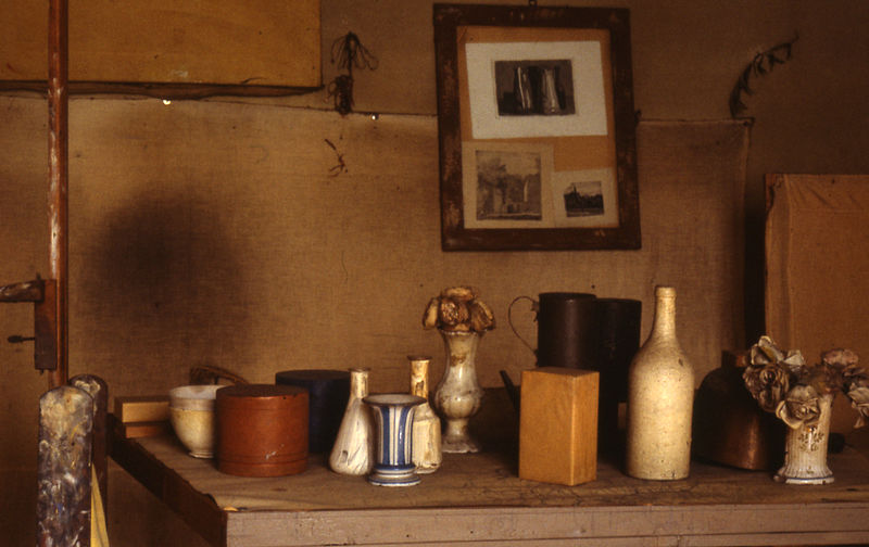
Giorgio Morandi (July 20, 1890 – June 18, 1964) was an Italian painter and printmaker who specialized in still life. His paintings are noted for their tonal subtlety in depicting apparently simple subjects, which were limited mainly to vases, bottles, bowls, flowers and landscapes.

Although he painted generic household objects, critics noted how his representation of these objects conveyed a sense of Morandi’s personality, monastic habits, and Bolognese environment. His tightly unified body of work would be influential for its close study of unremarkable elements of daily life, imbuing them with implications of deeper significance by emphasizing their painterly beauty and simplicity. He represents himself through his paintings and the objects he displayed which links which links to my theme that conventional objects can represent the history of a person.
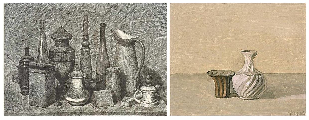
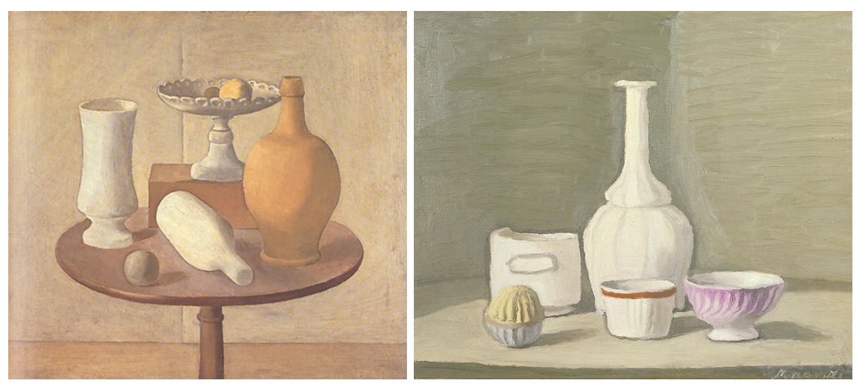
With his attention to technique and painstaking precision, Morandi extended the legacy of Italian painting into the 20th century, but gave it new relevance with his minimalist style and non-narrative focus. The sparse palette, clean lines, and careful brushstroke of Morandi’s still lifes are unmistakably modern and his attention to technique and the physicality of the painted surface connected later painters with the grand traditions of the still life and landscape genres.

The image on the right  depicts a display of five domestic objects arranged on a flat table surface: a bottle, a jar and three porcelain bowls of various sizes. The objects are arranged in two horizontal rows, with the three smallest objects situated at the front of the composition and the bottle and a taller bowl at the back. In this work, Morandi uses a muted colour palette that ranges from light and medium grey to cream white, beige, pale yellow and mauve. The ball-shaped container in the front row at the lower left corner of the painting has a top section with yellow grooves and a bottom section with white grooves. The cup in the centre of the composition has a red brim and the bowl on the right side has purple grooves. Still Life is inscribed with the artist’s signature at the bottom right of the canvas.
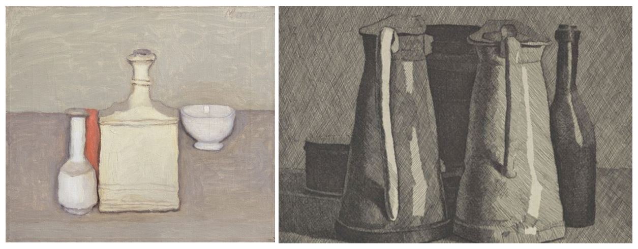
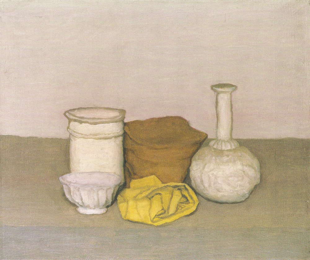
Morandi kept a supply of vases, bottles and jars in his studio, which he used as models for many of his still life paintings in a variety of arrangements. In a letter dated 7 July 1953 the artist wrote that there were ‘several variants of the present work and the same objects also appear in other pictures’


The image above is an oil painting. The canvas is divided into two horizontal segments; the upper half painted pale olive green, the lower, lavender-grey. Three objects – a white vase, a short round container and a conical-topped bottle – rest on the surface. They are arranged close together, one in front of the other, and appear to merge. A sense of spatial depth is introduced through a shadow of the objects, represented by dense strokes of darker paint, that appears on the right-hand side of the composition.

Morandi's studio at Via Fondazza

Morandi painted these familiar objects in his bedroom studio at Via Fondazza in Bologna through almost the whole of his career, only shifting to a rural house, at Grizzana, in 1960. Many of the still lifesof the last four years of his life were made there, alongside paintings of the landscape, and achieve an ethereal quality in which formal similarities are found across the two genres.

The Metaphysical painting(Pittura Metafisica) phase in Morandi’s work lasted from 1918 to 1922.

Metaphysical art:  a style of painting developed by the Italian artists Giorgio de Chirico and Carlo Carrà. The movement began in 1911 with de Chirico, whose dreamlike works with sharp contrasts of light and shadow often had a vaguely threatening, mysterious quality

This was to be his last major stylistic shift; thereafter, he focused increasingly on subtle gradations of hue, tone, and objects arranged in a unifying atmospheric haze, establishing the direction his art was to take for the rest of his life.

I decided to chose the artist Giorgio Morandi to take inspiration from when taking still life pictures of objects as his style and arrangements in his paintings are what i want to recreate in my photos with conventional objects. He uses a collection or objects with simple backgrounds and neutral colours to create a simplistic yet detailed paintings.


Mari Mahr

The work of Mari Mahr is deeply personal and autobiographical, yet addresses universal human concerns regarding where it is that each of us come from, and where it is that we each belong.

Her work has been exhibited worldwide including at the Serpentine, London and is held in numerous important collections including the Victoria and Albert Museum in London

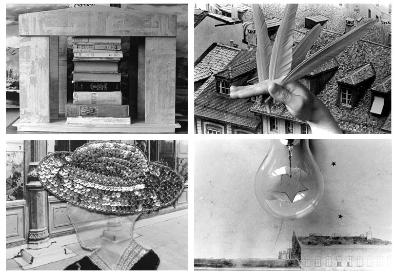
I chose Mari Mahr as a photographer to research as many of her images contain a variety of objects: clocks, birds, fish, books, picture frames, eyes, stars, buildings etc. This could link to the theme of conventions as they seem to be relatively domestic objects suggesting the life of a family or community.

Mari Mahr constructs her photographs from artefacts of her past life and that of her family. She was born in Chile, grew up in Hungary and moved to London in 1972. Her father was an architect but died when she was twenty four. Her mother was a translator; work that brought her into contact with Che Guevara and Pablo Neruda. These diverse origins are represented in her work by an equally diverse selection of objects

This series Between oursleves: ‘My Daughter, My Darling’… and ‘Time for Sorow’ all use the same stage and the same backdrop within their seires; the only variations being in the lighting and in what is displayed. This simplicity is her strength, for she needs little to tell her stories; leaves for the time of year, but also for her memories. Her photographs are therefore both imitations of remembrances and completely artificial. This is clear in her use of old photographs. A story is told as if it were a myth or nursery rhyme combining a landscape and objects that carry a symbolic meaning

NEW PLACES – NEW CODES (2000)

“These are based upon recollections – sometimes vague and sometimes quite specific from that miraculous time when as a child I was trying so hard to make sense of all the people and all the things around me.”” So, existing in a kind of limbo, these images of mine might be seen as reality re-considered – things that I might or should have said at the time.”

SYMBOLS OF OURSELVES (2002)

“All through the ages and in all cultures there have been effigies made to represent us – sometimes for religious reasons, sometimes for commerce and sometimes just for play. My house is full of them.”

“I see these faces around me not as specific representations of particular people, but representing all people. This generic quality has made them especially suited to their being cast as characters with universal significance in some of my previous works.”

“These portraits are a tribute to this international ensemble that surrounds me.”

Here is Mari Mahr’s website and a link to one of her series that links into my interpretation:

Secrets, Codes and Conventions – Gregory Berg

Gregory Berg

Image result for gregory berg

Image result for gregory berg photography

Gregory Berg is a New York-based photographer and urban explorer that photographs parts of the subway that most people never want to see. Throughout New York City there are dozens of closed stations and platforms, some of which are decaying very quickly. Berg says “I find abandoned subway stations of maps, jump into active platforms and walk the live tracks, avoiding the 3rd rail and moving trains” which shows just how dedicated his to his photography. Some of the photographs that Berg takes shows colours and textures that are almost of a dystopian underworld that no one ever sees.

I have chosen to look at Berg as I hope to take inspiration from his work when looking at exploration. I will show the urban exploration side of his work in my photographs and hope that my photographs convey the same secrets of explored areas as Berg’s work does.

My Favourite Photograph

Image result for gregory berg photography

This photograph is taken with the dim light leaking into the abandoned subway station, this creates an ominous environment and so creates mystery within the photograph. A shutter speed of 1/30 or less will have been used with an ISO of 200 or 400 as a low shutter speed would be needed to allow enough light to enter the lens from the dimly lit area. There is quite a cold tone to this photograph which emphasises the fact that the area is abandoned and ruined. There is a deep depth of field in this photograph which allows the whole of the photograph to be kept in focus so that the long pathway can be seen.

There is not much colour in this photograph – the only colour that really stands out is the blue light reflecting off of the walls. This pushes the ominous environment that the photograph portrays and at the same time creates contrast with the shadows. The photograph has quite a dark tone in it as there are not many light tones/highlights, this creates an uneasy feeling within the photograph. There is a 3D effect to this photograph as the pathway travels so far from the foreground to the background.

This photograph was taken as part of Berg’s exploration of underground exploration of Brooklyn in New York. To me, this photograph shows how wasteful humans are as they can have something as massive and intricate as this subway station and simply brush it to the side and then forget about it. Berg is trying to show that even if it is forgotten about and run down, it’s still an amazing place to visit.