Category Archives: Case Study

Filters

Author:
Category:

Artist Research’s – Breaking the rules: Manipulation

Noemie Goudal


Noémie Goudal is a French artist who graduated from the Royal College of Art in 2010 with an MA in Photography and lives and works in Paris. Noémie Goudal investigates truth and fiction through the use of layered photos of quiet, mysterious landscapes which she combines with elements of modernist architecture.
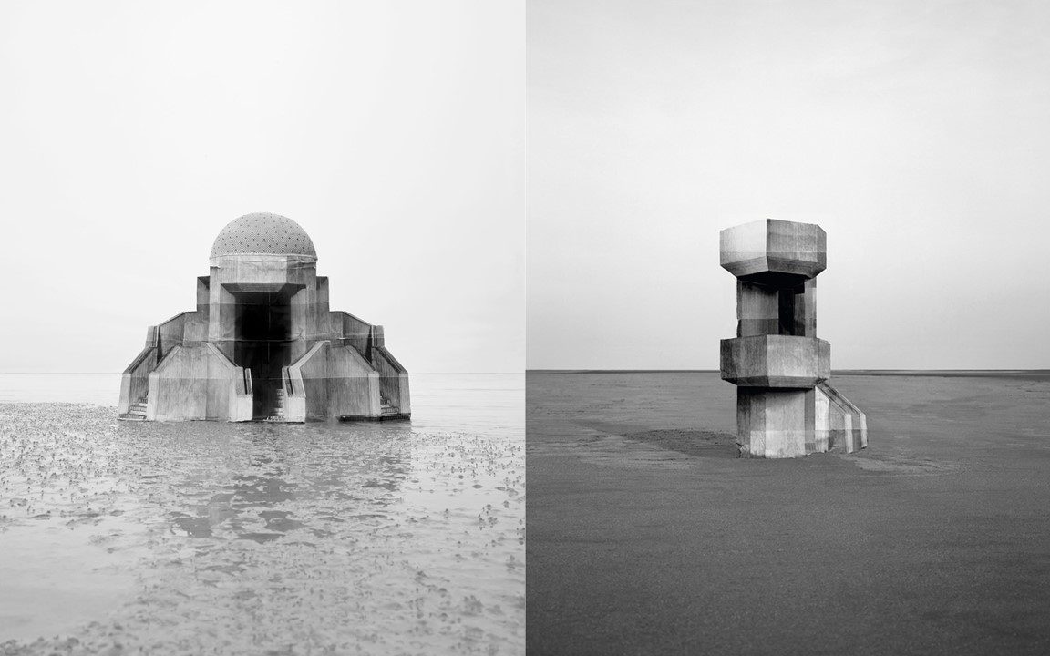
Goudal’s style is reminiscent of digital manipulation however they are in fact analogue photos which have been precisely shot and stuck to cardboard pieces to form an abstract sculpture. Goudal places these sculptures in natural landscapes often challenging the weather conditions. The final works generate tension due to the out of place proportions in the image which are only revealed in very subtle ways.
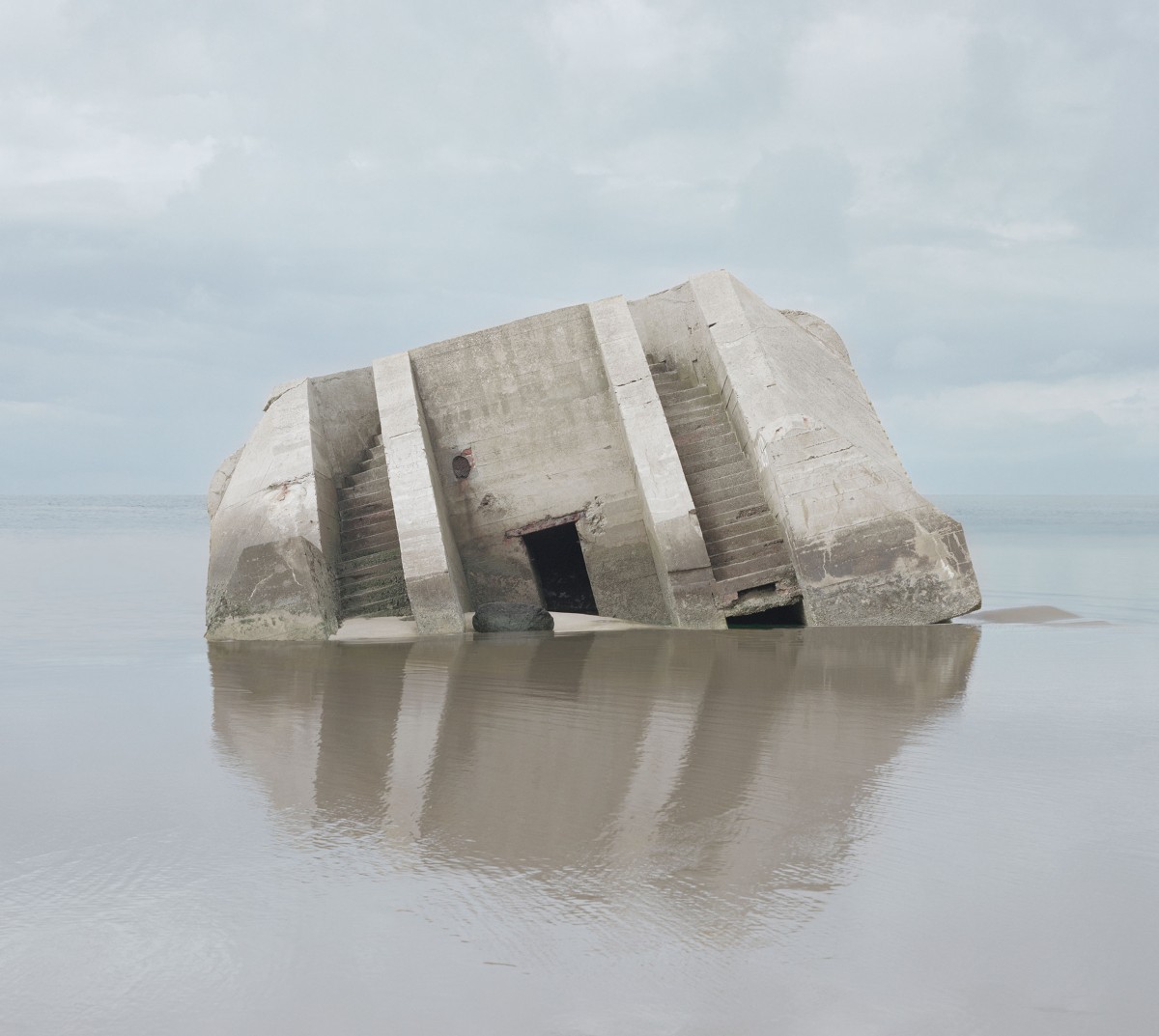
Despite Goudal’s fictional style, the bunkers in this image are real WW2 bunkers found on Normandy beach. Noemie’s style has lead viewers to believe this building is fake since many of her photos contain paper backdrops. This allows the viewer to question the reality of her images. The origin of this image, named “Combat” provided an interest to Goudal inspiring her to research geomorphic architecture, architecture that has a direct link to nature in order to imitate or draw our attention to it, leading her to create her own inspired series titled “Observatoires”.
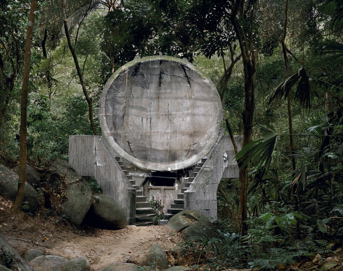
Image Analysis
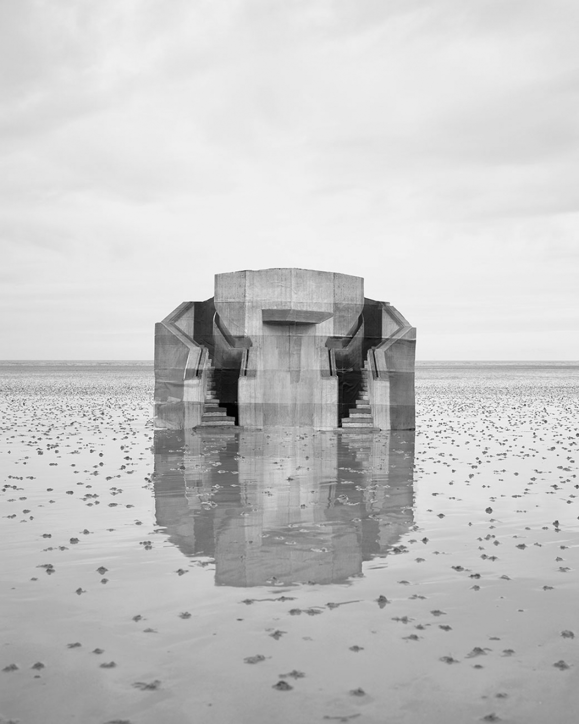

The image “Observatoire IV” was made in relation to a series of photographs depicting architectural constructs. Through the collection of images, both captured with her own camera and taken from the internet, Goudal puts fragments together on her computer and prints them on paper to place onto cardboard cutouts.

“What I like is that it’s not clear anymore what the function of these new buildings is. I see them as a sculpture, they become a different thing”

Goudal implies the relationship between the land and the manmade despite the absence of people in the photos.

Her images are taken in natural lighting on overcast days where her sculptures overpower their vast and empty landscapes. The tonal range shows the image as mainly grey hues although the photo is also presented in a black and white form. Increasing the contrast causes the presence of the building in the centre to become stronger where fold lines in the paper can also be seen when looking closely.

The sharpness of the image results from a fast shutter speed paired with a small aperture yet prevents the production of noise in the image so that it is still clear.

The illusion of reality is furthered by the addition of the reflection in the foreground which amplifies the size and significance of the manmade structure over nature.


Steve McCurry


McCurry’s career started in photojournalism, a field based around the truth and integrity of an image. Evidence of manipulation in this field, beyond standard colour correction and processing, can end a photographer’s career if they are discovered. Steve McCurry has worked on many assignments with the National Geographic, an organisation that does not “condone photo manipulation for editorial photography”. They prevent this from occurring by receiving all the raw files for every assignment in order to check images and complete colour correction themselves.

McCurry’s work has covered extreme armed conflicts such as the Iran-Iraq War, Lebanon Civil War, and the Afghan Civil War. He has risked his life on many occasions in order to capture his images, he was almost drowned in India and he survived an airplane crash in Yugoslavia.

McCurry’s work has adapted with the times where he now refers to himself as a “Visual Storyteller”. Many of his recent works have been shot for his own enjoyment, where he is able to show more freedom in the editing of personal projects.

Part of the NPPA Code of Ethics states:

“While photographing subjects, do not intentionally contribute to, alter, or seek to alter or influence events. Editing should maintain the integrity of the photographic images’ content and context. Do not manipulate images or add or alter sound [referring also to video] in any way that can mislead viewers or misrepresent subjects.”
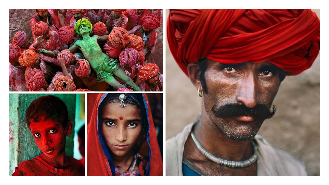
~ McCurry enhances his images by manipulating the saturation of colours which makes the photo more stronger to the eye.

McCurry concentrates on the toll war takes on humans. He intends to show what war does to not only the landscape, but to the people who inhabit that land. His works try to convey what it is like to be a person in an  economically deprived area. McCurry shows his viewers that there is a “human connection between all of us.” He believes there is always some common thing between all humans despite the differences in religion, language, ethnicity, etc.

Image Analysis
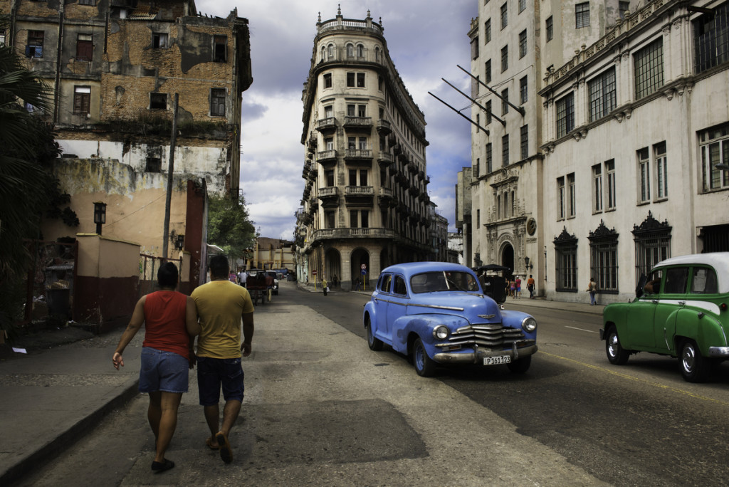

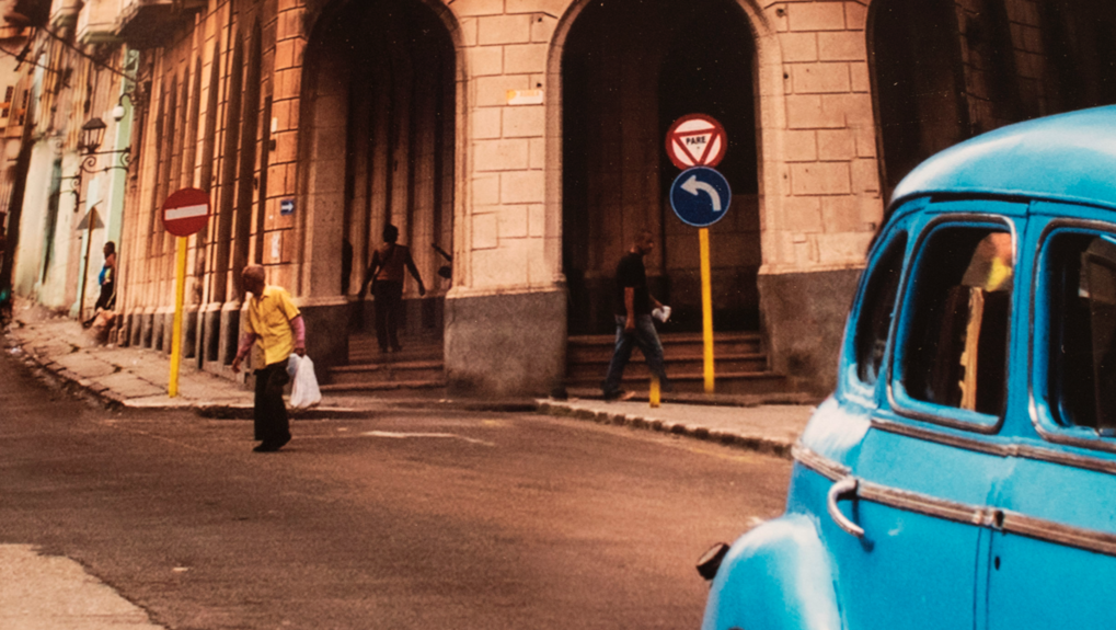
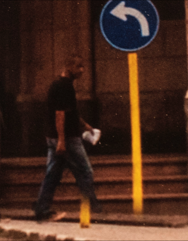
The Steve McCurry manipulation controversy began when Italian photographer, Paolo Viglione, noted a rather obvious digital manipulation in one of McCurry’s prints at a show in Italy.

The image, taken of a street in Cuba, shows a section of a sign was intentionally moved to avoid blocking the man seen next to it. Other issues include the bricks that make up the columns of the building not aligning properly, while the column on the right actually overlaps with the frame of the car in the foreground.

A wide angle lens appears to have been used in order to capture the entire of the busy street. This makes the viewer feel like they are actually there, becoming drawn to the building that McCurry has composed into the centre based from the viewpoint of his camera.

The change at first appears to not be noticeable as it is in the background surrounded by other busy features in the foreground like the two people walking and the two cars, both of which are saturated in colour to give the image a feeling of liveliness. The manipulation is an attempt to balance the composition.

The project based around Cuba is not one related to photojournalism as it is in his own personal interest. He is therefore not breaking the NPPA Code of Ethics however is still using manipulation in a way to enhance his visual storytelling.
My Response To Lewis Bush

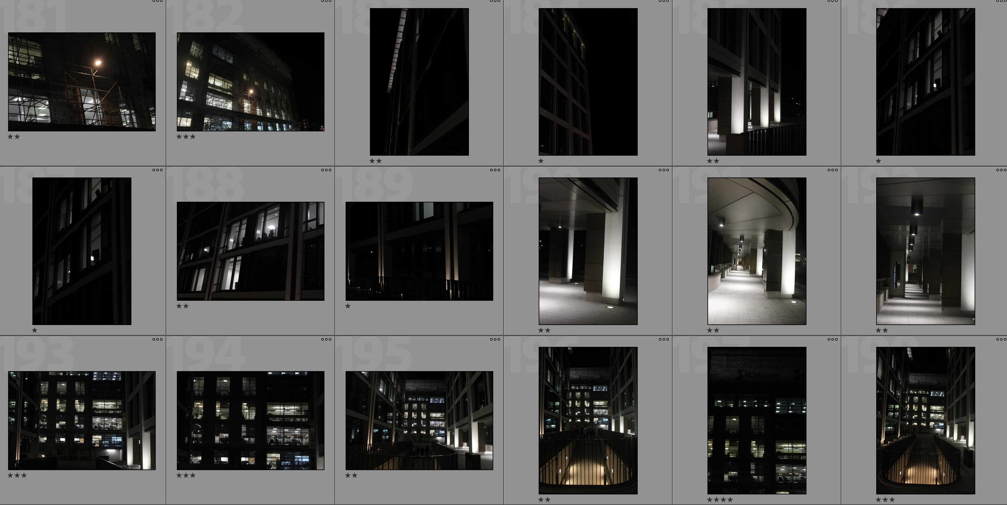
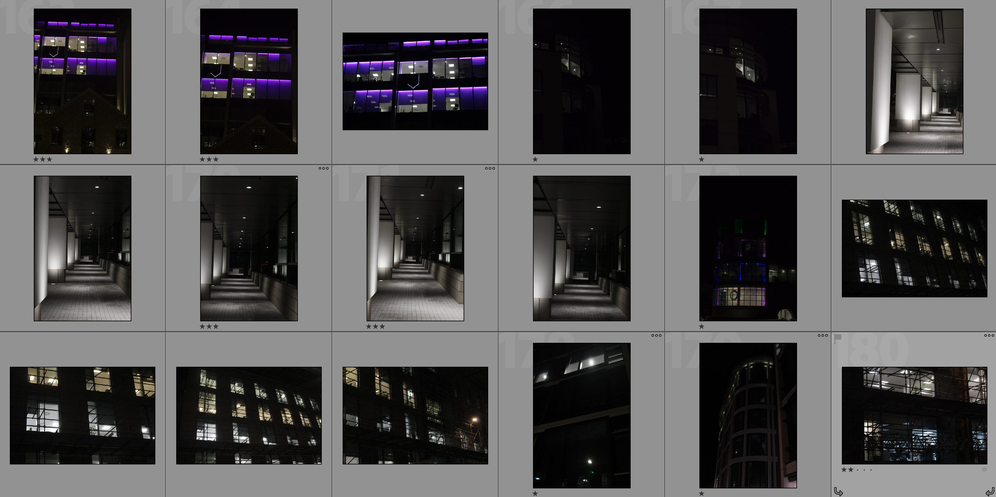
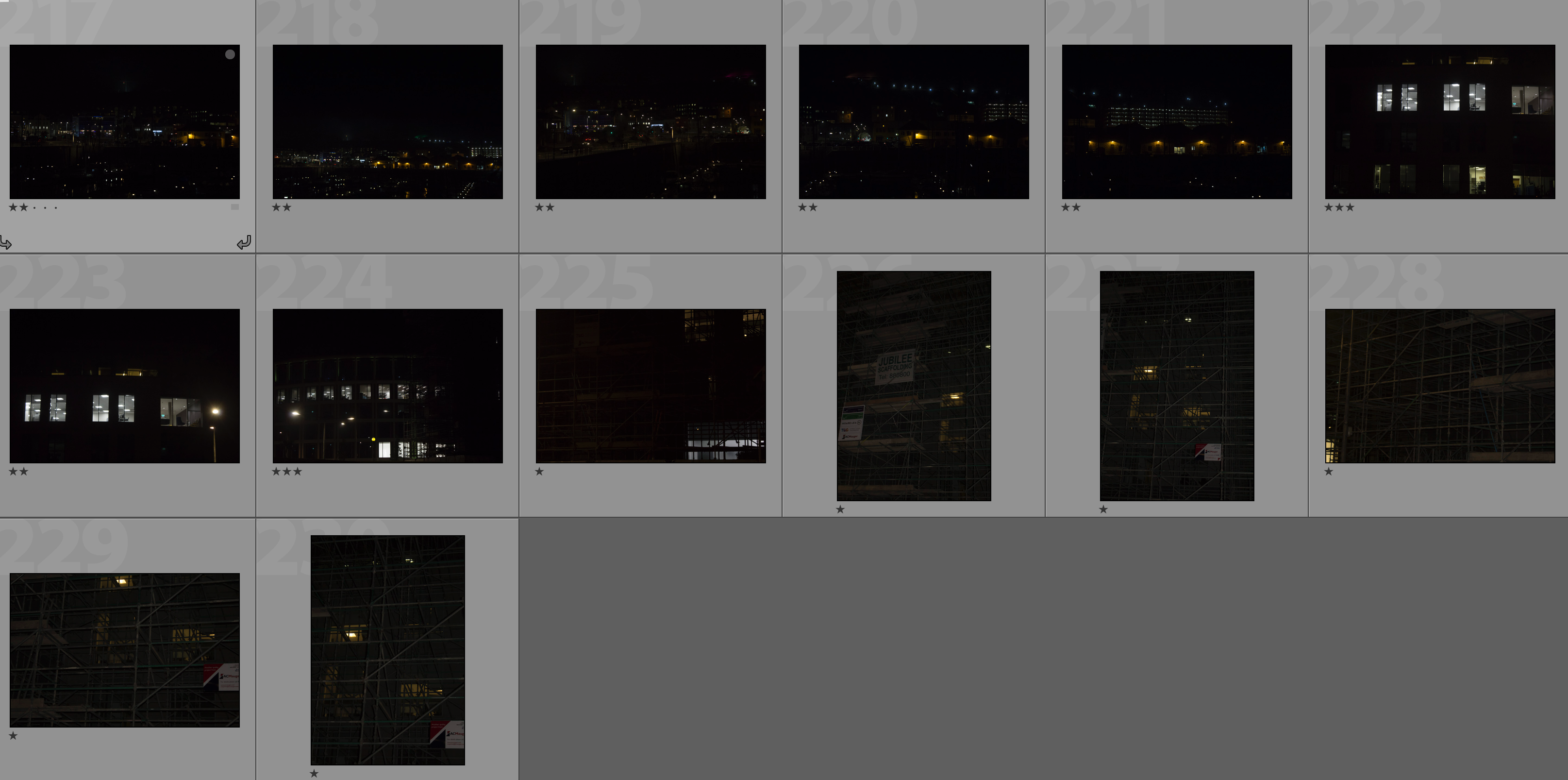
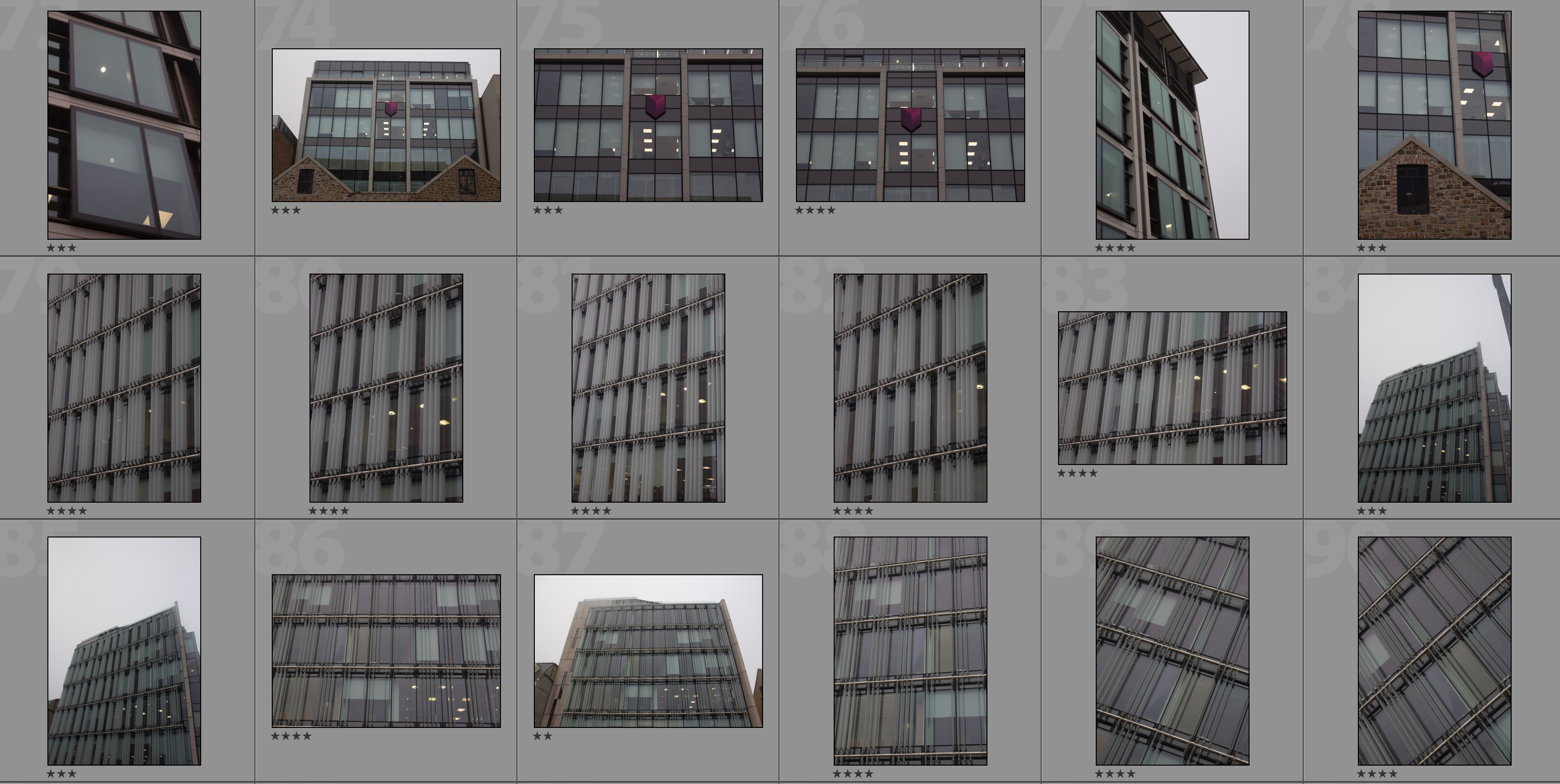
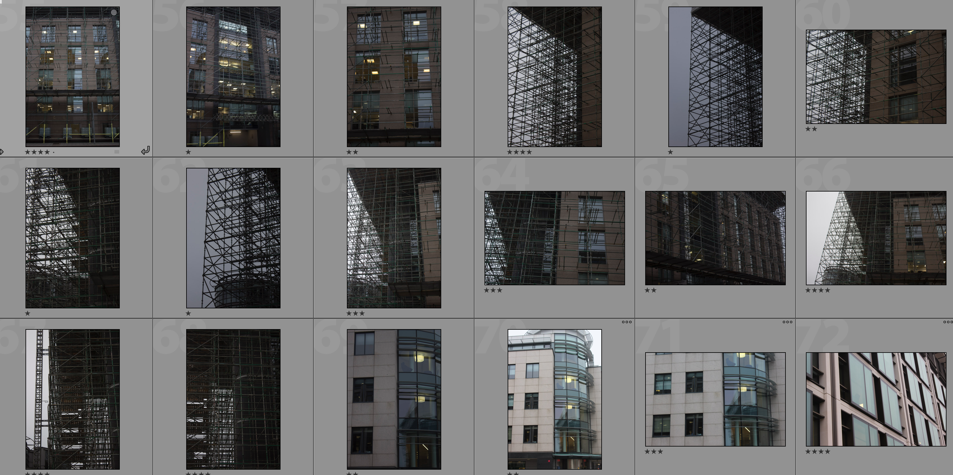
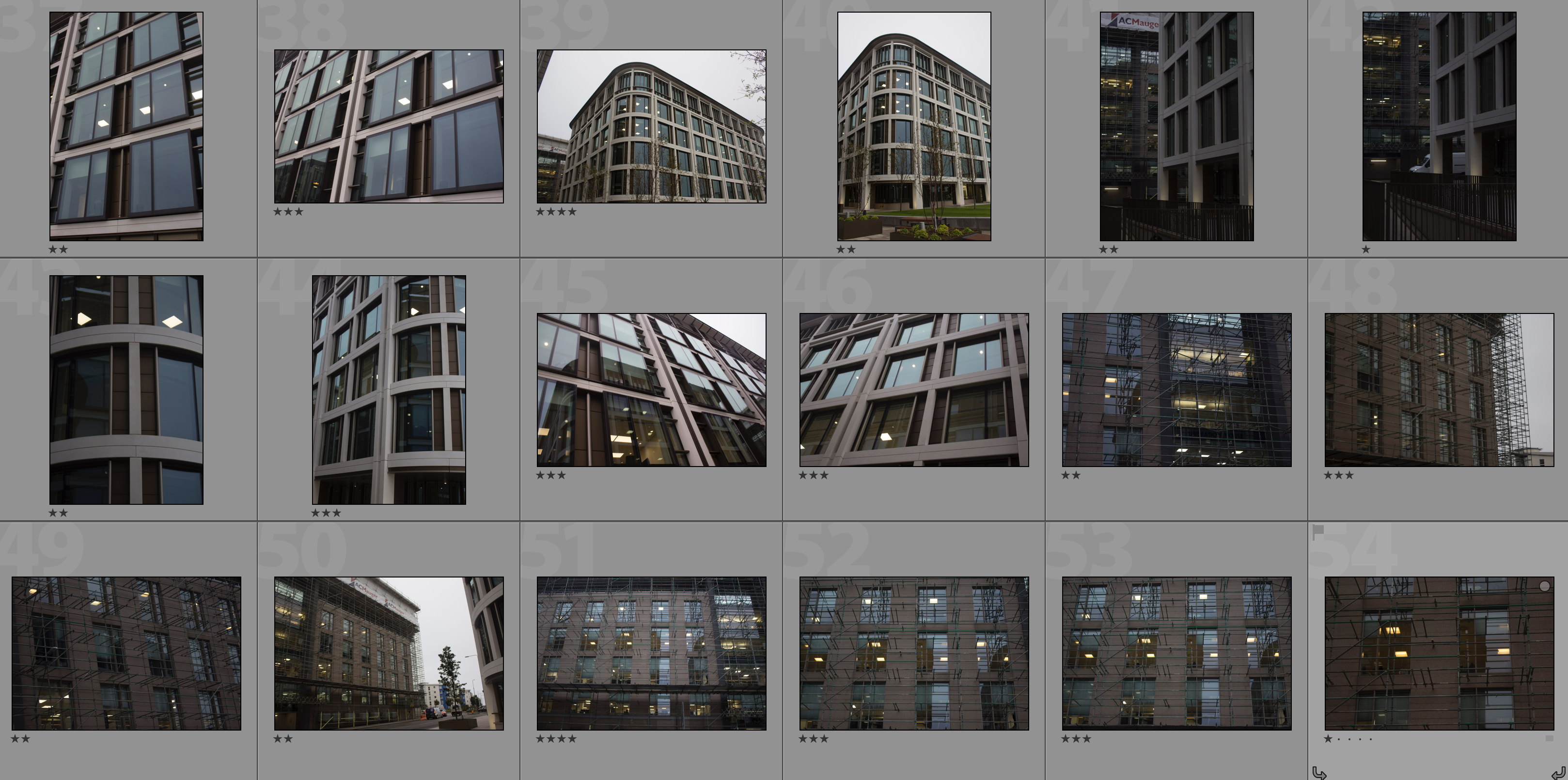
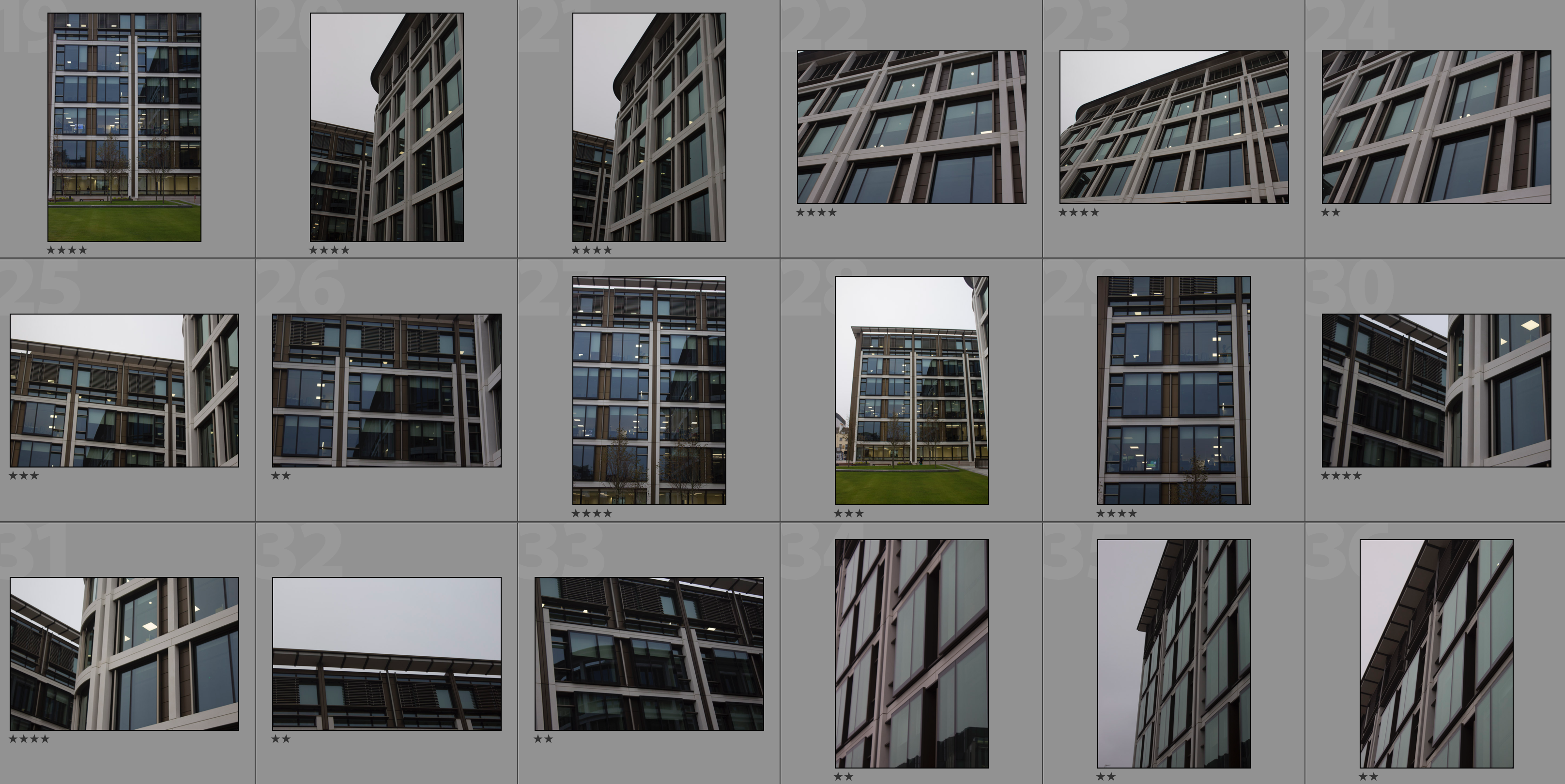
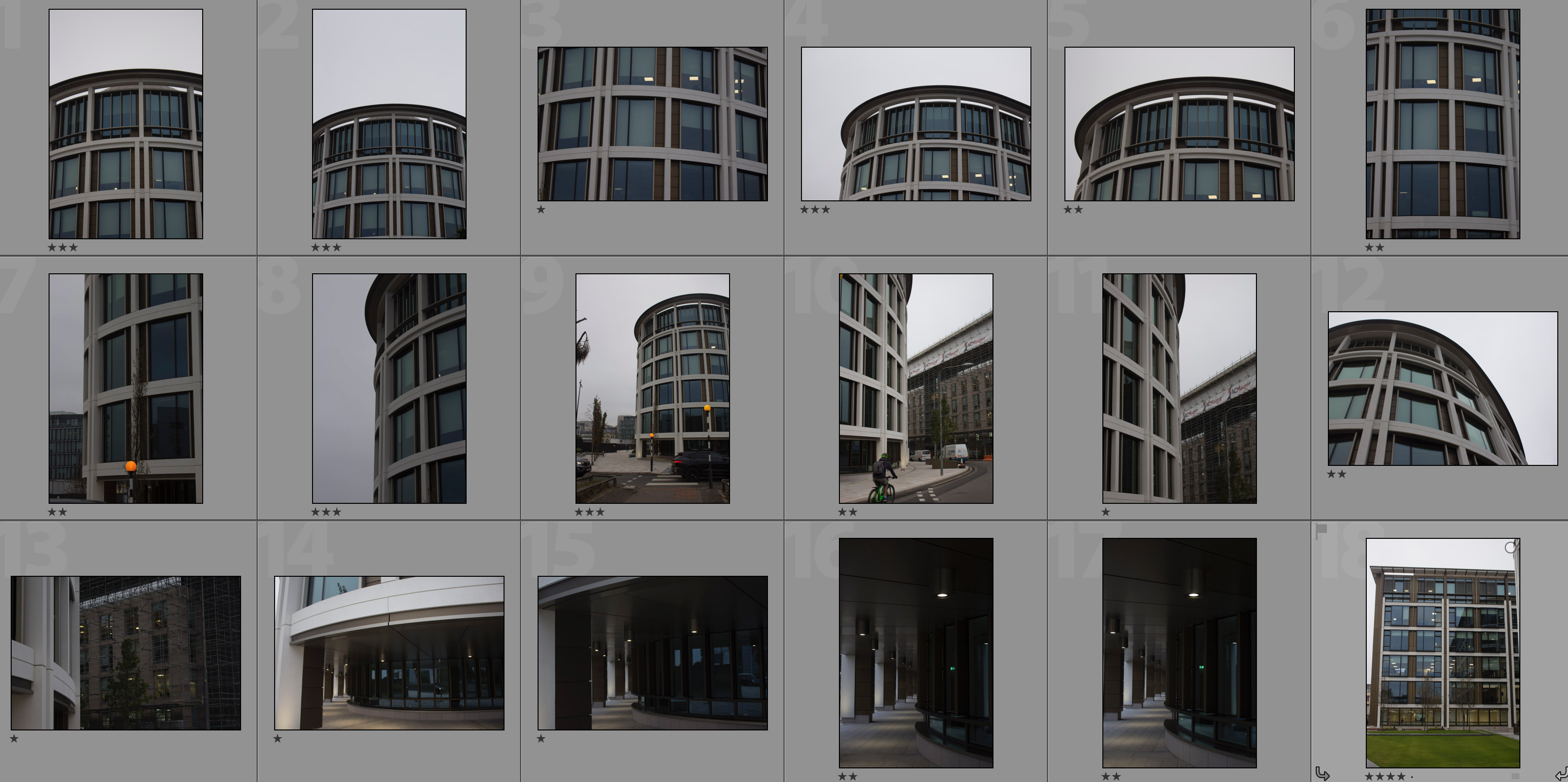
In my response to Lewis Bush I am going to be photographing the financial sector within St. Helier in both day and night and then creating a double exposure effect with these photographs in photoshop. The inspiration for photographing the financial sector comes from Bush’s ‘Trading Zones‘ and the use of double exposure comes from his project ‘Metropole‘ in which he used this technique throughout. I will be carrying out two photoshoots for this response – one in the daytime and one at nighttime. This will allow me to be able to work with a wide variety of photographs in order to create different effects and settings within the edits.
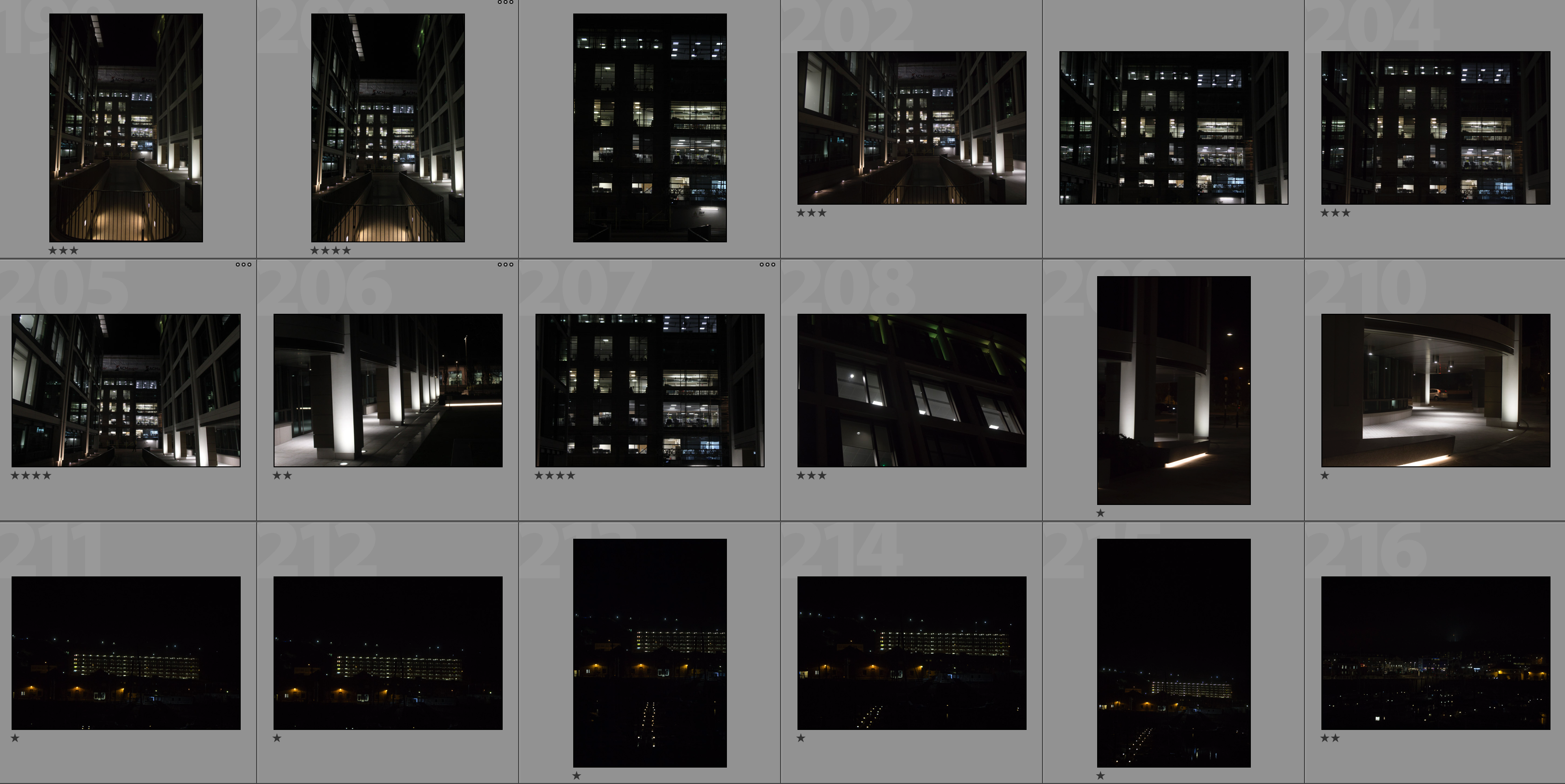
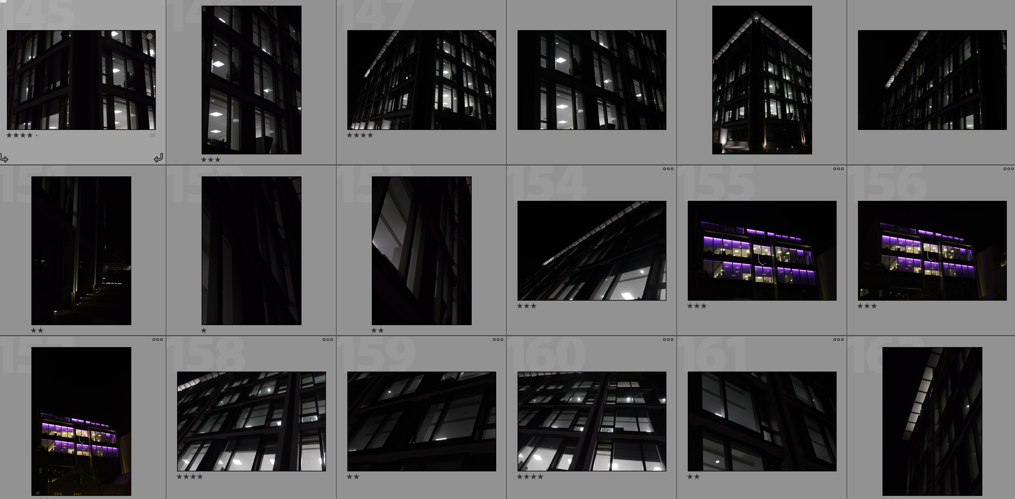
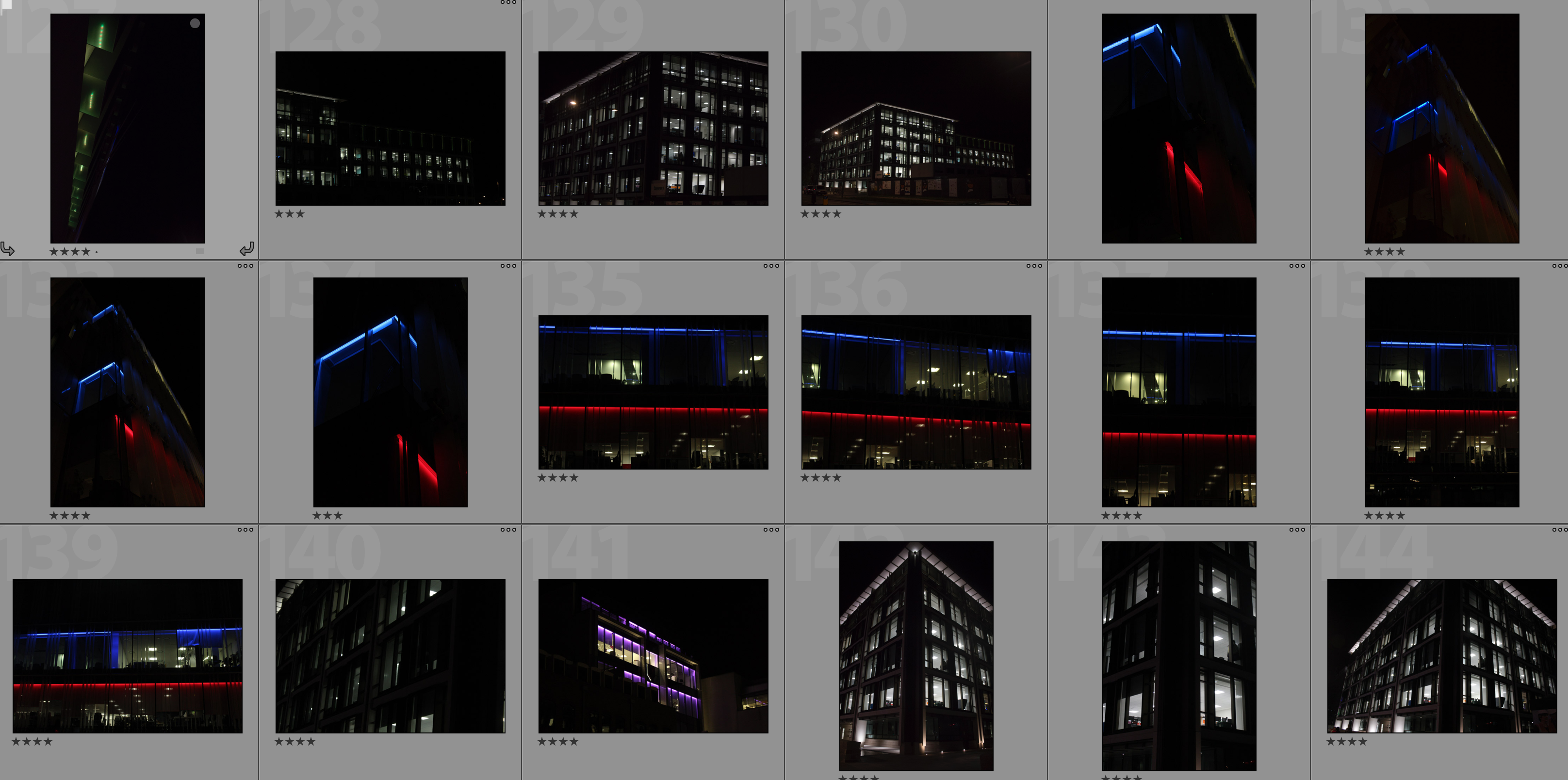
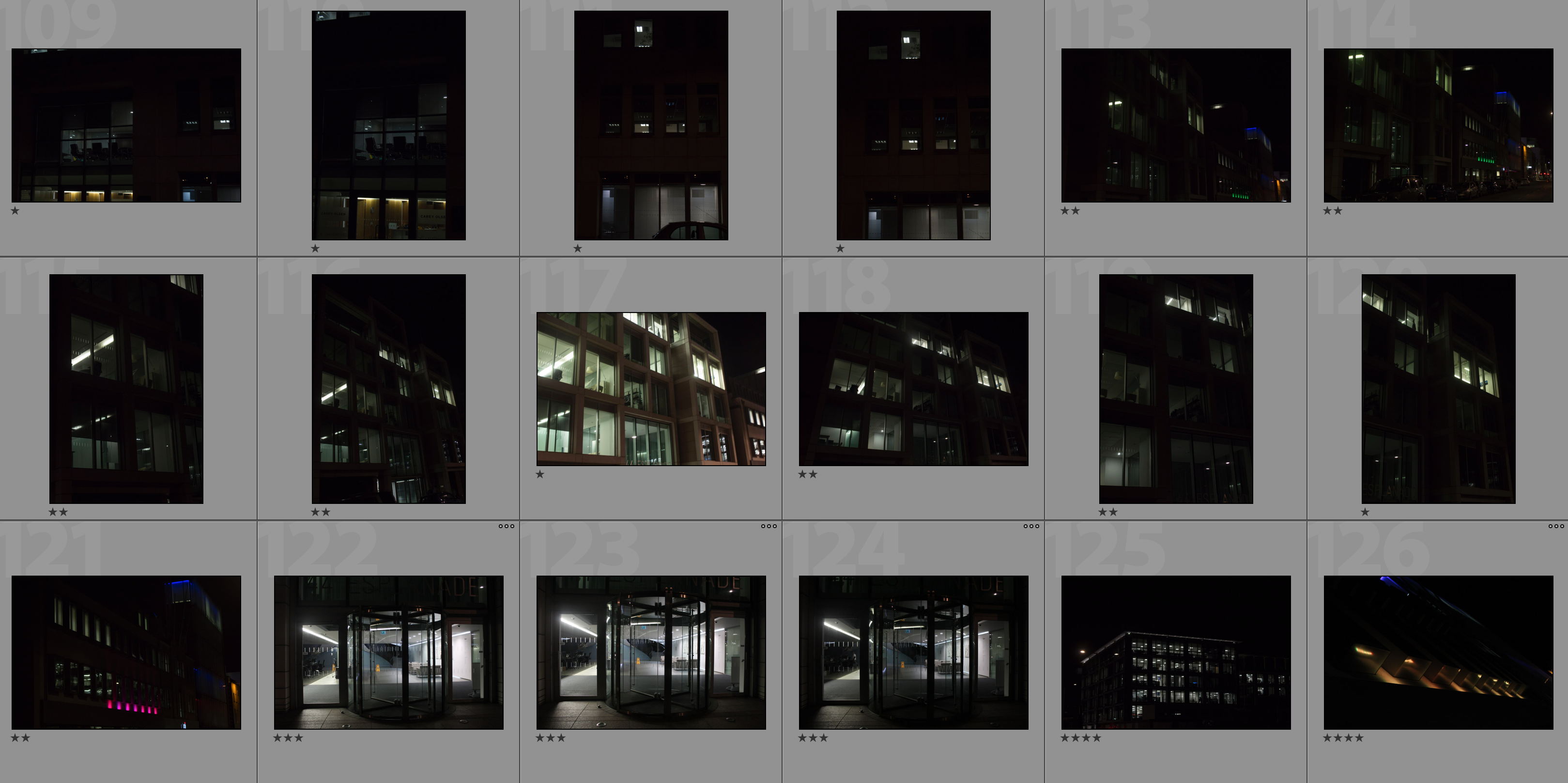
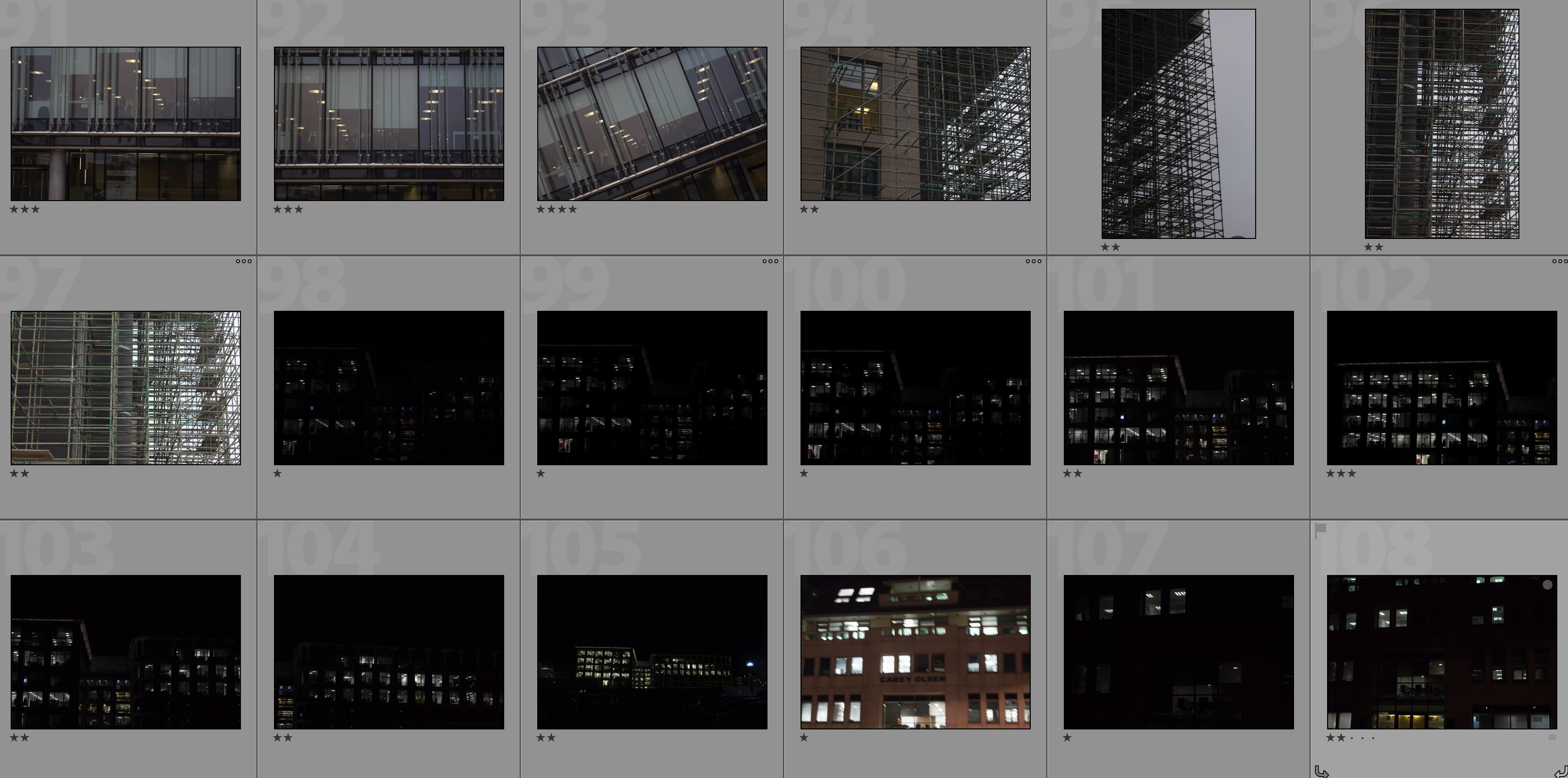
Contact Sheets

Editing Process

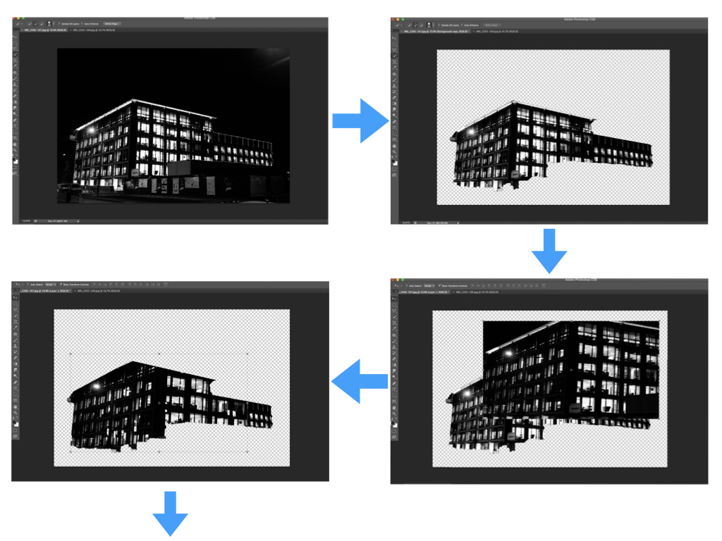
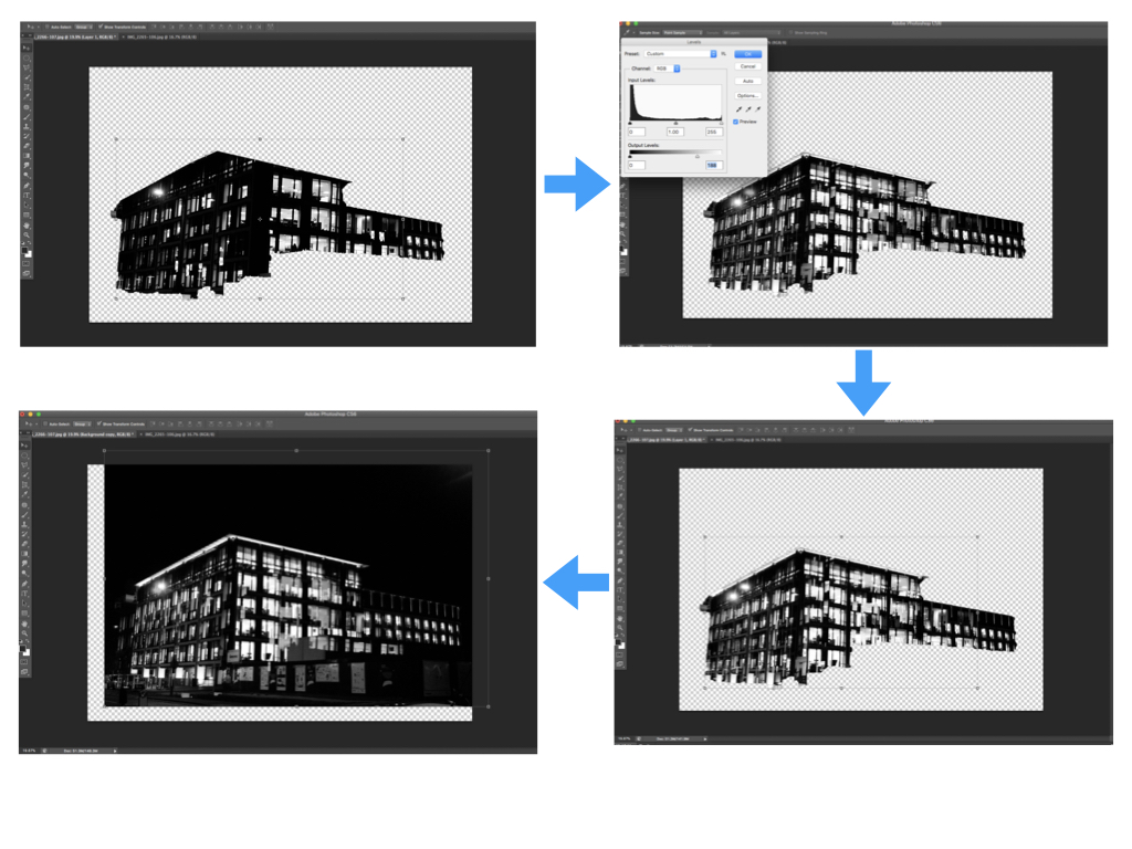
I carried out the double exposure editing on photoshop. I started by using the quick selection tool to separate the building from the rest of the photograph and clicked the ‘refine edge’ button to create a blank background. I then placed the second photograph over the base photograph and added a layer mask in order to shape the second photograph in line with the base photograph. After this I used command-L in order to edit the levels of the second photograph and so changing the black/white/grey properties. Next I selected the blending option as ‘lighten’ to allow the two photographs to merge. I repositioned the second photograph over the base photograph to create a double exposure effect then brought the background forward to reintroduce it to the composition. Finally I repeated this with multiple photographs to create a disorientating composition.

My Edits


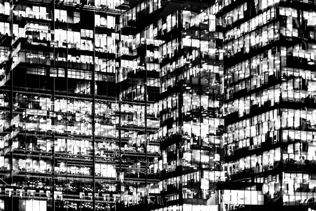
Analysis

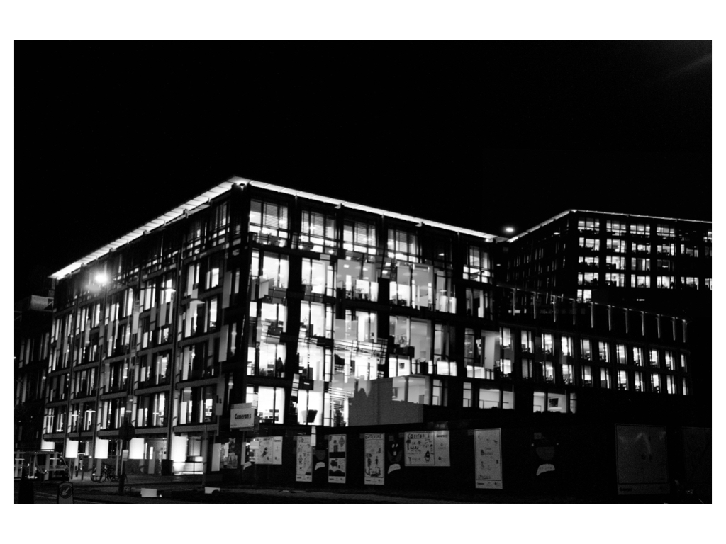
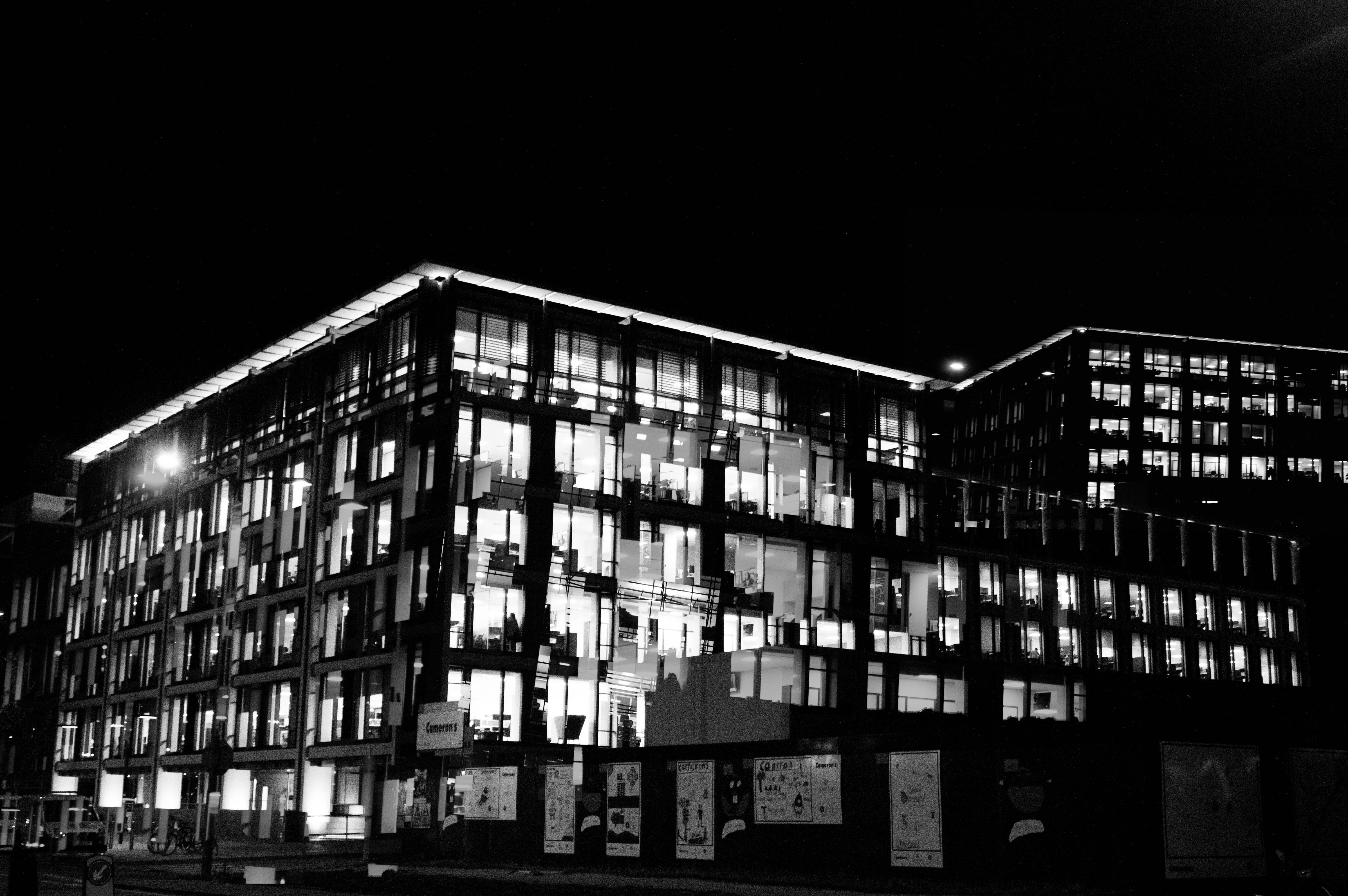
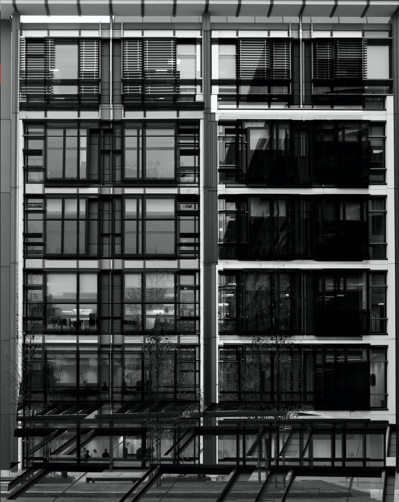
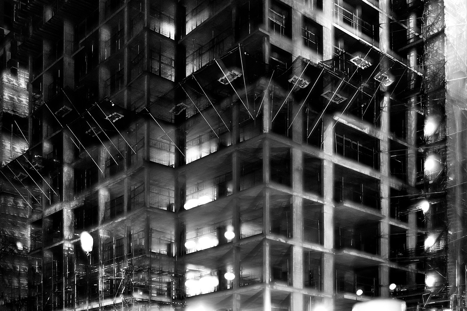
In this photograph I have used natural lighting in order to capture the natural shadows and contrast of the new finance centre in St. Helier.  This natural lighting allowed for reflections in all of the windows which creates a variety of tones throughout the composition. This variety of tones creates contrast between the dark black frames and the grey tones of the windows.  I used a deep depth of field to capture this photograph to ensure that every detail was in focus including the reflections in the windows.  By layering multiple photographs over the top of the original I have been able to create dark frames and dark shadows to contrast with the lighter tones – I think that this create a much more dramatic and slightly abstract photograph. I used a shutter speed of 1/60 to capture the original photograph along with a fairly low ISO of 200 in order to ensure that the photograph is exposed enough but is as high quality as possible. This high quality photograph allowed for the similar photographs overlayed on top to blend in well to provide more contrast and structure to the photograph.

There is no colour in this photograph as I thought that the black and white filter really allowed the black dark tones to come out to provide more contrast and shadows within the photograph. The lack of colour also allows the viewer to focus on the dark lines and paths running throughout the composition and so emphasising the disorientating intent of the photograph. The tones throughout this photograph are mostly gray with streaks of black running throughout it – there are not many bright tones in this photograph which I think works well as the grey and black tones allow the original photograph and the photographs on top to blend well together to create a photograph that is familiar to someone from Jersey but unfamiliar at the same time. From the way that I have cropped this photograph using perspective crop it is a very 2D and flat photograph except for the photograph overlayed in the bottom third of the photograph. This bottom third of the photograph appears to come towards the viewer which sends the rest of the photograph to the back, ultimately creating a sense of confusion within the viewer. The windows and lines throughout the photograph are very aesthetically pleasing as they create a pattern of squares and lines, making the photograph more intriguing. There is no immediate viewpoint that they eye is led to due to the abstractness and pattern throughout the photograph. The line straight down the middle of the photograph creates a sense of division within the composition as well as a sense of satisfaction due to the organisation of the placement.

I took inspiration for this photograph from Lewis Bush’s project ‘Metropole‘ in which he looked at the collapse of the British Empire and how in its place globalised capitalism grew as London has been rebranded as “a city of demolition, cranes, and glittering new high rises”.  ‘Metropole’ aims to record the effect of this on London through the form of documentary photography and I aim to show the effect of how Jersey has changed with the construction of the new financial centre and all the new flats and other offices within the area. St. Helier has changed drastically over the past couple decades and it may seem as if it is moving too fast for some of the residents that have lived through these stages. This photograph was taken as part of a shoot of the new financial centre, I took the original photograph and layered multiple photographs of the same centre over the top to create a disorientating effect.

I have attempted to recreate the double exposure that Bush used in his ‘Metropole‘ project in order to convey the idea that as the financial centre grows and as construction within the area goes on at the rate it is, the people of St. Helier are becoming more lost and disorientated as this is no longer the St. Helier that they’ve lived in for all of these years.  Bush used this effect in order to create the “sense of loss that many Londoners feel” in the big city. This theme of a feeling of loss within the city links to the genre of ‘political landscape’ as it looks at both the present and past in St. Helier showing how it has changed and how the residents of St. Helier are feeling about it all.  I think that the government of Jersey is focusing too much on construction and not what would really benefit and satisfy the people of Jersey.

Political Landscape – Lewis Bush

Lewis Bush (born 1988 in London) is a British photographer, writer, curator and educator.  Bush studied history at the University of Warwick and gained a master’s degree in documentary photography from London College of Communication, where he lectures on photojournalism and documentary photography.  In his work bush seeks to draw attention to forms of invisible power that operate in the world – such as finance.  Bush has the standpoint that ‘power is always problematic because it’s natural resting state is arbitrary and untransparent’.  Bush’s projects tend to incorporate writing and he has written about photography for a range of national and international print and web titles.
In Bush’s ‘The Memory of History‘ from 2012, he travelling through a range of European countries to document the way in which the past was being politically manipulated in the context of the economic crisis and recession.  This project links to the theme ‘political landscapes’ as it shows how the invisible power of politics is used and abused in different places over time.

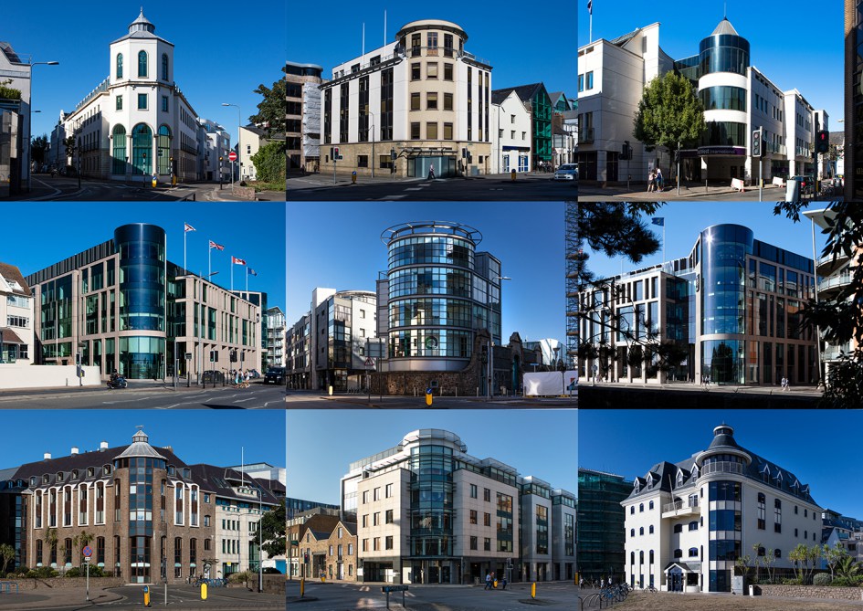
Bush is a photographer in residence at the Societe Jersiaise in Jersey where he is working on his project ‘Trading Zones‘ in  which he looks at the international finance industry.  It looks at the global economic crisis that began ten years ago and the resulting financial sector. Finance has been very unrepresented in documentaries due to its complexity and stature meaning that there is plenty of potential for investigation for documentary photographers such as Bush.  The project ‘Trading Zones’ is a result of six months spent as the 2018 Archisle photographer in residence at the Societe Jersiaise in Jersey, which is currently undergoing huge renovations in the financial sector.  Bush says he has used this time to “establish the foundations of what I anticipate will be a long term photographic inquiry into the financial services industry” as the project comes under documentary photography so this project will be ongoing over a long period of time.  Bush says in an interview with ASX “Finance here is the accidental product of events going back almost a thousand years, but is it also the result of very intentional choices made over the last half century” which links back to political landscape in the sense that trends and features change over time but often loop back around.  There are multiple methods of approach taken to this project by Bush – ‘Trading zones’ has inspiration stemming from different areas such as:

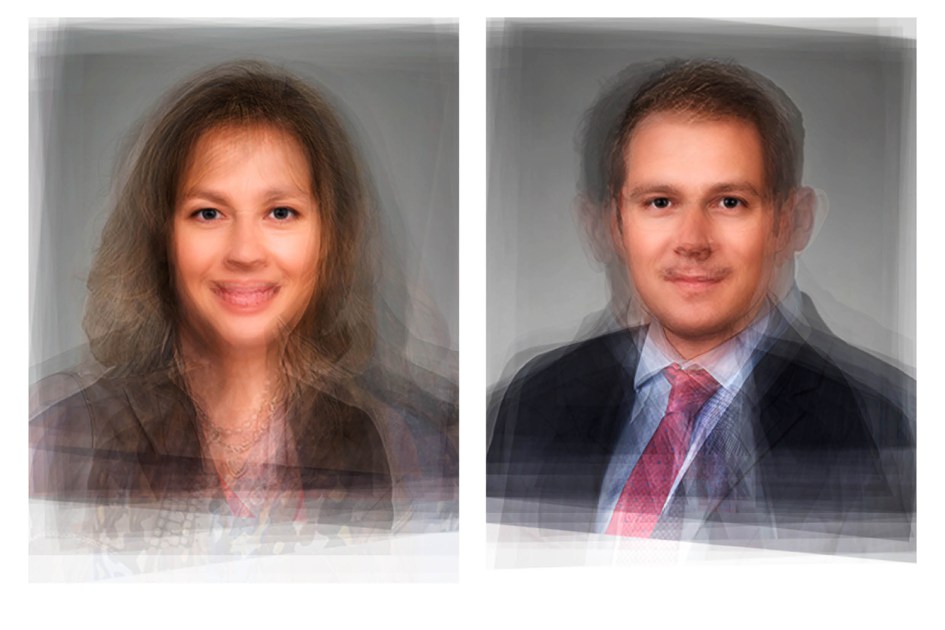
  • Portraits using a technique called ‘composite portraiture‘ developed by cousin of Charles Darwin, Francis Galton, who was an anthropologist.
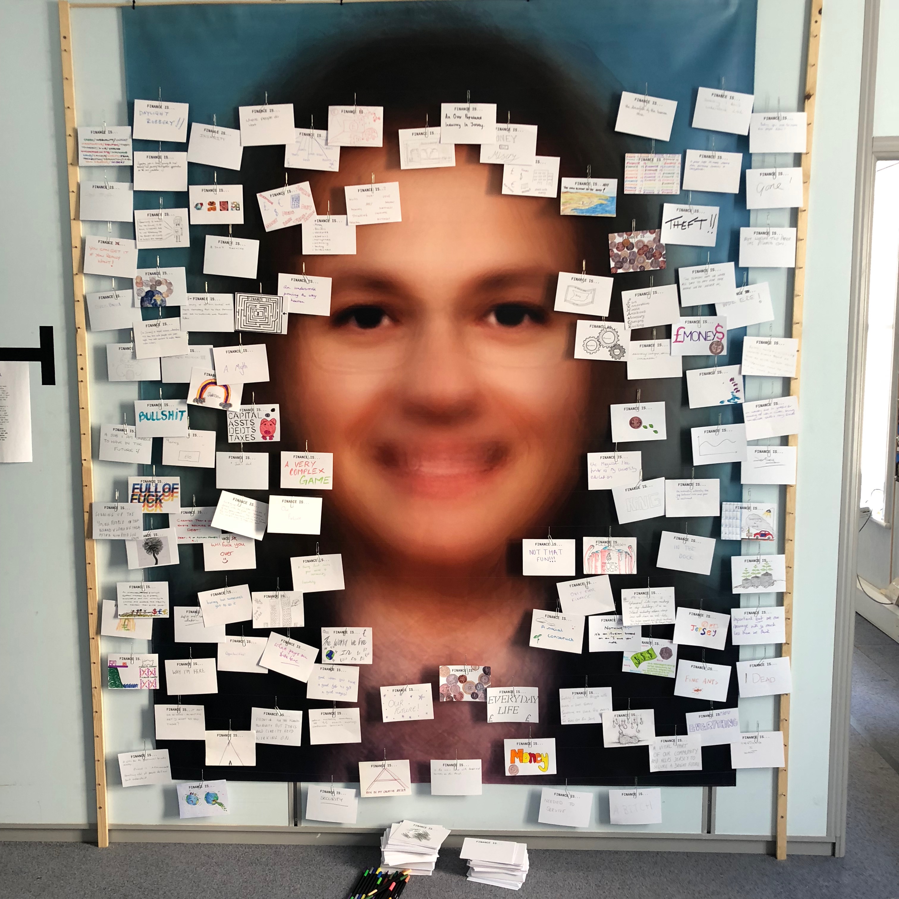
    • Bush merged hundreds of corporate portraits from a variety of countries specialising in different aspects of finance, resulting it what the average finance worker may look like.
  • Cards asking what the public thought of finance which drew inspiration from a project by EJ Major, who sent out cards asking ‘what love is’, expecting people to respond in whichever way they felt appropriate.

Bush’s residency finishes with an exhibition of ‘Trading Zones’ in the St. Helier Old Police Station where financial investigations unit of Jersey Police was based. This project is currently a work in progress and is continuously looking for future financial collaborators in order to develop this project further.

Analysis

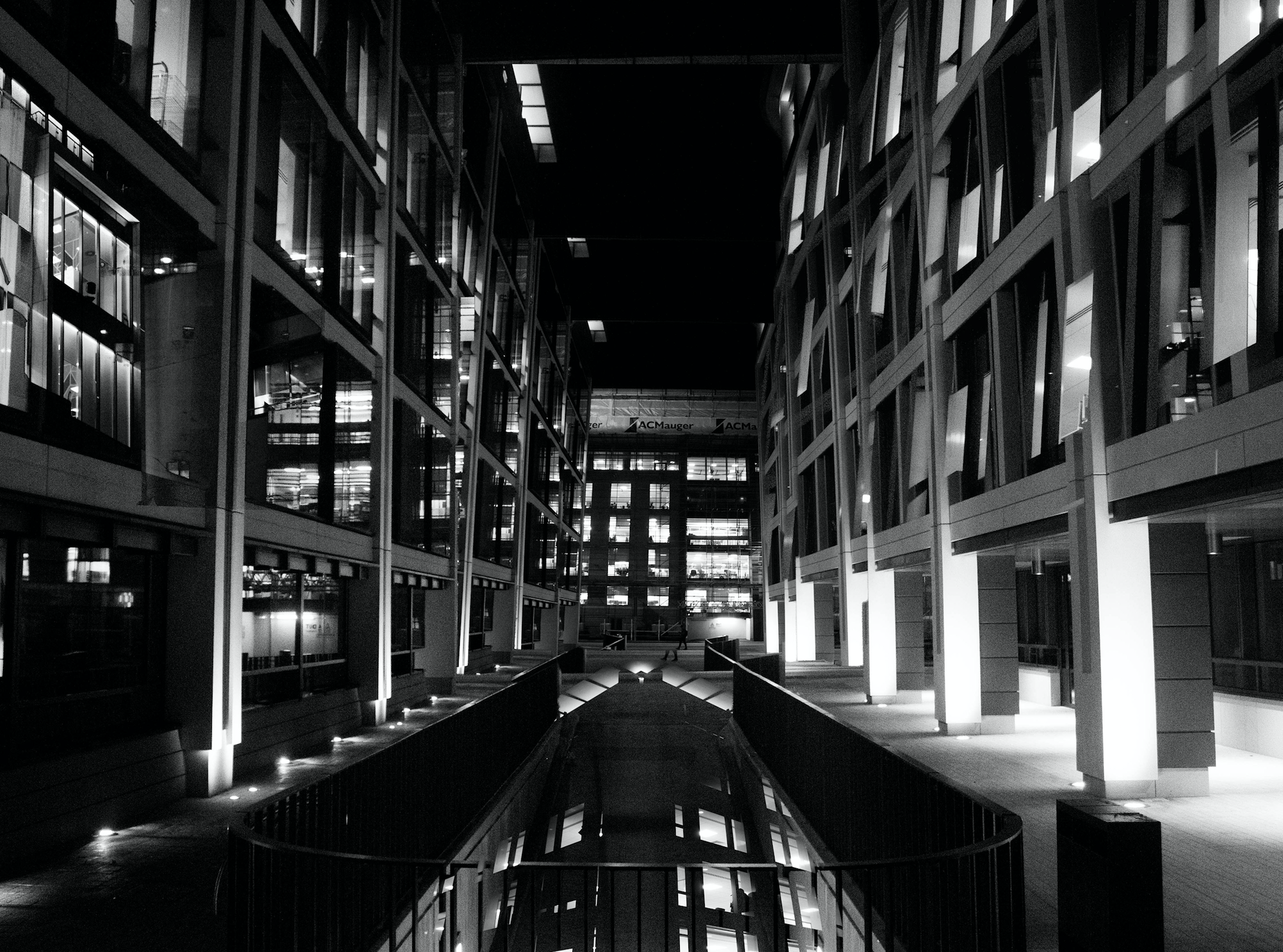
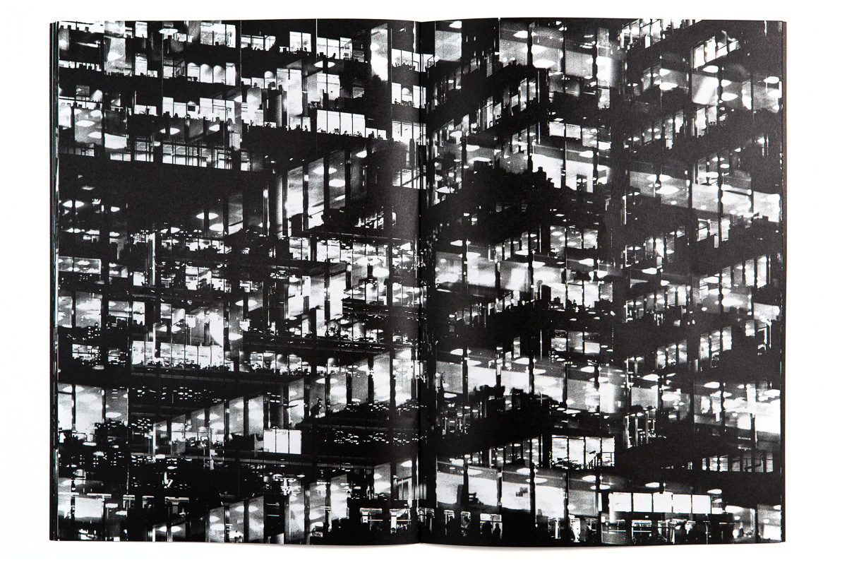
In this photograph it appears that lighting from within the inside of the building was used in what is possible night photograph. The use of this light is used to Bush’s advantage advantage as he uses double exposures to layer building over building creating a disorientating viewing along with contrast between the over-exposed lights and the dark shadows within the building. There is a wide tonal range within the photograph thanks to the range of shadows and lights within the photograph – this wide tonal range makes the photograph interesting in whichever segment the viewer looks as it creates intricate shapes and shadows throughout.  The lights and shapes are very intense as the viewer has to try piece the photograph together in order to understand it. It is unclear whether a short or deep depth of field will have been used in this photograph due to the disorientating nature of it – this adds to the mysterious elements of the photograph. A fairly slow shutter speed will have been used along with a low ISO in order for enough of the light to enter the lens from the dark environment whilst keeping the quality of the photograph as high as possible.

There is no colour in this photograph – only black and white along with the shades in between. This black and white approach to the photograph is very effective as it allows you to focus on the structure of the photograph and the buildings rather than being distracted by colours. The black and white effect also adds to the disorientating effect of the double exposure technique. Another addition that the black and white effect brings to the photograph is more contrast between the tones – especially between the bright white lights and the black shadows. The bright lights may be representative of a light at the end of the tunnel due to their glow in comparison to their environment. The photograph seems to have the texture of a graphite drawing which creates a really interesting viewing as what the viewer is seeing seems almost surreal. There is quite a 3D effect to the photograph due to the blending of photographs in order to create platforms coming out towards the viewer from the building. This 3D effect is complimented by the wide range of tones within the photograph. There are two points in the photograph to which the eye is initially drawn – these are the bright heaven-like lights and the platforms extending from the buildings – this is due to the lights contrasting in tone to the rest of the photograph and the platforms providing different shapes to the rest of the image. The platforms are also placed along the higher horizontal line of the rule of thirds meaning they add aesthetic to the photograph.

This photograph was taken from Bush’s project titled ‘Metropole‘.  This project looked at the collapse of the British Empire and how in its place globalised capitalism grew. London has been rebranded from “an investment opportunity” to “a city of demolition, cranes, and glittering new high rises”.  ‘Metropole’ aims to record the effect of this on London through the form of documentary photography. The project is titled ‘Metropole’ as London was once known as the Metropole meaning it was the mother city at the centre of a vast empire. These photographs were produced “during numerous winter night walks through the city”.

On Bush’s website he says that he used double exposure to create “increasingly disorientating and threatening as the series progresses” in order to create the “sense of loss that many Londoners feel” in the big city. This theme of a feeling of loss within the city links to the genre of ‘political landscape’ as it looks at the past of London and how it has changed – possibly for the worse. Bush continues this theme in his work on ‘Trading Zones’ in which he studies the Jersey financial sector. I think that through this exploration of disorientation and change Bush is trying to show that people often feel that the world is moving too fast for its own good as people get lost in temporary trends and patterns of life.

Essay 1: Lewis Bush vs Clare Rae x Claude Cahun

By the end of Week 4 you will all have visited and Trading Zones (Lewis Bush) and Entre Nous (Clare Rae x Claude Cahun).

Lewis Bush Generic Finance Workers


Lewis Bush Map
Clare Rae, La Pinacle No. 2

Week 6-7 : 10 – 17 Oct > Inspirations Lewis Bush vs Clare Rae

AO1 DEVELOP IDEAS: RESEARCH > ANALYSIS

Mini essay:  Write 1000 words with illustrations and references

Essay question: In what way can the work of Lewis Bush and Clare Rae both be considered political?

In order for you to write a critical essay you must adopt this methodology:

  • Visit both exhibition and make notes on initial thoughts, what do you like/ dislike, consider how their work are exploring Political Landscapes in different ways.
  • Document installation with your phone and select specific images  that interest you for further research and analysis.
  • Use these images to illustrate your essay.
  • Make sure you caption images, artist name, title, year, medium, size etc
  • Look up influences for their own work, historical / political / artistic context
  • Consider how their work is made within genres of documentary and tableaux approaches ie. observed vs staged.
  • Find at least 3 different sources and read the the texts below for a broader context.
  • Incorporate quotes and comments from artist themselves or others (art critics, art historians, curators, writers, journalists etc) using a variety of sources (at least 3) such as Youtube, online articles, reviews, texts, books
  • Make sure you reference sources and embed links to the above sources in your blog post using Harvard System of Referencing

See this PDF for help with referencing: harvard sysytem of referencing

PHOTO-ASSIGNMENT 3:  Make a response to either Lewis Bush or Clare Rae and evaluate.

EXTENSION: Make a response to both photographers and evaluate.

DEADLINE:  Mon 5 Nov -this is a homework task that must be completed outside of lesson time. Upload essay with illustration on the blog

Helpful sources and guidelines

Here is a recent interview with Lewis Bush in online photography magazine ASX where talks about his creative process, method of working including general thoughts on the nature of photography

If you get blocked when you click on the hyperlink above, read article here as a pdf Lewis_Bush_article_ASX_v2

Links to his website and blog Dispothic – about visual culture with a particular emphasis on photography in all its many forms, from the mass vision of smartphones to the algorithmic vision of internet search engine.

Here are images of Lewis’ text from his exhibition Trading Zones in Jersey

Here is a recent photo-essay by Clare titled; A Photographic History in Jersey’s Rock Faces where she talks about her work produced in Jersey.

Link to her website and exhibition at the Centre for Contemporary Photography (CCP) in Melbourne, Australia and a link to her book Never Standing on Two Feet accompagnying her work

Consider how Claude Cahun’s work has influenced Clare Rae.
Consider how the following two statements may have had an impact on the work of Claude Cahun / Clare Rae

  1. In the public sphere, women must assume sufficient power to change the cultural imagery and the political landscape.
  2. Women, who had previously been barred from participating in elections, changed the political landscape by becoming voters.

Click on this blogpost: PHOTOGRAPHY, PERFORMANCE AND THE BODY for more in depth investigation of Clare Rae’s work in relation to Claude Cahun and artists exploring issues of gender representation in photography and feminist theory around  self-portraiture and male vs female gaze,

DOCUMENTARY vs TABLEAUX

Two texts by David Bate from his book Art Photography (2015), Tate Publishing on documentary practice and tableaux photography. Read these to get an historical and contemporary overview of both genres

David_Bate_The_Art_of_the_Document

David_Bate_The_Pictorial_Turn

ESSAY PLAN > STRUCTURE

Make an essay plan that lists what you are going to write about in each paragraph. Here is a link to an essay structure.

  • Essay question:
  • Opening quote
  • Introduction (125 words): What is your essay question? Which artists will you be analysing and why? What are you trying to prove/ disprove?
  • Pg 1 (250 words): Analyse Lewis Bush in relation to your essay question. Provide any historical or theoretical context within art, photography and visual culture relevant to the artists work. Select a key image and use as an example to illustrate your point of view.
  • Pg 2 (250 words): Analyse Clare Rae in relation to your essay question. Provide any historical or theoretical context within art, photography and visual culture relevant to the artists work. Select a key image and use as an example to illustrate your point of view.
  • Conclusion (125 words): Draw parallels, explore differences/ similarities between both artists. Bring a conclusion to essay question.
  • Bibliography: List all relevant sources used

QUOTE > REFERENCING > ACADEMIC SOURCES

  • Research and identify 3 literary sources from a variety of media such as books, journal/magazines, internet, video (Youtube).
  • Begin to read essay, texts and interviews with your chosen artists as well as commentary from critics, historians and others.
  • It’s important that you show evidence of reading and draw upon different pints of view – not only your own.
  • Take notes when you’re reading…key words, concepts, passages
  • Write down page number, author, year, title, publisher, place of publication so you can list source in a bibliography
  • Use quotes to support or disprove your argument
  • Use quotes to show evidence of reading
  • Use Harvard System of Referencing
  • See Powerpoint: harvard system of referencing for further details on how to use it.

Critical image analysis

https://www.photopedagogy.com/photo-literacy.html

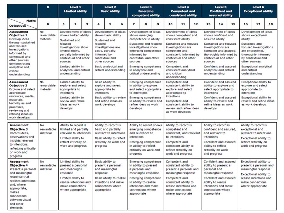
Refer to the marking criteria and pay careful attention to Assessment Objective 1…

  • show critical awareness
  • show contextual understanding


Political Landscape – Fernando Maselli

Fernando Maselli was born in Buenos Aires in 1978. He studied Fine Arts and moved to Madrid where he worked for major advertising agencies, shooting professional assignments for brands such as Coca Cola. This work won Maselli numerous awares at festivals such as Cannes.

In his current project ‘Artificial Infinite‘, Maselli appropriates the concept of the sublime through natures effects on the mind to develop his own investigation using elements like the vastness, the darkness and the hugeness of nature, but especially an attribute called artificial infinite: an element that is repeated many times in a constant and uninterrupted configuration generates in the viewer a sense of infinity. I think that the way that Maselli presents his work is very interesting due to the ways he cuts pictures up and puts them back together to create a collage style photograph but due to the gentle subject that is the nature he photographs I think that it could be more aesthetically pleasing without the photo manipulation.

Maselli spends several days in the mountains, taking pictures and later, in his studio, he rebuilds different parts of the landscape into a new landscape,trying to get, through the repetition of these images, the artificial infinite effect.

Guillaume Bression and Carlos Ayesta and Fernando Maselli have a common link in their approaches throughout their photographs as they intend to capture and document what the world is like in places that ordinary people wouldn’t visit without a strong purpose. Both of their photographs contain elements of staging in them as Guillaume Bression and Carlos Ayesta may place subjects to make photographs more intriguing and Fernando Maselli rearranges photographs in his studio to create the setting that he wants.

A contrasting feature in the works of Guillaume Bression and Carlos Ayesta and Fernando Maselli is that Maselli focuses on settings untouched by humans in order to show the aesthetically pleasing sublime of nature, wheres Bression and Ayesta look at the destruction of a man-made city.

I think that the purpose of this project is to show how aesthetically pleasing nature is when it is left alone – and still can be aesthetically pleasing if humans treat it with care, as Maselli has done through carefully creating a collage of photographs.

Maselli has a statement on his website explaining further his interest in photography and the style in which he enjoys working.

Analysis

The below photograph uses the natural lighting of the mountainous landscape along with a deep depth of field to create a photograph that shows the different layers within the natural landscape. Maselli creates a photograph that demonstrates high contrast in the lower half and low contrast in the upper half due to the fog and weathering of the setting. There is quite a large tonal range within the photograph ranging from the dark shadows within the mountain faces to the white blankets of snow on top of the mountains. A shutter speed of 1/60-1/150 will have been used in this photograph along with a low ISO in order to keep the photograph as high quality as possible whilst allowing plenty of light to enter the camera lens.

There is no colour in this photograph – only black and white. Whilst this black and white helps to create contrast and shadows within this photograph I feel that it makes the photograph slightly bleak with no area of the photograph standing out as a main viewpoint. The difference between the light tone in the upper half and the dark tone in the lower half creates an feeling of how extreme the weather is in the mountains. There is not much of a 3D effect in the photograph due to their not being any subject in the foreground – which it feels like there should be. The eye is led to the bottom of the mountains where it looks like there should be a viewpoint but there is only more snow.

Maselli took this photograph as part of spending several days in the mountains, taking pictures and later, in his studio, rebuilding different parts of the landscape into a new landscape,trying to get, through the repetition of these images, the artificial infinite effect.  The natural sublime has been a part of the arts through literature such as in Frankenstein for a long time and it representative of peace and tranquility.

I think that through these photographs Maselli is trying to convey the fact that there is so much of the world that most humans’ will hardly see or experience and that these hidden parts of the world are better off because of the absence of human intervention. This links to political landscape as Maselli is showing and contrasting how different landscapes really are without humans building on them and altering on them to meet some of their selfish wants.


Political Landscape – Guillaume Bression and Carlos Ayesta

Since the tsunami and the nuclear catastrophe of March 2011, Carlos Ayesta and Guillaume Bression have made regular visits to the region of Fukushima, Japan, and especially to the “no man’s land” around the stricken power station. Their visits mix posed situations along with a documentary approach. The title of this project is ‘Retracing Our Steps‘. I think that the street photography/documentary photography style that has been introduced in these photographs make the photographs more interesting as they appear to come from the view of an average person. An interesting point of view would be to see more dramatic photography approaches as this area is unseen by many so to explore it in multiple ways could be successful.

Guillaume Bression and Carlos Ayesta and Fernando Maselli have a common link in their approaches throughout their photographs as they intend to capture and document what the world is like in places that ordinary people wouldn’t visit without a strong purpose. Both of their photographs contain elements of staging in them as Guillaume Bression and Carlos Ayesta may place subjects to make photographs more intriguing and Fernando Maselli rearranges photographs in his studio to create the setting that he wants.

A contrasting feature in the works of Guillaume Bression and Carlos Ayesta and Fernando Maselli is that Maselli focuses on settings untouched by humans in order to show the aesthetically pleasing sublime of nature, wheres Bression and Ayesta look at the destruction of a man-made city.
I think that the purpose of this project is to document the damage that can be done to a once over-populated city and how environments change without the presence of humans.

Analysis

The below photograph by Guillaume Bression and Carlos Ayesta uses the natural light of the evacuated ‘no-mans land’ to create shadows and contrast within the photograph. The shadows created by the frame of the windows replicate the Japanese text onto the walls creating a feeling of a natural average environment – which contrasts with the fact that this area has been abandoned. There is not a massive tonal range within the photograph but there are enough tones developing throughout the photograph such as the contrast between the light sky and the dark cafe. A short-medium depth of field appears to have been used in the photograph as the subject in the foreground is in focus but the forest in the distance is slightly out of focus. A fairly low shutter speed of 1/40-1/80 will have been used in this photograph along with a low-medium ISO as the cafe gives a dark environment with not much light so the lens needs to be open for more time in order to allow more light to enter.

This photograph is not overly colourful but the touches of colour that it uses is very effective, such as the red flag against the blue sky contrasting with the dark grey/brown of the cafe. The darkness of the cafe creates a contrast against the light outside which further pushes the image of a deserted cafe. There is quite a 3D effect of the photograph as the seats and the subject in the foreground create an immediate viewpoint for the eye as opposed to the deserted area in the background. The cropping of the photograph allows for the subject to be placed on the left vertical line in the rule of thirds which create a more aesthetically pleasing photograph from the viewer and tears the photograph slightly away from the documentary photography genre and more towards contemporary photography.

Carlos Ayesta and Guillaume Bression composed this photograph after making regular visits to the region of Fukushima, Japan, and especially to the “no man’s land” around the ruined power station. Their visits mix posed situations along with a documentary approach, which is clearly seen in this photograph as they document how quiet and deserted the area is whilst setting up as a posed photograph. This links to political landscape as it shows the artefacts that humans have left behind but it also shows how the land has become a quiet place left to nature. It looks at the impact of humans on landscapes and how they change it.

I think that the purpose of this photography is to show how quickly and dramatically urbanised areas around the world can develop in either a negative or positive way and how much land is left to be used/discovered. It primarily looks at how the humans that once populated this area have left everything exactly as they were with no signs of chaos shown.


WALKER EVANS

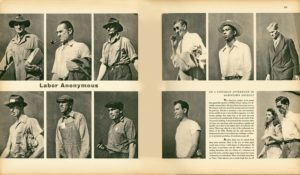
Walker Evans’ ‘Labor Anonymous’

These photos are from Walker Evans body of work titled ‘Labor Anonymous’. The way in which Evans has presented his photographs are similar to the genre of photography, typology. Typically, typology focuses on objects or buildings that can be placed into one category or represent similar shapes, rather than people. Evan’s has managed to achieve the aesthetic of typology by cropping each image to contain similar backgrounds and angling his camera from the same point; his waist.

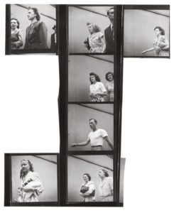
Evans had a night time job so he had freedom within the day to take photographs, using the natural light for most of pictures. Evans concealed his camera in his coat so he could take candid pictures of each person that past him, which managed to capture a particular essence from each individual. This was a technique that he used for many of his works as he said describing his Subway Portraits,  “The guard is down and the mask is off … even more than when in lone bedrooms (where there are mirrors). People’s faces are in naked repose down in the subway.” The same idea is used for ‘Labor Anonymous’.

This body of work reflects what I hope to achieve in my project for ‘The Future of St. Helier’. Evans has managed to capture an idea of what workers and people were like during his time by taking candid pictures of people simply walking to and from work. St. Helier holds many places of work and constantly has people walking to and from work and up and down it’s main street. In my last photo shoot I noticed that if I stayed in one place and took pictures of everyone that walked passed me, I wouldn’t have to go and find subjects to take pictures of. They simply walk past me, knowingly that I have a camera and I am actively shooting pictures. I’d like to dedicate a whole photo shoot to using this technique and hopefully capturing images of people in a moment of repose.


Walker Evans ‘Labor Anonymous’ contact sheet

J A Mortram

J A Mortram is a British social documentary photographer and writer. He is the photographer that produced the first zine in my previous post – the zine is from his ongoing project titled ‘Small Town Intertia’. Mortram records the lives of the disadvantaged and marginalised, making repeated visits with a number of people living within three miles of his home. The project tells stories of “isolation, poverty, drug abuse, homelesness, self-harm, mental illness, juvenile crime, and epilepsy”, that Mortram believes are otherwise under-reported.

I chose to study J A Mortram because he looks at individuals in the present tense but he also goes back and visits to see development and change, as we are doing in the ‘Future of St. Helier’ project.  His photographs appeal to me as they are very bold and look at sensitive subjects such as mental illness and drug abuse. The high contrast photographs all blend together well to create a strong collection of photographs.

Mood Board

Image result for J A mortram

Image result for J A mortram

Image result for J A mortram

Image result for J A mortram

Image result for J A mortram

Analysis

Image result for J A mortram

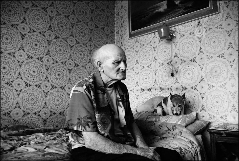
This photograph appears to use the dim natural lighting within the household in order to create a dark and contrasting atmosphere. This contrasting atmosphere creates some areas in the photograph where the subject is over-exposed such as the body of the man hugging the dog – this goes towards creating an even more dramatic feeling to the photograph. A short-medium depth of field seems to have been used as the photograph starts to fade out towards the edges – possibly due to the vignette effect. A quick shutter speed no slower than 1/60 appears to have been used as well due to the dark nature of the photograph, this dark nature may have further been emphasised by the use of a low ISO.

The photograph is also in black and white which creates an idea that there isn’t much happiness or positive energy in the subjects, it makes the setting seem very dark and draining. There is a very wide range of tones within the photograph as in parts it is nearly fully black where as in others it is bright white. There are many subjects in the photograph to lead the eye too but the initial subject that caught my eye was the table in the middle – possibly due to it being at the forefront of the photograph presenting the mess in the photograph. This gives the photograph a slightly 3D effect.

This photograph is from his zine titled ‘Diary Entries’ from his ongoing project ‘Small Town Intertia’ in which Mortram records the lives of the disadvantaged and marginalised, which can clearly be seen in this photograph as there is mess everywhere and it is obviously not a pleasant place to be living in.

I feel that Mortram is trying to shed some light on the disadvantaged and how they live by showing the rest of the world through his photographs and zines. Mortram says that these topics such as drug-abuse and homelessness are under-reported so this is his attempt to show people how privileged they are.

Image result for J A mortram

This photograph using natural lighting in order to convey the fact that this photograph is in the style of documentary street photography. The natural light ties in with the idea that these are just normal people living their lives and the photographs are not staged. It is quite a contrasting photograph in order to create a dark/glum atmosphere – which the setting in the background does itself. A deep depth of field has been used to take this photograph as the whole of the photograph is in focus. A quick shutter speed of around 1/60 will have been used to take this photograph due to the natural daylight. A low ISO has most likely been used here as the photograph is quite dark but not underexposed.

The photograph is also in black and white which shows how bleak and possibly hopeless the life of the subject it. There is a wide range of tones within the photograph due to the high contrast within it. The eye is lead straight away to the tattoos on the subjects back, which seem like a bad decision to most people and so further pushing the idea of what setting this is in. The photograph does not have many layers to it – only the man in the foreground and the walls in the background so there isn’t a major 3D effect within this photograph.

This photograph is another photograph from his ongoing project ‘Small Town Intertia’ in which Mortram records the lives of the disadvantaged and marginalised. Here Mortram shows someone that has made bad decisions and doesn’t seem to be in a pleasant setting to emphasise the idea that they are marginalised.

I feel that with this photograph Mortram is trying to show that everyone has their own unique properties and stories – he is emphasising that the marginalised and disadvantages are no different to the privileged in the sense that they make their own memories but in their own way.

LEWIS BUSH

Lewis K. Bush is a British photographer, writer, curator and educator. He aims “to draw attention to forms of invisible power that operate in the world”, believing that “power is always problematic” because it is inherently “arbitrary and untransparent”.

Lewis Bush – Metropole

These particular pieces are from his body of work ‘Metropole’. Bush has described it as ‘A composite of dozens of walks through the city of London, using it’s changing architecture as a metaphor for the city’s growing inequalities.’ Bush has used double exposure to layer buildings on buildings, which has created effects of disorientation in terms of scale, perspective and orientation.  ‘Metropole’ has a dark purpose behind resembling London, through its transformation into a ‘new empire’. His work is taken from the perspective of a citizen, comparing the new and progressing buildings and high rises with capitalism. He particularly relates to the idea of Globalized Capitalism, bringing forward concern of the new dominant ideology taking over western societies, thus the progression of threat that increases throughout his book.

At the beginning of this project, all students in the photography department met at The Societe Jersiaise. We listened to presentations about the master plan for the Future of St. Helier and the plans for construction. That was followed up by a presentation from Lewis Bush describing his work of ‘Metropole’ and its relation to the new construction of St. Helier. What I took away from his presentation was new ideas of editing and how I could make my project more interesting for me. I like the idea of cutting up images and layering them, and using double exposure to create something more abstract and unrecognizable. However, my project is based on exploring with people and community in St. Helier. I wold like to explore cutting up images of people and enhancing features of a person that describes more about an individual in a snapshot.

PERCIVAL DUNHAM

Two Boys With Their Toy Horse – Percival Dunham
Percival Dunham was Jersey's first photojournalist for a very brief period in 1913-1914. He worked for 'Jersey Illustrated Weekley' and then 'Morning News'. Percival Dunham's candid style of photography was well ahead of his time, long before the word had actually been coined. 
At the time this photograph was taken [early 20th century], photography wasn't a popular practice as it wasn't comfortably affordable or accessible for the general public and of course cameras were in their early stages of development. Producing a well taken photograph was more of a skill then than it is today as there is always an option for automatic adjustments on a camera, making it easy for anyone to take a photo and therefore making everyone a photographer. 
The image is a candid shot, taken just before the subjects would usually figure out what was going on and pose. But perhaps because of the time frame in which this image was taken, cameras weren't ordinary objects to see and therefore this explains the slight confused and blunt looks the two little boys exchange with the camera.  
The quality of the image can be forgiven due to the early stages of developing camera that was used and due to the age of the photograph itself. The image is a little overexposed which is expected on a sunny day. You could say this ruins the quality of the picture or it amplifies the feeling of warmth and sunshine in the scene on which the day this photograph was taken, almost adding an emotional sense when looking at the picture. As capturing reality was a task when a photographer can only produce an image in black and white, perhaps playing with exposure helped to draw out more emotion and feeling from a picture.
One could argue that this photograph is mundane due to the fact that the subjects are quite ordinary, doing ordinary things that little boys do -  no one would think to document this. However, I think 'ordinary' photographs help to unpick things that wouldn't usually be seen when walking past a scenario like this. A photograph freezes time and allows the viewer to take everything in from a scene, landscape or a person. 
Following my ideas of capturing the people that make up St. Helier, I would like to gather photographs that capture candid shots of individuals that help to identify personalities from facial expressions and clothes to proxemics.