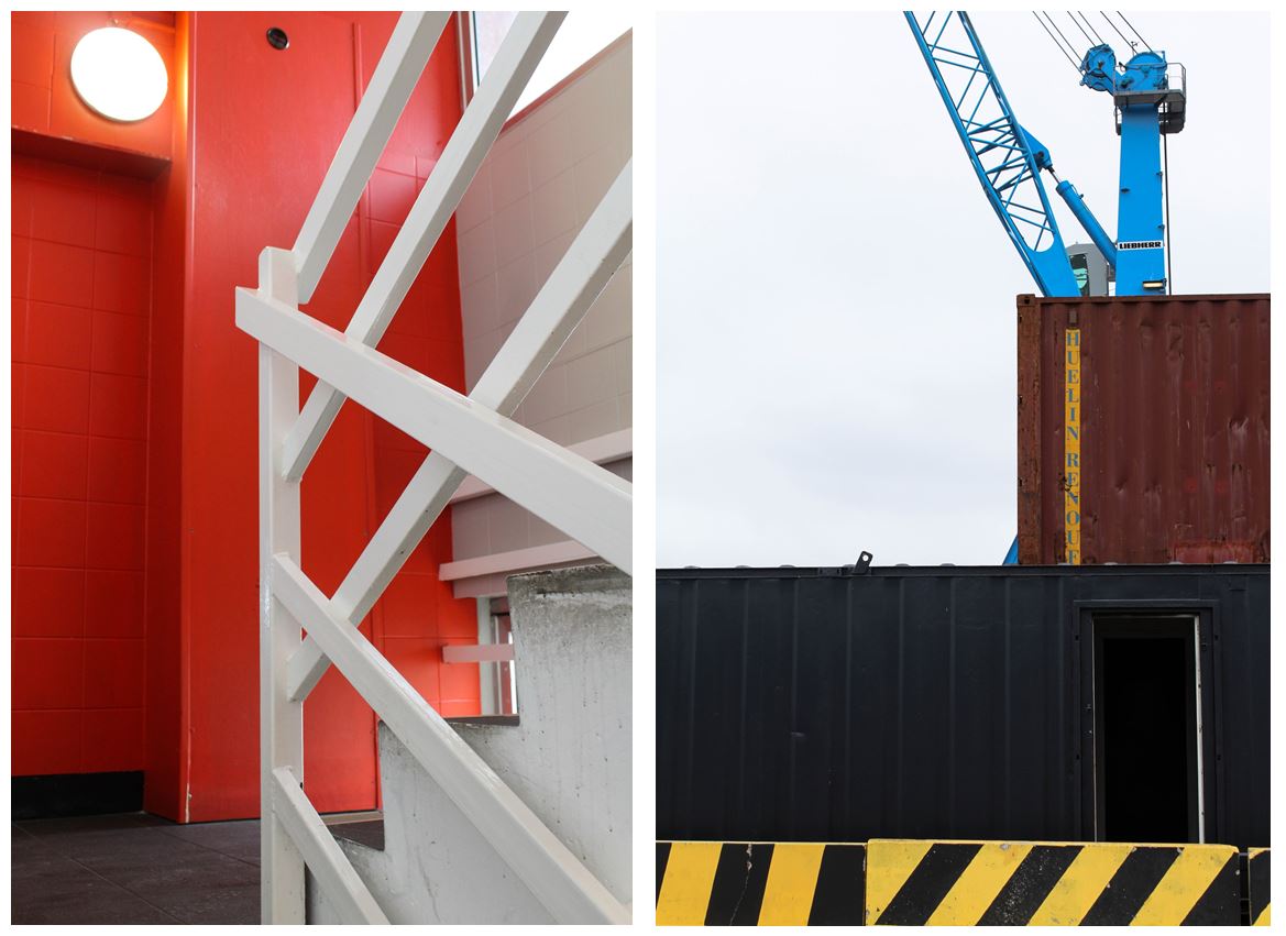
I took inspiration from Luke Fowlers ‘Two-Frame Films’ book. Fowler discusses how the idea of ‘in the blink of an eye’ has a different meaning for us as human beings than it does with the camera. When we blink and close our eyes, we are blind to the world in that instant. By printing two different images alongside one another, he aims to emphasise the momentary nature of a photograph.
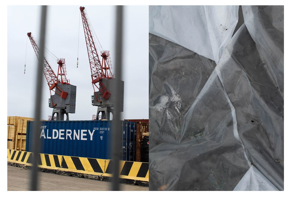
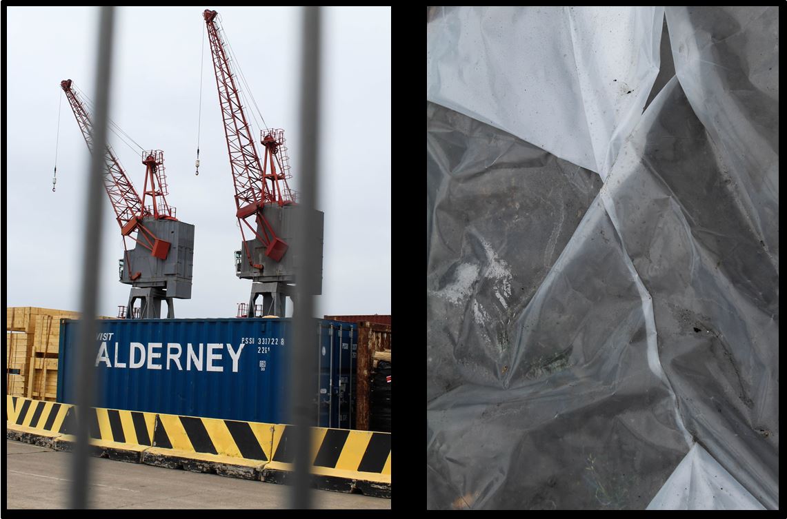
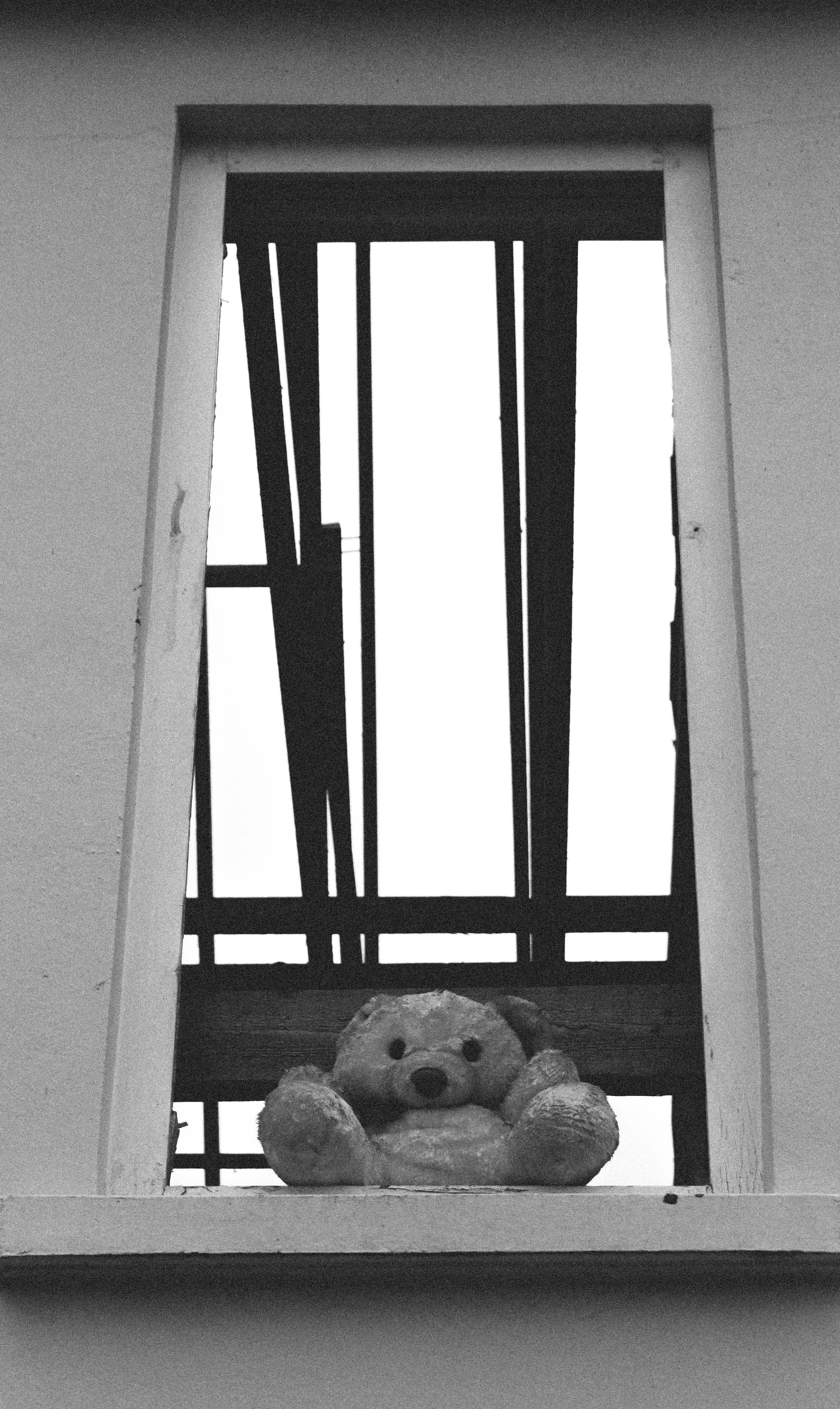
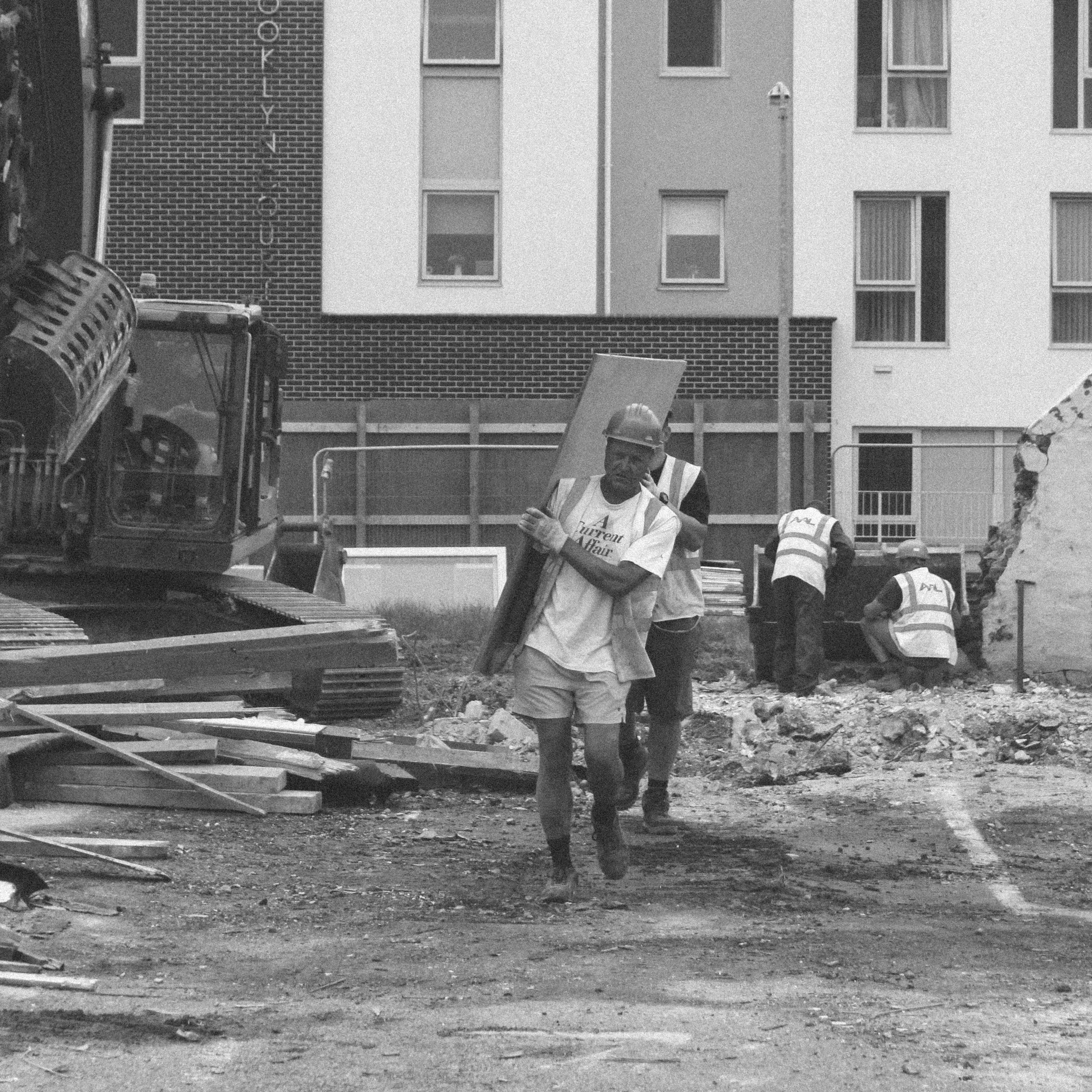
My first two images I took near the old harbour in St Helier. I chose for these two images to be paired together as I like the link of the grey in the cranes and bars to the underneath of the white plastic. I like these two images together as there is a juxtaposition between the close up detailed angle of the plastic on the right and the further away angle of the cranes and construction on the left, but still having the blurred close up of the bars in the foreground.
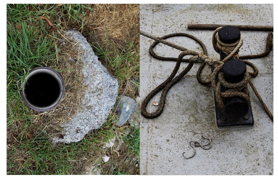
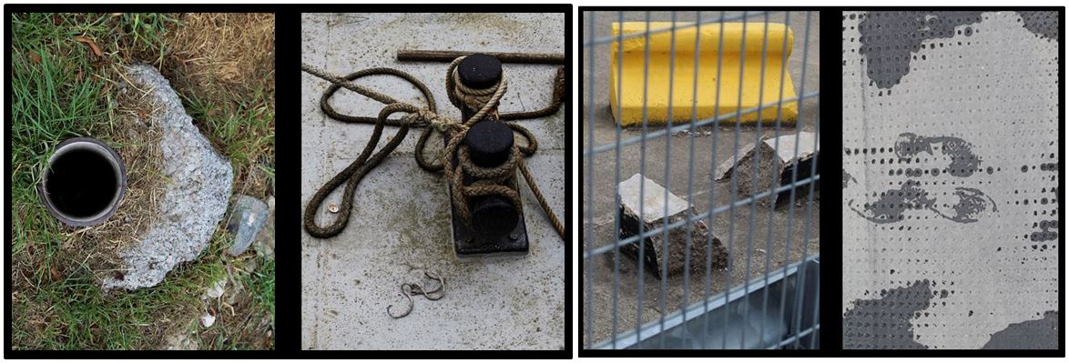
I paired these two images together as i found they have similar shapes a lines within them. Firstly, the pipe hole in the left image links to the two circular shapes on the right both of these sections being black making the connection more obvious. I also like the contrast between the textured grass and the concrete grey ground. The brown colour of the rope in the left images is balanced out by the brown dirt on the left making both these images completely different but connected.
To improve this image i would take a bird eye view of the image on the right so in both the images the angle would be the same but the subject and place wouldn’t.
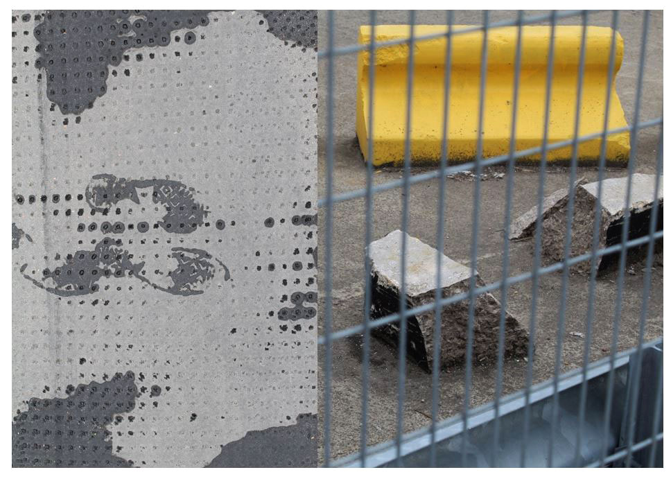
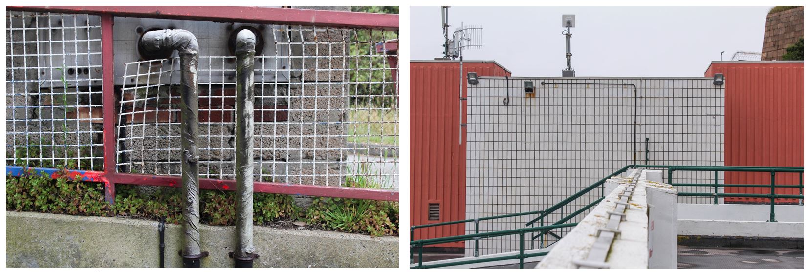
I paired these two images together as i like the juxtaposing patterns and shapes within the two. The fence in the right image has vertical and horizontal lines crossing over one another in the foreground which is contrasted with the left image containing more circular shapes like dots. Both images are quite chaotic but the similar tones of grey link the two together. The image on the right stands out more because of the bright yellow and more chaotic composition. I chose this image as it focuses more on what other do not stop and look at in everyday life similar to Luke Fowler’s style of work. I chose the image on the left as i liked the footprint in the center of the image showing the only trace of life across the two images and represents people leaving behind their mark on the world.
The paired images reveal an event unfolding – a meaningful narrative posed by photographic sets, sometimes close in temporal proximity (the blink of time passing, perhaps), while at other times, the intervals are more expansive, challenging the viewer to connect visible terminal points in a satisfying way.
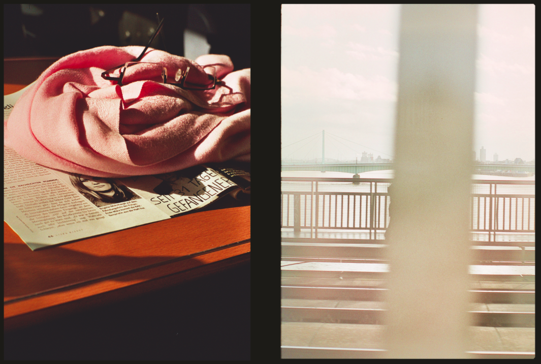
Fowler experimented with different film stocks, subjects and framing, and the images are inextricably linked to his filmmaking as evidenced by the elements of montage, colour and reflectivity that permeate the series. In both still and moving image, Fowler considers how an event might be abstracted by the camera apparatus in a subjective ordering of reality that is emphasised by the dialectic between paired images. The photographs are a means of personally testing the ability of the camera to authentically bear witness to an event, and its fallibility as a medium of representation.
Edits
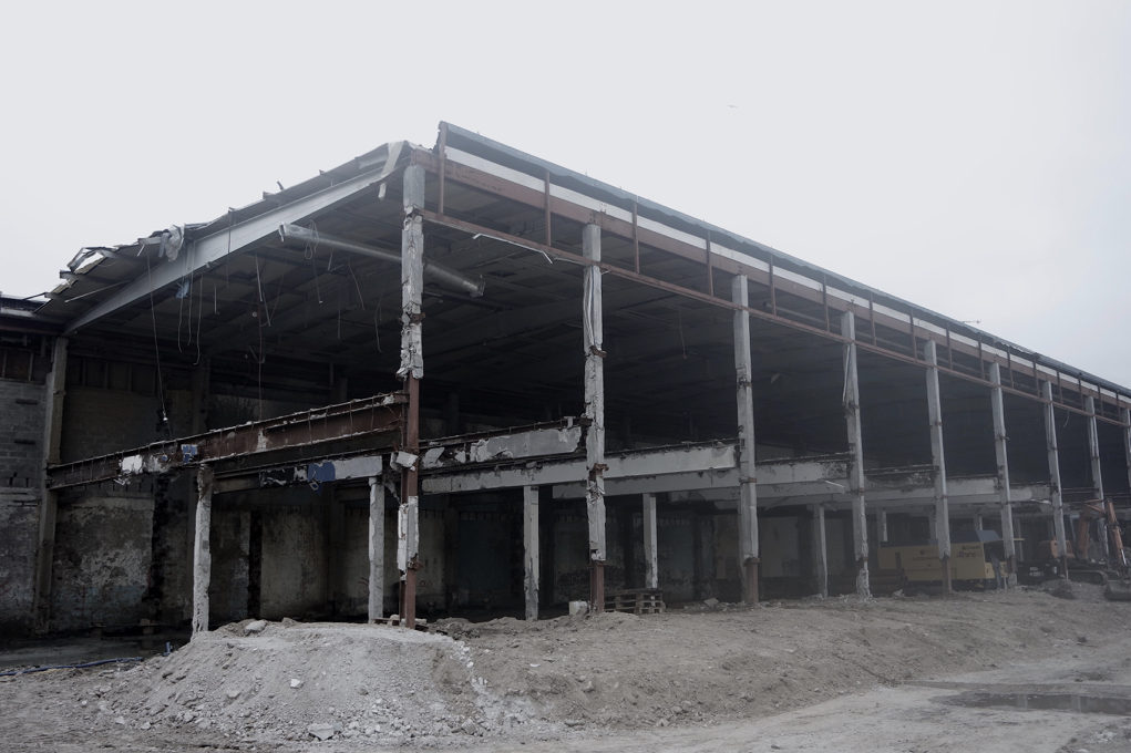
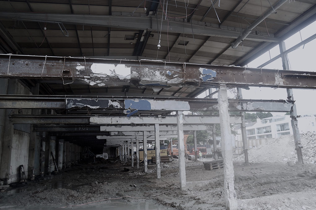
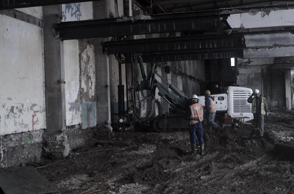
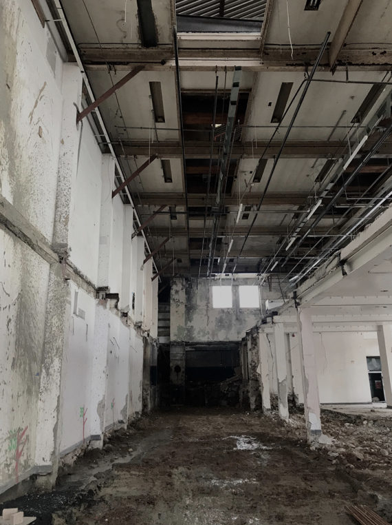
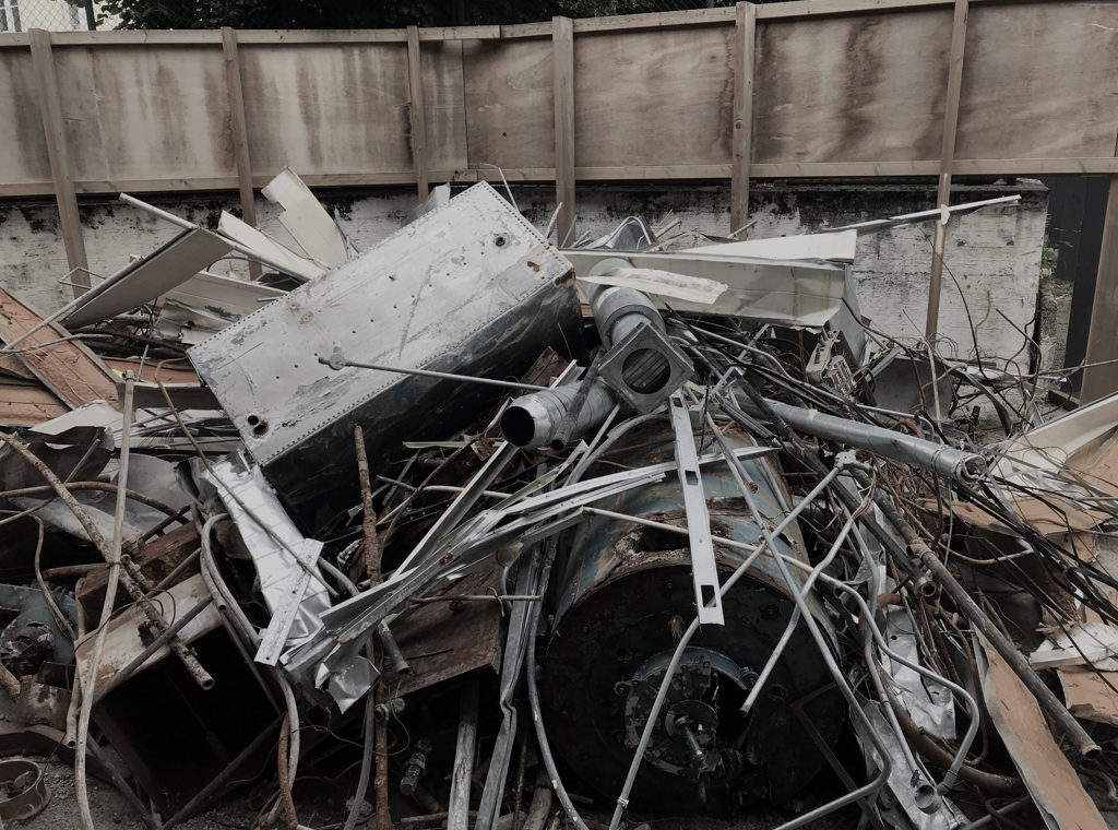
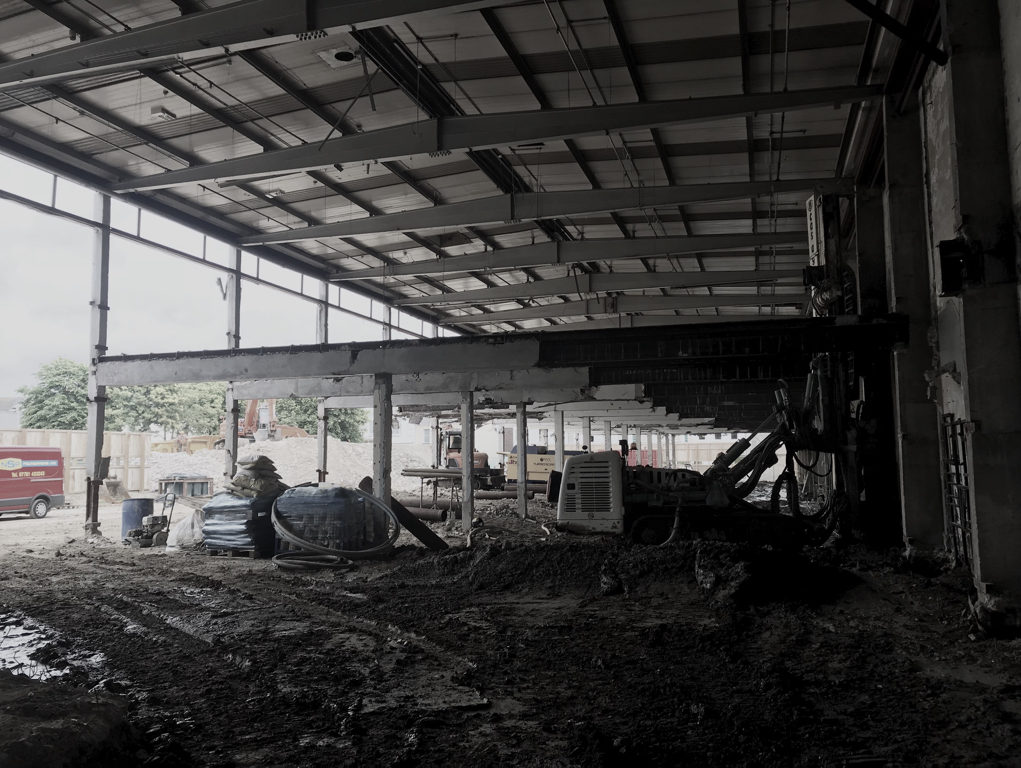

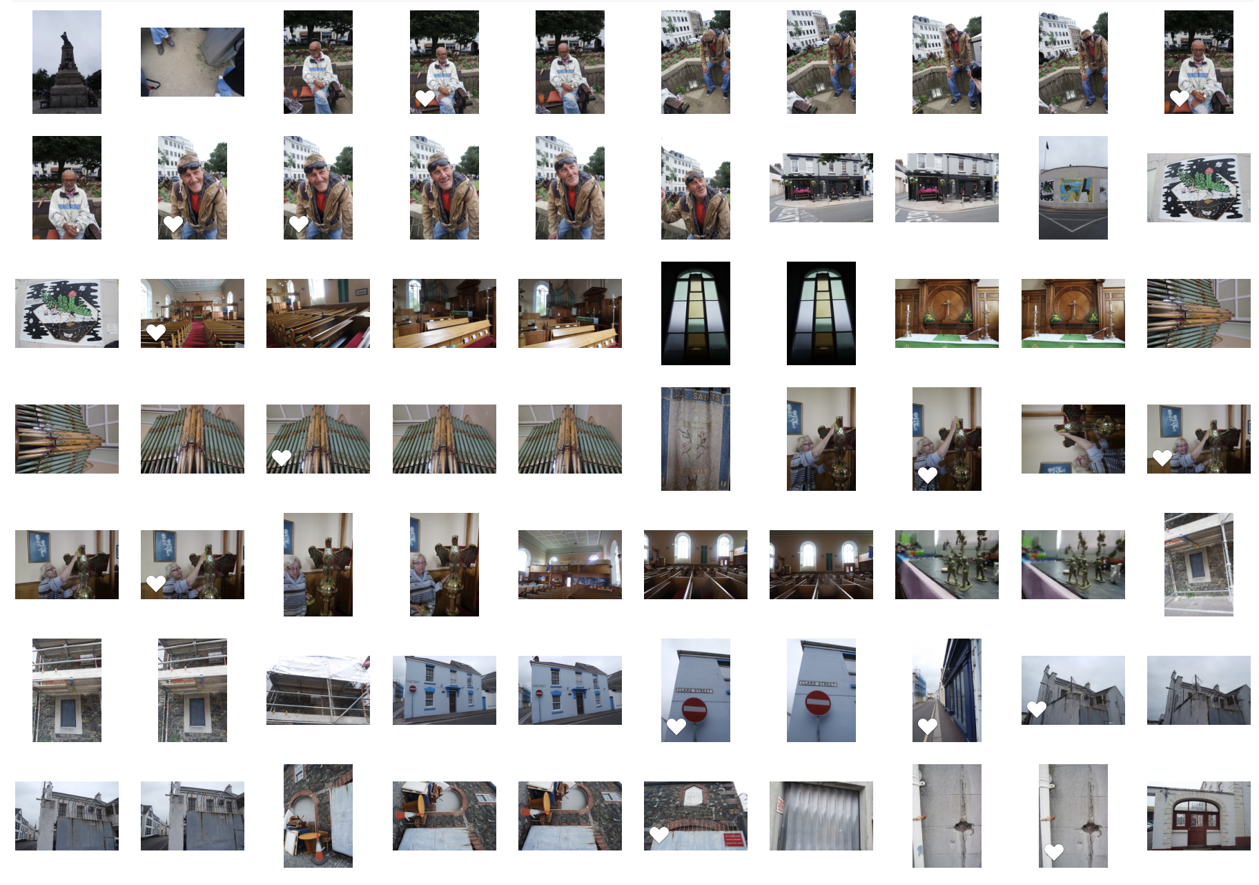
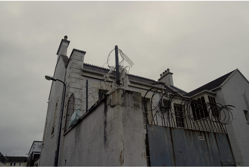
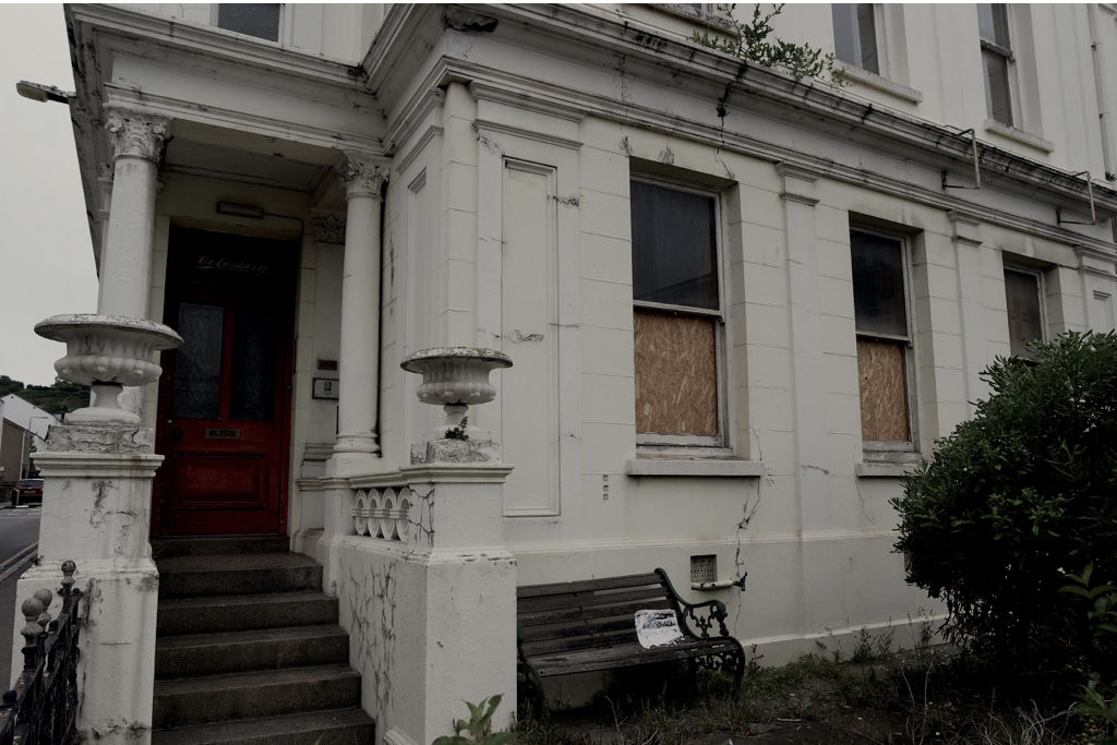
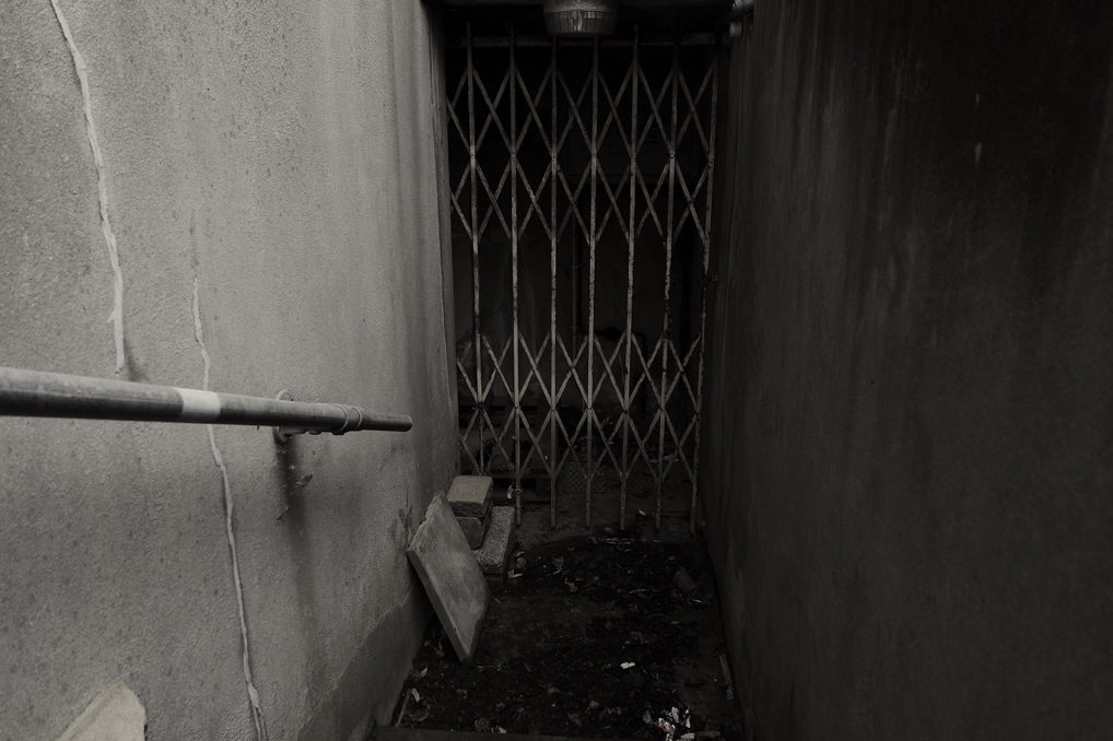
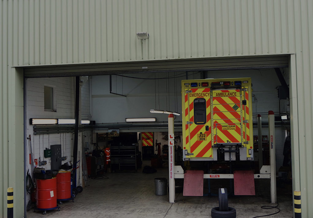
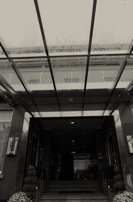
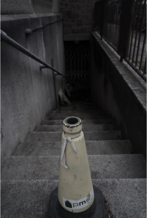
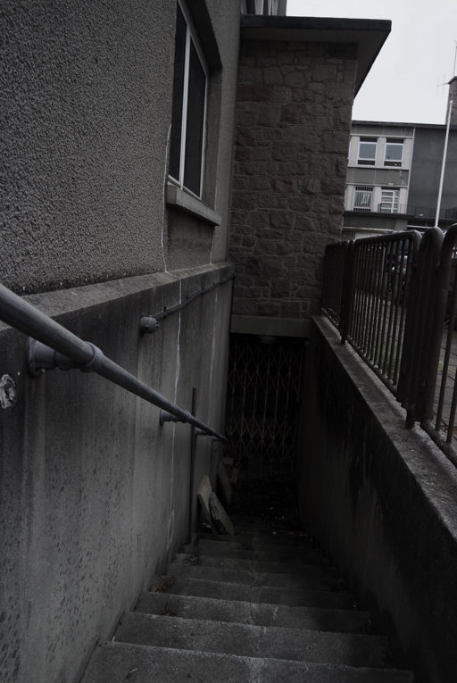


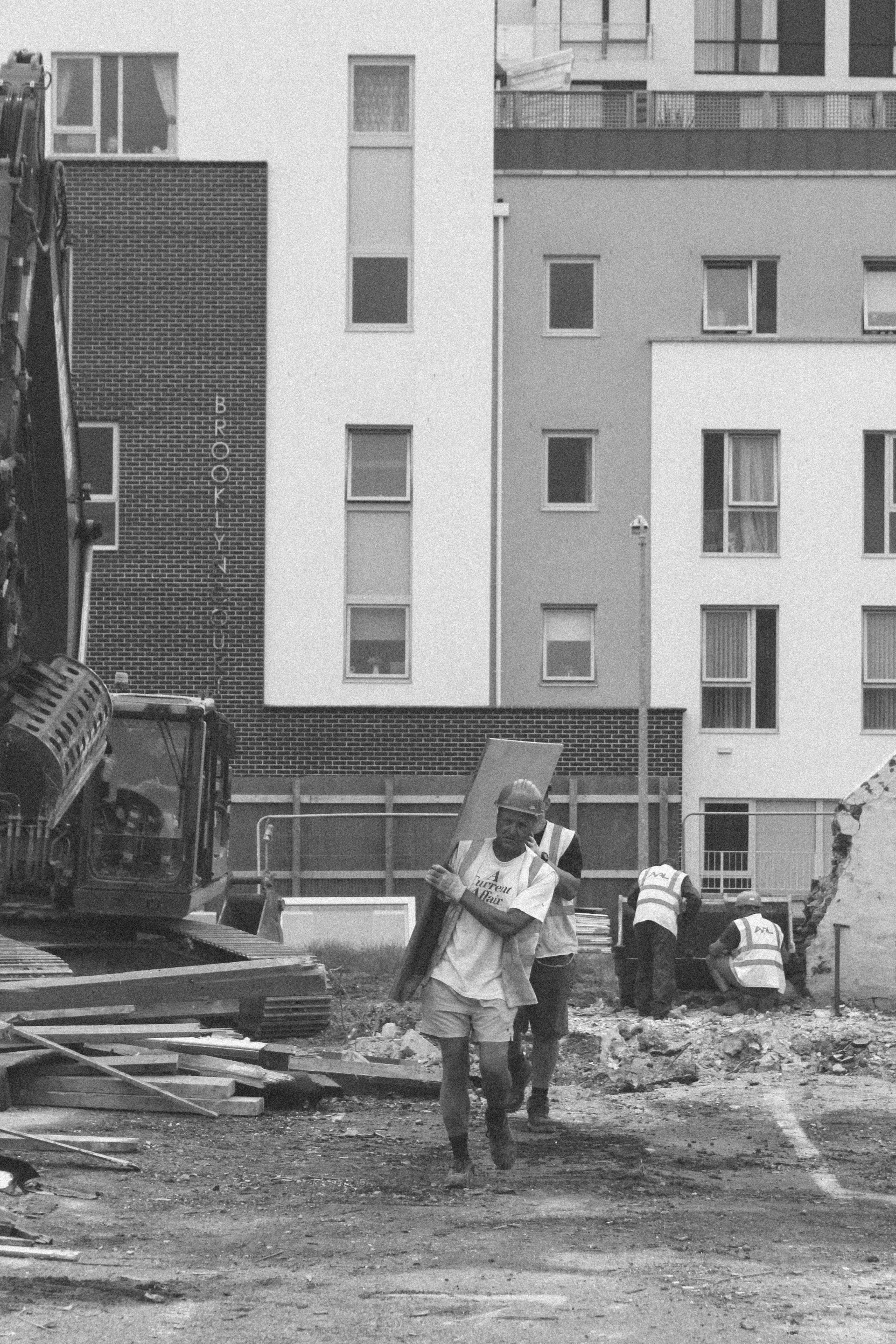
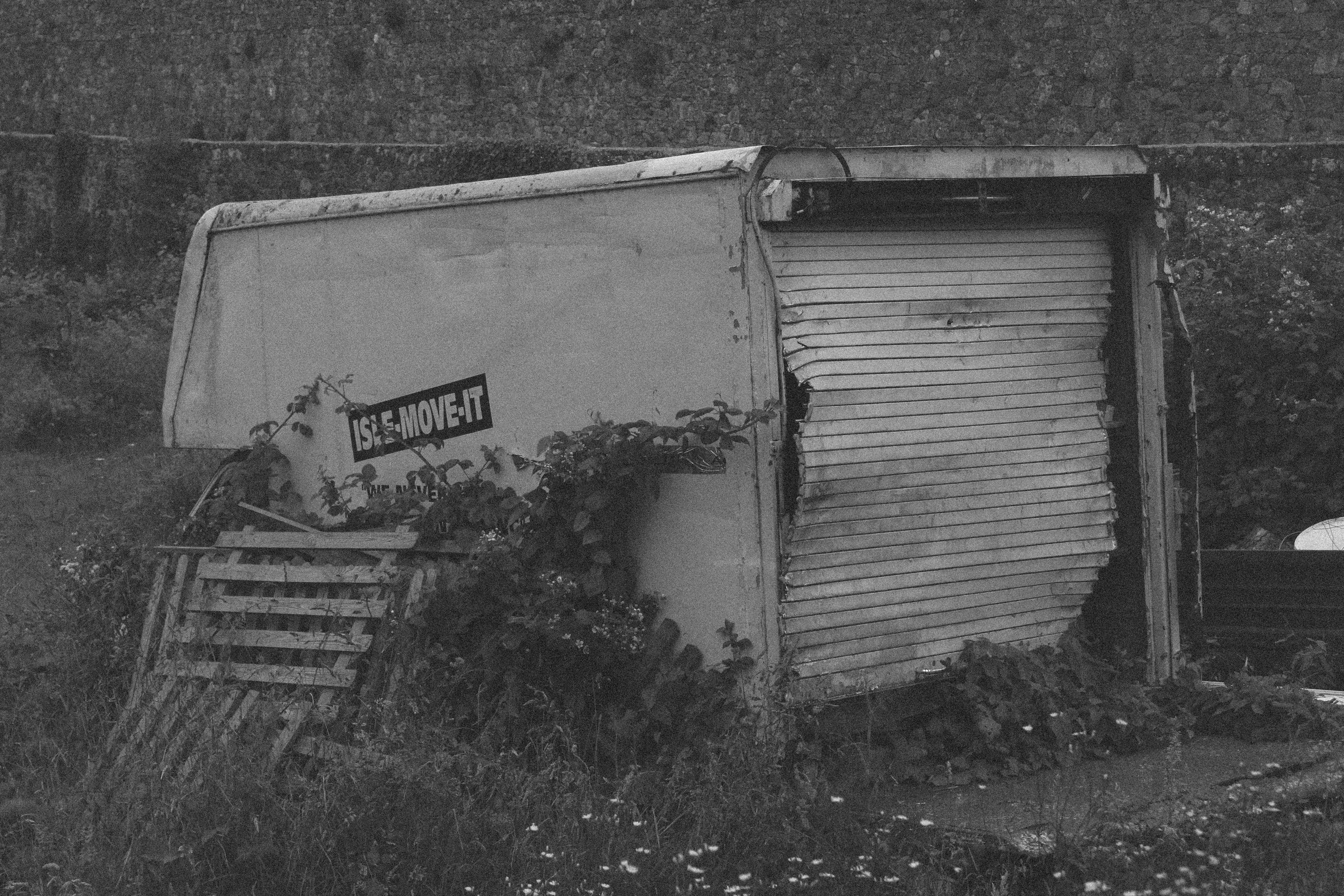
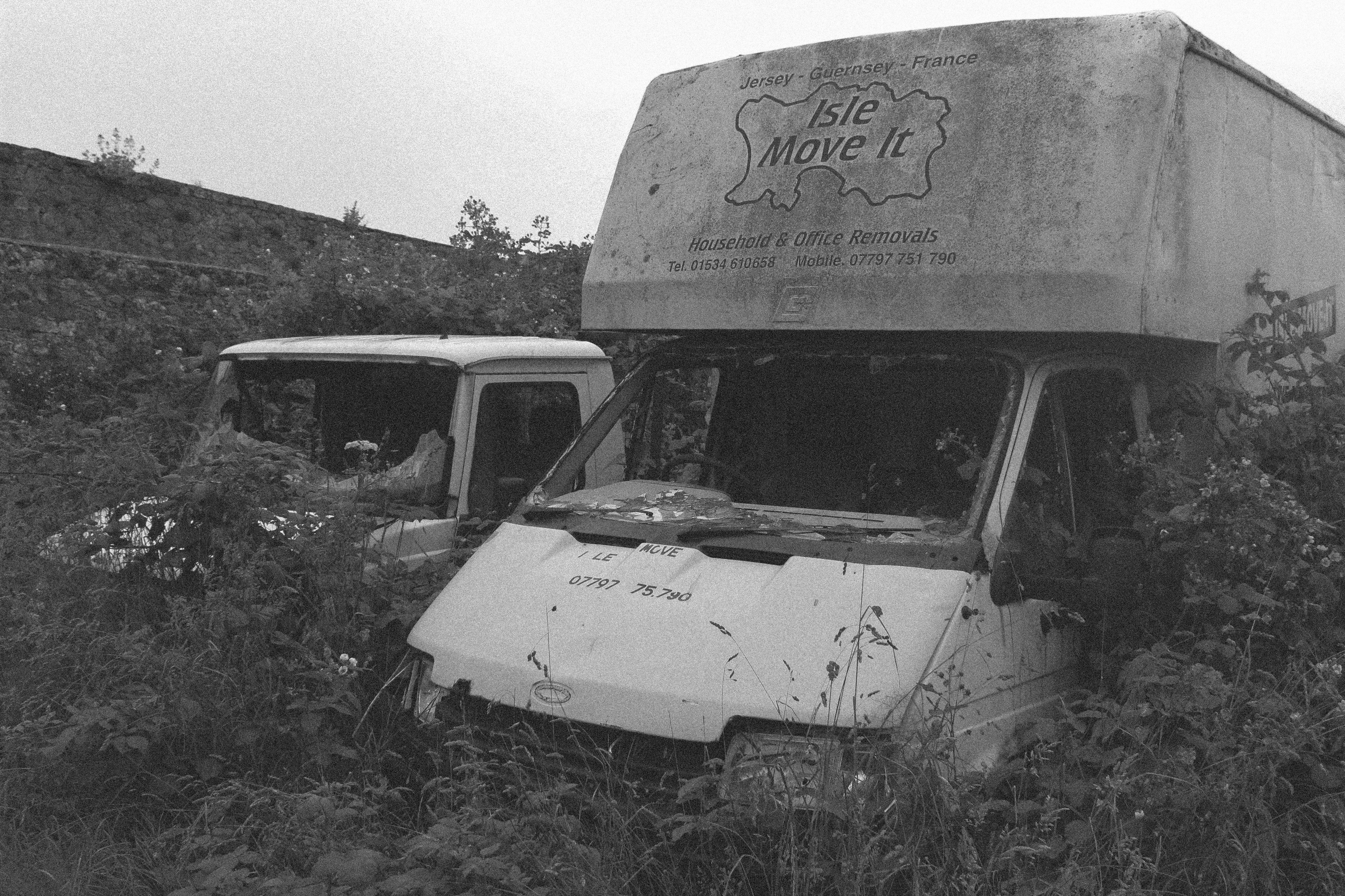
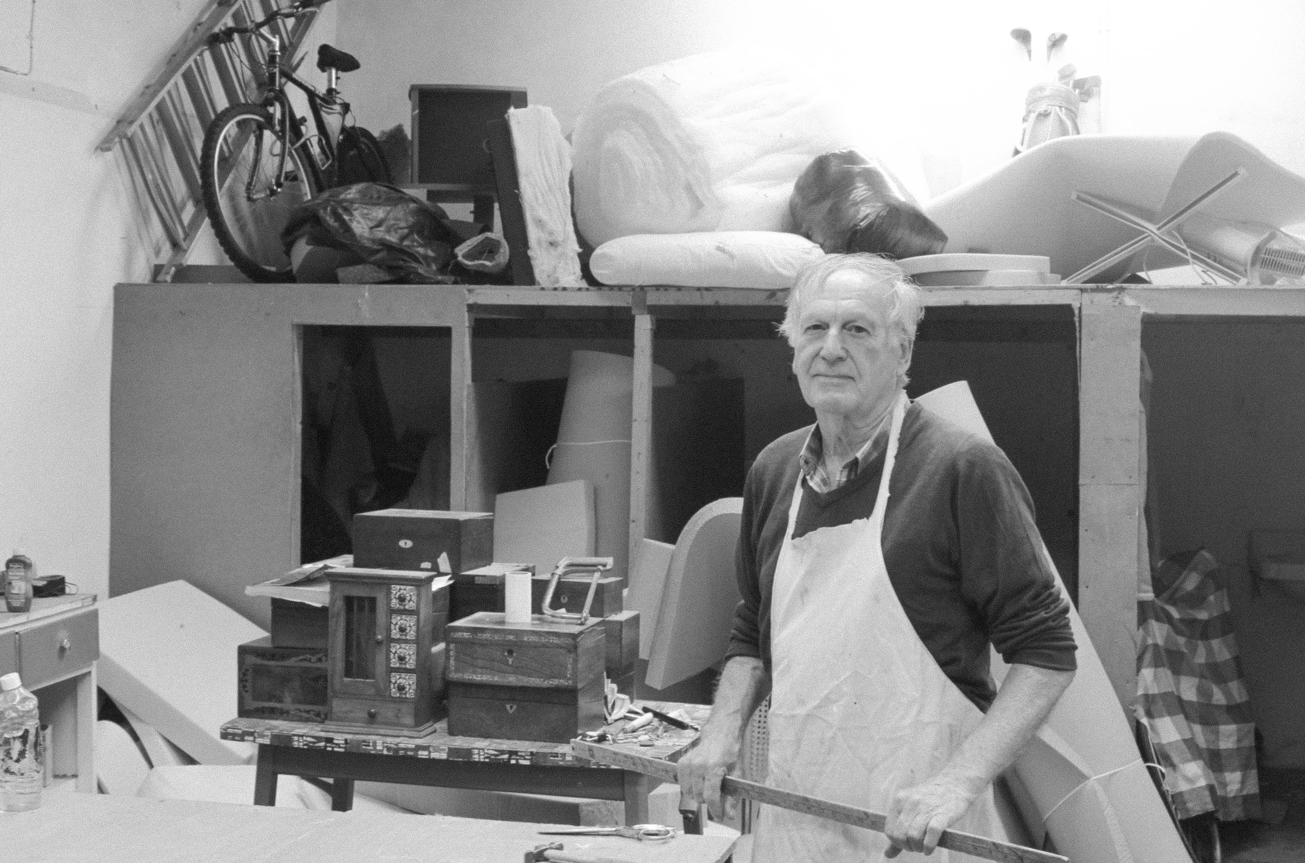
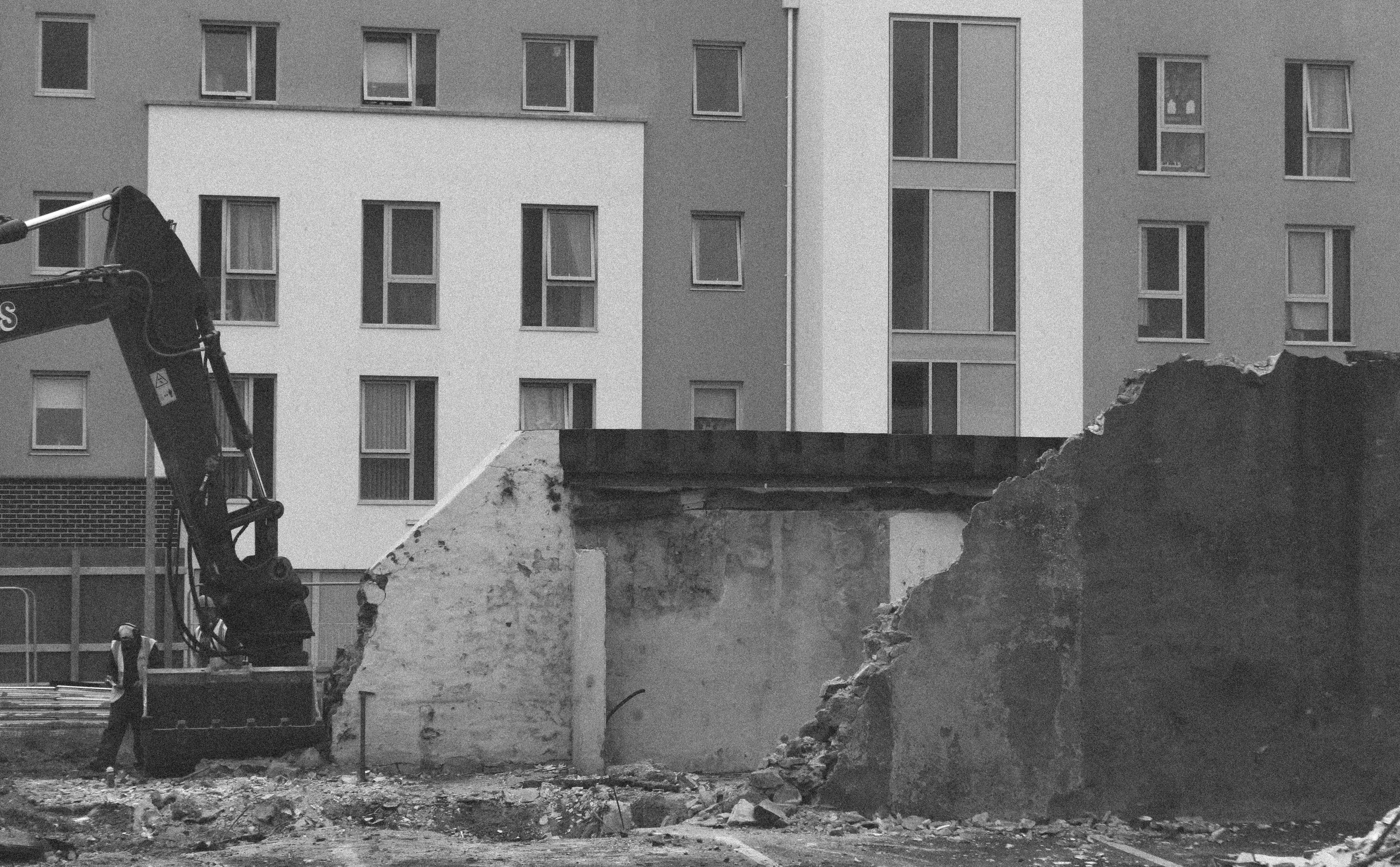
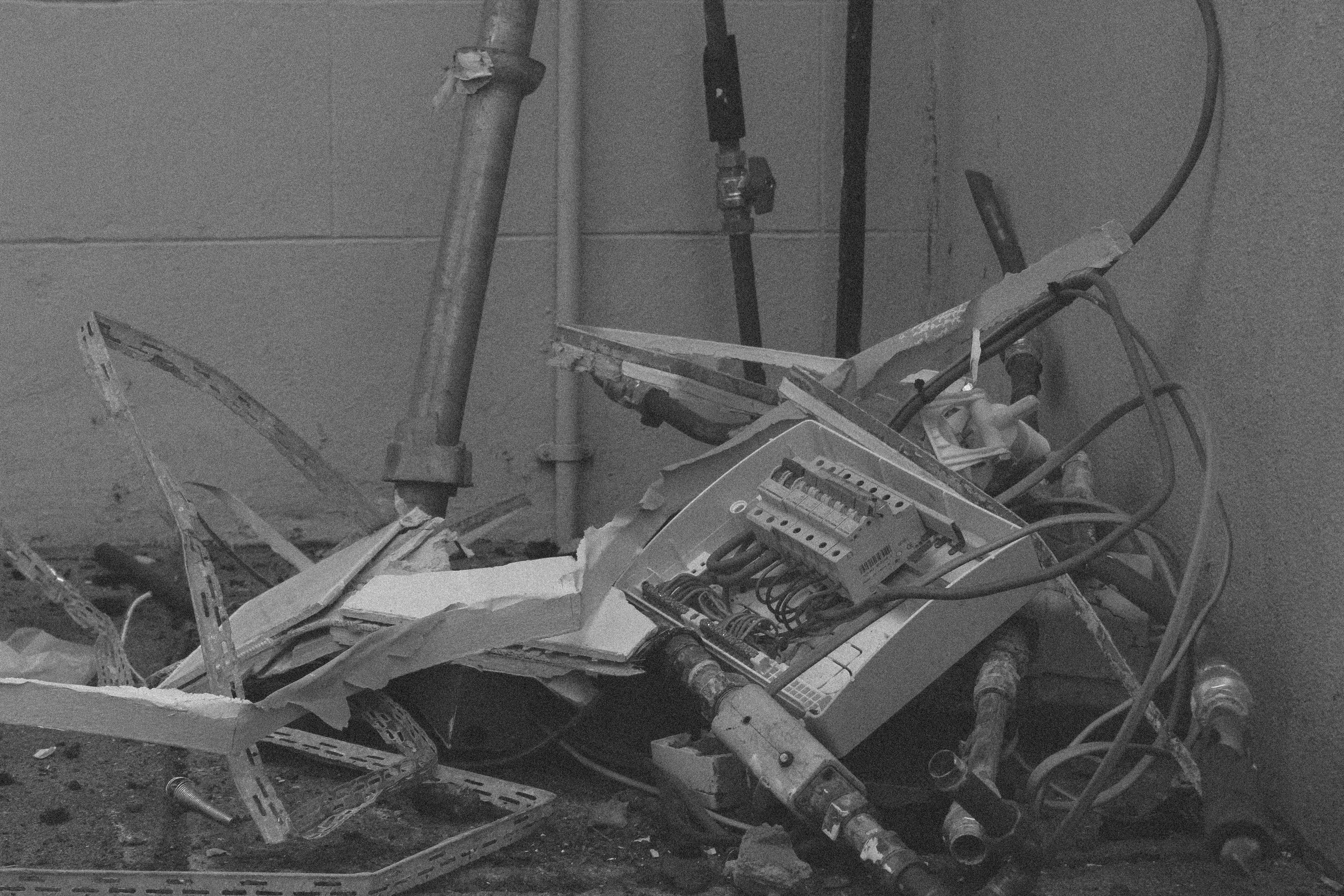
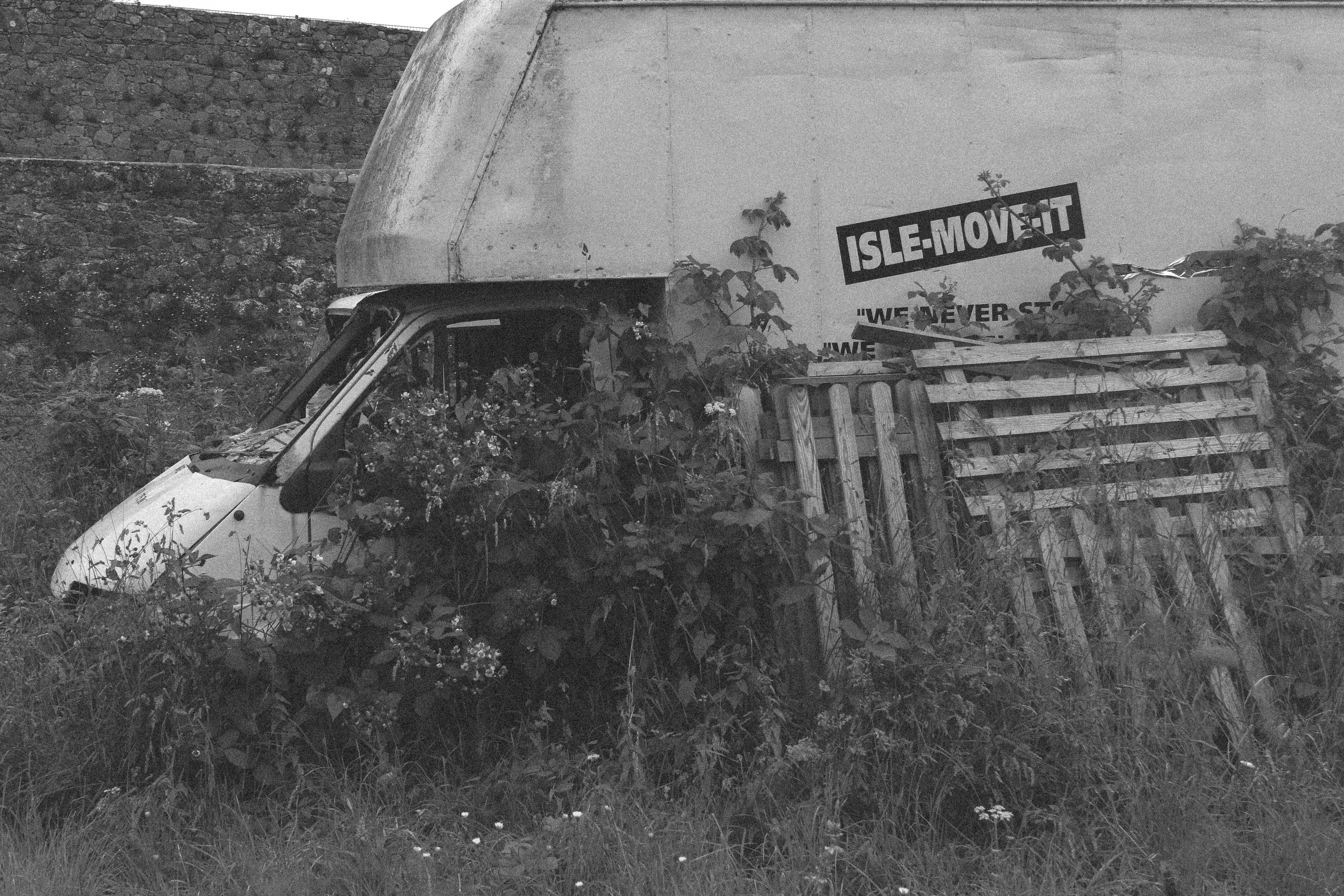
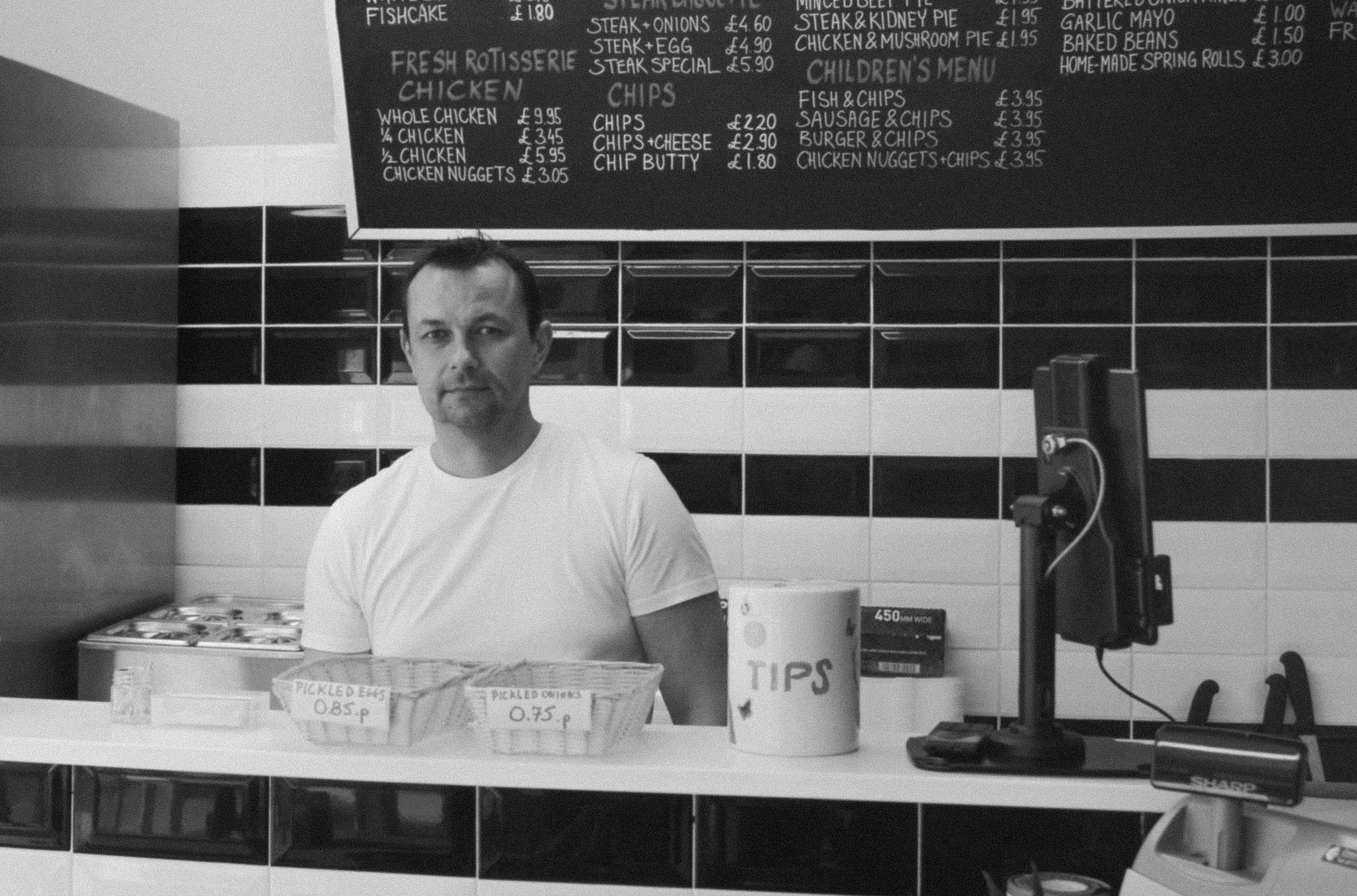
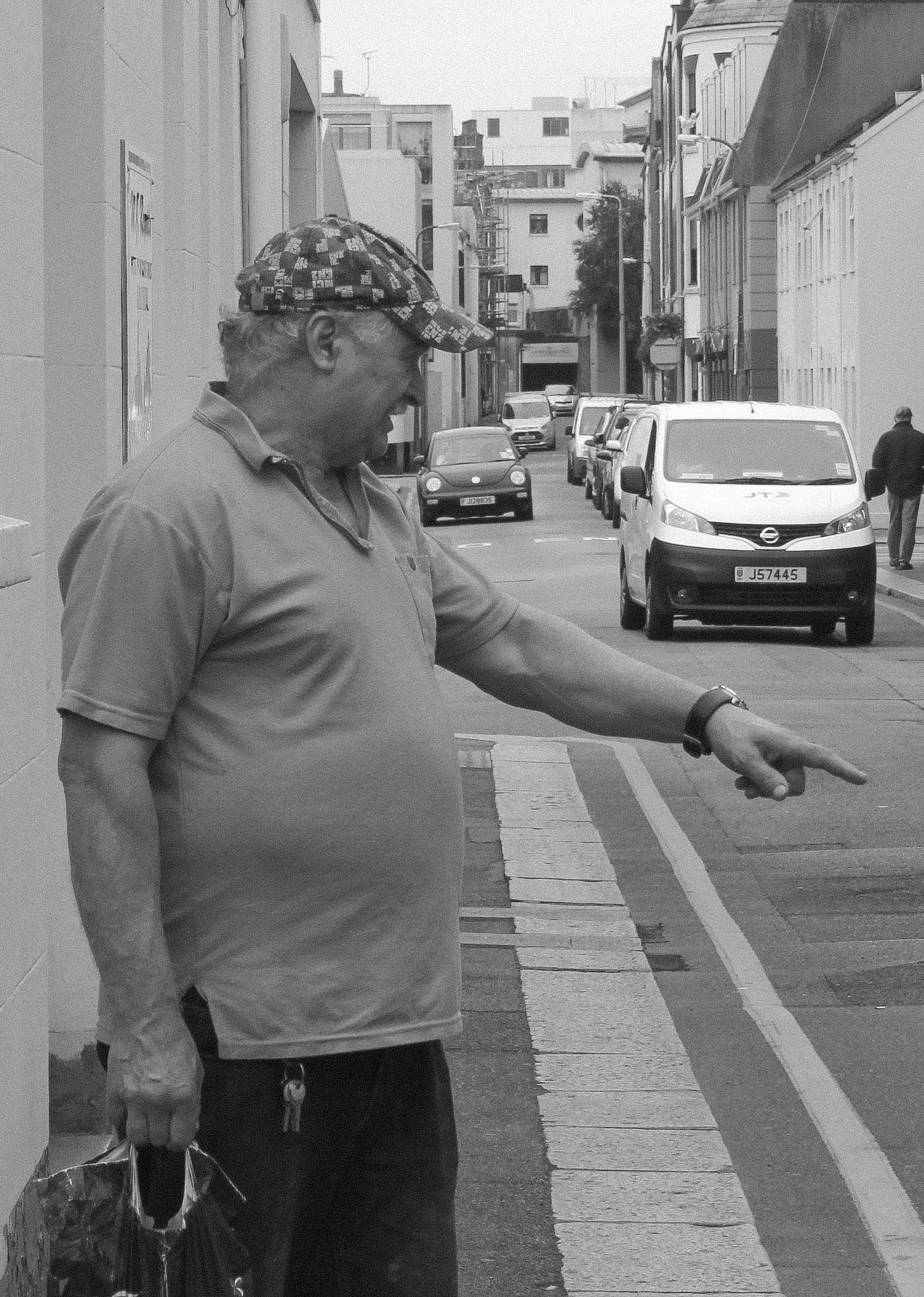
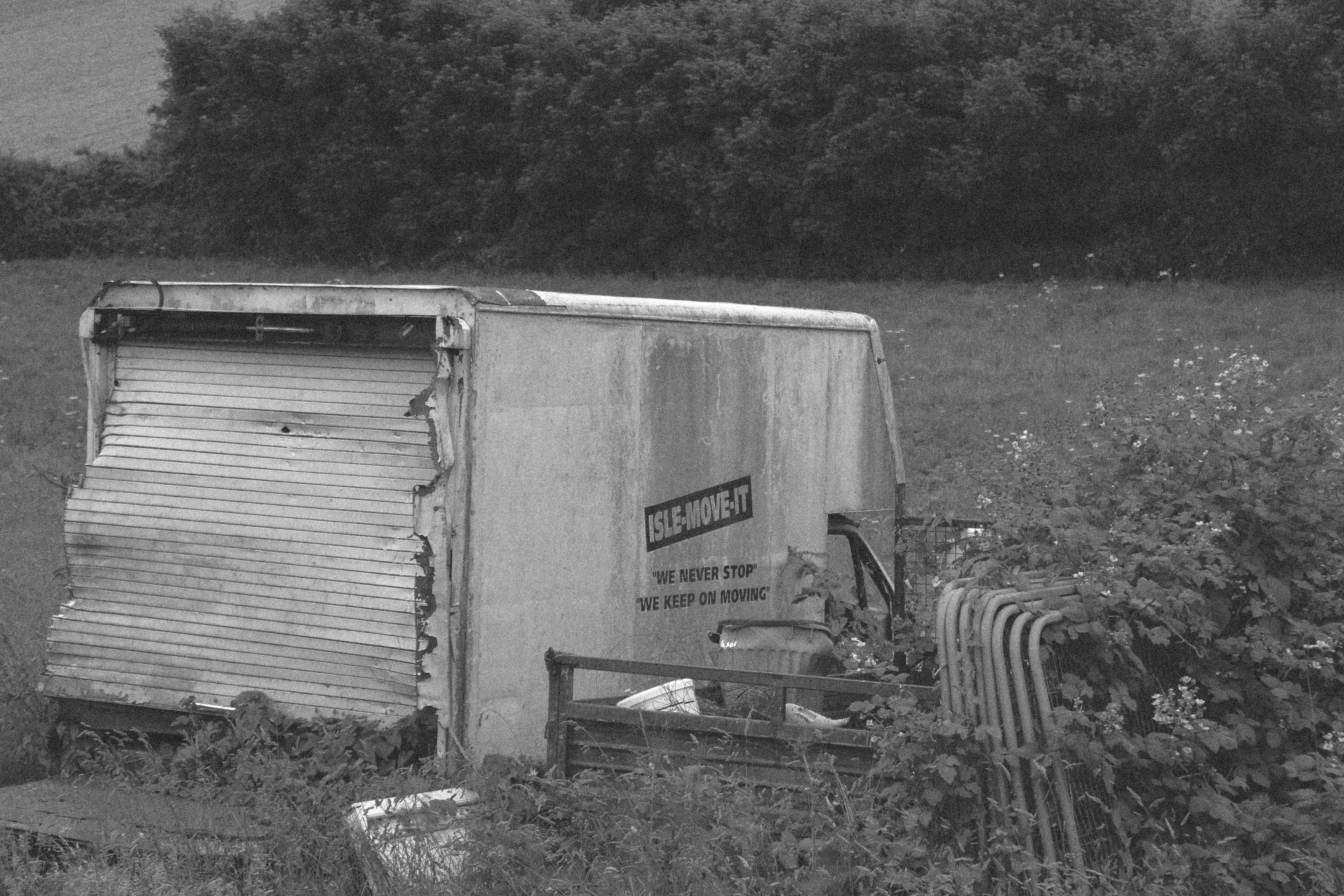
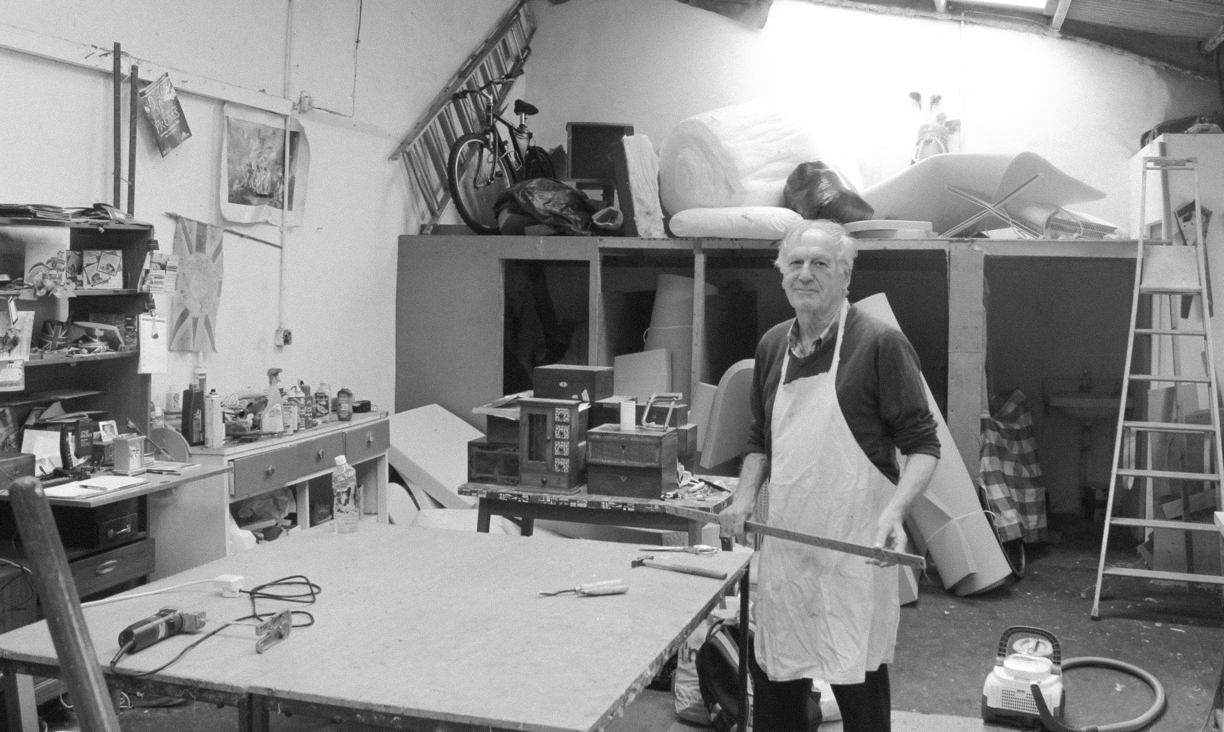
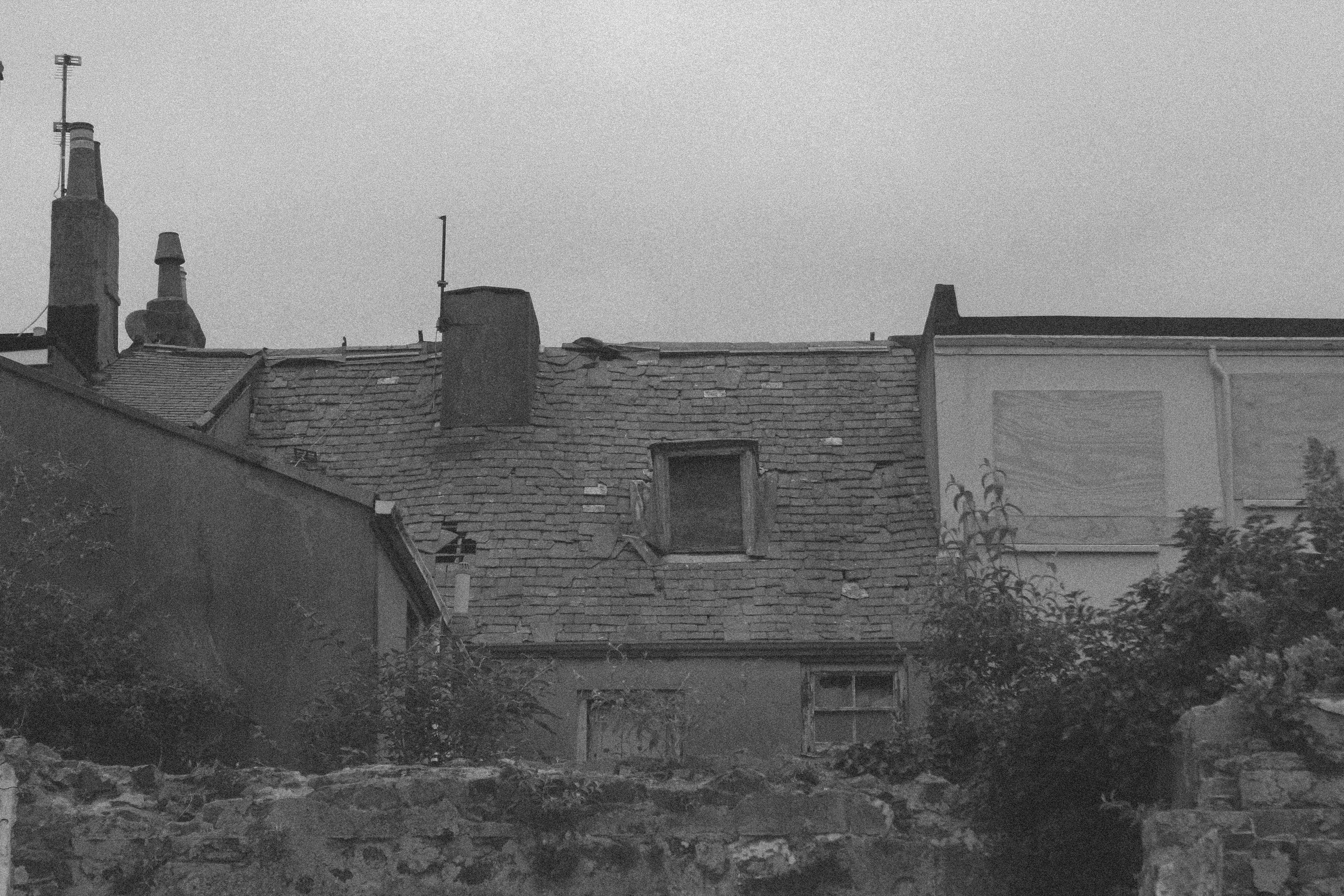
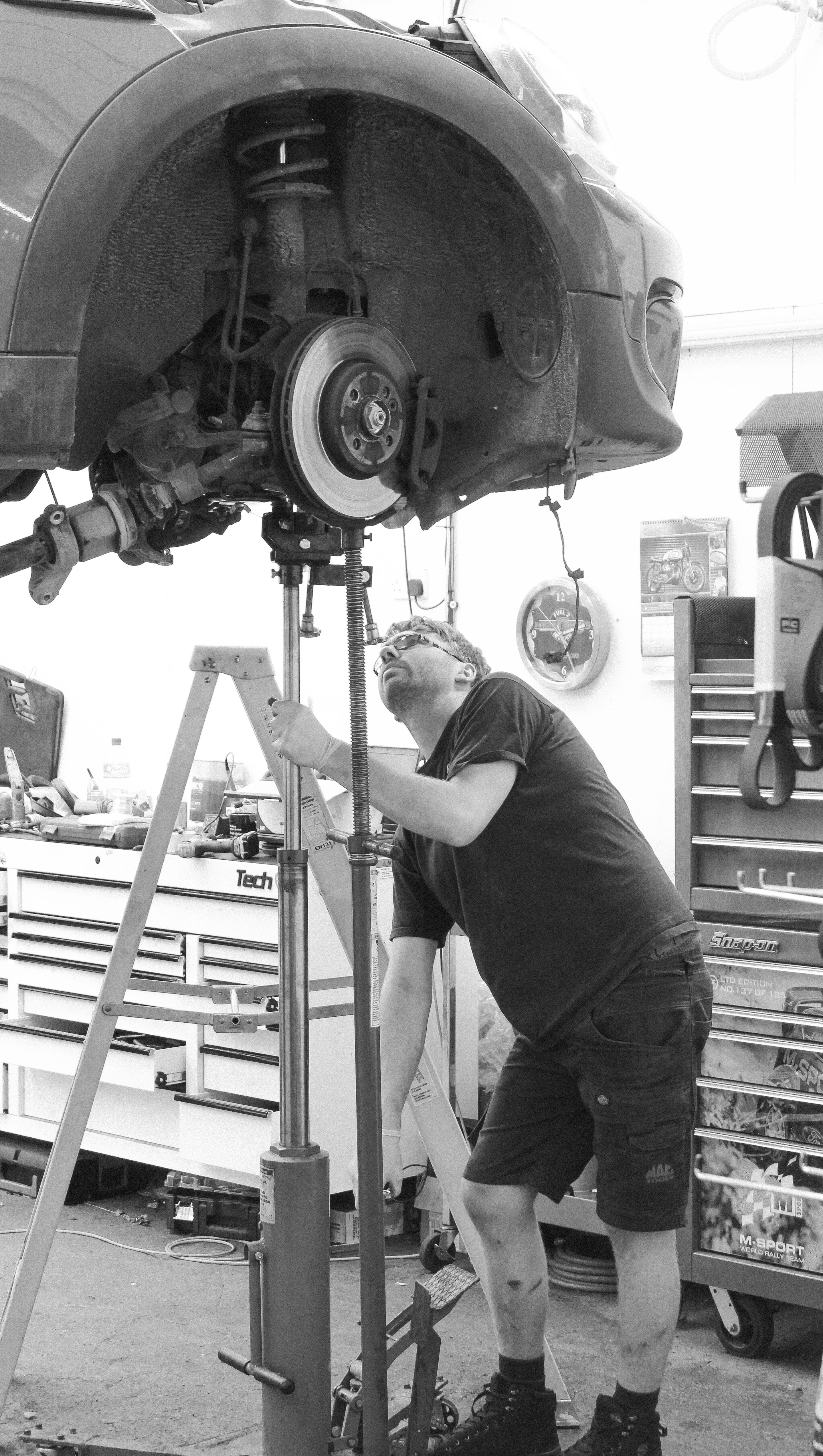
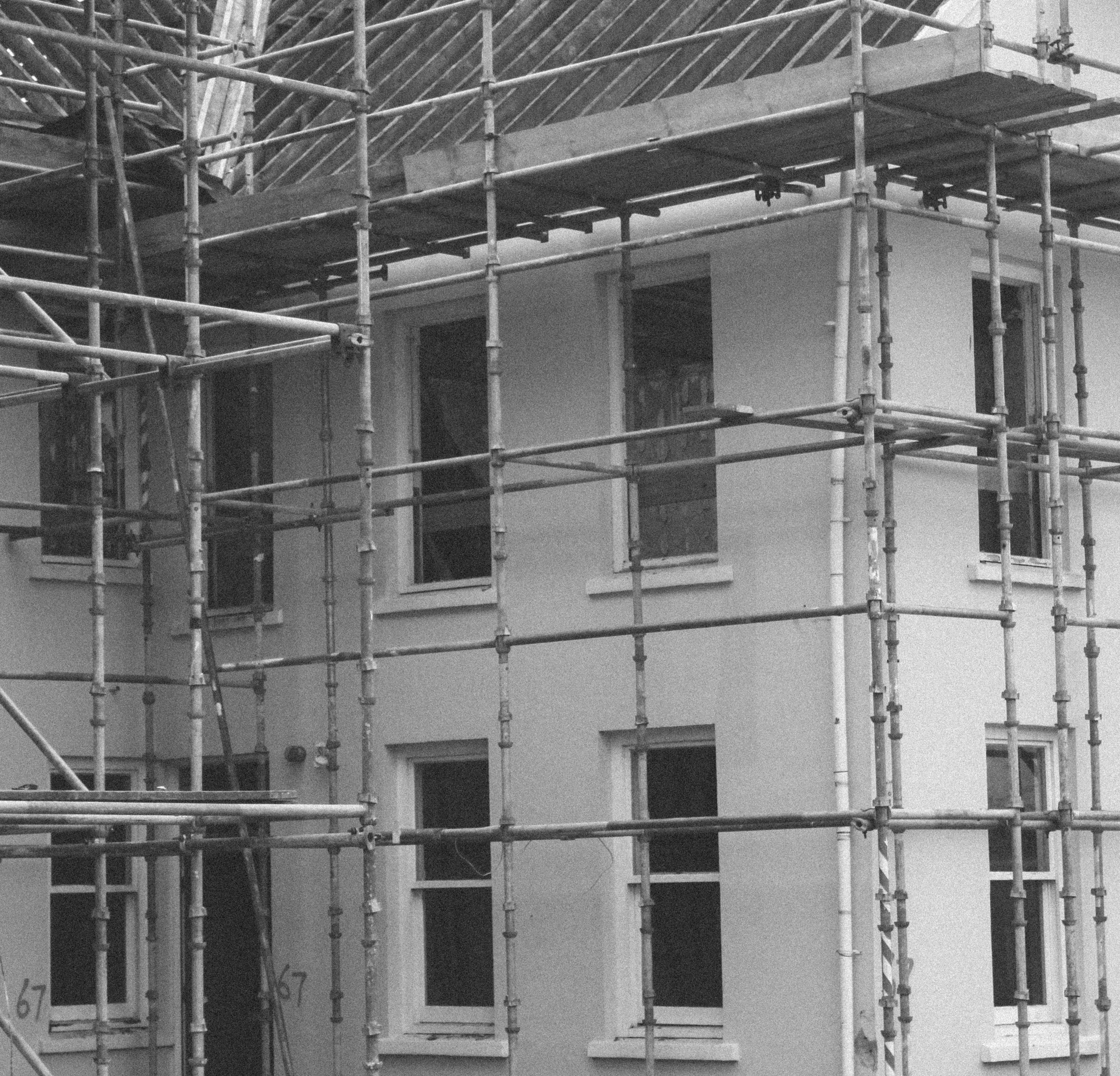
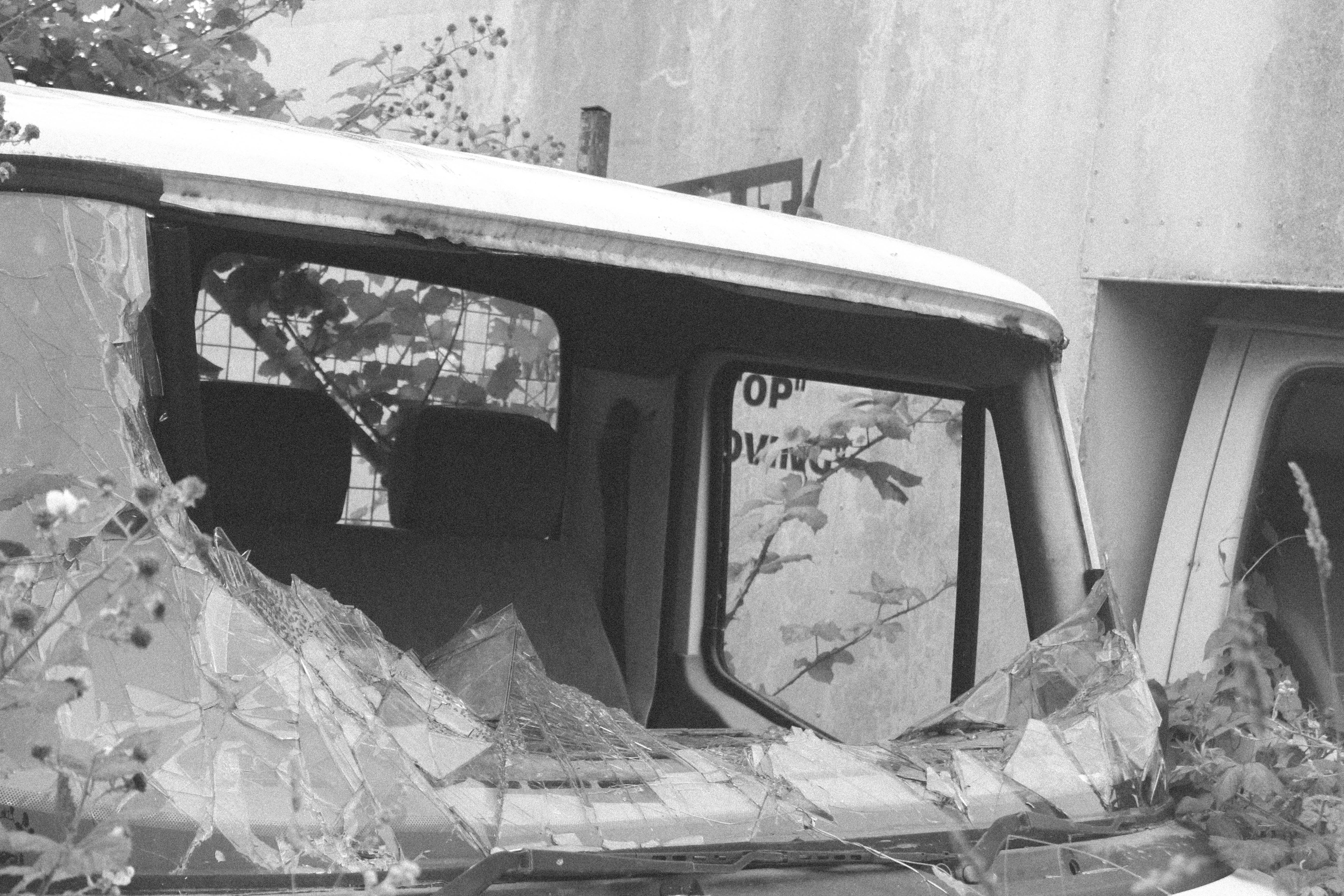
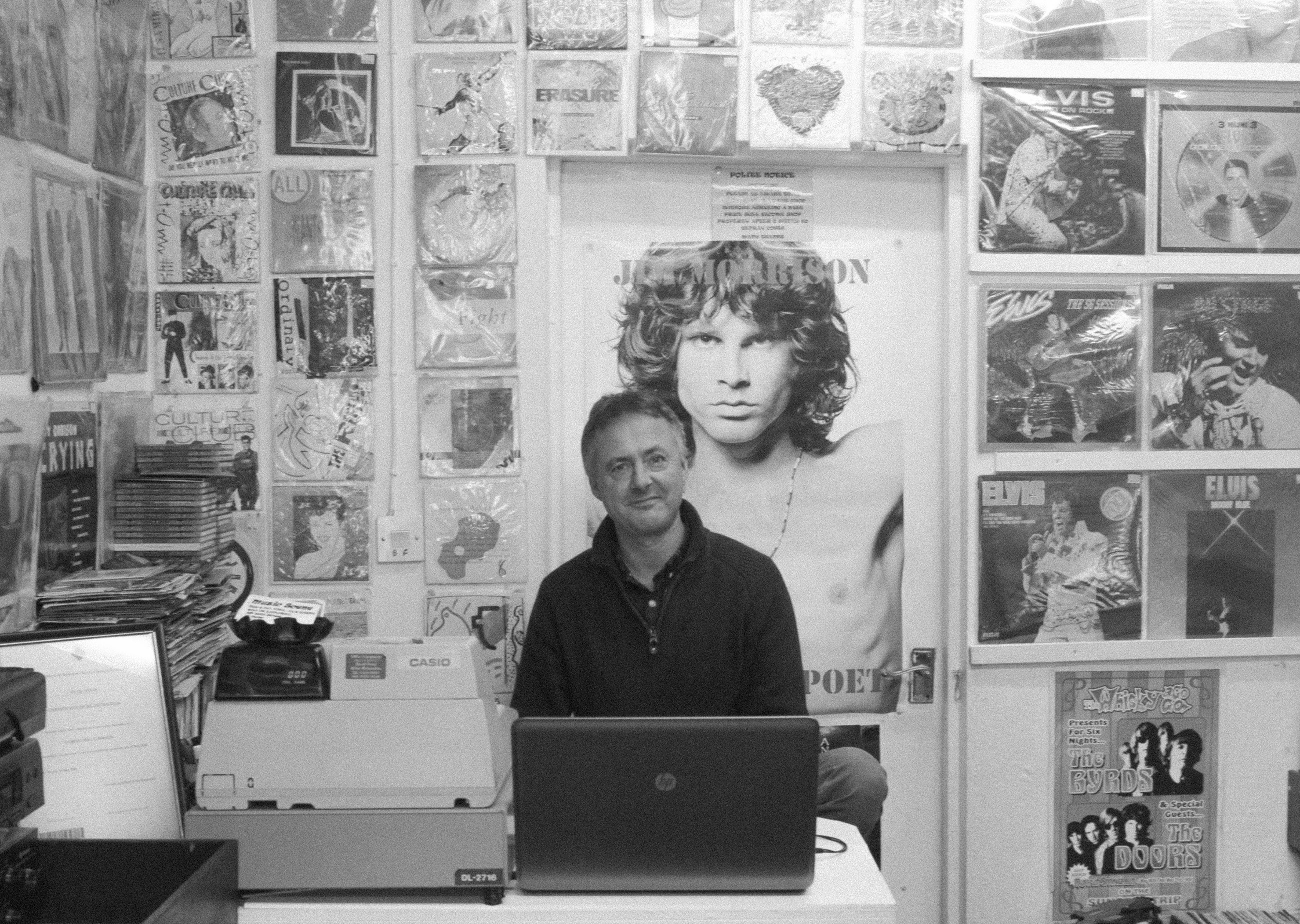
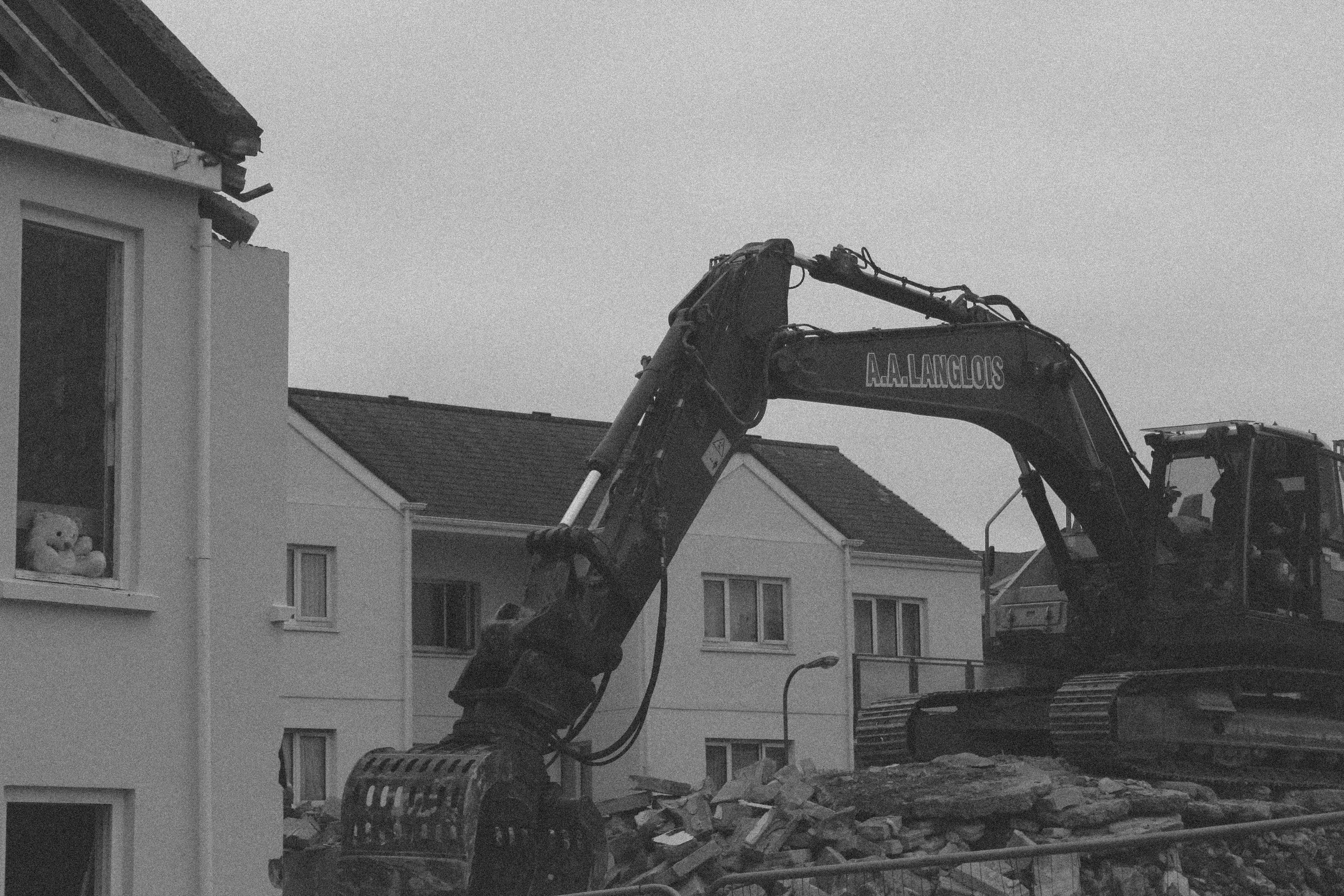
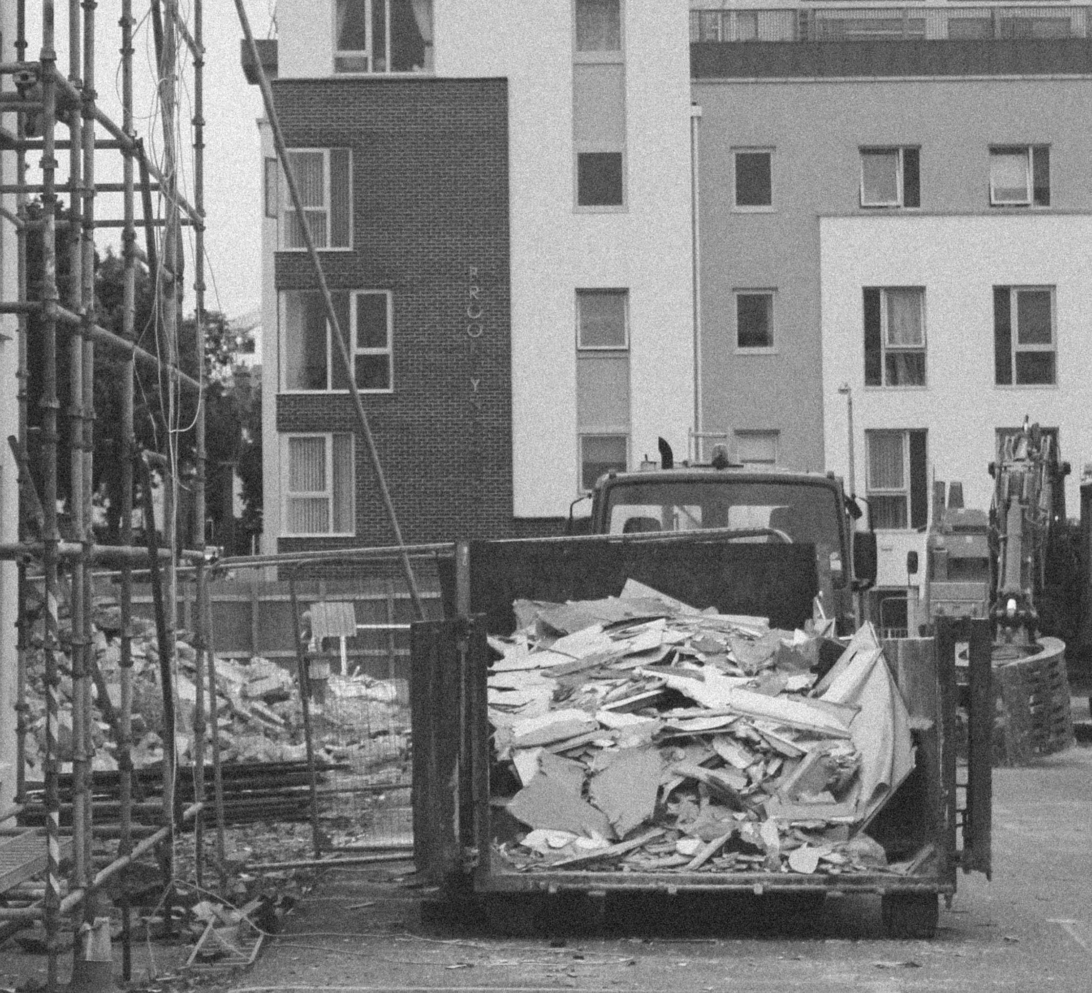
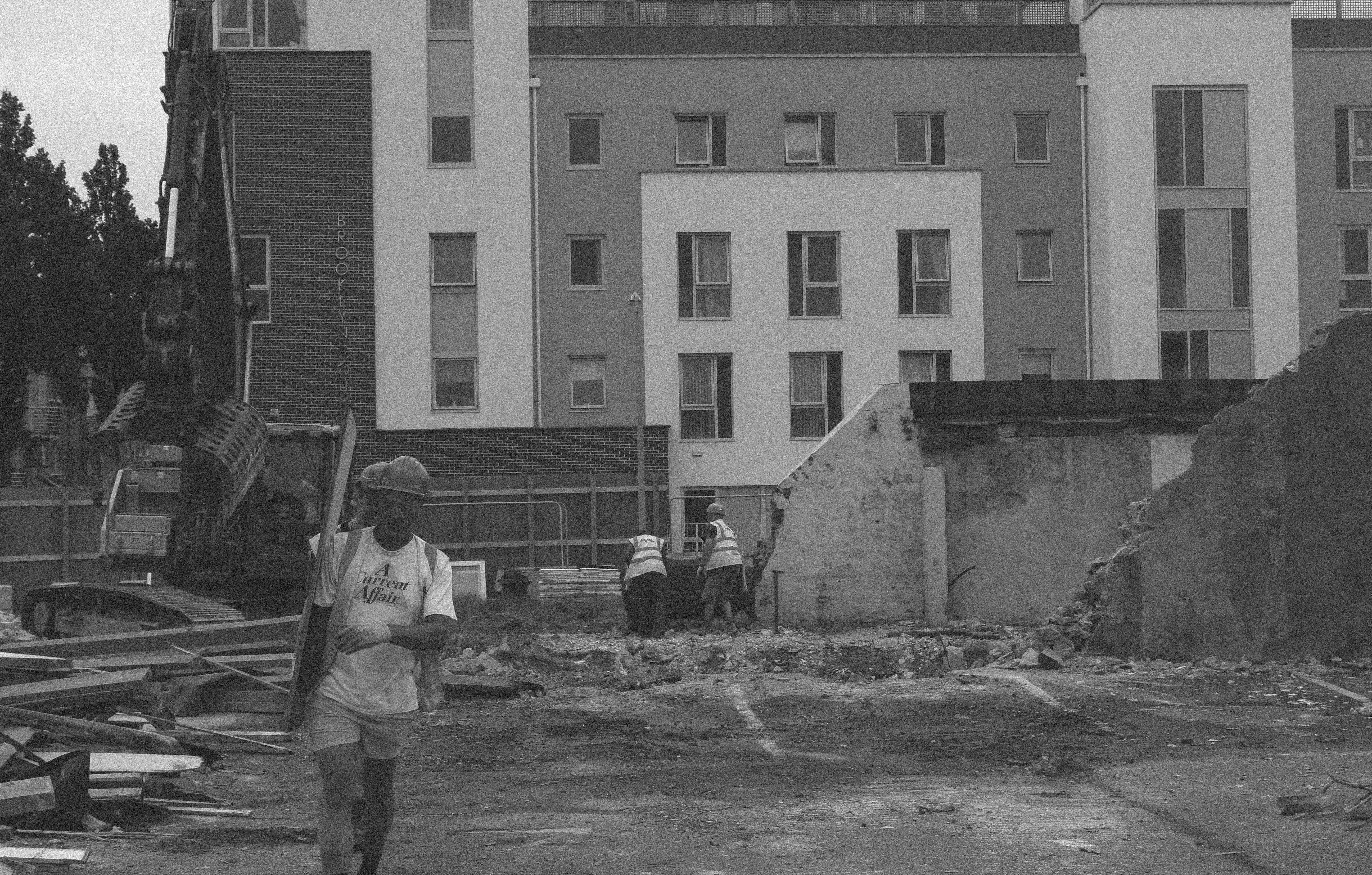
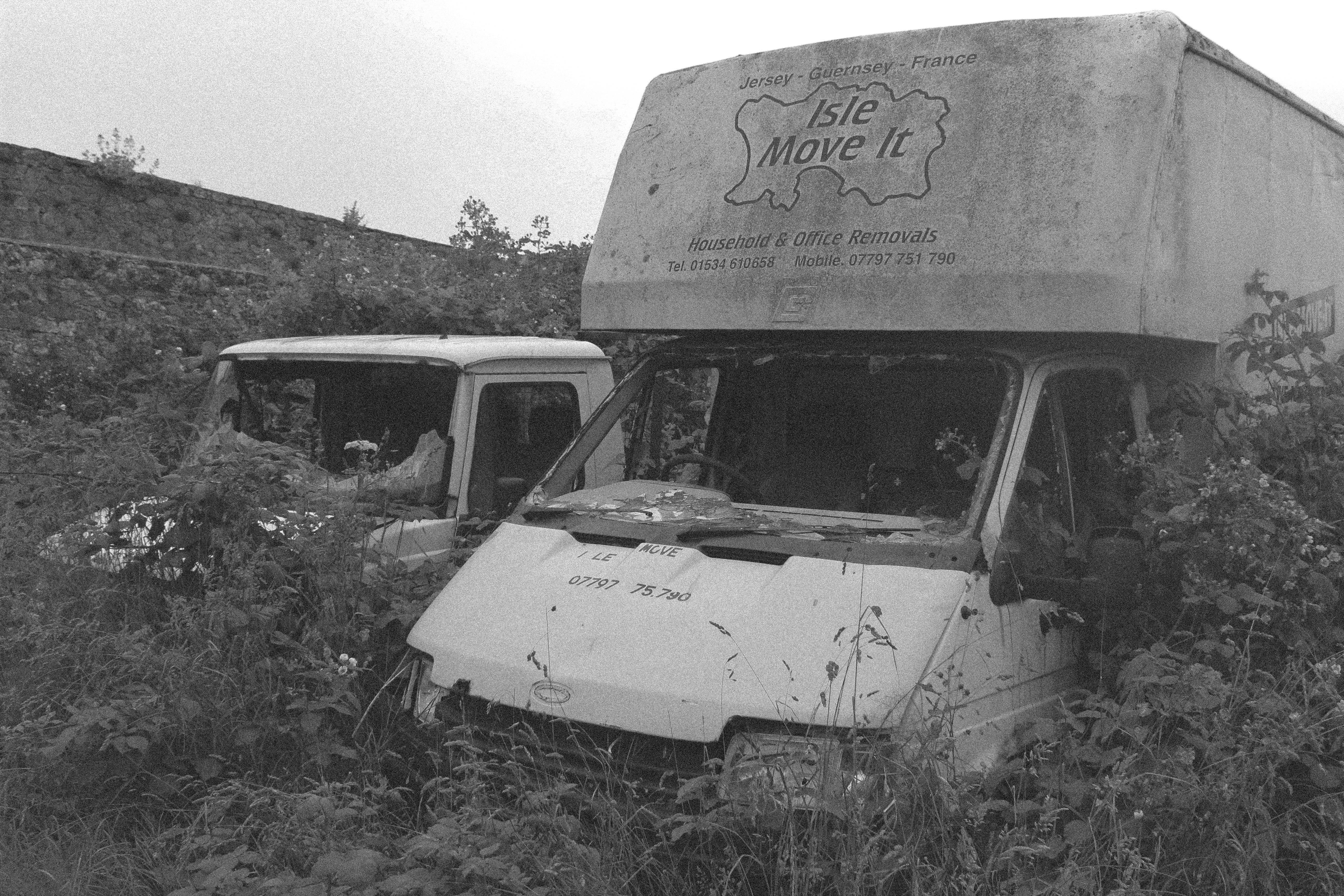
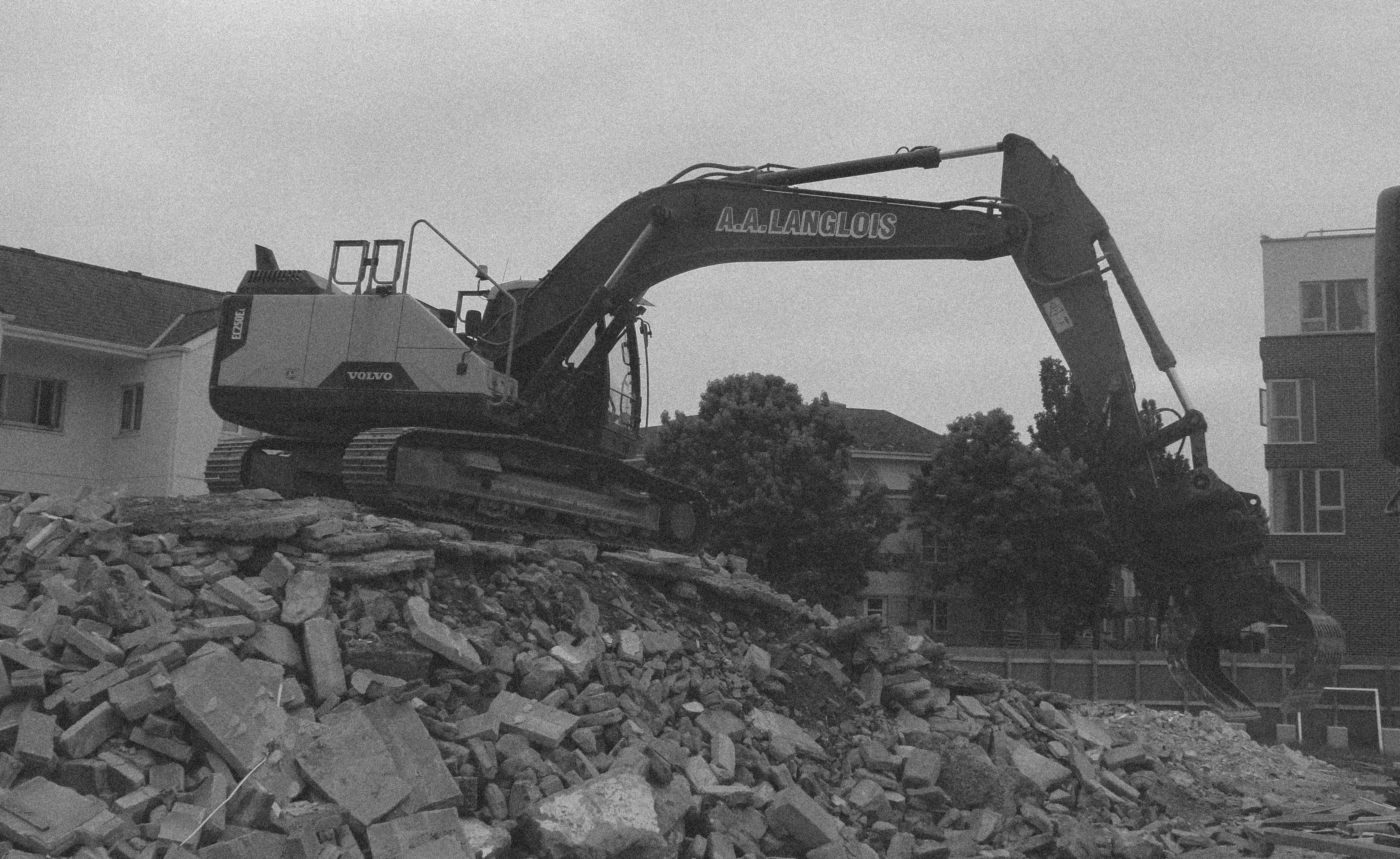
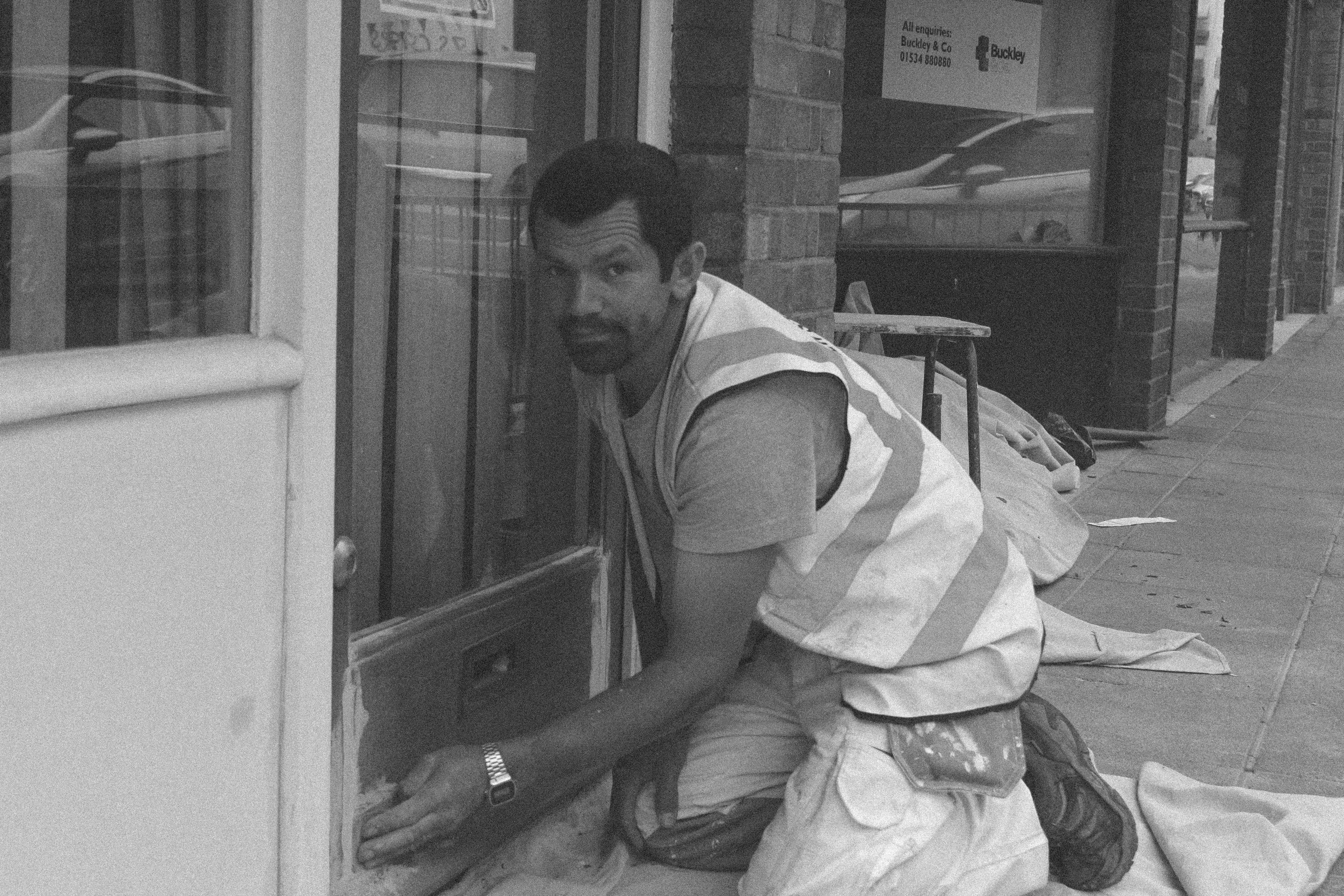
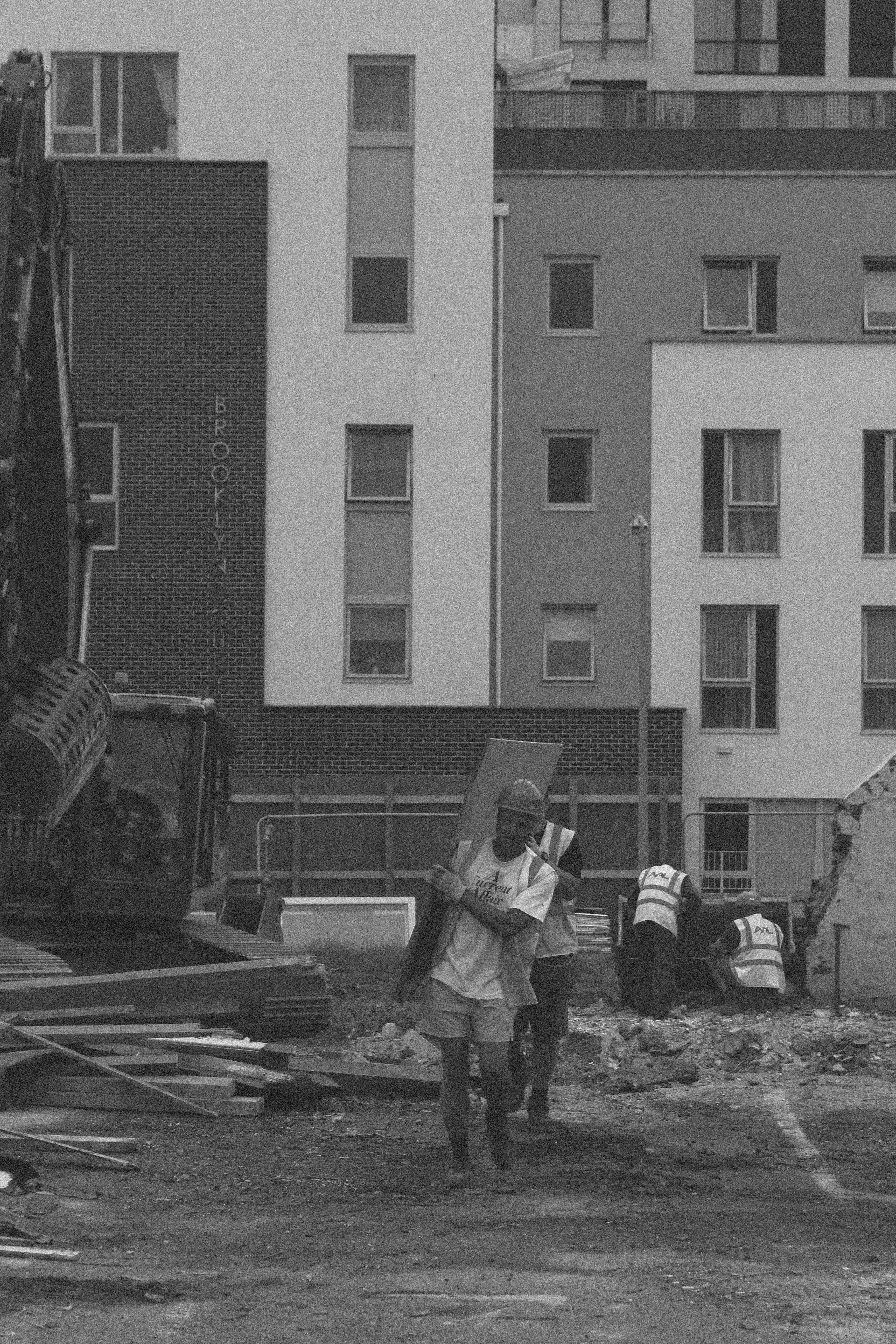
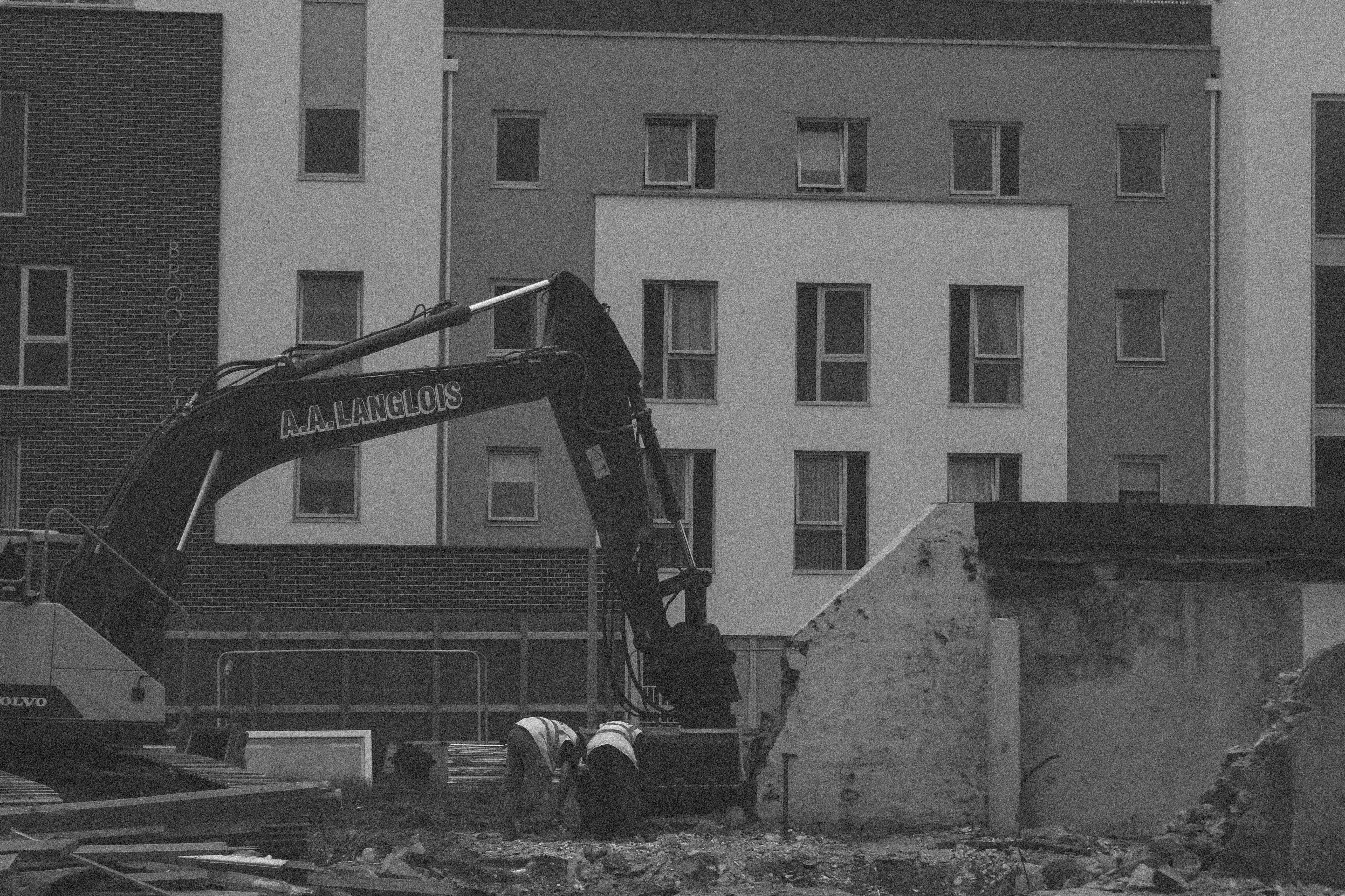
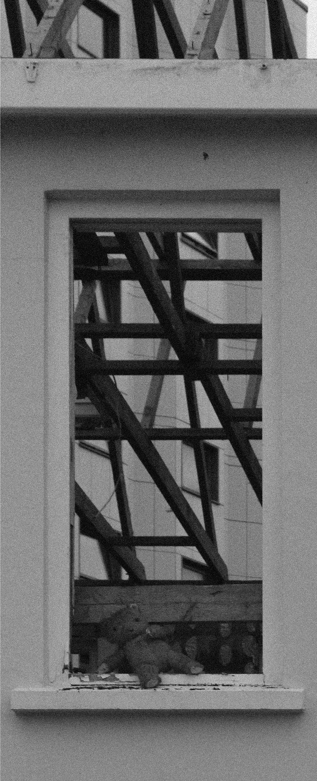
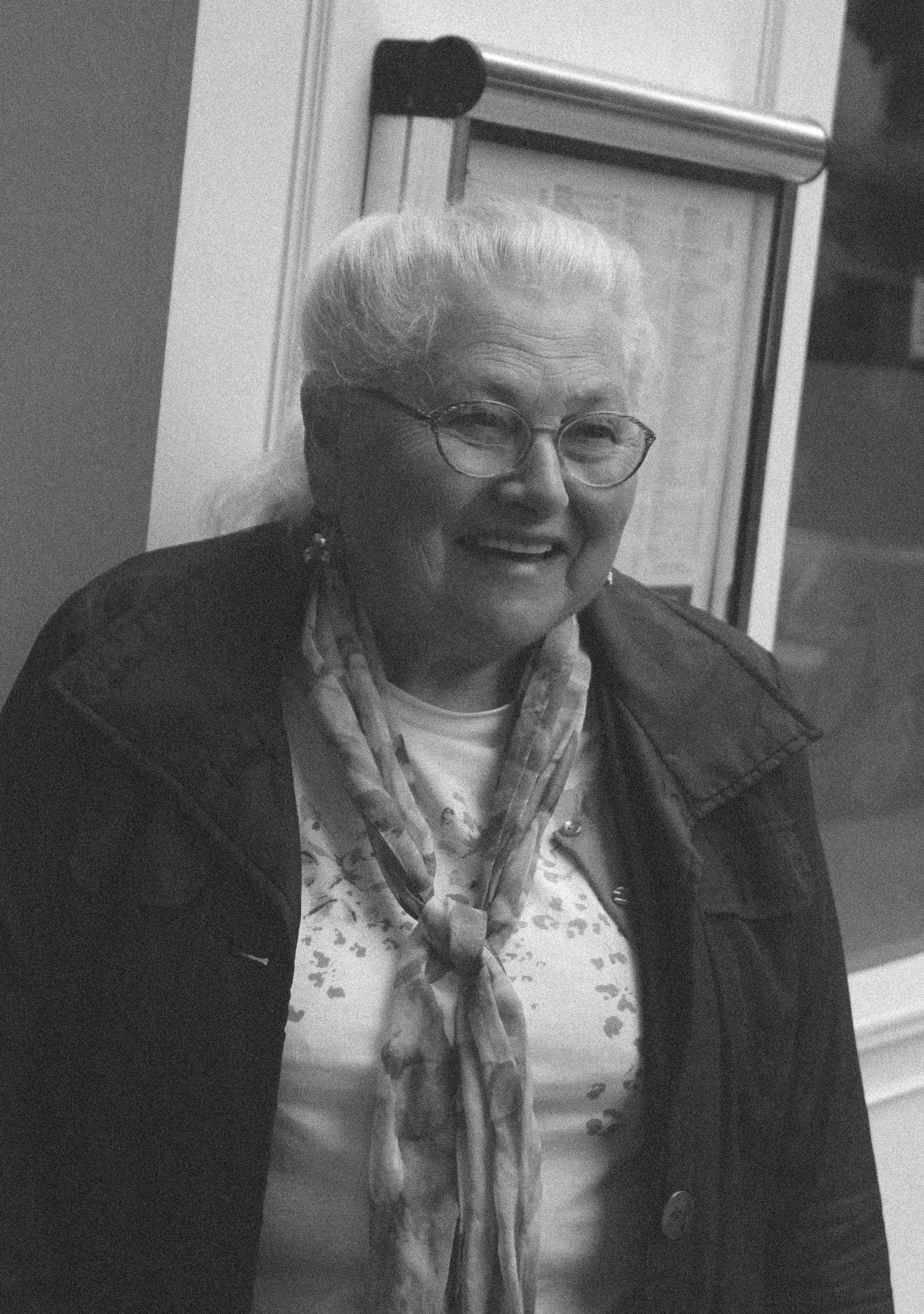
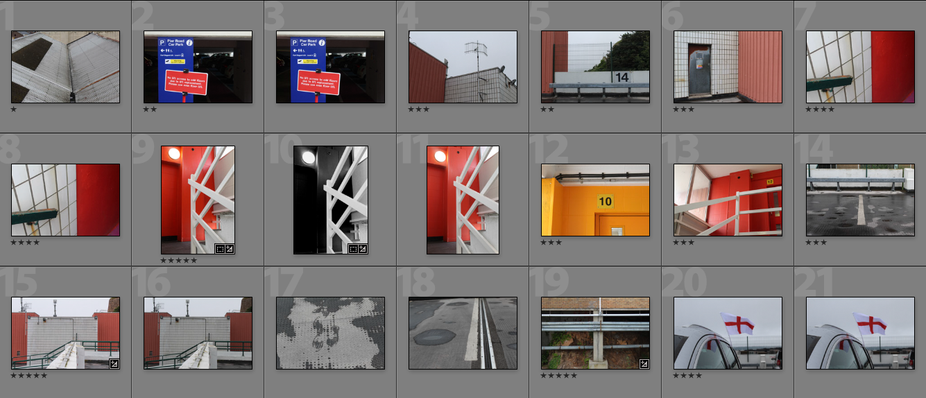
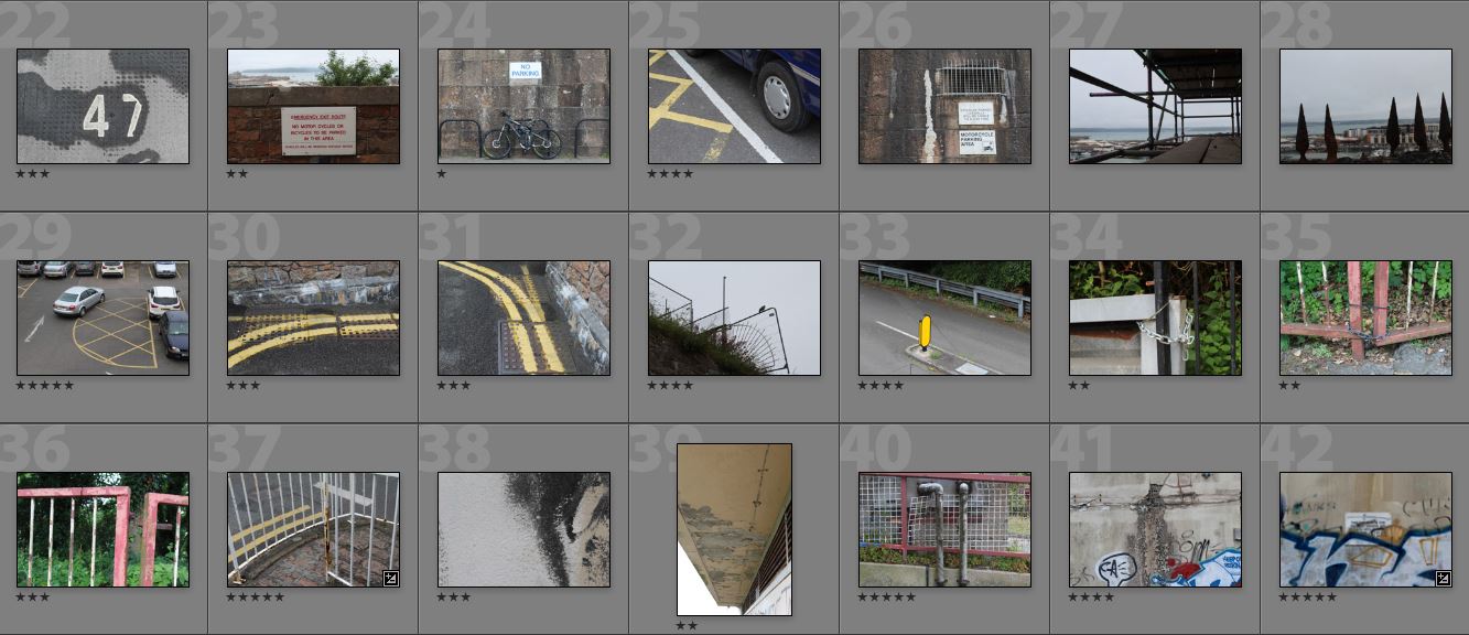
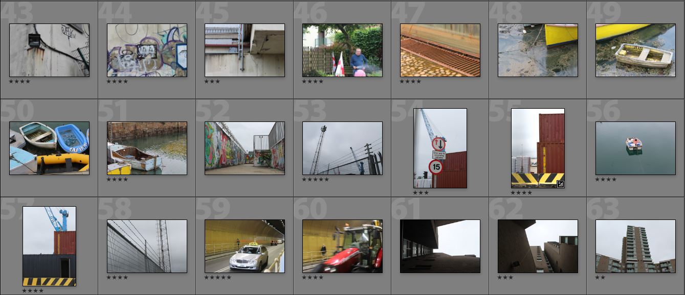
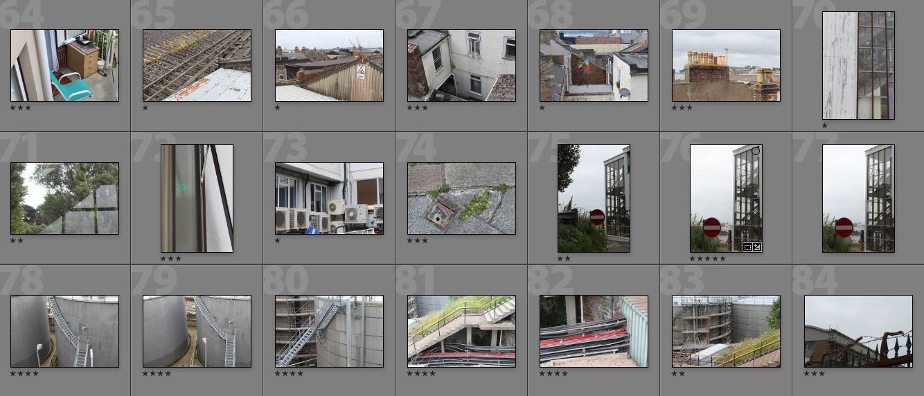
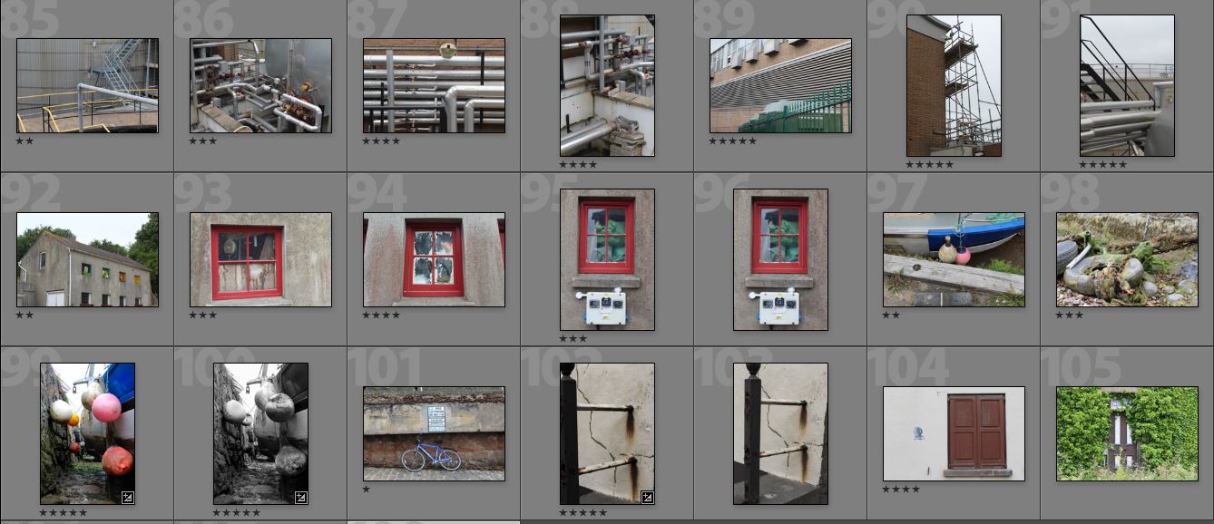
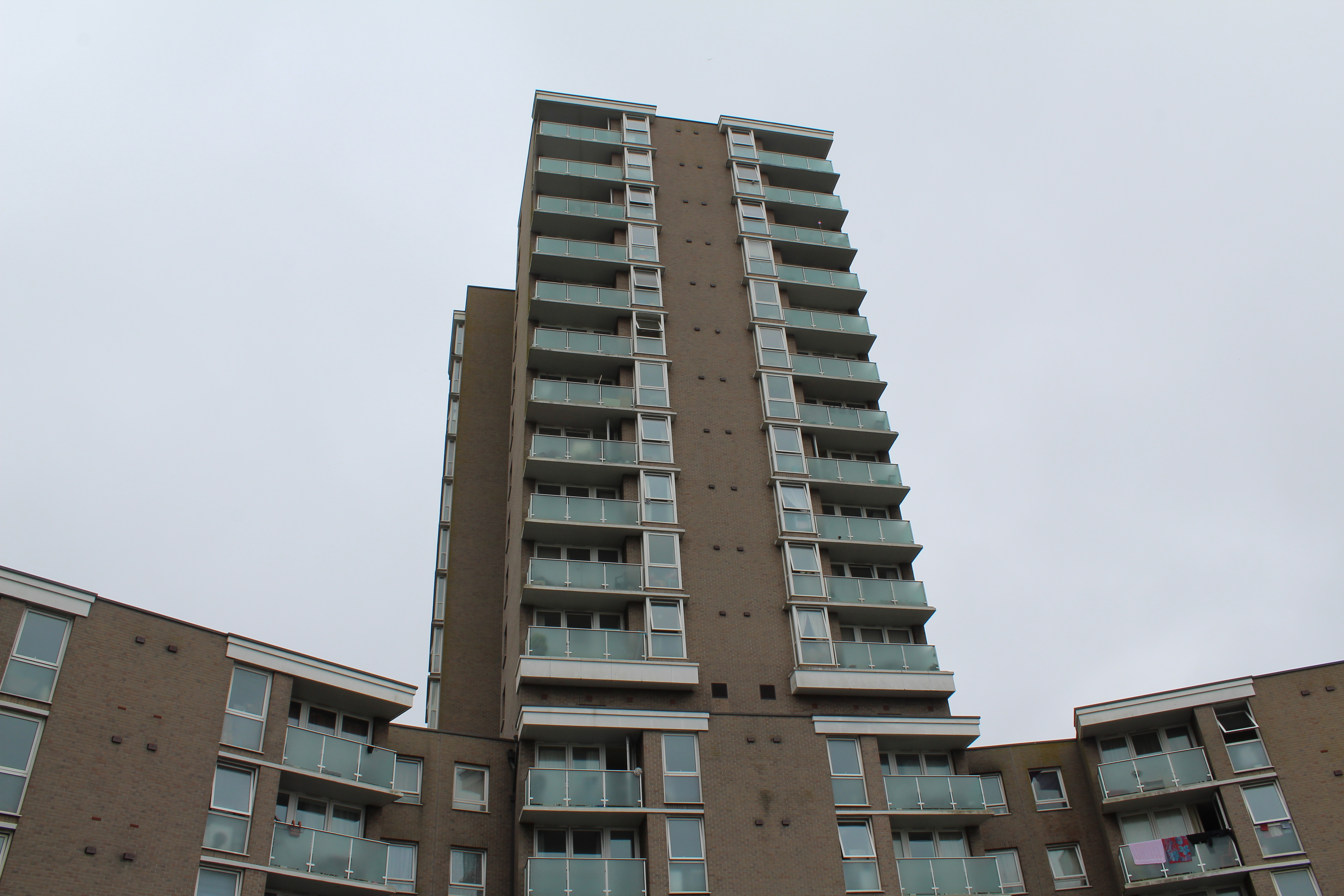
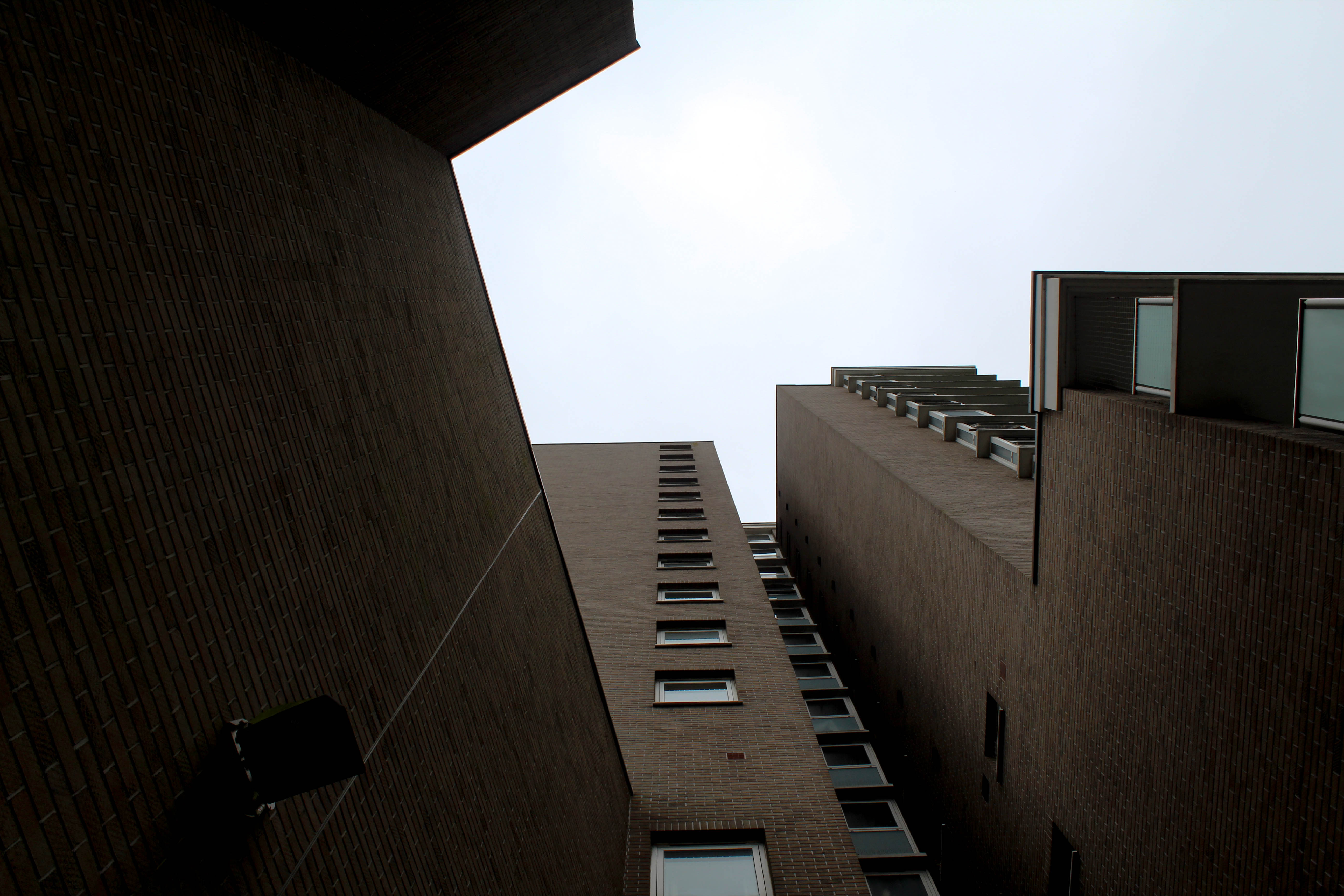
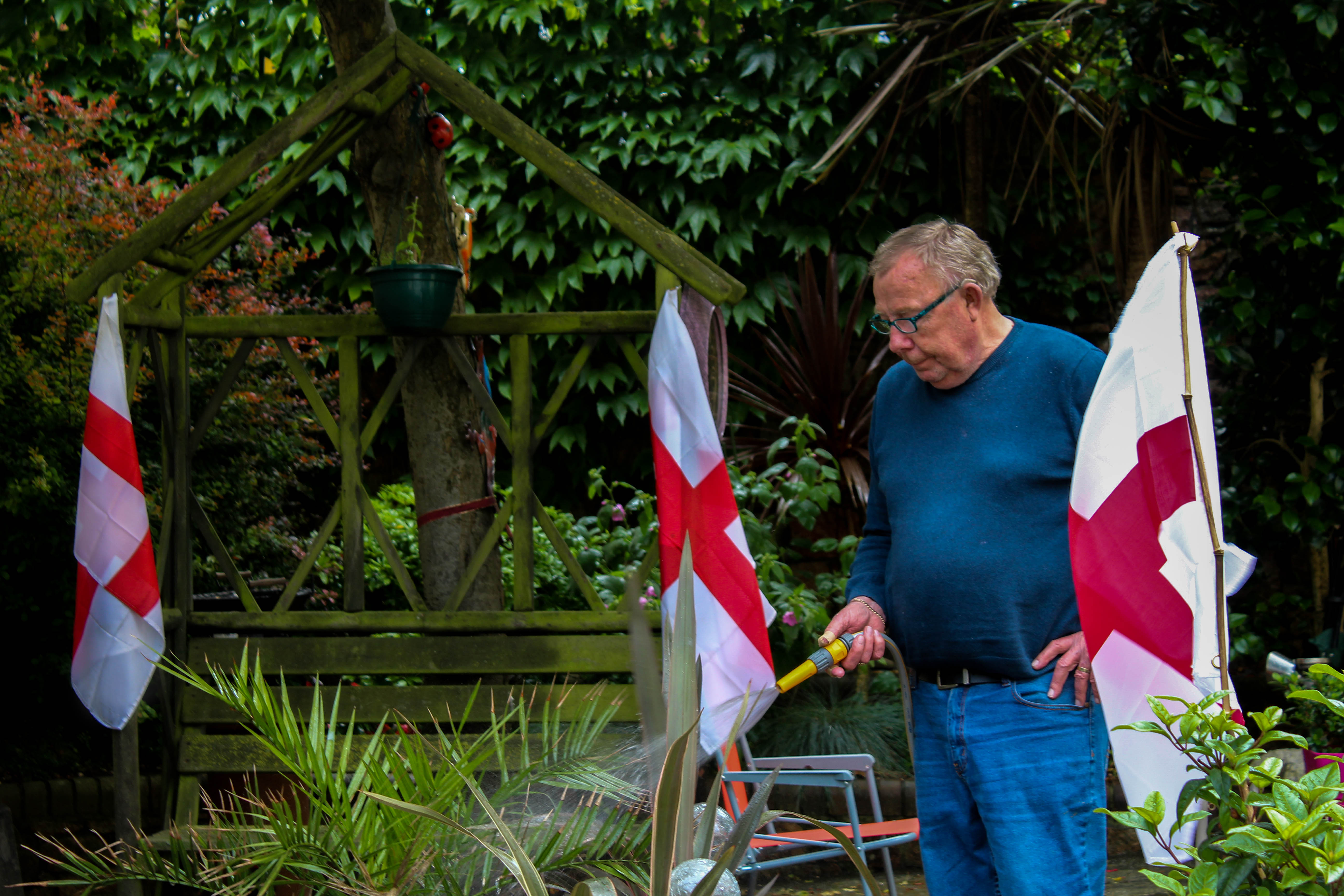
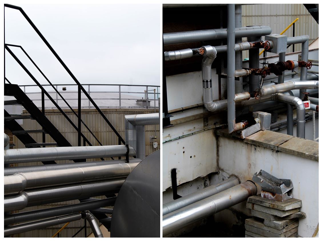
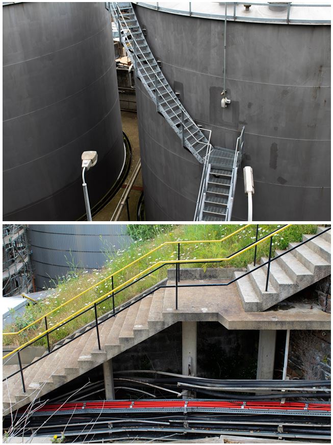


 I want the presentation of these images to keep focus on the images themselves because of the context. The style of these images are very minimalistic and I want the presentation to reflect that. I think the white and black boarders draw the eye away too much because of the contrasting shades and the bright colours.
Below is an example of Krista Svalbonas' presentation. She keeps the images she produces very raw and minimal, almost like the erratic shapes of her images defines itself. With my images, I think that the coloured backgrounds frames the pictures and there is no need for me to mount my pictures on a black board.
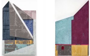
 Plastic - With the images I produced with plastic, I think my composition reflects Krista Svalbonas' work more than the bacon images. When I was creating these images, the process felt more creative in terms of figuring out the shapes and placement of the repeated images. However, I think I could of created more out of the material I had and produced a similar image like the pop art of bacon that represents the mass and the extent humans go to, to satisfy a habit. Both the topics have the same principle, a problem that has arisen because of the growth of population and selfishness of our race.


