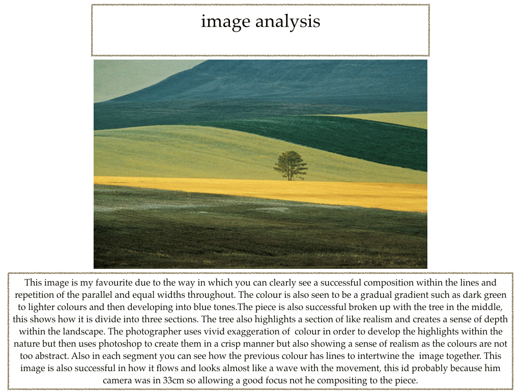
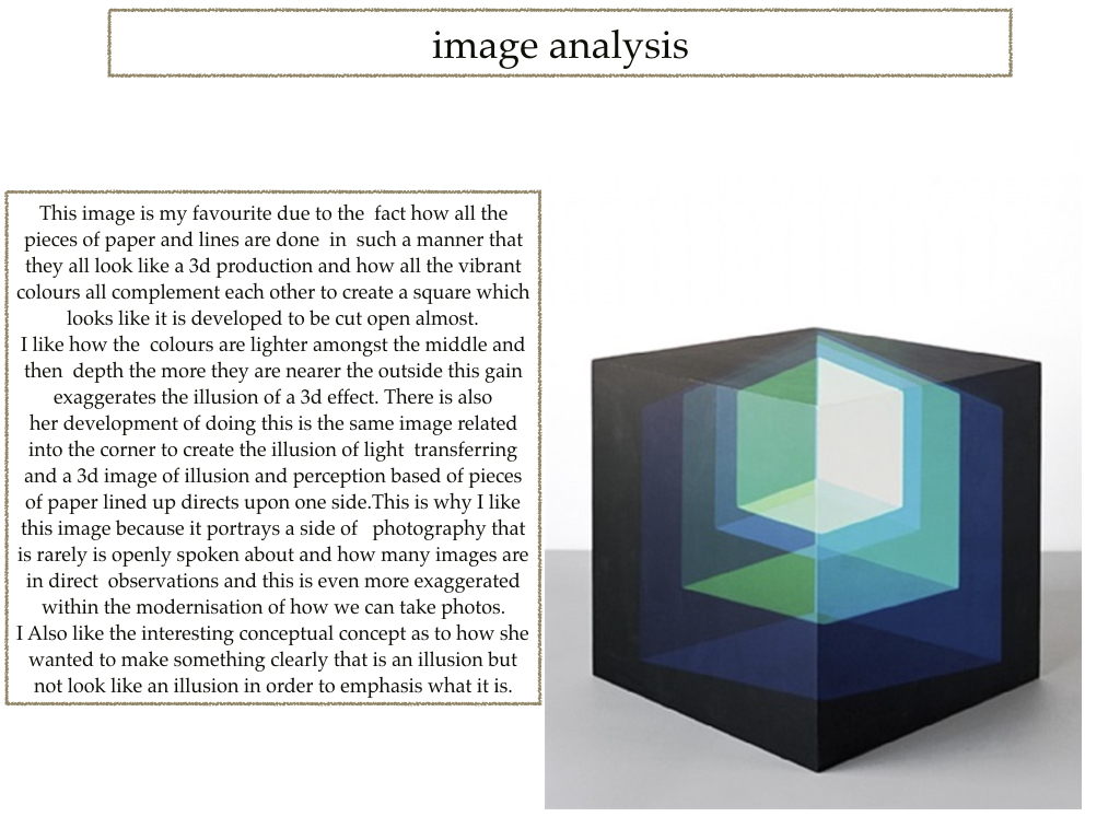
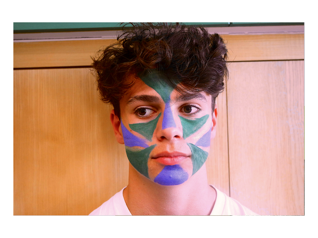
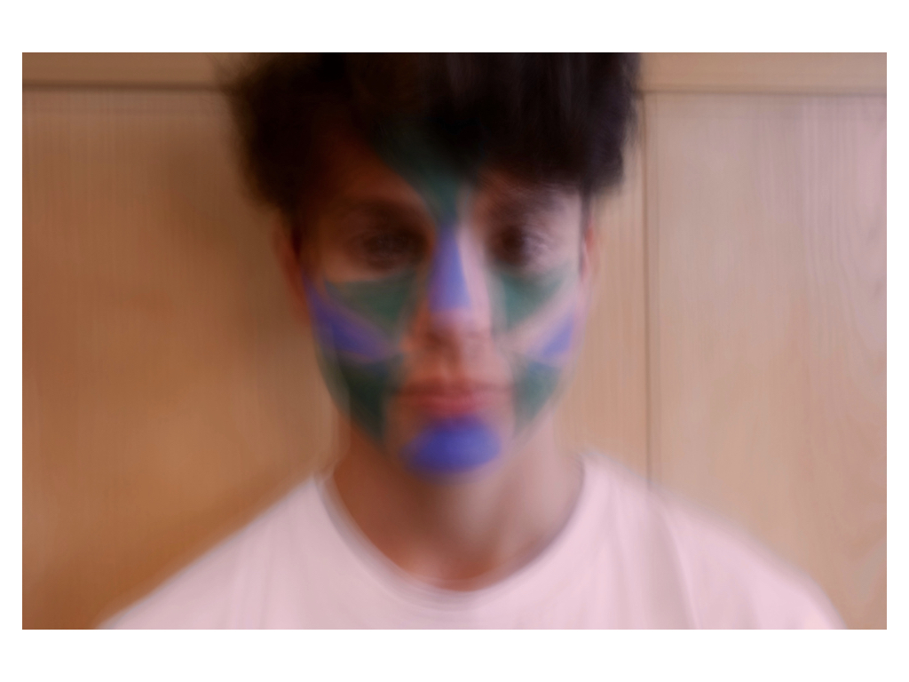
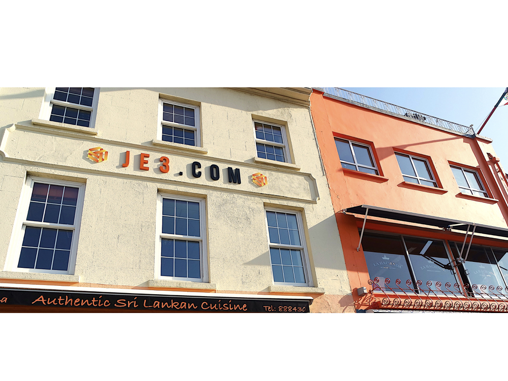
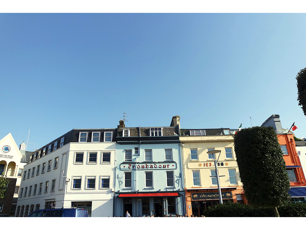
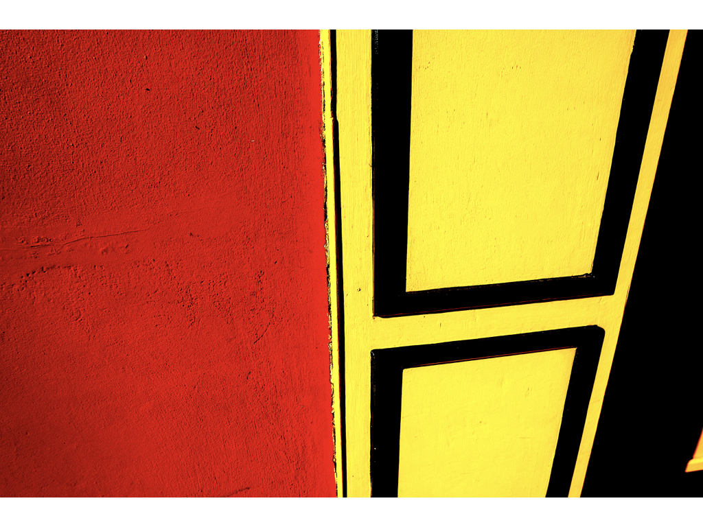
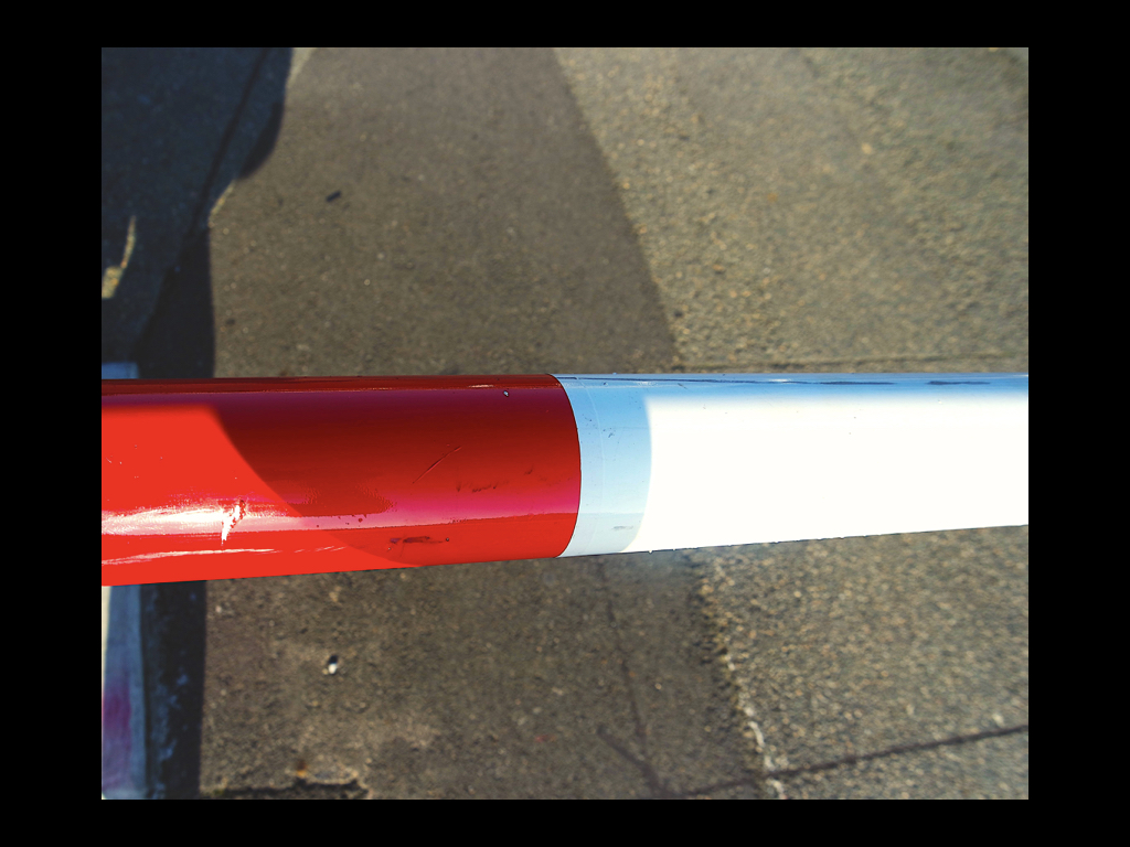
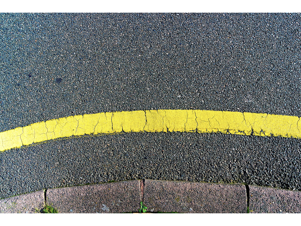
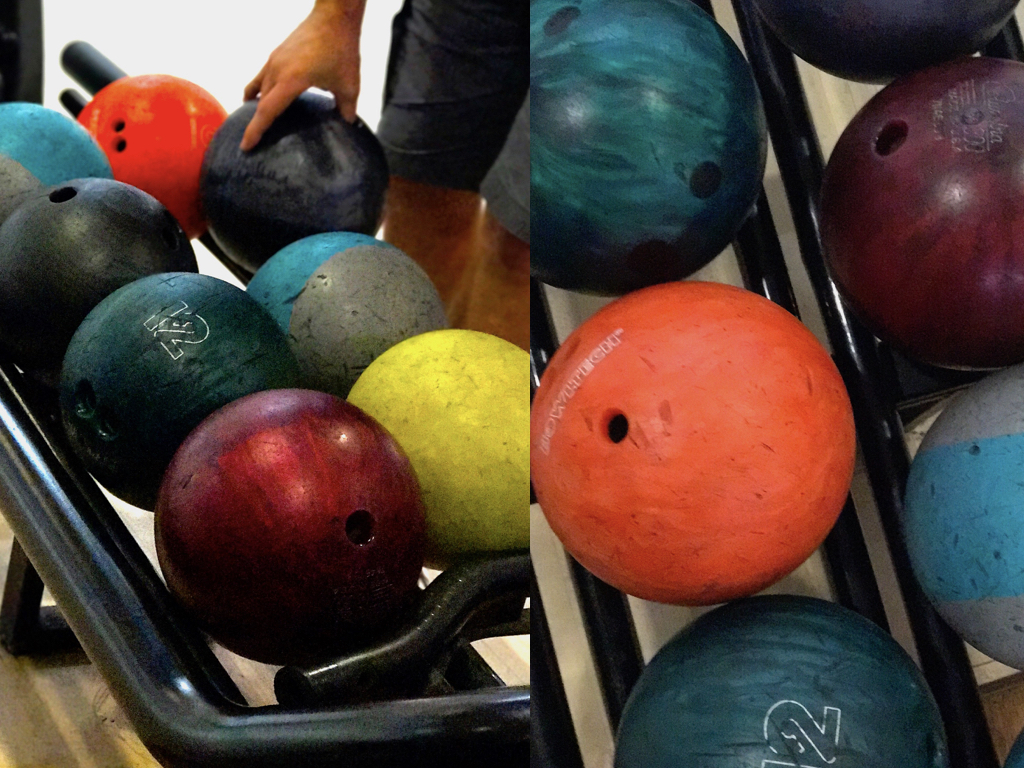



Taking inspiration from Tamara Lorenz, I tried to re-create her abstract photography using sheets of coloured paper and arranging them in different ways. I selected colours that complemented each other and cut pieces of paper to create traingles and other shapes to make the photos more interesting.
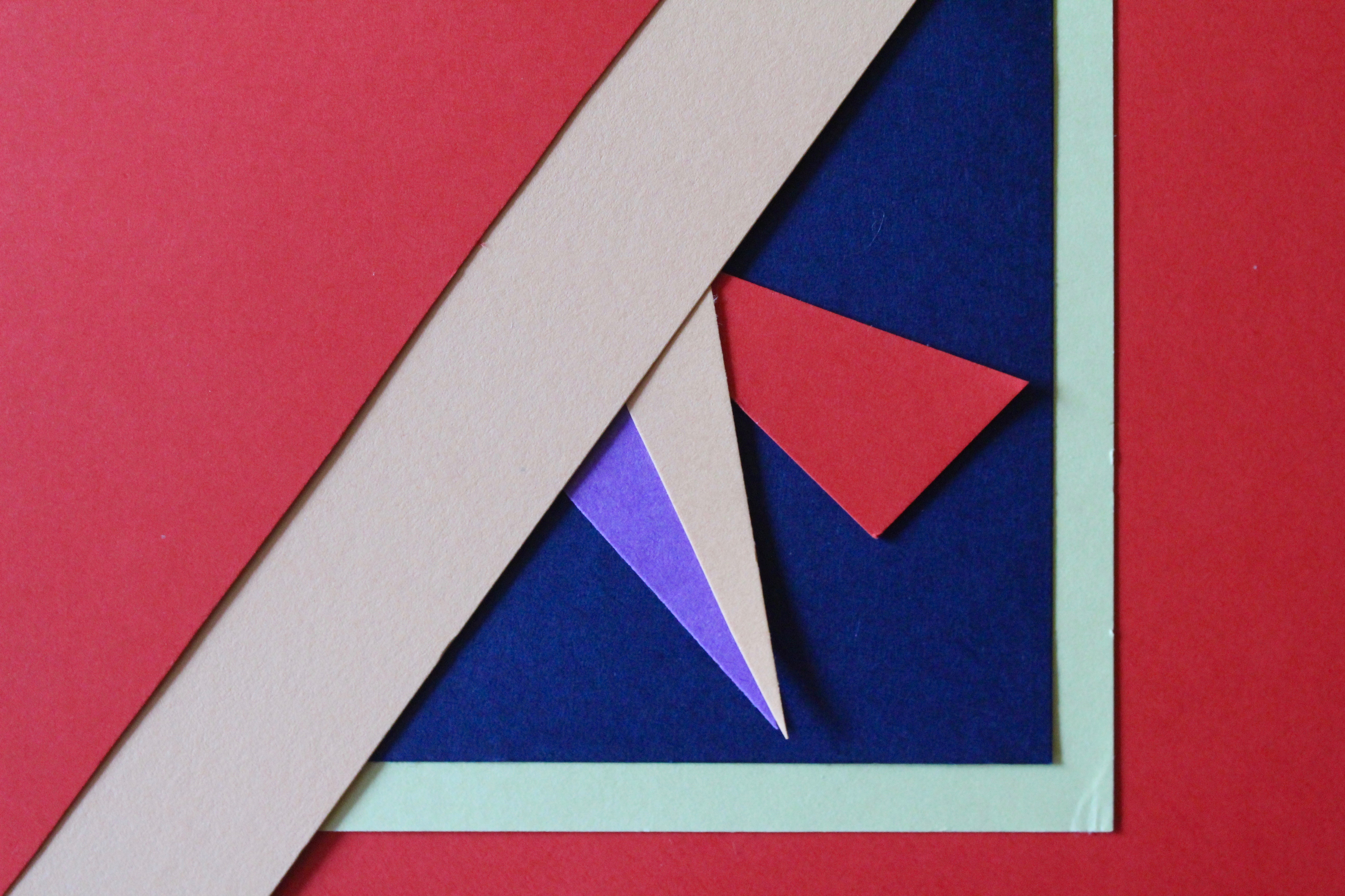
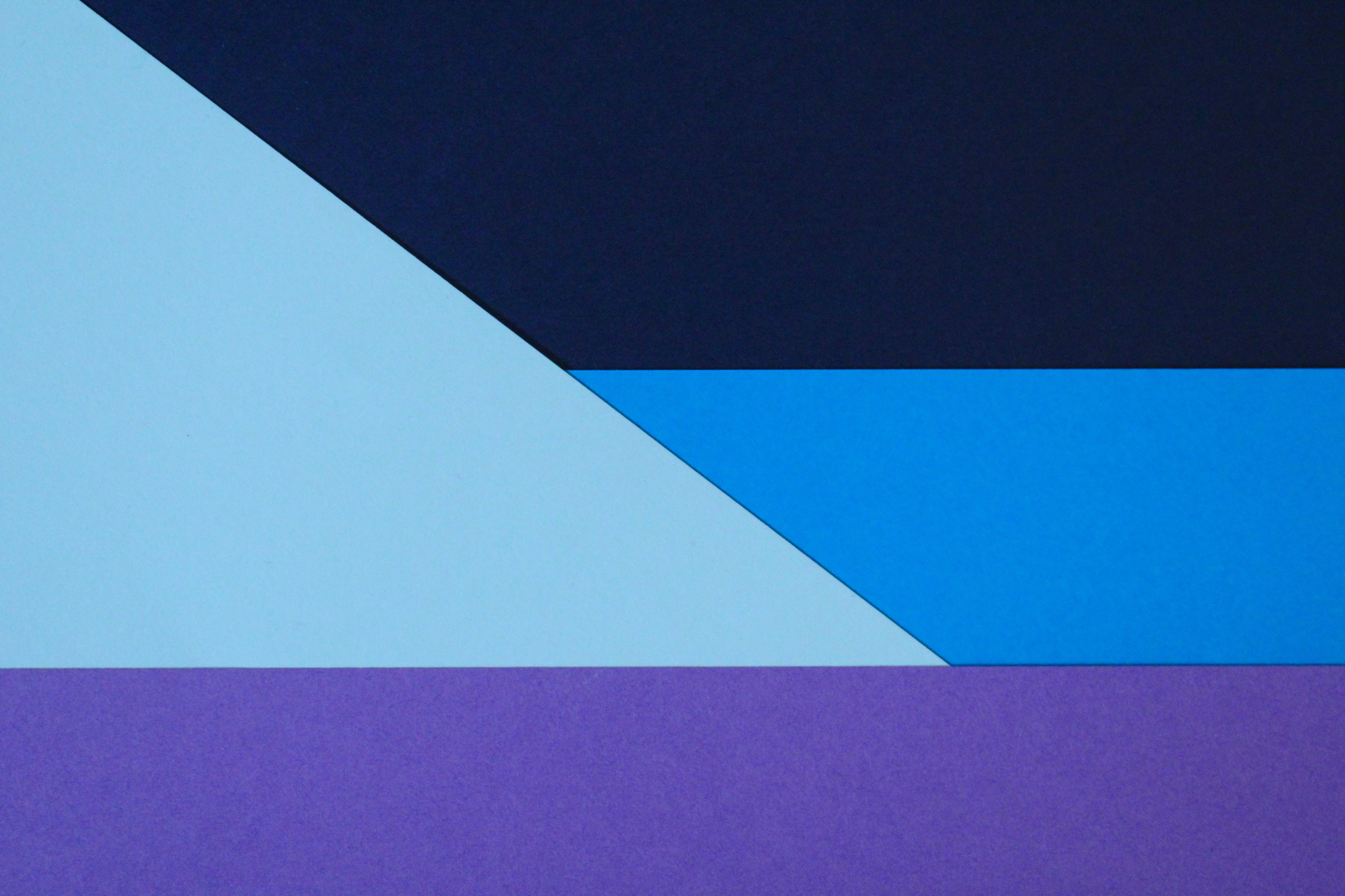

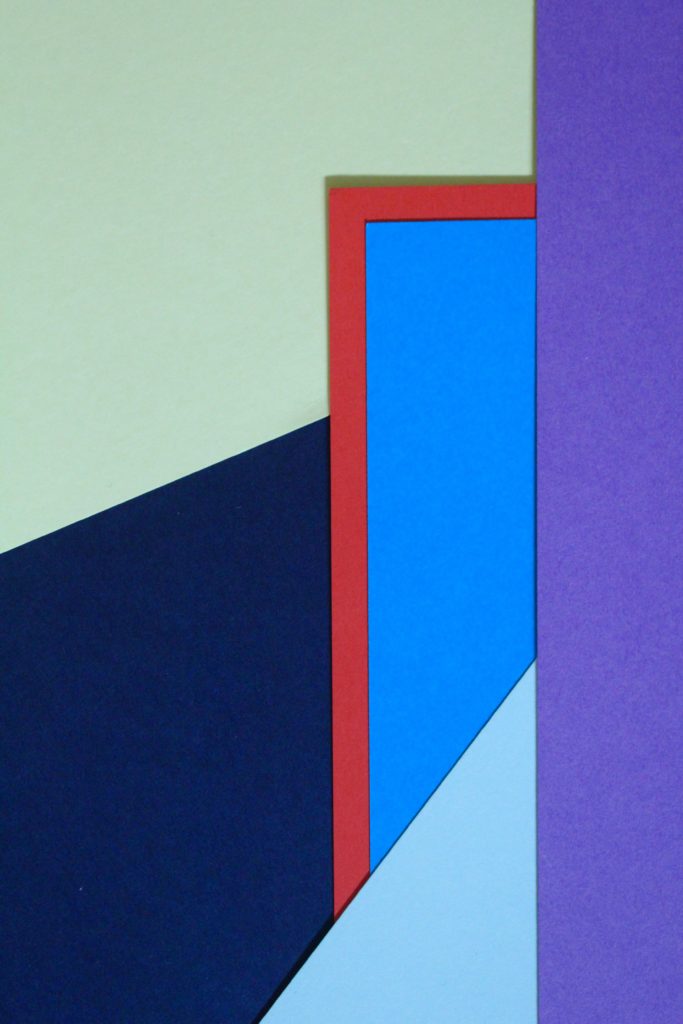
I especially like this photo and the colours I used to create the pattern. The red sheet of paper with the blue layered on top creates a bold outline and is the point where your eyes are drawn to. Like Tamara, the addition of strong planes of colour provide another source of contrast in addition to those of line, shape, tone and texture. The cold colours paired with the warm colour creates a contrast between the sheets. The paper layered behind is arranged to create distinct geometrical shapes, emphasising the straight lines. I experimented with different angles to place the paper and tried to find the most aesthetically pleasing arrangement. I experimented with flash and natural light and decided that natural was better. This work also shows similarities to Franco Fontana’s work using bold, vivid blocks of colour to link into abstract photography.
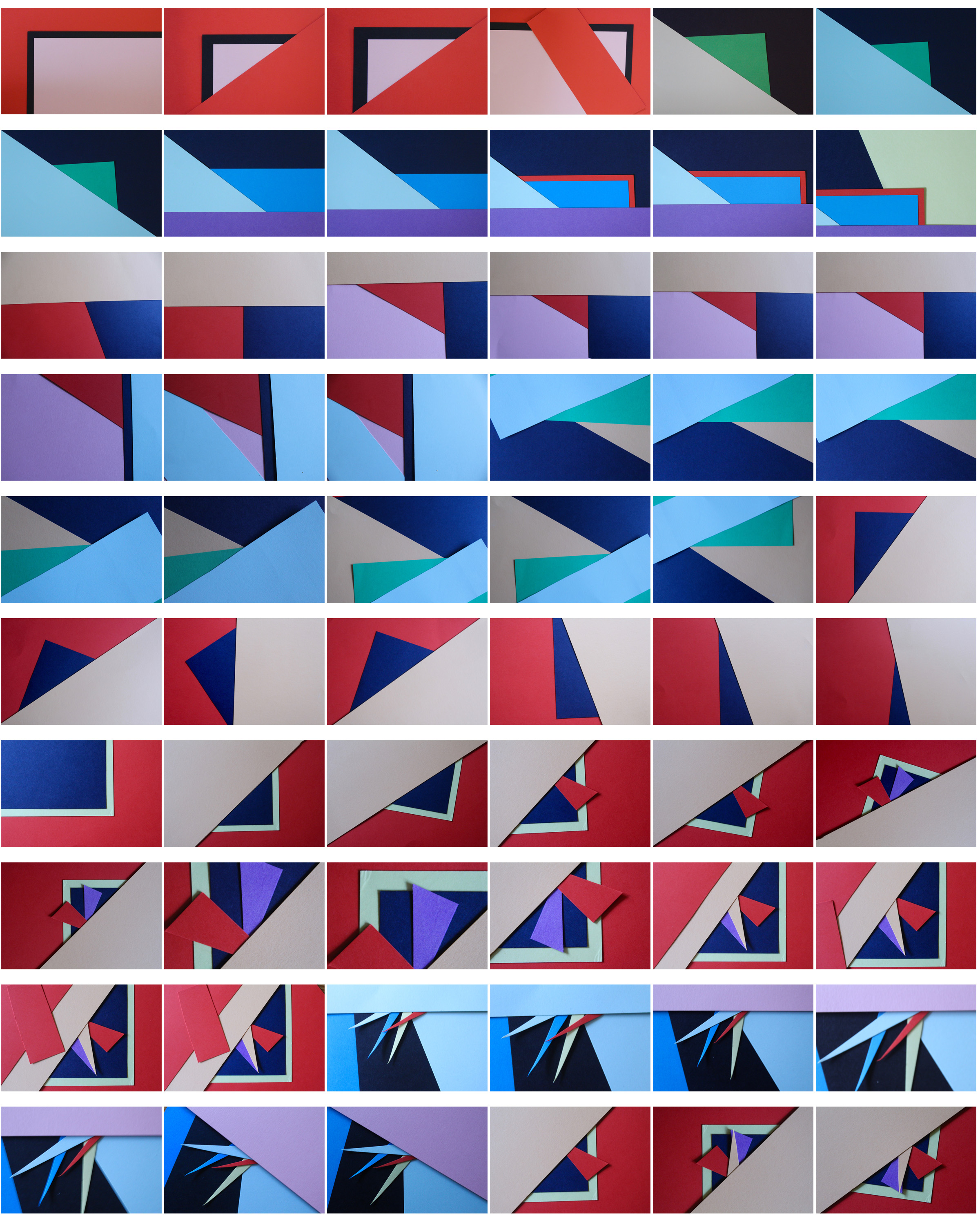
To further develop these photos I could arrange them in a different shapes, e.g. a circular shape, to frame the photos even more.
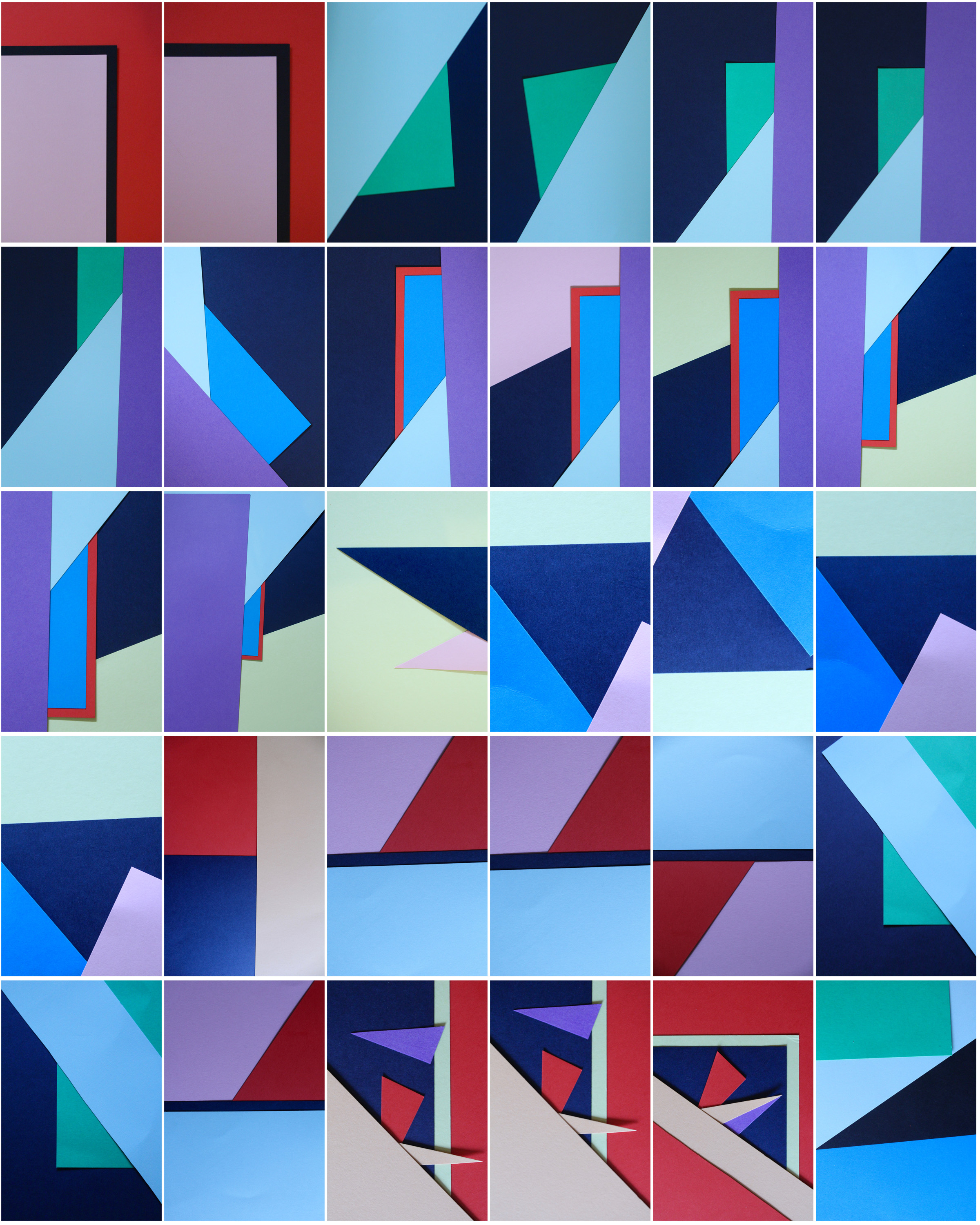
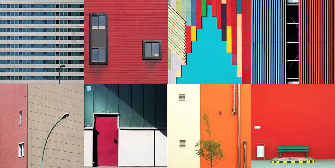
The below selection of photos are my final photos and composition. I have chosen these photos as they all link into each other and link to genres such as typology and minimalism whilst exploring colour and texture.
I took inspiration for the bright colour scheme from Franco Fontana and the idea for the use of texture from Aaron Siskind. The idea to present my work as a typology of similar photos came from Bernd and Hilla Becher. I tried to present these images in the same style as Mark Rothko – blocky images stacked on top of each other with spaces in between.
I chose this composition above the others due to the way it makes the photos look more collective and together than the others. The repetition of the lines and continuous direction makes the composition appealing to me. By using this composition, the pictures remain abstract but intriguing.

Julian Schulze is a Berlin based photographer which has an abstract and minimalist approach to photography. He is mainly focusing on the Abstract & Surreal genre of photography and it appears that he loves bold colors as well as color combinations and compositions. “I like the simple things in everyday life”. One of the most important things seen in Schulze approach is to identify freedom.
Analysis Of Photo
![]()
This image clearly shows a supposedly isolated man in what looks like an urban area between some interesting and abstract architecture. This image is aesthetically pleasing to view as it has a clear use of the rule of thirds. The image is split into three sections, the patio making up the bottom sector, the first part of the wall creating the second and the different part of the wall creating the third. Located within the bottom right box there is a fence which is used as a natural line to focus and lead us to the main subject of the man. Also the end of the fence is positioned of one of the focus points within the rule of thirds which helps to further guide the viewer deeper down the picture. This image has used natural lighting and appears that the lighting and colors have not been changed too much in the editing process leading to a extremely ‘real’ picture. I believe this image gives a sense of isolation and intimidation. This is due to the man being all alone and surrounded by buildings which appear to look down upon him creating an almost threatening approach. All this image contains is man made structures, no sights of the natural elements in our earth. I believe this shot is an indication of the rapid urbanization around the world and this is leading to humans destroying nature, plants and vegetation. It appears that the man is walking into the light and moving away from the darker place behind him. This is a clear relation to the contrast between good and bad as lightness relates and good and darkness relates to bad/evil. Perhaps this is suggesting the man has changed around his life and is moving on for the better or he is just heading into a much happier place compared to where he was before. It could also be seen that he has a ‘bright future’ as this is literally portrayed in this photo. However, on the floor we can see how the lighting has created different shaded shadows on the floor along where the man is walking. In the picture, he is walking on the darkest part of the shadow which could imply, he is not currently on the path for success but is heading in the right direction.
Photo shoot for Julian Schulze

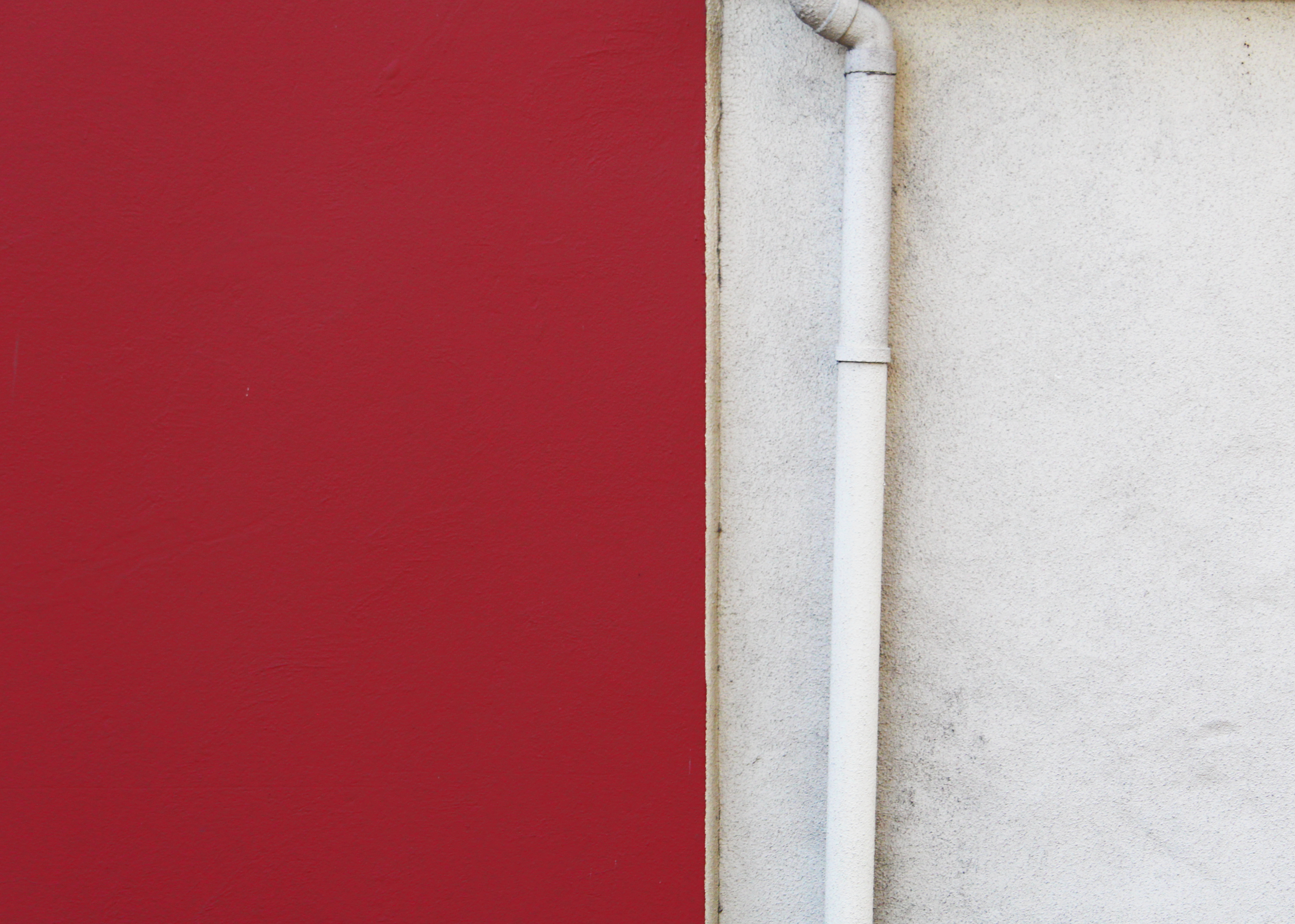


I believe these images strongly relate to Julian Schulz’s work in the sense that they capture a true response to minimalism with a strong demonstration of contrast. Also they have clearly got a sense of color which was the main focus of this shoot. I think what went well with these images is the composition I was able to achieve to allow a much more aesthetically pleasing image and the simply, yet interesting lines which separate color creating a natural, strong contrast. However I believe i could have improved the surrealism within the images to better portray the abstract theme and create an even more interesting photograph.
What is Bokeh? Bokeh, also known as “Boke” is one of the most popular subjects in photography ever. The reason why this technique is so popular, is because Bokeh makes photographs visually appealing, forcing us to focus our attention on a particular area of the image. The word comes from Japanese language, which literally translates as “blur” which is exactly what it is.Basically, bokeh is the quality of out-of-focus or “blurry” parts of the image rendered by a camera lens, – it is NOT the blur itself or the amount of blur in the foreground or the background of a subject. The blur that you are so used to seeing in photography, that separates a subject from the background, is the result of shallow “depth of field”, and is generally simply called “background blur”. The quality and feel of the background/foreground blur and reflected points of light, however, is what photographers call Bokeh.
To achieve this effect, you must select a large aperture about f/2.8, 1.8 and 1.4, then get up close to the subject, and focus on what you wish to be 'sharp' whilst making the subject far from the background you want blurred out. I really liked the way many photographers used the use of making lights into almost circular spheres, and decided to have a go at trying out the effect, by putting a clean glass over my lens to take the pictures it created the desired outcome, these were my results:
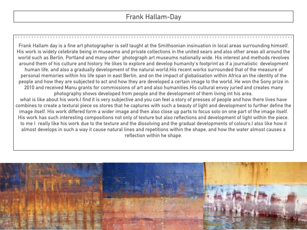
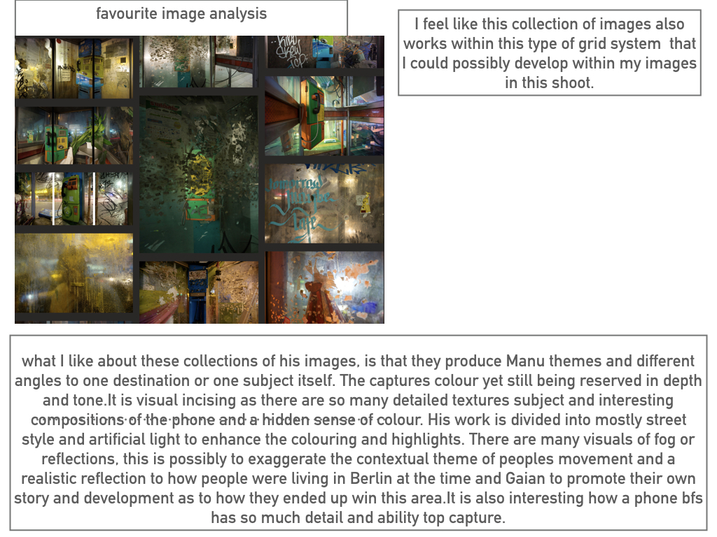
Washington, D.C. based photographer Frank Hallam Day’s work explores the impact of humanity’s footprint on the natural world. Day, who was trained as a painter, says his photographs owe more to the history of painting than photography. Day prefers digital photography to film because it allows him to adjust the image, both on the spot and on the computer. He is a self taught fine art photographer and his interest and methods revolve around culture and history. I am very intrigued by his work as he creates real and moving stories which i believe can impact people upon viewing the images. Not only can he do this threw the use of people and how they are living their lives, which are different to ours in the first world countries, but threw the use of both wide and close up shots of the pure destruction that we are creating to the world. I believe there is a strong contrast within Day’s photos from the portrait pictures in Africa to the landscapes of urban areas in cities which have been destroyed. I believe that this contrast is purposely showing us that despite we have all these luxuries and strongly built buildings we take it for granted and therefore do not look after them, allowing graffiti and tear to occur. I also like the work of Day’s due to the highly saturated and vibrant colours used, bringing a dull telephone box to life for example. Also, the use of great composition and natural lines within his photographs allows him to take a boring boat and turn it into something which makes us appreciate and intake the whole photograph.


Clearly this photo shows the inside of a telephone box. What usually would have and should’ve been quite a boring image is actually, in my opinion, a very interesting and eye catching photograph. I believe this photograph would have been taken with a relatively slow shutter speed in order to capture the high light which is seen in the photo, possibly a shutter speed of approximately 1/10 of a second. an ISO of about 400/800 seems to of been used due to the brightness yet sharpness of the photo. The rule of thirds has most definitely been used within this photograph, with the telephone itself being placed on the top left focal point and on the left hand vertical line. The use of this draws the human eye to this point and makes the viewer aware that it is the main subject of the photo. Furthermore, this image uses leading lines to draw us into the subject. The metal panels are natural lines which makes us instantly view the phone. This photo is highly saturated using vibrant colours to intrigue the viewer. The use of strong and bright lighting is contrasted with the shadows on the left of the picture and the outside area on the right. This creates a sinister and scary feeling as it gives an impression of isolation as it is only inside the phone box that is overly bright. The use of reflection on the glass of the phone box creates a feeling of confusion, creating a real mood and story to the photograph. At the top of the phone box we can see how it has been destroyed by graffiti which relates to the photographers intentions of capturing human footprints.


What is the rule of thirds? The rule of thirds is basically breaking an image down into thirds (both horizontally and vertically), so that you have 9 parts. As follows.As you’re taking an image, you would have done this through your viewfinder or in the LCD display, that you use to frame your shot. With this grid in mind the ‘rule of thirds’ now identifies four important parts of the image that you should consider, placing points of interest in as you frame your image. Not only this, but it also gives you four ‘lines’, that are also useful positions for elements in your photo.
The theory is, that if you place points of interest in the intersections or along the lines, your photo becomes more balanced and will enable a viewer of the image to interact with it more naturally. Studies have shown that when viewing images, people’s eyes usually go to one of the intersection points most naturally, rather than the center of the shot – using the rule of thirds works with this natural way of viewing an image, rather than working against it.

In addition to the above picture of the bee, where the bee’s eye becomes the point of focus. The next time I went out I decided to try this within my photos, to really get the viewers attention to the object of my choice, these were my results:
For the people, I decided to use the head of my friend and statue as the area I wanted the reader to instantly look too, where as the flower the seeds as the focus, and the rib-cage in the carcass.
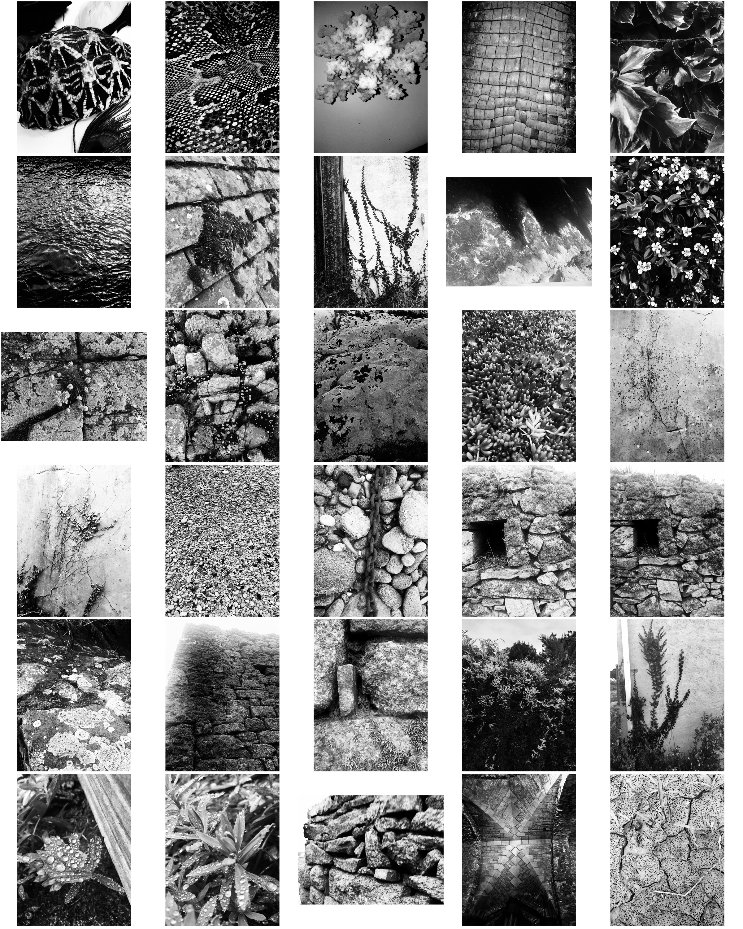
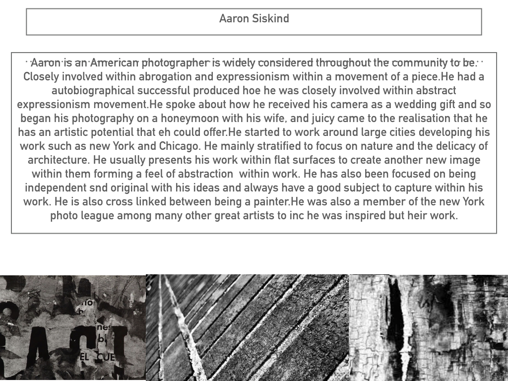
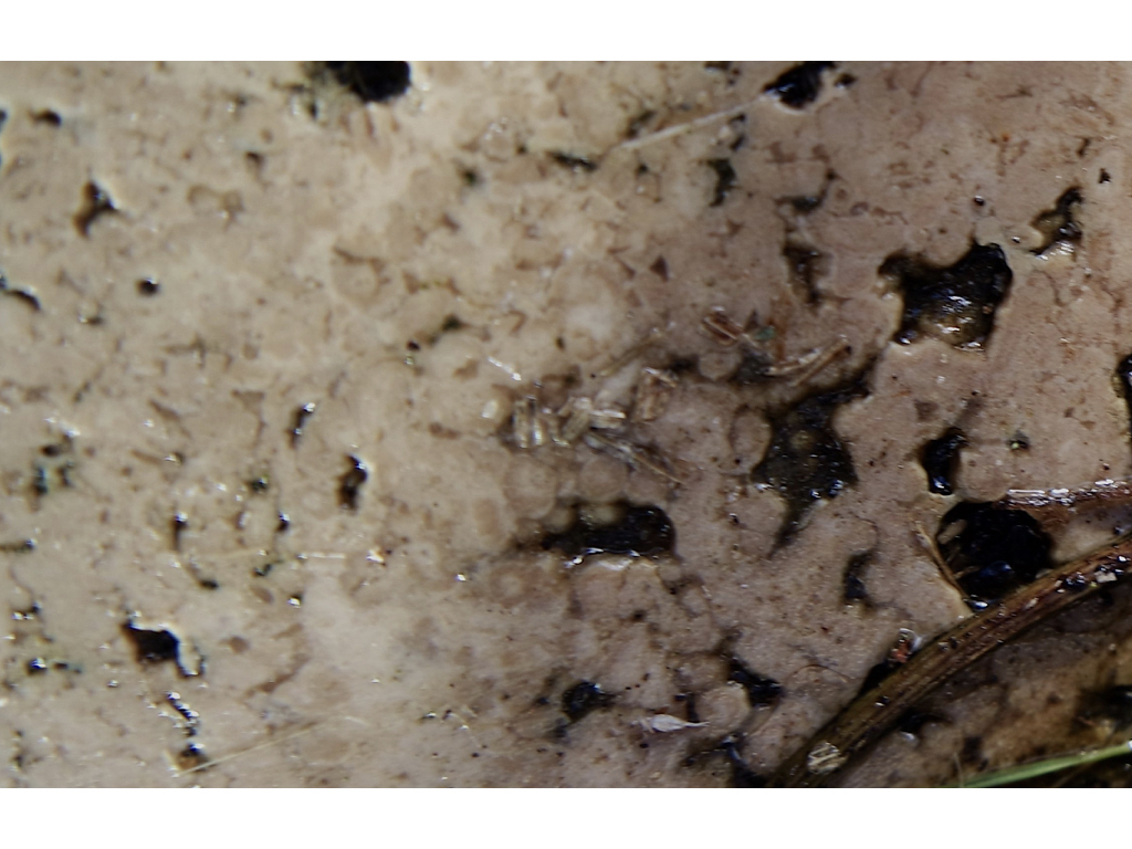
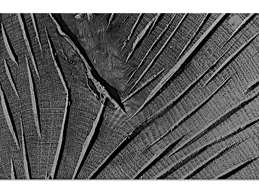
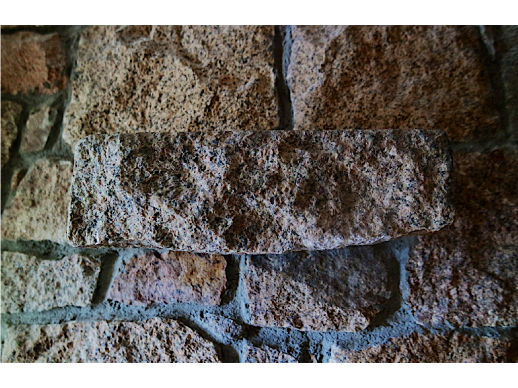
These photos take inspiration from Aaron Siskind focusing on texture, line and visual rhymes.

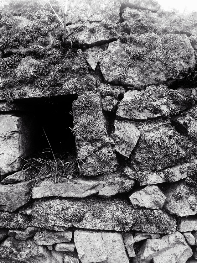
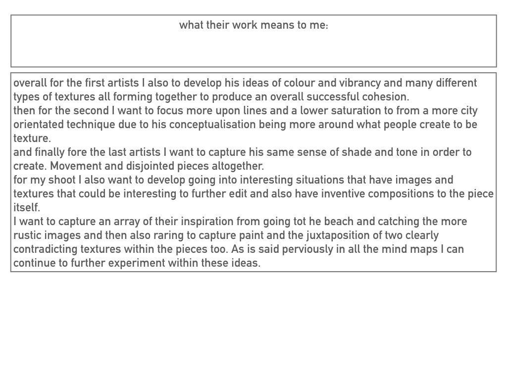
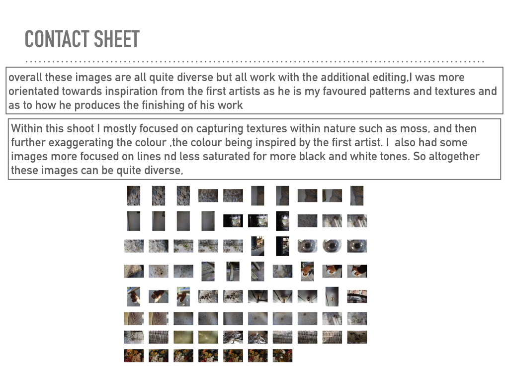
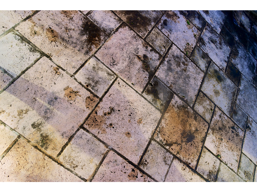
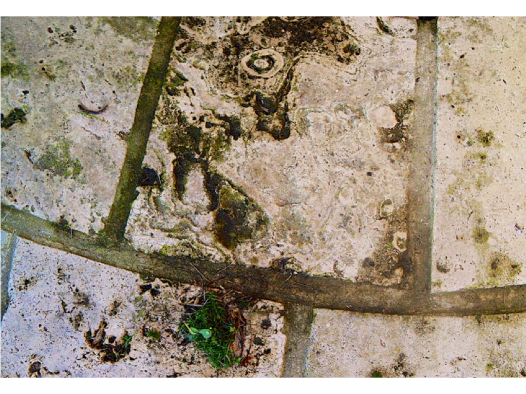
These two photos are my favourite from the shoot as they display texture of the surface, using the Ansel Adams zone system. The stones in these photographs both contain a lot of detail like the moss and weathering, making the photos more interesting. Both images contain contrasts between light and dark, the first image has contrasts from the higher level of rock and the shadows which they create below them, and the second image contains shadows through the gaps in the stones creating varied tones in the photo. Editing the photos in the contact sheet black and white makes them more similar to Aaron Siskind’s style.
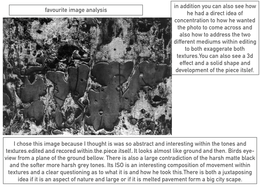
These photos show similarities to Aaron Siskind’s ‘Martha’s Vineyard’ photograph:

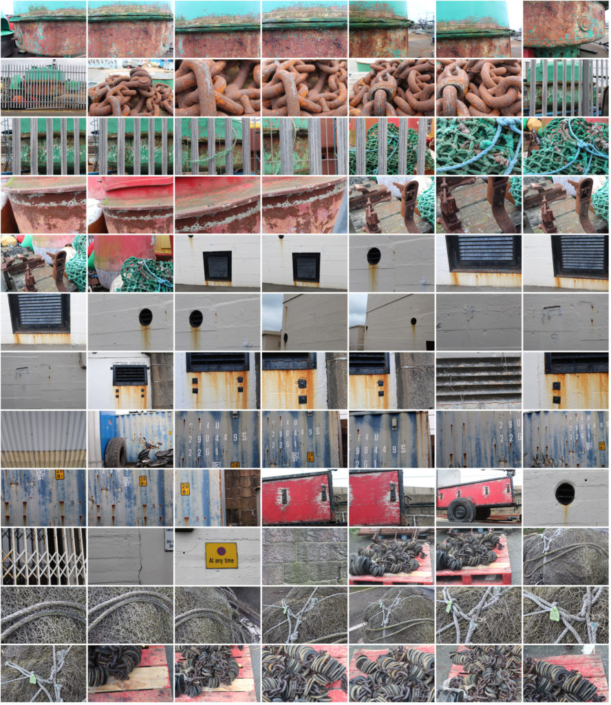
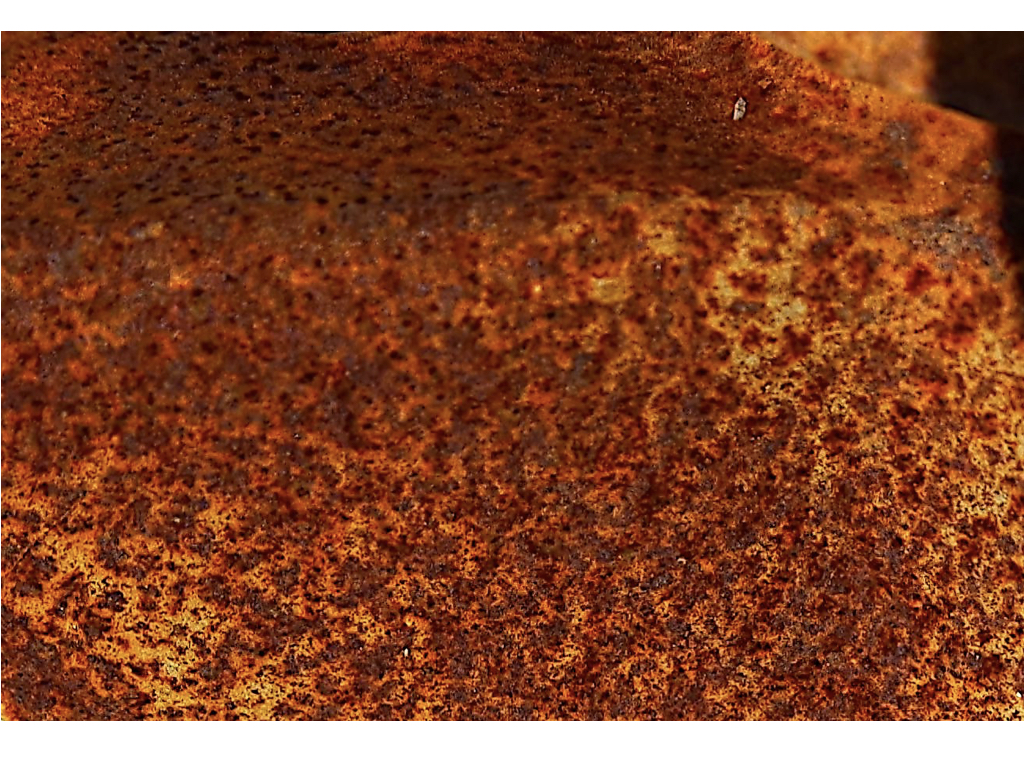
For this photoshoot I looked for objects that had been in the sea or near it so i could focus on the weathering and rusting, like Frank Hallam-Day did in his ship hull photos.
Final 5 Images from Shoot:
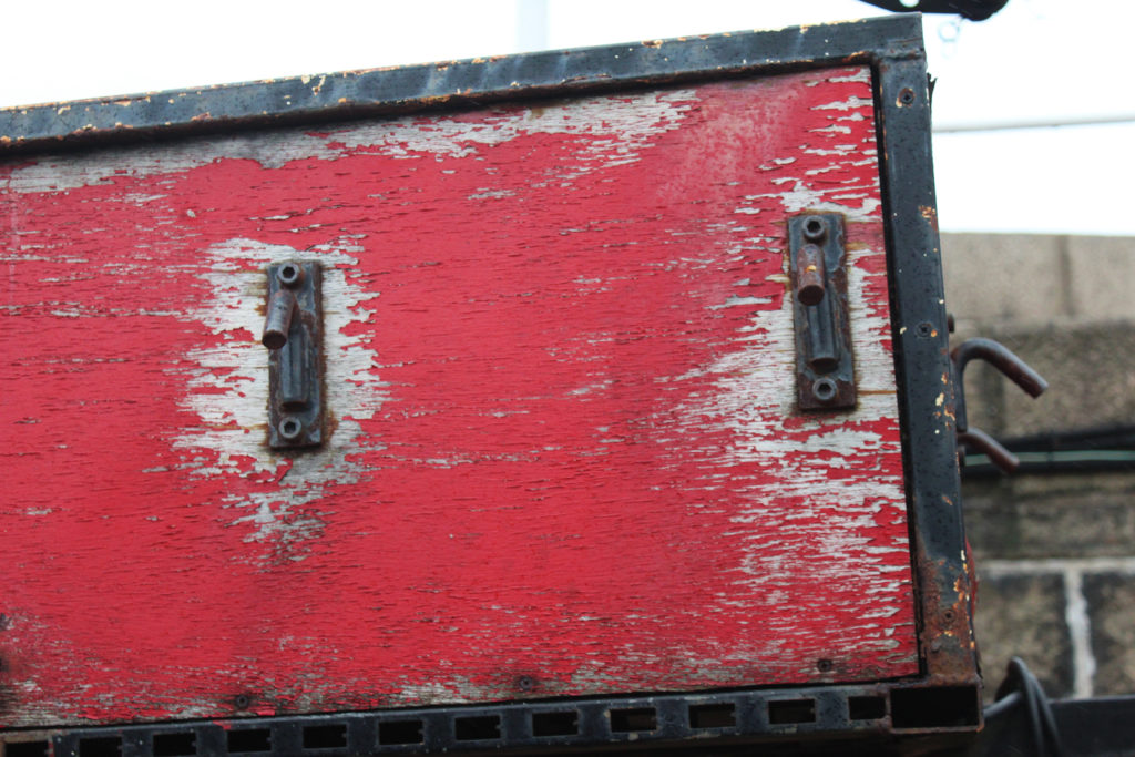
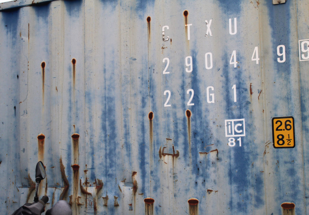

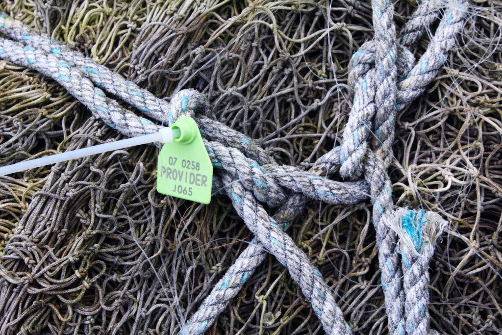
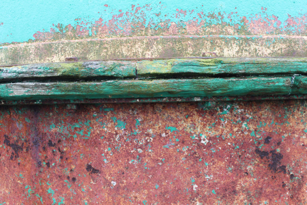
The photo which i think shows the most similarities to Frank Hallam-Days photography is image 5 as it focuses on the weathering and gradual deterioration of a man made object. It has horizontal lines, creating sections with the photo of different texture. To improve this photo i would have photographed the entire ship hull so it showed more similarities to Frank Hallam-Days work.
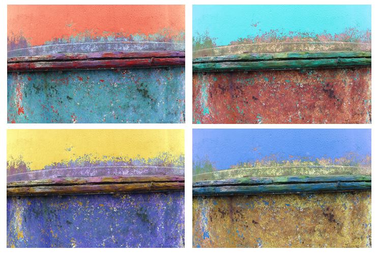
I edited the original picture and altered the hue to create different colours of ship hulls and a more varied range of photos. I tried to capture the way Frank portrays the effect of time on works of man, emphasising the rusting and weathering.
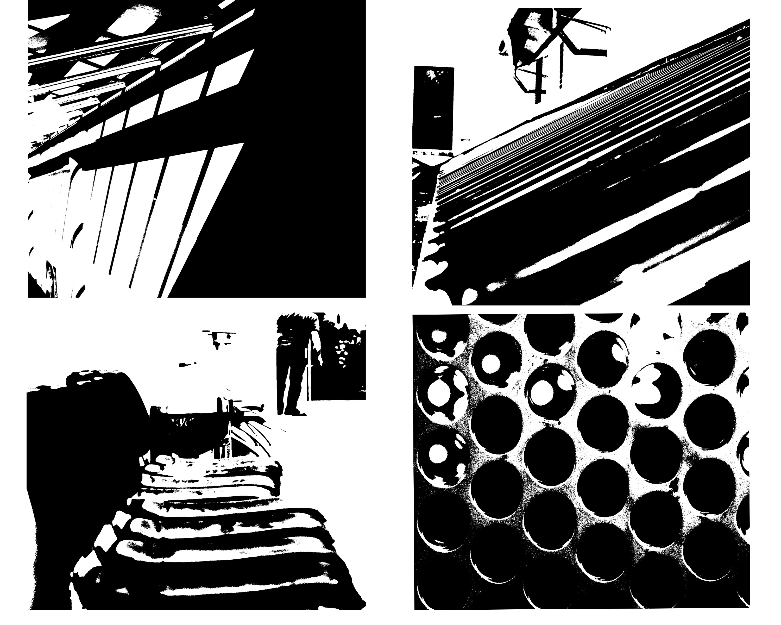
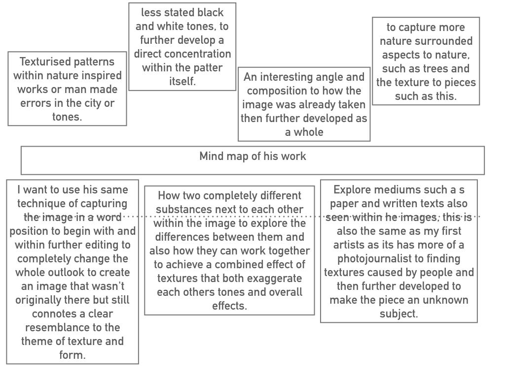
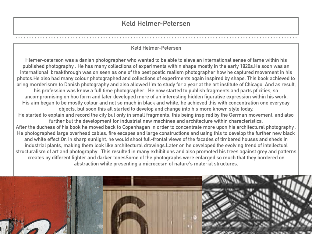
within this image it is edited to show black light within high saturated edits,then also turned into squares for an even overall finish.I was inspired by the artists Keld Helmer Petersen who wanted to achieve an international collection of experimentation shapes inspired by ranger patsch. He also developed poetic realism within his work and modernism within photography.
He eventually adapted and developed the intellectual structuralism to art and photography,he liked to capture leafs and trees against grey light and patterns created within nature.He started to become more abstract within the enlarging of his images focusing on the microcosm of nature.
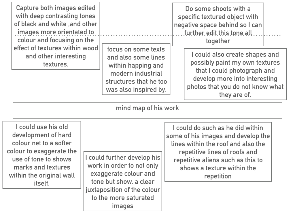
I chose these images due to their defined lines and shape within the pieces. I thought the compositions of the pieces where also quite interesting as there are many dimensions and angles to the piece themselves.
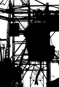
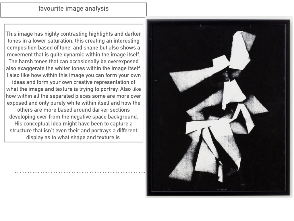
this is a clear example of his work and how he different from using more simplistic images to more complex lines but overall still achieved the same tonal range and detailed effect of the image.