Photo 1
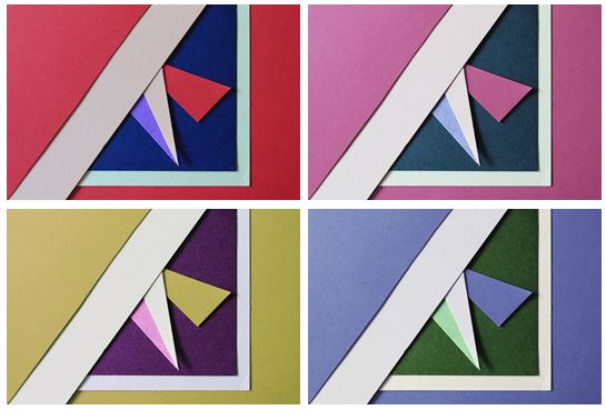 I first experimented with colours and changed the hue of the photos in photoshop and decreased the brightness so the colours weren’t too vibrant. I chose this photo as I think it represents abstract photography well through the solid bold colours and geometrical shapes I created by layering and cutting coloured pieces of paper. I tried to focused on creating contrasts between light and dark pieces of card to emphasise there colour. I personally like the red and pink coloured photos as I think they are the most bold and striking images.

I chose my two favourite photos that I think are the most aesthetically pleasing and experimented by flipping them horizontally and vertically trying to find the best composition and found that I preferred my original composition out of them all.

I also experimented by using circular frames which focused more on the middle section of the images, giving them a different appearance
Photo 2
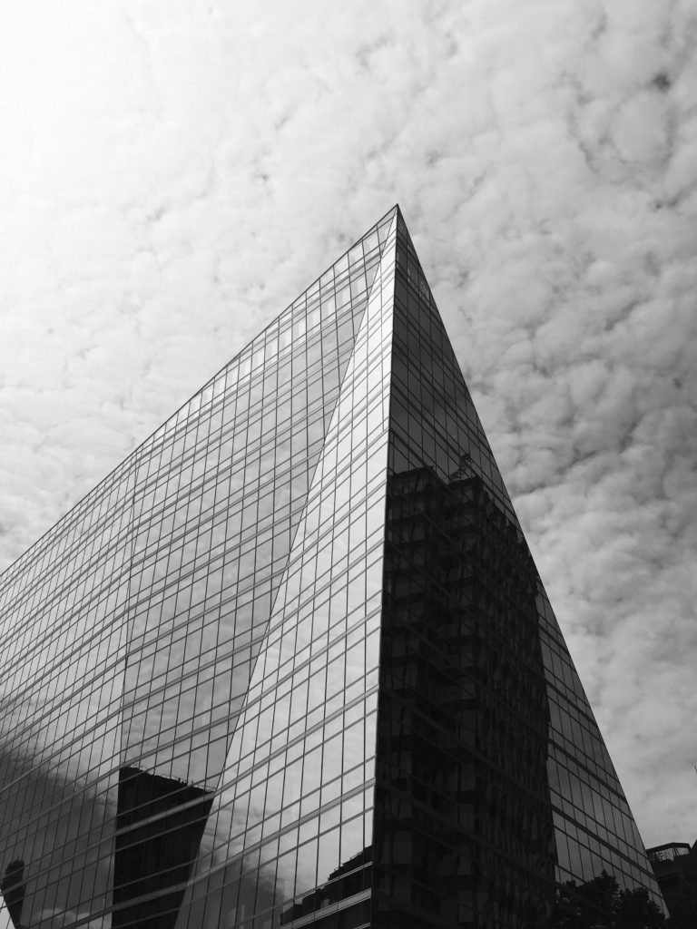
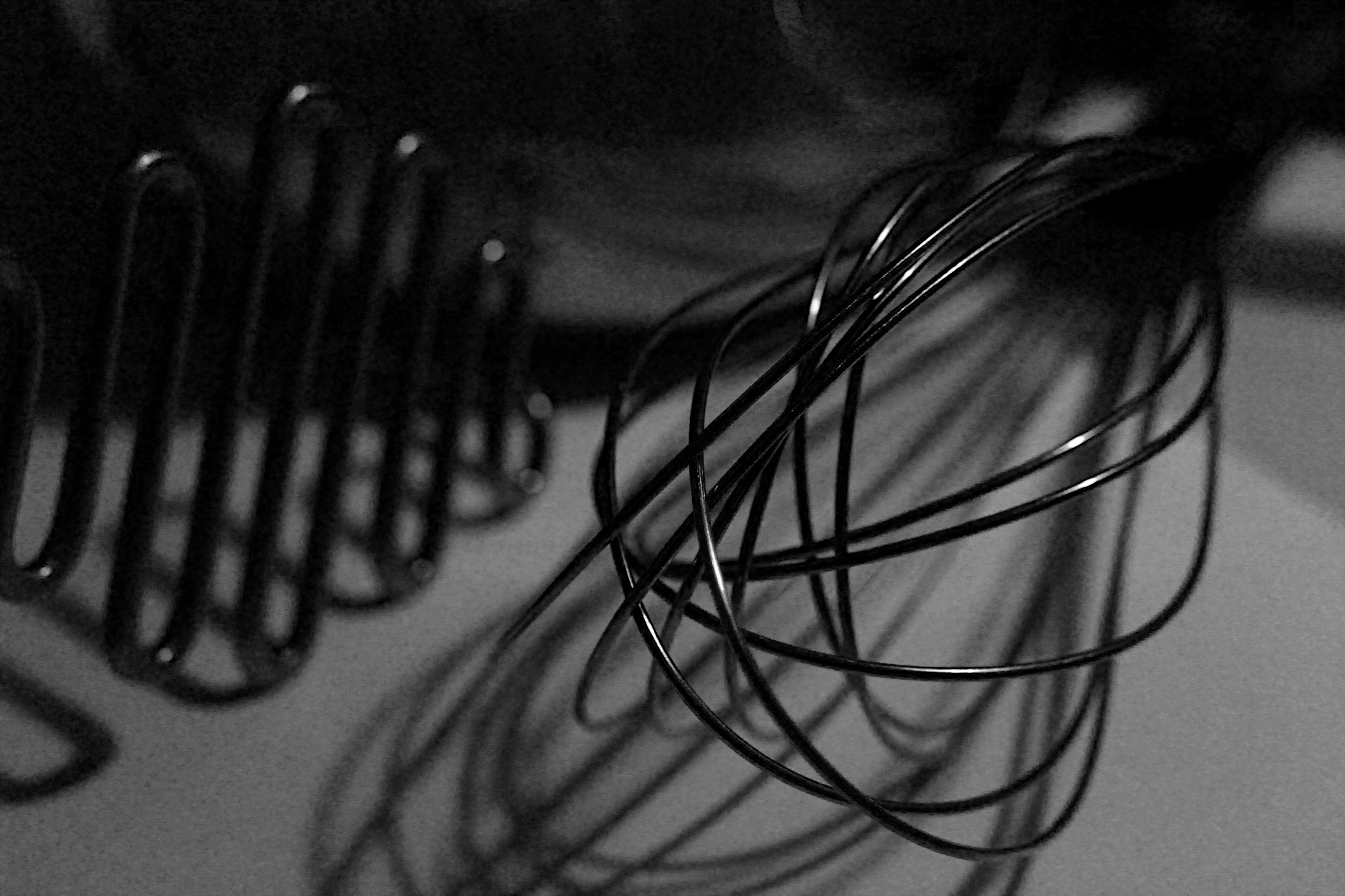
This photo was one of my favourites from my typologies exploration in London, when taking inspiration from Hilla and Bernd Becher. I found that it worked better as a single image, rather than together with others as it contained so much detail. I like the geometrical aspects it has and the repetition and pattern it shows, as well as the tonal variations.


I experimented with the original image, seeing if the photo looked more aesthetically pleasing in colour or in black and white and thought that both worked well as an overall image but decided that black and white was more powerful.
Photo 3
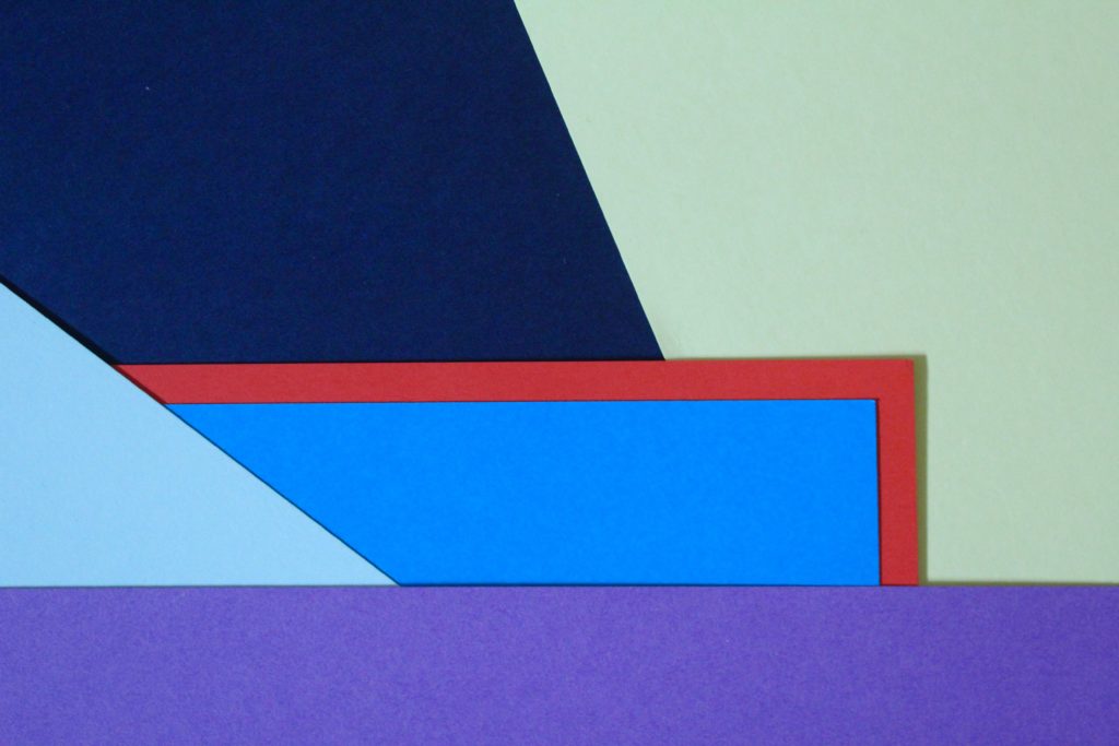
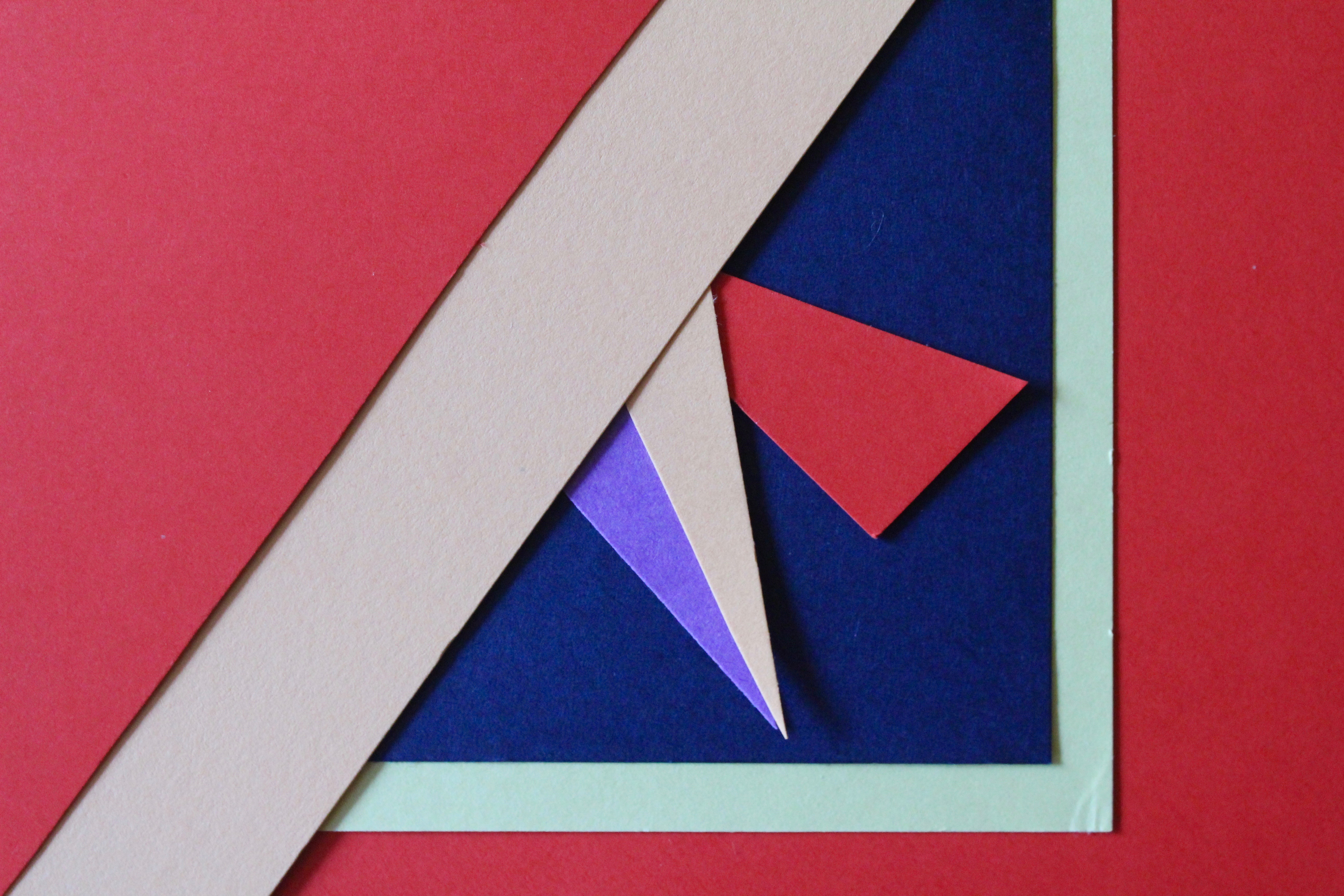
I chose this photo as one of my final images as I think it is a good interpretation of Tamara Lorenz’s work. I like the arrangement of the coloured paper and how I layered them to create distinct shapes with bold colours.
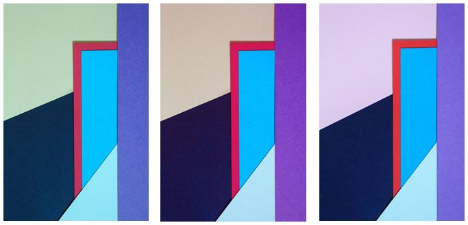
I experimented with the photo, adjusting the hue and I found my 3 favourite edits. The colours I found complemented each other the most were in my original image where the cooler colours (light green, navy and blues) contrasted with the warm colour red, giving a bold outline, which is the point where your eyes are drawn to in the photo.

I experimented with one photo by flipping it to create different layouts and creating symmetrical arrangements. I found that my favourite composition was the photo in landscape:

I like this composition as it contains horizontal lines as well as diagonal lines, with different sized shapes which are emphasised when the picture is landscape.
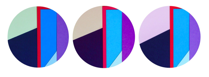
I also used circular frames to see if the images look more effective and found i preferred my images in a rectangular frame, following the geometrical design of the photo as the contrast of straight edges to circular edges is not aesthetically pleasing.




 I first experimented with colours and changed the hue of the photos in photoshop and decreased the brightness so the colours weren’t too vibrant. I chose this photo as I think it represents abstract photography well through the solid bold colours and geometrical shapes I created by layering and cutting coloured pieces of paper. I tried to focused on creating contrasts between light and dark pieces of card to emphasise there colour. I personally like the red and pink coloured photos as I think they are the most bold and striking images.


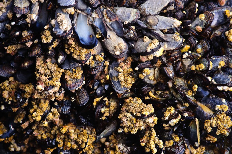 1) Find a texture - Finding textures is easy, you can find them in almost anything around you that catches your eye.
 2) Equipment - You will want to keep your aperture at about f/8, as you don't want to introduce shutter shake, which is what you want to avoid the most.
 3) Light - You should mainly use natural light like the sun to take pictures like these, as the rays of light will hit the texture at an angle creating an effect. Whereas inside you obviously need a off-camera light, which can imitate sunlight.
 4) Depth of field - By messing with the depth of field, you are able to create a seemless effect within the image, to perfectly blend a pattern into a backdrop.
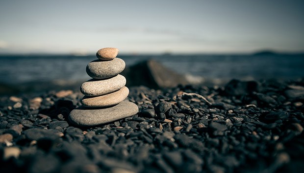 5) Mix - By mixing contrasting colours together, it is able to create an effect which is visually pleasing to the eye, due to an introduced twist.

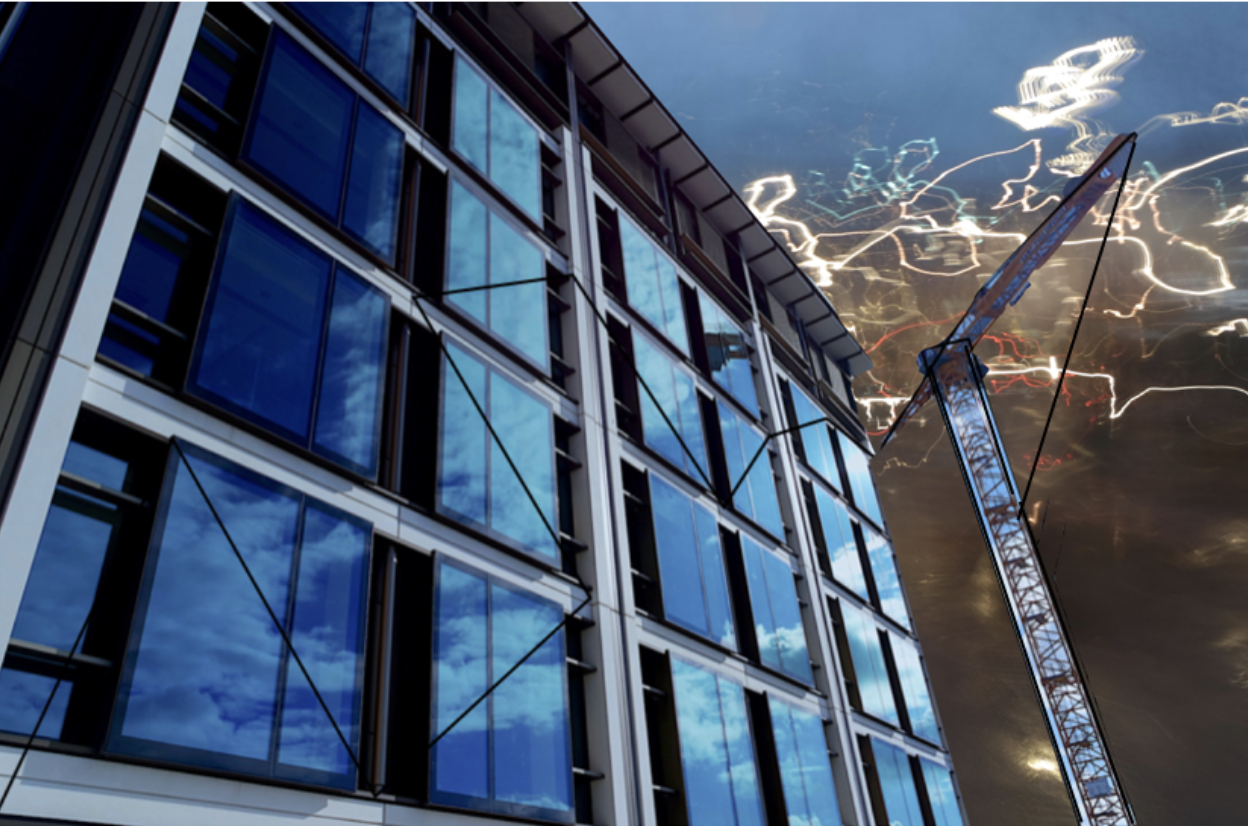

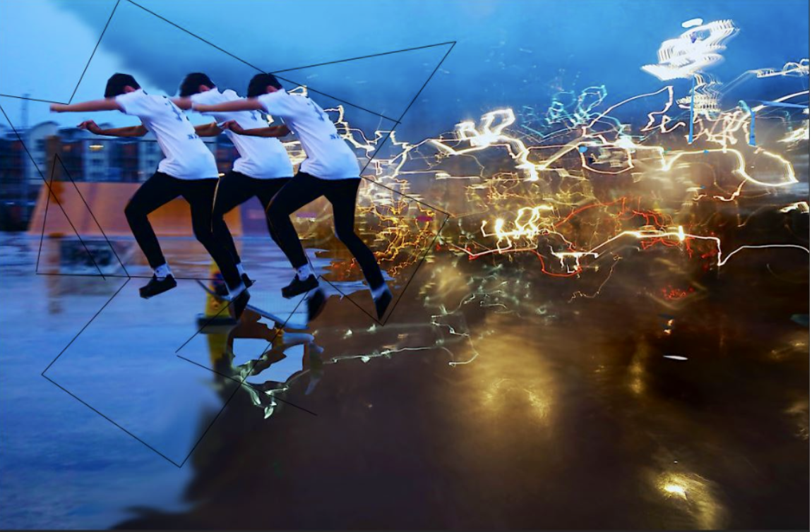


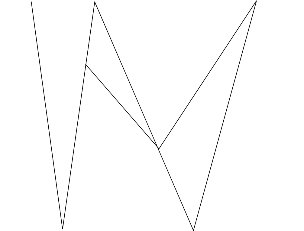
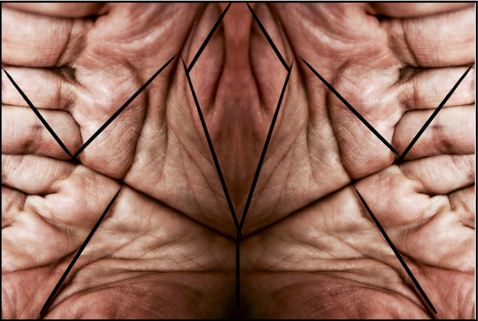
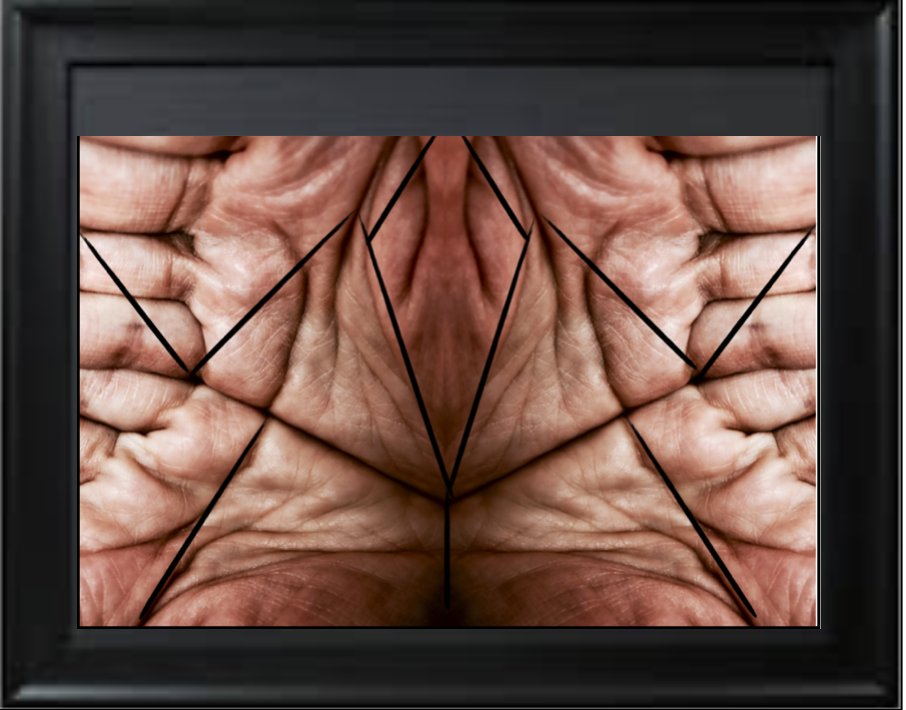
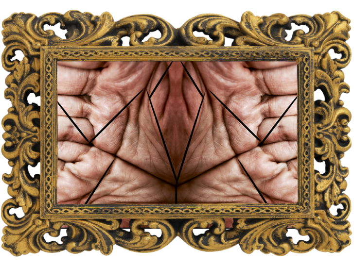

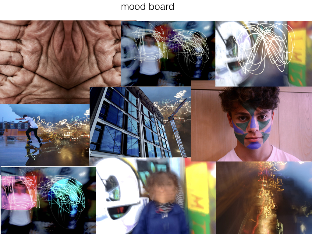
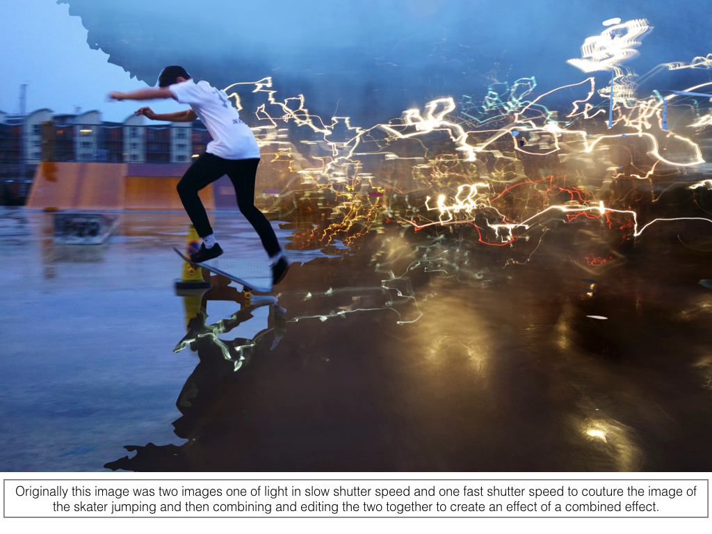
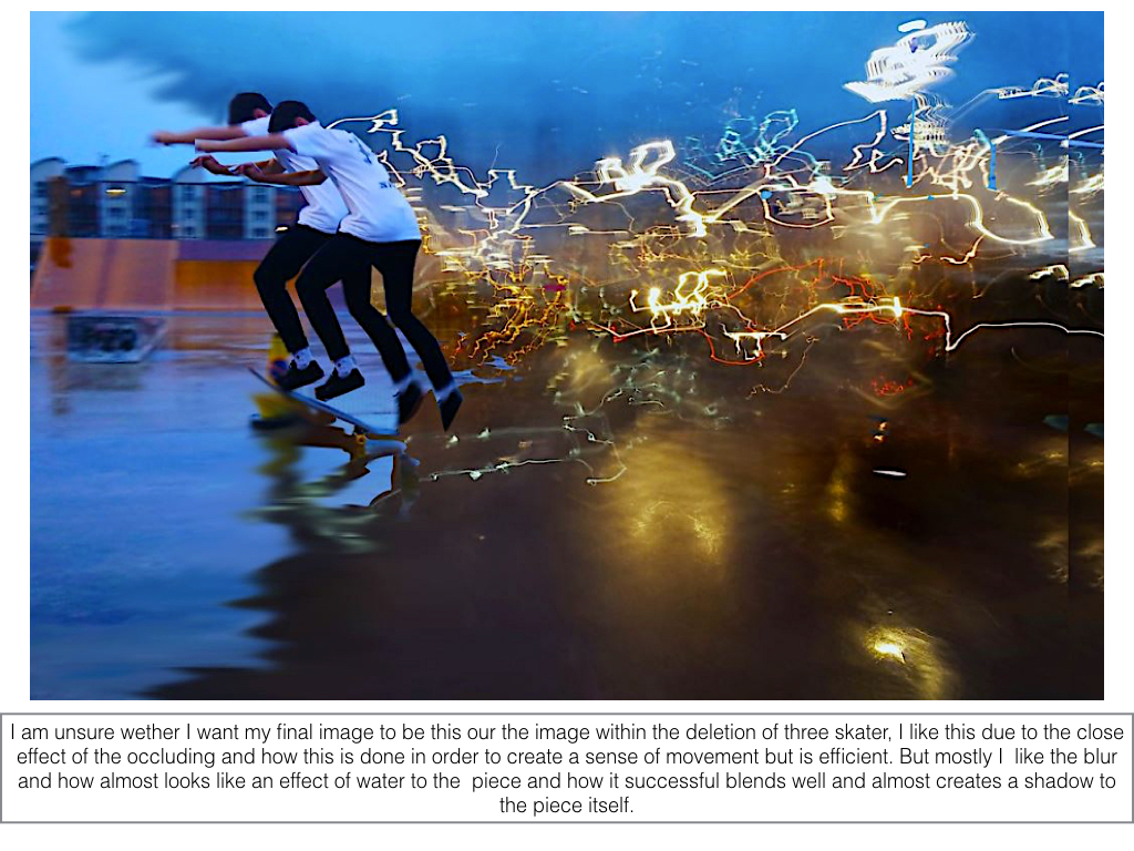
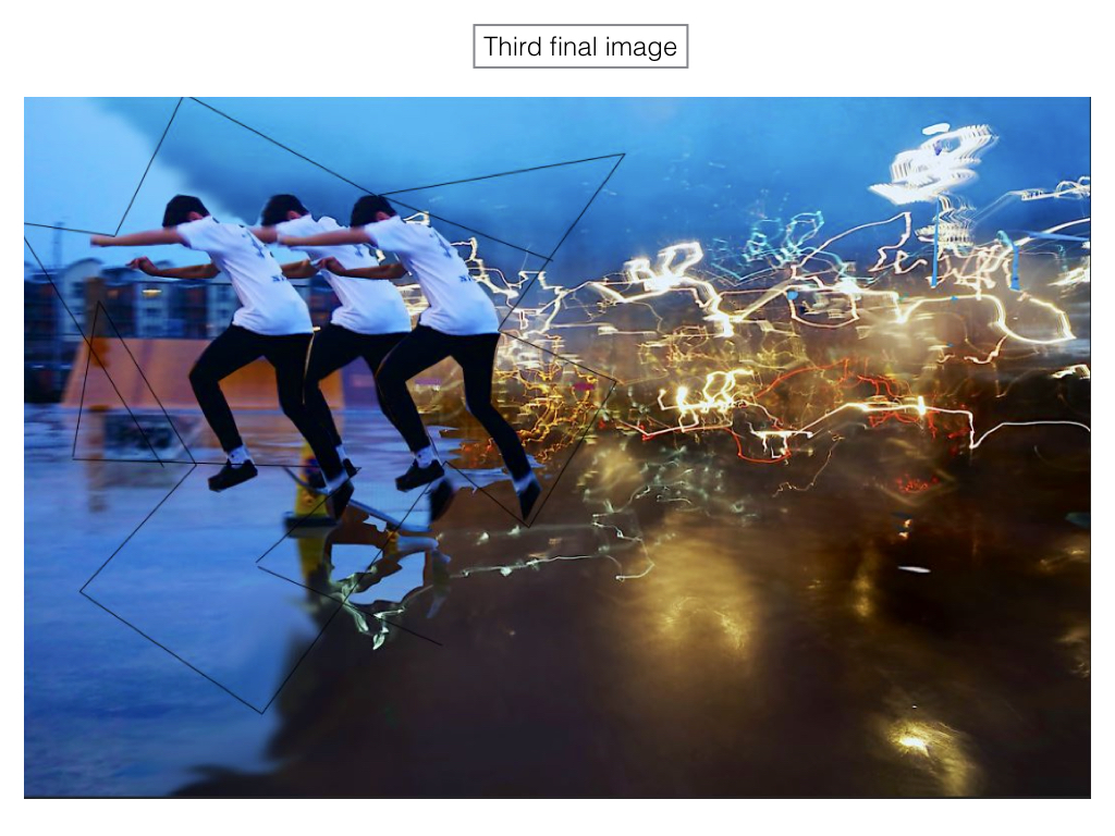
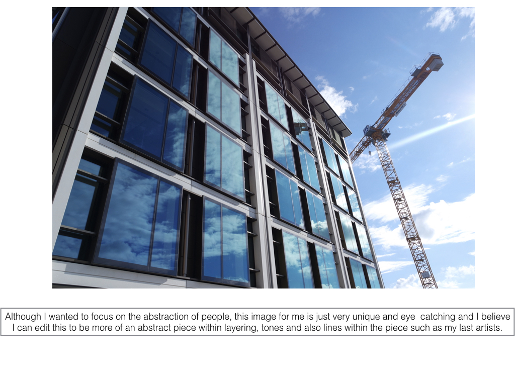
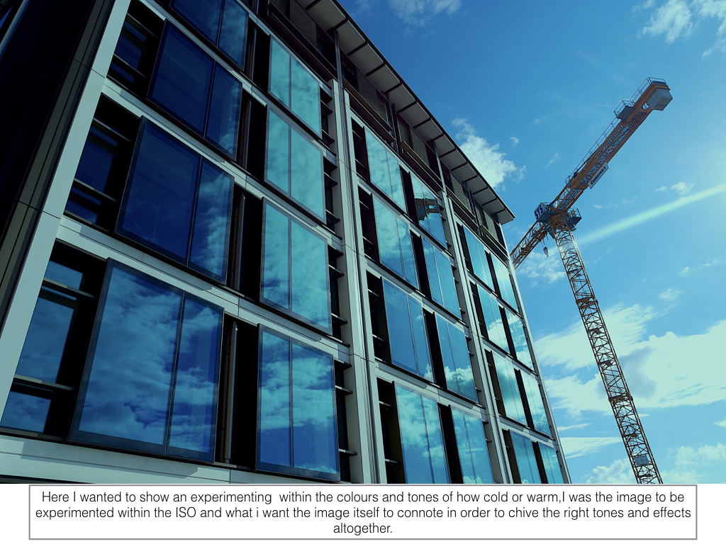
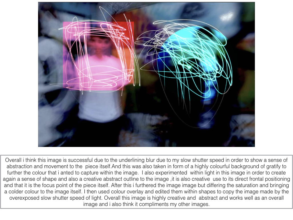
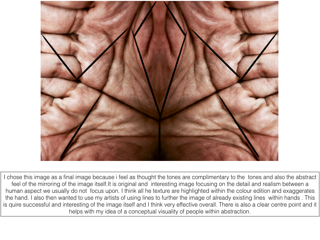
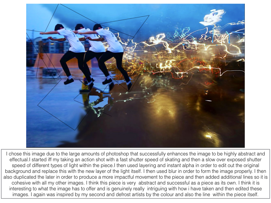
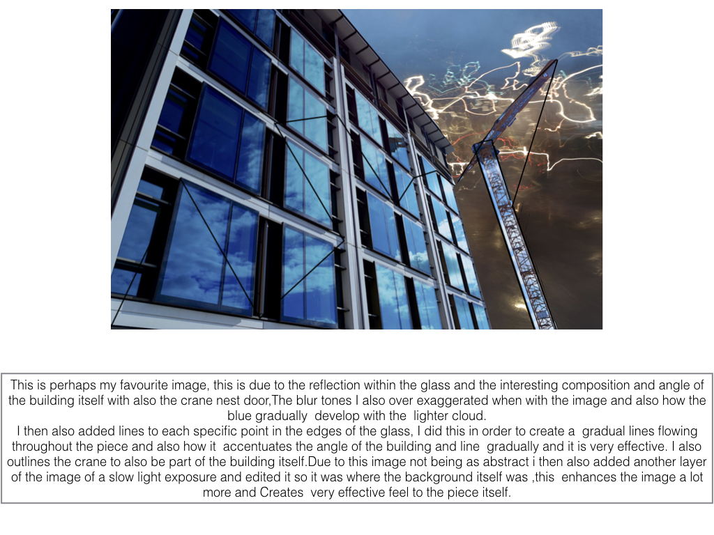
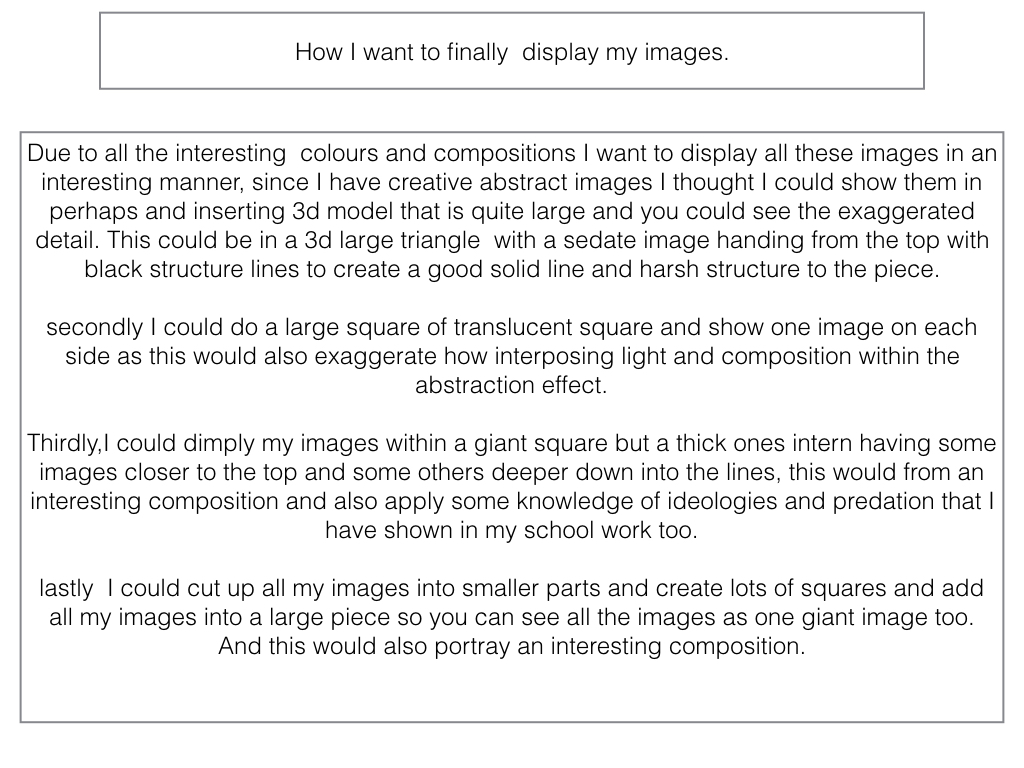
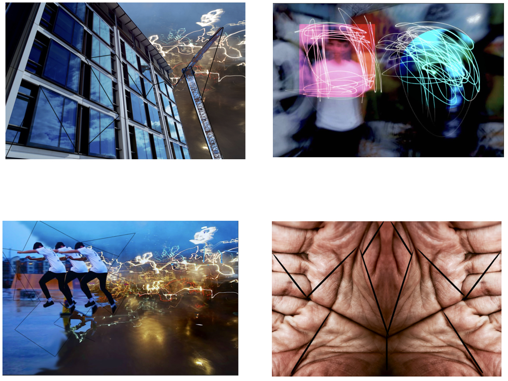
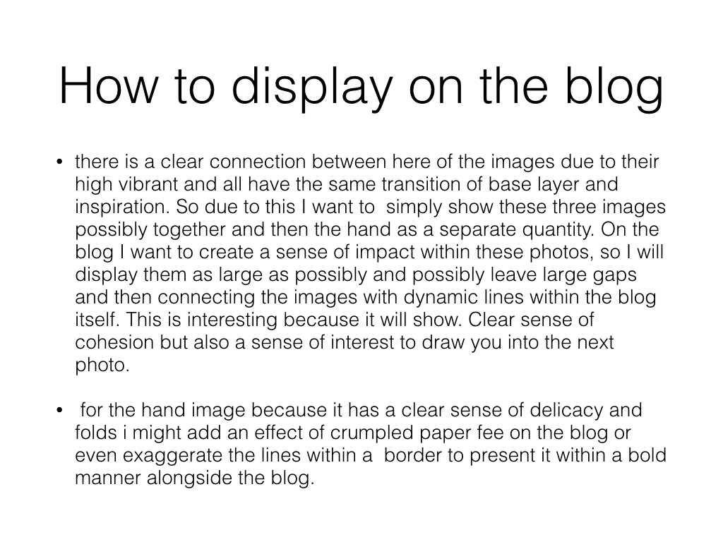
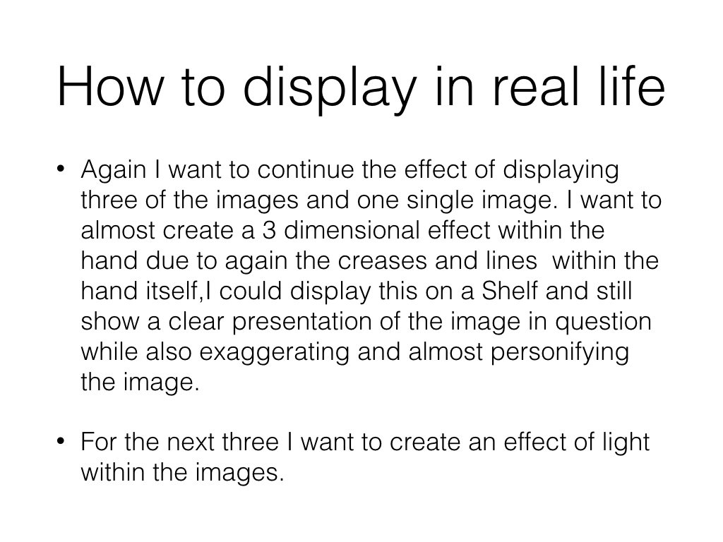
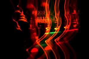
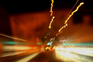
 To really create the effect I desired, I drove round jersey to and from destinations, taking pictures of lights that interested me as a photographer, as I thought they would capture the eye of the viewer. Some of the techniques I would incorporate into the images were motion blur and low shutter speed zooming, I specifically made sure not to use a tripod, as I wanted to create a disrupted effect to most of the pictures taken.
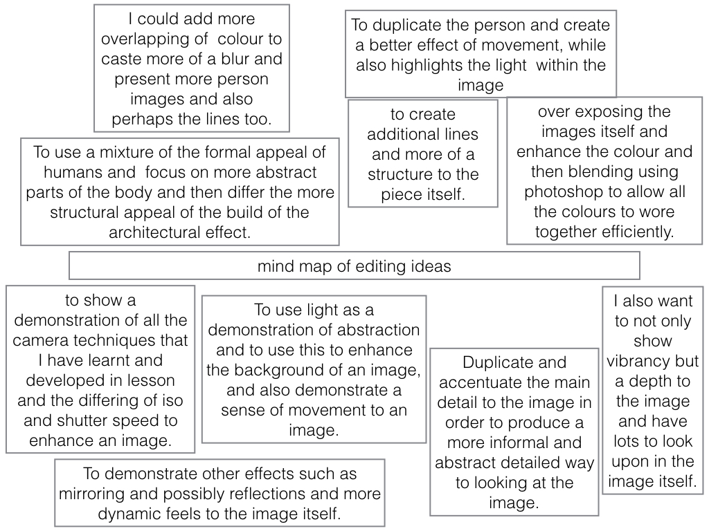
I decided to make a mind map of the objects and ideas behind them, that I could take in the shoot to help me along. From there I would be able to section off individual images from each segment, and choose the best image from each. This is what it looked like:
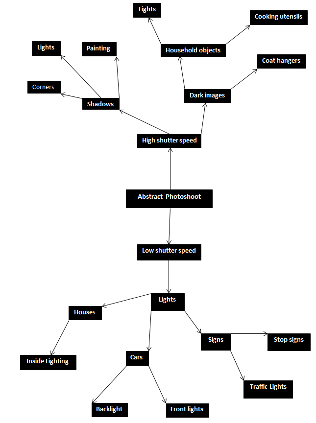 From here I went ahead with the photo shoot, and these were my results from this experiment below:
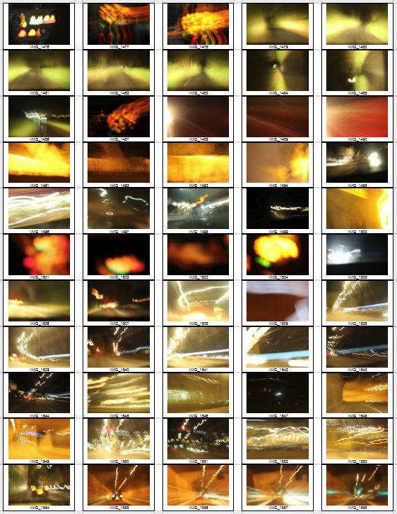
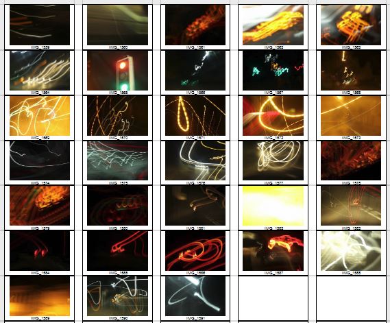
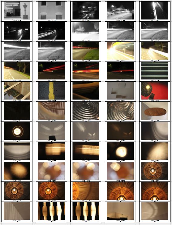
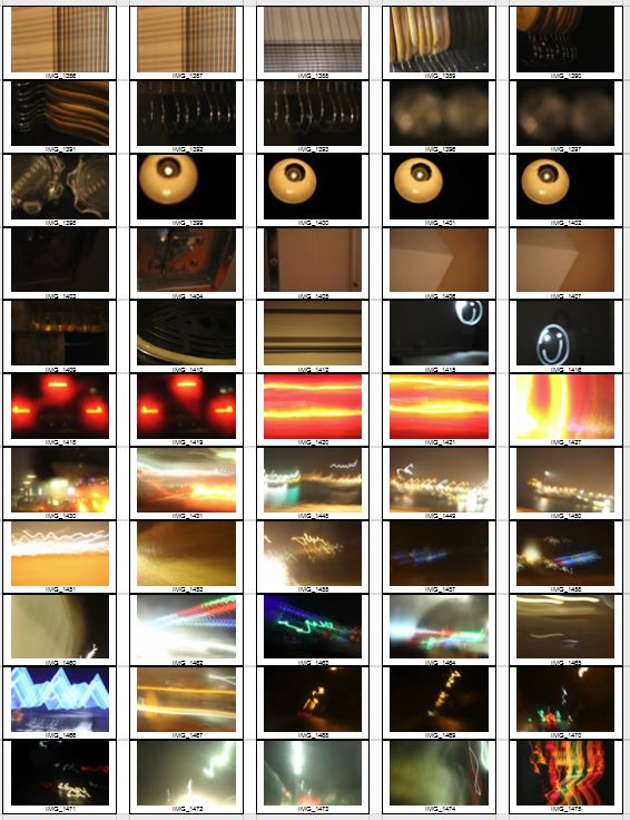
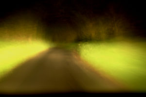
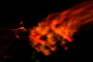
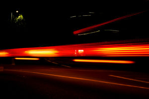
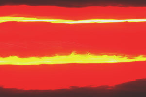
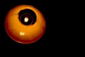
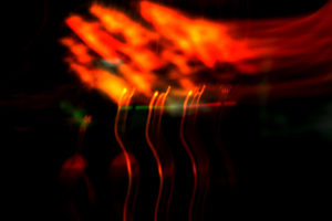
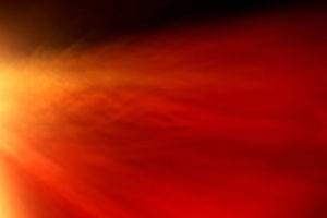
 From this selection of my top ten images, I decided to single them down even more to a top five, to really distinguish the good pictures from the rest. These are my top five:
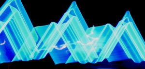
 I chose this image as I loved the triangular effect created by the outskirts of the blue lights at night when driving by, with a long shutter speed (1.8 seconds). I also thought that the contrast between the blue, really stood out from the rest of the image, making it very visually pleasing to the viewer, as seen by all the underlying shades of blue present within. What I really liked, was the fact that the image was an unbroken pattern, creating symmetry throughout the piece allowing for a greater effect.


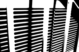 This style of photography inspired me to create my own small contact sheet, in which I would incorporate this threshold idea into some of my picture taken previously, using the software Photoshop. This would really make certain aspects of the image that I desired to stand out from the rest, by reverting the image to a black and white only state. However with certain images, I decided to invert the colors as I believed it made the image more aesthetically pleasing to the eye, and in some circumstances made the object I wanted to pop out.
This is the outcome of my experiment:
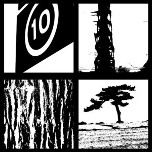 The method in which I created these images on Photoshop are below:
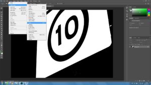
1. Locate the Image tab above, and click the adjustments section, which will reveal the Threshold section.
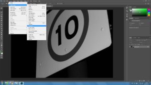 2. For some pictures I then had the idea to invert my image colors, allowing for a completely different picture to be formed.
