
Full size images:



Full size images:


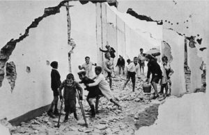
Street Photography is a sub-genre of photojournalism…

And what is a candid photograph?
Include images, moodboards, hyperlinks to relevant articles and URLs and add a video or two on street photography…
Create a blog post / case study about Cartier-Bresson that includes…
Discuss in detail the differences / similarities / intentions / outcomes and of course the photographer’s technical and visual approach.


Photojournalism really started to take shape when photographers could easily transport cameras into war zones. The “Golden Age of Photojournalism” is often considered to be roughly the 1930s through the 1950s. It was made possible by the development of the compact commercial 35mm Leica camera in 1925, and the first flash bulbs between 1927 and 1930, which allowed the journalist true flexibility in taking pictures.
For the first time, ordinary citizens could see the impact of the fighting right there in their newspaper. It was a pivotal moment in photography and it became more and more real between the Civil War and World War II.
Yet photojournalism is not just about war or photographers working the beat for a local newspaper. It’s much more than that. Photojournalism tells a story and it often does so in a single photograph. They evoke a feeling, whether its astonishment, empathy, sadness, or joy.
That is the mark of photojournalism; to capture that single moment in time and give viewers the sense that they’re part of it.


Put simply, photojournalism is about capturing verbs. This doesn’t mean simply taking an action photo. Communicating the verb is much more than that.
Although it is great when it happens, photojournalism isn’t about the best composition, or the best technical details, or a pretty subject.
Photojournalism is about showing the world a story of something that really happened.
Photojournalism allows the world to see through the eyes of the photographer for just a moment. When photojournalism is done right, that one moment conveys volumes of time.
Conveying the full story is part of environmental portraiture where the setting tells us as much about the subject as the subject themselves.
The emotion is often raw in photojournalism. The photographer is not directing the scene as a portrait or commercial photographer would. Instead, the best of them blend into the background and become a shadow figure (unlike the paparazzi). They are there to observe and capture, not become the story or interrupt it.
The photojournalist has a different attitude than other photographers and it’s necessary to capturing those memorable photos. And quite often, that single photo can become a call to action for the millions of people who see it.
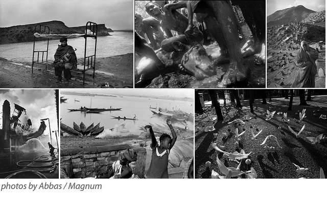
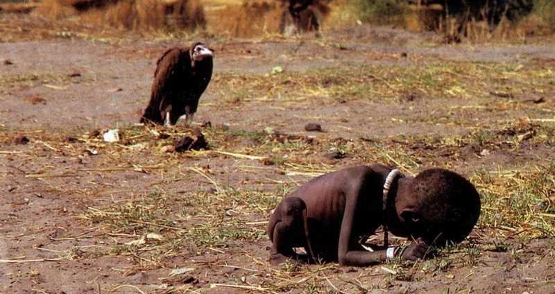
Another vitally important part of photojournalism is accuracy. This means that what is in the frame is what happened.
Power lines should not be cloned out. More smoke must not be added to a fire scene. What was captured is how it should be. Sadly, the era of digital photography has made it easier than ever to manipulate reality.
The image should be a window into the event. At most, lighten the shadows a touch to see faces or sharpen the image a bit for clarity but do not change the essence of what you capture in the photo. If you do, you change the story.

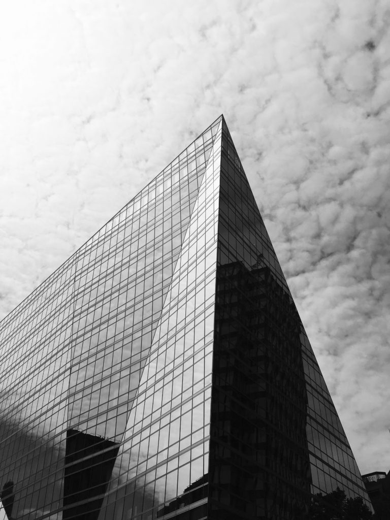
I chose this image as my final piece out of the three as it contains similarities from both the other final images through their geometrical designs and similar triangular shapes that I previously created with the paper. I also chose this photograph as I did not want my project to to turn into an art project and wanted to create variation within my work. This photo was taken with inspiration from Hilla and Bernd Becher’s work in my typologies homework, but I also think it contains elements from other homeworks (such as line, repetition and pattern as well as abstract and texture) which is why i chose it.
This photograph uses Ansel Adams zone system with contrasts from light to dark within the picture creating a photo with varied tones. One reason I like this photo is because of the reflection in which the building has that mirrors the clouds from behind, making the building bright on one side, and dark on the other. This photo also shows repetition through the thin black lines on the building creating a pattern, contrasting with the other side which does not. The building also has a thin black line outlining it, emphasising the structural properties as well as abstract appearance that it has. The fast shutter speed and sharp focus used to take the photo shows the details on the building as well as the clouds behind also showing texture and pattern. The composition of this photograph is aesthetically pleasing through its symetrical appearance.
Overall this project has allowed me to develop my understanding and knowledge of camera skills, and my ability to take better photographs, as well as allowing me to explore artists linking to my work in depth.
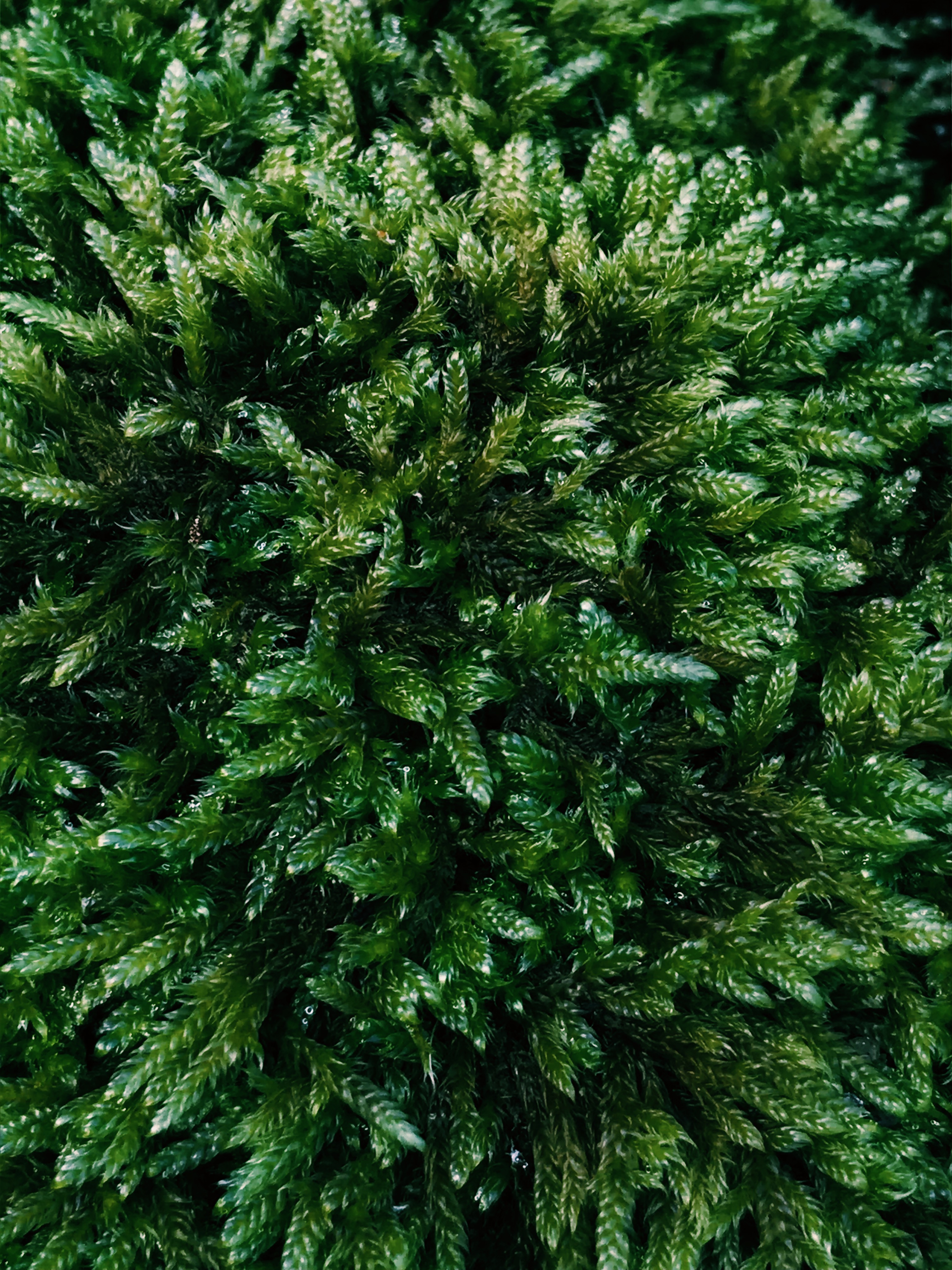
I chose this image as it includes many features of Formalism such as the texture in the moss (due to the light and shadow from the natural lighting), vibrant colour and repetition of the individual stems of moss. Abstraction is added where the close-up image appears as a forest from high up. Although the image is not symmetrical, it still appears appealing because of its natural appearance.
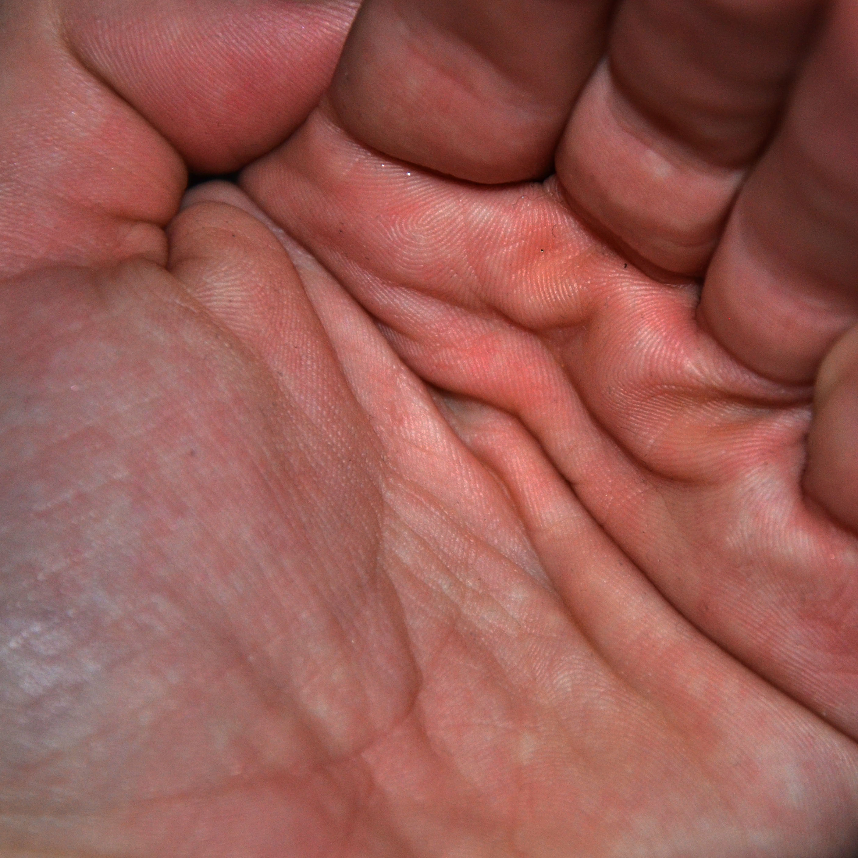
This image is one of my favourites due to its simple yet powerful appearance. A close-up of the creases in the hand allows for the details of the hand print to be seen. I added contrast to this image to emphasize the shadows from the creases and the red-ish undertones of the hand. I feel the abstraction in this image comes from the idea that it can never be recreated in the same way as every individual has their own hand print.
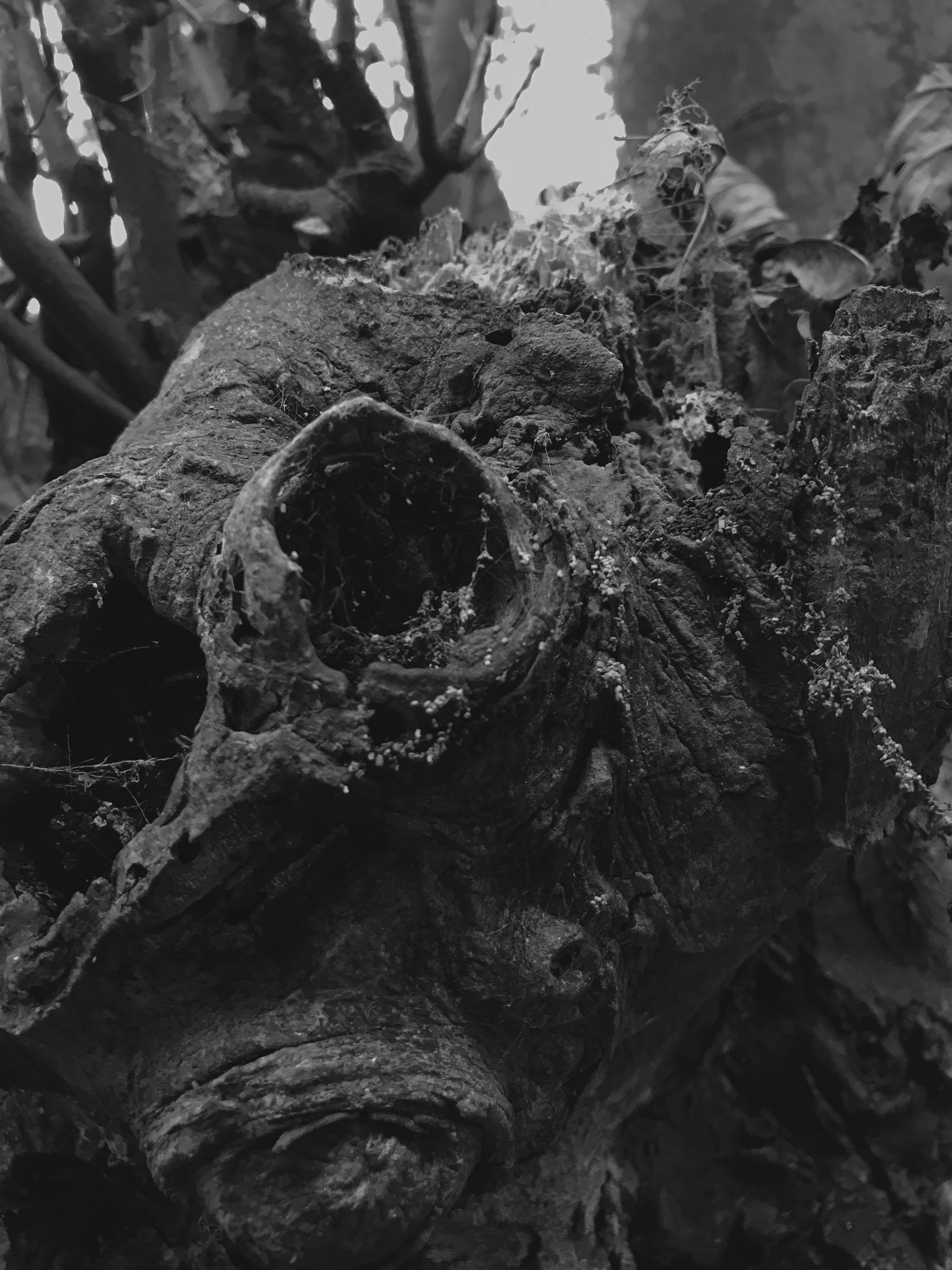
I took the inspiration for this image directly from the photographer. The image was already pleasing for it showed texture in the rotting tree log, and natural shapes and lines in the tree bark. After applying the black and white filter and changing the contrast, I noticed it could feature into the Ansel Adams Zone System. This combination with the blurred background (giving it a shallow depth of field) made it one of my favourite images.
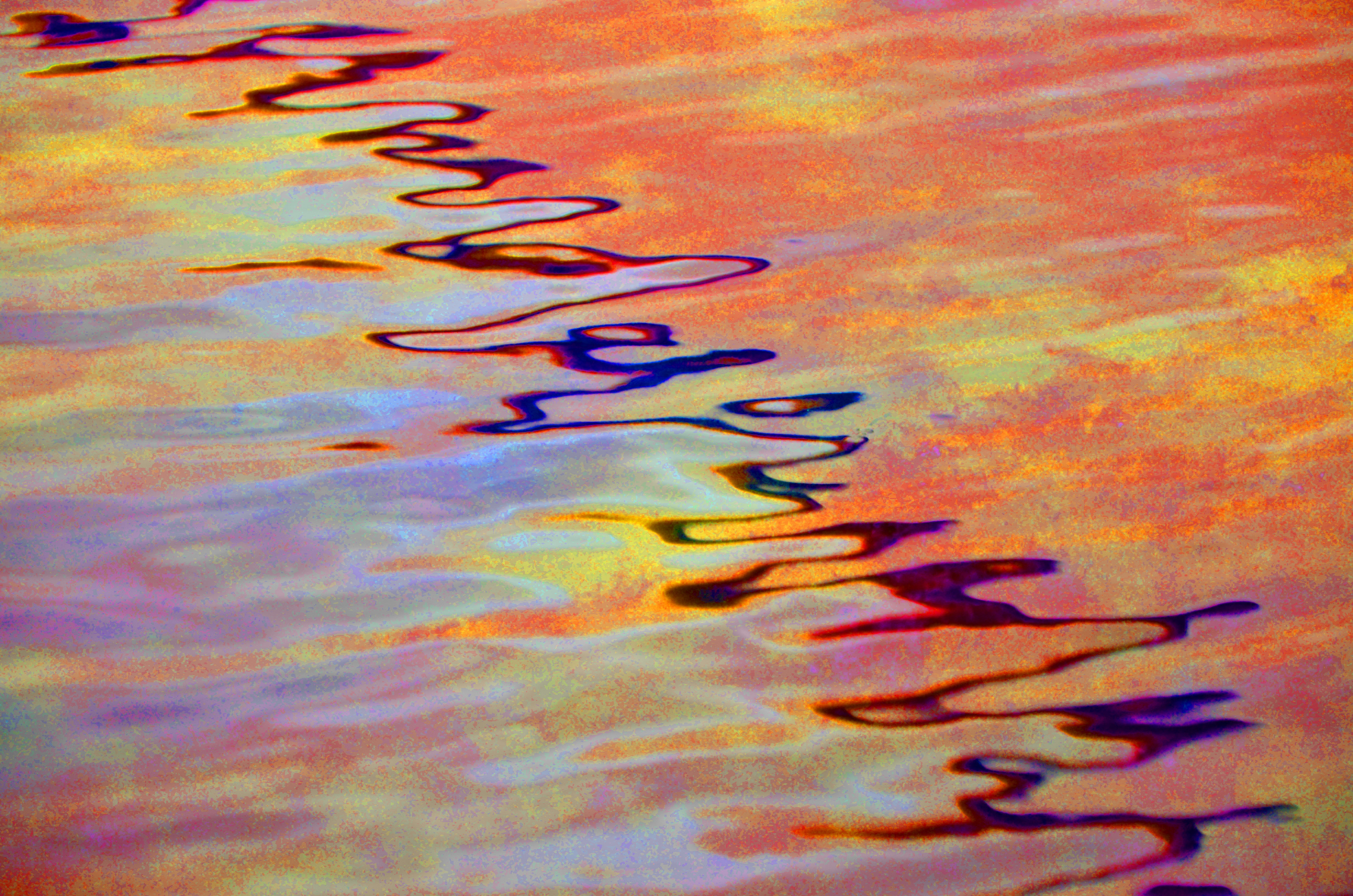
This image shows obvious abstraction from the distorted use of bright colours. The reflection in the water that goes down the centre of the image stands out and shows line. Texture is added to the image where the colour was over-saturated. This image is also one of my favourites because its unique and something I havent seen before yet still shows the common features of both Formalism and Abstraction.
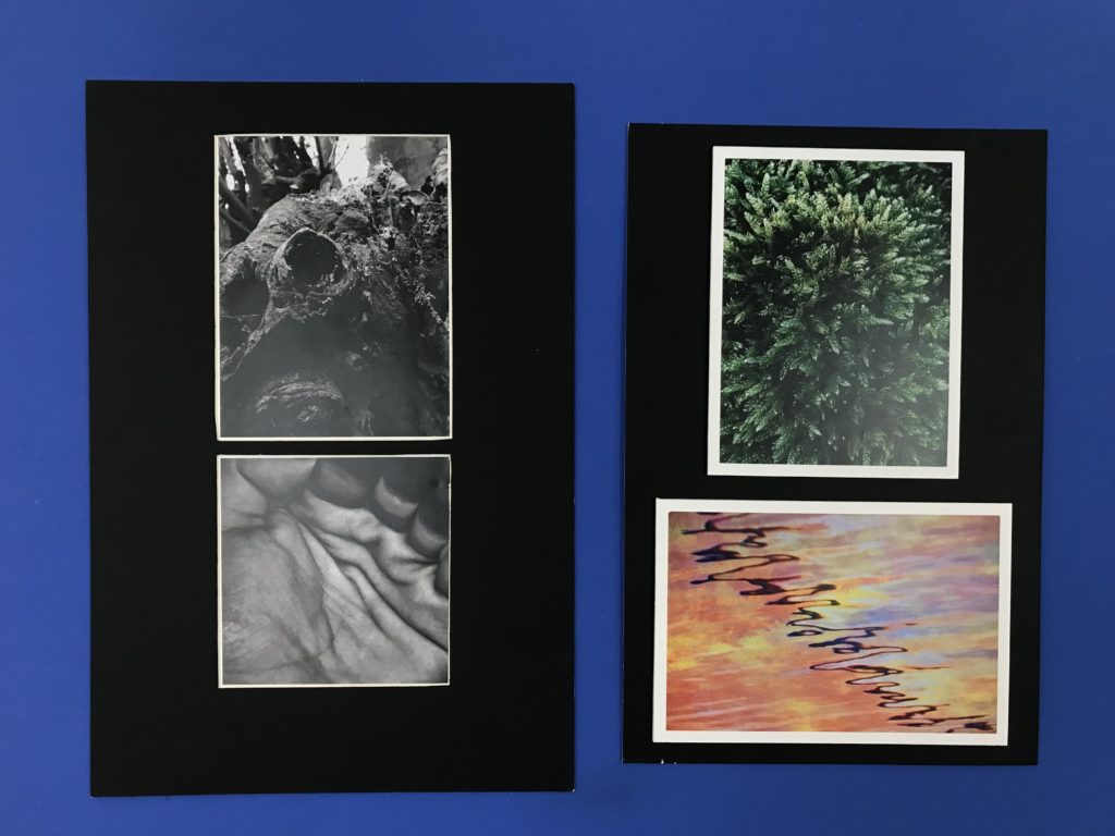
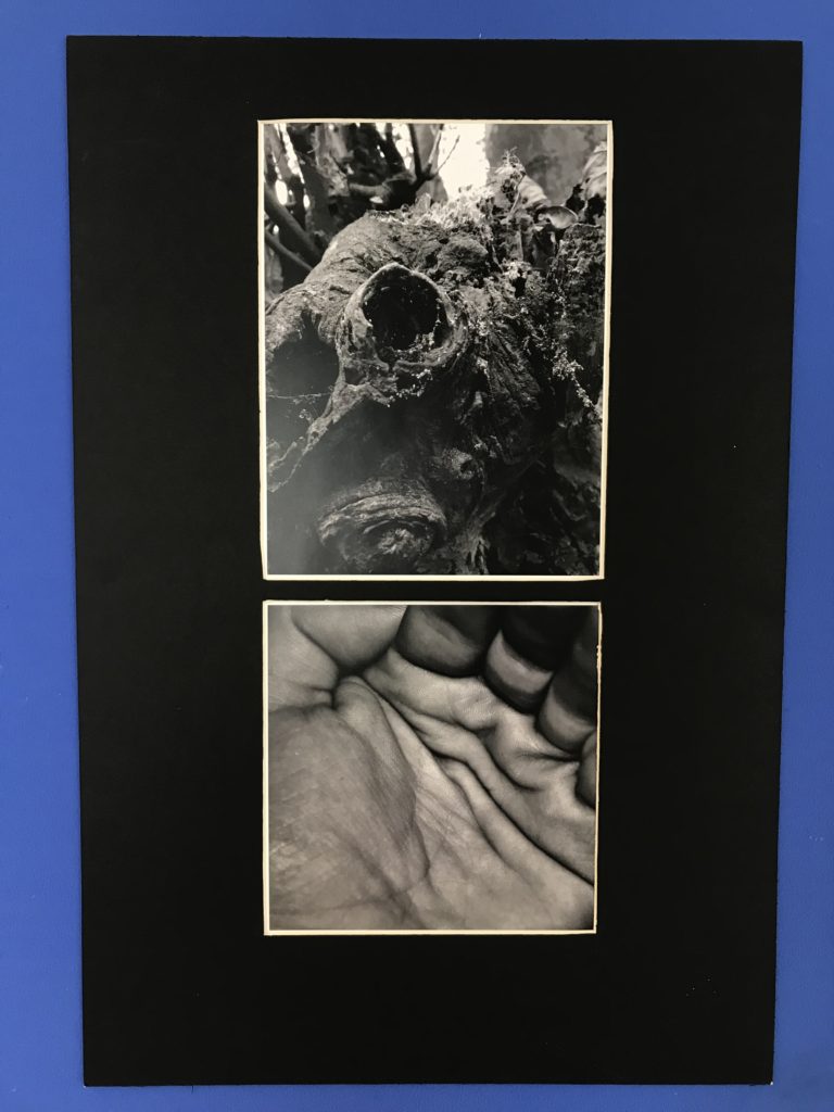
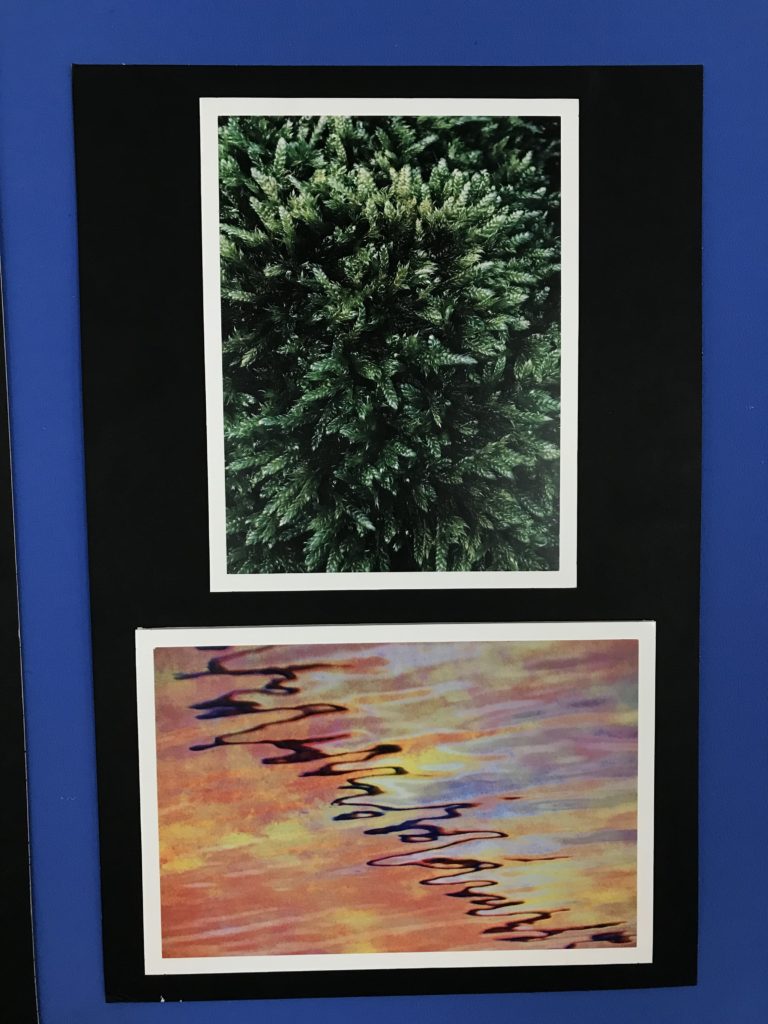
I paired my images so that one showcased colour and the other was in black and white. Images are connected by texture and shape.
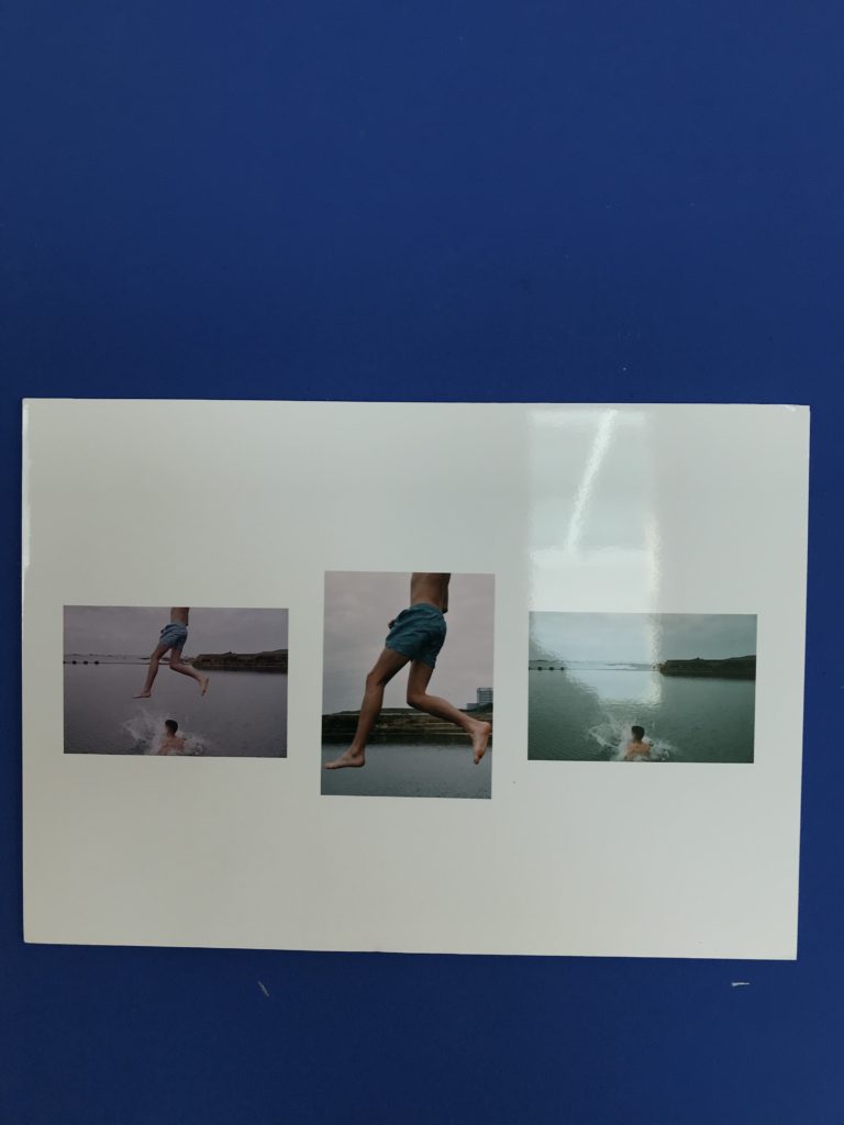
I also compiled three edits of the same image into one sequence.
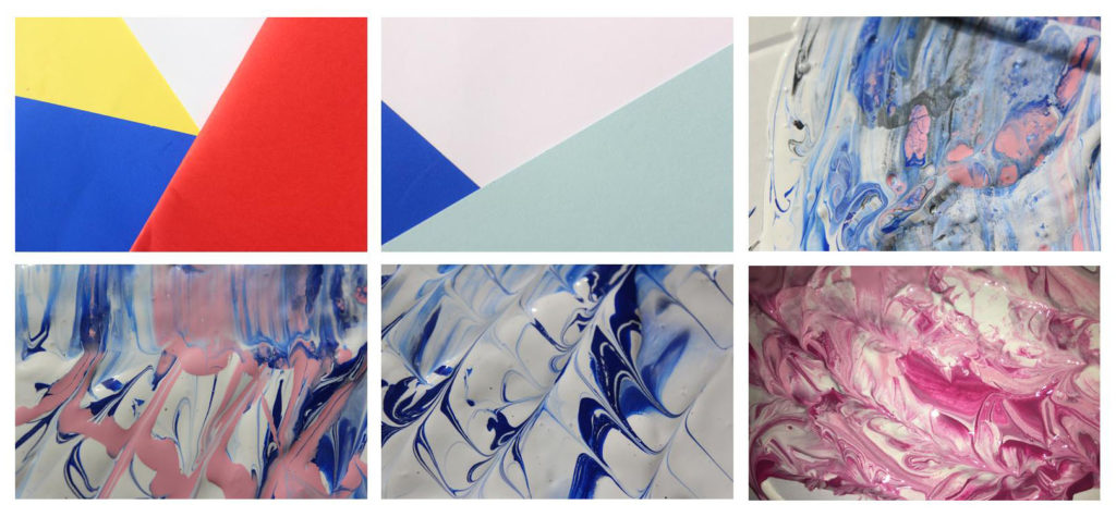
I chose these six photos for my final selections from my colour harmonies and contrasts shoot because I thought they showed a range of styles, patterns and colours. I took these photos in the style of two famous abstract photographers however for my final image I would like to edit them using skills I have acquired during this project.
Using these two images from my last shoot I re sized and rotated them so they were the same dimensions. I then added the blue photo as a separate layer over the pink one and experimented with blend tool.
For the first edit i used the blend setting lighten, this removed all the white areas from the blue image so that the pink showed through. This photo did fit the abstract theme however the colours made the photo a bit disjointed and you could still see the original image. For my final image I wanted something more traditionally abstract that showed a mixture of all the techniques I have learned through this project such as shape and pattern, colour and texture. The second image for me showed this the best.
Alternative Final Piece …
Edit 1
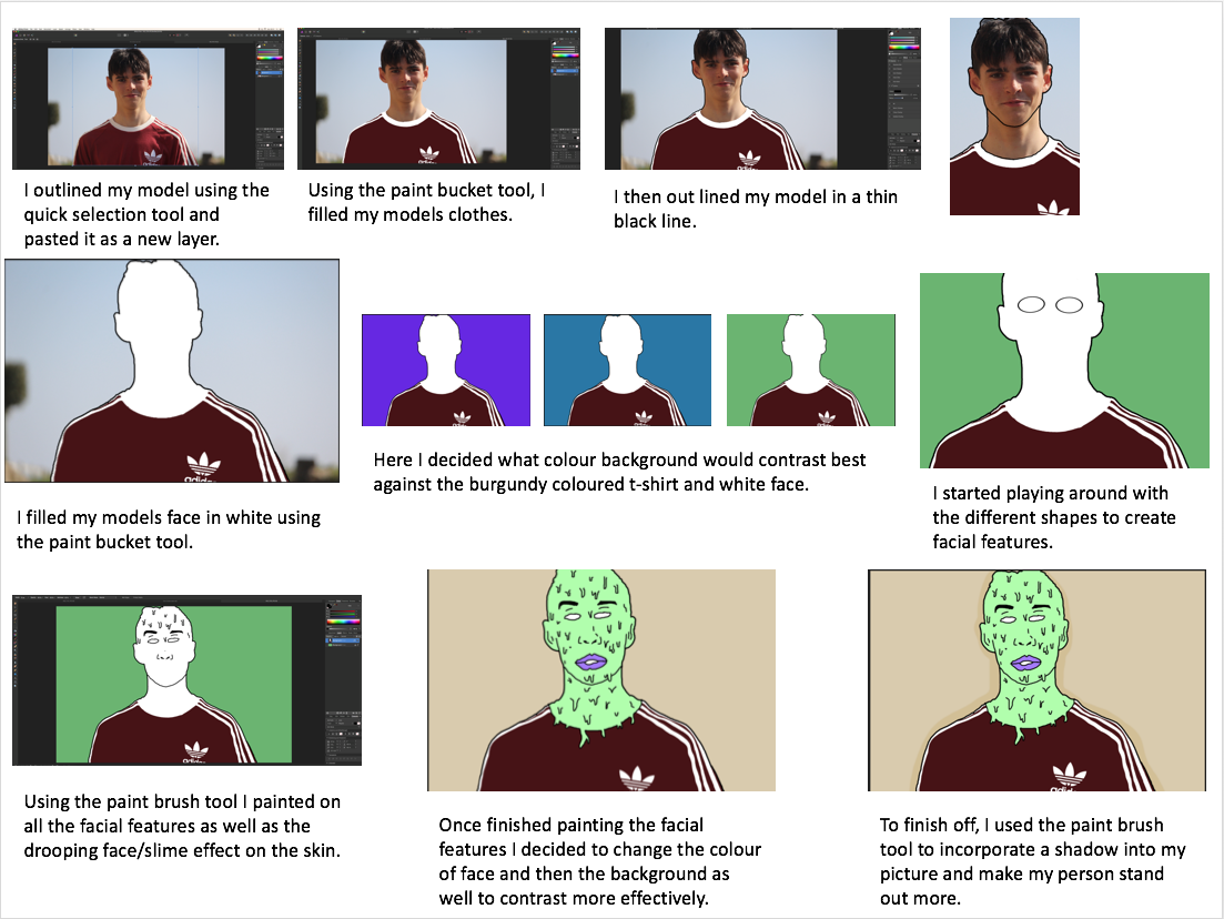
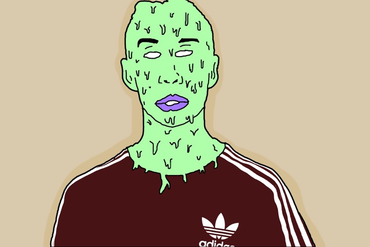
I belive this edit is good and has a strong relationship with my inspirations work. There is a strong contrast emerging between the persons skin colour and clothing with the background. The composition is effective as the main subject is dead in the centre making the viewer view that straight away, and the background is plain therefore it is beneficial to have the main subject in the middle. I believe this edit portrays the idea of hidden identity which I intended to do however I am not pleased with the image as a whole due to the background. I believe if I change the background to have a street or wall it would be more effective in revealing a story and creating a more surreal feeling/look.
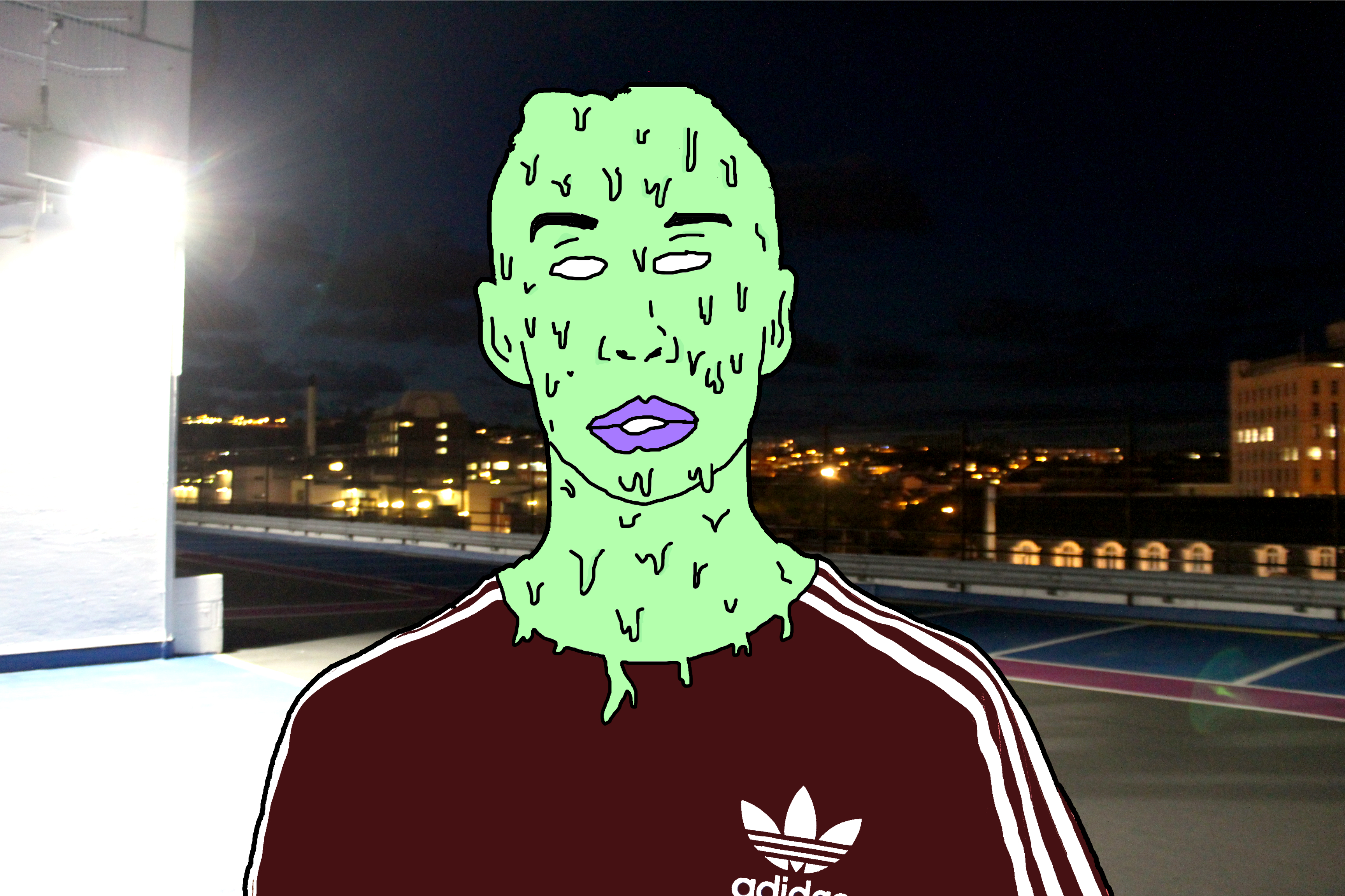
This is the final edit for photo 1. I believe that changing the background from plain to this sinister looking carpark roof image has completely changed how people may interpret the image. The background has connotations of crime and badness as it is taken at night, which is when most crimes happen and the light on the left appears to hide part of the image relating to a person hiding their identity when causing a crime. However the over exposed light on the left can reflect goodness, contrasting with the darker side on the right relating to badness. This may reflect the person in the centre who has to decide his path to take, the good path or bad path. Due to the fact I have edited the person in such way to distort any facial expression it leaves the viewer to decide what the person’s identity is like and how the background may or may not relate to it.
Edit 2
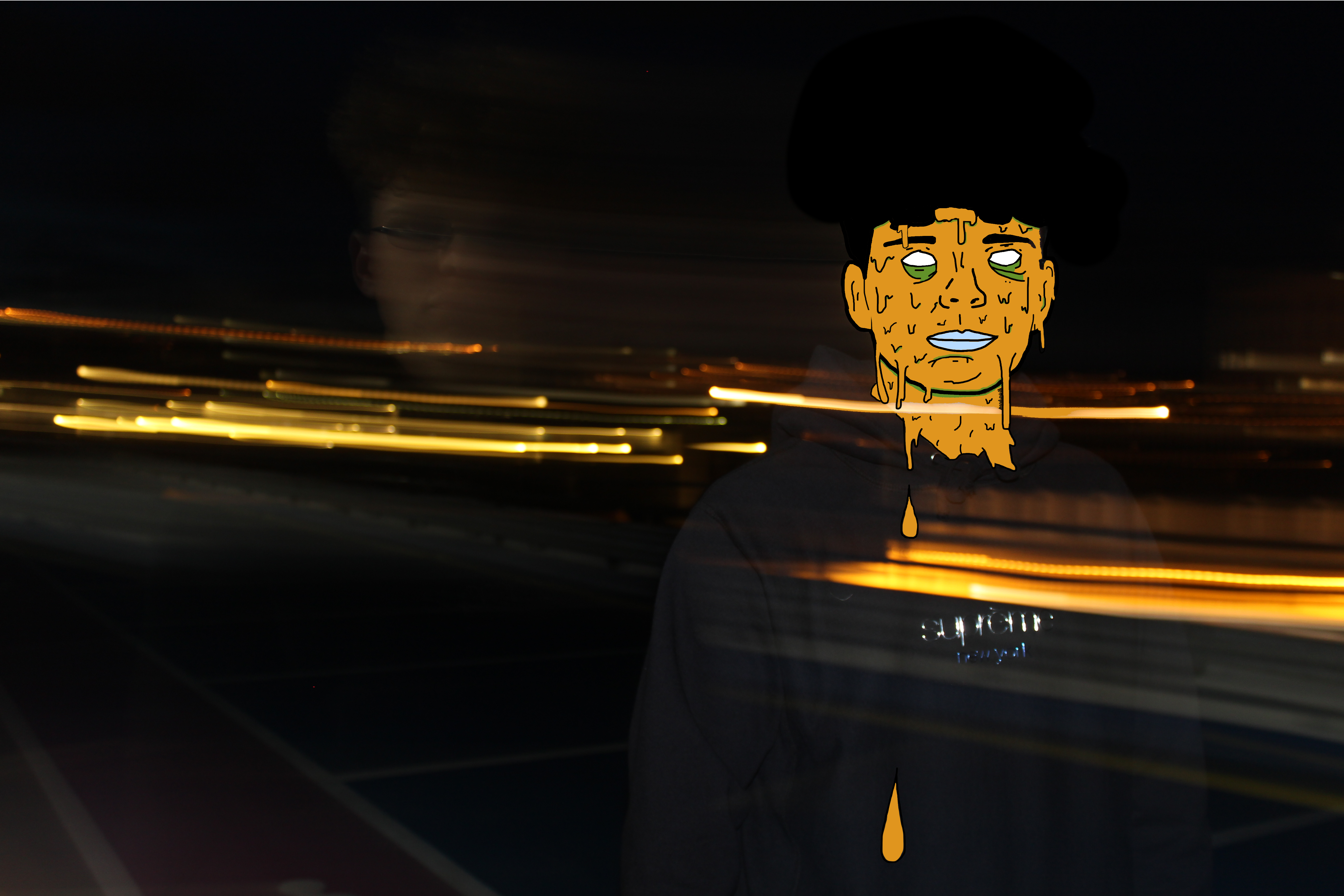
Using the same method as the edit above I was able to achieve another successful surreal image. Firstly I chose to use the colour orange as it fits in with the motion blurs which were created when I originally took the photo. These motion blurs were created by taking a photo with a long shutter speed, around 2 seconds, and panning the camera to the side. I was able to get my model in focus by holding the camera still for the first second facing him and then panning for the other second. In my opinion these motion blurs create a sense of movement which fits in well with my edit as the slime is moving as suggested by the falling droplets.
Edit 3
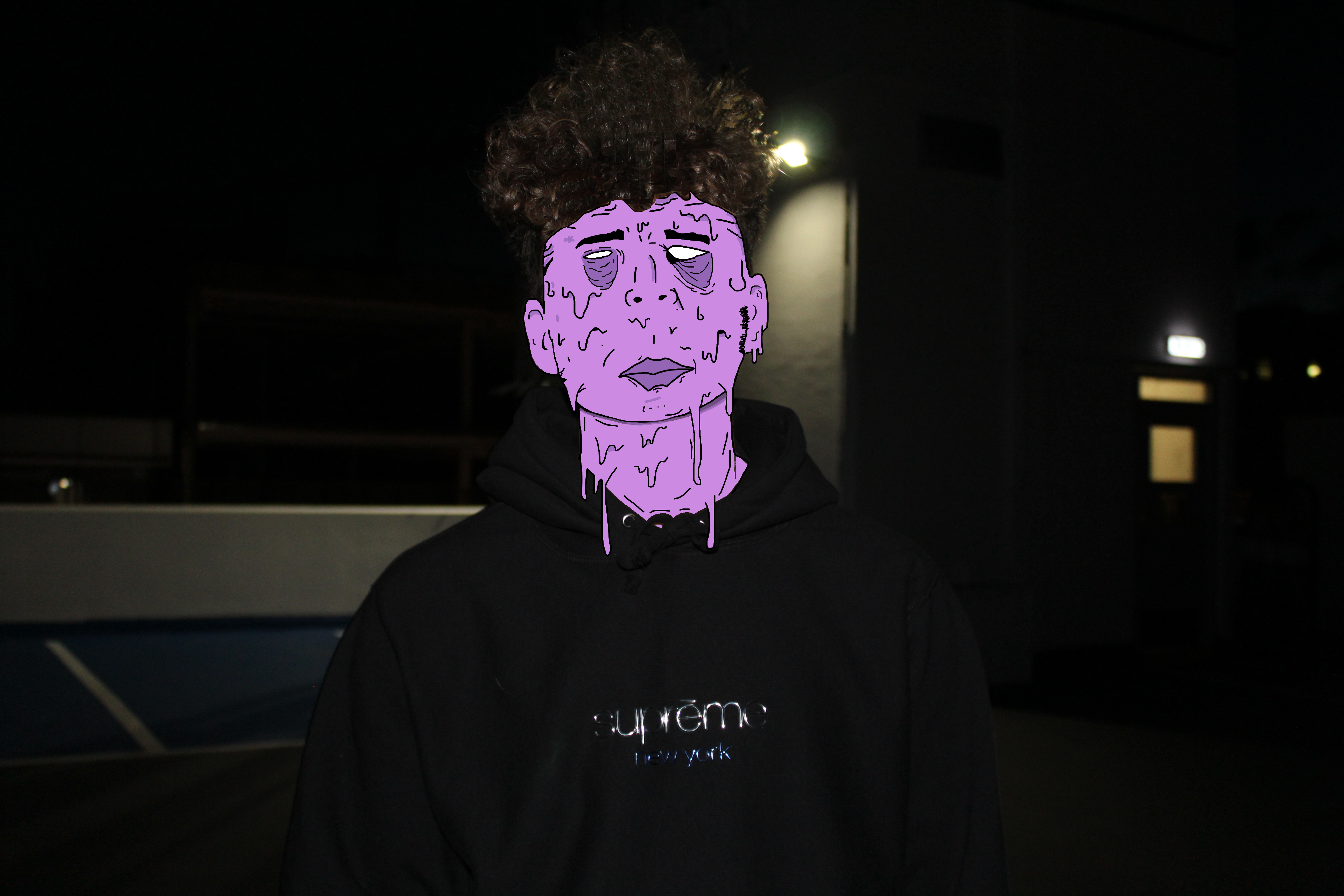
I believe this is my strongest edit. Not only is the digital manipulation at a high standard but the meaning and feelings portrayed are also very strong. Again, to some extent I have incorporated the running theme of blank identity however slightly altered this image to produce some sort of facial expression. In my opinion the facial expression, mainly within the eyes and how they appear to be bruised, reflects upon the theme of child abuse again crime. I believe the underexposed background gives the image a sinister and almost haunting feeling. The dark background is strongly contrasted with the color of slime upon the models face which focuses the attention on the person.
Edit 4
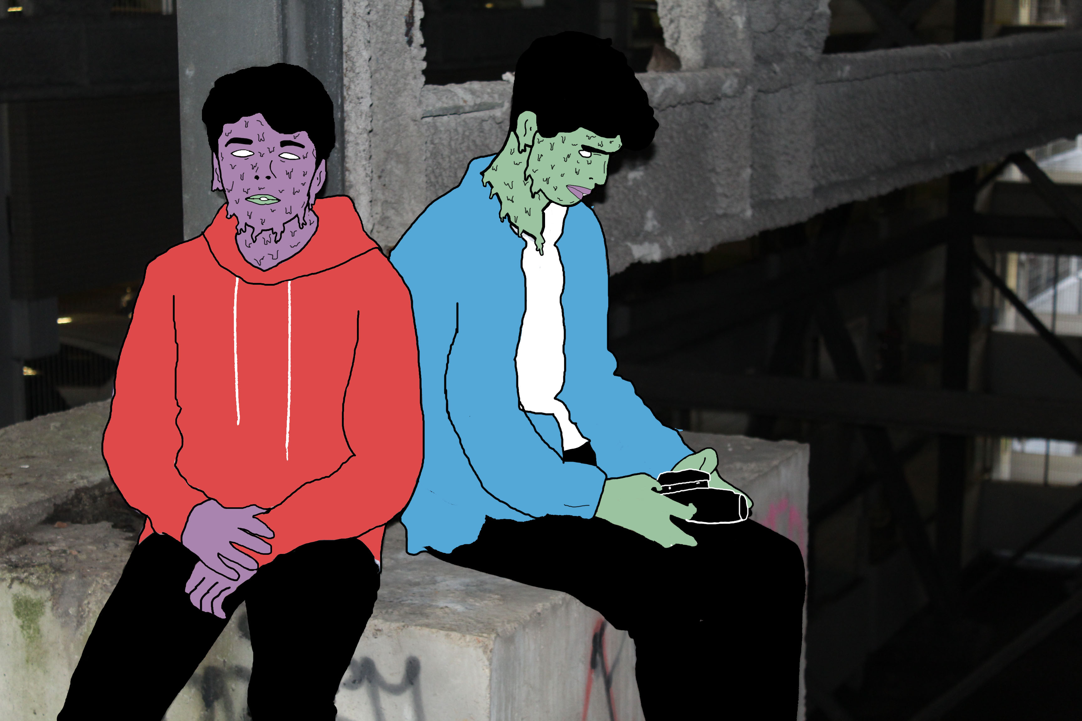
I like this photo due to the emotion and story it creates and tells us. I believe this photo has a sense of imprisonment as it appears the people are stuck in this enclosed area. The background within this photo is de-saturated to some extent which I think helps to add to the dark and depressing atmosphere. This photo uses the technique of leading lines within the structural features leading us away from the models deeper into the picture to view the rusty and old man made structures. The vibrant colors of the models create a strong contrast with the background relating to the opposition of light vs dark or good/bad.
Presenting My Work
After having reflected my images I have come to the decision that I will use only two of the original 4 images I intended on using. The edits I have selected to use are shown below. I have selected only these images as I think they are my strongest edits in representing abstract photography and telling a story. Also they pair well together as they are of similar colors and tones. These images link to abstract photography in the way it is a piece of art that does not attempt to represent external reality, but rather seeks to achieve its surreal effect by using shapes, colours, and textures. I think that the image with the motion blur lines relates directly to the photographer Ernst haas which was on of the photographers I researched as part of this abstract project. Ernst haas often includes motion blurs within his photographs to indicate a sense of movement and chaos which is what i have incorporated within my final piece. The motion blur lines not only work well with the dripping effect on the persons face but they add to the abstract effect in the way that it is not a usual and commonly seen thing.


Within this photo shoot I will be focusing on the effect of layering in an image when taking photographs. I will also explore the use of colors to create a more dramatic effect to these pictures and really pull the photo together as a whole. One of the photographers that I have been inspired within this shoot are called Tamara Lorenz. German artist Tamara Lorenz creates various constructions which she then photographs to exploit their abstract properties. The addition of strong planes of color provide another source of contrast in addition to those of line, shape, tone and texture. Rather than photographs of things, each image seems to create its own reality. Consequently, the viewer is unable to recognize a conventional subject and is occupied with the business of looking. As seen below:I wanted to incorporate this effect into many of my photos taken, and do decided to do this through corners of color paintings and instruments to mimic this style.
I used this mind map as my basis for the shoot, where I would occasionally use this to find what I needed to focus on most importantly. From this these were my results in the shoot:

From here I decided it would be best to cut the shoot down into ten images, through this it would make it easier for me to identify the photo I think is best in the shoot. These are my top ten images of the shoot:
From these images taken from corners of paper, I wanted to cut it down once again, to my top five images to single out the best one. These were the photos I selected:
I chose these images because of their composition, color balance and patterns. I thought that these images stood out against the rest and so finally decided to edit these down to my top image of the shoot. This was the image I chose:I chose this image as my final photo, as I thought it best matched with the style of photography I wanted. Which incorporated an element of graphic design into the imagery, making it simple but visually pleasing to the eye.
When photographing paper and card, you are able to cut, tear and shape the individual pieces to create abstract effects when taking photos. As seen below:This enables a clear definition between the lights and darks to the photo, whilst it being very simplistic at heart, the scrunched effect makes an almost complicated look to the image. This allows us to experiment as a photographer with not only composition but in a way our artistic creativity as well, due to how we are able to warp the materials given to form structures which we are able to use to our advantage.
Within this photo shoot I will be focusing on surfaces, textures and pattern. To do this I will be focusing on walls, metallic objects etc, from this it will enable me focus on specific details like peeling, cracks, and bumps to allow for maximum effect.

One photographer that has inspired me to do this shoot is Frank Hallam-Day. Washington, DC-based photographer Frank Day is a versatile artist shooting in both black and white and color film. Traveling the world to remote destinations, Day is able to capture the rich beauty of pattern, color and texture of the open-air markets, isolated landscapes, busy harbors and everyday lives of diverse cultures. Day has also mastered the landscapes and cityscapes of the world, shooting the angular architecture of cities such as Berlin, New York, and Baltimore, as well as the beautiful softness of Washington, DC’s cherry blossoms.As much as I liked his work, I decided to mainly focus on reflections made by the water, and since I lived next to the beach I thought this would be an ideal idea to do.

I used this as a basis for my shoot, so when taking the pictures would know what to specify on.

From these images taken, I chose the top ten out of the shoot, to narrow down and edit which one overall I think should be my final picture.
From these top 10 photos taken when walking on the beach, I wanted to once again whittle it down to 5 images, so that I would once again have a clear insight on what to have as my final picture.
Finally from here I was able to decide on which image would be my final photo. This was my result:I chose this image because I loved the detail within the crashing wave on the shoreline, whilst the contrast between the darkness of the wave and the foam in my opinion make a dramatic effect. I also loved how the composition of the wave slanted across the frame, creating an almost abstract effect to it all.