Category Archives: AO4 Present Ideas
Filters
Photoshoot 6- Landscapes
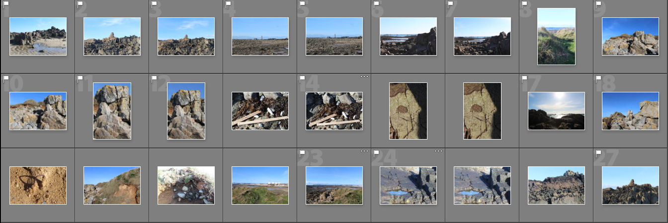

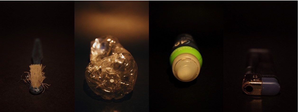
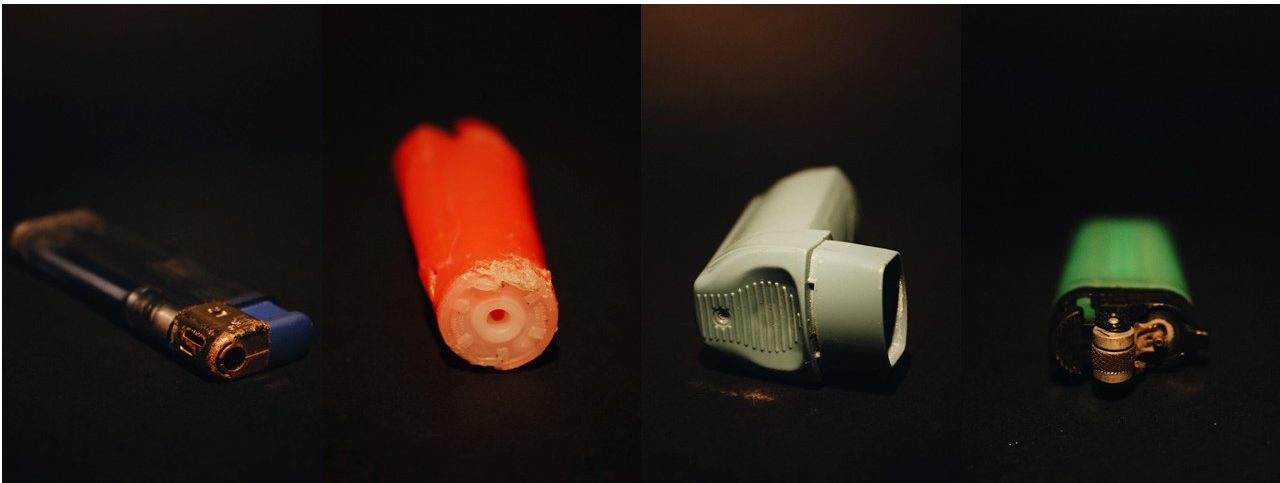
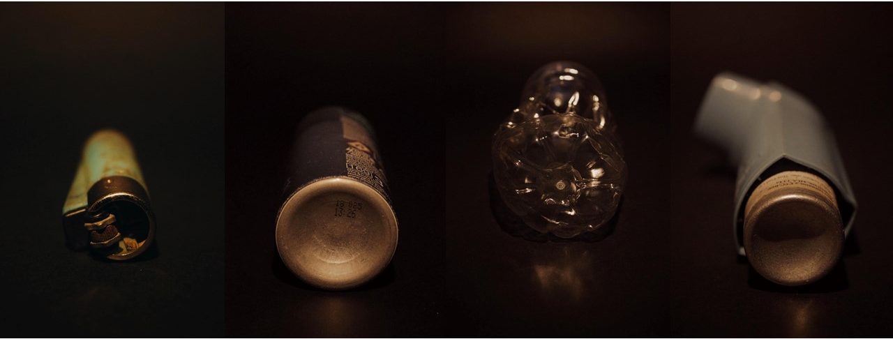
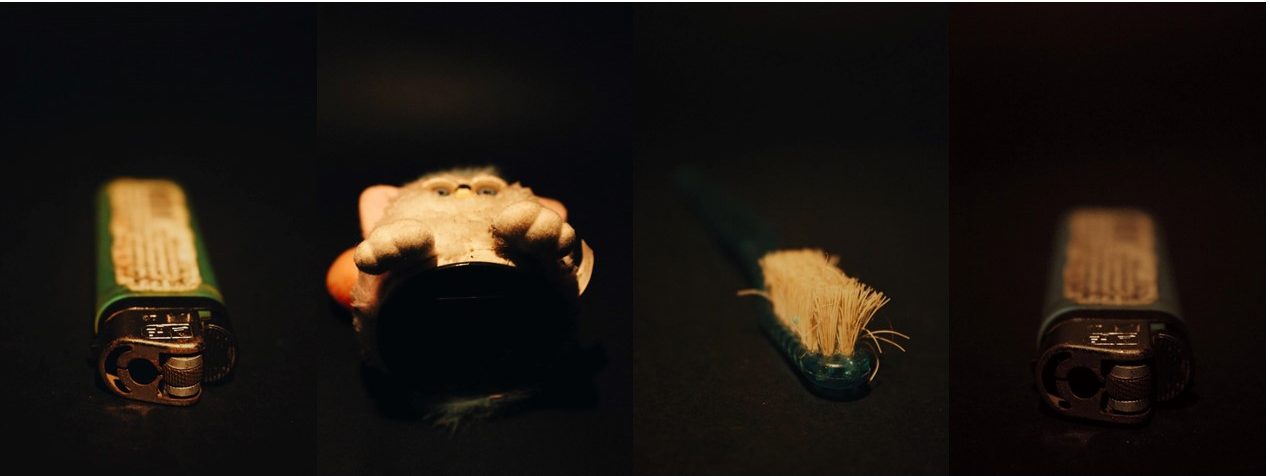
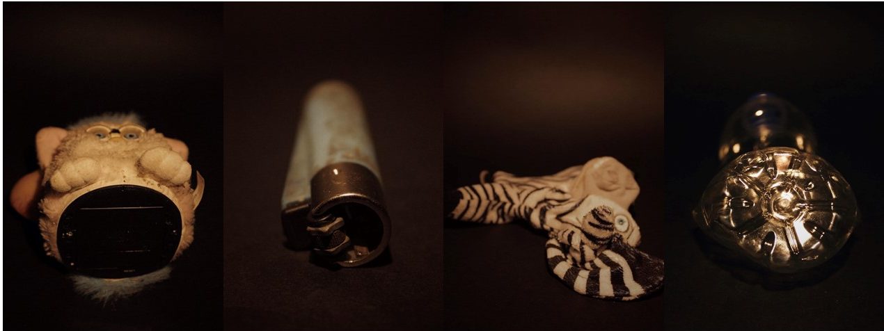
For this photo shoot i went back to La Motte to gather more objects that I thought represented what was there now to compare with archival images. I narrowed these images down and displayed them in a contact sheet above. Whilst i was there I also took additional landscape photos as the weather was different to what my other landscape images had been take in. From the photos I took, I displayed the final landscape images and studio images separately in two parts below.
Part 1- Landscapes


I particularly like these two images from this shoot as they have a different atmosphere to the other images in my project. The bright blue sky that’s behind the rocks and horizon, contrasts with the tones in the foreground in both images. When editing these images I will emphasise the contrast between the two colours. In the first image I was drawn to the unusual shape that the rock made along the top and the detailed sharp edges within it. I wanted to emphases the chaotic nature of the pattern, so contrasted it with the plain blue sky on the top half of the image, splitting the image in two. In the second image I wanted to emphases the developments that have been built along the horizon to contrast with the archival images from over 90 years ago when they were there. This is why I centered the image so that the incinerator was were the eyes are drawn to. I found I also created the same composition in this image as the first image, where the patterned bottom half of the image is contrasted to the blue sky.
I found that when I am taking photos I takes ones where the main subject is in the center of the image, creating a symmetrical composition. In my photo book I plan to space out the images where I centered an aspect of the photo, so that they create more impact by themselves.
Other images from the shoot:


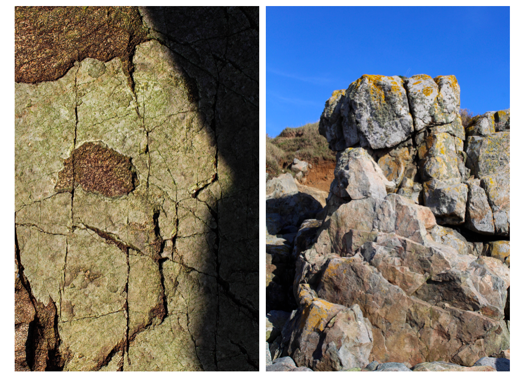
In these portrait images I tried to emphasise the shadows the that were made by the rocks. I particularly like the third image where i take a close up image of the pattern on a rock, highlighting the light and dark. I think that this image contrasts well with the other landscape images as it shows a close up angles contrasts with a wide one. In all the images, I wanted to focus on one section or a rock or the earth and emphasise it, which is why the objects all continue out of the sides of the photos.
Editing:
When editing these landscape images in photoshop I found that they were most effective when they were black and white. I experimented by editing a couple of them this way and compared them to the originals.
As well as turning the images black and white, I also adjusted the contrast and the white and black to find what made the image look the most aesthetically pleasing.

I think these two images in particular are the most effective in black and white as the detailed patterns that were originally there stand out even more. The different tones in the sky are more noticeable and are emphasised by the contrast to the rocks. Whilst editing I also used the grauduated filter to make the sky have more of a range of tones so that the final image was more vast and dramatic.
Although I like my black and white edits where I’ve emphasised the light and dark, I think that my final images for this project should be in colour as the archival images I have chosen to include in my photo book are in black and white. If my images were also in black and white the reader might get confused as to which ones are the modern ones that I took.
Part 2- Objects Experimentation

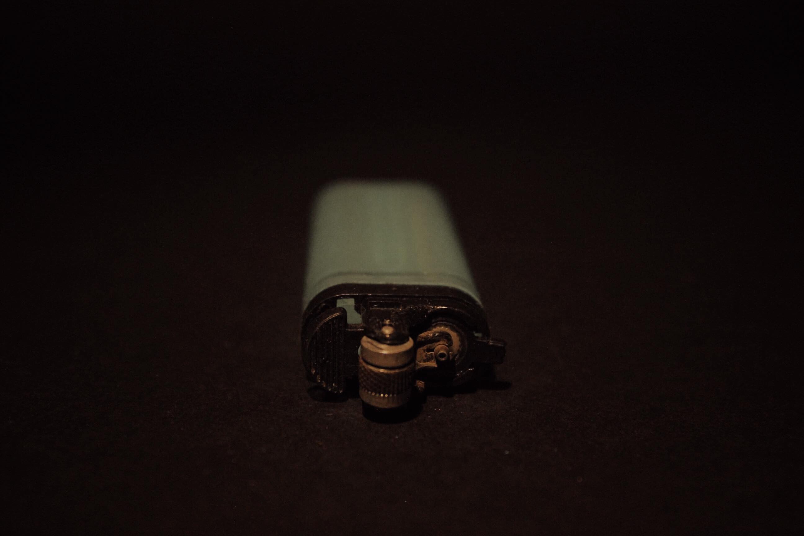
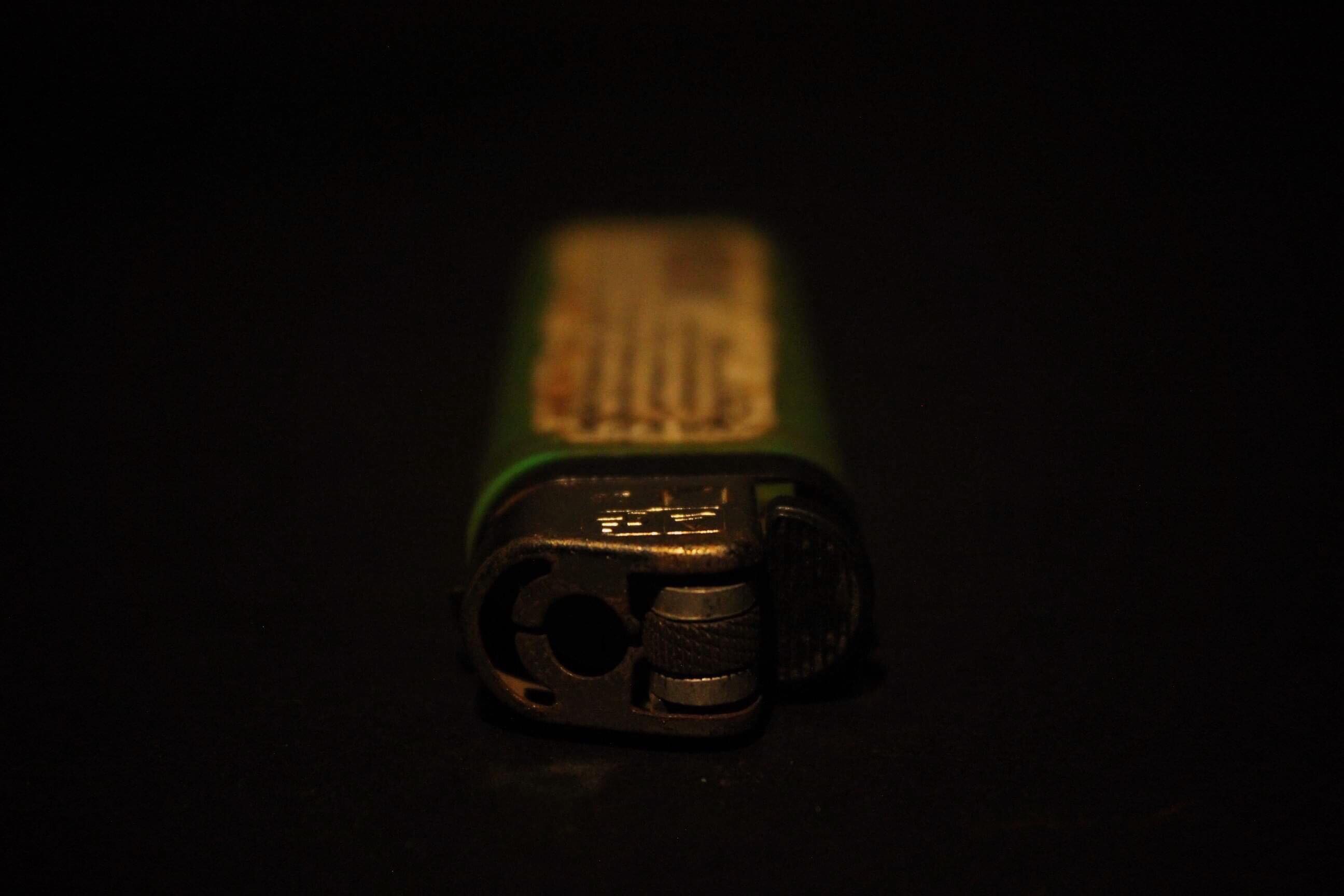
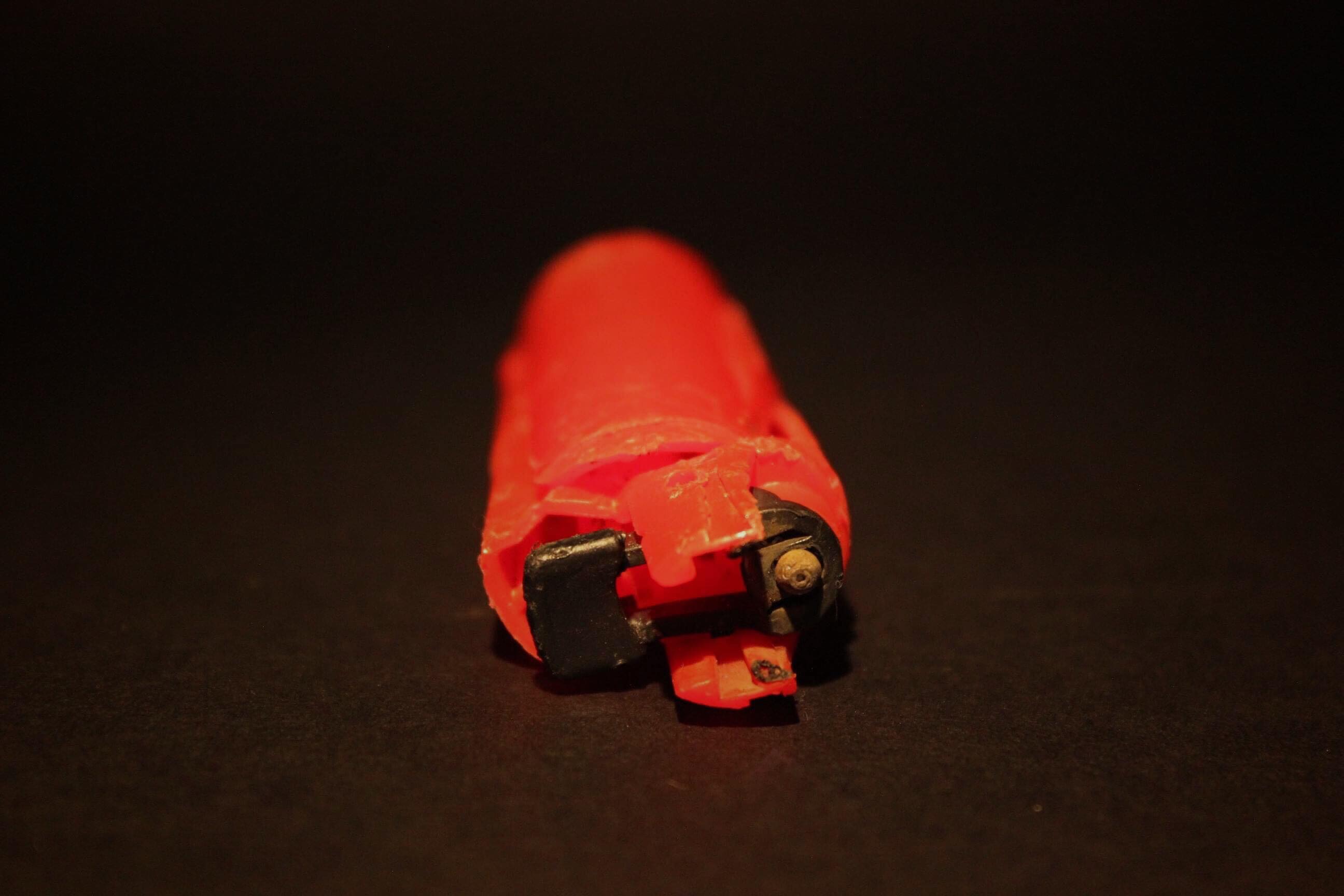
For the images photographed in a studio I edited them on photoshop. I first inverted the image to create the appearance of a photogram, simialr to Chrystel Lebas and Edward James Salisbury. I like this editing style as in my previous experiments from different shoots I found that the final images reflect the work of the early botanists where they used light sensitive paper which gives my images a scientific appearance. Instead of using natural objects i.e plants and seaweed, in this shoot I photographed man made objects to represent the changed environment in my work. Comparing these photos to that of early botanists show how what is found has changed over the period of 100 years and reflects the ideas of anthropocene. Secondly, I adjusted the levcels in my image so that the background was darker to contrast against the objects. I then adjusted the hue of the images so that that I could create different variations of the same image to see which one was the most effective. I displayed these variations below in a grid format. I also adjusted the levels in each image to brighten the obejcts and make the background darker.


From these variations of the same images, I think that the most effective image edited in the bottom row as I like the use of negative space within the circle shape the rope is making. I also like how the background in these images is completely black, taking the attention and focusing on the objects. The other edited images do this but have grey tones within this so distract the audience form the main subjects. Although I do like how the top rown images have a different appearance to the other. The bottom row shows exactly whats the object is, the appearance being more scientific, whereas in the top row it is harder to distinguish what the object is, perhaps making the overall image more interesting. This is through the lighter shapes surrounding the rope, which is the shadows inverted that were created when I photographed the images. I created shadows purposefully when photographing these objects as I wanted to see the effect it created when I inverted the images. Compared to the bottom row images, I think that they have a more delicate appearance as the shapes created are more rounded and go in multiple directions. In conclusion, I think that all the images are effective as they show different aspects of the same objects at different sections of it. In my photo book I will include a few variations of these images to interpret the work of Chrystel Lebas in her photo book ‘Field Studies’ where she include photograms.

For another object experimentation I decided to use all of the objects I had collected over the shoots I have previously done ans combine them with the objects I found in this shoot. I think that this is a good way of showing the changed environment and I thought that it could be a good image to end my photo book with. When arranging the objects, I first put the rope in a circle shape as this is the biggest object and the one that stands out the most. I then started placing the other objects around the shape of the rope, going in the same directions. I think that the combination of the natural obejcts e.g rocks, plants, flowers, seaweed in comparison to the main subjects the rope, creates an interesting image as it separates them as there is a divide in the center of the image, created by the rope.

I then went on to experiment with this image by editing the colour and tones within it. I tried to use warm and cold colours to see which was the most effective. Out of these edits I think that the black and white image is the most effective. This is because the shapes and shadows are emphasised as well as the negative space. Although in this image it is harder to see what objects are being photographed as they are all arranged so close together. In the orange/yellow toned image it is easier to tell what the objects are as the edit brightens the objects and the colours within them. In conclusion, I’ve decided that I won’t use this image in my photo book as I think it is too different from my other formally taken images and won’t create an easy sequence to look at. Also I like how in my other images I have displayed the objects by themselves to create a scientific appearance, like what botanists do when they are analysising species. In this image you cannot tell what each o f the objects are clearly and doesn’t follow the scientific approach I have been following throughout my project.
Botanical Experimentation

I started experimenting with my images from photoshoot 5 in photoshop, taking inspiration again from the photograms in Chrystel Leas series ‘field studies’ with new material. I want to continue developing my interpretations of her work so i can include some in my final photobook. In this photoshoot i collected natural objects like plants and rocks and displayed them formally. In Photoshop I inverted the images so that the white background i photographed the objects on turned black. I then adjusted the hue of the images to create different variations of the same image. I also adjusted the levels in the image to produce the most aesthetically pleasing image with the most detail. After this process i edit the image in Lightroom and edit around the objects so that the background is the same colour, eliminating any lighting and marks that weren’t supposed to be there.

I particularly liked this image when i experimented with different colours as i think the multiple objects displayed makes the image more interesting to look at and creates more of an impactful image. I also chose to display these images together as i think they work best as multiple images together, rather than singles images by themselves, as it shows the contrast between the 4 images and the variations. It also shows how the colour of the main subject of the image can can the whole feeling of the image. For example, the red image makes me think the there is a negative concept and message behind the plants, whereas this effect is not created in the yellow edited image.
Displaying them together shows how there can be many variations of the same image, that portray different meaning through colour. In these images i think that the black background works well as it emphasises the repetition of the leaves and shapes going down in size and the different shape that each plant has. I also chose to photograph this image landscape, unlike my other images in this photoshoot as i wanted to display the different sizes of plant. I think this can then show plants at different stages of their life representing how the landscape is constantly changing and growing .

Anna Atkins’s cyanotype of the eagle fern (1843)

I like the effect created when I inverted this image and adjusted the levels without changing the hue in this image as I think it reflects the early photograms that botanists made with light. One example is Anna Atkins’ photograms of algae in 1843. I think it creates an image reflecting the ideologies of romanticism that isn’t shown as much in the images where i edited them have a black background. This is because the main subject is made to seem brighter because of the brighter blue background, creating a more delicate and fragile appearance the objects. I also like this effect as it makes the appearance of the image seem more scientific, like an X-ray analysing every aspect of what’s portrayed.
The flowers in the inverted image look as though they are slightly blurred. This is because the shadows i created when taking the photographs have turned whiter, blending with the actual objects, making it seem as it it’s slightly moving. This reflects Mandy Barkers images in her series ‘Beyond Drifting: Imperfectly Known Animals’ where she moves the the plastic debris she’s photographing so it’s blurred and looks as though it floating in the sea. 
I continued experimenting with this image to see if i liked them in colour edits. I found that i do like them, but for a different reason to the first edit. These images have a more powerful, impactful appearance in comparison to the first edit. This is is because of the contrast between the dark black background with the bright colours of the plants and rocks. I also like these images as i think they grab the audiences attention quicker, and the repetition of the same image horizontally shows how variations of the same image can look very different.
I think i prefer the first two images other than the forth and fifth images as i think the last two look to edited and artificial. Although that was the intention of editing the in bright colours, the last two might be too edited. The first two are yellow and red and work as a juxtaposition to one another, whereas the last two don’t work as well as a contrast as they are both tones of blue. Overall I think these images work well as a series showing different colour edits. If i were to use them in my photobook i would arrange them in a different order so that the two tones of blue weren’t next to each other in the series.

Finally, i created different edits of images displaying just plants in them, also including some small flowers i found on La Motte. I think these are my favourite two images that i edited as i think they created a more delicate appearance that wasn’t there when rocks were displayed in the image. This is because rocks are bold and structured in comparison to the plants I’ve displayed. I first started editing these images by inverting them and not changing the hue to see if this image work as well as the previous image. I found that i liked this edit, creating a similar appearance to the the previous ones, reflecting the work of botanist Anna Atkins that some would consider the first female photographer. I developed them further and found that i preferred these images when i adjusted them in colour.


These three images are my favourite variations of colour edits. The first two are the same image edited in yellow and blue. I like the first image as it simplistic yet detailed at the same time. The detailed patterns created by the stem and flowers on the plant make the image more interesting, but it is still simplistic through the dark black background. This focuses all the attention to the object in the image.
I arranged the plants this way, with one placed vertically with the other coming out of it side, as it creates the appearance that it’s just one plant and i also wanted the stems and flowers to be pointing in different directions to create a more interesting shape. Having the plants in different directions makes them more emphasised against the black background as you are able to see all parts of the plant, rather than them being on top of one another.
The second image is edited in blue tones. I made the plant brighter in this image in comparison to the others as i thought it worked well with the blue background. Also in this image i decided that instead of a black background i would experiment by having a more navy colour to complement the blue tones of the plant, which i think worked well. In this images the blurred lines are emphasised more which is an effect i like.
The third image is my favourite from the shoot. In addition to the plant, i also added small flowers that i found on La Motte on the left side of the image to give it another interesting aspect. I think this image worked well as a yellow edit, as the flowers i found were originally yellow, so the edit emphasises there natural colour making them stand out more. I also think that they complement the plant well as they are different tones of yellow, the plant being a more darker yellow with hints of brown. The same delicate effect is created taking inspiration from the ideologies of romanticism, similar to the first two images but i think this effect is emphasised with further with the flowers added. This is because of how the flowers all create different shapes against the black background, not one being the same. When photographing this image i tried to make it seem a though they were originally apart of the plant, but had fallen of due to the changing environment.


Photoshoot 5- Botanical
For this photoshoot I wanted to re-visit the idea of formally photographing plants and objects I find at Green Island, taking inspiration from Chrystel Lebas and Edward Salisbury and his botanical photography. I wanted to create a scientific style to contrast with the landscape photography that would be in my photobook.


I first chose the image i thought were the most aesthetically pleasing and has the best lighting in them. I then displayed below unedited. I want to show the contest between the unedited to the edited. in this shoot gathered the objects i collected recently and tried to put them in different arrangements to find the one that with the best composition and patterns. I tried photographing single objects and finally started combining different objects together to create a contrast in the images.

I chose this as one of my final images to eventually start to experiment with because of the arrangement of plants. I tried many different ways of displaying these and found i they look best when i arranged them in size order. I think this makes the image look more scientific, similar to how a botanist would look at plants to analyse them. I think having them in size order shows how they were all at different points of growing, representing how the environment is constantly changing and evolving.
I also like this image due to the repetition of the stems creating vertical lines. Each plant then has different shapes and directions which their leaves are going, making all of the plants part of repetition but all being different.
The way the plants are displayed reflect botanists work. For example, in this photoshoot i took inspiration from Anna Atkins (16 March 1799 – 9 June 1871) who was an English botanist and photographer. She is often considered the first person to publish a book illustrated with photographic images. Some sources claim that she was the first woman to create a photograph.
Anna Atkins learned directly from the scientist William Talbot about two of his inventions related to photography: the “photogenic drawing” technique (in which an object is placed on light-sensitized paper which is exposed to the sun to produce an image) and calotype. Atkins self-published her photograms in the first installment of Photographs of British Algae: Cyanotype Impressions in October 1843.

“Looking at Atkins’s book today, what is most striking is not the outlines of the algae, however beautifully and delicately they crawl across the pages” (Joanna Moorhead, The Guardian)

I think the images i look interpret Atkin’s, but when i develop the images further and edit them i will make them look even similar to resemble photograms on light sensitive paper.
I also chose the two images below as my final images for this photoshoot as i think they also interpret the work of Anna Atkins well, especially when she looked plants in her photograms, as the stems and leaves are similar to my photographs. I also tried to arrange the plants in a similar way, vertical and spread out so you can see all parts of the plants, reflecting the work of botanists.
I like these two images as they work as single images and as a series. I think they work well displayed together as they are both simplistic images,and the contrast between the one plant and two is small, but changes the composition. The first image shows the plant displayed centered with equal space around the sides, this is so the whole plant is in the frame. I purposefully took the images so that shadows were created underneath the plants so that there are a range of different tones from light to dark in the image. I also wanted to see what the shadows would look like when i edited them with the appearance of a photogram as botanists don’t display there plants with shadows as it’s printed on light sensitive paper.
I used the white background against the plants so that the detailed sections of the plant can be seen and emphasised when i edit them. I chose these plants to photograph as i like how the parts of the plants had dried and gone a brown tone as it created sharp edges to the ends. Also the flowers on the ends had dried as well creating an interesting circle pattern to contrasts with the rest of the image with sharp lines. I also displayed the image with two plants in it as i thought it had an interesting composition where the plants weren’t centered like in my other images.
Conclusion
Overall, i think i successfully took my images in the style of early botanists but i still want to develop these images more by experimenting with different edits and colours. I will then display these together to show different variations of the same image.
Photoshoot 4- Landscapes at Dusk
I went back to La Motte at dusk and took 100 images. I then narrowed them to 36 images and displayed them below. I decided to go to La Motte at this time so my images have different lighting and tones in them. In Chrystel Lebas photos she often goes out to photograph at dusk (what the French call l’heure bleu ) when the world becomes more mysterious. “I was fascinated by night itself, by the absence of light and the impossibility of photographing” Lebas told Nanda van den Berg, the director of the Huis Marseille in Amsterdam. This inspired me to go out at this time the day to see how this would differ from the previous landscape image I’ve taken in this project.


I like this image I tried to emphasise the cool tones to heighten the elementalism relating to the ideologies of sublime. I think this particular image of mine definitely reflects that of the sublime, through the bold, structured shapes of the rocks with dark tones ranging rom brown to black. This combined with the sky which is a blue tone due to being taken at dusk, creates a mysterious and other-worldly appearance.
I wanted to show how the environment was changing by how the rocks had been warn down in comparison to archival images from one-hundred years ago. This is similar to how Lebas wanted to express how the environment was changing though how trees are growing, dying and re-generating themselves. I also like how the horizon is in the middle of the image creating a good composition, with detailed patterns and structures on the bottom half of the image which is juxtaposed with a simple sky with faint clouds. This is then connected with the rock in the centre of the image, being in both half of the image. The center rock is isolated from everything else in the image by sea and is shown by itself which contrasts to the other rocks in the image which are in groups together making the audiences eye going to the entered rock first. When editing this image i will see why it look like when i darken the clouds creating a more vast image.


I particularly like this image from my photoshoot as it has more context and meaning behind it than some of my other images. To me the cross in the center of the image could represent the peoples lives that have been lost on the beach, or the people that were buried in the island. This makes the image more mysterious and allows for the audience to interpret it however they want.
I also like the composition in this image as it is split into three sections , with the cross in the centre of them. The bottom part is th darker pat of the image, the dark brown tones contrasting to the light blue ones in the sea. The tones in the bottom part of the image link to that on the horizon which creates a more aesthetically pleasing image. This is also because the blue tones in the sea complement the colour of the sky. The cross in the centre of the image is the point that the audience first looks at as it dark brown colour is contrasted against the sea behind it. I think image also links to the first final image in this shoot as they both have a subject in the sender of the image which draws the audience in, which is then surrounded by detailed rocks and blue tones. I think these two image would work well in a photobook as they complement each and have simile aspects but aren’t too similar that your looking at the same image twice.
I tried to emphasise the blue tones in this image when photographing it at dusk and think I successfully did this. When editing this image i will try to further emphasises these blue tones and maybe even create more contrast between the tones in the sea compared to the sky.

Edits
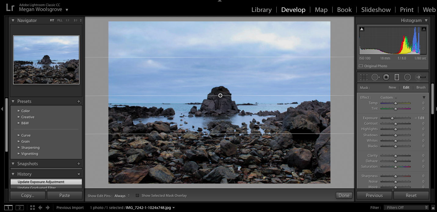
When editing my final images for this shoot i decided that i wanted to emphasise the colours in the sky and darken the colours of the clouds to create image the reflected the ideologies of the sublime more. I use the Graduated filter when editing all my images and adjusted the exposure, contrast and temperature to create more stand out images.


To experiment with this image I darken the blue sky towards the bottom but kept some of the white clouds around the top of the image noticeable so there was more contrasting colours. I think that the edited blue sky against the white clouds emphasises them more than the original and makes the landscape seem more vast. I also darkened the rocks around the bottom of the image to make it seem later in the day than to when he image was actually taken to make the overall appearance more other-worldly and mysterious.
I also experienced my adjusted the colours and temperature in the photos to see if any of the other variation would make a better image. I changed the image so that there were more warm colours int he sky the cooler colours. Doig this created completely different atmosphere in each image compared to the original. These edits make the image look more other-worldly as the colours in the sky aren’t something you would see everyday, which perhaps makes the image more interesting to look at.
Overall, I think i prefer when the first edit where i emphassed the colour tones as it creates a more sublime image and reflects the work Crystal Lebas more, which is something that i wanted to do in this shoot.


In this image i edited in a similar way to my previous image to see how editing the same way would make the images different. I darkened sky in this image using the graduated filter so there was more of a separation between the sky and the sea. I think this makes the sections in the image more noticeable as their are all different colours. Also the darkened sky makes the landscape look more vast and dangerous like there’s a storm, looking more sublime than the original.
I also tried editing this image with a warmer tone for the sky adding more yellow into the landscape, which creates a different atmosphere in the image. It doesn’t look as natural as the original, taking away the natural blue colours and adding a more other-worldly appearance. I also tried brightening the sea in the right image to create more of a contrast between the dark sky but found that it looks too edited as the dark sky would reflect the sea in real life, which isn’t happening in this image.
As a final image I prefer the first image as I think the darkened sky and clouds fits well with the aesthetic and concept of the image as the cross in the centre is representing people who have passed away, addressing a sensitive and sad topic. To me it shows how even though there’s a storm in the picture and waves the sea, the cross still stands as it always has, perhaps saying something about the people who have died in the area.

I also chose this edit as one of my final images as I like the reflects that the rocks create on the sea and also how it’s showing a different atmosphere to my other dusk landscape. The sea is flat with little waves in it, which contrasts to the other images I took which have more of a dramatic appearance. To me, this image is more calm and peaceful through the flat sea and the soft colours in the sky going from light blue and showing a little of the sun thats just set. In my opinion this image reflects more picturesque ideologies, compared my other images that look more sublime as its not as dramatic and vast and emphasises the beauty in the landscape more. When editing this image i used the graduated filter and brightened the sky a little and emphases the softer colours like the pale blue and orange.
Family Shoot 2

Keith Arnatt Response 1
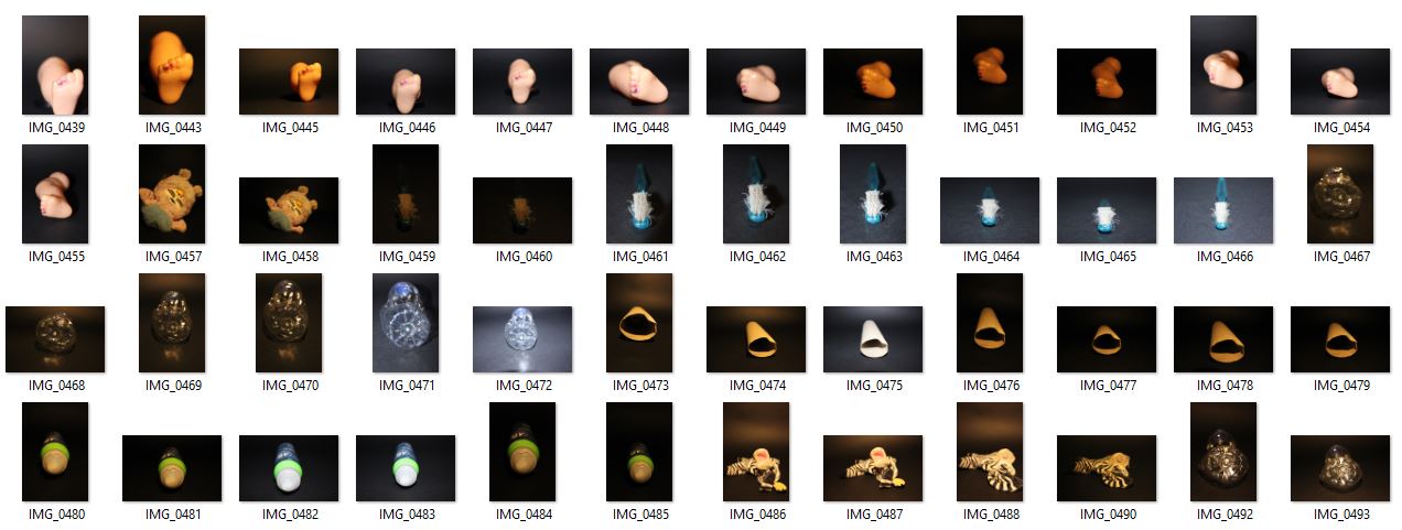
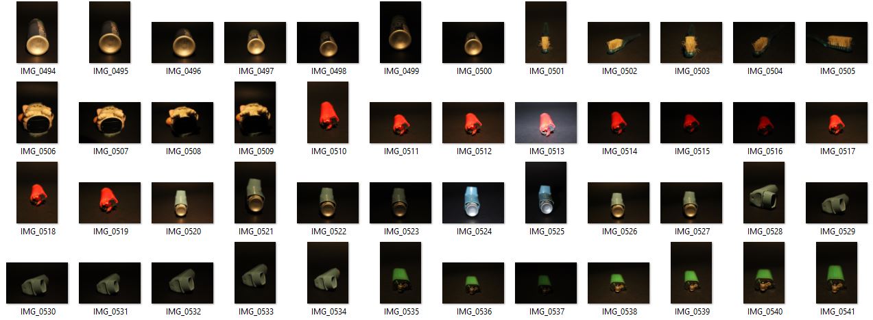
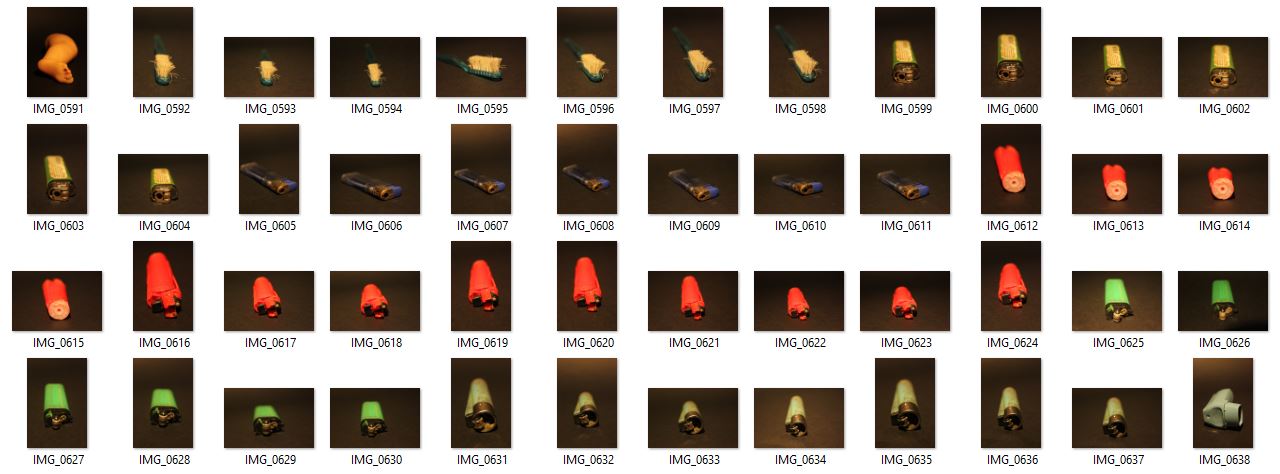

Edits:
Photoshoot 3- Landscape
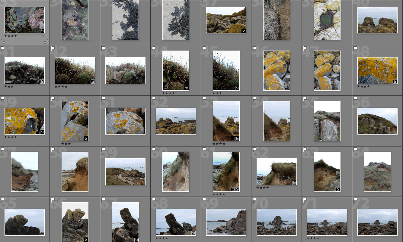
From this photo shoot I picked the best images from the 350 I took and narrowed them down to 40 and displayed them below. In the photo shoot i tried to focus on taking landscape images, but ended up liking more of the closer up images I took that looked at form and texture.
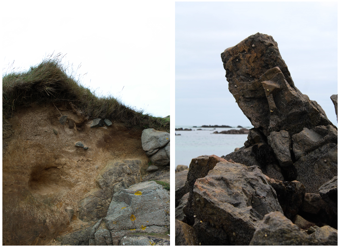
When on this photoshoot I found I was emphasising the shape and structure of the surrounding area. For example, the images above show natural objects (rocks and earth) contrasted against a bright background to make their shape stand out. The image on the left focuses on more rounded shapes wheres the right image looks at straight lines and more geometrical shapes. I was particularly interested in this rock as the shape was unusual and not like the other rocks on the beach. The angle it is positioned in a diagonal and sticks out above anything surrounding it. I like how in this image there’s close up rocks in the foreground which link to the rocks in the background along the horizon creating depth within the photo. The seaweed creates darkness to contrast with the lighter tones of the rock making a more interesting form. These two images link together but are also juxtaposed. In the left image the grey rocks on the bottom right of the image link with the right image and its shapes. The rest of the image is juxtaposed focusing on earth tones and more rounded shapes. I like this image because of the different textures shown in the earth and also because the image is divided into sections creating an interesting composition.
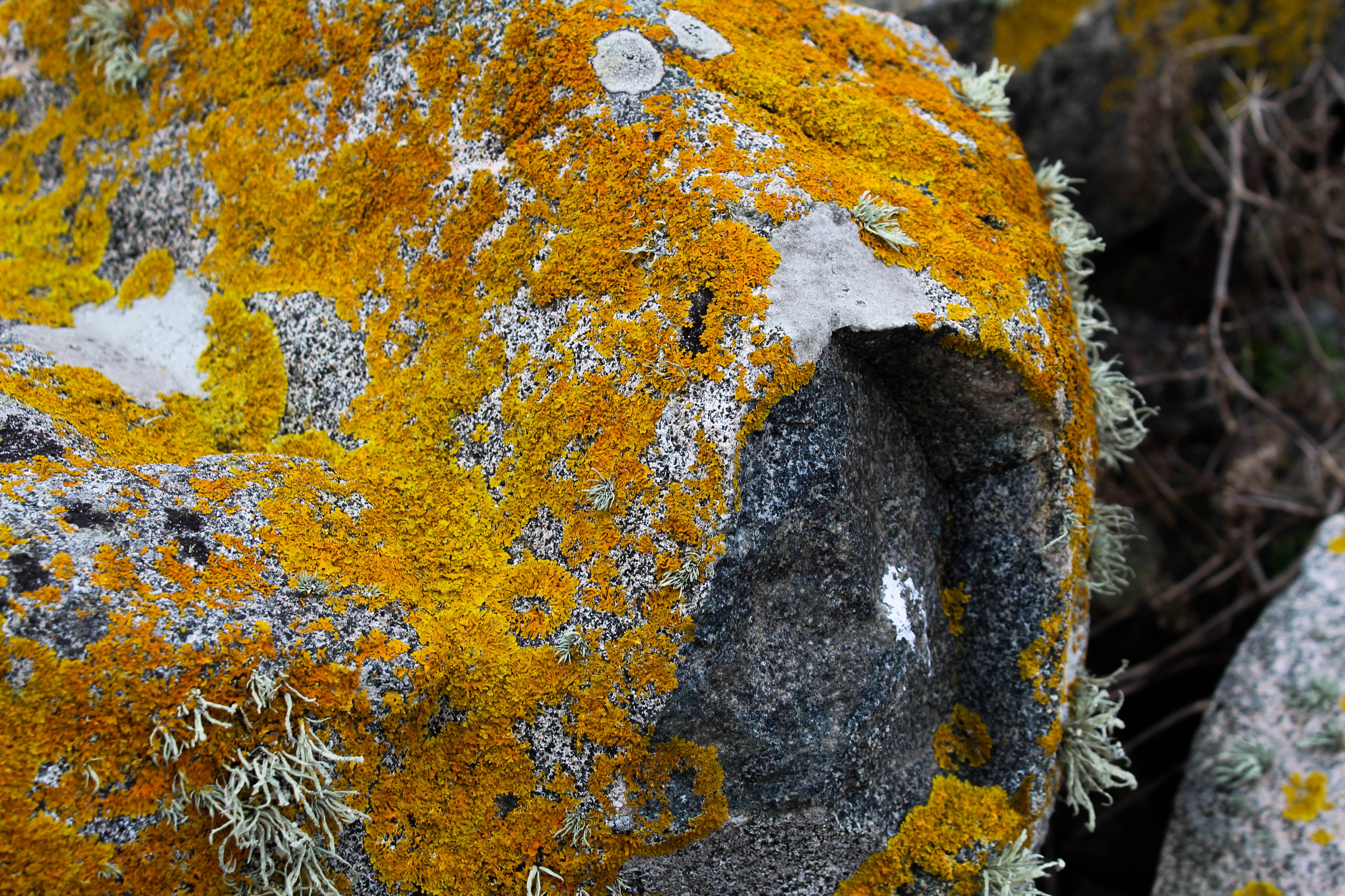 I chose this image because i like the many different textures and colours within it. The yellow/orange colour contrasts with all the other images I took in this shoot but still follows with the theme of earth tones that the others have. The different textures emphasise the rounded shape of the rock and make the image more interesting because there’s more details. I also like the angle this image was taken at as it emphasises the part of the rocks thats indented and isn’t orange which further highlights its 3d form. This part of the image also creates darker tones in the image to contrast against the bright colours. One aspect I could improve on is the composition of this image as on the right side of the image is part of another rock going out of the frame which doesn’t ruin the image but takes the emphasis off the other rock in the image. I think the other part of the background which shows brown parts of a plant complements the rest of the image and links to the arm colours on the rock.
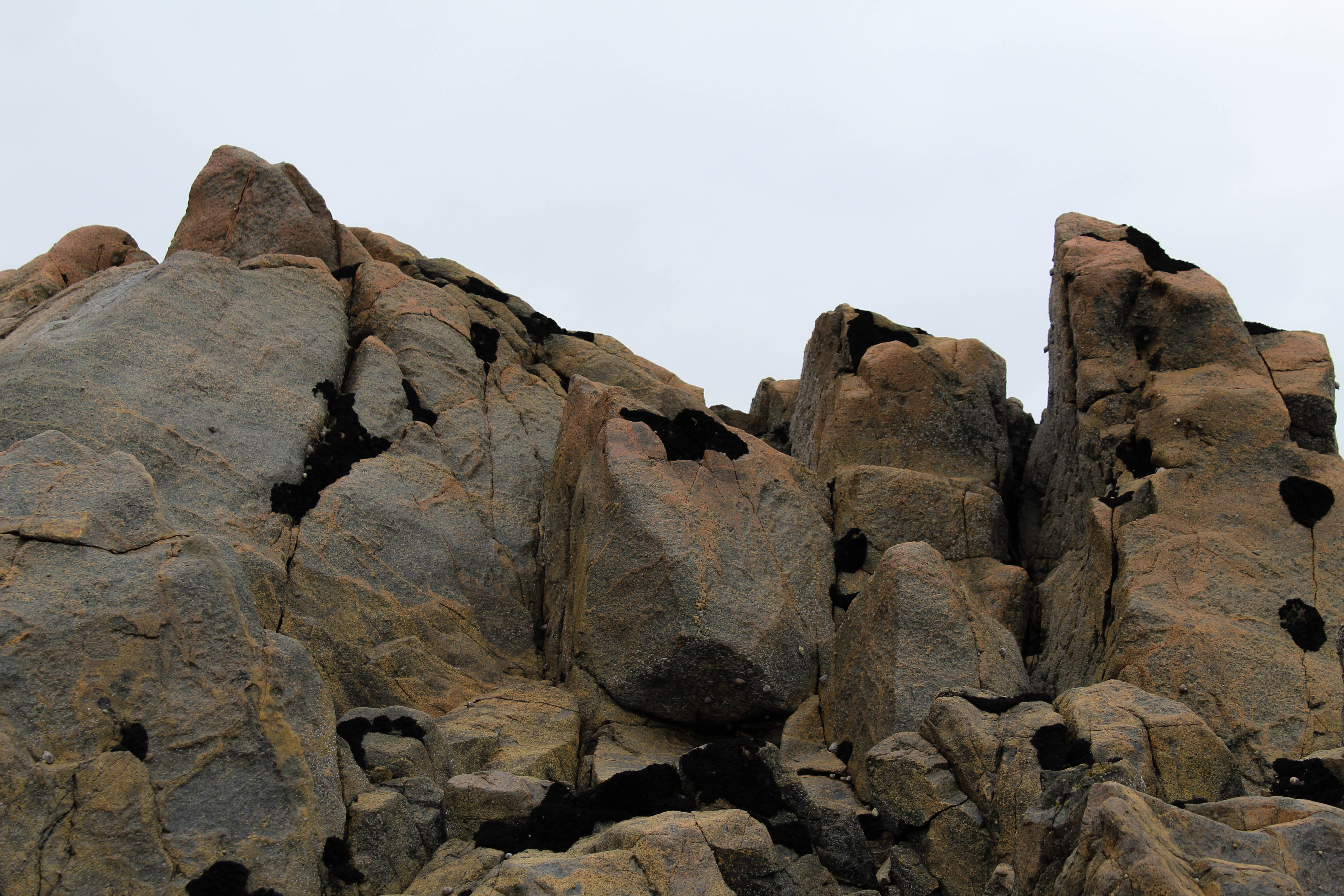
I chose this photo as one of my final images for this shoot as i think it complements my other final images well and follows the same emphasis on form and structure. The bright background emphasises the light and dark brown tones of the rock and highlights it’s interesting shape. I like this image as unlike some of my other images it doesn’t show anything in the background of the image and only show what’s in the foreground. Also its shape has rounded and sharp points which I like as it’s creates juxtaposition within the photo and further highlights it’s form. The seaweed which is on some parts of the rock creates an interesting pattern and adds to the different textures. In my photo book I plan to contrast these images that focus on form with archival images showing what the rocks and earth was like over 90 years ago. I will not find the exact spot where that images was taken but will show the contrast between the area over that period of time. In these image i aimed to capture was the atmosphere in the area is and I think i did that through the earthy tones.
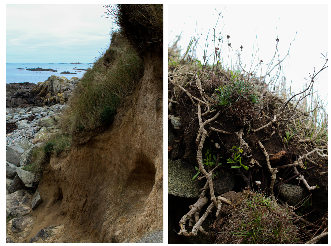
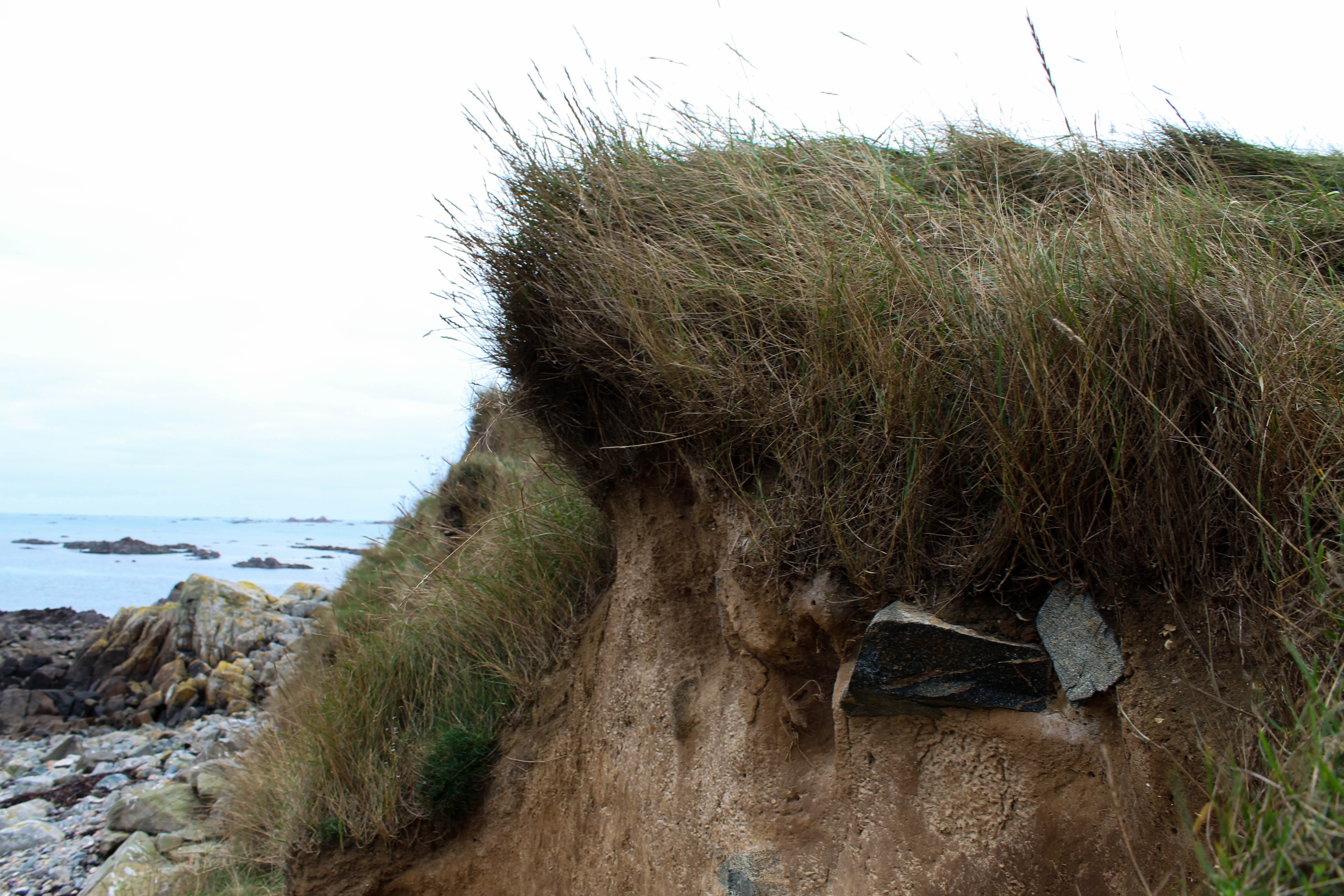
I chose these two image to display as I think they have many different elements to them which make them interesting. The image on the right focuses on the shape of the small branches coming out of the earth at the edge of green island. I tried to emphasise the light brown tones by using a bright white/grey background. I like the patterns the sticks make by growing in different directions and angles. The plants growing downwards in the foreground of the image contrast with the ones in the background growing upwards. These plants then contrast with the sections of earth that have grass growing on them bringing green tones to the image and making the textures more noticeable. I liked this image in particular as it shows new plants growing through through the bright green tones, but then also shows plants and grass that is brown probably caused from being near the sea and it being the winter. I chose the image on the left as as I like the depth of the image, showing different things in the foreground, middle ground and background. The foreground shows the earth of green island and it rounded form. This sections focuses on the earthy tones brown and green and its interesting shapes that formed from the sea. The middle ground shows the rocks on the beach next the island,the brown tones linking the foreground. The background shows the blue sea which contests the colours of the rest of the image. I like this image as all aspects of it are natural and it doesn’t show anything man made which i think portrays the atmosphere of the island.
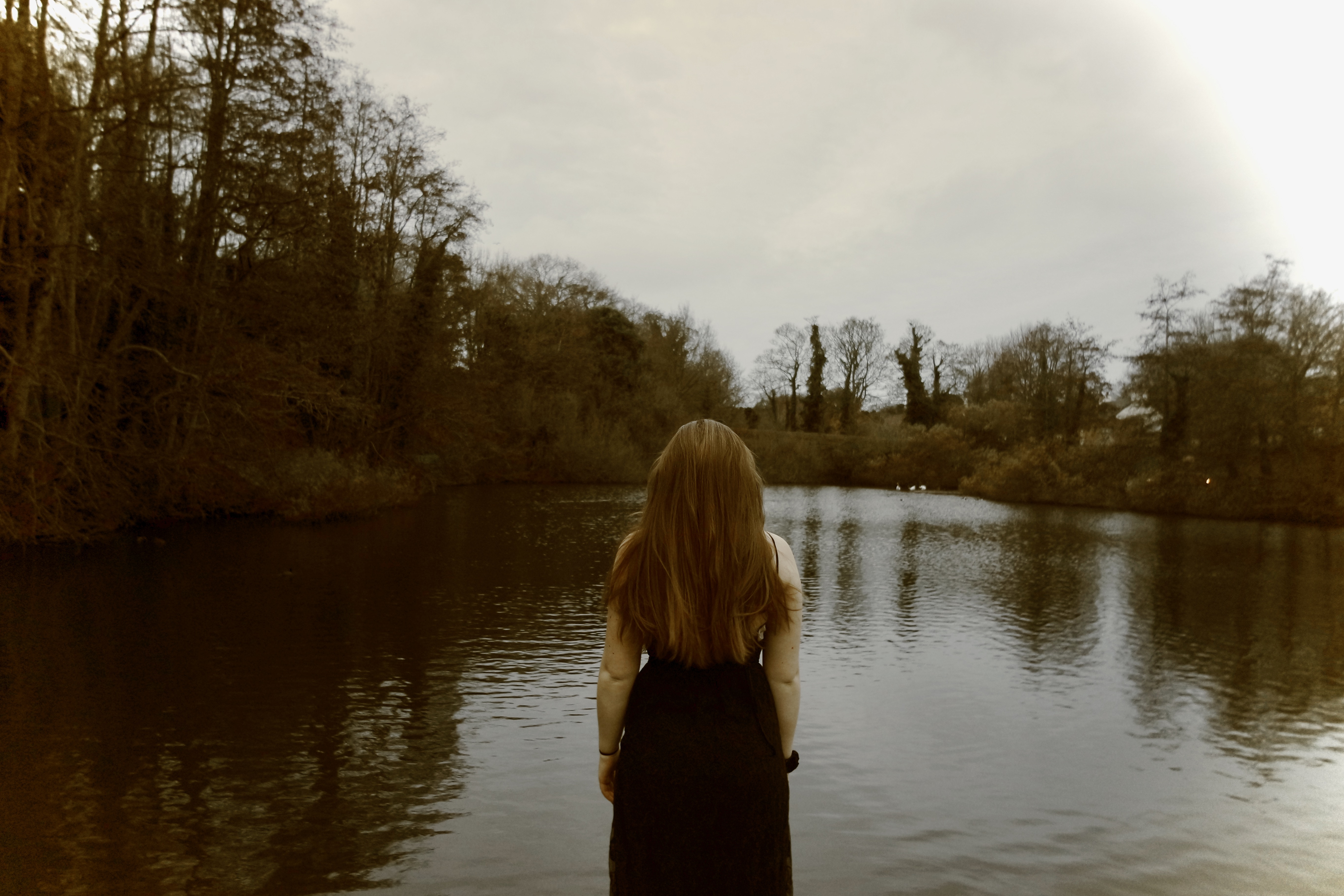
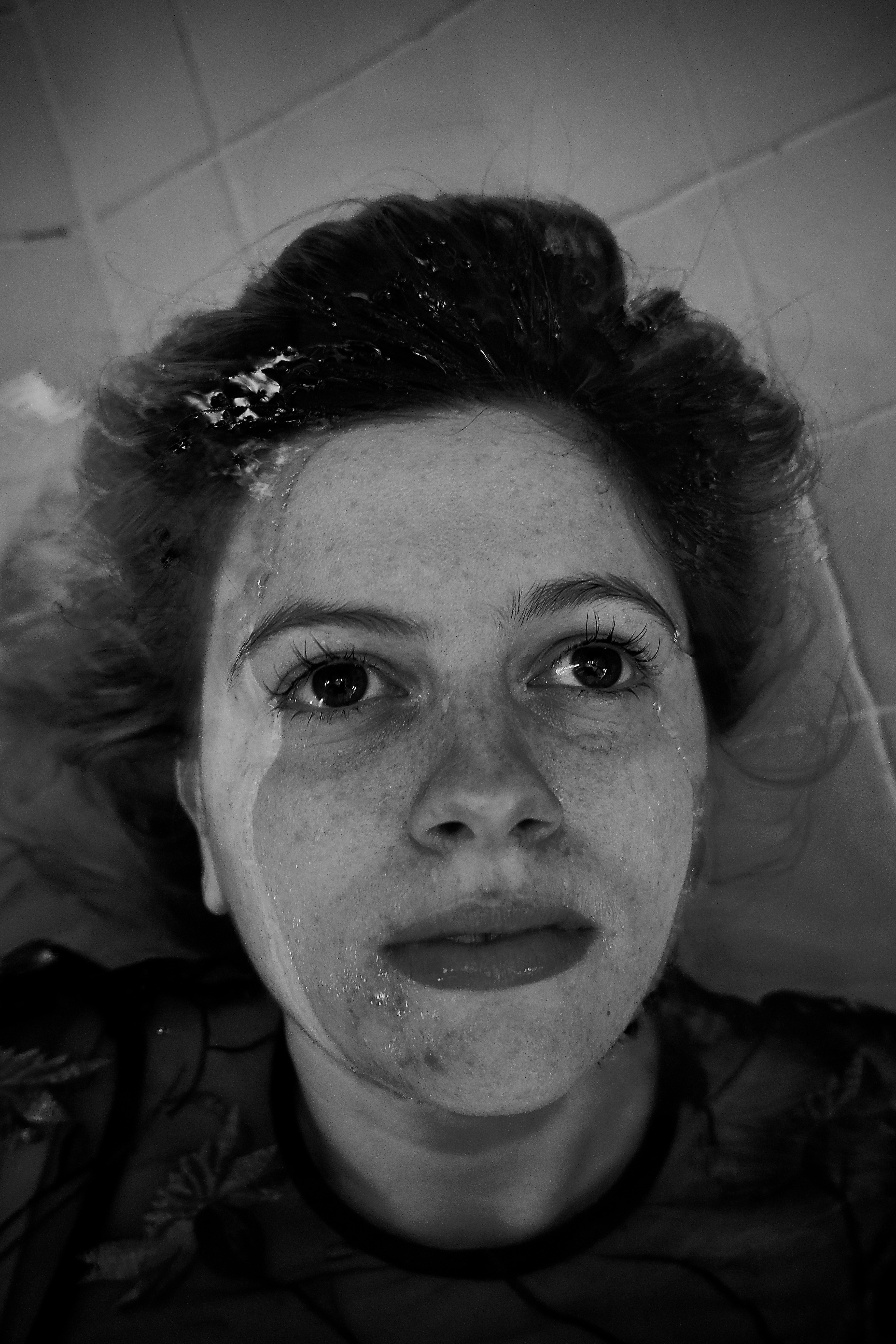
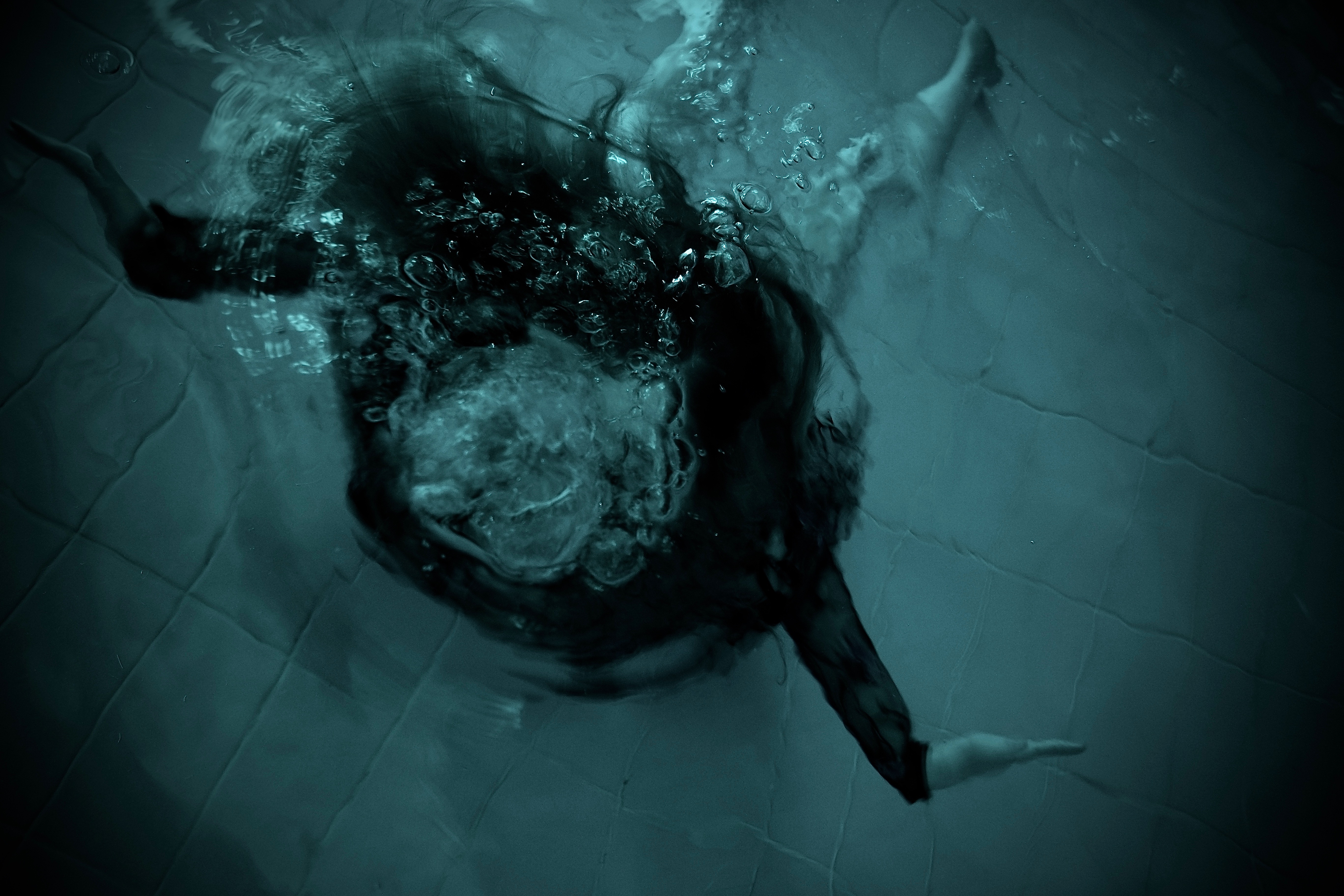
sublime shoot 8, inspired by BILL VIOLA
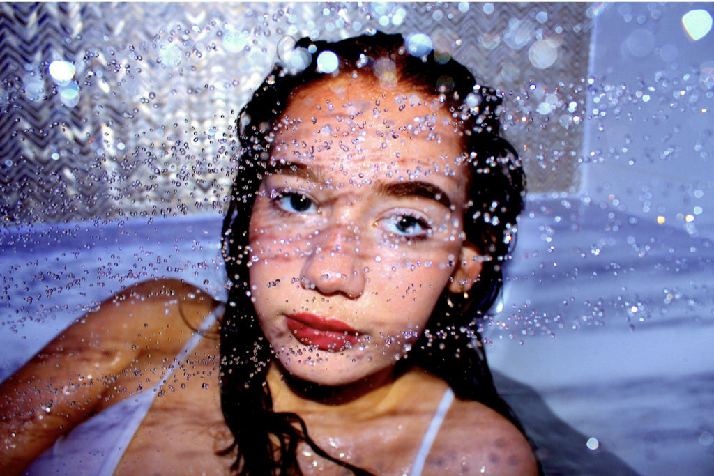
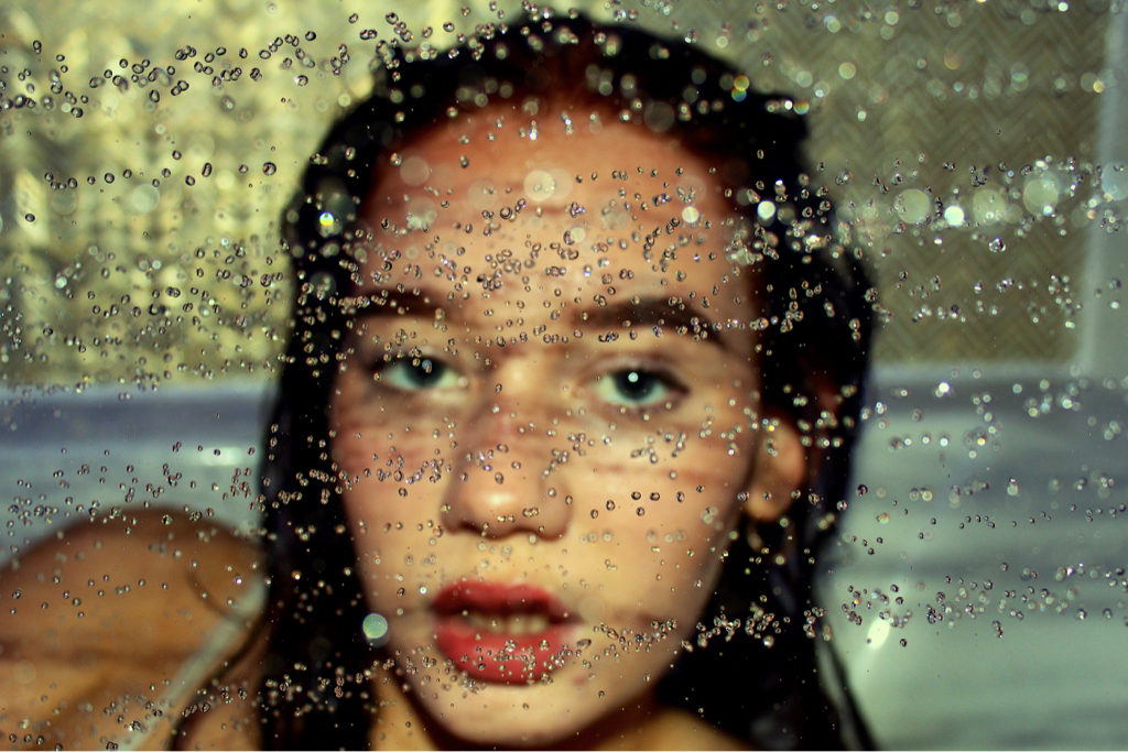
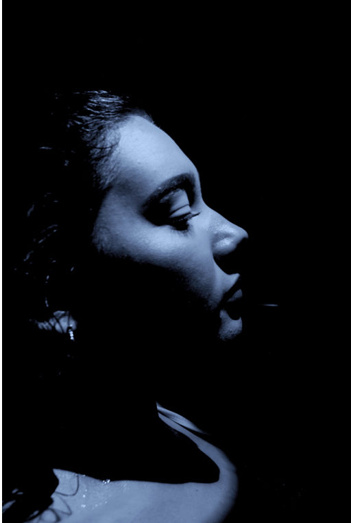
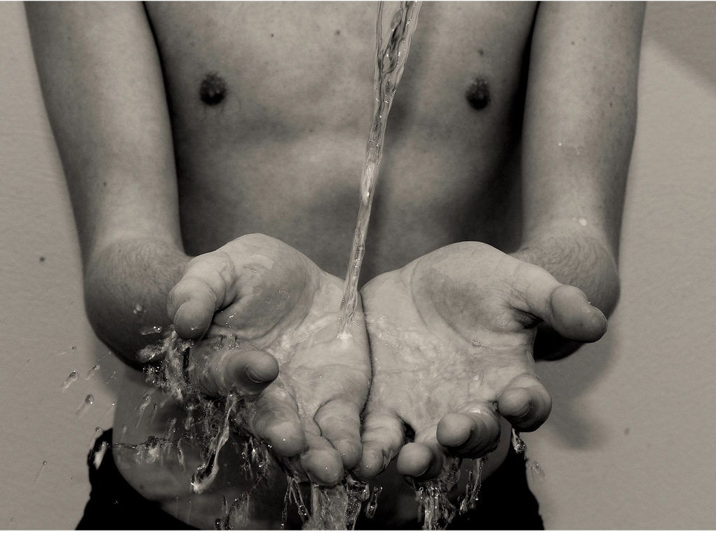
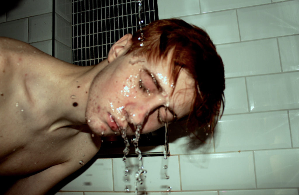
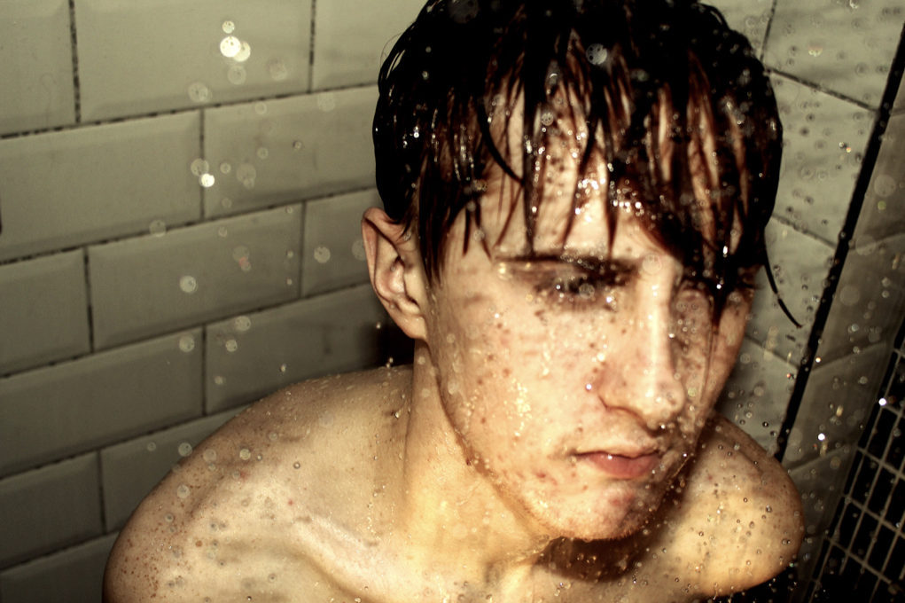
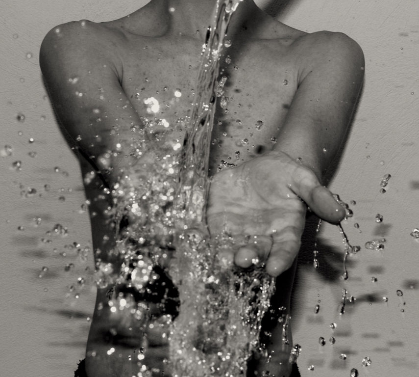
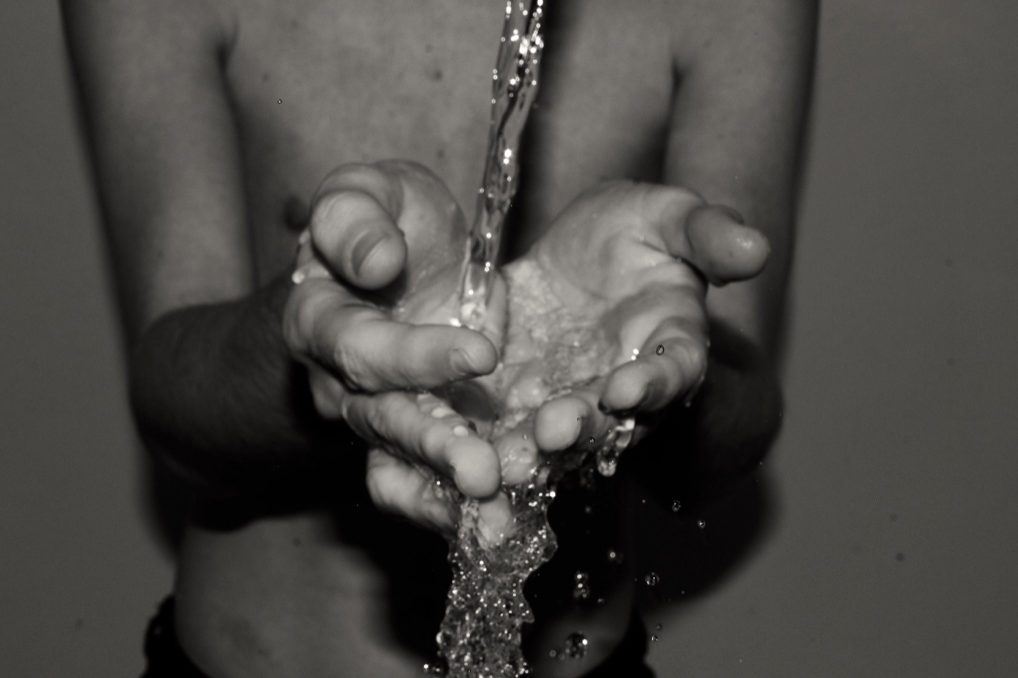
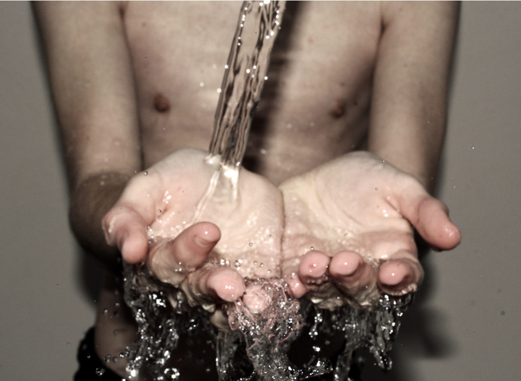
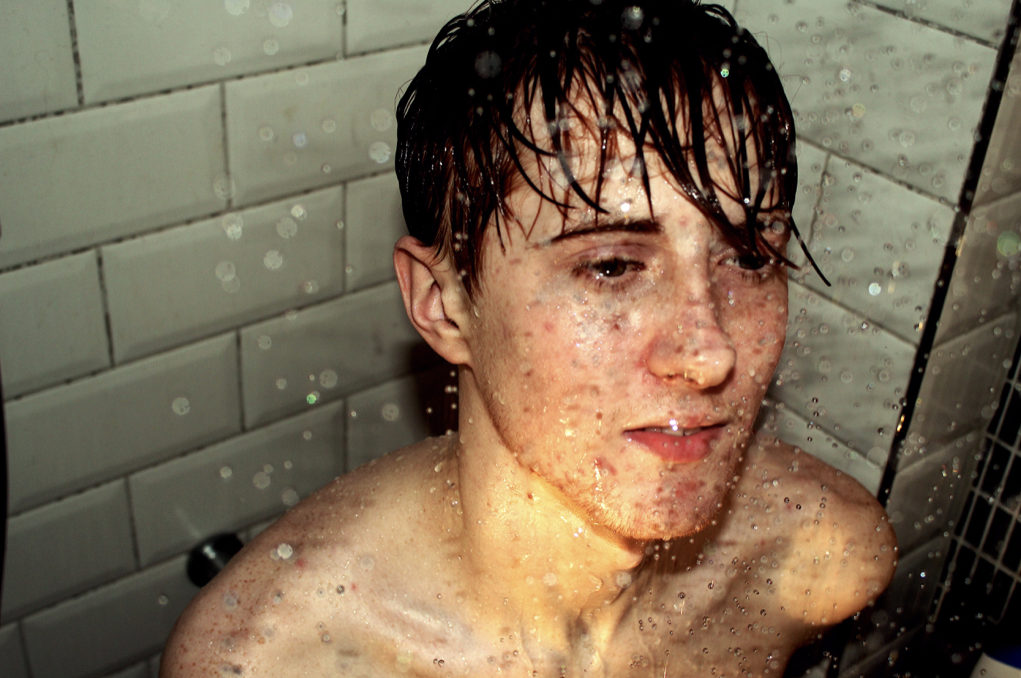
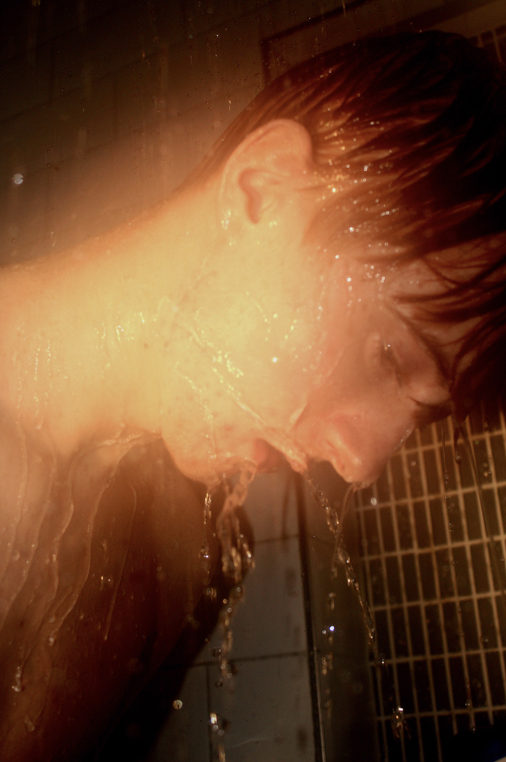
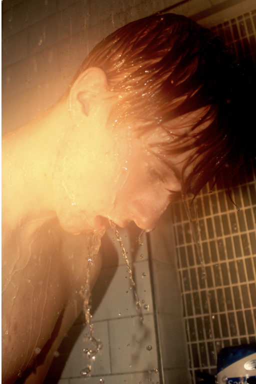
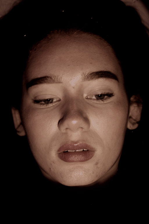
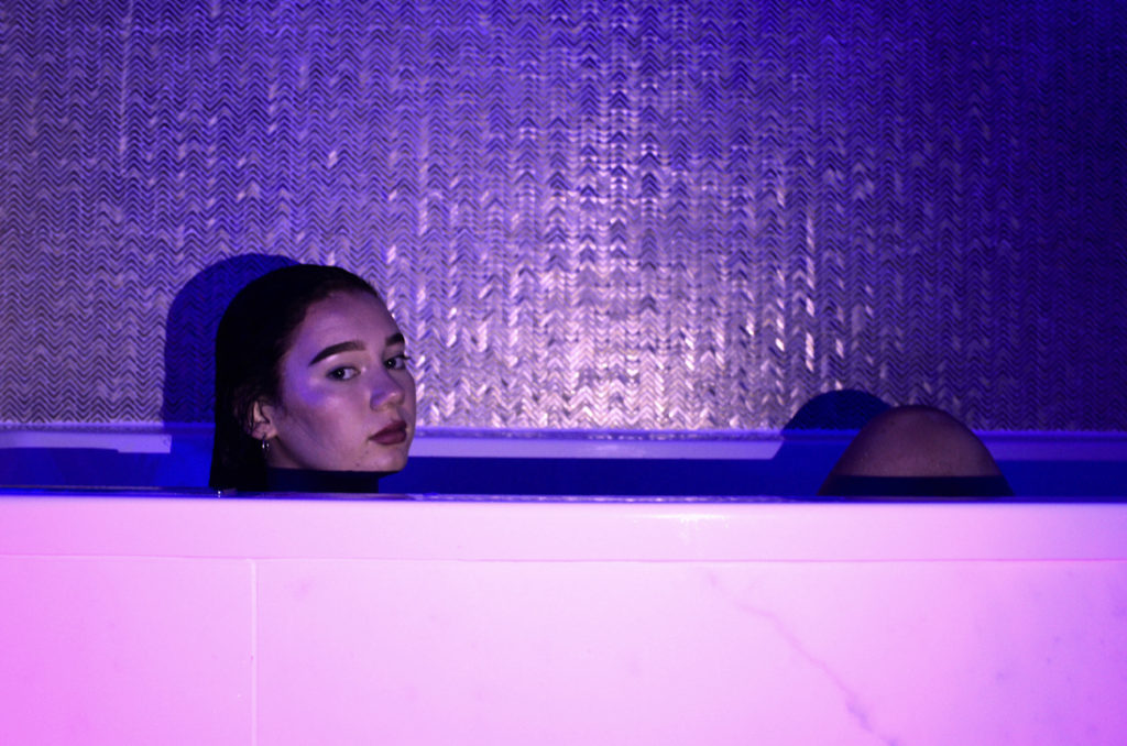
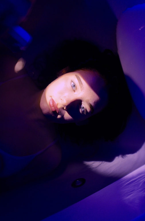
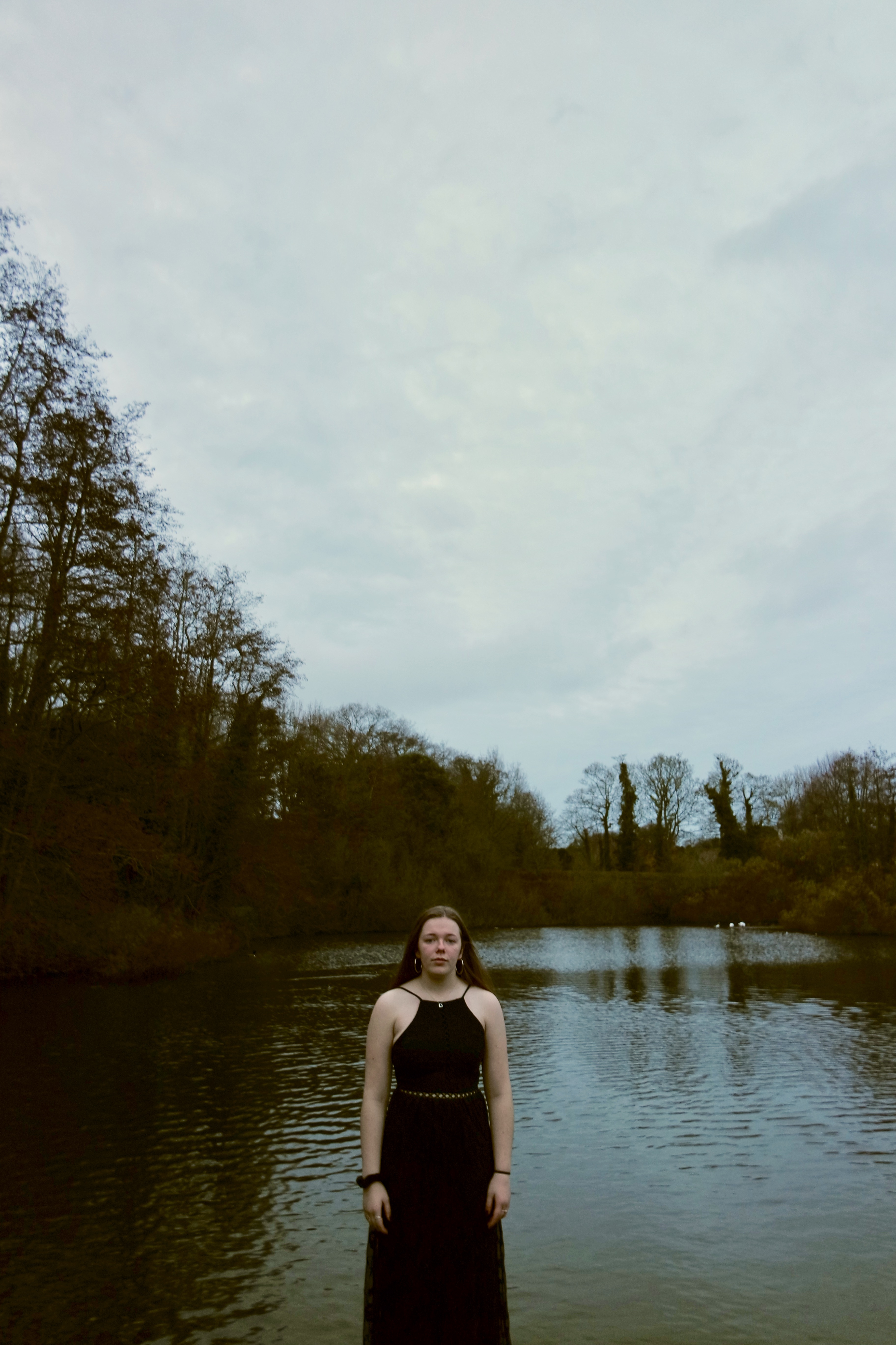
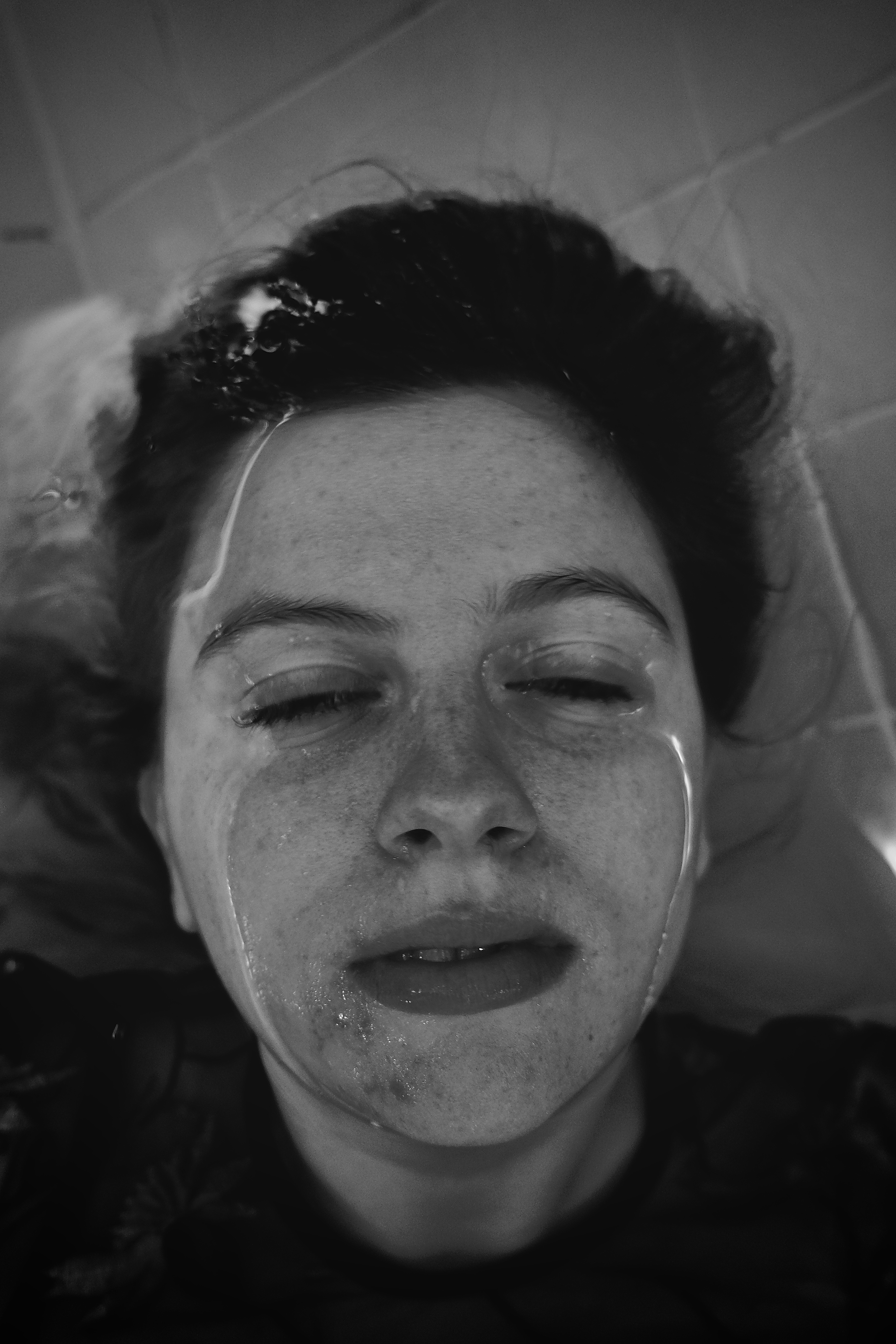
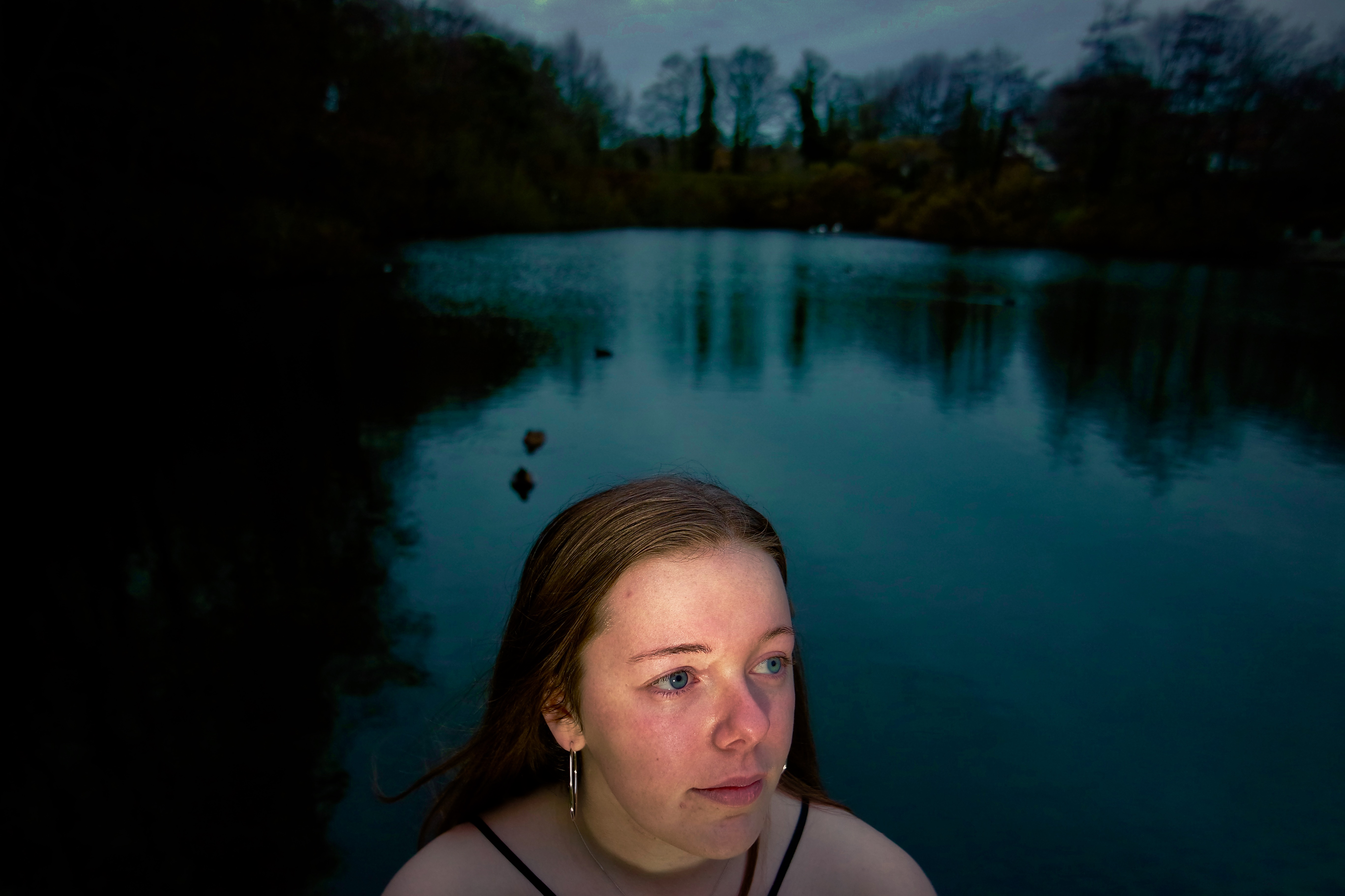
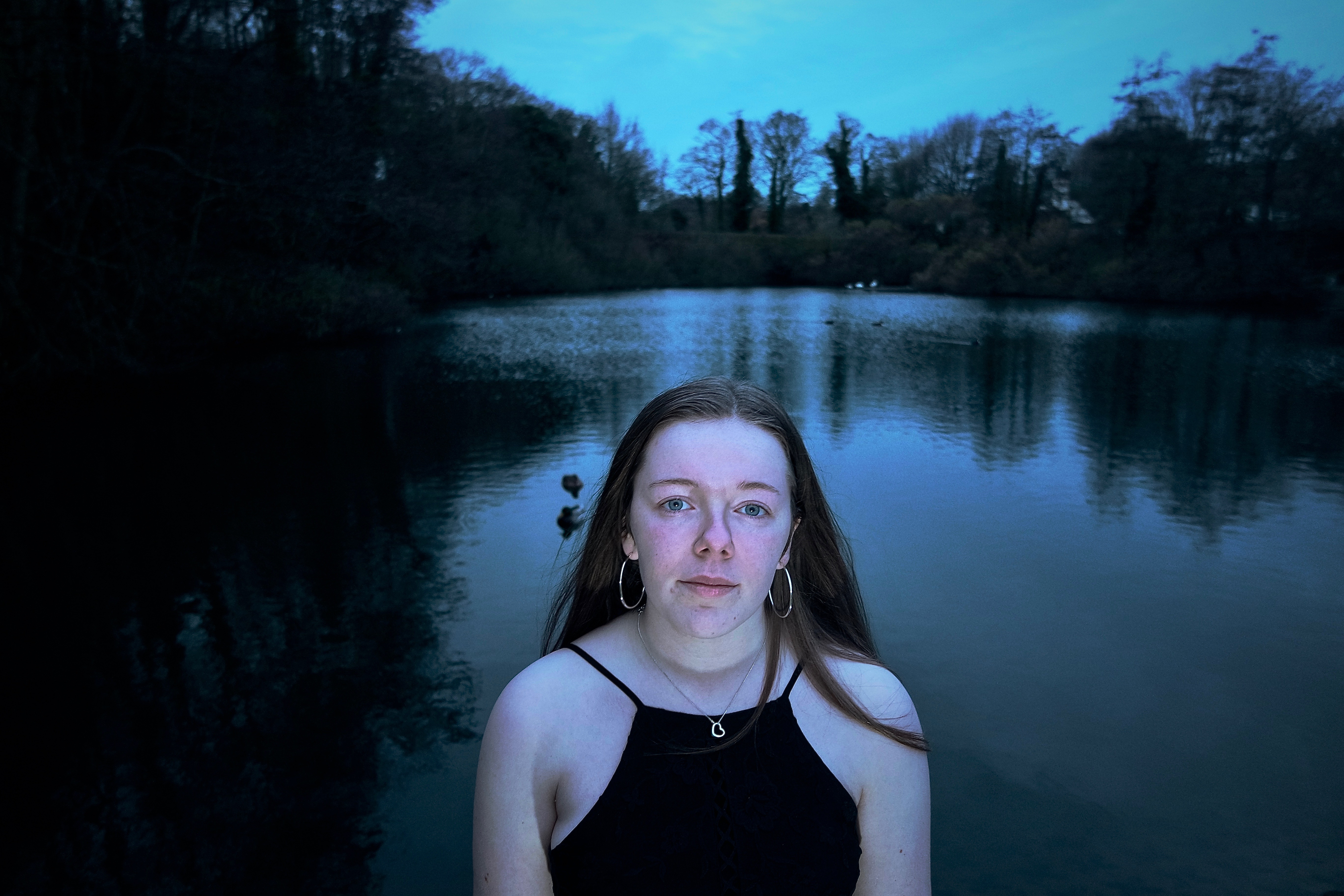
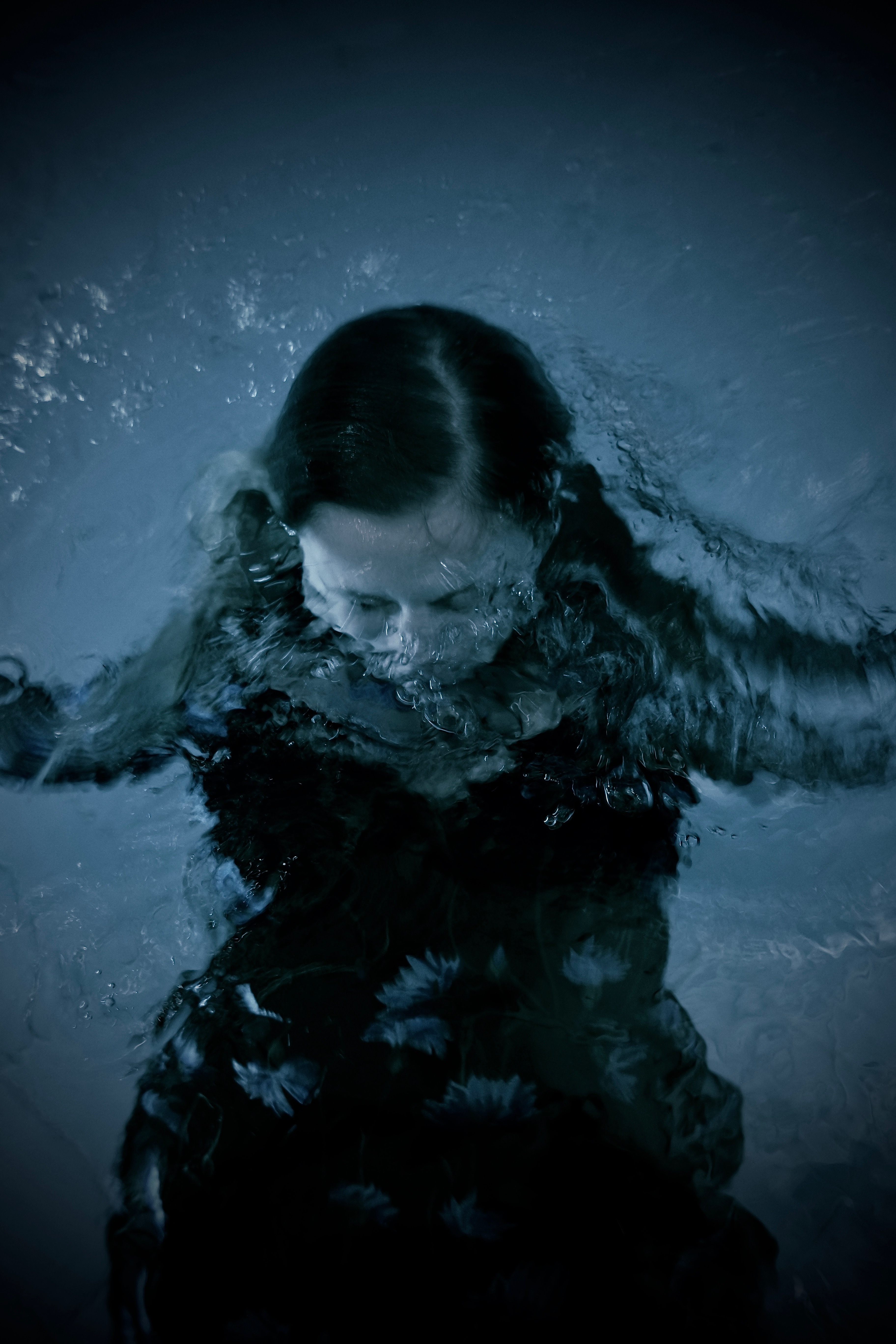
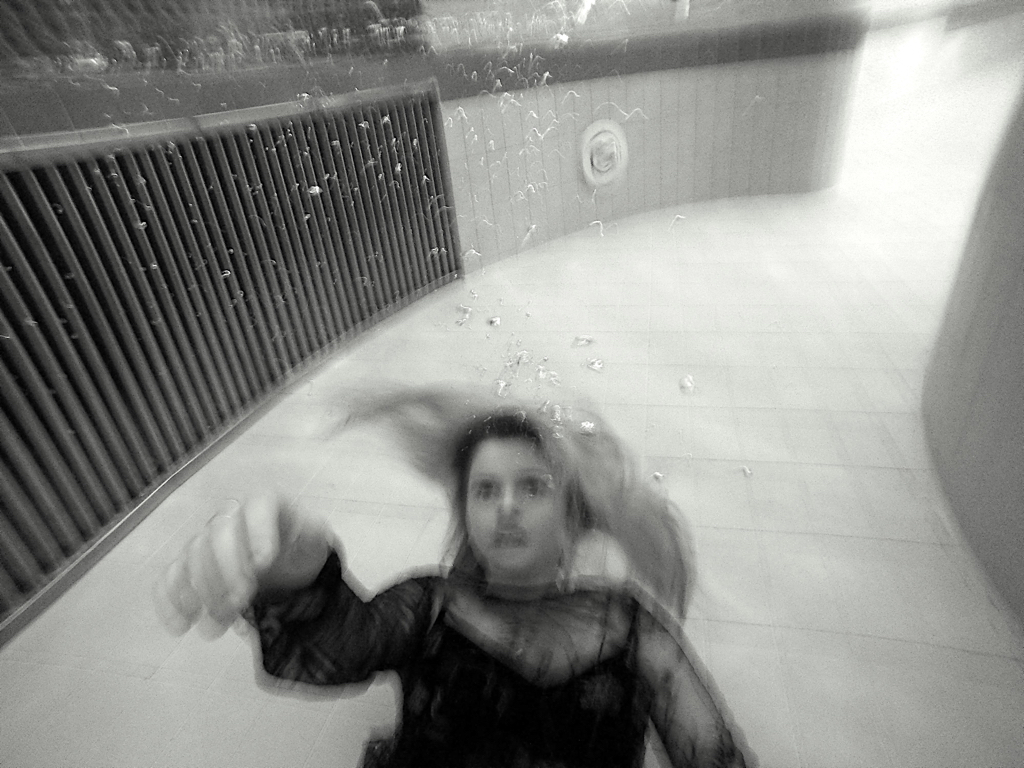
Analysis of the shoot: Viola uses water in such methods as to not directly represent water as being a solid from but as an entity for life and an expression of being. Because of this I wanted to use water in such a way it would evoke life itself, giving it a literal motion and abstract thought of its own. I wanted to take angles and compositions which would typically be very unusually and difficult angles to take of a person, many of which I placed the person themselves behind the water in order to capture the layers that I wanted to show. I do belive these images so far work well and successful within the rest of my work, but still need to take one more shoot inspired by this artists underwater, and then including more siren qualities of movement, This would be the inclusion of the whole body, and also the elements of skin ,scales, feathers…e.t.c. I think if I take another shoot of body texture, underwater photograph, and then the rest being more landscape shots, that I will finally have enough variation and also a narrative construct to be able to successful from a book with a successful narrative. I do think these images are successful and will support my new objective and still shows the combination of a reality, causation, reaction and the sublime and these images showing a real life significance and influence upon a person within the suspense of the water itself.
Contact sheet, more possible images not edited :
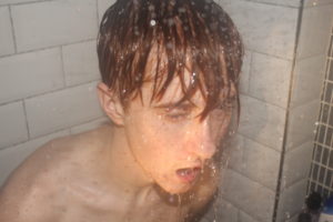
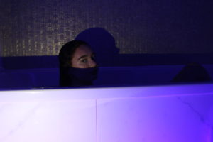
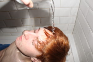
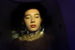
current Analysis of shoots and how I use these together.
Currently with all the shoots that I have so far, my main objective is to do one more underwater shoot ,and two shoots of landscape images which have the ability to split up the narrative of the book and not have a constantly repetitive water imagery. I have taken more shoots then appear below, However I do not know weather with ,y new objective if they will fit within the new narrative of the book itself. However if I do decided to pursue the angle of the sirens and the development of their forms, such as: birds and scales, this too could be a small photoshoot I could use with the intention to add some variety to the book itself. I always had the idea that I wanted every single image to be interesting within how it is composed and always have a new interesting surreal aspect of interests within the images themselves. Below is around 25 of the 40 images that I will need for the book. This allows me to keep a perspective of how many more images I need for the content to be to a high standard.
