Category Archives: AO4 Present Ideas

Filters

Author:
Category:

My Psycho-Geography Experience

The route I wanted to explore began on Belmont Road, before ending up around Ann Place Car Park and finally finishing by the old Ann Street Brewery. I have walked past this area regularly but very rarely get a chance to see what it actually looks like. I was interested by the modern houses and apartments surrounding an old run-down brewery.

This was my route.

The Ann Street Brewery was founded as a company in 1905, but brewing activities on the site it occupied in Ann Street (formerly Rue es Helles) can be traced back to 1871. The new company brewed ale, and only switched to other beer types in the 1950s. The company acquired the license to manufacture and distribute Coca-Cola in the Channel Islands in 1952. In 1958 the company acquired the distribution license for Bollinger champagne for the islands.

Ann Street remained a modest-sized business into the early 1970s before a turning point in 1971, when Ian Steven took over as the company’s lead. Under Steven, Ann Street began developing its pub estate holdings, which grew to more than 100 across the Channel Islands. The company also entered the French market, acquiring L’Abeille, that country’s leading supplier of private-label soft drinks for the French supermarket sector. Into the 1990s, Ann Street, which was listed on the London Stock Exchange’s main board, began seeking an extension onto the English mainland, building up a pub estate in southern England. In 2000 the company moved bought the Brubeckers restaurant chain.

Ann Street took over the Tipsy Toad brewpub in 1997. Jersey Brewery and Tipsy Toad were relocated to the current site in 2004. In 2008, following a management buyout, the brewery came under the ownership of Liberation Group. Beers are currently branded as either Liberation or Mary Ann. In 2011 the brewery was renamed to Liberation but still use previous brand names.

My Work

Final Outcomes/Presentation

For my final outcomes I gathered my favorite images from each shoot together to analyse and compare them. At the same time I had sent some of these images to be printed so that I could present them in a few different ways rather than just the image online. From this it would allow me to explore the use of composition and presentation of each image, creating a more aesthetically pleasing result as a result. These were my top 5 images I had selected throughout the course topic of ‘Landscapes’:

Presentation Of Final Pieces

Final Images

Presentation Method

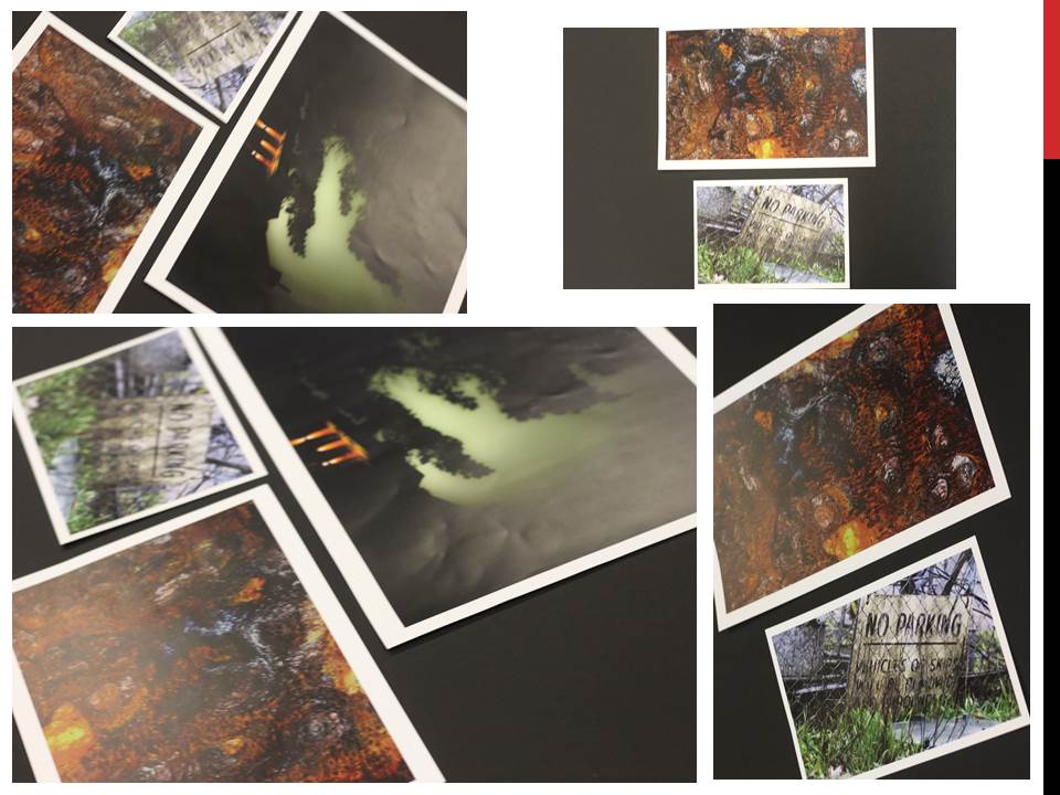
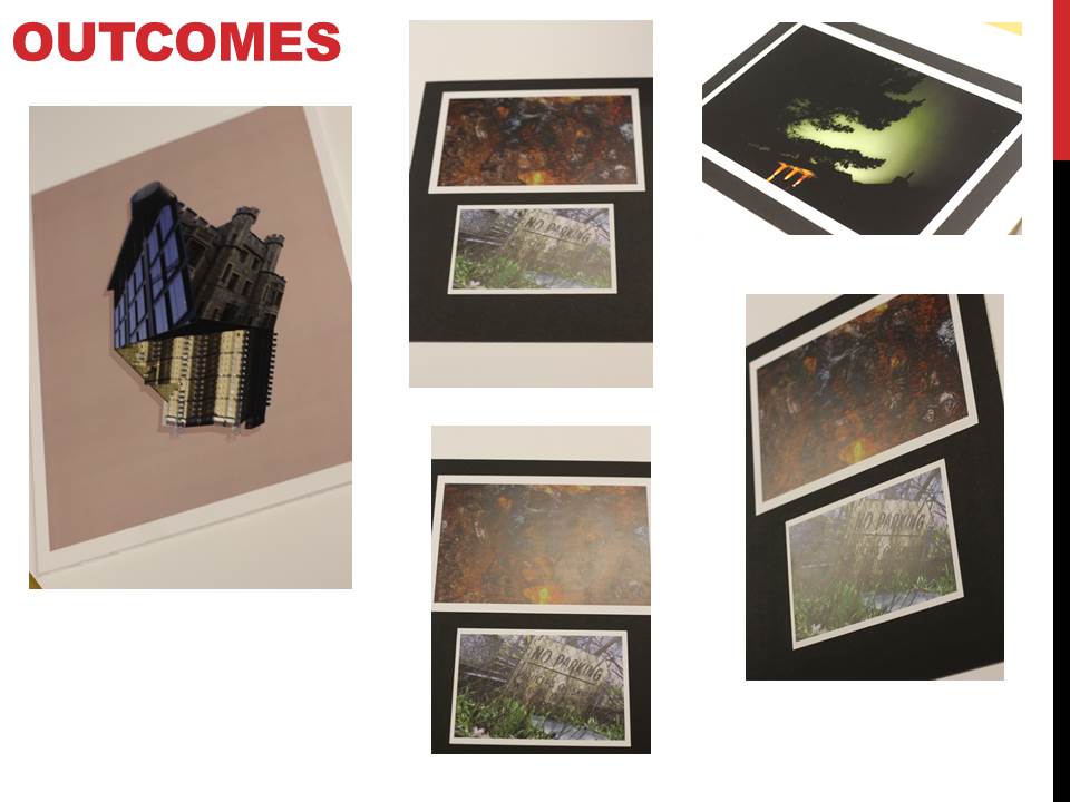
For the following images I chose a simple framing method; this is mainly because I feel like the images are rather complex and I think a complicated display would only harm the photographs as the viewer would be too distracted.

I bought 3 simple glass frames with a black outline; I found out that the images were too small for the frames alone so I decided to make borders in order to fill the empty space. I experimented with different sizes and colours before I then cut out 2 white borders (for the A4 prints) and 1 black border (for the A3 print).

Evaluation & Critique

Overall I am rather happy with the final outcome and how everything tied together; during this project I explored a variety of different landscapes (both man made and naturally occurring) but settled with a self made landscape.

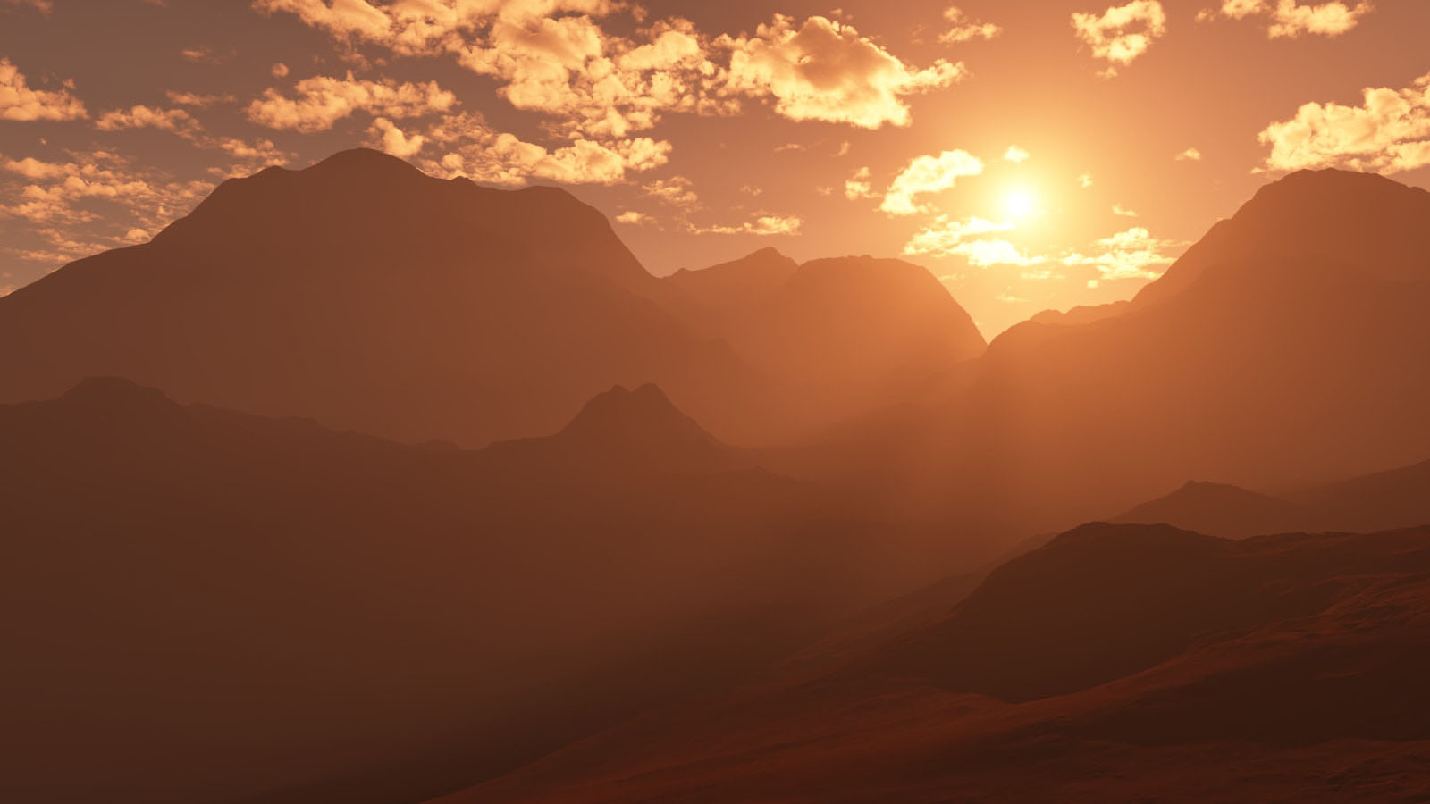
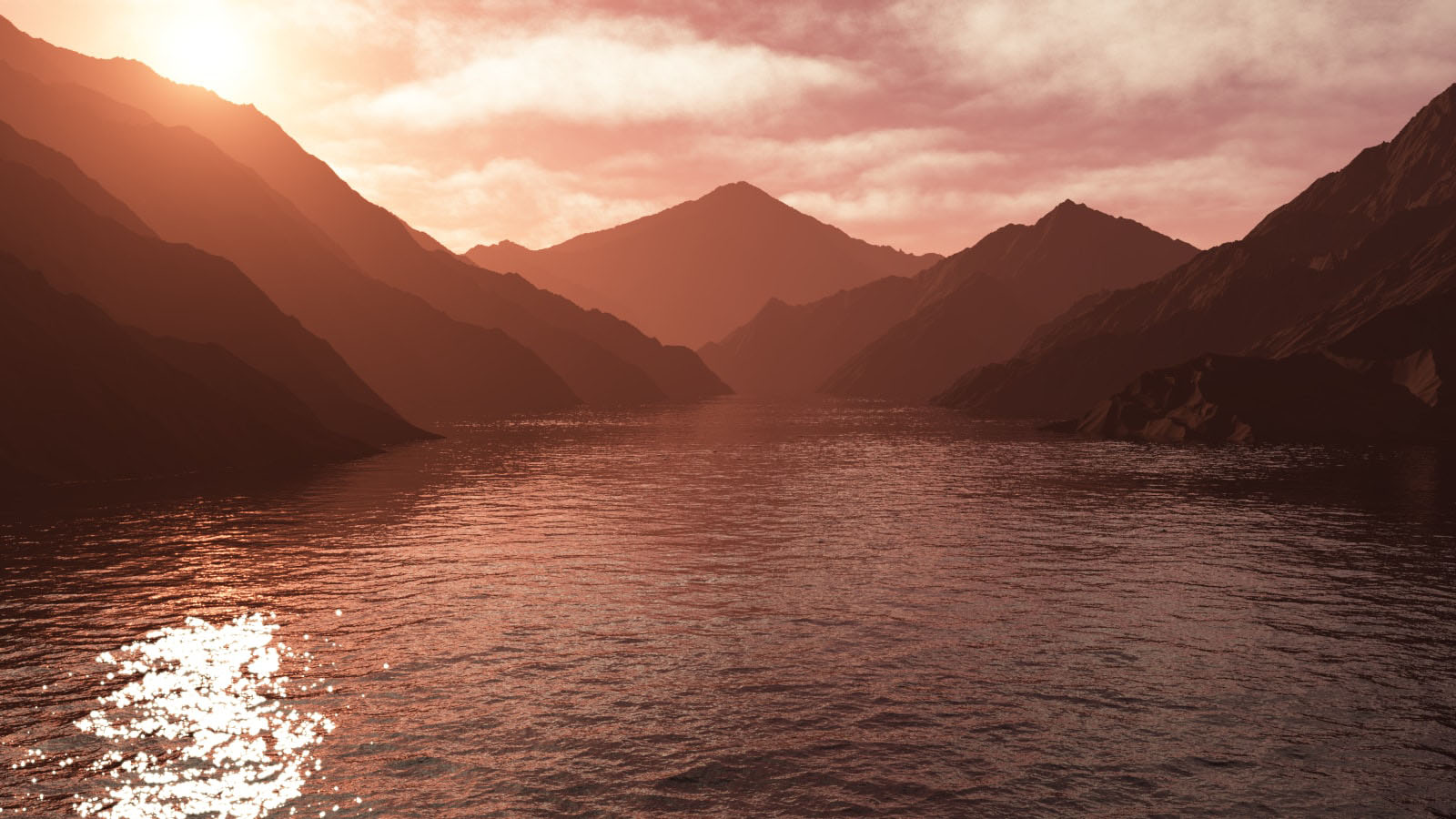
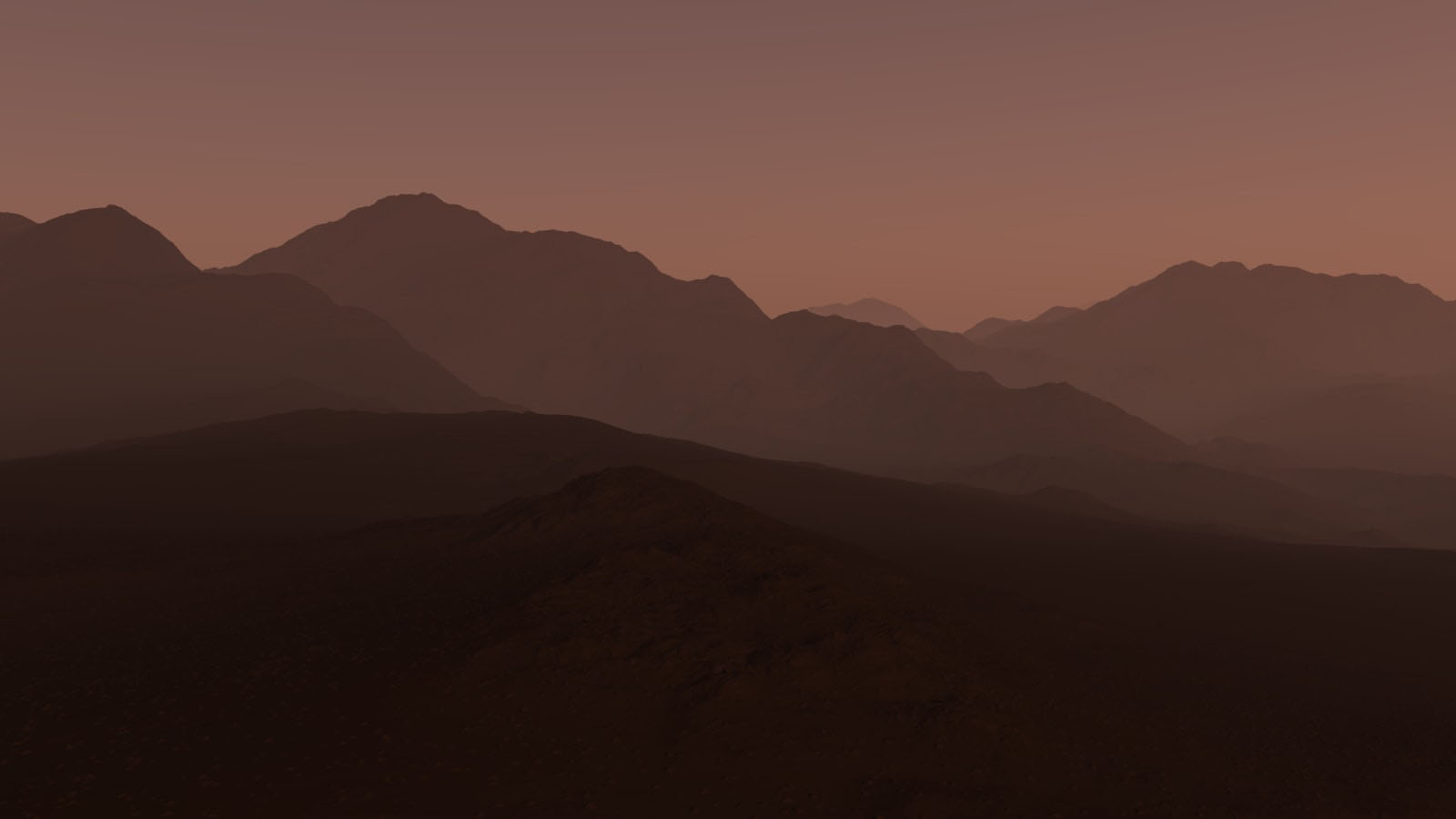
I liked the control I had over the geo-mapped landscapes; I could alter every last detail which wouldn’t be possible in a real life situation. Due to this i’m rather pleased with the photographs. The first image has a warm, morning atmosphere, the main focus of the image is the sun in the middle left. The second image has more pink undertones which give it a more surreal feel. The last photographs contains more purples which results in a colder, evening perception.

The lighting would have been natural if the photographs were of  real landscapes, otherwise it’s technically artificial as it came from a fake source designed to act like the sun. Since most of the images are in focus, it is safe to assume a small aperture was used (f/20+) and the shutter speed was a little longer than usual to help capture the detail. Visually, the images are appealing to the eye – there’s a distribution of tone and texture throughout each photograph. In addition to this, the first image follows the Rule Of Thirds (a point of focus is found within 1/3 of the photograph) which contributes to its success. The photos are all shown to be taken from the viewpoint of someone standing below the mountain scenery – which further contributes to the appeal of the pictures.

Critically speaking, the photographs feel detached from reality; they seem too perfect to exist. Maybe this idea of creating a landscape that’s perfect ruins the concept of capturing nature (which, most of the time, is not perfect). Although I enjoyed making these surreal landscapes, it also allowed me to understand Landscapes more deeply and even aided me in obtaining a new view.


final outcome and display.

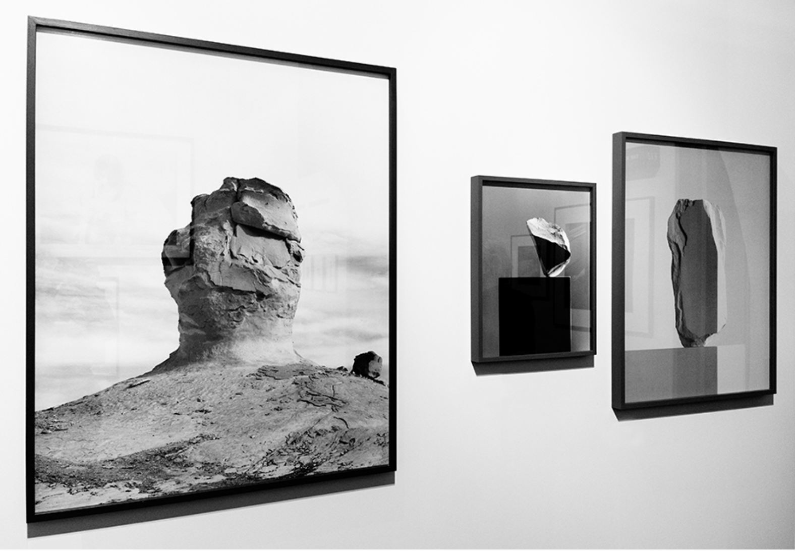
I decided it would be the most effective for the wide framed images to be in this order, this works due to the equal sizing and orderly shaping to the images themselves.The two landscapes and the portrait in the middle also allow the successful overall equal composition. I also think the most powerful image is the largest so again the most effective in this sizing order. This final  presentation also works alongside with my inspired artist in the way in  which it presents larger landscapes in a large size and the more abstract and delicate elements followed in suite but smaller to connote the simplicity to the images. This pattern of display also works because the lighter tones are surrounding the darkest image and the ones that is the most abstract.I could place all these cuts onto a larger white board in order to keep this as a clear set of work and additionally allow the long piece to be successful accomplished. overall all of these images display the forming of nature and architectural structures

Final Outcomes

Image 1:

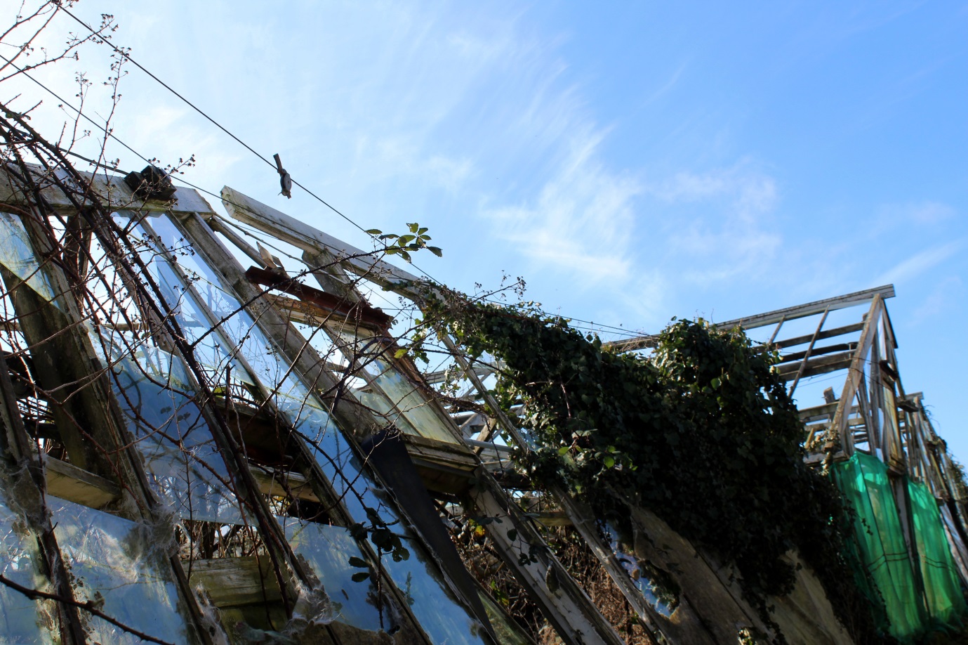
For this photoshoot I wanted to go explore natural places and landscapes but came across some abandoned greenhouses and decided to focus my photoshoot around them. I still consider this a photoshoot exploring natural landscapes as all the images contain some sort of natural aspect but combined with derelict greenhouses, either the plants that have grown around the broken glass and wooden frames or are surrounding the greenhouses by themselves. I chose this image from my photoshoot to be in my final 3 as I like the geometrical shapes and lines created from the broken wooden frames, giving a different effect than if they were not derelict.

Experimentation:

For experimentation I wanted to add another aspect to the image to make it more aesthetically pleasing and interesting. I decided to try and edit shapes into the photo so you could still see the background of the original photo but with a shape in the middle that was transparent so you can still see through it.
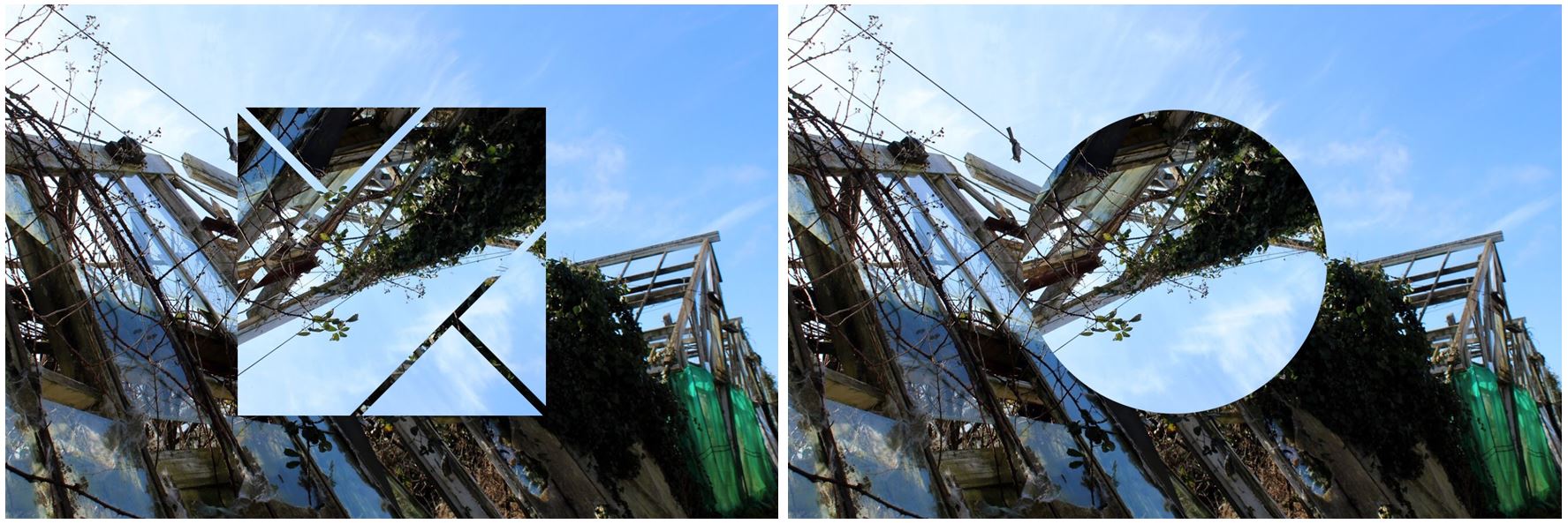
I also tried turning the image into a panoramic image by taking the photo and attaching it to the original image but flipped horizontally to create a symmetrical and aesthetically pleasing overall image. I decided to not use this image as i think its too repetitive and decided that when I added in a shape it gives the image a different aspect, rather than the same aspect repeated.
Conclusion:
  • When taking this photoshoot i didn’t have one particular photographer in mind and wanted to do my own images, with a combinations of ideas from all the different photographers I’ve studied.
  • Although i liked the image by itself, without much editing, I decided to add in different shapes to develop my work and to make it look like more of a final outcome.
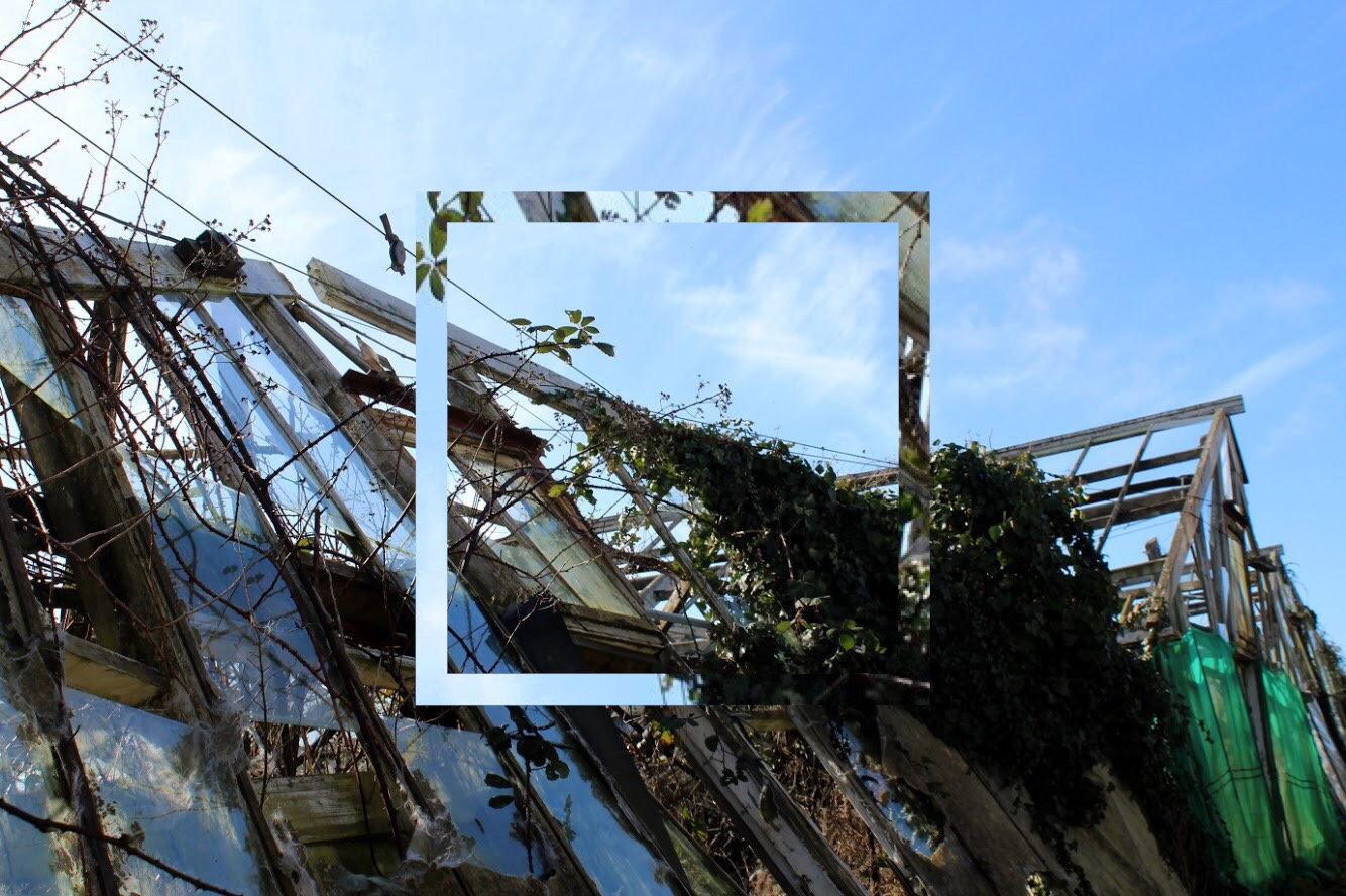
  • The square shape I have edited emphasises the geometrical lines and shapes within the image and adds a different aspect to the photo.
  • The shape also brings the light blue from the sky into the bottom half of the image creating contrast between the two as it contains parts of the image within the square.
  • The colours within the image as a whole are very neutral: the panes of broken glass on the left side of the photo also show the reflection from the sky making them appear blue in the image and  show the reflection of the clouds aswell. This blue then contrasts with the green on the right side on the image on a different greenhouse,

Image 2:
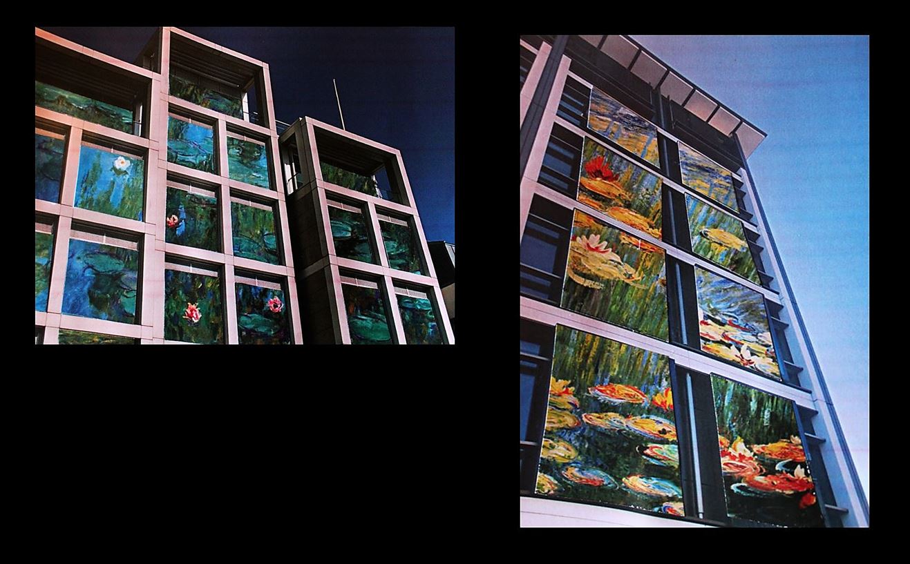
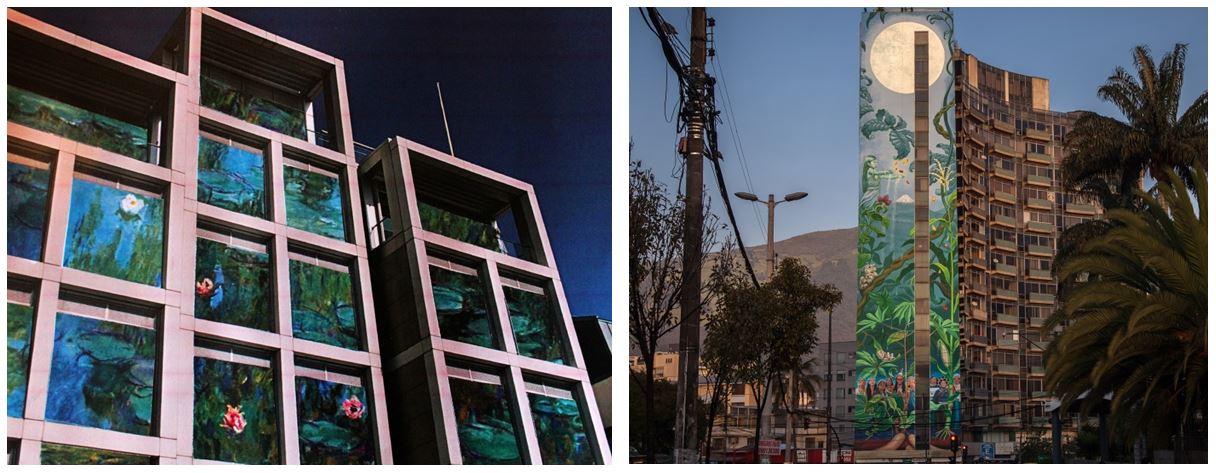
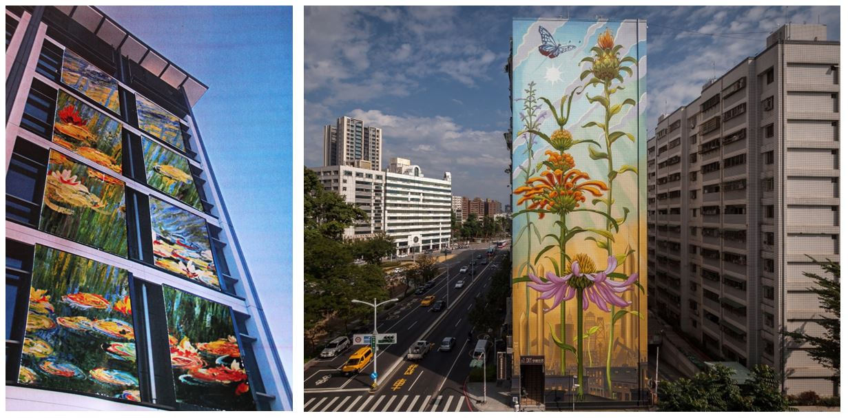
For these images I took inspiration from Mona Caron and the murals & street art she paints in the US, throughout South America and in Europe. For this image I put together two images as i liked them both together and decided to show the range and variation within my work. I added a black background as it frames the images and reflects how i want the images to be shown together rather than two separate images. I think they go together well as although they both have different paintings which i have edited in, the colours complement each other well as they are both from the same artist (Claude Monet). My favourite out of the two images is the one on the right as the painting is more visible and noticeable which makes it more similar to Mona Caron.

Experimentation:
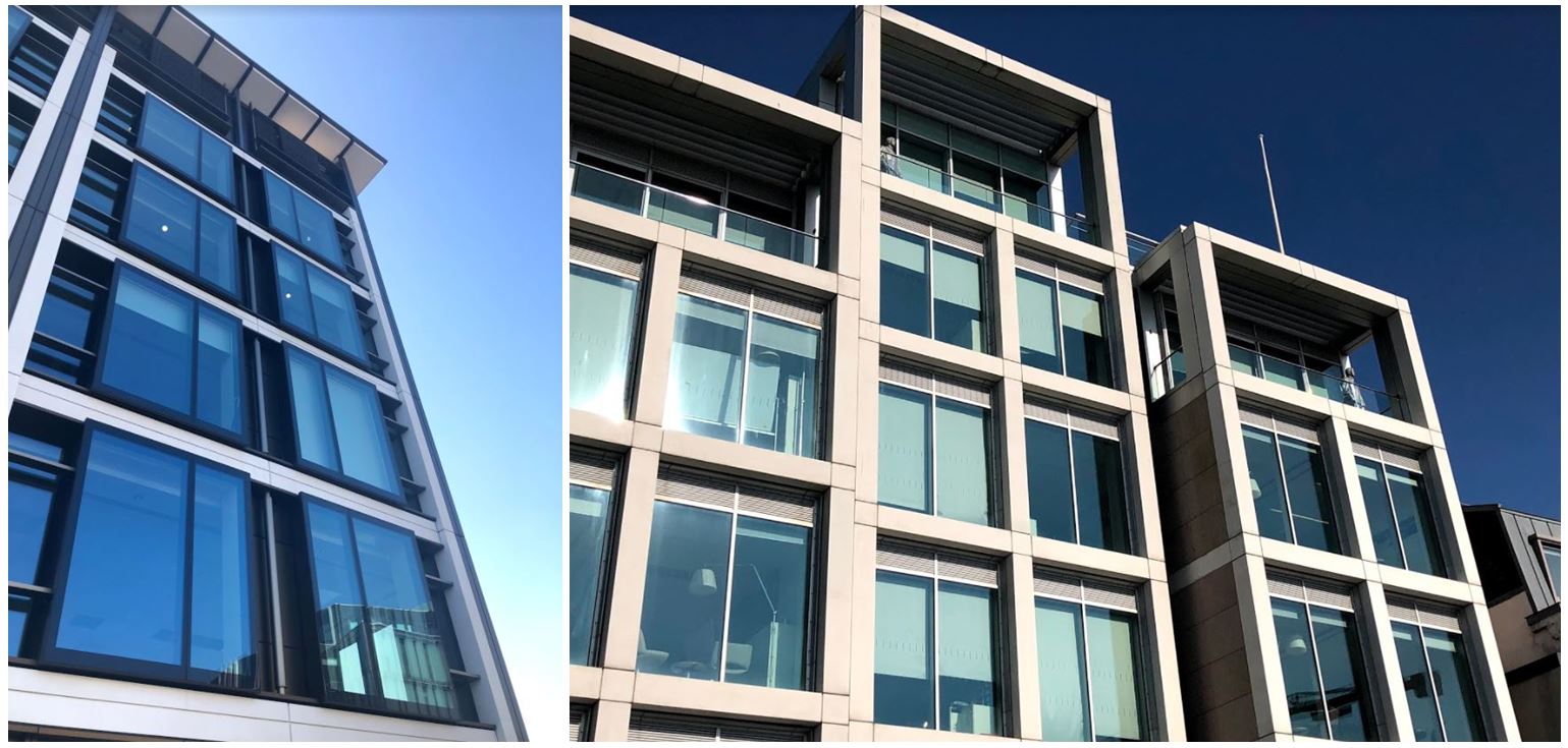
At first I thought I would edit the images onto the side of the buildings as that’s what the artist did but I thought the paintings would look better framed by the window edges which would make my images similar but slightly different to Mona Caron’s.
Compare and Contrast:
  • The one main difference between Mona Caron’s work and mine  is that she physically paints her images onto buildings (normally plants and flowers) to create murals for the public in the city, whereas I gathered images of paintings by Claude Monet (specifically his water lily paintings) and physically stuck them onto my own photos of buildings.  Instead of sticking the printed out paintings onto the walls on the side of the buildings, I edited them in the shape of the windows, so there were different sections of the painting around the image instead of just a whole image on one wall.
  • One similarity of Mona Caron’s and I’s work is that instead of using images of actual plants and flowers I used images of paintings that an artist has created to be more alike to Mona’s work.
  • In Mona Caron’s photos she has surrounding buildings within the building to create a sense of the city she painted her mural in, showing urban activity like cars and people in the images. She also does this to show the size of her paintings as without the surroundings someone may mistake it for being smaller than it actually is. In my images I only included one building in each of the images as i wanted all the attention to be on one single building, focusing on the paintings edited on as if i included other buildings there would be too much going on in the images when i displayed them both together.

Image 3
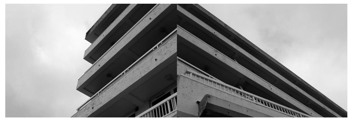
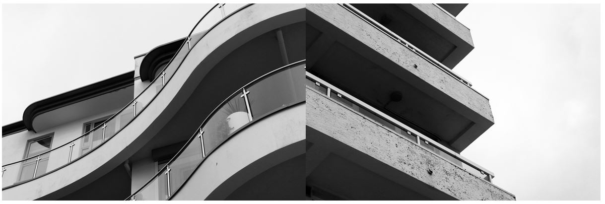
I chose this image from my Harve Des Pas photoshoot as i like the simplicity of it and the strong geometrical lines and shapes. I combined the two images together as i didn’t think the images would be as effective by themselves and be combining them together to create a completely new image and the illusion of a new building. I think this image represents the urban side of photography that I explored in this project, taking inspiration from the New Topographics through the contrasts of the harsh lines to the bright sky.

Experimentation:

To experiment with my images I tried different arrangements of images I took on my Harve Des Pas homework. I used images that i had edited to all have bold lines and shapes and connected lines from each image to the next (especially in the first image) so the images had a connection between them. I like the second image as it shows contrast between the curved and straight lines on different buildings, but they’re edited in a way to make them look similar: in both images the underneath of the balcony is contrasted with the light colour of the balcony and the bright white sky.

Compare and Contrast:

When photographing this image I tried to interpret some on Thomas Struth’s building photographs and some of the concepts he incooporates in his photos. He photographed industrialised cities focusing his attention on such cities as New York, Tokyo, Berlin and Naples.  Struth’s images of the urban environment concentrate on seemingly unspectacular streets and public spaces. This is similar to my photos as I focused in on one particular section of buildings, excluding any surroundings.  He seeks to record the face of urban space, seeing the architectural environment as a site where a community expresses its history and identity.

Struth deliberately refers to the tradition of black and white documentary photography, adopting a seemingly objective position. I also edited my images to black and white to create a similar effect to Struth’s. I also took the photo with a ‘seemingly objective position’ by zooming in on the edges and certain parts of the buildings, and with the compositions being simple.  One difference between mine and Struth’s work is that his photographs are neither staged nor digitally manipulated in post-production, whereas I edited my photo after, with emphasising the contrast between the light and dark sections.

Another similarity is that Struth had taken his photographs from the ground, adopting the viewpoint of a spectator looking up at the towering office blocks, which is what I did aswell. One difference between out work is that Struth seemed to focus his photos on a whole street or whole buildings, whereas I only focused on one section of a building, not incorporating any other buildings, giving a more objective viewpoint.
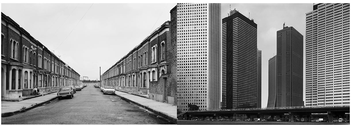
Overall I have enjoyed this landscape unit as i got to develop my knowledge in camera techniques and my understanding of concepts behind landscape photography that i wouldn’t have thought of before. I also now have a deeper knowledge of older and newer landscape photographers and the reasons they do what they do from researching romanticism, altered landscapes, as well as the urban and natural side of landscape photography and have explored each area doing my own interpretations.

Evaluation, critique and analysis of your final response

All of these I will do a window mount on mount board and leave a large white boarder surrounding the piece itself this creates a strong juxtaposing contrasts of white and dark tones and also creates a sense of harmony and a pattern to all the separate pieces. I think that tones create a finished piece it would be most effective to frame the pieces in a black frame and then hang them all in order or largest to smallest and create an overall pattern through the hanging itself. The top final image is the most accurate as the sizing is the same as i would too develop it for a finished final affect.I think the simplicity of the images is also enhanced within the frame as it too just highlights the tones without subtracting the attention of the images.

Evaluation:

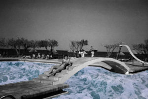
Overall I think these three pieces will be the most effective as they all have a clear linked theme of significance being;that of combining nature and then with architectural structures,they also have the same theme as my artist but i decided to use a wider range of setting combining woodland ans well as urban and sea scapes .They all have a continuing tonal range throughout being black and white continuing the same theme throughout. I also think that the display of them all will be effective as it is simple but also the second image will be cut into this style.

But also presents the ability of many different editing techniques and stretching the  ability to use camera techniques as well as Photoshop abilities. The editing also allows a similar overall theme throughout and does still respond to the artists themes.

critical analysis:

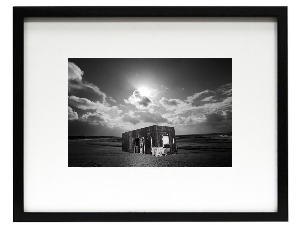
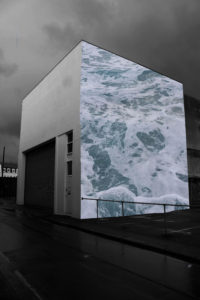
Critically I think the first image is the mostly successful,Due to the angle of the structure and also the way the light enhances the overall composition and the sea scape being effective and using the formalism lines too.Although i do think the lines surrounding the building could be edited better,as there are some issues are areas I did not intended to be there,furthermore the bottom could be possibly blended into the sea although i do not know if this would then take away the effect of the sea being present.

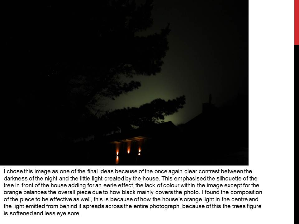
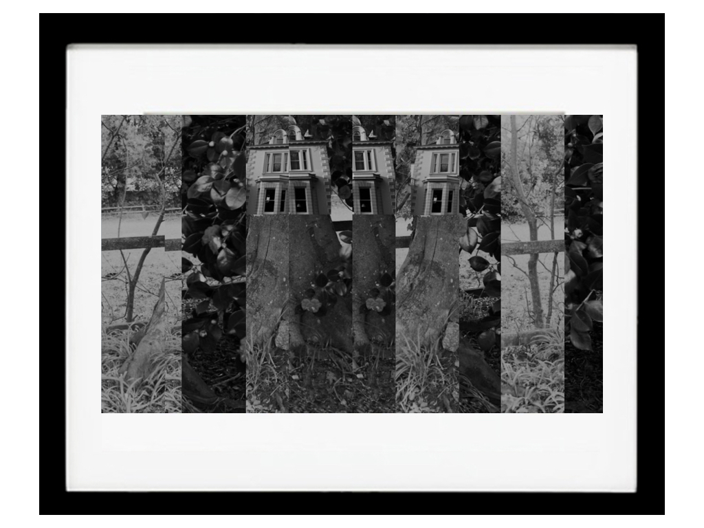
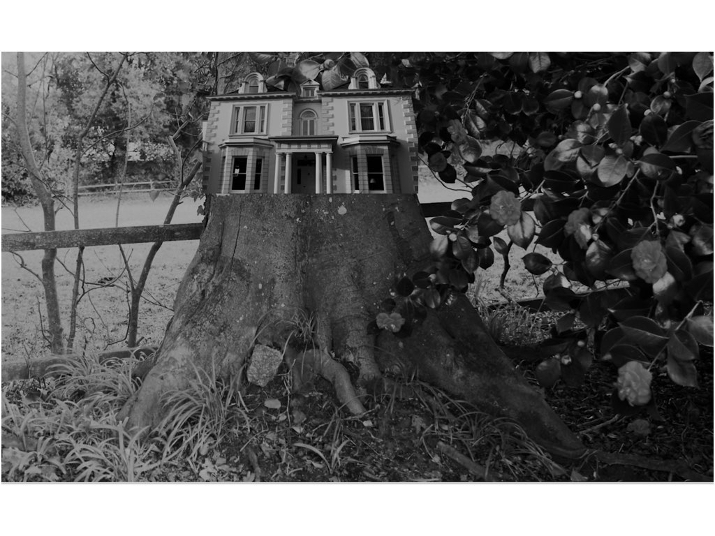
My second piece I decided I would not use the piece above but the original image where there are no lines  present,this is because it has a better quality and you are able to see the buildings of the tree and not have to question what is happening and if it is effective. To make this piece more effective I should have blurred the house to the tree and make a stronger area of cohesion and perhaps also make the tones darker as this would be more suiting to the other images.I do not think the surrealism is as accurate to a real life scenario as the previous image but can still be seen without questioning.

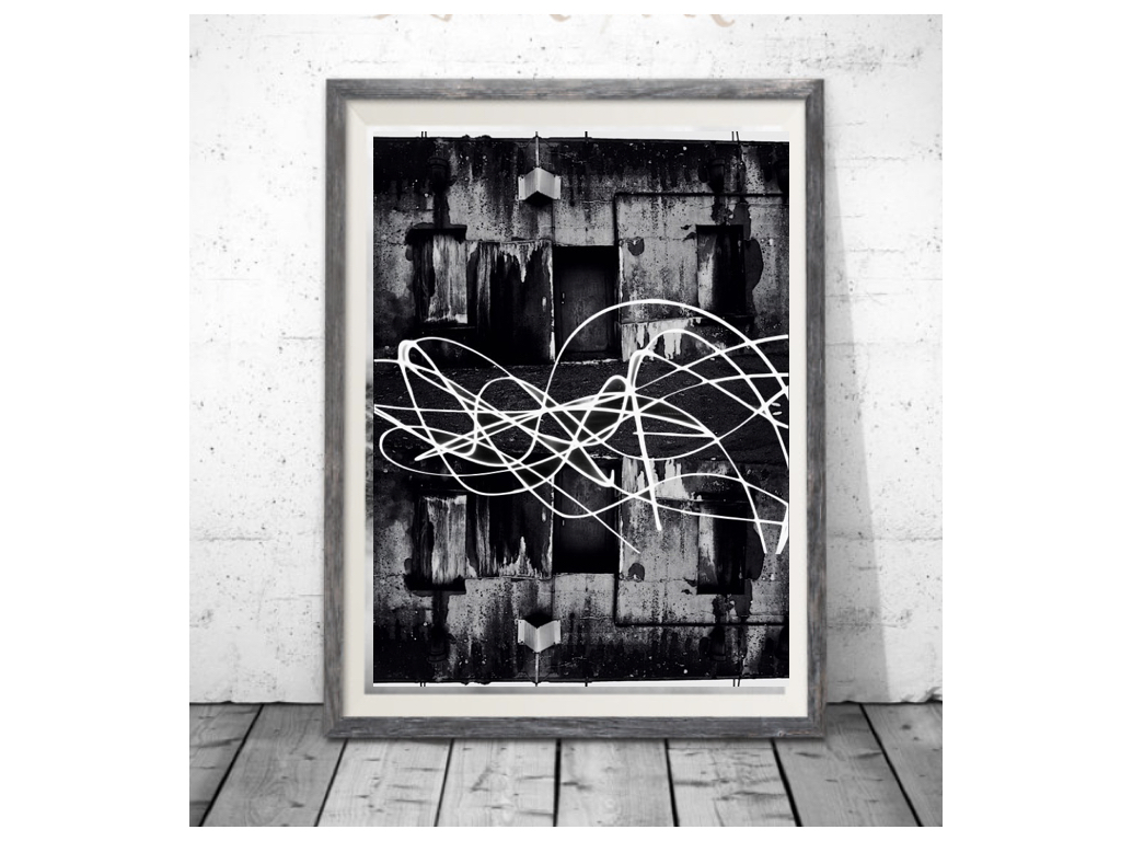
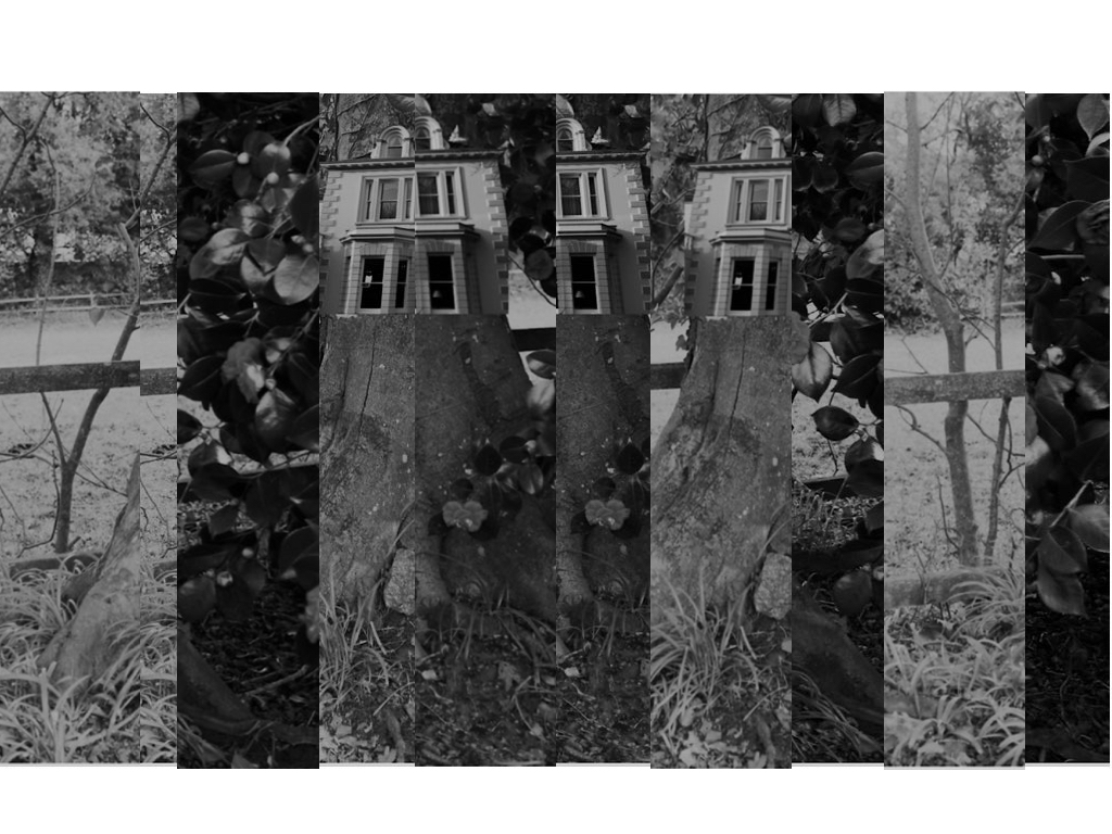
Thirdly this is a lot more abstract.This could be seen as effective or too much editing,but I do think again it present my themes in a different light overall.It could be slightly repetitive as just flipping the image is not the most in depth editing I could have done although i do think i was enhanced with the light I drew over the top with a slow shutter speed exposure,despite some sections with the previous background.

final response:

Overall I think that all my images work well together and still do show the themes of nature molding with industrial buildings. Although some could have been further edited but the simplicity of some of them still creates the same overall effect.


Mock Exam Final Piece

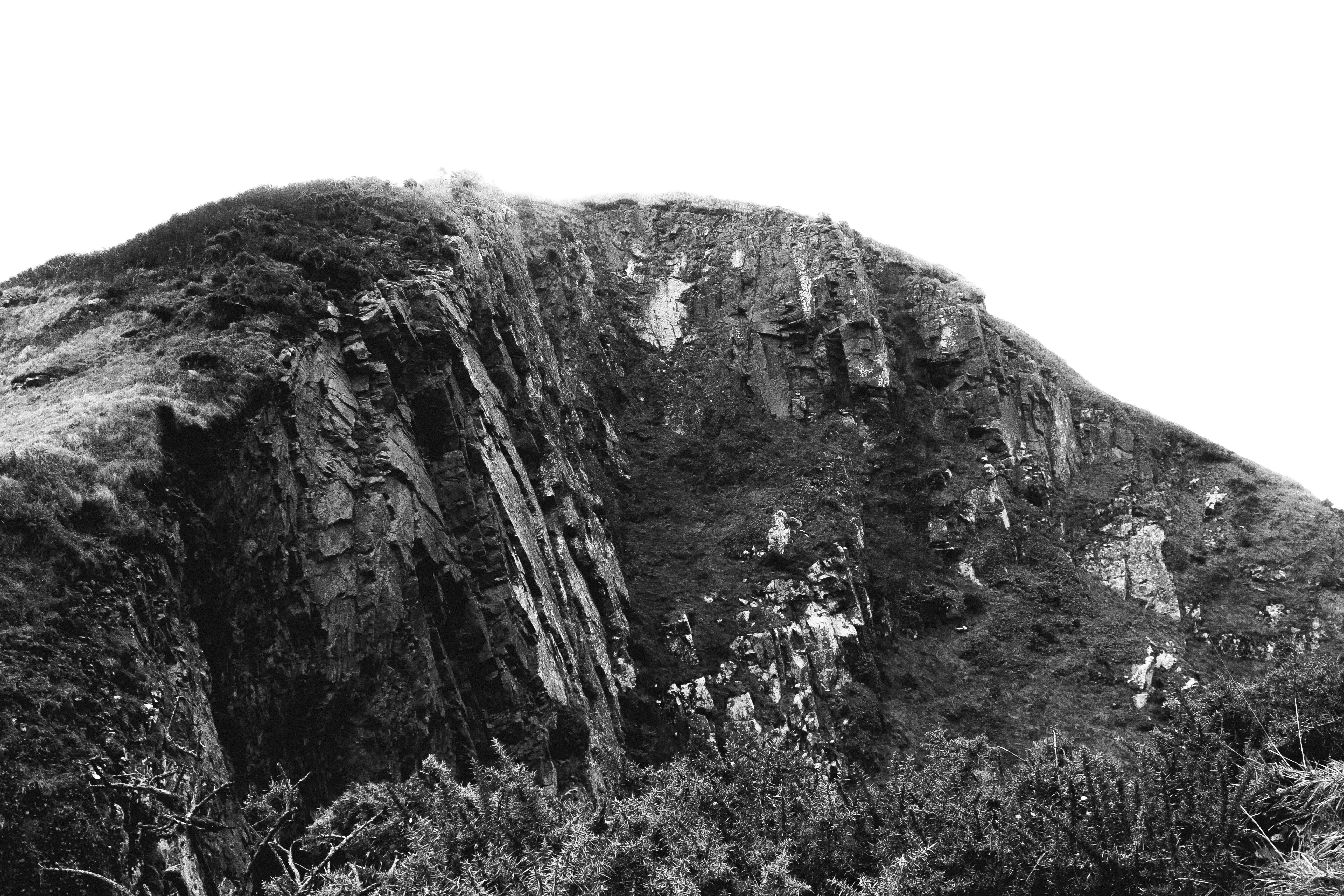
For my mock exam final piece I will be using this photograph:

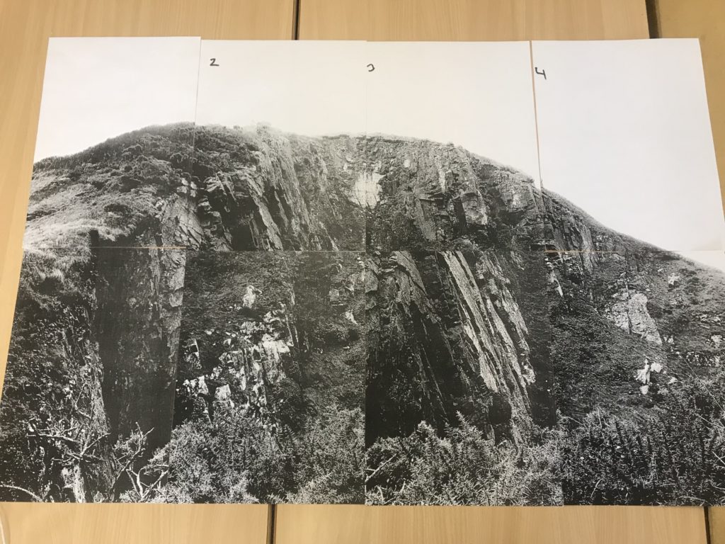
I plan to divide the photograph into 8 equal A5 sections and then use these 8 different photographs to create one big photograph as shown below. This will hopefully emphasise the size of the subject in the photograph and therefore create a more dramatic and impressive photograph.

Final Ideas/Presentation

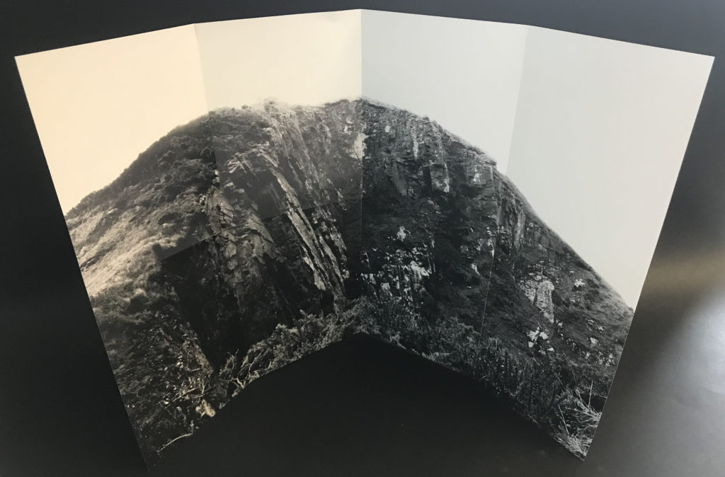
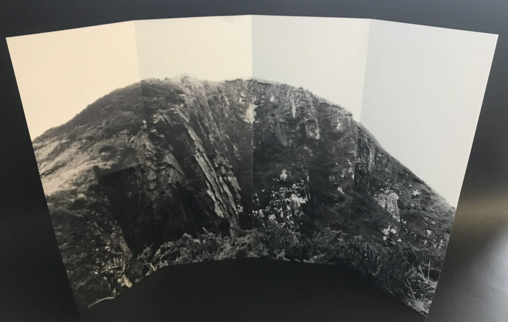
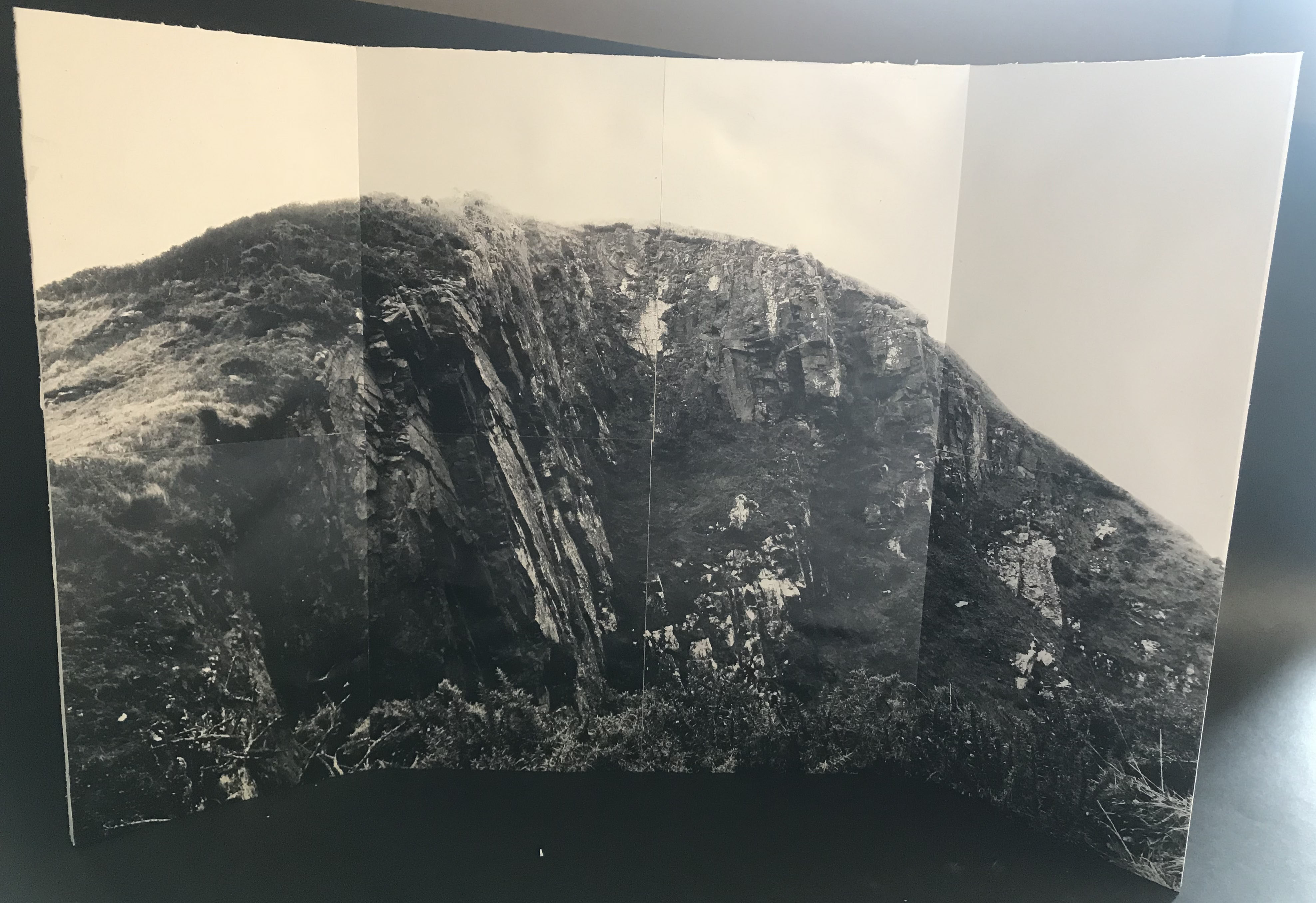
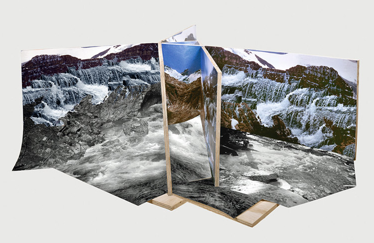
In my final piece I started by taping all of the smaller photographs together to make the full photograph. I then started to experiment different ways to present the photograph in a 3D form by using the creases between the smaller photographs.

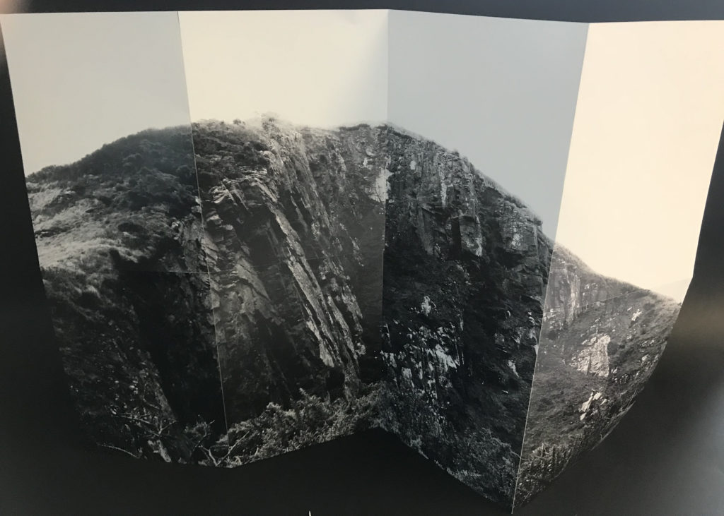
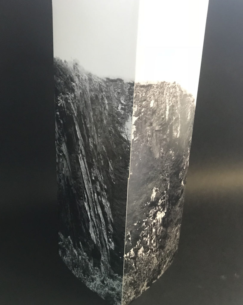
In the below ideas I have folded the photograph in different ways in order to find which would be most successful. I looked at making it into a sculpture image in which you would have to walk around to see the whole photograph.


I decided to present the photograph as below; the middle two quarters are flat and the first and fourth quarters are folded forward to be closer to the viewer. I stuck the photograph onto foam board using three different pieces to create the 3D photograph. If I was to repeat this project I would try to create the photograph on a larger scale by printing it off myself and then attempt to make a more intricate presentation.

Final piece – planning for mock exam

I am going to edit my final images on photoshop and print the out in various sizes, I will then frame them or mount them of foam board. this will help the photos stand out on their own and as the photos are already quite detailed a simple frame will help this stand out and not over complicate them.

I also want to experiment with my editing and try to display them in a more interesting way.

I will then frame both the image with a beveled edge on poster black poster board. I will print a variety of images and try different combinations of black and white urban images and coloured natural image to see what looks best.

with my other photos which are being printed i will display them by either backing them on foam board or creating a frame.

I will print this image out in A3 because I think it is a striking image and will stand out and show its details in the background better as a larger print. I want to to either mount this image on white foam board of frame it in white. the white boarder will help the writing pop and stand out oven more. This image does not fit in with my most recent artist study however I think it sums up some of the new skills and styles I have learned whilst doing this landscape project. For this reason I am choosing to present this image on its own.

My A4 print will be my edit inspired by Merve Ozaslan’s work, I combined two photos that I took to create a collage which shows an urban and natural environment in one image. I will back this image on white foam board with a thin boarder to help the highlights on the image stand out.

These two images will be printed on A5 and displayed as a pair. both of these images were edited from one old image which I then replaced the sea in the image with a new photo I had taken. The idea behind this collage is to show the balance and contrast between the natural elements.


Final Presentation Ideas

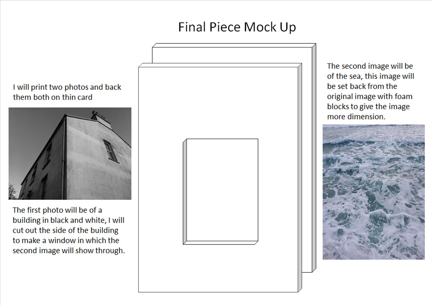
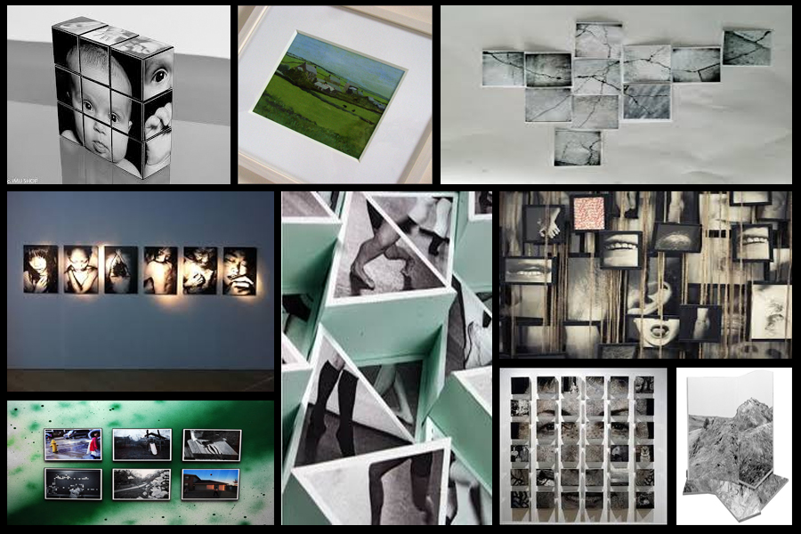
When presenting my imagery I wanted to experiment ways of which I could visually present my images differently to the standard style. A way in which I could do this was through Photoshop where I could manipulate images into the style of presentation I desired. Before I got to this stage however I thought it was necessary to come up with a mood board on my ideas regarding the presentation of the final pieces, this was my result:After looking over these images I decided I should trial run a few of them by manipulating the photos within Photoshop to get the effect needed. I Ideas I settled on were 3D presentation of the landscape and objects due to how through this method it allowed me to choose the focus of interest I wished the view to focus on, whilst creating a more realistic and abstract result. The second idea was the simple image between two black sheet with a white border, I chose this one because I loved the simplicity of the outcome as I thought it emphasized and complimented the entire piece.
I firstly focused on the 3D design with this being my desired effect:To create this I stitched images of building I had taken together, with me adding edges digitally it made the 3D effect I wanted, this was my outcome:
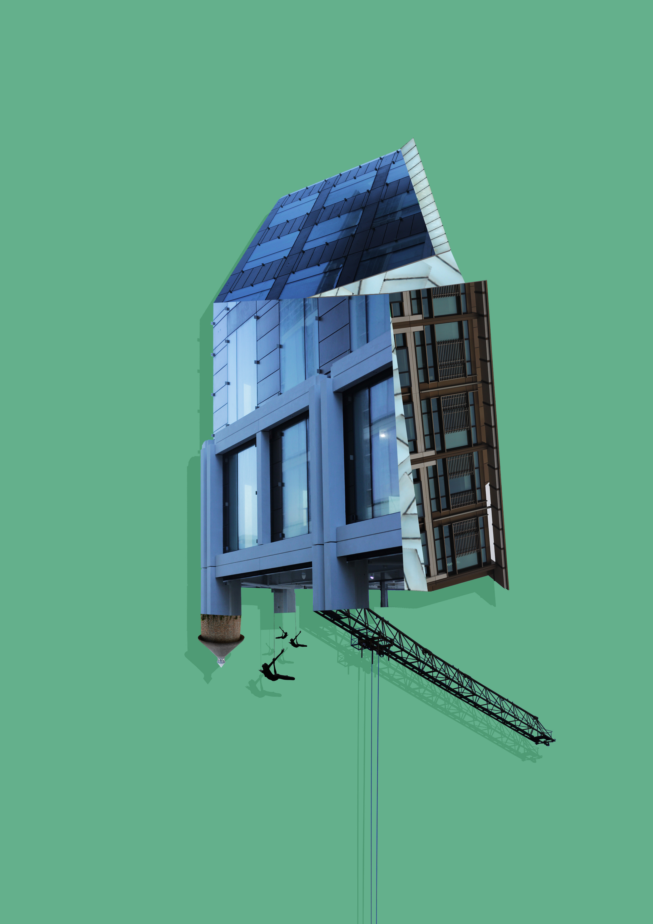
Whilst making this design I found that by adding a shadow to the piece created the effect as if it was mounted upon a wall, emphasizing the 3D aspects even more.
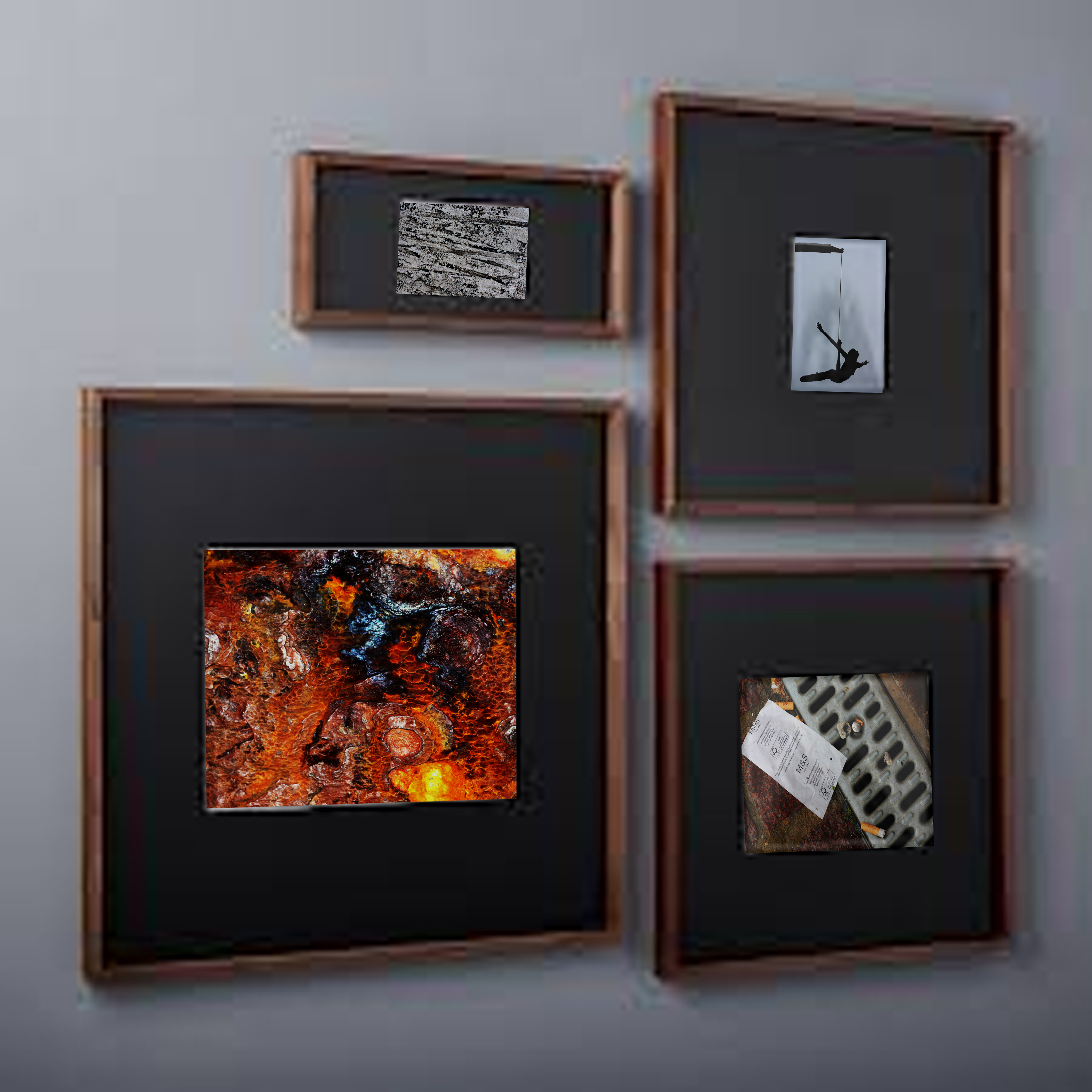
Once completed I moved onto the design of a plain black mounted image to present my images in. To do this I used simple shapes to create the imagery adding texture to them by using overlay, this was my result:

Image result for Diagram of framing a pictureWhen editing the images I found that when displayed together the pieces looked more aesthetically pleasing to the eye. This allowed me to come to the conclusion that I would display three of the images together to created this effect.
editing process,presntion ideas, contrasting to chosen photographer.

Editing process

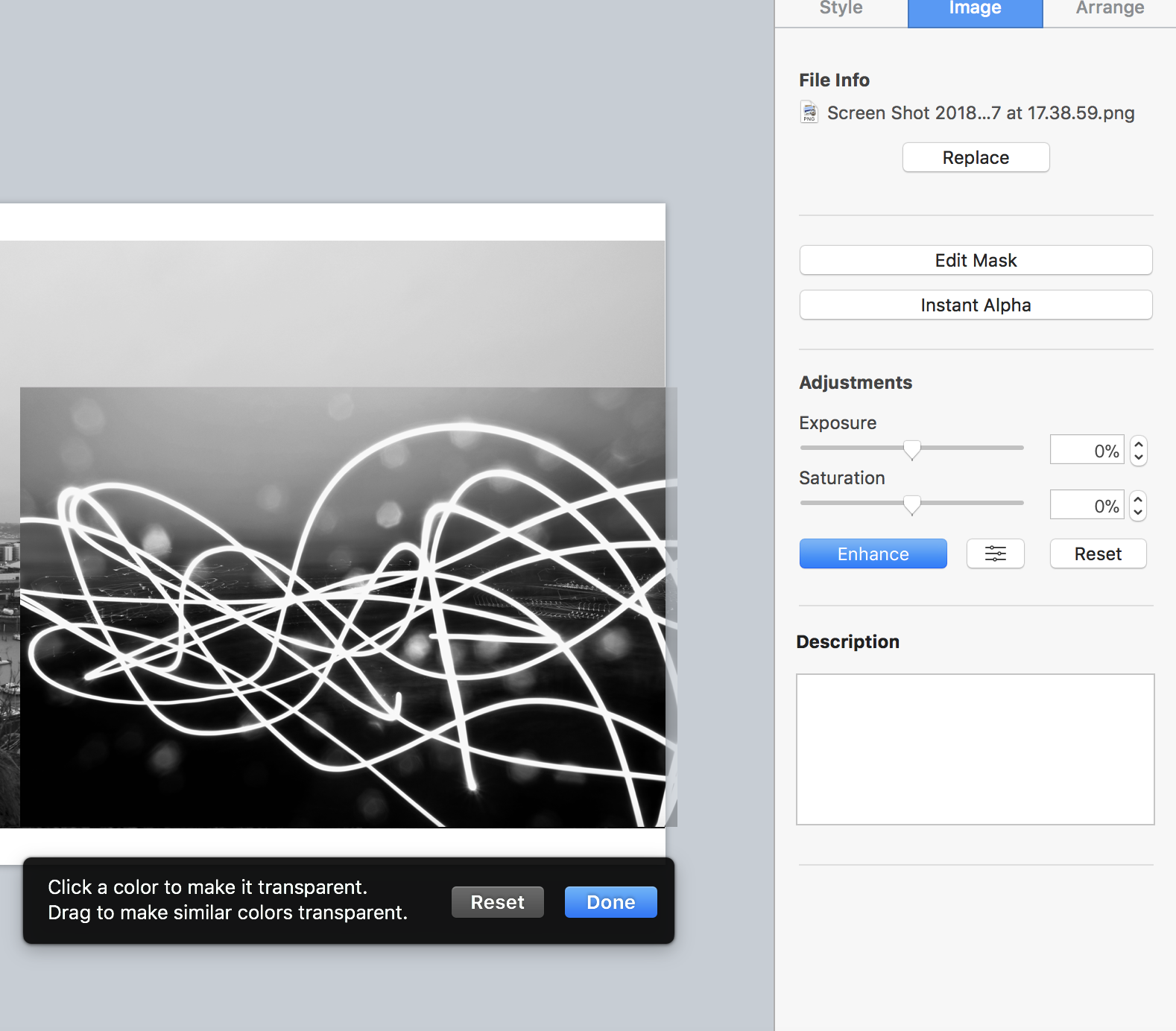
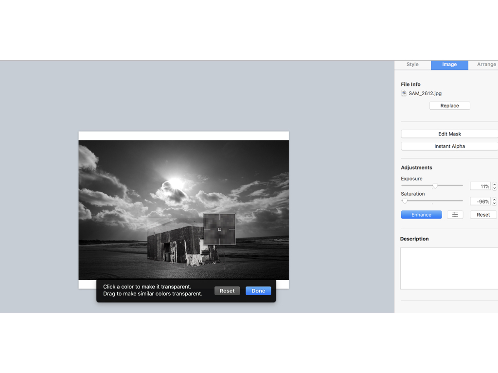
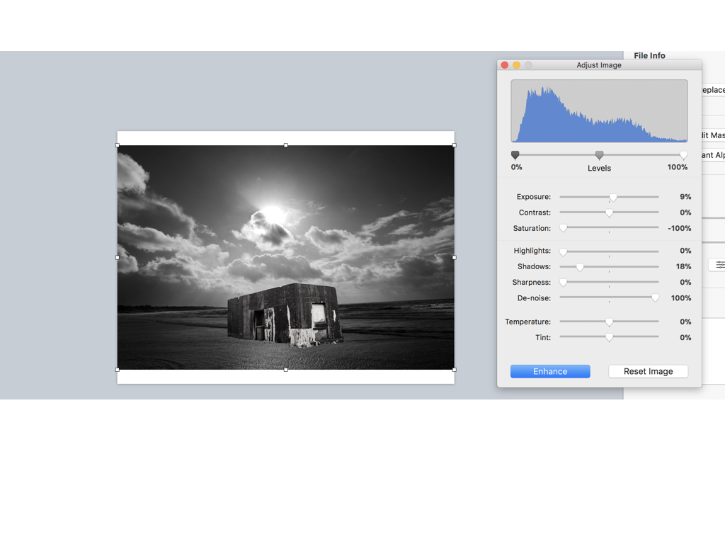
firstly when editing I went through all my shoots in order to find two images in which I think could make a successful overall composition,to do so I would line them up and think of a composition in which I could make.When I decided on the images I focused on the structural images and used an instant Alpha editing technique in order to remove the background and only use the part of the building that from a three dimensional shape and also has strong hold to its shape.I then layered the image in order to place the structure on top and arrange it in the composition middle so it looks effective on the light itself,Furthermore I edited the tonal qualities on both images lowering the saturation making the images both the same tones but creating a lighter exposure on the stature as it has a more realistic  feel to the light shining on top of it.

Here are the settings before I edited the images I found it important to find the same level of structure and the sea and lower half of the bulling so it looks realistic and also have surrealism within the image due to the believability.

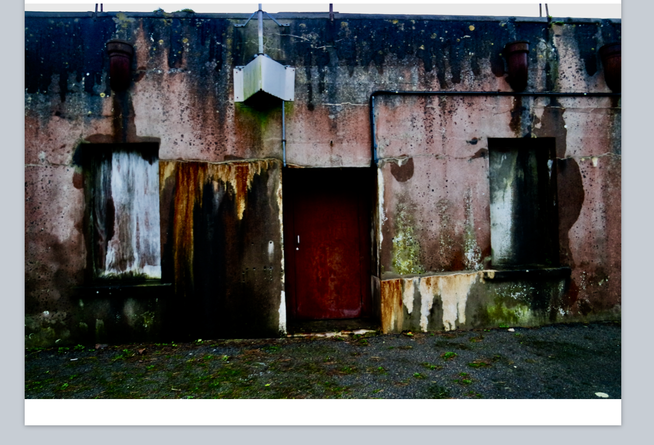
This was there original images of the houses I wanted to capture this due to all the lectures seen wihtin the building and an old sense of abandonment wihtin the image,furthermore I thought the shape and cut would work well when repeating the image due to the straight lines and form.

For this image I wasted to capture a slow shutter exposure on the light and show a movement over a city shaped thought it had strong abstract qualities but would look affective when layering an image.
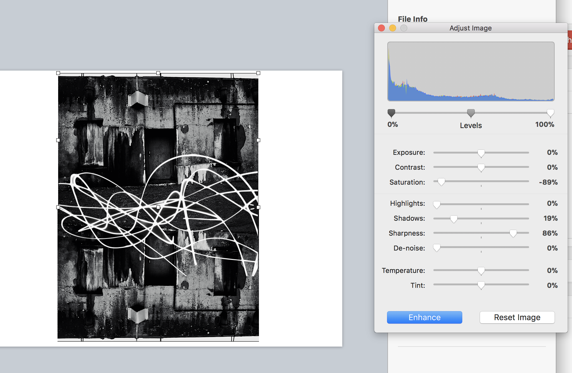
Finally I flipped and repeated the house images and adjusted the tones as above, I then used alpha once again to remove the black from surrounding the light exposure and then applied that to the image over the top structure in order to show an effective strand throughout the piece and an equal sizing.

To edit this image once again I was separating the house for the surrounding background and using the dame tones to attach the images to each other,Although It was mostly important to capture the size and insure it was equal to the size of the tree itself.I wanted to additionally experiment within how I can change the lines and overall image by cutting and resizing with them into separate sections of the piece,this can be shown here:it shows different sections and different tones yet you are still Able to see the original piece itself.

Presentation ideas / printing solutions

For presentation I think I want separate ideas but for all of them to compliment the individuality of the image itself:for the first image due to its simplicity and power to speak for itself I think a black frame with a white boarder would be effective in a large print out ,when doing this I thought due to the dark tones to all the images they would all look best in black frames wihtin different cuts and sizes of frame and inside displays.

My idea was somewhat based off of this, using different sized and thickness of frames to enhance the I ages themselves but I would also include a white inner boarder to the images, as I think this looks effective.

Compare and contrast to your chosen photographer

Noemie Goudal

Her work has a clear connection to my response of hers, showing structures  being on water and showing themes of surrealism and mirroring techniques such as she does in water,I was too able to show a opposition of their natural equal, wether that be sea and a man made mould or a manner and a tree, and or be a city scape conflicting with an urban building,I used her sense of  dimensions throughout my pieces and my final also using many different angles of interest.I think I have successful shown a sense of her ideas and format of nature  though my work and through a  comparison you will be able to see the same theme continuing through.