I ended up choosing pictures that included every piece of bacon so I could use each one to add to the quantity of bacon so it could reflect mass slaughter and production of meat.

The editing for these pieces took a few hours to complete because of the intricacy of cutting out the background. I cut out each slice of bacon so I could easily remove the background and move around the slices of bacon to achieve my desired outcome. To add more to my bacon quantity I duplicated some of the bacon slices and flipped them upside down or mirrored the image to add diversity.

The placement of the bacon was important because I wanted it to take in the same amount of satisfaction as eating bacon, yet obviously a synthetic satisfaction achieved by looking at the piece with the bacon perfectly placed in line with each other by using the rule of thirds.

Adding colour was my last step to compliment the meat. I have used colours associated with being artificial to add to the effect of the unnatural process of the meat industry. I also used red for one edit to emphasize the colour because of its significance in the process of the killing and eating of meat.
Category Archives: AO4 Present Ideas
Filters
krista svalbonas
In terms of my presentation I admire Krista Svalbonas' execution of demonstrating her story and issues in her pieces. Her images are very abstract yet are easy to deconstruct and interpret different meanings behind them. I want to reflect her work in the presentation of my work by keeping the focus on the subjects of my images and making the focal points stand out and clear for the audience.Contextual - Krista Svalbonas Krista's assembled photographs carry a heavy weight of personal and political meaning about immigration and the political influences that took away the meaning of a home for her family and herself, and replaced the idea of 'home' to be contingent due to their historical displacement. Technical - The images have been cut and reassembled in sets of three, 'creating hybrid structures that reinterpret and reinvent architecture, disrupting space, light, and direction'. Svalbona’s 'Migrants' series began with photographs the artist took in the three locations she called home over the past eight years – the New York metro area, rural Pennsylvania, and Chicago. The use of three images creates a 'stability that acts as a counterweight to the sense of dislocation'. Visual - The structures of her images almost replicate a triangle- the use of three sides lining up and becoming a whole image with a sense of continuity. Conceptual - The use of three makes the abstract imagery wholesome and complete with each part integral for Krista's desired effect. The fact she uses three separate pieces to create a continuous image shows the longing for continuity in terms of a home life.
Displaying My Final Images
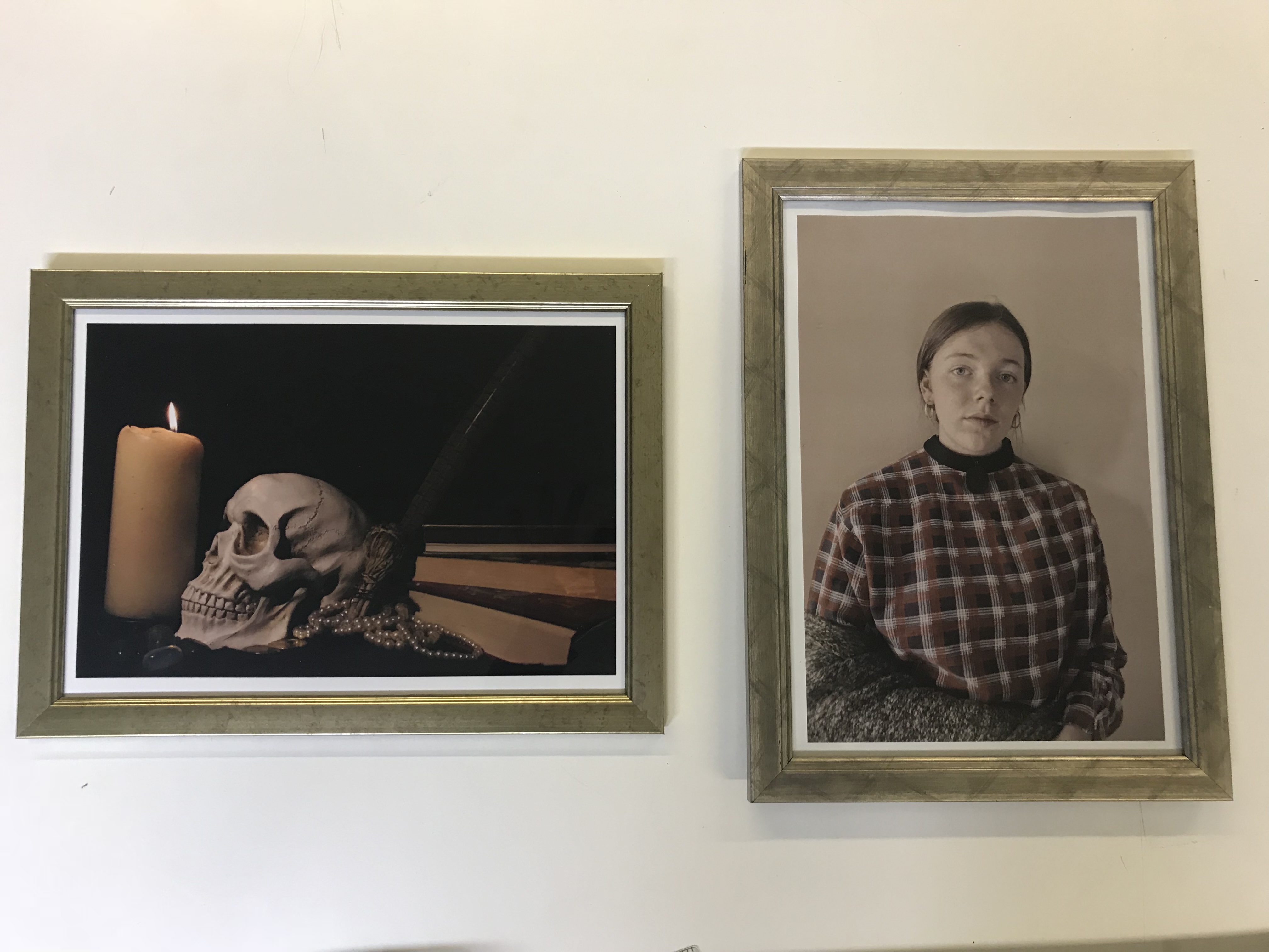
I displayed my photos in frames to resemble fancy paintings that hang up on walls. I believed this would give my images the appearance of more status. The frames also made the images themselves feel more historical demonstrating their secrets and meaning.
Final Image Choices
I chose these two images as they are representative of two styles of paintings, Vanitas/Still Life and Portraits.
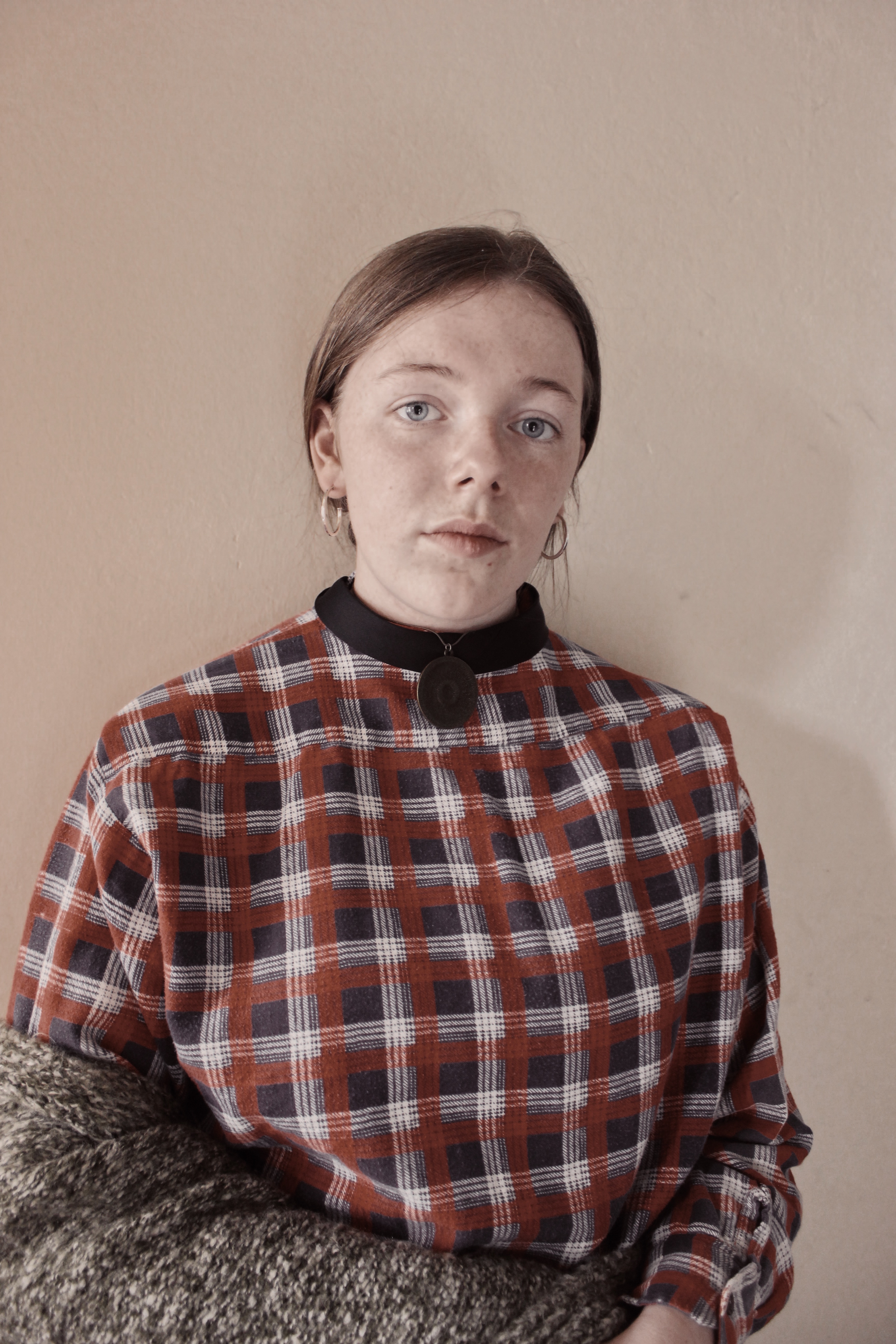
The Portrait image resembles Gwen John’s work from the model to the choice of clothing. This allows it to share meaning with the original piece of art whilst also gaining more meaning from the secrets behind the more modern subject. The light hits the subject’s face creating a subtle shadow that doesn’t destroy the image with harshness. The model stares intensely directly at the viewer allowing a link between their two lives, creating a more personal feel.
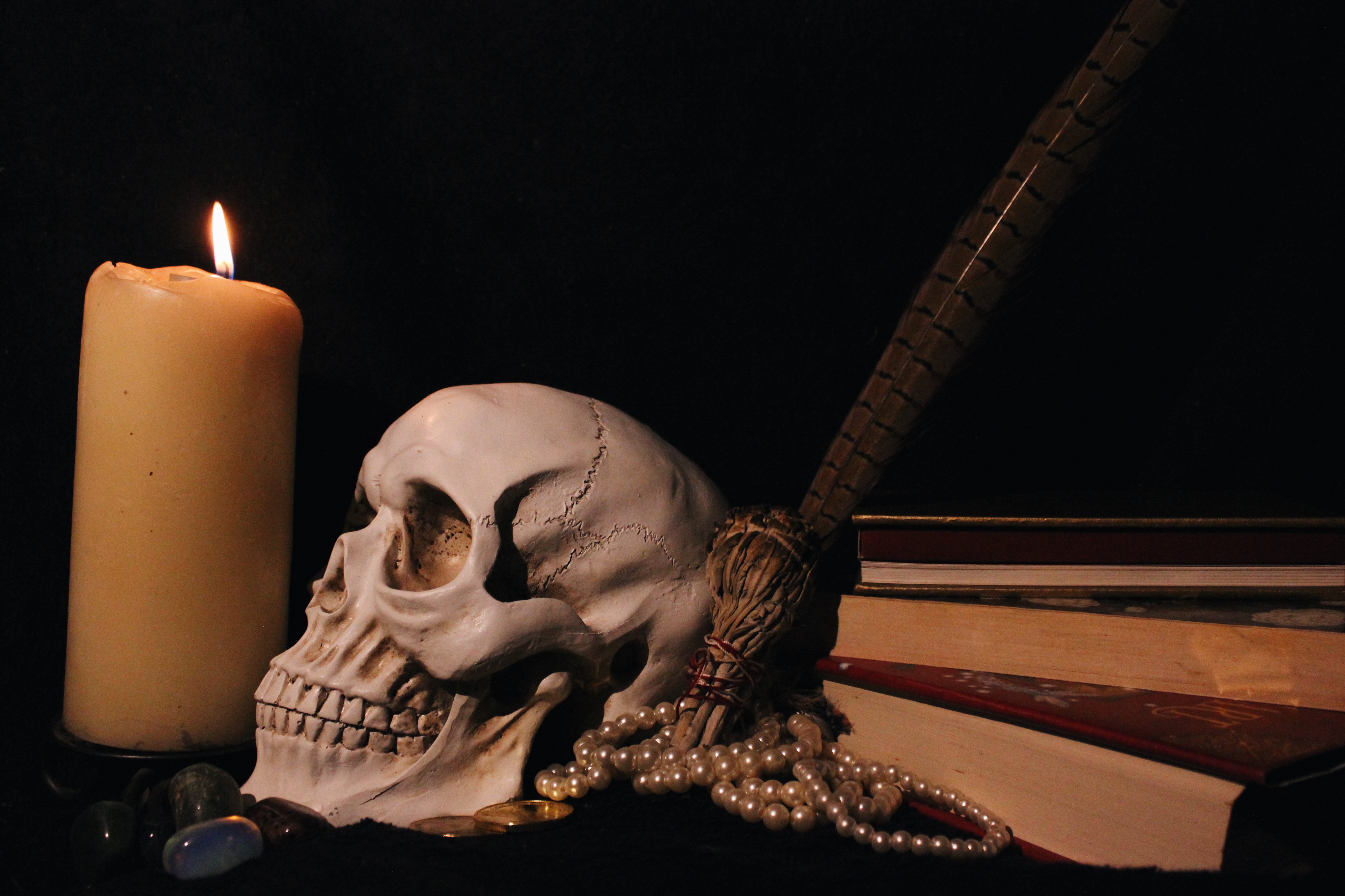
The Vanitas image holds a dark atmosphere in both visual and conceptual terms. It accurately represents the meaning of inevitability of death by the choice of items in the image, from the skull to the lit candle to the books, all common features of the vanita style. Although I took this image with a simple background, it still appears interesting by allowing the viewer different items with different stories to analyse.
Vanitas Edits
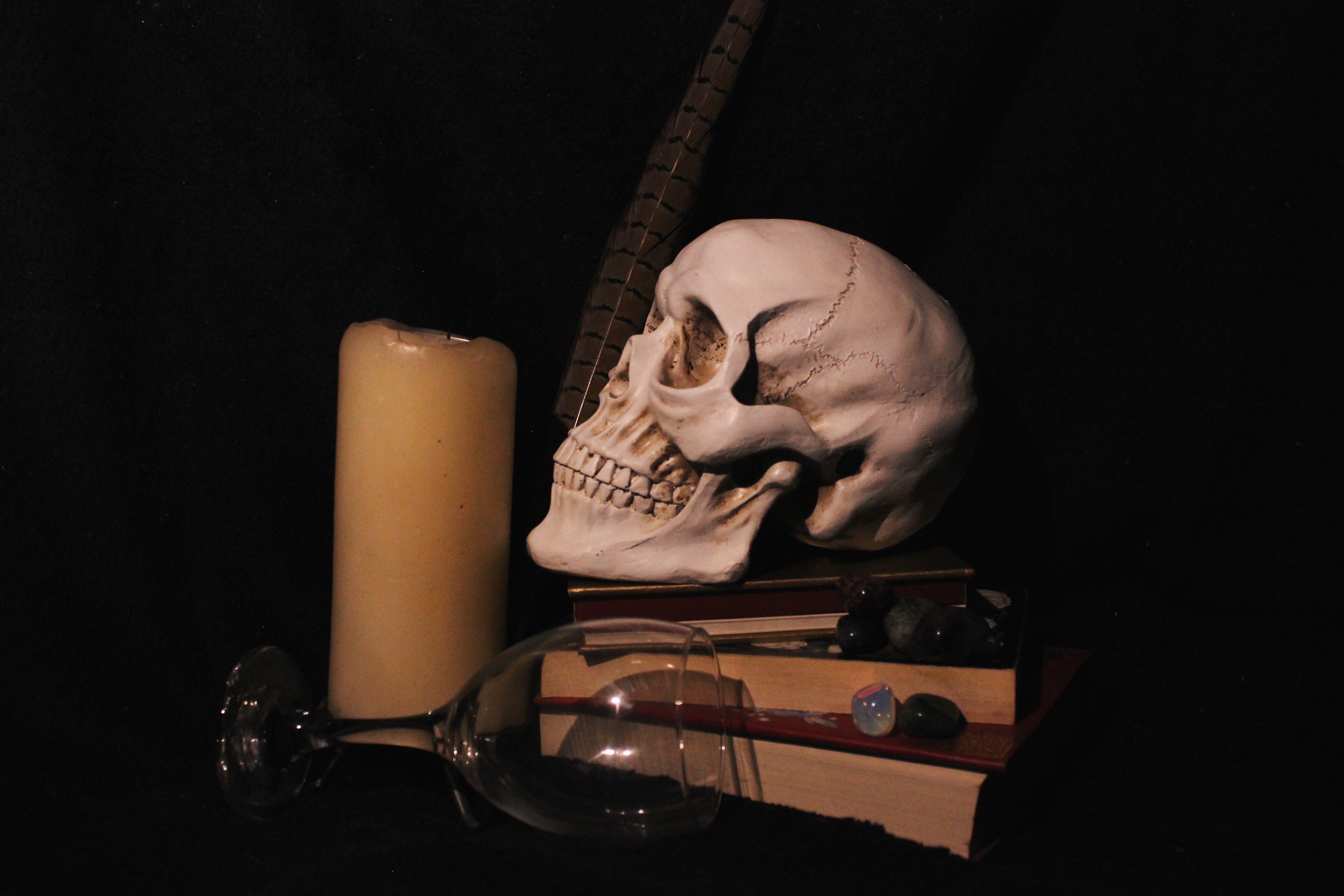
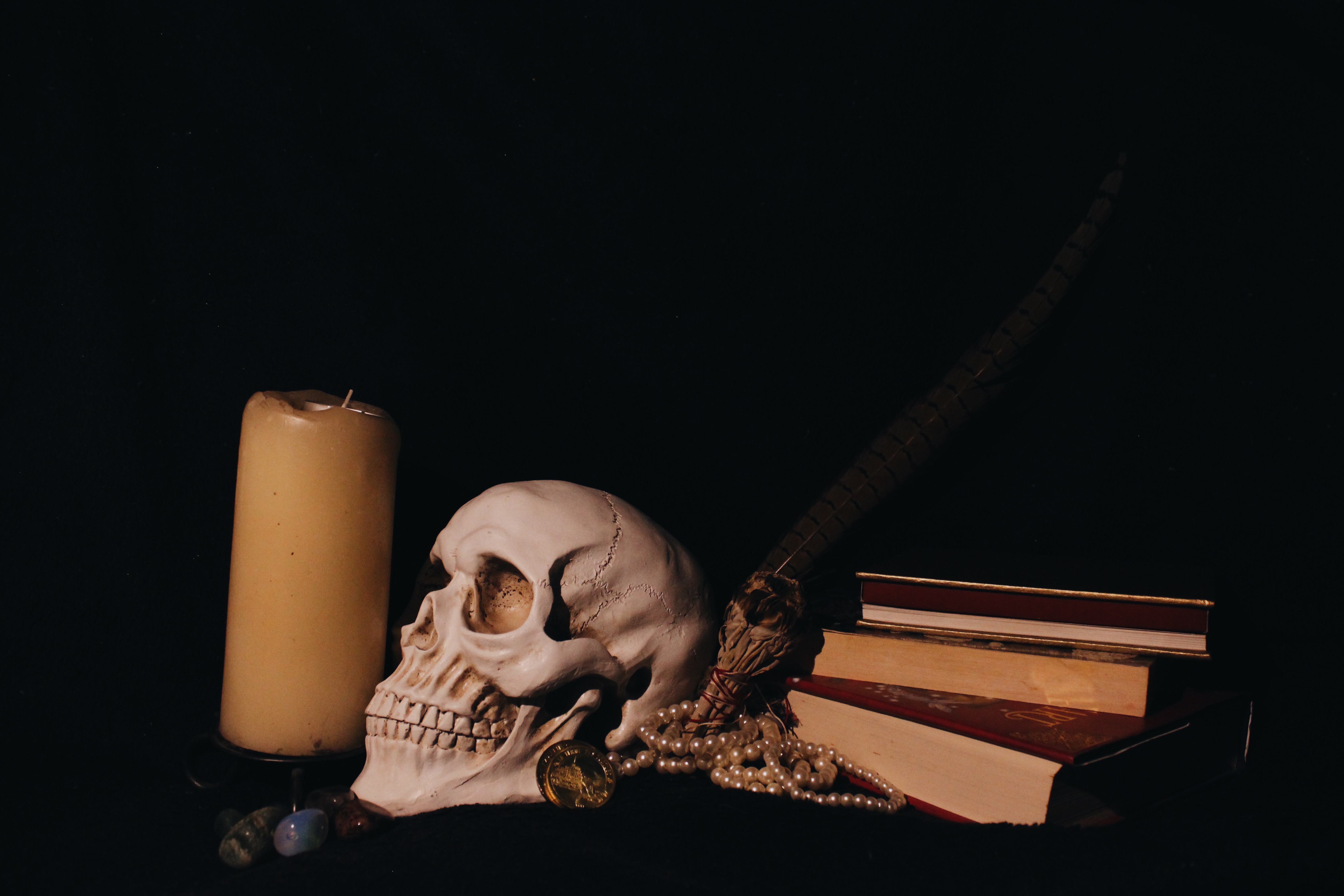
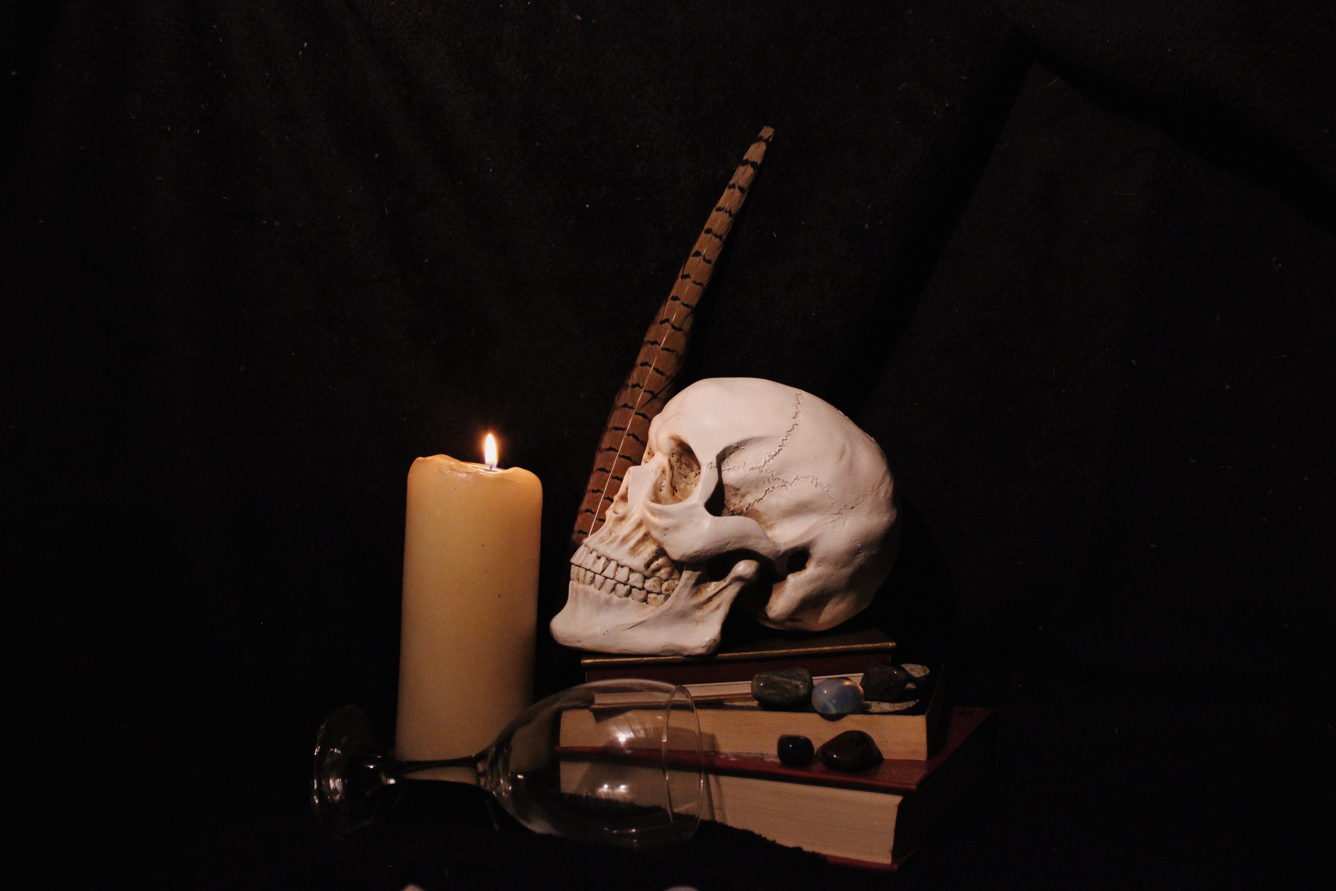
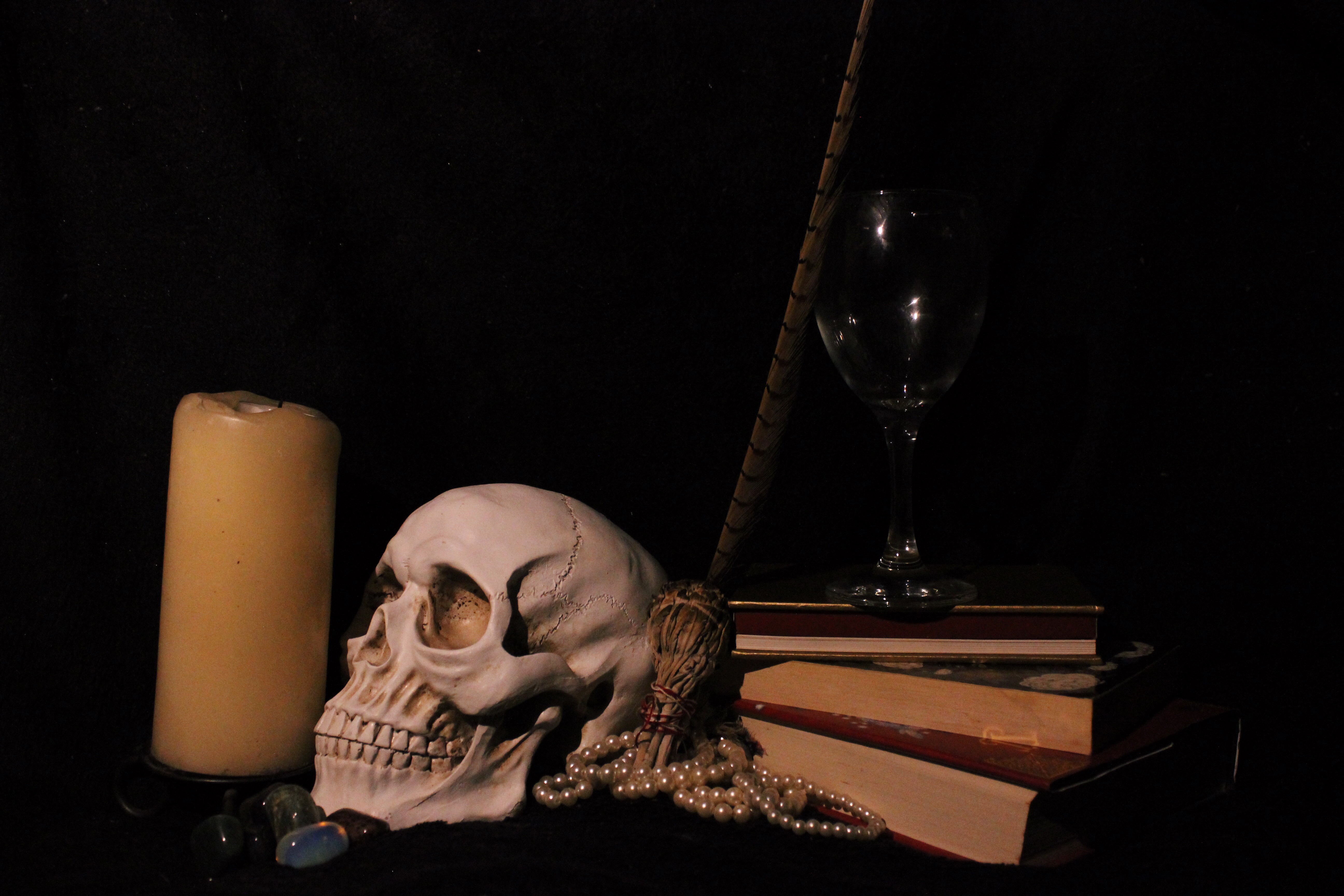

I applied filters to all these images to make the orange tones in the skull, candle and books stand out more. I reduced the exposure to make the background darker, and to emphasise the shadows on the skull.
Tom Hunter | Edits
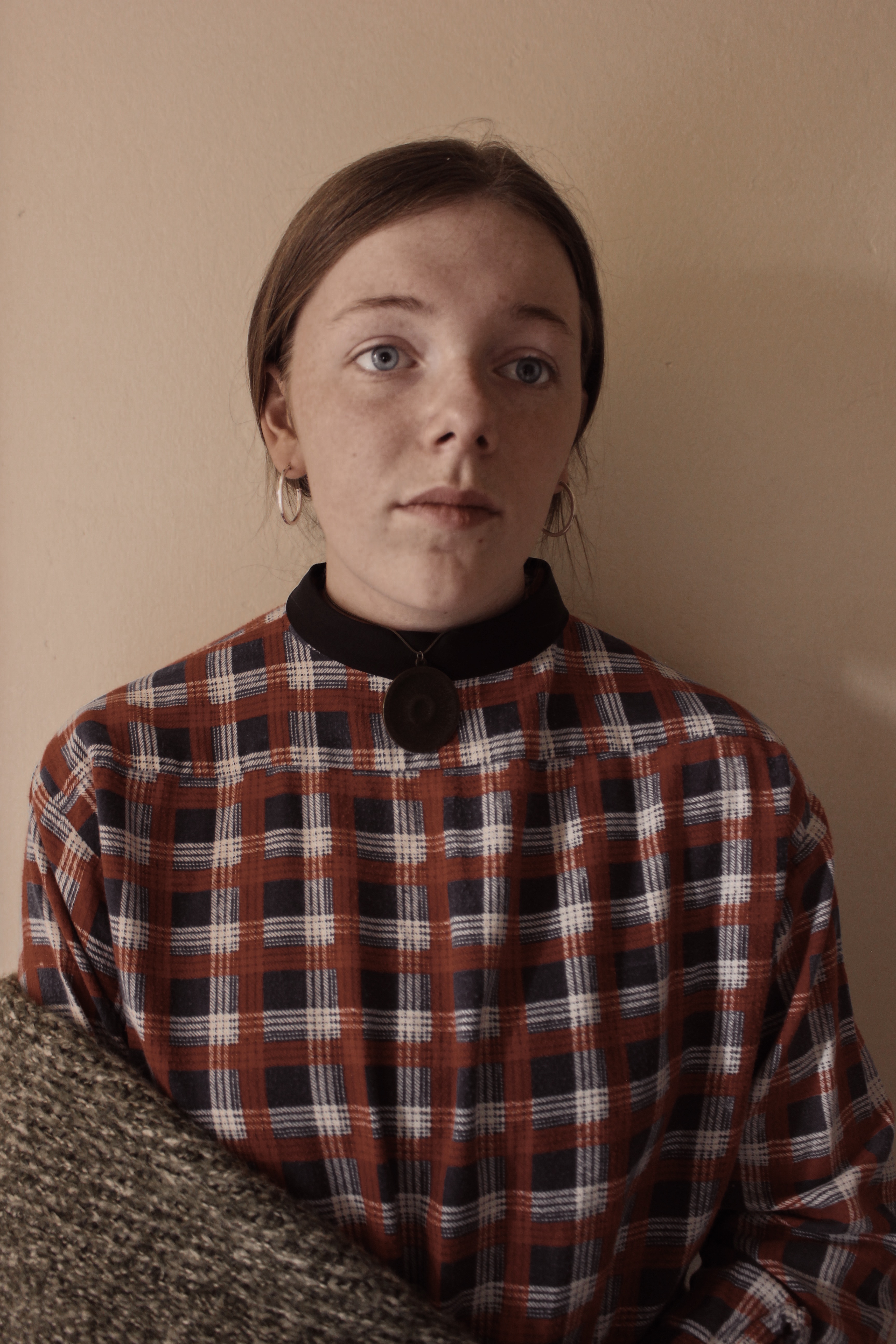

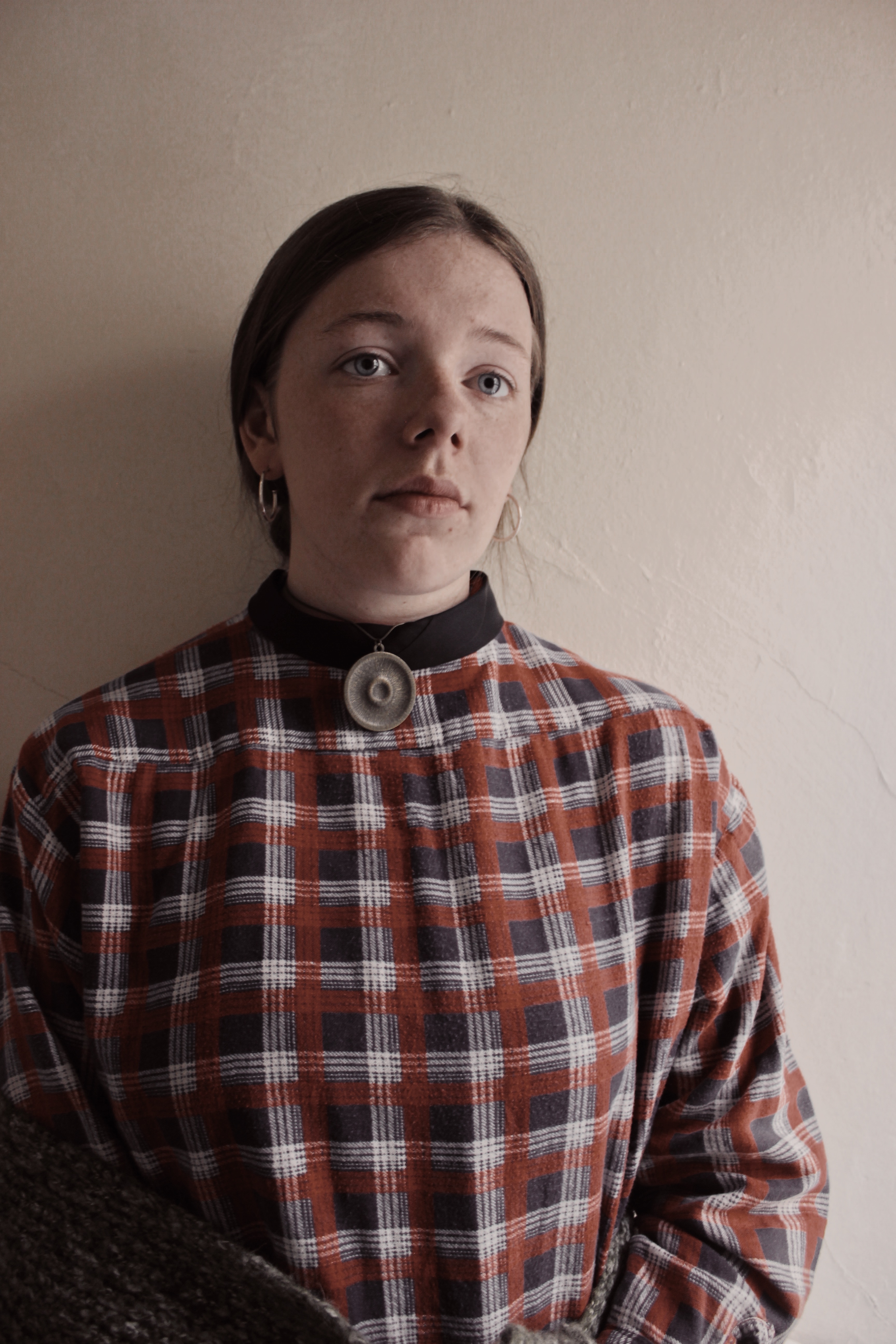
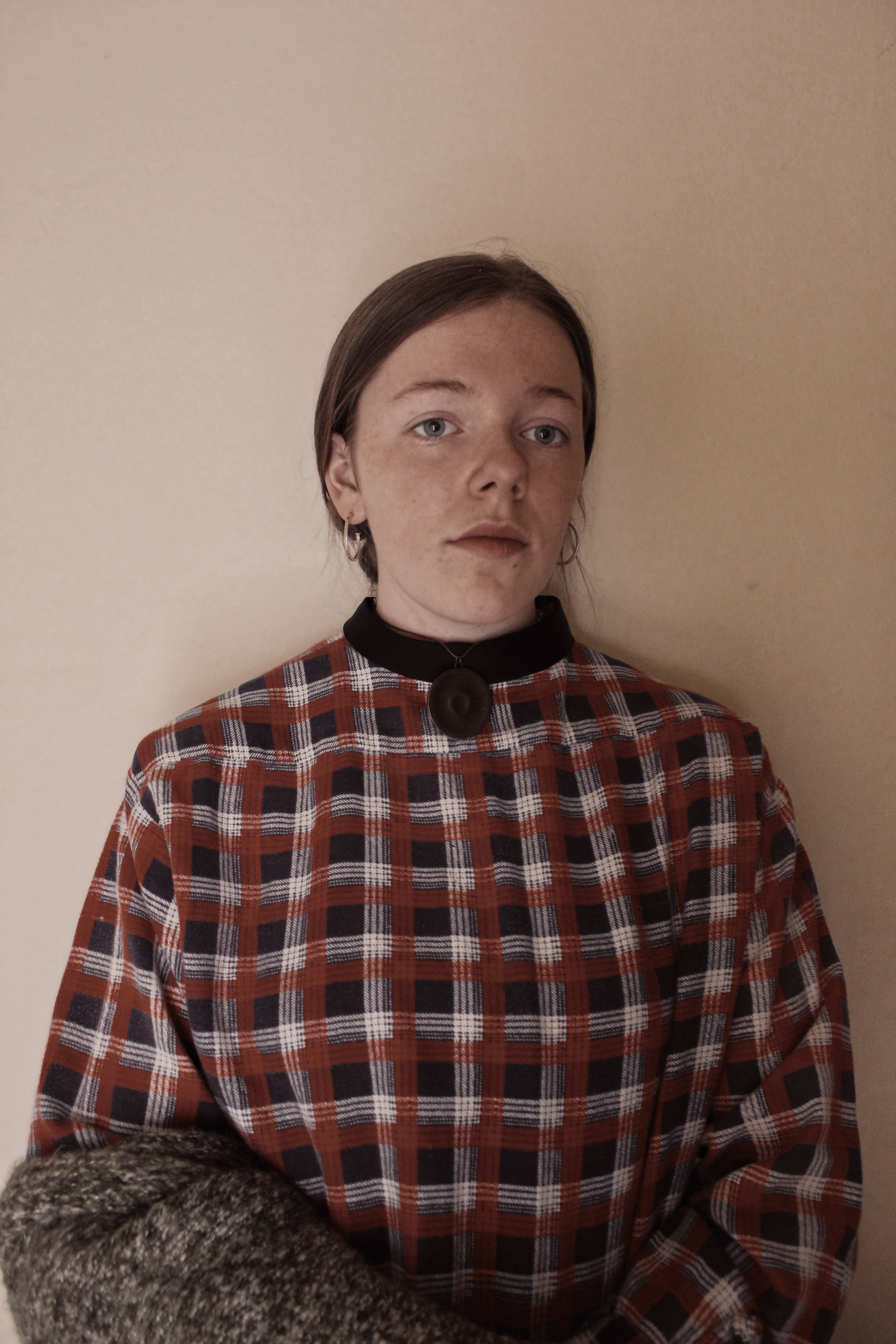
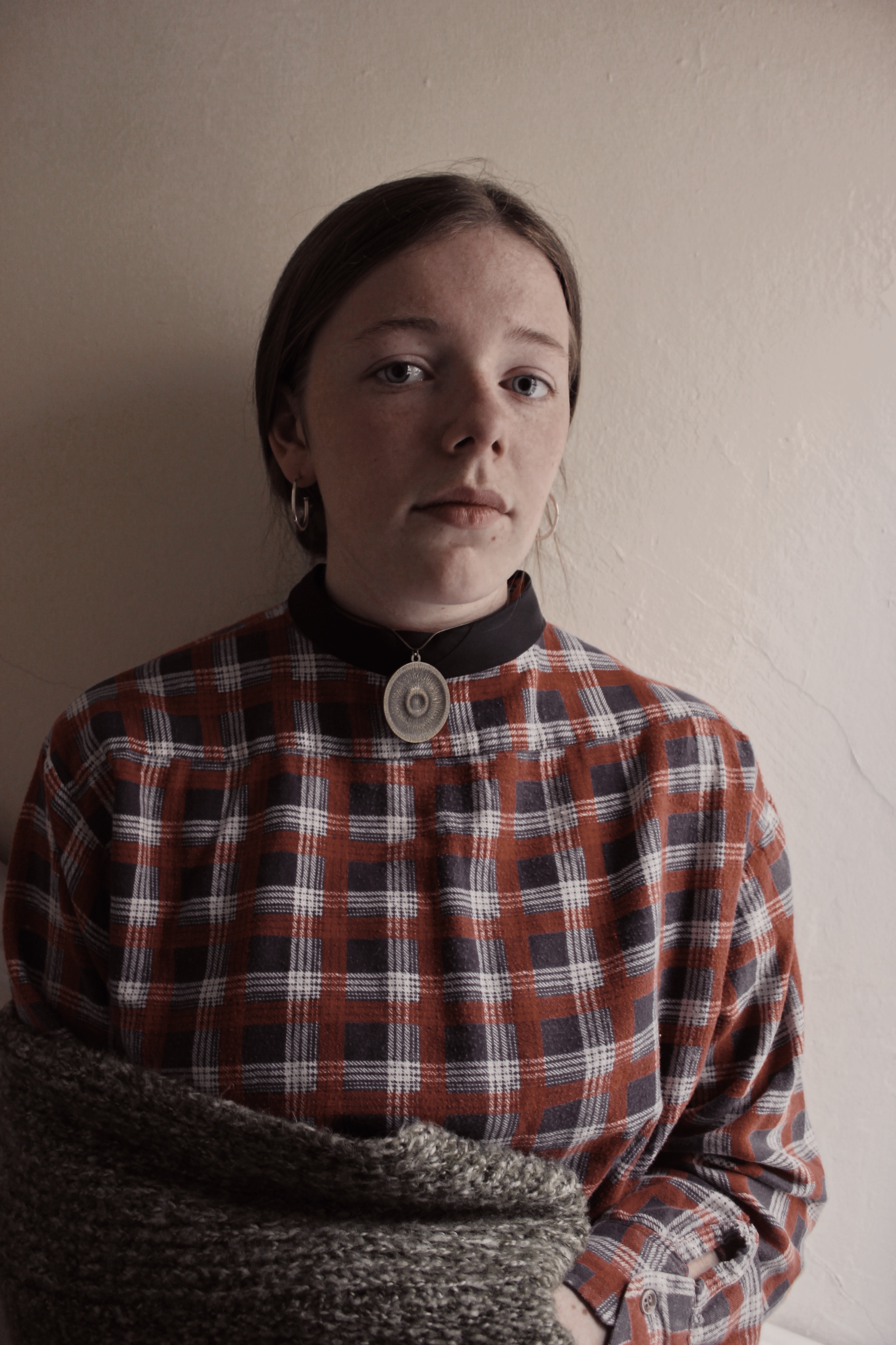
I applied the filter to all my images to give them the same temperature effect as Gwen John’s self portrait has. I chose these as I felt the shadows in the images don’t take the attention away from the subject in the centre.
Richard Tuschman and Edward Hopper | Edits
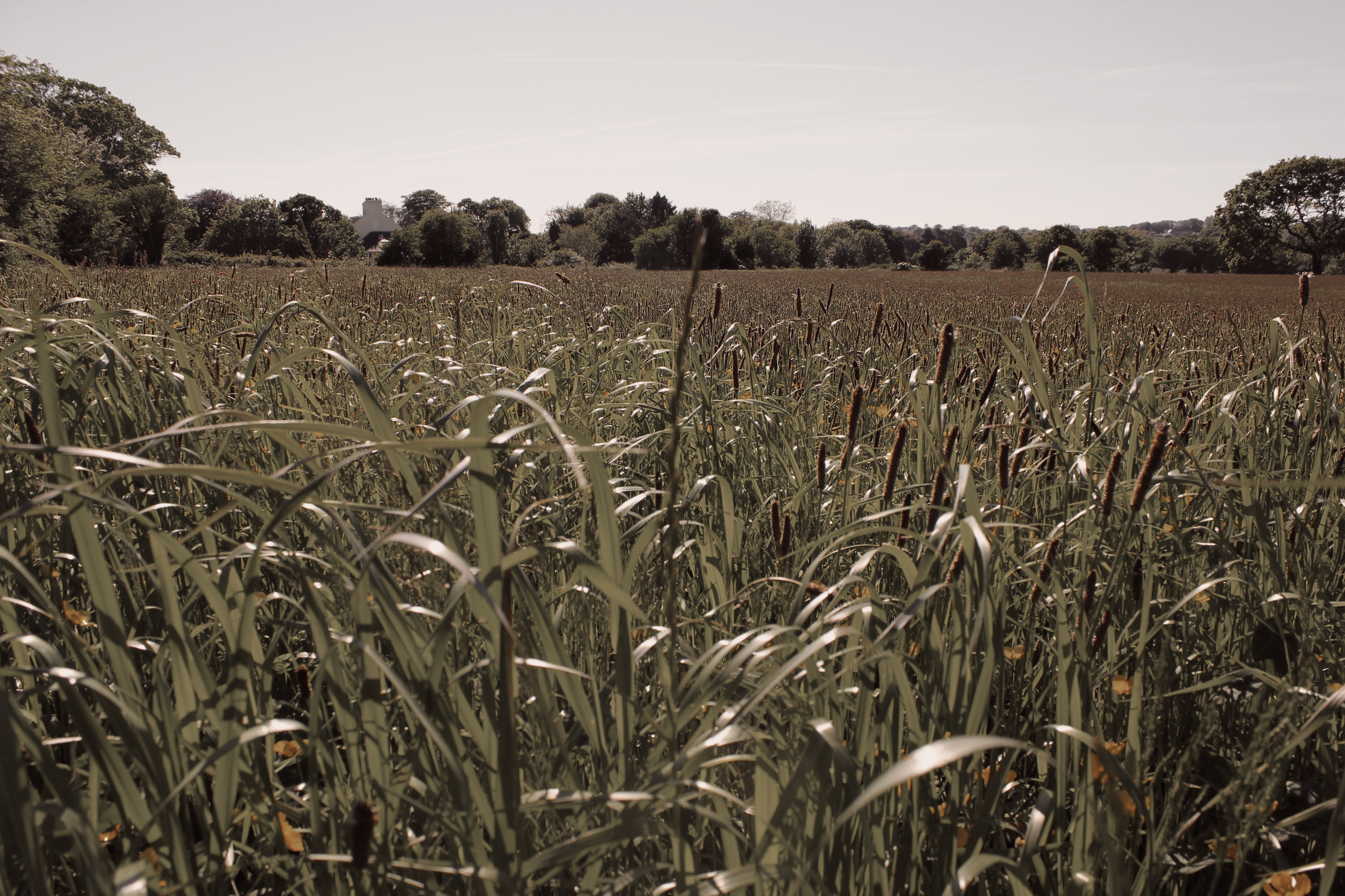
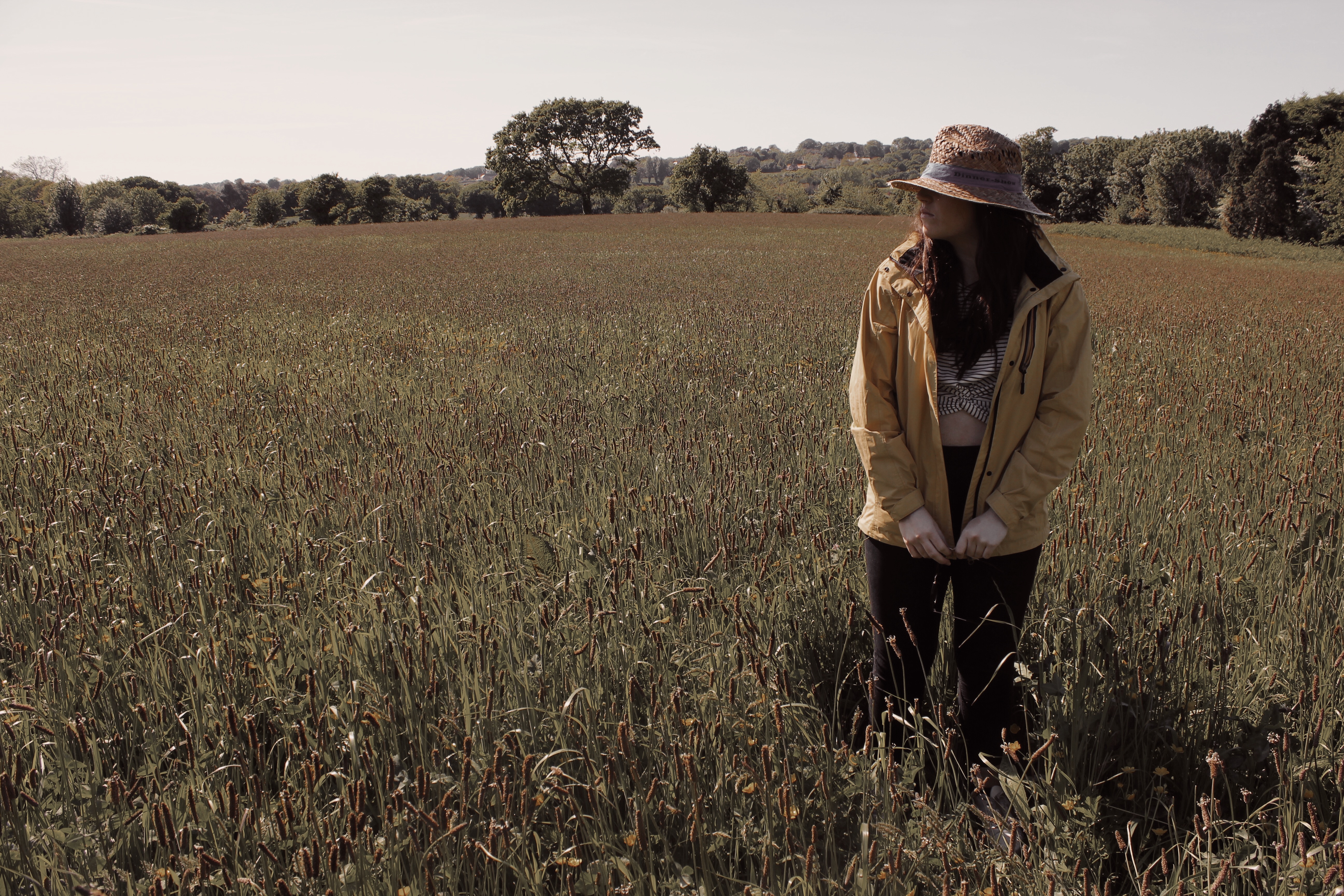
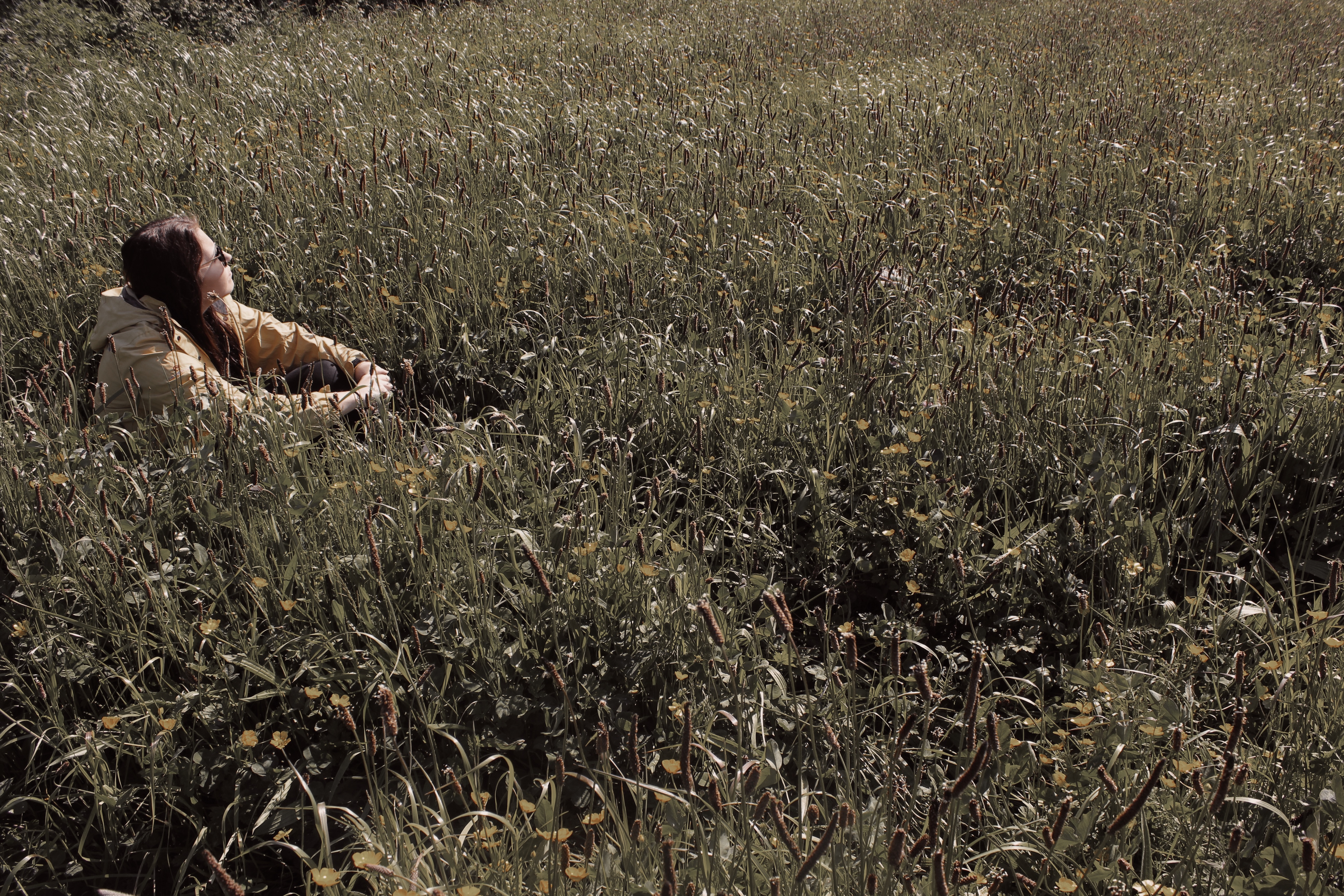
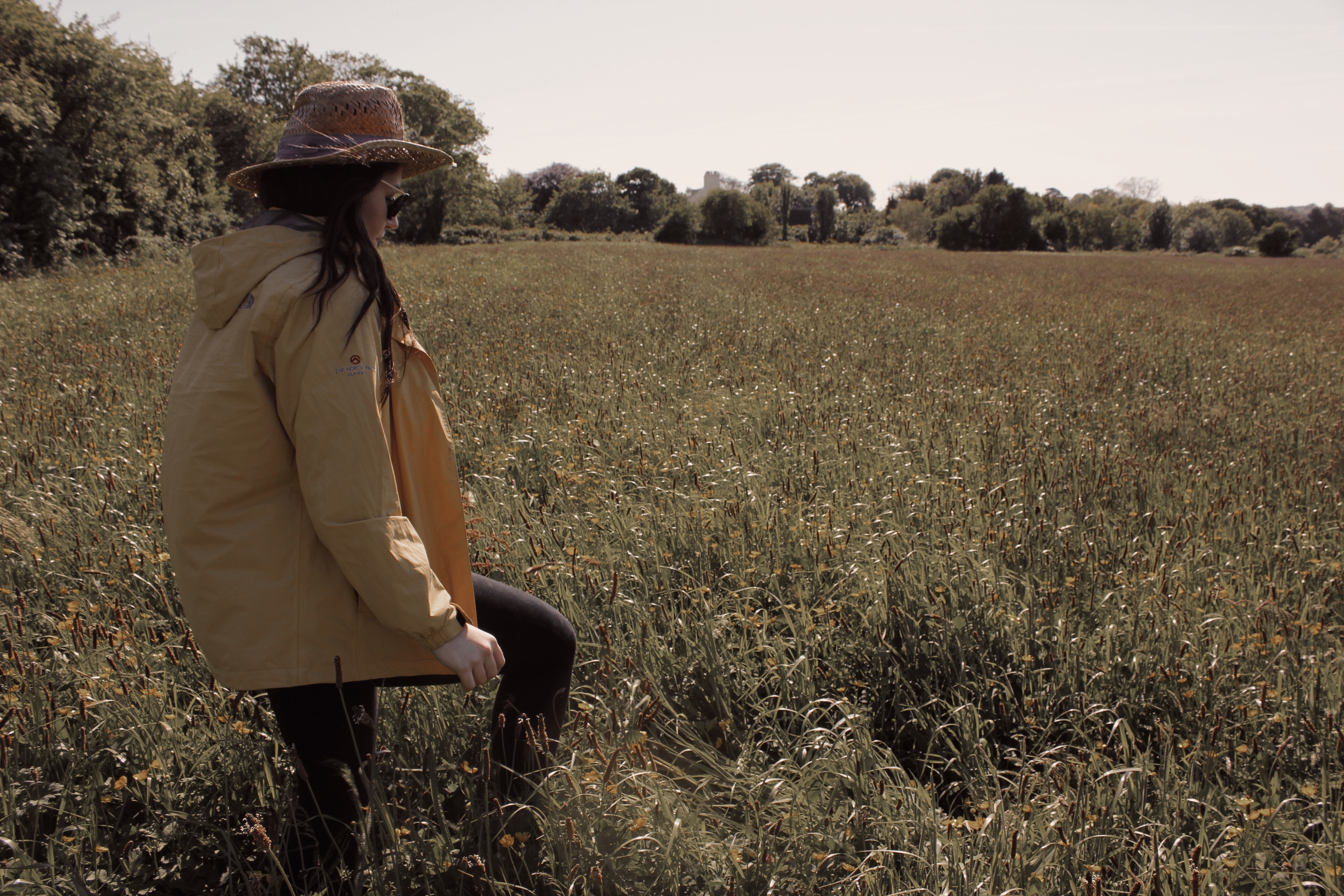
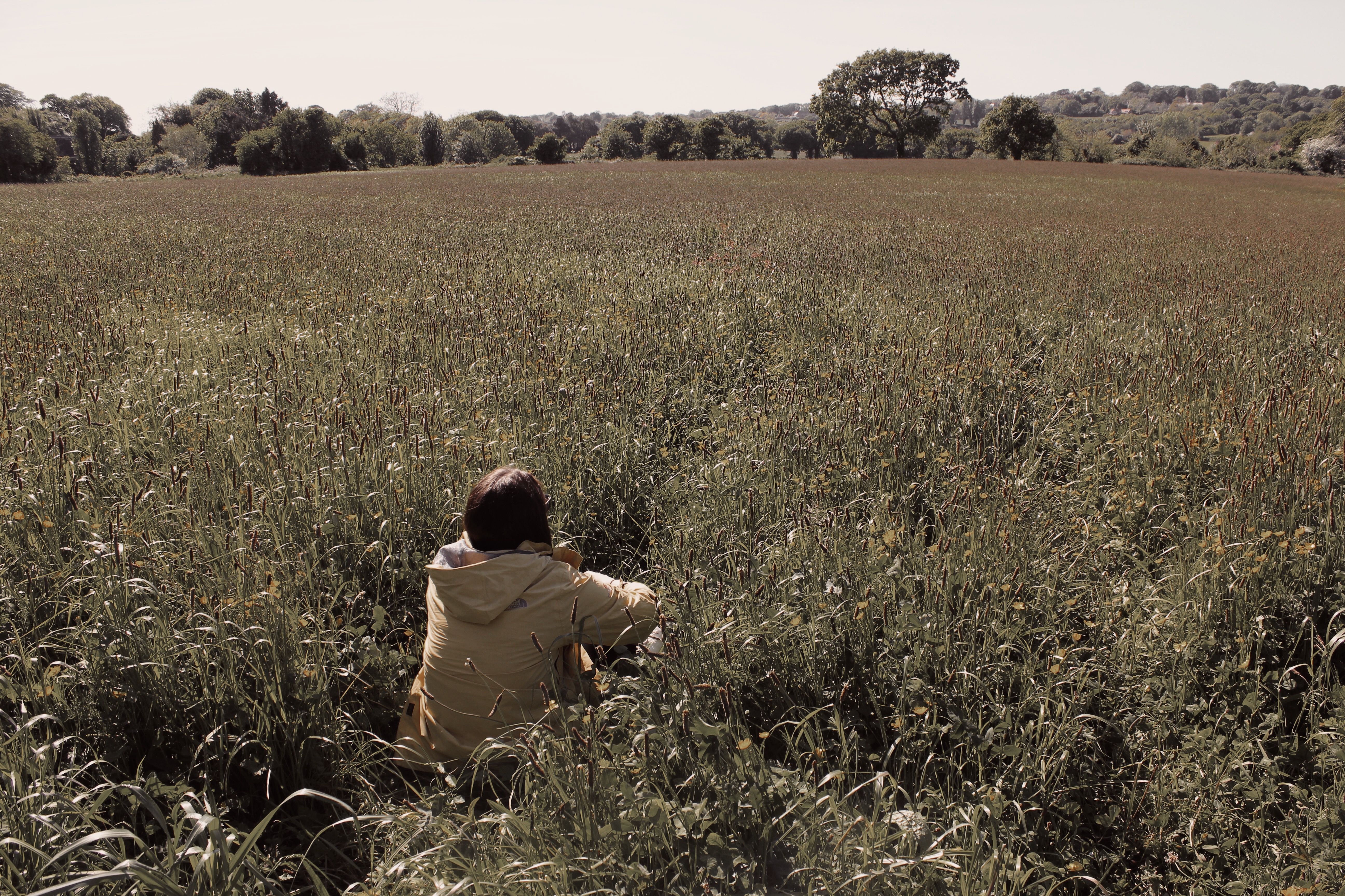
Like Tuschman, I was more inspired by Hopper’s Style to create my own work. Similarly, I used one subject in my photos to share the same meaning of isolation. In my photos, you can never see the eyes of the subject. This is supposed to deny the viewer from seeing the ‘windows to the soul’ and adds mystery to how the subject feels. I added the filter to reduce the warm temperature that was in the original images.
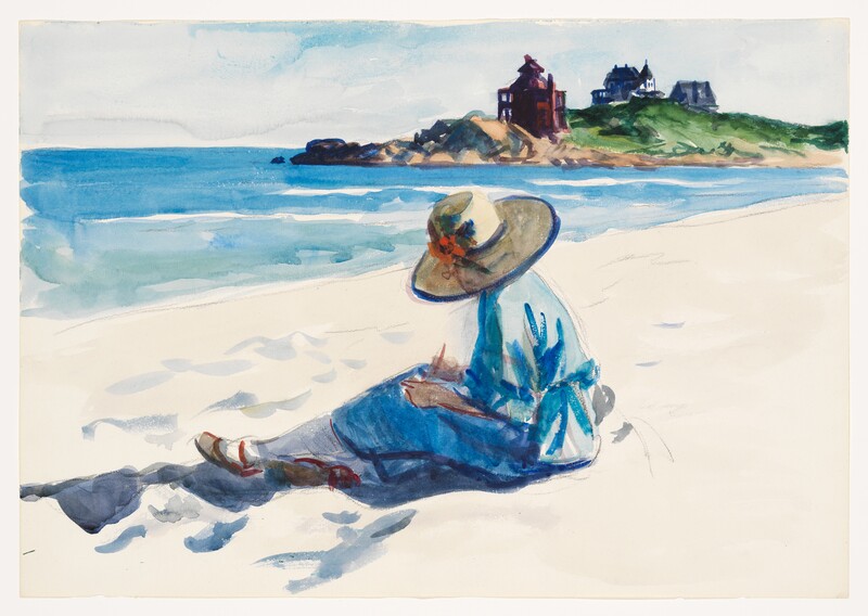
This image titled ‘Jo Sketching At Good Harbor Beach’ by Edward Hopper was probably my biggest inspiration for these images as I liked how the viewer was denied access to the eyes of the subject. It was also the reason I chose to feature a hat in my photos.
final presentation displayed,and methods.
final presentation:
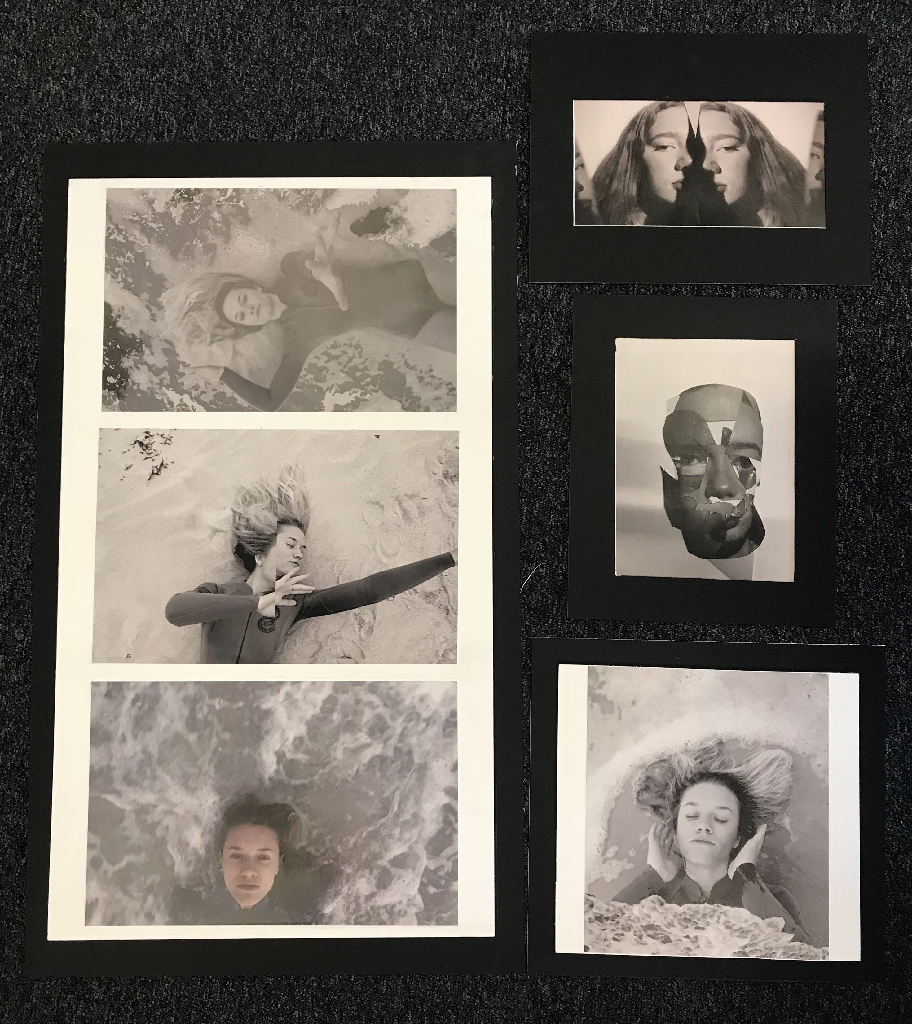
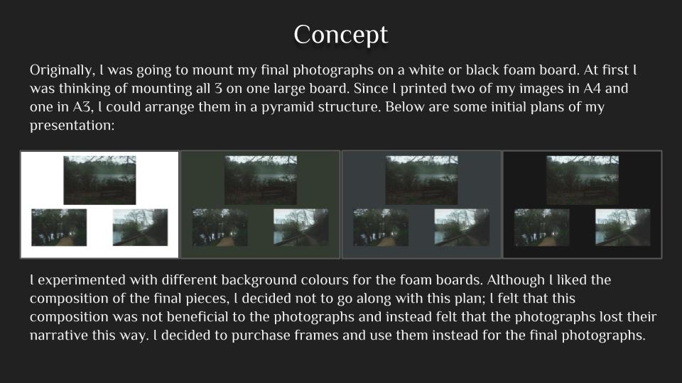
I decided to keep the same experimented final displays as my final outcomes as they were the most effective,however instead of purely mounting the two attached images I put them on a black boarder using a window mount,I do think this is more effective and suiting as the other images are also on foam then mounted onto a black frame.Overall the large set of three I think works well in the presentation and additionally the overall composition as a final set works together with the additional separate image as it acts as cohesion to the additional two images from different shoots.The large size of these a3 images on a large board has a strong impact that I think is successful altogether. I think with more experimentation my presentation could have been interesting with all the three sets of images on one very large board as all my included shoots work well together and it would allow more impact and dimensions to the piece itself.Due to my images being larger as I have added in frames the display is larger overall and so the arrangement to the images has changed to the original composition( this only being the seance row of images is longer)also because of this I did not think it was the most effective to connect the top image and the lower collaged image as the size does not work and it would not add anything to the overall final itself. I do think the frames are the most effective and especially the set of the final four images having the white inner frame.Additionally using both foam-board and window display shows both skills and also divides the sets in the most appropriate mannerism, allowing a more clear cut darker edge for the more abstract technical images then the more surrealistic experimental ones. Overall I think the frames themselves are successful as they are all in line and even and do enhance the images without removing Andy attention form the images themselves.
Presentation
Secrets, Codes and Conventions – Critique
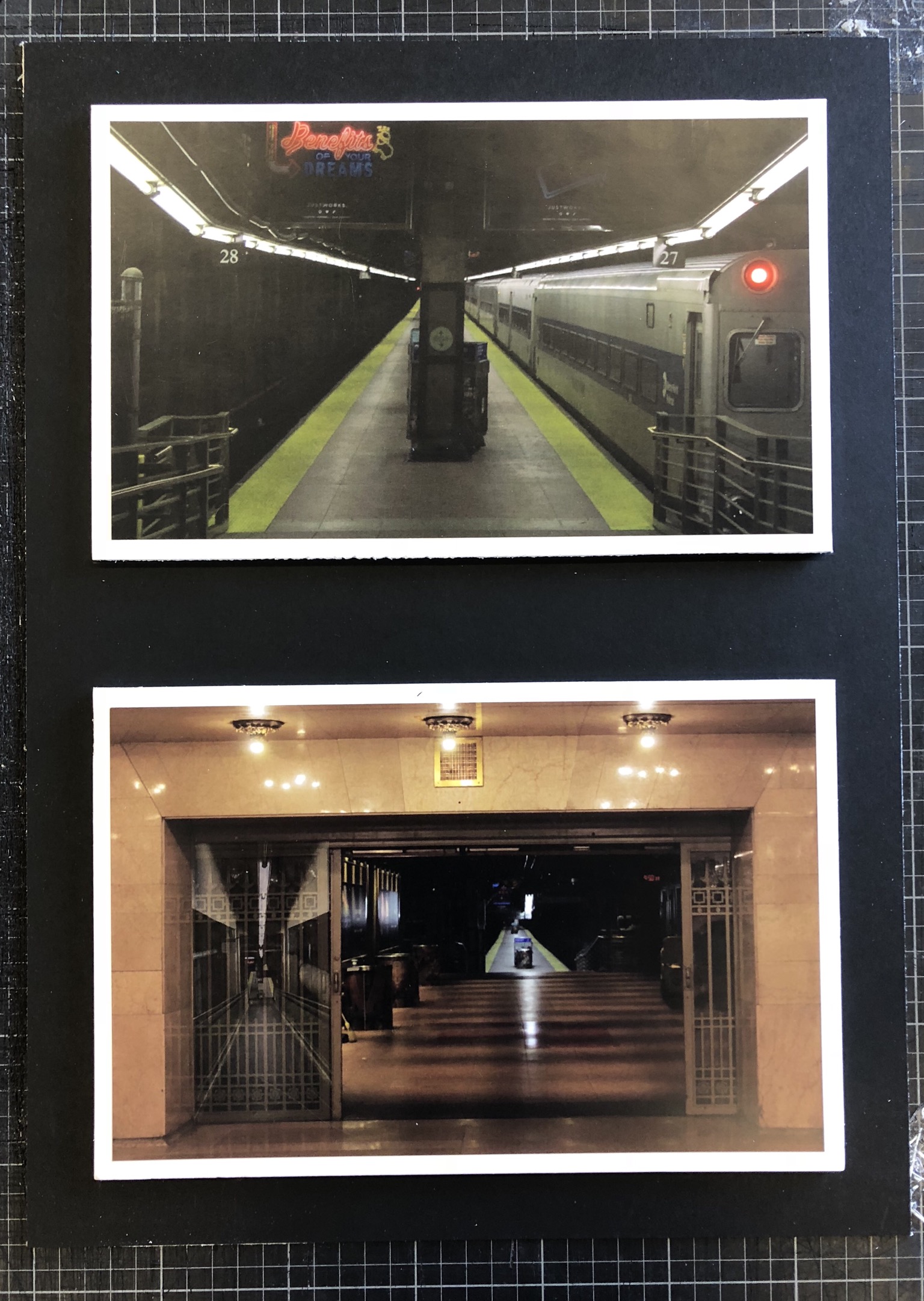
Above is my final set of photographs presented on white foam board and then on black mount board in order to provide a nice border for the photographs and to create more contrast within the photographs.
My main goal when I set out on this project was to explore the theme of secrets, more specifically the secrets within both man-made and natural habitats. I think that I have achieved this and shown this thoroughly throughout my work as I have explored natural structures such as caves, nature, abandoned man-made structures and constantly used man-made structures in New York. This set of photographs that I have chosen to present shows inspiration from the photographer Gregory Berg as I used the setting of the New York underground and captured it as if it was deserted – which it is quite the opposite of. This showed the exploration within the underground and how it can vary from being packed with people to having no people around, whilst this is going on there is a whole other world walking around above this. This tucking away of the underground introduces lots of interesting characters in the subways which people native to large cities would not normally see, and this exploration shows secrets of the city and the underground.
I think that I have achieved my goal throughout this project quite well but could improve it further by possibly attempting to recreate the final photographs in a busy area of the subway in order to provide contrast between images and more contrast between my photographs and Gregory Berg’s work. Another way that I could’ve achieved my goal further would be by looking at other areas within New York such as the less well-off areas in order to shine some light on how differently people live as we are so sheltered in Jersey.


