Category Archives: AO3 Record Ideas

Filters

Author:
Category:

My Responses to Richard Tuschman and Edward Hopper

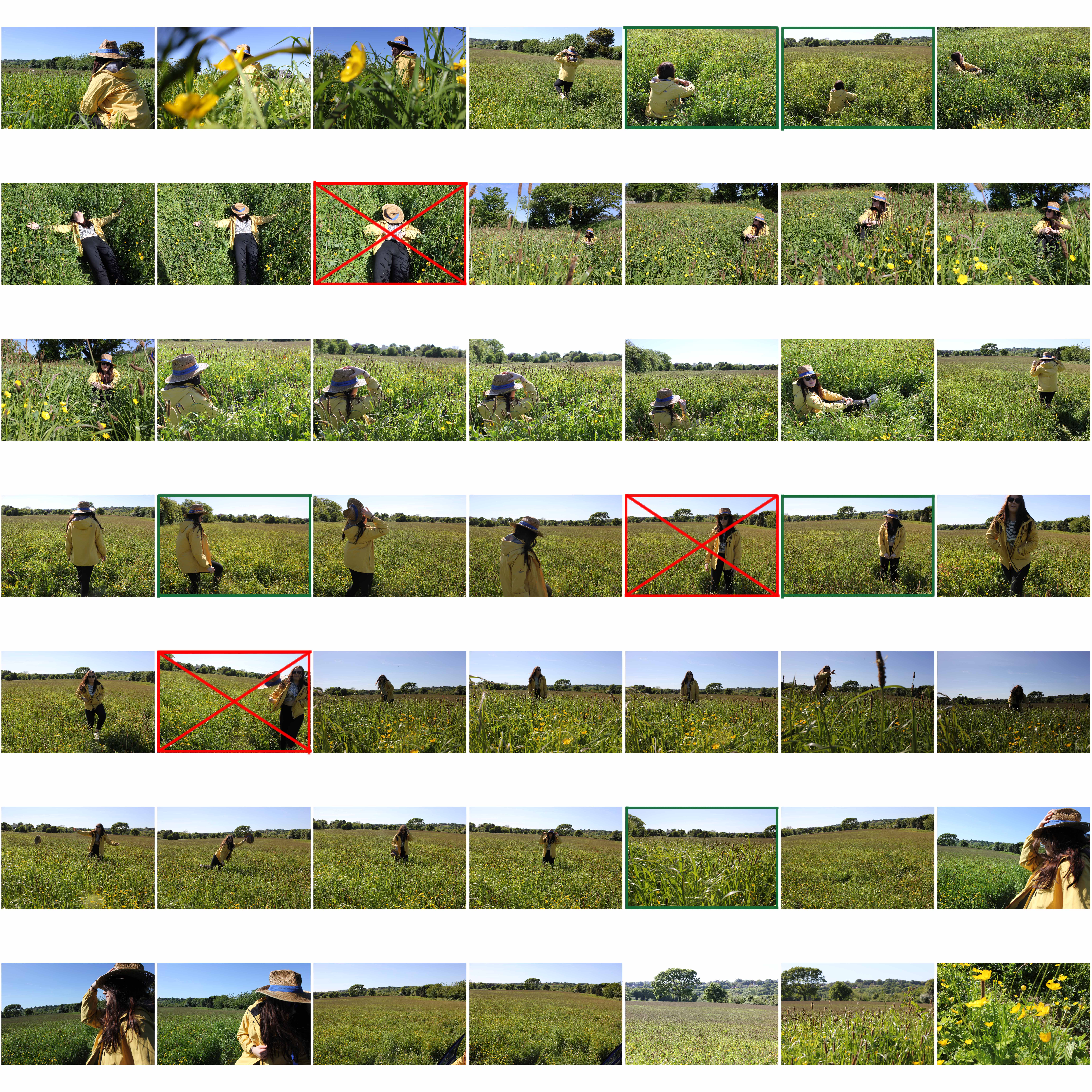
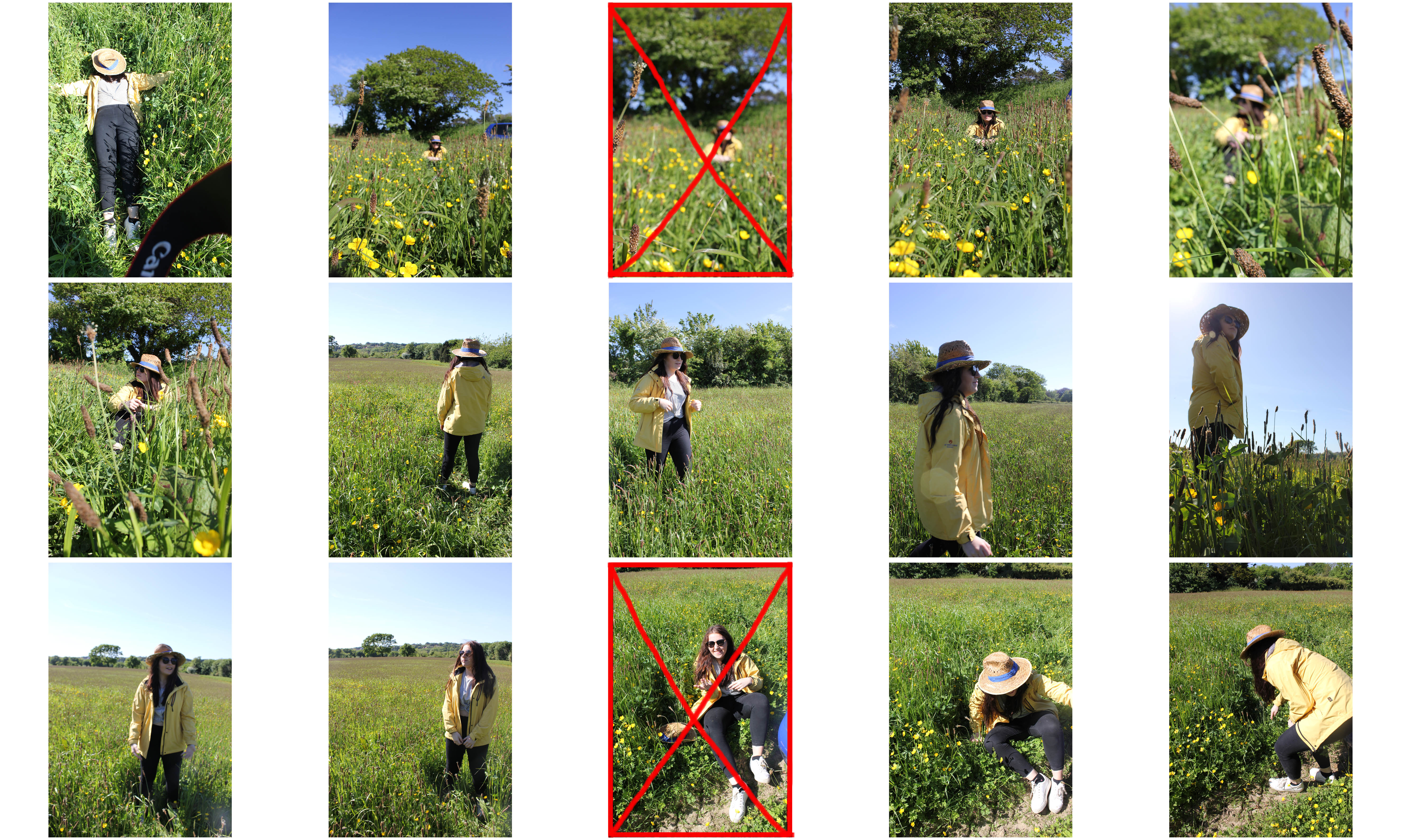
Photoshoot Plan:

Concept:Isolation
Location:A field with tall grass to give an overwhelming effect that the subject is surrounded yet alone
Lighting:Natural Lighting, however depends on weather
Camera Settings: Usual Camera settings
Props: A hat similar to the one featured in Edward Hopper's "Jo sketching at Good Harbor Beach"

I first decided to not use the images that featured the subject smiling as many of Hopper’s paintings depict a person alone and I also wanted to present this feeling of isolation.

Photoshoot-4


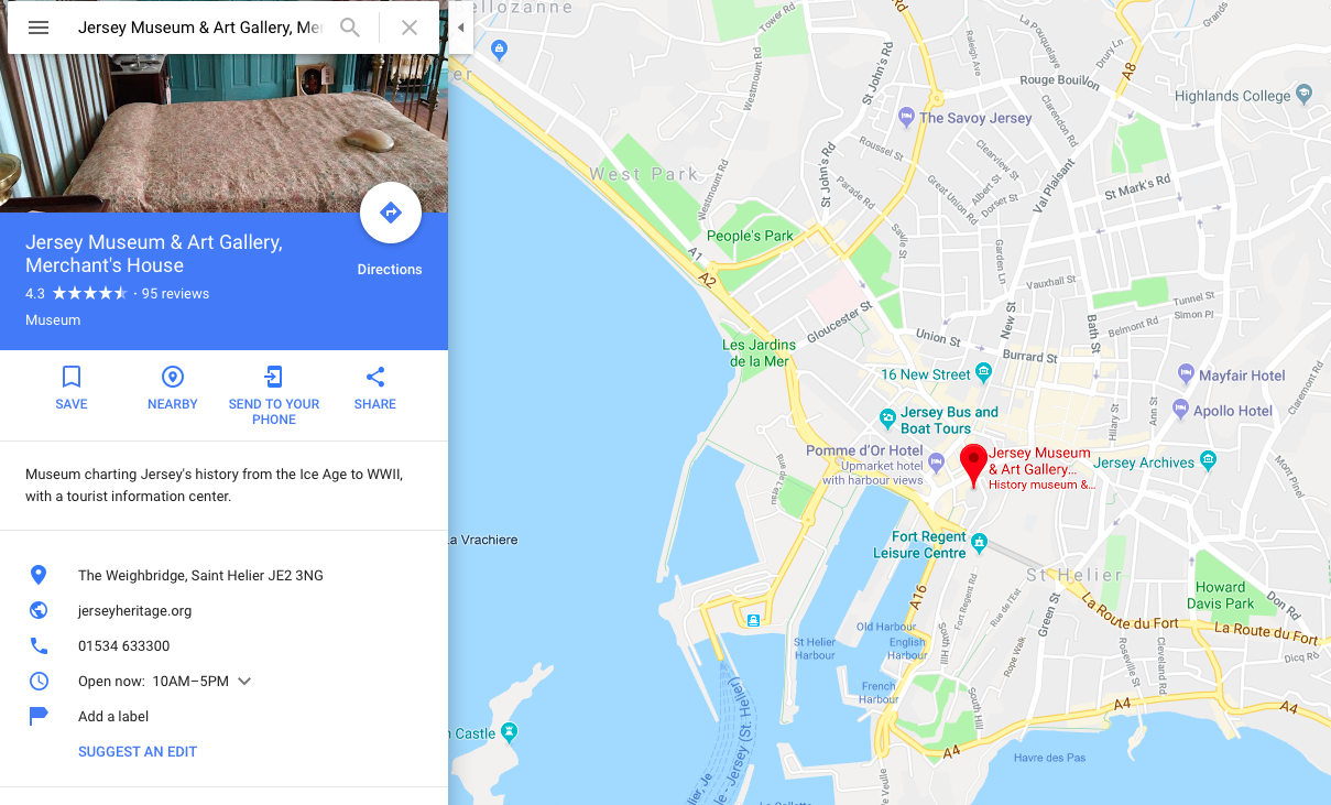
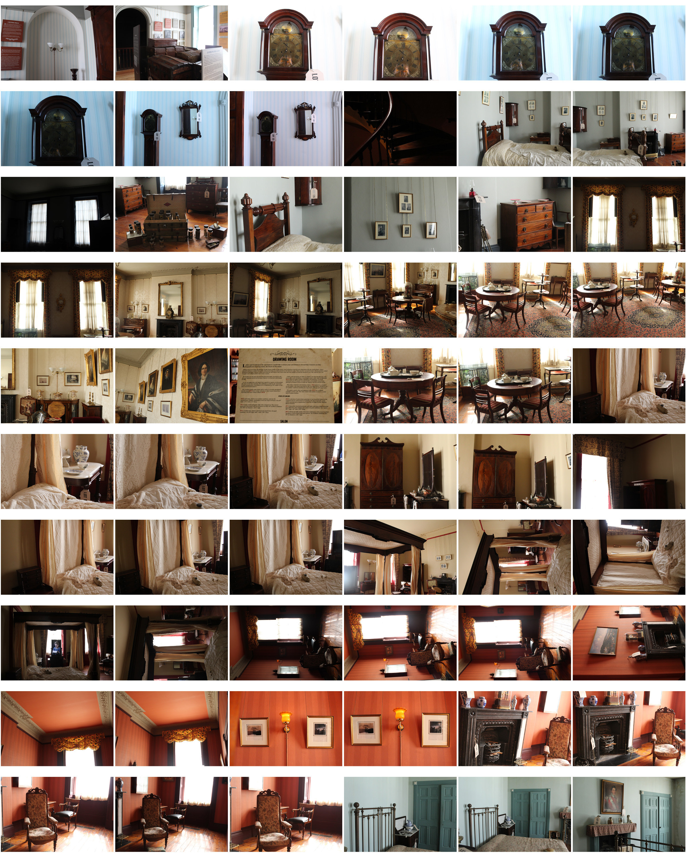
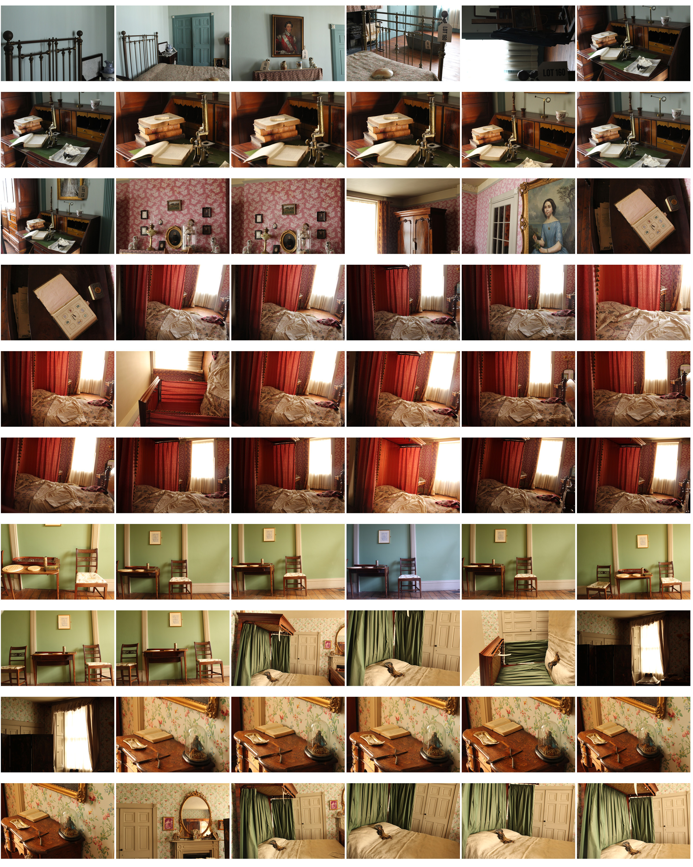
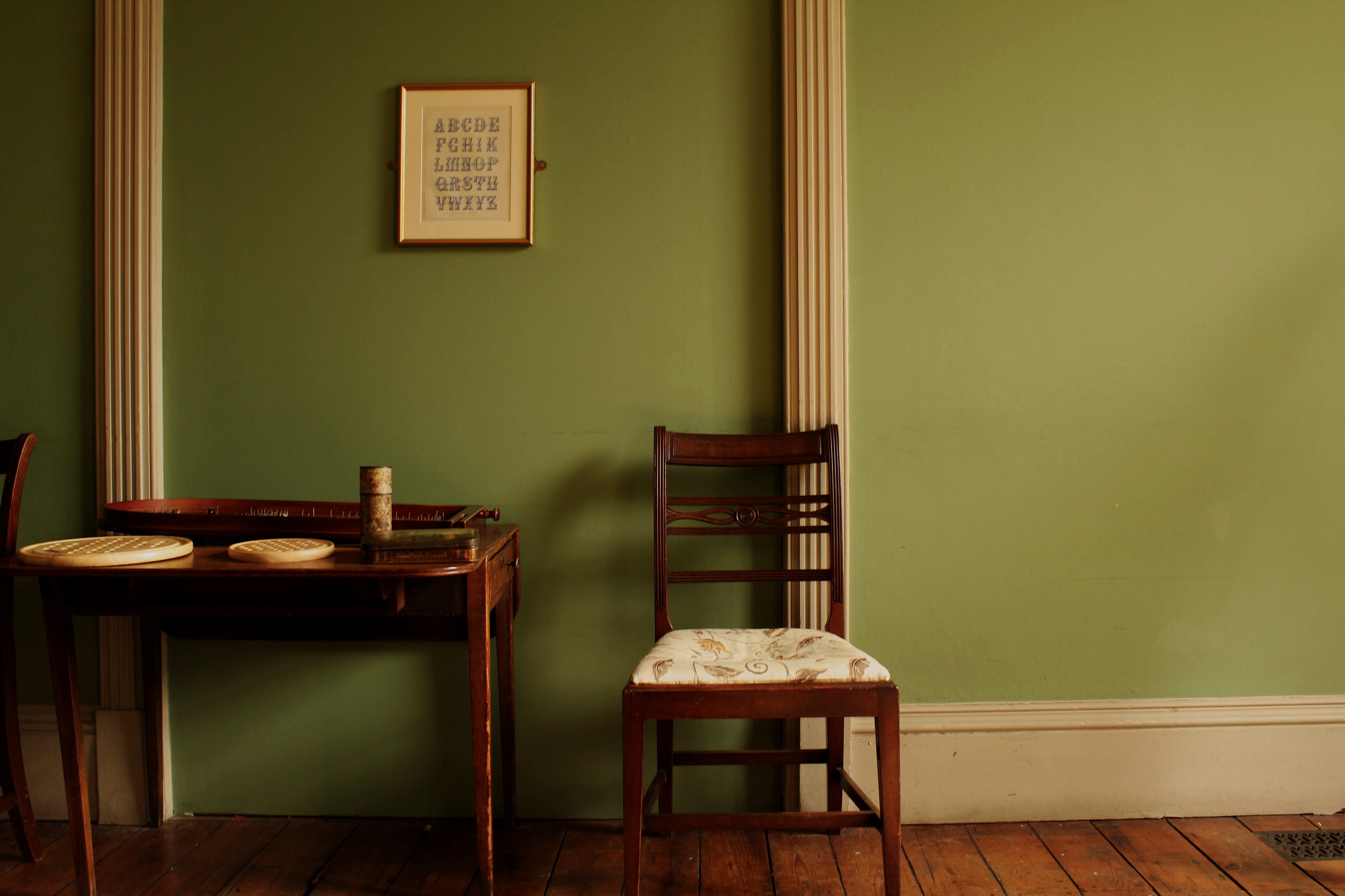
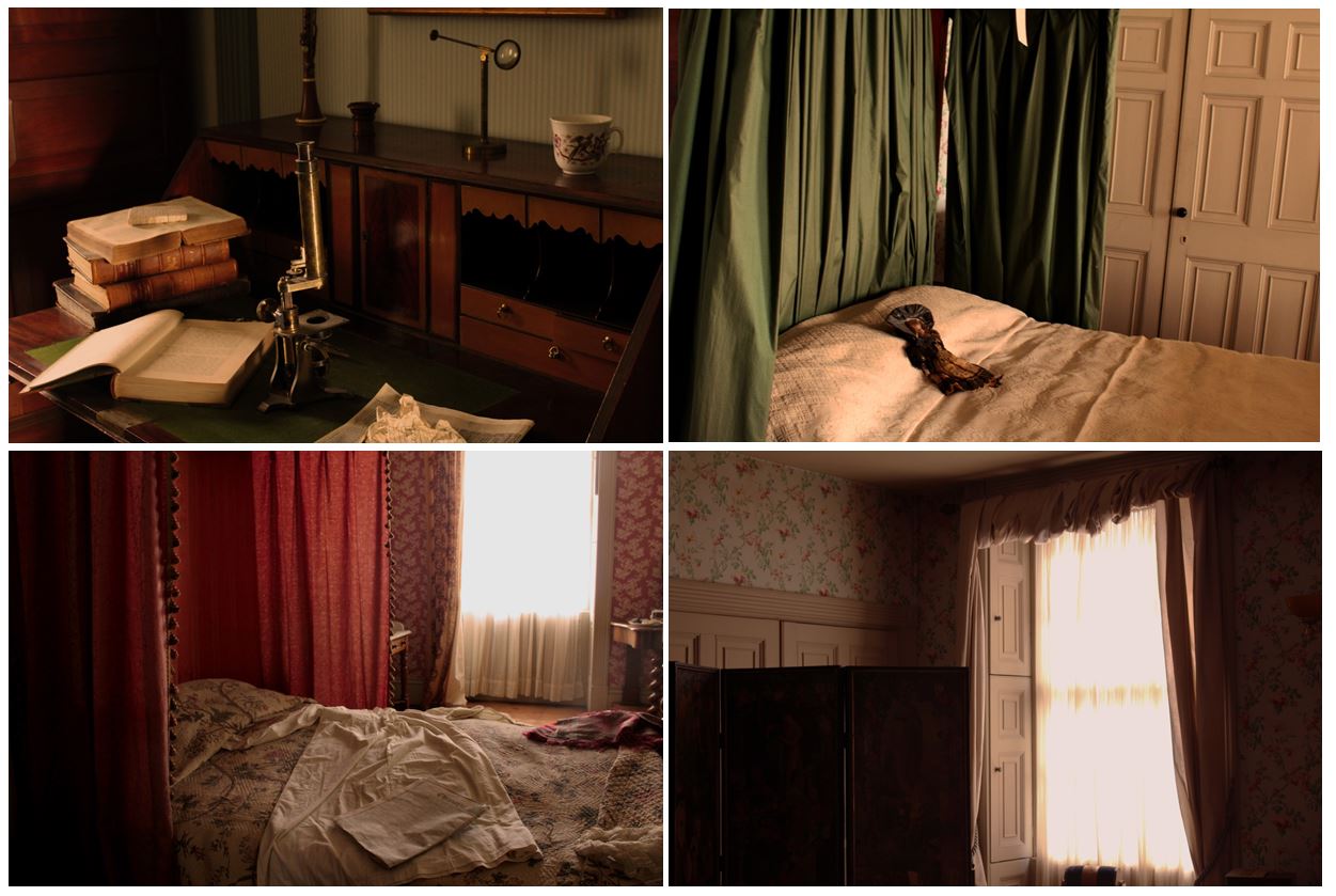
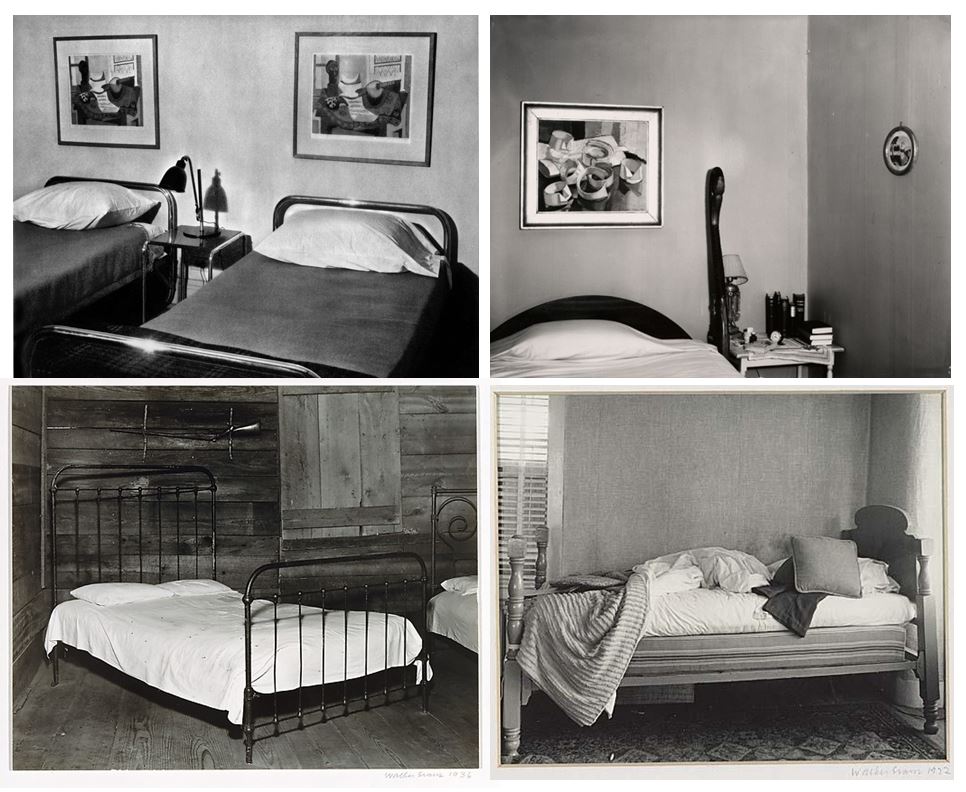
For my fourth photoshoot I decided to go to the Jersey Museum and focus on the Merchant’s house, looking at the old furniture. I wanted to interpret Walker Evan’s photography, specifically the photos in his book ‘ Message from the interior’ where he pays particular attention that he pays to the inanimate objects that are present, almost representing them as characters themselves.

The Merchants house is a recreation of the home of Dr. Charles Ginestet, homeopathic doctor and political activist. The house was built in the English Georgian Style in 1818 by Philippe Nicolle, in what was then the red light district of St. Helier. It has been furnished to represent what it would have looked like in 1862.

Philipe Nicole was one of the most successful merchants pf his time with about 20 ships. He and his wife had 13 children but upon his death in 1836 the house was left to one of his daughters, Jeanne.

At the age of 47 Jeanne met Charles Ginestet who had been imprisoned in France for his political views and was recently widowed with three children to support. Within the year Jeanne married Charles who moved into the house with his children.

Technical
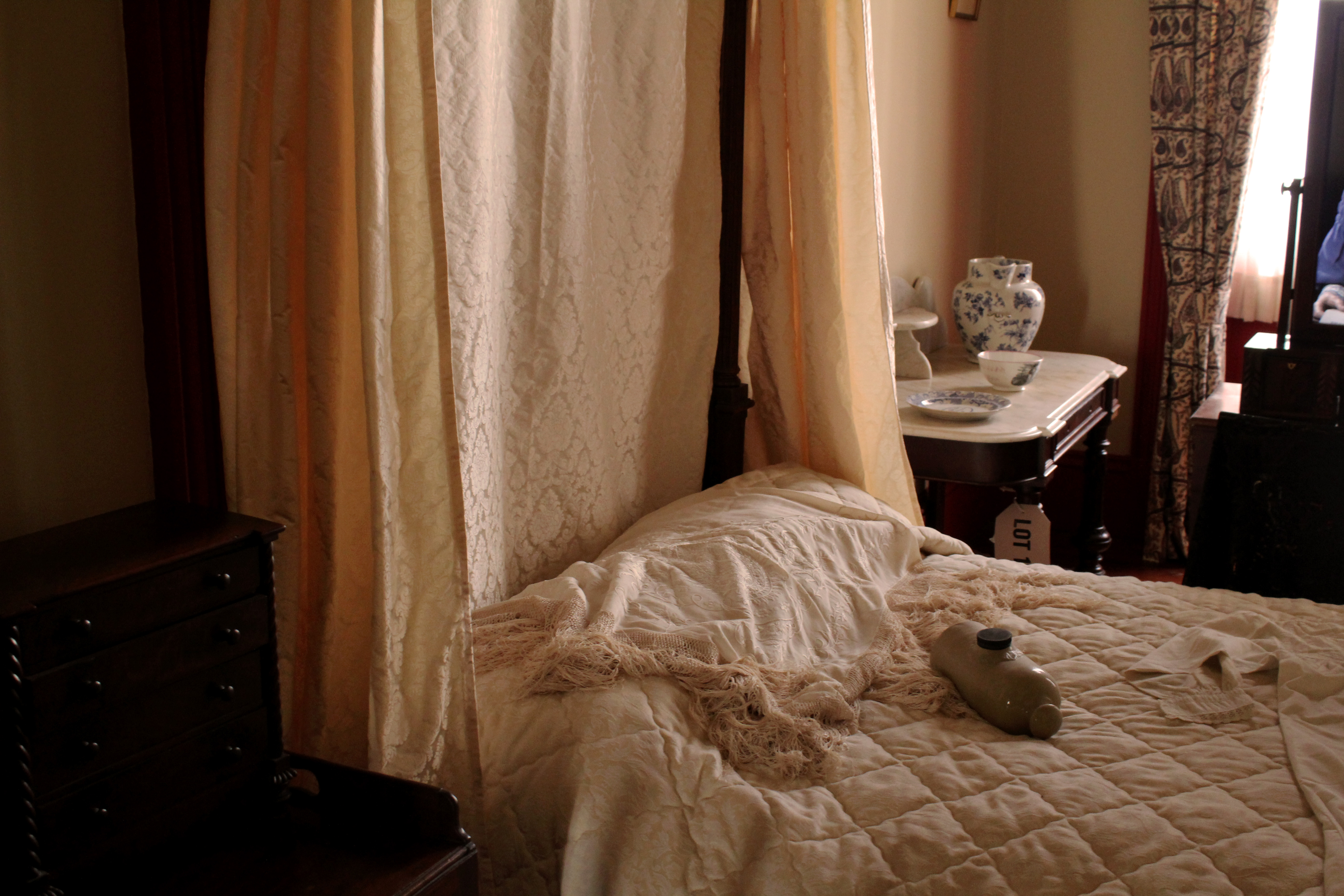
  • The lighting used in this image is natural, the light coming from the window on the right. This gives the image a more authentic look as it doesn’t look manipulated or too intense. I used a fast shutter speed so there was no blur in my image.
  • The angle this image was taken looks at the a four post bed from a sideways angle creating an interesting composition, rather than the image being taken from a front angle.
  • This images ranges with dark brown tones to light ones, dark brown in the bottom left corner, which is then contrasted with the light bed sheets and canopies which have yellow and brown undertones.
Visual
  • The lighting in this image creates light undertones, linking on with my other images from my project where the images look authentic and natural.
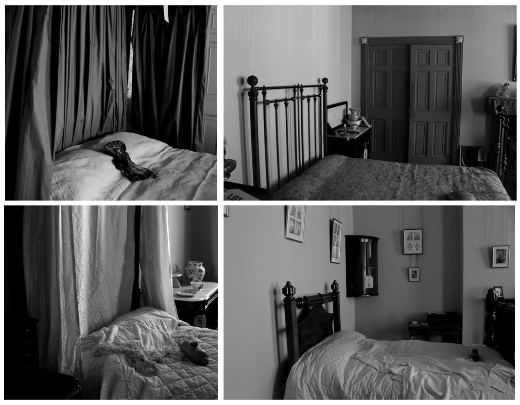
  • I specifically wanted to photograph beds when i went to the merchants house as i wanted to interpret Walker Evan’s images of different beds in houses from the book ‘Message from the Interior’.
  • The texture created by the material on the bed is what i focused on when taking the photo which gives the image depth and adds more detail. There’s a contrast in patterns made by different materials on and around the bed, e.g the checked pattern on the bed sheet, compared to the texture of the blanket on top and the pattern on the canopies on the four posts.
  • This image depicts what a bedroom was like 1860, the appearance of the bed looks like a person has just slept in it and the casual placing of the furniture and the ornaments surrounding the bed giving the appearance of a natural setting rather than a staged one. This makes it easy for the audience to imagine that the image was taken in 1860.
Contextual
  • The image is taken of a recreation of a bedroom from the 1860’s in the Merchant’s house.
  • I took these images of the recreation of bedrooms and rooms in the 1800’s as i wanted to show what life was like then and show how conventions have stayed the same and some have changed. E.g some aspects like furniture have stayed similar, but the conventions of how we live have changed from the 1800’s to now.
Conceptual
  • I wanted to take photos of furniture from a house in the 1880’s to link to my projects theme of how conventional objects and furniture have history and stories connected to them.
  • The objects and furniture shown in these images create the impression that someone still uses them based of the casual appearance the settings give.
  • This links to Walker Evan’s images where he pays particular attention to the inanimate objects that are present, almost representing them as characters themselves, also representing absence and the passage of time.
  • My images show furniture and rooms like someone is living and using the furniture, but there aren’t any people, also representing, like Walker Evan, absence and the passage of time.

Rooms shown in the pictures:

Anne Nicolle’s bedroom:
  • Her room is decorated in red, reflecting her family’s association with the Rose party.
  • Gas lighting was installed in the 1830’s but paraffin lamps and candles were still used.
  • Her was an ‘Albert’ with a partial canopy curtained for privacy and warmth and four posts.
Sydney Nicolle’s bedroom:
  • His father (Jeanne’s brother) died and his mother remarried and movies to England, too he stay in Jersey and lived with his aunt Jeanne.
  • His room was very simply furnished with a brass bed and various Militia items- uniform and sword.
Berthe and Alice Ginestet’s Bedroom:
  • They shared the albert bed for warmth, and it was unusual for everyone to have their own bedroom in 1862.
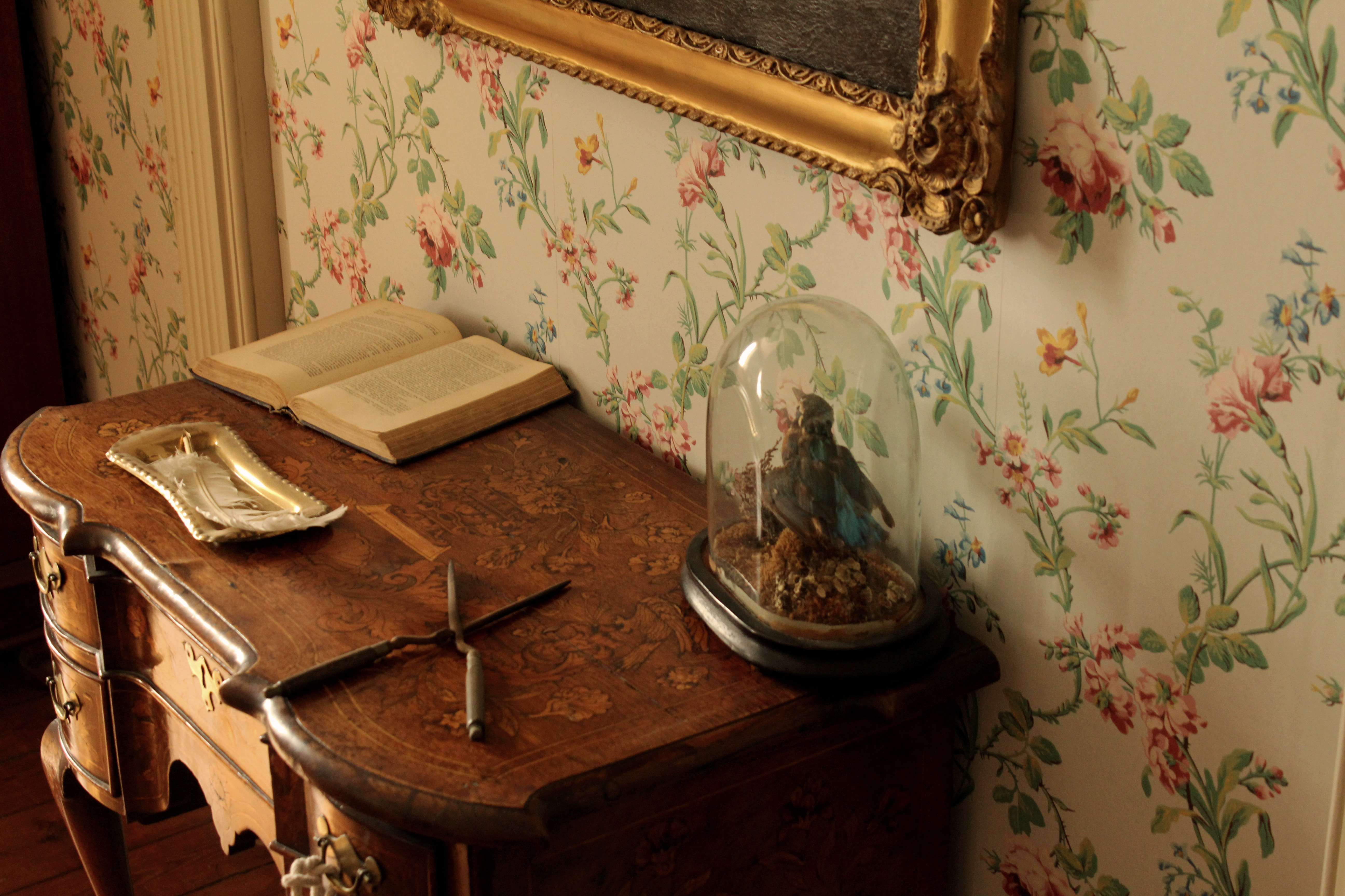
  • The room is typically floral with French wallpaper, drapes and privacy screen
Schoolroom
  • Education in 1862 was not compulsory but those wealthy enough employed a governess to educate their children at home.
  • Toys were designed for an educational purpose or to develop skills to take you into adult life.
  • In a horse drawn society, a young boy would need to know how to ride a horse which is what the rocking horse was for.
  • Jigsaws orientated from cutting out maps and scenes and fitting them back together, and the cup and ball encouraged hand/eye coordination and was known to be played by Queen Victoria.
  • Children’s clothes did not exist before 1860 an they wore cut down versions of adult clothes i.e. sailor suits.

The flooring throughout the house is mahogany, imported from South America on board one of Nicolle’s ships. The floors were caulked with tarred string, like the deck of the ship. Victorians liked to show off their wealth, particularly if they were ‘new money’. The clothes they wore and the buildings they lived in demonstrated this. Paintings were often displayed in the hallways indicating the occupant’s wealth and status because this is where the guests were received.

I edited some of the images from the photoshoot black and white to better interpret Walker Evan’s work and displayed them above. Below I have shown some of his photography to compare our images. I think I successfully interpreted his work paying particular attention to the inanimate objects that are present, almost representing them as characters themselves. I think the images I took represent the passage of time and absence, showing furniture and beds of people in the 1860’s, but the absence of people in the images show the history and how a conventional objects within a house can have more meaning than the purpose of what it was built for. In one of Walker Evan’s images shown below it displays a bed where it is clear someone is living in it as the bed is unmade like someone has just slept in it, which is also what I think i showed in my images. One difference between mine and Walker Evan’s images are that my images are of settings recreated of the 1860’s, whereas his images are actually depicting the 1960’s, time he was living in.


Minimalism Photo-shoot

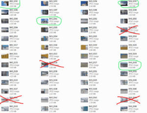
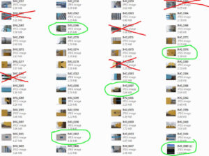
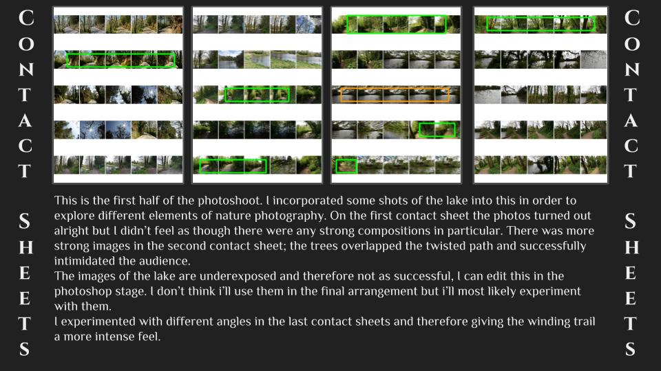
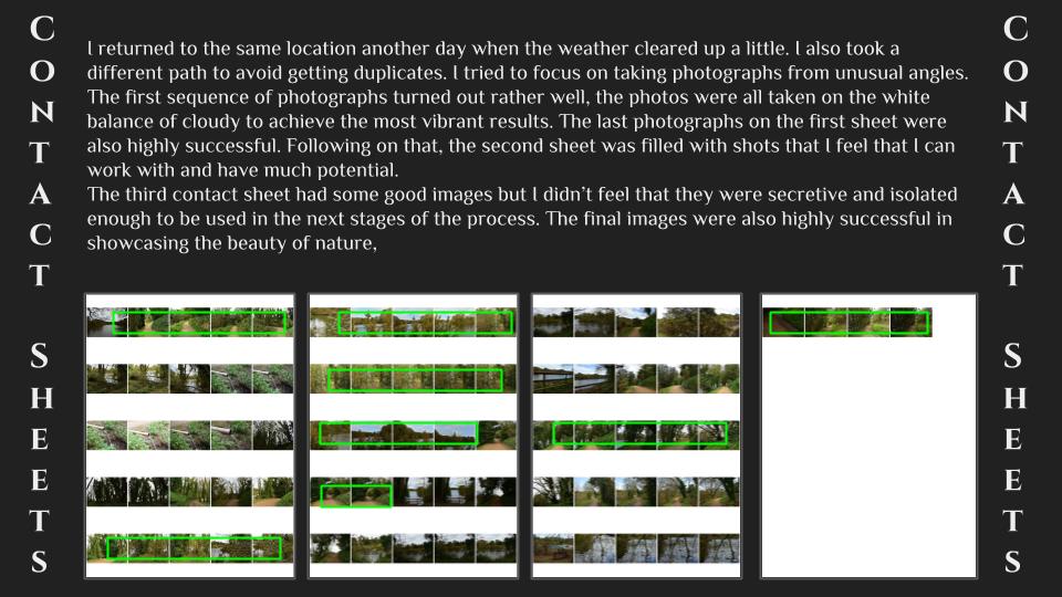
Contact Sheet 

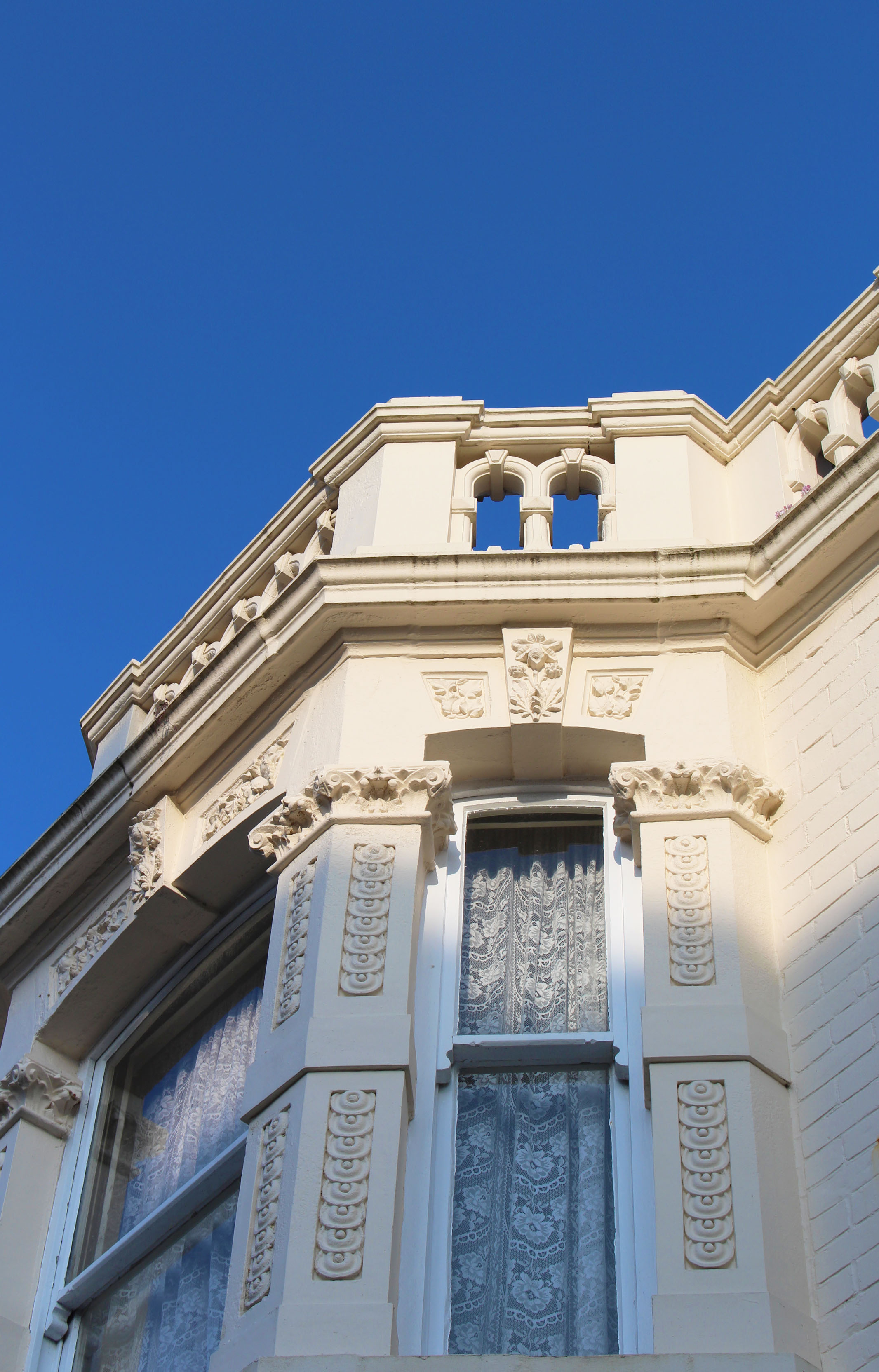
Best Images from the shoot

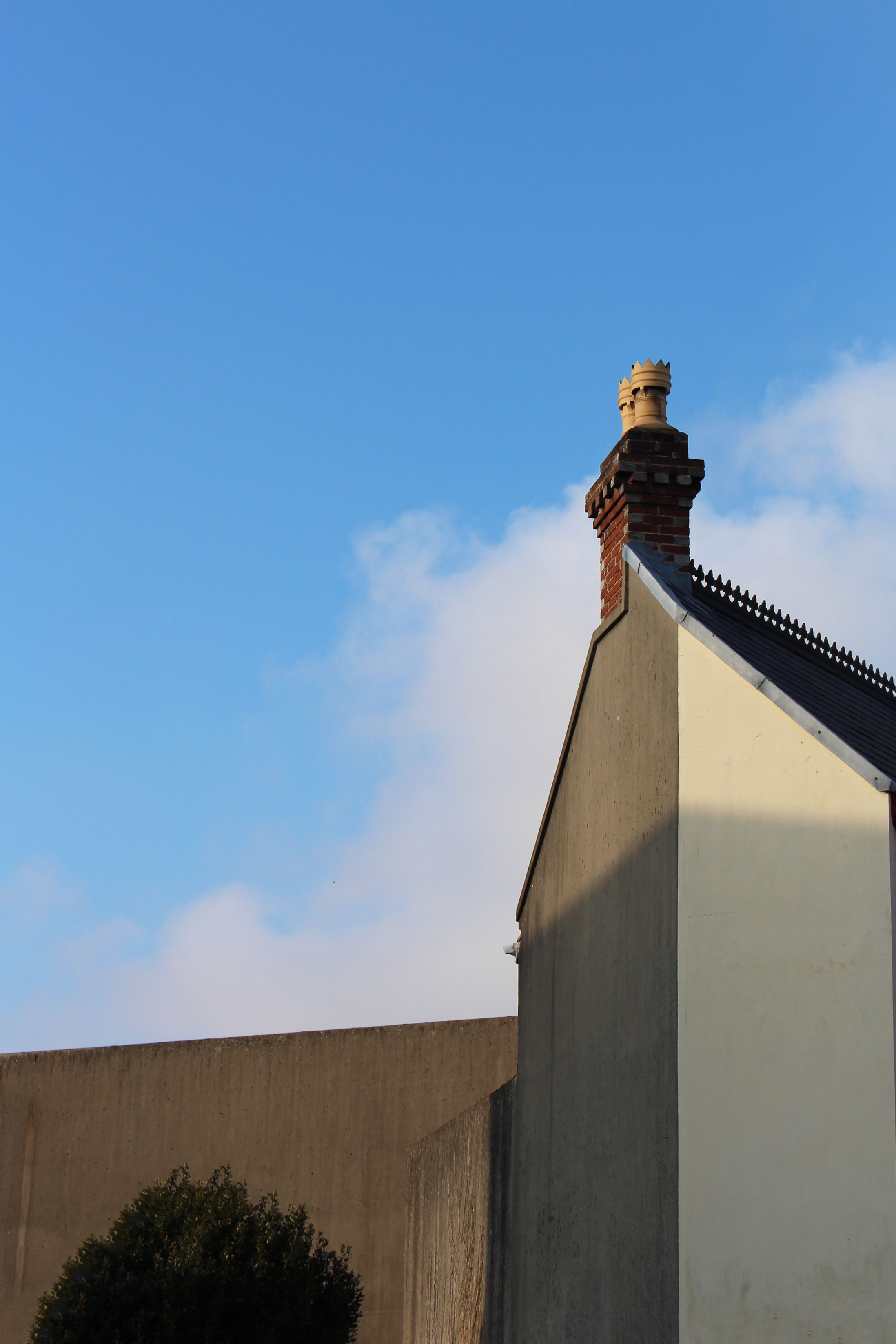
Best Image from the shoot 

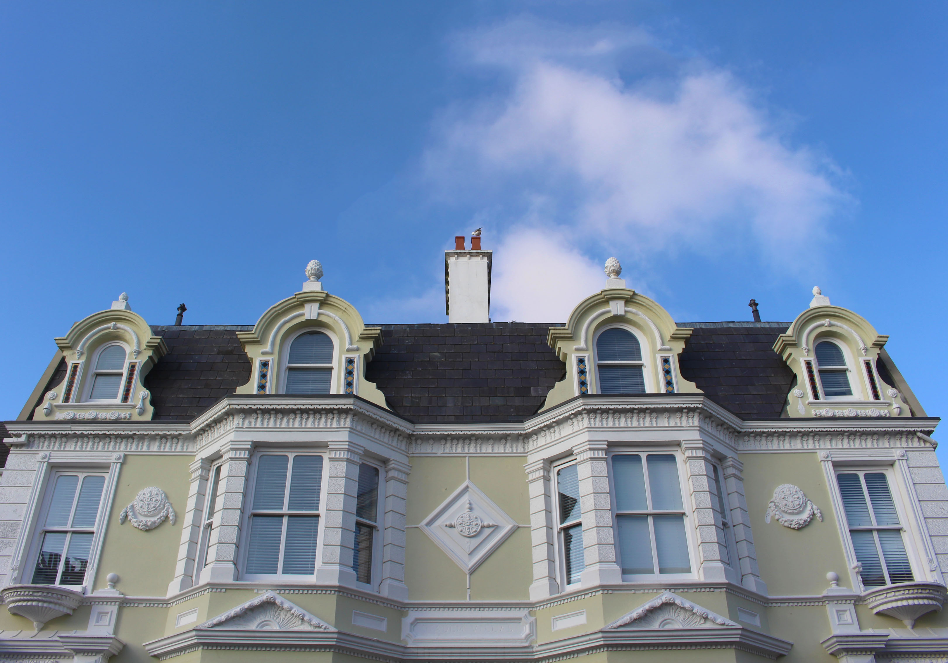
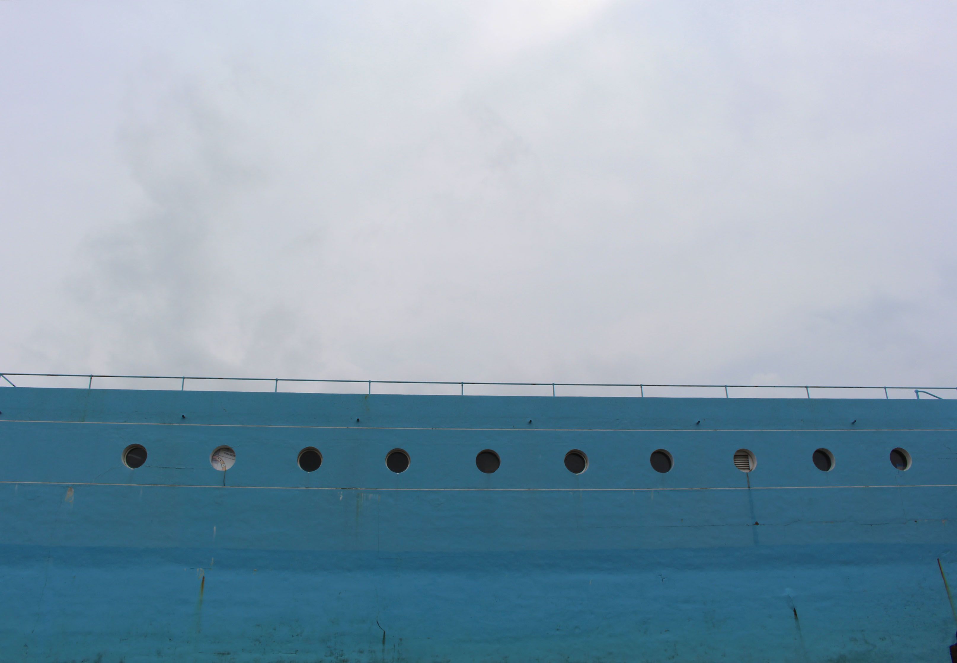
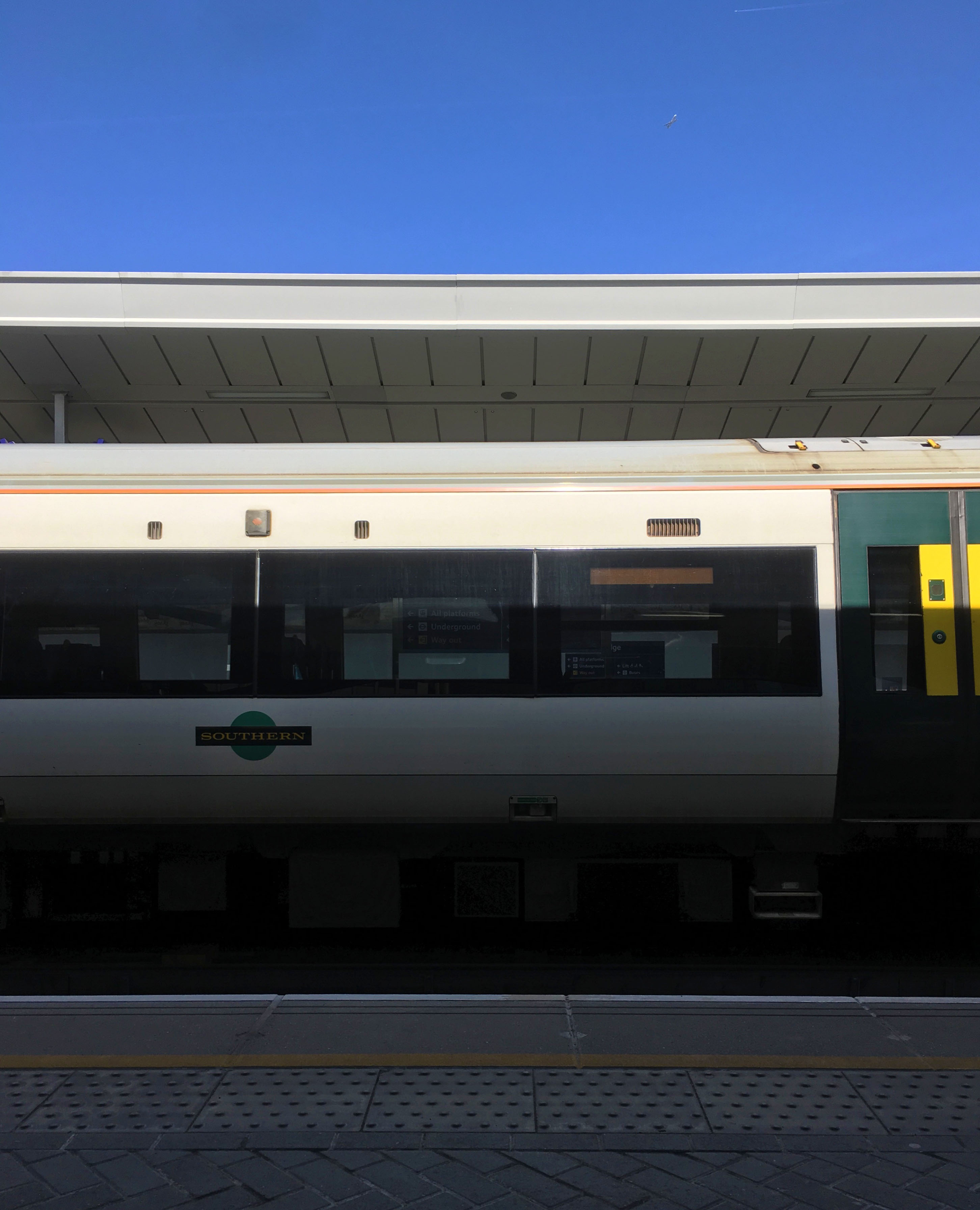
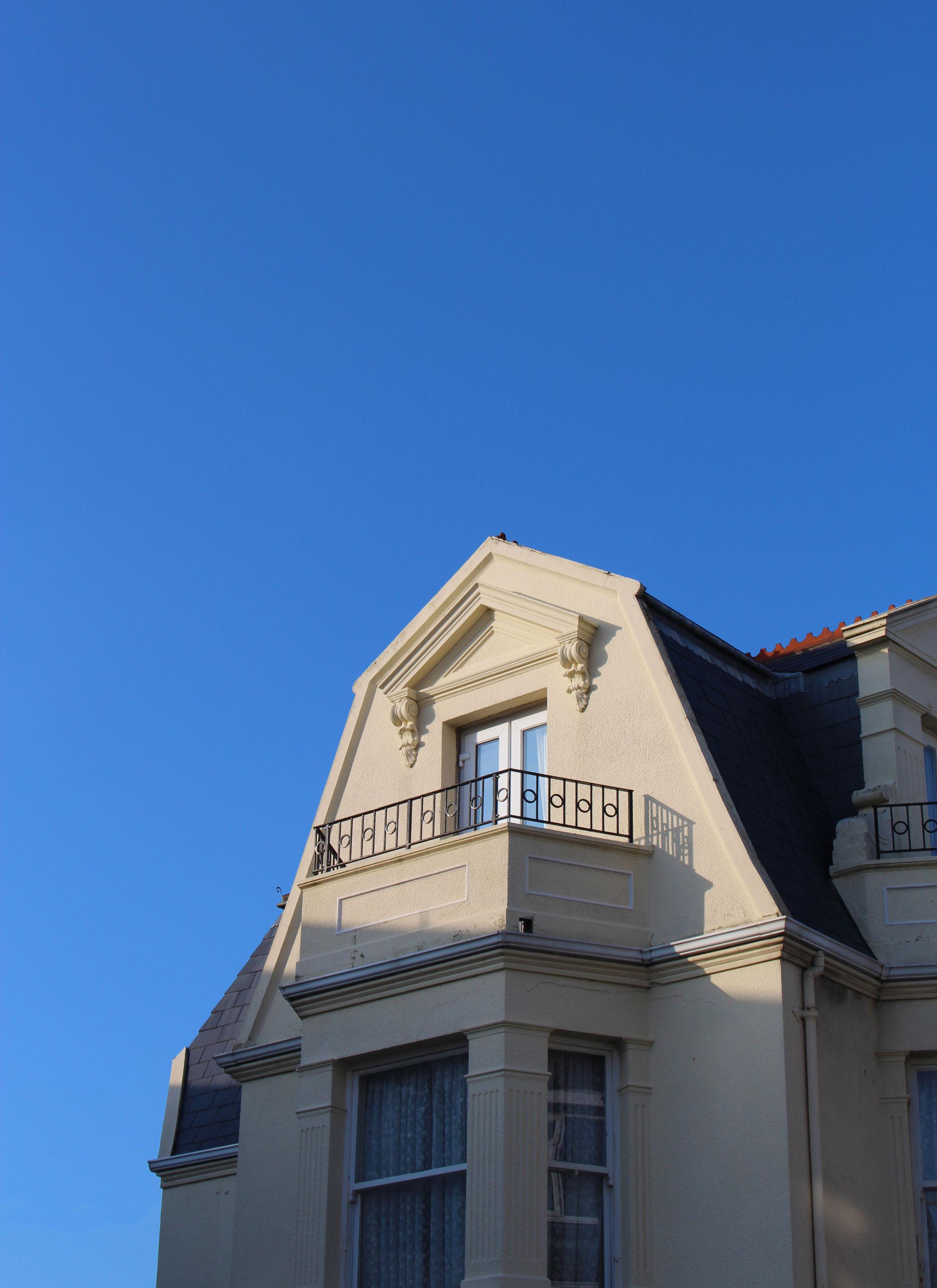
I feel that this is the strongest image from the shoot as I think that it includes the largest amount of the techniques that Iwanted to use; Abstraction,minimalism, and the use of colour.  I took this image using natural light, as I went during golden hour it helped to increase the overall warmth of the image which is what i wanted. I used a slightly faster shutter speed than normal as i wanted the image to be sharp and crisp. I uses an ISO of 100 as it was very bright when I took this image.When taking this image wanted the focus to be split between the building but also on the colour iof the sky so this is the reason for the overall framing of the images, I decided the building in the bottom right hand side and to have the blue sky as the main focus of the image, I wanted the onlooker would look at first rather than the building. I feel that this image has stong links to my interspersion  for this project Grant Hamiltion, has he also went out into his local area and looked very clearly to find theses area of of colour that could be created into pieces of art work. Visually the dominant colour in this image is a royal blue which give the overall image a cooler tone to it, otherwise the colour palette of the image is very neutral. The image is very flat and 2D this could be due to the able in which the light is hitting the house I took this image in an estate near my house close to my house, chose to photograph this house especially due to the detailed architecture as most houses now are very modern and have a emphasis on straight lines and being linear. In this image I attempted to bring in a sense of simplicity, whilst including elements of detail that can go unnoticed if looked at closely.

Evaluation and idea artist comparison

For my chosen final pieces I was mainly inspired by two artist being:

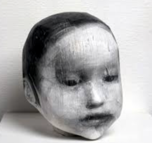
 Midori Harima

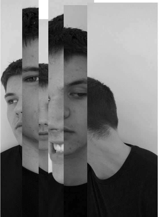
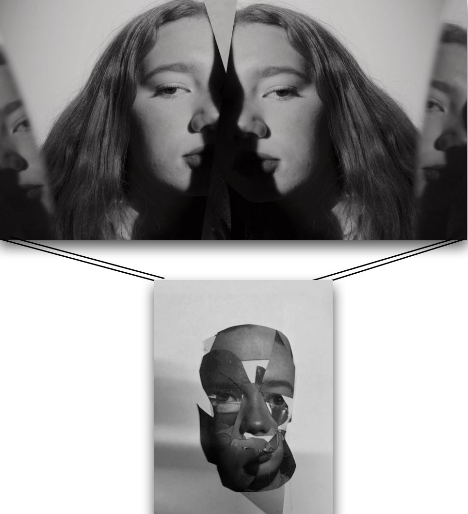
Comparison between artists work and mine:Harimas work is based around creating a 3d collage being a print off of her own image and wrapping this around a head structure to form a sculptor,I interpreted this as cutting up pieces from my portrait images and making this into a collage and then forming it in a curved manner to look 3d,I think it is quite evident to see the similarities between the pieces.And that my inspired piece works well with the techniques used.

conceptually it is an interesting piece as is symbolises different aspects of human emotion, the lighting to form a shadow is also effective as it further enhanced the three dimensional feel to the piece itself.


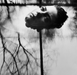
Connie imboden

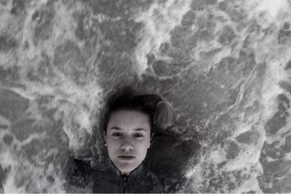
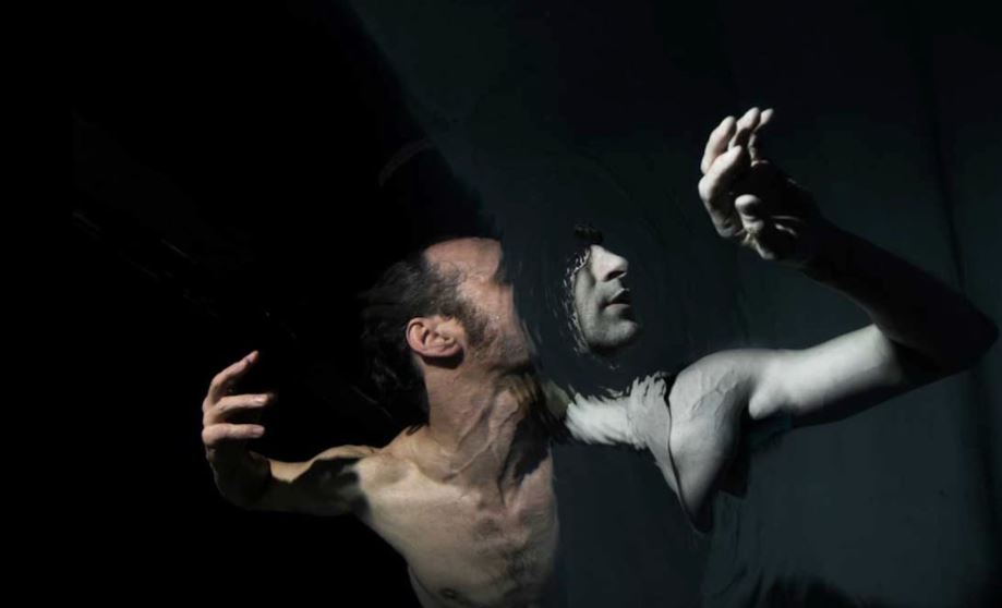
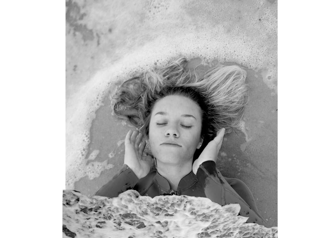
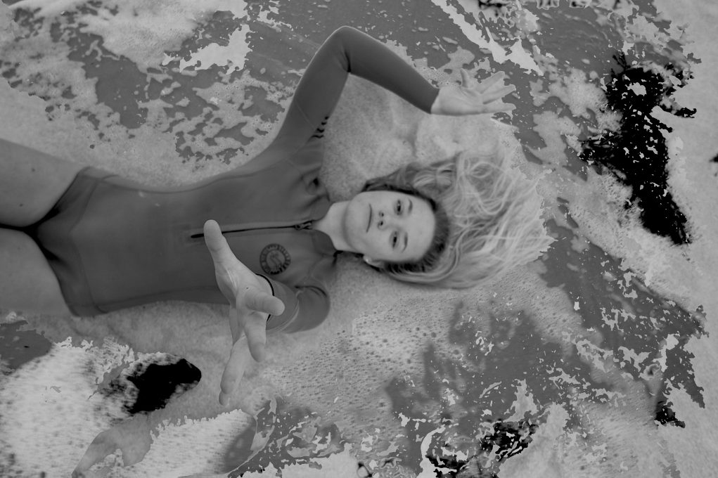
Second comparison:My main inspiration for this was themes of isolation from the behaviour of water, my image is a lot more abstract with a strong essence of movement, yet still has a similar composition and a similar facial expression to the artists work.Due to the unreliability of how the sea would be I think this is the most accurate presentation I could have to the artist. My other images all still carry the same concept of her work throughout.

Overall evaluation of project and final display:

Overall I think this project is very different to any work I have done before and very diverse within itself which using collage, themes of nature and behaviour; and finally  mirroring and editing techniques to remove features of a persons identity.I am happy with the final images I am left with and think they do reflect what I originally wanted to show through my work from the start. My work is clearly inspired by my artists but not a complete carbon copy,making  sure to add my own technique or additional themes of  human behaviour, isolation or loss of identity. when focusing on the words of:codes,conevtnions and secrets I feel as though I have touched on them all, being the ‘conventions’ of human behaviour and how we as humans are influenced through others behaviours,and also the unreliable behaviour of nature. Secondly ‘secrets’ is seen through the loss of identity and removal of features alongside the lack of presentation to people we think we know. lastly ‘codes’ is seen through the repetition of these characteristics  throughout many groups of people as if it is a code to be followed. There is a large range of editing between each shoot, the shoots are more concentrated on removal of identity I edited out significant features and used this to enhance the images.I also used photo techniques of mirroring and collage ,so overall using a large combination of many different ideas.The majority of my work is purely tonal shades of black and white, this is due to this being more appropriate to the pieces and themes behind them. At the beginning of the project I wanted to focus more on surrealism and I do think I have incorporated  some of these themes into my work, although I do think it has come out more of a direct portraiture observation,but with a complex presention and still does not fit wihtin the generic conventions of portraiture work.Overall I think this project is very unique and does apply to my themes and the outcomes I think all work well together.


Ability seen within images

your technical ability to record using a camera / lens:
For each shoot I have used different settings on my camera, each with the different aim to either capture,motion,light or a specific focus on my images.To do so I used large lenses to be able to  capture detail and movement within all my pieces,additionally I put my camera setting on macro to be able to capture the detail of the image and not have any blur as this is not the effect that I wanted to capture.


your ability to select and edit images effectively:
when selecting my images I wanted to give a variety of techniques and presentations of human behavior,I have done this by choosing three separate shoots. I chose my primary shoot to be focused on the combination of human and nature behavior and how when formed together present the convention of loss of identity and isolation within the water itself.I chose this shoot as it it the most creative shoot with the combination of editing and real captured shots,I think overall all the images are very dynamic and able to work as individuals too.


your ability to respond to a key artist:
as previously shown my main aim for every shoot was the same theme of human behavior but my inspiration for each shoot was inspired by a different artists,although the main two artist for my final images was Midori Harima and conni imboden,both of their work is used presenting people in different mannerism and showing a more gruesome side to their personalities,I have shown their techniques using collage and additional editing techniques of removing eyes and finally submerging people within water. 

Final images and possible additional editing

My first final outcome range

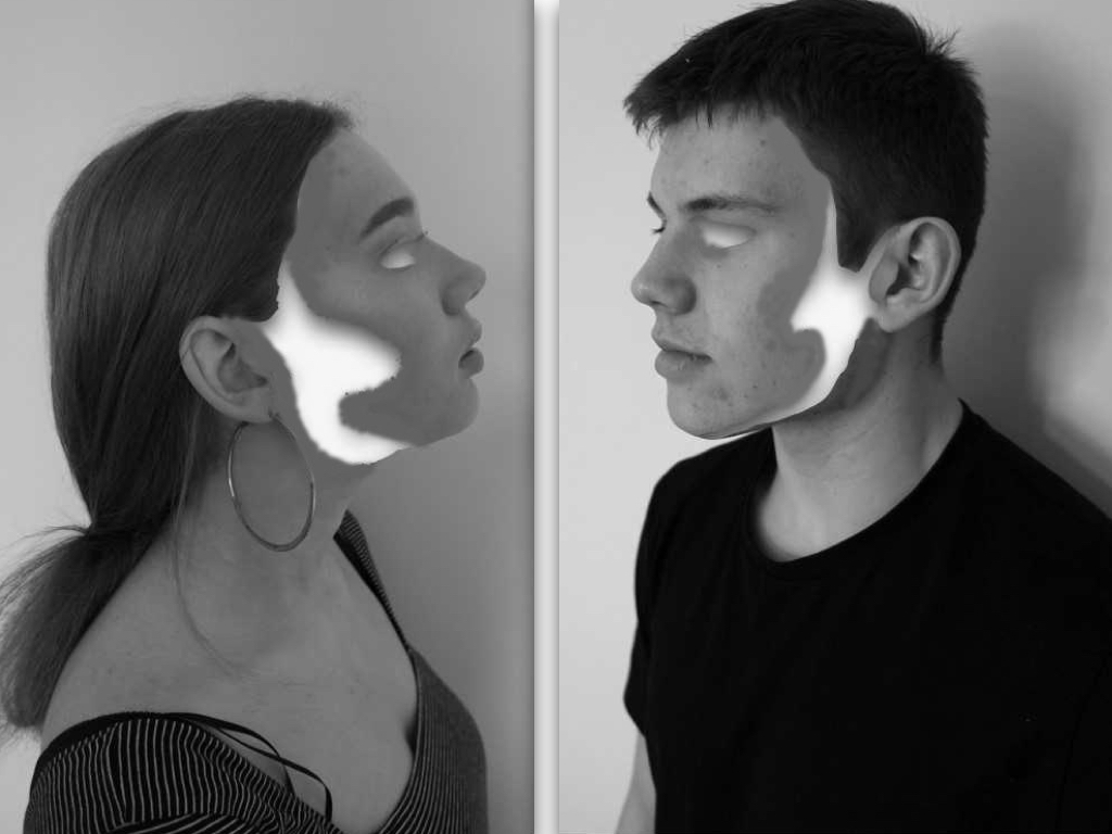
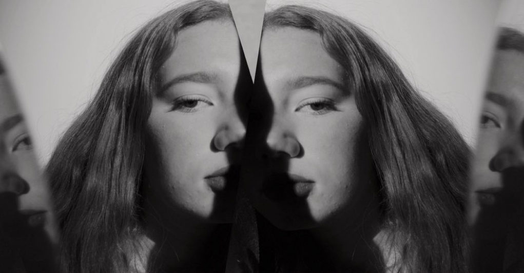
I chose this image as it contains a mirroring self removal of identity and questions the codes and conventions of people and how they act in groups when presented against another being. I think this is successful due to the tones and the removed fragments but after consideration I do not think is the most entertaining or edited to the level I would want for a finished piece.

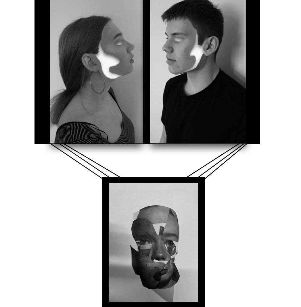
I chose this to be a final image as it successful conveys my themes of presenting many aspects of human behaviour and emotion presenting one identity and being, due to this being a collage of a photoshoot I had done it is increasingly abstract ,tonally and yet also demonstrates a distortion wihtin people and a secret that we hold in out identity. Overall I think the composition of this image is interesting and still allows a three dimensional  aspect of realism. I think this image has such a strong impact and I would want the size around a3 and to be printed on its own on a large black canvas.

This was originally a development idea for a final piece but I have since released I do not think the top piece is the most successful, because off this I will continue on the idea of hanging the collaged face piece but accompanied with a different piece on top. 

This image I have decided will definitely be accompanied with the collage piece, as it is interesting wihtin the mirror lines and the shades and again connotes a direct eye contact and a humanness mirrored of different emotions of different self, it proposes the idea what is real and if what we are seeing a a reflection of something untrue or if it is real.

I was considering this piece as a final but then have realised it,s not the most effective due to the editing not being the best and not finished to the standard I would want, although it would work well In a series it is not the standard of image I would want  to show.

Second final outcomes

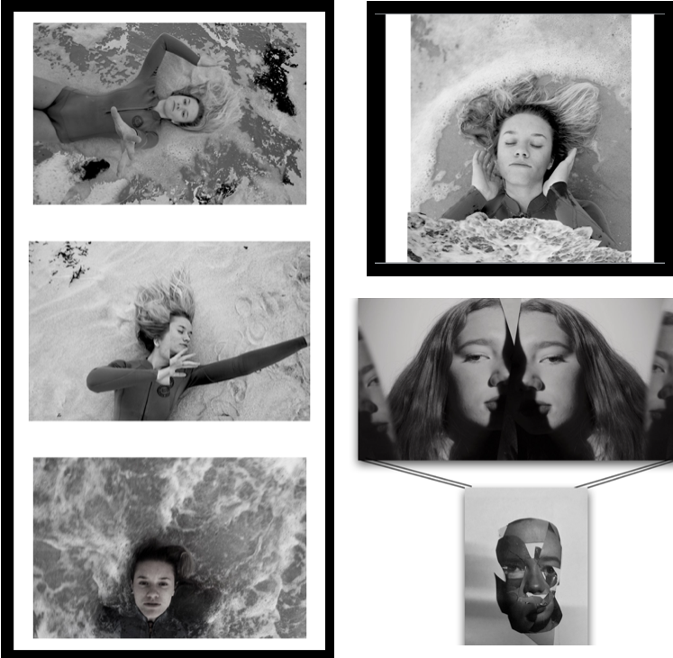
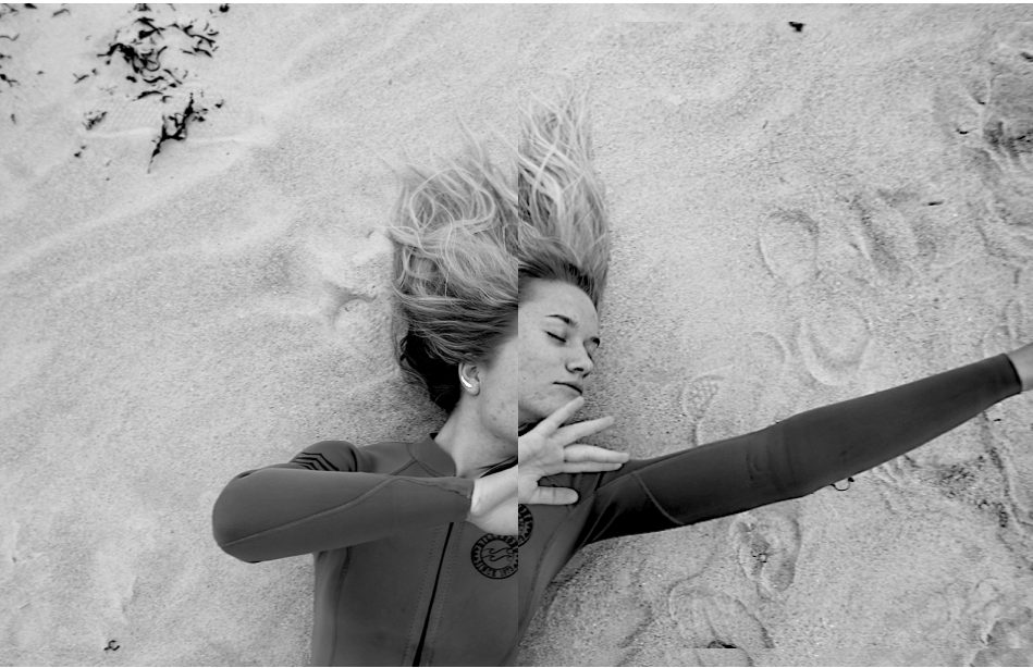
I then decided to focus on these following images as I think the moulding of the behaviour of nature and humans is more effective and the unpredictability of the water accompanied with additional editing has made a more accomplished set of images. I will have these four images as my main set, but separate this profile image and have it as its one successful separate image. I think this image is interesting with the amount of circular curves around the person, this allows a secret of hidden identity and being submerged and separated from society from being wihtin the water. Additionally the wave from below is interesting as it connotes tones of smoke and a gradually movement to the piece.

wihtin this image there is an emotion of isolation but it is highly accomplished and effective with the isolating pale tones of water contrasting to the darker face and direct eye contact to the camera.The composition works well as the face is at the bottom of the image as if it is being swept away.

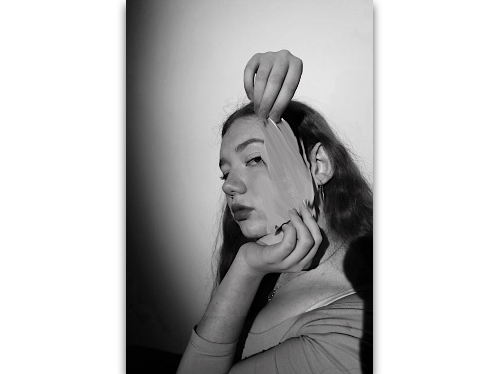
This images I wanted to show a removal of being and an aspect of  trying to escape the image, this simple editing enhances the image and still holds a simplicity.I chose this because it too still sticks to my themes and will work successful among the others. 

lastly I chose this images as there is a syncricity wihtin the previous and holds themes of escapism and surrleism within the hand almost coming through and out of the image, the textures on the floor also enhance a movement being surrounded by the water.Overall all these 6 photos(2 sets) of images will be successful and still convey human behaviour in two different environments and subject matters.

Jesse Draxler:shoot 4

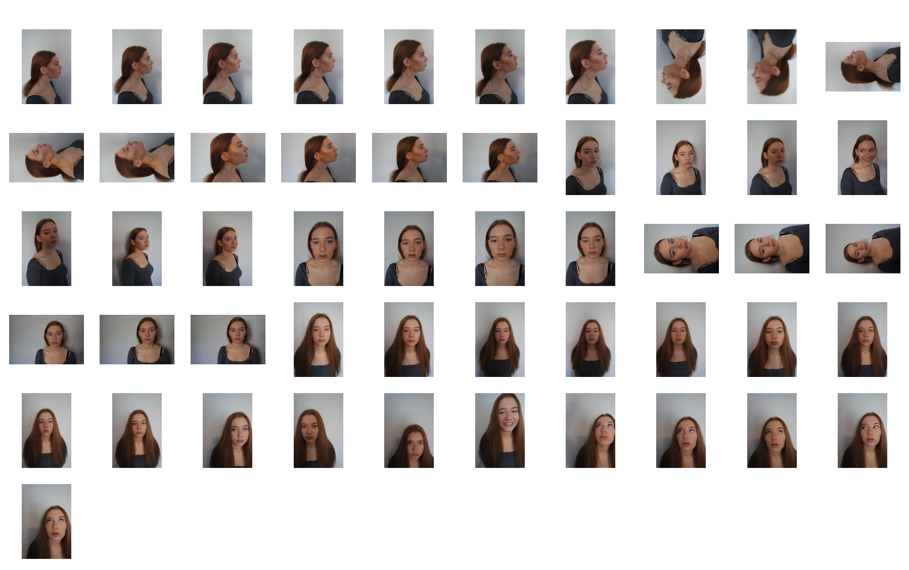
For this shoot I really wanted to focus again upon the conventions of human behavior being  neglected and removed from being treated as a person as this is what the artist does. I wanted to edit the images in order to reflect a personal emotion onto the image and present how human behavior works through the overall representation of the image itself.

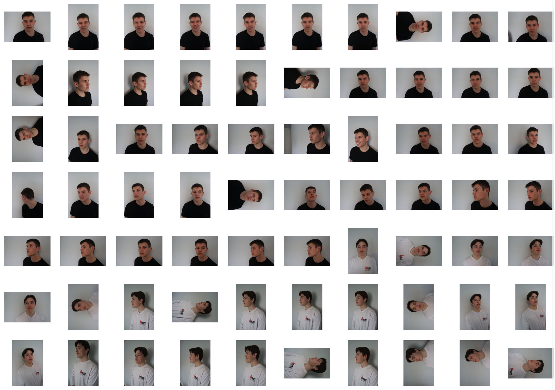
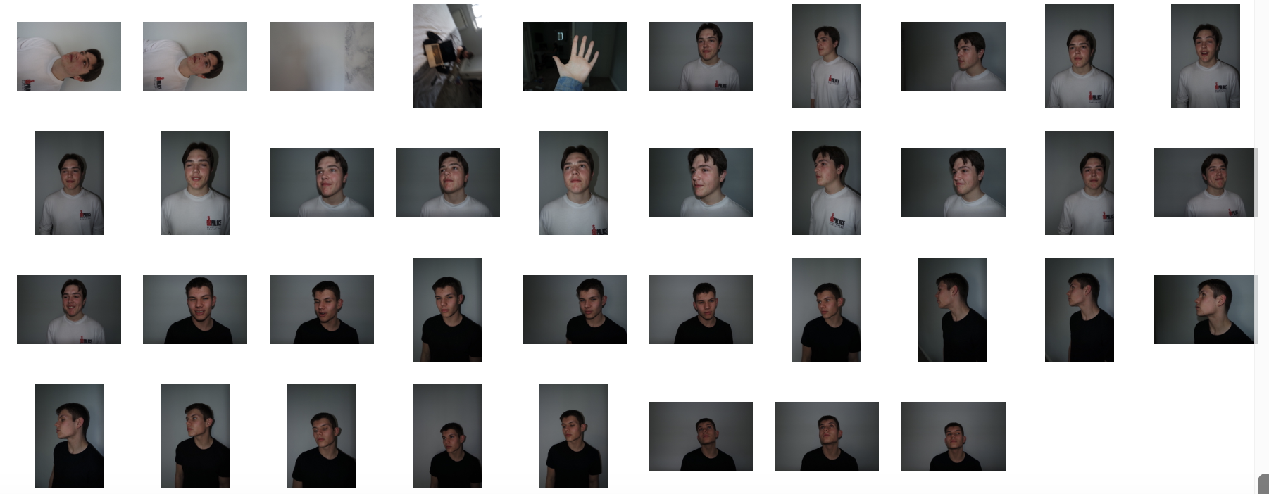
original photos,contact sheet:
Final edits:
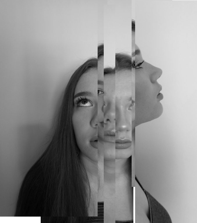
For these two images I was inspired by some of draxlers images where he cuts different profiles and angles them up in order to form a new composition of faces and a new style and angle to the original.I wanted to completely alter the images in order to create a whole different meaning behind them.
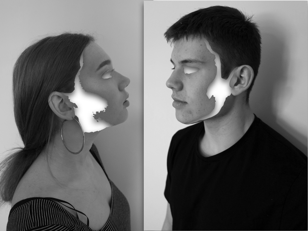
The editing for these images I  wanted to connote the removal of identity and how the unique abstract purposes a complexity to human behaviour. Although there is still a strong highlighted effect of surrealism within the images,the effect of emptiness creates a sense of suspension and secrecy within the image as they no loner represent who they are.
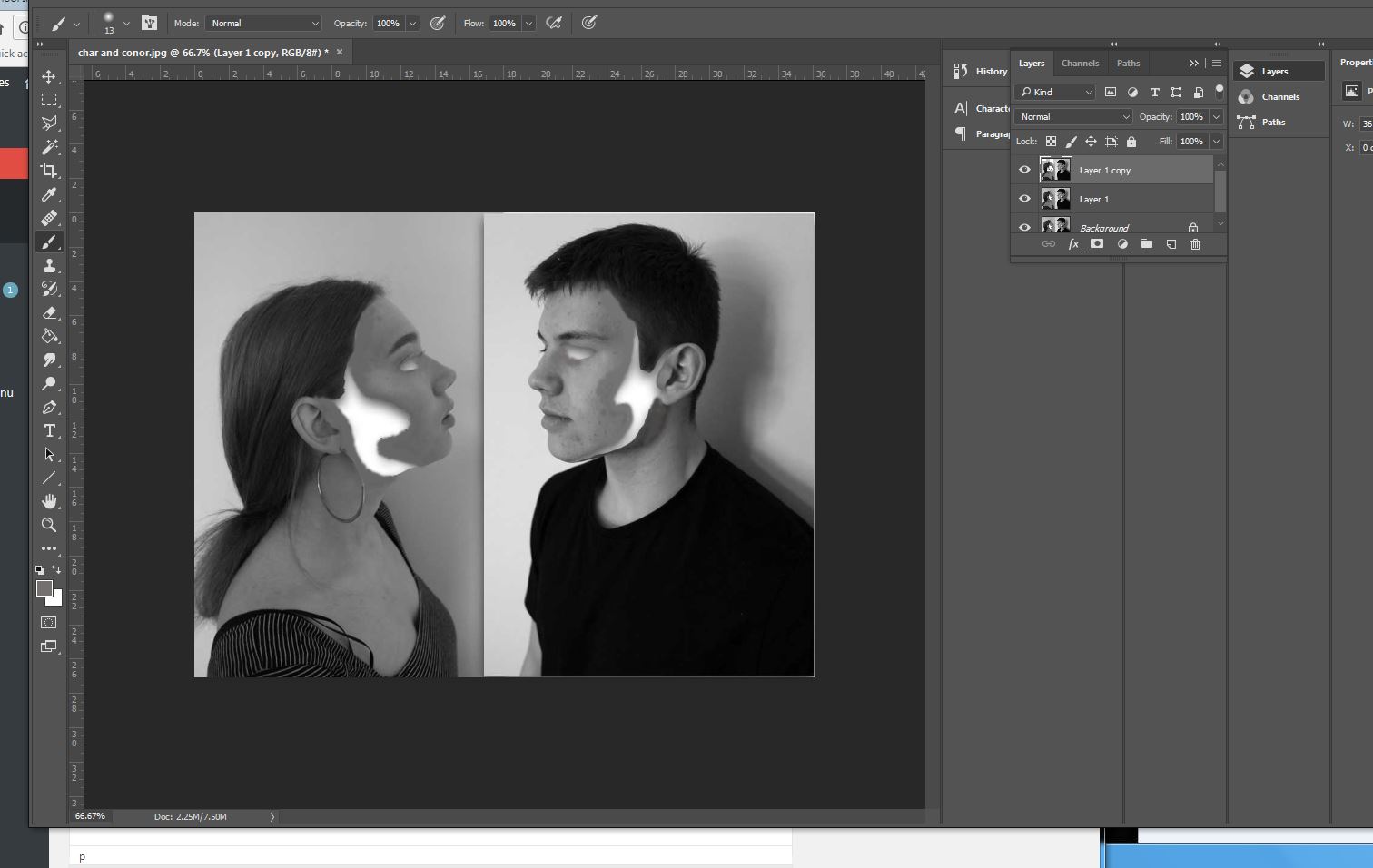
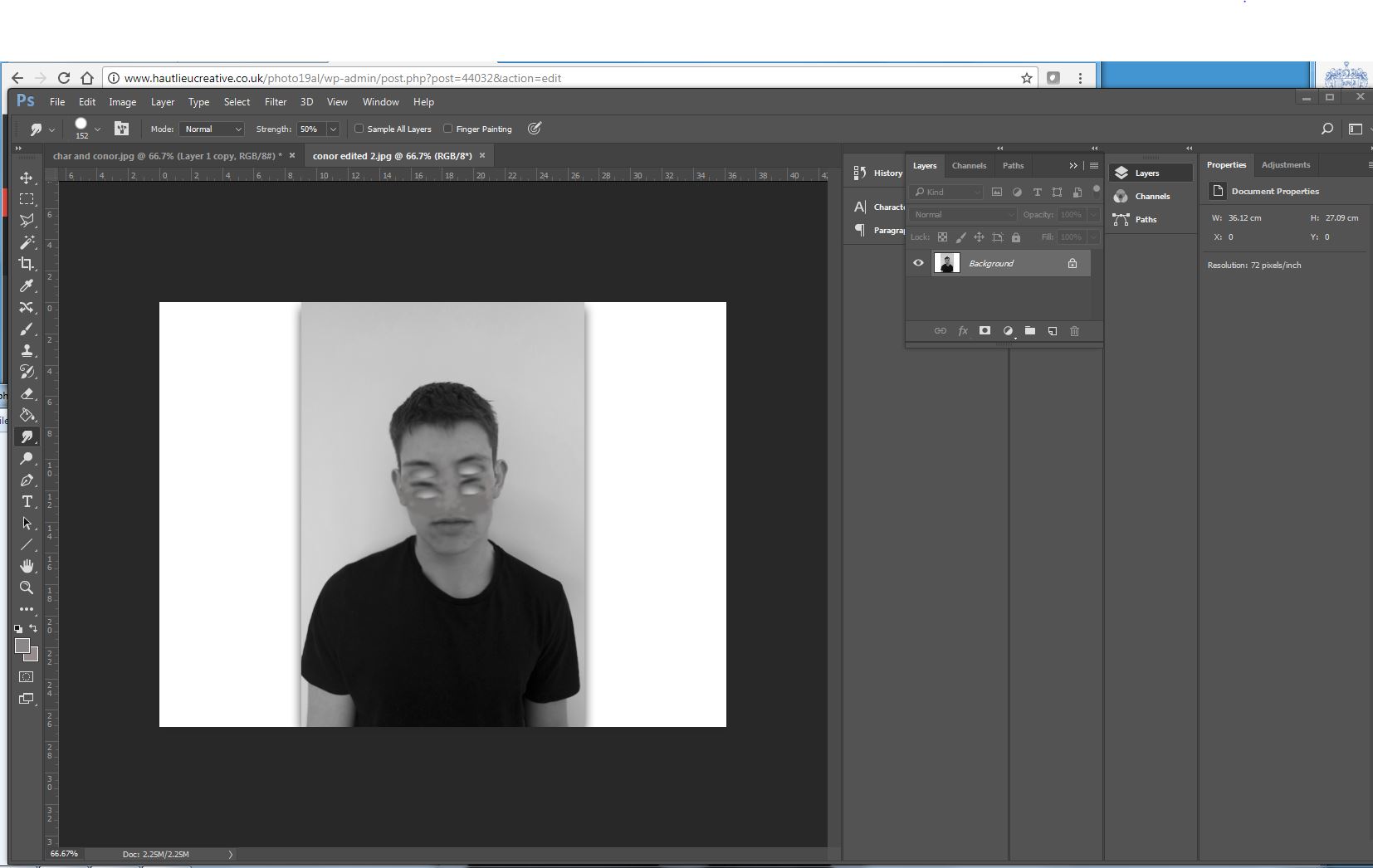
To edit the images I wanted to remove sections of structure and a flowing sense wihtin the face, In this case being the cheeks line and the side of the face,addtionally I wanted an absence of eyes wihtin the images, to do this I used instant alpha and removed sections at a time,but it was not as smooth as I wanted the overall image, because of this I filled in tonally with the brush tool with the same skin tone and rounded off the edges.This is more effective and creates a better overall finish to the images.lastly I created shade within the inside white area to create a more three dimensional real effect to the images.

Final edit:
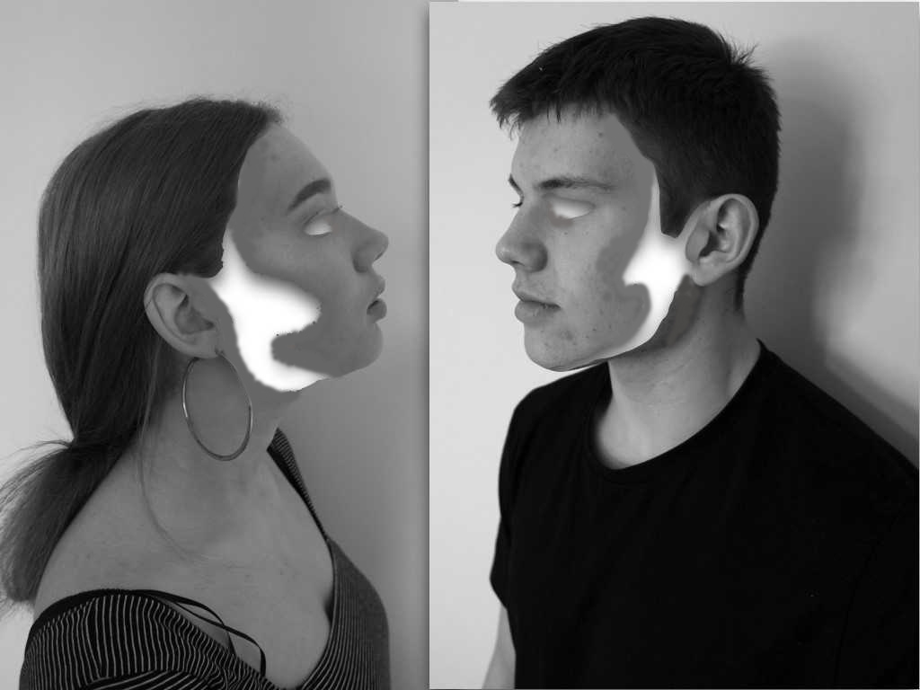
Similarly with the previous image I wanted to remove the eye but then copy that section below to form many missing sections of eyes, again to do this I used instant alpha and then used photoshop to smooth over the image and make it seamless throughout(using the smudge tool),This image is meant to presets a mask to identity but still an absence of our real behaviour.
Final edit:
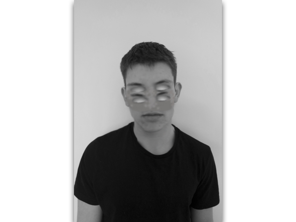
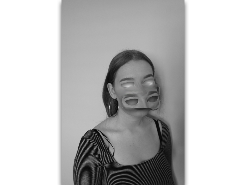
similarly I repeated this technique but wanted to form an effect of a mask so not blending the eyes in but showing a shape that has been repeated, to do so I experienced in different methods to find the most successful:

 

Final edit:
Final edit:This image is purposely experimentation to try and remove and cover a different sense of identity and not just purely eyes.
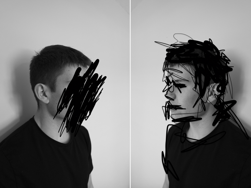
The next two images I think are less successful and more concentrated on experimentation;within these images I wanted to find an interesting composition of repetition of faces of different angles and edit them all into one to from an abstract and surrealistic piece. I did this similarly to my artists inspiration of demonstrating the combination of many different human emotions that we have and representing this in an abstract method.

Final edit:
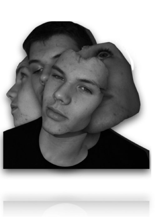
I edited the images by removing the body and editing only the sections of the faces that I wanted,I the framed them into an interesting composition and surged the lines to form a more synced piece.

Final edit:
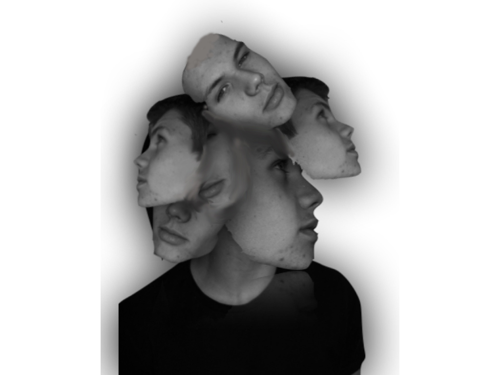
Overall I think the most successful images was the removal of facial features, this is due to the most successful editing and a simplicity but effectiveness of connection of human absence within the images themselves.