Category Archives: AO3 Record Ideas

Filters

Author:
Category:

FIRST SHOOT

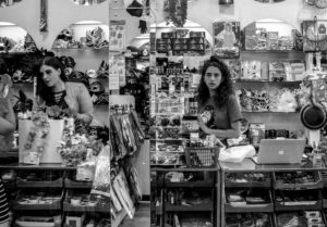
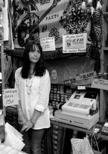
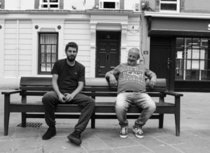
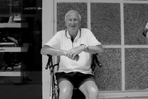
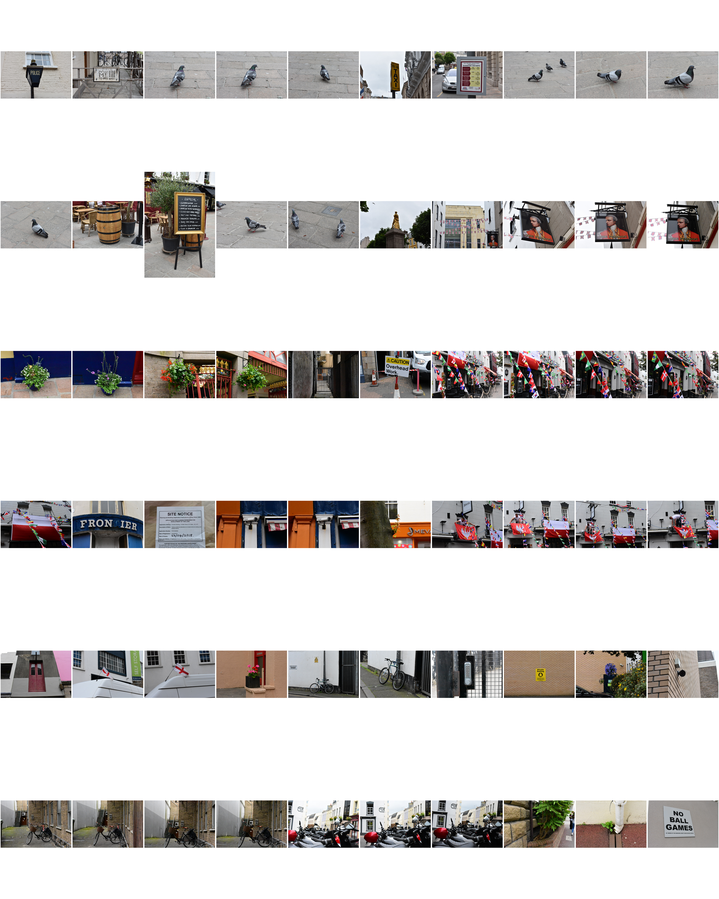
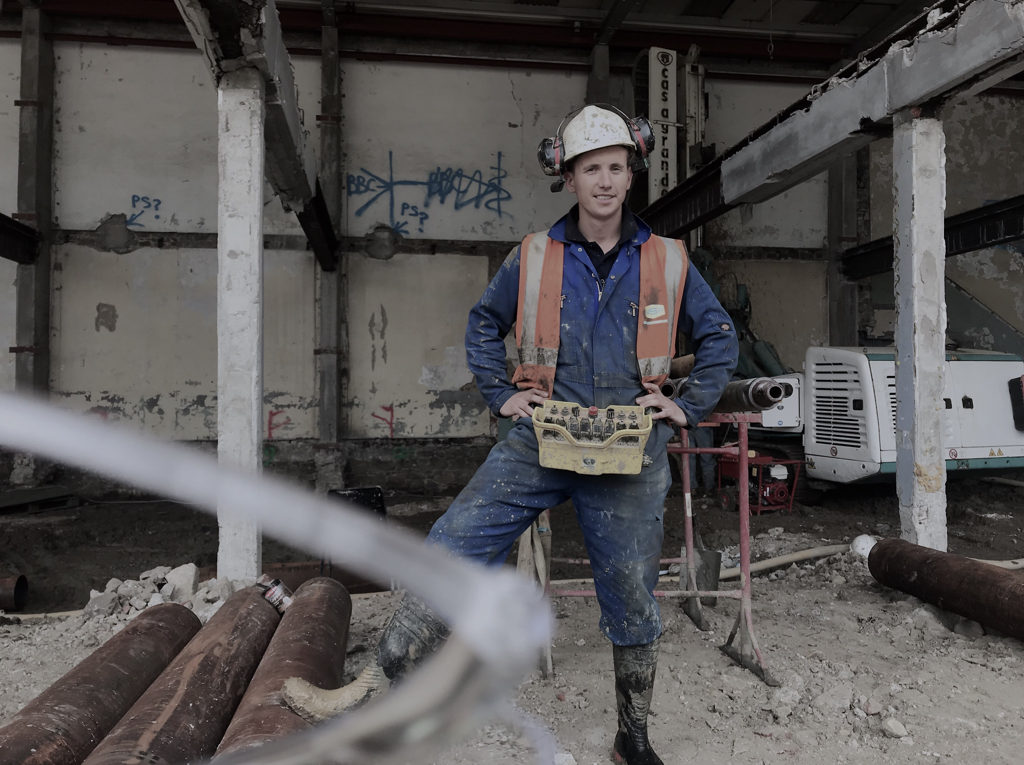
This was my first shoot to get comfortable with talking to people and taking portraits of people in the streets or working in shops. This photoshoot was to collect environmental portraits of people which I found mostly worked when people were working, or when I walked past a peculiar scenario or set up of people in the streets. This shoot helped me to gain an eye for looking out for interesting scenes and people which in a way gives as much insight about me as well as the subjects in each photograph, as these pictures are essentially a collection of what I like and find interesting.

EDITS

I decided to edit these pictures in black and white because it creates a more formal overview of the pictures and a different aesthetic essence within a photograph that you cannot achieve from a coloured photograph. This editorial decision has also derived from inspiration of Walker Evans’s ‘Labor Anonymous’ where he captures portraits of ordinary American ‘labourers’ or workers on a Saturday afternoon in Detroit. Although the photographs do not necessarily match Evan’s in terms of the set up of each scenario, there is the same idea of photographing a group of people – the people that make up St. Helier. I do like the idea of exploring typography within my design and editorial stages later on in my project.

Third Shoot in St. Helier

My Edits

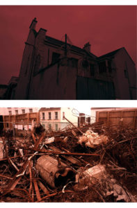
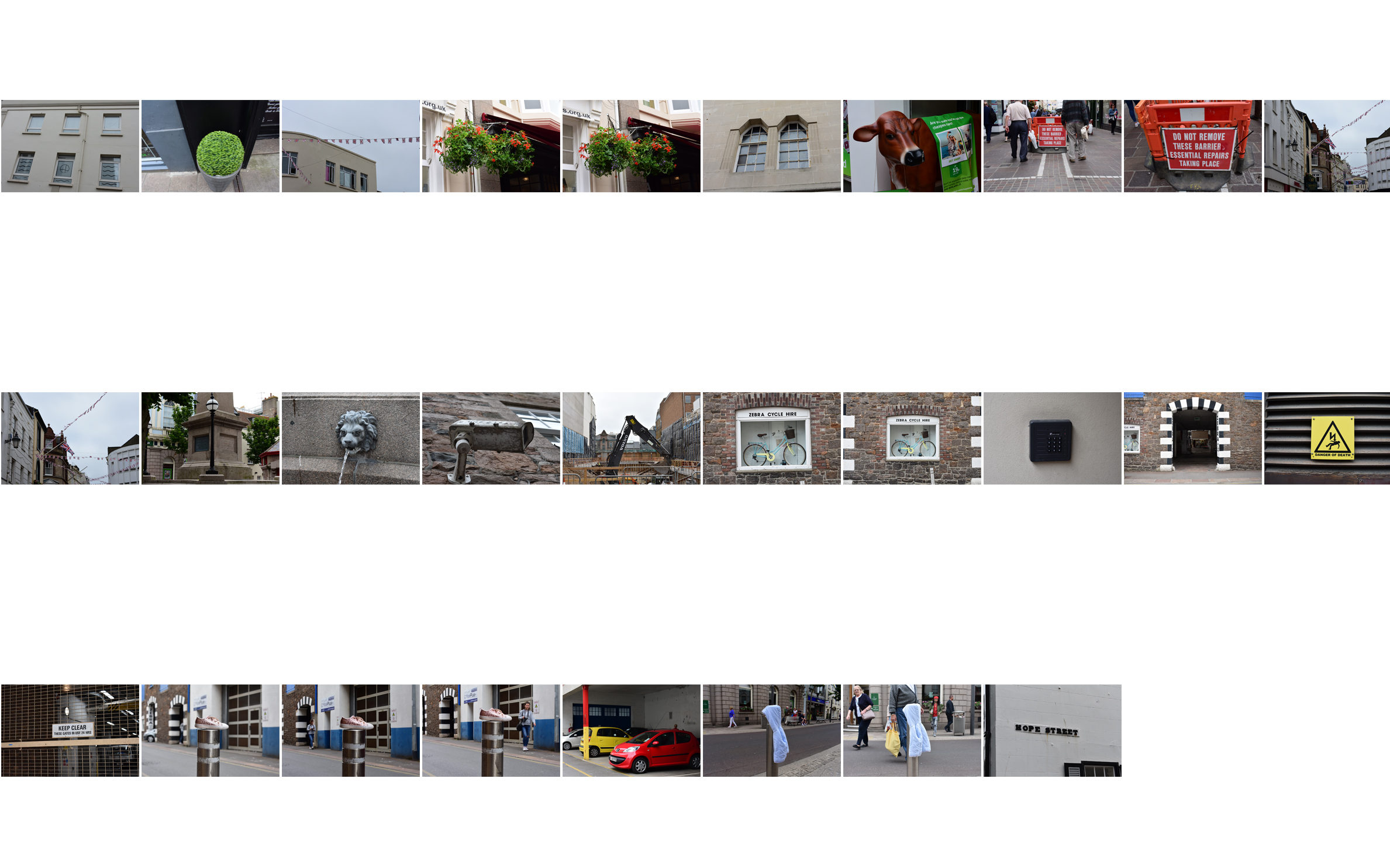
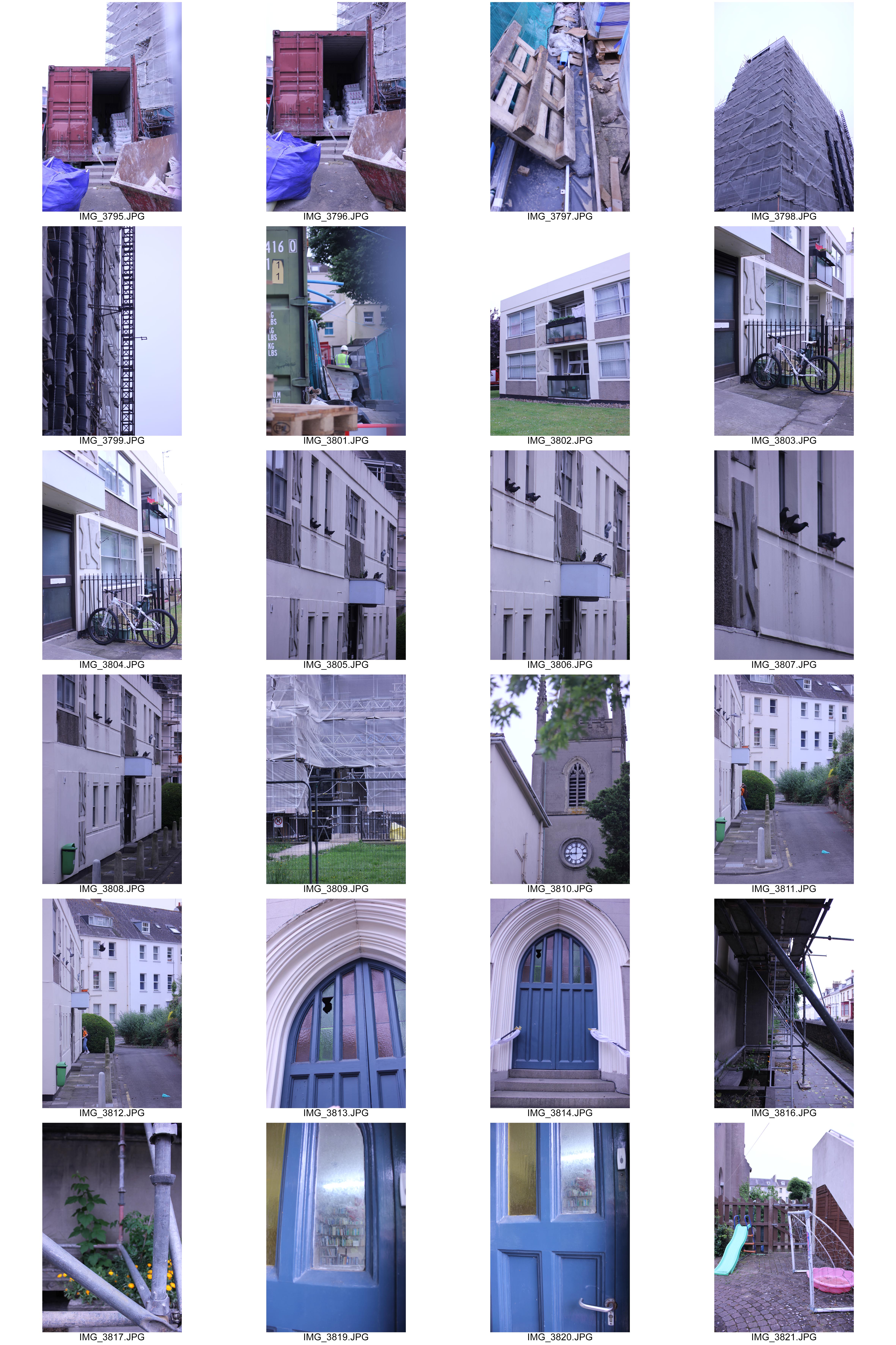
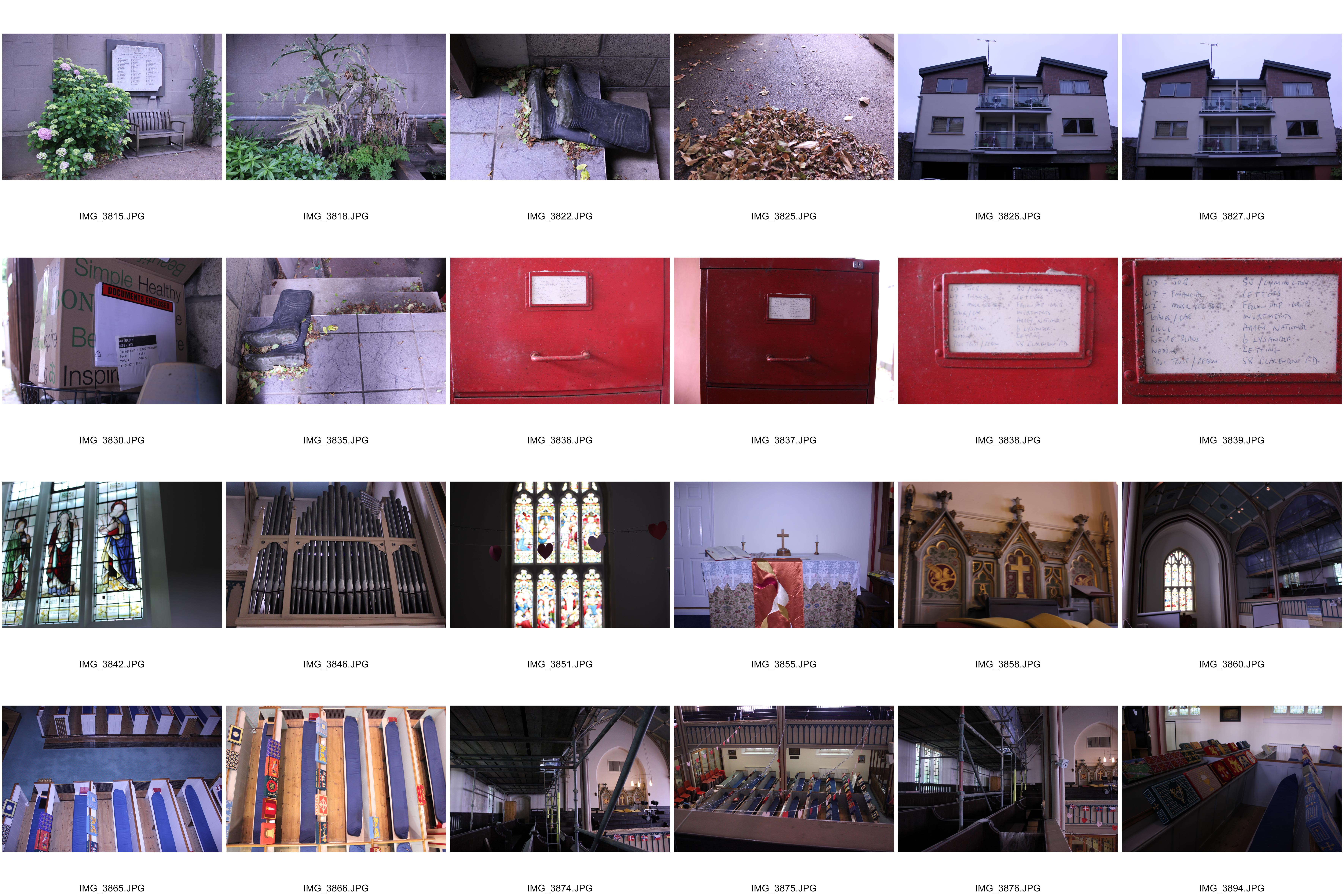
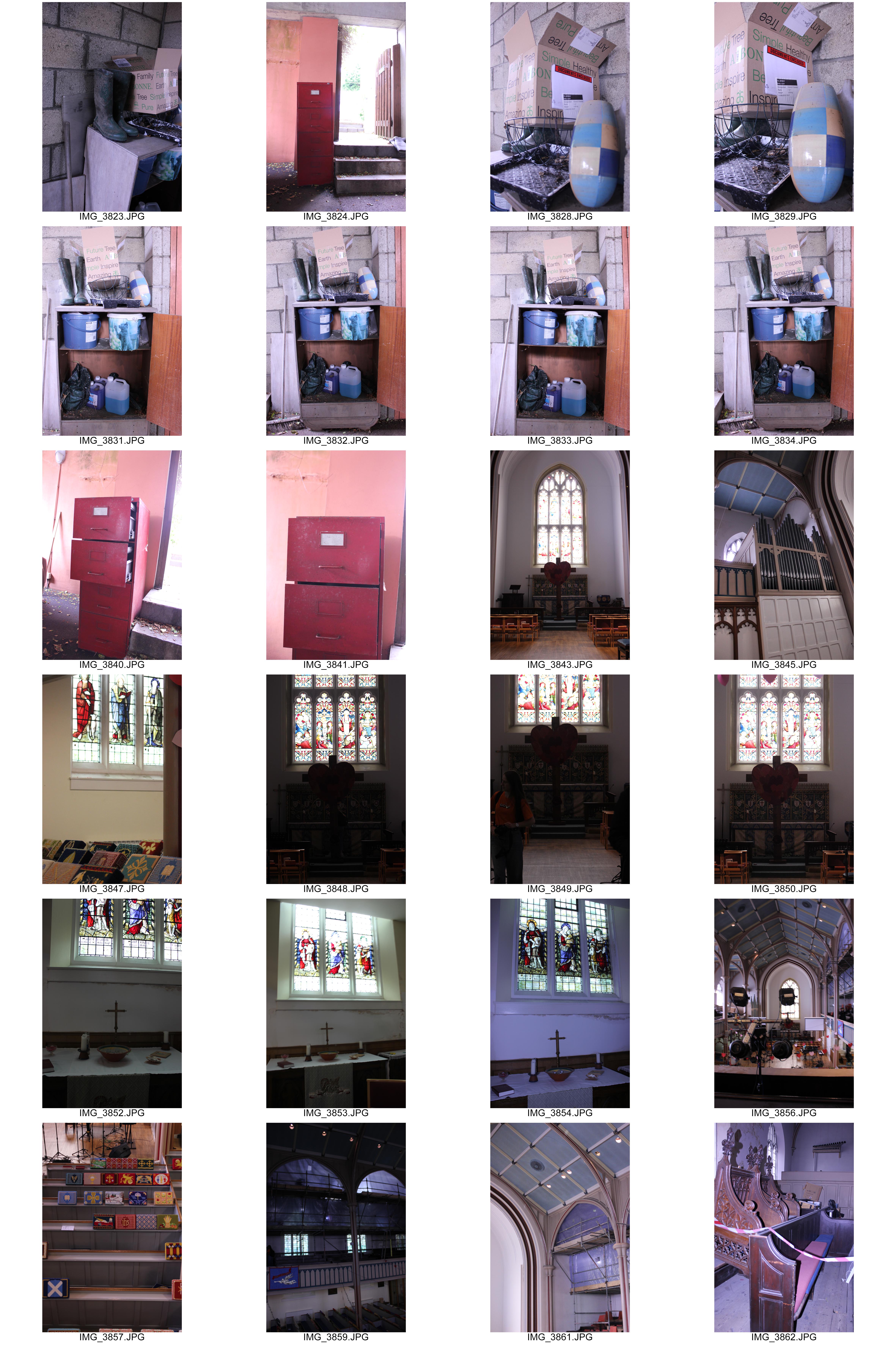
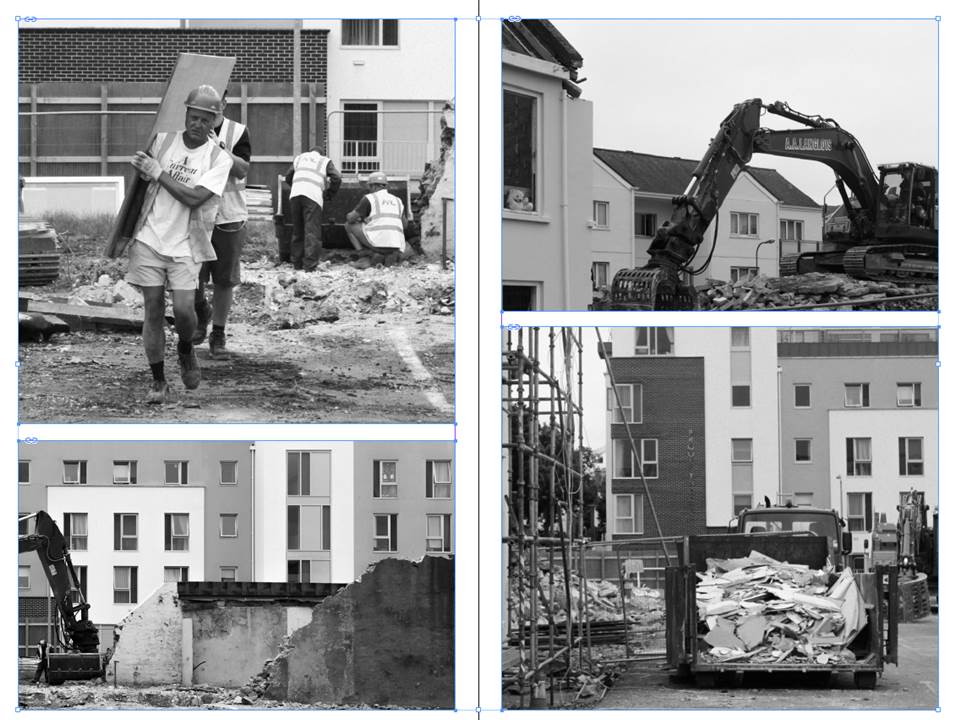
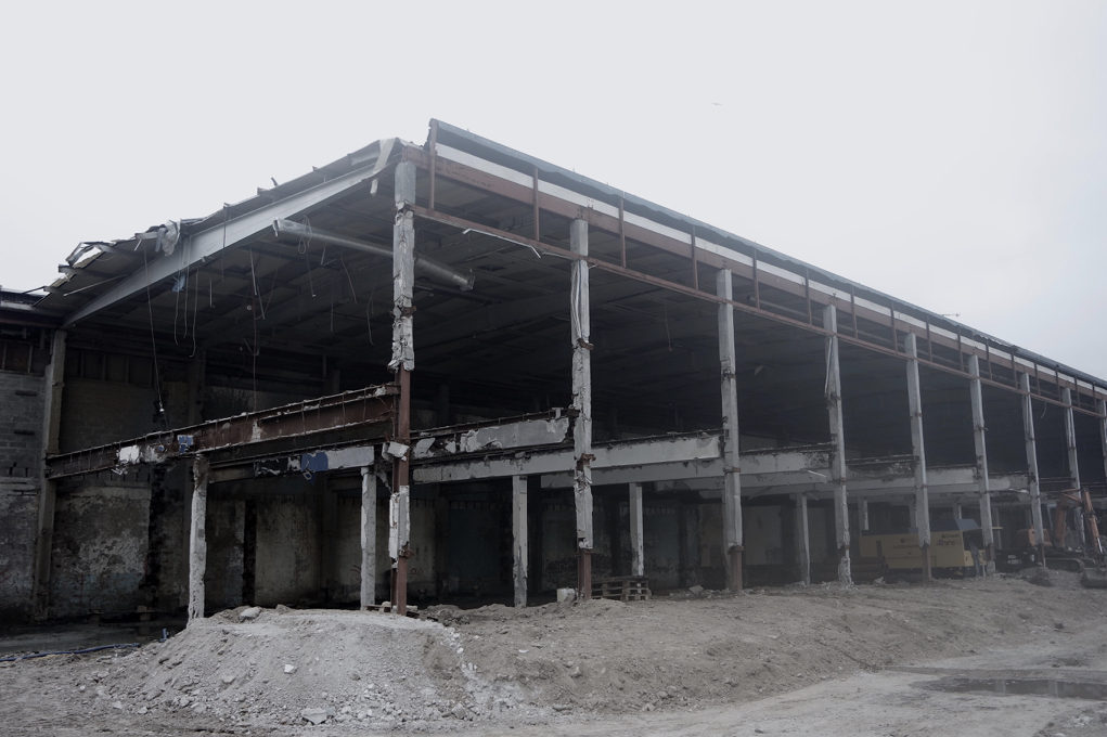
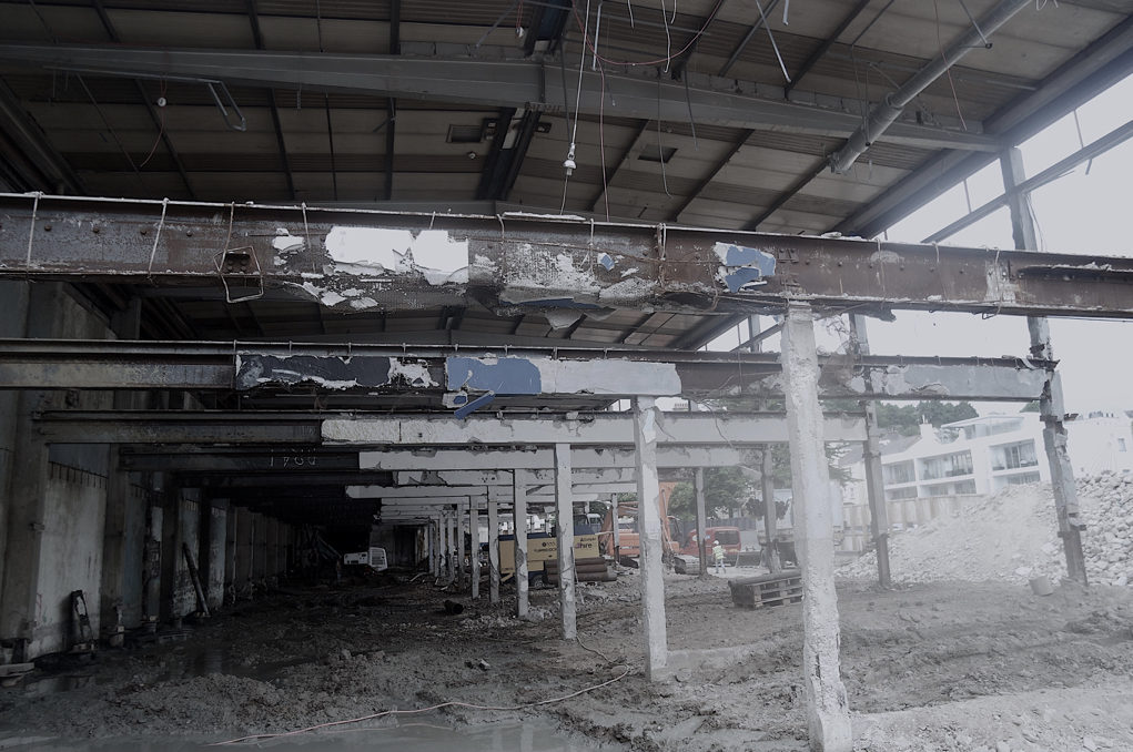
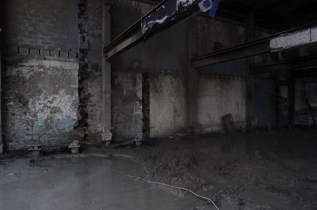
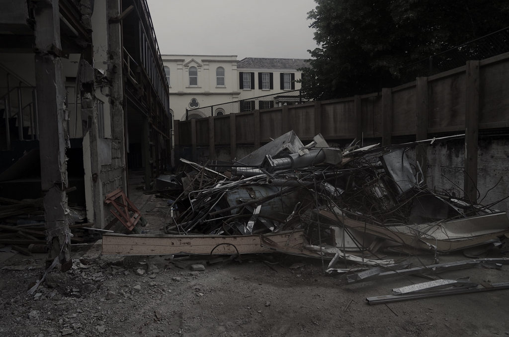
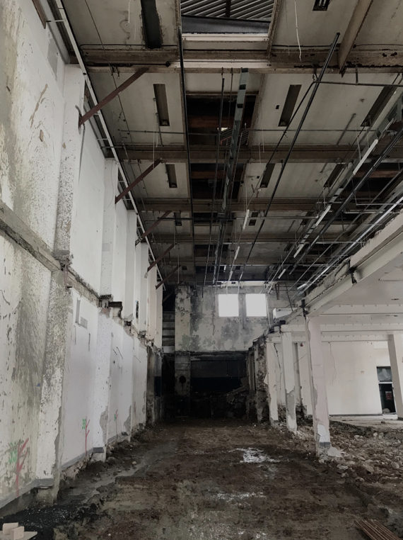
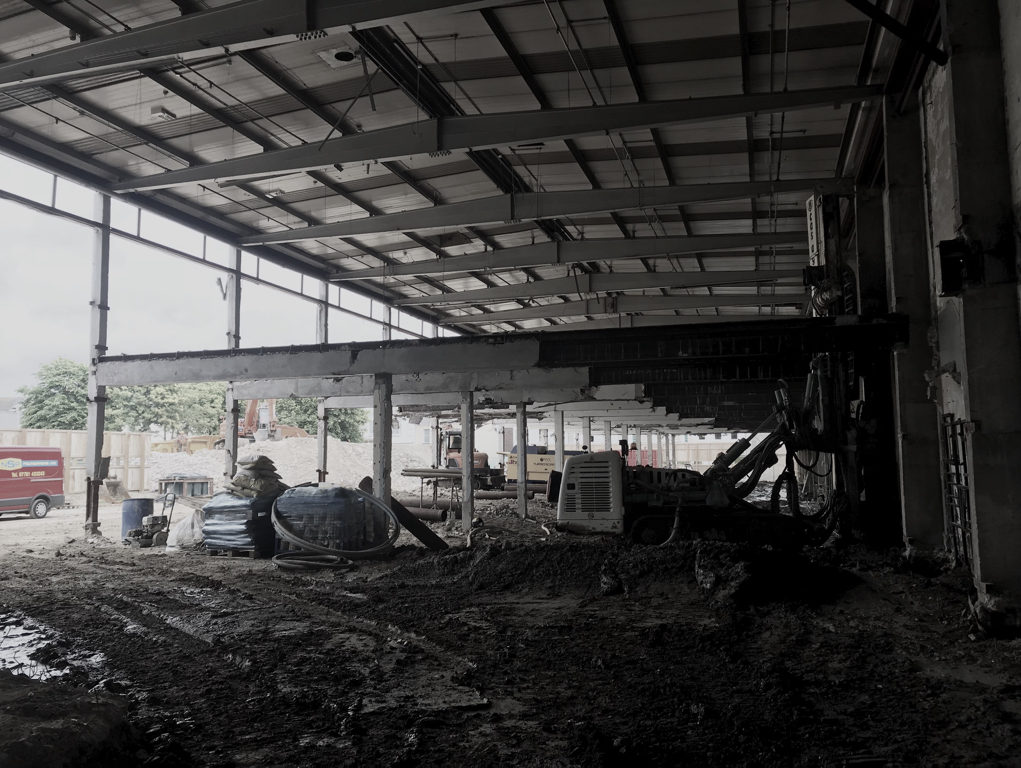
Below are my edits from my third shoot in St. Helier. In this shoot I focused more on the structures and greenery within the area to create a small selection of photographs. I have already selected my layout and my final photographs for this project but I felt that it was necessary to return to the area in order to see if there were any points of interest that I missed. I found upon returning to the area that my main point of interest – the building site – was demolished. The site for this is shown in the last photograph.

Final images and jersey archive inspiration

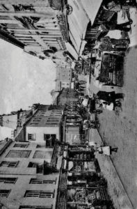
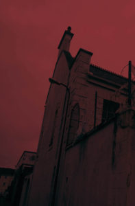
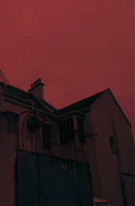
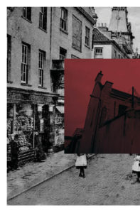
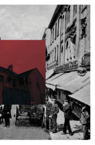
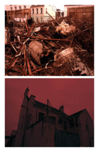
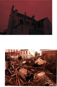
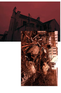
  • For my final presentations I not only wanted to incorporate my themes of the progression and modernisation of st helier but also the way in which I could demonstrate the history and st helier through the archives. I through I could express these themes tonally and show intentions of what the original images would’ve been similar to. I was inspired by themes of documentary photography, this seemingly objectivity should be the ability to convey the impression of an unmitigated image. 
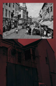
  • The images have  a range of colour overlay experimentations to show a vibrancy and show a senses of life to st helier itself. I was inspired by previous work as colour allowed a free expression and eye catching attentions to the composition nd layout of the images. Howver I think my work has many features of arcjitextual and urban landscapes better complimented wihtin cooler tones, these simplest comparisons present a pre occupation to different sides of st helier and the community and architectural interest wihtin the areas. 

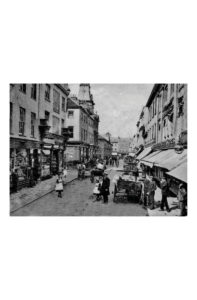
Jersey archive:When thinking about jersey archive I wanted to visit area of great prominence to st helier,i think it is interesting of how time shows the development and also deterioration of an area and allows the community to be subjective upon what they think about it.

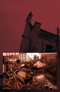
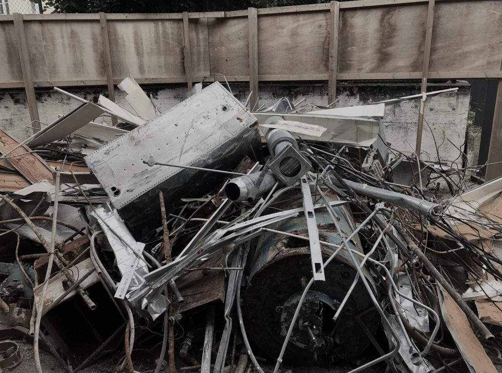
overall:My aim was to achieve a complimentary colour, composition and overall feel I want to convey of st helier.When speaking to teachers and other photogohers they agreed the most successful and complimentary images are those which represent jersey archive through the time difference of old and modern while still representing the area and mostly in an urban way. the colours I have chosen I have edited in such a way to be similar in their tones and have the same red themes throughout. all of these images demonstrate a process of destruction and reconfiguration of a landscape to form a comparison of St Helier itself.It shows a evolution of an area, time and the people living within the area itself. lastly I wanted to concentrate on the composition of he piece and experimentation within how the images can be presented to the audience with the most effective way.


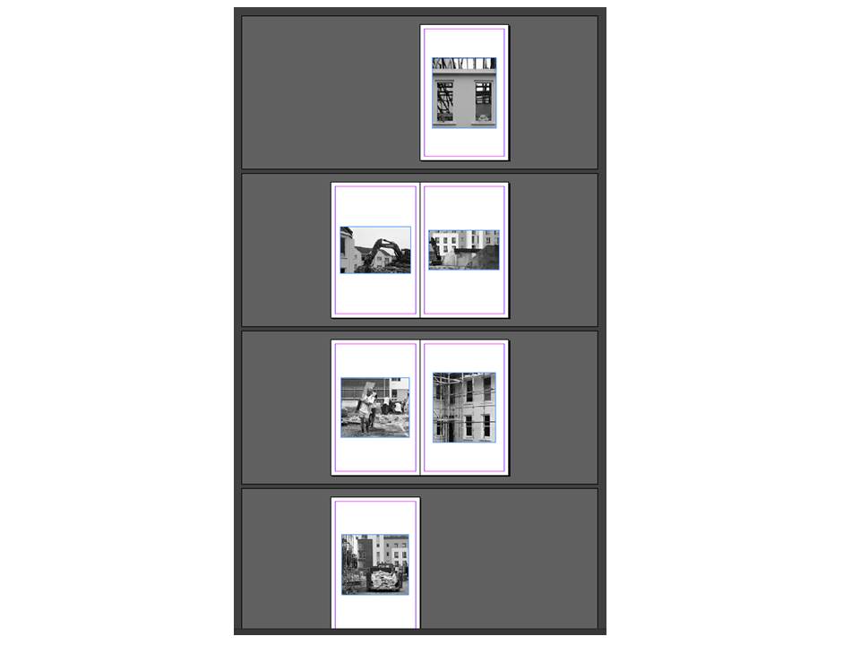
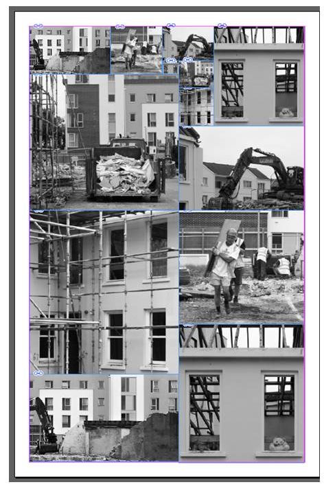
The lower compositions are too segregated and do not have the correct flow to what a double age would need in a magazine. I have further experimented within that could be my final composition.i could incorporate more experimentation within the architectural construction pieces I have as these also further develop a sense of work ethic and a life to st Helier and the property development within St Helier itself.I will definitely grout and develop an additional shoot for my St Helier project in order to grab a different angle or St Helier and the modernisation and constraint changing to St Helier itself

Independent Study 2

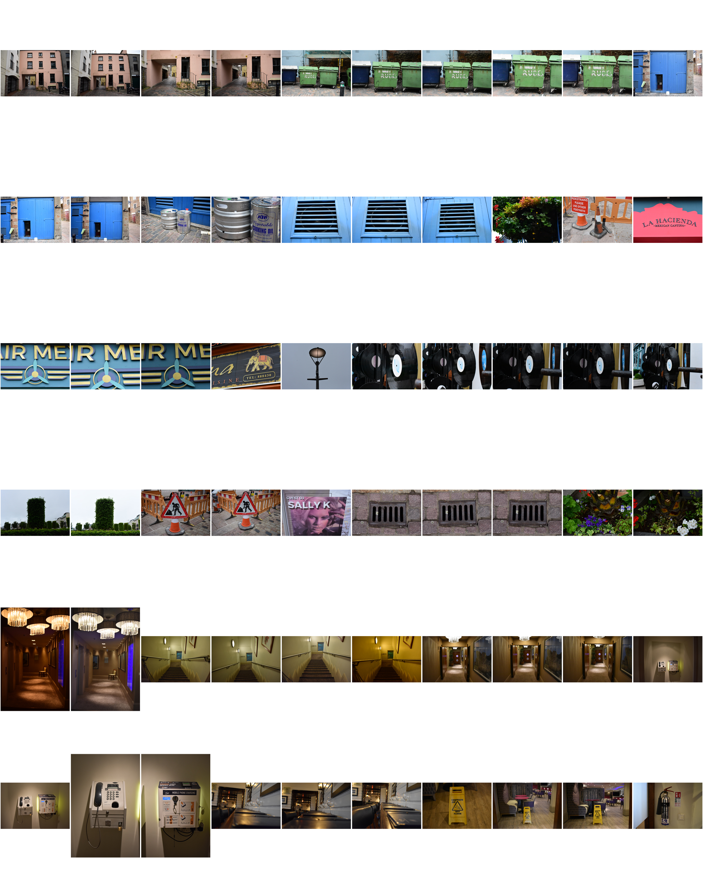
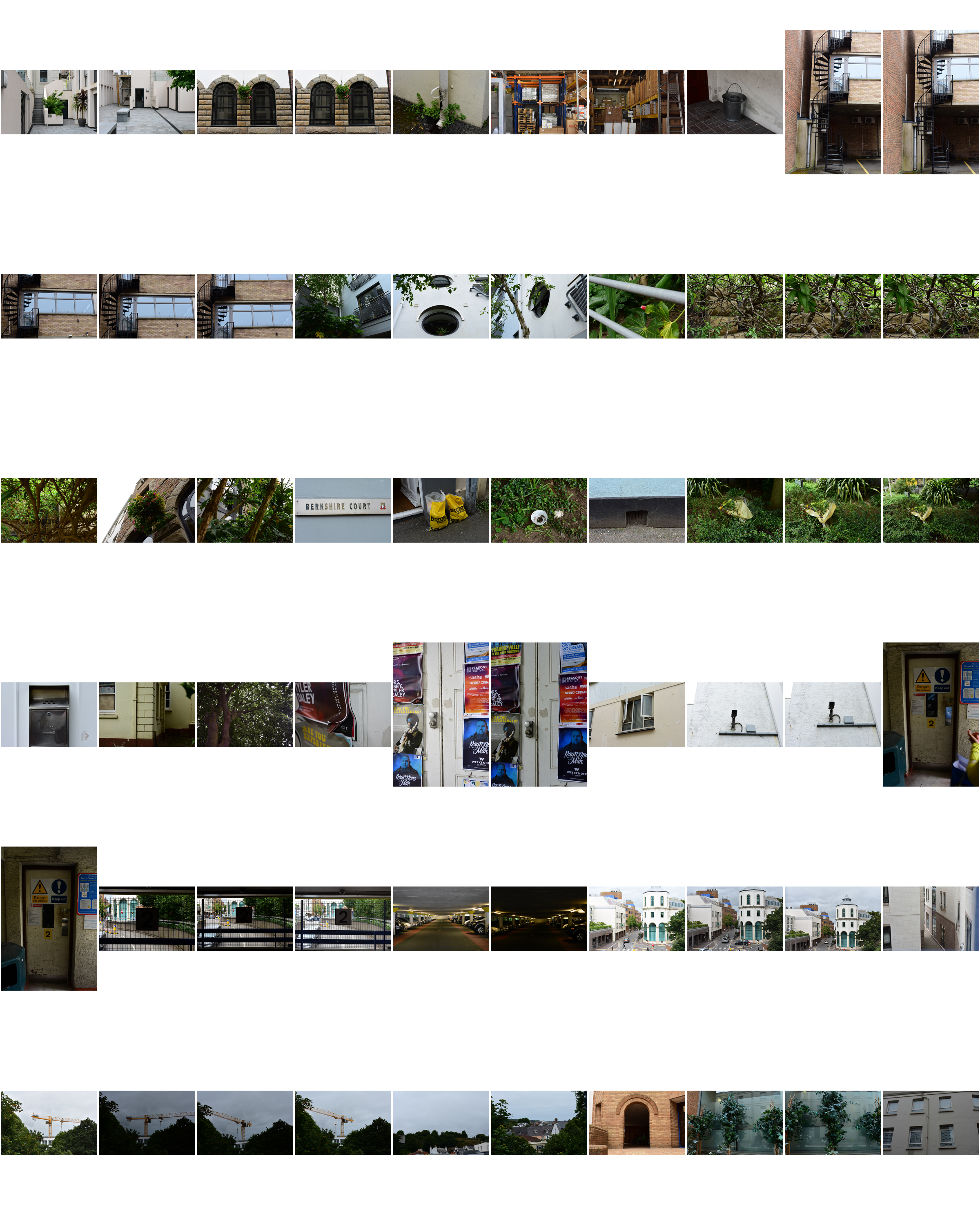
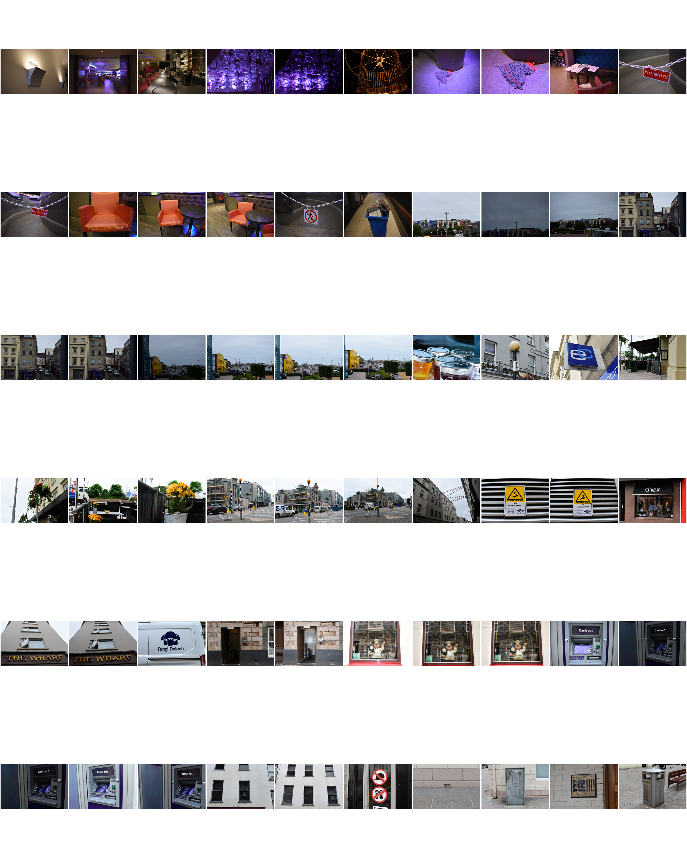
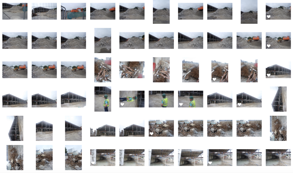
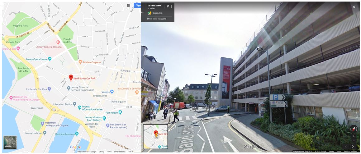
For my third photoshoot I wanted to focus on the more of the industrial aspects of buildings in this shoot. I first visited Sand Street car park which is surrounded by houses and buildings being near the centre of town. I also wanted to walk around and explore the roads in that area to fins more industrial buildings and structures. I narrowed my images down to 60 and displayed them below in a contact sheet.
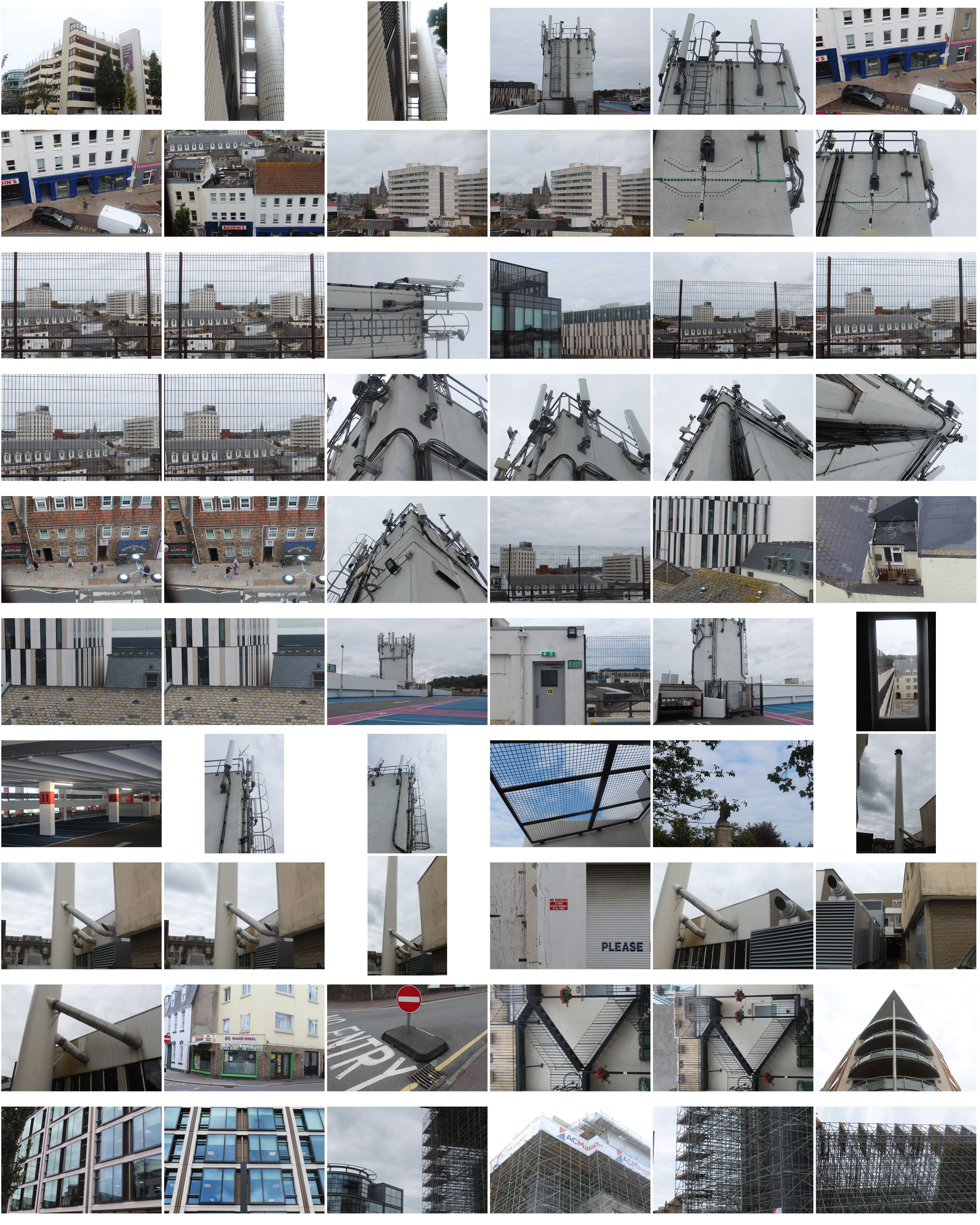
For this photoshoot i went to an location outside of the area i was assigned to find different buildings and structures in St helier that link to my previous ones.
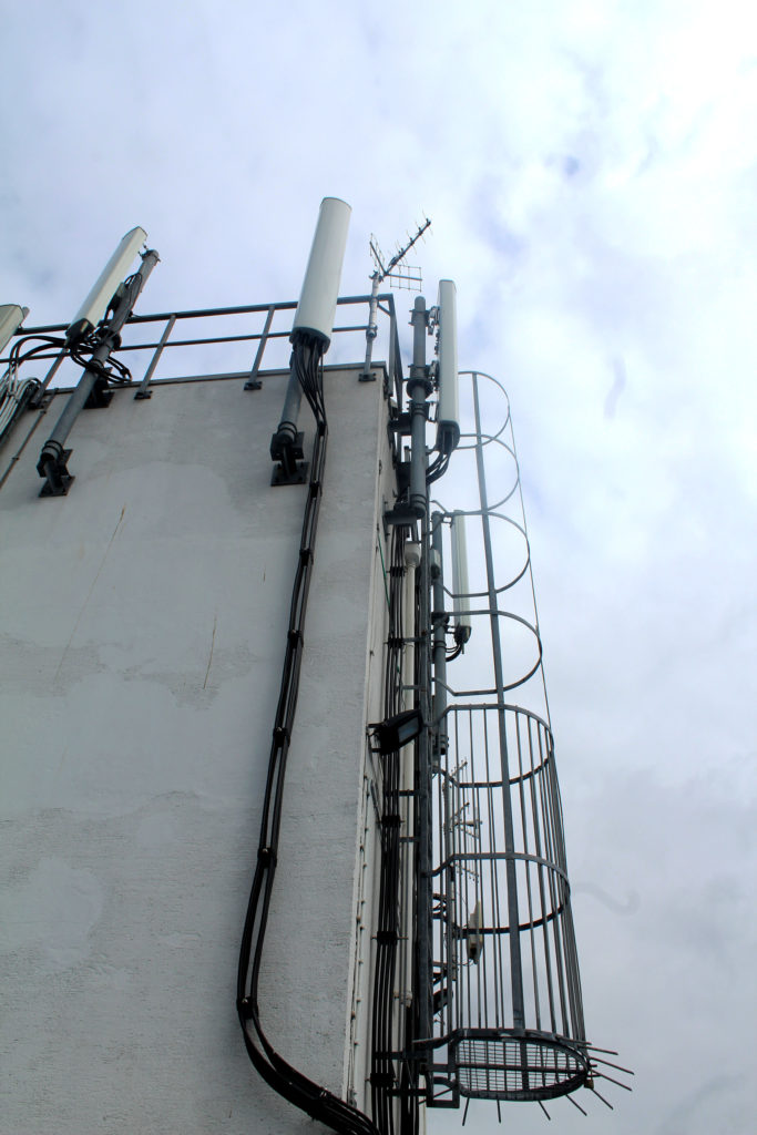
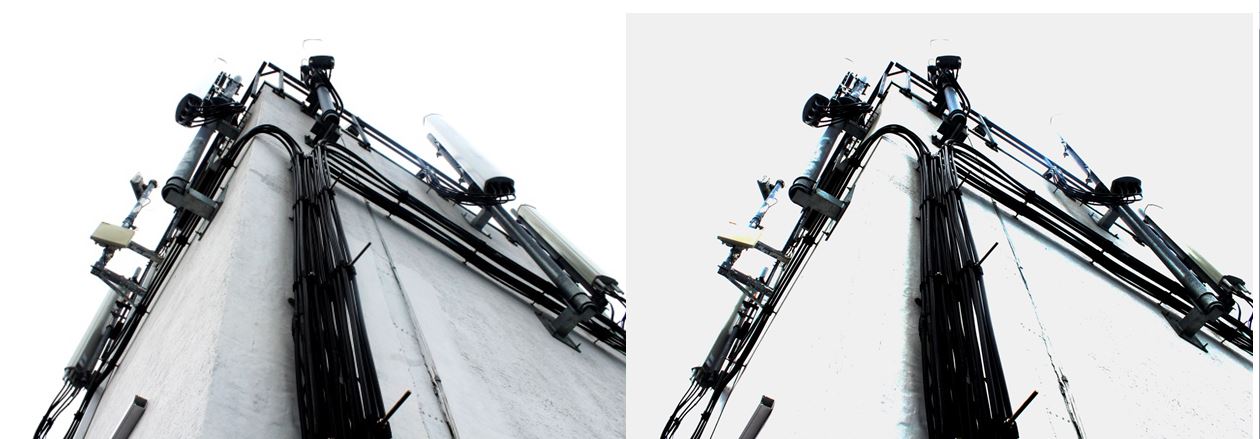
When walking around Sand Street car park I found this building structure that had wire and lamps on it giving a very industrialised appearance. I particularly liked this image as tones and colours in it are many black, grey and white even though i haven’t edited it this way. This means that building looks like its been edited in black and white in real life, representing how the industrialisation in Jersey is taking away the colour and culture. The cloudy sky gives a white background to the grey and black building in the foreground creating a hostile appearance. The angle this image is taken at emphasises the bold black wire running up the side of the building. I chose this photo as one of my final images as you cannot tell that it was taken in Jersey and could be anywhere industrial in the world, representing how Jersey is losing its heritage and culture by new constructions and starting to look like other towns and cities.
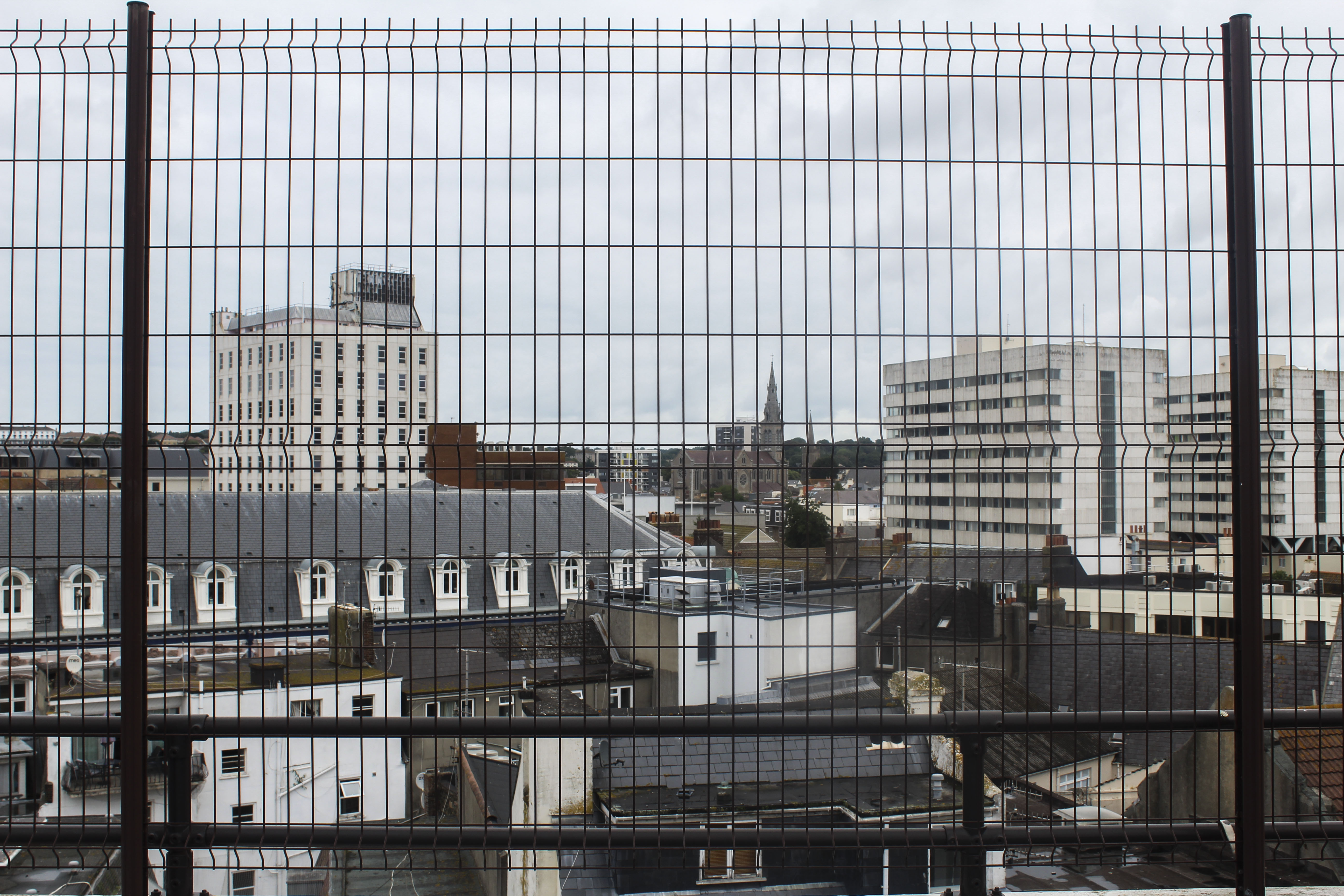
I like this image as it gives an overview of an area in the center of St Helier, showing the different and mismatched styles of building like tower blocks and smaller town houses. The angle which the photo was taken in a car park gives people a different perspective of St Helier than they might normally see. The way the buildings are arranged in this image to me looks like the buildings are being stacked and layered on top of one another. The smaller groups of older looking houses looks like how St Helier wanted housing to look like when they were first being built. Other buildings, like the flats, look like they’ve been stacked on top of the previous buildings, representing how St Helier keeps adding more buildings to the land when there isn’t much room, resulting in the overcrowding of buildings and a mismatched style of old and new.  The black, structured  fencing in the foreground adds another more interesting aspect to the image  which looks like the buildings and town have been caged, giving the image a more industrial and hostile appearance. This makes the front of the  image very symmetrical and ordered, which is juxtaposed with the mismatched buildings in the middle ground and background. The land only goes up half the image and is contrasted with the white/grey sky emphasising the whiter parts of the rest of the image and contrasting with the black fence in the foreground. Cool colours like grey, white and black with blue tints gives the overall image a dull and spiritless appearance. I did this on purpose so the idea to bring more vibrancy and culture into St Helier is emphasised.
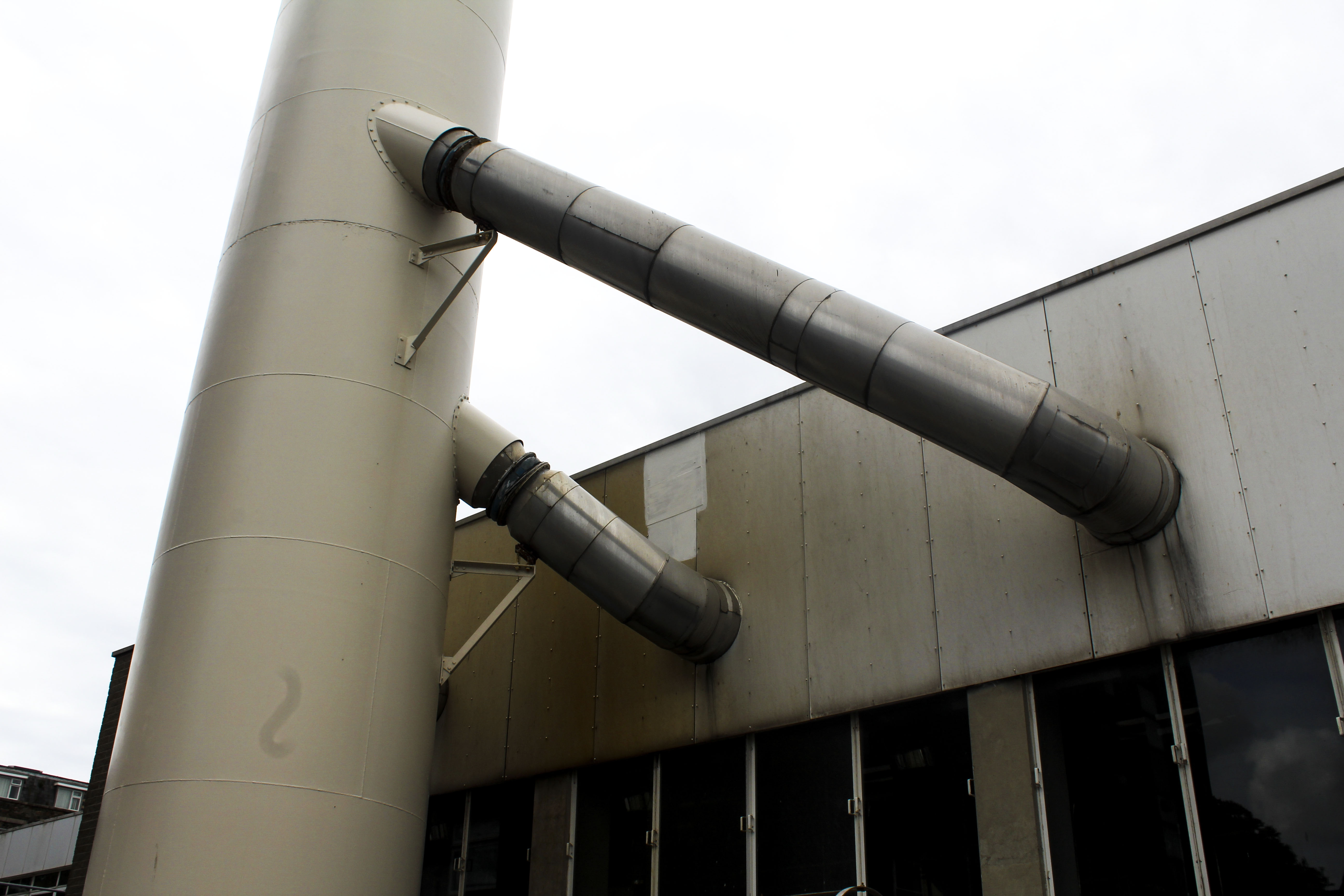
 

I also chose this photo as one of my final images as I like how it’s only showing an industrial metal structure with no signs of life. The yellow/brown tint on the metal gives the impression that it is rusting. What makes this an interesting image is that its simplistic but contains many different tones of metal from white to black to yellow. I think this image would work best as a part of a series rather than by itself as I think it could be apart of telling a story as now it doesn’t have any obvious meaning behind it when looked at.


Edits
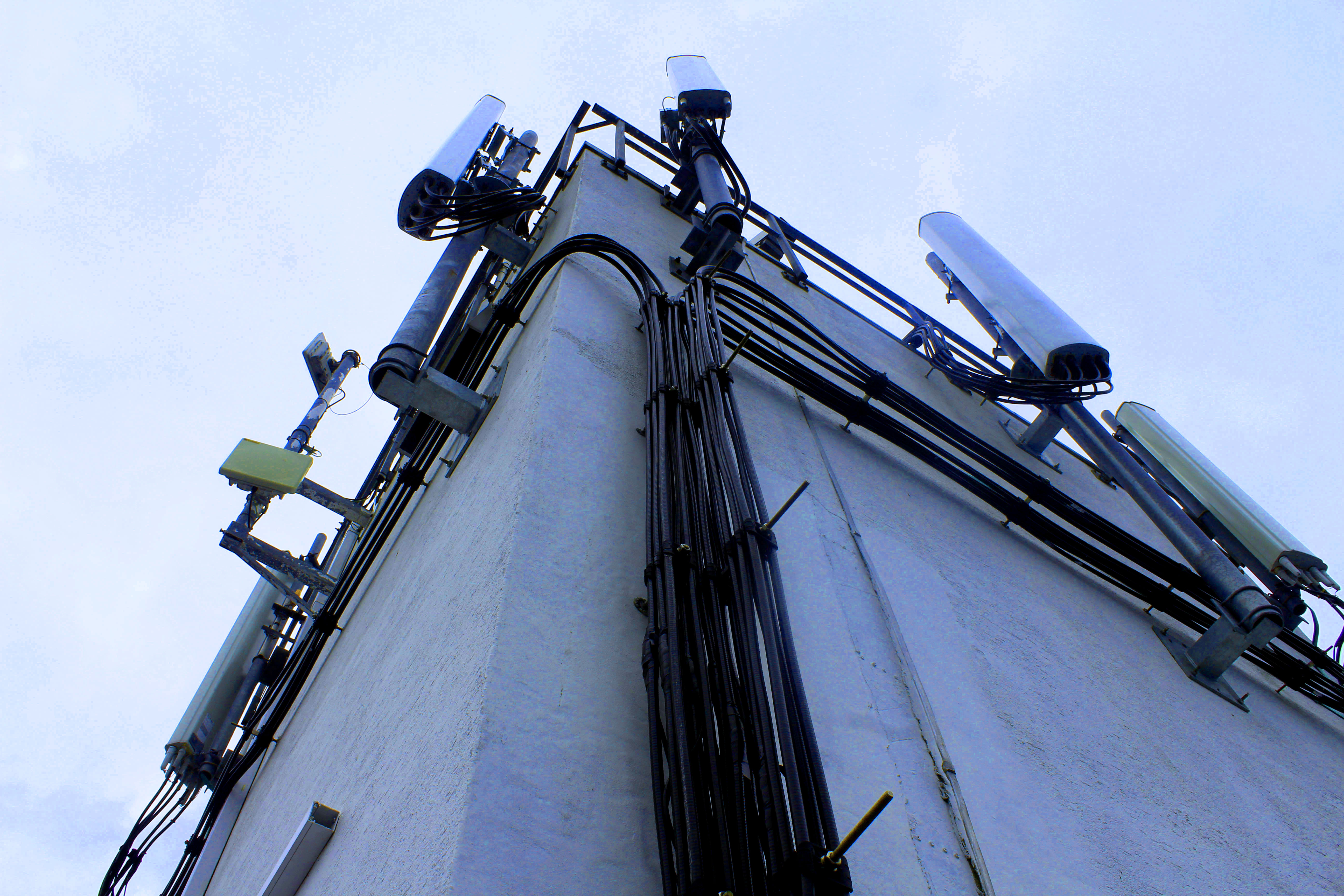
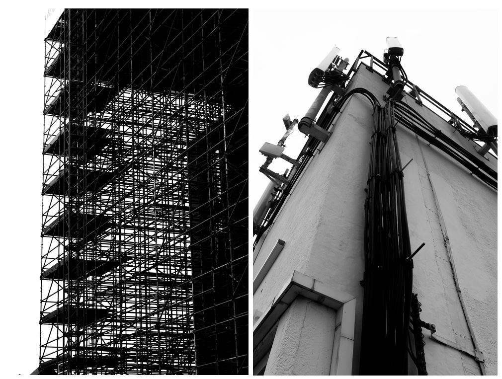
When editing this image I wanted to see if I could change overall appearance. So i experimented by increasing the exposure and increasing the brightness in one of the images so all the colour was taken out of it and was left with a stripped down version. This changes the appearance of the image making it look decolourised and bleached.
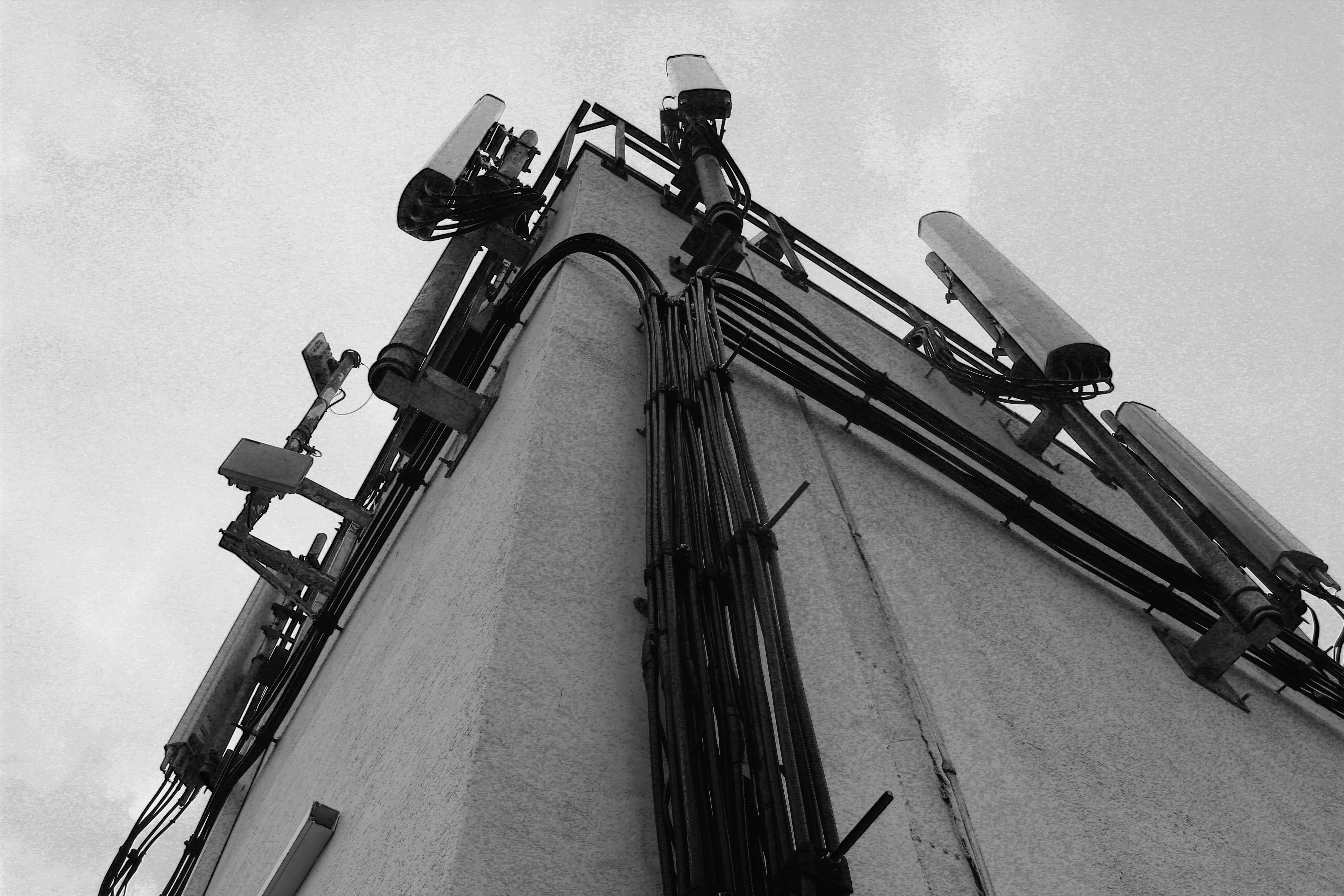
 

For these two image I edited them in black and white as well as increased the gradient in them so they give off a more historical and archival appearance. I like this as it makes them look more authentic like they’ve been cut out of a newspaper. The black and white edit takes out any remaining colour giving them a lifeless and desolate appearance emphasising just on the buildings and not on the lives of people who live in St Helier.


I also experimented by editing different colours to see if one was more aesthetically pleasing or had more of an effect. Although the coloured versions may be more interesting as an image, I prefer the images edited in black and white as it makes them look more authentic, which the colour doesn’t.
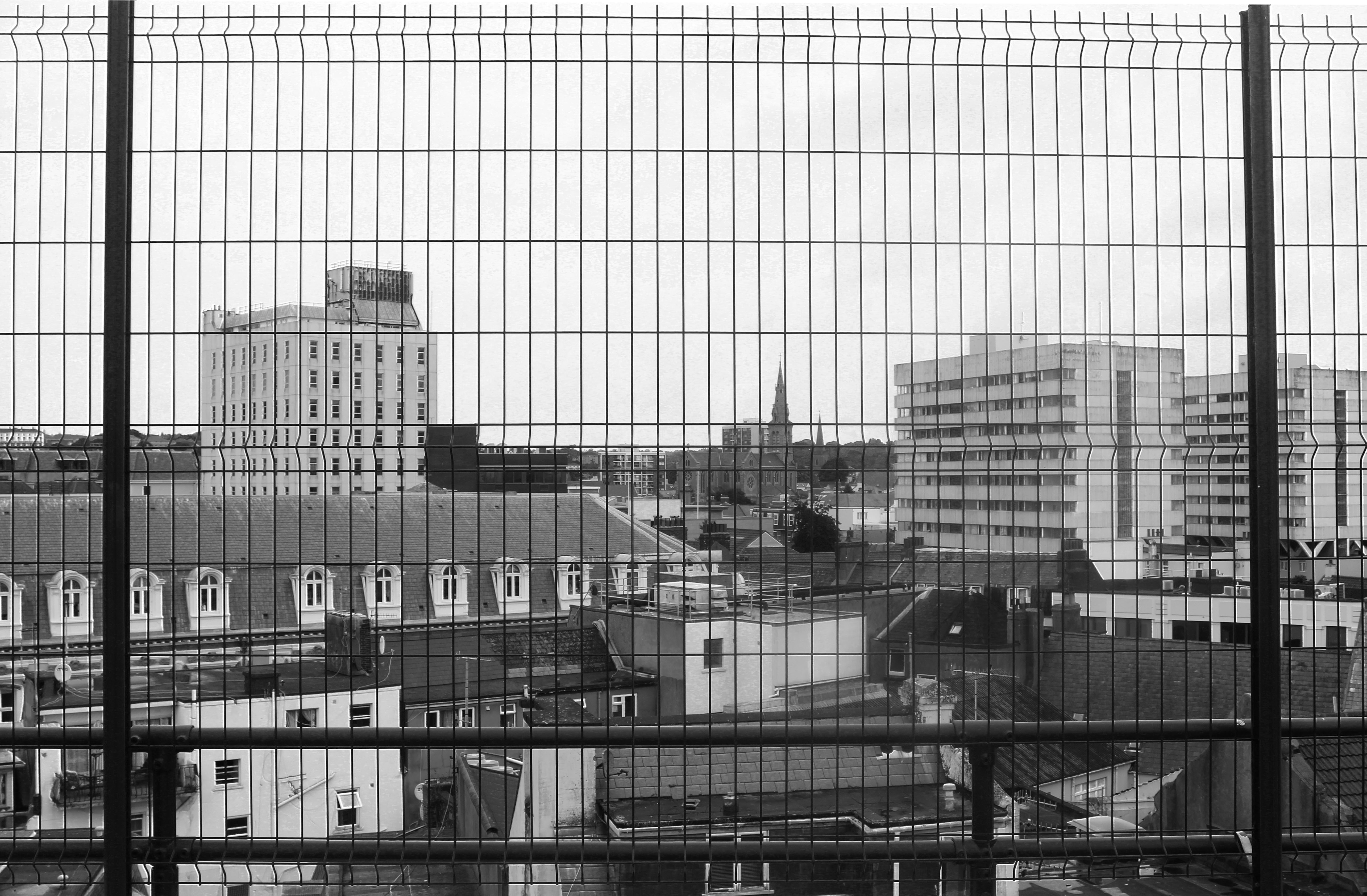
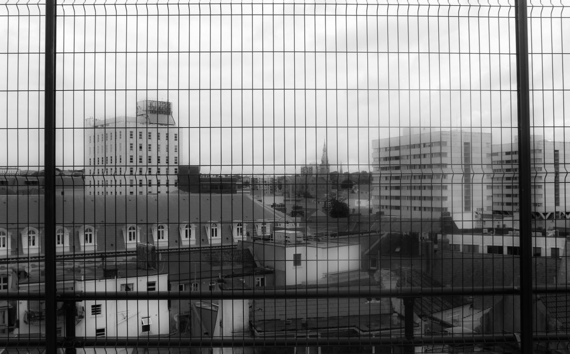
I edited this image in black and white and experimented with the exposure and contrast. In the first image I focused on emphasising the harsh black lines of the fencing in the foreground of the image and tried to show the different in the buildings by highlighting the lighter and darker tones. Whereas in the second image I focused on creating a blurred effect so the distinction between the buildings wasn’t as clear and the harsh fencing in the foreground was softened.  The blurriness creates a mist-like appearance like something has been put on the lens when the image was taken. I prefer the blurred image out of the two black and white edits as it gives the image another aspect that makes it more interesting to look at and makes it seem as like there is a meaning behind it. This could be that the blurriness is a representation of how the perception of St Helier is confusing as people don’t know what it will look like in the future with the increasing number of constructions being built.

Shoot Conclusion

I think this shoot was successful at capturing the increasing industrialisation of St Helier, focusing on metal structures and buildings with cooler tones to create a lifeless appearance. The editing also emphasising this by taking the colour out of the images and presenting the buildings and structure simplistically.  For my next shoot I could perhaps focus on how St Helier could bring back some of Jersey’s culture and liveliness and portray a solution to distract from the continuous industrialisation.
 

Third St Helier Shoot

For my final shoot, I will completely focus on the theme of “Signs of Life”.

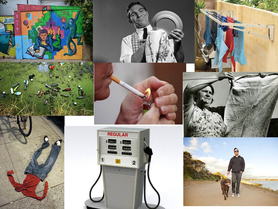
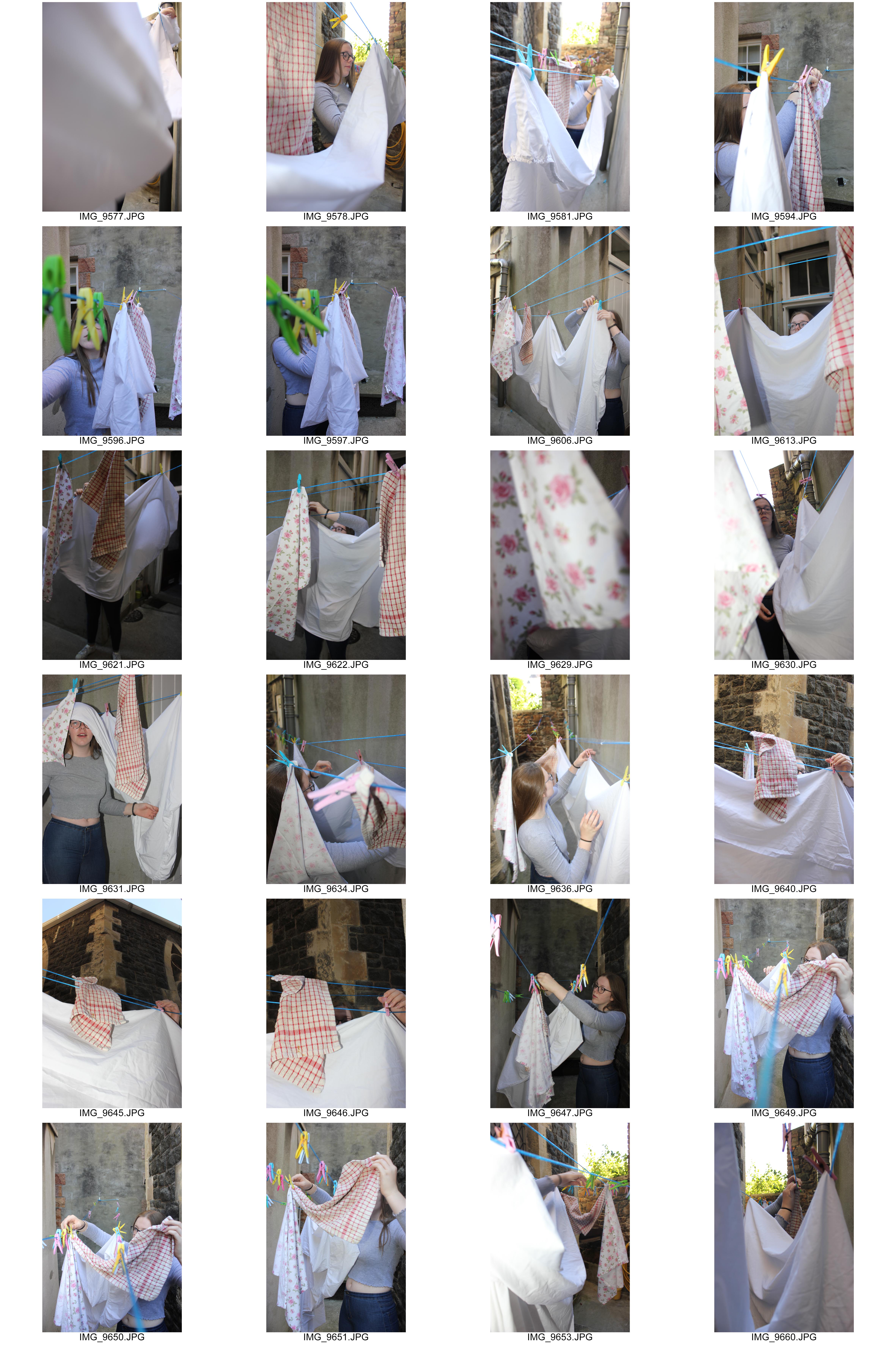
Before completing the shoot, I brainstormed my ideas of things relating to the theme. Some topics I came up with included graffiti and pollution that people create, daily tasks such as washing the dishes and hanging out washing, and objects we use regularly such as gas pumps.

I will explore the area once again looking for these specific themes to capture.

Concept: I will continue to use the flash especially for the images featuring the rubber gloves when washing up as this will really emphasize their colour in a familiar but dramatic way.

Location: Images featuring a person will be taken inside the subject’s house. The subject of the image will be a person who lives within the area I was given.


In many of the images, I tried to conceal the face of the subject as I wanted the attention to be on the action rather than the person. I did this in different ways such as cropping the face out entirely with the camera or by using other materials in the photo like the clothes pegs.

Second St Helier Shoot

For my second shoot, I will revisit the same area from the first shoot but with the aim of capturing a different effect from the different lighting or weather conditions that may occur. I am hoping to visit the area at around 6 – 7pm as there is still natural daylight but shadows will also appear as the sun is close to setting.

It is also important to keep a sharp eye as there may be details that I missed from the first visit or an event may have occurred to cause the environment to look different.

I decided to focus on the large buildings such as the tower block and the churches as I thought the light would hit them better and shadows would become more visible.

The area was not busy which meant I could get wider shots to capture the whole of the buildings.

St Helier First Shoot

For my first shoot, I want to explore the area given to me. I am already familiar with the area as I live in it meaning that I have an understanding of the daily events that occur there.

I will use the flash on my camera in the same way Tom Pope did in order to achieve a strong vibrance of colour in my images. I want my images to have a high exposure but not overexposed, so that I can choose to edit them into black and white images like Albert Smith’s work if I feel that it suits the image.

At this stage, I have no clear intentions of what the meanings behind my photographs will be. Instead, I will focus on details that I see in the subjects I photograph. I will compose my images carefully depending on the way I want to portray these subjects.


Experimenting With Design Layout

Design Layout 1

In this design layout I have focused on using borders and keeping space between photographs in order to create a simple and tidy composition. I think that this composition is effective because the photos are large to show the detail within them and the style of the photographs means they compliment eachother.

On the below page, I have looked at filling white space by transforming the photograph. I flipped the photograph horizontally twice to create a confusing composition. I like the idea of this but I believe that it does not fit in with the rest of the composition due to its complexity.


Design Layout 2

In this design layout I have looked at doing full bleed spreads along with images overlapping onto the full bleed spread. I think this composition is very effective as it makes the photograph more imposing and bold. The overlapping photographs are subtle but create an alternative look to the composition.
 

Design Layout 3

In this design layout I have stuck to one photograph per page. This created a simplistic and effective look due to the centralised photographs. I like this design as it is easy to look at and drags the viewers attention to individual photographs but I think that there is too much white space in this design.


Design Layout 4

In this design I have looked at putting all of the photographs onto one page and using the photographs more than once to erase all white space. This has created a design that is quite abstract but also quite messy – I do not think that it is as effective as my other designs due to this.

Design Layout 5

This design is similar to the first design but it lays out the images in a way that is not conventional. It leaves white space rather than making an effort to fill it in. I think that this creates too much contrast between the background and the photographs that I have used.
St. Helier shoot 3


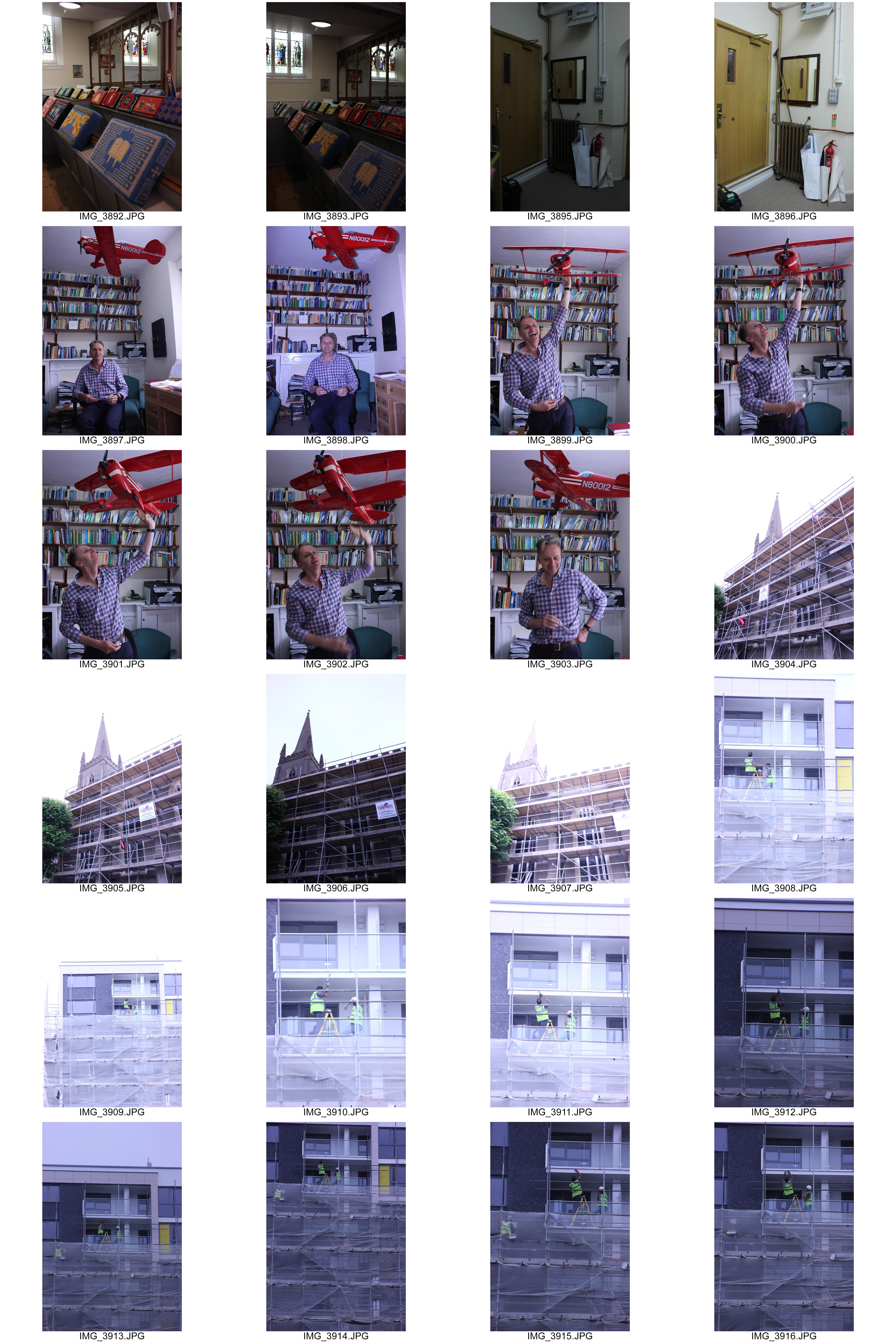
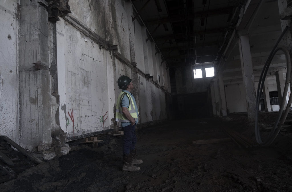
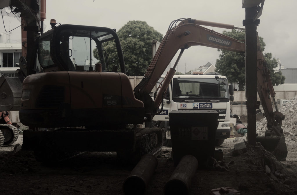
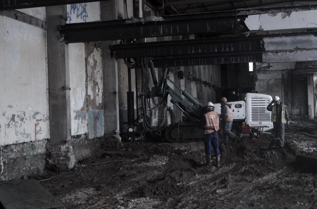
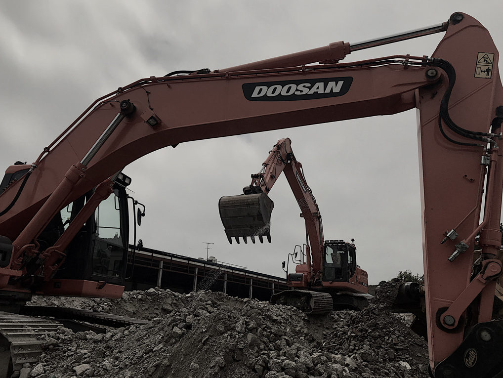
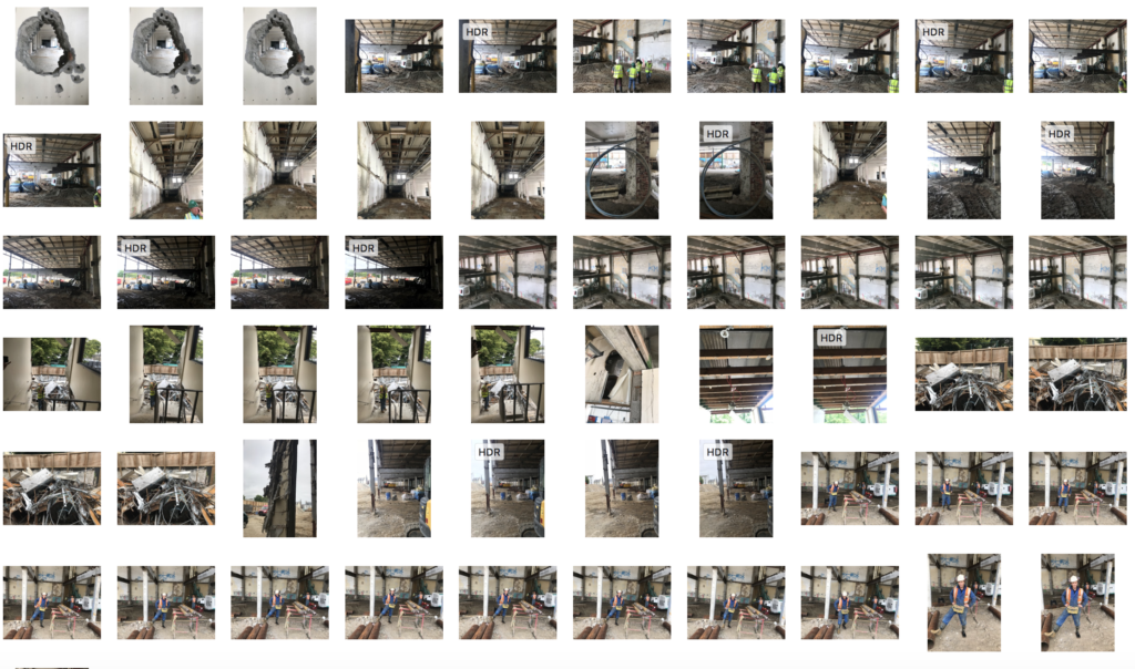
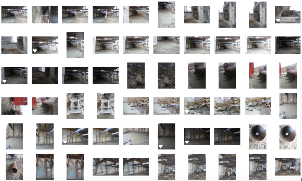
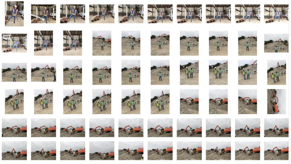
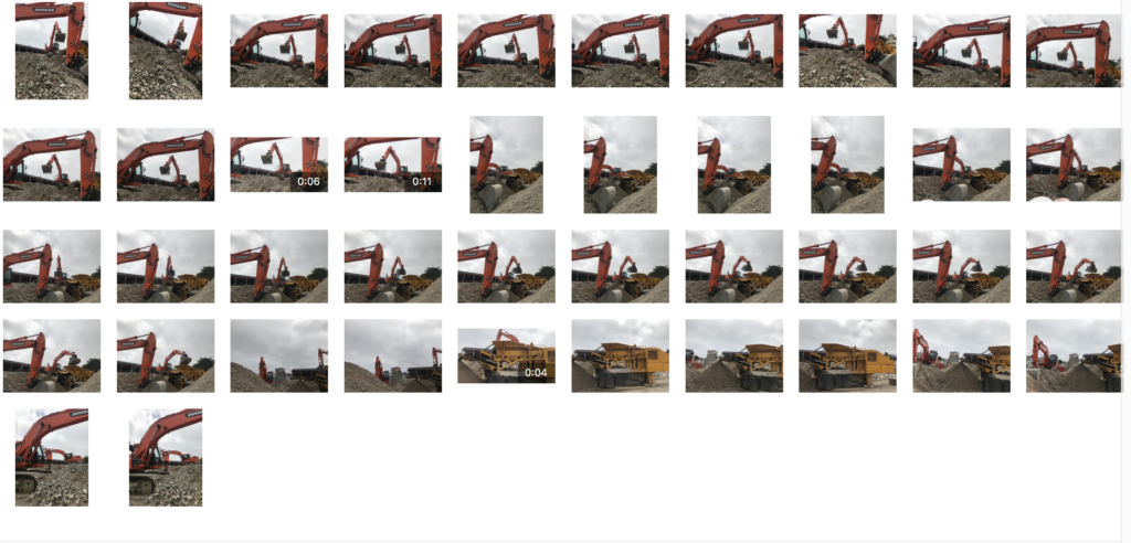
For this last shoot,I went to a buildings site and I wanted to concentrate on the old vs new St Helier and the modernisation and what has to happen to town.

When going to the property development site,there was a different attitude of st helier,which was less centered around community but more around making life better for others with new morden living conditions and to them making an old abandoned area Morer beautiful and becoming more futuristic in st helier. I agree with this.I think development is important because it makes many jobs for people within jersey and foreigners.They all have the same aspiration to make jersey a better place.