Category Archives: AO3 Record Ideas

Filters

Author:
Category:

Plan for second shoot

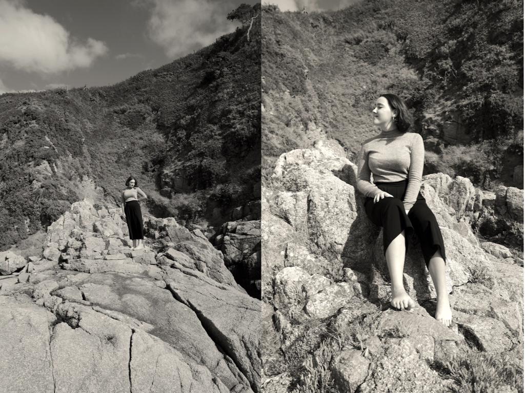
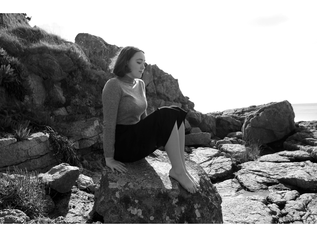
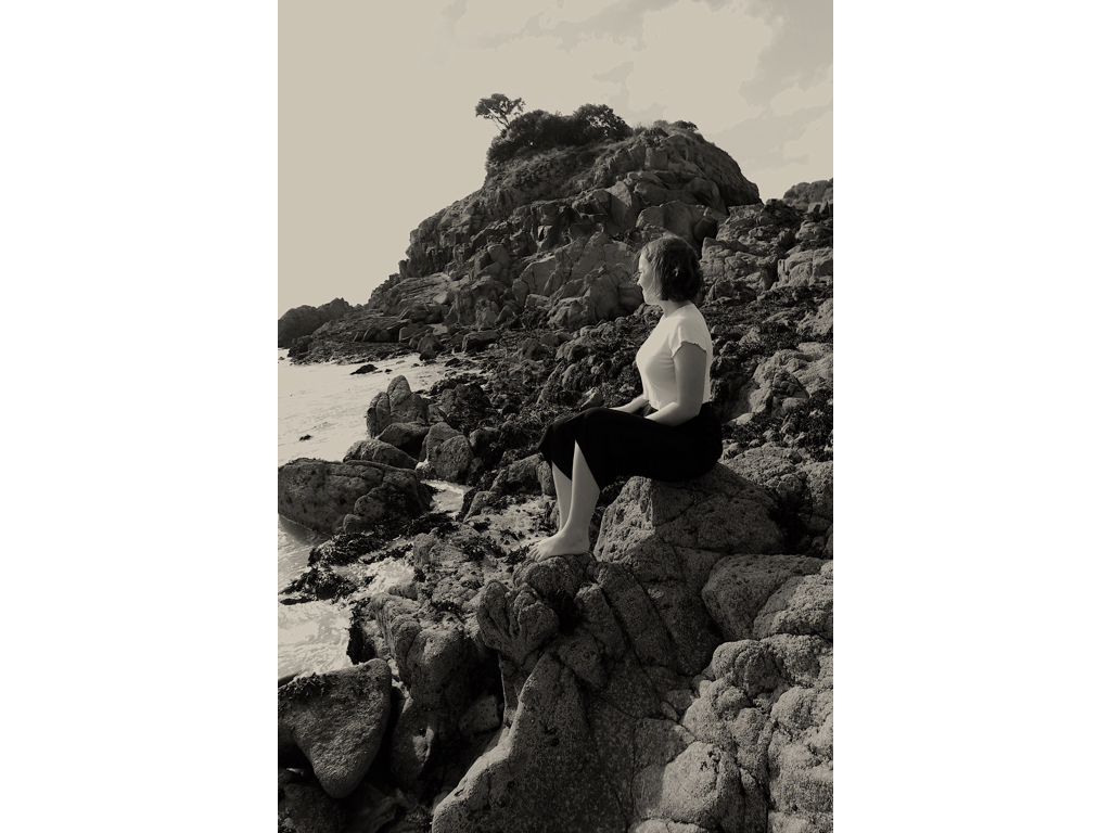
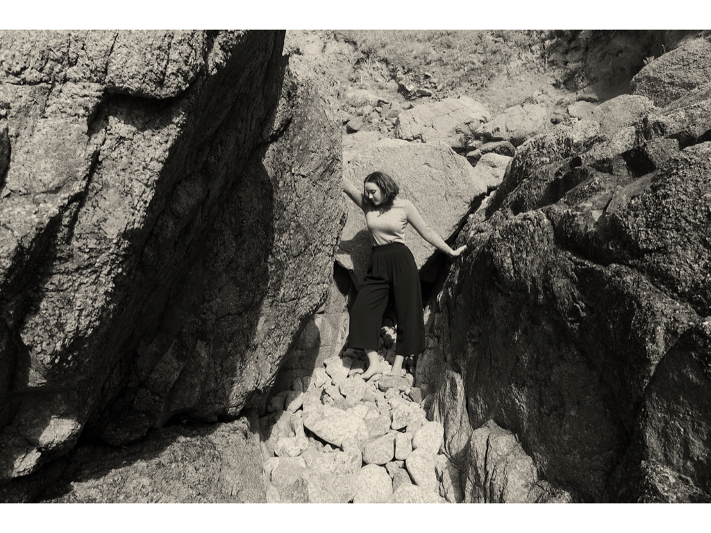
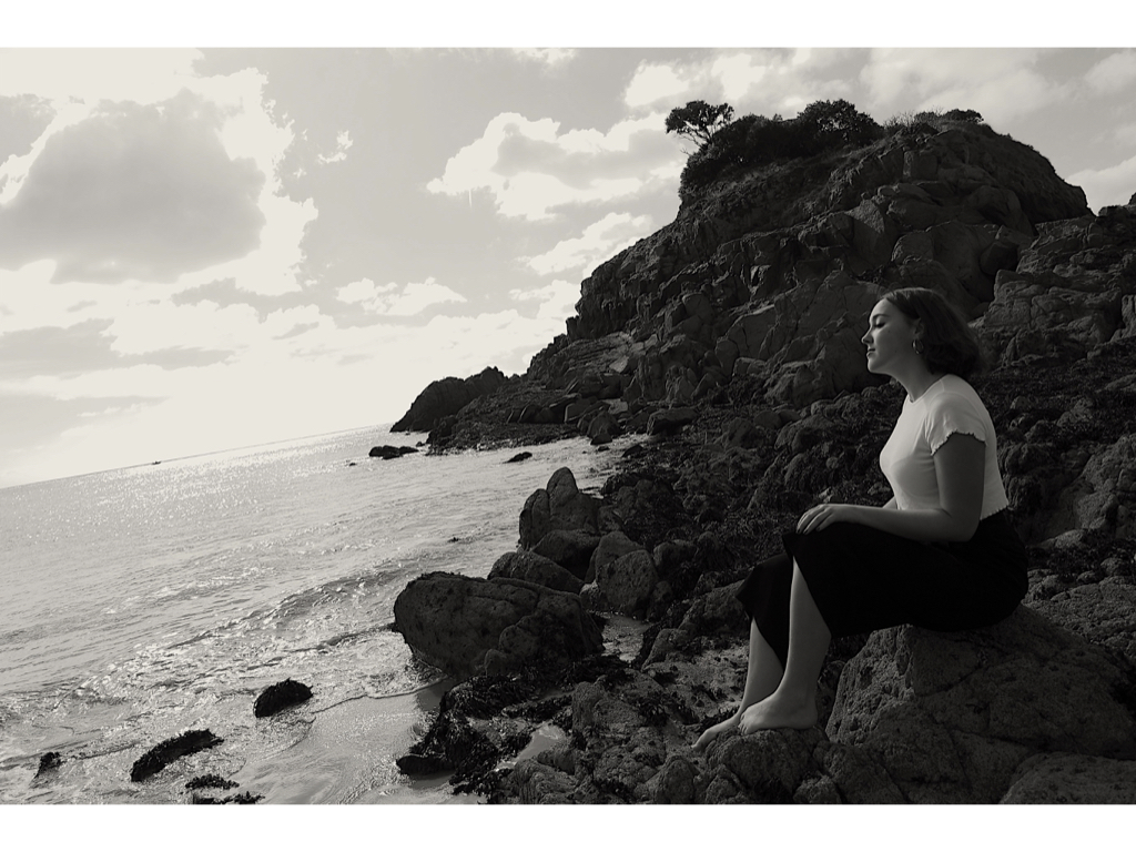
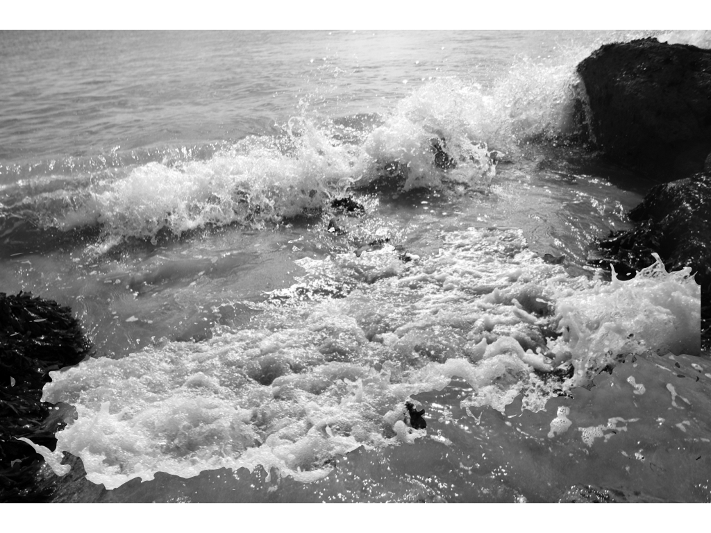
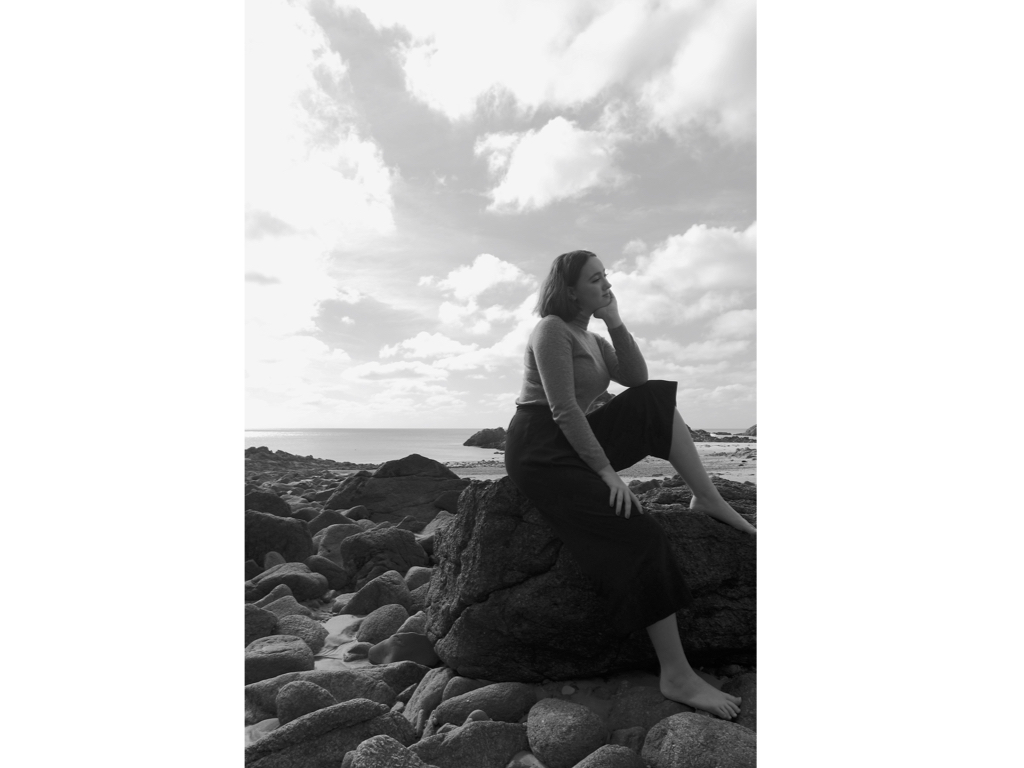
My plan for the third shoot is a clear influence from the exhibition of clare cauhn. I wanted to focus on the the political correctness of femininity and the political influence that can be shown through this girls positioning within the landscape and the fragility to the atmosphere she is surrounded by. I also want to capture more landscape images that she is surrounded by, this could be the movement and emotion of the sea and also how this movement and fluidity of the water is mimicking the women herself. I believe the impact of the sea shows a stronger connection to that of the sublime and nature having a really strong  power. I could in one of my next shoot like to focus on the way someone can go into the water and see both emotions within the person and movement and aggression of nature. I believe this would exactly hit my connection of the sublime, and this will really positively effect my shoot. Being submerged within an atmosphere in which you cannot breath and is deemed dangerous shows such a string emotion within the water and person. So a clear diegetic link between the shoot and emotions based of political bias.

shoot images:

edits:

colour experiments

Experimentation:

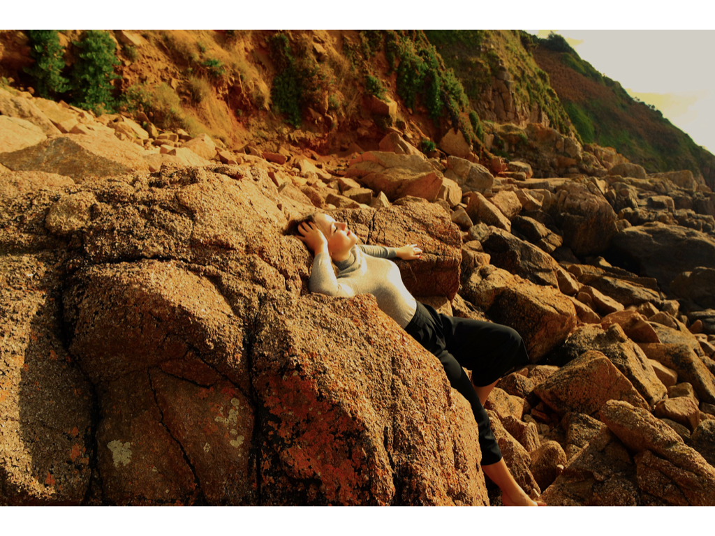
For this edit I wanted to revert back to how I edited my previous shoot and how I focused upon the way these shapes, colours and lines can successfully impact a piece. I believe I should further experiment with the images and find more conceptual ways in which I could edit them. I do think the composition of these images are correct in the way it shapes from and connotes a sense of femininity within the images. This political bias is not necessarily seen through injustice but how the sublime environment enhances the femininity of the piece  which contributes to the political factors of women rights and a stance for the power to which a gender can hold.

Evaluation: Overall I do think this photoshoot is a clear presentation of my inspiration from claude chaun and additionally is successful in the recreation of softness and emotion within the landscape itself.

analysis from shoot 1 and investigating the sublime

Overall I chose these images as they connoted the strongest emotion within the image itself. I chose 20 final images to further develop depending on their strength and mimicking the emotion. What I think I developed well on this piece is the overall composition of placing the body and how I have used this in order to create a sense of emotion and impact. I wanted to use photoshop editing in order to really over-exaggerate the tones so changing the colour of areas within the piece too.

The sublime:

Is said to be ‘an aesthetics, the sublime (from the latin sublimins) is the quality of greatness, whether physical, moral, intellectual, metaphysical, aesthetic, spiritual, or artistic. The term especially refers to a greatness beyond all possibility of calculation, measurement, or imitation’

To measure an environment by how sublime it my feel or be perceived is interesting. As seen above there is a connection to physical greatness and spiritual and artistic elements. This to me is a clear indication of the wide range of possibilities this word has to offer. As said previous I am interested within the philosophy and how to conceptual human emotions into a landscape, I believe developing this further into the sublime would be useful to my project. I have further developed  research of emotions within the sublime and researched emotions within landscape will use this inspiration to power on my ideas further.

when sublime is connected to issues of emotion it focuses on a deep threat and a harsh reality of weather, this being seen through a storm or the deep seas. Many piece that include people are them diving into water and how being submerged into a world is abstract and different from the world to which we know and view as normal above land. It combines natures power of man and also the lack of breath and cruel reality fo nature to be something of greatness and also concern. My question is what is the sublime and how can i show this through my themes of emotion, politics and landscapes? Is sublime about a feeling, event or a persons state of mind? It means to be raised and on top but also further defined as having a quality of greatness and magnitude. I want my pieces to be temporarily overwhelmed by anyone who sees them. A quote about the sublime really stuck out to me, this was ‘by a kind of pleasurable terror’ This echoes the social conventions of politics and freedom to me,It demonstrates an image of people wanting to escape and taking a deep risk due to their political or negative governmental conditions.And how a big leap or jump for freedom is pleasurable to escape but filled with terror when alone and surrounded with a landscape that is not familiar.

The sublime was associated in particular with the immensity or turbulence of Nature and human responses to it. Consequently, in Western art, ‘sublime’ landscapes and seascapes, especially those from the Romantic period. To my mind this means a clear representation of vast storms and seas, it is a mixture of beauty found in a life Threatening position. I believe through my work it would be tangible for me to create a scenario like this but as a false sense of identity. I would create a constructed narrative set almost as a tabloid to make the image look dangerous and have a feel of the sublime but not being so. This is not possible when it comes to going outside and capturing a storm but it is when creating an infliction of worry which as someone underwater, or moving quickly in a dark space. I think the sublime should no longer be just considered a natures act and a landscape but allowed to be pulled into someones emotion ,reaction and cause fro distress clearly portrayed within themselves.

An artist who uses politics to effect and emotion and create sublime work is the artist Damien Hierst. His work focus on the notion of the contemporary sublime ,so removing the previous style fo only using a landscape of a storm.The  starting place for tracing such returns of the natural sublime is Damien Hirst’s art work, The Physical Impossibility of Death in the Mind of Someone Living 1991. he is such a symptomatic artists who’s work is uneasy and contradicts with what is expected within society.  it is said that ‘His best work condenses our lived contradictions into perplexing, unforgettable, iconic images, in just the way that dreams do’ This allows his work to have such a huge impact on the audience it is viewed as a terrible going against what is expected and perceived as normal but yet alongside with this is so fascinating. His work clearly echoes inspiration  from within the body, mortality, violence, pain and power.a ‘universal trigger’.  Hirests taste that it works as a powerful sublime piece as  ‘everyone’s frightened of sharks, everyone loves butterflies’. however the shark carries a powerful charges frisson and forms a universal response reaction of the sublime.


Edits of three locations on first shoot:

My inspiration for editing was to exaggerate the emotion possessed throughout the subject and landscape, either through colouring, or more conceptual editing of shape and overlapping of colour.My chosen images editing:

Happiness

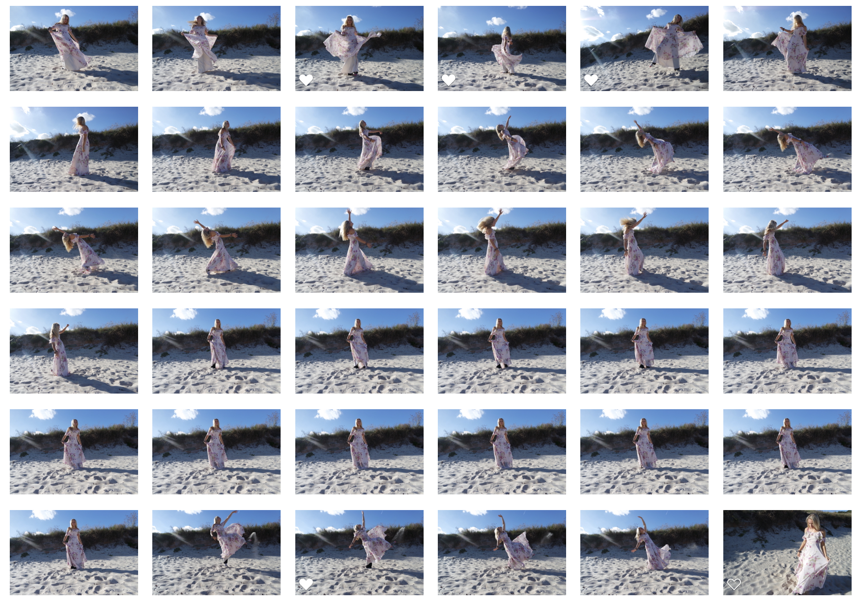
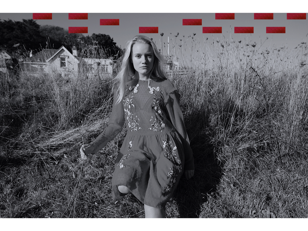
I chose to edit many of these images into black and white as it highlights a simplicity and exaggerates the natural light from the sun itself. I though due to the interesting composition of this images that I would add some interesting conceptual shapes in order to provoke more thought to the image itself. Due to this person having a positive connection to this landscape I wanted to express a naivety and exaggerate an ignorance is bliss type of feel. To my mind the circles connote a display of balancing work,oppitunities and commitments and the lines symbolises rising and becoming better and more connected to yourself and not worrying about political ideologies to consume us when in surrounded by our favourite landscape. The shapes also mimic the simplicity and provoke a ignorance is bliss quality. I believe it is evident that this shoot is more concentrated towards happiness and timelessness also mimicked throughout he free and life full movement of the dress.

Within this image I think I have successful caught the light and captured the movement of the dress itself, this personifies the dress to form a positive entity and a sense of freedom. Perhaps to this person this landscape to them is freedom and a place in which they can escape the governmental oppression to which they might face elsewhere. 

When experimenting with he images love I wanted to see how colour effects our emotions and so the effect to which we think about a photo and so what feel it ultimately communicates. I experimented within the saturation and also the conceptual contrast of vibrancy to show a sense of life, freedom and happiness.

anger

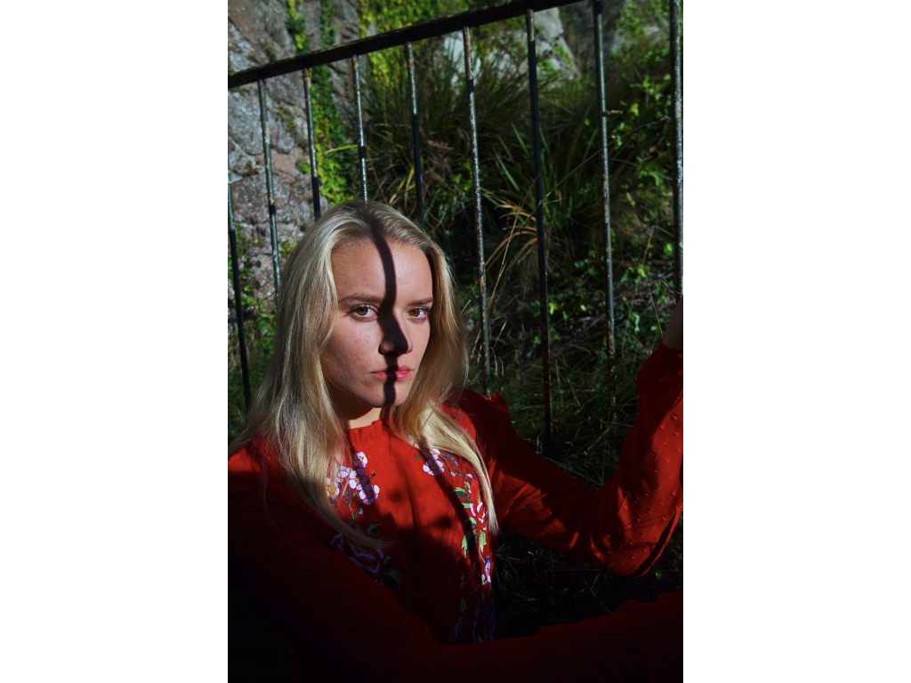
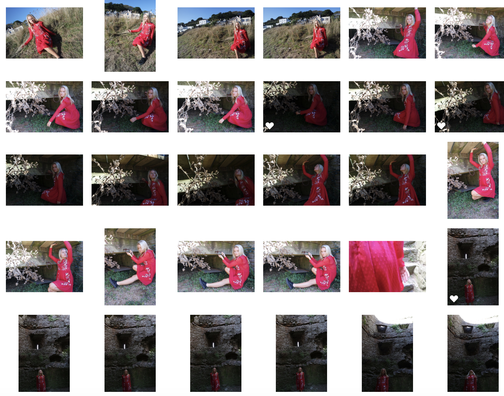
I decided the best way to convey anger would be through a darker ampeture and also a colour which clearly symbolises the emotion,this being red. I went to areas which show qualities of small confined spaces and making the subject feel small and powerless. I believe this successful demonstrates how they feel due to the way she is not allowed to make her own decisions but is powered by a governing group of higher people. The harshness of the rocks show an emotionless extent to which emphasis the governing bodies as being cut throat and an ignorance to peoples emotions and well being. 

Whever I have used a lighter tonal shade it is to highlight the irony to the possible future but that is kept through the bars of where she is. This is to communicate the opportunities not given to those depending on their social state ( poor education, not having enough money to pay for school)
I wanted to use typical characteristics  that you would find in a prison to once again emphasis the anger against the powerless state she and her family have been reduced to, due to having no choice in what happens to their future and money.
archive,first shoot images

When looking for inspiration from the archive I wanted to focus on accessing specific areas of location on my shoot, so influential areas that connect to the history of jersey found within the achieve and possibly using this as a background for an emotional piece. Archival images are much more influenced by narrative and documentary style due to editing effects and camera effects not being around. Because of this the achieve is a good place to go in order for a clear representation of the world that used to be and a good reflection fo the peoples attitudes and feeling within a scenario.

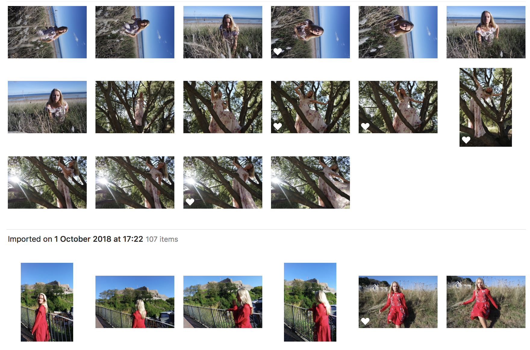
For my first shoot I went to three separate locations, being a beach, castle and towns full of archival images that have been around for a long period of time that are significant to jersey and its history. Within this shoot I wanted to incorporate three different emotions, The beach as being freedom and peace, this is reflected through the person I have chosen, having a great love and impact for the beach,It also shows that politics and negative impact on emotions is not always relevant when bought to an area of great love and admiration.  I want this to be reflected through the dress and positioning and way in which she is going to move.  I want to get many different interesting compositions and the way in which the body is held to reflect an emotion as-well as being incorporated into the landscape itself.

For my second location I will go to Gorey castle, I have chosen this as it is a hugely influential Archival area and shows a huge political impact of war and issues effecting how jersey is currently represented. For this shoot I want to show an emotion of sadness and anger, this will be mimicked by the colour of red and the action in which the subject moves and where she is placed. I want to incorporate many interest angles and find many little areas within Gorey castle that are dark and represent the suffering of war that this symbolises for many years. To this person it shows the past and present to how politics is now formed and how she is now deemed as a less important citizen because of the events that occurred here. I will use many camera effects in order to experiment within emotion and also using mirrors to show a reflection of time and such.

The last location is a little community within a small town, full of colour and a strong community. This will also show a reflection of love and also highlight the scenario fo living for more urbanised areas. I want to try and capture more people in the community within this scenario and also just the landscape itself. and could possible incorporate a narrative and documentary section of this shoot from following the people who live in the area itself.

First shoot: image count:251


My Edits Of My Response To Political Landscapes

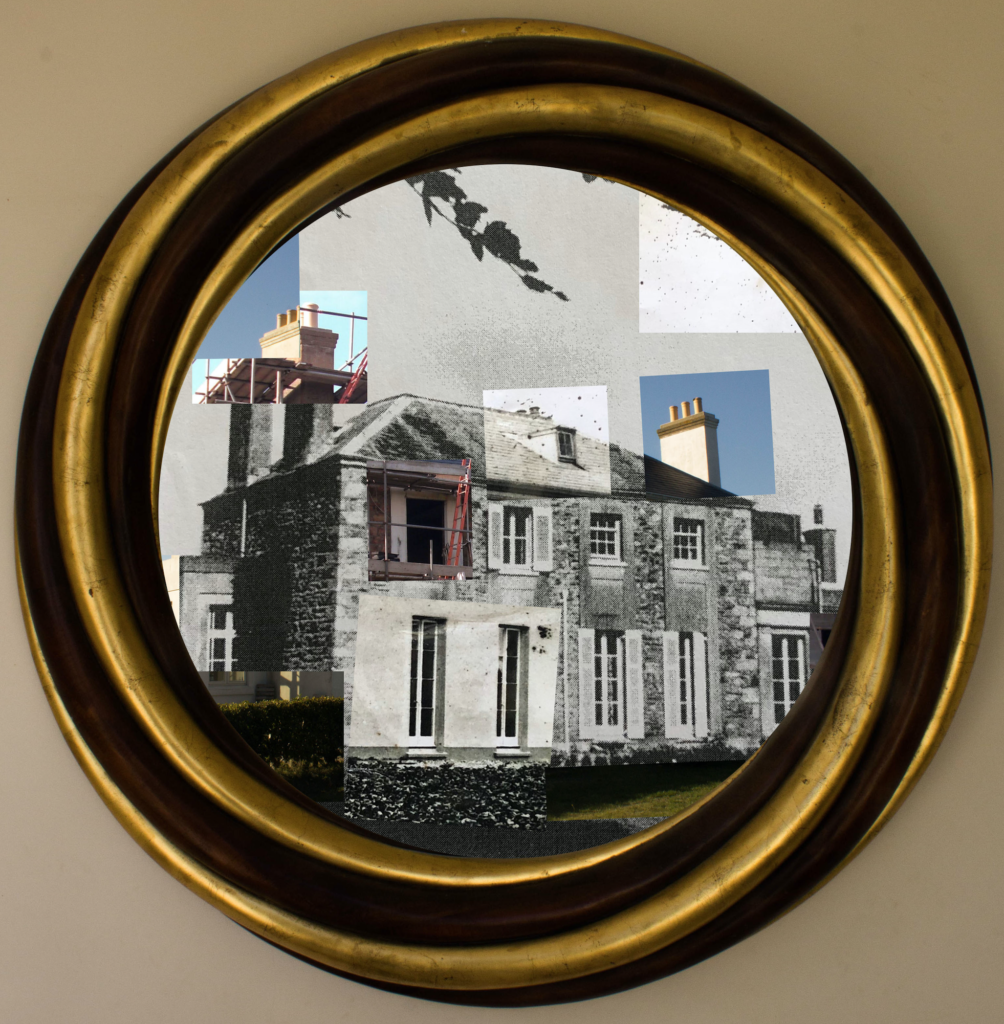
I have chosen to use the technique of pasting and cropping photographs over a base photographs and placing them in different places in order to align with the base photographs in order to create an interesting and contrasting composition. This allows me to be creative with the selection and placement of the photographs in order to emphasise as much as possible the differences and similarities between the past and present uses of the land. I will also be incorporating technique 3 into this by using natural frames such as mirrors and windows around the house in order to provide a more personal and interesting touch by showing how the fashion and style of property design has changed through time.

In order to provide myself with more photographs/frames to work with I have conducted an additional mini photoshoot within my household in which I photographed more frames and decorations within the house. I can use these photographs to broaden the variety of edits in my final outcome and to further show the current fashion and style within households.

In the edits I have used photoshop to alter/crop the montage photographs or archival photographs to fit within the natural framings that I photographed around my household and then placed the montages within the frame. I have done this to create a sense of personalisation within the edits as well as delving deeper into the theme of political landscape by showing how the inner decoration of the land changes over time, as well as the buildings themselves. The mixture of new and old photographs along with the modern decorations allows for the changes and developments over time to be shown as clearly as possible.

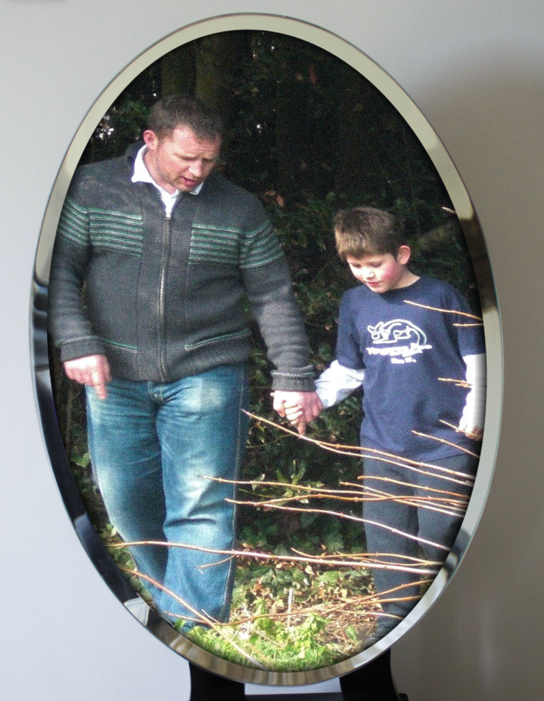
The majority of the photographs show the different sections of the houses and their developments through the use of montages but I have devoted one of the photograph edits to only the archival images within the frame in order for these photographs to be appreciated as they are without the contrast with the new photographs distracting the viewer from it. I have also included an edit which shows an archival photograph of me and my dad on the property in order to show that political landscape includes how the people involved in the change of land develop.

Analysis

In this photograph natural lighting was used in all aspects from the photograph of the frame to the photograph of the house from 1873. This use of natural lighting has allowed for the natural shadows of the structure to be shown which helps to create contrast between the different shapes and angles in the structure of the house. There is a very wide tonal range in this photograph due to its montage nature – the bright white paint of the newly refurbished house contrasts against the black hole that is the window being renovated, this helps to create multiple viewpoints and areas of interest of which all contrast with eachother. A deep depth of field is used for all of the photographs involved in this montage as the whole of the photograph is in focus which allows for all the small details of the contrasts between the old and new to be seen. A shutter speed of 1/50 was used to capture the mirror frame along with an ISO of 200 as I wanted the frame to be of as high a quality as possible in order for it to compliment the photographs within it. For the photographs within the frame a slightly quicker shutter speed along with a lower ISO will have been used as the photograph was taken outside so the shutter did not need as much time to allow the light to enter the lens. The photographs are all correctly exposed but the exposures between the different photographs in  the montage contrast with eachother to show the differences between them.

The colours in this photograph vary greatly due to the nature of the montage – the frame shows a dark gold and brown to contrast with the predominantly black and white montage. In the predominantly black and white montage there are splashes of colour through the inclusion of the photographs showing the current state of the house. These splashes of colour create a more interesting viewing and reminds the viewer how much technology has changed overtime to go from black and white to colour photography as well as the landscapes. There is a slight 3D effect to the montage as the closer corner of the house enters the background with the far corner being pushed towards the background – this 3D effect is further added to by the frame surrounding the montage, which creates a much more interesting and intriguing photograph. The frame is positioned directly around the centre of the photograph to allow the viewer clear viewing into what the frame is showing. This centralisation of the frame looks very orderly and neat which contrasts with the chaotic structure of the montage that it contains. The montage is placed within the frame in a way that shows as much of it as possible in order to convey my ideas within political landscape further. There are lots of viewpoints within the photograph as there is so much going on – which is possibly a bad thing – but I feel that there is a lot being said through this photograph so that fits the busyness of it.

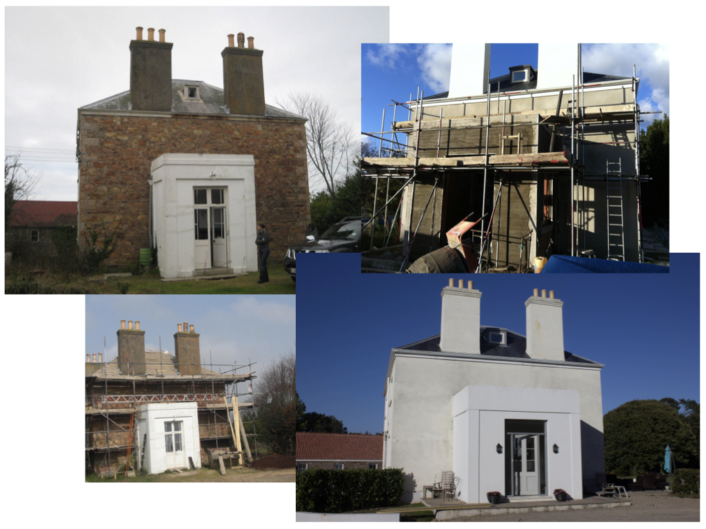
This photograph is made from a collection of archival photographs and new photographs of my house. This collection of photographs represent the history of the house and the changes that it has gone through. I have incorporated both archival and new photographs to demonstrate how the genre of political landscape links to these photographs. The house has many similarities to cod houses through the shape and style – these cod houses were built in the 18th and 19th century from people who made their wealth through the North Atlantic cod trade which can be seen as one of the initial sources of wealth within Jersey. After research on the house I could not find any evidence that this is a cod house but the similarities and shapes are very close. This photograph has strong links to political landscapes and Guillame Bression and Carlos Ayesta’s work due to exploring what humans can do to a landscape and how drastically landscapes can change over a time period.

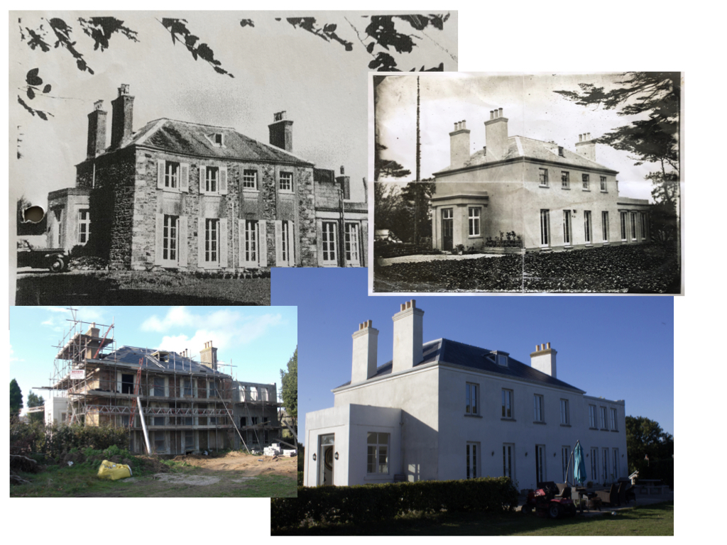
The idea behind this photograph is to show how even though fashion and trends come and go, they always come back around. This photograph shows sections of the house through photographs that are taken nearly 150 years apart – even though they are taken so many years apart the structure and shape of the building has remained. In the 1870 period only the people who could afford to would plaster their houses, but then later on it came into fashion for houses to have granite showing (as seen in the photograph) so the house was stripped of its plaster to reveal the granite structure. In the current state the house has been re-plastered in order to meet fashion trends and in order to show some inspiration from the original style of the property. This loop of fashion and trend shows how political landscapes often take inspiration from the past whilst putting a modern spin on them.
My Response To Political Landscapes

Original/Archive Photographs

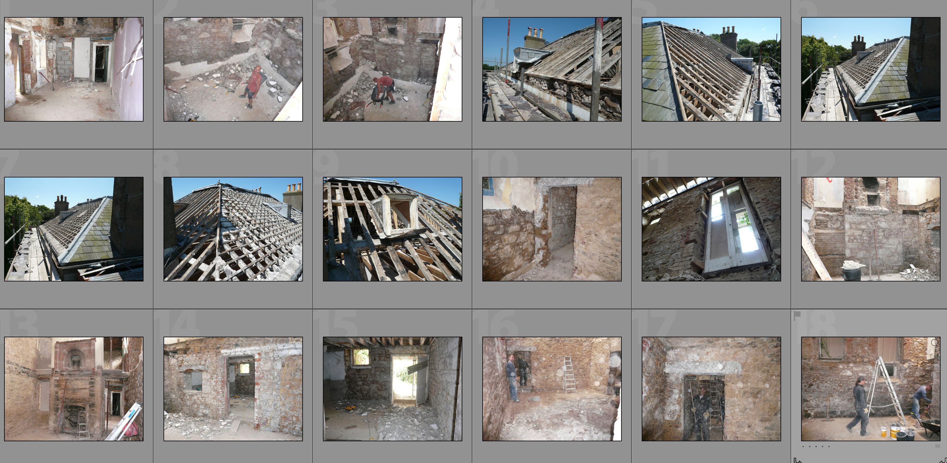
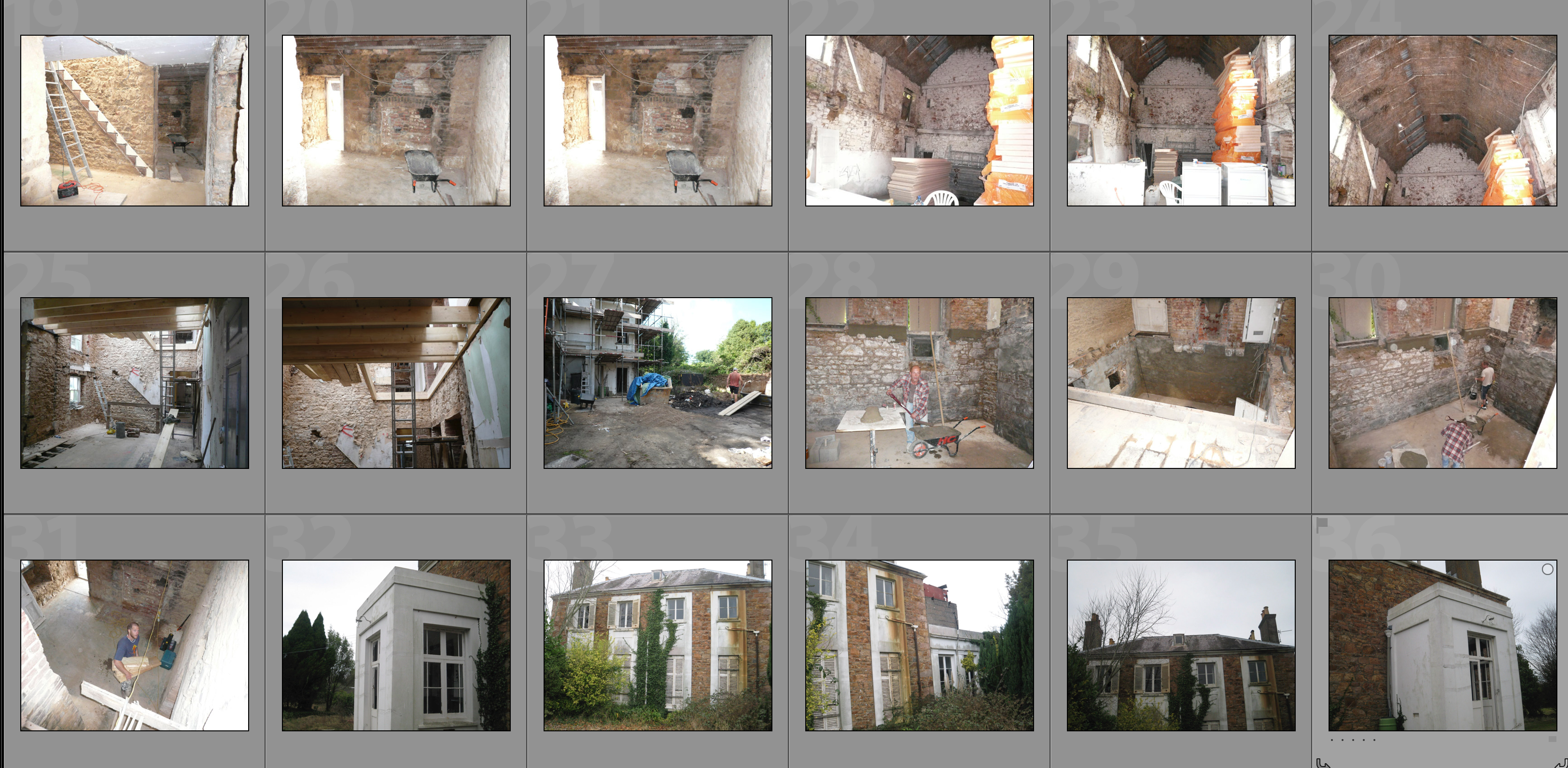
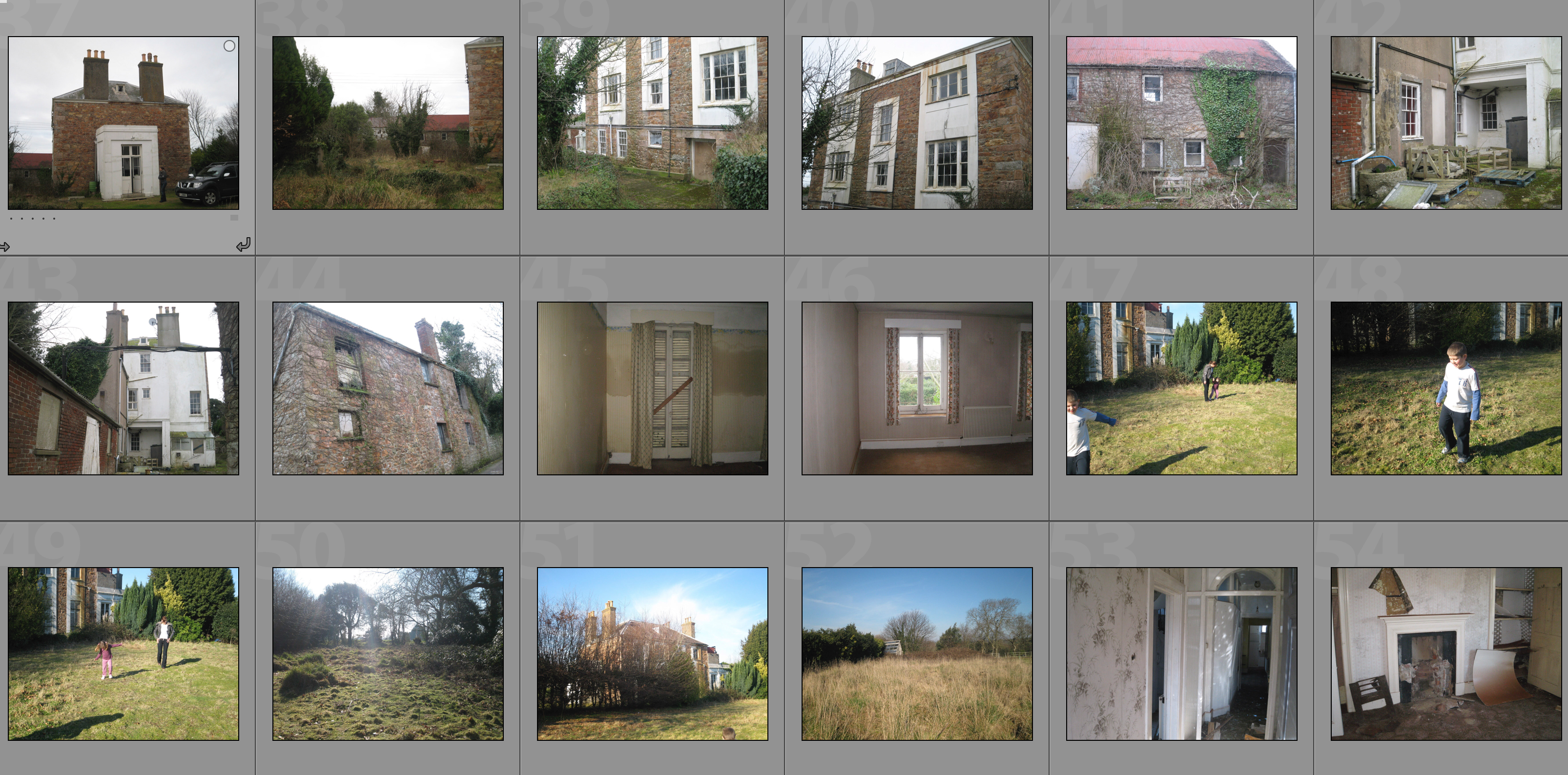
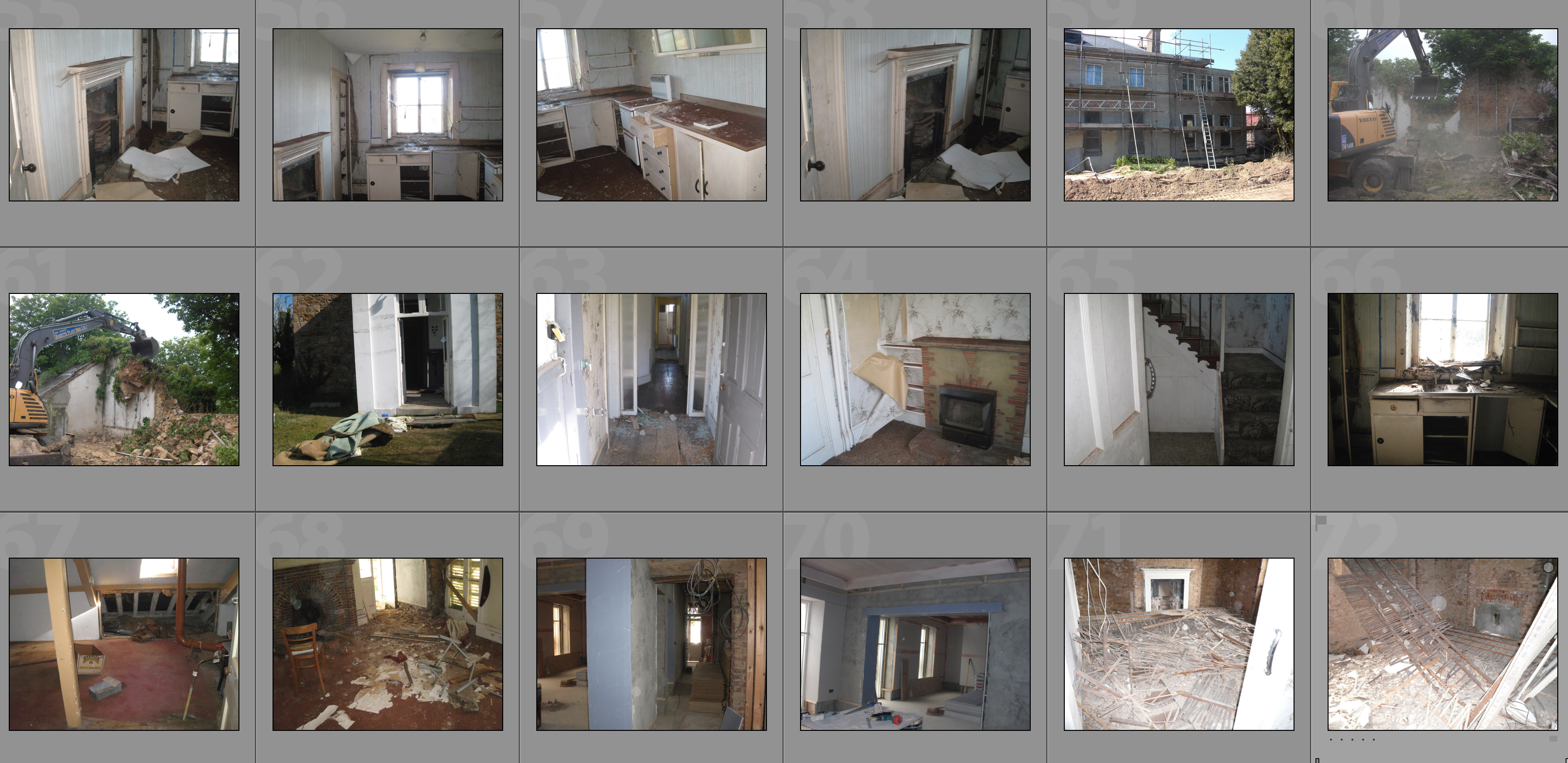
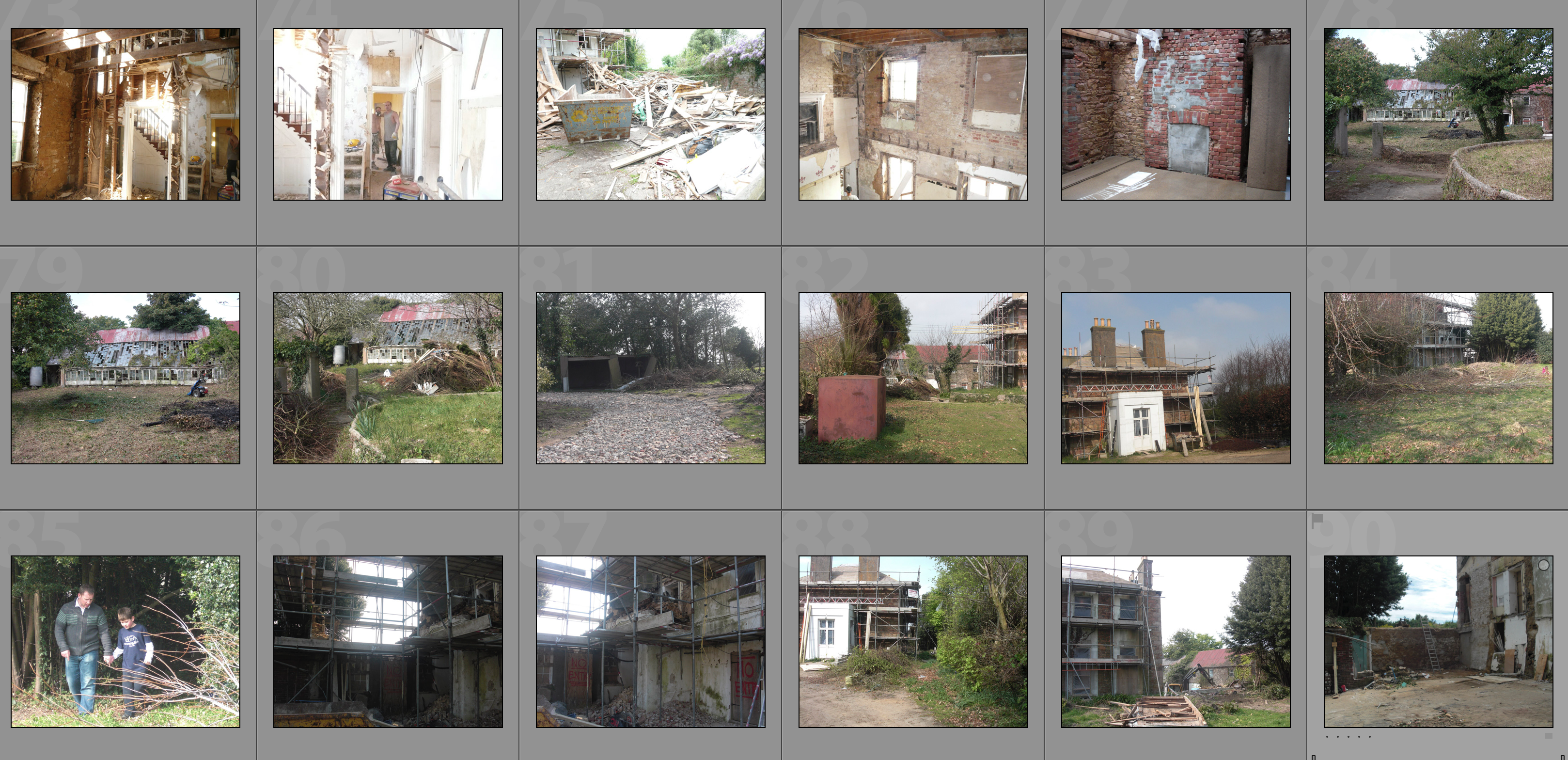
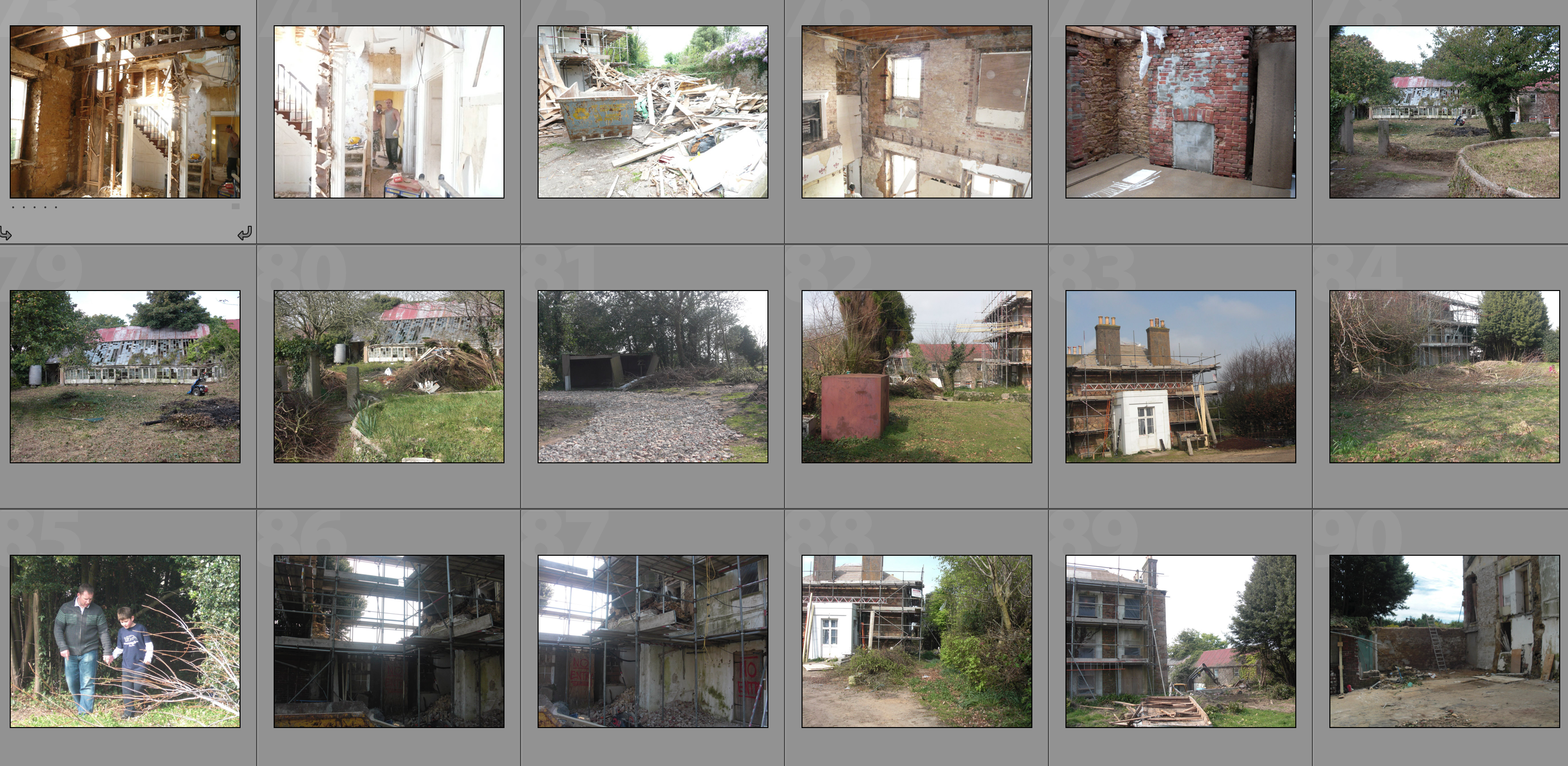
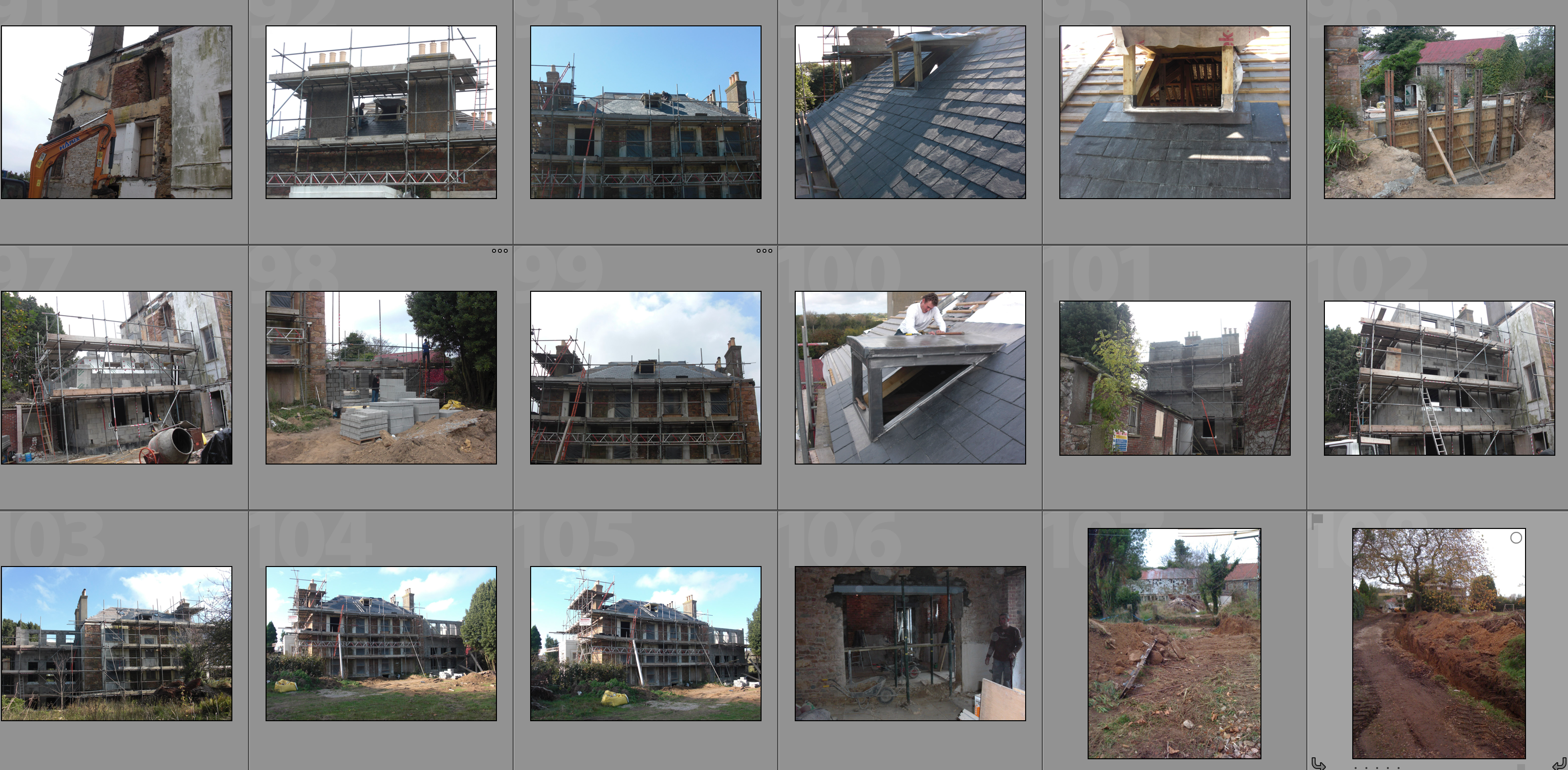
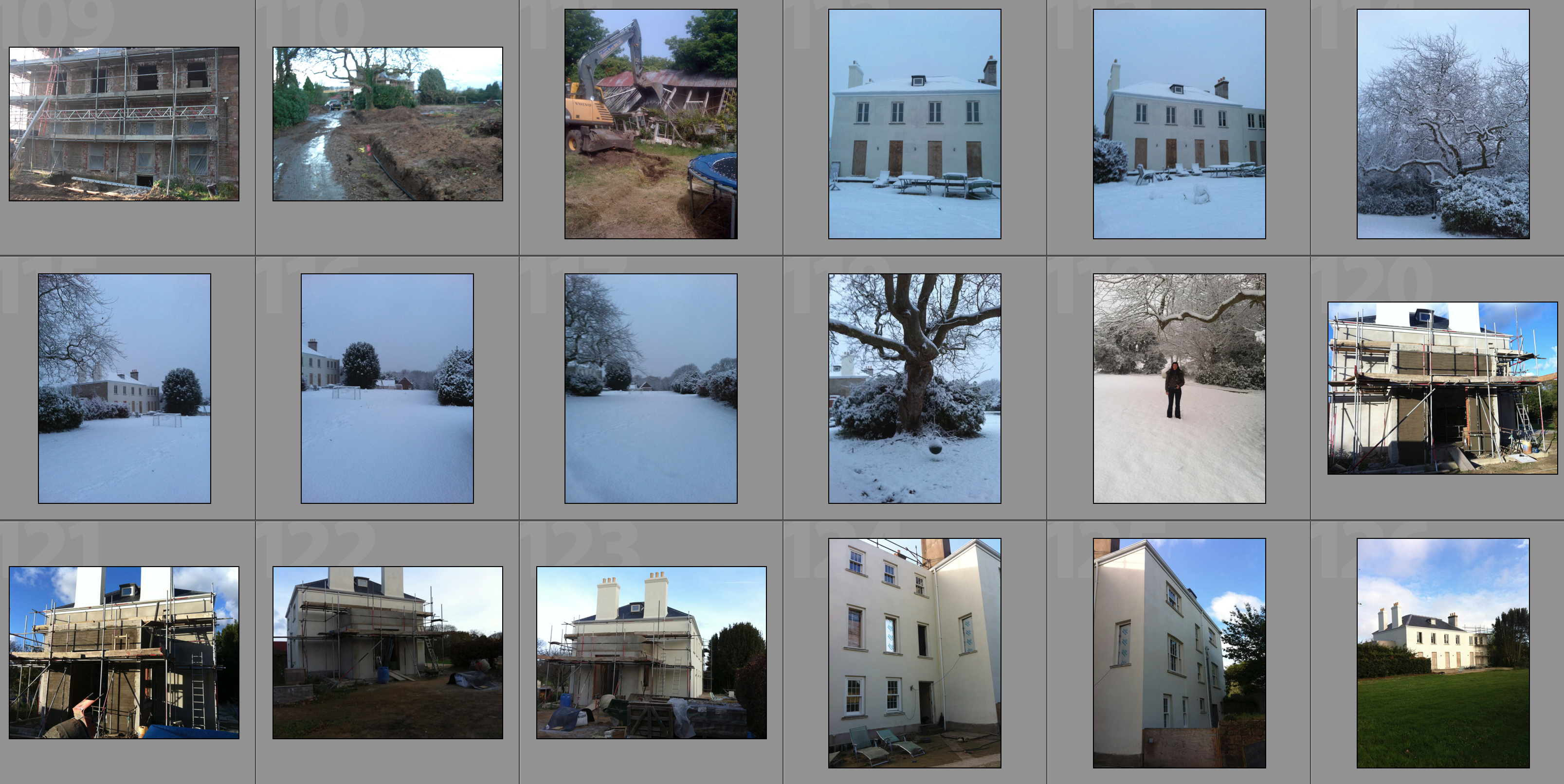
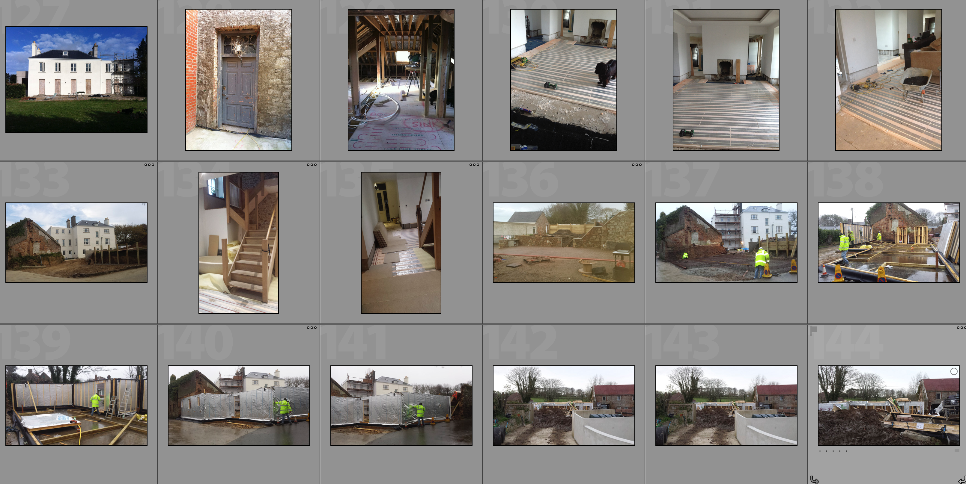
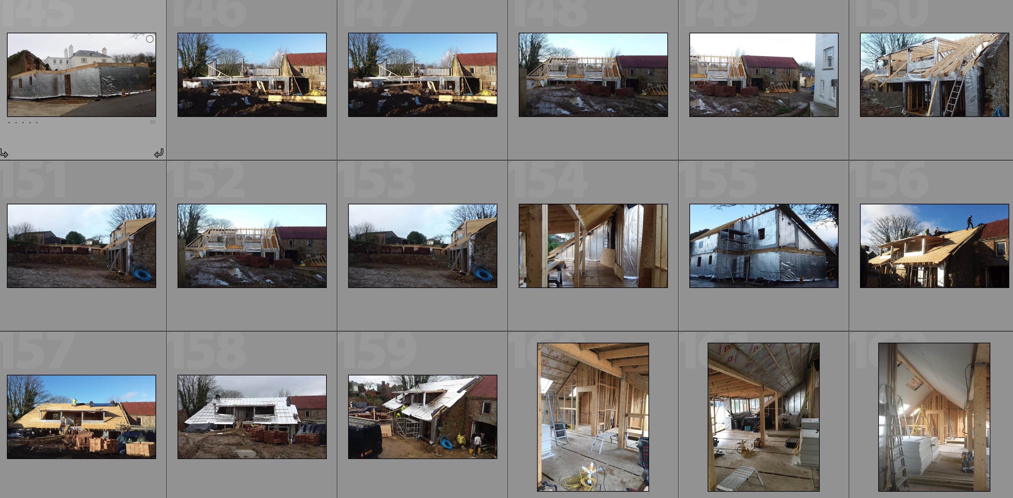
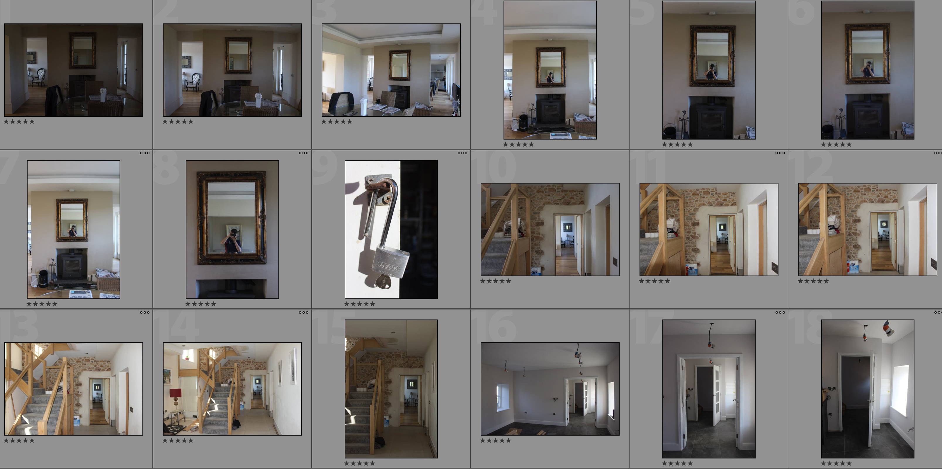
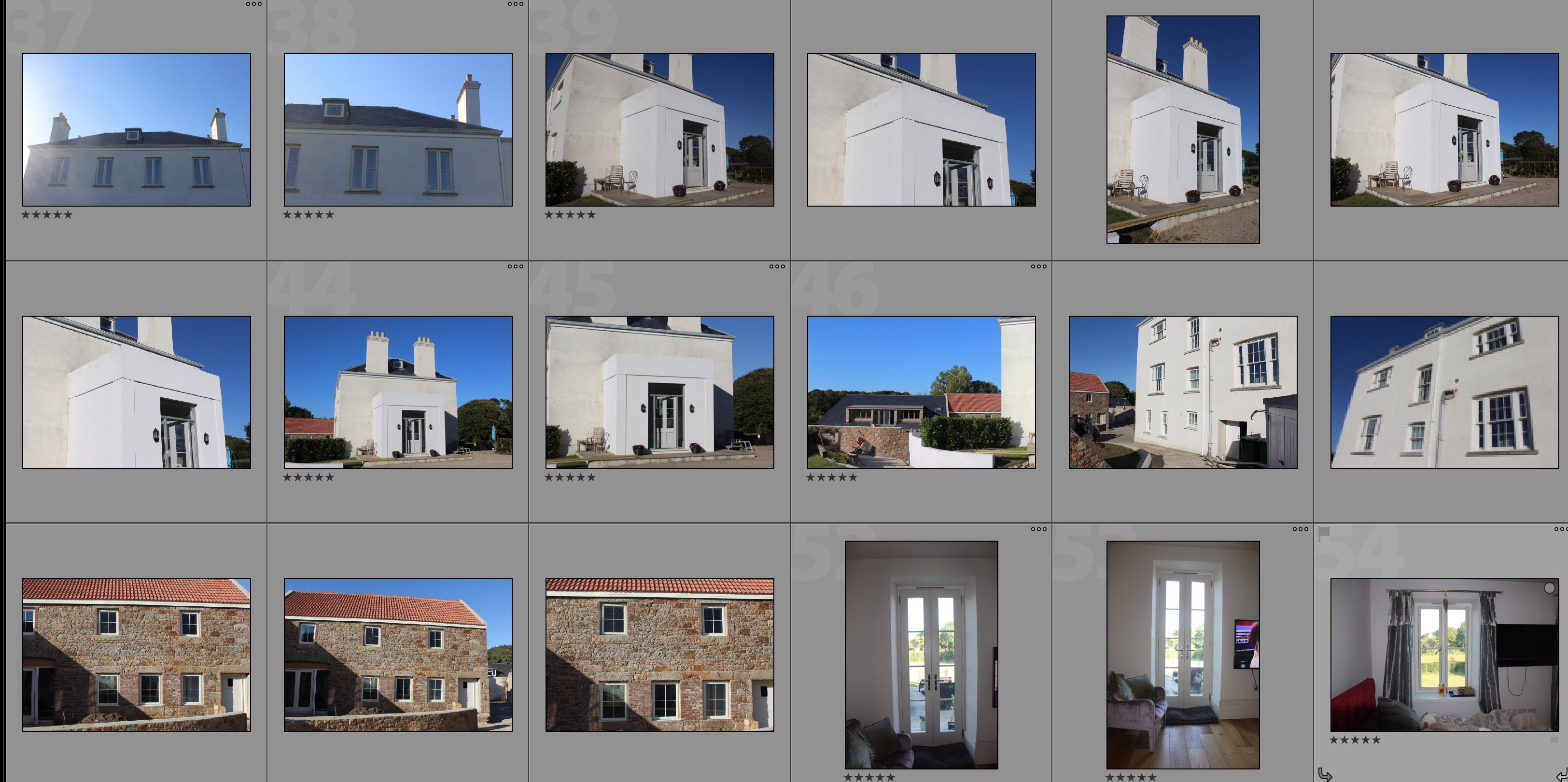
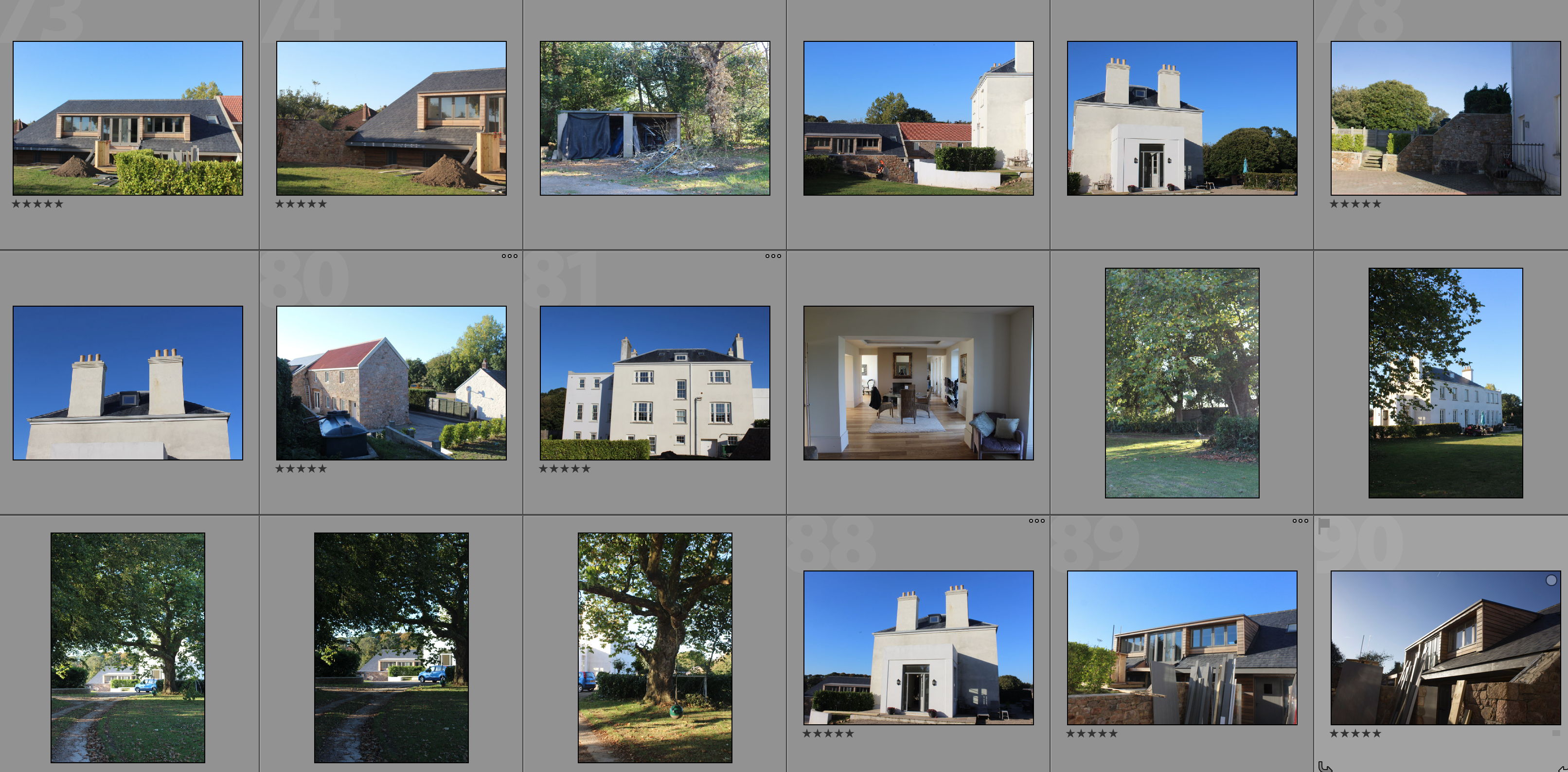
The below contact sheets contain photographs taken during the development of my house. The development within the photographs looks at how the land has changed over time through human intervention. The photographs show the houses at different stages including before development and the style that they were decorated in in the late 1800’s. This has strong links to political landscapes and Guillame Bression and Carlos Ayesta’s work due to exploring what man can do to a landscape and how drastically it can be changed over a period of time.

I plan on merging these photographs with my response photographs in different ways through experimentation in order to find the best way to show the contrast between the different stages in the development of the property and how it changes over time. A couple ways of which I am thinking of trying to do this is:

  • Layering the photographs on top of eachother
  • Cutting and pasting different parts of different stages into one montage
  • Splitting the images half and half

My Response Photographs

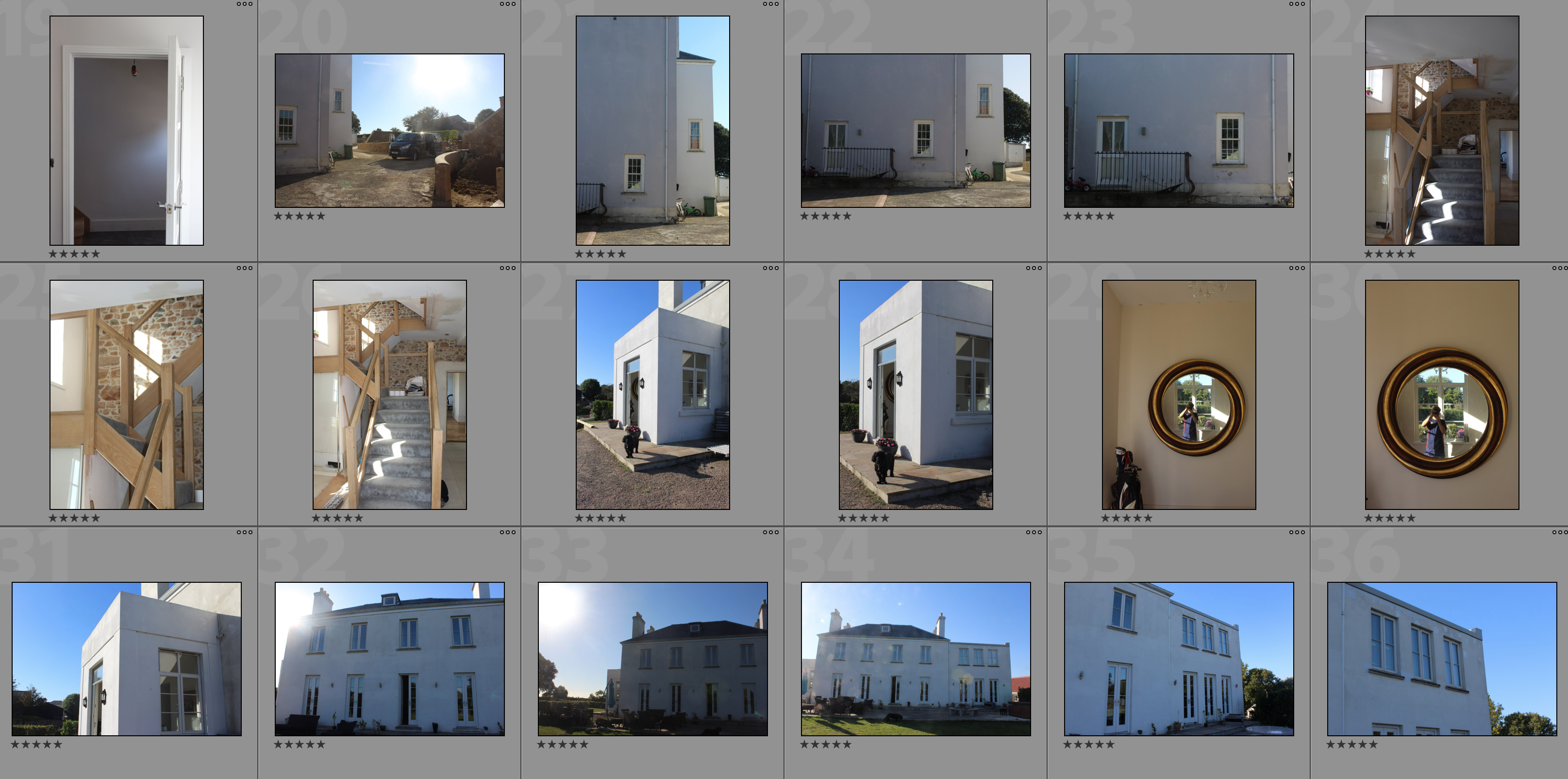
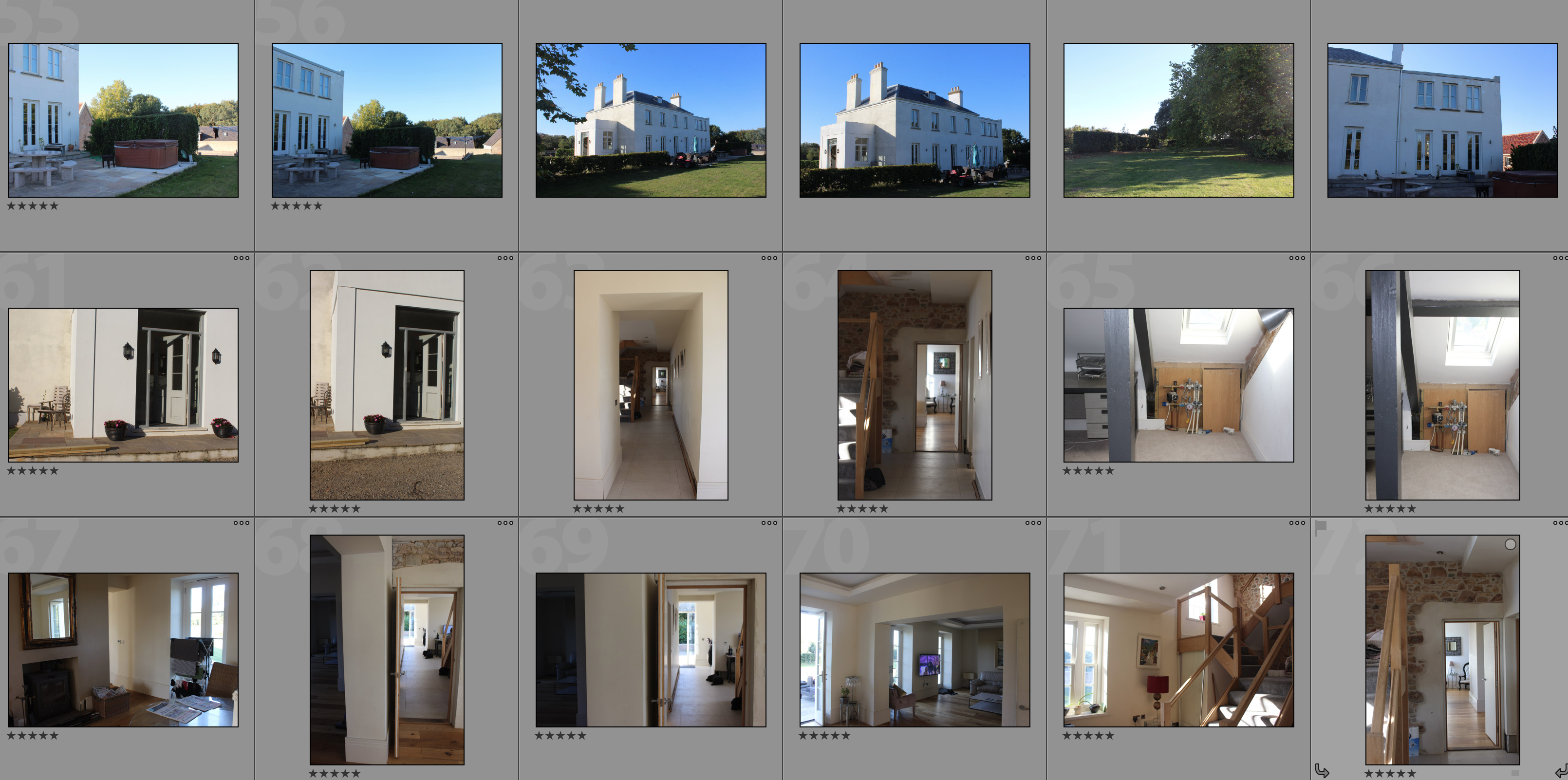
In these photographs I have tried to recreate some of the original archival photographs in order to be able to create contrasting photographs to show the development and changes over time. I have also looked at how the use of the land has changed by including photographs of furniture and decorations around the house. I have chosen a sunny day to take this shoot as I believe the blue skies and lighting creates a positive atmosphere due to the project being used for a good cause being a family home rather than a project such as the finance buildings.

Comparison of Photographs

Below are some comparison images of the different stages of development that the land has gone through over time. These images are only examples of how the land has developed and changed. I will be editing photographs by layering new photographs over archival photographs and vice versa in order to show the contrast and changes.

These changes date back to 1873 and show a variety of trends in the sense of property, for example in the below photographs the top right image is the oldest even those the style of house is almost exactly the same as the new modern development. This is because in the 1870 period only the people who could afford to would plaster their houses, but then later on it came into fashion for houses to have granite showing (top left) so the house was stripped of its plaster to reveal the granite structure. In the current state the house has been re-plastered in order to meet fashion trends and in order to show some inspiration from the original style of the property.

Zine final idea

I have decided that I want my zine to be very creative and unique I want the images to be on large paper, differing between glossy and card. I will then cover the front of my zine with a cover of fabric and will make a small piece of card ontop with perhaps a small picture stuck to create a clear visual demonstration of what is inside the zine. This will create a more interesting eye catching  zine and will allow the project to be about contemporary contrasts and comparisons.

inside my zine I want a mixture of double page spreads that change wihtin sizes in order to create the best effects for the picture as possible. I want to exaggerate the size of a building by having the image on large paper,I also want many of the images to contrast each other, some to have a boarder and some to have multiple on one page as I want this zine to be more forwards thinking than the previous traditional zines.

my zine experimentation:

Experimenting with layout, order and text

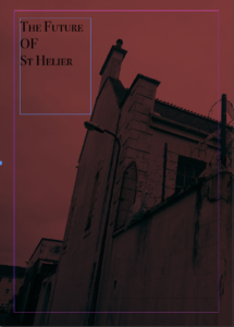
This will be the front page of my zine,I chose this due to the impact of the red and through the interesting composition allowed a clear title to be effective wihtin the top left corner. I chose a bold but yet elegant text, overall I think this is an effective for a cover and the rest of the building to carry onto the back will be effective.  Due to me also wanting to make a hard cardboard cover with a strong colour and clear visual stimulus it shows a clear connection from all the front covers.

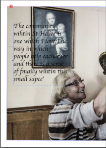
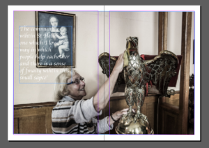
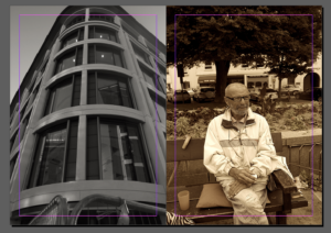
I decided it would be effective to use a quote of a lady to whom I interviewed in St Helier. I think this gives a story to the zine itself and a sense of community and really brings in the aims of presentation wihtin the Morden and older areas of St Helier. The text I chose was more twirly,I chose this as it connotes age of the lady and also demonstrates a fitting composition as this was taken inside a church. This is a double page image but I have given it a boarder as it has a lighter undertone. This at the end will make it smaller than other images but due to the different areas of interest such as the text, face and statue attention will still be drawn to the photo.

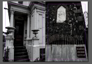
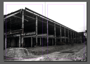
I wanted more harsh black and white pieces to cover all of the page.I chose these two images as I did not use them much previously and think they both demonstrate aspects of deterioration and contain a strong composition to the previous image. The strong white in the left image and the white in the centre right show a synritity to the images and I think the direct divide is successful in a simple display of the images.

As said in my previous post I want to experiment within different layout. I wanted to choose images which all chose the stature and impact of buildings in slightly different compositions.  Again I have edited all of the images into black and white this then shows a strength to the images and also shows implications to look at the buildings structure and not the images themselves.

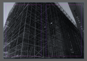
I chose this piece due to the interesting composition and how on a large size of glossy paper the strong impact this would have. It also has a clear convention to being connected to the construction,destrcution and  remodernisation of St Helier. I think the angle and harsh composition really creates a successful piece. Although this piece is very dark tonally It creates a very strong impact  altogether.

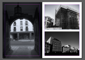
I am not sure however about this double page. In my mind I think the colours or specifically the tonal shading of the black and white does not site each-other. I wanted to show a contrast within the older community and people living within St Helier versus that of the new modern buildings. I think this is an interesting idea when done correctly but I will need to do further experimentation into this piece.

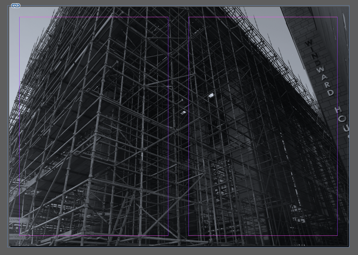
This is now one of my favourite images so I have decided to give it a double page spread. I like the way in which it is cut off as this implies its huge stature,I think the image itself is enhanced though the tone and the way in which the scaffolding creates a three dimensional atmosphere.

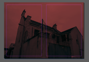
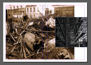
Lastly I wanted to experiment even more so within composition so making a miss matched composition. I think this is interesting as it presents two different types of rebuilding and the different tonal of warmth and coolness contradicting is highly interesting.

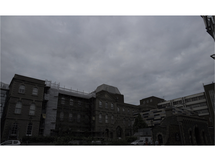
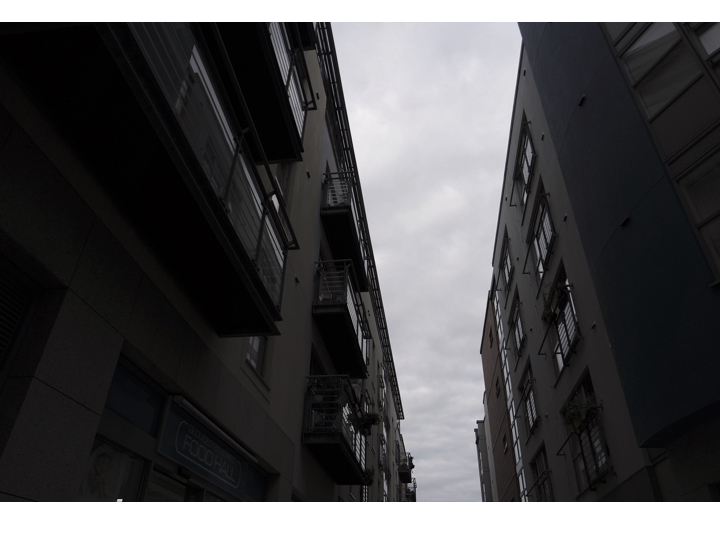
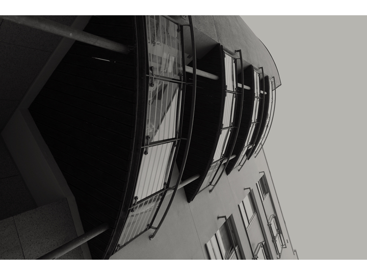
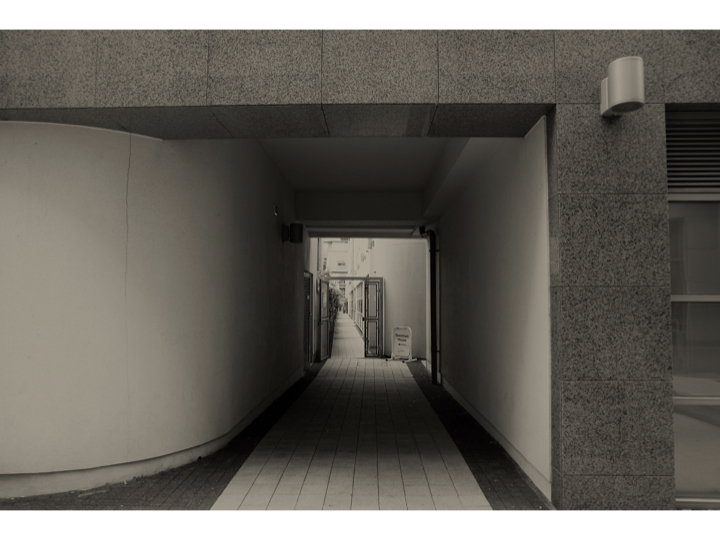
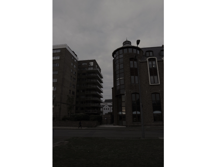
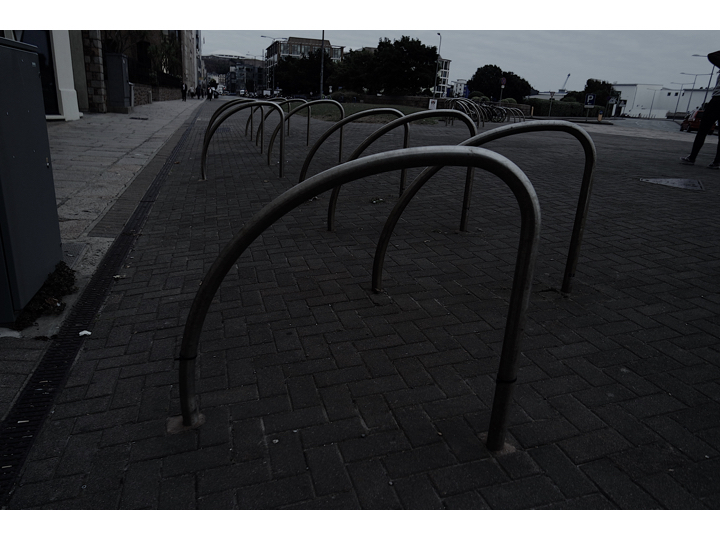
PHOTO SHOOT

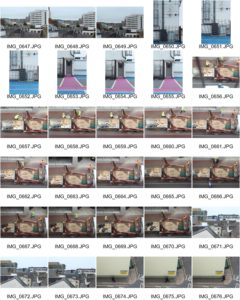
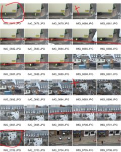
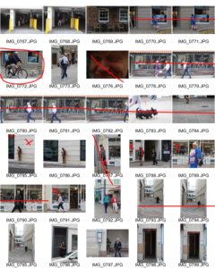
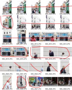
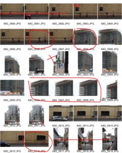
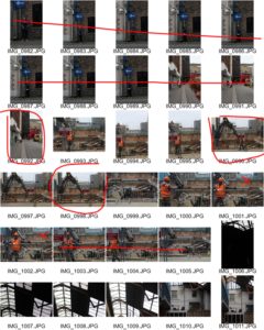
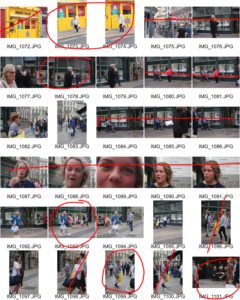
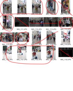
For our second shoot we left Societe Jersiaise to explore our allocated areas of St. Helier. First I explored my areas on foot and took pictures of the surrounding buildings and people on a street view, then later went to the top of sand street car park where I managed to capture pictures of town, construction workers and the public from a raised view. The car park was the only public point where we could capture pictures from a higher level so we explored commercial street. We asked the owners of multi story buildings for permission to photograph on top floors for alternative viewpoints of St. Helier. The one building that granted us permission was a mechanics warehouse. We never had the opportunity for an alternative high view point but we managed to capture images of the inside of the building where there were many unusual objects in unusual places. We came across old cars and old kitchen units in the derelict upper floors of the building and explored their storage rooms.


last shoot:St Helier development

contact sheet: Evaluation:For this shoot I wanted to finalise and make sure I have been to multiple areas In St Helier and reassure the images I have are the best way to capture St Helier in a successful angle altogether.I clearly focused more on the architectural side of my narrative within this shoot and wanted to display different angles that can be turned conceptually into an idea of character  which each section holds. Within these images Morden buildings are the recurring them although you are able to see some significant monuments and buildings more neglected and so perceived as urban. When editing the images I wanted to enhance tonal features and so the composition of shadows and the angles of the edges and shadows of the building themselves. This shows a presence to the work and position the more built upon section of St Helier to have more power and authority over previous sections. Overall I will not use these images as my final and will continue to keep my previous red images as they show a more possessive narrative of destruction reconstruction modernisation and the community which lives among this constant time.