Category Archives: AO3 Record Ideas

Filters

Author:
Category:

Homework 3 ( Ernst Haas )

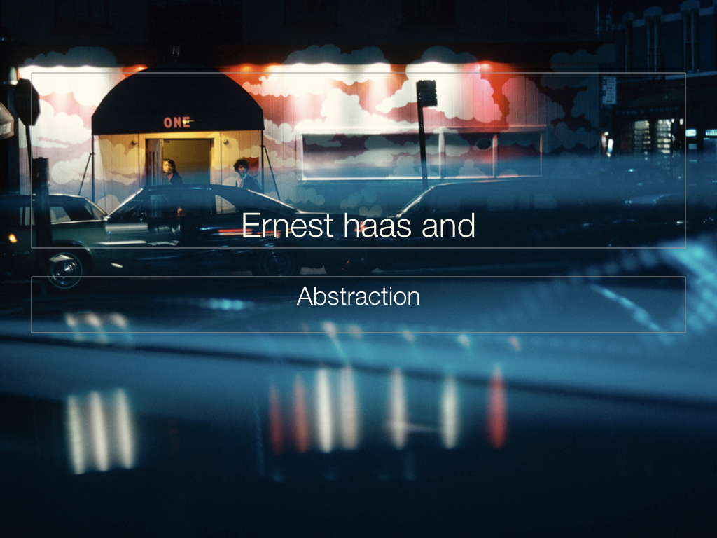
Ernst Haas

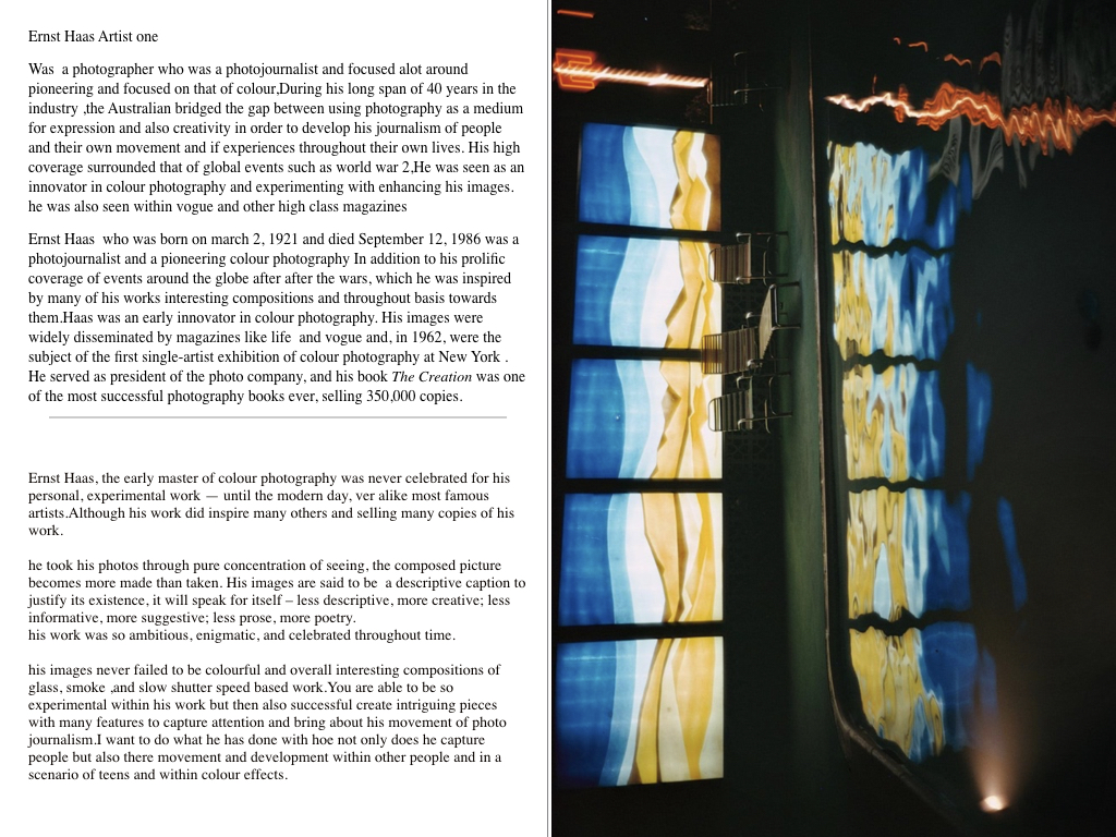
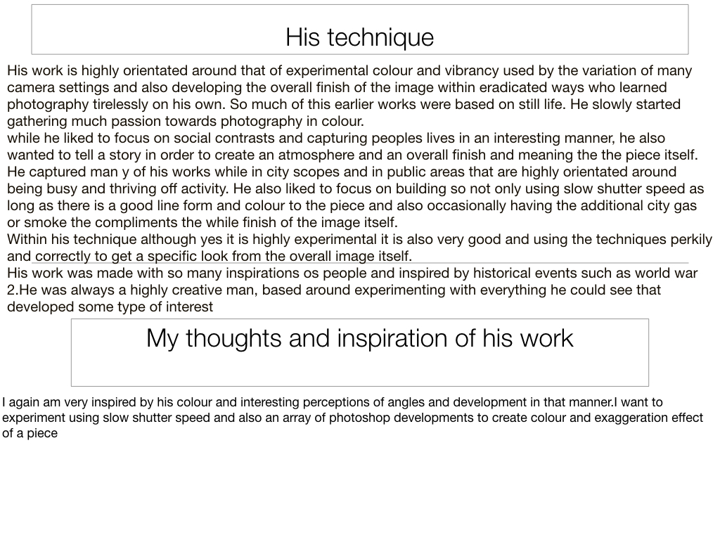
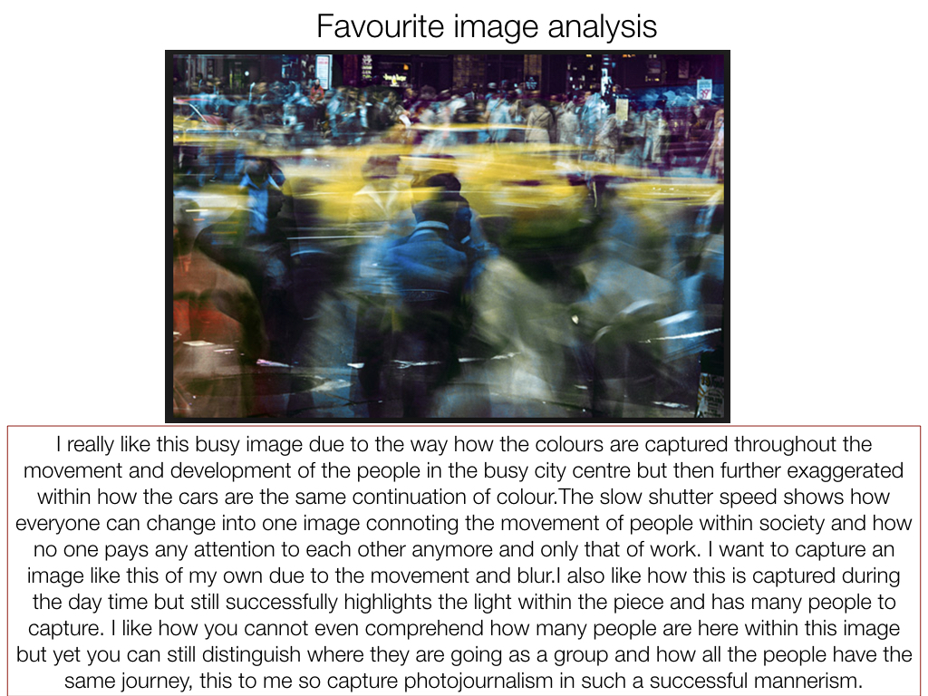
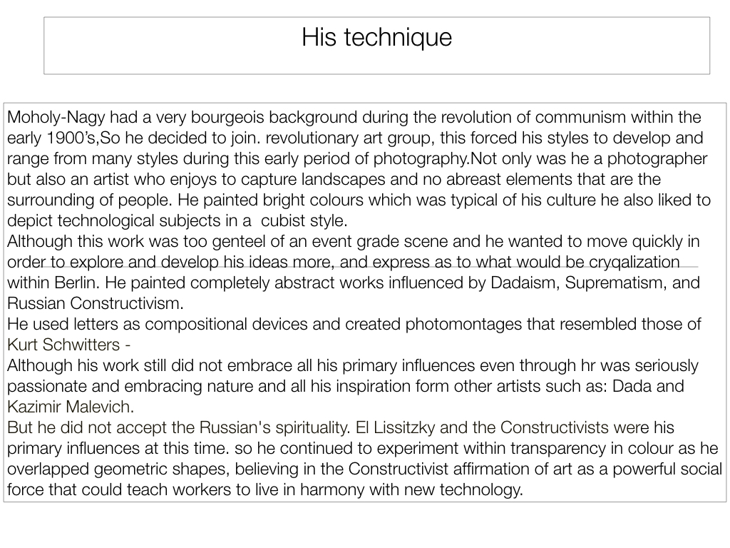
Ernst Haas was a photojournalist and a pioneering color photographer. During his 40-year career, the Austrian-born artist bridged the gap between photojournalism and the use of photography as a medium for expression and creativity. Ernst has a great vision in exploring photography in a more creative and unrealistic way than we actually see things in real life. Using various camera setting like shutter speed Ernst captures great visuals of urban environments, capturing the explosive and rushed vibes within these areas. He does this by producing many images containing motion blurs.

Haas was an early innovator in color photography. His images were widely spread by magazines like Life and Vogue and, in 1962, were the subject of the first single-artist exhibition of color photography at New York’s Modern museum of art. His book The Creation (1971) was one of the most successful photography books ever, selling 350,000 copies.

My Photo shoot Plan

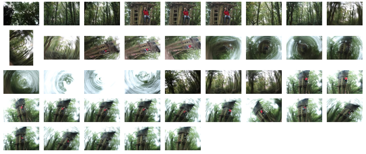
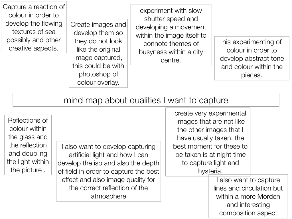
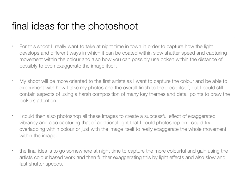
In my photo shoot I intend to use a slow shutter speed in order to capture abstract images which are serial, like Ernst’s are. It appears that he uses mainly natural lighting for his photographs therefore as will I and the location of my shoot will be in a woodland area, where I can capture the feeling within and among the trees. This is similar to Ernst’s photography where he captures the atmosphere in the city, amongst buildings however I am going to take a different approach by expressing the feelings found within a woodland area.

Contact Sheet of Photo shoot

Edits


Becher Inspired Photoshoot

What is a typology? 

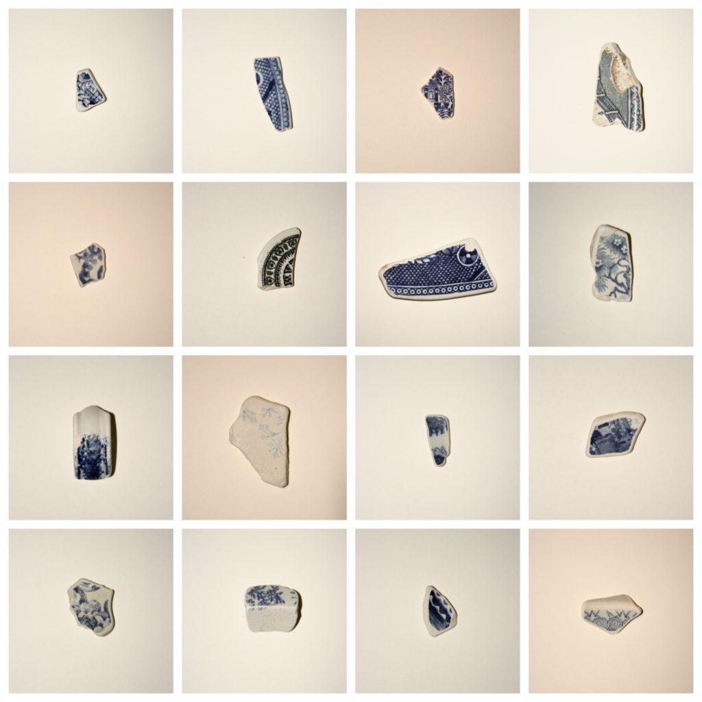
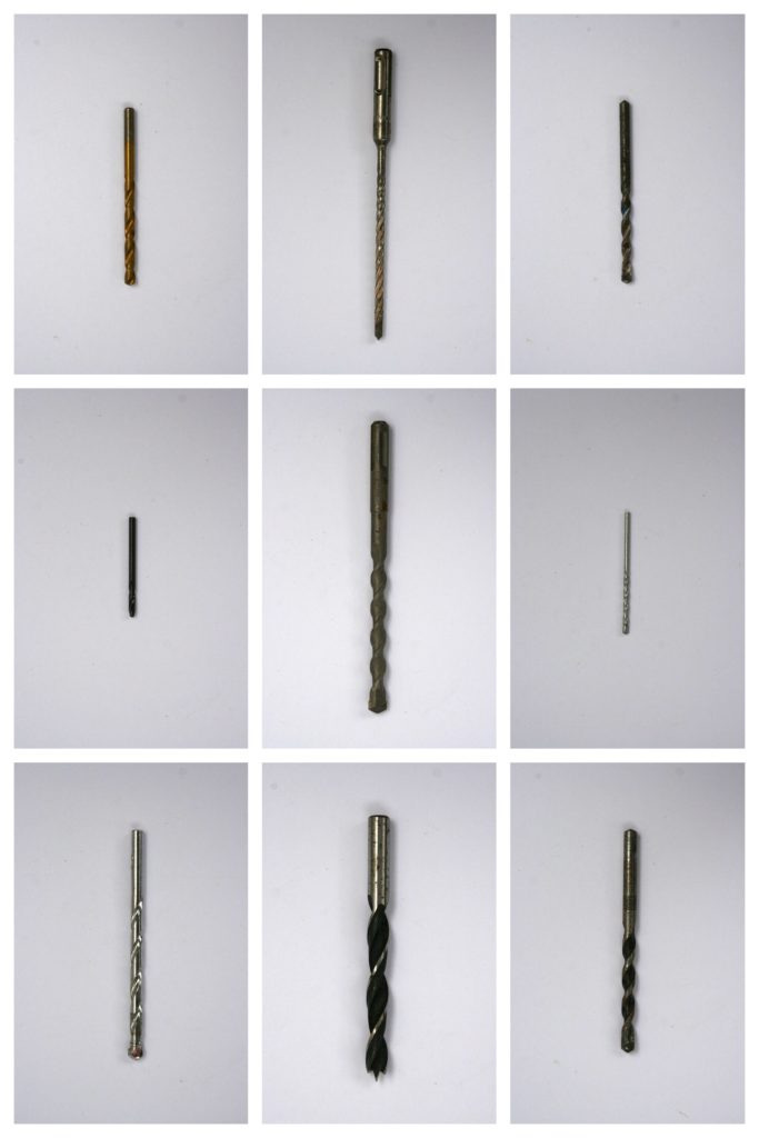
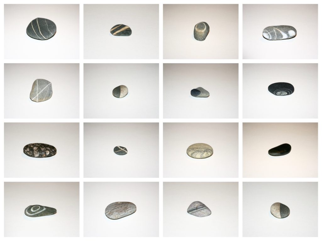
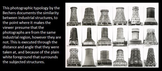
Typology is the study of types, however in photography a typology is a series of images, in which the photographer has taken many of the same genre of object (buildings, pencils etc), using roughly the same composition for each one creating that scenes of repetition about them.

Bernd And Hilla Becher

Both these Photographers were German based, and were commissioned by the government to produces typologies of specific types of buildings, as seen below.

Image result for Bernd becher photography

These Photographers would go around the country taking the same composition of certain objects, which when one was taken would not look that impressive, but rather when hundreds were taken precisely from the same distance, and combined together, it creates an almost artistic creation

In response to this I decided I would walk around my home area and try to incorporate this style into my images, I chose the themes around car lights, windows with chimneys, and doors. These were some of my results:
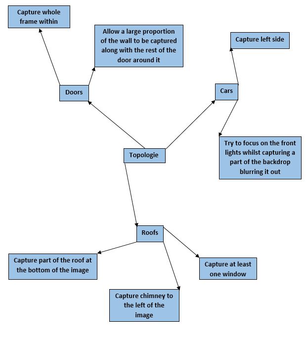


 I decided that the car topology sheets worked the best, due to the contrast between the lights and the bonnets of the car which came in different shapes.

Focal Length

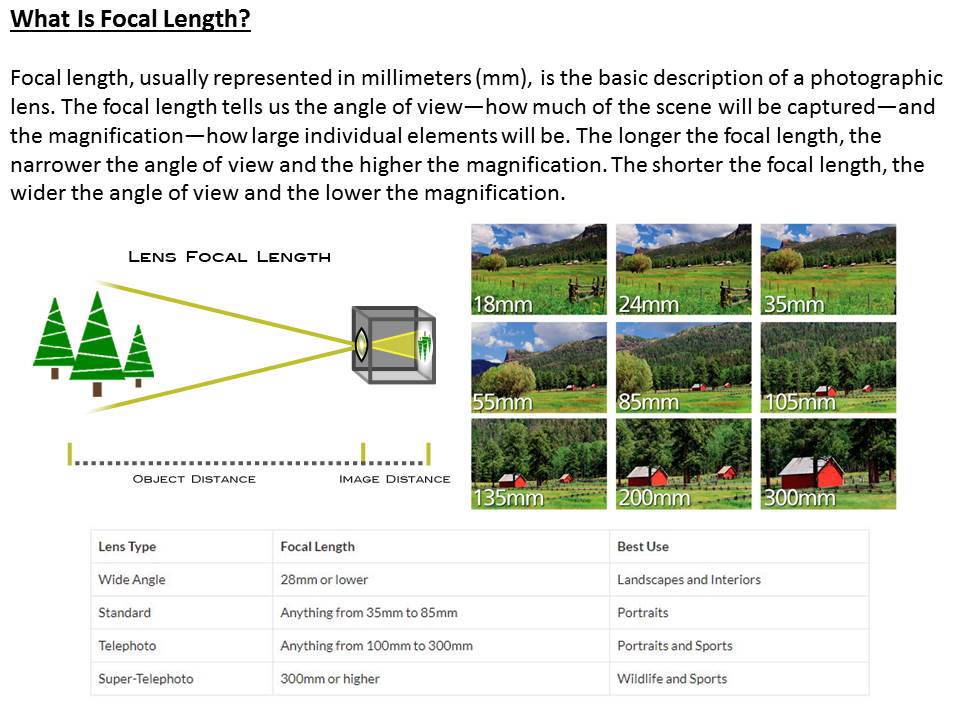
What is focal length?

The focal length of the lens is the distance between the lens and the image sensor, when the subject is in focus, usually stated in millimeters (e.g., 28 mm, 50 mm, or 100 mm). In the case of zoom lenses, both the minimum and maximum focal lengths are stated, for example 18–55 mm. Changing the focal length changes the angle of view. The shorter the focal length (e.g. 18 mm), the wider the angle of view and the greater the area captured. The longer the focal length (e.g. 55 mm), the smaller the angle and the larger the subject appears to be.


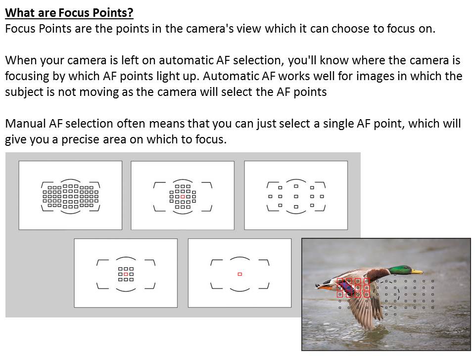
I tried having a go with this concept, by focusing firstly on the backdrop rather than the central figure, and then on the figure rather than the backdrop.

In this image I chose to focus purely on the backdrop of the trees rather than the character within, as an experiment with my cameras focal length.


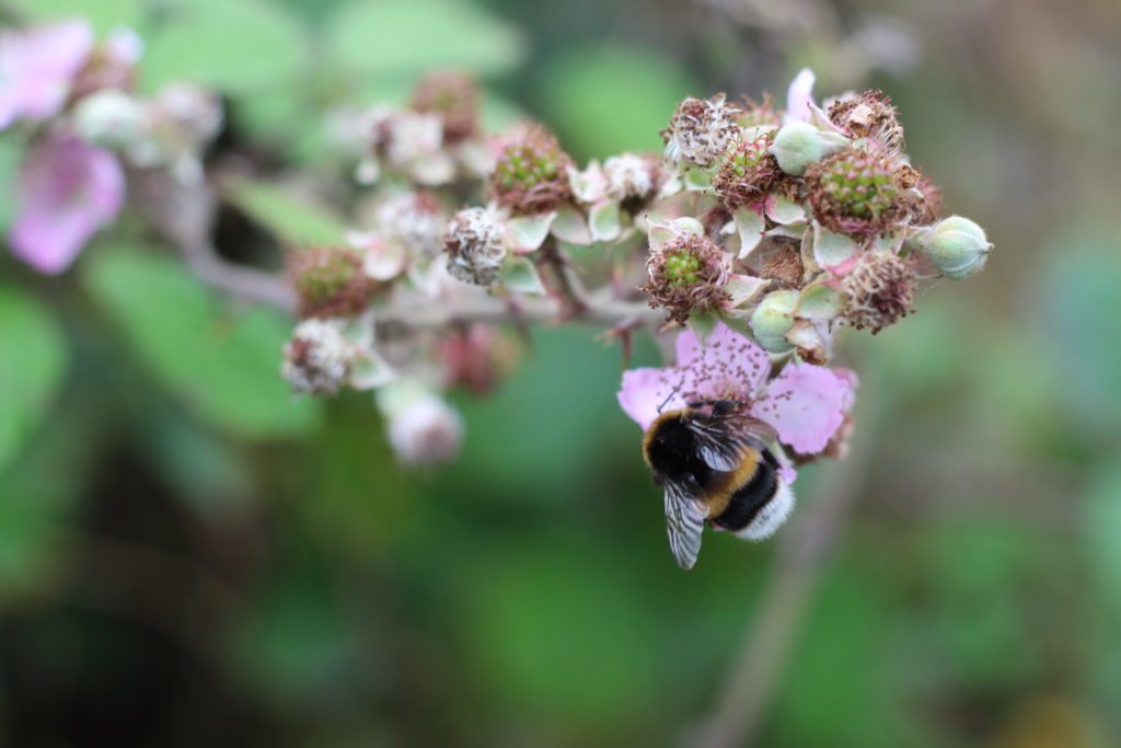
This image however I chose to focus on the closer object to the lens, which happened to be a bee on a flower, therefore blurring out the backdrop rather than keeping it clear.
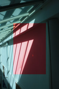
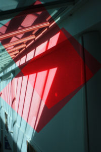
colour overlay and blur Photoshop

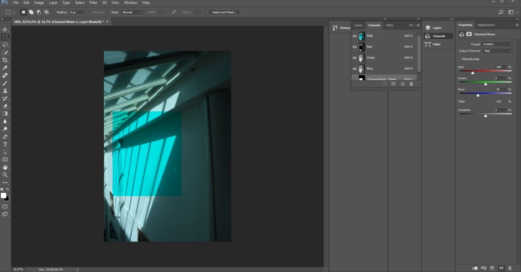
Within this piece I wanted to cut out two identical pieces and use this in order to develop an overlay and deepening of color over the highlights and cut out on the wall itself. I used red to contrast to the lighter blue tones of the underlay of the original image. I duplicated these layers and images so again the red is more significant and you can see this development throughout these images.

Blur Photoshop
I edited  this image within layering and adding a blur layers then went back into this piece. Within the first layer I used a rubber and the brackets to differentiate how big and small I want the rubber to be,again creates a depth of field of how I want the front to be. I focused on detail and have successful aspects of realism and only the back to so blurred which creates contrast. Then further edited this image in order to show better color such as darker tones to again exaggerate the image itself and not be distracted by off coloring’s creating a Batter finished effect.

Here you can see my method of developing the color overlay,finally you duplicate the layer and attach the specific shape and placing that you feel would be the most effective,The throughout the half circle you can develop the colors and development of the square and further the potion and add additional shapes to deb then the color.

And to achieve the blur photo I Opened Photoshop then Duplicated the Layer added Mask Layer –,after this I added an additional Filter going to Blur then  Motion Blur –and finally Then selected how blurred I wanted the image to be ,then to take away and add more reinvent I  Selected the Eraser tool and followed to  Erase the section that I don’t to be in focus ,producing the final image.

Typologies- Homework 2

Photoshoot 1

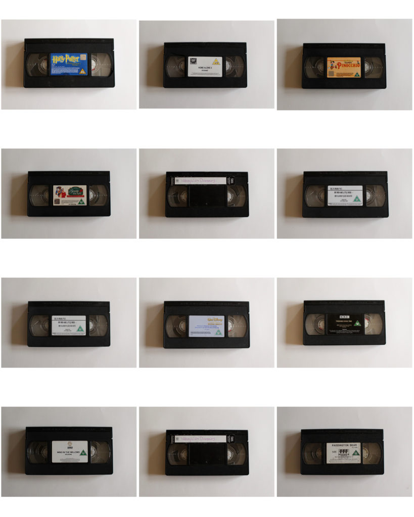
I used old video tapes to photograph as a typology because they all look similar but are slightly different. They all have different labels with different colours, and some have a greater antiquity then others. I placed a white piece of paper behind when taking my photographs as I wanted to emphasise the video tapes without any other distractions. I also like how the white paper showed the shadow from the light coming in on the right, giving the photo some depth and 3D qualities.

Photoshoot 2

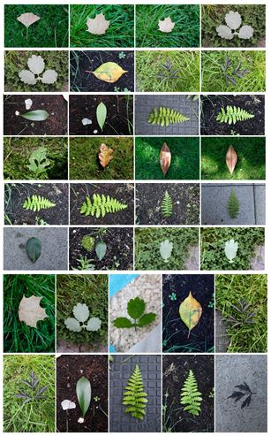
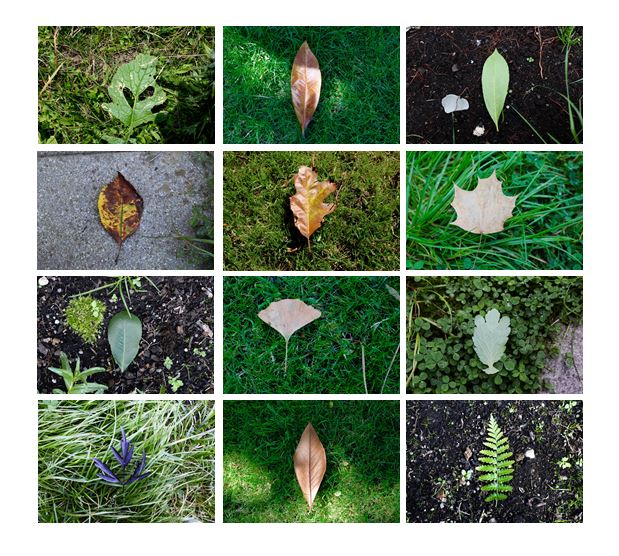
When photographing the different types of leaves I tried to make the backgrounds different for each individual photograph, making whole contact sheet more interesting and varied. I also tried to find a leaves with a range of different colours and different patterns and textures. I used natural light and had shadows in some photos creating a more natural effect.

I selected the photos I thought worked better together and created a contact sheet displaying them. I made sure the order in which they are displayed, and the colours in which they have, complemented the other photos, making the overall contact sheet aesthetically pleasing.

Photoshoot 3

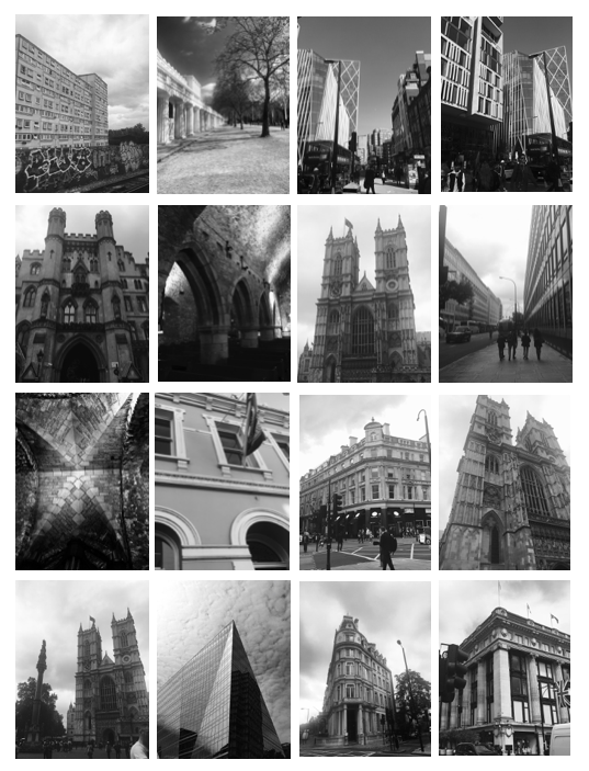
For this shoot tried to gather photos that are similar to Hilla and Bernd Becher and their structural photography. These photos are took in London and all show similar and different structural qualities. I chose to edit my photos to black and white, trying to recreate Hilla and Bernd Becher’s style. One improvement for this shoot would be for the buildings to be all the same size as some are closer up and some are at a further distance, so the overall effect of the contact sheet is not as strong and my other ones.

Overall i think i produced photos taking inspiration from Hilla and Bernd Becher well and tried to explore different sides to typology photography and took into consideration how they sized the object the same in every picture.

Typologies Homework Task Week 4

Typologies

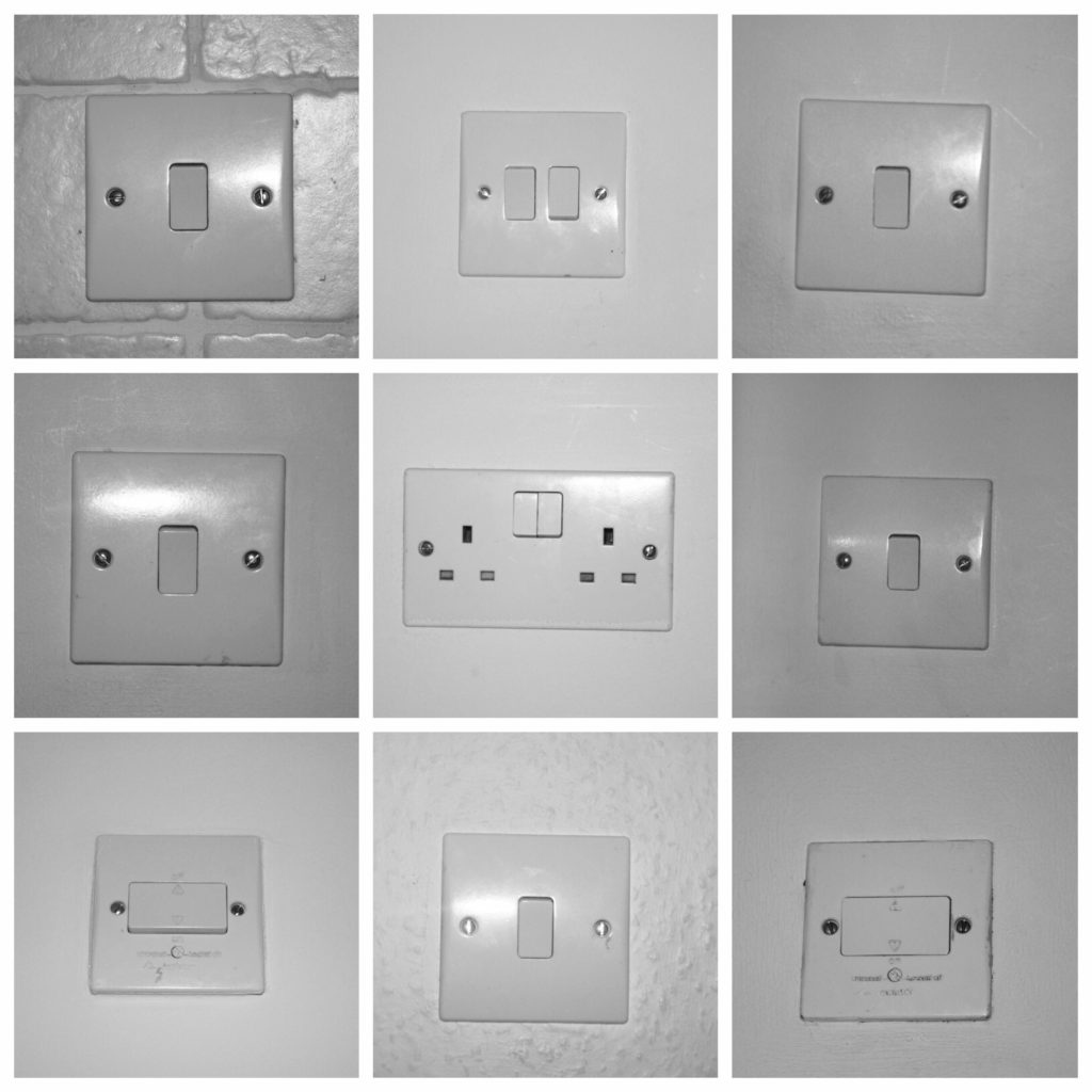
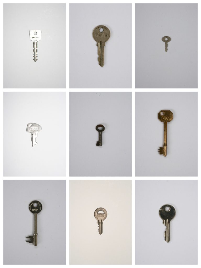
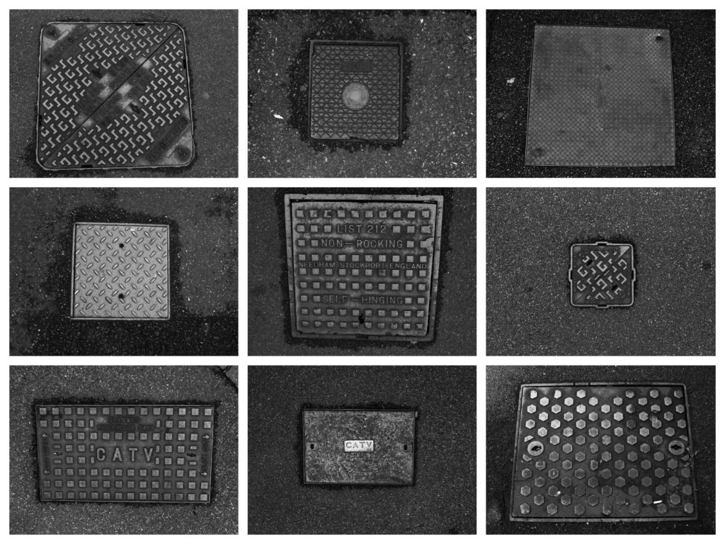
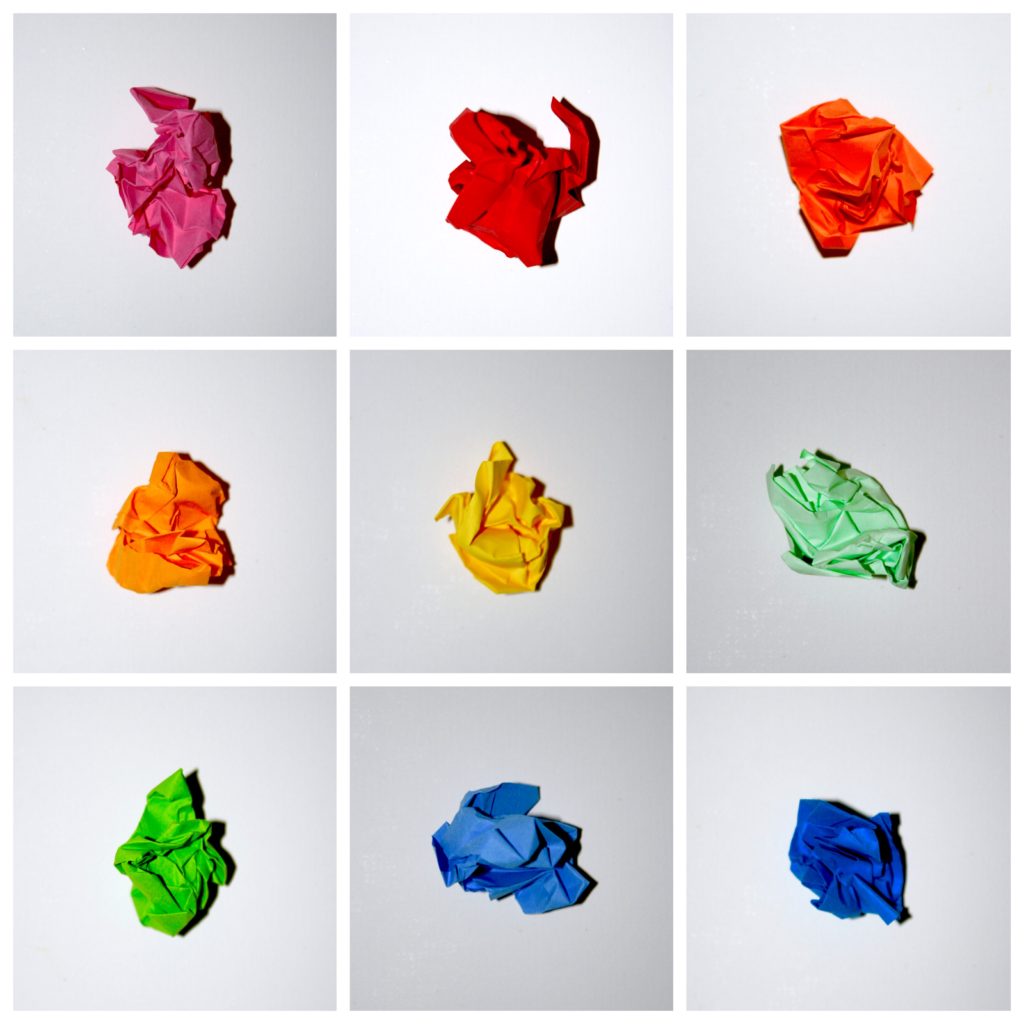
Typologies by definition are a classification according to general type. So in photography they are collections of similar ‘things’ compiled together to produce a visually similar set of photographs.

Photo shoot contact Sheet

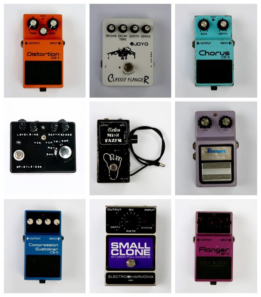
Photographic typologies produced from my photo-shoot

Guitar Pedals
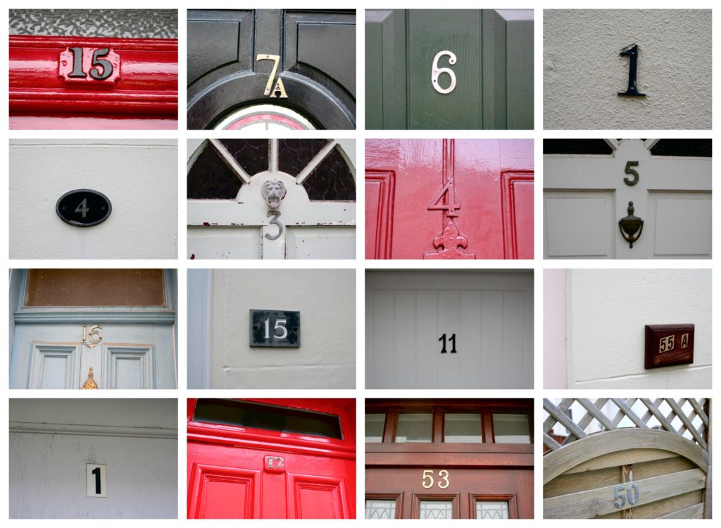
Door Numbers
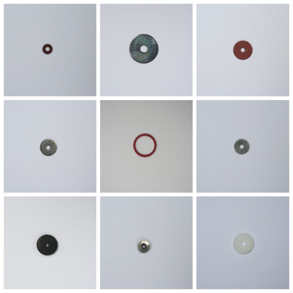
Washers
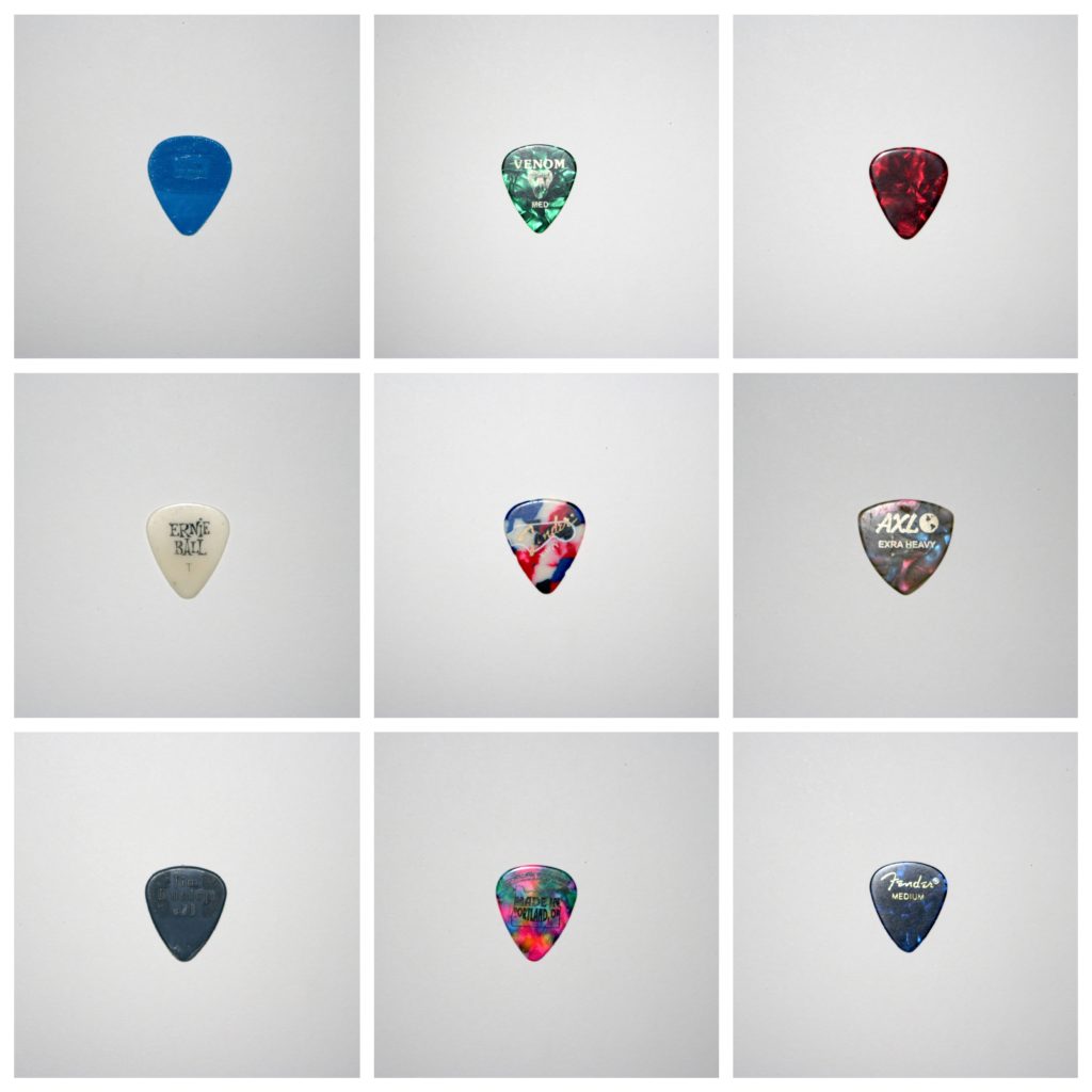
Plectrums
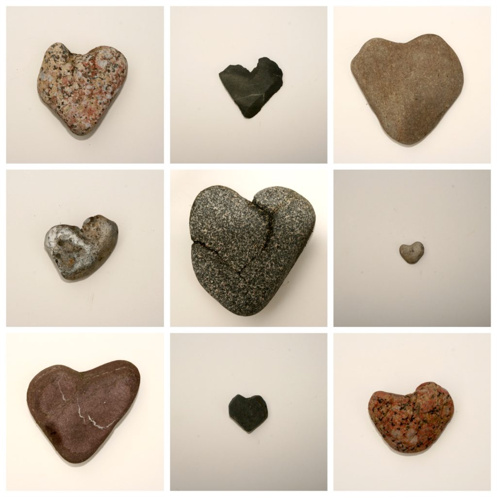
Heart Shaped Stones
Switches

Keys
Manholes
Coloured card
Pottery
Drill Parts
Pebbles

Photographer Research One (Jeff Brouws)

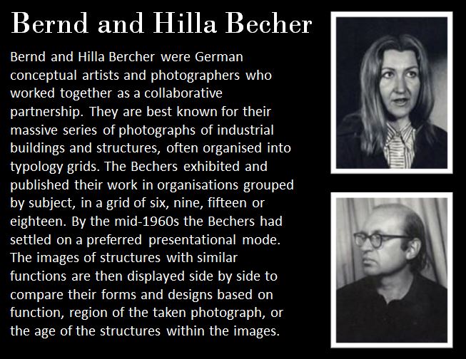
Photographer Research Two (Bernd & Hilla Becher)


Homework Assignment 3

Planning:

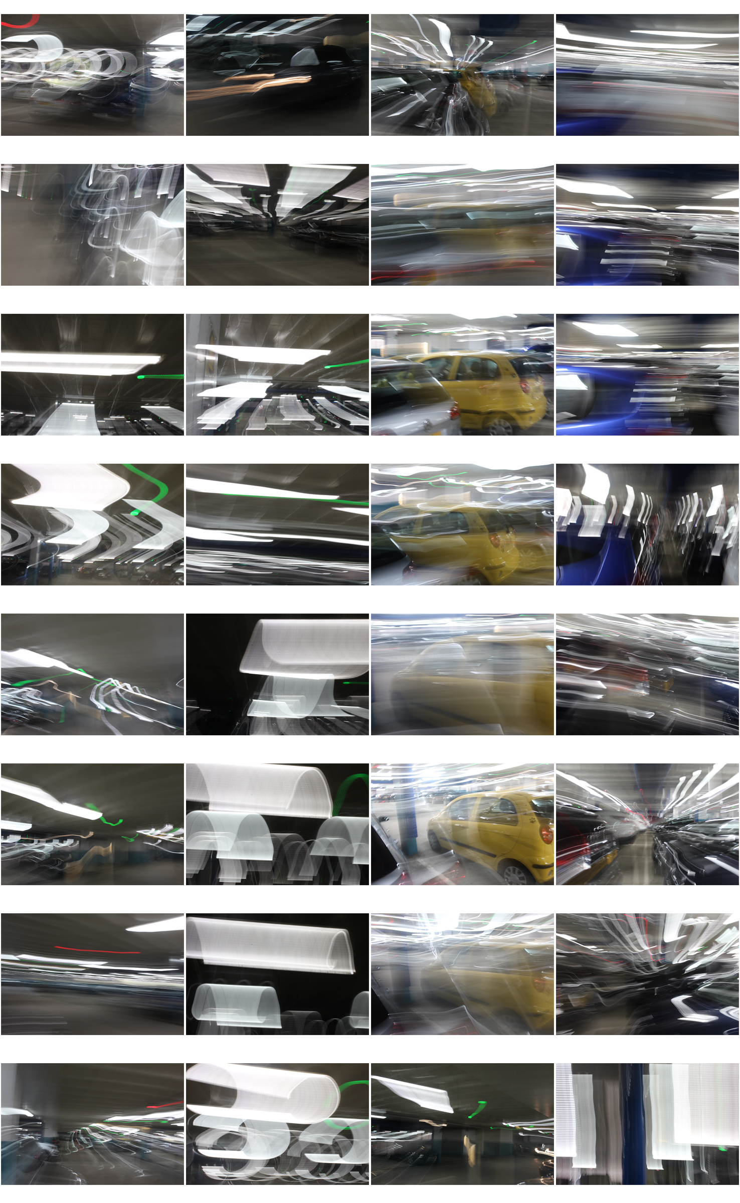
Task – Produce 100-200 images that show a response to abstract art and photography

Locations – Car park,  street

Subjects – Josh, cars, lights

Lighting – flash in the car park, natural lighting outside.

Camera settings – Low shutter speed (0.8 seconds) for blurred effect, ISO 800 due to dark settings, deep depth of field so high aperture.

Concept – capture and manipulate movement of light

Ernst Haas

Image result for Ernst Haas photographer

Image result for Ernst Haas photographerErnst Haas (1921-1986) was born in Vienna and took up photography after the war.
In 1953, LIFE magazine published his 24 page colour photo essay on New York city.

He received the Hasselblad award on the year of his death.He was a photojournalist and a pioneering colour photographer.

His book ‘The Creation’ was one of the most successful photography books ever.
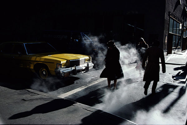
My favourite Ernst Haas photo:

This is my favourite photo by Ernst Haas because of the contrast and mystery behind it.

The yellow of the car contrasts very well with the dark, almost colourless, image. The shadows and silhouettes create a sinister and mysterious setting along with the smoke.

This could just be a photo he took in the middle of New York city but the shadows and smoke make it a very interesting and dramatic image.

Image result for Ernst Haas photographer

Lazlo Moholy-Nagy


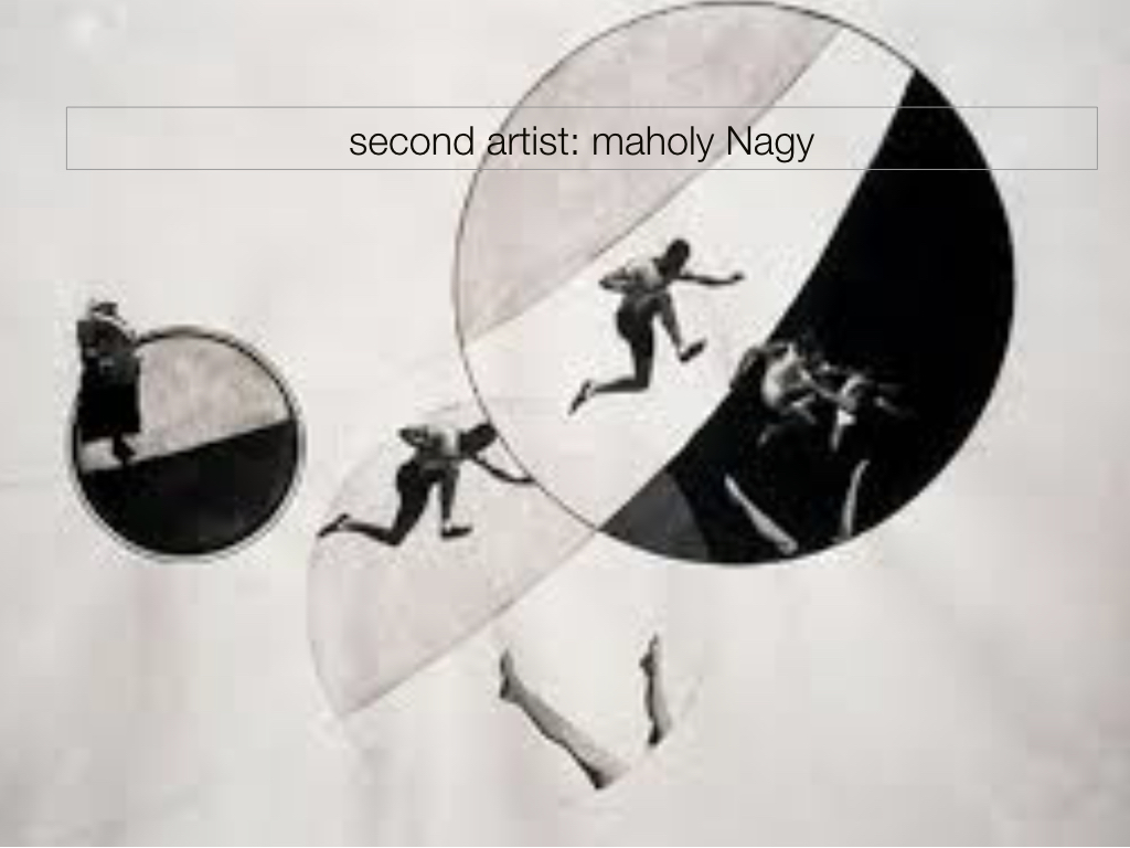
Image result for moholy nagy photographyImage result for moholy nagy photographyMoholy-Nagy (1895-1946) was a Hungarian painter and photographer.
He was highly influenced by constructivism and helped to integrate technology and industry into the arts.

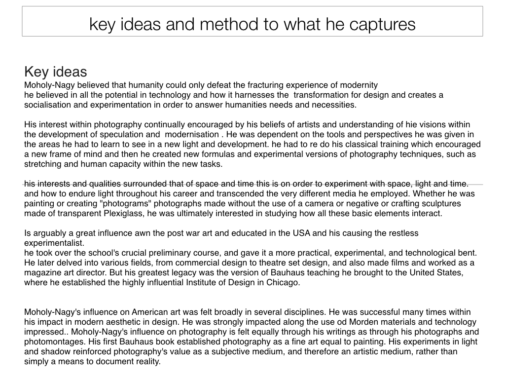
He believed that humanity could only defeat the experience of modernity if it harnessed the full potential of new technologies. He thought that artists should turn into designers.

My favourite Moholy-Nagy photo:

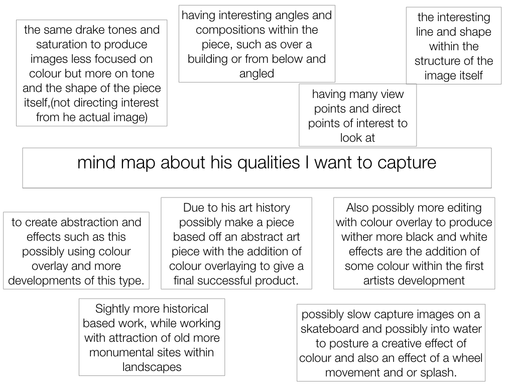
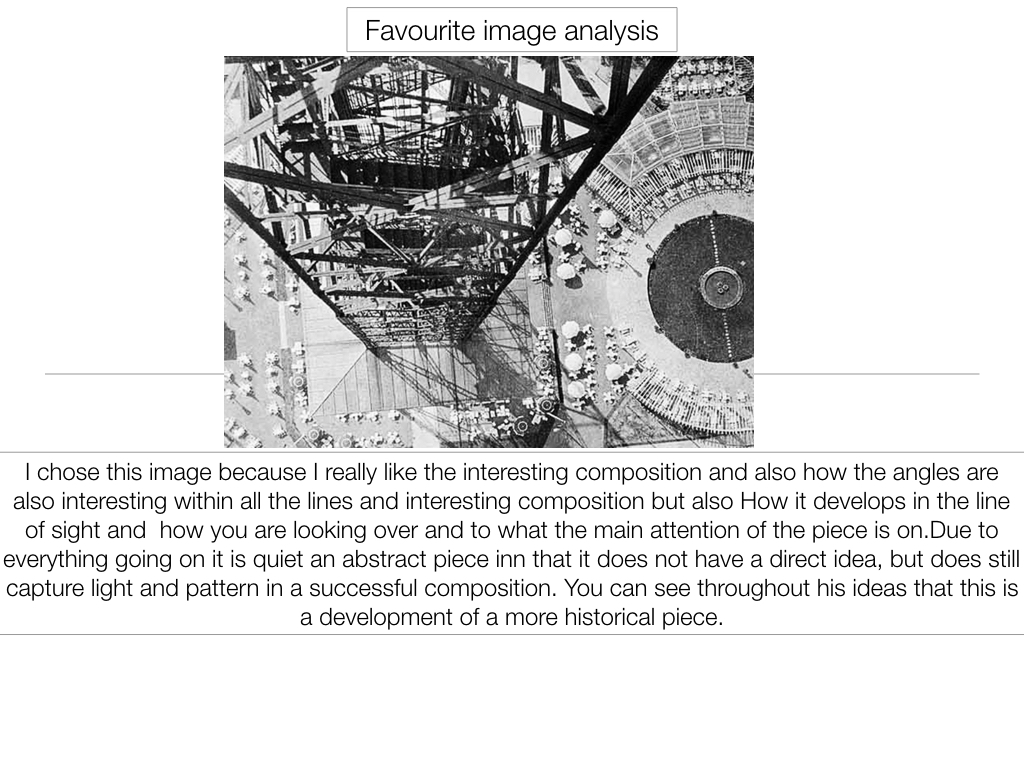
I like this photo because of the way he has used angles to create an image which the viewer has to figure out. At first the viewer is unsure what they are looking at when they see the contrasting white circles but after seeing the cleverly placed other worker, they realise what the image is showing.

This image shows well what Moholy-Nagy does – he integrates shapes and industrial work into his photographs. There are lots of different shapes in this photo which almost make it seem abstract.

Image result for moholy nagy photography

My Photos:


My Favourite Photos

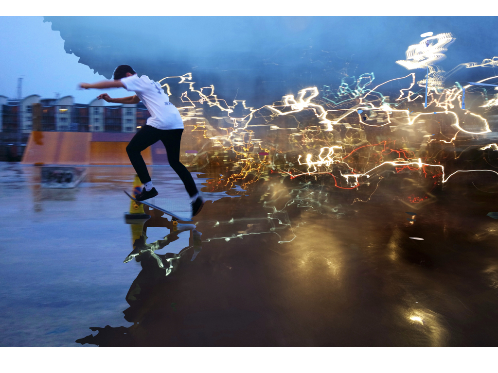
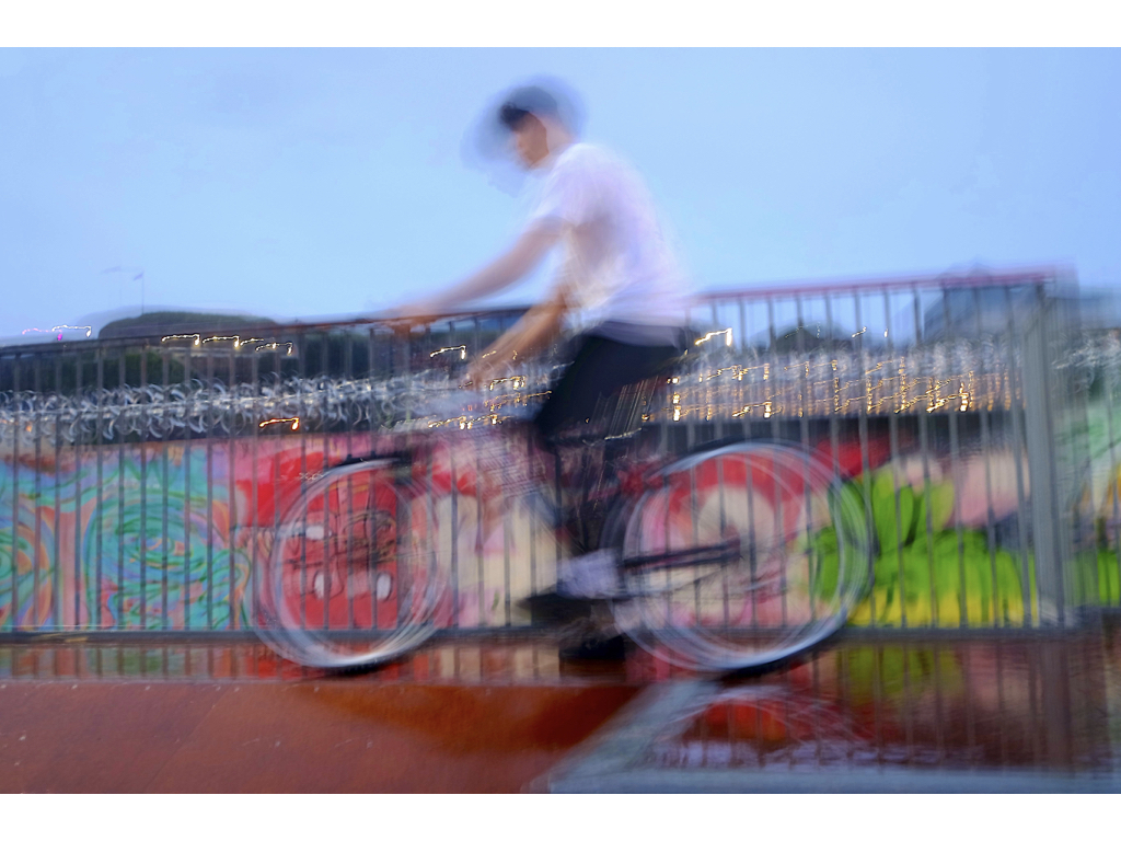
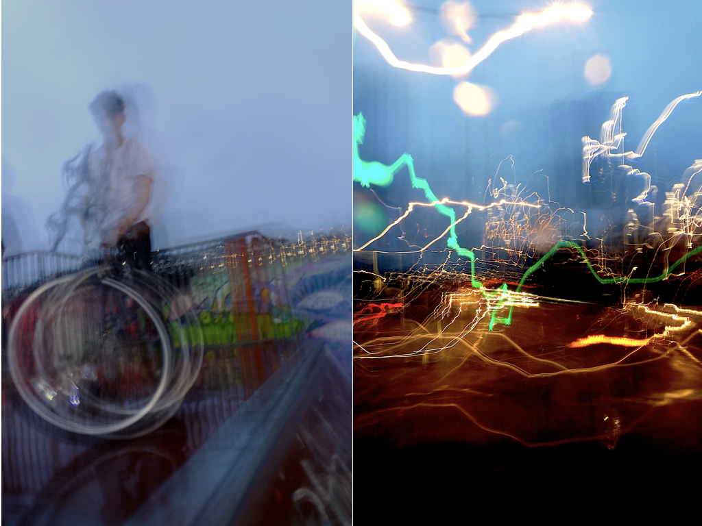
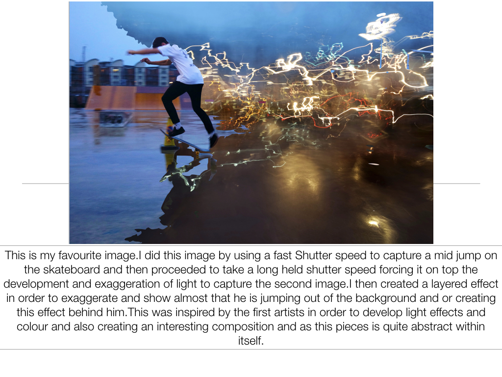
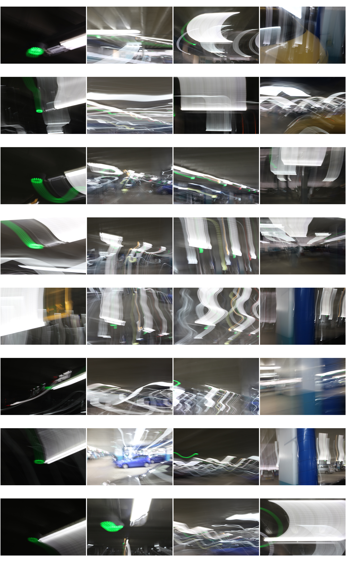
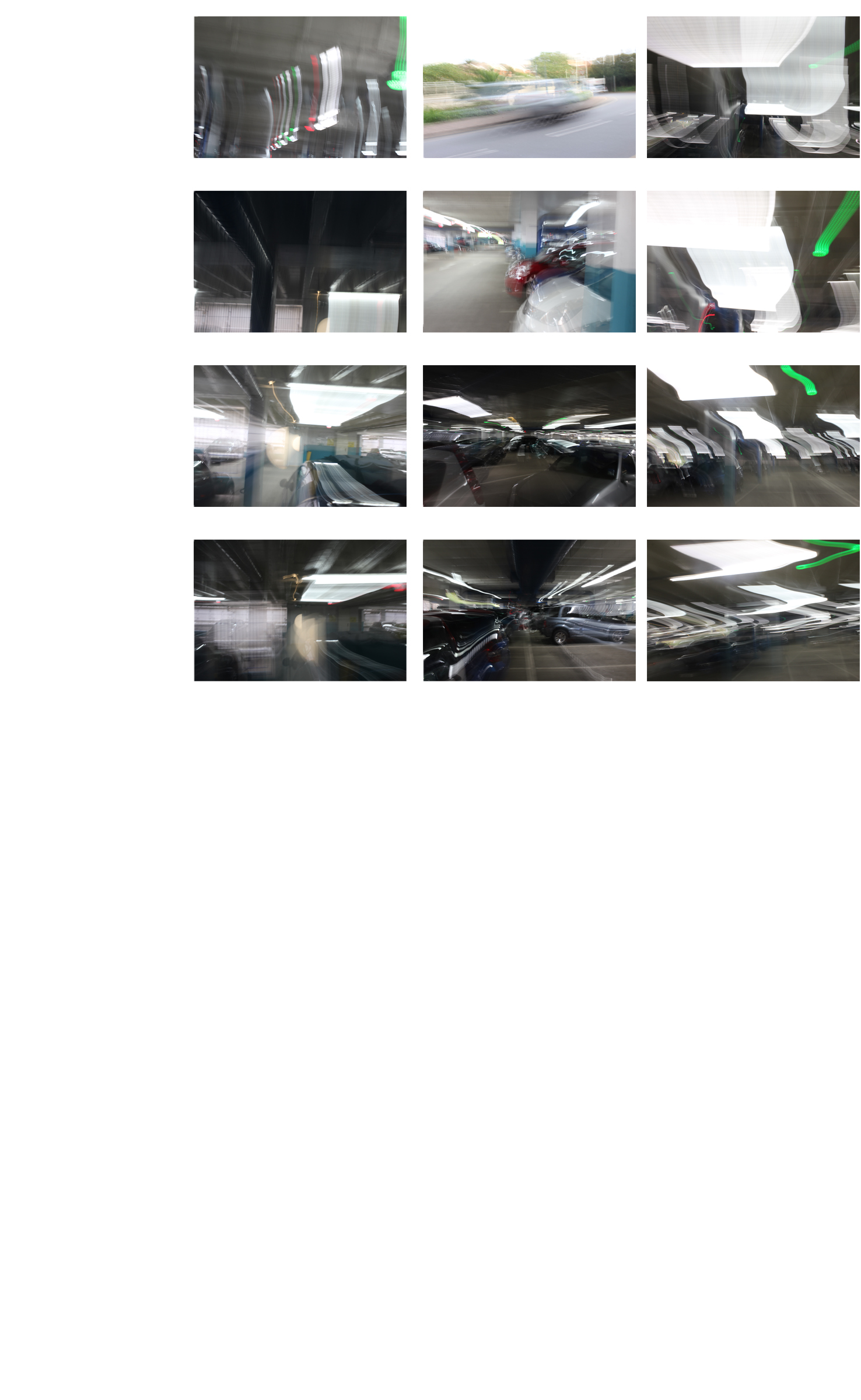
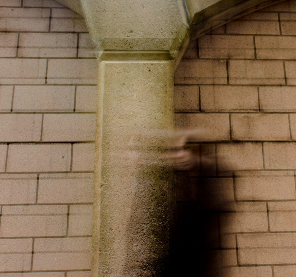
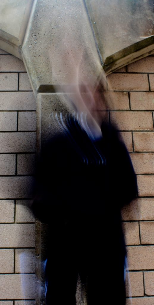
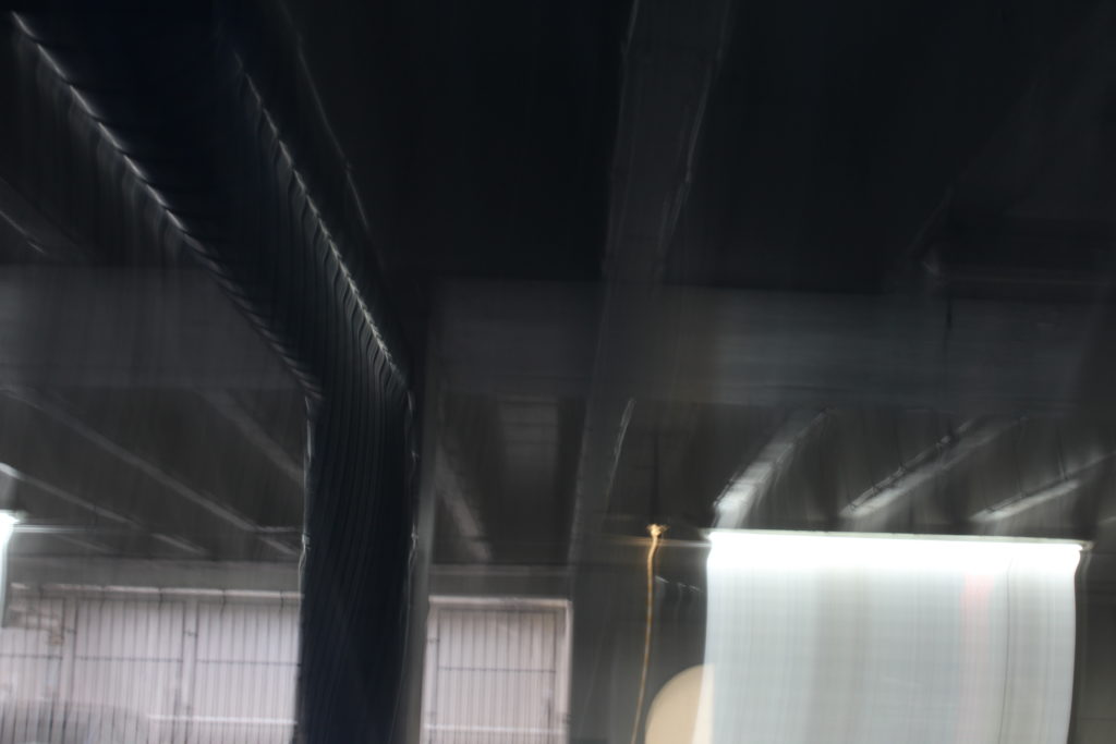
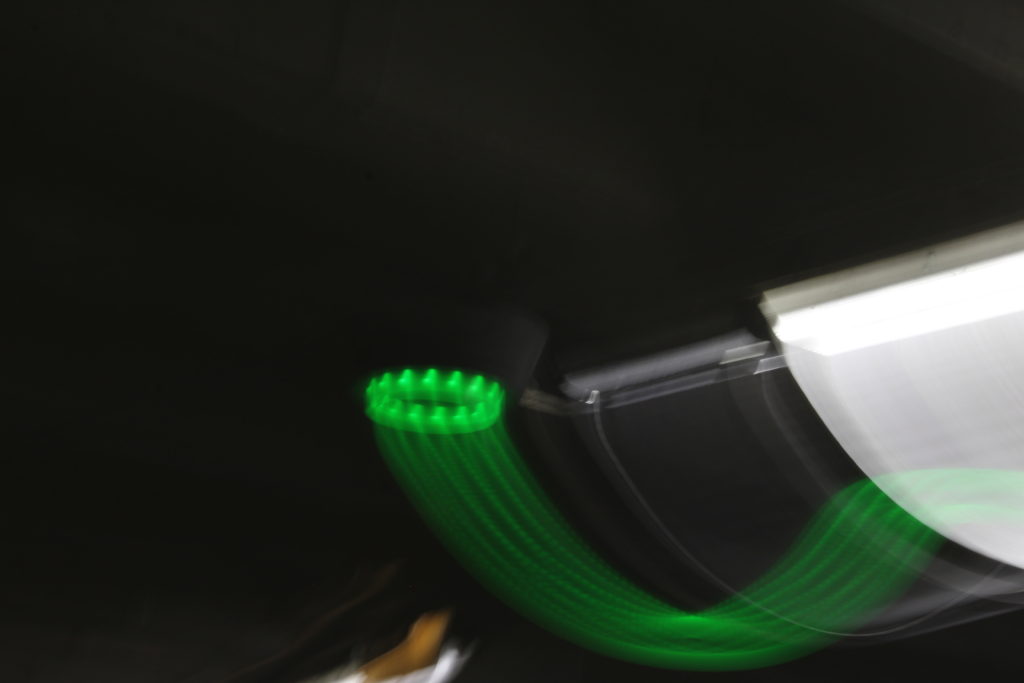
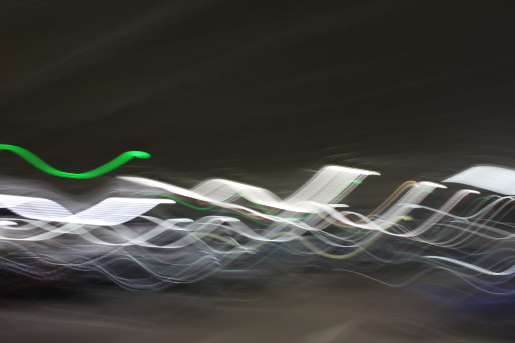
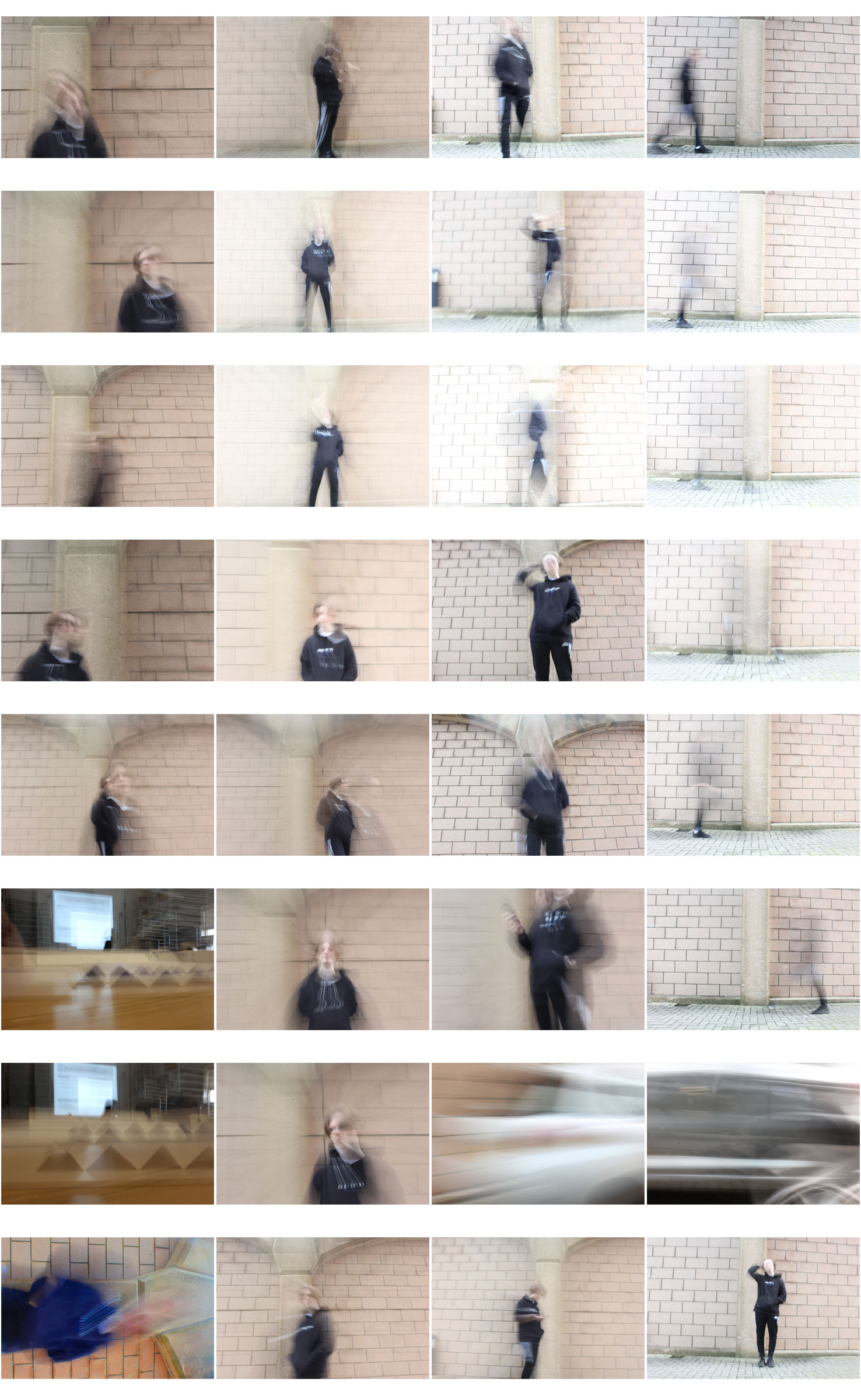
All of the below photographs were taken with a shutter speed of 1 second. In the first two photos I told the model to simply walk around to create movement but in the bottom three photos I moved the camera around in order to capture an abstract photograph.

In these photos I like how the black clothing of the blurred model almost blends into the background in places to create a more interesting image.

The below images create a gloomy and mysterious setting due to the contrast between the bright lights and the dark car park. To create an appealing image in the first photograph I have cropped it so that it fits the rule of thirds.

The abstractness of these images make them stand out to me because they look so out of the ordinary.