Category Archives: AO3 Record Ideas

Filters

Author:
Category:

Textures and Surfaces homework 4

Frank Hallam Day

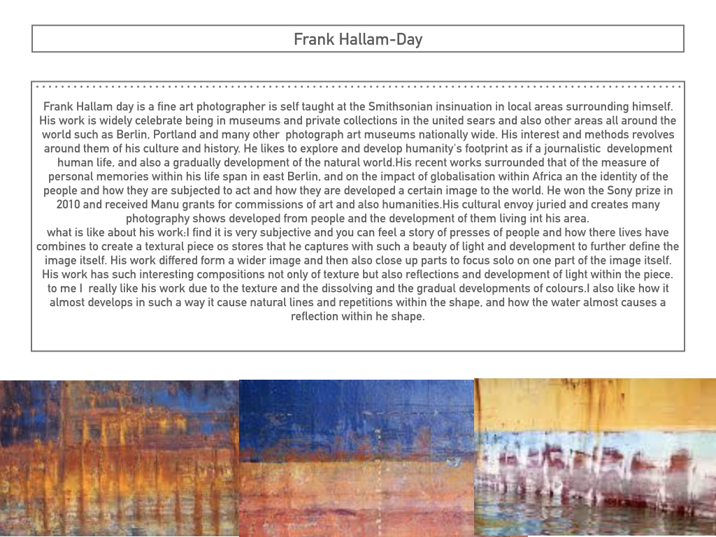
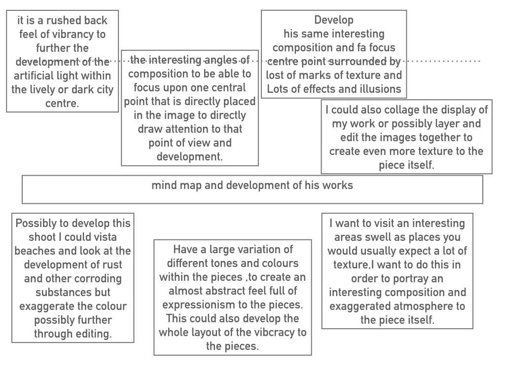
Washington, D.C. based photographer Frank Hallam Day’s work explores the impact of humanity’s footprint on the natural world. Day, who was trained as a painter, says his photographs owe more to the history of painting than photography. Day prefers digital photography to film because it allows him to adjust the image, both on the spot and on the computer. He is a self taught fine art photographer and his interest and methods revolve around culture and history. I am very intrigued by his work as he creates real and moving stories which i believe can impact people upon viewing the images. Not only can he do this threw the use of people and how they are living their lives, which are different to ours in the first world countries, but threw the use of both wide and close up shots of the pure destruction that we are creating to the world. I believe there is a strong contrast within Day’s photos from the portrait pictures in Africa to the landscapes of urban areas in cities which have been destroyed. I believe that this contrast is purposely showing us that despite we have all these luxuries and strongly built buildings we take it for granted and therefore do not look after them, allowing graffiti and tear to occur. I also like the work of Day’s due to the highly saturated and vibrant colours used, bringing a dull telephone box to life for example. Also, the use of great composition and natural lines within his photographs allows him to take a boring boat and turn it into something which makes us appreciate and intake the whole photograph.

Image result for frank hallam day

Image analysis

Image result for frank hallam day

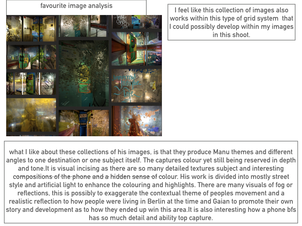
Clearly this photo shows the inside of a telephone box. What usually would have and should’ve been quite a boring image is actually, in my opinion, a very interesting and eye catching photograph. I believe this photograph would have been taken with a relatively slow shutter speed in order to capture the high light which is seen in the photo, possibly a shutter speed of approximately 1/10 of a second. an ISO of about 400/800 seems to of been used due to the brightness yet sharpness of the photo. The rule of thirds has most definitely been used within this photograph, with the telephone itself being placed on the top left focal point and on the left hand vertical line. The use of this draws the human eye to this point and makes the viewer aware that it is the main subject of the photo. Furthermore, this image uses leading lines to draw us into the subject. The metal panels are natural lines which makes us instantly view the phone. This photo is highly saturated using vibrant colours to intrigue the viewer. The use of strong and bright lighting is contrasted with the shadows on the left of the picture and the outside area on the right. This creates a sinister and scary feeling as it gives an impression of isolation as it is only inside the phone box that is overly bright. The use of reflection on the glass of the phone box creates a feeling of confusion, creating a real mood and story to the photograph. At the top of the phone box we can see how it has been destroyed by graffiti which relates to the photographers intentions of capturing human footprints.

Photoshoot
Edits
Rule Of Thirds

What is the rule of thirds?

The rule of thirds is basically breaking an image down into thirds (both horizontally and vertically), so that you have 9 parts. As follows.

Image result for rule of thirds
As you’re taking an image, you would have done this through your viewfinder or in the LCD display, that you use to frame your shot. With this grid in mind the ‘rule of thirds’ now identifies four important parts of the image that you should consider, placing points of interest in as you frame your image. Not only this, but it also gives you four ‘lines’, that are also useful positions for elements in your photo.

The rule of thirds 2

The theory is, that if you place points of interest in the intersections or along the lines, your photo becomes more balanced and will enable a viewer of the image to interact with it more naturally. Studies have shown that when viewing images, people’s eyes usually go to one of the intersection points most naturally, rather than the center of the shot – using the rule of thirds works with this natural way of viewing an image, rather than working against it.
 The rule of thirds in photography

Image result for rule of thirds
In addition to the above picture of the bee, where the bee’s eye becomes the point of focus. The next time I went out I decided to try this within my photos, to really get the viewers attention to the object of my choice, these were my results:
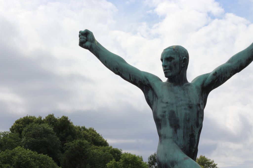
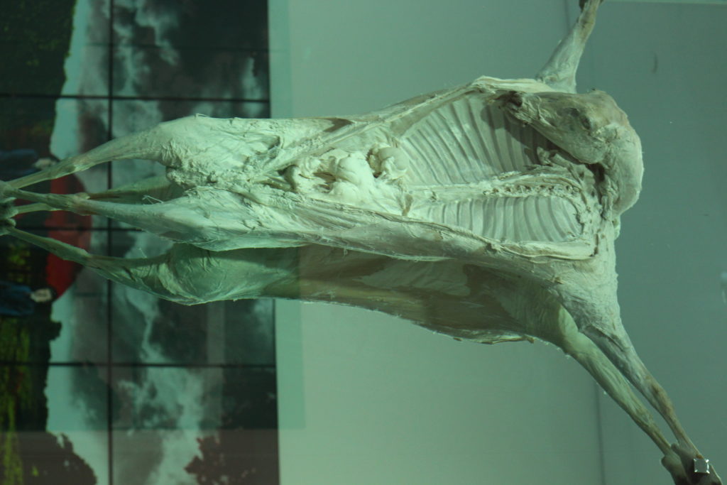
For the people, I decided to use the head of my friend and statue as the area I wanted the reader to instantly look too, where as the flower the seeds as the focus, and the rib-cage in the carcass.

Depth Of Field

What is Depth Of Field?

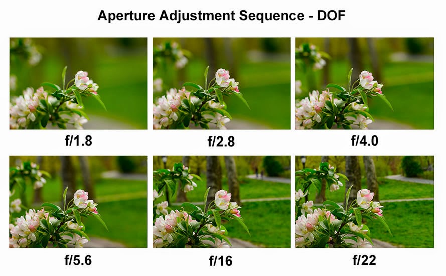
Depth of Field (DOF) is that amount of your shot that will be in focus. A large depth of field means that most of your image will be in focus whether it’s close to your camera or far away, whereas a small (or shallow) depth of field means that only part of the image will be in focus and the rest will be fuzzy

The size of the aperture has a direct impact on the depth of field. A large f-number such as f/32, (which means a smaller aperture) will bring all foreground and background objects in focus, while a small f-number such as f/1.4 will isolate the foreground from the background by making the foreground objects sharp and the background blurry.

Aperture

What is Aperture?

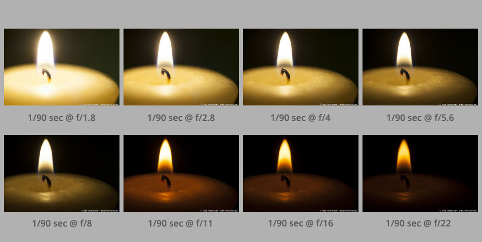
Aperture is ‘the opening in the lens’ to allow a certain amount of light in. The aperture that you set impacts the size of the hole in the lens. The larger the hole the more light that gets in – the smaller the hole the less light.

Aperture is measured in ‘f-stops’.

A smaller f-stop means a larger aperture, while a larger f-stop means a smaller aperture. For example, f/1.4 is larger than f/2.0 and much larger than f/8.0.


Texture- Homework 4

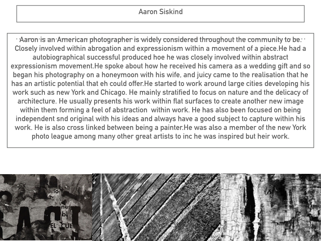
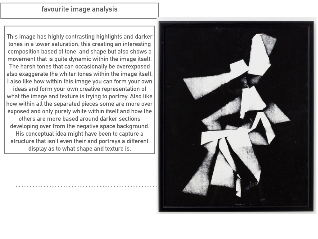
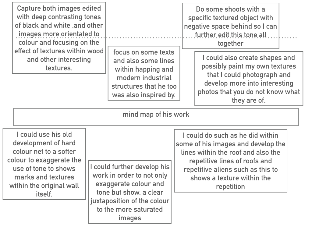
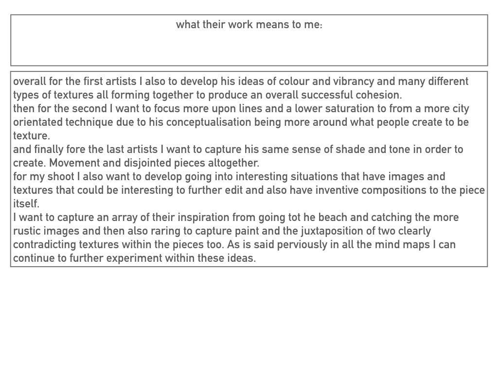
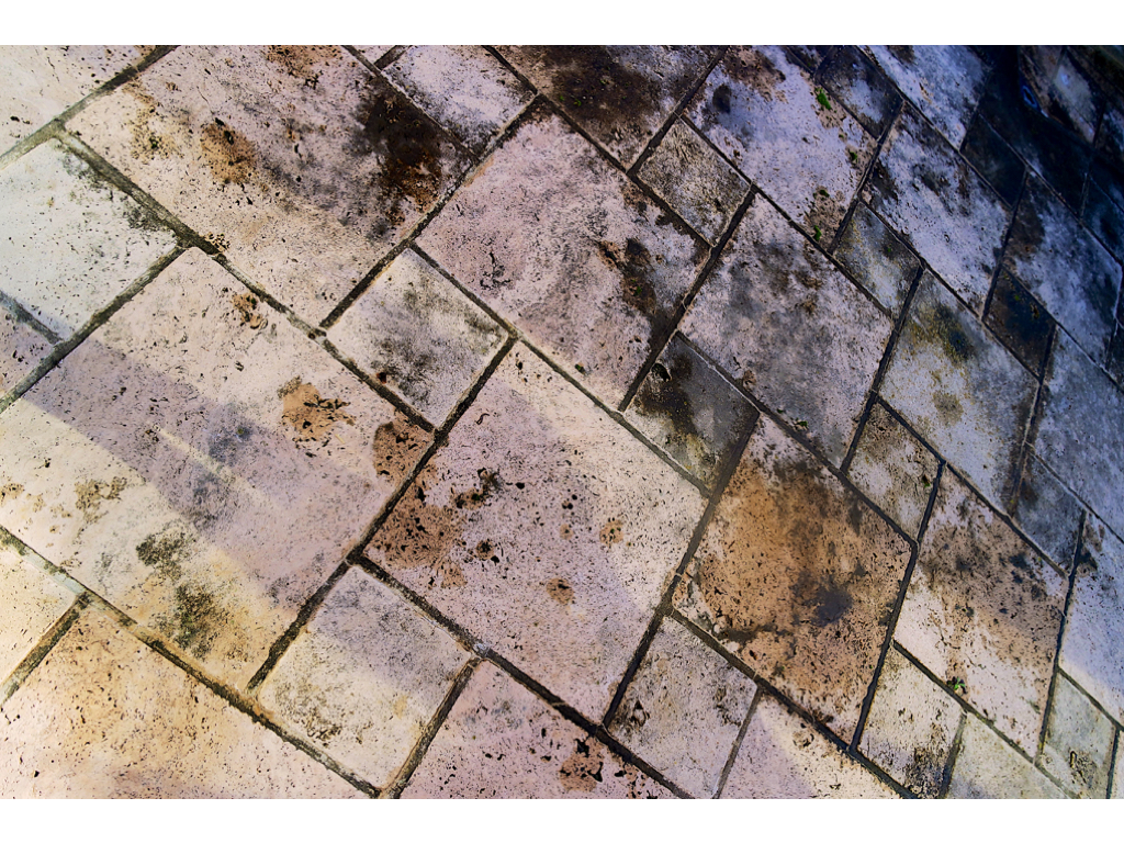
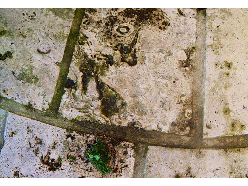
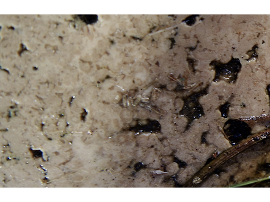
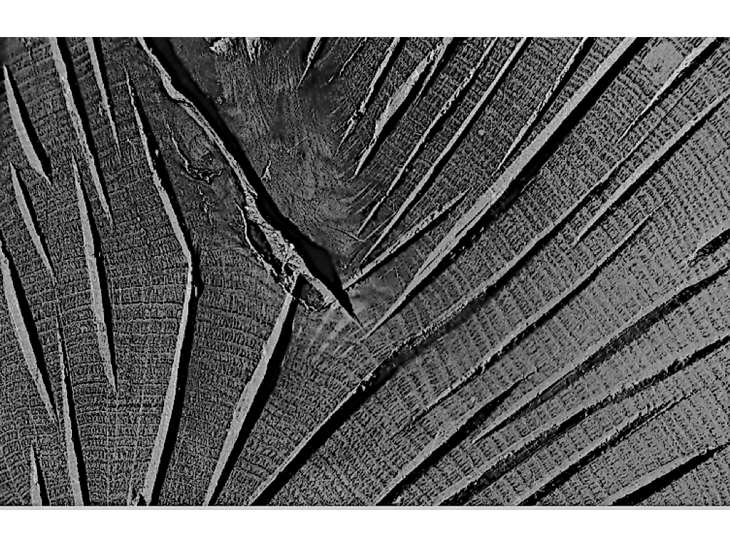
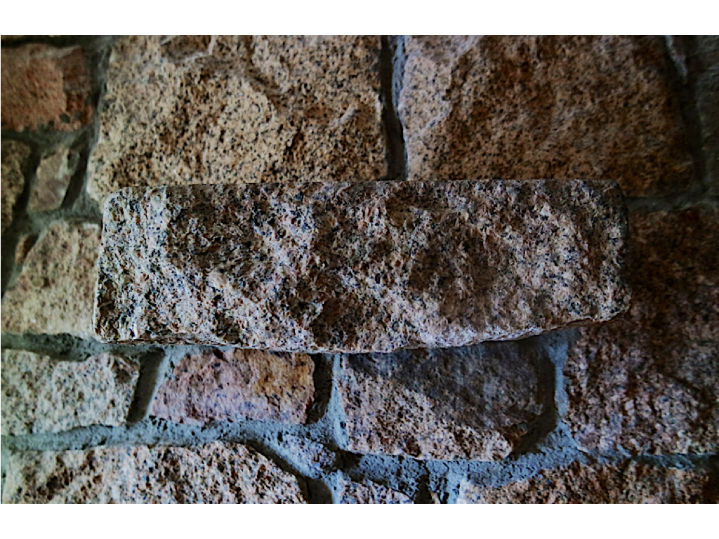
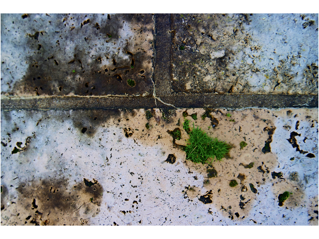
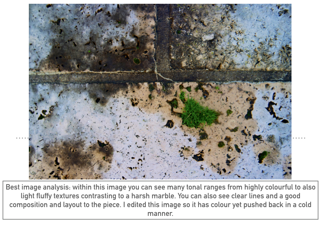
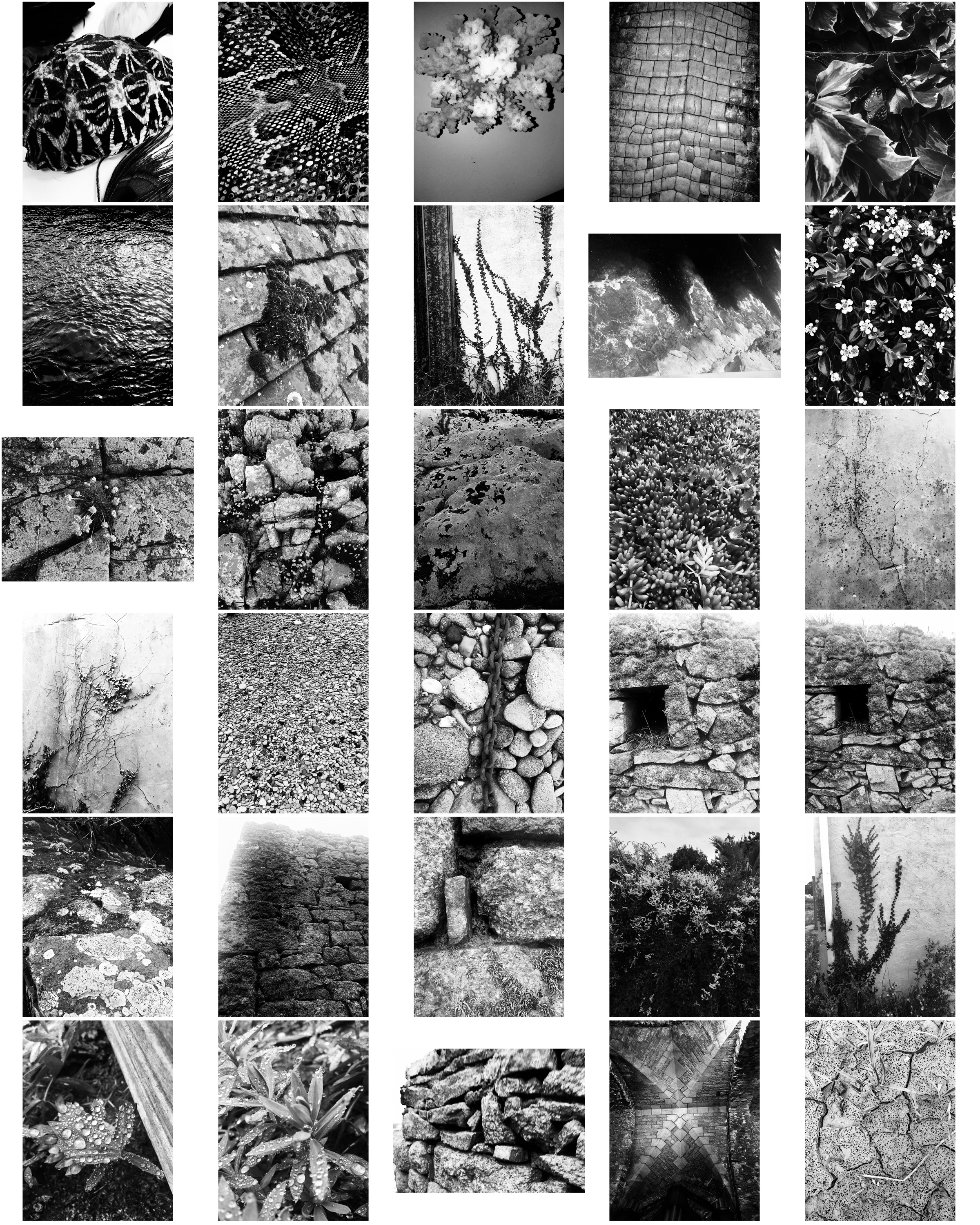
These photos take inspiration from Aaron Siskind focusing on texture, line and visual rhymes.

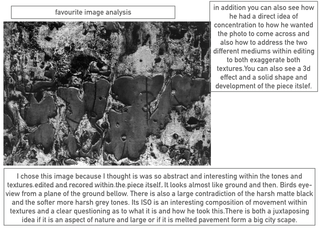
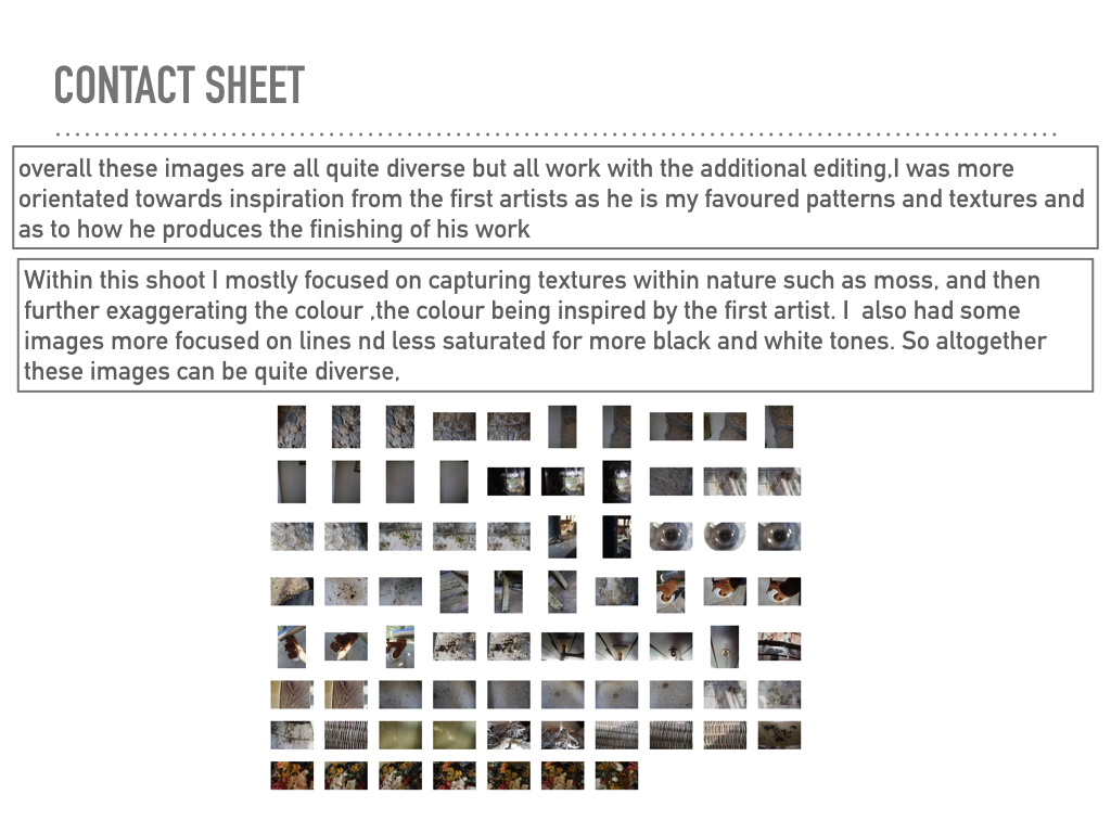
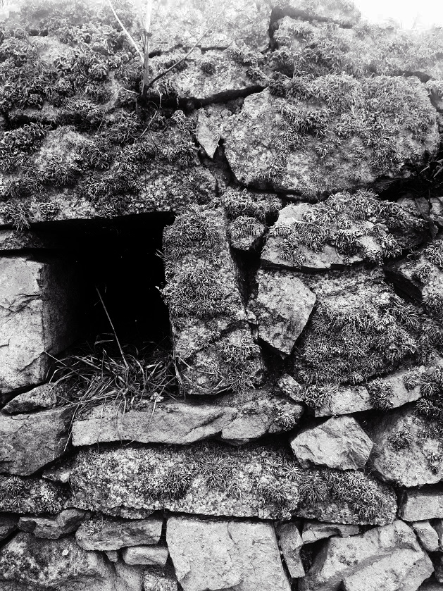
These two photos are my favourite from the shoot as they display texture of the surface, using the Ansel Adams zone system. The stones in these photographs both contain a lot of detail like the moss and weathering, making the photos more interesting. Both images contain contrasts between light and dark, the first image has contrasts from the higher level of rock and the shadows which they create below them, and the second image contains shadows through the gaps in the stones creating varied tones in the photo. Editing the photos in the contact sheet black and white makes them more similar to Aaron Siskind’s style.

These photos show similarities to Aaron Siskind’s ‘Martha’s Vineyard’ photograph:

Martha's Vineyard 131B


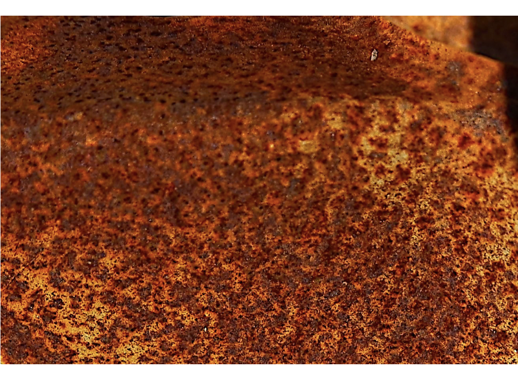
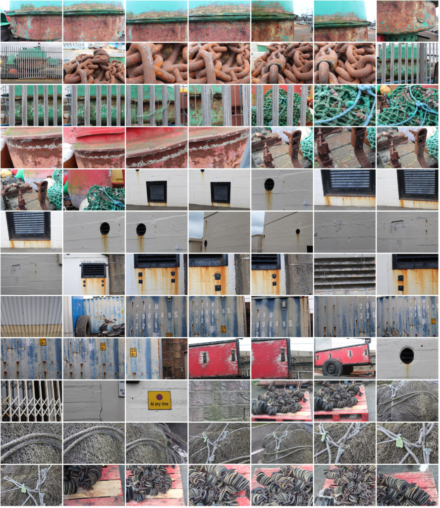
For this photoshoot I looked for objects that had been in the sea or near it so i could focus on the weathering and rusting, like Frank Hallam-Day did in his ship hull photos.

Final 5 Images from Shoot:

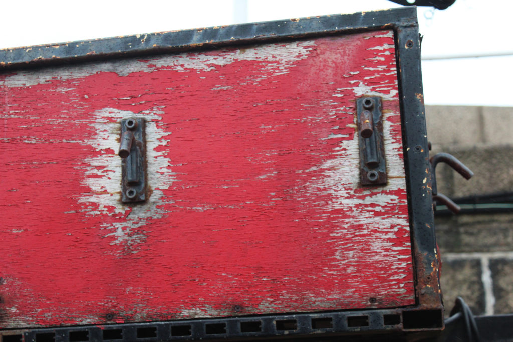
The photo which i think shows the most similarities to Frank Hallam-Days photography is image 5 as it focuses on the weathering and gradual deterioration of a man made object. It has horizontal lines, creating sections with the photo of different texture. To improve this   photo i would have photographed the entire ship hull so it showed more similarities to Frank Hallam-Days work.

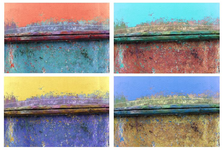
I edited the original picture and altered the hue to create different colours of ship hulls and a more varied range of photos. I tried to capture the way Frank portrays the effect of time on works of man, emphasising the rusting and weathering.

Abstract- Homework 3

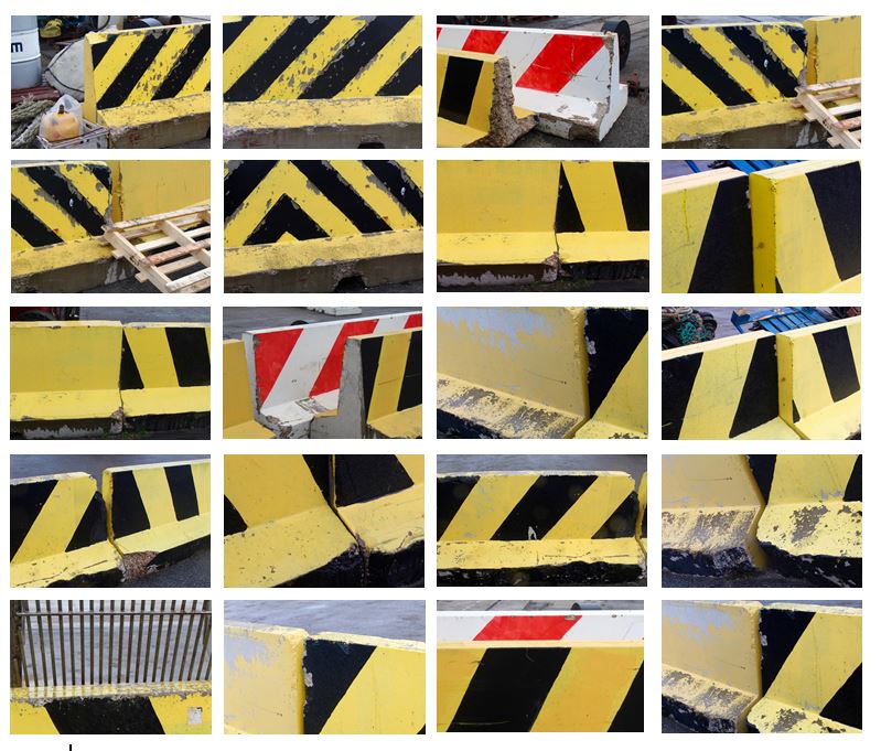
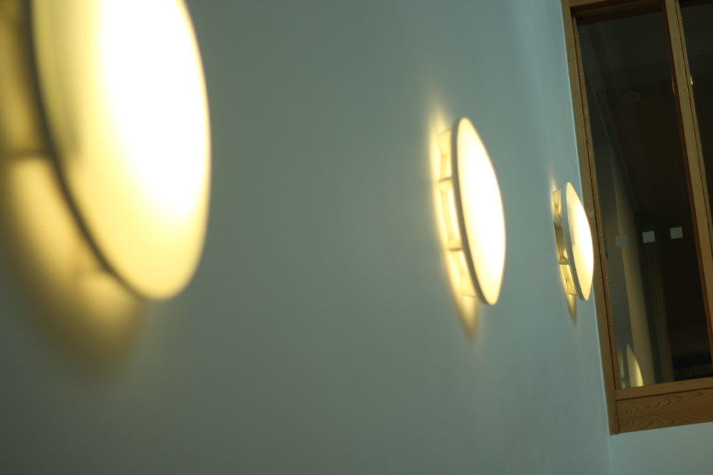
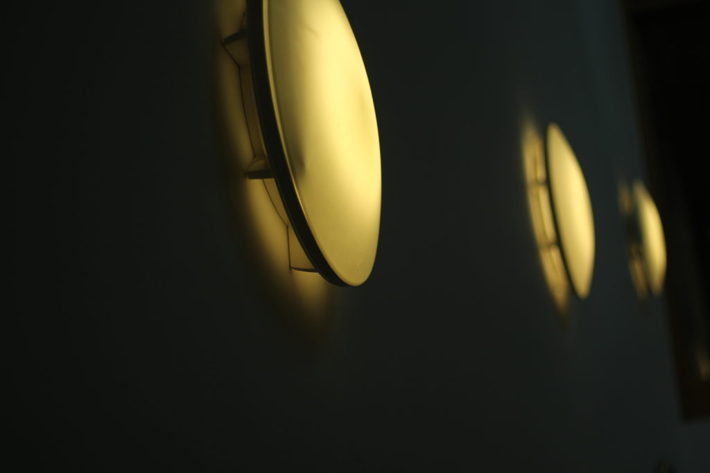
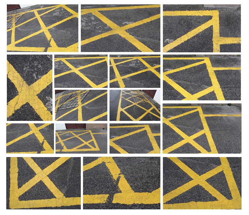
Abstract photography concentrates on shape, form, colour, pattern and texture. The viewer is often unable to see the whole object. The subject of the photo is often only a small part of the idea of the image. Viewers may only know the essence of the image subject or understand it by what is implied. However, it could be argued that all art, including photography, is essentially abstract. I first set out to look for straight bold lines and found that the bright yellow works well.

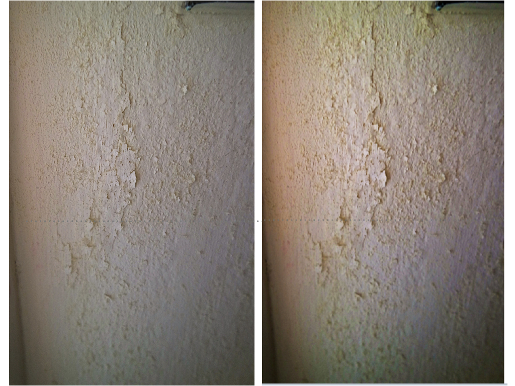
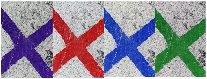
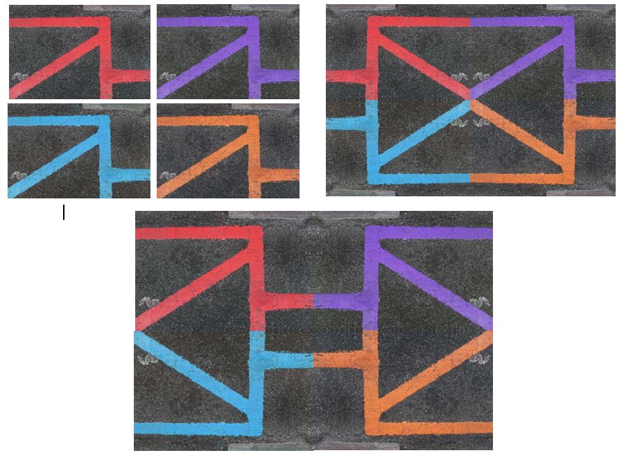
I edited these photos in photoshop by adjusting the hue and increasing the contrast to create different coloured lines to achieve more interesting, abstract photographs. I also experiemented with different layouts, creating patterns and geometrical shapes by flipping the photos vertically and horizontally.

I tried to explore the contrast of colour between the yellow and black and the texture they presented. Using natural light and photographed different angles of the wall to create variety within the collection. To improve this photo shoot I would edit the photos to make them more abstract so the viewer would not be able to see that it was a wall and would emphasise the pattern and texture.

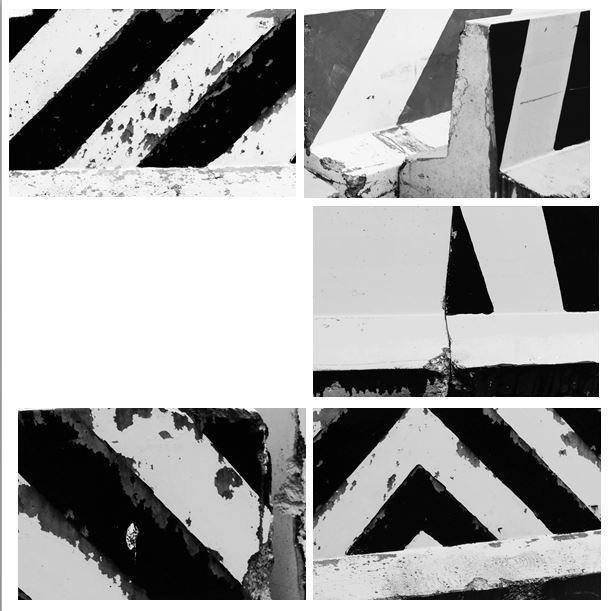
I edited these photos in photoshop to develop them further by turning them black and white and making the lines more bold. I like how the black and white emphasises the texture within the wall and the weathering that has occurred over time. I think it is now less clearer to the viewer that the photograph is of a wall and is now more abstract.

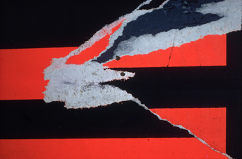
I think the photos I have taken are similar to this photo (Torn Poster II—Redbird) Ernst Haas photographed in 1960.  Both photos contain bold, straight lines and texture within that. The black lines frame the picture and are the points where the eyes are drawn to. Similarly, both contain horizontal, vertical and diagonal lines.

Focus And Focus Point

What is the focus point?

Autofocus points are what the camera uses to focus on a subject. You'll probably first notice them when you press the shutter halfway. Many cameras will emit a "beep," and some of the AF points will light up (often in a red or green color) in the viewfinder or on the display screen as seen below.

Image result for Focus and focus point

When using your camera in auto-focus mode, the auto-focus points will help you direct the focus to a particular location in the frame.

This is extremely convenient because the focus of your photo may not always be in the very center where the camera traditionally likes to focus and meter.

Autofocus points were introduced in film SLR cameras when the Canon EOS and Nikon F-series models were very popular. Since that time, the technology has moved into digital photography and is included in almost every DSLR as well as many point and shoot cameras.

The introduction of AF points gave photographers greater freedom in focusing on certain subjects in the photograph. It mimics the freedom of manual focus while giving you the smooth, quick operation of autofocus.

Autofocus points can also be connected to the camera's metering system in many models. This means that the camera will determine the appropriate exposure based on the chosen autofocus point, which is typically the photo's main subject.

The number of possible autofocus points depends on the camera.

Some cameras have a 9 point system, while other cameras have 11 points or even 51 points. The more AF points a camera has, the more options you have to fine-tune the focus.

Image result for what are focus points
After reading up about the ways in which I could use my point system on my camera, I went out with a few friends to incorporate this into my photos, these were my results:
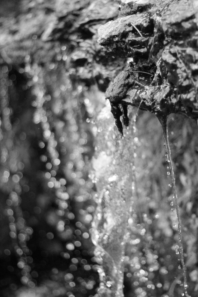
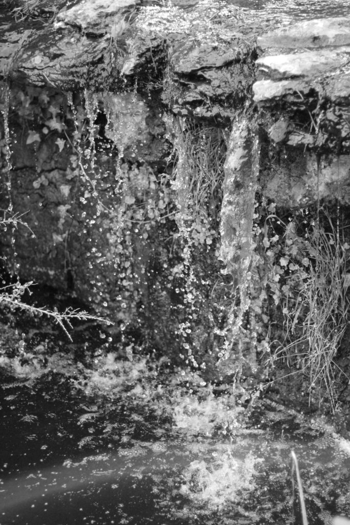
I tried to mainly focus on small details like webs and water to create a much more significant effect to the overall picture.

Depth Of Field

What is depth of field?

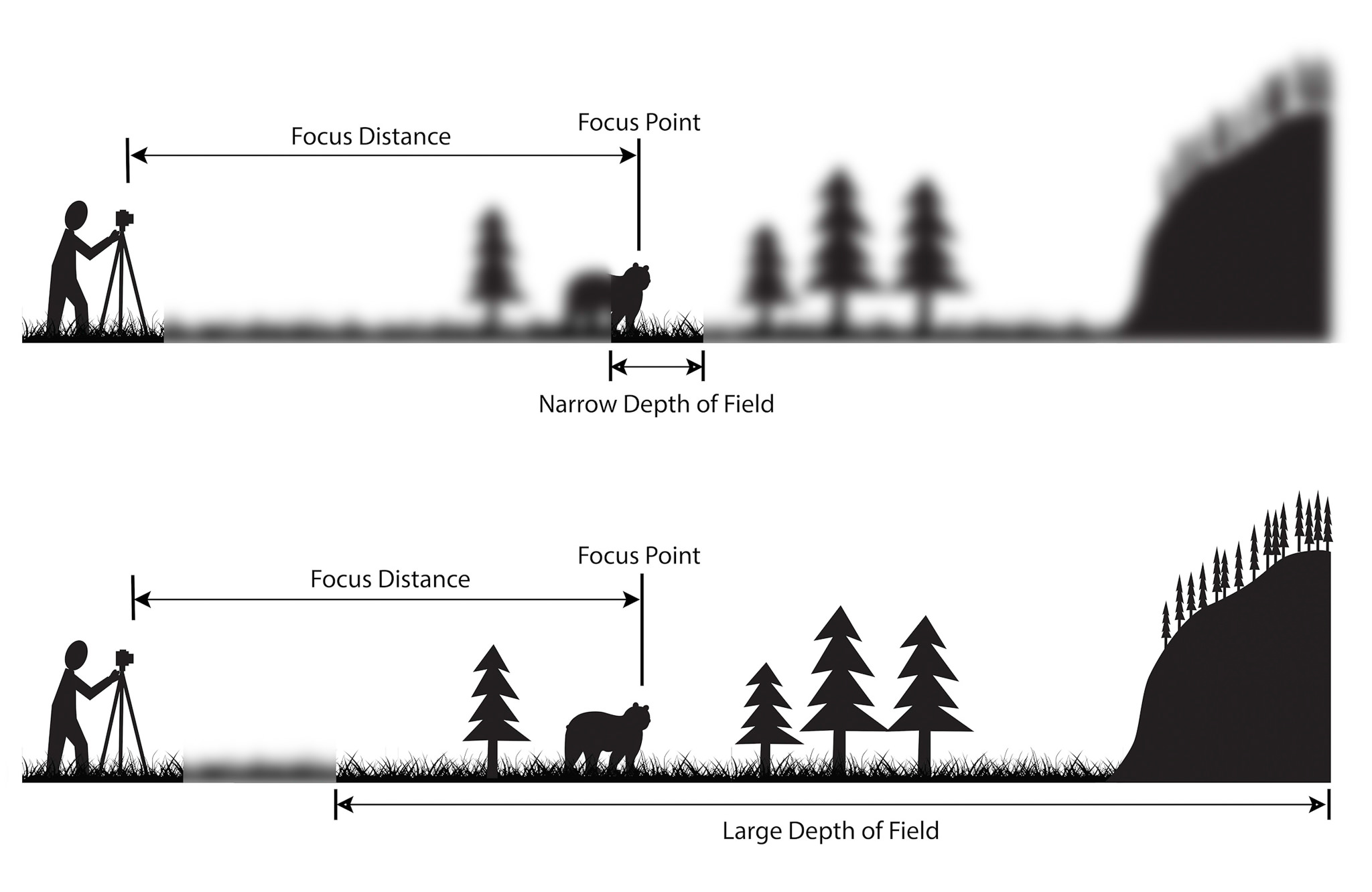
DOF is the zone of acceptable sharpness within a photo that will appear in focus. In every picture there is a certain area of your image in front of, and behind the subject that will appear in focus.

This zone will vary from photo to photo. Some images may have very small zones of focus, which is called shallow depth of field. Others may have a very large zone of focus, which is called 'deep depth' of field. Three main factors that will affect how you control the depth of field of your images are: aperture (f-stop), distance from the subject to the camera, and focal length of the lens on your camera.

Image result for what is depth of field
Depth of field diagram

In this picture below to the right there is a gradual focus change within the picture with a very narrow depth of field, allowing the photo to be in focus of one particular object. However to the left there is a much bigger depth of field stretching to infinity, allowing the backdrop to stay focused in detail at the same time.

Image result for what is depth of field
I decided to have a go with the method in a few of my photos, and so walked around school experimenting with it, these were my results:
I thought that messing around with the lighting would allow significantly for the viewer to notice what the focal point would be, and to my opinion I think that it worked.

Threshold Editing

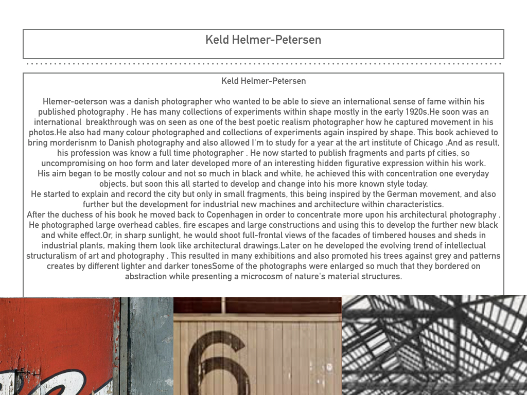
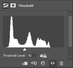
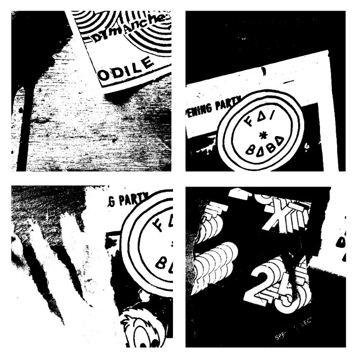
using the same techniques as Keld Helmer Petersen I edited four of the images from my most resent shoot. I opened each image onto Photoshop and cropped them all to squares, and changed the threshold to suit each picture. I then flattened each image and dragged them into a new tab which was a white square. Finally I arranged them into a collage format and saved it as a JPEG.