When photographing paper and card, you are able to cut, tear and shape the individual pieces to create abstract effects when taking photos. As seen below:This enables a clear definition between the lights and darks to the photo, whilst it being very simplistic at heart, the scrunched effect makes an almost complicated look to the image. This allows us to experiment as a photographer with not only composition but in a way our artistic creativity as well, due to how we are able to warp the materials given to form structures which we are able to use to our advantage.
Category Archives: AO3 Record Ideas
Filters
Frank Hallam-Day Inspired Photoshoot
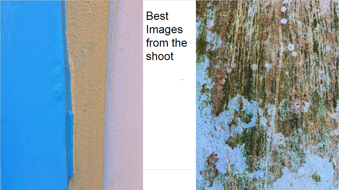
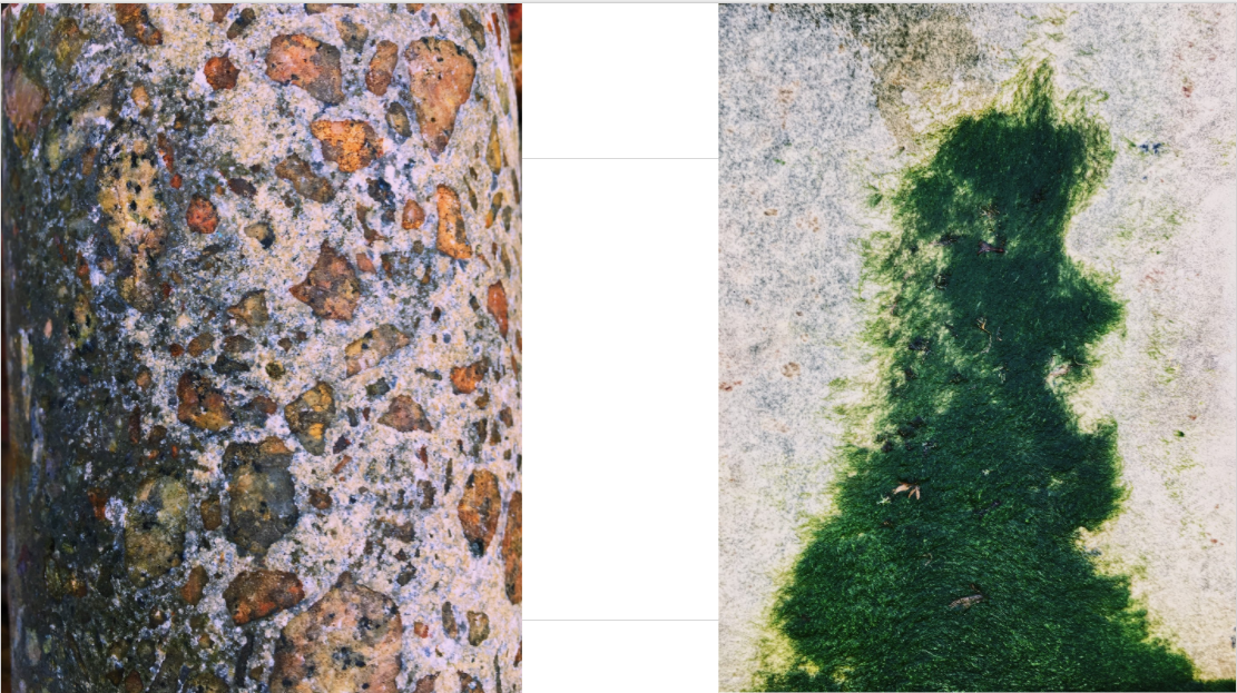
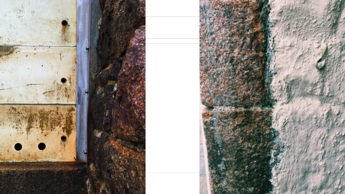
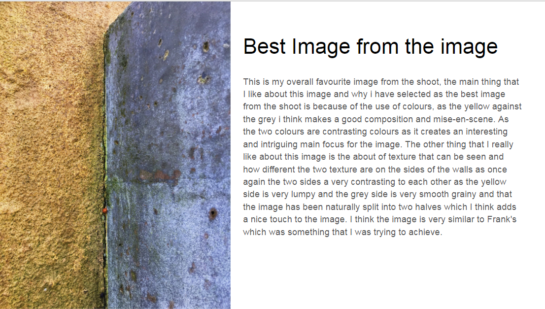
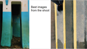
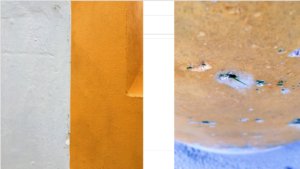
Within this photo shoot I will be focusing on surfaces, textures and pattern. To do this I will be focusing on walls, metallic objects etc, from this it will enable me focus on specific details like peeling, cracks, and bumps to allow for maximum effect.

One photographer that has inspired me to do this shoot is Frank Hallam-Day. Washington, DC-based photographer Frank Day is a versatile artist shooting in both black and white and color film. Traveling the world to remote destinations, Day is able to capture the rich beauty of pattern, color and texture of the open-air markets, isolated landscapes, busy harbors and everyday lives of diverse cultures. Day has also mastered the landscapes and cityscapes of the world, shooting the angular architecture of cities such as Berlin, New York, and Baltimore, as well as the beautiful softness of Washington, DC’s cherry blossoms.As much as I liked his work, I decided to mainly focus on reflections made by the water, and since I lived next to the beach I thought this would be an ideal idea to do.

I used this as a basis for my shoot, so when taking the pictures would know what to specify on.

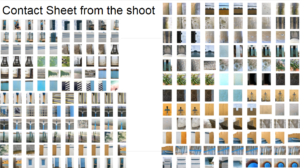
From these images taken, I chose the top ten out of the shoot, to narrow down and edit which one overall I think should be my final picture.
From these top 10 photos taken when walking on the beach, I wanted to once again whittle it down to 5 images, so that I would once again have a clear insight on what to have as my final picture.
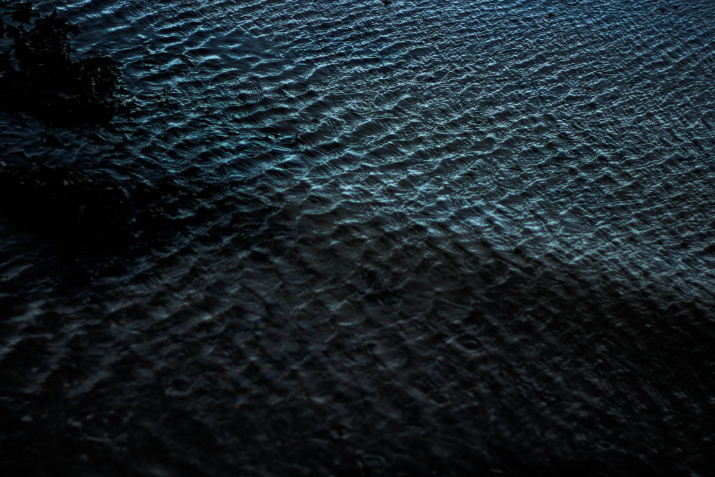
Finally from here I was able to decide on which image would be my final photo. This was my result:I chose this image because I loved the detail within the crashing wave on the shoreline, whilst the contrast between the darkness of the wave and the foam in my opinion make a dramatic effect. I also loved how the composition of the wave slanted across the frame, creating an almost abstract effect to it all.
Final 3 images
Photo 1
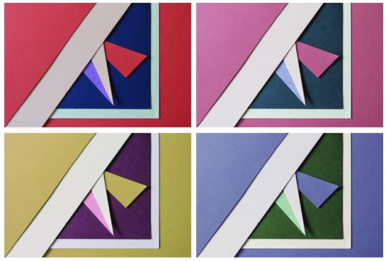 I first experimented with colours and changed the hue of the photos in photoshop and decreased the brightness so the colours weren’t too vibrant. I chose this photo as I think it represents abstract photography well through the solid bold colours and geometrical shapes I created by layering and cutting coloured pieces of paper. I tried to focused on creating contrasts between light and dark pieces of card to emphasise there colour. I personally like the red and pink coloured photos as I think they are the most bold and striking images.

I chose my two favourite photos that I think are the most aesthetically pleasing and experimented by flipping them horizontally and vertically trying to find the best composition and found that I preferred my original composition out of them all.

I also experimented by using circular frames which focused more on the middle section of the images, giving them a different appearance
Photo 2
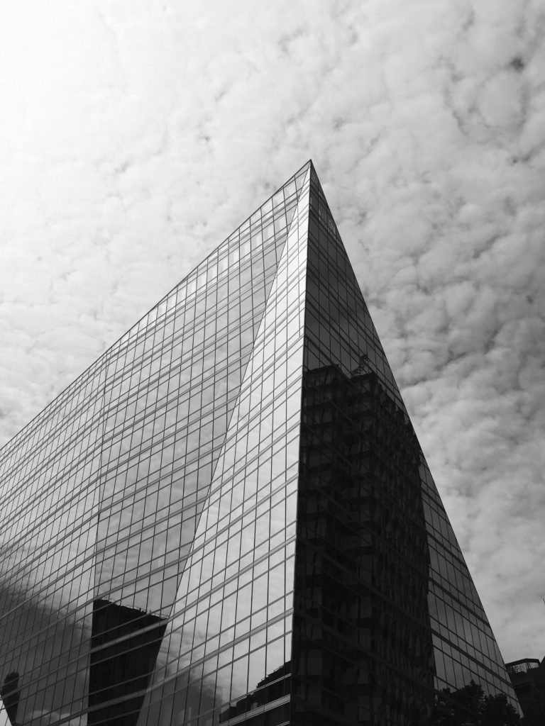
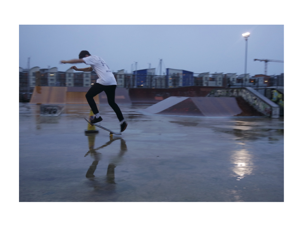
This photo was one of my favourites from my typologies exploration in London, when taking inspiration from Hilla and Bernd Becher. I found that it worked better as a single image, rather than together with others as it contained so much detail. I like the geometrical aspects it has and the repetition and pattern it shows, as well as the tonal variations.


I experimented with the original image, seeing if the photo looked more aesthetically pleasing in colour or in black and white and thought that both worked well as an overall image but decided that black and white was more powerful.
Photo 3
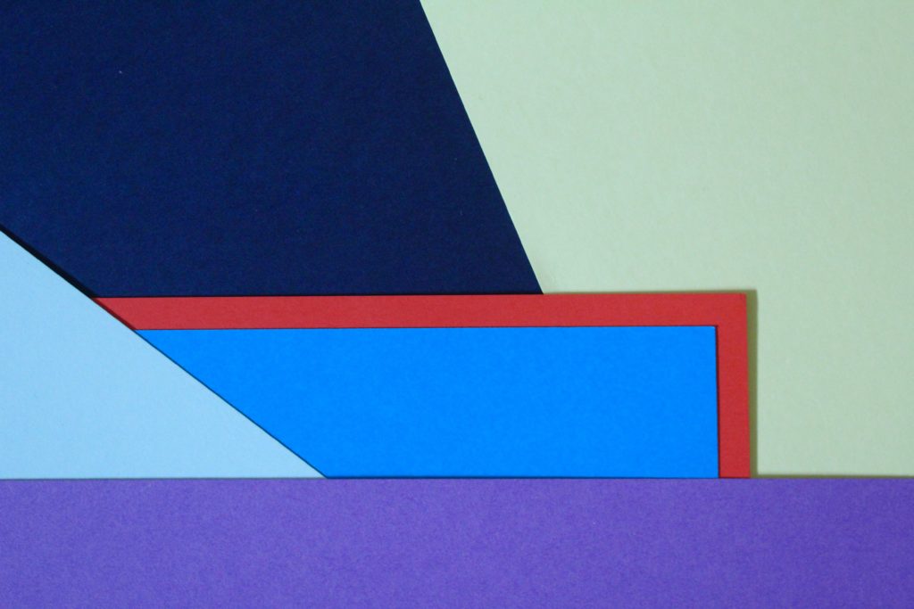
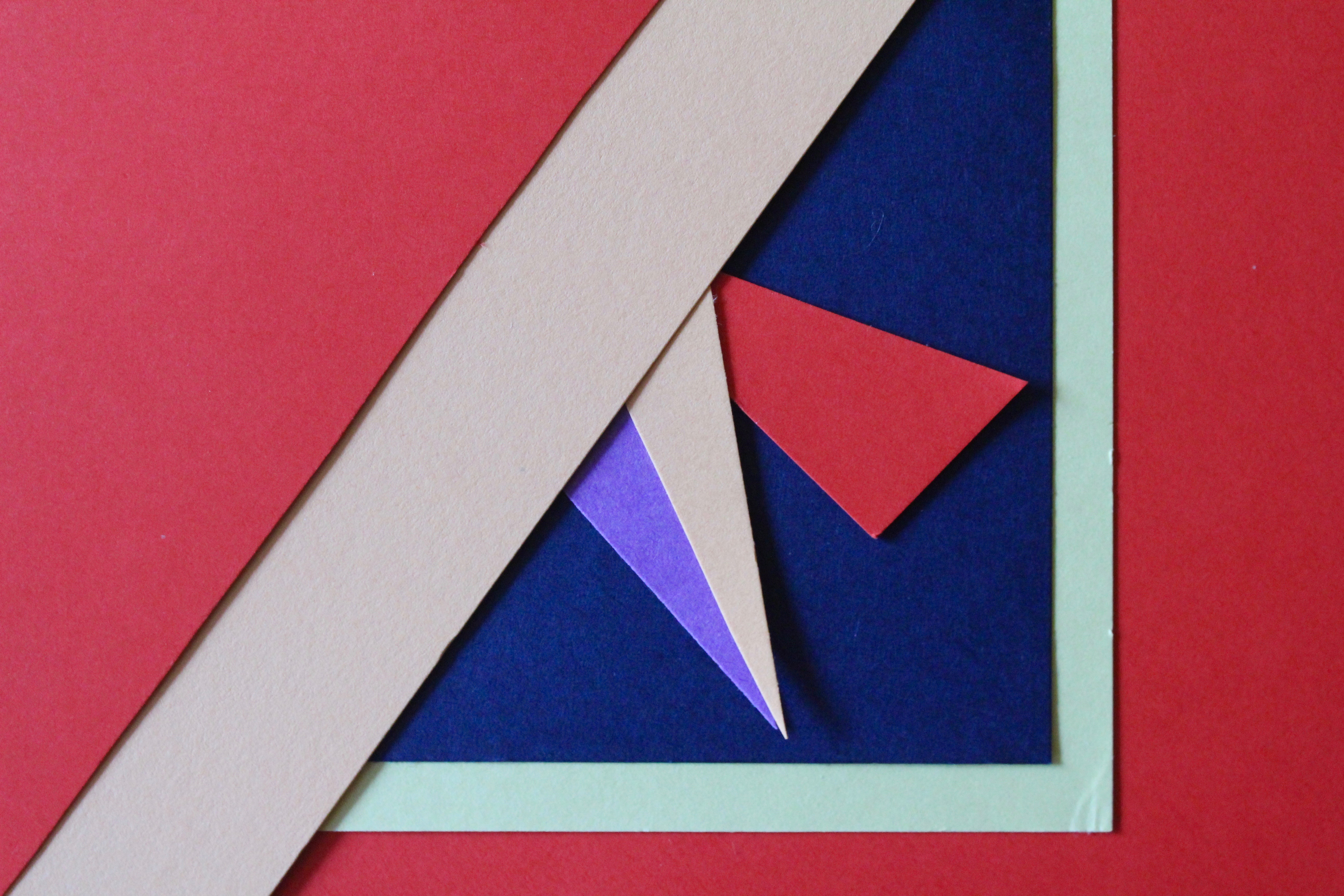
I chose this photo as one of my final images as I think it is a good interpretation of Tamara Lorenz’s work. I like the arrangement of the coloured paper and how I layered them to create distinct shapes with bold colours.
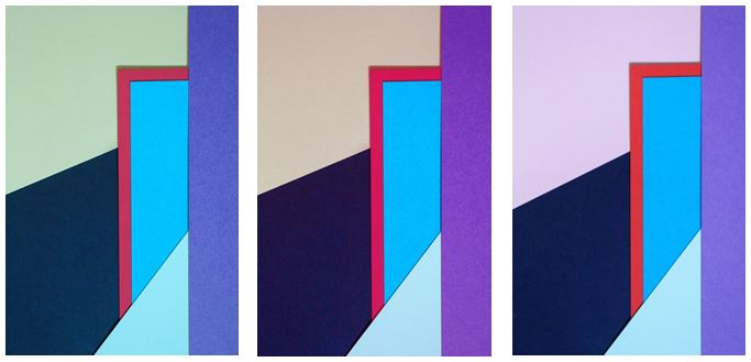
I experimented with the photo, adjusting the hue and I found my 3 favourite edits. The colours I found complemented each other the most were in my original image where the cooler colours (light green, navy and blues) contrasted with the warm colour red, giving a bold outline, which is the point where your eyes are drawn to in the photo.

I experimented with one photo by flipping it to create different layouts and creating symmetrical arrangements. I found that my favourite composition was the photo in landscape:

I like this composition as it contains horizontal lines as well as diagonal lines, with different sized shapes which are emphasised when the picture is landscape.
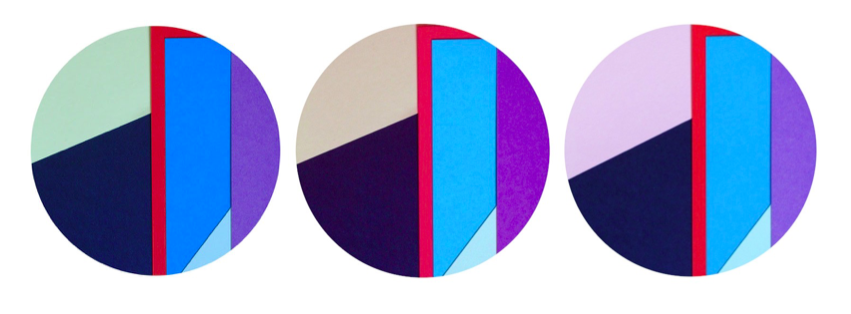
I also used circular frames to see if the images look more effective and found i preferred my images in a rectangular frame, following the geometrical design of the photo as the contrast of straight edges to circular edges is not aesthetically pleasing.
Textures And Surfaces
When working on textures and surfaces it is important to take into account the composition, light and depth. This is because texture is all about pattern, colors and depth, where every single detail plays a significant role in the overall perception of the photo taken. To capture this you need to remember intricate details, interesting patterns, vibrant colors and good depth. For example:1) Find a texture - Finding textures is easy, you can find them in almost anything around you that catches your eye.
2) Equipment - You will want to keep your aperture at about f/8, as you don't want to introduce shutter shake, which is what you want to avoid the most.
3) Light - You should mainly use natural light like the sun to take pictures like these, as the rays of light will hit the texture at an angle creating an effect. Whereas inside you obviously need a off-camera light, which can imitate sunlight.
4) Depth of field - By messing with the depth of field, you are able to create a seemless effect within the image, to perfectly blend a pattern into a backdrop.
5) Mix - By mixing contrasting colours together, it is able to create an effect which is visually pleasing to the eye, due to an introduced twist.
6) Unity - When taking pictures of textures and surfaces, sometimes it is best to take pictures of smart orderly patterns, as the way they are laid out are visually satisfying to the human eye.

Texture Homework
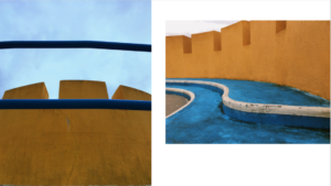
Abstract | Homework

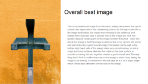
Final presentation
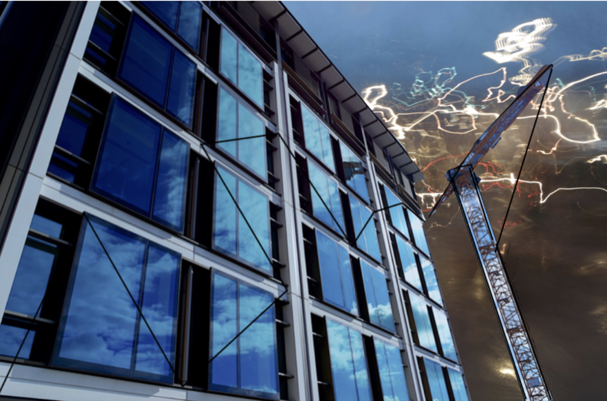

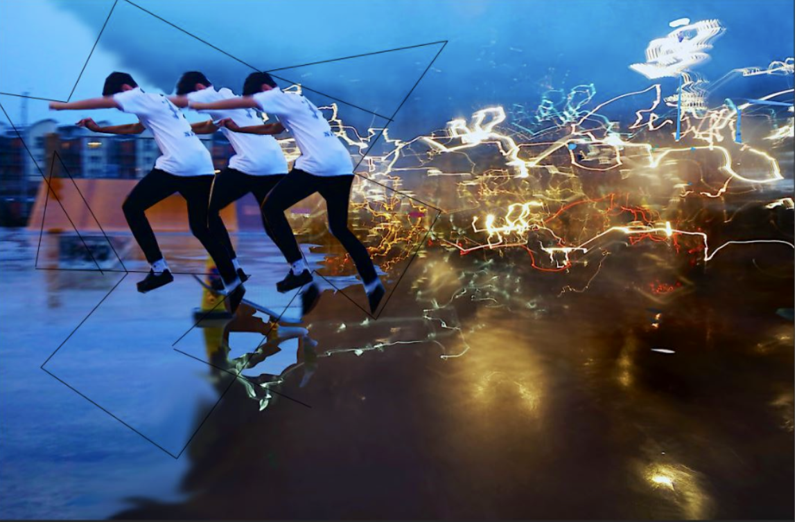


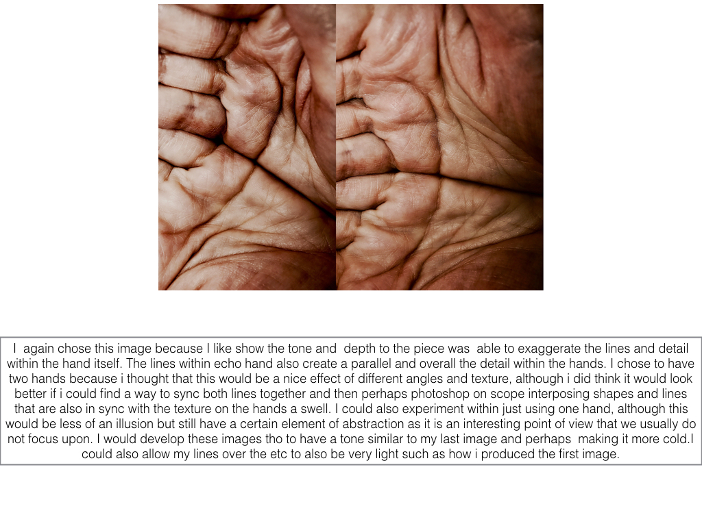
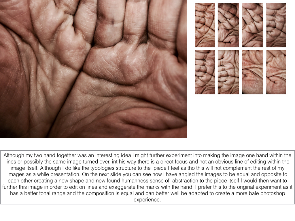
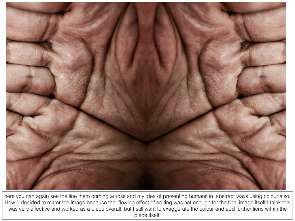
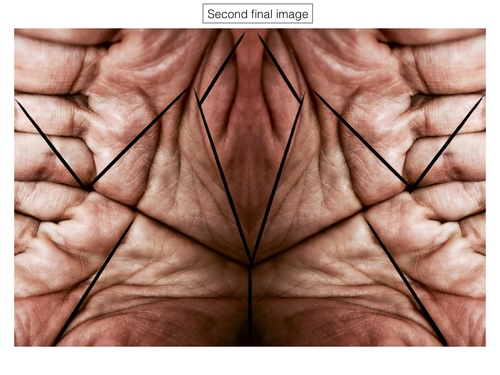
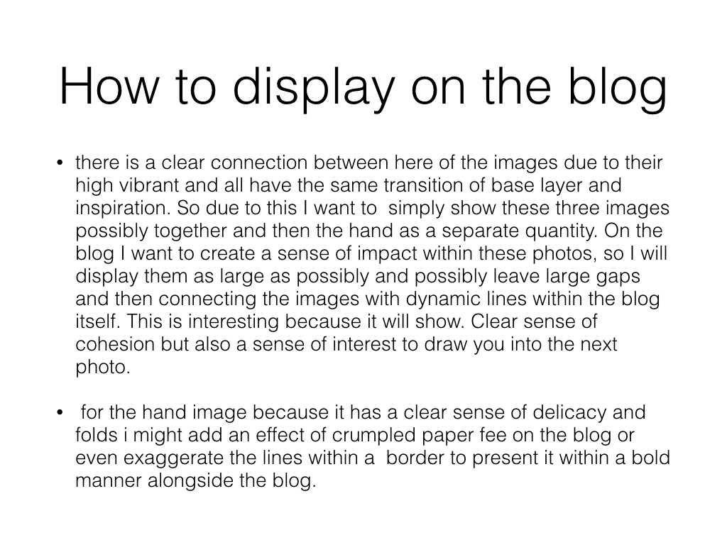
final Hand image
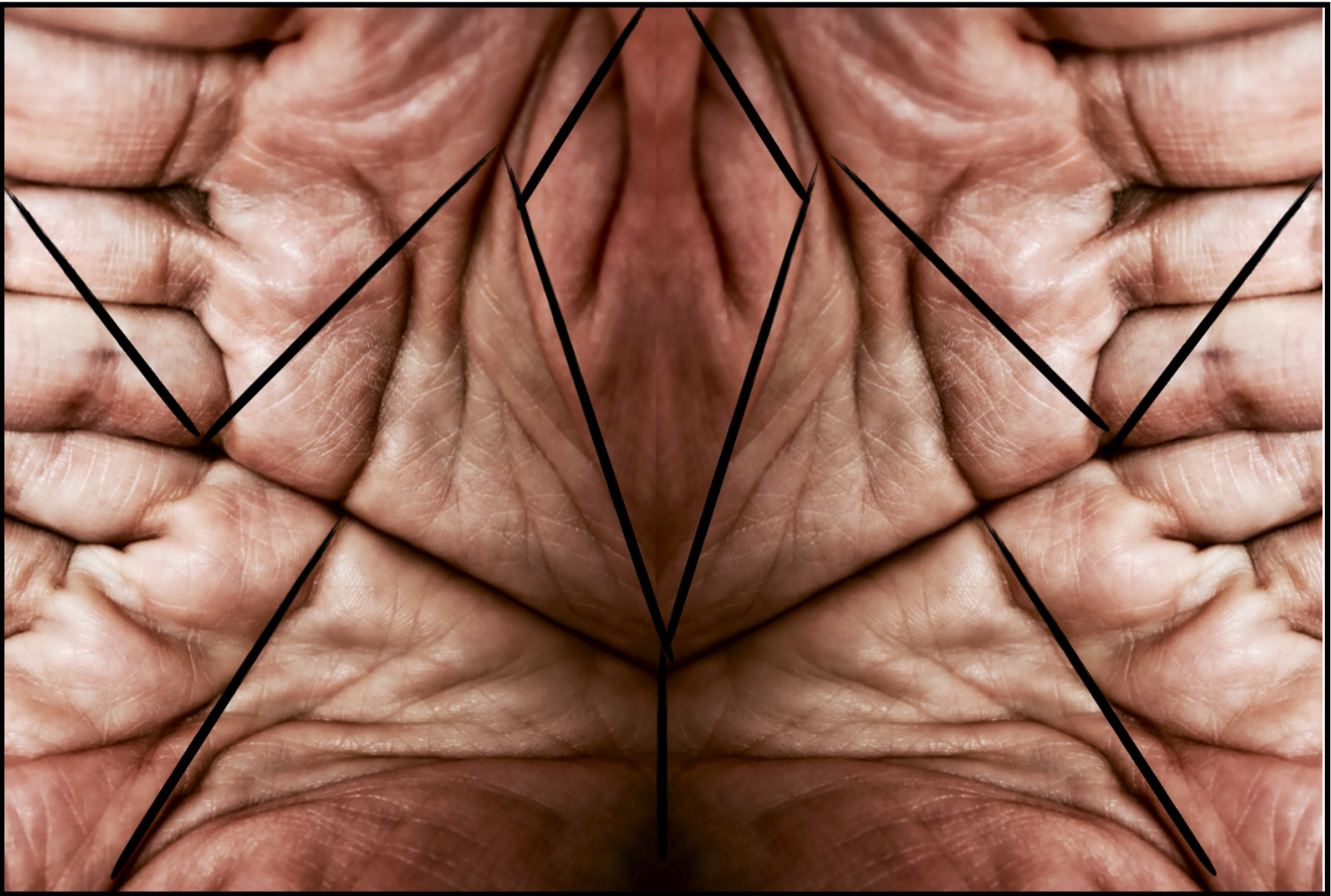
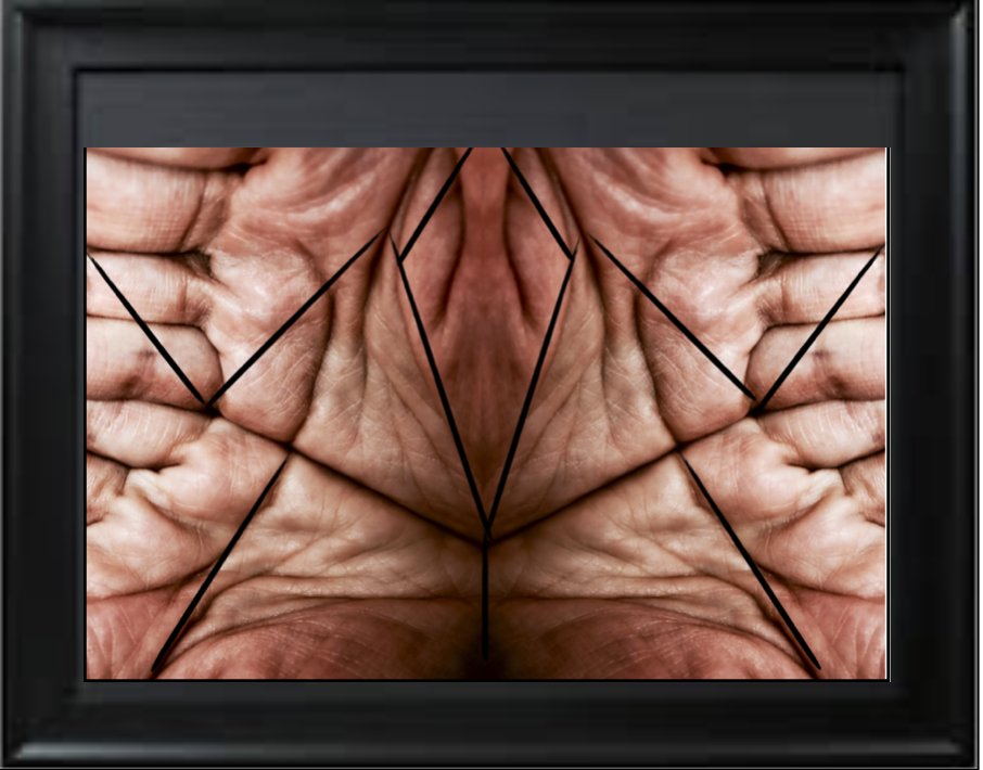
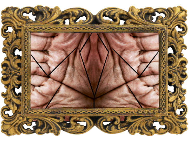
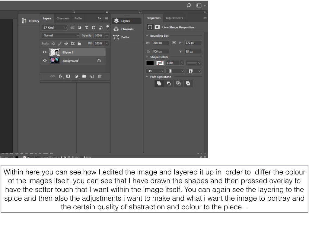
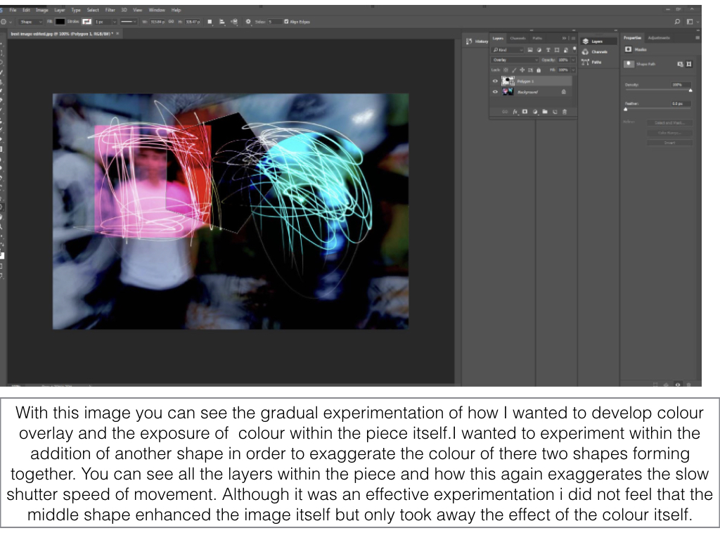
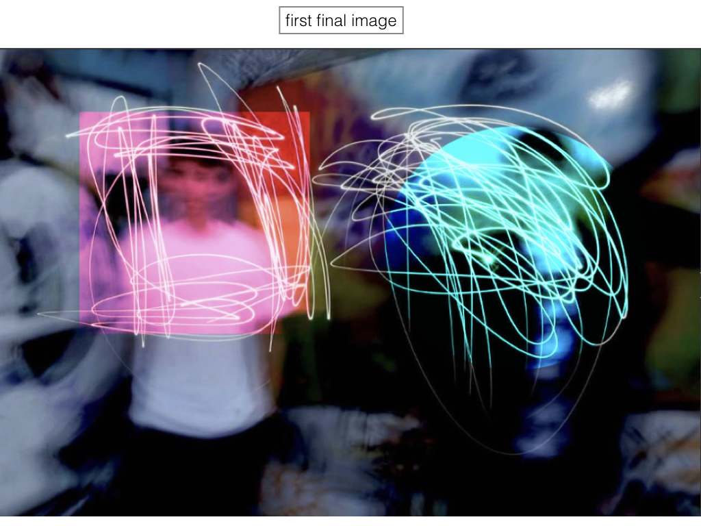
The image above is my favourite final image with the thin black border but I quickly wanted to further experiment within other possible boarder ideas within the piece itself.
Final

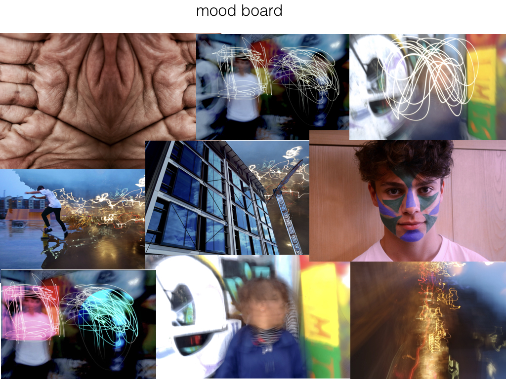
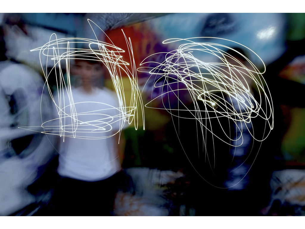
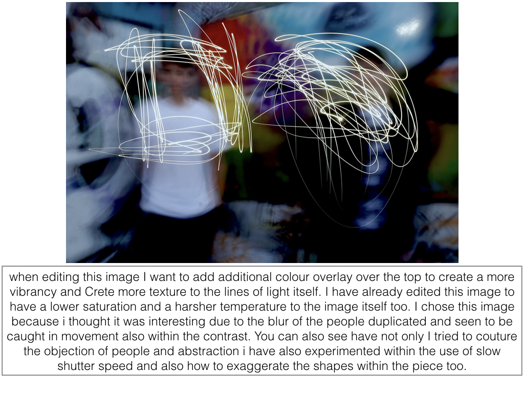
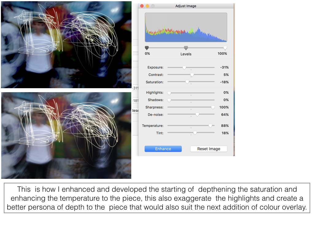
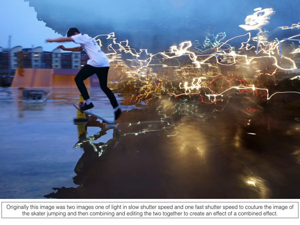
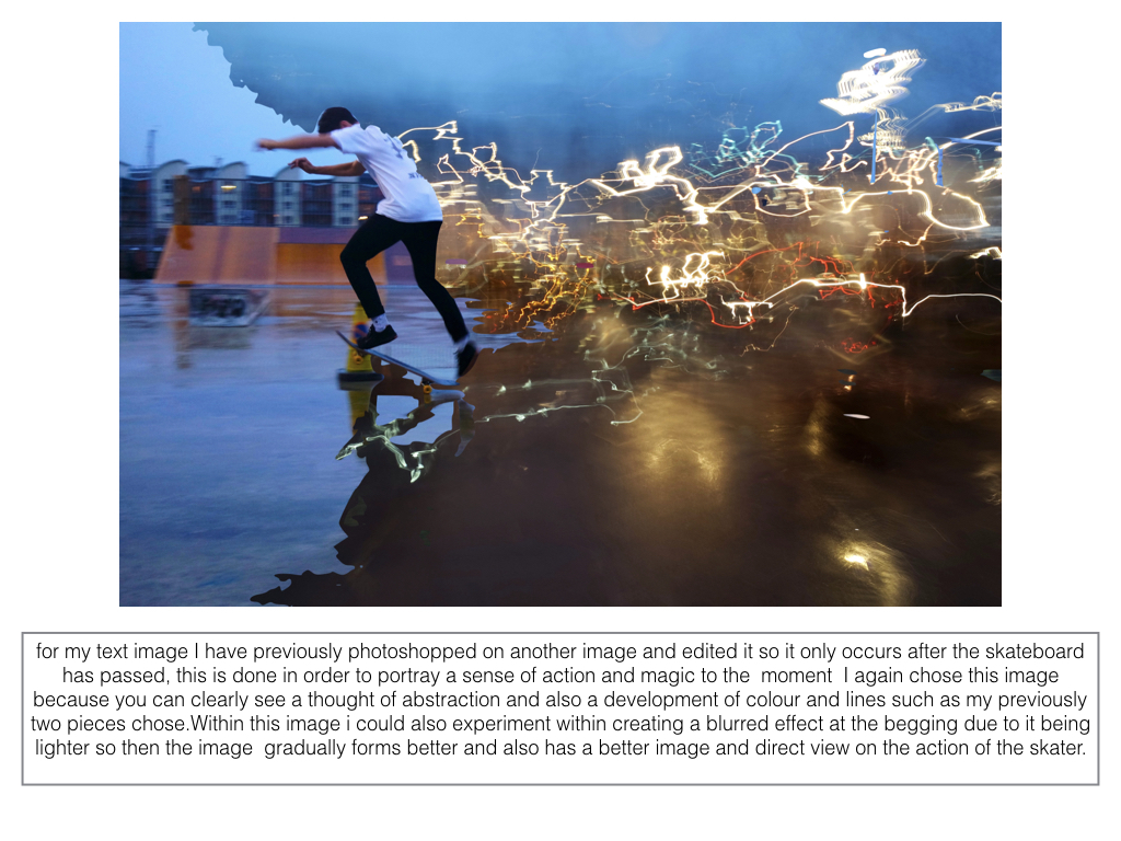
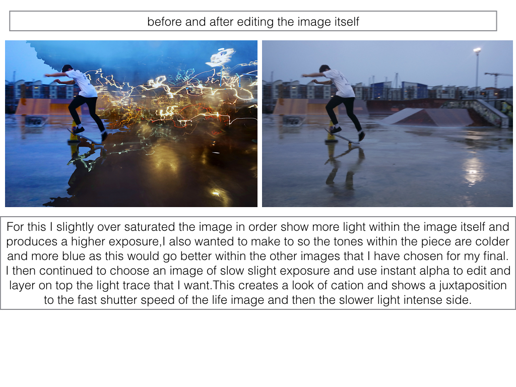
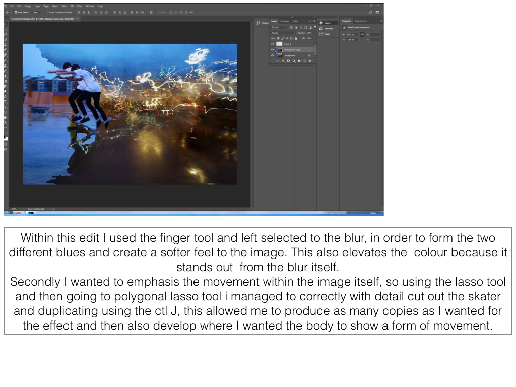
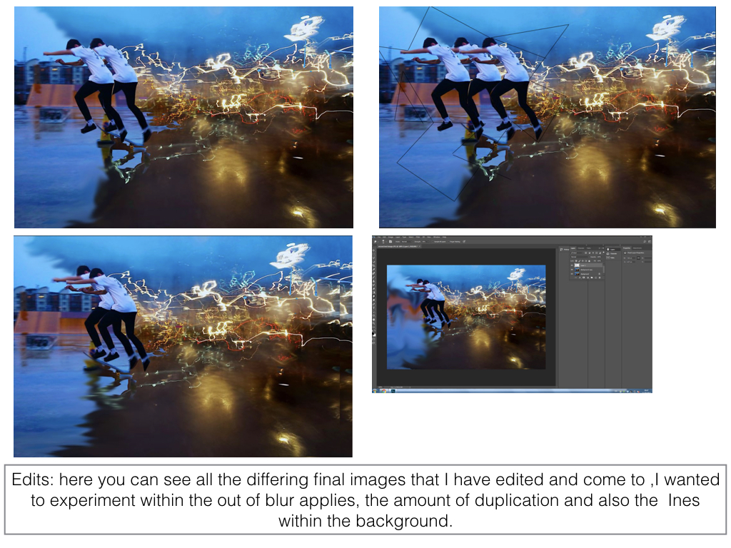
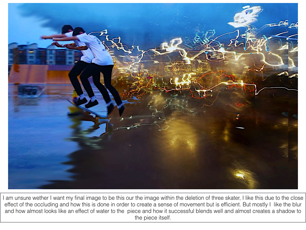
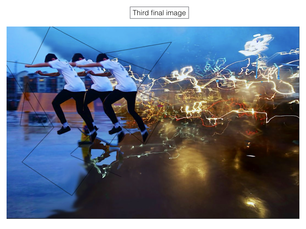
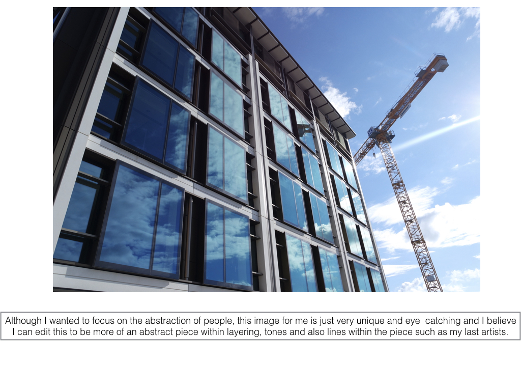
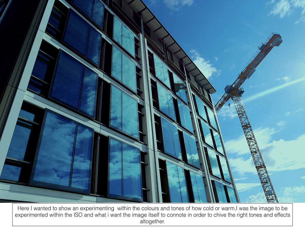
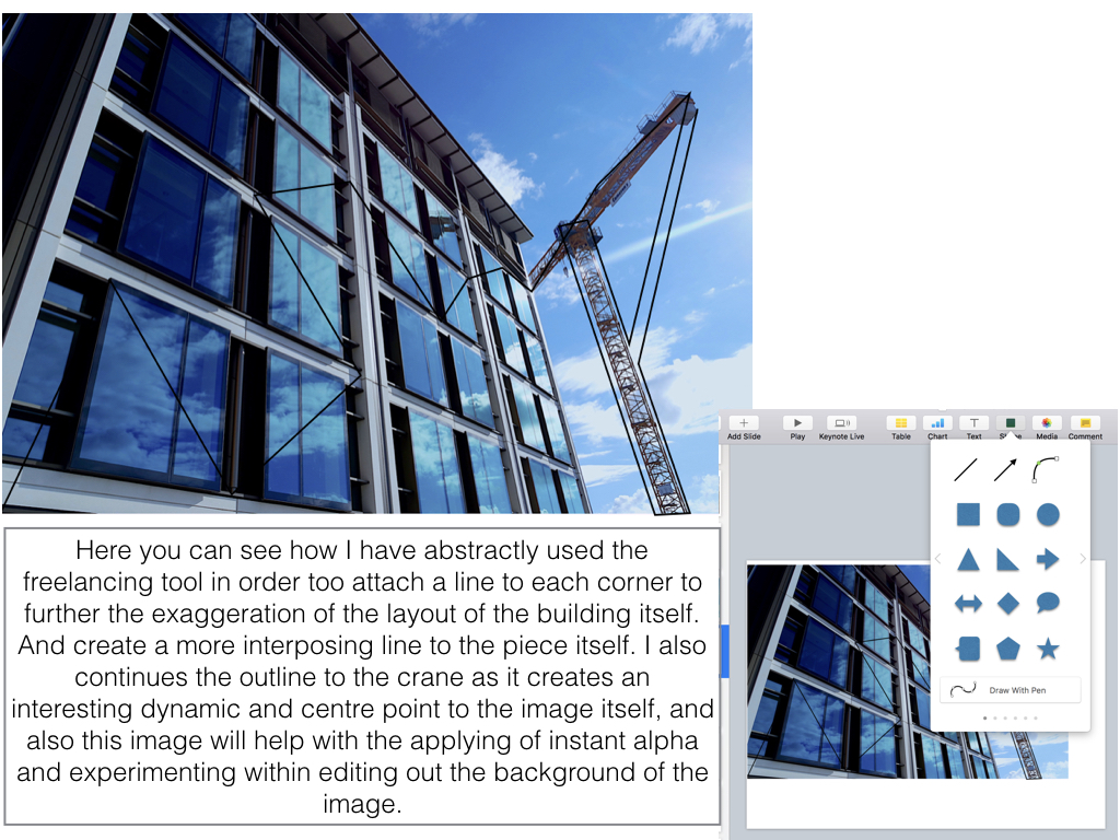
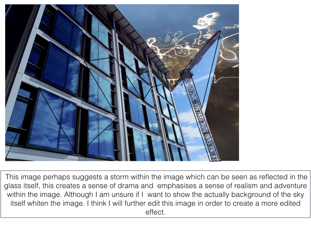
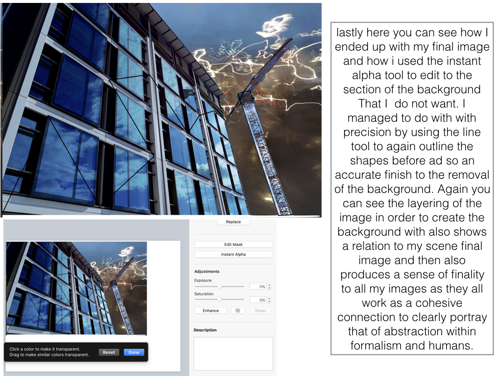
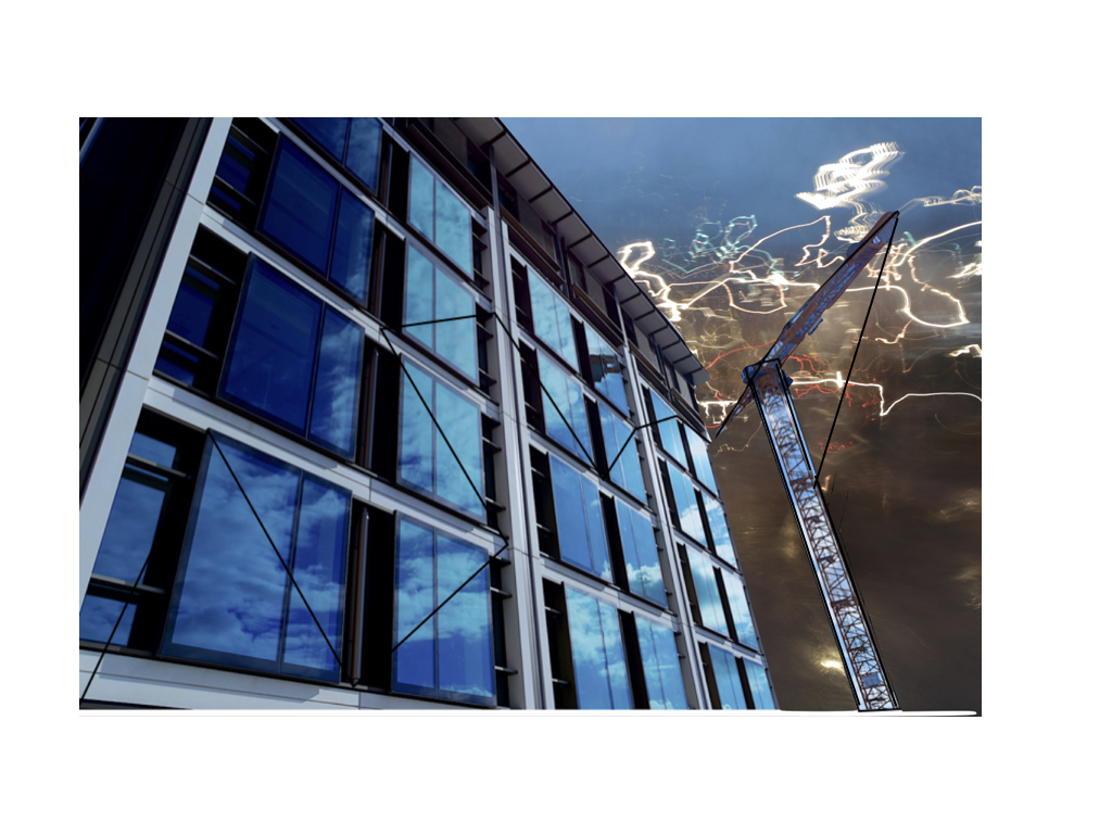
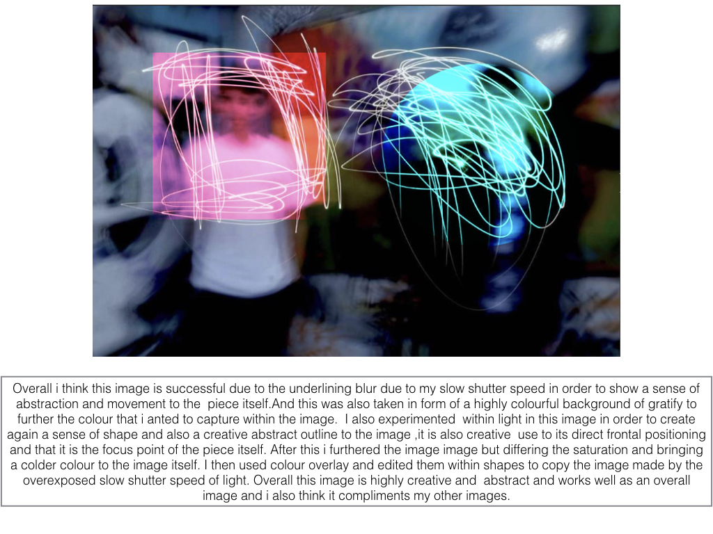
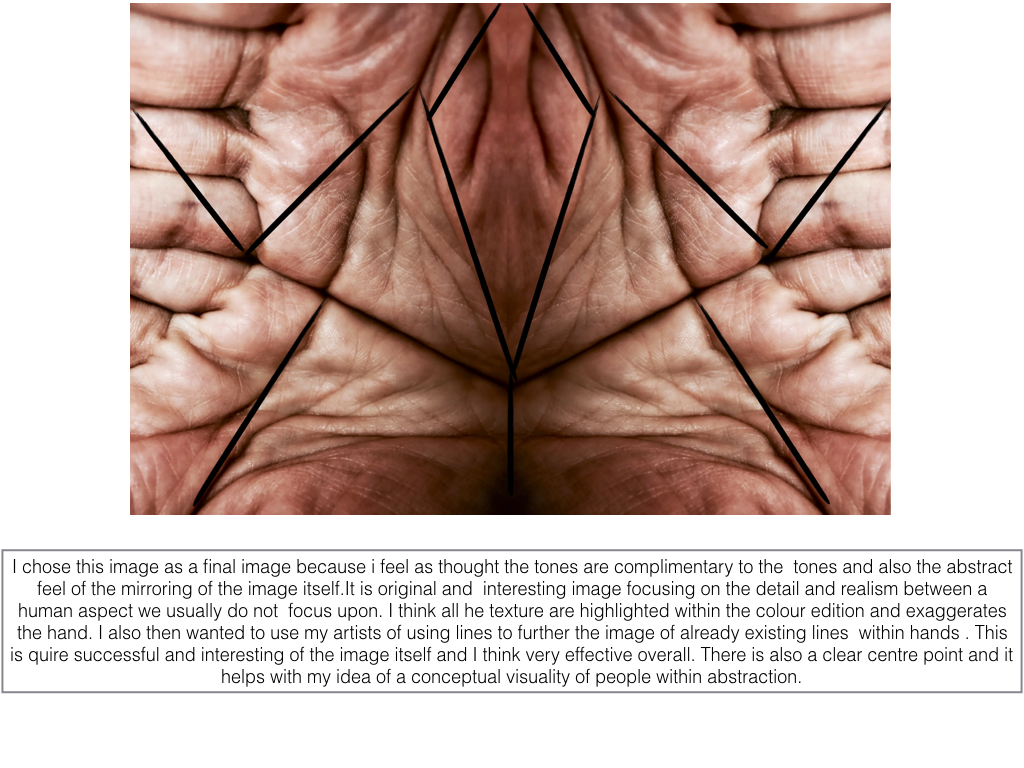
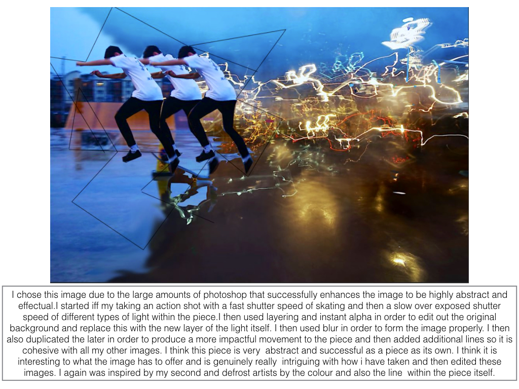
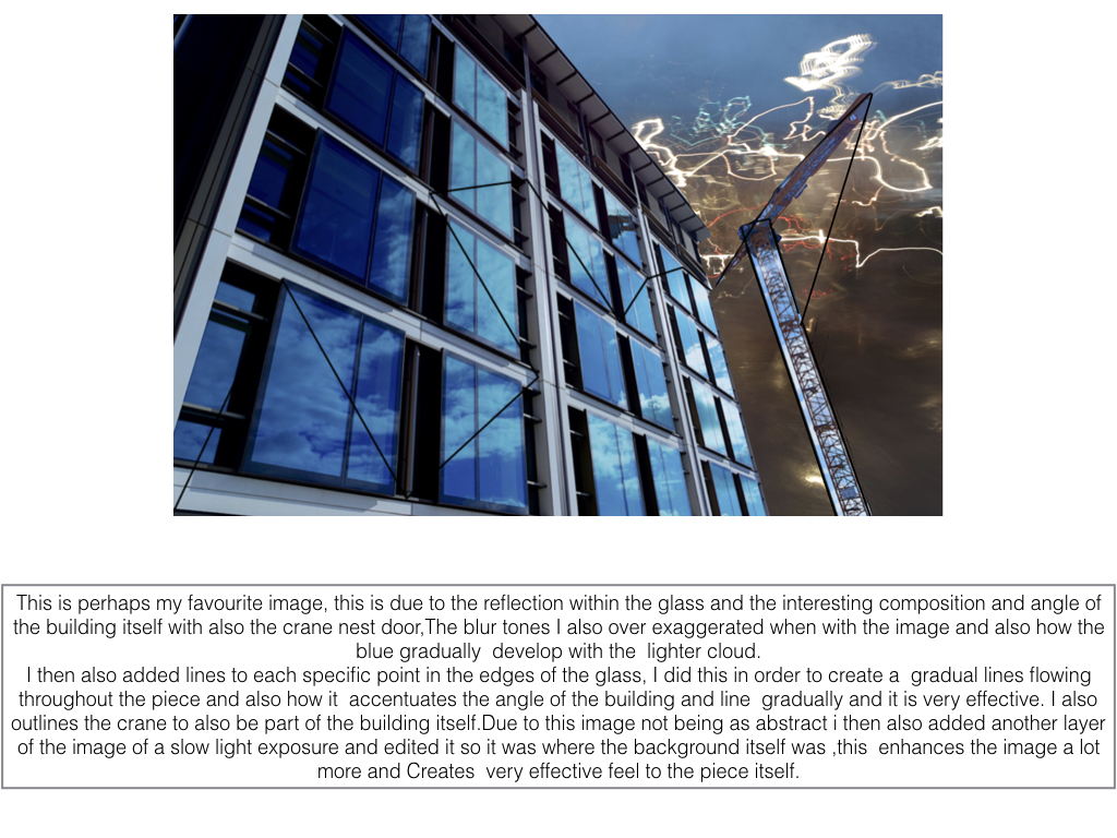
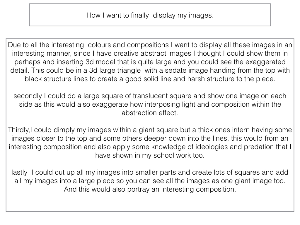
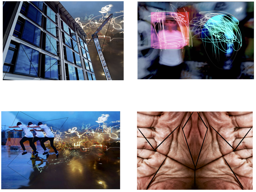
Analysing Robert Frank
Trolley - New Orleans

Robert Frank is a Swiss-American  photographer and documentary filmmaker born in 1924, with his most noticeable work being the 1958 book called The Americans.
Trolley - New Orleans 1955

Named The Trolley, this became one of Robert Frank's most famous photos released from the book The Americans. The picture captures the fleeting moment that conveys the brutal social order of the postwar America. Frank was originally shooting a street parade when he saw a trolley passing, in which he quickly spun round and took a picture before the trolley disappeared from view.

Visual

The picture consists of a small amount of tonal range but a large contrast between black and white throughout. The picture is obviously taken at a slightly angled position, with a balanced symmetry across the entirety of it. This image has been cropped from the original taken with a huge contrast between the white poles and the people next to each one, instantly drawing your eye to them.

Technical

A natural light is used within the image as it was taken on a bright sunny day creating a warm tone to the overall piece, but has been slightly manipulated with evidence of the Ansel Adams zone system used throughout. The whole image seems to be in focus with no blur at all with a big depth of field, whilst telling us that Robert must have used a high shutter speed to capture the moving trolley so clearly without the traces of blur. From the reflection in the glass above the trolley windows, it is clear to say that it was taken head on allowing for the effect to occur.

Contextual

The picture perfectly captures the racial separation between the people at that time period within America in which classes were divided (In one window there is an old white woman, the next are two white children and the last are two black men), whilst also revealing and documenting the truth behind what the Americans saw as 'The American Dream' in which not everyone was equal with similar opportunities in life


