




Category Archives: AO3 Record Ideas
Filters
Rankin
Who is Rankin? John Rankin (born 1966) is a British portrait photographer and fashion photographer. He made his name in publishing and founding the seminal monthly magazine Dazed & Confused with Jefferson Hack in 1922. The magazine went on to forge distinctive marks in the arts and publishing spheres, whilst developing a cult status forming and molding trends, bringing some of the brightest lights to fashion. And today is one of the leading online fashion and cultural brands.Rankin creates landmark editorial and advertising campaigns, with his work being some of the most celebrated by the biggest brands, charities etc. Rankin has published thirty books, and has his work exhibited around the world. In 2011, Rankin Film Productions was made to make music videos, commercials, and short films. Some of his work consists of:
I found that when Rankin captured the subjects features, he tended to base them around the head, making a certain aspect pop out (eyes, teeth and mouth). Through this it showed what defined them as an individual rather than what people saw them as.
Chiaroscuro
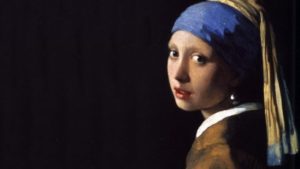
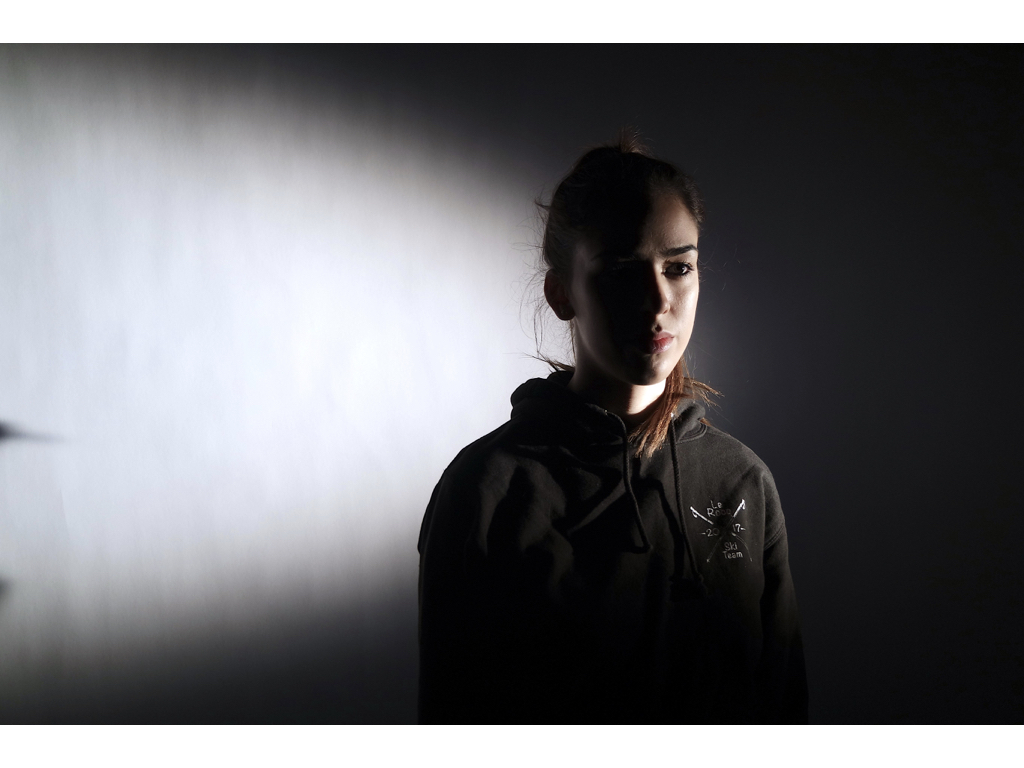
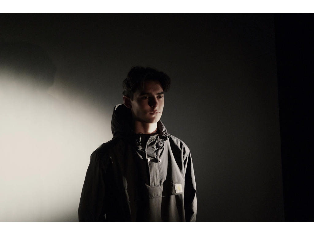
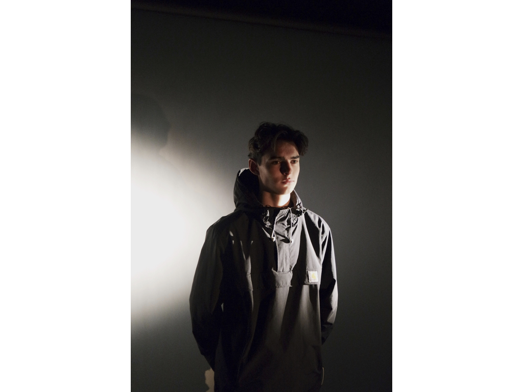
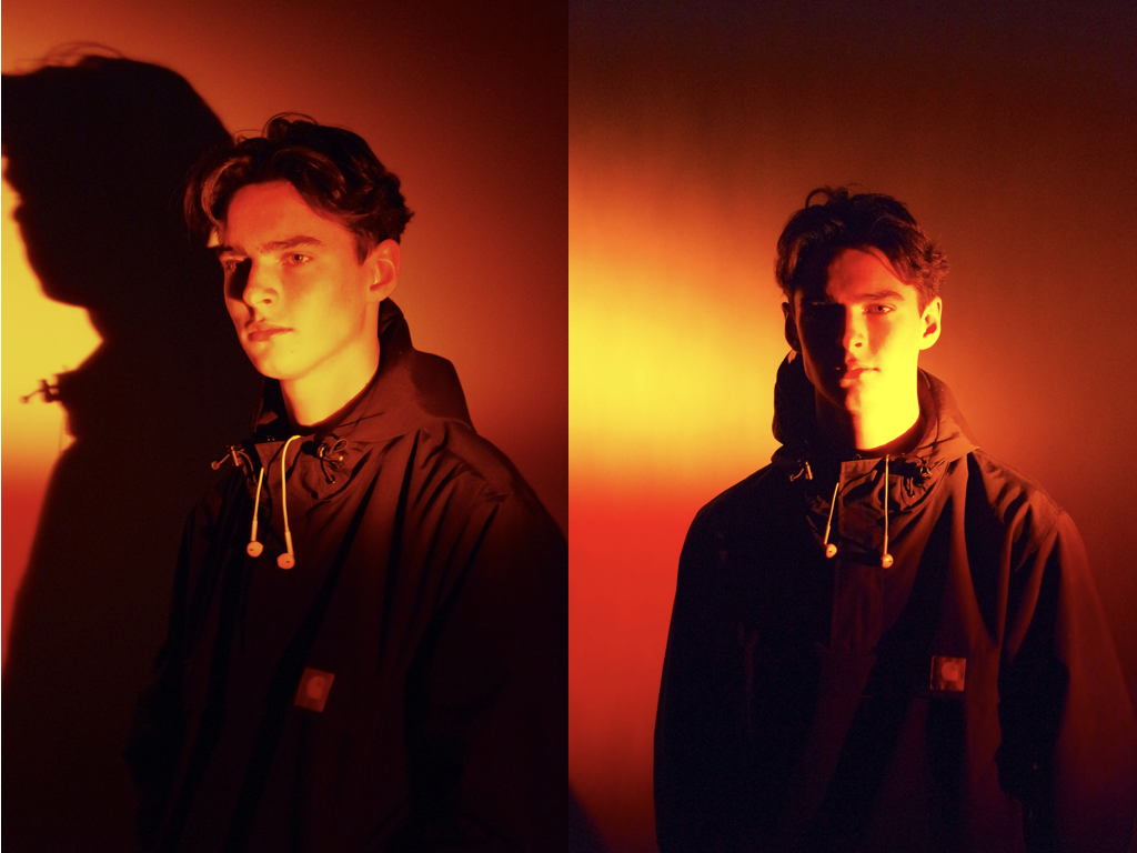
What is chiaroscuro drawing? chiaroscuro is the effect of light modelling in painting, drawing, or print making where three-dimensional volume is suggested by the value gradation of color and the analytical division of light and shadow shapes (Known as shading). Chiaroscuro has been used since the Renaissance and Baroque period where the artists wanted to engage their viewers. To do this one side of the subject tends to be darker than the other, usually bringing out an aspect of their features, and really drawing your eyes to it.How is it used in modern photography? Chiaroscuro is used within modern photography today to create dramatic portraits by making certain aspects of an image once again stand out as seen below:
Using this technique it allow as seen, it can also be used today to make aspects of objects as well as people stand out. When compared to the art, the chiaroscuro inside photography tends to be more dark and dramatic than the art, which tends to just make one side of the face slightly darker.
Week 10 | Studio Lighting | Creative Portraits
Concept : Rankin on “beautiful portraits”

Exploring Technique
Natural Light
Remember >>>Photography is completely dependent on the availability of light.
In most cases we can make use of natural or available / ambient light…but we must be aware of different kinds of natural light and learn how to exploit it thoughtfully and creatively…
- intensity of the light
- direction of the light
- temperature of the light and white balance
- Using reflectors (silver / gold)
- Using diffusers , tissue paper, coloured gels, tracing paper etc
- Front / side / back lighting
- High Key / low key lighting
- Shadows / silhouettes
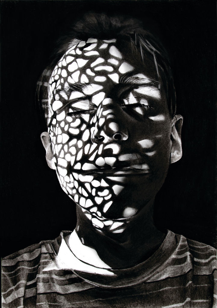

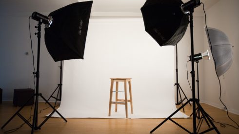
Studio Lighting
Using artificial lighting can offer many creative possibilities…so we will explore
- size and shape of light
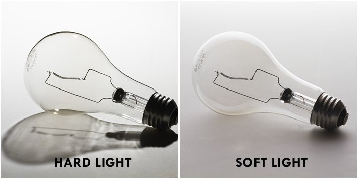
- distance from subject to create hard / soft light
- angles and direction…high, low, side lighting
- filtered light
- reflectors and diffusers
- key lighting, fill lighting, back lighting, 3 point lighting
- softboxes, umbrella lights, spot lights and floodlights
- chiarascuro and Rembrandt lighting
- high key and low key lighting techniques
- backdrops and infinity curves
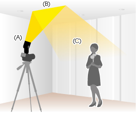
An example of “bouncing” the flash to soften the effects and create a larger “fill” area…try this wherever there are white walls/ ceilings
Using Flash
Flash units offer a range of possibilities in both low and high lighting scenarios…we will explore
- flash “bouncing”
- fill-in flash
- TTL / speedlight flash
- remote / infra-red flash (studio lighting)
- fast + slow synch flash
- light painting c/w slow shutter speeds
Evidence of Your Learning
During this weeks we would expect all students to complete 2-3 blog posts detailing how you are experimenting with various lighting techniques eg CHIARASCURO / REMBRANDT LIGHTING
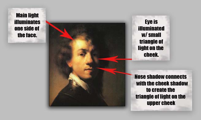
Add information / links showing how Chiarascuro has been used since the Renaissance in painting…but also how it used now in photography and film
You must describe and explain your process with each technique…add your images to your blog as you progress, print off your successful images and evaluate your process using technical vocab and analysis skills. Think carefully about the presentation of your ideas and outcomes…compare your work to relevant portrait photographers as you go eg
Annie Leibovitz, Irving Penn, Rankin, Richard Avedon, Yousef Karsh, David Bailey, Mario Testino, Steve McCurry, Jill Greenberg, etc
Expected Final Outcomes this Week
- Case Study and Practical Responses to Rankin
- 1 x Final Portrait using natural light + analysis and evaluation
- 1 x Final Portrait using artificial light (1, 2 + 3 point lighting) + analysis and evaluation
- 1 x Final Portrait using flash + analysis and evaluation
Make sure you ANSWER THESE QUESTIONS IN YOUR BLOG
- Why do we use studio lighting?
- What is the difference between 1-2-3 point lighting and what does each technique provide / solve
- What is fill lighting?
- What is spill lighting?
- What is Chiarascuro ? Show examples + your own experiments

Try a range of techniques…like this to adapt your lighting
Or use light painting techniques…
- Slow Shutter speeds (1/30th sec or BULB setting)
- Illuminate an area / person with a torch , car headlights etc…
HOMEWORK
Refer to your tracking / planning sheet
- You must complete a range of studio lighting experiments and present your strongest ideas on a seperate blog post
- Remember to select only the most successful images
- You should be aiming to produce portraits that show clarity, focus and a clear understanding of a range of lighting techniques
- Editing should be minimal at this point…we are looking for your camera skills here
Street Photography – Homework
Planning
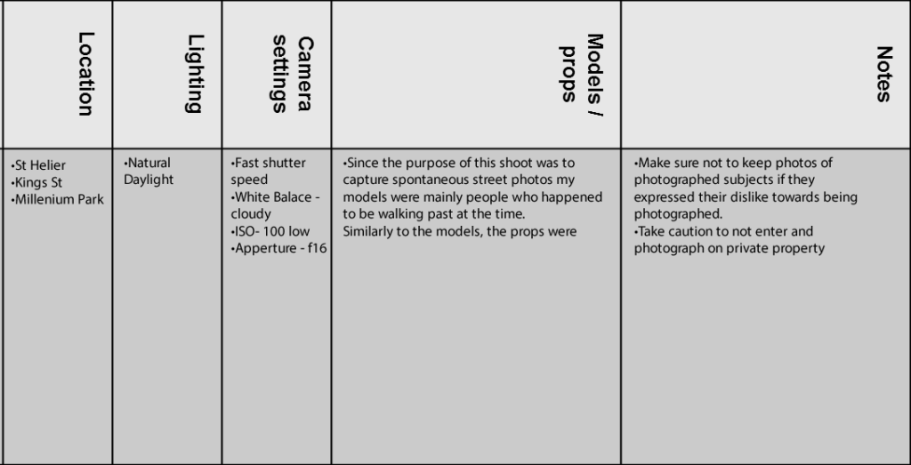
Task – Take 100-250 photos in an urbanised environment with people as the main focus.
Models/Props – Friends and strangers
Camera Settings – I will use a quick shutter speed of about 1/100-1/500 depending on how fast the subjects are moving as I plan on photographing them whilst they naturally move around. I will use a low ISO as the area I will take photos in will be well lit with street lighting.
Lighting – Natural lighting will mostly be used however may be necessary to use a flash to highlight key aspects in my models face
Location – In town as this is an urbanised area
Context – Photographing strangers and friends without them aware of the photo being taken in order to capture a realistic view of how they would be behaving.
Concept – To capture street photographs in the style of Vivian Maier and Robert Frank.
Vivian Maier
Vivian Maier (1926-2009) was an American street photographer born in New York City. Her work was unknown and unpublished during her lifetime. In 2007, collectors found some of her prints and negatives in boxes. Her images were first published on the internet in 2008. Her work has now been exhibited in North America, Europe, Asia and South America. A lot of details about Maier’s life remains unknown.


Robert Frank
Robert Frank (born November 9, 1924) is a Swiss-American photographer and documentary film maker. His most notable work, the 1958 book titled The Americans. His style of work is classed as photo journalism and documentary/street photography.

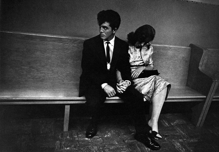
Photo Analysis
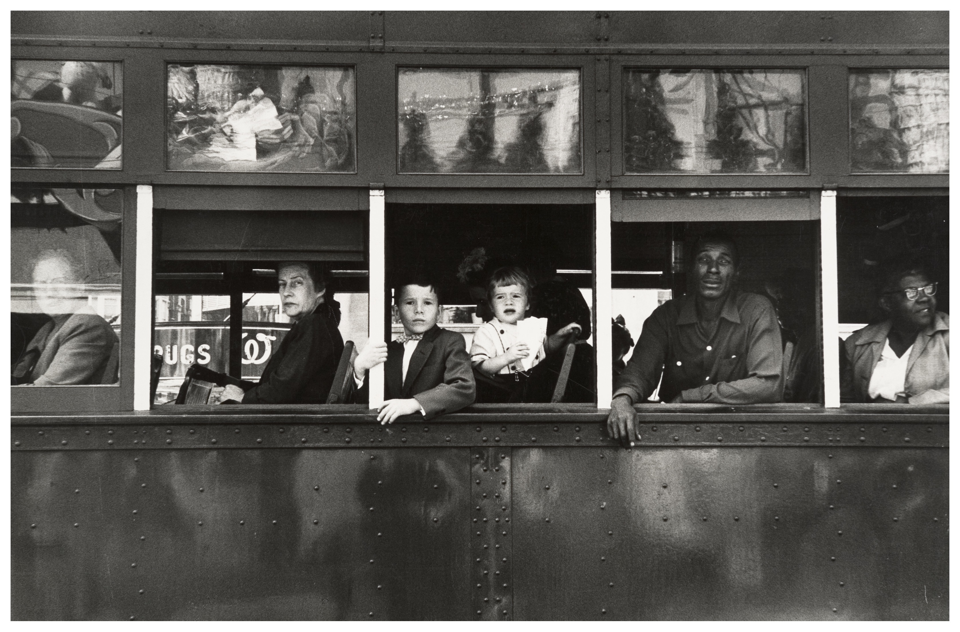
The first thing which caught my eye when observing this picture was the clear use of the rule of thirds. The bus itself create natural lines almost along the horizontal lines when following the rule of thirds. I believe this helps the viewer the see how the picture is made up of several portrait pictures. There is a large tonal range within this picture, with lighter tones towards the top and darker tones towards the bottom. The tonal range can also be seen within the skin tone of the people on the bus, from the left hand side a white man is presented and on the right hand side we are presented with a black person. We can clearly identify that Robert Frank would have used a fast shutter speed in order to take this photograph. This is because the picture is of a moving subject and would require a fast shutter speed to prevent a blur in the image. With a fast shutter speed he was able to capture a sharp photo.There is also multiple textures inside of this image, for example there is the texture of the trolley at the bottom of the image. The blots on the trolley also add another texture to the image. Moreover, there is the texture of the windows at the top of the image, these look smooth.
This image is split into 3 main sections, the top middle and bottom. The middle part is the main focus which contains the main subjects of the people. Where as the top and bottom contain some interesting textures and reflections but this is not what stands out and catches the viewers eye immediately. There is a definite contrast within this image, with the black and whites exaggerated. There is a clear contrast between the white poles/bars separating the people and the rest of the bus, perhaps influencing us that they are a main factor of the image. This photo has been captured in natural light which is expressed in the reflections at the top of the image. I think that the use of the picture being in black and white emphasizes the different races.
This image taken by Robert Franks was captured in the 1950’s. This image was also taken in America, New Orleans. At this time period, America experienced marked economic growth – with an increase in manufacturing and home construction among a post–World War II economic expansion. At this time period it was uncommon for photographers to tackle the issue of racism which is a key theme portrayed within this photo. The time period when this photo was taken was a time of racism and prejudice. Although the photo may have been an ‘accident’ as Robert Frank himself said, it may have been a powerful and strongly influential picture to help the problem with racism.
It looks as if the different races are separated from each other. The white man is at the front of the trolley while the rest are sat behind him. This can connote the fact that at this time people like that where protected by society and had more ‘privilege’. The different facial expressions of the different people can say quite a lot about the image. They all have the same serious look about them. This can represent the lives of these people. The layout of the characters in the image also represents the different classes, for example the man at the front could be a higher class than the one at the back however we do not know this it is just interpretation. The white bars can again also show the separation between the different classes.
My Photoshoot
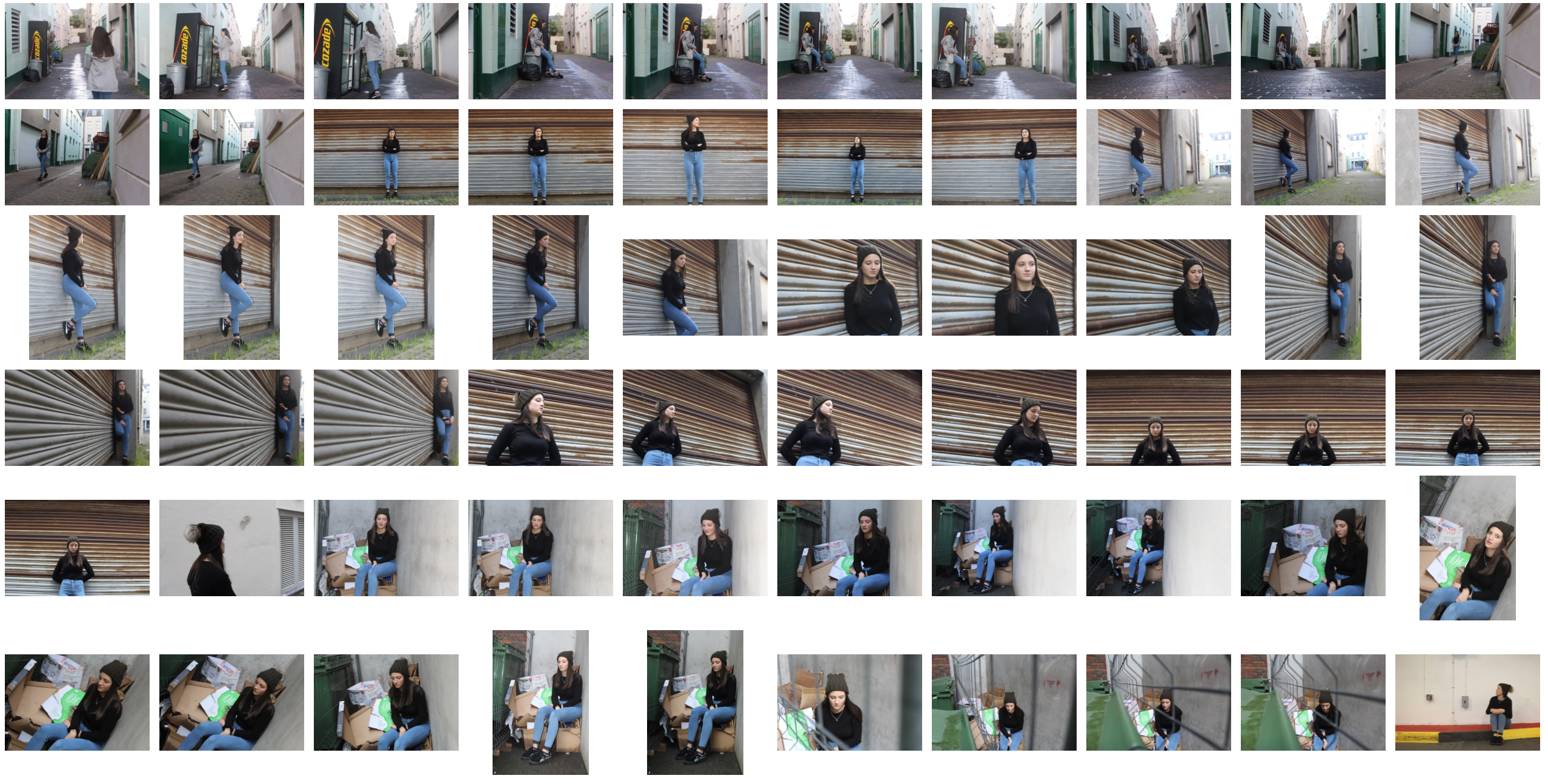
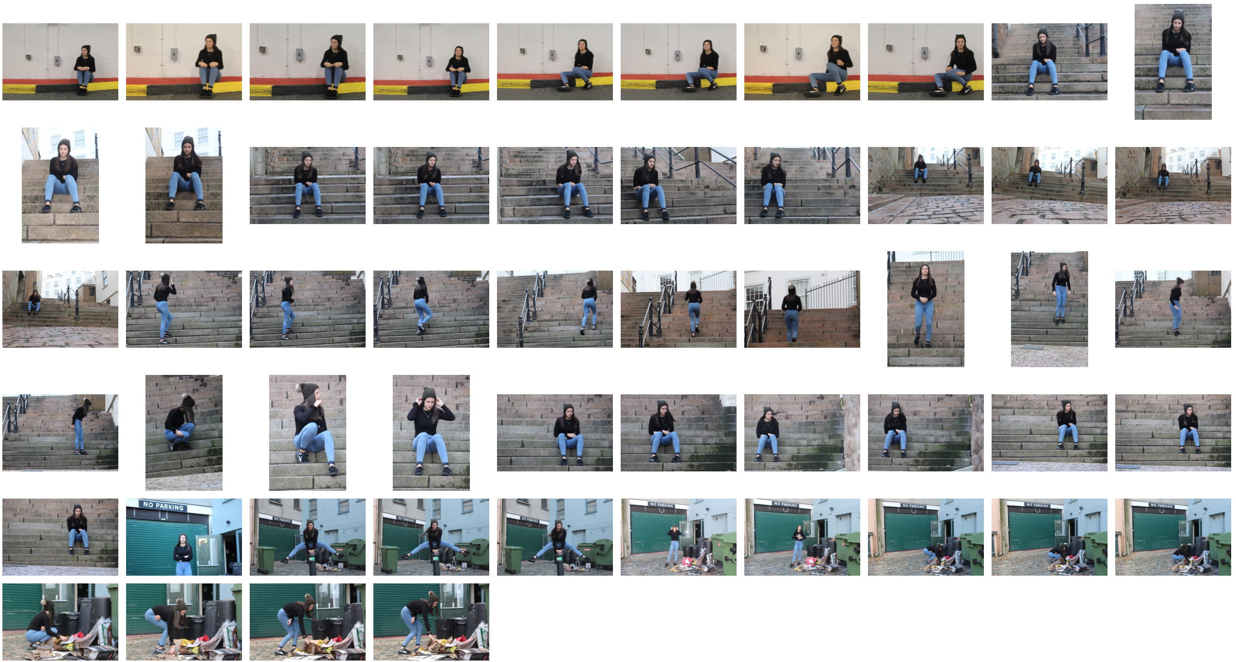
Edited Images
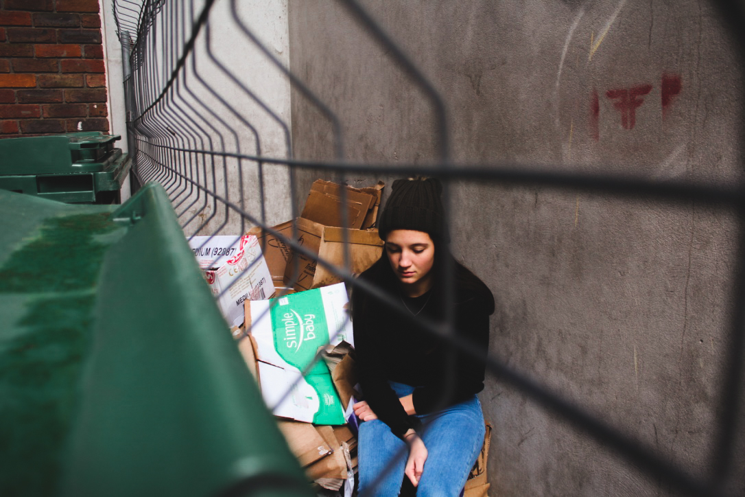
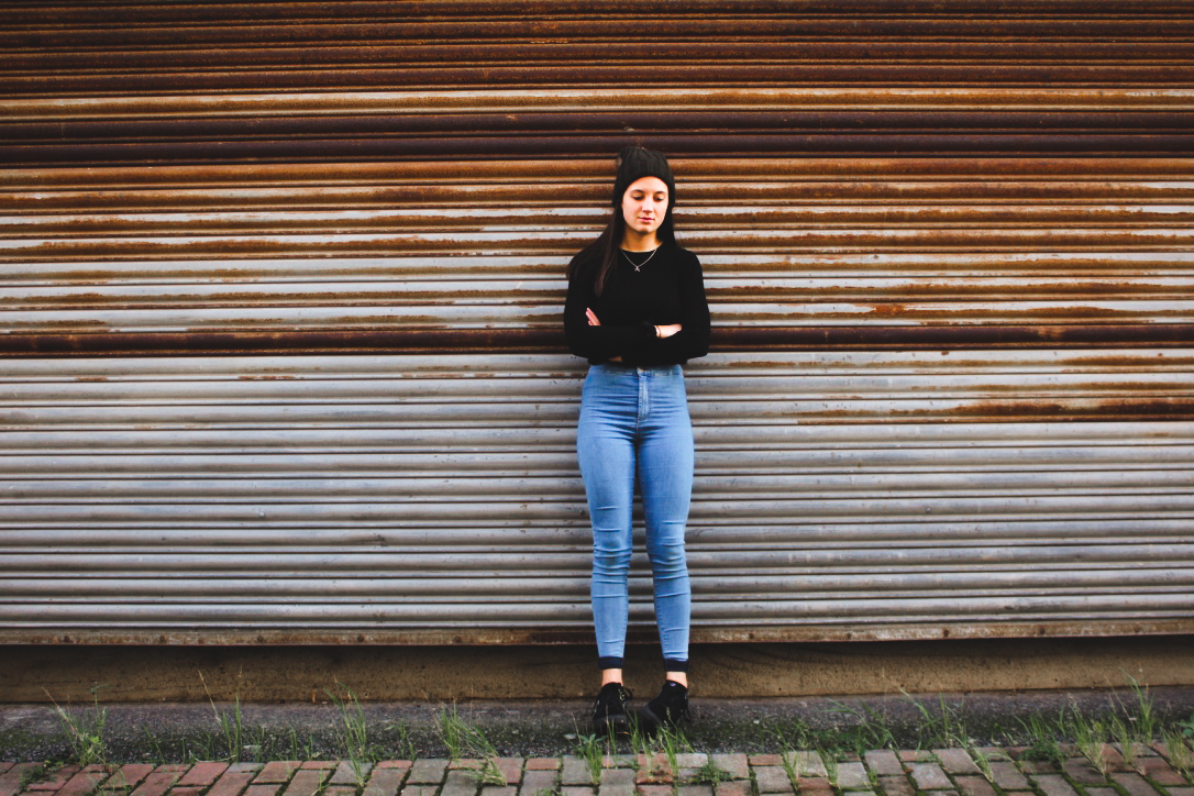
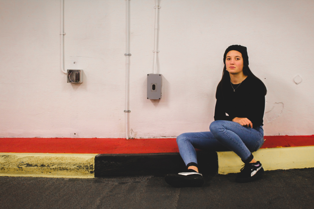
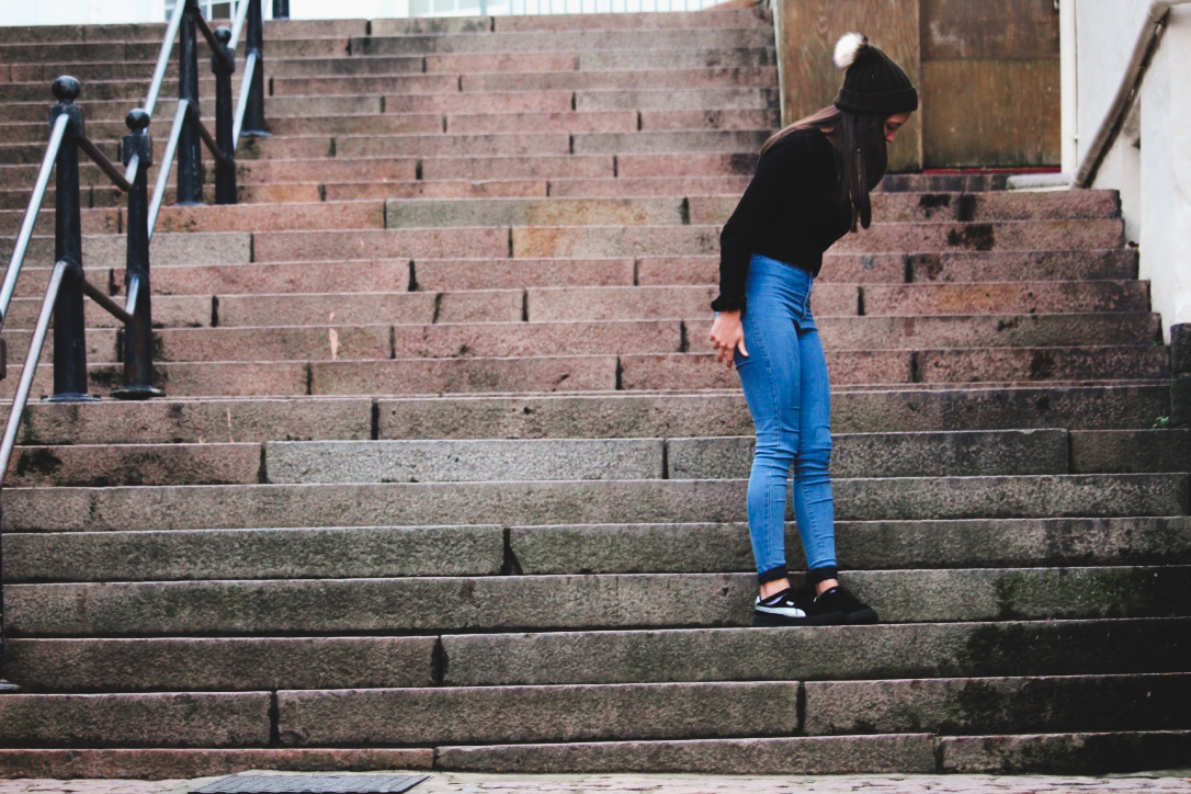
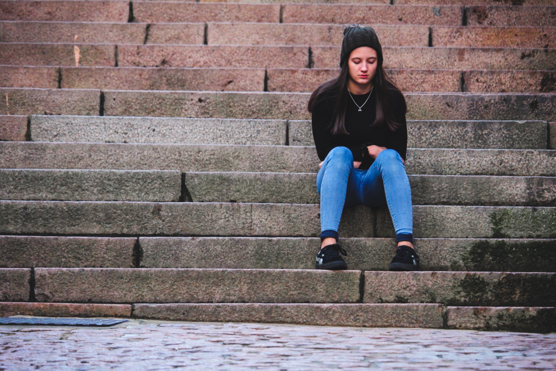
Street Photography Shoot
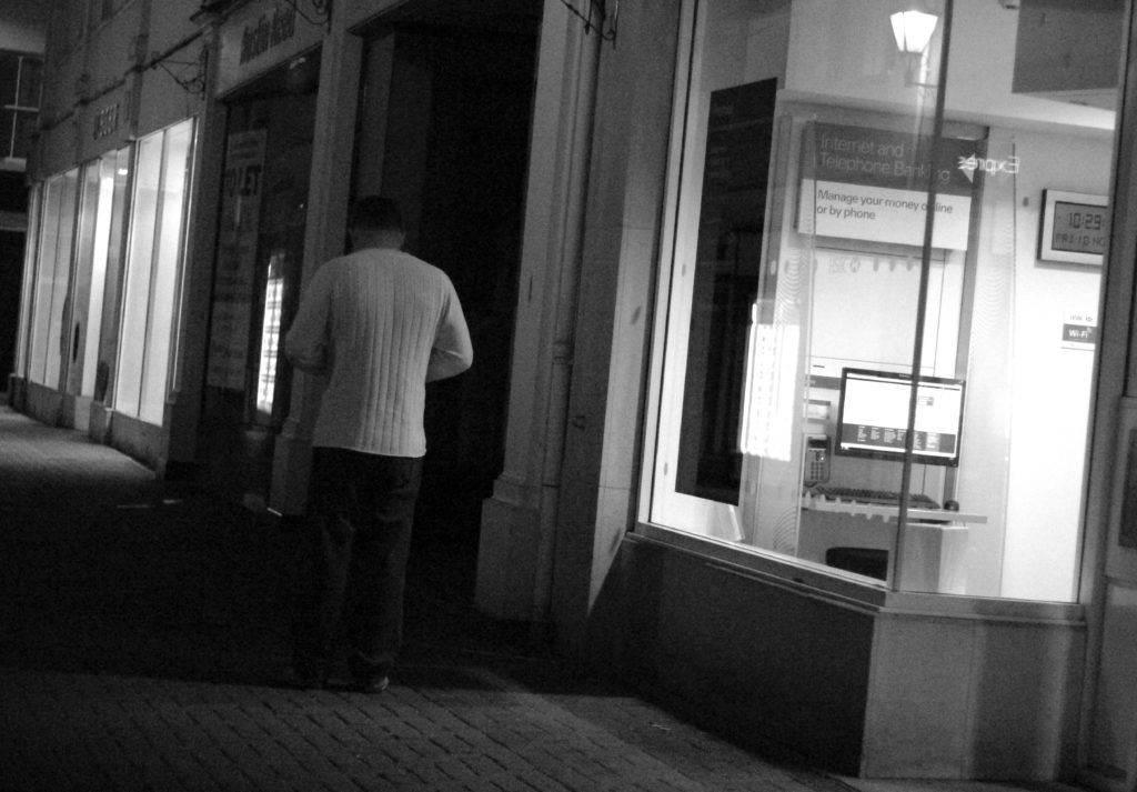
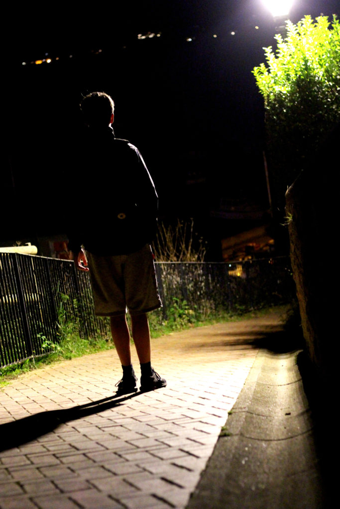
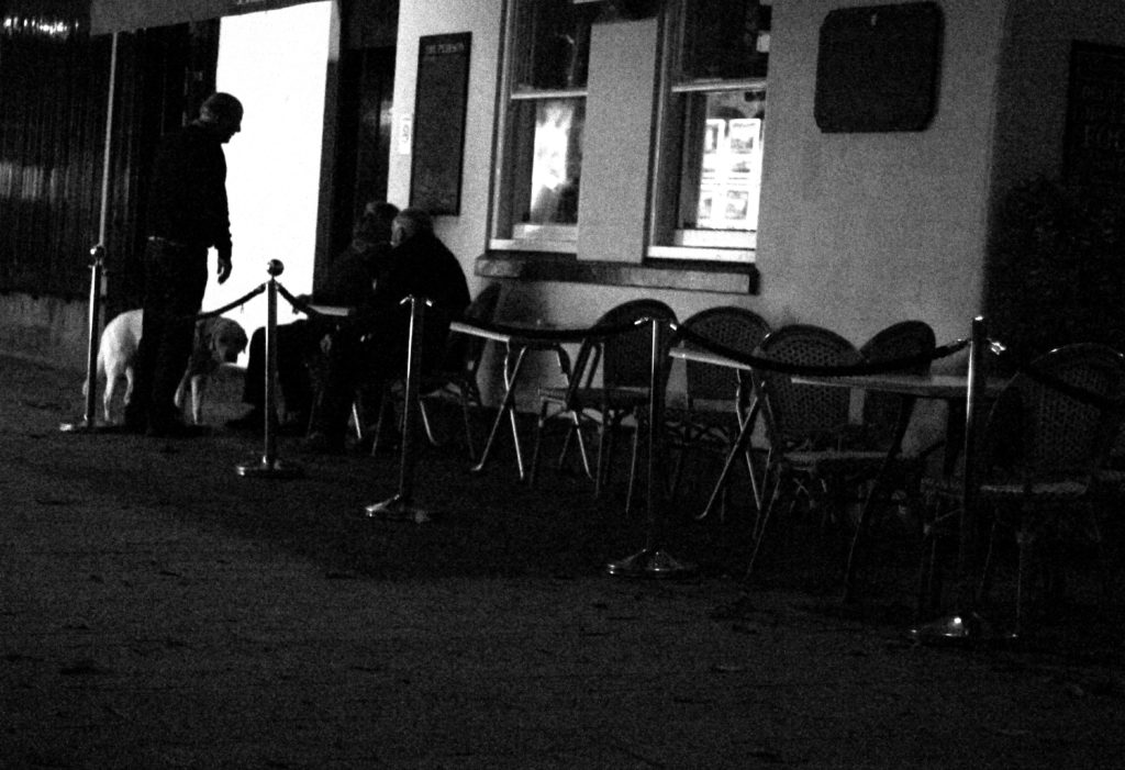
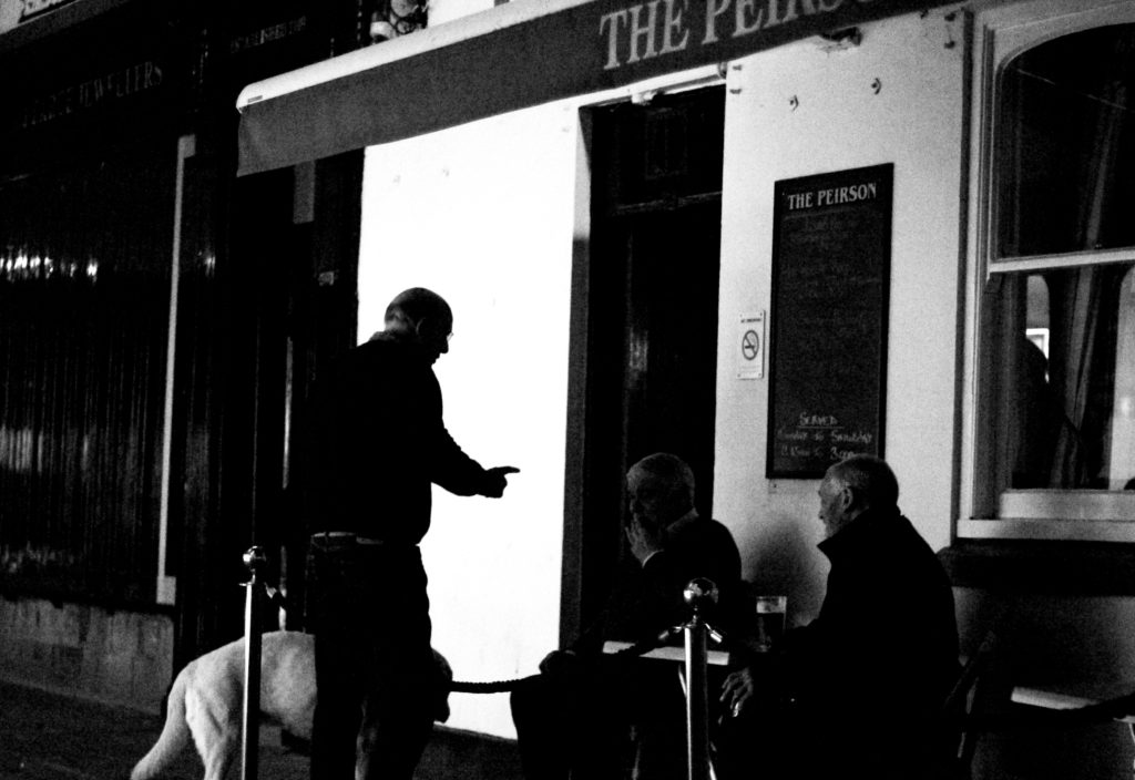
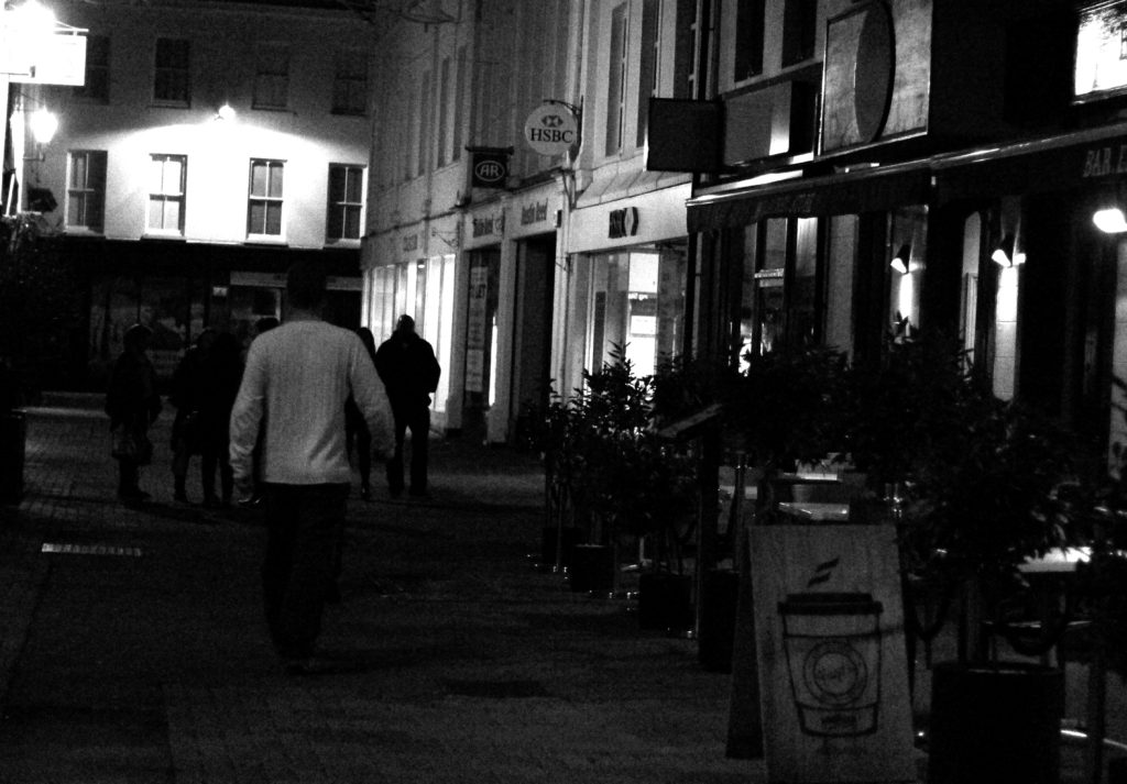
What is street photography? Street photography, also sometimes known as candid photography, is a type of photography conducted for either art of inquiry, that features many unedited encounters and random incidents within public places of interest. I found that many images of street photography included capturing the subjects off guard, and so thought that to try this would allow for maximum effect when taking the shoot. For my shoot I decided it would be either best to go into down for the nightlife, or stay around the street where I lived such as the bars etc. When planning the shoot I wanted it to be clear what I would be taking pictures of, and so made a mind-map to record my ideas, as seen below:This allowed me to focus on certain aspects of the shoot easier, as I now had a rough idea what I needed to capture. These were the results from my shoot:
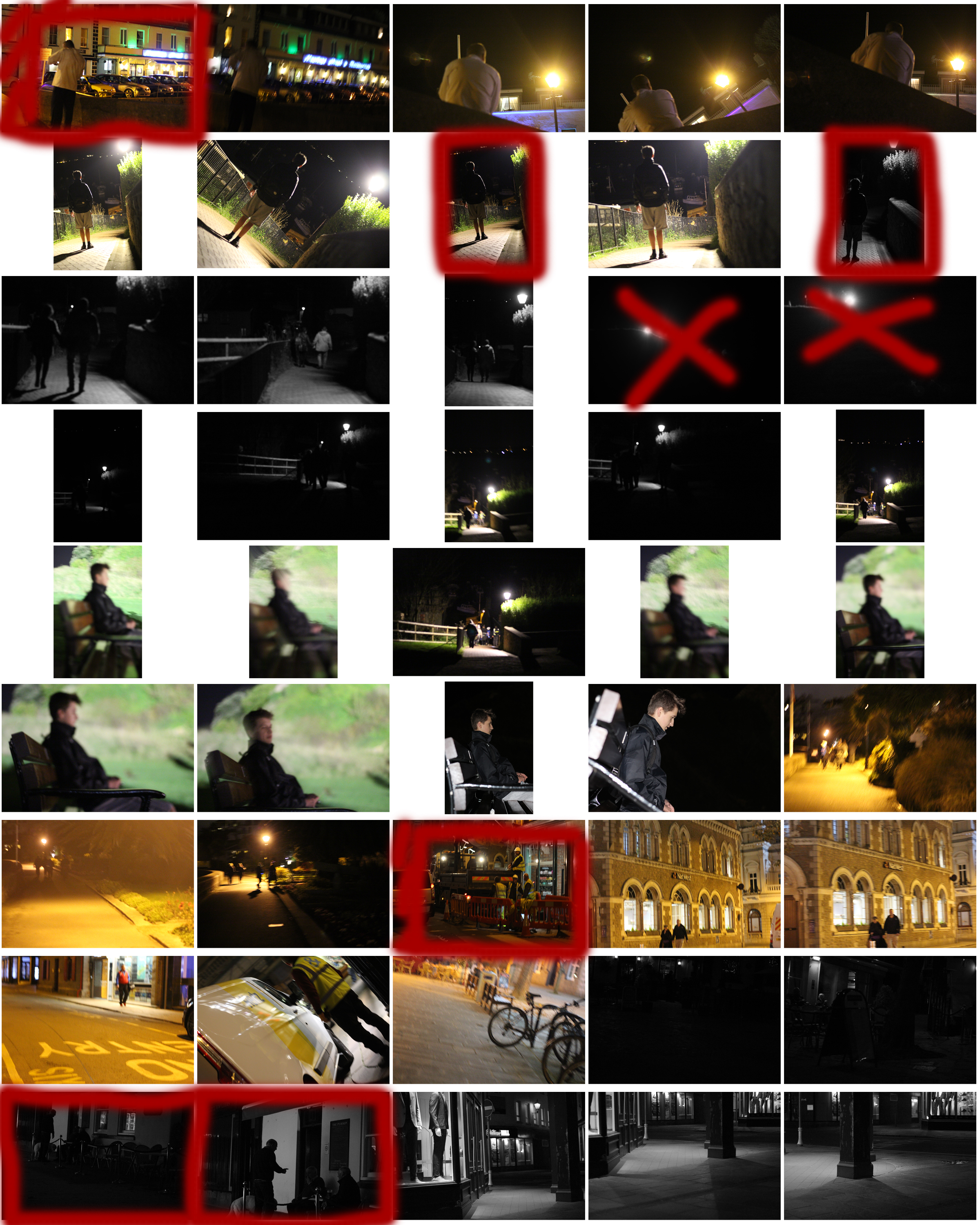
From the shoot I went on to highlight and crop the images I thought were the best out of all the photographs. This allowed me to limit the shoot down to just ten pictures so that I could choose my final image to display. These were my choices:
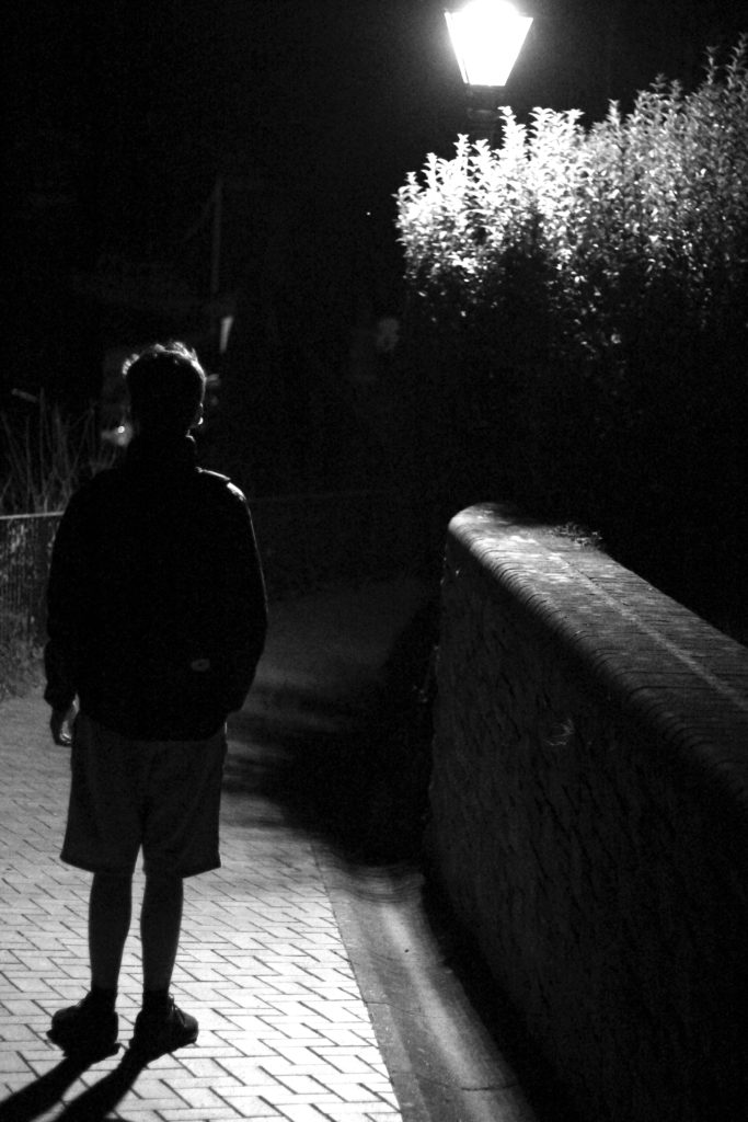
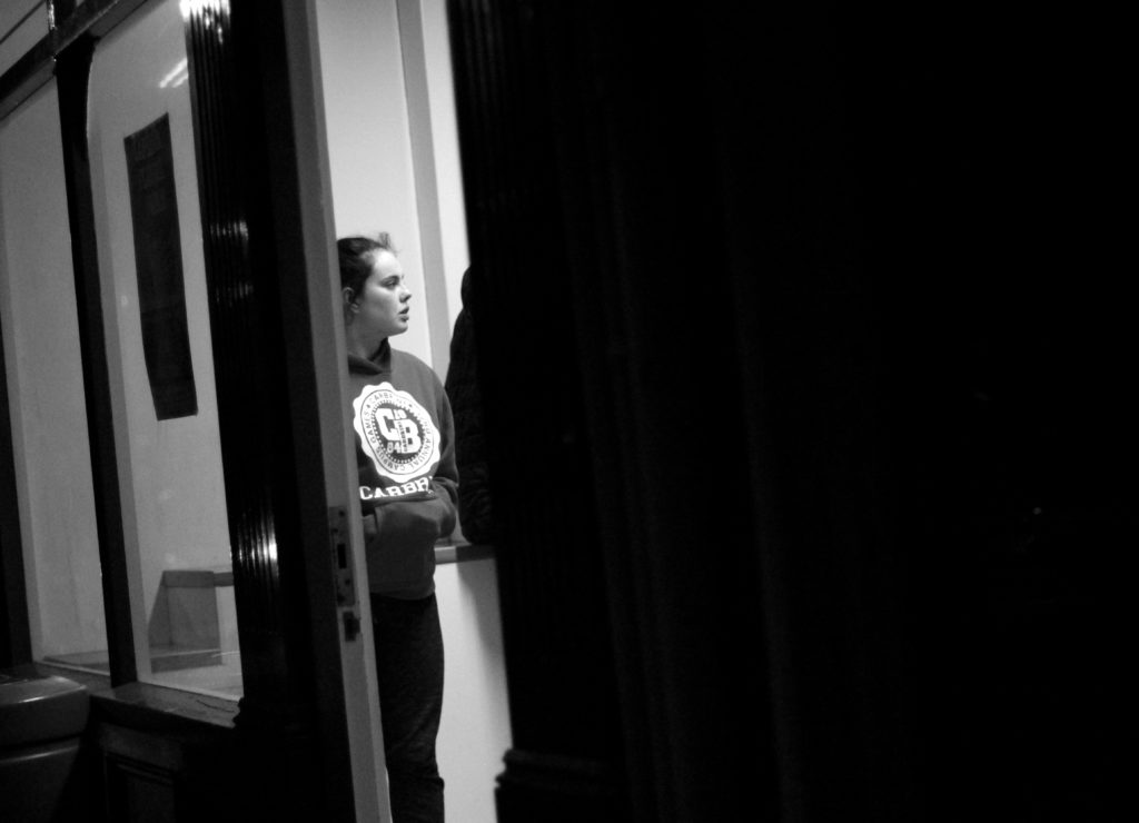
Once again from here I went to limit my selection to a top 5 to make it easier for me to find the final piece. This was my result:I chose this image because I loved the contrast between the darkness of the wall, and the subject. This is due to the rule of thirds which line up with the character inside, which instantly draws your eye to the face. I found that the pure blackness of the wall covering the picture added for a dramatic effect overall, making it almost seem hidden.
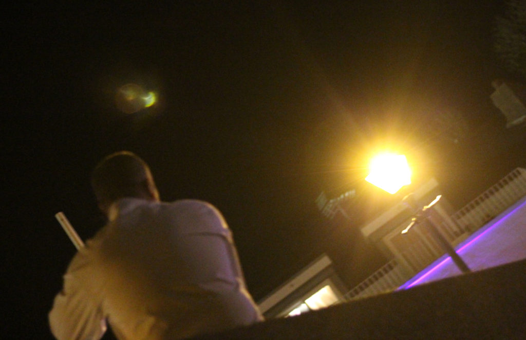
I chose this image once again because of the contrast between the subject and the surrounding area. I found that the silhouette created by the lamp really made the image pop, whilst at the same time balanced it so that the darkness itself was not too overpowering in the picture.
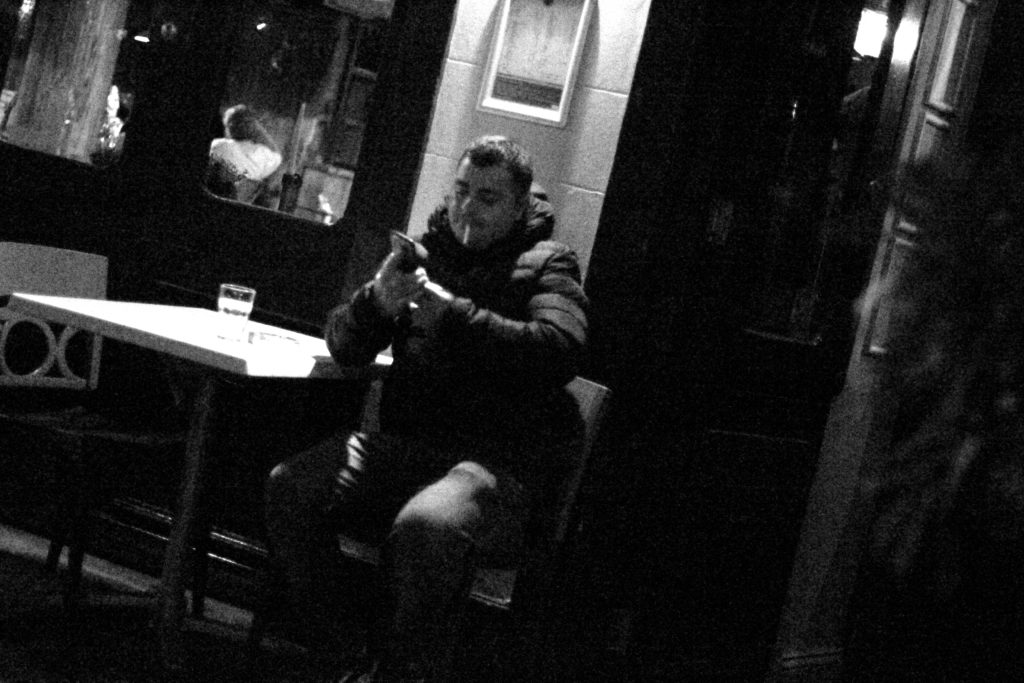
What I liked about this image was how the subjects face lit up against the darkness of the rest of the picture against the white strip of wall. I found that capturing someone off guard in their comfort zone allowed for a greater insight to the subjects life, and really captured them as an individual.
I found that this picture captured a clear contrast between the darkness of the three old figures and the white pub behind. I found that this silhouette that is almost created, makes the overall piece more dramatic than it is, with the blurred black building behind allowing for the whole picture to work.
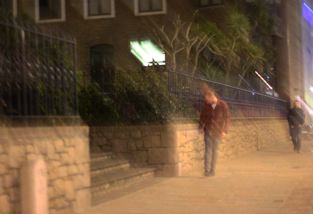
Finally I chose this image because it captured the nightlife of a man drunk stumbling home. What I liked about this was how the picture was blurred itself as well, allowing greater emphasis on the man in the jacket being drunk, and the perspective that he may be seeing. FINAL IMAGE
I chose this as my final image because I loved the use of the darkness provided by the wall, to create a backdrop which almost hides the subject behind, with only a glimpse of the subject within the heavily contrasted brightness of the indoors.
Studio Lighting – Homework Assignment
Planning
Task – Produce 100-200 images showing your understanding and control of studio lighting.
Models/props – For my model I will use somebody from my class.
Camera settings – I will use a fairly low shutter speed of 1/10 to 1/60 to allow more light to enter the lens from the dark environment when using a black background. I will use a higher shutter speed of 1/60 when using a white background. I will use a low ISO of 100 or 200 to keep the image high quality. I will use a shallow depth of field to create a soft blur in the background.
Lighting – I will be using red head lights, spotlights, natural light and flash to capture a wide range of images. I will be using red head light for soft light, white backdrop for some lighter images, a black backdrop for darker images, a spotlight for harder light, a reflector to reflect light into the model’s face and gel filters to change the colour of the light
Location – School studio
Context – I will be using the school studio to capture a range of images in different styles and different lighting.
Concept – To capture studio photographs in the style of David Bailey and Irving Penn whilst incorporating chiaroscuro.
David Bailey


David Bailey (born 1938) is an English fashion and portrait photographer. Bailey is considered one of the pioneers of contemporary photographer. He is credited with producing some of the most interesting images of recent times. He has captured images of some very iconic people such as The Rolling Stones and Kate Moss.
I like Bailey’s photographs because of the strong contrast in the images. As you can see in the images above, the subject is contrasted against the plain white background and this helps the viewer focus on the small details in the subject.
David Bailey Favourite Photo

It appears that flash was used in this photograph as the faces of the subjects are over-exposed. This creates contrast in the image between the white faces and the black details, almost in the style of Andy Warhol’s pop art. It also increases the tonal range in the photograph. A deep depth of field appears to have been used also because all of the photograph is in focus. A quick shutter speed will have also been used because the image is focused and sharp. It appears that a medium/high ISO has been used as the image is quite light but there is some noise in it. The grey background creates a slightly cold undertone to the image.
There is no colour in this image as it has a black and white filter over it. This increases the emphasis on the contrast and boldness of the image. There is a wide tonal range in this image but the tones quickly range from dark black to bright white, there is not too many tones in between. There is a slight 3D effect on this image as one of the subjects are placed behind the other, this makes the photograph more interesting to look at. Both subjects have been placed along the horizontal lines of the rule of thirds, this makes the photograph more appealing to look at.
This image was taken in 1965. It shows Reggie Kray and Ronnie Kray, two London gangsters. It is a widely recognised image and is of historical interest in terms of representing Bailey’s style of artwork and also the Kray twins, who were iconic and infamous.
From doing this shoot with the Kray twins, I think that Bailey is trying to show that he does not only work with high-profile celebrities with good reputations – but he will also work with the gangsters that have bad reputations. This shows the diversity in Bailey’s photography and what he is capable of.
Irving Penn

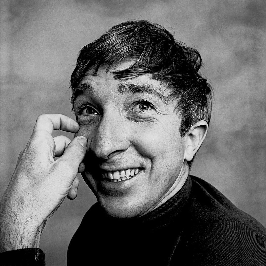
Irving Penn (1917-2009) was an American photographer best known for fashion photography and portraits. Penn’s work included work at Vogue magazine and independent work for clients including clinique. Penn was among one of the first photographers to pose subjects against a plain white or grey backdrop. Penn experimented with many printing techniques including prints made on aluminium sheets coated with platinum emulsion rendering the image with a warmth that untoned silver prints lacked. His black and white portraits stood out due to the high contrast he used in them.
I like Penn’s photographs because of the angles and poses of the subjects. This creates an interesting photograph that captures the eye of the viewer because most photographs aren’t taken from so close up and at these creative angles.
Irving Penn Favourite Photo
In this image, studio lighting was used coming from the right side of the image. This has created a wide tonal range in the image as it has created shadows and contrast. It appears that a deep depth of field has been used as the whole image is in focus, not just the subject. A quick shutter speed of possibly 1/60 – 1/200 will have been used as the image is sharp and in focus. It appears that a low/medium ISO has been used as it is a slightly dark image with low noise levels. The image has an underlying warm tone to it.
There is no colour in this image as a black and white filter has been applied to this, this has allowed more contrast and shadows to be introduced into the image to create a more eye-catching photograph. There is a wide tonal range in the photograph ranging from the white of his sleeve cuff to the black of his suit. There is a slight 3D effect to this image as the lens is so close to the subject so the hands and glasses are obviously closer in the image. The subjects face is at one of the points on the rule of thirds grid, creating a more visually appealing image. The eye is drawn to the subject’s facial expression straight away as it is unusual and eye-catching.
This photograph is of Truman Capote and was printed on a platinum palladium print in 1976. This would have been from a photoshoot that Penn did with Capote as Penn would often photograph celebrities in his studio as he was a very well known photographer.
In this photograph, Penn has gotten Truman to take an unusual pose and an unusual facial expression. This is a common recurrence in Penn’s photographs as Penn tries to catch the viewers eye with his abnormal style of portrait photography – it is what makes him stand out so he tends to play to this strength.
My Response
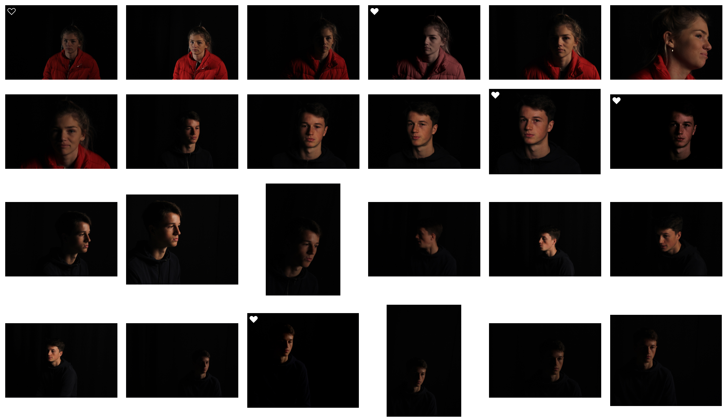

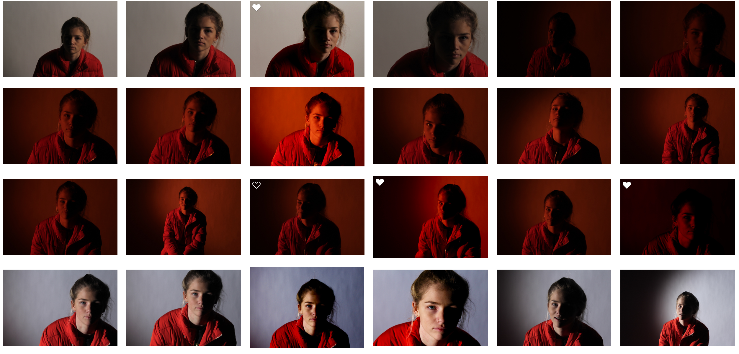
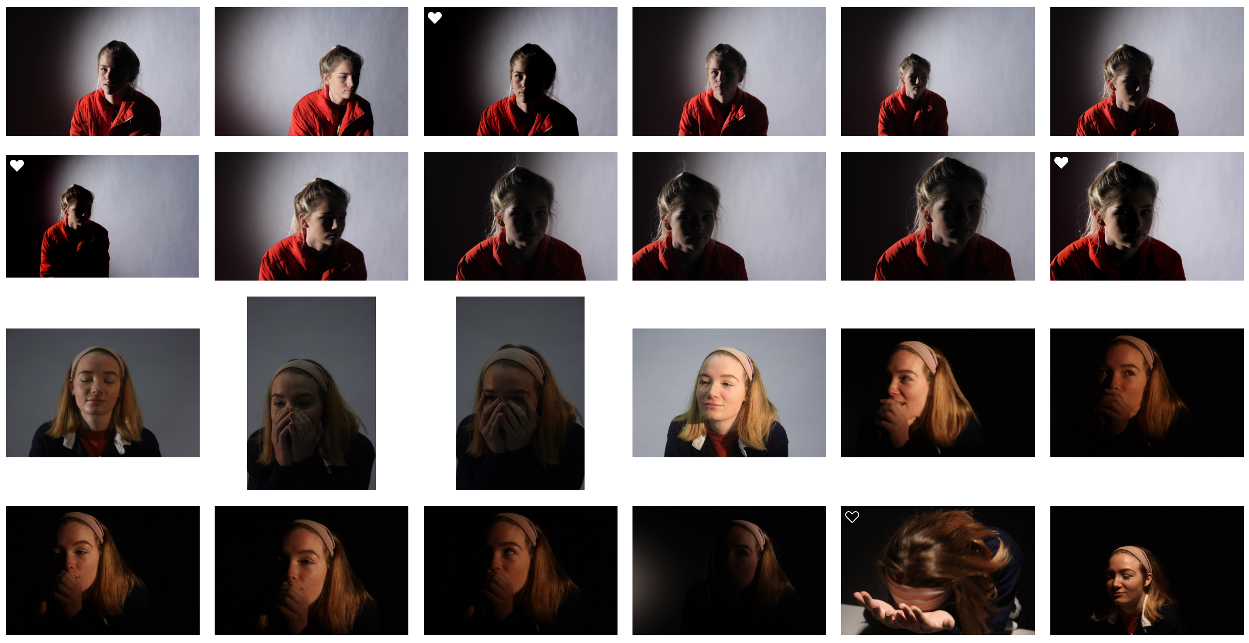


My Edits
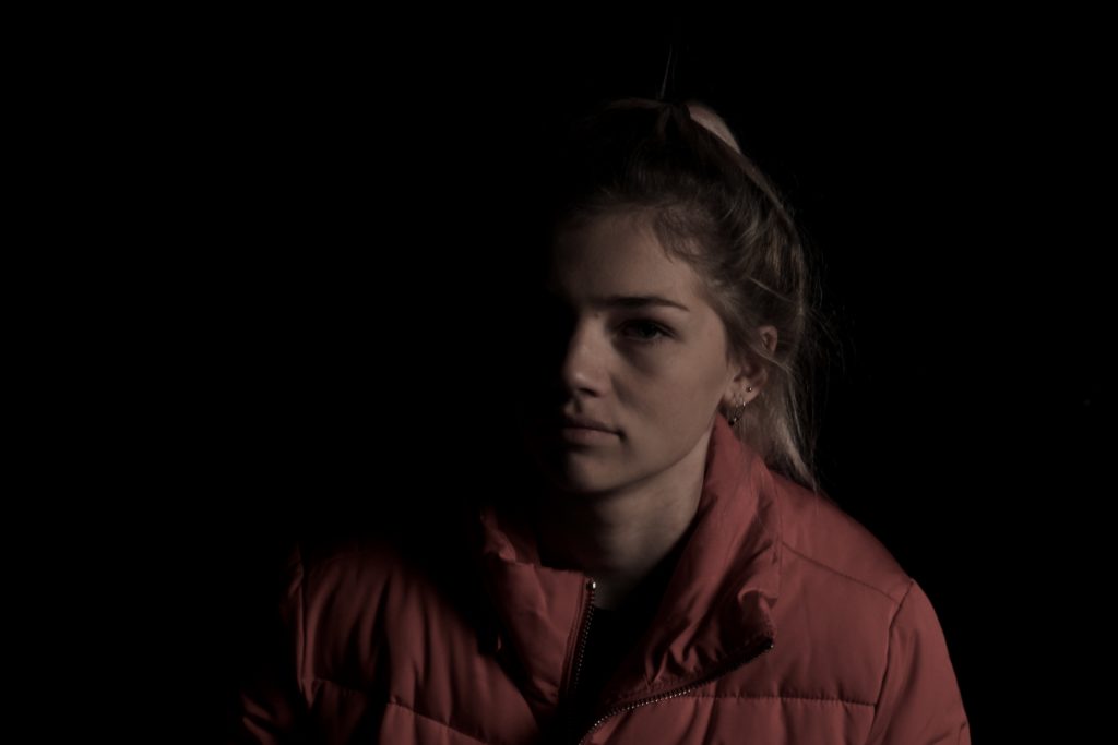

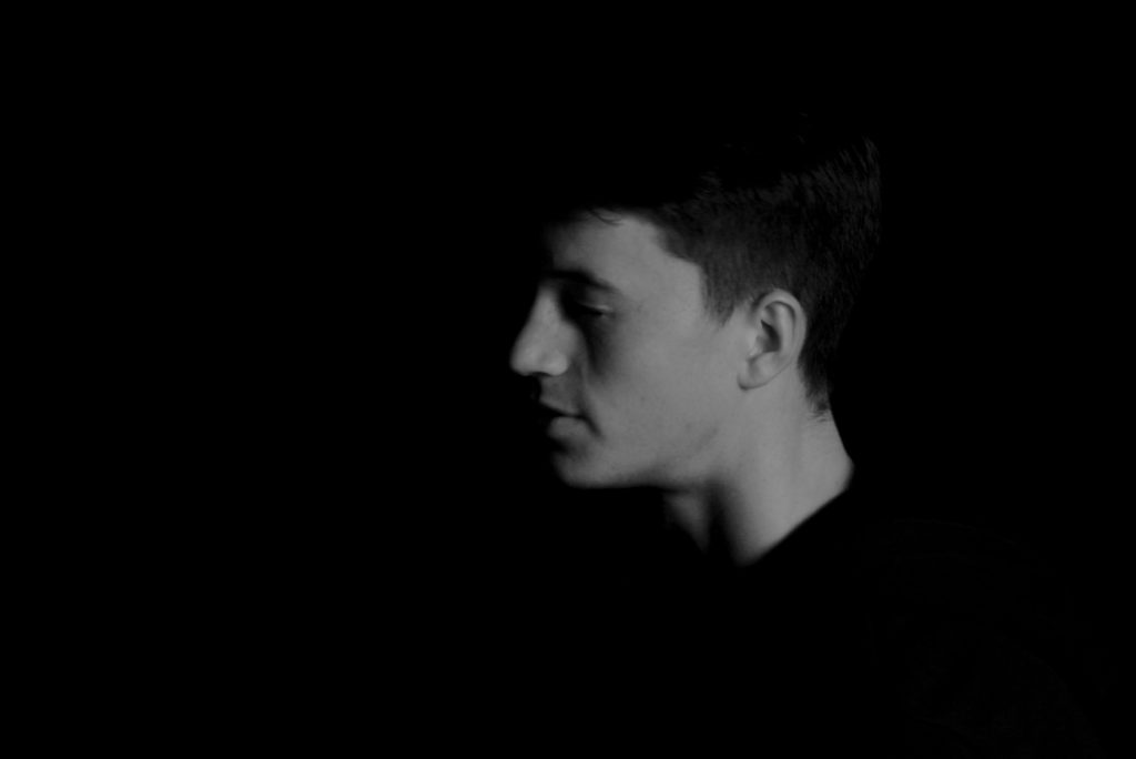
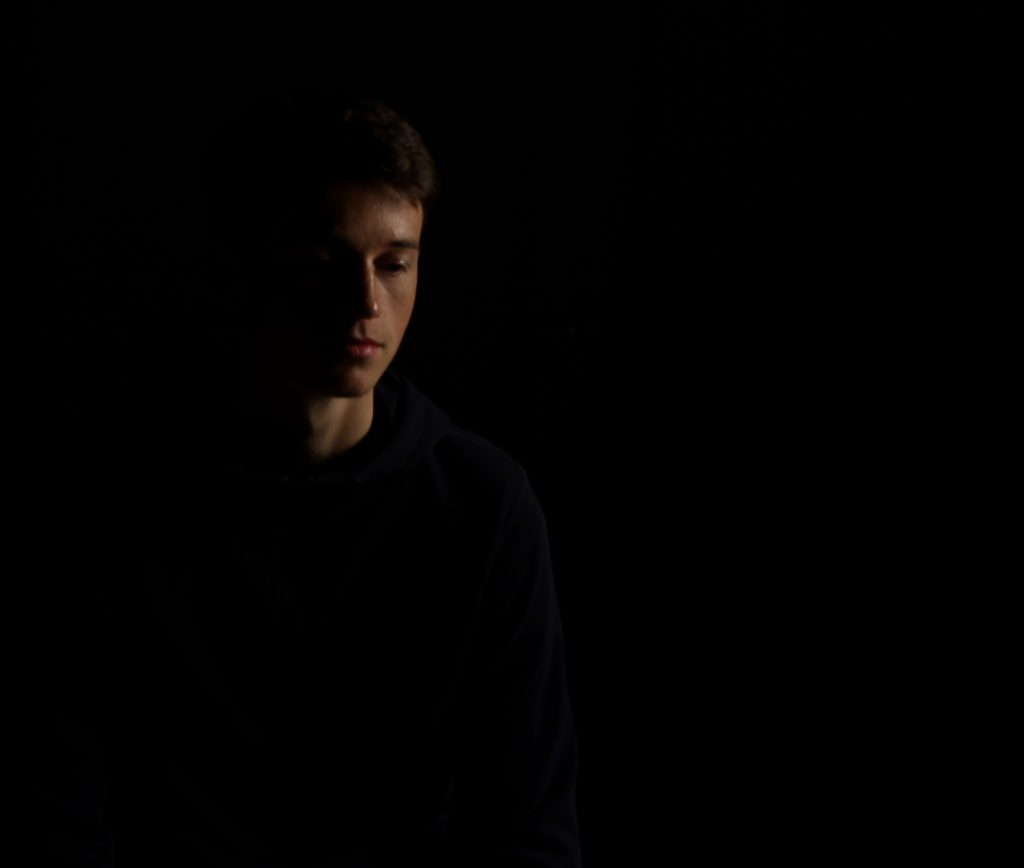

My Favourite Photo

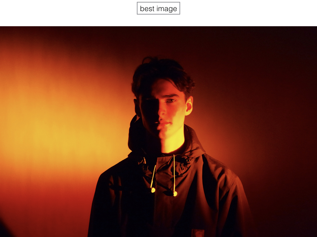
In this photograph, I used the soft light from red head light against a black background so that I could incorporate chiaroscuro into the photograph. I used a deep field of depth so that all of the image was in focus. I used a slow shutter speed (1/20) to allow more light to enter the lens from the dark environment. I also used a low ISO of 200 to keep the quality of the image as best as possible. I decreased the saturation in the image to create a slightly faded and colder effect.
The main colour in this photograph comes from the red coat which fades into the background, I reduced saturation in the image to help it fade into the black more. There are not many light tones in this image as it is mostly dark, this creates a mysterious setting in the photograph. It is quite a 2D photo as the only think that you can see is part of the model – there is nothing else in the image to compare her position to. I have placed the model along the right vertical line of the rule of thirds to create a more appealing image.
I set up this photograph in the studio, to get this photograph I had experimented with spotlights, red head lights, reflectors and gel filters. I took multiple photographs in this style but this one stands out to me because of the more gradual fade into darkness and the softness of the light.
I took this photo with the intention of experimenting with chiaroscuro and to me it was successful. I took inspiration for the dark tone from Irving Penn’s work. I chose a black background as I thought it would create a more dramatic image.
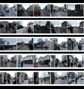
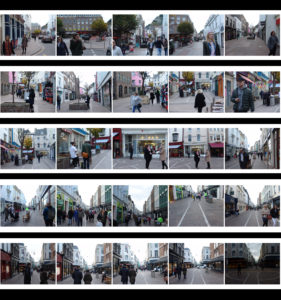
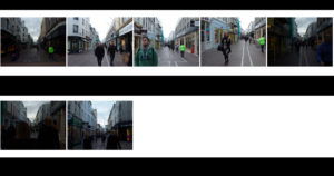
Street Photography Contact Sheets
Contact Sheets
Henri Cartier-Bresson
Who is Henri Cartier-Bresson? Henri Cartier-Bresson was born in Chanteloup-en-Brie, Seine-et-Marne, France. He was the oldest of five children, with his father being a wealthy textile manufacturer. His mother's family were cotton merchants and landowners from Normandy, where Henri spent part of his childhood. His parents supported him financially so Henri could pursue photography more freely than his contemporaries. Henri took holiday snapshots with a Box Brownie; he later experimented with a 3×4 inch view camera. His father assumed that his son would take up the family business, but Henri also feared this prospect. Returning to France, Cartier-Bresson deepened his relationship with the Surrealists. He became inspired by a 1930 photograph by Hungarian photojournalist Martin Munkacsi showing three naked young African boys, caught in near-silhouette, running into the surf of Lake Tanganyika. Titled Three Boys at Lake Tanganyika, this captured the freedom and grace of their movement and their joy at being alive. That photograph inspired him to stop painting and to take up photography seriously. Some of the work he started to produce consisted of: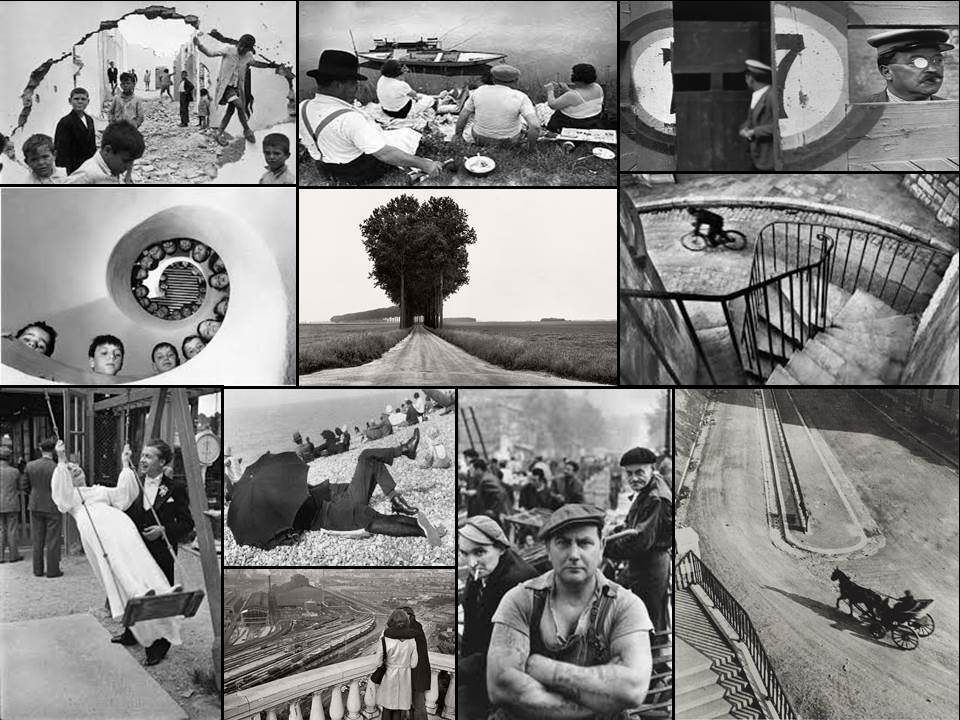
From this selection of a few of his images, I found that my eye was drawn to the picture of the wall crumbled in.
The contrast between the subjects within and the white crumbling wall, which in a way frames the image, allows the photograph to really define the faces of the individual children. From this it allows us to see the different expressions of each child, some seem to be captivated by this photographer taking the picture, whilst others are completely oblivious to it. Allowing the photographer to capture the playfulness but also the curiosity that is seen within each child. The fact that some of the children are playing on rubble, shows how that even in the worst scenarios, kids always make the best out of what they have, showing that innocence within.
Homework 2- Street Photography
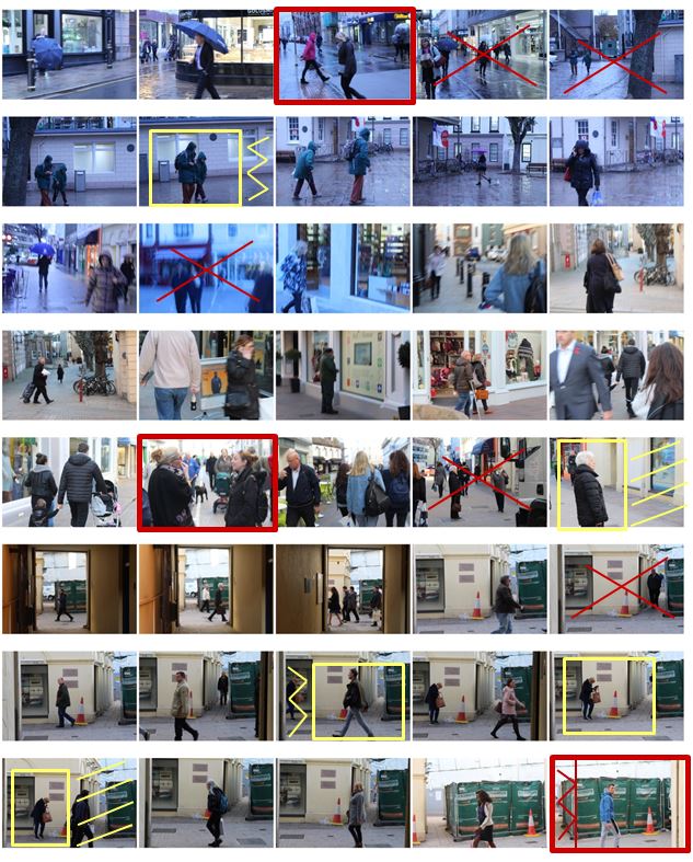 I selected the images from my photo shoot that I thought have a clear subject and a good angle at which the photo was taken and displayed them below. I have highlighted the photos I definitely want to use in red and highlighted them in yellow if they need editing.
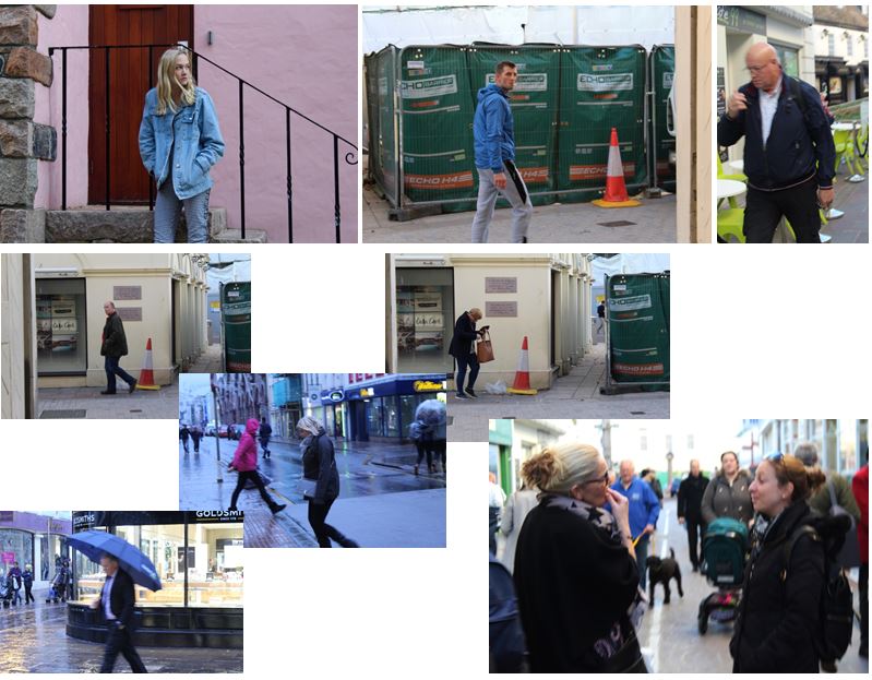
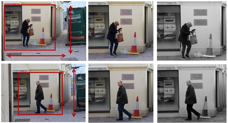
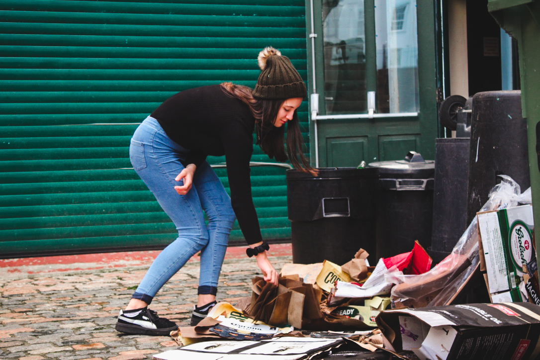
I have chosen these photos and have cropped them to make the overall photo more aesthetically pleasing and so you can see the person more clearly and distinctly. The photograph was candid as i took it at an angle in which the subject did not know they were being photographed, making it more natural. My favourite photo out of the two is the first one as it is more interesting as she is looking for something and is not just walking down the street.
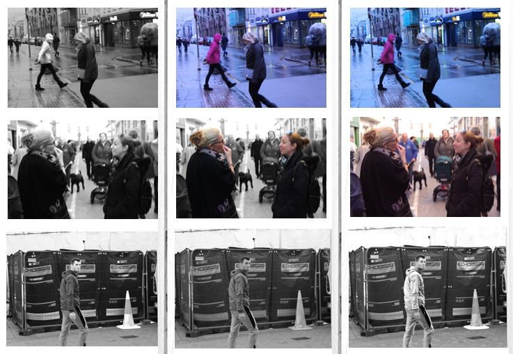
I chose another three images which I liked out of my photo shoot and experimented with the colours and tones. This process allows me to see my photographs next to one another and compare them with each other so i can effectively chose my final images. My favorite image from the first row is the 3rd image as i set the white balance to fluorescent light in order to create a blue tint. This creates the effect that the photo was taken in the evening. I also like the colours in the background as i think it gives the photo more atmosphere.
These are my final two images from the photoshoot.
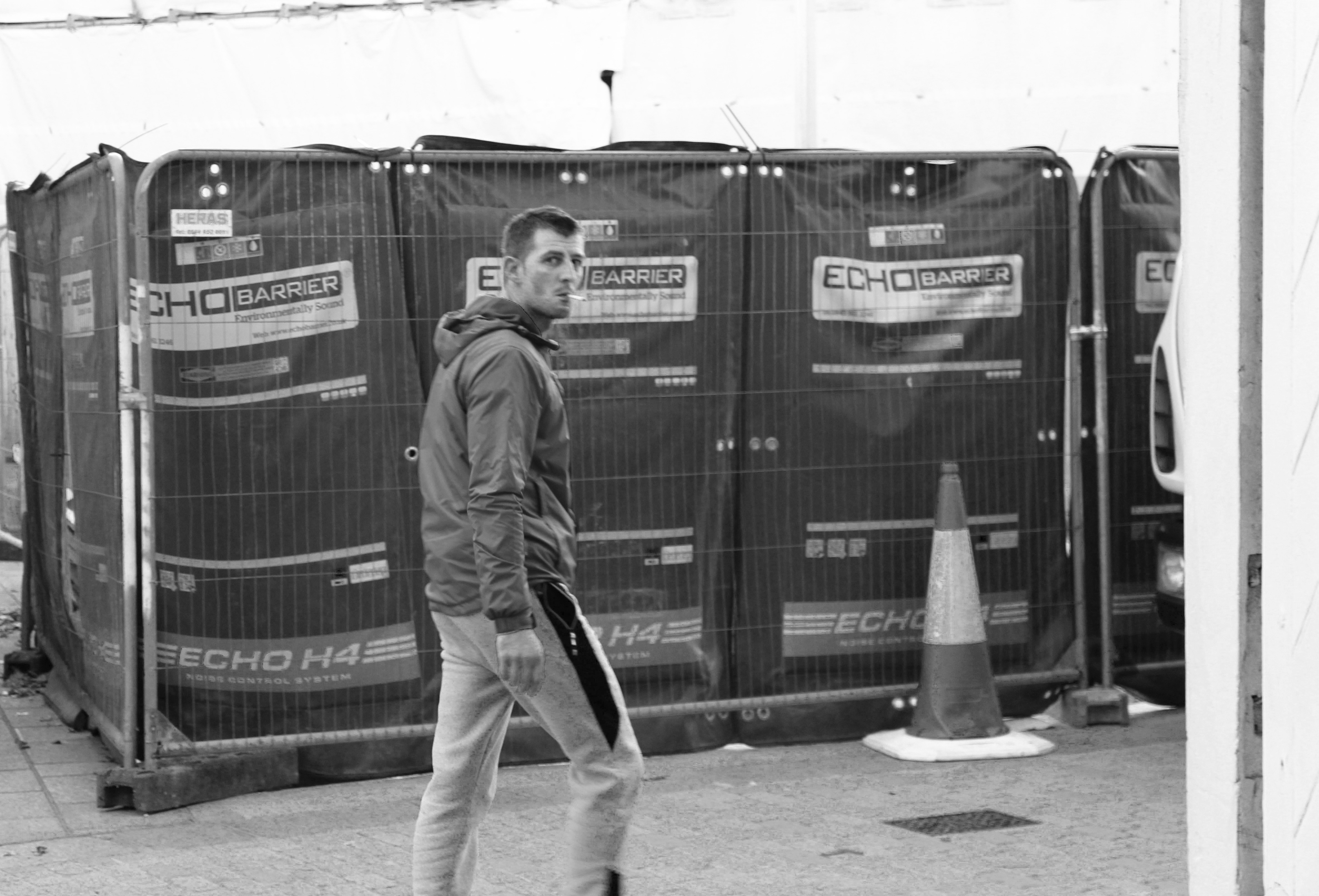
The first image i like as the subject is completely natural which makes the photo candid. I also managed to capture the photo the moment in which he realised he was being photographed which is why his face is confused. I edited the photo in black and white to emphasise the the contrasts in colour and so the subject and the street are in similar tones. I like the background in the photograph and i think it portrays a street well, the fencing and the traffic cone create a sense of the loud atmosphere when the photograph was taken.
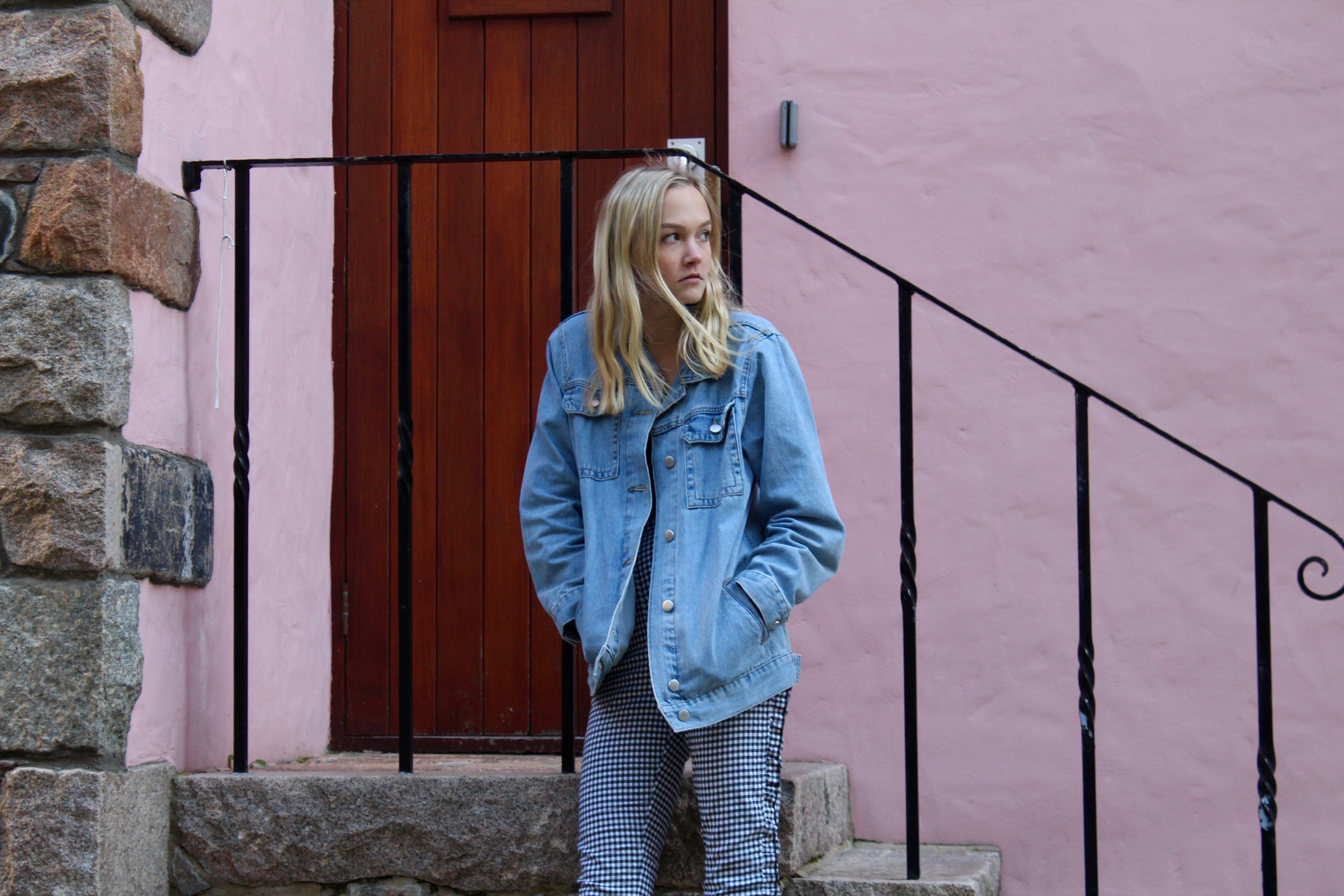
I chose this as my second final image as the atmosphere of the photograph contrasts a lot with the first image. The first being loud and busy, and this photo being more calm and relaxed due to the colours in the background of the photo. I edited the photo to emphasise the pastel light pink wall in the background and the railings behind her. The composition of the photograph is good as it is split up my straight lines showing the rule of thirds. The photo is also candid and natural as the subject is unaware that the photo is being taken making it ideal for street photography.


