Category Archives: AO3 Record Ideas

Filters

Author:
Category:

Photoshoot 2 // Loss Of Identity

Rosanna Jones

Rosanna Jones is a 19 year old photographer and mixed media artist  who distorts and tampers with her photographs to create unique mixed-media pieces that are both beautiful and disturbing at the same time.  She is based in London and recently graduated in Fashion Photography from Falmouth University. Rosanna explores how body image – whether positive or negative – can unconsciously effect identity. Through Rosanna’s work, she questions and challenges the ideas of beauty in regards to how a person feels internally compared to how a person is perceived by the outside world.

I believe there is a strong link between Rosanna’s work and the theme of loss of identity. This is seen through the use of camera settings which she intentionally uses to capture a sense of lack of identity. For example using slow shutter speeds to create a motion blur on peoples faces or using aperture to focus to foreground and blur the background, thus being the models. She also makes the most of the natural things, like smoke which she seems to have used in many of her projects. She uses this smokey effect to help hide certain features of a persons body and reveal some too.

Examples Of His Work

Image result for Rosanna JonesImage result for Rosanna Jones

Analysis

Related image

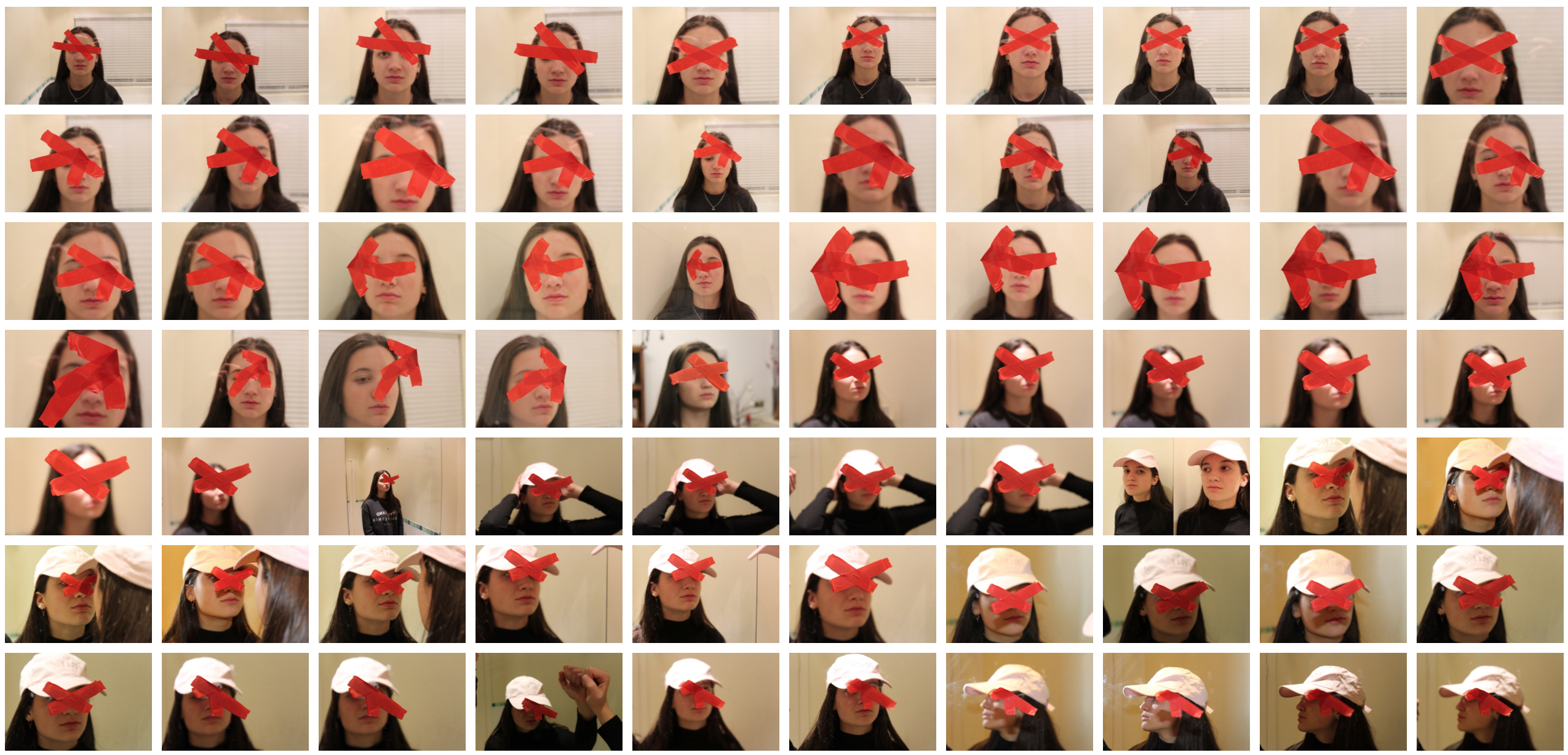
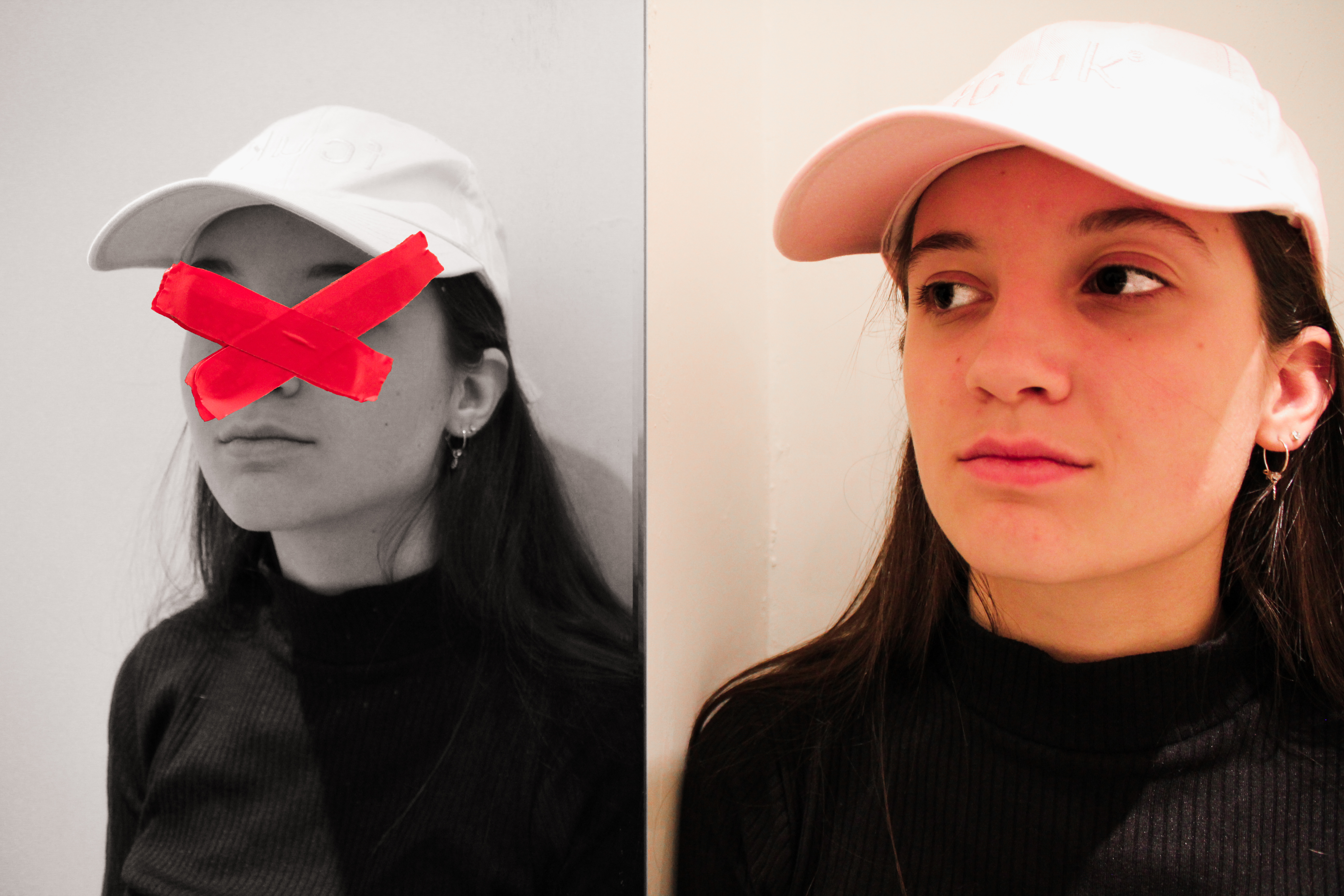
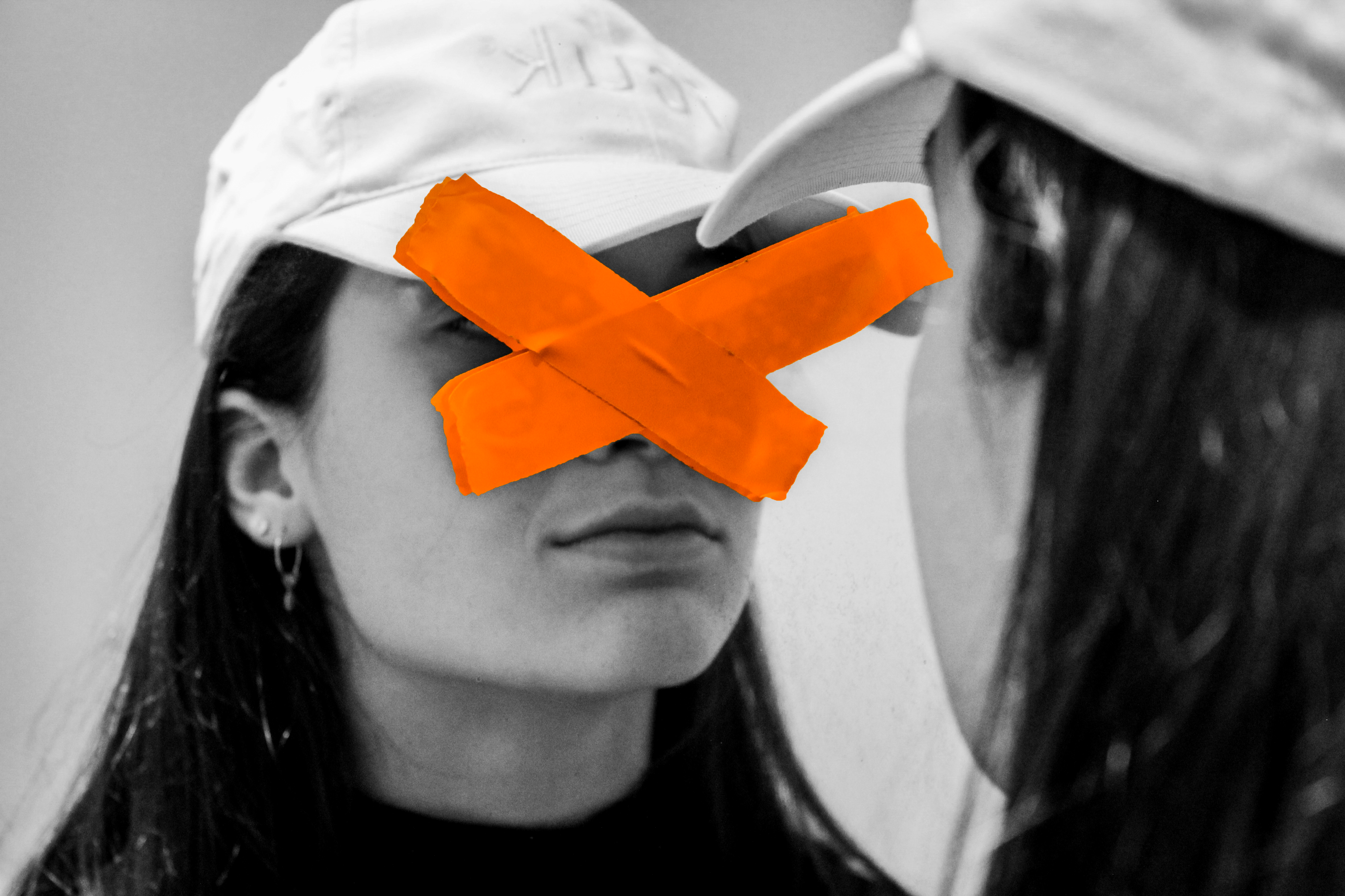
This image happens to be effective purely due to the simplicity yet effectiveness that it has. Although the image appears to be rather simple, it can be interpreted in a variety of ways, having many connotations. I believe this photo was taken through some glass or a window with the tape stuck onto the window. The photographer would have used a low aperture setting to allow a shallow depth of field, ensuring only the tape is in focus. The eyes are the key symbolization of a persons identity which I believe Rosanna covered to give this sense of a loss of identity. The tape, which is vibrant, help to attract the viewer and influence them to intake the messages associated with the picture. One message may being that you shouldn’t judge a person on their identity as we are all equal. I believe the messy positioned tape could reflect the harsh stereotypes that people make based on appearance. The  untidy tape acts as a leading line to help guide us around the face of the model. The eyes have seemed to been tampered, by the way in which they have purposely been covered. This may relate to how the person has been effected with what they have seen wrong in our society or how their personality has been tampered with. Overall this image is influential and a very captivating that helps to reflect a loss of identity through the use of a strong contrast and symbols that represent this.

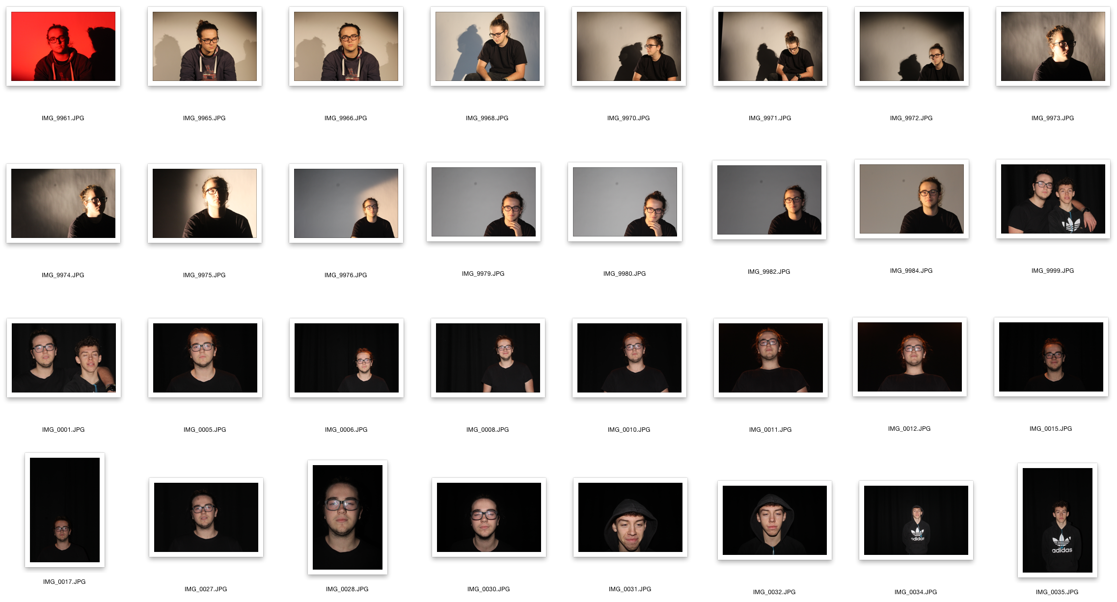
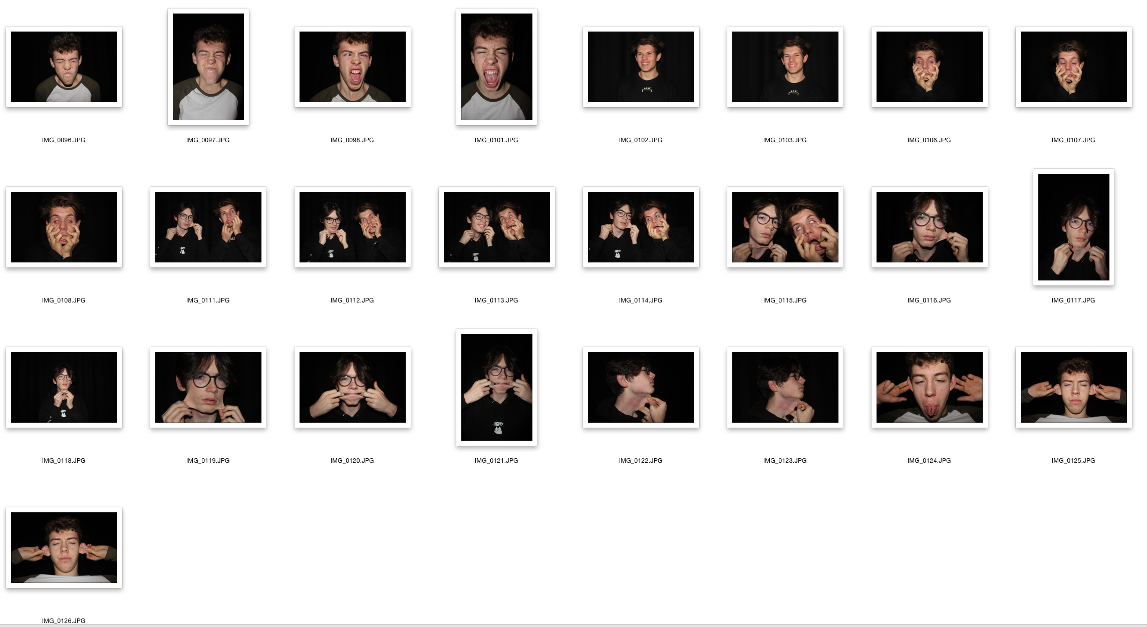
Contact Sheet

Edits

Identity Photography

In this post I will be exploring photography based around the idea of identity loss. I will be looking at the perspectives that we see people in, including the issues that many have to deal with. 
Here are some example of this type of photography:
In response to this I wanted to have a go at trying to create images based around this theme, using images taken by me which I could manipulate into these designs. These were my outcomes:
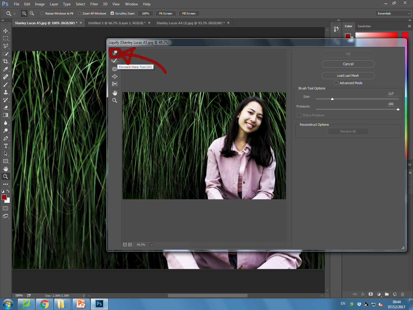
I explored a variety of techniques such as liquify, layering and separation. This allowed me to have the effects desired as I was able to manipulate the facial features of the subject, which can be related to the theme of missing or lost identity within yourself.
Liquify:
Layering:
Inside:

Tableau Photography

What is tableau photography?

Tableau is the French phrase for 'living picture'. Before photography was a thing it was a popular past time to which people would recreate scenes from famous paintings at parties. These people would dress up and use props to make it as accurate as possible. As photography emerged artists such as Julia Margaret Cameron created fantasy scenes like Sir Launcelot and Queen Guinevere, which prompted a huge interest in the art form. However this form of photography fell out of fashion with the introduction to realism.

Some of Julia Cameron's work can be seen below:
As seen in her work, she wanted to focus on how the photos were meant to recreate paintings in an innovative and creative way not seen before.
The 7 deadly sins were a popular topic when doing tableau photography due to each one having an important connection. These were Lust, Gluttony, Greed, Sloth, Wrath, Envy and Pride. I could then link this back to how these all formed their own unique identity and change the individual for the good or worse.

Final presentation Ideas

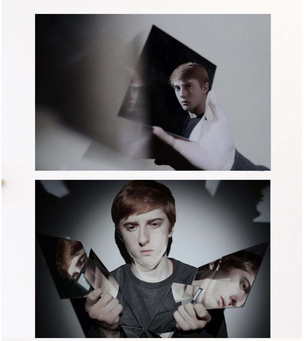
For this presentation I wanted a clear cut and also elegant presentation of the photos themselves, the sizing also compliments the image as the white is not too harsh so very suiting to the images themselves,I finally chose these two images to be displayed because both have the interesting illusion enhanced by mirrors and additionally the same tonal range and would both be enhanced with the same background color and cut of edge. I think the presentation of one being displayed on top of each together would work because it clearly displays the images both confidently and also creates a good demonstration of what the images are and can achieve.

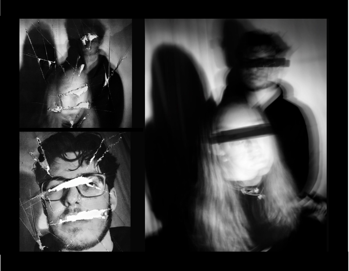
This image is also more busy but works well as it reflects the busyness and also the hardship reflected by the strong connotation of loss of identity. I chose three and separate these into one harsh of the cutting editing and the second with a slow shutter speed and covering of the eyes in a. different manner which is effective.The black background brings around a sense of cohesion between all the images but the placing also suggests an interesting overall composition and dominance within the photos.

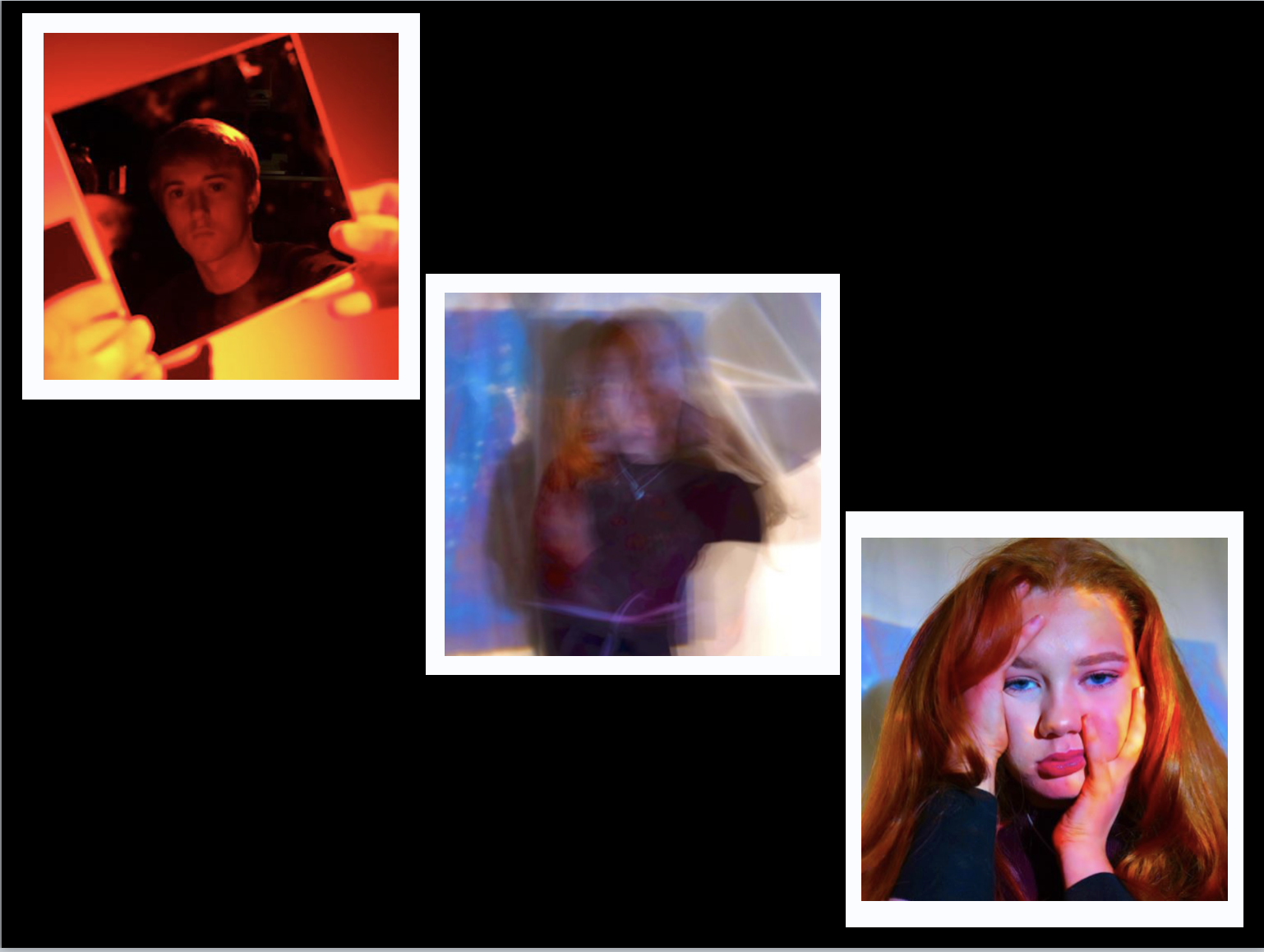
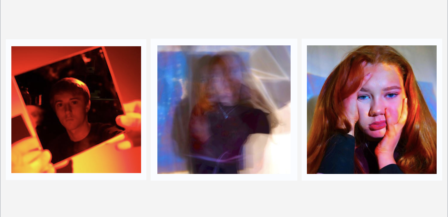
For the more colorful abstract pieces I chose black for the background but these did not successfully show the vibrancy of the color, due to this I decided on a more interesting white boarder for the images,which I just need to further check that they are all equal in proportion but this would also have both themes of the first and second presentation  within the final one seen here.I do think i could further experiment within this and perhaps lining up all three images to be in a line would be more effective overall.


I think this is a much better presentation,the harsh colours do not remove the attention from the actual images themselves and in addition you are still able to see the white boarders giving more of a shape.Also being in a line create a form to the piece and does again not remove from the vibrancy already in the image themselves.

Week 12 + 13 Completing The Portrait Unit

You now have 2 weeks to complete…

  • FINAL photo shoots as a direct response to your chosen photographer Re : Case Study (AO1 + AO3)
  • get out “on location” and explore tableau approaches in depth
  • explore a wider range of editing techniques (AO2)
  • blog-based presentation of final outcomes (AO4)

Ensure you have enough evidence of…

  1. moodboards
  2. mindmaps
  3. case studies (artist references)
  4. action plans
  5. photoshoots + contact sheets (annotated)
  6. appropriate selection and editing techniques
  7. presentation of final ideas and personal responses
  8. analysis and evaluation of process
  9. compare and contrast to a key photographer
  10. critique / review / reflection of your work

By Friday 8th December we should have your final prints (x3) ready to mount and frame

  • you will learn how to cut window mounts using a bevel cutter
  • you will learn how to group  / sequence your images
  • you will learn how to present your images using foam-board

Alternative Presentation Techniques

You should explore other possibilities and show on your blog a range of ways that you could present your work

such as…

Tanja Deman…using screens or backdrop to display images and present an alternative context
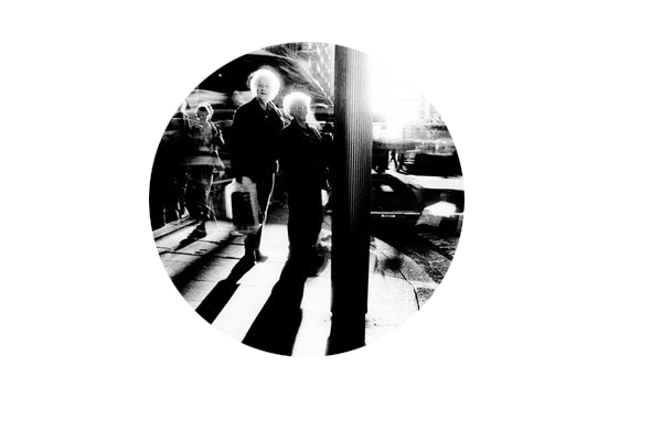
Experiment with alternative-shaped images….try circles


Remember to pay careful attention to…

  • your lighting
  • exposure control
  • composition
  • focus

Add at least one sequence of images to your blog to show the layout / framing of your final images


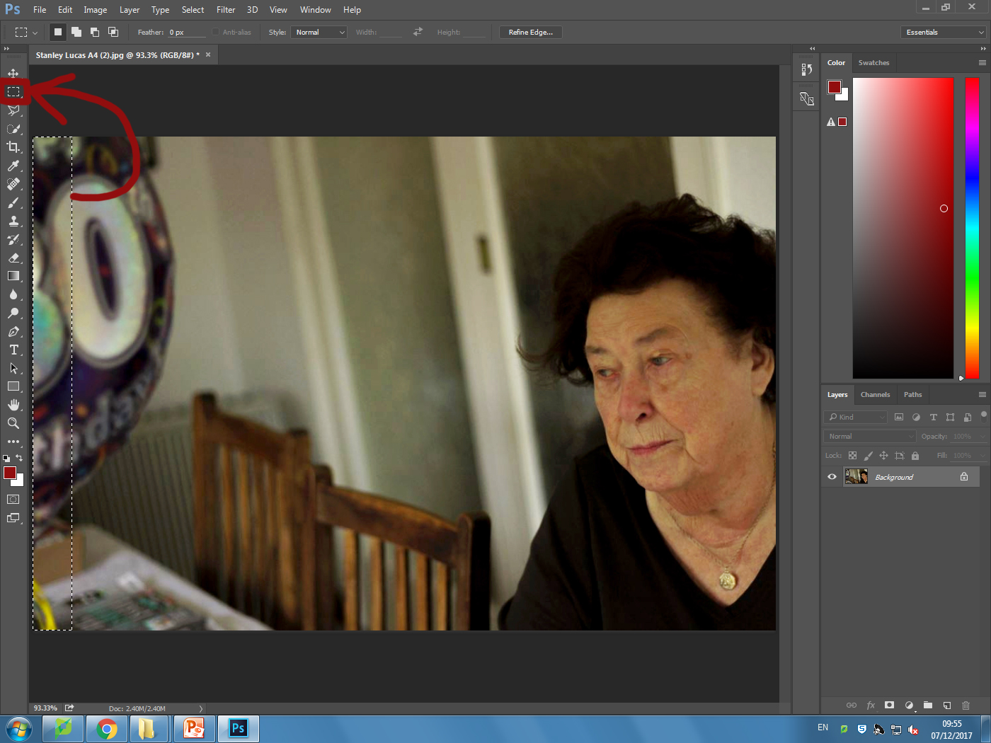
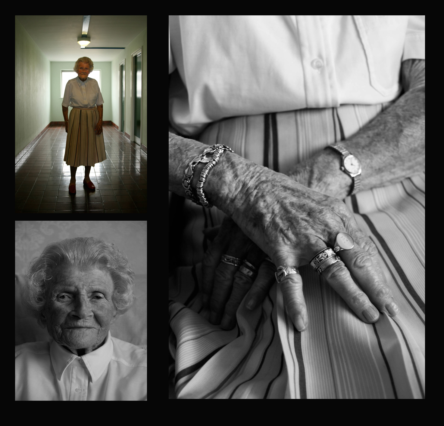
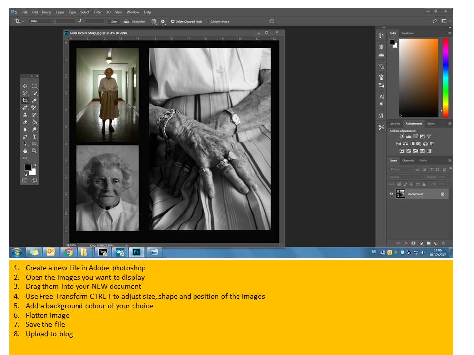
Use Photoshop to place your images within a document and add screen shots to show your process…

Tableau Ideas and Starting points

  • re-create an existing story-based photograph or painting, or scene from a film
  • illustrate a poem, story, song lyrics, dream etc
  • one or more of The Ten Commandments
  • one or more of The Seven Deadly Sins

Tableau Photography is staged. Think of it like theatre. Include props, backgrounds, costume etc that connects to your theme somehow.

Tableau Photography makes use of symbolism and metaphor.

Allegorical paintings / photographs contain metaphor and symbolism

Pictorialist Photography has connections with Tableaux Vivant.

here are some examples that could inspire your own ideas…

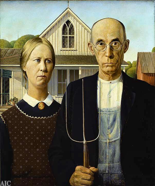
American Gothic by Grant Wood
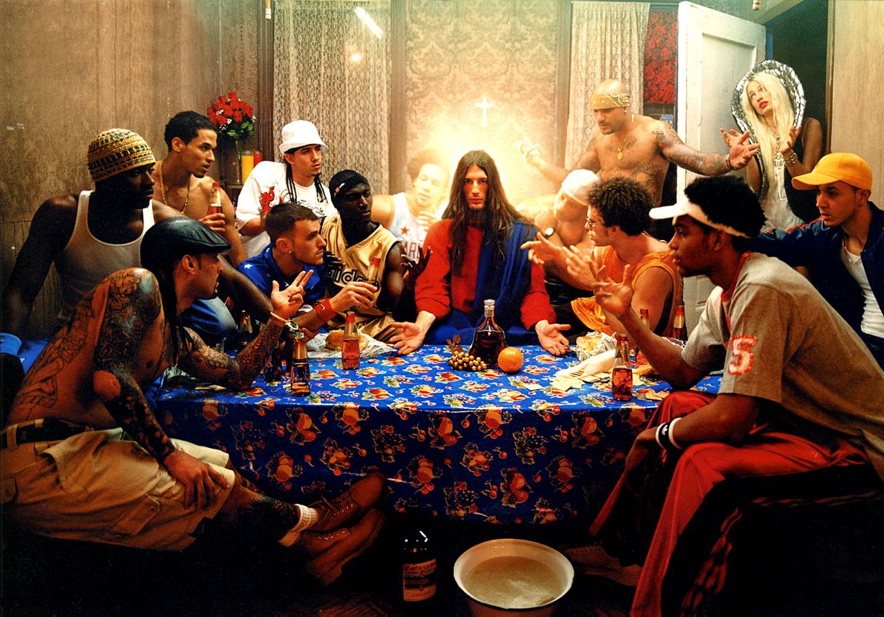
The Last Supper by David LaChapelle
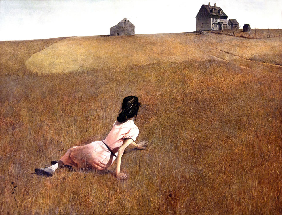
Christina’s World by Andrew Wyeth
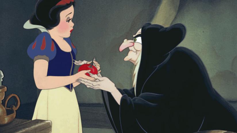
Disney’s Snow White

Critical Analysis of the story of Snow White CLICK HERE

Extension Task

  • Visit the Constructed Narratives Exhibition by Hautlieu A2 Photography Students
  • Berni Gallery—Jersey Arts Centre
  • Open 9am-5pm
  • Document your visit with photographs
  • Create a blog post with a review of the exhibition
  • Analyse a key image / set of images that interested you.


Portrait Final Outcomes

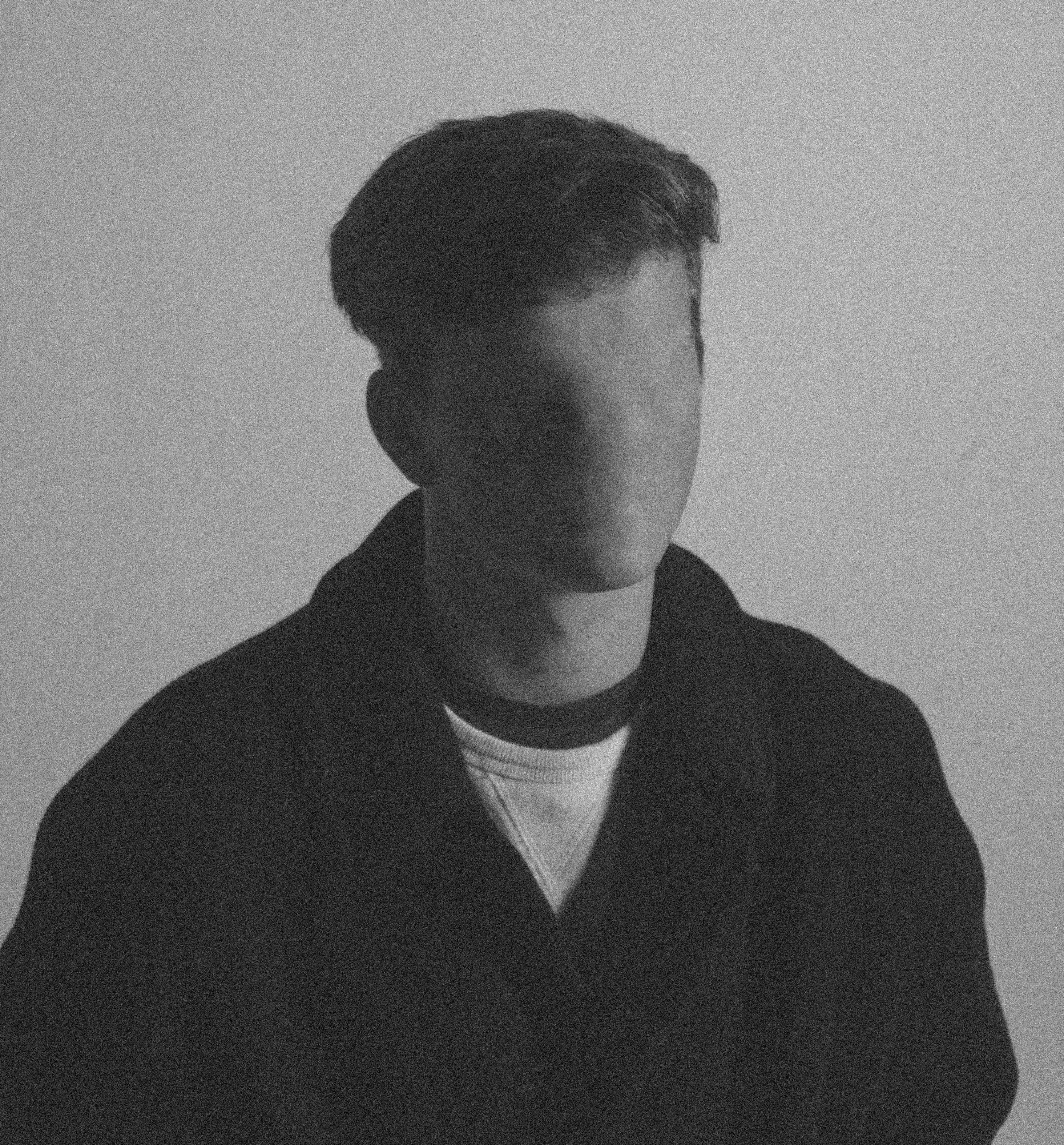
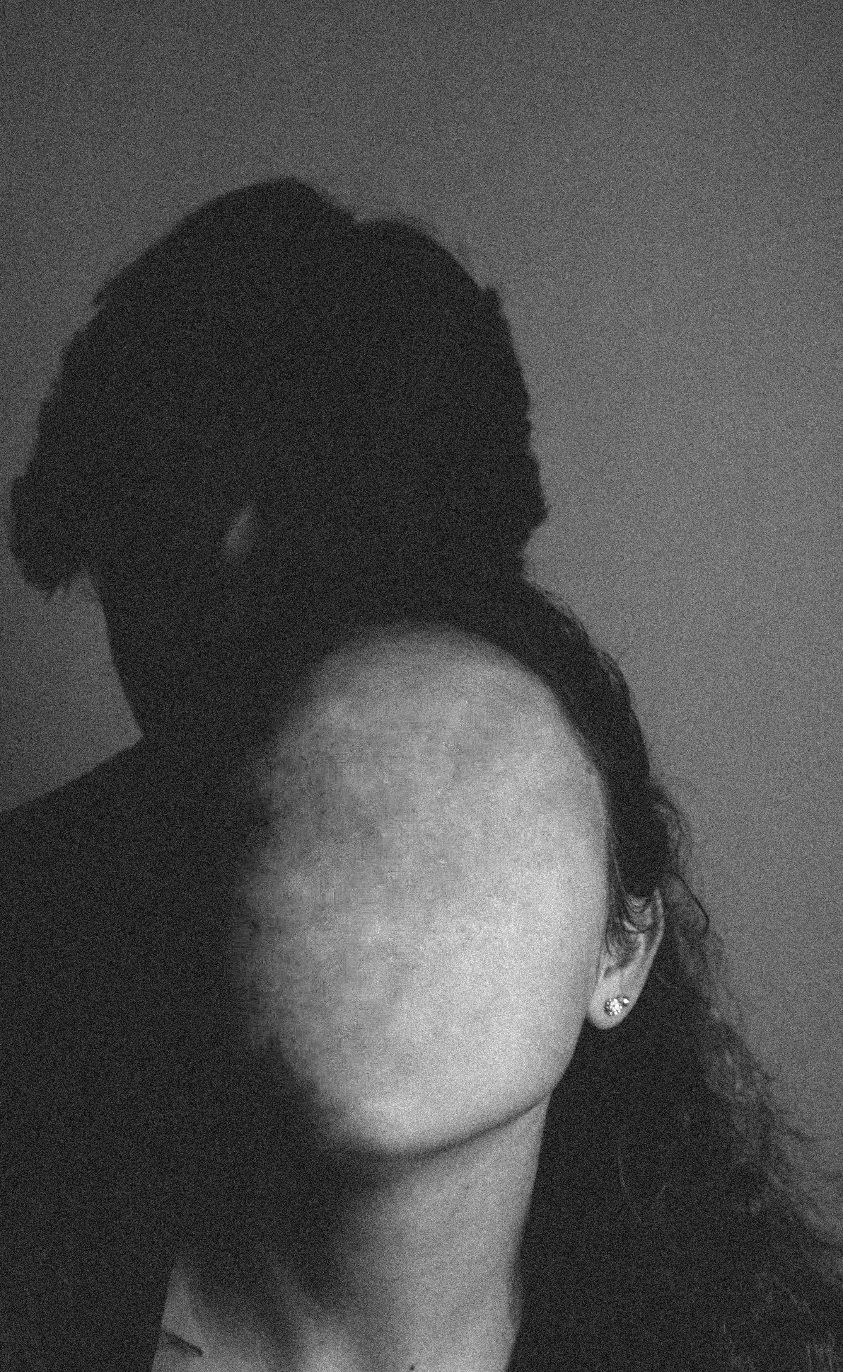
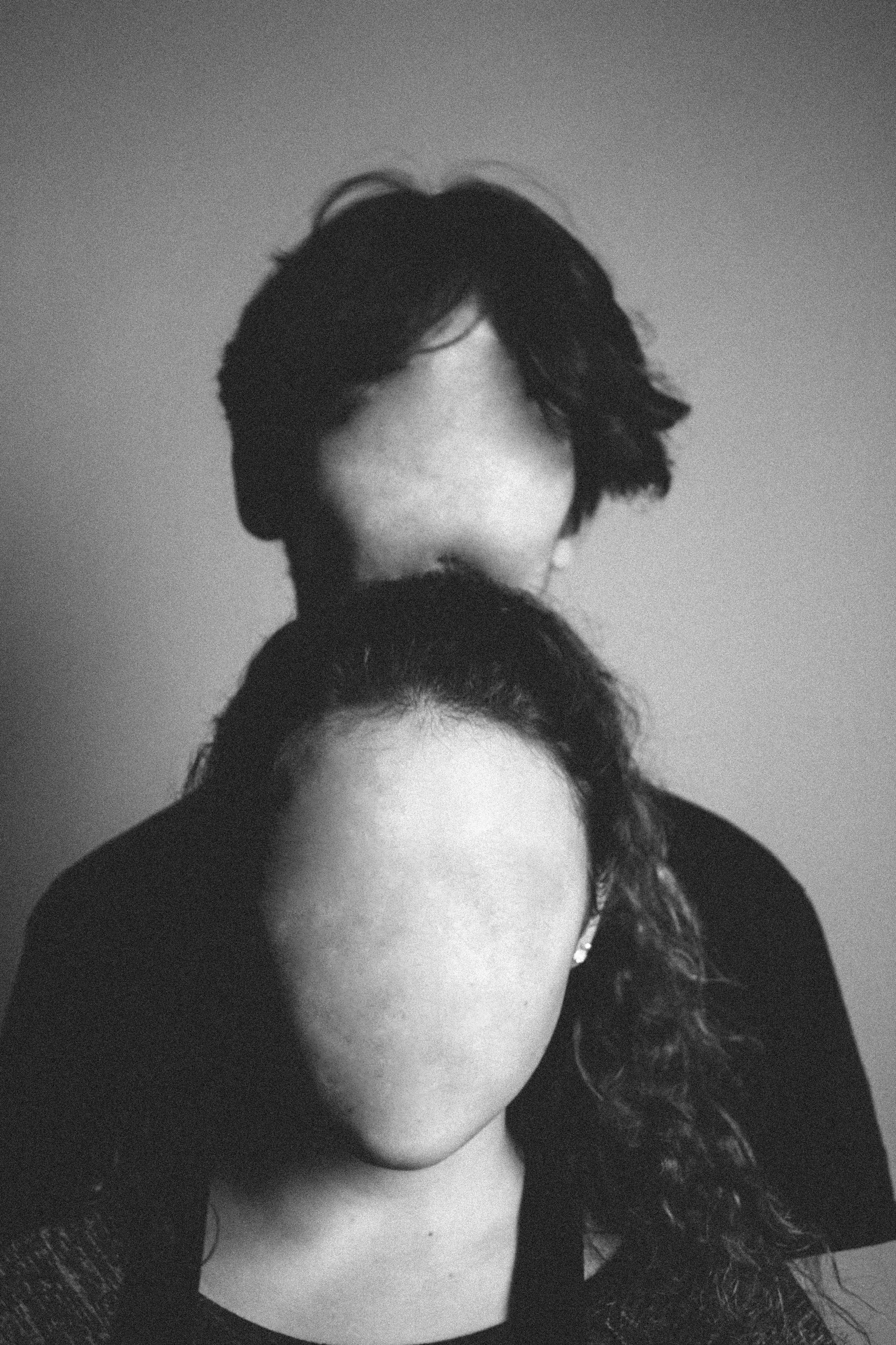
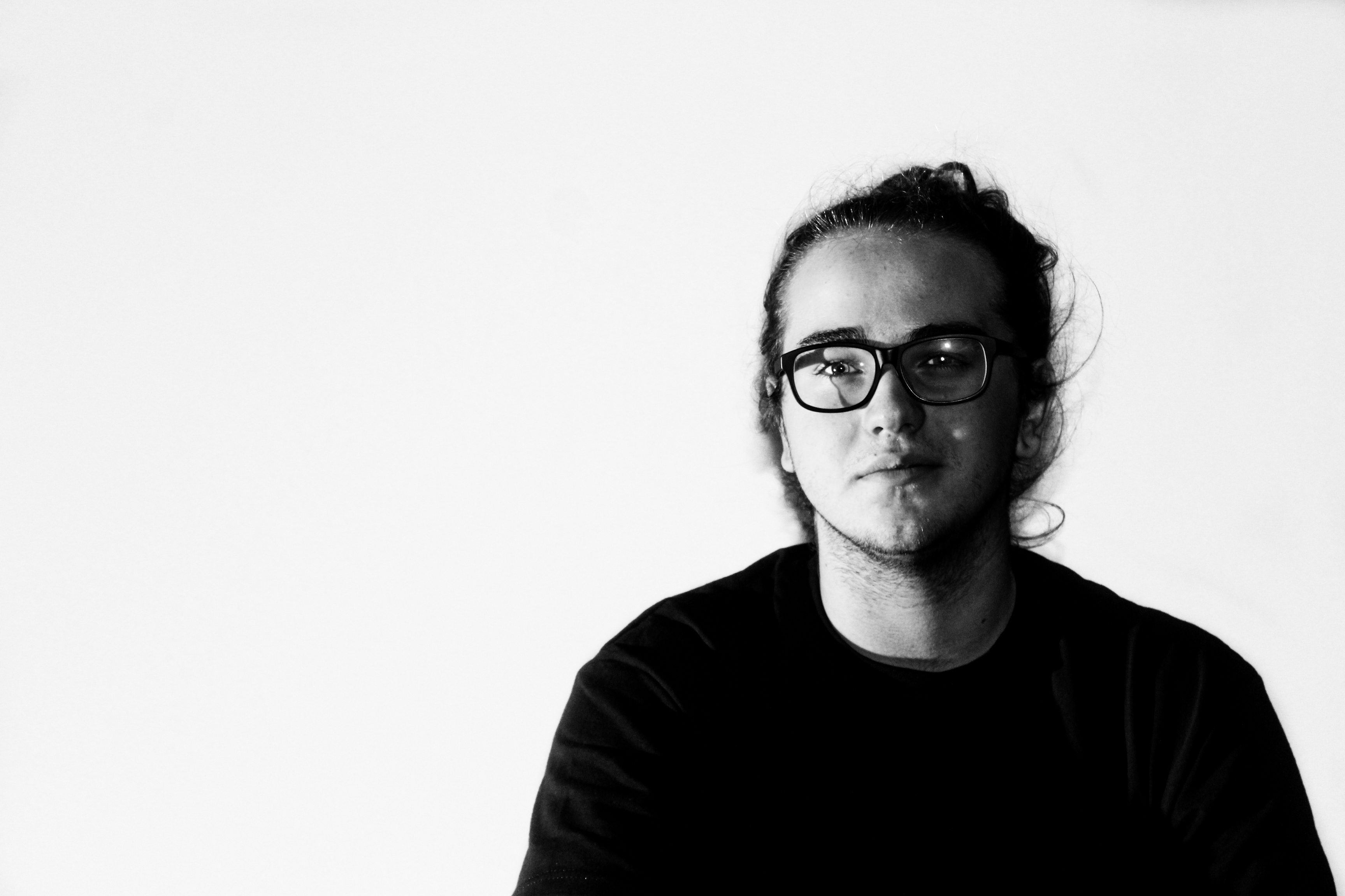
These 3 portrait photographs are my final 3 photographs. They are all linked by the theme ‘lack of identity’. I have removed the faces to show that without our characteristics we are all the same. The black and white with the slight noise helps to create a sense of blandness and helps to emphasise how boring we would be without our identities.

Photograph 1
Photograph 2
Photograph 3

These three images were created using artificial light. I used a redhead light to provide some soft light across the models’ faces and I used a spotlight to create a slight chiaroscuro effect to create a more dramatic image with more contrast and shadows. I used a shallow depth  of field (4.0) to create focus on the front model in photos 2 and 3 and to mildly blur out the background. I used a slow/medium shutter speed (1/20) to allow more light to enter the lens from the dark environment, I used this along with a low shutter speed of 200 to keep the quality of the images as best as possible.

I used a black and white filter over these photographs to create more contrast and I increased the amount of noise to create an old-fashioned portrait photograph effect, this helped to emphasise the idea that as individuals we are boring without our identities.  There is a wide range of tones in these photographs ranging from the darkness of the shadows to the highlight of the faces. There is a 3D effect to images 2 and 3 due to the positioning of the models and the slight blurring of the back model, this brings the photograph to life and gives it a more intriguing appearance. In photograph 1 there is less of a 3D effect due to the plain white background and the lack of facial features. I have placed the models in the centre of the images to create an uneasy effect in the images.

These photographs were taken in the studio with the work of Ducruix in mind. I took the photographs then edited them in lightroom to create an old-fashioned effect by using a filter, changing the white balance and increasing the noise. I then used photoshop to remove the features of the faces by using the spot repair tool. The aim of this photograph is to show something unnatural and make the viewer uncomfortable.

I took these photographs with the plan of using it for the topic of lack of identity. It shows that there is not much distinguishing each of us other than characteristics and features.  It shows how bland and boring the world would be if we did not have our individual identities as everyone would have the same aspirations and personality traits.

Final Images from all three shoots

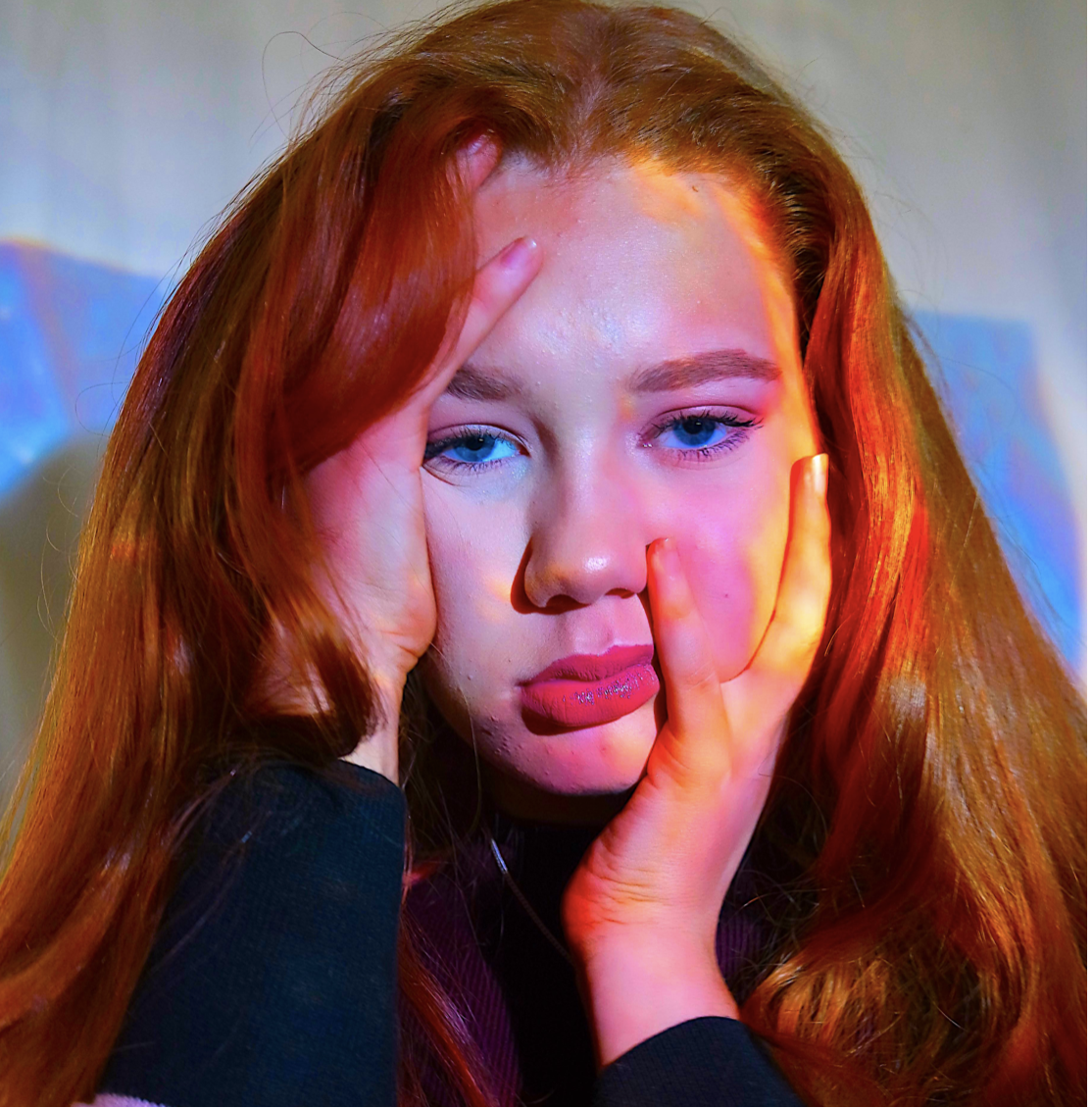
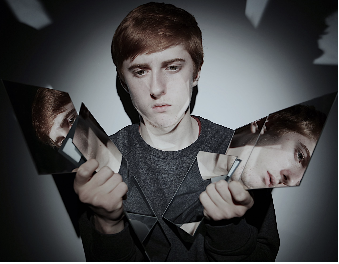
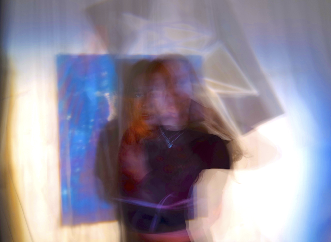
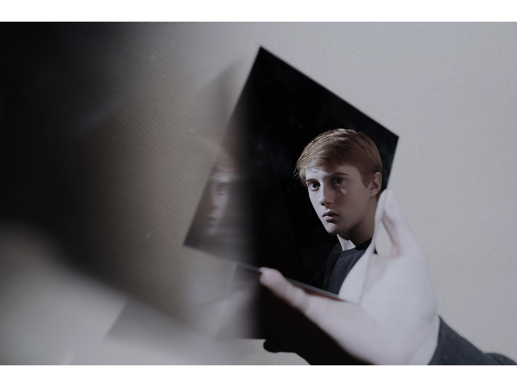
I chose all of themes images because I think in all their independent ways they successfully contribute to portray lack of infinity but have contrasting of both illusions,vibrancy and editing to make them all effective as a whole.I believe that all these images show an array of editing planning and developing techniques to make them all successful and demonstrate successful imagery within them all. I will though explore more ways in which i can edit them to demonstrate a larger range of techniques that i explored within my previous editing brainstorms.

displaying the images:


1st Display

For these three images I will  simply them upon one piece of paper.I have chosen to do this because I believe that the colors and meanings are all equally as relevant and would work successfully in syn within each own.For my display I will present these images all in large squares of equal proportions and then explore many ways in which they look most effective on the paper.

I think it would be quite dynamic and in keeping within the  vibrant tones if I gradually put the images from top left,middle, and then to bottom right,this slow diffusion would be unique and allow a dynamic composition to the piece itself.In addition I think it would be successful to use white paper with thin boarders,this allows a color that will not remove the vibrancy from the images and also not defect attention to a harsh surrounding color.Although these images are not all from the same shoot they all should connote the same successful properties.

It has become clear that all my images will be unable to be in the same proportions so i have experimented within changing my middle image,to an image that still has the same effect but would also work overall successfully.

2nd Display

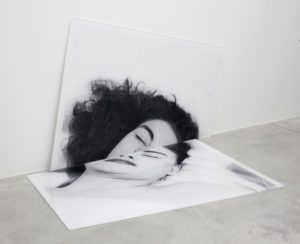
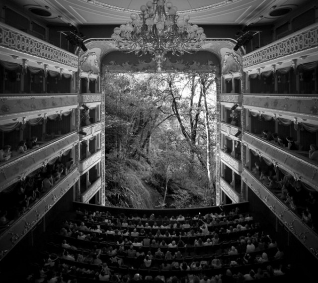
For these two images I will again use a large piece of paper,but I will enlarge these images in order to take up half the space,Due to the same of these images being more rectangular I will but one on top of the other but on a long piece of paper so then reduce the size of the paper so it only has these two images them-self. I chose these images because they both use mirrors in order to reflect a confusion of identity and also have the same tonal range.I would also want to photo shop the first image above and develop a darker tonal range as it is too light in comparison to the second.For these images i would also want a black background as they too are dark but have a lighter surrounding edge so would still have a fine overall cut to the images. I might use a white boarder in order to shoe the in keeping light theme to the pieces,and this too might make a more dynamic composition.

3rd Display

For the final display I wanted to show the darkest tonal range so far.I am unsure whether I should use two or three,but think two images would be more equally effective.I want a more interesting unique way of demonstrating this piece.Due to this being very strong removal of body parts and any subjective demonstration of who they are i think it would be fitting if they were on a structure of hanging as this would well sync within how they are only seen as an object and not a clear demonstration of a person. I could hang them suspended and framed next to each other,or even further the ripped ideas and tear up the piece but still show the piece within a square that is the same size on the same piece of paper,this would be interesting as it is unlike both of the previous and would use the same editing technique.I will experiment within the rips,but if they do not work and do not accomplish an overall successful image then I would use one image and cut this into four parts,this is so it still successfully shows the division and then my presentations develop from three images to two and then one last one just  divided into four which would create an interesting display overall.I would also want to Photoshop these images in order to make sure they are both the same shad of black,over wise the very similarly themed images would have a contrast and separate the overall composition.

I Know have edited all the images so they are all the same size and so an accurate presentation of a composition.


Creative portraits Homework-part 2

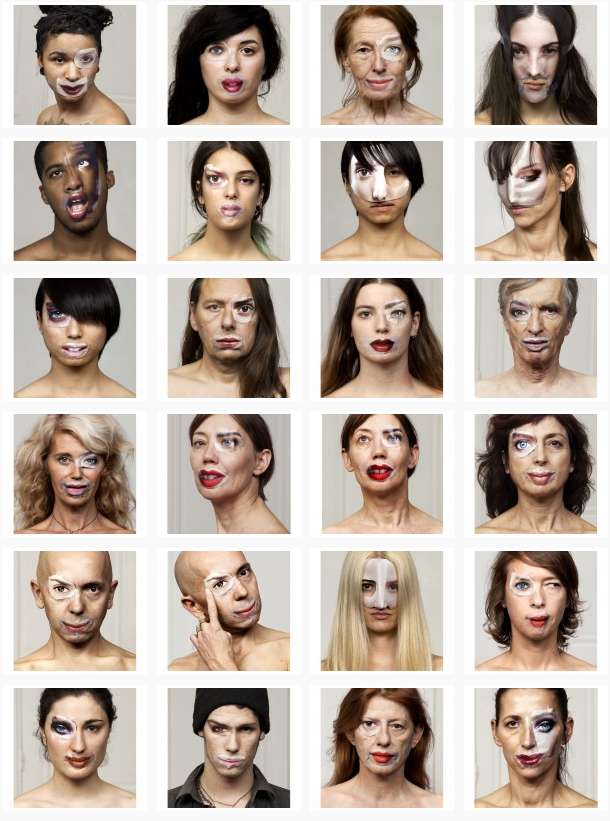
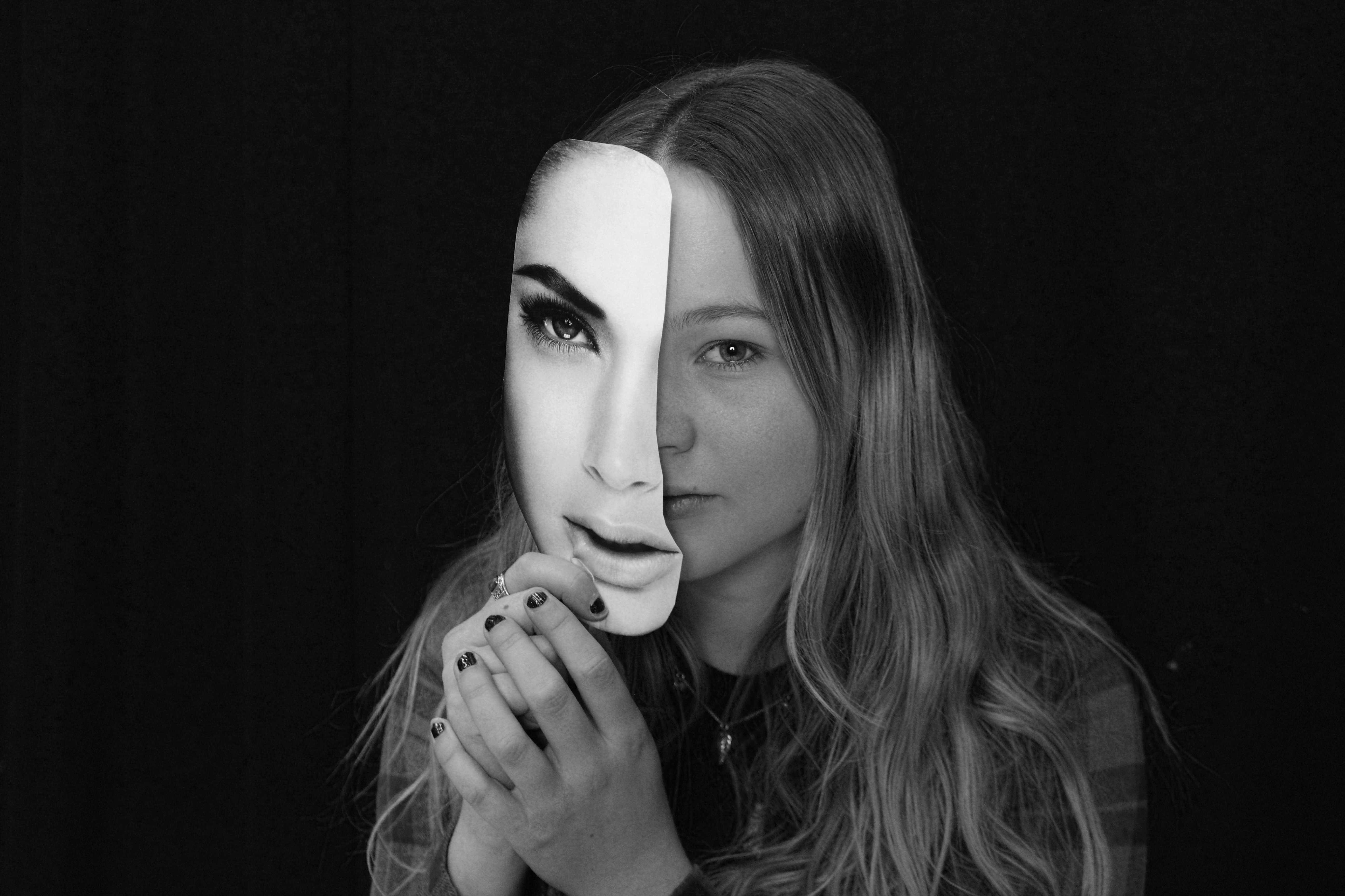
The exploration of both Bruno Del Zou and John Stezaker led to me the idea of experimenting with visual perception, linking to the way we see ourselves.  When researching this idea I came across a series of photographs called ‘The Identity Project’ taken by the French photographers Bruno Metra and Laurence Jeanson. They created a series of portraits that deal with the concepts of identity, beauty and otherness. Experimenting with our visual perception, they apply cut outs of facial features from glossy magazines onto their subjects faces to create a new form of facial expression, like they appear to have cosmetic surgery.

http://www.123inspiration.com/plastic-surgery-with-magazines-by-metra-bruno-and-laurence-jeanson/

“Magazines, cinema, television, keep creating and imposing codes that become social references. What one must look like, how to make up, what clothes to wear, how to behave… We are fascinated by the power of media to influence people’s identities.”

The series provides a compelling visual juxtaposition between everyday humans and the images seen in advertisements, taking a hard look at our identity, as each subject in the photograph de-faces and destroys her or his own image.

To explore this I planned to do an experimentation, taking inspiration from Bruno Metra and Laurence Jeanson , incorporating images from  magazines on peoples faces. First, I would try having printed  images and attaching faces from magazines and re-taking the picture and secondly physically attaching the cut out facial features over their eyes, lips, and noses to my subjects face, like Bruno Metra and Laurence Jeanson did in their series.

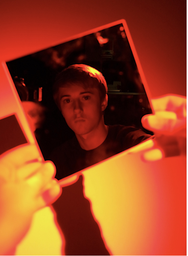
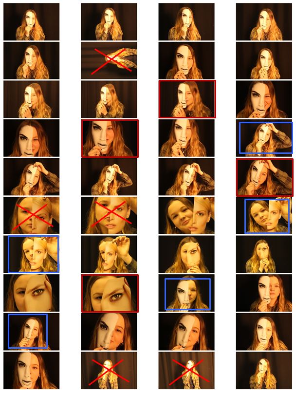
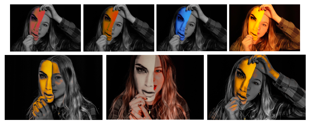
In my photo shoot I used a few different heads cut out of magazines and found that the one I used in the images that I’ve decided to experiment with was the most effective out of them all. This is because the cut of was the closest to the size of the actual model head.I then chose my favourite 6 images and displayed them next to each other so i could compare them. The pictures already had an yellow/orange tint when I took them which is what i wanted but i then decided to edit them to experiment with colours.

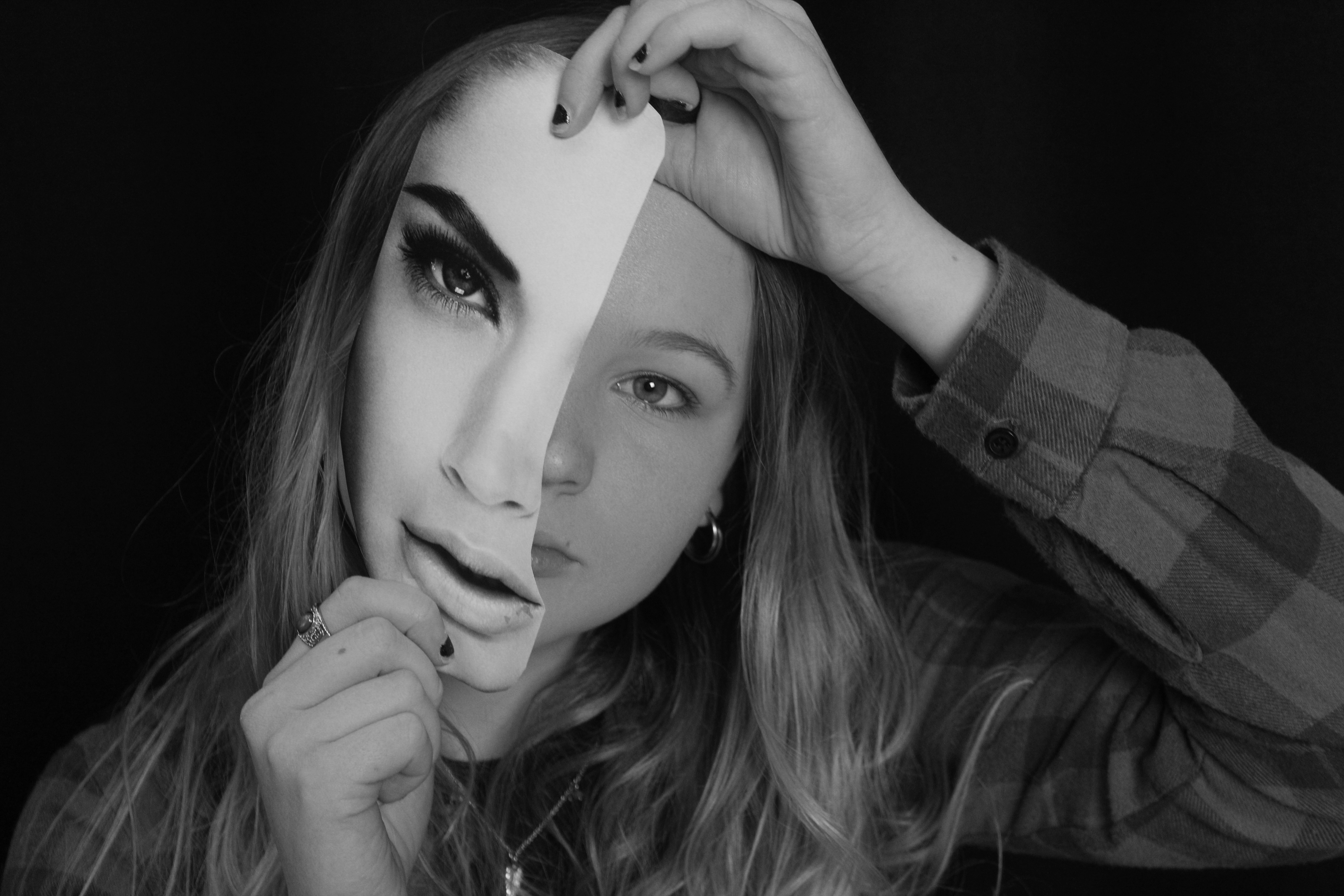
Although i do like the images edited with colour I decided my final 3 images for this shoot be in black and white as it gives them a dramatic effect that is not achieved in colour.

To edit these images i turned them black and white and increased the contrast to make the magazine cut out stand out even more compared to the subjects face. Doing this highlights the cutout and emphasises the shadow between the face and the paper creating a mask-like effect (especially on the 3rd image) and creates a clear division between the two. I decided for my final images to be in black and white as i did not want them to look over edited and too unnatural. I think I did a good interpretation of  Bruno Metra and Laurence Jeanson photography linking to the visual juxtaposition between everyday humans and the images seen in advertisements and their exploration of identity.

2nd Photoshoot // Studio Photography

For this photo shoot I intend to explore a larger range of lighting and backdrops to display a wide range of studio photographs. My previous photoshoot consisted of plain facial expressions and didn’t create a story or portray any sense of the models personality. Inspired by work produced by Rankin I decided to take some more images within the school studio to try and capture images which can convey a story or sense of emotion in which the model is feeling. I also wanted to try and incorporate a greater understanding of chiaroscuro by editing the images to be highly contrasted.

Contact Sheet

Edits

My Favourite  Edit 

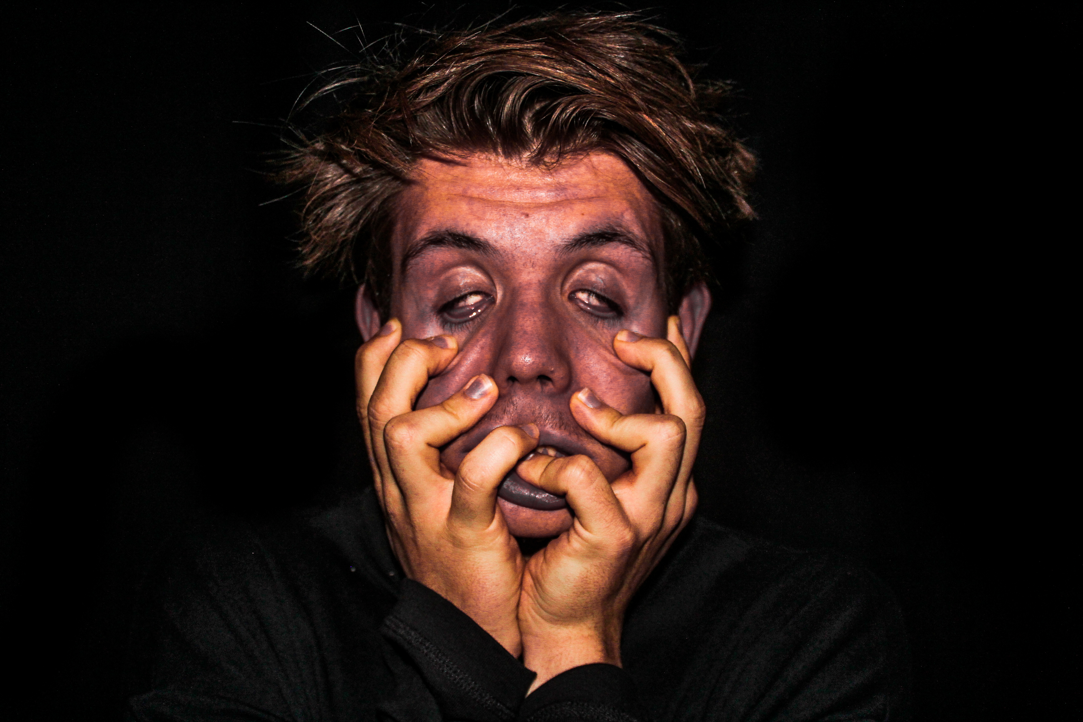
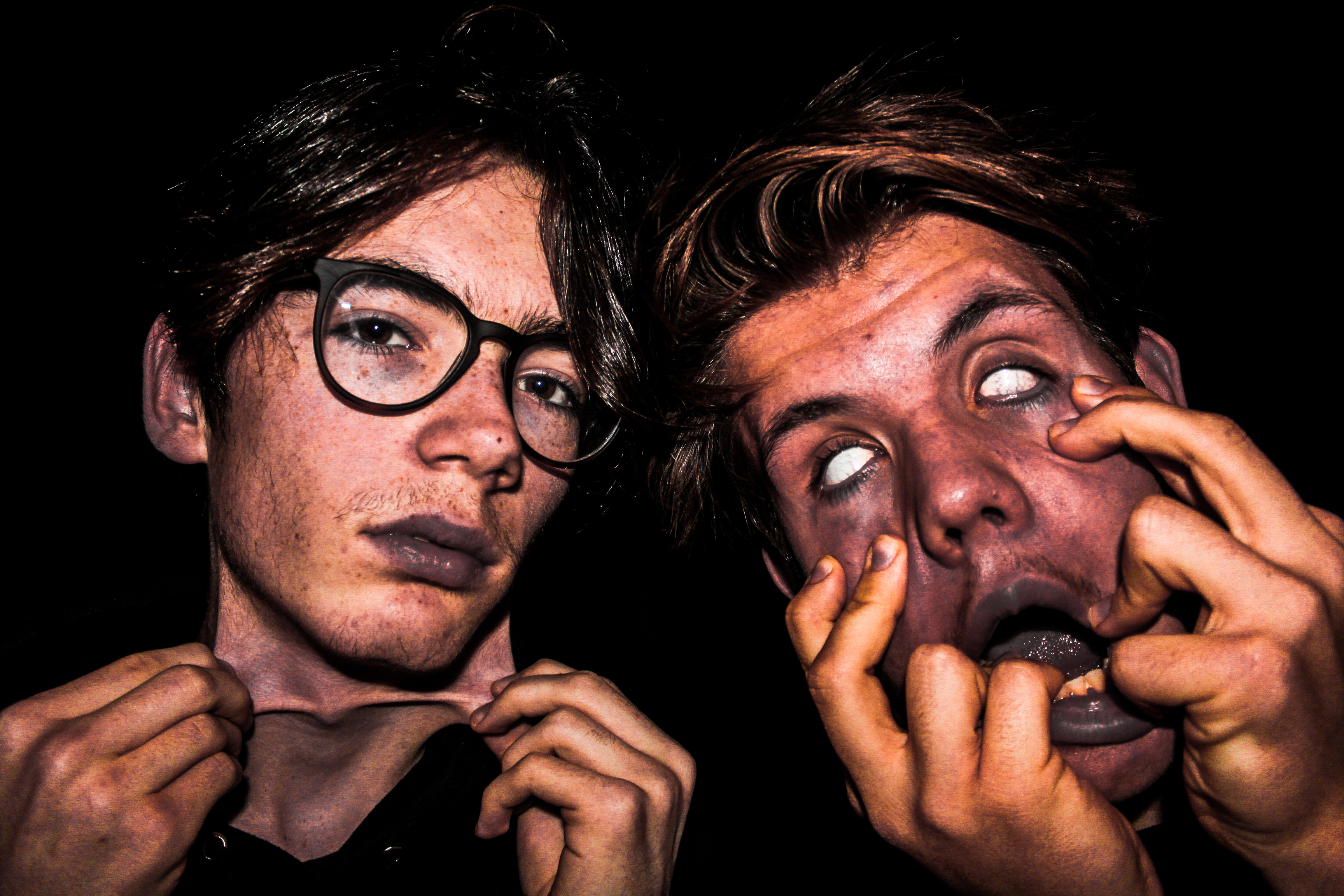
Within the process of taking this photo, I used artificial lighting in the studio with a blackened background. Using artificial lighting, mainly which came from the flash on my camera, helped to illuminate my models faces which is the main focus of the picture. I also used back lighting from above to help bring out the models hair, however it wasn’t too bright that made the hair distracting from the key elements of the photograph like the stretched parts of skin. I directed this photo with the intention to create a strong emotional response on the viewer which i believe has been successfully achieved. The image almost reflects a sense of deformity or could relate to physical abuse which is are very touching and horrifying topics. I like how the high contrast between the background and the facial features really brings out these themes which were intended to portray. To create the distorted effect upon the models faces, I played around with all the colours within Lightroom and increased the clarity by around 80 to really emphasis the detail within the face.  Increasing the clarity really helped to bring the image alive to give an extra punch and impact. I think this image was successful, not only because of the detail and the editing as a whole, but due to the story I was able to create, which could vary across several topics leading to the viewer able to unpick and interpret the photo how they like.


second shoot:close up tonal portraiture final development and shoot

My second shoot idea would be a close up face shoot focusing on editing and tones:

aim;To be inspired my tonal beauty and a relationship within the vulnerability of facial insecurity and a lack of vision,also an unknowing of reflection and being.

editing techniques:

1)A substance to cover the eyes

2)Dissolving the image itself

3)Bluring the image over the face and also to create a sense of movement.

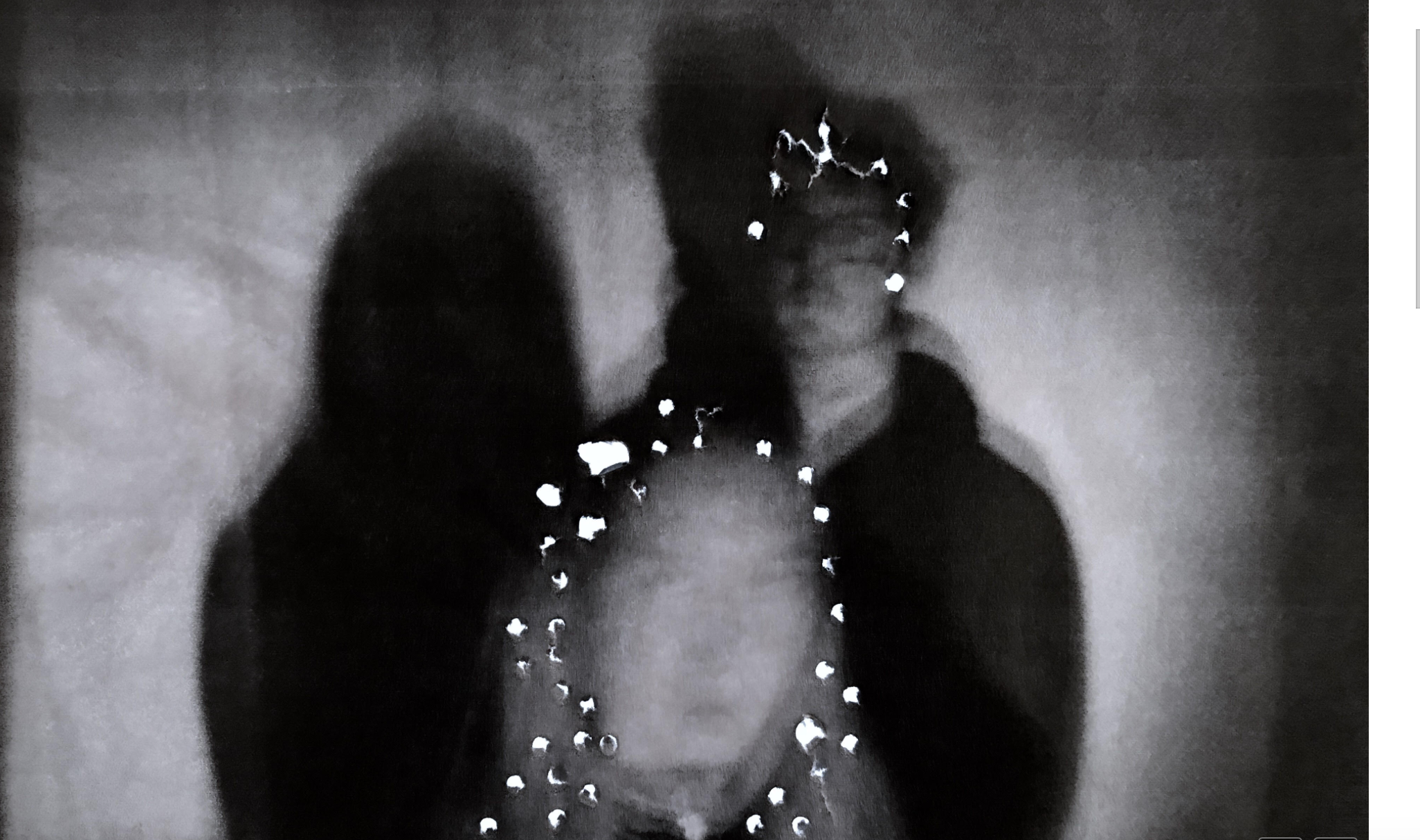
4)Poke holes within the image to create a source of light and lack of being.
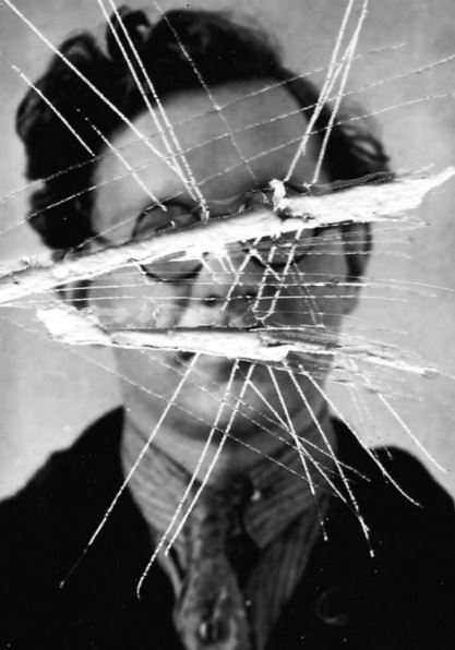
For this piece I was inspired by the abstract and more hardship and lines within the piece itself, it shows a harsh lines and brutal ship in order to symbolize a removal of ability to see who they are and express and talk about who they are and emphasis that lack of identity.there is also a harsh contrast within the beauty and close up of the face and the visor and abstract destruction of the rest of the shoots. there is also a theme of negatives and how the images have and as if they are an outcast.
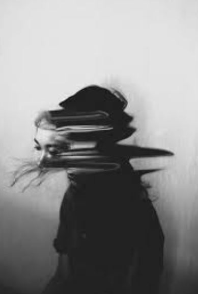
For this I was inspired by the lack of face and the movement of the nudge altogether,it shows a development of their personality and overall.I also want to show an interposing composition within this work so possibly using hands over the face to show an interesting miss direction of the piece itself. I like the way in which the face is still completely in connect and it is only the neck that is a somewhat diffusion of the body.It is very abstract  but still clear demonstration of lack of identity within a sense of confusion.
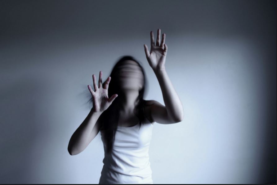
The overall composition of this piece is interetsing as it shows a grasp and focus only upon the body.The blur this time is focused more upon the face and a stillness of struggle upon the body itself, I like how the hair blends in within the movement of the face.The hands show an effort to grasp,perhaps in order to indicate a sense of release of wanting to hold onto something,perhaps a past memory or trying to grasp themselves.
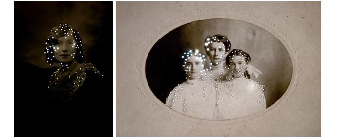
I chose this concept due to the way in which light can be used to enhance the people and show an interesting form of almost censorship, the light shows a gapping within the images, the light does not come through their face but only surrounded themselves indicating the main centered interest and also a sense of their spirit and not surrounding on what they look like themselves.

Artist I was influenced by is:Taylor Chan

Sometimes he is said to experience a sense of disconnect from who he is as an artist, it is mentally clouded state to which he finds highly emotionally driaining .He is said to enter a state of isolation brought form his own insecurities,so his work is highly inspired by his won journey and suffering.
This photo to me was inspired by a lack of confidence and also ability to create something with colour and many actions and such.It is quite a plane image but still connotes struggle throughout the positing  and also the development of the loose style.
This is also the same artists for the image above with the blurred face so carries the same ambitions and connotations throughout the works sense of differing trouble and lack of power.
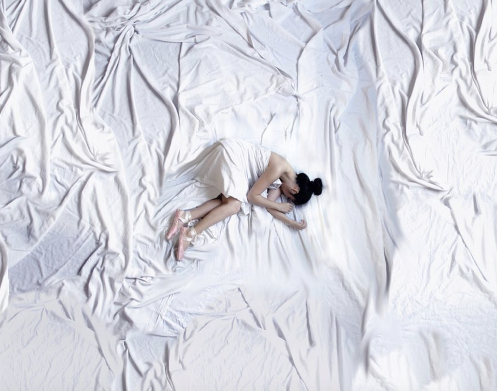
 This is my favourite piece from this artist due to the development of again how her body is covered and so develops into the background of the piece itself,furthermore her possession indicates themes of self conscious being and then also purity wihtin the white and in the somewhat childlike positioning;
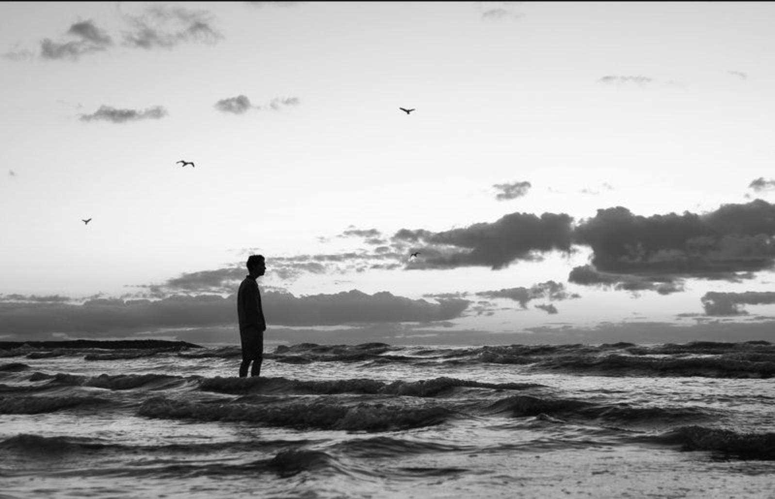
This piece is more like a landscape piece but still connotes strong themes of identity and lack or trying to finds himself and his being; The sky is almost seen mirroring the sea  and how it forms shapes that always changing and about top collapse, Perhaps this is why he is walking towards the danger and unsuraty  of the sea because he himself does not know who he is either.
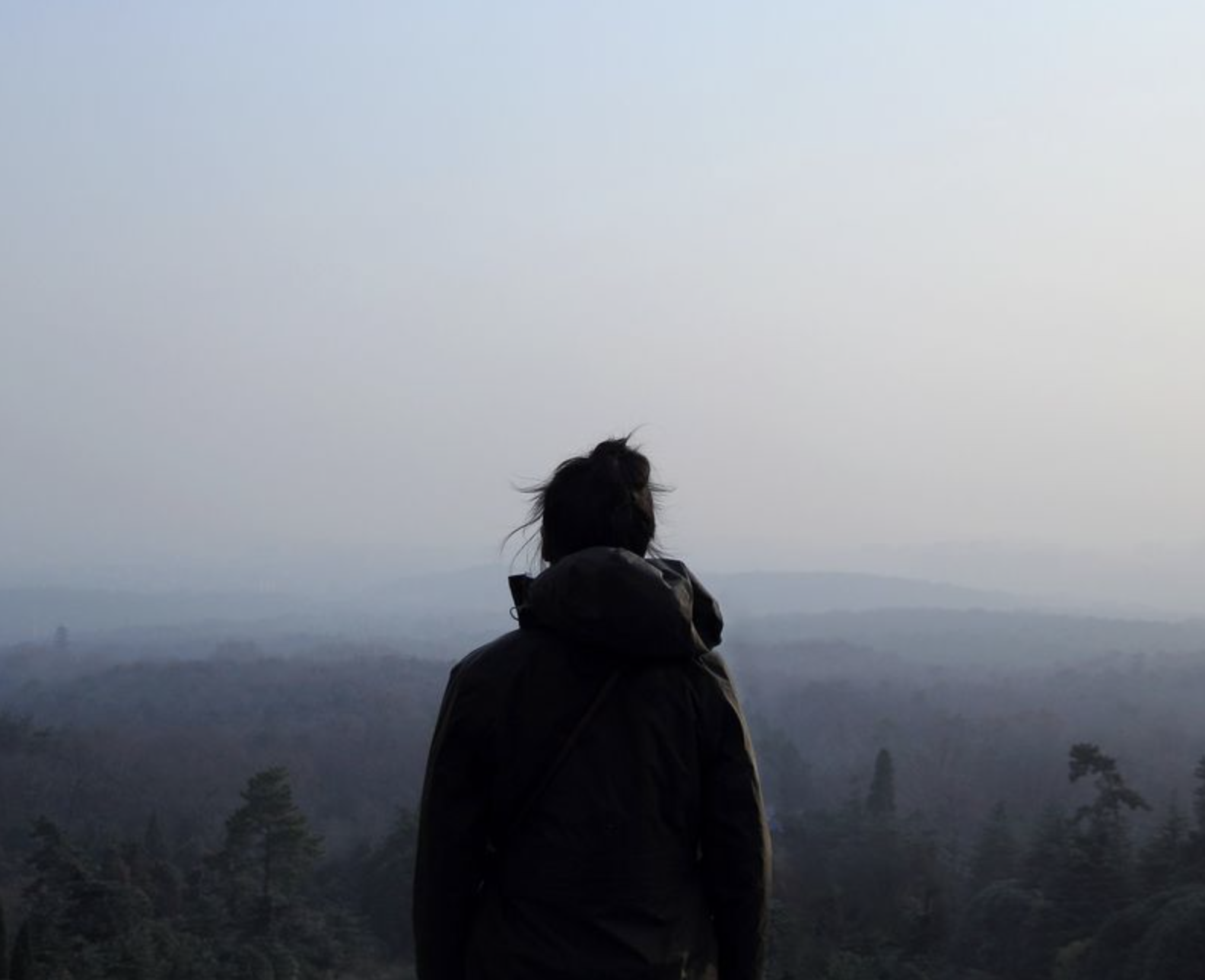
lastly this image is quite ominous and based around silhouettes to shows themes of possible abandonment and a self journey.The landscape creates a darker tonal range the also expands into nothing expect grey, this shows successfully that she herself feels like she is nothing and a metaphor for how grey is neither black nor white and is somewhere in the middle.
 images:
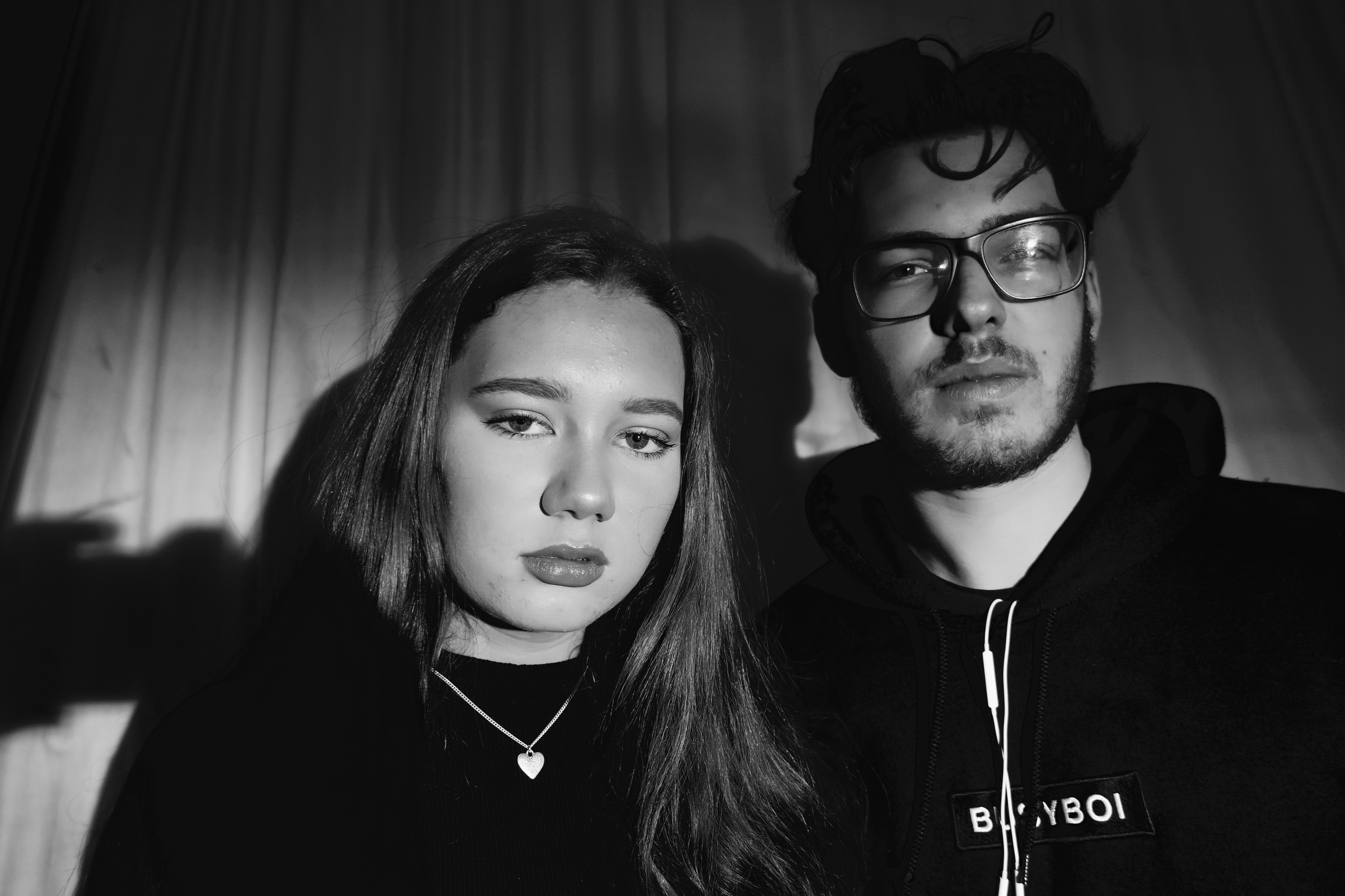
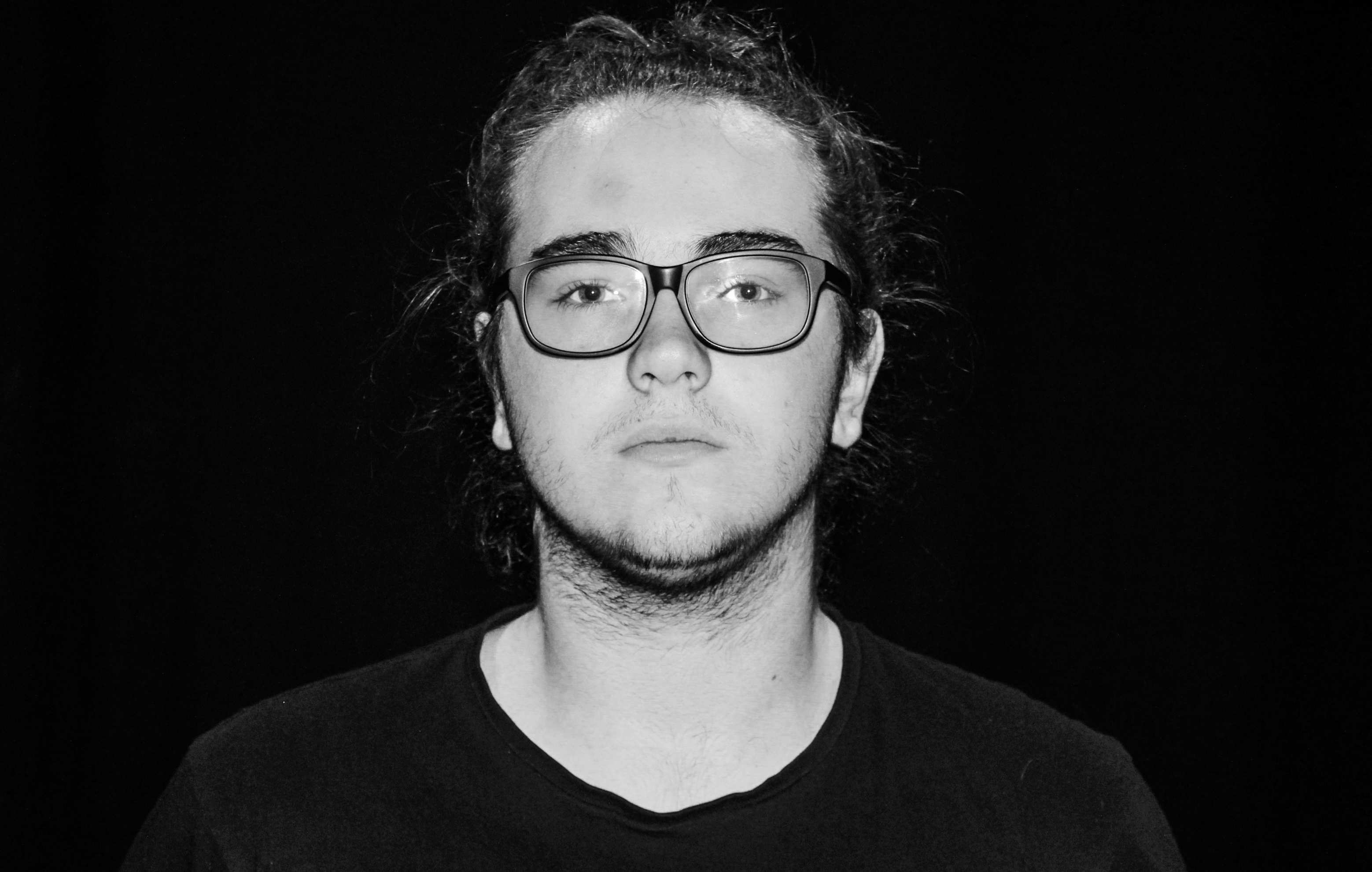
Here you can see my original images I wanted to show a simple composition in order to create effective centered editing.I also cropped many of my images in order to remove any unwanted shadows from the image itself.

best edited  images:
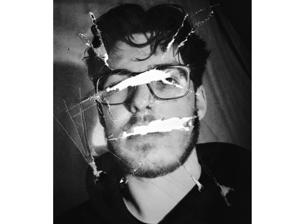
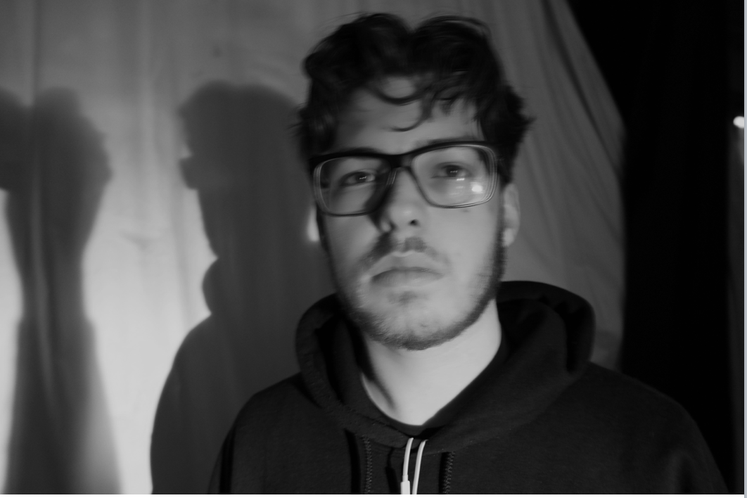
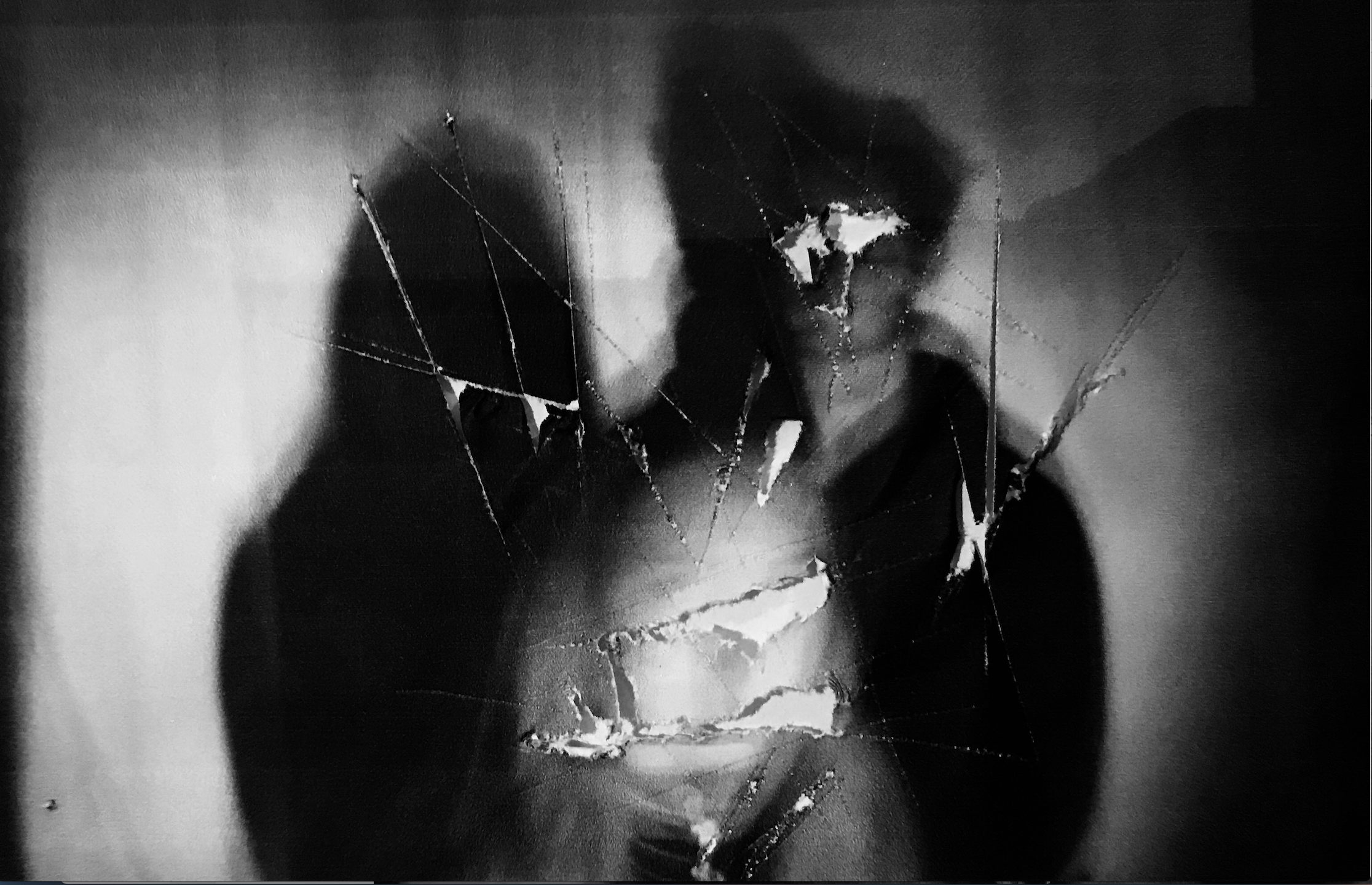
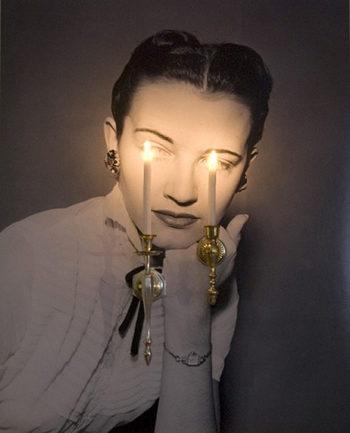
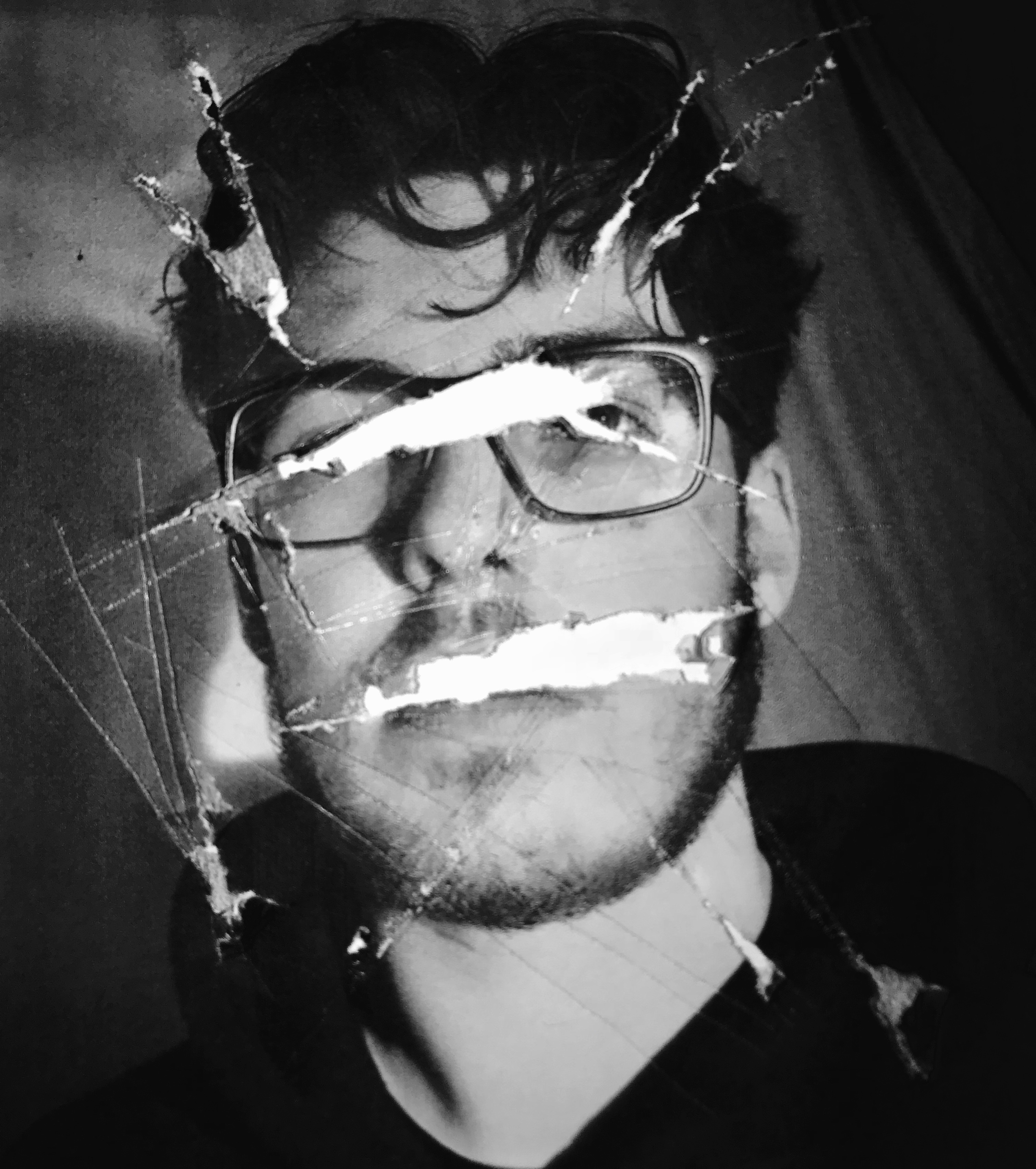
For this first image I was inspired by the first image shown above, it shows a removal of every feature that creates an impact of purpose, there is a sense of aggression swell that I wanted to show through the raggedness of the marks within the paper itself.
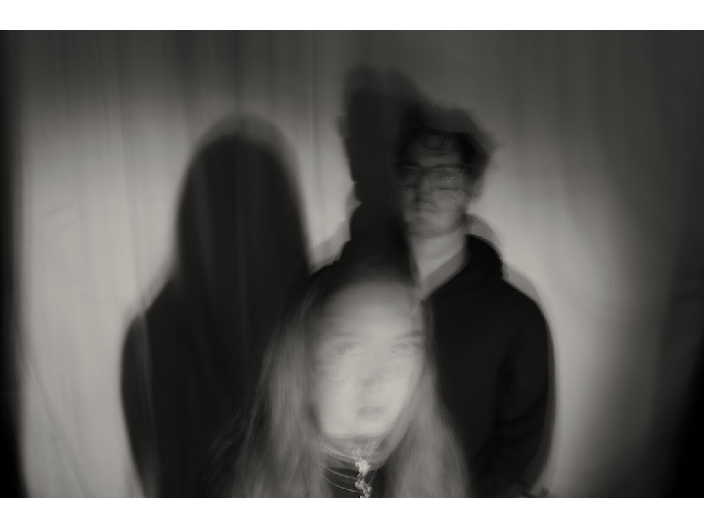
  Within this image I wanted to show a blur and repletion of the face throughout my images and how their shadows and positions are the same and there is only a  movement within their face, this was inspired by the second images want to further edit this though in such a way that it clearly shows a forward movement and blurring of the face but in a. more dynamic method.
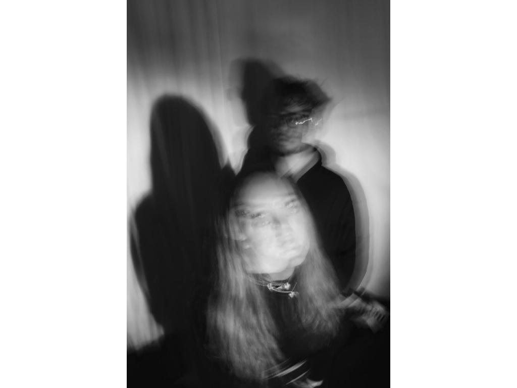
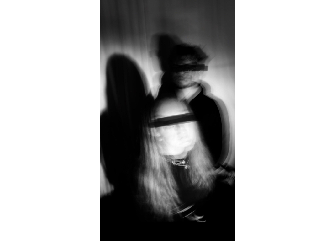
Here I used the image above in order to show a lack of identity  again showing a removal of the eyes but in a way of covering them which is not as quite sinister as the previous. it shows a sense of blinding them of covering them fro the truth in a way. And much like below this is the same effect of raggedly removing of covering up who they are. 
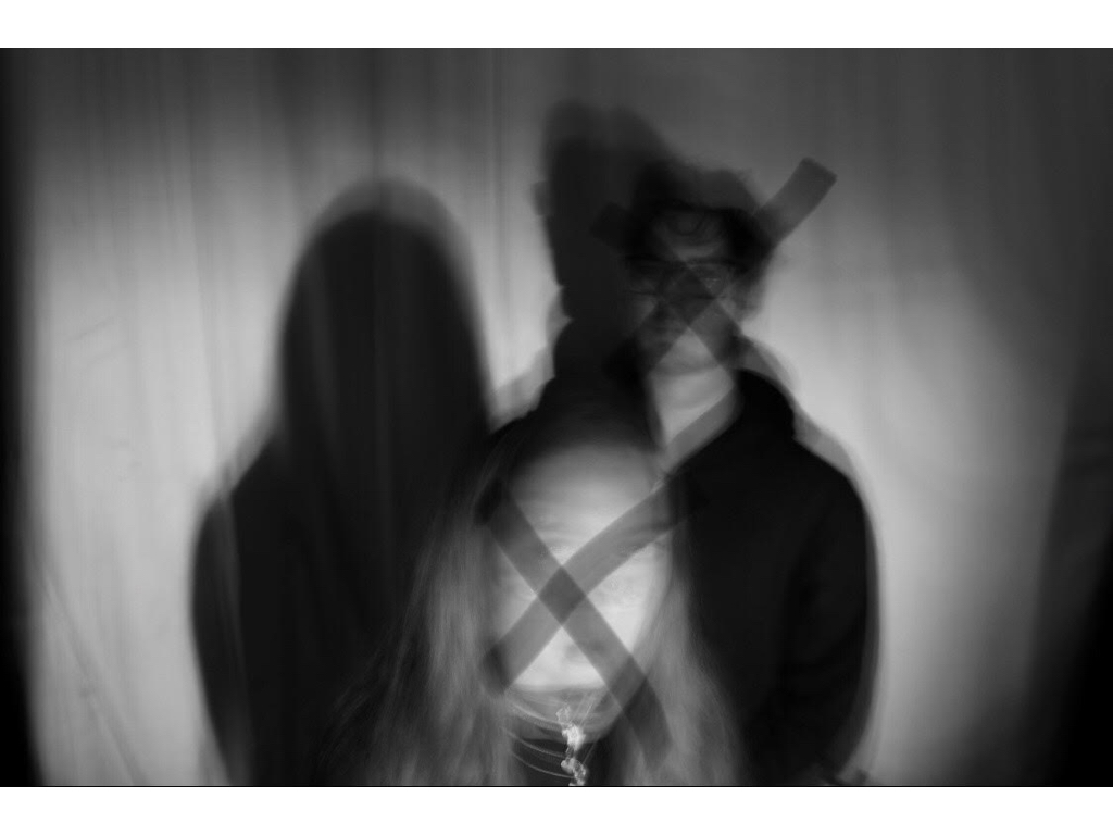
within these two I additionally wanted to show previous editing techniques of cutting out and getting a light from underneath in order to highlight the holes and ragged sensation from within the image.The random marks allow a presentation of harm and unwanted areas that symbolize within the loss of identity itself. It is also enhanced within the slow shutter speed of the piece additionally.

This edit was unsuccessful,I wanted to connote a movement of the face and a sense of blurring but overall it looks more liquefied and not the aspect of  loss and movement that I was trying to portray.

evaluation:Overall this shoot was effective by using the original editing ideas and transferring those onto my own personal work,however i do not feel as though these images are the strongest out of this project even though they do show a sense of loss of identity throughout.