Category Archives: AO3 Record Ideas

Filters

Author:
Category:

Case Study – Romanticism

Photographer Research – Hiroshi Sugimoto

Sugimoto Hiroshi, born on February 23, 1948, is a Japanese photographer and architect. He leads the Tokyo-based architectural firm New Material Research Laboratory.

He came to be known for his strictly black-and-white, highly stylized photography series. These series show views of the sea, extremely long exposed theatres, photos of scientific display cabinets, wax figures or Buddhist sculptures. Hiroshi Sugimoto sometimes works for several years on these work series. In recent years he has occupied himself increasingly with architecture, furniture design, objects and fashion.

“It was my goal to visualize the ancient layer of human memory with the means of photography”

“It is about returning to the past and remembering where we come from and how we came into existence.”

source

Photo Analysis

Technical

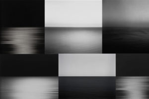
Although this photo may look plain and simple at first glance; there are many technical elements embedded in the image. Firstly, the smooth ripples in the water mean long exposure was used, Hiroshi Sugimoto most likely paired that with a slower shutter speed and bigger exposure to achieve this smooth and serene effect. Since the sky is rather dark, it’s natural to assume that the photo was taken at night – due to this, Sugimoto didn’t have to worry about overexposing the image as it would have been too dark to begin with. If the photo was taken in the dark, there would be no natural light for Sugimoto to work with meaning he had to rely on his camera and settings. Referring to Ansel Adam’s tonal range; the image seems to be missing the darkest black and brightest white but captures most of the tones in between.

Visual

Visually, I find this photo very pleasing and soothing. The lack of colour doesn’t feel like a disadvantage in this image; in fact, the lack of colour contributes to the simplicity and straightforward nature of Hiroshi Sugimoto’s photographs. By looking at the other photos in this set, it is safe to assume that Sugimoto used a black and white effect on this photo like all others. The photo has two parts to it: the sky and the sea, divided only by the line of the horizon that creates a soft contrast between the dark grey sky and lighter waves. Sugimoto purposely arranged the position of the sea like this in countless photographs to play and experiment with the concept of minimalism.

Contextual

The photograph was taken in 1997, during a time where most people had access to coloured photographs- Sugimoto purposely chose to not include colour in this image. Hiroshi Sugimoto studied art in Los Angeles in 1971, at the time of Minimalism and Conceptual Art – this is clearly evident in his work.

Conceptual

To me, the concept behind the image is to challenge the audience’s perspective and views on what makes a successful photograph. The image, at first glance, lacks the most conventional aspects of a successful photograph.  The image is incredibly plain due to the lack of subjects but still able to capture the attention of the viewer and provoke an emotional response. The whole set has a similar calm and harmonious atmosphere it radiates, allowing the viewer to feel safe and at peace – which may not be a feeling we expierence much in our chaotic everyday life.

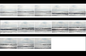
Contact Sheets
Final Edited Image In The Style Of Hiroshi Sugimoto
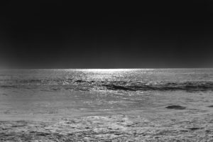

For this image, I first used the lasso tool to separate the sky and the ocean into two different layers and then I simply used the ‘burn’ tool to darken both the sky and the ocean until I was satisfied with the results.  It was an easy process but it allowed me to quickly obtain the results I wanted.

New Topographics Homework Assignment

Planning

Task: Take 100-150 urban landscape/night photos

Props: I will be using a tripod in order to capture some long exposure shots at night.

Camera settings: For my long exposure shots I will be using a shutter speed of 30 seconds to make them more effective, along with a 100 ISO. For other landscape photographs I will be using an ISO of 200 with a shutter speed of 1/20 to allow enough light to enter the lens.

Lighting: I will be using lights from passing cars, buildings and lamp posts to capture my photographs

Location: Town

Context: I will be capturing photographs with the style of the New Topographics in mind.

Concept: To capture photos whilst taking influence from the style of Robert Adams and Stephen Shore.

My Photographs

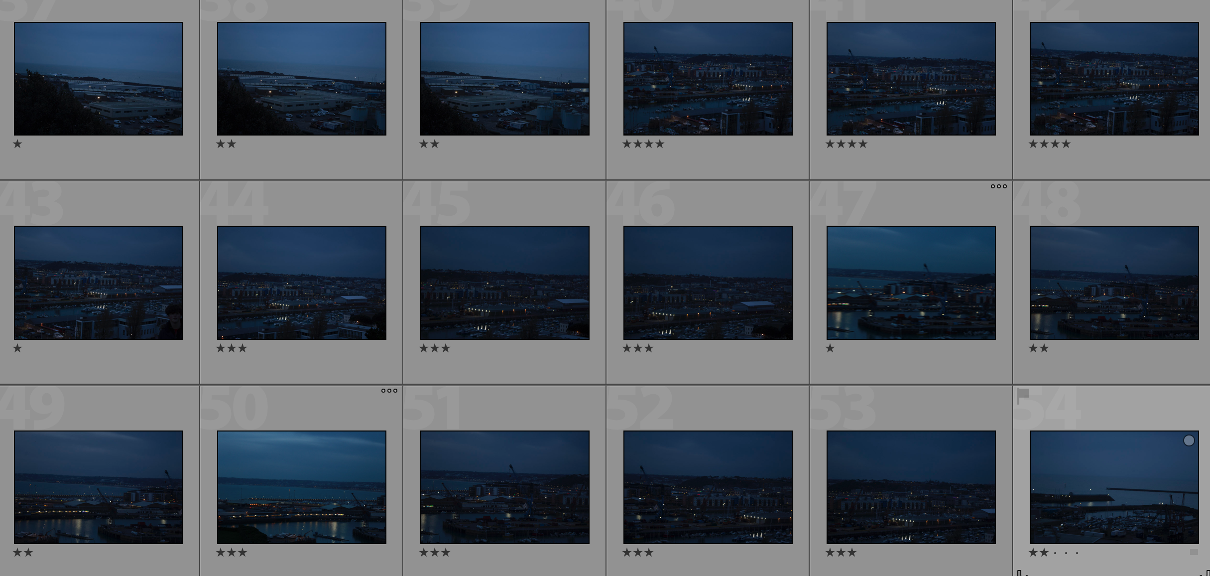
Contact Sheet

My Edits

My Favourite Photo

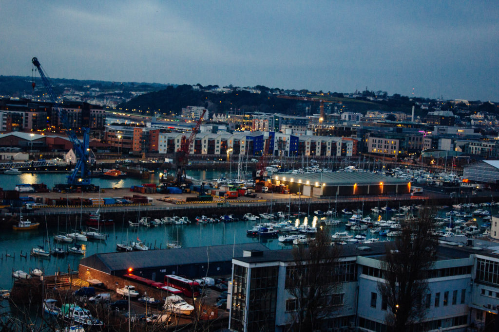
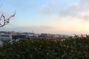
In this photograph I used natural lighting. I took advantage of the lights in the down as dusk approached in order to cast contrasting orange colours against the blue-tinted town. I used a deep depth of field of  20 to capture this photograph to ensure that the whole of the image was clear and in focus. I used a shutter speed of 1/20 in order to allow enough light to enter the lens from the dark environment, paired with the low ISO of 100 that I used, it allowed me to create a high quality image with a wide tonal range.

There are lots of intense colours in this photograph such as the orange lights and the blue sea and sky which cast a blue tint on the photograph. It is generally quite a dark image with the lightest tone being the bright lights. It has a slight 3D effect due to the harbour in the middle separating the foreground and background.

This photograph has been taken with the work of the New Topographic movement in mind. It shows the industrial side of the environment and all the man-made structures along with nature being pushed to the background or covered up by man-made structures.

The photograph shows how the nature shown in the photograph has been taken over completely by man-made structures and has lost the attention it once had. This is symbolic for the New Topographic movement taking over from the Romanticism movement. It shows how quickly things can change for better or for worse.


Harve Des Pas Walk

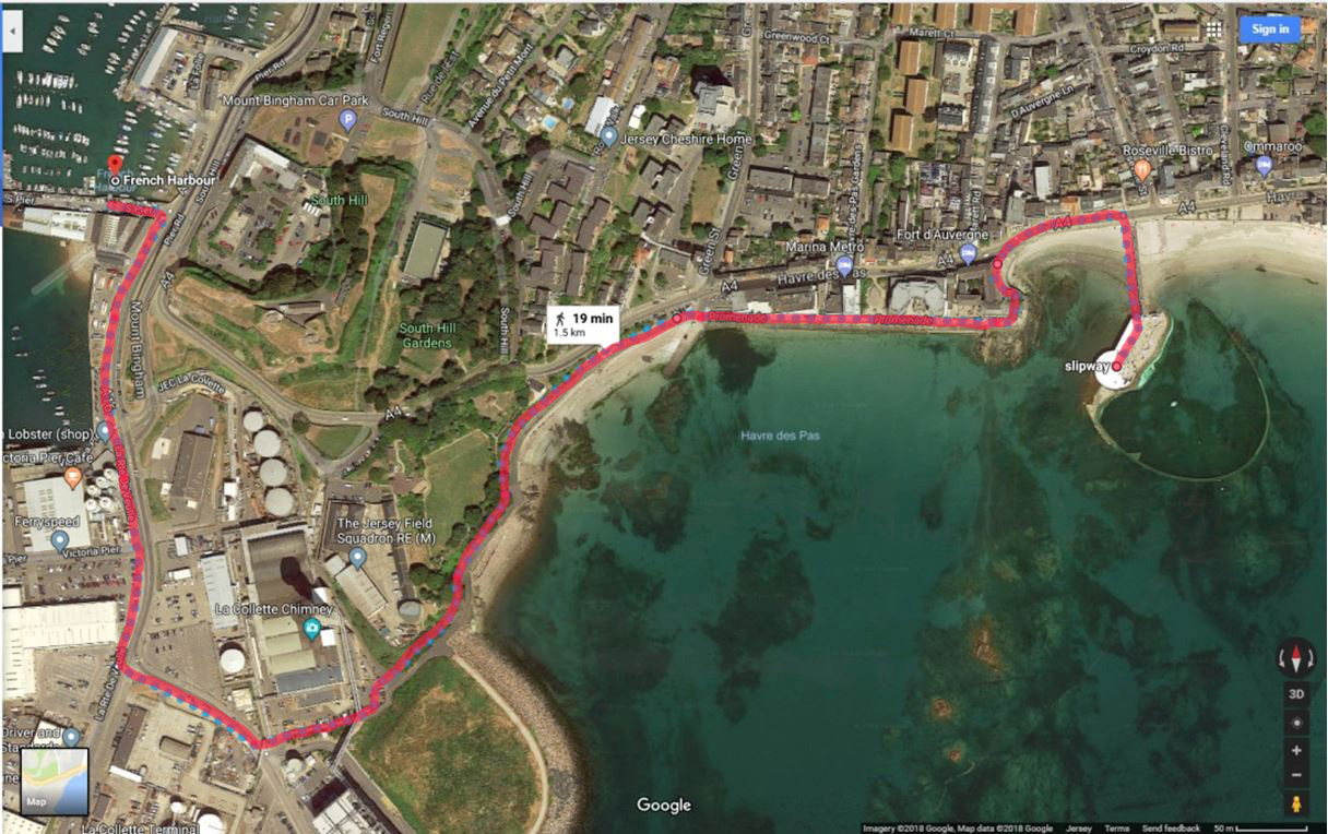
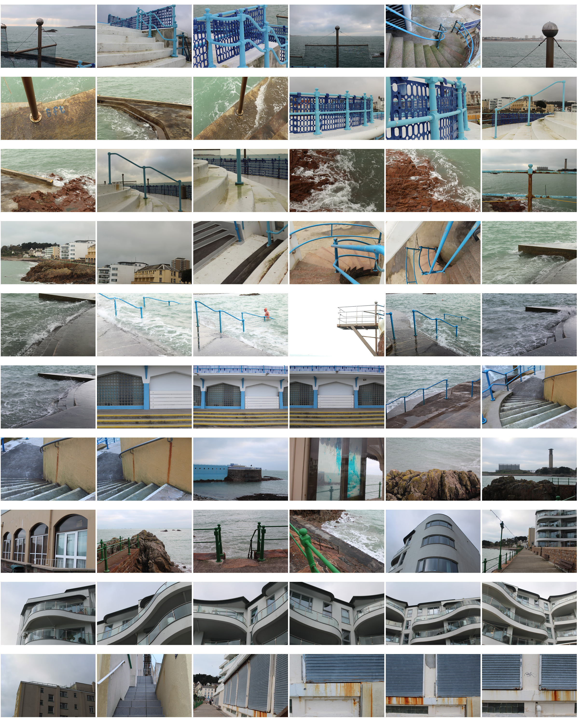
I planned to walk from Harve Des Pas to the Incinerator following the path back to town. This gave me different views and landscapes to photographs showing  my route and journey. I presented my images in a contact sheet and throughout you can see how the route and scenery change from natural to urban.

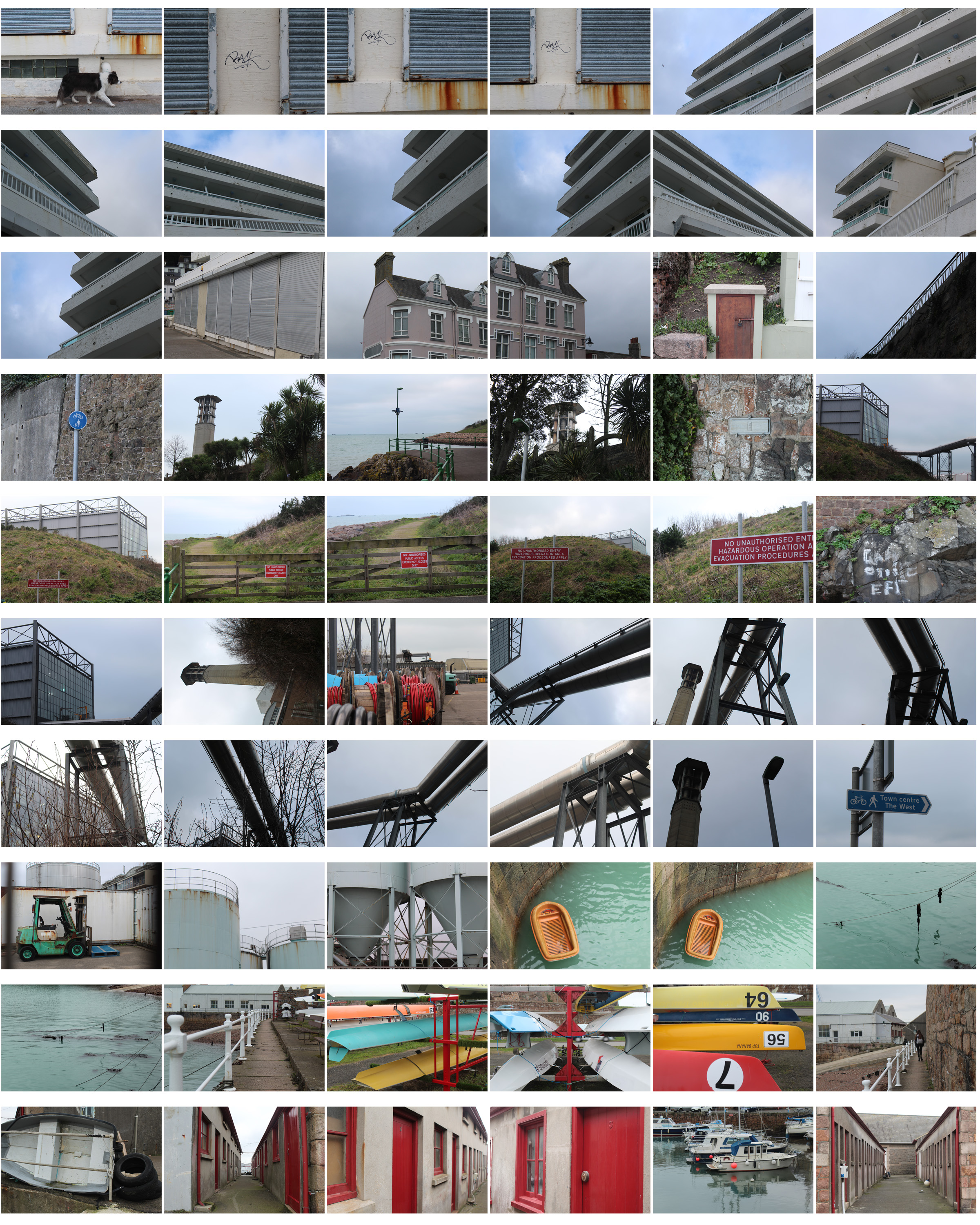
I then chose my favourite photos out of all the images, edited them and displayed them in the contact sheet below so the images can be seen more clearly. I chose these images as each one is completely different and shows the different landscapes I passed and the journey I went on- focusing on structured , man-made objects as well as nature.
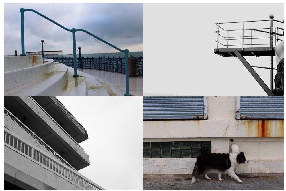
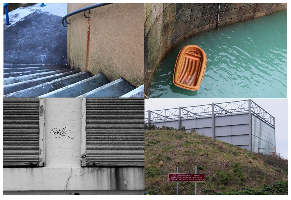
I chose this photo as one of my final images as it clearly shows how urban is taking over nature, similar to concepts The New Topographics focused on. The image shows a very structural industrial building in the background, and a natural hill in the foreground. The contrast between both parts of the image makes it seem like they wouldn’t be in the same place and so close together. It also shows a bright red sign post on the hill which also presents  the new topographics unease about how the natural landscape were being eroded by industrial development. I decided to leave the image in colour with not much editing as I think it emphasises the differences between the two sections of the image.

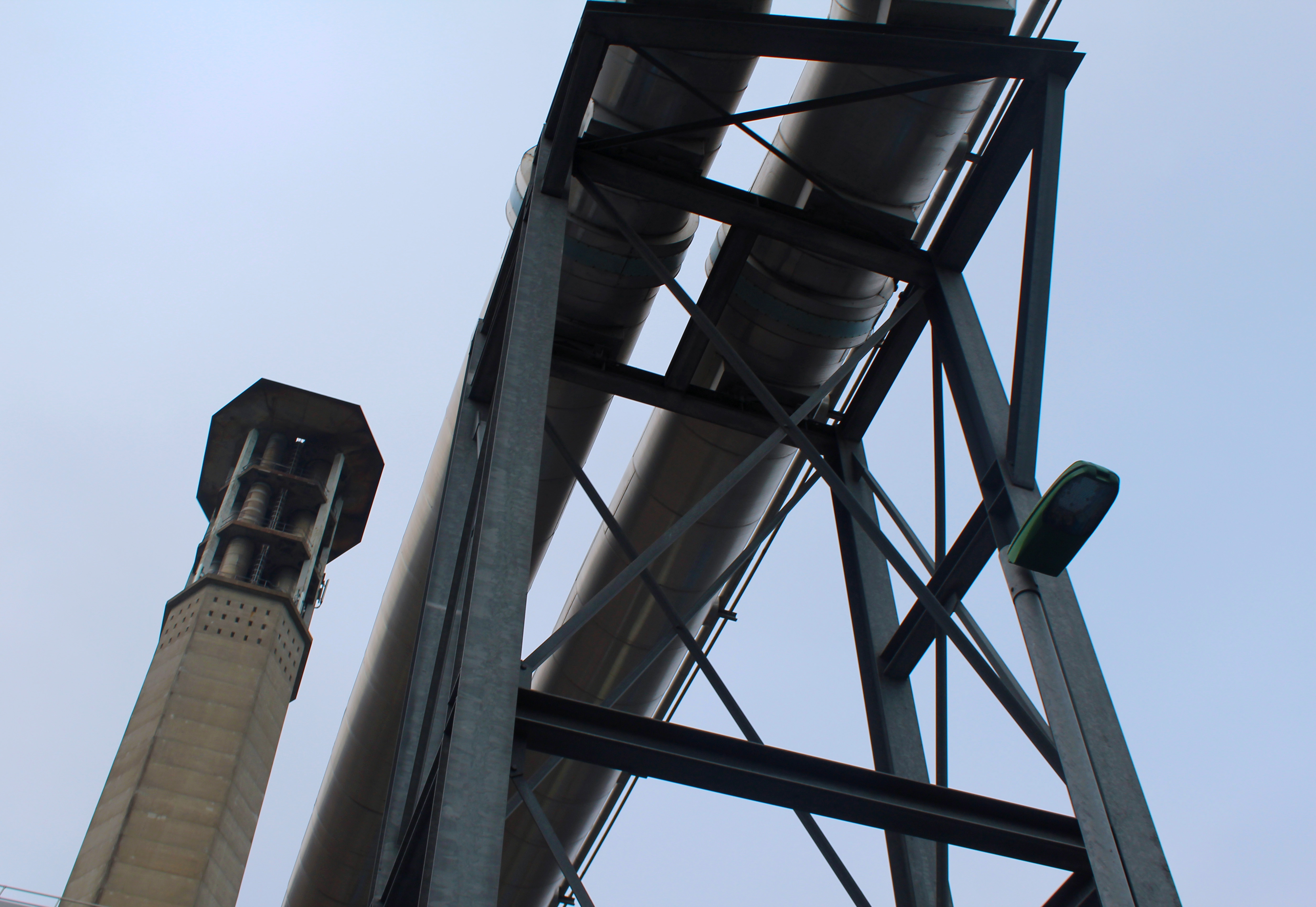
I also chose this photo as one of final images as I focused on industrial buildings and the structures they make. This image takes inspiration from The New Topographics as it focuses on geometrical shapes and symmetry. The image doesn’t contain any natural elements and only shows man-made structures which contrasts with some of the other images I have taken. I left the image in colour as the it only contains browns, greys and blacks that contrast with each other which would not happen as much if the image was in black and white. It also shows the structures and the sky being completely different (natural vs urban).

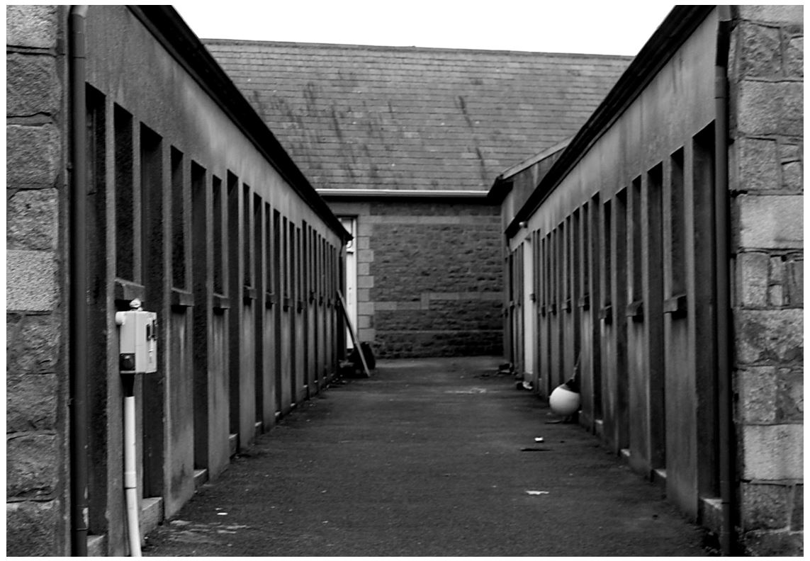
I also chose this image as it shows an alley that I tried to make  symmetrical to show lines and repetition on both sides. I turned the photo to black and white taking inspiration from the new topographic photographers, trying to get the same effect. The industrial photographs I’ve taken have similarities to Albert Renger-Patzsch style in The New Objectivity with clear, black and white pictures of industrial archetypes.
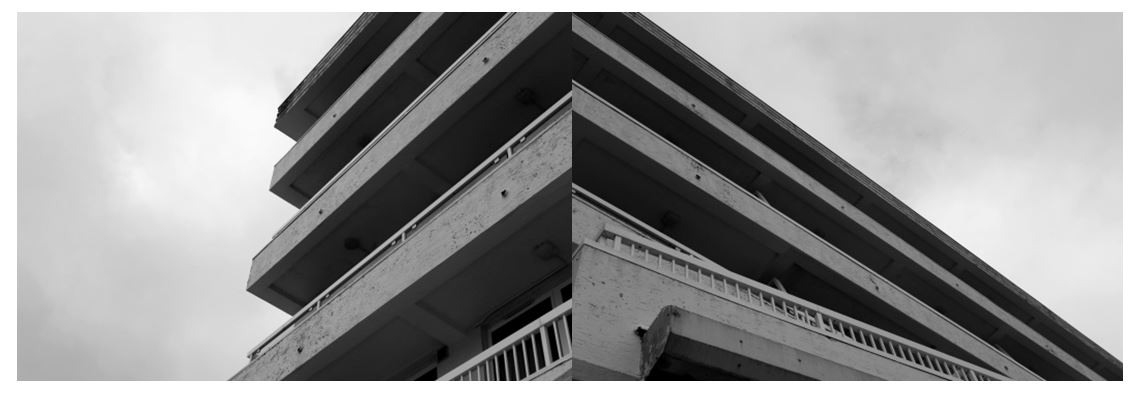
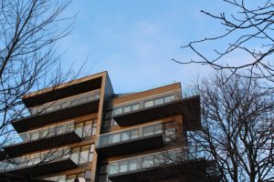
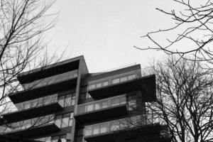
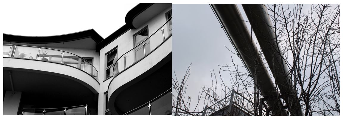
I also tried focusing on industrial buildings, zooming in on specific sections of the same building so I could present them together to show different perspectives. I edited them to black and white as I think it makes the images have more of a contrast between the tones of grey and emphasises the shadows underneath of the balconies and where the light hits the outside of the balcony walls, making the images more powerful. I arranged the images so some of the lines join up between the photos connecting them together to make a new image.

The New Topographics | Landscape Photoshoot

Planning 

For this shoot, I am planning in and around the West Park Area, as in this area there and large areas of green open spaces and wildlife, which is closely surrounded by new housing developments so the two do cross over and create a blend between nature and mans work on the landscape. Joe Deal also liked to look and the blend between the two and this is I have got the most of the inspiration for this shoot.

Contact Sheet

Best Images 


Favourite Image From the Shoot 


This is my overall favourite image from the shoot. I took this image using natural lighting. I really wmated to make a clear cotrast between the buildinhg and the colour of the sky, so i took advantge of when the weather was slightly overcast as this would help keep the main background colour of the imahge a netual colour which I would be able to edited back into  when I began the editing process. I used a quick shutter speed so that large amounts of light woundt be able to flood and make it too bright. When I took this imageI had the work of joe deal and the Topograiphic movement in my mind and how he wnated to highloight how nature have and colided  and the differentec in the plants and in the man made strcure, wity the tress there are lots of natural bends and curves, where as in the building of the the edged and lines and very sharp and harsh, which shows that nature is always pushed back by man-made buildings.

Homework 2- Night Photography

Night Photography

Night photography refers to photographs taken outdoors between dusk and dawn. Night photographers generally have a choice between using artificial light and using a long exposure, exposing the scene for seconds, minutes, and even hours in order to give the film or digital sensor enough time to capture a usable image. With the progress of high-speed films, higher-sensitivity digital image sensors, wide-aperture lenses, and the ever-greater power of urban lights, night photography is increasingly possible using available light.

The following techniques and equipment are generally used in night photography.

  • A tripod is usually necessary due to the long exposure times. Alternatively, the camera may be placed on a steady, flat object e.g. a table or chair, low wall, window sill, etc.
  • A shutter release cable or self timer is almost always used to prevent camera shake when the shutter is released.
  • A camera lens with a wide aperture, preferably one with aspherical elements that can minimize coma

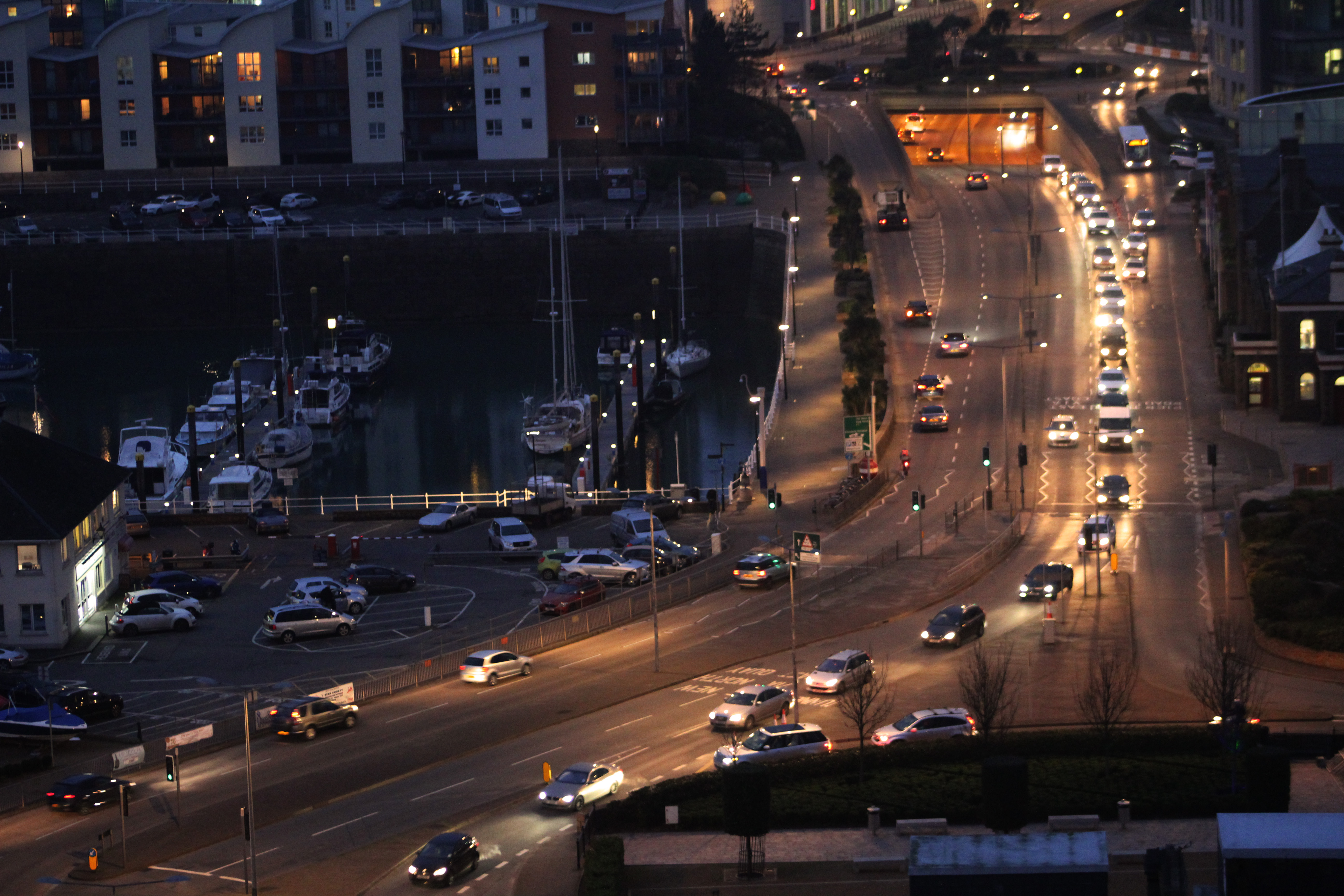
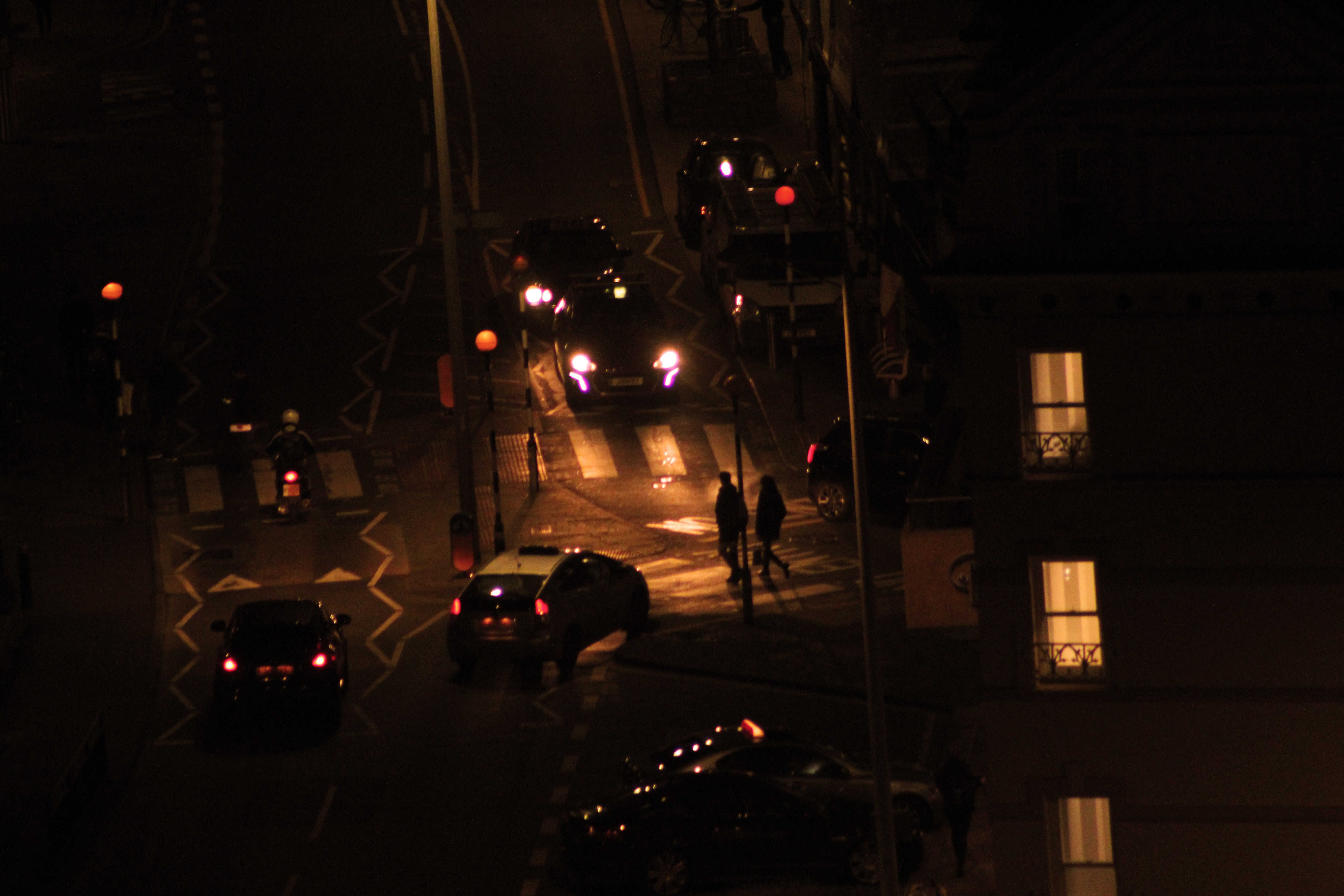
For my urban landscapes homework I decided do my photo shoot from a higher perspective taking inspiration from Nicholas Nixon and photographed buildings, with architectural views. I also took inspiration from Thomas Struth’s photos of industrialised cities and how he incorporated people and movement, presenting images of chaotic urban activity in some images, which is why I captured the movement and business of the cars. I decided to take my images as the sky was turning dark as I thought it would make the lights from the cars and buildings stand out more than if i took them in the day. In my first contact sheet the images have a blue tint where the the sun has not completely gone down, whereas my second contact sheet the sky in completely black by the end, showing the differences the light has on the images. In my second contact sheet the lights from the buildings and cars are much more bright and noticeable as the yellow/orange is contrasted with the black background , making it more clear that it is night time. I think these photos are more effective as the lights from the cars make the whole road light up, making it glow and stand out more.
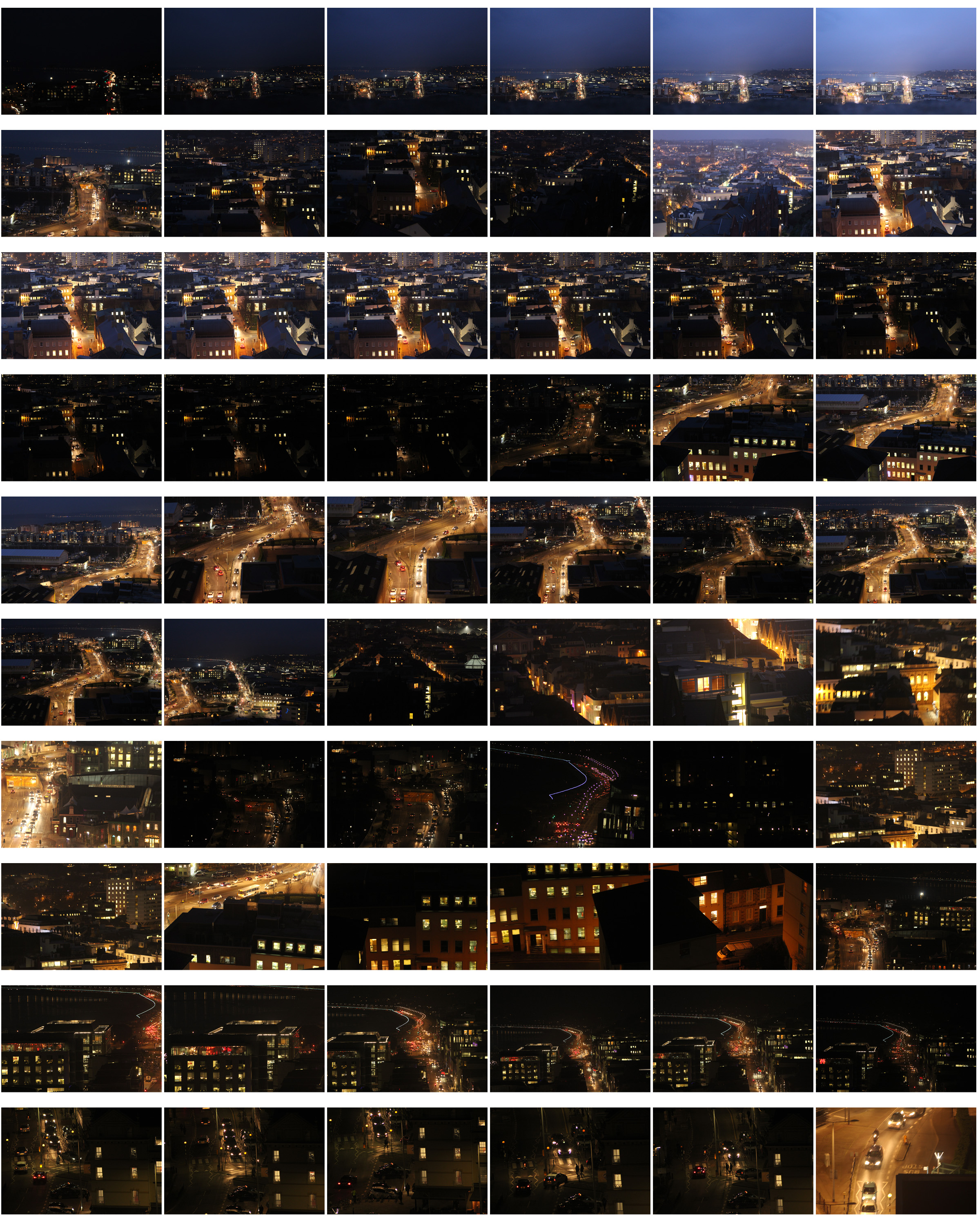
I first tried editing my first image in black and white which makes the roads seem more dark and atmospheric with the street lights and windows contrasting  from the dark roofs. It shows clearly where the road leads from where the streets lights up  even though you cant see the street.

I compared my photograph in black & white and in colour and decided that i preferred the image in colour because of the how the yellow/orange lights contrast with the black roofs and buildings more than they do than in black and white. Also how the road is emphasised more as it is illuminated from the light which is soft and isn’t too intense.

“Most photographers struggle with one thing in particular. That is how to make their photos stand out from the crowd. You’ll be surprised at how many locations that appear rather mundane during the day can be made to look incredibly dramatic at night. In cities, for example, you will find well-lit facades, bridges, skylines, etc. The city lights add interest and a dramatic effect giving you lots to work with.”

I also chose this image as it shows the business of a road filled with movement, presenting an image of chaotic urban activity, similar to Thomas Struth. The city that Struth presents is unregimented: there is little architectural unity, this is what i tried to interpret. I tried to show energy and speed within the image which I think I achieved from the blurring of the cars and lights by slowing the shutter speed slightly. I increased the exposure when taking the photo so all sections in the image are visible, still keeping the cars and the road the main focus of the image.

I chose this image as it is different from my other images but still overlooks chaotic urban activity but  scaled down by using a long lens to focus in on a specific street. The headlights of the car highlight the people crossing the road not too intensely so the overall image is softer than it would be in daylight. The corners of the image are black where the buildings are and gradually towards the center of the image is where the main focus of the image is.

Natural Landscapes Photoshoot

Photoshoot Plan 

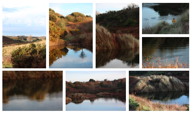
Concept:  After researching romanticism in natural landscapes and the photographer Edward weston I am going to take inspiration from the style of their work and apply it to my own photos.

Location: I am going to take photos in on the sand dunes where the is a range of natural settings I can make use off such as a large pond and trees.

Lighting: I will use natural lighting to take these photos and i will take them in the afternoon to avoid over exposed images with light flares.

Camera settings: I will take the photos using the manual  expose setting and the manual focus setting on my lens so i can change them both for each photo to get the best quality.

Contact Sheets:

Best Images From Shoot:
First Landscape Photographs

Planning

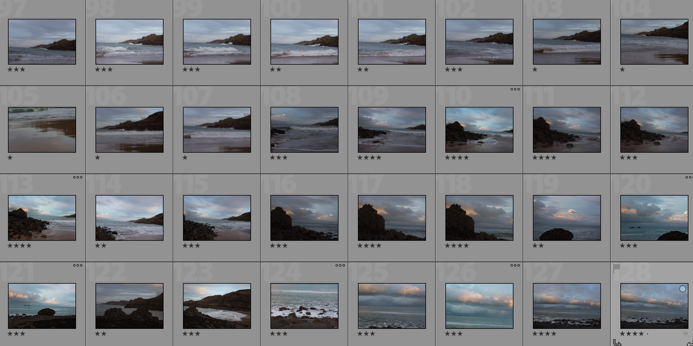
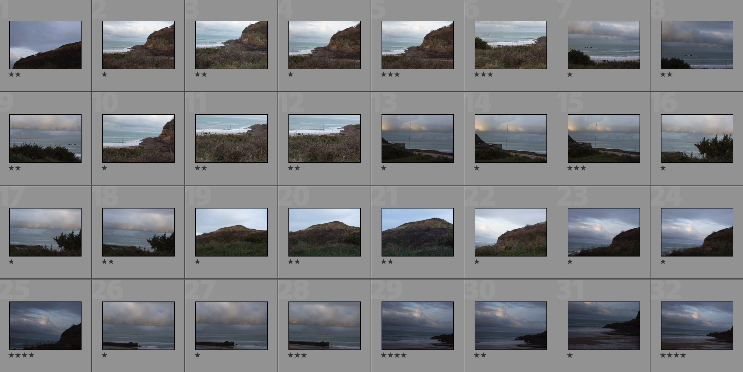
Camera Settings – I will use a fairly low shutter speed of 1/20 to 1/30 to allow more light to enter the lens from the darkening environment of the sunset. Along with a low ISO of 100 or 200 to keep the image high quality and to have a dark tone in the photograph. I will use a deep depth of field to ensure the whole photograph in in focus.

Lighting – I will use natural lighting from the golden hour before sunset for the photographs.

Location – I will do my shoot at Greve de Lecq.

Context – I will be using black and white, contrasting photographs in order to capture photographs in the style of the romantics.

Raw Photos

My Edits/Top 5

The Editing Process

I started off my editing process by using the custom white balance tool to find the correct white balance for the photograph (tool is the eyedropper tool on the right).I then applied the filter Fuji Neopan 1600 to create a strong, contrasting photograph that emphasises the shapes. I then adjusted the shadows, highlights, contrast, brightness and whites and blacks in order the fine tune the photograph.
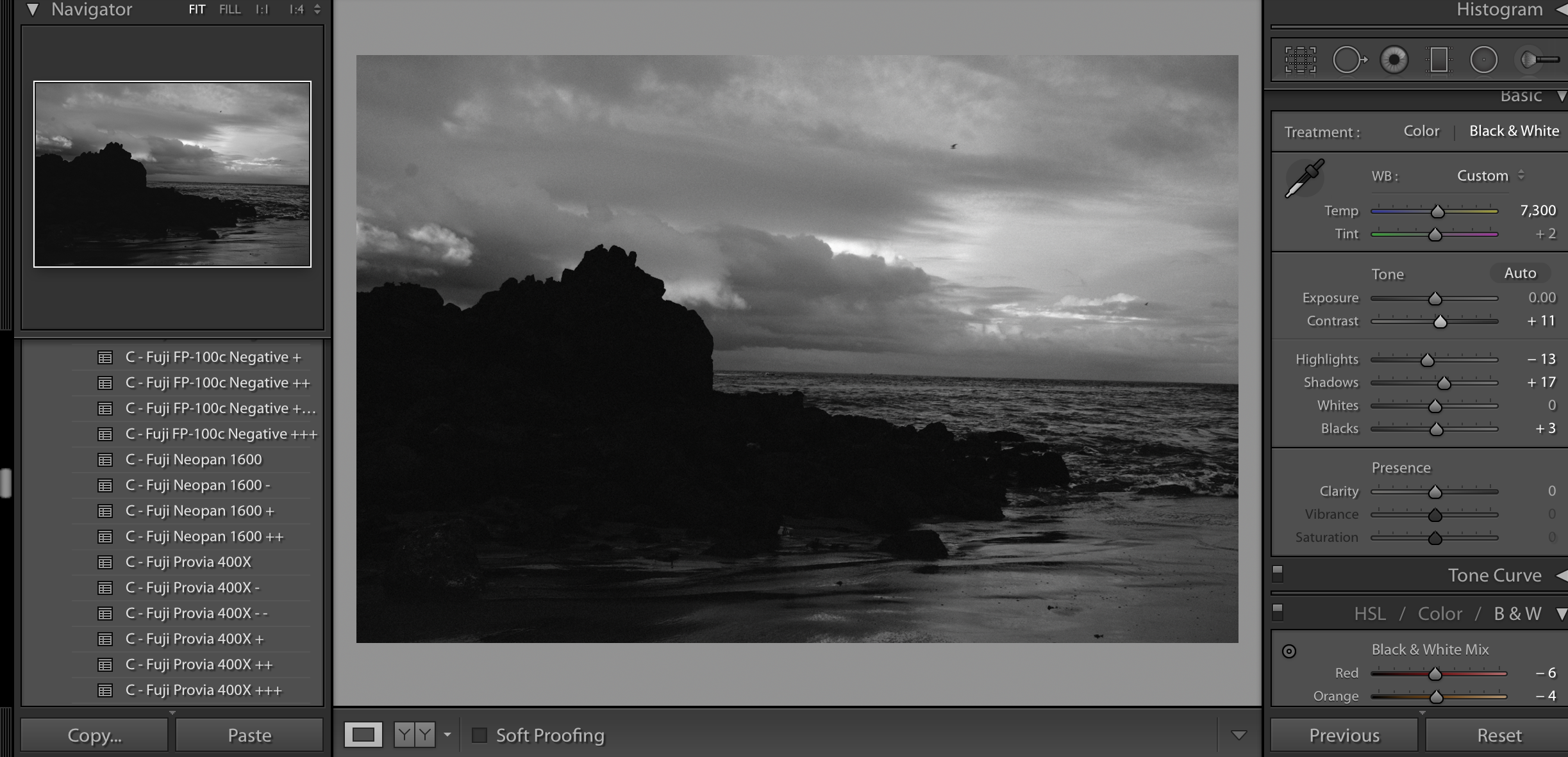
My Top 5
My Favourite Photograph

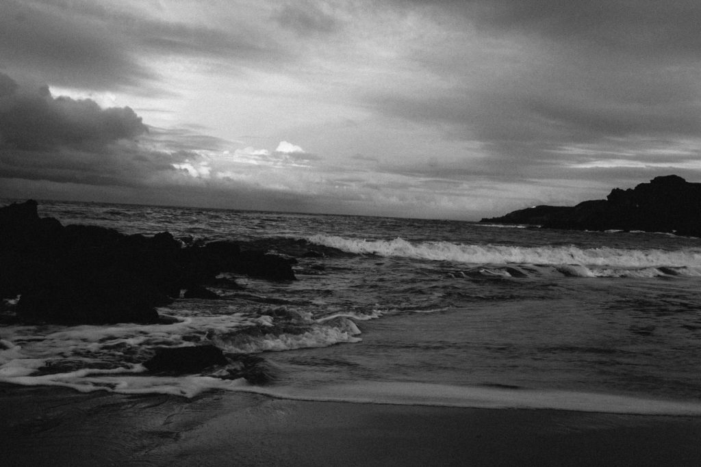
For this photograph, I used natural daylight from the golden hour before sunset. This helped to create a darker image with more contrast, drama and a wider tonal range. I used a deep depth of field in the photograph to ensure that the whole of the photograph was in focus. I used a slow shutter speed of 1/20 to capture the photograph to ensure that enough light entered the lens from the dark environment. I used this along with a low ISO of 200 to make the photograph high quality but dark to create a dramatic photograph in the style of the romantics.

There is no colour in this photograph, only black and white. This is because of the style of the Romantics, their photographs would be contrasting black and white photographs with lots of drama within them. There is a wide tonal range in this photograph ranging from the darkness of the rocks to the whiteness of the crashing waves, this adds even more contrast and mystery to the photograph. The texture of the clouds and sea shows quite clearly in this photograph, this creates a more realistic image. There is also a 3D effect in this image; the layers of clouds can be seen over the sea, this is further done by the texture in the photograph. There are three horizontal lines in the clouds and sea in the centre of this image, this pattern leads the eye to it due to the aesthetic of it.

This photograph was taken in the style of the Romantics. It involves a strong black and white with high contrast as this is typically what was in their photographs. The setting is also Romanticism inspired; the Romantics would picture raw landscapes without any signs of civilization around.

The concept behind this photograph and Romantic photographs is that it helps to show the scale of us. It shows how big and mysterious the world is and how we are just one mark on it at one small point in time. It shows that there is a meaning behind everything and aesthetic behind everything, even if it doesn’t appear so.

romanticised landscapes final images

Final ideas for my shoot:I was inspired by Ansel Adams and Fay godwits work, this is due to the way they both dramatically emphasised the amount of beauty but also movement and sense of attention within their piece,They continually did this by their high or mid perspective.Also the use of their dark contrasting tones wihtin the pieced how they continually evolve and move throughout the piece in order to show a sense of unity to the piece as a whole. Furthermore I was also inspired by the way in which they all used lines in order to draw a sense of direct view to a specific part of the images altogether.

when taking my images I focused  more upon the dramatic Skys and a contrast of softer Skys and an idealised beauty compared to a power possessive sky.I also had an aim to to take images of the landscape and direct lines continually going through although these were not my strongest outcomes.I edited the images with some in colourful saturation and others in more tonal ranges to show a large to relation to that of the artists.I did look for many leading lines and I was able to find some but they did not correctly show a continuation in the way I would expect so were not as successful as the coastline images.

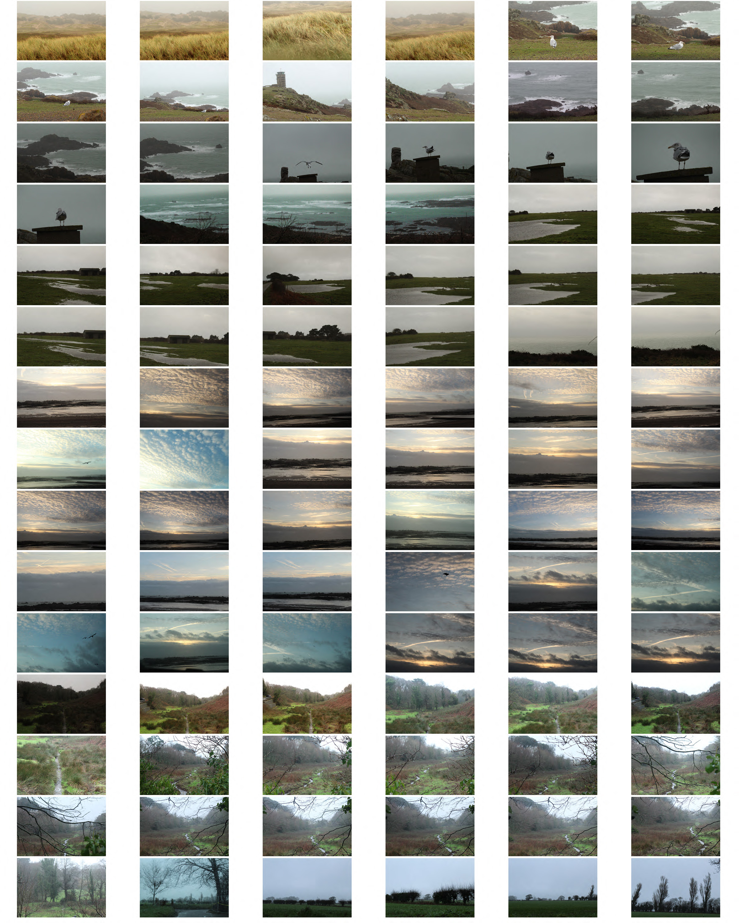
Above you can see the contact sheet of green landscapes and also the different angles of sunsets.I chose to take the photos at golden hour in order to see the changing and dramatic colours but also the darkness approaching from the right side within my images.It brings a warmth to many of the images and a great depth of colour.

you are able to see the before and after previous to editing the images and how I was able to enhance the colour to show a better detail of clouds and how to allow the reflection to be more vivid in its tone.

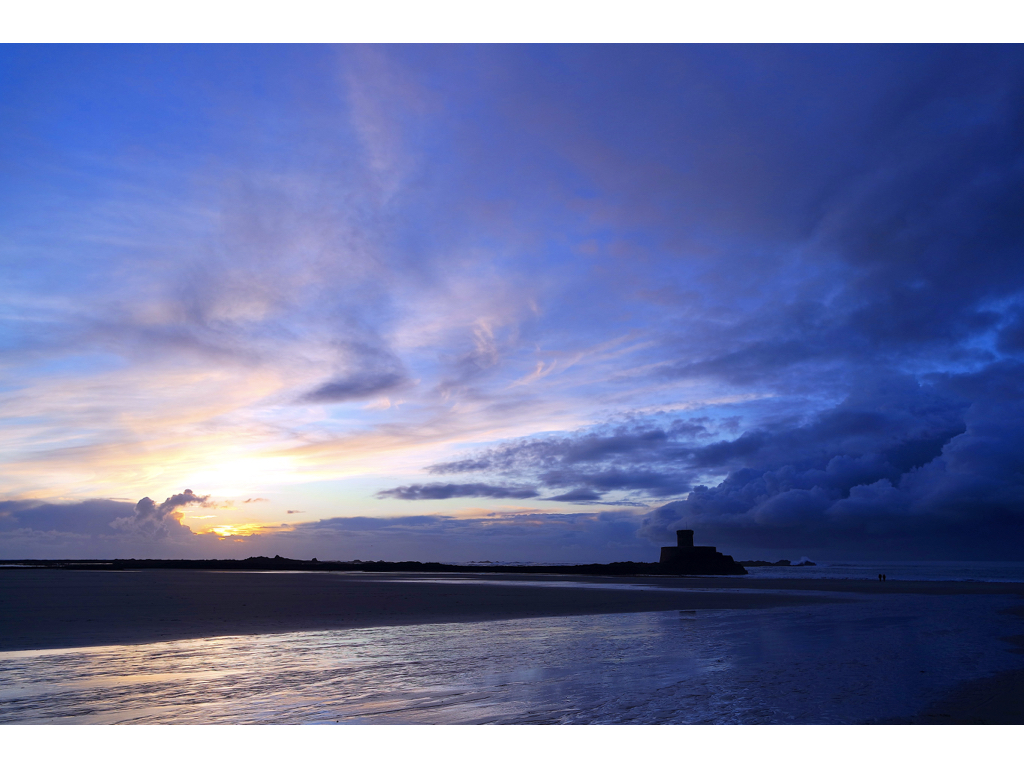
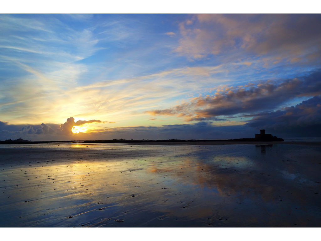
Here you are able to see I edited my images by enhancing the saturation and the colour of the piece,I chose to enhance the colour due to being able to see more drama and a stronger contrast between sides of the image, the juxtaposition of the lighter left side and the dramatic clouds and castle on the right.Additionally I edited the image this way due to the mirroring effect in the water surface and it looks as if a continuation of the sky.

I wanted to use the weather to evoke a sense of atmosphere snd emotion,I wanted their to be a relationship fo love within the coloured image and a sense of movement of light and attention,this is due to the stereotypically romantic choice of lighter colours and also how the sun is used to enhance from a stutter and the reflection of the sea shows a sense of peace altogether throughout the image itself. My aim was to capture the coastline and the sand dunes and how they are continuously evolving to capture different compositions and effects of light. 

overall I think this is my strongest image due to the lens of illusion and gradually forming power throughout the image.I wanted to show an understanding of reflections rising  the composition of the piece and how light can be used to suggest from and also movement to the piece itself.I took this image knowing I wanted both the light sense of warmth and other the authority of the castle and harsh clouds I used the technique of getting very high but lowering my camera so everything in the image looks level but additionally only capturing the reflection and the sky itself. I enhanced the exposure so the light so was able to progress throughout the image and used a wide angle lens in order to capture the whole angle of the image and see the size and power .These images are successfully romatisized landscapes although not edited within similar style due to the colours further down I edited my images tonally with a warmth in order to emphasis the artists styles too.  within the images above I wanted to capture a romanticised landscape in a much more vivid and and poetical extreme of colour caught within the golden hour, although I also wanted to capture a sense of clam that will soon be abounded due to the oncoming stormy strength of the high side and cloud formation.

These last images I edited in order to show the light and dark within the image and show a stinger relationship to the artists themselves. It connotes a much more stormy atmosphere all together but still effectively shoes the beauty within the landscape,the cloud in the last piece has such. strong depth and overwhelming power throughout the piece itself ,this was important because contextually it commands attention and shows how one beach can have such beauty and also dominate representing the power that nature has over people.

Homework 1- Romanticism in Landscape photography

To explore romanticism i planned to visit 3 different places on different days so each image was varied with a different setting and weather. I planned to show an interest in the natural world, taking inspiration from Fay Godwin creating careful compositions and control over tonal values, light and atmosphere.

For this photograph I tried to find a path or stream to be in my image with a natural setting. I focused on the branches in the foreground of the image and left the background more out of focus emphasising the misty environment which creates more atmosphere in the picture. Fay Godwin photos mainly consist of natural environments with trees, fields and beaches which is where I went to take my images.
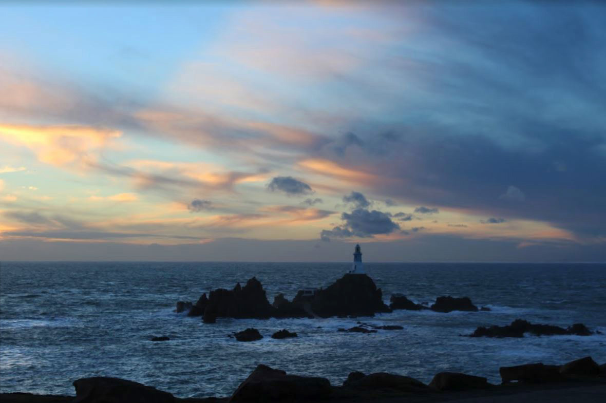
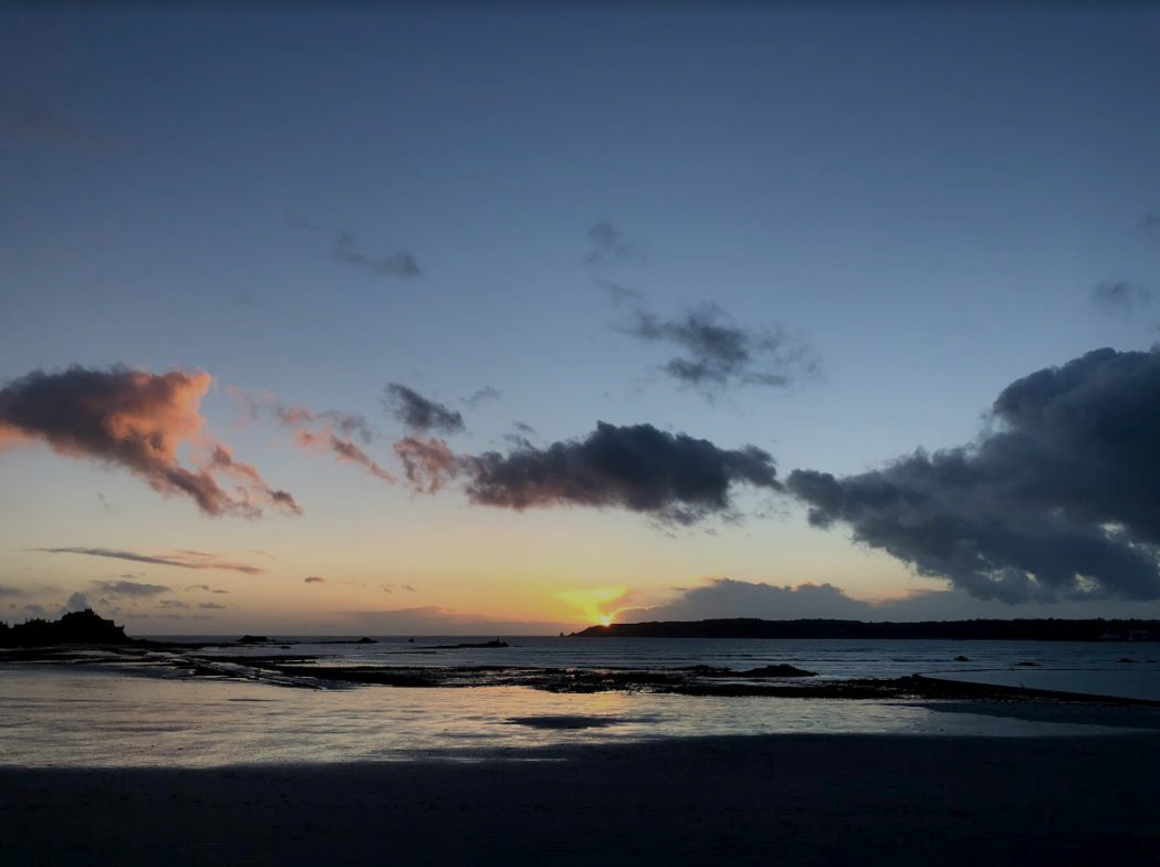
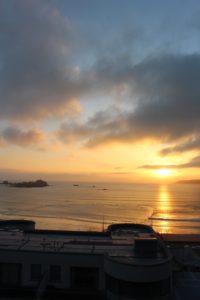
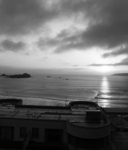
For my second photo shoot I decided to take my images around sunset creating a more romantic setting. Both images have clouds making them more atmospheric and interesting.  In the first photo I decreased the exposure to make the sea darker which emphasises the white and the rocks in the bottom half of the image. In the top half of the image i did not decrease the exposure, but did increase the contrast slightly and adjusted the levels to make the image more effective.

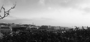
I also tried, when on one of my photoshoots, to take a panoramic on my phone to get a elongated field of view an dot get  wider view of the environment

Panoramic Photography:

Panoramic photography is a technique that stitches multiple images from the same camera together to form a single, wide photograph (vertical or horizontal). The term “panorama” literally means “all sight” in Greek and it first originated from painters that wanted to capture a wide view of a landscape, not just a certain part of it. The first panoramic photographs were made by simply aligning printed versions of film, which did not turn out very well, because it was close to impossible to perfectly align photographs. With the invention of personal computing, advancements in computer software and digital photography, it is now much easier to stitch digital images together using specialized software.