Category Archives: AO3 Record Ideas

Filters

Author:
Category:

Evaluation of Political Landscape

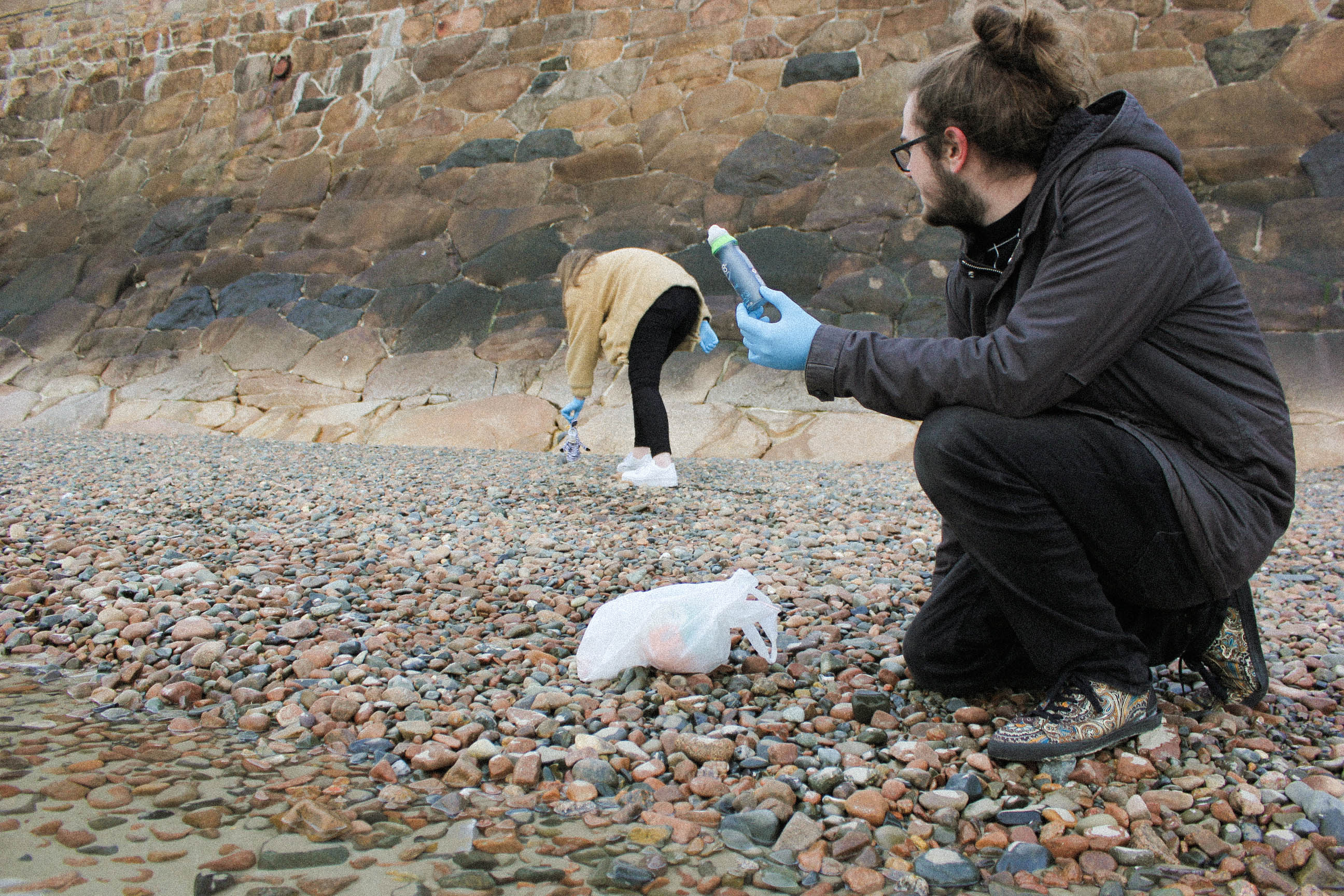
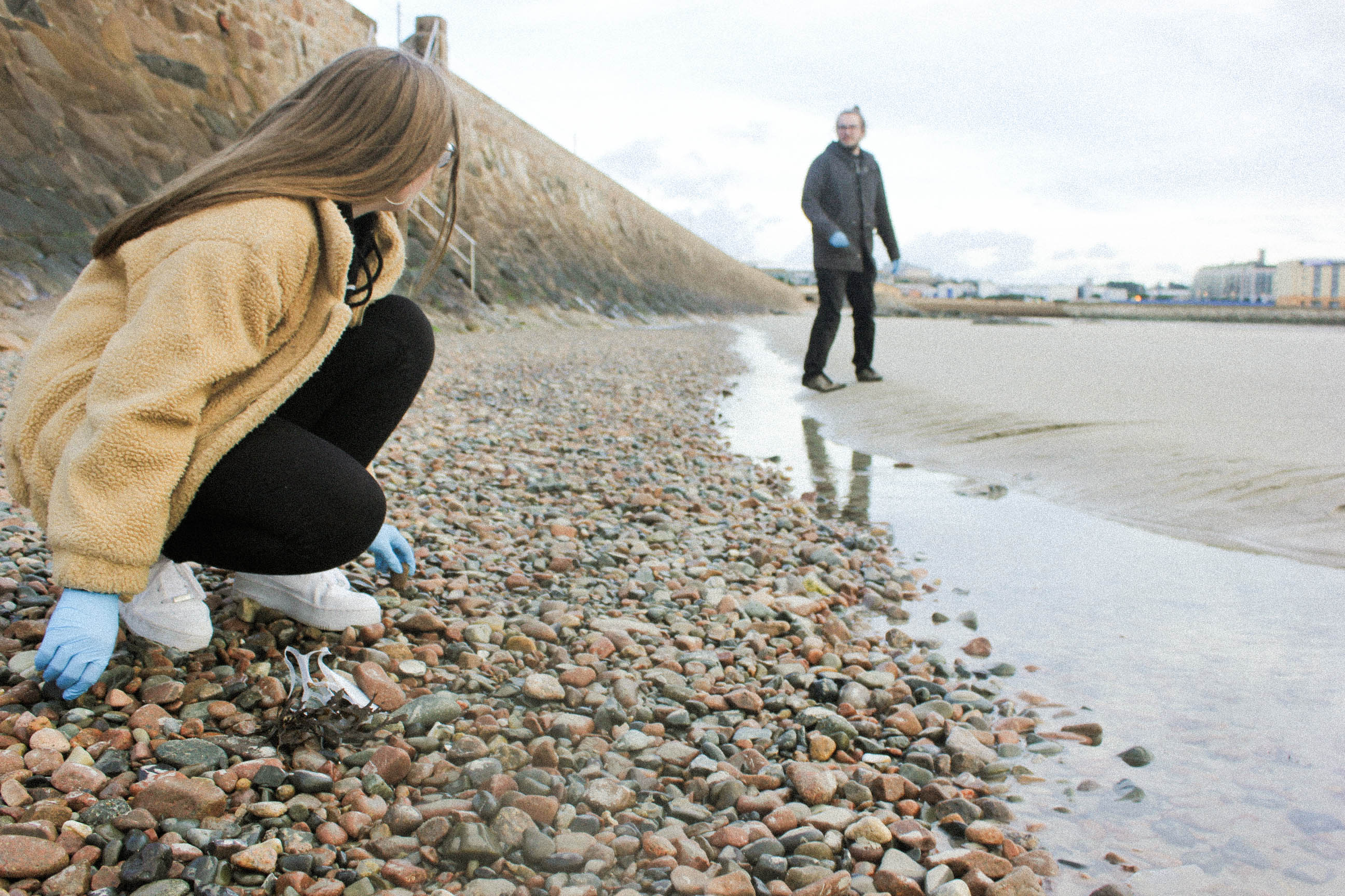
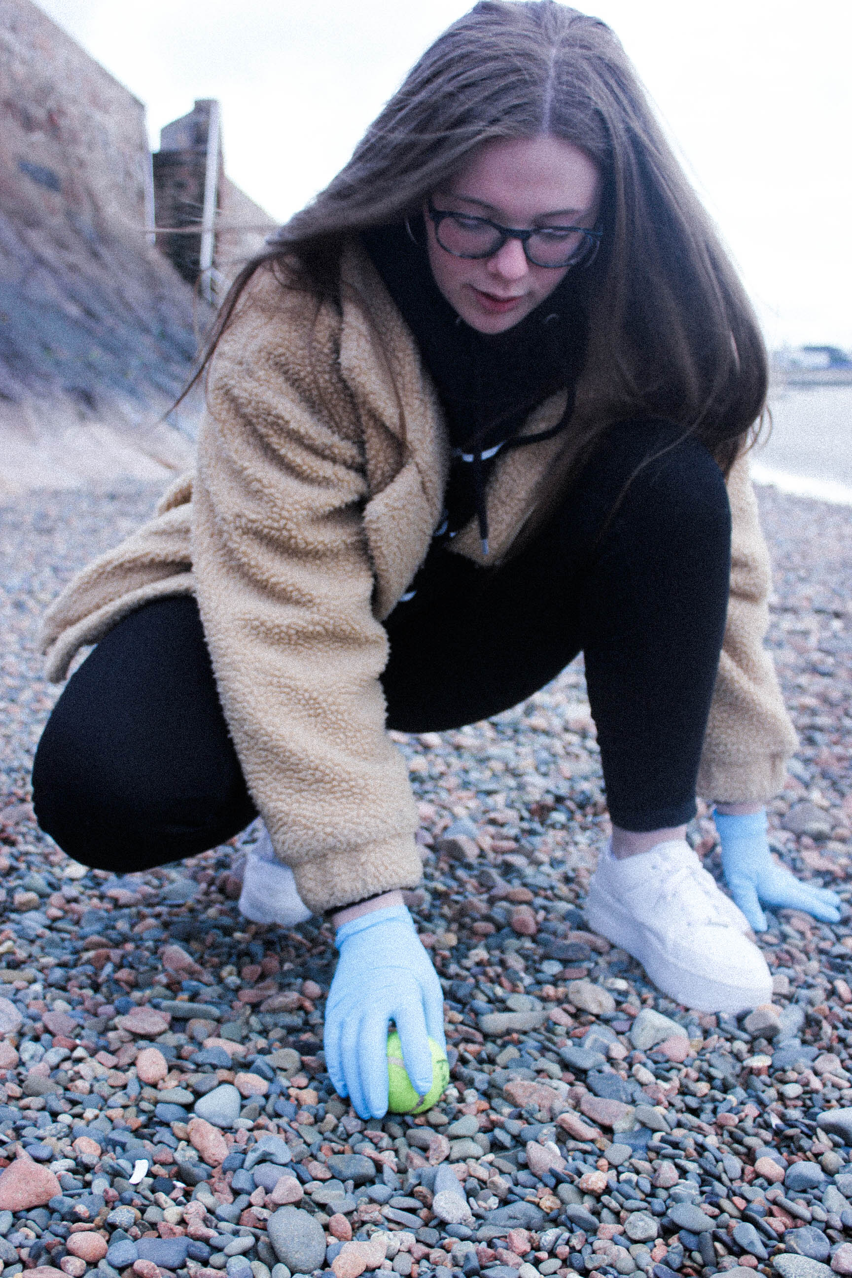
Going into exploring ‘political landscape’ initially I knew that I wanted to explore the development of my house over time and my experience of living within a house that is constantly changing and never truly finished.  I had my vision of what I wanted to do but I had to do some research to find inspiration on how to approach my project.  The first set of photographers that I studied were Bression and Ayesta and Fernando Maselli.  Bression and Ayesta focused on human memories and how the Fukushima exclusion zone has changed over time without human inhabitants having an influence over it whereas Maselli looked more at nature and land that had been untouched by humans.  I started to lean more towards Bression and Ayesta’s style as I felt that their project ‘Retracing Our Steps’ had a strong narrative throughout it whilst including a human element, which inspired me to include some archival and new family portraits.  I then started to explore the work of Lewis Bush – specifically his work ‘Metropole’ in which he photographed buildings with a double exposure effect in order to create a sense of confusion.  After creating a response to this I decided that this would not be an appropriate way to show the story of the development of my house.  I then found Huang Qingjun who had a strong body of work titled ‘Jiading’ which explored the modernisation of China and how the rural population had been affected – I felt that this was an appropriate project to take inspiration from as it brought a real human element to the table as well as exploring building and social trends in an area (which is seen in my project as the fashion of houses and clothing changes over time).  From here I took inspiration from the idea that Qingjun was looking at the belongings of the residents, and so I photographed the belongings of my dad, who is a carpenter with his own workshop, because he developed the house in his own vision and design with only help in specialist areas.  For this reason I felt that it was important to show an aspect of what goes into developing a house.  I took a lot of inspiration for my project from the straight photography movement as I aimed to create the photographs in this project in a documentary style in order to show things for what they are.   This interest in a documentary style approach led to the inclusion of lots of archival photographs of the house that were taken by my parents throughout the renovation as well as photographs dating back to the 1800’s.

Overall, I had a vision for what I wanted to do from the start and throughout the project the idea of how I would approach the project changed as I researched more and more.  I believe that the changing approaches helped me to achieve an outcome that was thoroughly researched and well put together as well as including a lot of the many aspects that come under the title ‘political landscape’.  Through this project, I have learnt that doing plenty of research is a priority when trying to find your approach – it can bring lots of inspiration to you and force you to think in ways that you had not previously thought about leading to more original and interesting ideas.  This project has taught me a lot about how much editing and experimenting goes into creating a photobook – halfway through the project I thought that I was nearly finished and so put together a selection of photographs only to find that the selection was missing something in a few areas and so I went out and increased the portfolio of photographs which ended up adding more complexity and sub-narratives to the book.  It is clear that experimenting with different ideas is essential for a successful project rather than being narrow-minded and sticking to one idea and allowing that to guide your decisions.


text to put inside my photobook

I belive after much research it would probably be too much text if I were to research stories, because of this I belive I will focus on quotes and short stories about the sublime. I wanted to start off by looking at poems which attempt to describe the sublime, which is a great relation to the subjectivity it has. With this I believe it would be possible to connect these explanation of what someone sees and connect them to my own imagery. The poems are divided into more abstract and contemporary feeling describing what the sublime is, combined with a more of a defiant research by a philosopher or writer describing what he thinks the sublime is, and what it means to people.

A meditation rose on me that night
Upon the lonely mountain when the scene
Had passed away, and it appeared to me
The perfect image of a mighty mind,
Of one that feeds upon infinity,
That is exalted by an under-presence,
The sense of God, or whatso’er is dim
Or vast in its own being (1805 Prelude, lines 66-73)

I chose this short part of a poem written by William Wordsworth as it reflects on his experience. The means by which ‘Nature’ transforms the mist into an ocean. It’s quite comprehensive and subjective as a text in its relation to each person, but this is why it is successful, as it mimics the feeling to that of the sublime.

Is with infinitude, and only there;
With hope it is, hope that can never die,
Effort, and expectation, and desire,
And something evermore about to be. (1805 Prelude, lines 538-42)

The sounding cataract Haunted me like a passion: the tall rock,The mountain, and
the deep and gloomy wood 
,Their colours and their forms, were then to me An appetite
; a feeling and a love (our emphasis 76-81
“Whereas the beautiful is limited, the sublime is limitless, so that the mind in the presence of the sublime, attempting to imagine what it cannot, has pain in the failure but pleasure in contemplating the immensity of the attempt”
― Immanuel Kant, Critique of Pure Reason
“And I find a happiness in the fact of accepting —
In the sublimely scientific and difficult fact of accepting the inevitable natural.”
― Alberto Caeiro, The Collected Poems of Alberto Caeiro

Whatever is fitted in any sort to excite the ideas of pain, and danger, that is to say, whatever is in any sort terrible, or is conversant about terrible objects, or operates in a manner analogous to terror, is a source of the sublime; that is, it is productive of the strongest emotion which the mind is capable of feeling.”


analysis:
After speaking to one of my photography teachers, I know the importance of the size and where the text lies on the page, and to make sure it is not too crowded. Because this I have above experimented with three different forms which I could lay out my book. The first being a short poem, which is quite large over the page. I believe the poem, first off, being next to this image is successful. The image itself is quite ambiguous yet does inflict connotations of loneliness abandonment and mystery. Because of this the poem discuses a lonely girl mimicking a lovely landscape which she believes to be sublime. To my mind this is a perfect example of a text and image helping each other in order to further evoke an emotion and a narrative story for discussion. However an important aspect which I need to change, is the sizing of the text. This on screen does not look large but when it is printed, this will overwhelm the page and make the layout look too messy with the large gapping. Overall I belive this double page spread with this text is successful and I will further develop this to my final cut of the book.
The second composition I experimented with I am less keen on. I  wanted to experiment with this image because it is a mimicked expression as what the sublime stands for. Her being underwater and face divided shows a beauty and inevitability of death yet peacefulness. Because of this the image should be displayed on a much a larger level. However due to the poem I chose being quite long to the extent of the space the text overwhelms and creates the page lookout to be too busy and then takes away from the poem , instead of enhancing the image itself. I believe the poem I have used already is successful on its own but the overall composition with this a layout, even with a smaller text is not very successful, and should not be used for the final edit of the book.
The last layout is a long extended poem discussing the limitlessness of beauty. These go hand in hand with the young girl in a deep tonal colours with a light shining on her, this symbolises her beauty, and  due to its darker tones also creates an aspect of Pictorialism within the photo. The boarder use also frees up space making the text look less crammed for space The smallness of the text itself also works and due to its shortness this once again enhances the image and I should develop this further, and possibly keep this as a final composition.

Photoshoot 6- Landscapes

For this photo shoot i went back to La Motte to gather more objects that I thought represented what was there now to compare with archival images. I narrowed these images down and displayed them in a contact sheet above.  Whilst i was there I also took additional landscape photos as the weather was different to what my other landscape images had been take in. From the photos I took, I displayed the final landscape images and studio images separately in two parts below.

Part 1- Landscapes

I particularly like these two images from this shoot as they have a different atmosphere to the other images in my project. The bright blue sky that’s behind the rocks and horizon, contrasts with the tones in the foreground in both images. When editing these images I will emphasise the contrast between the two colours. In the first image I was drawn to the  unusual shape that the rock made along the top and the detailed sharp edges within it. I wanted to emphases the chaotic nature of the pattern, so contrasted it with the plain blue sky on the top half of the image, splitting the image in two. In the second image I wanted to emphases the developments that have been built along the horizon to contrast with the archival images from over 90 years ago when they were there. This is why I centered the image so that the incinerator was were the eyes are drawn to. I found I also created the same composition in this image as the first image, where the patterned bottom half of the image is contrasted to the blue sky.

I found that when I am taking photos I takes ones where the main subject is in the center of the image, creating a symmetrical composition.  In my photo book I plan to space out the images where I centered an aspect of the photo, so that they create more impact by themselves.

Other images from the shoot:

In these portrait images I tried to emphasise the shadows the that were made by the rocks. I particularly like the third image where i take a close up image of the pattern on a rock, highlighting the light and dark. I think that this image contrasts well with the other landscape images as it shows a close up angles contrasts with a wide one. In all the images, I wanted to focus on one section or a rock or the earth and emphasise it, which is why the objects all continue out of the sides of the photos.

Editing:

When editing these landscape images in photoshop I found that they were most effective when they were black and white. I experimented by editing a couple of them this way and compared them to the originals.

As well as turning the images black and white, I also adjusted the contrast and the white and black to find what made the image look the most aesthetically pleasing.

I think these two images in particular are the most effective in black and white as the detailed patterns that were originally there stand out even more. The different tones in the sky are more noticeable and are emphasised by the contrast to the rocks. Whilst editing I also used the grauduated filter to make the sky have more of a range of tones so that the final image was more vast and dramatic.

Although I like my black and white edits where I’ve emphasised the light and dark, I think that my final images for this project should be in colour as the archival images I have chosen to include in my photo book are in black and white. If my images were also in black and white the reader might get confused as to which ones are the modern ones that I took.

Part 2- Objects Experimentation

For the images photographed in a studio I edited them on photoshop. I first inverted the image to create the appearance of a photogram, simialr to Chrystel Lebas and Edward James Salisbury. I like this editing style as in my previous experiments from different shoots I found that the final images reflect the work of the early botanists where they used light sensitive paper which gives my images a scientific appearance. Instead of using natural objects i.e plants and seaweed, in this shoot I photographed  man made objects to represent the changed environment in my work. Comparing these photos to that of early botanists show how what is found has changed over the period of 100 years and reflects the ideas of anthropocene. Secondly, I adjusted the levcels in my image so that the background was darker to contrast against the objects. I then adjusted the hue of the images so that that I could create different variations of the same image to see which one was the most effective. I displayed these variations below in a grid format. I also adjusted the levels in each image to brighten the obejcts and make the background darker.

From these variations of the same images, I think that the most effective image edited in the bottom row as I like the use of negative space within the circle shape the rope is making. I also like how the background in these images is completely black, taking the attention and focusing on the objects. The other edited images do this but have grey tones within this so distract the audience form the main subjects. Although I do like how the top rown images have a different appearance to the other. The bottom row shows exactly whats the object is, the appearance being more scientific, whereas in the top row it is harder to distinguish what the object is, perhaps making the overall image more interesting. This is through the lighter shapes surrounding the rope, which is the shadows inverted that were created when I photographed the images. I created shadows purposefully when photographing these objects as I wanted to see the effect it created when I inverted the images. Compared to the bottom row images, I think that they have a more delicate appearance as the shapes created are more rounded and go in multiple directions.  In conclusion, I think that all the images are effective as they show different aspects of the same objects at different sections of it. In my photo book I will include a few variations of these images to interpret the work of Chrystel Lebas in her photo book ‘Field Studies’ where she include photograms.

For another object experimentation I decided to use all of the objects I had collected over the shoots I have previously done ans combine them with the objects I found in this shoot. I think that this is a good way of showing the changed environment and I thought that it could be a good image to end my photo book with.  When arranging the objects, I first put the rope in a circle shape as this is the biggest object and the one that stands out the most. I then started placing the other objects around the shape of the rope, going in the same directions. I think that the combination of the natural obejcts e.g rocks, plants, flowers, seaweed in comparison to the main subjects the rope, creates an interesting image as it separates them as there is a divide in the center of the image, created by the rope.

I then went on to experiment with this image by editing the colour and tones within it. I tried to use warm and cold colours to see which was the most effective. Out of these edits I think that the black and white image is the most effective. This is because the shapes and shadows are emphasised as well as the negative space. Although in this image it is harder to see what objects are being photographed as they are all arranged so close together. In the orange/yellow toned image it is easier to tell what the objects are as the edit brightens the objects and the colours within them. In conclusion, I’ve decided that I won’t use this image in my photo book as I think it is too different from my other formally taken images and won’t create an easy sequence to look at. Also I like how in my other images I have displayed the objects by themselves to create a scientific appearance, like what botanists do when they are analysising species. In this image you cannot tell what each o f the objects are clearly and doesn’t follow the scientific approach I have been following throughout my project.

My Book Specification

Narrative: What is your story?

In 3 words I would describe my book’s narrative as – Microscopic, Anthropocene, Decomposition

In a sentence: My book intends to show the effects we have on the environment when we choose to throw away items instead of recycle them.

A paragraph: Instead, of capturing the environment itself, I choose to capture the objects found inside it which show the decomposition of their materials by the landscape. The breaking down of these objects is carried out by organisms at the bottom of the food chain, therefore impacting humans at the top as a result.

Design: 

How you want your book to look and feel: I want the book to feel like plastic by incorporating plastic onto the cover.

Paper and ink: I want the paper to be matte as it is more resistant to light. It feels more muted reflecting our silence in taking action against the destruction of the environment and the organisms inside it.

Format, size and orientation: 20×25 cm standard portrait

Binding and cover: I want a dust jacket cover so that I can incorporate 3D objects onto the cover such as items I’ve found whilst creating the project.

Title: The title will be based around the theme of plastic.

Structure and architecture: I will show the objects as the main focus first, and at the end of the book I will show images of the “behind the scenes” showing the collection of objects. I may instead decide to place these images in between every set of images depicting the objects.

Design and layout: My images mainly have dark backgrounds. I may associate images with the shape of a circle, as it is a common theme due to the they way I photographed objects through the microscope.

Editing and sequencing: I want to place images of objects close-up next to images of the same object from afar.

Images and text: I may place text alongside the image to tell the viewer what the object in the photo is.

Photoshoot 5- Botanical

For this photoshoot I wanted to re-visit the idea of formally photographing plants and objects I find at Green Island, taking inspiration from Chrystel Lebas and Edward Salisbury and his botanical photography.  I wanted to create a scientific style to contrast with the landscape photography that would be in my photobook.

I first chose the image i thought were the most aesthetically pleasing and has the best lighting in them. I then displayed below unedited. I want to show the contest between the unedited to the edited. in this shoot gathered the objects i collected recently and tried to put them in different arrangements to find the one that with the best composition and patterns. I tried photographing single objects and finally started combining different objects together to create a contrast in the images.

I chose this as one of my final images to eventually start to experiment with because of the arrangement of plants. I tried many different ways of displaying these and found i they look best when i arranged them in size order. I think this makes the image look more scientific, similar to how a botanist would look at plants to analyse them. I think having them in size order shows how they were all at different points of growing, representing how the environment is constantly changing and evolving.

I also like this image due to the repetition of the stems creating vertical lines. Each plant then has different shapes and directions which their leaves are going, making all of the plants part of repetition but all being different.

The way the plants are displayed reflect botanists work. For example, in this photoshoot i took inspiration from Anna Atkins (16 March 1799 – 9 June 1871) who  was an English botanist and photographer. She is often considered the first person to publish a book illustrated with photographic images. Some sources claim that she was the first woman to create a photograph.

Anna Atkins learned directly from the scientist William Talbot about two of his inventions related to photography: the “photogenic drawing” technique (in which an object is placed on light-sensitized paper which is exposed to the sun to produce an image) and calotype. Atkins self-published her photograms in the first installment of Photographs of British Algae: Cyanotype Impressions in October 1843.

“Looking at Atkins’s book today, what is most striking is not the outlines of the algae, however beautifully and delicately they crawl across the pages” (Joanna Moorhead, The Guardian)

I think the images i look interpret Atkin’s, but when i develop the images further and edit them i will make them look even similar to resemble photograms on light sensitive paper.

I also chose the two images below as my final images for this photoshoot as i think they also interpret the work of Anna Atkins well, especially when she looked plants in her photograms, as the stems and leaves are similar to my photographs. I also tried to arrange the plants in a similar way, vertical and spread out so you can see all parts of the plants, reflecting the work of botanists.

I like these two images as they work as single images and as a series. I think they work well displayed together as they are both simplistic images,and the contrast between the one plant and two is small, but changes the composition. The first image shows the plant displayed centered with equal space around the sides, this is so the whole plant is in the frame. I purposefully took the images so that shadows  were created underneath the plants so that there are a range of different tones from light to dark in the image. I also wanted to see what the shadows would look like when i edited them with the appearance of a photogram as botanists don’t display there plants with shadows as it’s printed on light sensitive paper.

I used the white background against the plants so that the detailed sections of the plant can be seen and emphasised when i edit them. I chose these plants to photograph as i like how the parts of the plants had dried and gone a brown tone as it created sharp edges to the ends. Also the flowers on the ends had dried as well creating an interesting circle pattern to contrasts with the rest of the image with sharp lines. I also displayed the image with two plants in it as i thought it had an interesting composition where the plants weren’t centered like in my other images.

Conclusion

Overall, i think i successfully took my images in the style of early botanists but i still want to develop these images more by experimenting with different edits and colours. I will then display these together to show different variations of the same image.

Photoshoot 4- Landscapes at Dusk

I went back to La Motte at dusk and took 100 images. I then narrowed them to 36 images and displayed them below. I decided to go to La Motte at this time so my images have different lighting and tones in them. In Chrystel Lebas photos she often goes out to photograph at dusk (what the French call l’heure bleu ) when the world becomes more mysterious.  “I was fascinated by night itself, by the absence of light and the impossibility of photographing” Lebas told Nanda van den Berg, the director of the Huis Marseille in Amsterdam. This inspired me to go out at this time the day to see how this would differ from the previous landscape image I’ve taken in this project.

I like this image I tried to emphasise the cool tones to heighten the elementalism relating to the ideologies of sublime. I think this particular image of mine definitely reflects that of the sublime, through the bold, structured shapes of the rocks with dark tones ranging rom brown to black. This combined with the sky which is a blue tone due to being taken at dusk, creates a mysterious and other-worldly appearance.

I wanted to show how the environment was changing by how the rocks had been warn down in comparison to archival images from one-hundred years ago. This is similar to how Lebas wanted to express how the environment was changing though how trees are growing, dying and re-generating themselves. I also like how the horizon is in the middle of the image creating a good composition, with detailed patterns and structures on the bottom half of the image which is juxtaposed with a simple sky with faint clouds. This is then connected with the rock in the centre of the image, being in both half of the image. The center rock is isolated from everything else in the image by sea and is shown by itself which contrasts to the other rocks in the image which are in groups together making the audiences eye going to the entered rock first. When editing this image i will see why it look like when i darken the clouds creating a more vast image.

I particularly like this image from my photoshoot as it has more context and meaning behind it than some of my other images. To me the cross in the center of the image could represent the peoples lives that have been lost on the beach, or the people that were buried in the island. This makes the image more mysterious and allows for the audience to interpret it however they want.

I also like the composition in this image as it is split into three sections , with the cross in the centre of them. The bottom part is th darker pat of the image, the dark brown tones contrasting to the light blue ones in the sea. The tones in the  bottom part of the image link to that on the horizon which creates a more aesthetically pleasing image. This is also because the blue tones in the sea complement the colour of the sky. The cross in the centre of the image is the point that the audience first looks at as it dark brown colour is contrasted against the sea behind it. I think image also links to the first final image in this shoot as they both have a subject in the sender of the image which draws the audience in, which is then surrounded by detailed rocks and blue tones. I think these two image would work well in a  photobook as they complement each and have simile aspects but aren’t too similar that your looking at the same image twice.

I tried to emphasise the blue tones in this image when photographing it at dusk and think I successfully did this. When editing this image i will try to further emphasises these blue tones and maybe even create more contrast between the tones in the sea compared to the sky.

Edits

When editing my final images for this shoot i decided that i wanted to emphasise the colours in the sky and darken the colours of the clouds to create image the reflected the ideologies of the sublime more. I use the Graduated filter when editing all my images and adjusted the exposure, contrast and temperature to create more stand out images.

To experiment with this image I darken the blue sky towards the bottom but kept some of the white clouds around the top of the image noticeable so there was more contrasting colours. I think that the edited blue sky against the white clouds emphasises them more than the original and makes the landscape seem more vast. I also darkened the rocks around the bottom of the image to make it seem later in the day than to when he image was actually taken to make the overall appearance more other-worldly and mysterious.

I also experienced my adjusted the colours and temperature in the photos to see if any of the other variation would make a better image. I changed the image so that there were more warm colours int he sky the cooler colours. Doig this created completely different atmosphere in each image compared to the original. These edits make the image look more other-worldly as the colours in the sky aren’t something you would see everyday, which perhaps makes the image more interesting to look at.

Overall, I think i prefer when the first edit where i emphassed the colour tones as it creates a more sublime image and reflects the work Crystal Lebas more, which is something that i wanted to do in this shoot.

In this image i edited in a similar way to my previous image to see how editing the same way would make the images different. I darkened sky in this image using the graduated filter so there was more of a separation between the sky and the sea. I think this makes the sections in the image more noticeable as their are all different colours. Also the darkened sky makes the landscape look more vast and dangerous like there’s a storm, looking more sublime than the original.

I also tried editing this image with a warmer tone for the sky adding more yellow into the landscape, which creates a different atmosphere in the image. It doesn’t look as natural as the original, taking away the natural blue colours and adding a more other-worldly appearance. I also tried brightening the sea in the right image to create more of a contrast between the dark sky but found that it looks too edited as the dark sky would reflect the sea in real life, which isn’t happening in this image.

As a final image I prefer the first image as I think the darkened sky and clouds fits well with the aesthetic and concept of the image as the cross in the centre is representing people who have passed away, addressing a sensitive and sad topic. To me it shows how even though there’s a storm in the picture and waves the sea, the cross still stands as it always has, perhaps saying something about the people who have died in the area.

I also chose this edit as one of my final images as I like the reflects that the rocks create on the sea and also how it’s showing a different atmosphere to my other dusk landscape. The sea is flat with little waves in it, which contrasts to the other images I took which have more of a dramatic appearance. To me, this image is more calm and peaceful through the flat sea and the soft colours in the sky going from light blue and showing a little of the sun thats just set. In my opinion this image reflects more picturesque ideologies, compared my other images that look more sublime as its not as dramatic and vast and emphasises the beauty in the landscape more. When editing this image i used the graduated filter and brightened the sky a little and emphases the softer colours like the pale blue and orange.

Mark Dion Response

Edits

To give the images the same vintage feel as seen in photographs of Mark Dion’s work, I overexposed the images and added grain. I increased the contrast and vibrance to enhance the colour in the stones. I created two versions of an editing pre-set where one version was curved towards the blue side on point curve, and the other was curved towards the yellow side. This was to change warmth and lighting of the images, that occurred due to the overcast of the sky.